Transcripts
1. Lesson 1 Introduction: Welcome friends. I'm shoving the digital artist and designer here to help and guide you in how to draw
and paint in digital media. Through my sharp and focused
classes step-by-step. Today, I'm going to teach
you how to make and pain using custom
brushes in Photoshop, which means you are
going to paint using your own custom-made brushes. Also, I will share with you
a particular artist's style, the jewelry artist style, and also a few key takeaways
which will help you to paint one of your or your very first digital,
usually masterpiece. This class will not only n here, you will get handbag information on concepts
of drying composition and will guide how to draw any attractive and enhancing composition using
those concepts. Having so much for you ahead. Can't wait to see you
in my next lesson. You understand better on
what the resources you need and how this class structure
to get the best out of it. So how do you enrol now?
2. Lesson 2 ClassStructure and Material Need: Hey, and welcome back. Before we dive in, let's talk about what all you need to go through
this class with me. One, the basic laptop or extra, or any device that you have. Next, Adobe Photoshop, downloaded and
installed your device. It could be any
version, CS or CC, better pen tablet or any other drawing pen
tablet that you have. I will recommend
you to have one by the company tablet
as it's beginner, friendly and very easy
to use and control. Also, it comes in at a very
affordable price range. If you're already having
one, good enough. And we can start
with using that. Also, I have a complete
custom-made Photoshop brush pack for you that will help you in painting your
first masterpiece, landscape. That pack is available in
project resources section. So you can just go
there and download it and import it
to your Photoshop. Now, here is the complete
class structure. Starting from basic
rush practice. Understanding concepts
of composition. Further, we will go to drawing composition derived
from those concepts. Then we will take on the jewelry artist style and understand what it is all about. Then take out the color scheme and also learn how to apply it. And finally, paint a
composed landscape using those custom brushes from reference image and Julie are the style in digital medium. And this will be your
final class project. Let's begin.
3. Lesson 3 Brush Basics: Hello and welcome back. I'm in Photoshop screen. And you should be
looking similar to this. Once you open Photoshop
in your device. I'm having a canvas already
made of 1920 by 1080 pixels. So to create a new canvas, just hit Control N
from your keyboard and enter the
required dimensions. Here I'm using 500
by 500 pixels. And it is in a square
format with 300 DPI. As I'm going to be
custom brush on it. Here in this new canvas, add a new layer from below to work above the background so that we keep both the
things differently. Now, in this new Canvas, select Brush Tool shot with
B from this brush panel, or go to Windows. You get to select the brush
panel. It is visible. If it is not visible beforehand, make sure you're drawing. Tablet is plugged in. And Jews hard round
pressure size brush. You can easily resize your brush using the left side
rectangle record for decreasing the size and the right rectangle bracket for the increasing the
size of the brush. Now, to make a grass blade
kind of structure like this, make sure you have clicked
D from your keyboard to set your colors default
to black and white. You can see how this is painting depending on
your brush pen pressure. Just fill it up like this. All I'm doing is by
using the same brush, nothing else, and just creating a grass blade
kind of structure. Now once you are happy, you can just use the move tool, shortcut V. And
make sure check on the show transformation controls and adjust the size
of your shape. You can use Shift to
make it proportionally on Alt to make it all from
the center proportionately. It depends upon you. I just just further. Now, if you just put enough, go to Edit, then
Define Brush Preset. Just rename it as
your wish, 100. Okay. Now go to the brush panel. Selected particular brush, which will be on the bottom
of the panel by default, to go to another
channel, that is brush. Settings. Your brush and make it a good custom made with
different settings. As a glass, organic grass
blade kind of thing. You can just use Windows menu, open, Brush Settings, panel. As we did earlier before, the brush panel thing. So here it is. Here just increase the spacing
to 70% or more. Now, go to the next setting
that is shaped dynamics. Adjust the size pseudo
to see in-person. Make the control set
to depend pressure. Then here is the
minimum diameter. Let us just put it
21% or near about. And the angle judo 1% only. Also serve to control
this time do direction. Further adjust the
roundness jitter to 5%, the minimum roundness to 25. Let's check up on the next
setting that is escaping. Here the scatter to
sixty-nine percent. That would be good enough. Make sure you're
smoothing is checked. Now click the corner below
icon here in the blurb below brush settings
panel here to save your brush with all
these new properties. And it will be very easy
to use for the next time. Again, simply just
rename it and hit Okay. And you are done. You have made a custom brush with your own settings and
your own structure. Just checking the brush by
simply painting it over here. I'm already using the brush tool and selecting that brush. I'm just painting
it over here and you can see how it is working. And you can even change
the color and see results. I hope you are now clear on how to make one
and in dry it. Let's meet in the next lesson to understand the
basics of composition.
4. Lesson 4 basics of composition: Welcome back. Let's talk about a
few concepts that either me or break
a good composition. Here, I will be stating
what not to do. And on other hand, what is the better option of it? In the first scenario here? On left side, this kind of competition buildup
a static field or a feeling of no motion or
no flow to your drawing. But you can simply just
moving new subjects to make a good interesting movement
and feeling of emotion. That is here on the right side. So this is the first thing. Now, come to this second case. This kind of placement make
your scene look centered. And this again gives us static
field, no motion thing. So easy way out is placing one of the objects
on a little far side. This will create it off center
kind of flow to your eyes. And this will give me nice
touch to your composition. Now, in the scene, you can see the issue. It's simply flattens your brain. The key to this is to make a
few overlapping situation. Don't just places
nearby and make sure they overlap
each other a little, little by little,
not too much to give it a nice 3D
space and feel. You can see a little adjustment gives such a drastic change. Let's come to the
fourth scene now. Here the problem is too much firm dismissed
in foreground. And you can see the
objects are very far. So this makes your drawing looks a little empty and
dull and boring. Simply add another subject
to your composition. Even if it is a half center
or out of the Canvas thing, let it be, give, it gives your space. And it will give you
space a nice volume. And this will just change
the entire composition. Look. Now see, this is no more
blank space kind of thing. Now in the fifth scenario, what we did earlier as a good option might not
be the good. In this one. This case is generally
called bad cropping. Might've do this is
anytime you add a subject, half of the Canvas, don't make it cut
down completely half. This just, you can include the three-fourths
inside the canvas and the 1 fourth outtake, our vice versa, if it is
too crowded inside already. So this will make
all the difference. Next, common issue is
far cornered objects. Solution to this is simply
bring them near to each other. Let's get to the end
of this scenario, which again flattens your space. Solution is just add
just the placement, bring the subject rental
or loving to each other. And see how creative
leaders gem. In the last case is all
about flat lighting, which just make your
completion go flattened. And this is not a good point. This is because when
the light is from the center point and just delighting to one
of the corners. And you can see your results. The things go dynamic now. So now let's learn how to create a composition from
these basic concepts.
5. Lesson 5 Creating Composition: Welcome, and here I'm having all the four concepts out of those eight concepts that we
talked in the last lesson. And let's learn how to draw
the composition out of it. I'm using hard round for her size brush and
making a canvas in-between the rectangle
thing like this. All I'm doing is in a new layer following as shown
in the concept. You can see how nicely I have to look this
style of home position next to the similar process
with the second one. You can see here. Now I'm quickly
reforming the card, want to see how the
result is going to be. Let's get to the final concept, which was all about lighting. Here, the direction is in De Carlo and shadow would
come out something like this. Let's just refer and
make new subject to our composition and also the lighting so that the
shadows will come out. How good that
particular object in our composition is really,
really attractive.
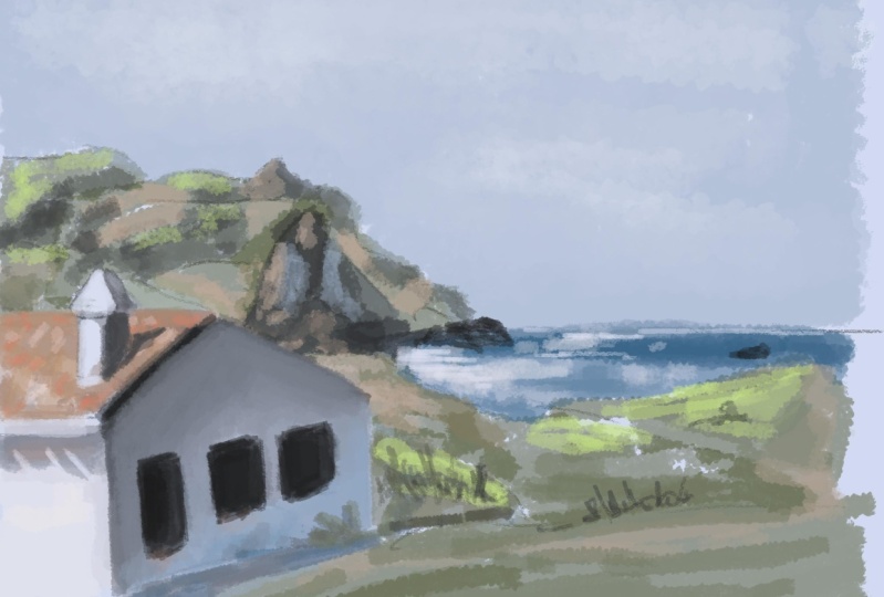
6. Lesson 6 Ghibli art style: Welcome back to the Julliard, a style, first of all, really is a Japanese
art form which is mostly painted using
poster colors on a paper. And it is wonderful detail
forms that most artists do. Mostly digitally
artists to paint in the style of impressionism of a subject that is
something that feels like the subject instead of
the complete the corner, the, every thing is to focus only done two
geometrical issue. Nothing. It's more
towards the impression of that subject and still detailed. Also when you look in
detail on this main things, simplification and
stylization is done more and more on a micro level and details are easy to
cash for your eyes. Also, really artist do make sure while painting any
background than foreground. Foreground and
background of a scene is defined and easy to identify. And as I said about
simplification, stylization on micro level. Here you can see it in the painting on the
right-hand side. The stylization and detail
make it so dramatic. Let's study of
painting in detail to understand how they apply the brush strokes use the
colors and everything. Here you can see the painting
is done a layered way. Along with the stylized
brush strokes. You can see the brush
strokes from a distance even you can easily identify
the front and back. Here. Even in the brushes, the use of the sunlight, you can see how the things are above, beyond
and everything. Also see how few range of darker tones is
used for dense areas. And in a similar way, it's a complete range
of colors to paint the brighter areas. Here. In the next case, I would like you to focus
on the sky background. It's not bleeding,
it's not like our sun, same color all over it. You can broadly see
there are two colors. And also there are other
brush stroke textures. To make sure it is
looking happening. It's looking a little detailed and something
even in this side. Let's meet in the
next lesson to learn about how to derive
color schemes.
7. Lesson 7 Ghibli color scheme: I'm having a few paintings
in front of me here. And we'll bring out
colors in a way to understand the color tones
used by those artists. I'll be using IP cartoon
shot with AI and brush tool shortcut V with
the basic hard round brush, bigger color, using
the eyedropper tool. And make sure you are
painting it on a new layer. We will meet in dark color
scheme on a different layer. You can see the
color panel here. Even in the brighter,
sunny paintings, color zones are so, so, so not so bright. They are all in the
middle kind of thing. They are not to write or
sharp on either. Not too bad. All in a certain range are a lot of colors to the particular painting
in front and back. So just painted both the
colors in different, different lines for a
certain color scheme of the art and design. You can see how it is. And let's go to the next
case of retail subject. Here in the tree. You can see so
many tiny details, so many color tones, so much range of colors
in just one tree. This is my favorite
because of this. So quickly follows
some same process of picking the color and then
creating the scheme out of it. Shade of green or
one single subject. Make it dramatic. This is the power
of the seller guys, and this is how
detailed the artist. You can simply go further and simplifying a scheme
of your choice. I'm just making a line. See how far I could go with it. So here the result
is seven colors. If I go to simplify
it more further, then there are the five colors. So this was all about
studying and practicing about the color scheme
of this art form from the your paintings. Now, let's take a step further and pick a
color scheme from a reference photo
and change it will be our color scheme for our use. You'll notice, I'll
give you colors are vibrant and not Google. So simply adjust it in your color scheme by using a
hue saturation adjustment. And take the saturation little lower and make the
lightness lighter. Here you can see the change. Now, I can't wait to see
you in the next lesson where we will be painting
together this scene, as is usually background.
8. Lesson 8 ghibli painting: Here in Photoshop,
having reference image and the color scheme that we
created in the last lesson. Ready to paint my background
with you beforehand. Use rectangular selection
tool, shortcut M, to select a space
for you like this. And on a new layer, simply select from below, add a layer mask. The point of having
a mask in advance is anything you paint
here is gonna be inside that defined area. Only. Your space
would look clean. Pick a color from the scheme, and use the color bucket tool. Shortcut G to paint the
solid base for your basic. Forced to step. Use another lighter tone and use this time
the soft brush, the symbol soft brush, and some here in the sky area. Now you can pick and blend the different colors from
the scheme one by one, using the same brush. Also use different size
to make it look dramatic. Once Jen, it's time
to paint diffuse, use hard round brush to
define the edges to it. And also vein this
field in a new layer, having that selection active so that the mask is again on that second
layer. In the same way. You can easily undo using Control Z anytime and repaint
that particular area. Using a grasp live
brush from the set. I'm just painting the
far will she do deals. Simply shift from the color to color to give a
nice light effect. And make sure you paint
your darker color force. And then the lighter
colors after that, if you again use
the darker color, make sure you being with
the lighter colors, again, entrant of those. So that the darker is light, it is in the front. That thing keeps
in your painting. Use another graph blob brush to paint the lighter
areas in the front. You can refer to the image
and go to more detail. After your desire. Once happy with the base, it's time to add the subject. This guy, that our flowers. Using one of the
digital default, HB brush or pen brush
paint these structures. The shapes of clouds. Then for the paint in
and complete that block, shape has a blog for single
color kind of thing. Keeping different
layers for the firms subject is really helpful. Now, hold control and click on that particular
layer thumbnail to make that printed area whatever you paint it in that
particular layer, that selection will be active. Then use another color
to paint and add drama to your subject
that the clouds. And this will look
very, very effective. With this, we are done with our digital, you
believe, background. I hope you guys have found it helpful and learned
a lot from it. If you make sure to leave your reviews below and also
share with you paintings, your projects that
you have painted. Along with me in this class, in the project staff, I would be, hi, I'm more than happy to see
your beautiful paintings. If any problems or issues
or any guidance is needed, make sure you comment me in the discussions tab and I
would be glad to help you out. And if you find it helpful, you can share it
with your friends and family who might need it. And if you want to go deep on learning digital
drawing and painting, make sure you follow me here. And as I come up with new
classes on this topic and also recommend you to watch some of my earlier ones. Thank you.
 Shivangi Dubey, Graphic Designer | Web Designer | Artist