Transcripts
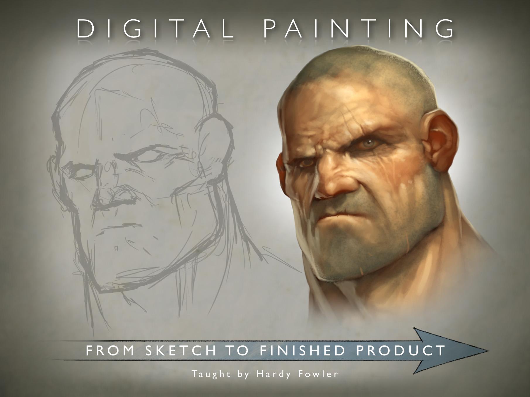
1. Trailer: - Hi, - everyone. - My name is Hardy Fowler. - I'm a concept artist, - an illustrator working in New Orleans, - Louisiana. - I don't work for various entertainment industry clients, - including concept, - art and promotional illustrations for video game companies and print markets. - I've had work accepted into various digital art annuals such as Expose and I'm also a - certified medical illustrator. - This class is called digital painting. - From sketch to finished product. - It will teach students to create a polished illustration from scratch. - Using Adobe Photo Shop will cover everything from how to first tackle the daunting blank - canvas all the way to how to present your finish work professionally. - This class is perfect for students or professionals seeking to improve their workflow, - but anyone who wants to learn to paint something cool on their computer we'll get a lot out - of this class. - So enroll today. - I look forward to seeing your projects
2. Class Outline: - so to start our class, - we're gonna break it down into three parts. - Part one is ideation, - sketching and thinking. - Part two is blocking in and painting in Part three is Polish and final presentation, - starting with part one ideation, - sketching and thinking. - First we need to define our project. - What are we trying to show the viewer? - What visual clues can we use to tell the story of the character we're trying to depict? - Once we have that decided, - we'll do a rough sketch. - It should be loose in gestural. - We're not gonna present this to the client. - It's more for our own use, - but you still want it to be solid. - Once we have our rough sketch in place will do an inking pass. - This is a second refined past for presentation to the client. - Let's get started.
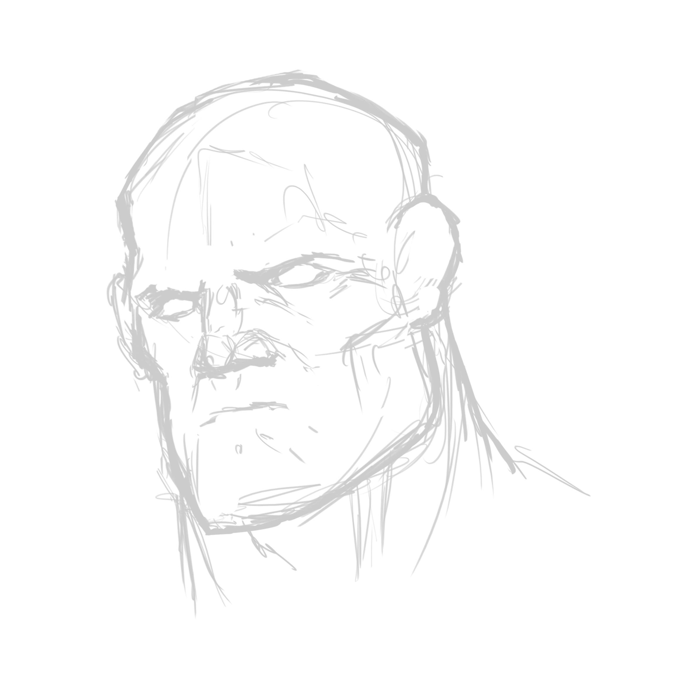
3. Rough Sketching: - So all illustration start with a daunting blank canvas, - and we just have to start making marks here. - I'm starting by making some loose, - sketchy oval shapes to start defining the main shapes of the head, - like the top of the head, - the years in the jaw just to get a basic contour shape down. - I'm showing the head from a 3/4 angle so that we can highlight the brow, - jaw and cheekbones. - But use whatever ankle you think shows the facial features that you want to highlight. - I've got my brush settings on screen here. - Uh, - I have sort of a flattened circle shape. - It simulates a chisel tip pencil pretty well, - but use whatever you're comfortable with here. - I'm starting to define the interior features of the face like the eyes, - nose, - cheekbones and mouth. - Know that this video is sped up to about 1.5 times normal speed, - so don't feel the need to be moving the brush around this fast. - Um, - at this stage, - just keep things relaxed and loose and let the shapes come together organically. - Try to keep perspective in mind is all future steps will be based on this sketch - perspective. - Mistake here could be compounded in later steps in Ah, - I I correct a few with the transform tools here. - Um, - make sure that the eyes, - ears and nostrils any paired features of the face all rest in correct perspective lines. - And you can make construction or perspective lines if you if you need them. - But, - um, - essentially, - just just trust your I, - uh, - and things tend to work out. - I'm switching back and forth between the brush tool in the eraser. - Justo, - add and subtract, - defining the muscles of the neck a bit. - Here, - this guys is huge. - Obviously, - it's a little bit exaggerated, - but that's what we want. - Here we go on making a selection, - Teoh to move that I seemed a bit out of perspective. - Um, - the lasso tool and hitting command t to bring up the transform tools very, - very useful on its Ah, - one of the things I like best about sketching digitally is you can transform your sketch on - the fly rather than having toe to start over or ah or anything like that. - It's enormously time efficient
4. Inking: - Now that we have a solid sketch nailed down, - it's time to create a new layer for our inking pass. - I would like to knock back the loose sketch layer to about 10% so that we can just barely - see it. - This helps the new clean inclines to pop out again. - I start with basic contour shapes, - but my brush strokes are much more deliberate and bold. - No, - uh, - no more sketchy lines here. - Try to vary your pressure on your tablet to give that thin to thick line weight variation - that will give a nice simulation of traditional Anqing. - The beauty here is that you can erase the ink, - which, - of course, - is not possible with traditional methods. - We're just tracing are rough sketch here, - but focusing more on brushstrokes than we were in the first pass. - The lines defining the main shape should be very thick and bold, - but later will add ah, - thinner, - thinner lines to, - um to add some detail to the interior. - Since we're doing a craggy, - world weary soldier face here, - we can add quite a few crease lines, - and it will only enhance the desired effect. - However, - if the character you're working on his female or a younger child try to be relatively - sparse with the detail lines that you add. - If if you over describe the creases of the face on a female or a child character, - they start to take on an odd masculine or elderly quality that just looks weird and should - be avoided. - One of my last steps in this part of the project is to sort of connect the lines at the - bottom. - We do that for the blocking in step that will come next. - It'll look a little weird, - like we're we're doing a severed head or a mask or something, - but, - uh, - that all gets faded out in the end. - Anyway, - this step is more for client presentation. - If you're just running, - ah, - rougher draft by them. - This is useful. - It's it's presentable that it looks relatively nice, - but you haven't invested too much time in it. - But if if you're going straight for a finished painting, - you don't necessarily have to do this step. - This is more of, - ah, - an intermediate phase, - something nice to present to a client. - Some more details here, - adding a scar to the eye and the chin just to give this guy some some interests and - backstory. - Little storytelling. - Um, - there we go connecting the bottom of the neck just to create one continuous solid shape - that we can select Ah, - in our later blocking in step.
5. OPTIONAL SIDEBAR: Basic Mark Making & Rendering: - This is a little sidebar video that I'm going to do just to go a little bit more in depth - on this, - um, - topics that needs some further explanation. - So this is a little sidebar from our main project. - Um, - just basic mark making. - So the first thing I'm doing is selecting a default chalk shaped brush from photo shop. - But this is just what I use use any brush that that you're comfortable with. - Um, - I'm just gonna make some basic marks and show you how I add in tones to the image my my - general rendering technique. - So I've got a opacity and flow Both said it about 20%. - And I like to just tap in, - um, - tone and make it build up. - So its cumulative Every time we add tone, - it gets a little bit brighter and a little bit more opaque. - Um, - I'm just making some random random cloud shapes, - I guess, - But just trying to show something round show how I build up the illusion of dimension by - adding tone extremely basic stuff. - Just want what the students to know the the general technique I use. - I switched from the brush tool to the smudge tool a lot. - I like my brush strokes to be rough and varied, - kind of modeled looking. - But then I can smooth things out with the smudge tool again, - sort of, - ah, - brush shaped brush for blending. - I'm blending out the edges of these little shapes and trying to make things a little bit - smoother. - But just trying to make them look textured and interesting, - painterly even, - um, - anything to avoid that flat, - overly soft photo shop e generic look that I think can really identify a beginner if things - look overly soft and computer generated. - I don't think that's a good thing, - so that this is a good way to make your mark seem interesting and painterly. - Uh, - not not so cold and digital as is some people. - Ah, - try to avoid it, - Z, - not something that your clients would be after. - Um, - and I'm just kind of messing around with the smudge tool just to show how you can create - some hard edges and soft edges, - really in the same shape without bothering with selections or anything. - So it was a simple exercise. - I thought we would be good if we rendered a sphere and a cube Um, - just just some basic art school exercises that I'm sure you've all done a 1,000,000 times. - But, - um, - it could be useful when getting to know the software a little bit more and might help the - main project make a little more sense if you know these very basic steps. - So I've filled in some solid, - darker grey shapes, - and I'm just doing some very basic background stuff. - Teoh to try and make it seem like a three dimensional space. - It were occupying, - sort of putting a spotlight on the ground to make those shadows make sense. - And I think I decided I didn't like that horizon type thing I had tried to do in the - background. - So the first thing I'm going to do is show the simple digital way to render a sphere and a - cube that I don't like. - This is sort of my example of what not to do. - It's kind of the chief way to go about it, - Um, - but it's not very interesting. - It does look around, - it gets the job done, - but it's Ah, - it's pretty cold and un interesting, - Um, - adding a highlight, - uh, - leaving a core shadow and there I'm just painting in some reflected lights of the same - thing you You've probably done a 1,000,000 times in art class. - Um, - but just getting to know the software here a little bit here, - I'm a de selecting the parts of this cube that I don't want to paint so that I can just - just paid on that that top edge and sticking with my sort of example of what not to dio. - I'm just doing some airbrushing inside of the selection, - and it gets the job done. - It does make the form seem three dimensional, - but it's it's not terribly interesting. - And it it has that dull digital look that that we're trying to avoid some reflected lights - there on the other planes. - And there you go. - We have a basic cube in a basic sphere rendered, - Um, - now I'm going to start over using the mark making techniques that I just outlined to try - and make something mawr textured and mawr interesting. - So in the sphere were just tapping in some tones. - It's not so smooth and and uniform is the Grady int was which I like it. - You know, - this could be a cannonball or an orange or something organic and interesting other than a - perfectly smooth ball bearing or whatever it might have been. - So I've got the tones dropped in. - Basically, - I'm I'm doing some blending here with a smudge tool. - And again, - I I like the more random, - organic looking variations here. - It just makes a shape much more interesting, - and it it takes practically the same amount of time. - Once, - once you have got a little practice adding in a bright highlight here but same techniques. - Just, - uh, - using pure white instead of a gray color and some blending. - So there we go, - Basic sphere rendered in a more painterly technique. - Now the same thing for the Cube rather than bothering with changing this selection. - I'm I'm just going Teoh paint in some tones, - um, - kind of a timesaver, - really, - and just building up the values, - making some variations in the planes that it doesn't seem perfectly flat but but has some - texture to it reflected lights on the other planes. - I'm adding some some lighter values to that that edge to try and try and make it pop a - little bit and, - ah, - keeping in mind our lights or sort of to the upper right corner of this image may be closer - to the middle. - There we go, - adding Cem. - Brighter highlights to that. - That edge where the cube changes planes, - it almost makes it seem metallic or ceramic and some blending again. - Here. - Um, - I'm blending kind of in a diagonal, - and it helps to define the planes. - If if you only blend in one direction and then you'll see when I go to the other plane, - I changed directions that I'm blending. - It makes those brush strokes look like they're in opposite directions and reinforces the - idea that this is two different planes. - So that's at some basic mark making in basic rendering.
6. OPTIONAL SIDEBAR: Basics of Faces: - So we're gonna talk a little bit about the basics of faces and how how light should strike - them, - how we can help ah defined their shapes just by keeping a few things in mind before we even - start. - So I've got a bit of, - ah, - collage of images I've done in the past, - and we're gonna talk about light sources. - The guy in the upper left, - um, - his light sources up into the right. - First, - the light hits the forehead. - You can see some highlights on the hair above the eyebrow, - the bridge of the nose, - the tip of the nose. - Then on the cheek, - bones on the light side, - the upper lip particularly bright, - right beneath the nose and the chin. - And in this case, - he's got a strange expression. - So got a highlight right under the lip. - And, - of course, - those those light sources need to carry down to the shirt and his collar is well, - but basically the right side of his face is the light side and we let the other side be the - core shadow similar to the sphere we rendered. - This has to look round, - but it's ah more complex shape. - Obviously, - so course shadow on that side of the face, - under the eye, - under the nose under the chin. - And there's a cash shadow on his shirt, - just just keeping that life source consistent. - Once we have that Aladdin, - Cem reflected lights, - secondary light sources to the edge. - So we've got that white white color on the sides on his cheekbones and on his lower lip. - And, - um, - I've even added ah reflected light and orange light just to show the light coming off of - that cigar. - Ember. - Um, - so that's that. - That's That's basically how how to make a face Look around. - Oh, - I've also added some light Coming through the ears from behind. - Makes the years look translucent. - That it's a trick I like to use a lot makes it the skin look riel on the bottom. - Right here. - This is a bit different. - Was going for something more mysterious. - That's what the project required, - so we can just barely see his face the lightest, - mostly on the back of his neck and his cheek. - Um, - I've done the translucent ear trick again here, - but this one was to be more of a silhouette, - make the character seem dark and brooding, - um, - the female character near the middle. - Same general idea. - Ah, - 3/4 view. - The light is hitting the forehead, - nose and cheekbones most prominently. - I've rendered things much more softly here to make her skin seem smooth. - That's one of the main differences in my technique between men and women. - I think that's not uncommon. - Same thing for the girl below, - uh, - light sources hitting in the same places. - Core shadows fall to the same places and their m circling the reflected lights on on the - cheeks to help round out the form of the face. - This character at the bottom a similar to the one on the bottom left. - But I I added a little more light to illuminate the face. - And this monster on the top, - I included. - Just to show that the principles work for any kind of face really doesn't have to be a - person, - just, - ah, - let the light sources fall where you want to highlight. - Um, - all this guy's weird jaw shapes and is, - uh, - craggy brow and forehead core shadow. - And then I'm just adding, - reflected lights to help round him out. - And there we go. - He's he's pretty much a uh, - a believable three dimensional shape. - It works, - works for anything. - So it was an exercise I thought we would render in a simple faces. - A sketch I had done beforehand. - Um, - very simple. - I'm just using the default round brush and I'm going to use ah ah, - higher key Gray. - Just to start start painting in some very basic values were just going to do it in - grayscale for simplicity where we're just thinking of light here, - light and dark How it hits the face. - Um so upper right side of the forehead, - bridge of the nose, - the cheekbone on the right side, - light underneath the nose on the upper lip, - some light on the cheeks here, - the bottom lip below the lips and on the chin. - And already this this looks quasi believable. - You can recognize it is a face pretty easily. - And here I'm just tapping in some some different tones to try and unify things a little bit - and then add some brightness to the areas that I want to pop, - carrying things over to the darker side of the face to say that the contrast isn't quite so - stark. - You want it to be somewhat of a smooth transition. - And actually, - I went to bright on that that part of the head. - So I raced back here. - But there we go. - Just just tapping in values. - Um, - even with this simple brush, - you can vary things quite a bit and make it look nicely textured. - There we go, - some light on the neck keeping in mind that that there would be an area of shadow - underneath the chin on the on the lower left side, - just adding in some details here. - Oh, - I've switched to a pure white here to add some very bright highlights at the areas I want - to stand out mainly the the brow in cheekbone. - Once we have that, - I'm adding some reflected lights to the other side of the face, - the nose underneath the brow and the poor head. - I'm just letting the background gray served to be the core shadow in this case, - just just adding light here. - No, - no darks. - There we have it.
7. OPTIONAL SIDEBAR: Using Quick Mask Mode to Block in: - I thought I would do another optional sidebar to help clarify the quick mask method that I - use for the blocking in step. - Um, - and just to explain the layers a little bit, - Mawr and make sure that this is clear. - So what I've got here is the ink layer on its own layer on what I can do is command click. - I'm holding down command and clicking this image of the layer, - and you can see the marching ants around all of the ink marks. - Eso That's the first step we command Click Inc. - We can see that selection the marching ants around the ink. - I then press cue to enter the quick mask mode. - It goes red, - Um, - and then I hit the tilde a key, - and this is what I call the mask view it It just looks like a negative. - But basically everything that is white is our selection, - and everything that is black is not. - So. - Once we're here, - I select the magic wand tool. - Um, - I have contiguous checked off. - I think that's important in what I will do is select the outside of the silhouette and you - can see the marching ants are going around the perimeter of the face. - So I then select in verse and I fill with white by just holding down option delete. - Excuse me, - Command, - delete. - And now we've got a filled in white, - which will be our selection shape of the silhouette of the character. - And if I hit queue again, - I will exit quick mask and you can see now we've got the marching ants going around the - outside of the face. - Uh, - what I'm doing now is adding a layer beneath the ink layer, - grabbing my science background color and fill the foreground color, - which is option delete. - And there we go. - I've hit de select, - but you can see I have ink on a layer above and the blocked in color on a layer below, - and I'll merge those later. - But it's it's good to have them severed here just just for everyone to understand. - And, - of course, - any time you want to use a layer as a selection, - you just command click the image of the layer and there you go. - You've got the marching ants again, - and you can paint within the selection with with no worries of going outside the lines. - So I hope that helps clarify
8. Blocking in & Painting: - Now let's move on to part two, - blocking in and painting. - The first thing we're gonna do is use our ink layer to create a blocked in solid form. - We'll keep this on. - A layer is a backdrop to our painting. - When it's on its own layer, - you can command click on that layer at any time and call up the solid shape as a selection - . - Once we're done with that, - we will start doing an initial value painting. - Uh, - we'll just use tones to describe the form three dimensionally. - Ah, - this is where all those still lifes and figure drawings from our school come in handy. - Once we have our values the way we want them to be, - we're gonna convert the values into believable skin tones so that it it looks like really - skin and not just a flesh colored mannequin. - So let's get started here. - We have our ink layer. - Um, - I have a step by step process listed here, - um, - a few photo shop operations, - but essentially we're selecting the ink layer going into quick mask mode, - selecting the outside with the magic wand tool, - then selecting the inverse and filling it in with white. - Ah, - feel free to rewind if you needed to see that again. - But now we we've converted our outline into a solid shape. - I like to use a dark kind of scion greenish color for my base. - Uh, - it mixes well with the skin tones that I'll be adding later. - So that's my reason for that. - But I feel free to experiment. - Okay. - I've got sort of the shock default Brush it. - It comes with photo shop. - It's nothing that I made. - Um, - I believe I'll display the settings here, - but I'm just starting. - Teoh drop in some basic tones broad loose strokes to begin with on then, - of course, - will tighten that up later. - But I'm using a light source sort of above and to the left of the face just to give us some - strong shadows beneath the brow and the nose and the cheekbones Always try toe to use your - light sores toe Highlight the features of the characters face that you want to highlight A - strong jaw, - strong cheekbones and brow really helped to sell this, - guys. - Ah, - big, - big, - tough, - mean soldier guy s Oh, - that That was my choice there. - Um ah, - you'll notice I flipped the canvas from time to time. - It just keeps Ah keeps fresh eyes. - Just if anything looks a little weird and you can't figure out why, - oftentimes flipping the campus will make it very apparent. - I use, - ah, - bright orange color to paint my values. - There's there's no reason for it, - really. - I think it it shows up very well against the dark scion. - That might be the only reason Use whatever you want. - You could use flat white for this. - Anything we're gonna we're gonna change it later on. - So this is really just for our own benefit. - Um, - I use Ah, - I think 20% opacity and 20% flow setting for the brush. - But I'm I'm just tapping in and ah, - and dropping those tones in, - Of course, - feel free to erase out If if you think you've been too heavy handed somewhere there we go - racing out of shadow beneath the lips, - adding some highlights. - Try and save your very highest key values for the areas of the face that you really want to - pop. - Um, - for my character, - I think that would be the knows the brow and ah, - the cheekbone. - Eso I'm keeping things kind of medium range everywhere except for right there. - Ah, - good. - Good understanding of anatomy of the faces helpful here us especially with, - uh, - very defined, - craggy kind of face that I'm doing here. - I'm really trying to show every every muscle and bone beneath the skin. - Make make it seem believable. - Make it seem like a living person. - And and not just a drawing, - of course. - Uh, - within limits. - Putting some tone on the neck is well, - ah, - I'm gonna try to do some some strong cash. - Shadows beneath the chin like the ones I have underneath the nose, - the lip and the brow. - Um, - cash shadows. - They're a great way to make your form believable is three dimensional. - There we go, - racing away some tones. - I think I'm doing a light pass of values just to fill in some areas. - It seemed to be to contrast E
9. Skin Tones: - Now that we have, - ah, - some believable values. - We're gonna convert these into skin tones, - and the first thing I've done is change the value layer into a light yellow color. - Then I've made a new layer beneath it that's very important beneath the value layer. - And I'm just dropping in some maroon reddish tones around the cheeks, - nose and ears and lips. - This is really how you make it look like living skin and not just flesh colored plastic. - You have to vary it a little bit. - You want the cheeks in the nose, - the lips in the years to be reddish. - Ah, - and then you can leave the scalp and beard relatively green. - Let that that science based color show through. - Um, - now I've merged the two layers once I've got those general areas defined, - and I'm just sort of sampling colors on the fly by holding down the salt key. - When you're using the brush tool, - just sort of pick and choose colors and paint in. - It starts mixing everything together naturally, - a lot like a traditional painting. - Um, - I've selected Cem some high key Ah, - a new color just to give some highlights to the nose brow and forehead. - Uh, - but really, - this is Ah, - where you just sort of let let your brain zone out and, - uh, - let it happen. - Naturally. - Just pick and choose colors. - Trying to find the forms. - Uh, - three dimensionally, - um, - of, - ah got the shape of the block in selected so that I never paint outside of the lines. - That's very handy. - You can see I have the block in shape on its own layer so we can just command click that - layer whenever we want the selection. - Um, - I switched to the smudge tool here. - It's sort of like using a blending brush. - Um, - but this helps you smooth out some of the rougher values. - I don't want this guy to be to smooth just so that his skin looks looks rough and craggy, - but this is very helpful. - If if you want smoother skin, - um, - here we go. - I'm, - uh, - darkening the ears in the neck painting and some shadows. - Just trying to define the form and make it look three dimensional. - Um, - I'm not rendering the eyes in this step. - I usually leave the eyes for a later step, - just focusing on skin. - Here. - Here, - I'm adding some detail to those scars around the eye that I wanted to show more smudging - here just to blend out a rough edge around the mouth that it wasn't working. - Um, - putting some highlights on the chin. - Ah, - paler greenish color just because it's where we wanted to look like he has a beard.
10. OPTIONAL SIDEBAR: Basics of Eyes: - So this bar will be called Basics of Eyes just to help us learn a little bit more about the - anatomy of the eye and how light hits it. - Help us make a realistic rendering of a nice so a little bit about anatomy. - This is a sectional illustration of the I, - um, - so we can see on the front here I am outlining the cornea, - which is the clear part of the eye. - Inside. - This is the iris. - It's the colorful part of the eye behind the clear cornea in the hole. - In the center of the iris is the pupil for our purposes, - the nearly black dot in the center. - So, - um, - a little bit about how how light hits the eye. - It travels through the clear cornea through the pupil and crosses over to hit the retina at - the back of the eye. - That's how we see probably a little bit more science than then you signed up for, - but, - um, - but anyway, - let's see. - We'll have light coming in from the top. - In almost all cases, - the first thing you'll notice is a very bright, - pretty much 100% white highlight on the upper curvature of the cornea. - Um, - that that's really the ah, - very important thing to make it make it seem like a really I now, - because that highlight reflects away light that leaves the iris beneath that highlight very - dark. - So, - uh, - that lets the rest of the light bouncing around inside of the cornea to illuminate the - lower part of the iris. - Um, - early says that's how I understood things to work in terms of the physics, - but practically for us. - That just means that the iris beneath that white highlight should be dark, - and the Irish near the bottom should be light. - So the three basic things are the bright white highlight dark iris at the top and light - iris at the bottom. - I've got three ah alien characters. - I did hear where the eyes were a big selling point, - and you could see on all three. - They've got that bright white highlight and the irises dark near the top, - dark near the top, - dark near the top on all three, - and the iris is brighter and more colorful near the bottom on all three. - And you can also see that bright white highlight near the center. - But but above the centre in all cases, - and it's very important that it overlaps that dark pupil the black circle in the middle. - It makes the I seem three dimensional, - deep and unbelievable makes it very interesting. - It was another exercise I thought we would render a very simple I I left the eyes out of - our first pass at this simple face illustrations. - So let's do that now. - Uh, - the first thing we need to do is build up the round spherical shape of the globe of the I. - So this issue look like a sphere sitting inside of the eye sockets before we do. - Anything just occurs to me how much this guy looks like Dr Manhattan right now, - but we'll fix that. - Um, - here I'm a racing away the round shape of the iris. - Do that on both sides, - and you have to be careful here to make sure that the iris that that they're both pointing - in the same direction Otherwise, - he'll he'll look like he's either cross eyed or has a lazy eye. - And that's usually not what you want. - Um, - now I'm painting in the dark pupil in the middle. - I'm painting in some darks near the top of the iris like we talked about dark near the top - and light near the bottom. - There we go, - adding some light near the bottom. - I'm ah, - racing back a bit. - Didn't want those eyes to seem to brighter contrast e relative to the the rest of the image - and finally, - the bright white highlight in the middle and we've got it.
11. Polish and Presentation: - So that brings us to part three, - which is Polish. - The first thing we're gonna do is add eyes and hair to our character. - Um, - I've got some neat tricks for both That can really save you some time, - and we'll go through those step by step. - Once we have those in place, - we will add secondary light sources. - Some reflected light and pin lights to really make it pop. - And also it gives us a chance to to tell some some background story about the characters - setting. - Suddenly, - finally, - we'll do one more passive polish and get it ready to present. - So here we go. - We're gonna start with the eyes. - I've started a new layer. - I like to build these up sequentially first with a a reddish color than a yellow than ah, - off white. - But essentially, - we're just trying to render spheres in the eye socket. - Make it look around in there and I'm blending that out a little bit. - Next will erase away Cem around irises. - Ah, - this is where you determine what direction your characters looking in to be careful not to - make him cross eyed. - Um, - there, - um, - erasing away a pupil. - Um, - and make sure to make the Irish darker near the top. - This helps it look deep in in jeweled when when you add the highlight, - finally add a single white dot over the pupil, - and suddenly it it looks like believable eyes looking at you. - Now I'm adding stubble of added a new layer, - and I have simply switched the brush mode to dissolve. - And that's why the marks are little bitty dots instead of a continuous tone, - it's just a different brush modes. - Simple is that makes him seem reasonably believable stubble. - Once I've done that, - I do a Goshen Blur filter just about two pixels and ah, - knocked back the opacity a little bit. - And just like that, - we've got We've got some hair and some eyes rendered, - and this guy's looking pretty complete. - Now for some polish. - We're gonna add secondary light sources. - I'm I'm adding in some white ish light a ziff there, - a second light source to the bottom left of the page. - Here. - This really helps to round out the edges. - Makes makes the character look three dimensional, - also can create a cool mood. - This is also a good opportunity to to do a little bit more storytelling. - For example, - if if you make these reflected lights bright orange, - you could be saying that your character is in a war zone or somewhere where there's a fire - . - If you want to make it a bright, - eerie green, - you could be saying that your character is in some weird alien setting or on a spaceship. - You use those things to your advantage. - Make make everything you do back up the story that you're trying to tell. - It's why it's good to keep these reflected lights on a layer so that you can just a just - those colors without adjusting the rest of the image. - It's very handy. - I'm a blending out a little bit here with the smudge tool. - Once again, - that's our on the keyboard shortcut. - I switch back and forth a lot between the brush tool and the smudge tool. - Just hitting B and R B for brush are for smudge, - adding some some brighter lights on the other side of the head, - as if they're a spotlight behind and above the character. - There we go have switched to that dissolved brush again just to add some hair highlights on - the head and the chin. - Those those tend to pick up bright lights dramatically so that that's a good good trick to - add in. - Ah, - here. - I'm trying to show a little bit of light shining through the translucent years, - kind of like when you put a flashlight up to your hand. - You can see the light coming through and it's bright red. - Ah, - that's what I'm doing here. - Just to to make some light look like it's shining through, - make the ears look believable is his thin skin. - Uh, - now I'm doing one more pass. - Just just sampling sampling colors and painting in wherever I think it needs it. - I'm treating the edges here with a smudge tool. - It flattens out your image if the edges look too hard. - So this is a good way to make those edges. - Receipt is toe smudge them out a little bit, - kind of like a blender brush. - Here. - I'm using the burn tool just to darken a few things that I thought could use a little more - contrast. - I think I I go back a little bit on that, - but, - uh, - that that's a handy tool O on the keyboard is the is the burn tool attempting to adjust the - brightness and contrast. - But I think I like things the way they are. - Finally, - I've just added a mask and I'm using the Grady Int tool to fade out the neck and then on a - new layer behind the character's head. - I'm just doing some white airbrushing and there you have it. - We have a finished product. - Ah, - this has been digital painting from sketch to finished product. - Thanks very much for taking this class. - I hope you enjoyed it and got a lot out of it. - I look forward to seeing your projects.
 Hardy Fowler, Digital Artist