Transcripts
1. Course Trailer: well, welcome to concept art character design. My name is Hardy Fowler, and I've got an amazing, invaluable course to share character concept art. This is a really exciting in high demand field. Countless entertainment industry clients are willing to pay very well for skilled artists who can conceptualize and pay beautiful and memorable character art. But this is a highly competitive corner of the market, and you need to stand out from the crowd if you're going to 16. So the main big picture idea of this course is to show you how to elevate good character art into amazing character. I've been doing this for over a decade now in my career has taught me some surefire ways to push any character concept painting to the next level. And that's what I want students to take away here. We're going to make your portfolio stand out from the pack. We're gonna turn good into great. This course is designed for character artists who already feel like they know the basics but want to rise up to much higher levels. Will do six full character concept projects covering a wide variety of genres and challenges, and I'll show you some incredibly cool and easy to master rendering techniques. But this course is so much more than just a painting. Demonstration will dive into all of the concepts and theories that guide great character design, and you'll learn all of the skills, habits and mindsets that really elevate those pro level portfolios that get picked by clients. I love chatting with students and seeing their work. We offer responsive support and feedback, and this course is packed with valuable resource is in bonus materials. So if you're looking to reach that next level and create the con portfolio that can launch a concept art career, don't miss his course enrolled today. Grab your stylists and let's paint cool stuff.
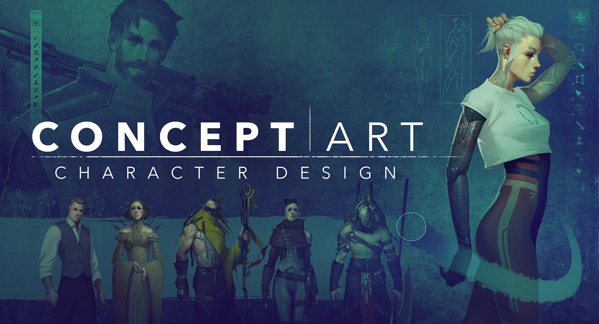
2. Introduction: everyone. This is hardy and welcome to concept art character design. This is gonna be an extremely fun, invaluable course. Will help all students take a huge leap forward with their character concept art good on you for enrolling. So character concept are designed. This is a really exciting in high demand field tons of entertainment industry clients are willing to pay very well for skilled artists who can conceptualize and render beautiful and memorable characters. But this is also a highly competitive corner of the market. They're just lots and lots of artists out there looking to fill a limited number of jobs. So the main big picture idea of this course is to show you how to elevate good character art into amazing character. I've been doing this for over a decade now, and my career has taught me some surefire ways to push any character concept painting to the next level. And that's what I want students to take away here. We're going to make your portfolio stand out from the pack. We're gonna turn good into great. This course is designed for character ours, who already feel like they know the basics but want to rise up to much higher levels. In fact, many of you may have taken my course character painting and are wondering what is the difference? I'd say this course is just the next big step forward and builds on those fundamentals. We're going to go much more in depth and really focus on elevating the way we think and the way we render to help you out, shine and out compete all of the other character artists in the market. So this is a pro level course to really get you over the finish line, making competitive. I would consider this a high, intermediate or even advanced level course, technically, but we're gonna take things one step at a time, so no one should feel out of their death here. There are no required prerequisites. But students in this course should feel reasonably comfortable with painting faces and human figures and should even know some basics about designing and rendering characters. Now I offer courses on all of these topics if you want to brush up on anything before moving forward because we're mainly gonna skip over this basic stuff and focus on more advanced topics. Now, I've also got free courses on Art and Photoshopped fundamentals if anybody has any basic or software questions. But if you're not feeling really confident with the very basics of digital art, it might be best to start with one of those more fundamental courses and then come back to this one. So let's check out our course outline to see what's up ahead. First, we'll go over some key concepts in theories. We're gonna really changed the way we think get you guys thinking like top tier character concept artists. These include overview concept artists, toolkit character punch up using design principles. And then we'll take a look at the power of faces in the power of hair. Next, we'll do some really fun, really helpful rendering exercises including cloth and drapery, leather and metal. I've got some really great easy to master techniques that you guys you're gonna love. I'm really going to show you which brushstroke to make where it's gonna be a great playbook . After that, we're gonna put everything together and tackle our main course projects. These are gonna be a lot of fun. They give you a huge shortcut to building those winning portfolios. Okay, One last thing before we dive in. Please take a minute to download the course. Resource is thes air super helpful. There's some really valuable things that I'm including here, so you don't want to skip this. I put everything into a single file so that you won't have to track items down across different lectures. This includes everything you'll need. I've got a helpful course guide, all of the photo textures that I'll be using in our demo project and even some really cool custom Photoshopped rushes that will help add texture and interests of this course is really jam packed with value in extra bonuses. I've also worked up a really handy propose sheet for our main course. Projects will just be tracing over these templates so that we can focus on the design of the character and clothing and not really worry about figure, painting, poses or proportions. Anything like that, he's will really make things easier along. Those lines have also included a layered file that includes all of the skin and faces that I've created for our course project characters again, since we're focusing on character design and not on face or figure painting, I wanted to make these available to students in case you'd like to use them as you practice . So that's a big picture. Look at what will be tackling in this course. I hope you're fired up and ready to take your character art portfolio up a huge not I'm really excited to share this course with you guys. We have a lot to get to. So relax, grab your stylists and let's bring some cool characters to life.
3. Overview: Oh, hi, everyone. This is Hardy. In this section, we will kick off our concepts and theory section with a quick overview. So let's take a broad, big picture. Look at the craft of character concept art. We'll ask ourselves what makes it character cool. That's what we're doing here, after all. And since this is a more advanced course, we're gonna take it a step further and ask ourselves what separates the many good character portfolios out there from the great ones that really launch careers? Well, here's my checklist. Consider these air golden rules and kind of a starting point whenever you're beginning your design process. Interesting but accessible concept. First and foremost, every character painting starts with an idea. It's the concept, the story that we're gonna communicate visually. We want this idea to be interesting, but a common amateur trap is to make the concept behind the character way, way too complicated here. Some examples that I think avoids this trap and really come across well, basically make it something that your audience can understand entirely within a few seconds , something that you can just describe easily in one phrase. So alien warrior, wasteland, scavenger alien Priestess things like that. If the character that you come up with requires paragraphs of explanation than the visuals simply aren't doing their job, we need to get it without the artist around to explain it. A good way to make sure that you don't fall into this trap is to move through your sketch face somewhat briskly. Keep things fresh and moving along. And if you find that you've been working on the very beginning steps of a character for too long, it's likely that you're attempting to show a concept that is just too convoluted. You should find ways to simplify homework. This is a huge one that can separate a professional looking portfolio from a beginner. Take some time to really research your subject matter before you start sketching. Immerse yourself in the historical period, cultural influences and personality of the character you're bringing to life. The Internet makes this easy. A 1,000,000 awesome references air always just a few clicks away, and what your audience likely won't be historical costume experts or fashion professionals . Everyone has a sense of style, and they really appreciate, even subconsciously, when we take that extra time to get this style in details, right? Even five minutes of research can add dramatic authenticity. Even small details, like a buckle pattern or just the cut of the clothing based on a real world or historical reference can make all the difference. So take that five minutes to become a five minute expert on what you're designing. Design principles. How the fundamental building blocks of visual art These air so important and can be used to great effect when designing characters and their clothing and costumes. This is another one of those key concepts that elevates professional portfolio's. Now I've got a design principles cheat sheet available to all students for easy reference. All of these are important, but we're going to single out a few and devote an entire lecture to this topic in the videos ahead. The extra step. Don't quit Sometimes. In fact, often the difference between a good character and a great character is one small detail or subtle twist that could be added when you're 99% finished. As you getting experience, you'll learn to spot these opportunities to take a boring character and really punch it up into something awesome. We'll devote a full lecture to this as well. Remember this really handy quote the most dangerous enemy of a great design is a good design. Don't settle for just good. Okay? Keep these guiding principles in mind. You'll be crafting ideas and rendering like a top tier professional.
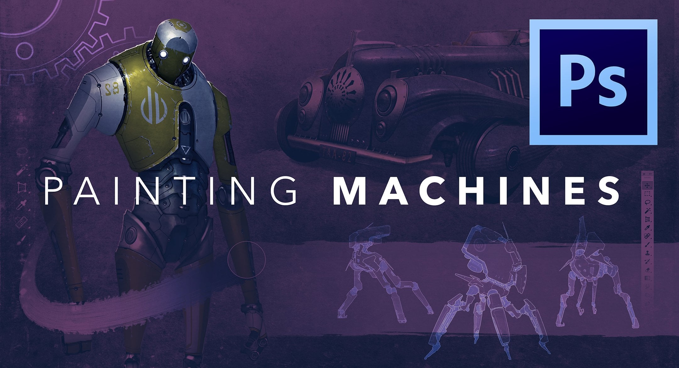
4. Concept Artist's Toolkit: Oh, everyone, this is Hardy. In this section, we will open up the concept artist tool kit. This is a super handy set of guidelines and ideation, devices that I can always rely on to push it character painting to a higher level. First of all, let's discuss an important fact about concept art that many overlook the main job of concept. Art is not just to paint pretty pictures now. I bucked against the statement for years because I've always loved the rendering side of art. But I've come to realize that it's true. Design is the primary job of a concept artist, and now that's my favorite part of the process. This is another thing I heard over and over again designed being the main job, but I wasn't quite sure would admit. In fact, I remember searching unsuccessfully for a simple answer to the question. What is designed? So after a decade, here's where I've landed On that design is original ideas and visual stories communicated with a pleasing rendering. That's it. The rendering is only the vehicle by which we bring our original ideas toe light. In fact, all of the nice looking rendering in the world won't help a boring or overly convoluted concept. So this lecture is designed to get your mind thinking about how to push those ideas so that you'll be on the right track before your first brushstroke. Here's a great one to start with. One original thing For any design, ask yourself, Does this contain at least one original element that I come up with something new or cool, or is this just sort of a boring knock off of something that already exists Now? We don't have to reinvent the wheel with every character. In fact, we count on familiar elements to make our characters relatable. But if you find that your design seems overly derivative or just isn't interesting than spend a moment coming up with just one memorable, iconic feature that you can add in, this could be almost anything a unique facial feature and eye catching clothing cut or pattern a weapon just anything cool and memorable. Push that design authentic story. Now this goes to the heart of concept design, which is visual storytelling. Were communicating a cool narrative about this character. There's some guidelines that we can follow that will make our character more relatable, believable and just likable to our audience. Authenticity is key. We can do this by gathering as much information about our character in their world is possible. Really nerd out. Try to get into their universe and try. Make them into riel. People in your mind. Try to absorb their style and personality and imagine as much as you can about their daily activities. This simple thought exercise can often bring your character into a new level of realism and beauty because it got you to cool new ideas about their clothing, their gear and just their general costuming details. So tell a cool in a rials story. With your design, your audience will be able to see that extra thought and love shine through re skin. This is a fun one that can create loads of amazing possibilities. Re skinning is a design tool where you take design language from one source and kind of grafted onto the framework of something completely different. So think steampunk iron man or a show like Firefly, which is basically a Western but said in space, you just take the design language from one source and paste it on top of another universe and presto, you've created something really cool and original. We'll do a project specifically based on this concept, a lot of fun. It's a great tool, something you can use to create entire game or movie universes. So let's go back to the Firefly example where we take a futuristic space opera type of design language. So spaceships, distant planets and all kinds of crazy technology. And then we just apply that to the framework in story of a classic western. So think pistol shootouts, heist and all kinds of fun Frontier adventures with so many amazing design languages and really ancient cultures to reference the possibilities to mix and match our enlist re skin and can be a great way to get a design off the ground. Okay, you are now empowered with the concept artist toolkit. Keep these ideas in mind and your designs will be cooler and more original every time
5. Character Punch Up: Oh, hi, everyone, this is Hardy. In this section, we will discuss character punch up. We're gonna check out a bunch of ways to add loads of interest and story to any character design with really small changes these air just little extra details that can get a design across the finish line. If you're stuck, you won't believe how powerful some of these tiny accidents can be to show all of these have worked up a base character. And we're just gonna add these punch of details one of the time so that you can see the effect now. Not all of these will apply to every situation, of course, but I wanted to just list is many as I could think of. And I hope one day one of these will be just the enter your design needed. So here we have generic dude character. There's nothing really wrong with him. I like the pose in the rendering, but I've deliberately made him about his plane and uninterested as possible. There is practically no story here whatsoever, except that this guy combed his hair and put on a sharp suit. So let's start looking at some ways that we could add some fun edge, punch up this design and make it into something cool. This is gonna be fun. Let's start with tattoos. Always a cool way to add instant edginess in backstory. Tattoos always have a story behind them, and it gets a viewer's imagination wondering about the character's life and journey. Muchas tattoos do in real life. Plus, they just add so many. Cool design possibilities basically gives you permission to add color and pattern anywhere on the character's skin that you want. Wild hair hair can tell a huge story. So if your character is looking mundane or on interesting, try a wild or unconventional hairstyle. It can add movement, color accents or just give your character some more edge and originality. This is one of those great things that can make a character really iconic and unforgettable . Piercings similar to tattoos and wild hair piercings at instant edge and back story. Give your character some punk attitude piercings. Make a really cool visual accent, bacon frame or draw focus to certain parts of the face, and the shiny metal is always a cool contrast to the softness of skin tones, scars or injury. Instant backstory. What happened to this guy's he a warrior? Was he attacked? Is he enraged by the pain he is left with in seeking revenge? All of these really provocative story possibilities come from adding this one simple detail . This could go beyond scarring. Try an eye patch or a prosthetic or robotic limb, a great way to punch up a design warpaint similar and effective tattoos. But this has a really cool, tribal primal feel to it, so that has a lot of energy and intensity to your character. It's another great way to work in some color accidents, too, as I mentioned not of these fit every situation and in fact, I have a hard time connecting warpaint to this guy. But it's a really great punch up tool that you should definitely remember future Fi. OK, I'm pretty sure just made that word up, but this is a really easy way to make a design cooler just fast forward him about 25 years into the near future. We can do this so easily by making some incredibly subtle changes to the clothing. In fact, you may have to look very closely to even detect it near future clothing design is often deliberately made to seem timeless. Kind of like this guy's suit. But if we change a few cut lines and add one or two very subtle details, suddenly this characters from the future with all the interest and intrigue that that brings a symmetry, add something to just one side of your character. This could be almost anything extra shoulder armor, a pattern or a weapon or gadget. Here. I've just added a single black glove. Why is he wearing it? Is he hiding something under that glove? Did he commit a crime that he's trying to conceal? It tilts the balance of your image, and that movement can really jump start a design. So remember that your designs don't always have to be symmetrical. And if you're stuck, that symmetry might actually be the reason. So this is a cooling to try bright accent color. Nothing adds instant pop better than a big dose of bright, beautiful color now uses with some restraint and just add it to a few select areas. This could really set the design off and make your character really iconic and memorable. I love subtlety in my huge but it often ends up giving me characters that air to gray, so I love to reach for this trick to add some serious kick right at the end of a project. Don't be afraid of a bright color, a guaranteed boost every time, patterns and decals, a super cool way to bring in some variety and interest. The best part is that patterns are super easy to create. With the digital medium, you can easily create your own or just use photos. You won't believe that many cool patterns are all around you, an old rug or a sofa or just check your closet. The options are limitless, and they pretty much always lead to a cool result. Hidden power or supernatural. Now, obviously, this won't fit every situation, but when it does, it can be supercooled to add a very subtle hint of some hidden super power or ability. This could be a simple is a subtle glow to the eyes or a hint of power emanating from the hands or head. Adding the suggestion of the supernatural always kicks the interest way, way up, grime or dirt. This is just one of those fun additions it takes about two seconds to add in, but it can have a huge impact. Just make the character dirty, have some great brushes for this that I'll share. They really make this. Justus Simple is a few clicks. When the character looks dirty, it really sparks the viewer's imagination. What crazy ordeal has this guy just been through? It adds loads of authenticity and backstory. Now let's check out a phone variation on this. If we change the dirty stains to be bright red boom, suddenly he is a murderer. Now you need to be careful, adding, in these blood splatters, it instantly raises the maturity level of your audience so it can be limiting. But for the right genre. And if your character is supposed to be violent and villainous, this is a really powerful, visceral detail you can add that will really resonate. Okay, hope you found this list of quick punch up options helpful. I'll make this generic character available for you to download if you want to experiment with some of these ideas, but just keep these in mind for your course project. I'll bet that at least one of them will help you out. If you're ever feeling stuck more fun stuff like this in the lectures ahead
6. Applying Design Principles: Oh, everyone, this is Hardy. In this lecture, we will take a look at how to apply design principles to your character designs and clothing. In particular, this is the really tangible stuff where we learn where to put lines and forms to arrive at a cool design. Kind of the nuts and bolts of how to concept are so design principles. I've made a handy CiCi listing these out with some brief descriptions. These air just a set of guys to keep in mind that can help you get a solid grasp on something that's very subjective and difficult to nail down, which is cool art difficult to describe and capture. So this set of principles is about as close to that is. We can get now all of these principles air relevant and important, but will be singling out a few that apply most to clothing and costume design. Here, the three that we want to make really good use of in all of our character concept designs balance one of these single most powerful design concepts that you can master, especially when it pertains to concept art. Good use of balance really makes a difference in practically every concept piece that I work on. Environment, vehicle, character, creature. It all applies, and it all makes good use of balance. In a nutshell. This is where we balance large, relatively solid shapes with collections of smaller, numerous shapes. Think of it is a scale with one large thing on one side in a much of smaller things on the other side, balancing it out. You need both working together for a clothing design or really any design to work well. So check out this samurai type character that I'm sketching in the clothing shapes I'm creating. I'm starting with really large, visually quiet shapes, like the main masses of the robe and sleeves. These become this heavy visual weight that kind of give the I place to rest now. There isn't much going on in these shapes, and you can tell by the time I'm done sketching in all of his main large shapes. This is looking kind of plain, pretty one interesting. Now it's time to balance these large shapes out with numerous smaller, visually active shapes were just chopping up certain areas into smaller, numerous shapes. Yeah, that's going. This starts to add interest, makes things feel more correct and solid. You can juxtapose almost anything with this principle. For the large part of the equation. It could be a jacket, a plain shirt, a large armor panel, kind of any large thing that doesn't have a lot going on in it. On the other side of the balance, we have numerous small repeating elements. You can use belts and buckles, buttons or patterns, just anything to make it more visually active. All of these busy, eye catching things to add interest detail, and it really makes it the perfect complement to the larger, quiet shapes. And when these two sides work together in balance, awesome things happen. So when you're crafting the shapes of a character's clothing or costume, remember to balance big shapes with numerous smaller shapes in your designs will really sing Big thing. Little things, little things, little things. Okay, contrast, another really important one for clothing and costume design. This is the juxtaposition of elements with opposite attributes to draw focus or attention. That's a very fancy definition, basically saying things next to each other need to look very different in order to pop. Our designs always need to pop. We need to find focal points to stand out and really get the viewers attention You kind of make that part of your story to the most interesting part is a part with the most contrast now there are many ways we can achieve contrast. Light versus dark is always a good obvious one, but we could get contrast with our color choices, too. If you try to keep your color scheme mostly subtle, and then drop in a focal area of super bright color for some great contrast in punch, that's a great way to go. You can also payer opposite color Hughes or try pairing plain areas with something visually active. Kind of going back to balance like a pattern works well. There are tons of great possibilities, but just remember, that contrast is your best friend. If you've got a design that you're not quite satisfied with, it can really be the answer that your design needed movement. Now this is how we direct attention and add dynamism to our designs, really make it exciting and interesting kind of leap off the page. Now, of course, I'm not talking about actually animating your characters were still just dealing with still paintings, but you can still imply movement and add layers of sophistication to your image. There are two main applications of this. The 1st 1 is very straightforward. Just try to make it look like something is moving on your character. You can show a scarf or a long jacket, tail blowing in the wind. Perhaps a belt or a strap hanging on an arm or a leg is moving. Kind of a secondary motion, or even just a walking posed, just tried include some kind of implied motion in your design will be much more dynamic now . The other use of this is a bit harder to spot but just is important and powerful. We can use the lines of our clothing design to move the viewers attention to a focal point . Long swooping lines or collection of elements pointing to a common area. Lead your viewers eye to the main selling point of your character with all of this awesome implied movement. Keep these powerful, time honored design principles in mind as you start making your first brush strokes. This really is the core stuff to making cool art, so if you can reduce these complicated stories into these relatively simple concepts. It can make your task seem a lot less daunting, really give you a good road map for success. So it's a good framework to start can help you get the ball rolling. But most importantly, it will lead you to dependable, fundamentally solid designs every time.
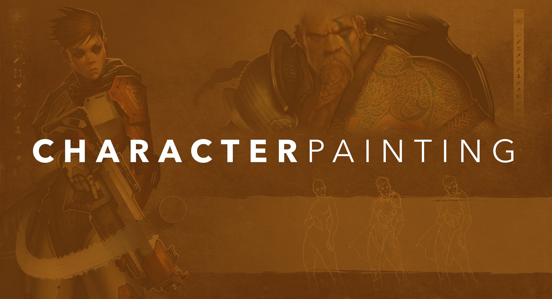
7. The Power of Faces: Oh everyone, this is Hardy in this section, we're going to take a quick look at rendering faces and discuss all that they can add to a character while we're chatting. I'm just gonna show a really quick overview of my technique for rendering faces and getting realistic but painterly skin tones. This will kind of be going on in the background. While we discussed several concepts, paying the human face is a pretty gigantic topic in and of itself. So we're just going to skim the surface in this video. If your face rendering skills could use in Polish, I would strongly recommend my course painting faces, which is devoted entirely to this awesome topic. OK, so as you can see, I've got the value painting pretty well underway here. Always start by doing the value rendering first. In fact, I don't even worry about color or skin tones it all until way later in the process. This bright orange color that I'm using is pretty much totally arbitrary. I just started using it for value renderings years ago, and it just kind of stuck is a habit. I just think it looks cool, but feel free to use any color for this. Just make sure that your value painting is on its own layer. That's super important for later Value does a lot of big, important jobs for us. It's how we define the shape in forms of our face. It's where we determine the light sores, but for character art, most importantly, it lays the groundwork for the expression and the attitude that our face will communicate. This is where we start to know who this character is and really feel their personality. It's an incredibly subtle art, since even the tiniest adjustments to certain areas of the face can completely change a character's expression. It's amazing anybody use painted faces before knows that tiny little adjustments can really make a huge difference. I'm going for a pretty much neutral expression here, but even that takes it quite a bit of fine tuning areas like the corners of the mouth, the eyebrows, the forehead, those little lines around the eyes. These all have a huge effect on expression and attitude, and value is what determines this. Tiny creases are determined by the lights and darks that we had So a few marks at the corners of the mouth on this painting and you start moving from a neutral to more of a grin . As you can see, I find Tune this quite a bit. But that's all part of the fun of this pushing tones around until the personality we imagine is showing through. Okay, now comes the really magic part of this technique. We will convert this value painting into skin tones. First, I'll do a hue saturation adjustment and will slide this bright orange color over to be an off white. Basically, it's a very bright pale yellow next on a layer underneath the value later, and it's very important that this new layer is underneath. We're going to start adding in some reds with a soft brush, so I'm just painting this in selective areas of the face. We want the nose, cheeks, ears and lips to be more red than the surrounding areas. Already, you can start to see how a simple, flat value painting is starting to look like living realistic skin. It's this variation in hue that does this skin is a pretty complex material to render Realistically, it's actually kind of a semi translucent material, so light is shining through it, and we can even sort of see the blood beneath it in areas where the skin is more translucent. So like the lips, cheeks, ears and nose. Now that these basic Hugh Variations air established, you can just flatten the layer and the huge variation layers together. So Value and Hugh Variation or now merged into one skin tone. From here on out, I'm just refining things on this joined layer. We start adding in some fun, artsy brushstrokes just to show a little hand of the artist, and I use the high dropper tool frequently. If you're painting with the brush tool, you just hold down Ault or option, and you can sample colors on the fly. You can kind of just pick it up and lay it back down quickly. So over time, if you do this enough, it has sort of an averaging effect. It kind of brings tones together and can make it seem a little less modeled and textured. But you don't want to lose all that texture, so finesse and fine tuning his key here. I'm gonna leave the hair for the next lecture so she will remain pretty much ball, but would you need to add some eyes to do this. I'll start by adding the whites of the eyes, which I do by sampling nearby skin tones. Whites of the eyes are actually not as white is. Many beginning artists think. In fact, they tend to sit back in the shadow in most lighting situations, kind of in the brow shadow. So be careful not to make them to brilliantly white or anything, or they could be really distracting. Next, we'll add the round irises of the eyes. It's important they look in the same direction. You don't want a character to seem cross eyed or kind of lazy eyed, unless that's by design. I've painted in a bit of a bounce light in the bottom of the I to give the iris, um, color and to make them seem kind of like deep, jeweled eyes. That's what makes the eyes look really cool. And then I had this single bright white highlight to give it that soulful shine that really makes it character seem alive and like they're looking at, you always love that part. It's really that moment when the character starts to feel riel like somebody's looking out of the screen at you. So with just a little more polished, we have a pretty nice face rendering here. I like her personality and attitude. I think the skin tones and form of the face are working well for me. Next, let's check out how I rendered darker skin tones. I've started with a sketch again and will essentially just repeat the early steps. So I'm using value to describe the shapes of the face into, to start determining her personality. Kind of start getting a feel for who this person is. Since we're taking a second look at value, let's talk about an extremely powerful value concept that many artists overlook value edges . Now we all understand this basic values sphere where we see the lightest tones on the area where the light source is shining most directly. And then the tones gently fade away to the core shadow and reflected light pretty basic stuff. In fact, this is kind of the cornerstone of value, rendering using light and dark to make something seem three dimensional and round butt value edges are just is important and really add realism when used well, especially in organic forms like faces so check out this graphic to see what I mean. We have these nice soft fades from light to dark, but we also have sharp, abrupt changes from light to dark, almost a sharp line where the value changes dramatically light and then dark almost instantly. So be sure to include some of these hard value edges in your face renderings. Check out the inner corner of the eye or the margins of the lips or the corner of the mouth . See those sharp changes from light to dark? This balances with all of these soft radiance we've got going on in the cheeks and the forehead. It really elevates the realism. So remember this incredibly powerful concept any organic form? People, animals, aliens, whatever value edges. Okay, now for the main difference when rendering dark skin tones versus lighter skin tones. I'll do that hue saturation shift once again, but this time will just shift to a brown tone about like this. Now, once once again, we add in that under layer beneath the value layer, and I'll add in some subtle Hugh variation. But you'll notice it's not so much red this time. It's basically just a darker brown that I'm using to kind of even think out in darker skin tones. We don't see quite a ZMA much Hugh Variation. The local color doesn't change. Is it much as it does in light skin tones? We don't see that really red lips, cheeks ears. But we still need some huge variation for this to seem like realistic skin in dark skin tones that comes from the highlight. Dark skin is really beautiful to paint because it allows for such nice contrast. I'll use a fairly gray color in a pretty high value, and we start adding in some highlights to add shine and form. And this is when the skin really starts to look realistic. Hugh Variation is what makes skin look like skin and not just like some beige colored plastic, so it makes it seem alive with dark skin. We get another great opportunity for variation with EJ lights, so I'm making this secondary light source of pretty bluish hue, and it just looks awesome on dark skin. It makes it seem like she's in a room with a window off to her side somewhere. And there's this, um, blue sky shining in. So since we're dealing with a darker local color. The blues of the edge light really pop. Great effect is one final bit of polished. Let's use an overlay layer to add some subtle glow to areas of the face, so of command clicked on the silhouette, and I filled it in with a new layer with this kind of greenish yellow color. And when we set that to overlay makes the face seem to glow this pretty orange, and that's way too much. I've masked out the entire layer. We're just revealing some small parts of it with a radio Grady int, but uses soft airbrush on that mass, too, if you want just kind of basic masking stuff. This at some nice subtle glows to the skin and even more Hugh Variations. So I think we've just about got a Finnish face here. So that's a look at my general approach to rendering faces in character concept art. Try to think of faces is just another important part of your character's costume. They really tell the story. They communicate the attitude in personality of your character. It's actually how your audience first engages with the character, so it's worth putting in a little extra time to make sure that this important feature is really a strength of your concept art. It's gonna help you stand out from the crowd and get those top to your jobs more on this in the lectures ahead.
8. The Power of Hair: Oh, hey, everyone, This is Hardy In this section will take a look at the power of hair. Awesome lecture Title Hair has an amazing power to completely transform the personality and feel of any character. So this is worth taking a really close look at I've got a fun little demo set up here. We're just copying this punch up characters head to work up some different hairstyles. So I'm gonna get started on the first variation of that. I want to talk about a few things here. I'm just using this cube brush. I'd like to make some nice chunky brushstrokes, at least when defining the hair early on in the process. So this is a good one for that. But you can really use just about anything. There isn't a magic hairbrush or anything. It could be just the default circle if you want it to mostly about technique and about the principles you're keeping in mind. But as we get going here, the first thing I want to talk about is color. Now, a common beginner mistake is to sort of make the hair color to iconic. Will think Well, this character has blonde hair or black hair, brown hair, and you just pick some color that's just yellow or totally black or brown, and it just doesn't seem to fit. And reality hair doesn't really work that way. It's actually much more of an extension of the skin tone, so it needs to look integrated. I usually start describing hair by just sampling a color from somewhere on the face, like in a shadow area, and just start blocking it in like that way. And then you can pick Cem variations for highlights and things like that. But hair needs to look like it's part of the skin needs to look integrated. Another thing along those lines is hairline. Now hair very rarely just sort of starkly appears on top of skin completely opaque. What I mean by that is there needs to be sort of a transition. Where the hair isn't quite, is thick. To cover the skin entirely, we can see a little bit of skin tone. Showing through that hairline area can add a lot of realism. If you could just give that a little extra attention. Kind of ah zone, where it fades from skin to hair, has a ton of realism so worth a little extra attention. We can see that on the sideburns, especially here, and also where that part line is on the hair. Next, let's talk about brushstrokes now. You don't want to use a 1,000,000 individual hair brush strokes with a one pixel brush. Then it's of looking kind of unrealistic. Believe it or not, even though that's sort of what we see when we observe someone's hair up close, it's much better to make your hair look a little bit more impressionistic, kind of painterly. And you can do this with larger brushes or a paint daubs filter is what I'm doing here to kind of make some of those overly active too many strands of hair type marks kind of gel together into a few impressionistic looking dobs of paint. I like that look much better. Finally, let's add a little bit of stubble to this guy just to give him a different look. This is another really powerful part of the hairstyle that can change the attitude and feel of your character a lot, and I just do this the same way. I add in hair kind of the way you treat a hairline sort of semi opaque marks, sort of transitioning it from a darker area all the way out to the skin tone. So you're sort of feathering these marks, but overall, we just want these marks to be kind of impressionistic, kind of thick dobs of paint tend to make it look more charming and painterly. It's just a great way to go, so I hope you find these techniques helpful now. Check out the huge effect changing the hairstyle has on the personality story and even the perceived age of the character. Other than the facial. Here, this is all the exact same face. It's hard to believe now. This seems like quite a few options, but I have barely scratched the surface here. There are so many cool hairstyles that you can borrow from to round out your character, story and personality. Come to think of it, the not cool hairstyles can often have the biggest effect. So use the power of hair to make your viewer like or dislike your character. Make them edgy, make them nerdy, make them young, make them old, nick them from the future from a long extinct era. All of these impressions can be delivered with a well thought out and well executed hair design. It's a lot of fun to play with. Easing can really help your art stand out from the pack. So get this some time in practice and really make it a strength of your concepts. More on this in the course projects ahead.
9. Rendering Cloth: Oh everyone, let's start our exercise section with a cool worksheet that will teach you all about designing and rendering believable cloth. Obviously, this is a critical component of rendering a great character, So this worksheet will show you exactly how I approach cloth as a material and as a design element. So we'll check out everything from how cloth behaves to the actual brush strokes that I used to render in texture it believably. If you have this PSD handy, I invite you to follow along. So let's start with some quick Leinart sketches that will show us a few important attributes about cloth and will help us avoid some common beginner traps. This first exercise has two simple purposes, and the 1st 1 is movement. Whenever you can sketch cloth with a quick whip of the wrist, go for those long arc ing curves. Some expressive lines early on can make a really big impact on the feel of your final product, so start loose makes him nice looking main shape lines. The other thing I want to point out here is that cloth is very thin, pretty much always, and when it curves, you often see two sides of a piece of cloth like we see here, make sure that those curves add up and that the main shape of the cloth isn't getting lost in all of the turns and curves. A little bit of extra thought to shape integrity can help you avoid a weird M C. Escher type of impossible cloth fold that will be an eyesore later on, so watch out for that. Next, let's check out lazy cloth. The point of this one is that cloth is lazy. It's limp and just does whatever gravity and the structures supporting it dictate. So let's imagine that this piece of cloth is draped over an imaginary rod at the top that that needs to drape in a very smooth arc down to the ground worth in, folds up on upon itself and kind of puddles up in its base. The cloth needs to seem soft and foldable, so little zigzag edge marks and gather points where the cloth Bunches up can really sell this, but mostly just think about this structures beneath the cloth and how that lazy cloth sort of drapes itself over it. The tension and folds that you show can tell us loads about the characters. Figure beneath cool. So let's take these two basic concepts for a spin and try out a simple clothing drawing. I'm gonna do this long duster style leather coat, but feel free to branch out if you want. This exercise will just get us familiar with the basics of how to sketch out close. How to make those first marks to start to define a costume will use a bit of that balance design principle, too. So we're combining large, quiet areas of the jacket with some cut lines smaller, more visually active shapes. But let's also start thinking about tension and fold. So where on the garment is fabric need to look tight? And where should it look, bunched up and folded on itself? A good rule of thumb is that if it bends like an elbow and knee or a waste than the clause should bunch up if the cloth is hanging or maybe form fitting over a smooth area of the figure, it should look, talk nice. Now let's put this all together in a really quick design and rendering exercise. I've got some posed templates set up here, and this is the base point for all of the projects it will be doing. It's a really helpful way to start a project. Post templates just take anatomy and proportion out of the equation so we can focus entirely on story and design principles and come up with a nice clothing design. So it's just die. Then those first brush jokes should be really expressive. So just whipped the wrist, gets him nice looking lines down on the Candace and the ball will be rolling right away. Things just kind of start to flow. I'm just going to do a simple jacket and pants with a T shirt, but if you want to stretch out creatively, by all means, go for it. Think of the post template is one of those manic informs that fashion designers used to create clothing. You're just adding design elements over the top of this form that already exists, and things just kind of take shape. This is where we consider those high principles, wears our visual balance coming from where is our contrast coming from? Should we mix form fitting with loose fitting? Should we find a way to include Sameh symmetry? All of these decisions end up adding to the story and the success or failure of your design . So it's a very exciting part of the process. This is where we make all of those big picture decisions okay, that's working well enough for an exercise. But before we start rendering this in, let me show you two super easy brushstrokes that will work for, like, 99% of all cloth rendering situations. I'll fill in a square with dark side hand, and then we'll just copy that down below. This will be our base. Next, I'll create a new layer for the rendering. I think I'm just gonna use this gray color. First up is a simple long stroke. I've got my brush set on pretty low flow and opacity about 20%. We'll just do some long diagonal marks. Each mark is another tap on the stylist, so it starts to build up tone with each brushstroke. Nick. It's lighter and lighter. This is good for those long draping parts of an article of clothing where there's no bunching or folding. So keep in mind that contrast equals shining it. So if your material is shiny leather or something like that, boost that value range and include some bright highlights. Okay, pretty simple stuff. So next let's check out an awesome technique for folds the Z stroke. Basically, we just zigzag a line of marks back and forth, and then we switched to the smudge tool and pull the zigzag marks back and forth to enhance the effect. Isn't that cool? It immediately starts to look like bunched up folds of a jacket or elbow or something When used well. This technique can add instant realism for a bit of polish. I'll often revisit these in refined things by sampling the color on screen and then painting it back down. So you just hit Ault, or option when using the brush tool, and it will switch to the eyedropper tool. I like the smoothness and polish it. This little extra step adds, It could also be really nice to add a small detail wrinkles somewhere in your cloth. It's really just adding a shadow or highlight to one small strip of the cloth and then blending an in a bit with either the smudge tool or painting over it lightly. Nice. So now that we know how to render cloth, let's copy this design over and put this into practice. Next, we'll use the magic wand tool to create a silhouette based on our Leinart. So it's very important that the line art is continuous around the entire perimeter of the character. If there are any gaps, like I have any ankle here, it won't work, so make sure all of those lines are solid. Next, we just use the magic Wand tool to select the outside of the figure and all of those negative shapes made by the knees and elbows. And then we just select inverse will then create a new layer and fill that in with that scion based silhouette color. I'll go had emerged down the line art. We can start rendering. I think I'm going to tackle the jacket for so we'll create a new layer. We'll get started. So the first thing we want to think about is value. Where's our light source coming from here? We want to make sure that we light all of the planes of this article of clothing. Realistically, so think three dimensionally. Remember that three dimensional value sphere about our main highlight in our shadows, and we're off to the races, so thinking about some brush strokes as well. I chose this pose with the elbows bent so that we could do some really nice practice of that Z stroke. You can see how instantly realistic that looks when we have that leather material kind of bunched up around the elbow. So a really great stroke to master give that winsome practice. But I'm just smudging things around kind of evening out some of these brush strokes, just trying to make it look more realistic. But we've already got our main values established. It's already looking pretty, really a little bit of extra shine on the light source side of the jacket, just to give it or that authentic leather feel. Now I'm going to do a bit of line work. So I've switched to a much higher opacity brush, even using my race to a little bit to kind of carve out some little seems little pockets. It's all these neat little details that give us that visual balance kind of carving our big forms up into smaller shapes. It gives us that great design principal that it works so well for clothing, so that's that's already adding a ton of realism and detail that we really want kind of does to great jobs, makes it look more beautiful and more realistic and gives us that great design boost that we need really making great use of those design principles. So this jacket is looking pretty good with a little more refinement. But next we're gonna jump to rendering the pants, and this is really important. But I do this on a new layer. As you can see, I'm just using the same gray color, but it really doesn't matter when these two things are on their own layer. We can just do a hue saturation adjustment later in the process, and we can kind of pick our colors then so you could do purple pants and a green jacket. It doesn't matter at this point, just trying to make it look like an authentic material. So doing all of those e shaped folds all of those nice, shiny highlights to make it look like leather. That's all we're really worried about at this point. Value and material integrity, a little bit more refinement, trying to make that leg that's walking out towards us a little bit more highlighted. So giving it that nice, leathery shine. It's also emphasizing those cool little Z folds at her waist where the leg is coming out towards us. So lots of cool stuff that these brush strokes can conducive for us really put him to work for your design. But that's looking pretty good. We're gonna erase away Cem. Seen lines bring in some of those design principle elements just to make this look as cool as it can so little mix between high opacity brush and erasing to give us that night's line work accent. It had so much to those smooth values that would add it in gives us a nice contrast. So that's really looking cool. Little more fine detail on on some of these little areas of interest, trying toe to give it some nice focal points. Even in this simple exercise. So cool stuff to keep in mind. Let's try some different colors. We've got things on different layers, so this is really easy to do. Think I'll go for kind of ah, of an intense brown jacket, but we could try anything. Have fun with this. This is kind of the fun part when we can make it just about anything we want. Another technique I want to show you is when we just block something in. So I'm gonna make the T shirt inside of her jacket, although it's actually a layer on top and we just fill that in 100%. If we lock that layer, we can just paint within it without worrying about a thing so you can make a selection from it. You can just lock the transparency and look out easy. That is, You can just paint right in it without worrying about messing up your leather jacket steps or anything like that works really well. So just doing some Z folds kind of imagining tension and folds. All that great claw stuff we've been discussing really puts it to good effect here. A little bit of a cash shadow from the jacket, and I think that's starting to look pretty nice. Very realistic. It's a nice color variation. I love our brush strokes, so it's time for a little bit of final polish, so I'm going to group all of these rendering layers together and just pull that group over to the side to make a copy. and I'll merge that altogether. So got our entire rendering all on one layer here for our final step, which will be using photo textures. So I've got some photo textures in a little folder here for you guys to play around with these ads. So much richness and detail if you use them with a little bit of subtlety. I'm gonna be a little bit heavy handed here, so dial it back a bit. But we'll just put one into a new folder called Textures will select the silhouette and just mask it out. So this entire layer group is masked out. The photo Onley exists within the silhouette of our rendering. Then we switch that group too soft light. That's the critical steps soft light blending mode for this layer group, and then it lets all of our cool painting details show through. But it gives us just a little bit of color flavor in all of this cool texture, showing through from any photo you paste in so incredibly cool, a little bit of of leather texture for those pants, a bit of a pattern, and I've got this awesome Asian style tapestry that we'd make the t shirt. Look a little bit cool. Use this with some finesse. I'm sort of going overboard here just to show you guys the basic idea. But you can just warp these things into place. The possibilities are limitless. You could make things look incredibly realistic. Use it with a little bit of artistry, though this could be done. And in sort of an amateur way, that makes things look just like somebody pasted a photo on top of a crude painting. That's definitely not what we want to do here. So he should only be a subtle little boost to a fundamentally solid painting. We never want to rely on this too much, but a super helpful way to add just a tiny bit of sophistication and refinement is a final step. So I like the way that's looking a little heavy handed, but we're just gonna merge that all together, and I'm just gonna add some accent kind of kind of white stripes just to give this a little bit of final interest. Usually a good final step I do for a cloth rendering. But that about does it guys, this is a pretty successful looking bit of cloth rendering from start to finish. We did some Leinart for our design, showed some nice cloth brushstrokes even did a little bit of photo text Oring just adding in a little bit of paint to finish this one up. But I think that's a great look. It's, um, successful cloth rendering techniques. Hope you find these super useful.
10. Rendering Leather: Oh, everyone in this exercise will take a close look it how to render leather. The basics are pretty much the same. His rendering cloth. But there's some easy to master techniques with leather that can add some really nice details. So this material is worse. Um, practice. I've got another quick exercise sheet set up here and you're invited to work along with me . Or just relax and check out the video. I've got some base silhouette shapes set up on their own layer so that we can just command click to get this selection from these any time. Okay, let's start with this gauntlet type object on the left. So now that we can just make a selection and I've already got our base silhouettes, I'm just going to create a new layer that we're gonna do our actual painting on. I'm just going to stick with this single kind of brown base color for all of this. This works pretty well. It's a pretty de saturated, brown kind of a muted color, and I chose this gauntlet object because it's basically a cylinder. It's very easy to render. We just sort of need to decide where our highlight is where our light sources, but it's got an opportunity for some nice Z strokes in the middle. It sort of got that folded part at the wrist, so we'll get a lot of different stuff here, and I'm just happy in a lot. I've got this brush on pretty low flow and opacity, and I just sort of tap. It gives us that a semi opaque overlapping that gives us a lot of texture and our brush strokes. And that's really what we want with a little smudging here. All kind of bring those e strokes back and forth a little to give it that really nice, realistic folding cloth look. And we're already on our way. This is coming together pretty nicely once you get your base tones established. Now is when we can start really doing some ornate leather work, so have switched to my eraser tool, and I'm just going to start subtracting out. Some seems start making it look like areas where two parts of the leather have been sort of stitched together. And already that had so much realism noticed that I followed the contours of those e strokes around those folded parts really important. It adds a lot of dimension. So with that same brown color at higher opacity, I've drawn a little edge around the top, and I just used the clone stamp to copy a perfectly matching copy of that above it. So we've got two perfectly parallel lines, really makes it look like a realistic edge. Whenever you can use photo shops, tools to make something perfect like a perfect copy of perfect Curve, it really adds a nice solid feel to your draftsmanship, sometimes wobbly, the or kind of unconfident looking lines can really make an image look sort of amateur. So use these Photoshopped tools like the clone stamp or just copying things to really make your work look better. OK, I like that. So next we're going to start looking at how we can make better use of those Photoshopped copying tools, and I've got a little belt looking thing here. It's gonna be one of those bullet holding gun belts, so I'm going to start by just adding in a little bit of tone with low flow capacity once and again. And now I'm going to start adding, in some of this line work, these little stitch ings that make leather look so cool But just subtracting away some little line shapes And then once I'm done with that will come back and add a nice high opacity edging. So grab my brush again and just scrape in some little lines to give those little stitched edges kind of a shine. It's like they're catching the highlight. And suddenly what was basically just a rectangle is now there's pretty complex, cool looking shape with all of these overlapping stitch marks. So I've erased away an area where I want these little bullet holder things to go, and I'm just gonna create one and we're just gonna copy it. Photoshopped makes this so easy. Really? Any digital painting software has this capability. So I'm just drawing one little curve at the top, one curve at the bottom, and then I'm just gonna render this like a cylinder, so sort of a light source side, a bit of a core shadow and then a little bit of reflected light on the dark side of it. And that's all you really need to do. Once we have one in place, I'm just going to switch to the move tool, which is the on your keyboard shortcut. If you hold down Ault and shift, you just bring it over to the side and it makes a new layer. Just like that. We have six bullets ready to go in our gun belt, and that took practically no time. It also one of these great ways where the photo shop tools can make it look like you spent a long time making something detailed in its super easy. Same principle with braids, any kind of overlapping, repeating leather element. Braids are a great example. All we really have to do is a little bit of line work to establish the edges of these little folded straps of leather, a little bit of rendering. So it looks like they're kind of tunneling, looping over and under one another. And that's all we really need a little bit of smudging to refine that once I've got my brush strokes made and we've got our base unit that we can just copy over and over again. Now you can either copy it with the move to like I've done or use the clone stamp tool. Really both work. It's ah, pretty much identical effect, but it's really a matter of preference If you want to be able to control the layer by itself. You might want to do that move tool because it makes it copy. But as you can see, Clone Stamp works. Justus. Well, that took practically no time. And it's a really interesting leather detail. So similar kind of idea here, I'm going to do sort of, ah, rap like the grip of a sword or some other kind of weapon here. Same kind of deal. We start with a little bit of edging where those little straps of leather kind of come together and overlap a little bit of rendering on top so that this whole object sort of looks like a cylinder, bit of smudging to refine that little bit of rendering on this under strap. And that's really it. With with these techniques, you're kind of just coming up with one nice looking base that you just repeat over and over again. And it's incredibly easy this time. I'm using the clone stamp, but it's a pretty much identical effect, so we can just copy that any number of ways to get these nice repeating elements and Of course, you can merge down and quickly turn two and the four and four into eight. So you could get to hundreds of these little repeated units in no time. Gonna put a little edge on this last little part of the handle just toe at a little more detail, some copying. But that's basically it, guys. Some super easy, really effective leather techniques that can add a lot of really nice appeal to your image . Hope you find this helpful.
11. Rendering Metal: Oh, everyone. In this final exercise, let's check out some great techniques for rendering metal. Metal can bring so much contrast detail in visual pop to your character. So this is definitely a material that you want to master, and that should really help. Here's our exercise sheet, and once again I've got the silhouette shapes on their own layer so that we can just command click for those selections. In that way, we can make sure we're always painting inside the lines. Let's start with this basic sphere. So I've got to set up because we're going to try this in two basic colors. And I've actually got little swatches next to each so that you can just sample those so we'll start with kind of, ah, silvery metallic grey sphere. Now the key for rendering metal is in the brush blending mode, so check it out. I've got that set to color dodge, and as you can see, that makes this sphere painting get way more saturated and bright. With every brush stroke, it kind of multiplies the effect. It gets brighter and more saturated, so this can quickly get totally blown out. But that's kind of what we want first fear. Same thing with this gold color. We just start painting and you can see quickly. It goes from something pretty muted to this really nice intense yellow. So color dodge is the perfect brush mode for metal gives you that contrast that you want for that high reflectivity, that richness of color. A lot of good variation and complexity gets built in just with this basic switch of your brush mode. So that is the key step. One other thing is that metal is reflective. It reflects the colors and light sources around it. So see, if kind of tried to indicate that these two spheres air sort of reflecting light off of one another and even light sources off in the background. Let's cut a little seem in this. I've just a raced away some of this gold sphere, and I'm adding a little highlight. I'll even add in a few little scratch marks. Same thing just the color in color Dodge blending mode. And that's all you have to do. To add these little bright tick marks just gives it a lot of nice surface detail. A little extra interest really makes it feel more tangible to the viewer, so these two spheres air the basics. It's kind of the whole idea behind rendering metal, so we'll just apply that to some other shapes. A few more complex situations. But let's start with this cylinder. Same basic idea. We're just tapping, and every time we do, our color gets more bright and more saturated very quickly with color dodge. So you need to treat this with a little bit of restraint, or it can get totally blown out in a hurry. But that's what these exercise sheets or forward to experiment a little bit, doing a little bit of smudging to kind of imply the circumference of this kind of metal pipe looking thing, adding a little bit of extra highlight. But what I really want to show you with this one is that if we erase away the top, I'm going to create a new layer and using the marquee tool in an elliptical shape, I'm gonna create in a lips and give it a stroke of about six pixels that causes this nice, perfect edge. And if I locked that layer and paint within it, I can even make that edge. Look shiny and metallic, so that gives us a super realistic looking finished to this really simple pipe. So it's copy that next over to our next station here, and we'll try something else. I'm going to create a little ellipse kind of a belt around the middle of this in a dark color. Now I'm going to create another layer and go back to our base metallic color and give that a little metallic highlight. It's very important that when you're painting shiny metal, it's on its own layer. Otherwise, color dodge will interact with that base color down below, and it won't work, so we can just copy these shapes and it gives us this really nice little detail. If I slant that and repeat it a few times, it even looks like a threaded pipe. So really cool stuff. You can go from just a simple cylinder to a really ornate looking weapon handle or some kind of other detail in no time. One other cool detail is a little rivet, and all we're doing is just rendering a single little sphere on its own layer, sort of a basis, silhouette layer and then a highlight layer. Then we can copy that as many times as we want can really add a nice accent to any kind of cool metal work. Give you a lot of interest. So next let's tackle this armor shape. This is gonna be a cooling. So I'm just going to describe this edge of this shoulder piece a kind of a nice, long our king line. And if course, we're still in color Dodge for this entire exercise. So if I paint over this line a few times, you can see it's sort of start to brighten up. We've kind of got the main highlight part of this little kind of rolled metal shape on the edge, This armor and same thing, I'm gonna sort of had a little accident line along the front of the armor Peace. So we sort of define our shapes with this. I'm a racing away a little bit kind of toe imply some reflected light. But if we use the clone stamp tool, I can make this perfect parallel line right next to it. And it makes it look incredibly solid and well put together just because those lines are perfectly parallel, thanks to the clone stamp tool. I'm creating a stroked ellipse here, and I'm just going to transform that into shape so that we can do sort of the same thing for the collar part of this piece of armor. Once again, if I lock this layer, I can paint within it with color dodge, and it gives us that nice shine again. Super handy feature when you can just lock a layer in paint right into it. And, of course, since all of these perfect geometry Photoshopped tools or making our lines look perfectly parallel and geometrically round is, they should be. It already gives us this really nice, solid feel to this shape that's basically just hand sketched, and suddenly it looks like something incredibly realistic. So those little edge details are a huge, huge, important way to make really realistic looking metal. And now it just becomes a matter of kind of filling in the plains between it, with the basic principles we learned on our sphere rendering exercise, just sort of using that color dodge brush mode to sort of build up these really contrasting great popping tones that give us that high reflective, shiny metal look that we're going for a little bit of smudging to kind of smooth these out , but because of those really solid edges, it almost lets us get away with kind of not quite such perfect rendering on the inside. The I really goes to those edges. There's nice, sharp, perfectly parallel or perfectly curving geometric click correctly lines. That's really what we want. That's something I really want you to take away from. This part of the exercise is that making those edges really solid can really pay off and let you get away with some nice, expressive brushwork that may not be perfectly along the line, so just doing a little bit of detail inside here to get this some little tick mark. Some little scratches. Not all metal objects should look perfectly smooth. This was probably hammered into its shape. If we really think about it. So little dents and dings here and there just add character to your medal and almost all metal, even if it's supposed to be a nice shiny suit of armor, should have these little details as a lot of character and just a lot of fun. Next, let's check out sort of more of a futuristic type of metal, just sort of panels or robotic parts. This is basically how I go about that. Mainly it just needs kind of a sharp plane change so you can see this highlight I'm adding Here is right when this basic shape kind of curves from a highlight side to a dark side gives us almost this sharp feeling edge to it. That I'm enhancing with all these little scratch marks in this highlight just gives it a lot of character, makes it feel like something you can feel if you were gripping it. And that's really the basics of it again, just carving out some little seem lines that seems to make just about any kind of clothing or metal rendering look cooler if you take a minute to carve out some scenes. But here's a cool detail I want to show you. If we add in a circle, create a new layer and then just stroke a circle inside, we can create a really nice looking kind of counter sunk rivet. So if I paint within that and I'll just lock that layer again with color dodge to give it a little shine on the bottom and I'll even a race away a little bit of the top so that it looks kind of recessed. Back in this whole, we get this really cool looking rivet counter sunk into a hole. A nice, futuristic look. I used this exact technique in all kinds of things. Machine renderings, futuristic looking armor robots always looks cool, so that's a great little trick to carry forward. Next, let's try and make a really nice looking, ornate piece of metal work, so this could kind of be anything a really fancy earing or headdress or kind of a belt piece on some kind of a warrior. And I'm just starting with some circles, just using the marquee tool and then going to edit and stroke, putting that on its own layer so that we can lock that and paints, um, shine within it with color dodge. And that's a good way to start. So just a racing away where these circles kind of don't belong and we're adding some little details here and there, but with color dodge in that locked layer, we've got a really nice shine, got our light source established, got a really nice solid edge, so that our interior shapes kind of have something solid to work within. It will make it look really professional and clean, and it takes very little time. So if you take a minute to define these edges first, it really makes your interior rendering look very polished and very professional. Same thing with these little elements coming down below. I'm just defining the edges with some sharp rendering to make it look more more professional, more clean. And whenever possible, you can copy what you've already done in just transform it. Another thing that always looks great. The I really seeks out symmetry when something is supposed to be a perfect counterpart of something near it just used photo shop or whatever your app is to copy it and flip it or transform it so that they are the exact same. The I really seeks out little things like this. So if you take a minute to really make a perfect copy of what you're working on, it really makes it look more solid and fundamentally sound. So a lot of this particular part of this exercise is showing you that you can sort of grab what you've already painted. Copy and pasted somewhere else, and it will look great. In fact, it looks better that way than if you tried to hand paint it twice or more times. So we've got these little hanging trinket parts of this metallic object over here. And I'm just copying part of this central decorative part. And there you go, just with a few copy and paste functions. We've got this just about ready to go, trying to make it a little bit darker on one side, though, just so that the lights or seems more consistent. I've copied that down below, and we just got a little more rendering to do to kind of make this fit perfectly. But all of that solid edge work has really helped us out. So a little bit of edging on this bottom curve. And I think we're ready to fill in these main metallic shape, so sort of jumping back to our sphere rendering mode here, just add a nice highlight to the top of this curvy shape, a little reflected light, a little bit of blending to make it seem nice and smooth, and it really starts to feel metallic and again, thanks to those nice, solid edges that we made with Photoshopped tools. It just all feels like it fits it. It's very solid, looks crisp and clean and professional, so adding a little bit of a spherical rendering to this interior shape to make it look round like it's got some dimension. And that's basically it. We've got something that looks really ornate and complex, but with kind of a rendering formula in a few Photoshopped tricks, it took practically no time. It also one final thing I want to show you guys, is it the soft light photo texture mode really works great with mental just looks terrific . So I've pasted in this rusty metal texture, and we're gonna put that a lay in a layer group and set that too soft light once again and check that out. All of our great metallic rendering still shows through, but we get all the really nice color variations in texture accents from this cool photo, and suddenly our armor piece has all of this great complexity and story. It's all old and rusted, really cool. So just using a clone stamp tool to kind of find, tune and splash that texture around adjusting the hue a little bit so that it's not quite so saturated trying a few things. But that's the basic idea. This photo texture mode on soft light really does a great job and works especially well with metal. So hope you give this a try. I hope you enjoy these techniques. It's a great one to master will really help your character concept.
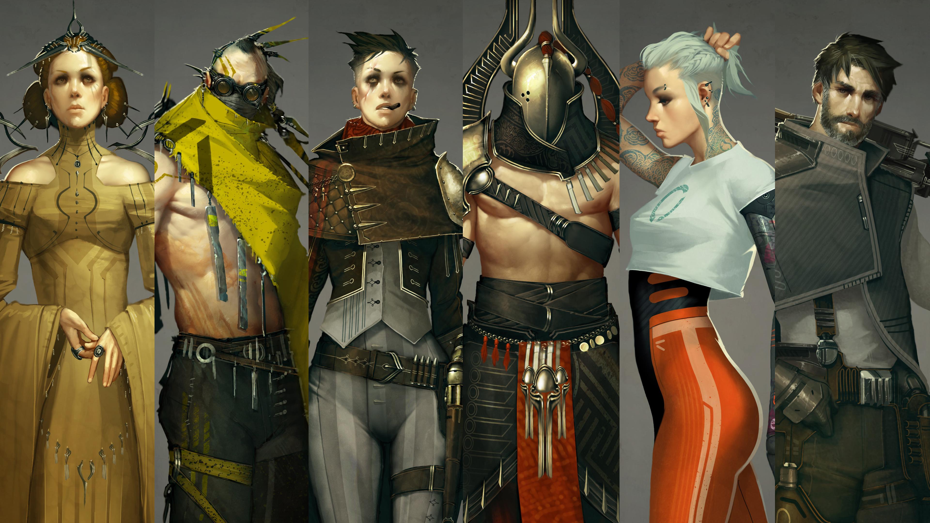
12. Project Briefs: Oh, everyone, before we dive into our main course projects, let's take a look at our project briefs. Now. This is very similar to how a professional assignment usually begins, with some kind of written document describing the character in all of the specifications, story, personality and details it must capture. So that's exactly what I've worked up here. We have six full projects to work through, covering a really wide variety of genres, focal points and rendering technique. So the items bulleted for each character give you just enough to kind of get your imagination sparking and sending you off to start collecting visual references for inspiration. Here is yet another part of the process where professionals can really elevate themselves from beginners. It's important to read everything very thoroughly. Make sure that you understand the brief completely before you get sketching. You would never want to send a finished painting or even a sketch that misses some crucial details specified in the brief. So just take a minute or two of extra time really absorb all of those details, Ask questions. Clients usually have a lot of themselves invested in their character ideas that are more than happy to answer questions or hear your general ideas at this face. So don't be shy. It shows professionalism and engagement, and your clients will really appreciate it now. I usually like to say this for the end of a course, but let's check out all of our finished course project characters in all their glory. I'm showing you this early because I know that six full characters is a lot, of course, work to do. You absolutely do not have to do all of these to get the full benefit of this course. While each character covers a different genre and as different rendering and design solutions, feel free to pick and choose which ever character you want to do. Maybe there's an empty spot in your portfolio that could use one of these character types. Or maybe one of these is just feeling mawr interesting. It's entirely up to you, and I just want you all to know that I've included so many projects just to fill this course with his much information and value as possible, but not to overload students. So pick and choose entirely at your discretion. Okay, that's my speech. Without further ado, let's jump in and start making some character concept art
13. Queen - Concept & Sketch: Oh, hi, everyone. Welcome to the Queen Project. Now you've made it through all of the book learning part of this course, and it's time for the fun stuff. Let's make some character concept art, so we'll just dive right in now. First step for all of these projects will be to select, oppose and I've got the post sheet that you can use for any of these, and I've selected this one. So our character is a queen. So the pose is our first real concern for how we communicate that because her attitude will be a very important part of her whole character personality. So this poses very relaxed, but it's confident she looks like she feels like she really belongs where she is. Her look is kind of looking down at us just a little bit. That chin is sort of raised up, so kind of ah ah, haughty arrogance. It is very fitting for a monarch, somebody who's in charge of some gigantic part of something, and you know, at this point, I'm not really sure if I want this to be ah, historical period sometime in the past, or even some distant future queen of the galaxy type thing, and in fact, it's incredibly subtle the changes we would need to make to make it fit either. So you know what? It could kind of be both. But bottom line is, she is in charge of a lot of people. She is the boss. She is in charge. She's kind of this symbol of perfection and an ideal of everything. So that's what we really want to get across. That's the personality we want to exude. The pose and the details that we choose will really fit that. So early design steps here. I'm trying to get a little contrast in with some sort of form fitting parts kind of tight around the chest, tight around the sleeves, but also some really nice billowing draping parts to. So she's got these almost absurdly huge sleeves that I think are really cool and then some little poufy parts on her shoulder. I did a good bit of research just on Pinterest before getting to this part, researching both historical queen outfits in regalia and some concept art done for things like Queen Amidala in Star Wars. So things like that are great references for this, but This is a really great one toe have in your portfolio because it just shows how you can push something just way over the top in terms of ornate nous and decorum just making her his as intensely powerful and adorned as you can. So a really fun one and a really valuable one to having a portfolio great one that art directors would look at closely. So let's just see if we can make something really beautiful and exude all of that really intense confidence and perfection and just high above everyone else attitude that we're going for here. So I don't really want to show any legs or feet. That just seems kind of like something that would be covered in a an important figure like this. So kind of a long draping dress that kind of puddles up around her feet thought that would be appropriate. Notice all of these lines that I'm using that design element of movement to sort of lead the eye up towards her face. So the sleeves, all of these little metal projections coming off of her shoulders, they all kind of draw attention towards the middle. They're all kind of big Hey, look at me things. And even in real life, those those little adornments to to a monarch are meant to do exactly that. They're attention getters designed to lead the I. So that's that's really something we want to capture here. Fun stuff you can draw upon from real life and also just fund design elements that you can just apply and make it work for your design. So this is coming together pretty well. I like our our basic lines of our clothing here. I like our contrast. We've got some good balance going as well. There are some areas that are very visually active the headdress, the area in the center of her chest that I think I'm gonna make some kind of metal work. We've got some nice repeating elements to give us those visually active areas, but then we have some nice simple drapes is. Well, to balance that out, you need those kind of sort of relatively quiet areas. So I think the sleeves, the dress puddling at the floor and her face will be areas of relative visual calm. Compared to all of this cool metal work and trinkets and just visual activity that will make her look important. Give her that pop that we really need her toe have and communicate all of that really cool queen attitude that we wanted tohave. So I'm getting to the point where I actually need the post template less. Unless once I get to this phase, I'll often just copy over things like the hands or the face so that they can become a part of my design. But as you can see, we've got her figure pretty well established here, and it's all working well, I'm gonna do kind of a second pass on this kind of like an inking step. So to get that started, I'll just select these areas of her skin that will be visible in the final product and just pesos into a new layer. And I'll just kind of use this is a jump off point to do this second passed kind of a refined ink line step. This is the step that you would want to show to a client. So once we get this Leinart second pass all the way finished, that's what I would usually send off to a client. Just to get approval, say is this design what you had in mind if there are any changes to be made, it's incredibly easy to do that with simple Leinart, certainly easier than if you sent ah, final painting or even a rough painting. So this is a great step to kind of get your ideas tested and, ah, really fun to store of to sort of refine things. Your ideas start to really crystallize what was just sort of ah ah, flick of the wrist. A sketchy idea really starts to take shape and become a solidified thing. So notice I'm starting to pay a little more attention to things like symmetry. If there is something that's the same on either side, I take them the time to copy and paste that make it truly identical. Our eyes tend to seek out that kind of visual symmetry, and if you try to do that by hand, it can also it can often end up being kind of an eyesore. So just a little little craftsmanship tips to make sure that the things start off on a really solid footing here. And that's what this second passes all about. A lot of fun rotating these little shoulder piece kind of metal adornments out a little bit . Just a change, one of my lines a little bit. But I really like the importance in the grandeur that these little metal, spiky things add to her makes her look kind of like a really important space queen. In fact, it's it's equally ambiguous whether or not we want toe like this queen that really comes down to the details. She looks very confident and certainly very in charge, and that's good. That would be true of either a benevolent or an evil queen. So it all comes down to the details. It's funny you could come to the end of this design. And if you just give her a black dress with like, spider Web designs on it and gave her some really dark eye makeup, she would look evil, like the Ice queen from Snow White and the Huntsman or something like that. But if we give her a light colored dress, make her seem kind of angel like and above everything, she seems benevolent. So it's funny how simple changes can really radically change the direction in the feel of your whole character. So black clothes contempt likely mean villain light. Close kin typically mean hero or benevolence if we're really being kind of reductive there . But just an interesting thought about hell. We can kind of radically change directions. It virtually any part of the design process, so kind of just refining things as I go here making these little folds, making sure that all makes sense. Remember, in our cloth rendering exercise, it's important to maintain that shape integrity so we don't have any weird EMC essure cloth folds that just don't make sense. So that's what I'm really thinking about here, kind of using little whips of the risk to make some nice little fold lines, adding a little bit of interest and getting our drapery rendering plan in place for those cool sleeves like that's gonna be a really nice feature of this one. That nice drapery, just kind of pulling off of her hands, really helps emphasize that Nice pose actually spent a lot of time deciding what to do with her hands in this pose. It was kind of a strange thing. I wanted her elbows to be folded and out towards this. It just seemed like a very regal pose, but I eventually decided on sort of her hands, loosely clasped, almost like she's adjusting a ring on her thumb. It seemed like just the might the right blend between a casual pose like someone who's relaxed and powerful and also something that seemed grand and kind of formal, Which, of course, that's what a Queen of Monarch should be all about. So we're communicating all of those things, checking all those boxes to really get our story across, and it's a really fun one already. So just making sure that all of this drapery makes sense, making sure that all of these swooping lines kind of lead up towards the focal points of the piece, using that movement design element starting to get a look at the big picture here. We've got a really nice visual balance. We've got a lot of nice, visually active areas that are balanced nicely by those few large and relatively visually quiet areas, so that's working really well. Personality design fundamentals. All of those things are what we want to be thinking about in these early phases and thats working really well thanks to the post templates. Normally, we'd be worried about pose and anatomy as well. But that's kind of just taken off of our plate with post templates, so make really good use of those it it saves you. Ah, lot of headaches, always looking to improve efficiency, make life easier. And this is a good one. So just adding details now, kind of making all these lines a little more solid, adding some little repeating elements toe about building yourself a framework and then kind of adding little details within the inside. I'm also going to do a little bit of a bit of a pass around the outside to just add a little more line wait, make these lines feel more solid, just more crisp and professionally presented, so that if we do send this by a client, it'll look very professionally drafted. Our ideas won't get lost in a messy rendering, so you always want to present your work well, especially when it's a design that you love and believe in and really wanted to get approved to send downstream. So a really fun part of the process just sort of a victory lap of your design because we've got all of our main elements pretty much decided I'm spending a little more time looking at thes sleeves. I've given it a little bit of a break and come back after a short amount of time, and I've decided that I can do better with e sleeves wouldn't make them or kind of, ah, draping, swooping type of drapery and not that weird kind of bundled up loop that it was a moment ago. So I'm just gonna extend those all the way down to the ground. I think that's a really cool, very queen like detail to imagine, too, that even her sleeves kind of draped behind her. You can imagine, as she walks this great train of cloth kind of following behind her. It's just a very grand and imposing kind of visual, and that's definitely in keeping with our personality. We're trying to communicate here, so you just save a copy of your Leinart. If you want to try something new, just a race away and here we go. I like that much better, gives us, um, really nice little folds at the bottom. I like how it just swoops downwards and then gives us that nice little zigzag. At the end. It will be a really nice drapery painting in a nice, quiet visual area to balance out all of the cool, ornate details we've got going on. So defining a little bit of the sleeve edges here, but at this point, it's really just finishing touches. We've got our main design in place. I think all of the main big picture boxes have been checked. She's looking really cool, and I think she's ready to start doing a clothing rendering. We can start making some color and detail choices and the steps ahead, so I'll see you there.
14. Queen - Cloth: Oh, hi, everyone. In this section we will continue our Queen project by doing some cloth rendering. So let's get started. When we switch from Leinart design mode into painting mode, we need to do a few things. First of all, I've painted in this splash background, and that's available to you all. The next thing will need to do is convert our line, drawing into a silhouette so that we can start painting. So I just use the magic wand tool to select outside of the Leinart and then click all of the little negative shapes. And then we just do select inverse and weaken. Just contract that a little bit and I'll create a new layer and we'll just add in a silhouette and that will give us a good basis to start from and use this dark scion color just works well with skin tones, and it's just a good base. Another thing I've done off screen is all of our skin and hair rendering. So I've got that in a folder up above these, These assets are available to you as well, but I'd encourage you to do your own rendering if you like, and, uh and we could just take it from here. So we've pretty much got everything set up. Getting a good look at the silhouette always gives you kind of a fresh perspective. And I'm actually thinking I'm going to do some design changes here. A few of the little metal projections weren't quite working for me once. I can see it all blocked in. Sometimes these design choices to sort of look different. And I'm just gonna make some changes. So really weaken change and tweak our design in any phase in the process. And that's what I'm doing here. Thought she could use a stronger headdress. Kind of a really cool, kind of wicked looking tiara type thing. So just trying out a few little silhouettes trying to get a few cool things going here, and we'll do some nice, ornate metal work with that later. But I like this much better. A much more dynamic design. I like the movement it creates, and I think we're off to a good start. So sort of a quick design correction there. And now we're ready to do some cloth rendering. So since her her garment, really, her whole costume is made from one big garment. It's all the same material. This one dress not really pants insured and jacket. It's one thing. So to make life easier, I'm going to get organized budgets blocking in the entire dress. So I've picked this red color. That's what I'm gonna choose for her dress color at this time. But we're definitely gonna change that later. Kind of arbitrary at this point. But I'm just sort of tracing around everywhere where there is skin, and we're just going to use that to block in the entire dress. So just using this to create a selection, a layer that we can just lock later in paint within. Do all of that nice cloth rendering without worrying about stray marks going over the skin are going somewhere else that they don't belong. So this is just a nice step to sort of get organized, make life a lot easier from here on out. So that's all there is to it. I've got a nice blocked in shape for her dress, and now let's start some cloth rendering do some of that fun stuff that we practiced in the cloth rendering exercise. So I have just got my painterly brush here that's available to you all is well and I'm just going to start by determining light source So light in shadow, adding in some light tones here, and I'm painting it 100% opacity. I sort of like to do this past where I just determine light and dark. I don't really worry about half tones, any kind of a smooth Grady int from light to shadow. I'm just sort of dropping in these big, chunky brushstrokes to determine where is light shining and where is it really not able to sort of come back and refine? That is we g o. But you can see I'm starting to define the light source, starting to give it some of those little dizzy stroke. So we're determining where the cloth is sort of bunching up versus wears it draping or where is it taught? So we can see that kind of in her midsection, her abdomen. It's very tight, but then around her elbows and the little cuff lines around her upper arm, we've got that nice Z stroke, so that's really where we determine those nice little cloth details, tension and drapery and how ah how much it's folded or not really cool things you can figure out with just one shade of light and dark. So that's what I'm doing here. Just to sort of figure this all out and get the rendering started. And what we'll do later is just sort of go back and kind of fill in the grades between. So it's not all gonna be 100% light or dark. We sort of fill in the gray areas in between. So that's what I'm doing here, kind of trying to determine where this sleeve sort of overlaps the dress underneath and just doing some cool drapery work, Figuring it all out, keeping that light source in mind. Sometimes a really well done cast shadow can add tremendous realism. So got that going on in a few places, kind of on her abdomen, um, on her neck, where the chin is casting a shadow and also where this long sleeve that's catching a lot of the light is casting a darker shadow below. So adjusting a little bit here, I've decided I want this fold to be kind of coming out towards us so you can sort of change the way the cloth lies just by changing light and dark. So all of these phone decisions get made with this easy step. I don't do this every time, but this is a nice way to go when it's one really kind of Maine garment. Like this dress, of course. So it's time to sort of start filling in the middle ground between light and dark. So I've dropped my opacity about 50% in just brushing in some mid tones and you can see it starts adding, a lot of subtlety and refinement really start making this look more realistic for my material. I'm imagining this dress is made out of something like silk. Seems like something that find clothes that Ah monarch would wear would be made out of. So I want to give that a little more shine than I might for, say, cotton or something like that. You don't have to be a textile expert, but pay attention to your references. If it's a a fancy article of clothing like this, silk might be a good choice. And if you research that a little bit, you'll see some really beautiful shines that silk has. I'm gonna definitely capitalize on that. It can do so many nice things. I use that in leather, too, but gives us this really nice pop, a nice little highlight that makes our our cloth looks so much nicer. It reinforces all of those little Z marks that we make to when when those have a highlight on them. They really leap off the page and gives us all that great information that those folds give us about. Where is the cloth kind of bunched up? Enfolding really looks beautiful, so that's Ah, that's something I really want to emphasize in this lecture that nicely stroke, almost like the cloth around her abdomen and certainly on her sleeves is bunched up a little bit. And I'm really pleased with that. That's going very realistic. I want these sleeves to be coming out towards us just a little bit, so I'm going to use a little bit of this bright highlight color to make those pop a little bit at a little bit more of this shiny highlight to the sleeves as well. Anywhere where there's a Z stroke, and if it makes sense with your light source, always a great place to bring extra attention that that Z stroke is really a great feature . And if you can bring your viewers attention of that, it always ends up going over well. So make those ah highlight in a focal point if your light source will allow it. Ah, really powerful stroke doing a little bit of smudging Now I've switched to the smudge tool , and I'm just sort of dragging the long draping folds and zigzagging across those e strokes . And, as you can see, it really enhances the thief. Effect on both also Smoothes things out. Makes that clause Seymour flowing and kind of uniform. Up till now, it's been a lot of textured brushstrokes, kind of semi opaque marks layered on top of one another gives it sort of a mottled appearance. So when we start smudging, it brings a lot of smoothness to our image. Really makes it look a little more sophisticated, gives it some of those nice middle grounds, and it also helps us reinforce the way the cloth is draping. You can see some of these smudge marks make it just look like it's swooping upwards towards her so you can really use this smudge tool to do a lot of different things for you, kind of smooth things out, determined the direction and flow of your cloth and just reinforce your brush work. So this is really handy adds a lot of sophistication and a lot of information to your cloth rendering as well. So that's a really handy tool I used used the smudge and brush tool pretty much as two parts of the whole I go hit B and R repeatedly on the keyboard. So my two favorite tools here and they work well together. A great team coming along really well here, Really, like our light source establishment I really like are different brush strokes. We've got some nice balance between bunched up areas and smooth flowing areas. So right now it's just sort of a refinement step where I'm making sure that everything's working. We don't have any weird M. C. Escher folds that don't make any sense. I invoke him a lot, but two great analogy. If a full just seems impossible, you need to fix it. So that's what I'm doing here. Switched to a slightly darker color to just stretch that value range. And there are some parts where this cloth is really receding into shadow. So I needed that extra bit of darkness toe. Add a little bit of pop areas where the cloth is really receding away. So inside these sleeves, kind of in the armpits here, where really almost no light would be shining at all. And as you can see, stretching that value range really adds a lot of richness and just makes it seem or more. Ah, nice, nice and good contrast, I guess. Is that the word? So just adding a little more of that, also using our light source in that dark to make it look like a little bit of reflected light on our torso under the neck. Here is, well, that's all coming together really well. So at this point, we're still not committed to a color. We got cloth on its own layer. It's separate from the skin, so none of those decisions have been made yet. In fact, later in the course, we're going to change the color of her dress completely. So this is also handy if in a professional project your client s to see your design in a different color, let's see her in blue or black, it becomes really easy. If you just keep that is its own layer. You can easily change it. Give your client another look. That's always part of the design process. Is just trying some variations and we'll have a lecture all about exactly that. Taking an existing concept and using Photoshopped tools to easily work up some variations so that you can give your clients of different design looks a big part of the character concept artists job. It's a lot of fun, too, and the tools here make it incredibly easy. But at this point, I think we pretty much have a successful cloth rendering really nice brushstrokes, really nice light source, and I think it's all coming together very well. So with a little more fine tuning, Teoh edges and some value adjustments will pretty much call this part of the process done. And in the lectures ahead, we will make this look even cooler, so I'll see them
15. Queen - Final Polish: Oh, hi, everyone. In this lecture, let's conclude our Queen project with some final polish. So at this point, we've kind of been noncommittal about our colors. But it's time to kind of cement some of those color choices and all of the story implications that go along with that. So it's sort of time to decide, good guy or bad guy. And I've decided I want her to be a good guy, a benevolent nice queen. So instead of going for something dark, I'm gonna go for kind of a nice gold color, maybe something pretty light, actually. So switching to sort of yellow, you can just sort of the justice by hitting command, you doing all these huge saturation adjustments, and we'll add in some accents to to make this look really cool. Color balance is a good way to do this command be and some brightness stuff. So we can really change the entire look and feel of this character with just a few photo shop operations and notice. I made a copy of that cloth layer just in case we decide to go back. Another thing I've just done is created a multiply layer, a command click the cloth layer to make a selection. I filled it in with this solid color and I said it to multiply, and that gives it this nice, dark accent on top of the cloth. And if I'm asked that out and then selectively reveal it them here, I'm just using some Grady INTs. It kind of gives us this nice transition, a bit of a fade from a darker color, and we can even paint in some cool line work. Different designs add stripes any kind of little details, but for now, it's just sort of a nice fading Shadow gives it some nice Hugh variations of nice color variation, and that's what we're going for. I've got this pretty subtle, but you can dial this up. You can make it intense stripes or just something barely there. So let's use this layer. And I'm just painting on the mask to reveal away some of this darker color on this multiply layer. And that's how we can add in some stripes. So I'm going to start making this dress a little more interesting. Not just one solid color, but add Cem patterns, other cool little details just to give it. Some more intricacy make it more ornate and and regal because we want her to kind of be over the top is fancy looking as we possibly can. So this is a great way to kind of define some of those fun little details. So just coming up with ways to add little stripes and patterns, this is another time when you can really decide what time period your character lives in. So we could add some really futuristic looking designs and make her look like Queen of the Galaxy in the future. Or we could make it look more classic, some kind of scrolling leaf pattern. And suddenly she's in, You know, the Victorian era or something like that. So these thes decisions really carry a lot of weight, but it's a lot of fun. The main thing is, we want to keep the shape of our cloth in mind. If we're adding stripes to a part of cloth, it's curving. Make sure the stripes kind of agree with that. You can really kill the dimension that your your cloth has. If you put a stripe on it, that doesn't really add up, so we're making sure work matching the contours of the character. All of the folds and curves of the cloth need to be taken into consideration when adding these patterns, or it just will be kind of an eyesore. So just good stuff to keep in mind, uh, kind of playing with a few ideas here. Just sort of feeling your way through When you're working on a mask, you notice the colors air just black and white, and this is just basic photo shop mask stuff. But that means we can kind of undo anything that we do. So this is a very free process. You just paint in white to reveal this darker color to add a stripe or something, and if you don't like it, you just paint black again and it disappeared. So it's is easy is that and it really allows for some fun, very free design work to add these cool pattern. So a great way to get some accents and really add a lot of interest to your character easily is with one of those multiply layers and thanks to blocking out that cloth later in the beginning, we really made that easy, so I'm adding another accent layer. This one's not on any special blending mode. It's just a new layer, and I'm painting in some dark accents. Ah, lot of these will be the basis for some of the metal work that we're gonna add. So some of these little hanging trinkets and jewels this will be the base for We'll do a lot of work with the color dodge metallic brush mode later on in this lecture. But remember, for that to work, the metal material has to be on its own layer. So these air just gonna be the dark basis for that shiny metal to sit on because we can't paint color dodge right onto the dark base where the colors won't work, right? Hope that makes sense. But it's really just the same thing that we did in our metal rendering exercises. So all of this fun little line work, little seems, and details kind of sewn into this very important, very fancy dress for this very important person. Very cool stuff, carving out little lines and seems, as I've said before, just always seems to make something look cooler characters, clothing, even weapons, machines, creatures, these little lines to suddenly take it up a huge notch in realism. So really, take some time. Just let yourself come up with some some fun line work, any kind of. It's a very free process, a very good place to express them creativity and just let the stylist work and see what comes of it, because it's all undoable if you don't like it may have mentioned that to this point, but that really is. The best part about digital art is that you never have to really be afraid to try anything , because it's also infinitely re workable that you can always just jump and then hit. Undo if it doesn't work out. So really, let yourself stretch those creative muscles. Try something you may have not tried before. See if you can really grow and push your boundaries a little bit. The digital medium makes that practically a zero risk proposition, so there's nothing to lose. Just just try some new things, push that envelope. But we're just sort of refining some of our line design work, using the clone stamp to have some nice repeating elements here, and I think that's working really well. I'm really keeping it ambiguous about era It's still not entirely clear whether she's from the future or the past, but I kind of like that. It's sort of fun to keep it on the border, doing a little more base work for metal. I wanted her to have some some rings on her fingers, so I'm adding in just some dark base silhouette shapes on this accent layer, and that sort of sets the stage for our metal work. We'll start that now. This is really gonna be just like our metal rendering exercise. So I'm on a new layer. I've switched my brush to color Dodge, and we're just going to start by defining some of those edges, just like we did on that piece of armor in the metal rendering exercise so turning, smoothing up and down depending on whether or not I need to make a long, straight line. That's a really handy function that I haven't mentioned yet, but smoothing really steadies your hand. If you need to make a long, smooth curve or a long straight line, that's a great thing to do. It's one of the newer things to come out in later versions of photo shop, so if that features available. Give it a try if you need to make a long, smooth line very handy. So as you can see once I have one line made, I'm just using the clone stamp tool to give it a perfect copy next to it. And those kind of paired perfectly parallel lines really makes a very solid looking basis for some metal work, carving out a little bit of this base shape so that we can see a little more of her hair showing. And I think that looks really cool. This is that part of the design that I reworked a little bit once seeing it in silhouette, and I really like how it's coming together. So just refining things. But it's crazy how nicely that metallic shine contrast with the relatively smooth Grady INTs of the skin in cloth. Metal just always is. Such a great accent gives so much pop and shine to an image. Lots of contrast, and Photoshopped makes that so easy. This color dodge mode makes things really look nice without much work at all, and if we just repeat the little shapes that we make, it makes it look incredibly solid and just perfectly machine, and it all registers very well. So use those those Photoshopped tools to make things look like they match like they belong together. Could I add in some earrings here and I'll make these pretty ornate as well, really just adding a single shape and then just repeating it. So it's sort of just draw some cool lines, give them sort of a shiny highlight and then just clone stamp them the shapes air practically random, but it comes up to be something really cool looking just about every time, just thanks to that clone stamp tool making it such a perfect copy when it all matches that perfectly, it just makes our I think, that this is something really solid that belongs. So repeating some of these little shapes now onto these little studs on her dress. Once you get to a certain point in a concept like this, you can start to just borrow from the nice renderings that you've already done elsewhere in the image and just copy and paste. The whole process actually starts to really speed up. You get to kind of the downhill side of it when you've already got so much nice stuff going on on the page that you can just copy it and use it elsewhere. If you use that with a little bit of restraint, it doesn't really even look like you're just copying and pasting. It looks good. It looks like things belong together. So with these little swirling metallic shapes, I'm gonna get a lot of good use out of out of that same motif elsewhere in the image so really handy stuff. You can kind of build one nice looking part of an image and really get some mileage out of it. So I hope that metallic exercise really made sense to you guys because that's one of the easiest parts to get so much nice looking detail without a lot of work at all. And that's definitely what we've got going on here. Notice. I'm only working on one side of this kind of detailed metal piece because we can just copy and paste it to the other side and then make the one on the dark side of her just a little bit darker. But flu shot makes that so easy. We can just copy and paste things, and they really look like they belong together, adding a little bit of kind of fill in metal work to some of the parts of this metallic stuff that's in the light source. It looks so cool with just the edges that sometimes I overlooked that we need to fill in the flat shapes as well. But those edges air so powerful that it does a lot of the work for you, adding a little bit of detailed of this ring on her finger. And I just copied a metal detail from above, doing a little more painting and here to make that shiny. And I think I'm just gonna leave these metallic. That will be a cool place for a big, shiny Jewell. Perhaps, but I think we've got all of the color interests that I really wanted for this, but maybe a design choice. You could do differently. So let's copy and paste this metal work to the other side, a little bit of fine tuning to make it fit, and it's just that easy. We've pretty much got a nice rendering. All this nice metal work in place, and we're in really good shape here, So she's starting to shape up very Well, we've got a very nice drapery drawing some really cool metal work, adding in some little trinkets, kind of hanging from the headdress. You can get insanely detailed with this stuff. I'm just using the clone stamp, kind of borrowing a little metallic detail from somewhere on her outfit and just stamping that into other places. So look out instantly, weaken. Just totally cover her with all of these little cool, hanging metallic details makes your outfit look incredibly ornate like it was. It took forever to create this dress. Same thing on the headdress. Look how easily we add these really ornate looking parts of the metal work I love. That photo shop makes it so easy, so I hope that's a real game changer for you guys. It's something that's helped me a lot in my work, just instant insane amounts of detail with practically no work. It also your clients will love. This will really help your portfolio stand out all of this really ornate metal work, and it really doesn't take much time at all, probably about 1/2 hour in real time, so we're gonna do a little more detail ing here. I've decided I want to give her sort of a war paint type of punch up kind of more like detailed makeup like she's got some interesting face. Paint just is a little bit of punch up here. So same things we did with that accent color on the dress. We just create a multiply layer, a mask that out. And then I'm just revealing that in certain places, and there are a 1,000,000 cool possibilities to work with here. But I think we're just going to go with kind of a stripe on her forehead and kind of Cem implied long eyelashes. Kind of ah peacock type motif. I think that's very fitting. Add some really nice punch up to this design. This accent colors really work well, come on very nicely here. So let's have some photo textures just to get this a little more texture and color interest . So we put that in a layer group, mask out the entire layer group, and then we just said it too soft light. So once it's inside of there, it won't go beyond the layers of the mask. We don't want our texture to kind of leak outside the lines, so this is just about perfect. Set that layer group on soft light and check that out. We get all of that cool texture from that piece of fabric, and it really fits well. Just the right amount of color variation to not not anything too drastic. It's not really changing the hue, but it really adds some nice texture. Gives it a lot more interest, so I'll just clone. Stamp that and a few other places copy a whole layer just to bring that texture up above, and we just sort of fine tuned. You can adjust anything. The hue, the saturation, the brightness just make it kind of fit. And you never want these to overshadow your painting. So this is not a crutch to sort of substitute for a painting. You don't ever want to try to go find a photo of a dress. For example, you you don't want the photo to kind of save you whole steps. It's just a nice little bit of accent at the end. Just makes it look a little bit nicer. So we're really getting to the final steps of this. So noticed I have grouped everything, made a copy of it and then merged it together. And I'm sort of cleaning things up. I'm going around the entire perimeter of the character now a racing away. Any strain marks that may have gotten outside in doing a light smudging just 10 or 20% all the way around. It gives a very subtle blur to the outer contour of your character, and it really rounds things out. Those edges air to sharp. It has an effect of flattening the character, making it look like it's not three dimensional. So this is an important part of final Polish. Is just treating these edges really makes the character seemed more realistic. I think that's working really well. So I've created a new layer, and we're gonna add in some secondary light sources kind of try to give her some cinematic lighting. So for this part, I'm just doing a bright light along the edge. So, like there's a spotlight somewhere behind her. There's so much information that could be included in these edge lights. They add a lot of detailed around things out, really make the shapes of your figure more clear, but they also give us some environmental cues. If the spotlight was bright orange. It would make her look like she's around a fireplace or something. If it's blue, it could look like moonlight. There are a lot of cues and information that you can add in. Make it bright green and it would look like she's in an alien environment or something like that. But this is working really well. We're getting to the very last parts of the process. So what I'm doing here is just some fine tuning. This is sort of the last parts of the process when you can polish things up. So any any stray mark. I didn't like any part of the cloth that I think could use a little bit of extra highlight . This is when we do it. And guys, I think this one is looking great. It's just about a finished product. I really like how this has shaped up. She's got outstanding personality story, really great design fundamentals, and I just think the rendering. He's gone really beautifully. I hope you like your project, but I think we're just about done here. But no, we're not remember. We always want to push our design. So what I've done is I have waited one full day and then I have come back to take a second look. So I decided to take good and push it too great. So let's see what we can do. I've got the character again and I've decided that this midsection is just looking a little plane. So we're gonna punch this up, push it that extra step that we talked about in our concepts and theories and try to do something cool. So I'm gonna add some kind of hanging drapes, these little kind of ribbons hanging from the mid part of her dress. See what kind of cool accents that can add. And we're just sort of warping that into shape. I just copied parts of the dress that already existed and just brighten them up a little bit and warped them into place. And that's all there is to it. We've got an extra cool detail. I'm going to copy a little bit of metal work to make this look a little more interesting. But these small steps that we can take to add a little bit of extra pop a little more interest that's such an important last 1% of your project where you can really take something from being good and take it all the way to Great. So a little bit of a trick there wanted you to think that we were done just to show you that you can always come back and take your project just a little bit farther. And sometimes it's that last little detail that adds all of the interest that make it into something truly amazing. So now is the rial final version of our project. We went all the way from a sketch from opposed template, added in all of our colors, did a really nice drapery rendering, added some supercool metal work using the handy Photoshopped tools. And we arrived at this really nice final product. So I hope you're pleased with these first projects, and I look forward to taking all of what we've learned here in taking it to the next level in our next project. So I'll see you guys there
16. Wasteland Mystic - Concept & Sketch: Oh, hi, everyone. Welcome to the Wasteland Mystic Project. This is gonna be a really fun one. So let's just dive right in. I've got my posed template pasted in here and setting my documents size, but I think we're ready to kind of start a concept sketch. So the general idea for this guy is that he is this kind of weird wizard dude who just hangs out in a wasteland in a post apocalyptic environment. So this one has a bit of a danger of falling into that trap of an overly convoluted story. So I'm trying to make it very simple in my mind, just kind of, ah, eccentric Oracle type guy who wanders around the wasteland. And maybe he's sort of a supporting character. Maybe it's a video game. Where are our hero? Will go and talk to this guy to find out how to do something so kind of just think of Ah, kooky old wizard guy in that post apocalyptic environment. So early design choices on making here is I want to make his environment apparent. I wanted to look like he is a part of this post apocalyptic wasteland, so these goggles kind of a wrap around his face, kind of to protect him from the toxic environment, presumably kind of a radioactive, war ravaged, planet earth type of place. So we'll have some hints of futuristic elements on him, things that he may have scavenged from a near future world before it all got blown up in radioactive. So keeping that kind of design language in mind, but also in terms of design, fundamentals, shapes and movement, in contrast, want to really be aware of that, too, Because, ah, lot of a lot of our design will depend on that. For example, the eyes, his goggles. I've deliberately made them perfectly round goggles or something that take a little bit of extra attention. Humans have such a really strong identification with eyes. The shape of eyes tell us a lot about how to feel about what's looking back at it. So it's easy on a face to make somebody look angry or sad by the shape of their eyes. So when you're designing a helmet or goggles or any kind of clothing version of eyes, you need to keep those things in mind, and I have deliberately going with perfectly round circles because they're completely neutral. It's looks like this guy is looking at you, but he does not feel one way or another about it. If I made those goggles triangles angled inward, he would look kind of threatening if I made them tiny little slits. It would make him look kind of strange and mysterious. So goggles air a lot of fun to play with. Kind of one of the main features of this character and something I just wanted to talk about a little bit here as we get started, want to include some cool material contrast to. So as you can see, I've got a lot of metal trinket type things hanging off of these really nice flowing drapes that make up part of this wrap around his shoulders. Really nice contrast between materials there, and it will also give us some good drapery to include and bounce off of that metal rendering. Trying to give him some nice movement here, make it look like he's being blown around by the wind like he's in this harsh environment where the wind blows and the the you know, scorching desert sun is always whipping at him. So really trying to make his environment apparent and also work in some of those nice, futuristic, post apocalyptic details. I also want to do that visual balance thing where we're balancing out large areas of relatively inactive shapes with areas of repeated, smaller, more visually active shape. So we've got these nice trinkets that we can put pretty much anywhere, and those really do a good job of doing that visually active stuff. But we want to make sure that these flowing drapes a relatively calm and quiet to give our viewers I a place to rest and kind of take it all in. So a lot of complexity to balance here. I want to make sure we're always keeping sight of our story and our design fundamentals and kind of making the to bounce off of one another and really make it work. So they were doing a pretty good job here, getting a good sense of who this guy is. His personality. He's gonna be walking around with this staff that will design later. So really giving that kind of kooky, eccentric, old Wiseman type of thing also got some cool design elements going on. I like the looseness of the cuff around his wrist kind of makes his whole lower arm look bigger. Kind of a nice exaggeration. Also, like how the pants and the other drapery are kind of baggy and billowing, and they sort of match with his relatively form fitting midsection in all of the little straps around his arms and all of the cool little hair bindings that he's got going on. So with all this nice tribal stuff, we're sort of getting another look at the future that this guy's a part of. So it's sort of like all of the logic in science of our time now has faded away. It's been all war ravaged, and humanity is reverted to this more tribal state, where they come up with all of this mythology to explain the world around them. In this guy's kind of the keeper of all that, he would have some prophecy about where you need to go in your journey. Or maybe he has medicine, herbs, magic spells things like that. So one of these really fun supporting characters that should be just really fun and weird and have all kinds of fun. Little details about him to to really sell all of that great back story, and I think we're on our way here, trying to make it look like his outfit is pieced together from things he scavenged from this war tourney wasteland. So the cloth will be kind of stitched together, maybe have different colors. Later on, he sort of got just little pieces of metal that he is integrated into his clothing, kind of like makeshift armor. In a few spots, he's got the wrap around his neck, the goggles to protect him. It all fit is another fun detail. We might even try to make some of the metal look like it was scavenged from something recognizable like a road sign or just some noticeable piece of machinery. So kind of a fun blending of new and old with this type of genre, Post apocalyptic is a Thanh of fun, and it's also a really popular to great way to blend old and new motifs. We've obviously got kind of an old medicine man type of vibe going here, but we're blending it with all of this great mad Max, hard core wasteland type of stuff that that really fits well, So we're coming along here. I'm needing to rely on the post template less and less, and that's always a good part of our design. Means things are really working for us, so we'll just sort of continue and leave that behind. And it's it's really shaping up nicely, just adding a little bit of line. Wait here to kind of solidify some of our lines might just forgo the second pass on this and sort of just tighten up the sketch. I do that sometimes you don't always need that second inking past, you can just sort of a race away, refined some lines at a little bit of heavier line weight to your more main bold shapes. Good Leinart hierarchy really helps describe a form well, that I'm really liking this story here. Lots of fun to be had with this type of character, and you can just imagine his personality quite a bit. We've also kept him kind of mysterious, which is really cool. We can't see a whole lot of his face. We're kind of getting all of his personality from his posture, his clothing. We sort of know what he is all about. Just based on all of that and and that's, ah, sort of a challenge when you don't have a face to help you. But sometimes the the hiding of a face, the lack of a face can add so much mystery that it lets the viewer kind of connect the dots on their own. That's a big part of an artist job, especially a concept artist, is sort of leading a viewer up to a point and then allowing their own imagination to fill in the blanks. That's a really powerful thing. The great artists learned to do is not try to overly spell out everything. Let the viewer's imagination take it the last 20 or 30%. So if you can do that, it's ah really great way to help engage your viewer. They could make it into anything they want. They tend toe like your designs much better when they feel like they have a part in creating it in their own minds. So it's a strange thing. We we want to include all kinds of information, really tell the view or what we want to do. But we also count on the viewer doing a little bit of our job for us and kind of taking the ball and running with it, using liquefied to fine tune a little bit. Sometimes the pose doesn't seem quite right Once we've put clothing on it, big waited clothing can affect the visual. Wait, so I'm doing a little bit of fine tuning and a little little more curved to his pose. Make him seem a little more relaxed. He also seems like his muscles are a little bit too huge. I kind of forgot that in a post apocalyptic wasteland, this guy's probably having a tough time finding so much food or timeto time to lift weights . So I want to make him a little bit skinnier to fit with his environment in his his conditions a little more. So I think that's more appropriate. Also, like that contrast it adds with his kind of big wrist shape, kind of hanging from this skinny little arm just makes him a little more charming and gives us a nice stylization. Think that's working really well, also, really like how his hair is kind of bound up in these little headdress type things. I'm not sure if they're gonna be feathers or metal. Things just kind of a nice wild hairstyle to give this guy punch up, although, honestly, this guy's entire design is so out there that he doesn't need much punch of. He's very interesting and all all of all of the design elements or so unconventional that it really doesn't need many extras. We won't need Teoh add scarring or or anything like that or, ah, blood spatter just to make this guy interesting. The design and the whole setting is really working for us already. So a great solid foundation to start from just adding some refinement, making sure that the shape of the goggles, the the exact gaze he's giving us is exactly the way I want it really important that the shape of those goggles really fits with the personality we're trying to sell here. And I think that's working very well. I like his boots. We're gonna find tune those a little bit. They look kind of improvised, like he found some boots and maybe stitch some metal onto the front of him, and it's working really well. I'm gonna add that staff later, but the position of his hand, I kind of had a design around that because I knew he would be holding something in a later step, so wanted to look like he's putting just a little bit of his weight on this staff that doesn't exist yet and have, ah, grip that sort of casual, not super tight. I also want to imply that he's got some little elements that air sort of blowing in the wind. So his hair kind of flipped out to the side. All of these little metal trinkets air hanging in a slightly different angle gives us a little bit of visual movement, like they're sort of moving in the wind like a wind chime. They're all kind of moving around, so little subtle cues of visual movement can add at a ton of interest and just make your design look better. But we're on our way here. We've got all of our main elements in line, and we've really struck a nice, delicate balance between all those design fundamentals that we need to keep in mind and a cool story and a nice pose. All that great stuff needs to kind of come together in jail, and I think we're just about there. So from here on out, it's kind of just a matter of building on this nice foundation and adding some cool details , kind of thinking ahead to the later steps in our project. What are the fun little objects that are Viewer is gonna wanna watch to really get drawn in to this character's world. So just refining a few shapes, thinking of some funds, story details like where he might have scavenged some of this stuff from and we're on our way. They're going to go ahead and start designing this little staff object. I wanted to look like it's kind of derived from just pipes or something he might have found in a junk pile, and he just sort of fashion some little hanging objects out of it. So definitely want this to look like a makeshift object that he crafted himself. And I also wanted to seem like it has some kind of spiritual significance for this guy. So it's time for me to start thinking about things like iconography. What is it that this guy is? What does he believe in? What is sort of the nature of the spirituality that he has devoted his life to, So this is a fun time when we can almost make up this kind of futuristic theology that this that this guy might buy into. So I've got a very vague idea that maybe he sort of worships the sun. The sun is probably very imposing part of his day to day life, say, really trying to get into that character's head. So I'm thinking about including a few motifs that sort of imply that So a lot of circles are semi circles with rays coming out of them. Sort of what I'm going for for this staff. But I'm going to continue to refine that as we go. Another opportunity for some nice drapery, just some cloth wraps hanging off of this staff blowing in the wind. We've got one kind of looped out, but then it comes back and wraps around the staff. Really nice stuff, Teoh. Help imply that movement and just give it a lot more interest. Even gives us, um, environmental cues you can practically here, the sand blowing around behind him in this just from from those environmental cues we're getting close to wrapping up. But after a little break, I've decided that I want his face to be even more hidden. I think seeing nose and mouth is a little too much information. So I've decided to go with kind of, ah, mask on his face. Maybe that that sand in the toxic fumes of his world are just too toxic. So he's got his face covered up and actually like that much better. We want this guy to be really shrouded in mystery. He's got kind of a cool bane from Batman Vibe going on now. I really like that decision, really. A lot of balancing mystery with with the story we're trying to tell, really. Works also added a few little Ben's and joints to this staff. It looked a little bit too plain, and actually those little pipe fitted elements make it another element that reinforces that this is in the future, like he salvaged this piece of metal from some old building. Or maybe a car part or something like that really want to sell that? Because it could be a matter of just a few small details that tell us where are setting is if it's the past or the future. But guys, I think this design is shaping up pretty well. We'll go ahead and call this done and we'll start adding color and details in our steps ahead, so I'll see you there.
17. Wasteland Mystic - Leather & Metal: Oh, hi, everyone. In this lecture, we will continue our wasteland mystic character by adding in some leather and metal. So let's get started. So now that our concept is finished once again, it's time to switch from Leinart to painting mode. So we need to block this guy in and make him a silhouette. So we just use the magic wand tool to select the outside in all of the negative shapes and just select inverse. And that gives us a selection that we fill in with Scion. And we've got our silhouette just like that. Another thing I've done is paste in this splash background layer on the background, and I'm also got all of our skin tones painted in. So did some of these things off screen so that we could keep the project moving forward. So I got the skin and hair in a layer group, and as you can see, I'm just masking out, giving it a nice, clean margin between the skin and the hair. That's a good, solid place to start, so that we know where one material starts and the other ends got some nice cast shadows built in there, so we can see where that cloak is casting a shadow on his chest and I think we're in good shape. We're gonna start by painting in some leather. So this will really be exactly like the leather and cloth exercises that we did working on just establishing a light source. And then we'll start working in some of those nice Z strokes in areas where the cloth is kind of bunching up, just smudging those in to enhance it. So this is a bit of ah, unique challenge. A few things we need to consider here about this guy's pants in particular is that he did not just go and buy these at a store. This is something he needed to kind of improvise. So I'm not quite sure what I want to make them look like, kind of cobbled together. Maybe he stitched them together out of some found materials that he scavenged himself. So I definitely wanted to have that rough cobbled together kind of look that would definitely fit with our story and just make this guy really interesting. Were painting in one solid color here. But I want this to end up looking kind of multicolored and multi faceted like it's stitched together from different things. So texture and color accents are gonna play a big role in telling this clothing story with this guy later on. But for now, which were just tryingto establish this material, give it a sense of texture. How softer, How taught is it? What kind of folds or smooth draping parts does it have, and just establishing our light source So fun stuff. It's really exactly like the exercises just to give this guy good base. I'm a racing away. Some little seems here, kind of getting that process started where it looks like this was sort of stitched together out of multiple things and erasing away some of these other little belts and straps. It's always good to kind of establish really clean margins when you have a character that has multiple different types of clothing going on. So unlike the Queen, this guy really does have different articles of clothing, and whenever they come into contact one another, like the pants and these belts and knee pads and stuff, it's good to have him on separate layers for the first, most important thing, and we also want to erase away so that we have really sharp margins between the two. If you have Messi, brush strokes in the two articles of clothing look like they're kind of paint marks straying into one another. It looks kind of kind of unprofessional, and you definitely don't want that. So a nice, clean work up really, really helps. You start on a solid footing, doing these little leather wraps on his wrist to and use the clone stamp really effectively . They're pretty much just rendered one of these little cylinder shapes wrapping around his arm and then just copied it. So we'll use a small brush to start doing a little bit of edge work to really make those strap edges pop. And just like that, these raps air looking really nice on his arm. It's a little bit monochromatic at this point, but that's okay. Remember, we can change the color at any point. I kind of just start with this brown sort of working from, ah, leather base point in my mind. But we can really change that, and I'm sure we will. As the project progresses, a racing away, a little bit of mottled texture to just to make this look kind of textured and like it's comes from a wasteland. So the goggles I want there to be some kind of leather straps that he wove himself toe hold these goggles in place Wanted to look like something he made himself. So I've got little crossing straps of leather there, especially over the nose piece, just to make this look like something he improvised. So I've created a new layer. We're going to start a second leather, and I'm just painting in the same color. But again, I'm keeping this separate so that we can do hue saturation adjustments on either of these layers and make them look a little bit different from one another. It's gonna be that huge variation that makes this look really convincing. Gives it that nice color flavor distinction that will make the two materials look separate . But in the beginning, in these early phases, it definitely looks pretty monochromatic. So hang in there. This is just kind of, ah, an early establishment phase, but coming along well, got some nice weaving patterns. No real need to do much Photoshopped copying to make these weaving patterns look exactly right because I actually want these two look kind of kind of haphazard, like he just found a few straps of leather and just wrapped them around something without carefully weaving. It wanted toe all seem very rough, spun and kind of cobbled together, cause that really fits with our characters. Story here. But all kinds of cool little leather strap details places where he's kind of tied down pieces of his clothing or his gear Little leather strap seems like a great material to fit with our setting here in our stories. Really cool stuff, and all it is is a matter of making some nice, sharp edges where those straps kind of pop out, and then just a little bit of rendering to make it. Follow the light source. Follow the contours, the ones on his leg and is his belt, for example, or kind of following around cylindrical object. So we need the light source to kind of curve around a little more. Racing away just to put some random seems here and there just to show where maybe two pieces of cloth that he found were kind of stitched together even a few little stitch marks to show that he may have had to actually so this toe to make it all come together. But that's a pretty good, solid, leather based foundation, So let's start doing some really cool metal work. This will give us a lot of nice contrast with this leather. So I'm making a few based shapes just dark silhouettes, because we'll do our color dodge metallic rendering on top of this. But I want all of these little shards of metal to be hanging, so I'm using those just on their own layer as base shapes, just little trinkets hanging off of him. I want a lot of his clothing to seem kind of ceremonial in decorative. So let's start our color dodge work by giving these goggles and nice, solid border. So I've just made a circle, done a stroke and lock that layer so that I could do a little color dodge painting, and I'll just copy that and repeated inwards. And just like that, we have a pretty effective goggle rim here. With a little more color dodge painting, you can really add that cool shine. Give it a really distinct light source, and I'll just copy it over to the other side once I've got the shape just right and perfect . We've got a part of the costume that needs to be perfectly round, kind of looked machine, and we use the photo shop tools to do exactly that. It looks very solid and contrast well with the sort of more haphazard parts of his costume , also defining his his air filter gas mask type thing we've got going on here, just like in our metal rendering exercises. We just established those shiny repeating edges, and we can just fill in the Plains in between. And it just gives it a really solid base point when we use Photoshopped tools to give it that perfect registered repetition. But this is looking really nice. Got some nice highlights going on. I love the way that metal and leather look together. The two materials just are such great companions because they have so much nice contrast between one another, sort of a cool color versus a warm color. That's always a nice contrast in just it's two completely different levels of shiny nous, so we sort of get a lot of good things working for it. So leather and metal you'll see those is good, good teammates all the time, starting to think about a symmetry a little bit. I might want his goggles to be maybe not exactly identical on either side. So I'm adding some little details to this one on the dark side of his face to make it look just a tiny bit different from the goggle on the other side. And I think that's awesome. That's really fitting with the story we've got here. Looks like something he had to improvised and kind of invent for himself. And it also just adds that nice punch up element of asymmetry gives him a little more visual interest, but this is coming along really well. Wanna add in just a little bit of shiny metallic rendering to these shards hanging off of them again? He is attaching some kind of spiritual significance to all of these little decorations he's got hanging off of himself. So I want they used to look kind of important, make them eye catching. You could almost hear this guy jangling around as he walks through the wasteland up to you . So want this toe feel very riel. Lots of texture make it seem like this sort of sharp metal shard that he just found somewhere and saw some kind of spiritual significance in it and made it part of his clothing. Just like in our leather aren't mean our metallic rendering exercise. As you can see, once we do a few areas of rendering that are working for us, things start getting easier. It starts rolling downhill for you cause you can just copy areas of your rendering that air working or clone, stamp them into other places. It starts all building off of one another, and it just becomes cooler and cooler because it looks like you've spent hours and hours making all of this detail when really you're just doing a few things well, taking the time and craftsmanship to get it right. And then you just let that work for you, get more mileage out of everything by copying like I'm doing here. So I really like the holes perforated in that air mask on its face. So I'm thinking, maybe I'll I'll copy that and see if I can use it in a few other places. Like maybe he just found this big sheet of perforated metal in a junk yard somewhere and he's used it to make all kinds of useful things for himself a little knee pad, some boot and hand armor. Or it might just be sort of a decorative, shiny thing to help him with his his spiritual, mystic endeavors, whatever they may be. So lots of fun mystery here. Lots of great story explanations you can really attach for all of these things that were just sort of doing because they look cool. But it all makes sense. It all has to kind of come together. We need to balance visual design and story to make it all work. And I think we're really on the right track here, doing a little bit of fine tuning. Sometimes when I copy and paste, things can sort of be forced into a shape or an area where they may not necessarily belong perfectly. But you can usually fix that with just a little bit of edge work that always makes things more solid. Make them feel like they belong in the place that you've chosen. So those really bright metal edges that will add a lot really add a lot of solidity. Just make it look really competently drafted make it make sense. So a little bit of edge work on some of these metals charged just toe make them look sharp and interesting. And we're really coming along here. I love all of these interesting little metal details, adding a little belt loop kind of a buckle thing on this, and we just repeat that with the clone stamp. And just like that, a very quick curve that I drew with a little shiny highlight suddenly looks like something very solid and machine because we just copied it with the clone stamp tool. Now it's time to put a little detail in all of these decorative items he's got up on his head. So little metal pieces he's got woven into his hair earrings, things like that little hanging trinkets that this guy adorns himself with because they have spiritual significance. So going to do some really cool, ornate metal stuff. But I also wanted to look like he may have gotten these out of a Nenjiang or something. They're sort of auto parts that he's repurposed as jewelry. Really cool thing that fits with this post apocalyptic environment that we're trying to set here, makes him look like kind of, Ah, a punk rocker, Mad Max type and it It really fits and also fits with the whole mysticism that we're trying to portray here. But those look really great. Actually, I think all of the metal work on his face is becoming a really nice focal point that we can build on in future steps. Really great contrast. Really nice fit with the story in just the overall style and personality that he's showing is really fitting. So adding a little more decorative items to his face. Maybe he's got his hair kind of tied up in this little not object, and that just gives us a little more interest, great opportunity to add some more metal and just make him look cool. So with a little more metallic rendering on some of these detail items, I'd say these steps were really coming together. Well, we've got a nice contrast between leather and metal, so we've really set the stage for some nice rendering in our future steps that will add some or polishing detail of ahead, and I'll see you then
18. Wasteland Mystic - Cloth & Color Refinement: Oh, hi, everyone. In this lecture, we will continue our wasteland Mystic project with some more cloth rendering. So let's get going so similar to our last lecture, we're just rendering the cloth that kind of separated it out into leather and cloth. So we're kind of doing this cloak, wraparound shawl kind of garment that he's got going on here. So got that on its own layer. I'm trying this out with this really intense red, but we're still not locked into any color decisions. In fact, later on in this video, we're going to do some color choices. So a little hue saturation adjustment on all of these layers that we've kept separate just so that we can find the right necks trying this out to start with, though I really I'm sure that I want to balance a really intense color with all of the more muted, leathery, earth tone type colors we've got going on already. So trying this really intense red, but what will change that up later? For now, though, just focusing on those claws strokes that we've practiced a lot already, kind of a lot of long swooping drapery, a few little Z type strokes where the cloth is bunching up, kind of coming down this shoulder wrapped around his neck, kind of like a scarf. And for now, I've got sort of loosely draping off around his chin like maybe he pulls it up if there's a dust storm. But for now, he's just got it kind of casually sagging. So some cool little character decisions we can make there to make it a little more interesting. I'm using this painterly brush, and I should mention just if you ever are not sure which brush I'm using, you can look at the little brush icon in the upper left corner, and it's often kind of small, but you can tell by the shape which one I'm using. I'm gonna try really hard to limit the number of brushes I use in this entire court. So by and large it will be this one or just that diamond shaped brush. With very few exceptions, that might use just a soft airbrush every once in a while to do some masking. But there shouldn't be any confusion about that, and all of these brushes are available to you with the course, so you should be able to just use exactly what I'm using again. The brushes are not the end all be all of digital painting. Ah, a lot of what we're doing here can be done with just default round brushes. But just adding these t bring a little extra value, give you guys something cool to download and use with this course and just to show you Ah, a little bit of what these brushes conduce to add a little bit of nuance and character. So doing a little bit of smudging and polishing up, adding a little bit of an accent color here. Want some of these edges to look like they're sort of woven and rough spun. So I'm adding Cem edge lines and occasionally a little thread, or to kind of popping out again. Don't want this to seem like he bought it from a store, and it's this fine, smooth sheet. I wanted to seem like something salvaged or stitched together himself or just something rough. So these little details, little wrapped folds and frayed edges really give it that character that we want. Give it that post apocalyptic, harsh environment que that we really want to show and they're just also a really beautiful detail. If you can hide one of these little threadbare areas into one of these darker spots to sort of give it some contrast, it really works outs on trying to find opportunities toe to sneak in little little eye catching details like that wherever I can. A little bit of extra highlight here to what? The brightest part of the light sources just about where his shoulder is. So all of these nice little Z folds kind of cascading down the shoulder and chest. I'm giving those just a little bit of extra highlight just to make that light source really shine. Same thing with some of these other wraps around his leg and around the staff that he's holding some more of this little exposed threads Really cool stuff. And it really gives you a really strong sense of the type of material that this is made out of. So let's make some color decisions. I've got all of these things on separate layers, so I'm gonna make this leather of his pants and his arm wrap a lot cooler. I didn't want it to be quite such a warm brown maybe a little bit of contrast here with the colors we're gonna use, I'm going to do ah, color modification layer. I've just filled in kind of a scion color on a multiply layer, as you can see, and I've mass the entire thing out. And I'm just going to reveal that in a few places, fine tuning a lot of colors that you can see on the layers that I'm jumping back and forth a little bit. This is where we get the idea across that his clothing is made from a bunch of different parts. That he may have cobbled together gives it that really salvaged kind of post apocalyptic look that we're going for. And this also gives me a chance to add a little bit of accent to this pretty simple shawl that he's wearing some stripes, maybe some little designs, Some decals. Maybe we can work in a little bit of story that he kind of got this from somewhere. Maybe it's a flag or some part of, ah, big drapery that he just sort of salvaged and repurposed as a cloak for himself. Things like that. I'm just trying to feel my way through some little potential cool story elements there and also going to try out just a little bit of a shine just to add a little extra variation to our clothing so similar to the multiply layer. But I just filled it in with a light color, and we're set on overlay. So we've got sort of some darker stripes and some lighter stripes, and I'm just using masks to sort of hide and reveal those in. The overall effect is to just make this guy look like his clothing is all generally homogenous in terms of color. But it's also really patchy. Kind of cobbled together gives it that really great salvaged Look, now it's time to make some color decisions, and I've settled on this really cool nuclear greenish yellow for his cloak. Think it fits the story in just the feel I'm going for pretty much perfectly. So that's a decision I've made here, and I'm gonna kind of stick with it, working on some shadows now to just cement some of these cloth forms a little bit. I like how his body is casting a shadow on that area cloth that drapes up towards his wrist , holding the staff, so starting to think about cash shadows Really great ways to make this cloth seem realistic just makes it seem like that light sources more concrete gives a lot more form and realism to the character. So working on making this the drapery, the shape integrity is solid as I can to make this just a really nice solid drapery rendering similar to the Queen Drapery is a big feature of this one is something we we really want our our viewers toe to see is really well done, kind of a strength of this kind of characters. That's why we designed it this way and want to make sure that the render follows through on that. So a lot of fine tuning here, just sampling colors that are already there by holding down Ault or option on the keyboard and painting them back in. It has this nice smoothing and averaging effect. If we do it enough. Sometimes after the initial rendering, the brush strokes look a little bit splotchy, especially when we paint with low opacity and flow like I do in this technique that can happen a lot, so this step is important to kind of homogenized things. Smooth it all out. Gives it a nice, nice, refined look, so worth a little extra time to polish it. Not super entertaining to watch, but necessary. So I wanted to make sure to include this, adding a little bit of extra shine again. Want to make that brightest part of his shoulder area really popped like That's where the harsh wasteland son is just beating down. And this is really coming together? Well, emphasizing a few more of these little hanging thread areas Want this cloth to just seem like it's beat up, and it's been whipped around in the harsh wind for years, and that's, ah, really great way to go. Just thinking now we should probably end up, add adding Cem Grimes. Some of those great spatter brush is at the end to make this guy look like he's really dirty and has a rough life. All fits very well. You can really start to feel the personality of this character like you. Somebody cool you would want to interact with in a video game or a movie, something great. So that's always a great litmus test of whether or not your design is successful is, Would you want to play this character? Would you want to go talk to this character if he was just sort of a non playable character in the background in a video games, It's somebody you would want to go check out an experience, So that's always a great measuring stick to see if if you're on track or not. And I think I would definitely want to go see what this crazy looking guy has to say if I encountered him in a game. So I think we're on the right track. Little more shadow and light work just refining this drapery to make it as solid as we can . The guys. For the most part, I think this step is just about finished. So up next, we'll add a little bit of texture in final detail and really make this guy shine. I'll see in the next lecture
19. Wasteland Mystic - Final Polish: Oh, hi. Everyone in this lecture will finish off our wasteland mystic character with some final polish. So let's get to it. To start this part, we're going to do some photo text. Oring. So I've pasted in some really cool photo textures really nice rust texture, this fabric pattern in this great bucket that I always get lots of quote used for. So once again, we're gonna put that in a layer group. I'll name that photo textures, and we're going to just mask the entire group out with the characters. Silhouette to all These photos on Lee are visible within the characters. Silhouette perfect. So, as you know, next, the crucial step is to switch the entire layer group too soft, light blending mode. And this is always the really cool part. We can see all the great texture information from these photos, but we don't lose any of our great painting underneath. So sort of the best of both worlds as this really great texture accent, maybe a little bit of color variation, too. But we get this nice character of a painting doesn't end up looking like some photo collaged fake looking digital painting really gives us the best of both worlds. So just using the clone stamp to kind of do these individually seeing if I could find a good place for some of these little parallel struts on this old metal bucket to sort of look cool. But you can just use all the Photoshopped tools toe, manipulate thes photos and use them in a way that will work. Sometimes really cool Surprises can happen in a a texture that wasn't necessarily intended for one part really works. For example, this cool blue rusty metal texture that I downloaded from pixels dot com I believe a free stock photo website. It had this amazing effect of making the skin look really pale in places and kind of have this orange ish grime to it. It really has this awesome feel of him being maybe radiation exposed or something like that . So I love the contrast of the pale skin in the really cool rust texture, really great kind of happy accident on that one. Those little grooves gouged into the metal to get a really nice little grime detail as well , so you never really know what the's photo textures air going to do. for you and sometimes thes thes fun. Happy accidents can happen. And that's really what happened here for May. It's changed the entire feel of his his skin tone really, really help cement this story and environment we're tryingto to build here. So ah, really great turn of events there. Just pasting these in in a few places, seeing if some of these parts of the rust texture will work in certain places. I like copying those little gouges into a few different places, so trying that here and there just to make this look extra cool, this is the phase in the painting when we want to start really making the grime. And last minute Little Polish steps really come together. So his cloak suddenly looks really dirty and worn like it's just been when and Sun blasted for years, maybe, and that's really fitting. So photo textures can really start to make something feel finished in polished. So trying a little bit of accent color here I've filled in a layer with yellow and set it to overlay, and I'm just painting in some little stripes on some of his clothing, kind of trying to echo this color we've got going on with the cloak. Maybe this bright, greenish yellow is thes central color to whatever spirituals significance this guy subscribes to. So that's really fitting. We're gonna make it all kind of start to gel together. So he's got his one accent color that we're going to stick with, and it really works. Using one of my spatter brush is here to mask some of that out. So we don't want these stripes to look perfect and brand new. They're kind of worn down again. Sun and wind blasted really fits. So now it's time for a little bit of deke ailing. Get add some kind of war paint iconography to fit with all of the mysticism We're tryingto sell with all these cool little costume details. So I'm going to just use, um, Photoshopped tools to make a little design super simple here, starting with a circle. I don't know if you remember, but we talked about maybe the sun being a central part of this guy's theology. So I'm gonna gonna do that. I'm using a cool, relatively new feature of photo shop called Symmetry. And if you switch this on, it's the little kind of butterfly icon, and there are a few cool options. But I usually just do it for this to kind of make a design that's the same on either side. It's just one step shorter than trying to draw something and then copy it and you can sort of see the symmetrical pattern develop in real time. So a fun, little way to design something really quickly. You can get a look at it already reflected without any extra steps. And this is just about right. Sort of looks like a little person abstracted, but definitely implying this son. So that's just about what I am going for. In my experience, simple is better for these kind of things. You can go extremely ornate with this kind of tattooing or patterns, but when it's something post apocalyptic or futuristic, it seems to be a little bit cooler if you could make it very simple and geometric looks very futurist. So that's what I've gone with here, and I'm sort of trying to decide whether or not I like it. Better. Dark or light is if it's white paint that he pasted on, or if it's just part of this dark kind of warpaint accident color. So using more of this multiply layer I've got here, I think I'm gonna go ahead and settle on that. I like the dark warpaint again. We're echoing that neon yellowish green color that that really fits with the rest of this character, adding a few little ticks of war paint above his eyes. And I think that's all jelling really nicely. We want the war paint on his shoulder to match the cloak, to match the accent lines on his pants and on his face. It all just sort of comes together along with a little bit of that color on his hair braid little, feathery kind of decorations. He's got going as well. So before we do any more brushing, you have to remember to turn symmetry off, and I'm just going to start. Adding in some secondary light Source is always a really fun part of the project. It adds a real cinematic quality, kind of like he's got a spotlight off camera a little bit really helps round out the forms . It helps sell that three dimensionality and as you can see a little flick of the wrist, and I could make it look like a few stray hairs or other little threads, or things like that are kind of sticking out. These little edge lights really catch details like that. You can do it with hair or stubble or whiskers on the side of a man's face. Little hair sticking out threads really adds a lot of realism. A lot of dimension gives it that nice cinematic quality. There's also just a lot of cool information. There's we mentioned in the Queen Project. The color and brightness of these have a huge amount of information in them. If I made this edge light blue, it would look like a blue sky out of a window. If I made it orange, it would look like there's a fire burning. Maybe he's in a war zone or just somewhere where there's a fireplace, you can do all kinds of things bright green to make it look kind of alien and weird. Lots of cool information to be had with ease, edge, light. So take a minute to give that a little extra thought, and it can really work for you gonna bounce a little bit of light into these goggles. I don't want them to seem quite so black inside with already got the nice shine established when we did our metal rendering. But I want those two look like there's a little bit of light bouncing around inside to give it that sort of deep jeweled look. So these air some sort of deep, glassy type objects looks like a lens eso that's really helping. They're trying to decide what kind of color I want. That little splash toe have a little bit of warmth, and I think that's fitting perfect, really making these more engaging in deep. And that's exactly what we want. So we're starting to come down to really a final Polish steps here, so I've grouped everything into one layer. I've made a copy, and then I flattened the copy group. So we've got everything on one layer here, and I'm just doing this is an almost finished step to start treating edges. I'm erasing away any little stray marks, little things that that the sketch lines caused when we blocked in our silhouette just cleaning up. It's a really good professional last step just to make things look clean and well presented . I'm also smudging a little bit as we go around the circumference just to make sure that the edges aren't so razor pixel sharp. It will flatten things out if they're too sharp, so a little bit of smudging to treat your edges. And that really goes a long way to make things seem more round gives it a little more dimension. Make sure you don't have any edges, that air killing all of this hard work you put in to make this seem like a three dimensional form. It also is a good opportunity toe. Give a little extra smudge to things that might be blowing in the wind gives it a little bit of a motion blur. Like things they're just flipping around in debris. So the little hair decorations, certainly those ribbons of cloth hanging off of his staff, and we're looking good. Another advantage is when we have everything on one layer. We can use liquefy to do some on the fly modifications without worrying about it, having to repeat over all of the different layers. So another thing that I say for these final Polish steps, and I'm trying to decide if maybe his head feels just a little too tall, adjusting that a little bit. And as you can see, you just it undo a bunch of times to see a good before and after. And I think I like it better like this lightly too tall. So we fix that a little more detail work. This is when we start copying parts of our rendering, they're working really well and just getting a little bit more mileage out of it. We've worked really hard to make all this look really cool, So might as well stretch it as far as we can go start making this image look like it took weeks to create with all the detail weaken splash around when a lot of it is just kind of building on what you already got in place in making it work for you in other places. So a little bit of last minute detail work can go such a long way. I'm just adding these small little wraps, little details to the leather work. Makes you imagine this guy, actually, tying these little knots himself really makes a character in his world, Seymour realistic. And if a viewer really likes your character, they're gonna want to zoom in and really pore over these details, so you're gonna want to make sure that it will hold up to that kind of scrutiny. This is one of those big things that separates very successful portfolios from the more amateur ones that don't quite get the right attention. It's these little details when somebody con's zoom in and see all kinds of story information, all kinds of little things that make this character's world and their personality come to life. That's when clients and art directors just think while this artist really is putting so much thought into these things, they're creating entire worlds in their mind to help bring these characters to life in a reality. It just doesn't take that much more work or thought it sort of just this last. A few steps to make these details shine, make it look like every part of this costume is done deliberately and fits with. The character's personality fits with the environment. So a really cool final step. It's also just a lot of fun. You kind of just go head to toe on this character that at this point, you're pretty invested in and just find little cool things to make it look a little more polished, a little more interesting. Just great little last 90 last 1%. So along those lines, this is the point of the project. When we want to just take a break, step back, give it a little time to rest and come back at it with fresh eyes just to see if there's any little last 1% detail. You can add or change to take this from being a good concept to a great finished character concept painting. So I've got a few decisions made on how we convey EST. Finish this guy off, so let's go ahead and do that. First of all, I've rendered this staff offscreen. Didn't really think that was much of a character concept rendering, so I just sort of put this together off screen. It's based loosely on the shape of his shoulder tattoo warpaint thing, and that's a very simple rendering there. One thing I've decided is that his head just seems to be sticking up a little bit too high . So little proportion issues like this can really leap out at you if you give your design just a little time to rest, So I'm gonna make his head sit down into that scarf a little bit more. And I love the lines of his shoulder, his neck and his head. It all really fits. Much better to nice, smooth curve again. That sort of ends it. Those little feathery things hanging out off his head. I also found the gas mask looking thing on his nose to seem a little too birdlike again. It may have been that working with the little feathery process going on on his head, but I've decided to just go with a more simple wrapped around his mouth. So he has always kind of guarded against the toxic fumes of this post apocalyptic environment. So that's what we're gonna do there. Another decision I've made is sort of a last minute change, changing the head position, changing the the face and gas mask area as well. And I like this way better. Gives us an opportunity to do some cool detail ing all of these little over wrapping leather type straps. Kind of weaving in and out is the light turns to shadow just gives us a nice, cool focal point edition, right? But our main focus around these goggles, so I like that much better. A good last minute change adding a little bit of highlight to fix fit with some of that secondary light source stuff that we've got going on a little bit of line work to make that fit. And I think we're in really good shape. Another last minute design change is I just wasn't really digging the boots. So I think we can do better. They will be cooler if this guy was barefoot, like he just wanders around the burning wasteland in bare feet. Just seems to fit with this sort of tribal primal type of feel that I want this guy tohave . He just trusts in in whatever deity he worships to protect him from the harshness of the environment. So maybe he doesn't even need boots. So just going to do a quick skin rendering addition to sort of tie this all together. And instead of doing that orange value rendering as I usually do, I'm just gonna kind of directly sample some of the skin tones we've got elsewhere on his body just to make sure that it all matches really well. And it's a pretty simple process of just sampling the brighter values up above and painting them down below. So ah, very quick skin tone rendering, which is something kind of unexpected at this stage in the process. But it's never too late to change your design. That's sort of the main take away. Here is even though normally I would have skin done is one of my first steps in a character painting. At least once we get to the rendering portion, it's really never too late. So if you want to make a radical clothing design may be exposed more of an arm or a shoulder or a midsection. Go for it. It's never too late. You can just sort of copy your layer and add a new option to it. Photo shop is infinitely forgivable and re workable, so don't ever let anything really limit your ideas. If you're on the cusp of a great design and it needs some kind of ah, fairly significant change like that, go for it. You can always just save aversion. Copy that layer and give it a try. The worst thing that can happen is that you don't like it as much as the way it Woz, and you just go back so really easy, very liberating and in always a nice way to make sure that you're doing your best work. There's never something you were too scared to try, because Photoshopped makes it really easy to undo if it's just not working. So always a cool thing to try at the last minute, when a handsome little wraps to his ankles as well didn't want his feet to be completely without any kind of clothing. And that just seemed more appropriate again. That cool, sort of tribal, feral type of look that I'm going for. And now it's just time to start thinking about very last steps were about to declare this guy totally finished. Is there anything we want to do before we send him to the client or just consider it done? So these air the very final steps, adding a little bit of detail of these raps on his ankles just to make it look cool and interesting give it the same kind of texture and level of finish. Is everything else going on on the character so that it doesn't seem to stand out when you're adding something last minute. That could be a bit of a danger. Always want to make sure that things air jelling. So adding some more of that grit and grime and even some some texture as well to make it seem like these feet have been walking around a very tough environment their whole lives, and are not just fresh from a pedicure or anything. Wouldn't want that. I'm gonna copy some of this cool rust texture as well again just to make it gel with the skin tones we're seeing earlier. And I'll just pace that end in a few places, and that's looking really cool. The feet really match the color in the feel, the texture of everything else we've got going on. And I think that's a good fit, really. Like the decision to switch from boots to bare feet. Think that fits really well and I'm starting to get a really good feel for what this guy's final appearance will be, and I think he's been really successful for the most part. It's sort of ah, difficult concept to try this one, sort of. Ah has that danger of being an overly convoluted concept, but I think We've done a good job of of navigating that and making sure that we really stayed on this story. We want to tell here all of these details. All of the rendering choices we've made have really been designed to pushes towards this simplified story of this cold mystic guy who lives in a post apocalyptic wasteland. So we're really coming up on the very last steps, just a little bit more rendering. But guys with just a tiny bit more of this final polish and really just fine tuning and noodling a little bit, I think this guy's just about finished, so I hope you're really pleased with your projects. This is a fun one to include in any portfolio, post apocalyptic, wasteland type stuff with little futuristic details like this last minute little glitch, if on adding to his shawl really, really have a great spot in a portfolio. They always add a lot of color, a cool genre to sort of round out all the other genres you might see more commonly. So I really hope you try this a really fun one. So let's take a look at our finished product. I love how this God turned out a really cool story, great sense of setting an environment and just loads of personality. Color contrast in fund details It really round this one out. I hope you try something like this. They make a really cool addition to any portfolio. Up next, we'll take everything that we've learned here and take it to the next level. So see in the next project.
20. Steampunk Villain - Concept & Sketch: Oh, hi, everyone. And welcome to the steampunk villain project. This is gonna be a really great one for the portfolio. So let's get started. So we start with a blank canvas and opposed template, just like in all of our other projects. And I've chosen this kind of taking one step forward. Quasi. I relaxed. Kind of nice, gentle movement style pose. I've also got her head tilted up a little bit again. This is a villain. We're gonna be a little bit subtle with this, but we definitely want her to seem kind of devious and unlikable by the time we're done. So all of these early pose decisions have a lot to do on what the final product will feel like. So it's worth a little bit of extra thought to make sure you've got that just right before you jump in and start designing some cool looking costuming ideas. So that being said, I'm just making these early big picture decisions were thinking about things like design fundamentals want once again story. What do we want our our audience to feel about this character? What kind of ah story do we want tohave? What? What is her environment, her world, her day to day activities. All of that information comes from these early sketch phases. So design fundamentals. I'm trying to balance a lot of cool visual weight, large kind of quiet areas with lots of numerous repeating, visually active areas that that great stuff we're always trying to do in all of our projects. I'm also doing something else. I'm kind of trying to balance out some big, heavy forms with some of the smaller, more delicate feminine forms. Something cool about creating a female soldier is a lot of that nice contrast between more feminine looking parts and things that you can make looking really strong and, ah, lot of great possibility there to have a really strong looking character, so trying to balance a lot of that cool stuff it's an interesting challenge always makes for a nice ending composition when you can get those things to work well. So things like the large gauntlets on her wrist, the big kind of bulky collar around her neck, these really strong looking forms that really add bulk and weight and power to her presence . Another thing is, we're trying to make her seem like an officer. We want this woman to be in charge of an army, so she's got to exude a lot of confidence. She's in command. Nobody questions her orders or they get executed that kind of thing. So all of these fun little background story details need to be communicated. Of course, there's also the entire steampunk aesthetic. So to those of you who aren't familiar, it's basically like we're taking Victorian era clothing. But putting it in this kind of alternate universe, where there's all kinds of crazy, steam based technology, so think airships that fly in the sky with with propellers and blimps and cool, little gear driven, steam powered inventions that could never have existed in this sample or a basis historical period. But this this whole kind of re skin genre kind of makes that possible. So that's where we're trying to exist here, basically an ornate Victorian era military uniform with little hints of steam based technology and just kind of a cool back story. That's what we're going for here. Steampunk, along with cyberpunk, is among the most sought after kind of genres things I get asked to do most often steampunk in cyber punks. Everybody loves the punks. For some reason, those things are just red hot right now. So I would definitely recommend including one of each in your portfolio, those air. Really great eye catchers. I'm jumping around a little bit, but trying to make really ornate cool leather work that would fit this this basis historical period, trying to make that a real feature of this design. So we've got lots of details going on. Lots of cool buttons and stitch lines in her jacket, her her collar and little bits of kind of detail. Leather work around her wrists, all of the little straps, like her gun belt that strapped around her thigh as well. We're all gonna were gonna make that always ornate is possible. Really Give its, um, really finely crafted leather stitching kind of a feel to it. That's what we're going for. We also wanted to have some military type of regalia, So obviously she has a pistol on her hip that signifies kind of an officer. She's also gets, um, armor on her shoulder. Kind of a little symbolic medallion, kind of pinning her cloak together, her collar around her shoulders with some little military style chains hanging around the shoulder. So those little details really make it look like she is an officer, somebody who is in command, somebody high up in some kind of a military outfit. A little bit of a backstory of have in mind for this is she is a military officer, But it's sort of easy for all of this grandiose looking uniforms stuff to make her seem like a hero. So it's sort of a play off of that. I'm gonna try and do all of that, but take it in the opposite direction. Make it look like maybe she is a disgraced member of the regular military who may be joined , often informed her own faction who comes in attacks the main city where the military she used to be a part of. Maybe they've shunned her and exiled ER, and so she started her own kind of rogue military outfit. None of this is essential for what we're drawing here, but it's fun to come up with these. He's fully realized backstories in your mind when you're at this phase, so we don't want it to be overly convoluted, just kind of a little fun thing to keep in your mind as you can create these little narratives for yourself. And that's kind of what I have going on here. Her face is going to give us a lot of communication about how we're supposed to feel about this character. But for the most part, it's just confidence with the pose in all of the cool regalia and uniform details, we're gonna do a lot of cool piping and make it look really, really ornate in steampunk and awesome. So this is gonna be a really fun one and a huge value to the portfolio. So I know I've definitely given you guys the green light to jump around and try any project you like. But in terms of portfolio value, this one is way up there. So steampunk and cyberpunk are great things to include just kind of rounding out some of the details here, trying to go head to toe and really follow that character template the post template to make sure this all adds up. It just sort of deciding how I want to break up these lines. Where do I want to put those visually active, smaller shapes? Where do I want to leave things more blank. So I've got her hips and thighs to be sort of the calm area. Maybe that cloak around her shoulder midsection. That's pretty calm once we get past the little buttons and armor. So we've gotta have those areas of balance. And I think so far it's working pretty well. We're gonna do a lot of cool juxtaposition of leather and metal, So there's a reason we spent those two rendering exercises deliberately going over those two very important materials. And that's all gonna come to fruition. In this project. Metal and leather just tend to look really cool together. For some reason, they just work well. It's the contrast between the really shiny lustre of metal, the cool colors generally and then the warmth in smoothness of leather. With all of the neat little stitching and lines, it really works well together. It's probably the cornerstone of the steampunk aesthetic. Is that juxtaposition of leather and metal in all kinds of cool detail opportunity. So really trying to make that a focal point? A real selling point, something that anyone who sees our image could find memorable, taking a little extra time to really plan out all of these little lines and buckles buttons , all of those great steampunk details that are gonna make our final products shine. It's always much easier to spend a little extra time here at the sketch phase to get that all planned out, rather than having to repaint or kind of design on the fly later. You can certainly do that, but it's always easier to just get it nailed down at this easy phase and then come back and just really paint inside the lines later and execute the design that you already thought out. So this is kind of that really brainy part of the process. It takes a lot of that mental energy is you're trying to figure out how to answer all of these big picture questions, make it all work with design fundamentals. With your story. It's really the most challenging part. If you can do a good job set up a really nice solid framework for yourself. The rest of the steps just sort of seemed like a formula that you can fall into. So take a little extra time. If you need a break, take a break and come back at it with fresh eyes. I'm a huge advocate for that. It really has saved me in so many times when I felt stuck. So I've definitely recommend that, adding in a hairstyle, that's, Ah, one of the huge personality and story parts of this that I really want to shine. So giving your kind of, ah shortly cropped hair on the sides and long blowing in the wind for a little drama on top . And I think that's perfect, very cool and very military. So with that, I think we have a finished design up. Next, we'll start adding some color and take this to the next phase. I'll see you there.
21. Steampunk Villain - Leather & Cloth: Oh, hi, everyone. In this section we will continue our steampunk villain project with some cloth and leather rendering. So let's get started. So now that we have our design finished, it's time to block that in into a silhouette. So we're sort of switching from line mode to painting mode once again. So with the magic wand tool, you select the outside all of the negative shapes and then select the inverse and you have a selection you could just fill in just like that, just as we've done our last project. So emerged this sketch a copy of the sketch with our silhouette and that that gives us a nice base to do our painting on. We've got the sketch kind of visible, and the silhouette also got that splash background pasted in, and I've done our skin and hair rendering off camera, and I love how this turned out. I decided to go with a scar on her face, kind of a blind eye and also some earrings in a cigar. I thought that gave her the exact personality I was going for for this type of military officer, but also kind of villainous in a little bit evil looking. So the dark eye make up the scar all really working for me? So cool Little punch of details like that can really make the difference. So let's get started with a little bit of leather rendering. Gonna grab our painterly brush here and just start with some basic leather brush making strokes. Kind of those long swooping strokes and a few Z strokes wherever we want it to look bunched up. Guys, I apologize. I had a power outage while I was recording this and the video saved. But for some weird glitchy reason, the cursor is not visible, and there's no way for me to get that back. So I really like the leather rendering. I did so I didn't want to just trash this and start over. So I'm hoping you can still get a good idea of what I'm doing, even though that cursor is not a visible. So I apologize for that. But it's it's really the same stuff we've done before. Yeah, I've got a very small brush doing those edges, doing a little bit of smudging here, so you can always look at the history panel to see which operation I'm doing if you're ever unsure. But sorry. I know this is a little bit difficult and the cursor comes back later in the video. So as we're just jumping around here, just working on making this look very faithful to the material good leather rendering we wanted to have those kind of modeled textured looks, some nice blending of Z strokes and long draping, swooping folds. And this is gonna be a really nice basis for all of the ornate leather work that we're gonna add either. So I'm already starting to subtract away with the erase tool. Some little seem lines. In fact, the general process that we follow for this is just painting in those brush strokes, the drape, long swooping strokes and Z strokes. Then we cut out some lines, and then we just use the brush tool again with high opacity in a very small diameter to do some little edge work. So that's really the formula kind of paint cut lines through and then do edges over and over again. This character is gonna be really leather heavy. So basically everything but the the small number of metal parts are all gonna be done in this same technique, So moving down of the gauntlet, these are gonna be a really cool feature, part of her uniform, because they've got that really cool kind of diamond pattern going on. We're gonna do some really cool seem work and really make this look. Or Nate's gonna be a very memorable selling point for this character. So very cool stuff to pay attention to here. And it's all basically, just what we did in our leather rendering exercise just take into, ah, one more degree of complexity. So this is all based on the exact same fundamental stuff that we learned in that exercise. We just sort of apply it t cooler and bigger ideas. Just copying this little buckle on her wrist, just like we do near the in steps. It's always good to be able to get more mileage out of something that you've already done. Rather than painting it new, it also just looks better when two things were perfectly identical. If they're supposed to be so cool stuff to do their that saved you work and just looks better. So the digital medium is really very helpful in that regard. Painting in the glove. I've got a nice little zigzags e stroke right around her fingers where the finger and the thumb cut together, Really looking cool. So just starting to carve out this diamond pattern on her gauntlet makes it look a little bit extra armored like maybe there are multiple layers of leather she might use. This is I guess it's all sort of ceremonial, but it is cool that she has some armor, makes her look tough, difficult to defeat. And I'm doing a little bit of extra highlight work like some of these little diamond shapes are a bit puffed out, so they're not just flat seems cut through a flat object, but those each diamond has a little bit of dimension. And I love it that already looks so cool at so much detail and gives us those nice, visual, active repeating shapes that really balance our design beautifully. And it's gonna go really well when we have the other more calm visual areas to balance off . So off to a great start with our leather rendering. This is you can tell how excited I am about this is why I didn't want to trash this one after the cursor didn't appear after the power outage, but bummer. But I'm hoping you can still follow along, just doing a little bit of work on the belt, just starting with the edges again, just like in our leather rendering exercise. Filling in some of these little textured brushstrokes to make it look kind of modeled and interesting in terms of texture but also following the general cylinder shape that her whole midsection would have. We've also got a little bullet holder like we did in our exercise, so that's gonna be a nice little extra detail just to bring more interest, more of that cool steampunk flavor to this character. It's exactly what we're going for so zooming in a little bit so that I can create one base object and then I'll just repeat that over and over again. You can use the clone stamp tool or just copy and paste. It just Azizi is that as long as we get our one based shape done well, the rest of it just kind of falls in place. So that's an amazingly efficient used of the digital medium makes it look like you've pored over the details for hours and it just takes a few seconds. So bring me some more of that stuff over to this gun holster. We're actually going to see very little of the gun itself. So things project really is all about leather. So just starting with some edge work got that basically cylindrical shape of the part that's actually holding the barrel of the gun in just a little detail work, paint the main shape. Make it look kind of like leathery material. Carve out those little seem lines and you're on your way. So it's really a formula we're following over and over again with steampunk characters. They are so leather and leather like cloth intensive, you can get a little bit exhausted. In fact, I found that happening to me. In large parts of this project, you just feel like you're doing the same type of thing over and over and over, So if you feel yourself getting burned out, it's time to take a break. I can't say that enough breaks are really your your best friend. It's so disappointing when you get to the end of a project that has parts that you love. The design is really strong, if you did a really great face or some other rendering that you love. But then maybe even after you sent it to the client, you realized I've really rushed through this certain part, and it's just an eyesore that just bothers you. So take a break. If you feel burnout coming on. A huge, huge advantage to the digital medium is that you can always undo things, and if you take that break, it can always just pop out at you. If you given a little time, come back at it with fresh eyes. Just copying these little straps were kind of making our way down from head to toe. And once you adapt things, t the other side. If they're perfectly symmetrical, that always makes it seem like it fits a little more. So. Generally we have our light source determined by our characters face, and I'm trying to make all of these leather details fit that. So the arm on the light side is a little lighter. The belt has its main highlight, kind of near that light half of her face. It all has to add up, and that's Ah, that's all determined by our face once we commit to that, so pay attention to that something I haven't talked about very much. But it's extremely important. Light sourcing always needs to add up. You'd never wanted to seem like it's coming from one side on one part and then the other side on the other, so just making sure that all works out. I got a cool opportunity for some really nice Z folds going on on her boots. Here. Boot leather can often be a little bit soft and bendable, so it's cool to make it look like it's got those joints where her ankle is kind of bending up towards it. Says she's taking that step, kind of putting her weight onto her toe really help sell the movement. Actually, just the way the clothing is folded, it all adds up really well. So those e strokes are incredibly powerful. May be the single most powerful actual brush stroke technique that I know is that Z stroke ? I hope hope you got some practice on that and are really making that work well for you. It's a great one. So we're just carving out some seems trying to make this boot look a little more interesting than just sort of flat cylinder. That's what steam punks all about after also really need to put in the time. To make each one of these features is cool as it can possibly be and taking a look at the big picture. All of this leather is really looking cool. It's a nice basis. It's certainly the center point in the foundation of our whole project. So I think we're on our way here. And also it's on its own leather. So even at this point, with all of this rendering we've done, we are not at all committed to any color choices here, Weaken do a hue saturation at any point and make it into anything we want. So lots of cool stuff here, and I'm just a racing away. A few details to make some of these seems look a little more interesting, but I think we're just about there putting some little lines on her collar to make that a little more interesting. But all in all, this is a really cool leather rendering. I think we're on our way, adding a new layer to start the next cloth rendering, which will be this long, kind of military duster jacket and same thing, really. It's sort of refreshing to see a different color in the image, finally, but we're not committed at this point. In fact, I'm pretty sure I'm going to change this near the end of the project. But this kind of grayish blue is a nice balance to the warm brown for now, and we're just doing that basic cloth rendering stuff Nice Z folds around her elbow. I like how we have some sort of bagging is to the sleeves. Not everything is super form fitting gives us a little contrast to all of the more form fitting parts of her uniform. And thank goodness the cursor is backed by this point in the image. So thanks for hanging with me on that. But we're getting some good base rendering done cutting a few seems out, blending things in with a smudge tool just a little bit and also keeping that light source in mind. Each time we start a new material kind of need to remind yourself of that, that it all has to fit with the other stuff, and I I flipped the canvas frequently. I have a keyboard shortcut set up for that. I've made it command shift F, but it's a custom keyboard shortcut. Photoshopped doesn't actually have a default for that, but you'll see me flip the canvas a lot, and I do that to keep things fresh in my own. I if there is some kind of a weird proportion, we're rendering issue, and you just can't quite put your finger on it. Flip the canvas. It always makes it jump out at you. It makes it easy to fix. It also has the advantage of sometimes there are just certain angles that your hand just doesn't really feel comfortable moving in. So if you flip the canvas, sometimes it can make your brush stroke approach way easier. But as we go here, we're just sort of moving from material to material. I'm going to start getting quite a few layers here because there are a lot of things I want to keep distinct. Another signature of steampunk is that things need to look layered. It needs to look like there is a shirt underneath a vest underneath a coat underneath a bigger coat. You know all of that cool layering is really a hallmark of this genre really makes it fit. So that equals lots of layers because I want to be able to edit what these materials colors are as we go on. So I'm trying to be pretty organized. Give everything in name so that it doesn't end up just being layer one layer to let your 50 . So that's Ah, good little bit of housekeeping to make sure you can find your layers easily just makes you work faster. But doing those little Z folds kind of where the letter of her pants kind of folds is her hips tilt forward, kind of trying to show a little bit of the muscular underneath these air. Pretty form fitting. This is gonna be some contrast with the baggy nous of her sleeves. And also, they're pretty calm visually there, one of those large shapes that will balance out all these visually active things we've got going on like the diamond pattern gauntlets, all of the cool stuff happening on the gun belt, and we're gonna even ADM. Or as we go on, so lots of ornate leather work and piping all the cool line work we had to leather work to come in the lectures ahead, but for now, just trying to keep all of our materials organized and just do a nice rendering for everything. It's sort of our basis so that we can make all these cool design decisions for now. But actually really, like all of these choices so far, right out of the gate, I really like the light leather pants and how they they contrast with the darker jacket and the dark leather. So I'm adding in her shirt. And if you remember from our cloth rendering, we can do this thing where we just block in. This shirt is a solid object on top, so I've just filled that in by selecting the outside with the magic Wand tool and then selecting inverse. And now I've got this solid object that I can command click for a selection or just locked the whole layer, and I can paint within it without any worries of stray brushstrokes. So a really great, great way to just add in some kind of a smaller bit of cloth when there some other complicated, layered things going on like we have here. But again, it's the same thing to Z strokes and long draping, draping strokes to make this all add up and just trying to make it fit with the light source are racing away a little shirt seem here to make it look like it's two sides of a shirt that come together with some buttons, and that all fits really well. A little bit of smudging to make some of these chunky marks look a little smoother, like it's a smooth cotton fabric, that kind of thing, that's all working really well. I love how the jacket and the collar above kind of cast a shadow, and it's really only looking bright white near the bottom, where those shirttails are sort of sticking out. So definitely coming together a lot of nice contrast between light and dark. It's got that really great steampunk feel to It looks like a classic Victorian military uniform, but taken to the inthe degree with just a little more interest to take it to that steampunk place so loving how this is going, I've decided that this scarf would be a good place for an accent color. For the most part, everything we're seeing here is very muted. The tones air pretty de saturated. We've got a pretty pale brown, very grayish blue and pretty much gray pants. So it's time to have a little color pops somewhere and think the scarf would be perfect for that. Maybe the color of that is some kind of military signal for which brigade you're with or something like that. She's on the red squad, things like that. So we could make little military iconography really work for our story. And that's definitely ah, great fit with this character. But with a little bit of fine tuning, we basically got are based based cloth materials in place here. She's got a great attitude. The face is really helping that all of the cloth is just the right amount of detail and contrast that we want Really nice looking brushstrokes. We've got that draping and Z stroke stuff working really well for us and lots of cool, ornate leather work. So I think so far we're off to a great start. Looks very steampunk and up next, we'll add a lot of color and detail some other materials and really round this one out, so I'll see in the lectures ahead
22. Steampunk Villain - Metal: Oh, hi, everyone. In this lecture, we will continue our steampunk villain project with a metal rendering steps. So let's get started now for this. I'm going to try something a little bit different. We're actually going to get a little bit off of what we did on the metal rendering exercise . So instead of color dodge, I've just sampled a few cool gold ish brass looking metal colors. I'm gonna try to just sample these directly. This is mostly just to challenge myself. Just try out Ah, fun kind of different metallic rendering style. But you definitely don't have to do this. The color dodge method with a single color works, Justus. Well, just sort of trying to shake things up a little and try something a little different. So I've just added in these base colors kind of ah ah, base a shadow and highlight. And then I'm just sampling and painting in the little mid tones. Now I'm just adding a little edge. So I think that's pretty cool. Glad I tried something different, but come to think that I might actually prefer the color dodge method just gives it that richer, deeper value range. And there's nice, bright blown out highlights. But this is pretty cool. We definitely got a lot of good brushwork going on some cool shadow colors to play with here. So glad will have. This is just a little bit of variety, always adds a little more character and just variation to the way you handle things. So a good thing to include here just wanted to show you guys something a little bit different. So just put those those few colors up is a swatch to kind of sample to get started. But from here on out, we're just kind of using what's already on the character so pretty cool. I like how that looks, and it will give us a nice variation. Fine tuning that a little bit with some brightness and contrast adjustments, burning it a little bit with the burn tool just toe deep in some of those core shadows. Again, I said value range that makes things look metallic, and I'm changing the color balance a little bit. Here was just a little too burning gold and painting in a few little tick marks and scratches just to show that this this shoulder pad has been in a few battles. So cool stuff. Metal in this step is really gonna start bringing this image toe life. It's gonna give us so much great contrast and pop with all of the leather and cloth we already have in place. So discuss that a little bit in the last lecture, But you're really going to see that come to life here. We're gonna have so much great contrast. So trying this still on the belt buckle. But I'm pretty convinced that I'm gonna stick with that color Dodge metallic metal rendering from here on out. So let's go ahead and switch to color Dodge mode. And yet that is so much easier. You can see what took about 100 brushstrokes trying at the new way. I can do so much easier, so I'm sort of reverting back to my comfort zone, but always good to try something. And I definitely wanted include that here and encouraged that. But I really do believe in that color dodge blending mode is being just a great way to get easy, fast, great looking metallic material. So that's what we're gonna do here for the duration. I'm gonna have some little bullets to her bullet belt here. So I just want to render one kind of appointee metallic cone shaped, sticking up like the tip of a bullet and also the little ending at the bottom. Just using the clone stamp for that. And once we have this single base shape, just like we made the loops on the belt bullet holder, we just copy those a few times. And just like that, we have some really awesome detail, really fits with with everything and just rounds the story out. So I love that. One thing I didn't really mention is that the way her pistol and her her hand right by the pistol are opposed. That's very deliberate. I put that hand back a little bit to make it look like she's almost ready to do a quick draw, so it's subtle, but that's what we're implying here. Time to add these little metal. I guess their buttons on this collar sort of just cool little decorative items. So I made one little base shape. It has sort of a circular part, and then this more pointy triangular part. So once we have that base shape, we're doing our metallic color dodge rendering on another layer above, so you can see it's two layers. But once that's ready, I'm going to make a copy of this base shape so that I could make a little cast shadow with it. But for now, we're just doing some nice metallic rendering to make this look cool and shiny. And justus usual. Once we get one nice looking version of this, all we're gonna do is copy it and thats symmetry that perfect repetition really looks good . It's not just being efficient or lazy, it really is what it should look like correctly. So now I'm just creating another shape beneath, and I'm gonna blur that a little bit. Just made a dark color and that exact shape that gives it sort of a built in cast shadow. And once I copy those layers together, there we have it. I've got these nice little metal buckles, I guess. Decorations or buttons. Just cool things hanging from her cloak here. So that's perfect. Gonna do Sort of a similar process for this medallion on her collar. Here. This is one of those sort of symbolic decorative military regalia elements, so I've switched back from color dodge to normal mode so that I can just do a little bit of normal style painting to try an echo, a little bit of that shoulder pad, that it's right by. But I'm paying close attention to the shape. I wanted to kind of have a raised lip around the outside. So that's why the top is kind of in shadow, and the rest of it is catching some highlights. So the highlights and shadows that we had obviously really determined the form. So with all these cool little metallic decorative items, you want to make sure that you're keeping that in mind, adding a little bit of color dodge rendering to the earrings, starting to do some of these belt buckles. The little smaller belt buckles things that tie down these straps on her wrists and will do some on her boots as well. But all we have to do for those is essentially treated is an edge. You just do one little line of shiny metallic highlight, and that's about all it takes. I try to put the brightest highlight on the corners when they're kind of square shaped like that, and it really instantly makes it look like this kind of ornate metal buckle, so just a few brushstrokes can can really get you everywhere. You need to go with metallic rendering. And as you can already see at this point, those metal objects just give such nice contrast with all of this leather really adding so much pop and interest. Nice variation. So it's really working beautifully for us. Get a copy a few more of these buckles down below. As you can see, I try to get a lot of mileage when I make a shape that I like. So these small buckles that sort of tied down wrists and ankles figured those would be sort of part of a set. So it's It's a good idea to copy those, make them exact replicas of one another, and now I'm gonna borrow some of this shoulder pad and apply it to this knee pad below. So again, just getting mileage out of stuff that you've already done. This looks like a good fit, so adjusting it a little bit to make it fit that rounder shape, and then I'm gonna add some highlight thinking of the forms of this again, sort of like it's got one of those raised edges, kind of flares out over the boot and also has kind of a recessed area above that main highlights. It's sort of like a dish raised around the outside of this shiny, spherical object to really cool. Look, we've got all these nice color variations, makes it look extra metallic like it's catching some of the warm light from all of this leather around it. You makes you wonder about the things that air reflecting off of it off camera things like that. Basically, the more color and mawr light sources and shadows you include in metal. Up to an extent, it really makes it look just richer and shiny. Or so it's tough to overdo this. It's not impossible, but more light sources, more little shiny highlights and shadows. It all makes for really great, rich looking metal, so you can kind of go nuts with this. I think it's better to take it too far and then try to reel it back in than to settle on something that's sort of not quite there. You never want anything looking to dull, especially with metal, were really counting on that to give us a big boost and highlight and pop. So make that work for you again. Copying some of those little buttons shapes that that would work well is a little decorative item on her boot here. And we're really coming along getting some good mileage out of this. I'm gonna use this for the buckle on her pants as well. Don't want those quite as sharp. So I'm a racing away that sharp tip and just making it more of a blunted object. Make it look more kind of like a slim almond shaped button, and I think that's working really well, adds another little nice, repeated, visually active area for our design balance. And it just makes that area of of her costume a little more interesting. This is gonna be a lot of fun. It's time to add some rivets toe all of these little intersections in our diamond shaped leather patent. So I started with a simple circle and then on a new layer and back in color dodge mode. I'm just rendering a tiny sphere. Basically, it's like a little shiny ball bearing, and once we have one of these made, it's incredibly easy to just clone stamp them all over the place. So I'm fine tuning this a little bit because we're gonna repeat this little sphere over and over again, and it's it's gonna be really cool. So trying to make sure the shadow and highlight are popping just right, and now we can just start clone stamping those into place. And while I love that, I'm pretty sure that the gauntlets are my favorite part of her entire costume here. So once we get out towards the edge of squashed it a little bit to make those circle shapes look like they're rounding out. And that's pretty perfect. That's exactly what I was going for. A really great way to get some contrast. Make that a supercool point of interest, and you can just copy these as many times as you want. In fact, I often just cover machines and character concept costumes with these rivets because they're so easy. They had lots of good repeating design elements to give us that great balance, and they're just cool looking and it's it's just a lot of fun, adds a lot of interest. One of those things, it makes it look like you have been detail ing away at this four hours, and this is actually one of the easiest possible steps you can do. So it's just repeating something once you can do it well, one time, and that's really sort of the big secret with metal rendering you do it carefully and professionally once, and then you can just really get a lot of mileage out of it. So similar concept with a little chain that I'm gonna add to her shoulder thought about making this a rope kind of a decorative wrote. But I think a chain would be cooler, a little more steampunk. So just on one little chain link, I copied it into two, which turns into four and eight and 16. And as soon as we merge that down, we've got a really nice little chain object here that we can then just warp into place and kind of curve around her arm. So I find that looks much better, much neater than trying to paint these little chain links by hand again. Just making these digital tools work for you. And look at that. It took just minutes to make this really intricate nice little focal point of the metal work. So hope you really get a lot of use out of that. Gonna absent little metals kind of military decorations hanging from these chains. And I am sort of just doing this on the fly, kind of making it up. I find that the shapes of these have all kinds of different symbolic meaning, so we can get away with just essentially making up cool looking shapes, and they will look a lot like these, these great military decorations that that inspire them. So just trying to copy in a few things, using the clone stamp tool just to grab some nice metallic rendering from elsewhere in our metal rendering and just copying that end, making it look like little hanging chain trinket items make it look like she's got some great back story like she has been heroic in battle and has earned all of these decorations and rank really great stuff for the whole military story that we're going for here. And this is all starting to come together. I want this medallion thing on her shoulder to be a little more sharp, indistinct so I'm doing a stroked circle around it and then just adding a little highlight gives it a more clean edge, really just makes it look more kind of geometrically sound. And that's what we want. It was looking a little too free hand in loose. So just taking a minute to use those digital tools to make this look a little more crisp and clean, geometrically perfect. And that's what the digital medium allows you to do. You don't want to go to stiff with these kind of things again. Our audiences, subconsciously even are looking for that hand painted hand of the artist type of rendering , so you never want to get too far away from that. But the digital tools can really do a lot of great things for you, so make sure you're using it with the right balance, the right level of artistry and finesse. But also make sure you take advantage because this is very powerful stuff and can do a lot of great things for your image, adding some dark buttons just repeating those shapes to her shirt. And this is coming along really well loving, with all this metal is doing for my image. So let's do this cool pistol Now it seems complicated, like we're gonna have to design this really ornate Victorian kind of flintlock pirate pistol, but you won't believe it. It's actually incredibly easy. It's sort of like the ornate decorative metal piece on our our metal rendering exercise. We just do some edges, fill in a few areas with all of this color dodge highlights stuff that weaken do with just a few brushstrokes, and that's it. A few repeating elements, like the edges of that grip I'm doing, sort of a spherical rendering for this top where I guess the bullets air loaded in. Gonna do kind of that flintlock pistol style. So it'll have those little hammers that you click back with your thumb and they set off gunpowder wanted to look like that kind of thing, but I'm not really going into a ton of detail here, going to just copy a few things like these barrels so that it looks like a double barrel type of big pistol, and it will have a nice, perfect geometric copy next to it. That look makes it look much more solid and crisp. And just like that, guys were 90% done, giving a really good impression that this is a pistol with all of the details that are implied here. And we did an incredibly small amount of rendering, just some crisp edges. Cem repeating things that Photoshopped makes look geometrically identical to one another. And it will look really solid and sound in terms of the engineering that we're trying to imply so really easy stuff to make it look like you've done some very complicated rendering that just took a matter of minutes. So a few final items here to add in before we consider our metal rendering done and we're cruising here, just a few little buckles down on these boots. Justo, bring some focal points down below. You never want to get too involved in the main upper parts of the body and forget about things like feet and boots. So that's what we're doing here. But with that a little touch up, I'd say we're just about done with our metal rendering. So up next, we'll add some final polish and finish this one off. I'll see you there
23. Steampunk Villain - Final Polish: Oh, hi, everyone. In this lecture, we will finish off our steampunk villain project with some final polish. So let's get to it. So this is the home stretch for our project here. We're gonna do everything we can to really make. This one is great, is possible. So to start, I'm going to start making some color decisions. We've kept everything on a layer, so I'm just doing some hue saturation adjustments to see if I've got the coolest possible color scheme. So I've switched the jacket from being that blue to kind of this warm, orangish brown, a really intense brown. And I'm trying dark blue for that scar for a little while just to change things up. A little work in some warms and some cools, and we'll try that for now. We could end up changing that a little bit more later, but this is the phase when you want to start making these decisions. Now we're going to do an incredibly fun step called piping. Now piping is just the sort of ornate stitch work. It's kind of Ah, a rolled thick little edge of fabric that just gives little borders and accents toe all of this cloth. We could make this really ornate and it's a really great hallmark of the steampunk genre, part of what makes it so beautiful. So I've got a circular brush with a very tight spacing. I think it's all the way down to 1%. So we want these lines to be really continuous in smooth. And I'm also turned up the smoothing on my brush a good bit so that these lines all seems steady. We don't want to see any wobble in these really it. Also doing everything I can to make the curves very smooth make the lines straight and very deliberately looking and confident. That will really work well for this. So just like with a lot of our other steps, were just doing one good line or one good design and then we're just repeating it in photo shop. Really, any digital media makes that super effective makes it look like it's all machine and perfectly symmetrical. Everything matches its neighbor perfectly, and that's really what the eye seeks out with this kind of thing. If we try to do this by hand, there's just almost no way that we'd get it just right enough that it wouldn't seem a little bit strange. So use the digital medium really works well for you doing kind of a cool little lace pattern type thing on her belt. This also gives us another cool opportunity steampunk clothing being really ornate in having all of these great piping Lacey details. It gives us an opportunity for some cool contrast. We can put some feminine decor in her uniform, so she is this very villainous kind of badass steampunk officer. But she's also got some very soft and kind of pretty things going on on her uniform. So a really nice contrast there all of these great charming elements from both sides of the spectrum working together here so really like how that's going. And since we kept things mostly dark, at least on the jacket and the collar here, this bright white accent really pops well, so a super way Teoh define the borders of our clothing to add some really beautiful accident in detail in just cement our genre. This looks 100% more steampunk than it did before we started this step, so piping remember, it's very, very useful, and it's just really fun. It's essentially adding decorative elements to a clothing design that you already really like usually used to draw attention to a focal point. You can make these very ornate if you want to. You could do a really interesting kind of woven Lacey pattern if you wanted to. I'm being a little bit minimalist with this because I don't want it to look like it's some kind of, ah, ballgown level of decor. I wanted toe still look like a military uniform, but still have it looking very kind of grand and important since she is an officer and all with that great contrast that she's a villain. So an evil military officer extremely fun stuff, and I hope you can see how powerful this is. So since we've been doing a light piping color on the darker costume elements, I'm gonna kind of reverse that. Do something a little bit darker, give these buttons on her light colored shirt. A little bit of that Lacey accent. So again, we just do one. Use the photo shop tools to make it look kind of perfect in neat, and then we just copy that gets a more mileage out of it. I'm gonna bring that down to her knee Here, bring it up her leg a little bit as well. Maybe it's some part of an interesting seem line on her pants, and that's really working. Well, very cool stuff. Another thing. We can do it. This step is add some stripes or patterning. So I thought at least part of this shirt could use some stripes, so just made some lines. I'm gonna put that on multiply, and that's it. We just sort of warp it into shape, and it sort of fits the contour of her shirt. I just hit command tea and then go to the secondary warp functions. To do this, I'm liquefying a few little waves into it so that it matches that wrinkle and folds of her shirt. And just like that, we got some instant stripes, and it's really just that easy. So another extension of this whole piping step just adding cool patterns in shapes to make these clothing air is more interesting. Very cool stuff. Get back to work on this leg. I think I will put some of these little lacy repeating elements on this leg. Makes it look a little bit more feminine, brings that cool steampunk charm and and gives us that great contrast between this sort of rough military look and a little bit of nice, feminine decorative stuff to really like thes button piping elements that I did. So I'm just gonna redo those. This is gonna take me quite a few tries. I like the the idea of sort of a keyhole shape. But I didn't quite like this scale in the shape of those two just hitting Redux. This is one of those great times when if you could just take a quick break sometimes something that isn't quite as great as you would like. It really jumps out at you. And that's what I've done here, just just reworking a little bit. And then it's the same steps. We just copy it and then reverse it to the other side. If it has a ah partner on the other side. And there we go. I like that much better, bigger and more noticeable. And it really fits. So this is all working Well, I'm gonna have some stripes to her pants. Very subtle, because I don't want these to become really visually active and I'm sort of counting on these to be the calmer, softer part of the design, one of those large areas to balance out all of the smaller, visually active shapes. But I would like to add a tiny bit of extra accent and interest, So I've just made some stripes warp the mint of place and set them on very low opacity. Just 20%. We can see all of the good cloth rendering underneath. It just gives us something slightly mawr interesting to look at on her pants. A nice pattern. So always a cool thing to add in just sort of smudging around where the wrinkles are. Try to make these stripes sort of fit with the contour of these folds we have. And that's really effective. Brings just the right amount of interest to the pants without letting them become to visually active. Also need to make sure that they match. This seems so. If you have any buttons, you want to make sure that they're straight up and down with those and any kind of a scene line. Just think of this is a fabric pattern that you need. Teoh actually match how how it sits in real life. So I've locked the piping layer and now I'm doing a little bit of cash Shadow work once some of these to sort of sit back in the shadows. So this collar is definitely blocking some of the light from the piping going on on her jacket, and all we have to do to get that across is lock that piping layer and we can paint any color we want into it. So just grabbing some of the brown from the jacket and using a soft airbrush. We just sort of paint that end. We've got this really nice cash shadow effect that so much realism and dimension when we can do that. So another great way to just keep layers organized make it all easier to to get these effects done in seconds. Instead of having toe re do anything or carefully paint around something, this is the way to go. So you all know that I love this studded diamond shaped pattern, so I think I'm gonna try to get a little more use out of it by copying it to the shoulder of her collar Here. I think that's a really great focal point with all those military medals we have going on there. So I'm gonna make it even more decorated and important looking by adding in just a little more of this studded diamond leather pattern of loved, that shape. And I think it works well, appear to just to bring a little more interest upwards towards towards the contours of her body and towards her face all of the great focal elements that we really want to draw attention to. Just a little bit of fine tuning to make sure that this fits in the right place, making sure that the light source agrees it really is just a Z Z is copying and pasting into place. But sometimes you have to do a tiny bit of touch up to make sure that things fit and I'm erasing a way to make sure everything is kind of where it belongs. I've kept things layered, so I'm actually putting this underneath the metal layer, and I can just fit that right in. I don't have to worry about covering up the chain or the medals that I took all that time to paint. So Layer organization really did me a huge favor there. Easy ways to to keep things simple, usually keep my layers pretty well organized. Keep them preserved until I met nearly the very final steps when we'll just copy everything in a folder and merge it into one so that I can do all those final pile of steps. But we're not quite there yet. Still a little bit of painting I want to do. I'm actually bringing some of this accent color to the medals. Didn't want everything to just be flat and metallic so often. Those medals air pretty colorful, wanted to echo a bit of that in the decorations as well. And that's looking really cool. Fixing up this this studied pattern on the collar just a little bit more. But up next we will be adding some photo textures t kind of really round this one out, and that's really gonna add a lot of punch. It will guide some of our color decisions as well, but basically gives us some nice texture tooth to work with in a few nice color accents. So I've painted in our pasted in a few really cool ones here. This ah, Asian style tapestry is metal bucket in this skirt pattern and also this really decoratively etched shotgun that I came across. So ah, cool bit of metallic detail work that I thought might work well with this. So just is we did before. I've got everything in a layer group and we just mask it out so that the photos only exist inside of the layer mask and then we set that all too soft light and just start using the photos inside, moving them around, changing the brightness in shape and just put using them to their best extent. I usually keep these kind of subtle. This is on 60% opacity, and I don't want it to overpower any of the painting. We've already got quite a lot of visual activity going on. So these these photo textures don't have a whole lot of work to do for us. It's already pretty nice and nuanced. I just want a subtle hint of some texture just to give it a little bit of extra detail. So I'm going to copy out this part of this ornate shotgun and maybe see if it works well for our pistol over here. It's cool to get just a little hint of that really, really ornate metal etching work. I think that fits well for this super decorative pistol, even though I'm definitely want to imply that it can shoot in fighting a battle. But it's gonna be really ornate and decorative, and this was sort of a cool, happy accident. But I really like the way this swirl pattern looks on the collar. So we had this relatively blank part of her uniform, and I think that this pattern really brings a lot to the leather work really makes it look more interesting, like it's kind of got this pattern stamped into it. I'm looking to see if there are other places that could make this work, but I think that's over doing it a little bit. But I'm definitely going to keep that cool little photo texture. Going on in the leather collar here really adds a lot, brings a little bit of detail to somewhere where it may have been lacking just a tiny bit. So I'm fine tuning that a bit, just to see how much of it I want to stand out and how much of it I want to just sort of sit back and be a subtle indication, but very cool stuff. You can really have things happened that you didn't expect it all, sometimes a texture that doesn't seem related to the object. Your text Oring really fits well. And here's the case in point. I have this cool Asian tapestry photograph, and I'm just looking for some way to maybe make this scarf look a little bit cooler. But I noticed that I really love the red stripe that it's adding to her whole. Her left in this image really brings a great color accent. So I think I'm going to keep that. It looks really interesting to have that red stripe going down her collar all the way down her sleeve, too. Her glove. And it might be just that accident color boost that I've been looking for to kind of signify the brigade or the squad that she belongs to. So I think I'm starting to shift my idea back towards red here. So let's go ahead and bring this scarf back to being that nice, intense red, and it's really gonna work well with this photo texture that we've added in. And there we go. I think just like that almost by accident. I have kind of settled in to my color scheme, Really like the rich, intense brown's on the leather. But that red stripe on the arm really fits in well with the collar and the scarf. So we've suddenly got a great identity for this character. Her accent color is really working and using this this tapestry pattern, we just get a cool bit of texture on her scarf and also on her arm. So we've added so much great information with that. It just looks much more ornate. Looks like tons of detail that we painted in by hand. But of course, it just took a few minutes in a little bit of exploration to find one of those great situations that just sort of happened. Sometimes in this photo tech cering process, so hope that seems cool to you. Hope you can find little ways to make these things work for your work as well. So we're getting to that home stretch part where we just merge this into its own later. So it happened fast, but I grouped everything into a group, made a copy of the group and then flattened that copy. So I'm working just on a single layer here, and I do that so that I can treat all of these edges kind of erasing away any stray marks, but mostly just going around with the smudge tool in just giving everything a slight smudge . I'm usually on 10 15 or maybe 20% just to give a tiny bit of blur to that outer edge. If those under to crisp, it can kind of flatten things out and make them look like not as three dimensional as you wanted them to be. A. So it's worth that extra step just to treat those edges. Give it a nice, painterly final look is one of our final steps will start adding in a secondary light source. So I'm going to use that cinematic spotlighting type of edge light on the side of her head , and I love that I love when it can catch little hairs. You get a really good sense of her haircut, that really short cropped area on the side of her head, and then it turns into those longer strands of hair on top of her head, perfect so that that can really work well for you. You can also have little little bits of yarn or thread, kind of popping up from an article of clothing. Those edge lights could be really powerful when they catch one of those tiny little wispy things. Like a hair or a thread really adds a lot to just the roundness and the cinematic feel of your character. So give that a shot. It just takes seconds. And it can add so much to your image. Very cool stuff. So I've really given this a few minutes to rest. It's that kind of last 1% where we want to just come back at this with fresh eyes, and it's pretty much great. I didn't have any details I wanted to change, but I'm doing just a tiny bit of color treatment with a filled in orangish layer that I've said to overlay and put that on low opacity. I just wanted to splash a tiny bit more warmth on certain areas of her uniform for a little color accent. But guys, other than that, I think we're just about finished, so let's take a look at our finished product. I love how this one turned out She has got so much great personality. So many great steampunk details hope these techniques really work for you because this kind of stuff is always a great centerpiece in a character concept, our portfolio. So up next, we will take everything we've learned here and take it to the next step. So I'll see you in the next project.
24. Temple Guard - Concept & Sketch: Oh, hi, everyone. And welcome to the Temple Guard project. This is gonna be a really fun when kind of a big, scary boss character with some great historical influences. So let's dive right in. I started with the pose, and this guy kind of has to arm options, but we're just going to use the ones down at his side. So big picture ideas for this guy. I want him to look like a big, scary kind of boss warrior that you have to fight in a video game. So want him to seem very big and menacing have all kinds of scary details. I want him to have a really menacing presence. Just make him just exude scariness and intimidation. So everything from his pose to a lot of the details will include will communicate that is faras the role in the portfolio that I want this guy to serves. I want him to seem like a really heavily historically researched kind of warrior. This will be a great fit for a video game like Assassin's Creed, or maybe God of War, something like that that draws heavily on military and kind of royalty uniforms and costuming from the past. So this is a great one for professionals or those with professional aspirations to include in their portfolio. Because art directors love to see things that feel very research, they want to see that this artist can really do homework and find something that seems like it's plausibly from historical period. So a really valuable one to include in the portfolio when I would definitely recommend, even if it's this, not this exact boss warrior type, something that looks like it came right out of a historical period like it's from a movie, something that really has a great sense of setting. So research gets in details that will really ring a bell with an art director, and you will have great success with this kind of historical type piece that fits into those video games that I mentioned before. So some other design ideas I've got going on here I wanted to seem kind of like a big gladiator, so his helmet and his armor are gonna be big and strong looking, but they're also gonna be kind of flashy. They're sort of made mawr to intimidate opponents than they are to protect this guy from being hit. So we're gonna make it really shiny gold, kind of some big over the top parts of the armor, like these kind of fins sticking up behind his back, big kind of bulbous armor peace on his shoulder. But at the same time, you'll notice the guy's arms and lots of his chest are uncovered. That goes back to that whole intimidation style of armor. This guy wants to show his big, jacked up muscles so that his opponent will be scared of how strong he is. He's got this helmet that hides most of his face. It gives him all of this mystery in this weird sort of inhuman indifference to what he's looking at. In fact, he doesn't even have eyes just these weird holes on Lee. On one side, I thought that was a really cool kind of creepy detail just to make him seem a little bit in human like he's just looking at you through these little holes. It's just kind of a nice, creepy details, so there's some really fun psychology behind a lot of these gladiator armor types, and that's what I found in my research that a lot of them really sacrifice function to seem scarier, inm or intimidating. And that's how these fights were one sort of more of a show than an actual battle. Of course, in the video game, I'm sure this guy would just be as tough is, however many health points he has. But that's the idea. We want this really over the top kind of display and outward appearance for the armor rather than functional. So we're not trying to design something that would actually work well as armor. It's mostly just decorative and to intimidate. So, so much fun to be had With E so many great bits of psychology you can play on. I'm shrinking his head a little bit to make his body seem bigger. We're gonna make his shoulders. His muscles seem just really hawking and massive and just make him seem like this merciless killing machine. Who's coming for us as soon as the cinematic sequences over and the fight begins. So that's the idea. I'm also trying to balance out design balance, so we've got some large, relatively visually calm areas like the skin, for example, won't have a whole lot going on on there. Some of these bigger parts of the drapery, and then we've got these really active visual areas. So there's little repeating trinkets of armor on his chest on his right shoulder. Thes cool, overlapping kind of braid leather wraps on his forearms will do that as well. So we're gonna have a lot of fun with all of these visual design balances. In a way, this character is a lot like our Queen Project because it's just something where we want to go so totally over the top, take everything to the 10th degree because he has to just be big and intimidating and scary . And we can pretty much do whatever we need to to achieve that. You can use any kind of excuse to put some design elements somewhere as long as it sort of fits with your his historical research, and we can really draw from many places to make that work. You should go ahead and do it. Whatever gets you that feeling that you're looking for and fits within the reference of your historical period, that's what we're going for. So in this particular case, I'm actually drawing on quite a lot of things. It's sort of a hodgepodge so any actual archaeologists or historical experts will definitely call me out on mixing several different cultures. But he can definitely see overtones of ancient Egyptian, ancient Roman, ancient Persian things like that. It's definitely that kind of a feel, something that he may have been a bad guy in the movie 300. You definitely get the feeling of what we're going for. Gonna try and find a way. Teoh have some kind of over our king iconography that I can repeat in a few places, something that sort of ties this guy together thematically, maybe some kind of an animal that his armor evokes, or some kind of ah, deity that he wears and serves. And that's what his his armor and drapery kind of put out there to his opponents. Things like that. Just some kind of iconography that fits gives us this overall theme that we can just tie all of these cool design elements back together. I've also left one of his hands kind of gripped in a fist because I think at the very end of this project, I'd like to give him some giant over the top weapon to kind of matches armor maybe a giant hammer or a an axe or a mace. Er, something cool like that. I'll do a little bit of research to see what would be most appropriate, but we will say that for the end, trying to bring a little bit of extra visual detail to the mid section here. We've got so much great, visually active stuff going on with this sort of hyper ornate decorative type of costuming that it's important to remember to find places for the eye to rest, to give those big, visually calm areas. That's why added in that kind of cloth hanging down from the belt just to give our eyes a little bit of a break, don't want it to be so active that it it just seems too noisy, thickening up the arms here. He's starting to look just a little skinnier than I want him. So making those arms just think his tree trunks trying to make him look scary, like whoever steps into the Coliseum with this guy would just drop their sword and take off running. And I think I'm definitely feeling that that feeling here. So the helmet that goes back to that great concept of when you are designing armor that covers a face. There's so much great psychology that goes on there, sort of like the goggles we put on our wasteland mystic project, the way that those eyes or shaped, or the things that are hidden on the face they just really have a powerful effect with the viewer makes him resonate, makes him really relate to the character in a way that that you can steer with those decisions so so much of his face is hidden. We have no idea what this guy is feeling towards us, and that just makes him seem indifferent like he is. This merciless killing machine who is just looking at us is the next thing he has to come swing his ax at. So exactly what we're going for. Doing a little bit of liquefying to make some of these curves around the helmet, this really heavy piece of collar armor kind of further hiding his head. I want to make sure that those curvy lines make it look like that's a nice geometrically sound shape. But from here on, I think it's just adding details. I think his pose in general armor shapes are working beautifully, so it's just refining some of these details that sit within these main forms. Where do we want these little leather straps to be braided, you know? Is there somewhere we could add an extra few trinkets of metal armor jangling around little things like that to make it seem cooler? And that's what we're doing here. A little bit of extra strap work, kind of checking the pose to make sure that this all works with the template he's proportionally sound other than the shrunken head. I'd say we were pretty faithful to the template, so that's perfect. And the smaller head does make his body Seymour massive. So before we call this design finished. I gave it a little rest, and I came up with an idea I like much better for the helmet. I'm giving it kind of a built in ponytail like there's hair that comes out of the helmet, sort of like on those cool spartan helmets that have that awesome red Mohawk coming out of the top. But I also thought we could give this guy's helmet some cool bullhorns to give us that kind of over our king theme give him this cool minute or type feeling. So I've got this nice curve coming out towards us. It can imagine these looking really great with some shiny metallic rendering, and he just really fits with this character. He's this big, hulking, menacing guy, so bullhorns are kind of a perfect thematic fit, and they give us just that extra little bit of interest in menace on the helmet that I was looking for. So with that little change in a few minor little edits to sharpen things up, I think this design is just about finished. So up next, we'll start adding some color and doing our early rendering steps. I'll see then.
25. Temple Guard - Metal: Oh, how everyone in this lecture we will continue our Temple Guard project by doing our metal rendering. So let's get started. So once again, we're going to switch from concept and Leinart mode into painting mode. So we want to block this guy in, and I do that with the magic wand tool, just selecting the outside in the negative shapes and in doing select inverse in filling in a new layer with this dark, scion based color. Now offscreen, I have pasted in this splash background once again, and I have also got our skin rendering done is well, So give this guy some really built muscles, fits really well worked in some cash shadows to with some of the armor. So we're in a great spot here with with those main pieces in place, and we can start rendering in this guy's costume and this lecture is gonna be all about metal. So we're really going back to that metal rendering worksheet. We're gonna be following that exact concept for just about all of this. It's essentially just color dodge filling in Maine spheres and cylinder shapes, and then just doing some really sharp edge work with some of that repeated edge type stuff a little bit different here. I'm actually going to start with just this soft airbrush. It's just a default photoshopped round brush that I've got set toe low hardness. It's It's very soft, just cause I want ah, lot of these metal main shapes to be big and shiny and very smooth. Wanted to look kind of perfect again because this is kind of decorative, ornate metal work armor and not necessarily something that looks like it's all beat up and scratched. Of course, we'll texture that a little bit with some smudging so that it doesn't look so perfect that it looks overly photo shop e and artificial. But that's the main approach here. I tried something with that painterly brush early on, but it was just getting more texture that I wanted so early on, just filling in these main shapes, thinking cylinders and spheres and just doing that exact little rendering formula that we've done over and over again. But just smudging things around and refining things. I've got sort of the main spherical shape of his helmet, the nice cylindrical renderings of the tube like horns coming off of his helmet, and now I'm just doing a little bit of edge work, some little kind of ring shapes, reining in that that ponytail, type of decorative thing he's got going on coming out of his helmet just to make that look a little bit cooler. And the more light sources we add to these, the more shiny the metal seems so I've got a really bright, reflected light on the dark side, and I'm just adding more in you can see the horns on the helmet even reflect a little bit of the shiny mane helmet below. So all of these things are kind of bouncing light off of one another. All of that adds more of a metallic look to this material, and that's what we want. And just as I'm doing here, we could always carve some little seems in to just add a lot of detail, and that's the main formula. We're gonna follow over and over again, rendering in big shapes, doing some smudging to make it fit the shape well, adding some secondary light sources and then just kind of erasing away in making it fit and then finally adding these really sharp well crafted edges to kind of hold everything in. And as you can see, I'm working on the collar piece of armor here, and that's kind of our first place where we're really gonna do this. Do one nice smooth rendering with the highlights in just the right place, and then you just copy it with the clone stamp. And because they are perfectly matched to one another, it will look so solid and professionally drafted. Even if the line has a little bit of a wiggle to it, it almost doesn't matter. Songs. It's perfectly symmetrical. With its neighbour, it looks rock solid. So a great trick there, I hope. I hope you guys are really catching on to this. This this character will definitely have. Metal is sort of the feature material. I would say the steam funk Melon was definitely are leather project. These guys are metal project for sure, and it's gonna look really cool. So already there's little border edges to this collar piece of armor already make it look so cool and detailed, and it's just a few lines. So we're gonna try and kind of copy that with this large piece of boldest shoulder armor again. This is not specific are not especially useful as protection armor, but it's gonna look really ornate and grand make him just seem big and important and intimidating. So that's the whole whole idea behind this kind of character in this armor, and it's just really fun to paint super ornate over the top. Things are always just a lot of fun. It's kind of the desert of concept art. It's just pure fun putting all of these fun little details in place to make a character just seimas over the top as you can. So again, some some similarities with the Queen Project here obviously a very different vibe we're getting from the character's personality but similar overall ideas. So just doing some more that border work to make these shoulder pad elements look nice and solid. We've got those repeating lines working really well for us over and over again, and this is just coming together nicely. Some good highlights. Everything's looking nice in metallic, and these these little shiny edges almost have the same effect is the piping did in our steampunk villain project. It's just this really nice highlight border that kind of frames in costume elements and just makes it look really nice. So it's cool doing this backwards. We kind of had all of the leather done in the last project before we did these borders. But for metal work, kind of like to work the other way. Do the borders first to kind of define your areas and then fill in the the main shapes. If you even have Teoh, I'm actually liking the way some of these look without much of a fill in. They look kind of cool, just having it dark on the interior in this bright, shiny edge on the outside. So some decisions I'll make later on in the process about what to do with that, but really promising so far and loving, have those edges air just defining everything, giving a lot of great visual interest if there are parts of your character that you really need to draw attention to pay attention to the lines, to have some of those lines pointed towards that focal point or have more shiny and interesting things happening at your focal point. So as you recall from our design, we have these sort of little rectangular metal trinkets hanging from one side of the armor , and I always save a copy of the concept sketch in case I kind of forget something that was in the the design. So there we go, using that for reference. So I'm just going to do one nice version of this to make it look like a nice, solid piece of metal and so that they're consistent, and then I'm just gonna repeat them over and over again. It's the same thing we did on the bullet holster on the steampunk character. We've done it in a few other places, too, but it's at great use of the digital medium where if we can do one thing well, one time, we can just repeat it over and over again and get lots more mileage out of it. It looks nice and consistent with its neighbours, as it should, and it just is easy. It's much easier to just do it good once and then repeat than having to try and repeat things over and over again, hand paint them and make them all add up. Really a difficult prospect. So, just like that, as soon as I've got one done, I kind of copy those and then warp the entire array into place. And I wanted to be sort of splayed out, spreading out over his chest and shoulder and also sort of wrapping around the curve is the shoulder curves away. We want that to fit that shape, too, and doing a little a little bit of shadow work, keeping our light source in mind here cause these are sort of on the dark side of the character, and we don't want him to catch too much highlight on that dark side. So that's working really well. Adds this really nice repeating design element. It's kind of a scary, intimidating little set of blades. Kind of hanging off of this guy just makes him look very, very tough and intimidating. So a really cool early feature element a nice accent for all of the cool metal work we've got going on. So I hope you like that and hope you can remember that whole concept of just doing one element and then repeating it, making it a ray out of it. It looks great, and it works for so many different things, gives your characters a really professional and very detailed look, and it's incredibly quick to get one of these array type objects in place. So I'm just tweaking the colors a little bit, thinking I'd like a little bit more of a gold warm Hugh. So messing around with the colors a little. I've also added a cast shadow. There are some nice cast shadows on his skin, so I'm just jumping into the skin layer group here just to find Tune that a little bit. Didn't want those to look like they're just floating there empty, but that's coming along really nicely, so we'll move on. I actually jumped off screen just to try a few things, and I came up with this little pointy triangular piece. Nothing we haven't done before, but I'm just gonna copy that a lot. T get a little more mileage out of this thinking that sort of spiky, triangular shaped language really fits with this. It's always a good shape to imply kind of aggressiveness and threat in danger. Evil. All of those great things can come from the triangles of these pointy horns. All of the spiky type sharp objects we have on this character all really goes towards that . The main feeling we want to feel about this guy, which is get away from him. He can hurt you. So really trying to reinforce all of these design changes wherever we can, using some of these hanging shoulder elements toe to work on our kind of belt buckle area here, hanging from the chains. I think that's pretty cool. Might revisit that a little bit later on, but always a good good idea to try and use something that's already in place to kind of get the ball rolling on another element, especially if you're not sure exactly what your design should call for. Just try grabbing something from another part of your painting and seeing if you can get that to work. Similar thing. I'm reversing out part of the shoulder armor to make sort of, ah, a medallion piece that's connecting this belt strap across his chest to the main piece of shoulder armor and that we're finally jumping back to a little more brushwork. So just rendering in a nice metallic sphere to cover that medallion. And since it's sitting inside of that nicely defined metallic edge that we made, it really just immediately looks incredibly solid and realistic with so little work. So I'm beating that to death a little bit. But it really is one of the single most important concepts in metal, rendering that if you can just get that that early step right, it really helps you later on. So I hope that makes sense. Adding some or the little ring shapes to his ponytail thing coming off of his helmet. I want that to look very ornate might make that bright red come to think of it, so little mental notes as you go on of cool ideas for later. And then we're finally rendering in the main spherical metallic shape of this big piece of armor and smudging that into shape a little bit. I've got these edges on another layer that's always good. Teoh. Separate your metal edges from the big metal rendering shapes that you're doing because you tend to want to do a lot of smudging around on those larger renderings, and you never want to mess up those crisp edges. So got these things working on two separate places coming along very nicely have kind of defined the shape a little bit where we've got that edge coming out towards the chest is raised a little bit. So the highlight actually starts a little bit off of the edge, gives it just another dimension of realism and another cool little detail. So it's coming along really well. We've got the nice highlight kind of up towards where the light sources according to our helmet in our skin. So that's all working, just sort of adding in extra reflections here, kind of everything reflects everything in this kind of metallic rendering. So you really it's tough to overdo that sometimes when you race away the shadow, it sort of turns one light source into two, and that can really add to the metallic feel. So just that little bit of a racing I did a moment ago suddenly made this look much shiny er and more metallic, I think using a bit of a Circle Marquis just to kind of add in a ah perfectly curved reflected light to make that fit a little bit better and warping that into place, they're good. I'll just paint within this locked, stroked line here so that we can add that highlight. I don't have to worry about any wobbly lines because I do want that to be implying that it's sort of a perfect sphere going over his shoulder, and we've got a lot of nice solid work there that it really is, using the digital medium to make things look much more solid and geometrically sound. That's definitely what we want when there is a a quote unquote perfect shaped involved. We always want to use these digital tools to make it perfectly round or perfectly smooth curve. Whatever the case may be, those tools were there to help you. And sometimes when those lines are supposed to be perfect and they are wobbly or you try to hand paint him and it doesn't quite work out, it's one of those eyesores. It just looks like a really amateur type of mistake. So digital tools or your friend definitely make the best use of them that you can, doing a little more detail work on the helmet. As you can see, we've come a long way from just a simple airbrush rendering, and it's got some nice scratches and little highlights where maybe the planes of the helmet changed just a little bit, and I'm adding in the creepy little dotted eyes, just sort of a few little holes where he can peek out of his helmet. I love this whole design of the hidden face and strange eyes. It just really works. Makes you wonder. What is this guy thinking under their? What is his face like? Is he some kind of hideous, deformed person who only has one eye? All of these great implications come from from this kind of hidden face and weird costume eyes kind of things we can do with a futuristic helmet or goggles. It's all really powerful psychological stuff, so really making that work well here, love how that's coming across. I'm doing a little bit of highlighting around those holes just to make them a focal point. Said that our viewer well, key in on that and start asking themselves all of these questions that I'm trying to communicate here, all that great fun stuff, and I think we're coming along. We've got a pretty nice set of metal rendering just about head to toe here. So this point, it's kind of just adding extra extra detail to make it look as cool as possible. So going to do a little bit of highlight on these. I'm not even sure what to call them. Kind of decorative fins. He's got coming off of his shoulders. I'm sure there's a formal name for this kind of this kind of process. Have seen it in Egyptian type of influences a lot, and I need to find that out. But cool looking, curving shape coming off of his shoulder for our purposes is about all we need to think about it. Just adding a little bit of shine. I'm gonna treat this kind of like the collar where I'm not gonna actually fill it in with a lot of shiny metal rendering. I'm just gonna let the edges sort of define the shape, and then maybe we'll fill it in with a little bit of texture and color later on in our final Polish steps. But that's working really well. It's just kind of, Ah, an edge of border to sort of let let the rest sort of fill in kind of a racing away. I'm sort of working around the horns on the helmet a little bit here just to make that all work and very cool. I've decided to make a little bit of a design change. I don't think I really need this spikes coming off with these little shoulder fins and also the pony tail sticking out. That's kind of a lot coming out of this guy's shoulders. Plenty of visual interest. There is no way we have any danger of this guy being boring or not enough going on. So I thought we could lose those and it'll let me highlight this pony tail. So I'm kind of re rendering the silhouette there. But with that last little design change, I think this design is really coming together. Well, we've got a very solid metal rendering. So we've stepped, set the stage nicely for our other materials, and we'll do that in the next lectures. I'll see you up ahead.
26. Temple Guard - Leather & Cloth: Oh, how everyone In this lecture we will continue our Temple Guard project with our cloth rendering. So let's get started with that. Basically, it's gonna be a lot of leather, all of these straps going on, kind of holding all of this costume together and also some of the cloth drapery so that the sort of robe like things going on at his legs in that at cloth hanging off of the belt that will be kind of cloth. But for now, let's just do these straps. And I want these to be ornate in cool leather work. But it's gonna be very different from the steampunk villain. We're not really gonna do piping or any real stitch work. We just want to make it look like lots of braids. A lot of overlapping cloth, like this whole suit of armor or costume has to be kind of hand tied onto this guy, so that will be much more fitting with the historical periods were referencing and just give him a lot of cool visual interest to tie in. So my main approach to this is anything that looks like it's just a simple leather strap. I'm going to try and make it just a notch or two more interesting with with some braids and overlapping wraps. Just cool things to make this all look like this guy's somebody really important. So I realized that I was actually approaching the light source a little bit wrong with this . So I had to flip a few things just to make sure that that all fit. And I think that works much better. So I catch myself with these little errors sometimes, and it's really easy to fix. But want to sort that out before I go too far along. And we're just really doing these basic little belt shapes, cutting in some edges for some cool. A little more detailed kind of leather wraps like we discussed a minute ago. Kind of making this look is, or natives we can, making it look like it's all kind of folded and overlapping in and out of these little metal buckles, so makes it look really cool. It doesn't even have to make perfect sense with one braid going into another. Lines and shadows tend to just make these things seem like they add up, even if it's not exactly how it would be in real life, so you can get away with a lot. The eye tends to just forgive it if it looks cool. So I'm counting on that a lot here, a little more of that type of approach going on on the chest strap here. And I think I've already kind of settled on a general. Look for this. I really like these diagonal braids. It really just fits the period that I'm trying to evoke here and just makes it look cooler than just a simple flat leather strap. So I'm gonna be repeating that entire motif. Really? Well, A so you can see the forearm wraps or kind of a similar thing by design already. So that's sort of where I got the idea for that. And we're just gonna stick with that whenever you can have some kind of over our king uniting design language that works really well. So you wouldn't want one kind of leather work on one part of the character and then something totally different somewhere else. It just looks like it kind of clashes and doesn't all belong to each other. No, it doesn't have to be complete copies every time, but just the general spirit of it. The design language you use so sort of these small straps and diagonal lines. That's that's sort of the rule book I'm going to stick to for this leather work that we're adding in. And, as always, this is on its own layer. So we're not committed to this color. In fact, I think these warm browns might not be exactly what I want. I've sort of gotten used to and sort of starting toe like how black the leather looks in the contrast it has with these nice, shiny gold medal areas. So I don't want to get too far away from that. But for now, we're not super worried about color. We're just worrying are concerning ourselves with the nice material rendering, making it look like these cool, little overlapping leather braid type of things. And that's looking really cool so far, just trying to give some of this leather work a little bit of a rest area. So I made this part of the chest strap on the dark side just a little calmer and copying and pasting, getting some some mileage out of that chest strap. I just copying it to these two little bands circling his his arm on the dark side, and I think that will work. I refer to sides is light and dark because I flipped the canvas so much that if I say left and right, it wouldn't make much sense and we just go by light source. It orients is so I know it's not particularly dark, but I just wanted to mention that a little more copying and repurpose ing to try and get this toe all work. And just like that, we have some really nice, very on brand, very, perfectly appropriate to the period type of leather work. So with the forearm raps, I'm going to do this a little more methodically, kind of in that do it once and then repeat it. Type of idea. So, just like that, we've already got some nice leather bands, kind of cylindrical e lit so that it really makes his arm look around like these air wrapping around a cylinder shaped object like the forearm. And just like that, we've got a pretty nice rendering in place. After I just rendered that one strap, which took a matter of seconds and then just repeat it. So another great time when we make the digital medium do all of the heavy lifting forests and it just looks perfectly matched, inappropriate, really good stuff. So just doing a little bit of fine tuning here to make it end in the way I wanted to what the's wraps toe look like. They kind of have an overlap where they're sort of tied down at their beginning and their end. Otherwise, it kind of begs the question. Why doesn't this just sort of unwind itself? So I'm trying to make it look sort of cinched down at the elbow and the wrist just to make that look all kind of tightly wrapped and like it's secure and this guy's ready to fight so very cool stuff. A little bit of edge work goes a long way, sort of similarly to our metal work. If we could define those edges in a nice, crisp way, or even used some perfect matching clone stamp stuff to make two parallel lines that always just makes it look really solid and inappropriate, So that's gonna work really well for us. The other good news is, is once I get the leather rendering done well on one arm, I can just copy and paste it to the other arm. So that's all I'm trying to do here. I've decided to make the straps going in the opposite angle kind of smaller. So maybe there are two different kinds of leather. Just thought that was more interesting. Gave us, um, some two different kind of levels of visual activity just to make uninterested in contrast there. And I love how that works, which is copying that to the other arm. And just like that, we've got these very detailed, braided, overlapping leather straps really working well for us, Really cool stuff. Just doing a little more brushwork to these edges to make it kind of fit this other hand sometimes that they don't match perfectly. And our hands are asymmetrical here. So just a little bit of fine tuning their and very cool stuff, darkening the raps on the dark side of the character just to make that fit with the light source. And we're ready to move on Very cool stuff. So he's got these sort of hip guard type of things. It's not quite cloth robe on this part of his costume yet. I want this to be sort of a heavier thing. So I'm gonna make these leather and I think we'll try Cem. Some sort of leather overlapping, just a little bit of edge work here, and I'll see what I can do. Sort of experimenting a little bit to see if if I can make these edges look cool. And after Ah, a few ideas tried, I've decided maybe we'll let this be one of our areas of low visual activity for a little bit of design balance. There's a lot of overlapping braids in a lot of ornate metal work all over this guy's midsection. The arms, the belt, everything. So we'll just let this sit down, maybe have a little bit of photo texture information in it in our final steps. But I think that's the right call to make these little hip guards relatively calm. Visually, give us one of those big rest your eye shapes to balance out all of the really cool, visually active, ornate stuff going on. So just treating that like a cylindrical leather rendering kind of on the light side of our character. So a little bit of a highlight near the top kind of that nice, modeled texture, and I'll just copy it across to the other side. We'll have to find tune it a little bit to make it fit the shape and the lighting conditions. But it's just that easy. Once you do something well on one side, you could just copy it, get more mileage out of it. That's the whole beauty of the digital medium in one of those great things that lets a professional stay efficient. After all, oftentimes are professionals are charging either by the image or by the hour. It behooves you to be able to work quickly and without having to re do lots of things. If you can get two illustrations done in one day instead of one, you stand to be more profitable and more successful. So any time I can point out inefficiency away, to do something easier and still haven't looked great. That's definitely something that professionals should take note of or aspiring professionals, because efficiency really is a huge part of being successful in this industry. Being able Teoh work quickly and effectively to get great looking work done and make your clients happy in a short amount of time. It also helps because this industry is also accompanied by often very tight deadlines. So if you I have a client saying I desperately need this character concept done by Tuesday , you want to be able to confidently say, I could do that. I know I have the efficiency and the tools to get that done on time, so don't worry about it. And your client, I love you for it. Bringing some of this leather style rendering up to the collar, just a splash, a little bit of color in there, didn't want it to just be blackness surrounded by those cool metal edges. So just a tiny bit of rendering, since that really is catching a lot of the main light source. But I don't think we're gonna keep it that brown color. In fact, all of the brown on this character is getting away from the feeling I had in mind. Overall, I think some cooler cloth materials would look cool with that warm metal gold tone, so we're gonna be doing a little bit of fine tuning their But for now, it's just a matter of getting the materials looking right brushstrokes, light sores were not worried about color. We're gonna just that in our final steps and really make some decisions there. But for now, just making it all kind of work. Doing the rendering, Getting all the elements in place to make this guy look is cool as we can. And I love it. We're Nate leather work and ornate metal work always just looks so great together. Leather and metal. They're just ah, great team. So I'm gonna do something a little different for this cloth hanging off of his belt. Just gonna fill in a solid shape on a new layer, kind of a race away the bottom edge to make it look like it's sort of folded up on itself like it's catching a little bit of a breeze. And then, since we have that on its own layer, I can just lock the layer or command click it for a selection, and then we can paint within it in any way that we want. So now that the layers locked, I can start adding in some of those nice drapery brushstrokes really makes it look like some folded cloth. You can really get a sense of movement from this. So that's something this guy was lacking a little bit is movement. A lot of him looks very big and heavy and static. So this cloth blowing in the wind, the little straps hanging off of his belt and even the ponytail, or how I'm getting a little bit of movement and dynamism into this big, hulking character. I just had an idea for a little extra detail. I'm kind of liking this bright red accent color. So maybe some little tassels hanging from his belt here thought that would be a cool little extra detail. And we're sort of getting to the point where we want to make this guy is ornate is possible . So this is when all of those little bells and whistles, little points of interest that we can add in T make it look like we have spent tons of time detail ing this guy putting thought into every little point of interest on the character can really pay off, and it really doesn't take much time. So starting to think about those sort of final level steps, seeing if there are some areas where all of these cool little details can help out our story and just give us some some design needs. If there's an area that's too calm visually, you can add these little detail. Points of interest is a cool little visual bells and whistles just to make it more interesting. So one last large area of cloth is this robe hanging down around his feet and I'm gonna go with bright red for that is, well, I'm liking that so much on the cloth hanging from the belt that we'll try that here. We're definitely not committed, and I'm not really sure about this. It's a lot of red, but for now I'm not really worried about it. Just doing some cool drapery rendering. I want this to look really flowing like it's kind of hanging from his midsection, but sort of pooling and puddling around his feet with, of course, that one foot sort of peeking out at us out from the shadows. It's a really nice look, So with some smudge work, I can get some Z strokes and some nice, long flowing, drapery type treatment working for us there, and that's coming along really well, you know, erase away. Just keeping the light source in mind. I wanted to look like a few different folds of cloth. Like uh, yes, this is sort of kind of like a toga style thing where it's really just a single piece of cloth. It's overlapped and folded and nodded together. So that's the general look. I'm going for a nice flowing drapery, little collections of overlapping folds where it's sitting on the ground remembering that gravity kind of controls, how lazy cloth sits and that should all work really nicely. Very cool stuff so far. So the little bit of a highlight. It could make these edges pop a little bit, too. That's of course. A big part of making convincing looking cloth is making it look thin, like it has a wafer thin edge, mostly giving a little kind of some knots. Like this, fabric has some little rough spun edges where it's tied together in kind of a decorative way at the end of the cloth. I love that little detail. That's a nice little bit of punch to a really big area of drapery that is in danger of getting a little boring. So I'm gonna repeat that with this cloth hanging from the belt, and I think we're coming along nicely. Gonna experiment a little bit with some different color attempts just to see if we can find a nice balance between all of this warm leather, all of these bright reds. And, of course, all that cool gold medal. So I'm going to start tinkering with that a little bit to see what my favorite color scheme is for this. But with that, I'd say we've got off our main materials in place and up. Next, we'll be doing some final Polish stuff to finish this guy off in a great way. So I'll see you in the lectures up ahead.
27. Temple Guard - Final Polish: Oh, hi, everyone In this lecture, let's finish off our Temple Guard project with some final polish. So we've got all of our base elements in place. Great looking pose, attitude, design and metal and cloth texture. So it's time to add in some final detail. Make this guy's cool as we possibly can before we call him Finished and send him to a client posted in the portfolio. Anything like that. So I'm starting with a little detail work, making some kind of individual looking strands of this little pony tail type of thing that he's got on his hair. It's probably something like horse hair or something like that dyed red. So just making these really course looking hairs to just give that a little bit of detail. Not a huge focal point, so I don't want to get into too much detail, but we're gonna move on now. It's time to do a little bit of I guess. It's sort of like piping, but it's more like just decorative line work to fill in some of these blank spaces. I'm gonna make a cool little pattern of these sort of angled blade shapes. It's a very Egyptian style motif, and I'm gonna make thes curve up the little fin shapes on his back. So just repeating a few of those until I have a nice beret and then I'm just gonna use the free transform functions to distort and work this into place. And just like that, we have this really cool, maybe kind of an abstract wing type of pattern going on just has a very nice Egyptian look that I like a lot looks like Maybe it's gold leaf kind of inset into the material that thes fin shapes are made out of. So very fitting and very cool brings a nice little splash of detail to somewhere that's it's been pretty dark. So don't want this to be the most attention getting part of the costume, but definitely feel like this part needed a little bit more. Interest also has the nice design effect of having all of these lines pointed right at our character's head, which is where we want to draw focus, give you that great intense stare with that, that soulless gaze that he's giving us. That's our main selling point, so it's kind of win win on that, just gonna reflect this over to the other side, and that just took a few minutes, and we've got a ton of really great detail going on on these little fin shapes and a little bit of punch up to our design as well. So that's really working well for us. Have to do a little bit of a racing away to make sure that that doesn't overlap where it doesn't belong. But we're gonna straighten all that out. I thought that's working pretty well, so I'm going to try something a little bit similar on the hips later on. But for now, let's do a little designed to go on this cloth hanging from his belt. I've turned on symmetry with the brush tool, and we're just going to try and come up with some kind of, ah, neat little motif that could be a pattern. We're sort of a decal on this pretty, relatively calm cloth hanging from his belt, so just trying to come up with something that fits this general look that we've got established. Maybe it's sort of starting to tilt a little bit more Egyptian or Persian and look so going for that and with symmetry on. It's kind of cool because it could be almost anything. And if it's a perfect match of its neighbor across, it ends up looking pretty cool. So trying to just make all of this work come up with something that fits in A. I think I'm settling on a pretty nice base shape here, and this is just about perfect, kind of echoing the sort of angular wing type of designs. And I think that's a pretty nice fit so that Oh yeah, definitely. When I put that on the character, it looks even more like it belongs there, So gonna transform that a little bit, make it fit with the angle of this cloth. Make sure it looks like it's wrapping around the cloth in the right way, so a little bit of warping can kind of let you bend it into shape. And just like that, we've got some some nice piping style details added to this clothing that just took a matter of minutes that's working really well. Trying out some different layer blending modes on these two, sometimes a color dodge or a vivid light or something like that could make it interact with the colors beneath in a really cool way, but for the most part, normal with maybe a little bit of masking works. Well, I've also locked this layers that I can add a little bit of metallic sheen to certain parts of this. So it really looks like gold leaf inset into those fin shapes now and I'm really liking that fact. It's working so well, I'm gonna bring a little bit more of this idea to these hip guard type of elements. So I want to do something pretty similar, but thought I'd use a circle for this is well, so I'm doing a little bit of stroke work to to make the basis for this, but just going to do another kind of Finn shape Those nice little angled strokes and repeated straight lines just look really nice together. So is always Once we've got one working for us, looking pretty nice, and we're all set. All we have to do is copy it over and over again, and it gives us that nice pattern that just looks so well makes things look so correct and really solidly drafted when these things were perfect copies at one another. So I've got a nice array of those set up, and I'm just gonna distort those into place. And I think we're in great shape here. It's amazing how just a little bit of these little Leinart details the piping is I call it at so much punch and pop. It can solve some design challenges for you with either movement directions of lines or just adding some little point of interest to a place. It was looking a little too bland or dark, so really useful stuff there. So it's just a little more fine tuning of this. I think we're ready to move on to our photo text Oring steps. So I've paced in and a lot of really fun ones here. Some familiar ones, like the fabric pattern and the tapestry. But I've also got this cool little meander pattern in this washcloth, this dish towel that I found that had some really nice, ornate stitching. So we're gonna use a lot of different stuff to give this guy some really cool period, appropriate patterning and texture. Just make it all work really well. So I'm starting with this fabric pattern. I love this one because it just adds a little bit of variation. It's kind of a modeled type of look that just adds a little bit of light and dark. Makes it look like maybe the textiles weren't just perfectly created. And that's working well. I also really like the meander pattern on this little edge of I think it was a little vase I've found at a museum. So of really cool little design, all these little angular, meandering patterns looping in and out of one another. That fits the period that we're going for perfectly and adds a little splash of color and design to Cem, relatively visually calm areas. So making that work for us really well and I love how that's turning out, really just the right amount of detail for that relatively visually calm side of the hip guard also gives us a nice opportunity for some asymmetry. We've got different things happening on different sides of the body, and that's gonna can often be a really nice way to punch up a character so really digging that as well. Now I want this robe on his bottom half to be still relatively visually calm, so I'm just using this texture is just a tiny little bit of tooth for this. Don't want it to be extremely noticeable. In fact, I think I like the way it's working on the cloth hanging from his belt better than the robe . So we're just gonna make it work for That interacts nicely with a little design on top, but that was getting lost a little bit. So just changing the Blair mood, re shuffling the layer stack a little bit to make sure that that doesn't get lost. And I think that's working well. Gonna try this meander pattern again on his collar wasn't quite sure what to do with this. I tried a few things. I wasn't sure how ornate I wanted to get. I even toyed with the idea of some kind of a gold relief image of a bulbs just to echo the horns on his head. But it just ended up being a little too much, and it was competing with his helmet in his face. So I liked the idea, but sometimes it just doesn't work in execution, and that's what happened here, so I would have liked to do that. But I think this is the better call just to include a little bit of pattern and let all of those other main feature elements really stand out. So sometimes you you really want to do something. But it's just not the right call, and you kind of have to have the discipline t know it when you see it and just let it go if it's not working perfectly. So finally, let's use this awesome tapestry, one of my favorite photos in my entire library. It's so versatile for some reason, this can look like almost any culture you want it to, and it really works well. So I'm saying if if something from that might help punch up the collar is well, but I think I'm definitely gonna use this on the robe down by his feet is well, just to add a little bit of pattern to those very cool stuff. So erasing away, seeing if that's a good fit, and I like that pretty cool. But it's definitely gonna work beautifully for other parts so that it's super versatile. Tapestry has really been my best friend, very glad to have snapped that one, and I'm really glad to be able to share it with you guys hope you find it is useful as I have a very fun stuff, just sort of seeing where all of these things might work. It's all about getting as much mileage is. You can out of a given texture. It's easy to get a little out of control here. Sometimes this can start feeling like it's working so well that you just use a texture everywhere. The end up with just a an overly photo looking painting. That's not what you want, so use these artfully use a little bit of it restraint, but definitely experiment. You never know when that happy accident might occur. That makes one of these really fit with what you're doing. And perfect. I love it. I've got the little border edge of this tapestry kind of defining the gap between these two panels of cloth, and I think that's perfect. So just liquefying and into place a little bit, making it match the little the little waves in the drapery and and masking it out a little just to make sure that all of these overlapping textures are where they belong, you never want a texture to kind of sit where it doesn't belong or it could just be an eyesore. One more little texture. I found that I wanted to use for this shoulder guard. Figured that needed a little more ornate patterning. So just trying that out. They're pretty cool. Gonna knock it way back in a passage. E the guys after all of this photo text Oring in fine tuning We're really getting down to the final steps here. It's gonna be that part of the rendering where it might be a good time to take a break and just come back at this with fresh eyes to see if there is one final little round of detail ing that you can do to make this even better. So around this phase in the project is when I just set it aside, it feels pretty much done, but I'm not quite sure. So step away for a little while. Maybe even give it a day if you can, and then come back at it with fresh eyes. And that's about where we are here. So I've decided that the belt, all of these little metal things going on on his belt could use a little more detail. So I've copied that cool little medallion type rendering from his shoulder, and I'm going to do some more kind of hanging, ornate metal work to make this look as cool as I can. So just copying things where there's a nice little bit of rendering in a certain part of the character, you just sort of copy that and get more mileage out of it. If if it's not the exact thing it is meant to, it's destined to be. You can sort of just grab it and try it, transform it into a different shape. So, for example, this piece of shoulder armor is suddenly this nice little hanging piece of ornate metal jewelry, essentially so these things can often be repurposed in ways that you might not have thought of. So just experiment. If it's just a nice looking bit of rendering, regardless of what it is, sometimes you can get some more use out of it, so fun stuff to try. And as you can see once I get the ball rolling, I really start using these things over and over again, and it really works. You can go from nothing to something with tons of cool detail in just a few clicks. So very powerful stuff. He's really fun. Final Polish steps to make sure that we're sending this guy off with our very best possible treatment. Another thing I saw doing a little bit of research is some of these little decorative elements air kind of these little gold coins. So I've just copied a few little circle shapes. I'm putting some shadows on some of them, so it looks like they're angle is kind of catching the light source in different ways. And just like that, we have these really nice little jangling decorative coin shapes hanging from a chain you could even fill up. A whole side of a figure with these kind of a chain mail type pattern makes a really nice, elaborate headdress. It's a really easy technique toe add lots of visual interest, little sparkling decorative elements in almost no time at all. I think that's overkill actually, like just the single line of these coin shapes hanging down, but I'm gonna see if there's some other places where that might work better, and actually I kind of like it on the end of this hanging piece of cloth kind of is a little wait for this, something that helps it sort of hang and not just blow to freely. But it's also really cool how it's kind of flying up a little bit. Brings a nice little bit of visual punch to a relatively quiet part of the project somewhere that we may have neglected a little bit in terms of detail. So a really cool last minute addition. And now I've got everything on one layer. I had made a group of everything all the layers previously, and I just made a copy of that emerged that groups that were working on one layer here and this is just those cleanup steps where we smudge the edges, a race away, any stray marks that don't be long. And I'm just treating the edges, giving them a tiny little smudge to make sure that they don't look too crisp and sharp. Which sort of kills that feeling of three dimension. So edge treatment is one of those little craftsmanship items that you really need to do in your final steps just to polish this guy up as much as we can, and he's looking really nice, just adding in some little strap details. Sometimes there's a lot of information on the perimeter. So areas where these leather straps kind of overlap, they need to stick out beyond the contours of the skin a little bit. And I'm just doing that a little bit of edge treatment to make sure that this all adds up. But really successful character. It was sort of Ah, uh, a fine line. We were walking a very specific feeling and type of character that we wanted. Teoh hit on here and wanted to wanted it to feel very historically researched, very, very true to form and in all of our reference materials create a really clear sense of period and menace with this guy, and I think we've achieved all of that. So it's just a little extra polish, some additional light sources on some of these metal items. I think this guy is just about finished, so let's take a look at our finished product. I love others. God turned out tons of menace and mystery, great looking, historically referenced details. He's just really come together well, and I hope you find a really good use for this type of character in your portfolio. I added this really cool, wicked looking acts just to kind of finish the whole character and give him a little bit of extra gear. But hope you found this one fun and helpful for your portfolio. Up next, we'll take everything we've learned here and take it to the next level, so I'll see then.
28. Cyberpunk Alice - Concept & Sketch: Oh, hi, everyone. Welcome to the cyberpunk Alice Project. This is gonna be a really fun 1 May be my favorite in the whole course in a really valuable one for the portfolio. So let's dive right in. I've got a template, Paste it in and I really spend a long time on this pose template. So ah, lot of stuff going on here wanted it to seem really casual. Her whole persona is just one of relaxed confidence. She's very cool. That's pretty much the whole story about this characters. I just want her to seem really cool. That's almost the whole story. We want to get a great sense of all of the great cyberpunk style and just make her seem like a cool main character type of personality. I also wanted her to have a robotic arm is kind of a feature element, so wanted that near arm to be that kind of cool highlighted feature element. So the Post had to sort of check all of those boxes, and I came up with this, which I really like. She's kind of pulling her hair back kind of a casual, relaxed type of pose. We're getting a really nice. Look at that arm that will be robotic. And she's just got this really nice, almost kind of ballet type of repose where her legs air are opposed in almost dancer like fashion. So checking all of those boxes and actually the design here is gonna be relatively easy. Ah, huge proportion of her entire costume will be this really form fitting bodysuit. So a lot of it is sort of already in place. We're gonna have to design the robotic arm, but her clothing below her chest basically is gonna be this form fitting bodysuit. So that's product practically done, except for a few little detail lines we're gonna add. And that's all There really is, too, that the pose did a lot of the work. Fourth, it's just a matter of coming up with cool little personality showing details. So a cool little T shirt that will have some kind of graphics on it gives her that sort of nice, punk, edgy attitude. I think we're definitely gonna do Cem piercings, some tattoos, all of that great punk culture that we want to include in this. I should also say that cyberpunk is just on fire lately about one out of every two projects I get approached with come from this genre. So this is a really great when the heaven of portfolio, some kind of cyberpunk element and in fact, any kind of cyberpunk element if its character art environment art vehicle designed, it's just a really great thing to have right now. Now that probably won't last. Trends like this tend to come and go, but for now definitely want to include some cyberpunk just refining a little bit. This is coming together pretty nicely. We've got a cool hairstyle going to do some braids, kind of pulled back and, ah, long piece of hair kind of coming down over her ear. So we're kind of catching her in this nice personal moment when she's just kind of fixing her hair up looking relaxed. It's just all working really well, so we're gonna contrast some of the the nice sort of feminine charm. She's very pretty as a very nice looking overall feel that we're getting from her with sort of the the harsh, dystopian stuff that is so cool about cyberpunk. So this robotic arm will be kind of a dark, ugly contrast all of the lovely things going on in her design in her pose and just her general attitude that's coming through. So that's where a lot of the interest comes from in this whole genre is just that nice juxtaposition of beautiful and kind of ugly. So I want this arm to be pretty minimalist, actually wanted toe follow the contours of a normal human arm pretty well. So what that means is, this becomes pretty easy. All we really need to do is just divide a few lines to show some little mechanical joints, and then it will just be a matter of adding some cool details in this later on. I'm gonna give it kind of a nice dark metallic rendering, maybe some rivets to make it look like it's definitely a machine. And not some kind of, ah, a suit of armor or something like that and also have a cool idea to give this some sort of punk embellishments. Maybe there's graffiti in stickers, and little things like that kind of slapped onto this like she's decorated it, almost like somebody would tattoo their skin because this is part of her body and part of her life, and she kind of wants to show her culture on that, just like somebody would with a tattoo. So that's sort of the main design I'm really doing here. Other than that, it's sort of just a nice pose and a nice attitude that we're using here. And, of course, this poses available to you if you'd like to use it as a jump off point. But for cyberpunk, it's sort of finding that nice juxtaposition between beautiful and ugly. If I had to boil it down into one small thing, it's the same way. In cyberpunk environment you are looking at sort of a dazzling, gigantic neon city with all kinds of beautiful colors, super bright, overstimulating lights and signs everywhere. It's amazing it's beautiful and incredible, but at the same time it's this overcrowded kind of always night and raining really dystopian dark future. So that is cyberpunk in my point of view. In in essence, is that juxtaposition. And that's definitely what we want to get across with here, kind of balancing beauty and harshness and ugliness in what we're doing here so hope that comes through, it's gonna be a lot of fun making those two elements kind of play off of one another. But for the most part, this design and its technical terms it is pretty easy because a lot of it is just that form fitting bodysuit with some cool lines carved through it, a pretty minimalist robotic arm. And then the rest of it is sort of just being done for us with the post. So up next, we'll start doing the really cool work of adding color, making some big design decisions and really bringing this one toe life. So this is gonna be a really fun in useful project, and we will continue this in the Lectures ahead. I'll see you there.
29. Cyberpunk Alice - Cloth: Oh, hi, everyone. In this section we will continue our cyberpunk Atlas project with some cloth rendering. So let's get started. So here's where we switched from design mode to painting mode once again. So we're just gonna block in this sketch pretty easy. Just magic on the outside and any negative shapes go to select in verse, and then you just create a new layer in fill it in with a dark base color, and I always use this scion color. I make a copy of the sketch so that I can just merge a low opacity version of the sketch with the silhouette. We've got a nice base to paint on once again have the splash background. And I went ahead and did the skin and hair painting off screen so that we'd have all that ready to go and we could get started on a cool costume design but really tried to make her skin and hair painting really cool. Very beautiful. I'm kind of using beauty as a design element, actually, something I want to uses contrast with the ugliness and sort of harshness of other parts of her costume. So kind of an interesting way to look at it is using beauty as a design element, and hopefully that will give us some really cool pop. So just to get things organized since, basically her costume is quite simple. Technically, it's essentially just two different materials. So the T shirt and then everything else basically. So I just thought I'd make life easy and get organized at the beginning here and block those two main materials in so the T shirt. We've already done that with kind of a light gray color, wanted to be basically a white T shirt, and then I thought that it orange would be a really cool color option for the bodysuit. So just blocking those two items in, and now we can just click those or paint on a locked layer anytime we want. So that's very handy when it's just a couple of simple materials to divide up. This is a great first step. Justin really keep things organized, so let's start doing some cloth rendering. I've got the light source established with the skin tones, and I just I'm going to start thinking about where the light would be hitting here when it kind of most bright on the shoulder, kind of the front of the chest, and also the edge where the shirt is sort of build out a little bit. It's gonna be causing a nice cash shadow on the orange bodysuit below. Another nice bit of design contrast is we have the really form fitting bodysuit contrasting with the relatively loose T shirts. So I wanted to make those two things very apparent, very cool, the way it's gonna be sort of splayed out, and we'll cast a nice shadow on the bodysuit below. But for now we're just working on those main cloth brushstrokes doing Cem some Z strokes wherever we wanted to bunch up or show tension and just doing some long flowing brushstrokes and painting in some cast shadows wherever I want that to look more kind of smooth and flowing. So just basic drapery stuff. And it's such a small little area of fabric that this really isn't too tough, kind of just basic lighting scheme and cloth brushstroke considerations to keep in mind here. And the work is pretty much just following a formula. So I've got the T shirt kind of bunching up under her armpit. I thought about maybe including some kind of indication of robotic stuff, sort of protruding underneath. But basically I thought it would be best to just keep this human is if that was a normal arm. The T shirt sleeve was covering, and I think we're in good shape what that robotic arm to really seem like. It's just part of her, like it's nothing abnormal. Obviously, from her expression and pose, she's perfectly cool with it. It's just part of day to day life in this crazy cyberpunk future that she lives in. So all that stuff is kind of subconsciously being communicated. We're really making that work for us, just a ton of fine tuning here. I want this material to seem very smooth, but also it needs to convey a lot of information about what's the structures underneath the light source. The color all of that great stuff needs to come across. So taking a little extra time just to fine tune all of this and make it is refined as we can, since there really isn't any drapery elsewhere in this character to give us all of these nice brushstrokes, I'm really trying toe get as much mileage at as I can out of this cool T shirt. We're gonna have some nice graphics and decals in later steps, but I think that's pretty much good to go. So now we'll start the bodysuit. Basically, this is so form fitting that it's essentially like we're just doing a figure painting. If we take color out of the equation and we're just thinking of this in terms of light and dark, we're basically just painting a female figure. There aren't really any cloth bunched up areas, nosy strokes to keep in mind. It's just kind of a smooth, essentially second skin. So that's the way I'm treating this, keeping human anatomy in mind here and again. A lot of that is covered in great detail in my painting figures course, but for now we're just kind of glossing over that one, her hips to kind of curve away into shadow. We've got a little bit of her abdominal muscles showing through is well, and those were defined by the curve of that cast shadow from the T shirt. So really cool stuff to kind of make her abdomen seemed like it curves away into that nice base cylindrical shape that it has. But we're also gonna want to see a lot of her hip anatomy showing through here. Since that's gonna be catching the main lights or such kind of gonna be our our highlight focal points. I'm gonna put a lot of good shine on that to make it really look cool. We're gonna have a little color contrast later on To didn't want it to be quite so flat is just this gigantic block of orange. It will still be that, but just not quite to that extent. Now, we've got the main light source established, and I kind of did that thing where I just paint 100% of a light in a shadow color. I'm going to start refining kind of filling in the gray areas in between light and dark. And it just makes things start to look much smoother and more natural. In fact, we'll jump back and forth to ah airbrush every once in a while just to balance out all of the nice textured painting that I'm doing with some super soft, smooth brushstrokes. Just to make a lot of this seem to have a very smooth texture and it's just giving us a really nice base toe at all the cool costuming details like graphics and in different color accidents to this that we're gonna do later. So really fun stuff. Deepening some of these shadows under her shirt and on her thigh on the far side. Here, just toe stretch our value range a little bit. It was feeling a little to Middle Cay. Sometimes you really need a little bit of dark and they're two kind of punch things up. Make those light areas really pop, and that's what we're going for here. We want this to be kind of Ah, really? Just knock the audience over the head. Focal point. Super bright supersaturated. Very cool stuff because that that's really kind of part of the fun of cyberpunk is you are really free to do any kind of crazy colors that you want a lot of times. It's sort of loops in eighties nostalgia, kind of a time period, design wise, famous for extremely bright over the top colors, and we can borrow a little bit of that cool rock n roll spirit for some of our cyberpunk renderings, and I'm definitely trying to do that with this super bright orange, and I think it's gonna be a great finished product, adding in some little highlights, maybe just increasing the shiny nous of this body suit material a tiny bit, the being very light handed. With this, I don't want it toe turn into something that looks like shiny spandex or anything. Not quite the look I'm going for. But just refining things sampling colors is I go by holding down Ault or option on the keyboard and then just painting back in. And as you can see, we've got a pretty nice looking figure rendering done here. It shows all of the musculature underneath all of the joints, all the great charming human figure stuff that we try to do with one of these really form fitting costume choices. So really cool stuff, adding a little shadow to make that calf muscle pop a little bit more and adding a little bit of highlight as well. We've got her knee defined well, that near leg kind of has a locked knee, so that knee is sort of popping out. Very cool stuff. You always want to make the muscles of one part of the body kind of flow into the next. So trying to sort of bring up some of those little muscle bellies from from the lower leg up into the upper leg really gives it that natural, smooth look. And also, since there technically is some clothing there, it's sort of softens these little shapes, too, so we don't have to get to hyper realistic. We're not actually looking at skin, even though this is certainly very form fitting and close to it. It's not exactly what we're going for, so I think we're striking A really nice balance. Is the final material Not to be overlooked is we need to render in these shoes that she's wearing kind of a simple, sort of sneaker, high top type design that I'm going for. But I want to make it really minimalist. That's kind of how I'm gonna bring this into the future is by making it kind of so featureless that it seems like some kind of really minimalist sneaker from the future. So kind of some fun little apparel design choices you can make their, and that really seems to fit with the time period. Maybe some slight echoes of that eighties nostalgia spirit in cyberpunk, but not too much. It's It's still pretty, purely a futurist look that we're going for here and very cool. Another nice area of contrast between this flat gray setting off just that burning orange that we've got going on for the bodysuit. So very fun stuff and think it ties our whole color scheme together very nicely. Lots of good contrast, both in terms of saturation and value. It really fits with the spirit and that the time, I guess setting that we're going for it was about to call it a historical period. But this has not happened, of course. So just adding a little bit more accent work on some of these areas of the body suit to really be darker line. Some of it's just sort of sitting in that middle range, so always good to stretch. The Value range had to do that a few times with this bright color. Super bright colors can be a little bit disorienting. Actually, you can lose track of the values a little bit because it's so bright. It just kind of all seems to work. So come back at this and give it a second look. That's certainly what I did here and just decided it needed a little bit of a dark punch. Teoh extend that value range properly, and I think that's looking much better things or kind of rounding out more nicely. The areas in shadow are receding away just like we want to, and it's making that leg on the near side really pop out like it should so very successful . So far, we've got our good base colors in place, a really cool skin and hair style to kind of match our punk culture. Give us that nice juxtaposition between beautiful and harsh and ugly that we're gonna do in our future steps. But I think this is really working well, a super cool base rendering for our main cloth items. So, up ahead we will add more detail, do that robotic arm and then bring in some textures and do some final design punch up. So we'll cover all that in the lectures ahead. I will see you there
30. Cyberpunk Alice - Metal & Refined Cloth: Oh, hi, everyone. In this lecture we will continue cyberpunk Alice with some metal rendering and some other more refined steps for our cloth and other things. So it's dive right in. First thing I want to approach with. This is this metal arm robotic arm. So we're just going to start basing in something based shapes and kind of see what develops here. I want this to look like it's sort of one of those minimalist futuristic designs. My first thought here is to make it kind of light in color, kind of like an old I don't know, maybe sort of like an I Mac type of Apple super clean, minimalist type of design. And I think that's pretty cool, working in some base shapes, trying to define these main cylinder shapes of the arm. And I think that's a pretty cool look. We've got this sort of cylindrical stuff going on with the little sphere, shapes at the joints, a nice cash shadow at her sleeve. But for this kind of thing, I just try to define the main shapes. Definitely don't worry about any kind of inner workings or very technical robotic stuff. Complex joints, working together for this particular thing. I wanted to seem his minimalist is possible, which is much easier to do, which is kind of nice. We don't have to do a 1,000,000 little hydraulic gears working the moving parts of this robotic element, but it's also just kind of more fitting with this, and it also gives us a chance for some really cool contrast. If we have this sort of sleekly designed, super clean looking, futuristic robotic arm, it's just gonna look that much cooler when we contrast it with Cem graffiti and stickers to make it look more gritty and weathered like its head kind of a tough life in a really difficult cyberpunk city environment. So all of these things I'm keeping in mind, contrasting all of the kind of bleak ugliness of this genre with really sleek and beautiful looking things, too. So that's the main thought process there. As you can see, I'm kind of defining some of these shapes, bringing a little bit of regulator angularity kind of trying to define these kind of echoes of human musculature that are going on on this robotic arm. Think good robotic design sort of has a lot of influence from the organic counterparts that their kind of emulating. So we're definitely trying to bring that across. Want this to look very recognisable is just a normal arm. In fact, that's in our our story here. That's probably what it was designed to replace is just kind of, Ah, prosthetic, that seems, is much like the original arm is possible. So that's sort of the basic thought process going on there. And I think we got our main shapes rendered pretty nicely here, doing a little bit of refining, making sure the light source all makes sense. We've got her wrist kind of casually curved backwards out of the light source of some of these fingers are actually in shadow, and this really relaxed pose fingers just kind of hanging there in her arm with the elbow bent just slightly about is perfectly neutral and relaxed is I could get it. But we're getting a really nice look at all these cool robotic elements, so it's time to carve Cem Joint lines Kind of Cem seem lines where these little robotic panels kind of meet up together a lot like in leather work. It's just really cool to have these little lines dividing parts of your design. It just makes it look nice to have these little linear elements that give you such nice contrast with the smooth, painterly rendering that you've you've done there. And it also just makes sense. This thing is assembled out of different parts, so we need to see the seams where those parts are fit together. Just really works for us on a number of different levels, and it just looks cool for line work. The brush I'm using. I tend to increase this smoothing a little bit just to steady my hand. Make sure that there isn't any wobble or or, you know, ugly curves going on in any of these lines and smoothing really helps with that. One of my favorite more recent photo shop features really great that they added that in just to finding some of these joints kind of the same idea, but making sure that each of these fingers has a few joints going on, and I think that's really coming together. We have a pretty nice, basic robotic arm looking very cool. I like the minimalist approach seems to fit with this This genre were working within very well and should work well. Bolden ing up some of these highlights just seeing if there are any other big panel shapes . It might look cool, but I kind of like the smoothness and riel were really adhering to kind of human anatomy on this, not any real deviation. But instead of being a sphere, I've kind of flattened out this little elbow circle to have it sort of B flat on the end. Same with the wrist. But that's just a little more interesting than that spherical ball and socket joint type of thing. So that's working well. What we can also do is add some bright highlights to this later to make some of this metal scene a little bit shiny. Er, I'm eventually gonna go much darker right now. This is a little too close to the T shirt color, so sort of a mental note for the future. But for now, it's sort of like when we render cloth or leather. We're not super concerned with that. We just want the shapes, the feel of the material, that's what really matters at this step. We can always change that with a hue saturation or any number of other adjustments that can work with that, adding a little bit of that sort of metallic sheen. What this to look like? It's kind of made out of some kind of plastic proper, probably. But a little bit of a highlight makes that a lot more realistic, especially on these surfaces that air cylindrical and really catching that light source. So I think that's a really cool step, and I kept those seem lines on their own layer, so I'm putting the highlights underneath that it just makes it that much easier to manage. You don't have to work around the same lines, just paint right through them because they're on a layer underneath. So with that are robotic arm is coming along really nicely. I'm stroking and a lips here just to give it a nice, sharp kind of mechanically perfect edge to that little elbow joint. Any time, use stroke on one of these marquee shapes. One of these geometric shapes that photo shock shop can provide for you. It just adds a lot more sophistication, gives it that really crisp, clean machine rot. Look that your designs really need, sometimes gives it a lot of nice contrast with all the painterly hand wrought things that you're doing here is well, so just a little more refinement on some of these light sources. The robotic arm is kind of the main main item in this video. These can be fairly complex, even a simple one like this. So I really wanted to devote pretty much its own video to this kind of thing. We'll cover some other stuff, too, but I wanted to give you a good look at how to get a seemingly really complex look. With just a few brush drugs. It's time to add some really cool counter sunk rivets. So it's just a matter of using the marquee tool to make a circle and then using stroke to make a little outlined circle. And that's really all there is to it. A bit of, ah, shine on the underside of that and a bit of a shadow on the top, and it looks like these little bolts air kind of counter sunk into the machinery, and that's perfect. We can just place these in a few places, maybe areas where seems come together like a little wrench goes in their toe torque up the power or whatever she might do with this arm. A really cool detail. Just take seconds in it. It can be copied over and over again to give you so many cool looks. So I love that counter sunk a rivet, really one of my favorite techniques to just add a lot of punch to any kind of, ah, mechanical element. Do it in vehicles. All kinds of things really works well. That's coming together. Let's let's take this brightness way down to make that design change we talked about earlier. I love the darkness. This is where we're starting to really feel that juxtaposition between kind of ugly and dark that goes along with all the other more charming and lovely parts of the rendering here. So nice. Dark metal just looks pretty harsh and ugly, and it contrasts well with, with everything else going on time to add a little bit of an accent color so that this body suit isn't just so uniformly orange. Don't want it to be quite so much so. I thought it we cool if we had a black, almost black accent to kind of the midsection and upwards towards the chest, so kind of enhances the hips. It brings the waistline way up, which is really cool and just gives us a lot of contrast. We have all kinds of great stuff going on this really light T shirt, the super bright orange bodysuit, and now we've got this really almost black accent color defining that, and I'm even carving some lines into the body suit to give this is much pop is possible, so there's pretty much contrast of just about every kind going on here. Contrast in our theme contrast in color and value. We're gonna even use, um, texture to give it even more contrast. Kind of soft organic parts contrasting with harsh mechanical pieces. So ah, lot of really interesting ways that you can use contrast to make a design pop in cyberpunk just as so many practically easy opportunities. It just the genre lends itself to all of this great contrast. Hope hope a lot of this is is opening Cem some thoughts for you, giving you some cool ideas toe how to take this genre and really make it work for you because it's it's a Superfund playground to work within refining this area between the hips and shirt a little bit. Didn't want that to go quite as high. So actually reversing out a few little shapes just to make that kind of an interesting design, starting to take on kind of a cool fifth element type look, which I really like. I don't wanna lean into that quite as much, cause that's not exactly the cyberpunk feel that I'm going for. But I'm really loving the way that this robotic arm has shaped up and all these design elements air working for so splashing, a little bit of rendering and attention on the shoes again. You never want to forget about the feet, especially when you're adding details to all the other parts of the body. But just doing a little bit of that here. Up next, we'll refine this further at in some textures and details and get close to finishing it off . So I'll see you in the lectures ahead
31. Cyberpunk Alice - Final Polish: Oh, how everyone In this lecture, we will finish off our cyberpunk Alice Project with some texture and final polish. This is gonna be really fun. So let's get to it to start with. Let's add in some photo textures, so same process. Here's we've done a few times, but something a little bit different, and I'm going to do some tattoos instead of soft light. We set this to multiply, and I only want this to affect her skin. So I've masked at a layer group just like we do with the soft light photo texture mode. But I've said it to multiply, and I'm using this really cool pattern from this tapestry that I took a photo of. Makes an awesome tattoo, lots of detail, kind of a cool dragon type serpent design going on. And I'm just gonna place this and work it a little bit to make it fit. Also need to brighten that up a little bit. I wanted to look like kind of dark grey ink on her skin, not quite so dark as we have it already. This is incredibly cool. It's one of those miracle punch up items that just adds instrument instant interest in detail. And wow, that that makes her look so much cooler and edgier in just a few seconds by paint pasting in these details and warping them into place. It fits so well with her character, the cool hairstyle that we've got going on the whole genre. It just really makes it pop. This is always a incredibly fun part of the process. So congratulations. If you're this far in your own cyberpunk projects, you have officially made it to the super fun part. So a lot of great stuff going on here, but that's working really well. We've got some nice details. It's kind of making the really light tones of her skin have just a little bit of contrast. All these really cool designs at some color gives us all of that great, edgy punk attitude that we're going for here. And that's exactly what I wanted out of this and its It's working beautifully. So right on point here, with our texture multiply, works really well for tattoos. So just a heads up there practically the same process is using photo textures in soft light blending mode in terms of layer grouping and warping it into place. All of that good stuff. It's just that we said it to multiply instead of soft light. So back to our more traditional photo text. During that we're used to We put it all in a layer group and we mask the whole layer group out so that these photos on Lee are visible within our characters silhouette. And once we said it, too soft, light blending motors I've already done. We can start messing with some of these photos, changing their brightness, changing their position and size used to make sure that they fit. So with this fabric pattern, I'm just trying toe splash, a little bit of texture. A lot of this rendering so far has just been super smooth and featureless. So I want this to just give it a little bit of grit and tooth kind of make it look like this is sort of a harsh environment that she lives in. So just tiny hints of roughness really fit with this. This cool metal bucket works really well for robotic stuff. It's got this nice, bright highlight going on that gives that sort of plastic looking material amore metallic shine and I really love how that's working. Bucket has a lot of really good interesting metal features going on. It's kind of a grainy surface, sort of hammered metal, and that just looks really cool. Contrast with the nice smooth rendering we've got going on just takes it to a whole other level of realism. So really liking how that's working used pretty much the same texture on the upper arm and the lower arm and kind of erased away around those seems at the elbow. So now I'm starting to think about how she might decorate this robotic arm. Sort of somebody who puts a tattoo on their skin might want to embellish. Their robotic prosthesis is well, so I'm trying this tapestry out. Maybe the two tattoos can kind of echo one another, and that looks pretty cool. But I think the main point of this is I wanted to look layered. Maybe she's had this robotic arm for years, and sort of things have come and go gone with her whim. So I found this great little collection of stickers and graffiti. Ah, free stock photo. I think frump exel's dot com or maybe unspool ash, and I'll post links to those two because those were really great free to use stock photo websites that I get a lot of use out of. And that's where I found this one. It's got some really cool details going on. I think it's some stuff about some bands. It's got some interesting little icons, Cem stars and little other stamps going on, and already it's brought so much color variation and cool interest going on is I messed with different layer, blending modes to see what looks the coolest. But it gives it that kind of splotchy graffiti wall look that I really wanted this robotic arm to have. It fits perfectly. It gives us such a great look at her backstory. You can imagine this this character just putting stickers on or coloring on her arm with a marker, just something to make it match her culture, her personality. And that's what we're going for here. So all the little details that were in this wall of graffiti and stickers, we're borrowing all of that charm and personality to make this awesome robotic arm that we painted come to life, and that's really, really working. Well, it's got all that punk attitude. It reflects the tattoos beautifully, really working well, So I've got this kind of ribbed metal edge that I'm going to see if I can make that work in a few other places, See if maybe these upper parts of her body suit have some little kind of overlapping elements. So seeing if I could just pay set into place using my existing selections to kind of erase away where they don't belong and then also helps that relatively featureless black part of the body suit have a little bit of interest in it. I didn't like how completely flat black that was looking. So just adding on element or to toe to bring that up a little bit. I'm gonna handcraft a few little stickers. Just kind of fun stuff that I can add to the graffiti style things going on on her arm already. So making kind of a little emoji face guy, I thought that might be a fun fit in a star. Most gonna try kind of an arrow, but you can really just use the Marquis tools, Modify, modify selections by contracting or expanding. It's incredibly easy. You just modify it, bring it in a little, and you can turn a solid shape into an outline, Really that easily? Gonna try an arrow to. I'm starting that with the rounded rectangle custom shape tool just to make this sort of have a rounded edges and that's it. It was just a few shapes that I kind of cut in half and reflected, and we got a pretty cool looking kind of futuristic arrow. Looks like something from dance, dance revolution or one of those games, so that's a good fit. I think that looks cool. Like a sticker she might have chosen toe add to her robotic arm here, seeing if I can find a cool place for the star but not sure about that. So I'll just knocked the opacity way back and let's see where Smiley Guy Emoji lives. Maybe on her wrist. And I think that's perfect. Really. Helping all of this back story of what this character might have done to kind of embellish her robotic arm just really makes us all cool. Brings her whole world into a more realistic kind of feeling, for so that's really the The experience we're trying to give the viewer is we're just giving a peak into this character's world. So I'm doing something similar on her T shirt. Wanted some kind of very simple design for the T shirt. So I've just created this circle, notched out a few little gaps to make it a little more interesting. And then I'm just distorting it into place, making it kind of match the angle of the T shirt. And I think that's really cool. Una liquefy a little bit to match some of the folds and curvature. And that's working pretty much exactly as I had hoped. Going to see if we can find a more interesting color than just flat, black or white. Maybe we'll echoes some of the orange, but that we could use more of a cool color here, Sometimes using color opposites. There's color compliments like orange and blue can be really beautiful. So that's what I think we're gonna go for here is just sort of, ah, find some cool colors to balance out all that stuff. That's why that tattoo color is looking so good. Is it? It contrast so well with the orange in the body suit and all of the warm skin tone so a lot of really good use of the old color wheel here to make some of these color choices. It's time to do a little bit of decal ing, I guess that's kind of what we've been doing already. But gonna add some kind of white white stripes to her body suit just to make it a little more interesting. Not quite so monochromatic and featureless. So just making a cool little stripe with ah kind of angled part notched out of it just to make it a little more interesting. Give it that slightly futuristic but simplified geometric look. And I'm gonna liquefy that into the curve of her hip that we defined by that little seam line. And it's just that easy liquefy is really a miraculous tool. It can help you fit any kind of a shape you want into any any space. And that's exactly what we need here. A little more brushwork to make this more interesting, deciding if I want some other stripes to kind of balance this out. I don't want to go too overboard. I like this being overwhelmingly orange, but I thought a few more little accent shapes would make this look a little more futuristic and a little cooler. So those little rounded rectangles really, really get that point across. Well, maybe a few extra stripes here, down by the knee, but basically we're just doing some accents here. It's kind of like the piping steps in our steampunk villain or the little embellishments we added to our Temple Guard guy. Just interesting line work and stripes toe add accent ad pop that there's somewhere that looks just a little too empty, empty or a little too simple. This is the place for this kind of mark making just to make it look a little cooler. That's what we're trying to do here, and that gives it a really, really awesome kind of racer type of a look. Suddenly her body suit looks like it might be part of, ah, motorcycle type of outfit, which brings in all these really cool story elements that you can imagine. Maybe she just took off her bike helmet. You can imagine that awesome, iconic Akira motorcycle. Maybe that's the world she lives in. Great things like that start to happen. If you just play around with these little decals, adds a lot of great visual pop can kind of spark some new directions with your story, and it just looks cool. Contrast in accent just always helps bring and designed together. So I'm just fine tuning this, making sure that all these stripes are doing exactly what I want. And we'll experiment with that a little bit to make sure that we don't want it to be too super bold. Wanted to kind of fit and sit in the image a little bit more. So I'm messing with the blending mode. I'll mess with the opacity a little to make these stripes look like they kind of belong on the bodysuit. Don't want to seem quite so much like this perfectly opaque thing sitting on top. Wanted to really sit in the material like it's part of it. So that's what I'm doing here. Just integrating it into the costume a little bit on a layer mask. I'm kind of hiding. Some of it is, it curves around so that we don't lose that shape, don't want it sort of flattening out the form, so that's perfect. It gets a little darker as it recedes away from our light source, and that's just what we wanted. So I like how there's looking so much on the bodysuit that I'm looking for other opportunities to kind of bring that kind of mark to elsewhere. See if we can make this robotic arm even cooler. So I'm just loosely kind of sketching things around on the same layer to see if I can find something that looks cool. Some little border shapes, little accents, really the same ideas is what we have going on with the bodysuit. But but seeing if we can get to more mileage out of that, going to set that aside for a minute and do these really cool earrings, we're really trying to push this kind of punk rock n roll type of personality as far as we can. So some really interesting piercings, one in the eyebrow, one high up in the ear and they're kind of unconventional shapes, really cool stuff, just to add a little more and that awesome cyberpunk flair that that we just want this image to be to be really singing with so really working Well, a little bit of metallic shine did that with the color dodge mode, kind of the only traditional metallic rendering we do on this character, but all working well, just sort of checking everything out and fine tuning at this point we're getting close to being are our final final Polish steps. So this would be a good time to sort of sit back, give your image arrest. I'm not going to do some kind of fake, finished gotcha moment like we did with our Queen Project, But this is the time we're sort of at the 99% mark, and it's a good time to take a break and come back at it with fresh eyes and and see if there's some way you can push this design just a little further, or if there's something that just strikes you is not quite great. You just take this minute to fix that or change or add. Just make. It is great as you can, so we're definitely at that point in our project. I'm I've merged a copy of the group, so we still got everything in that group. We can edit it if we want to, but I made a copy and I'm just treating the edges now like we've done in all our projects just going around the entire perimeter, doing a bit of smudging to soften things again. If those edges are two razor crisp sharp, it's sort of flattens things out. So if we do a slight smudge with 10 or 20% on our smudge tool, it just adds a tiny blur to the outside of your character and rounds. Things out just makes it look smoother. Also, if there are any stray marks kind of left over things that happened from your sketch stage , you can just erase those away at this point. So we're really just doing cleanup and edge treatment here. A few little proportional adjustments, kind of making the part of her abdomen that slopes upward just a tiny bit slimmer to fit her pose. And I think that works really well. We're really getting to the final points here, though. So a few last minute embellishments that occurred to me some ways that we could make her robotic arm even cooler. So just a few Mawr designs I wanted to add in. So I'm just making a stroke Circle here kind of went about it the long way, but that's the net result is a stroke circle with a little line notched out of it. Just another cool kind of futuristic motif. And I'm gonna put that on her hand. Maybe this is the company that makes this robotic arm that's its logo. Something like that. And just seeing if I could do something cool with this same shape a few times. But I like it on the hand, but not so much on the forearm. So I think there's something we can do a little bit cooler than that, a little more exploration to see if I can save that. But sometimes it's best to just sort of ditch an idea that's not great and just keep moving on. So I'm going to try something a little bit different here. We're gonna use the custom shape tool to make a rounded rectangle, and I'm just gonna cut that in half. So it's sort of ah, half of it and try sort of a more complex shape. Maybe this is a logo, after all, but it's something just a little more futuristic and cool looking. So I think that is just about the kind of shape on looking for I'm going to contract the selection so that I can turn this into a stroke outline, and I'm just gonna transform and warp that onto place. I really love that. That's exactly what I was looking for. That kind of stroked outline gives it a totally different feel, and that's exactly what I think this forearm needed wanted something kind of formal and factory made to contrast with all of the embellishments that she's added. So we've got sort of this really stern corporate logo surrounded by all of this fun graffiti and sticker marker stuff. So I thought that would be really cool. Really, like how that's working and just experimenting with some different colors to see what I can do to make this is cool is possible. Just trying this really bright burning orange like it's kind of stamped into the metal of her arm. When it was made in the factory, I thought that would be a really cool look, something that fits with cyberpunk sort of things that glow when they're under a black light or something like that little hint of neon or some cool flavor like that. But guys were really getting down to it. Now I've got ah, a secondary light source layer that I'm working up here just have a little bit of a cinematic light, kind of splashed onto her shoulders in the back of her head. Gives us a lot of great information in just such a nice cinematic quality, so you can make the hairs on the back of her neck really catch that light. Cool little wisps of threads sticking out. We're making this arm just a little cooler and brighter, too, and it just makes the figure Seymour three dimensional and just gives it a nice painterly looks, one of those charming last steps. But with that, I think we just about have a finished painting. So let's take a look at our finished product. I think this is definitely my favorite project. I love how this one came together, such a cool genre, and she's got all that great cyberpunk personality in details. All that awesome contrast it's built into cyberpunk is really shining through here, so I hope you try something like this. It could be a really great one having your portfolio so up. Next we'll do one more project and we'll take everything we've learned here and build on that. So I'll see you in the lectures ahead
32. Drifter - Concept & Sketch: Oh, hi, everyone. For our last project, we will do the Drifter. This is a really bun, one that we saved for last. So let's just jump right in. I've got opposed template set up here and the poses just a very relaxed, kind of friendly guy hanging out. He's gonna be holding a rifle over his shoulder, and it's just sort of in a casual pose with his hand on a belt buckle or something like that. Kind of a smiling, good natured kind of guy, so wanted to establish that kind of energy right off the bat. And for this one, as promised, we're going to do a re skin project, so I'm not sure if you remember that. But re skin is when we take all of the design elements from one genre or type of universe, and we just apply that onto the framework of another one. So we're sort of going to take something like a futuristic space opera and apply that to an Old West. So it's the same formula that Firefly follows. It's actually the same formula that Star Wars follows in a lot of its clothing designed to . So this is a great one, Teoh, Include, This is gonna be a really fun one. So just to start with, I am thinking Old West, I am basically just rendering a cool looking cowboy. So starting with one of those cool little wraparound pancho kind of duster jackets that it is sort of like a theropod. And maybe it hangs over the shoulder links up in the middle. But it's not really a jacket with sleeves. We're gonna give him some pants. Kind of like jeans, some gloves in a white shirt with suspenders. All of these great kind of iconic cowboy details. Pretty much everything but a hat. I've decided I want to see his whole face. So I'm not gonna do that big cowboy hat. But for our design approach, it's just a Western. We are just drawing a cowboy here. The only difference is that future If I punch up step. Not sure if you guys remember that, but we talked about it in our character punch up lecture at the beginning of the course future. If I is when we just change a few minor details things like texture or the cut of clothing or some decals or icons just a few tiny things can put something into the future so it can change your entire genre with these very small details. So I'd say this guy is going to be 90% just a good old Western character cowboy and that last 10% those little future if I details or what will make him look like he is from a science fiction John or something like Star Wars or something like Firefly. So this is gonna be really fun. It's kind of a great way to blend two different kinds of intellectual properties, two universes, two genres and really make it work well together. So that's the general approach. That's the whole re skin idea that we're gonna be using here. As for the character himself as toe Who is this guy? What do we want to know about him? What do we want to feel about him? I'm thinking he is sort of a kind of a good natured, likable scoundrel, types of kind of ah Han solo type of energy where he cracks a lot of jokes. He sort of smuggled stuff. He might break the law a little, but he's basically just a really good guy who might have your back in a battle. Something like that. Sort of a good anti hero type of character that audiences really like to get behind. So that's the general energy we're going for here. And that's all coming across in the pose. His face will have a lot to do with that. So I wanted to have just a little hint of a smile and just seemed generally good natured and likable and that should all work out perfectly. So pose and face has a lot to do with that. But as you can see, this is really hitting that kind of 90% cowboy in 10% science fiction balance that I'm going for all of the kind of armor type stuff I've got on his leg. His shoulder has a little piece of armor, maybe some of the elements on his belt or a little more high tech than you might expect in a Western, even putting some little science fiction type bolts and gadgets on his shoulder. So I wanted to be really subtle. You want it to be tilted way to one side when you attempt to re skin something like this, you don't want to seem like you've just cobbled together a few things equally, and it's not sure which one it belongs to. You just want it to be overwhelmingly one thing and then kind of a hint of the other. So check out that future five part of the character punch up lecture again if you don't remember that. But that's really the essence of this kind of a re skin. Such a fun, useful exercise toe to make up entire new game universes once are really cool steampunk, Iron Man that just got your your imagination, working about an entire story that that could be all kinds of great stuff. You can have futuristic samurai you could have. I think something like the Warhammer 40 K is basically medieval knights, but in the distant future. So all of the great epic Nissen stories and legendary stuff that comes from a night story, something King Arthur ish kind of grafted onto this super violent, distant future. That's what makes franchises like that. So cool is it's all just kind of a re skin. It's interesting because even if the audience isn't consciously aware that it's essentially blending those two things. It's sort of just makes sense when you see something like a Warhammer 40 K that's a re skin . You sort of already know what to expect when you see this warrior in this super ornate armor with all kinds of decorations hanging from it. And he's fighting for honor to protect his brothers in arms. Things like that, you kind of already know what to expect out of this heroics. He's fighting for some kind of a king for some cause or some belief that he believes in. You kind of already know the character's personality because that night medieval King Arthur type story is already familiar to you. So you can sort of count on your audience connecting the dots with this kind of thing, and that's what we're going for here. You can just tell already by this guy what he's wearing the whole Western vibe, that he probably gets up to kind of cowboy type activities. He gets in shootouts. He made Rob a train or something like that. He probably rides something off into the wilderness. Might not be a horse might be a a swoop bike or something cool in science fiction, e but you can just sort of imagine a lot about this guy. He spends a lot of time at the space bar after he's done smuggling or whatever it is he does. So Han Solo is a great example of this kind of mix, and it's it's great that you can just count on that familiarity that your audience will have with this kind of thing. So hope you try out a re skin. They're really fun. And the possibilities are practically endless. You consort of just grab a historical period out of a textbook and then just ask for it into the future. Something like that really works well. And there have been so many great games and movies and stories that essentially pivot on this very concept because it just has so many great things built into it. It all works really well, So I've added, or I'm pretty much finishing up our details here. Want to get this guy cool? Hairstyle want him to look kind of scruffy like He obviously doesn't wash his hair every night cause he's a drifter after all, and he sort of moving from town to town in his spaceship or whatever but I wanted to make this look really cool, kind of given a scruffy kind of charm. So that's what I'm working on here on its own layer. But our design is pretty much wrapped up. He's got all that great cowboy stuff, the suspenders that boots the jeans with a big gun holster on his hip, the cool kind of poncho style duster over his shoulders. So that's all working really well. Soon as I get this haircut kind of nailed down, I think he's just about fully designed. And what, ready to take this guy to our color steps in the lectures ahead, so I'll see there.
33. Drifter - Cloth: Oh, hi, everyone. In this lecture, we will continue the drifter with a cloth rendering. So let's get started. We've got our Leinart design all finished, so we're gonna block that into a silhouette so we can kind of switch into painting mode. So I'm just using the magic wand tool once again to select the outside in any negative shapes and then hitting inverse, and I'll just create a new layer and fill that in with a dark based color for our silhouette. And I use this dark scion for pretty much all of my project. Offscreen, I have pasted in this splash background once again that's available to you all, and I will merge the Leinart in the silhouette. Just that I can kind of see it is I work. I've also done our skin and hair painting off Candice, and this is what I've come up with. Kind of scruffy hair style and beard. I want him to look like he might be in his late forties at approximate age, really kind of that great Han solo type of energy, just a little hint of a smile, but don't want him to seem super happy related or anything. So I like the balance that we struck here, kind of a cool salt and pepper hair coloration going on in his sideburns and his beard. So I think that's working for me, definitely looks like a cowboy and looks like he is kind of fitting in this re skin genre that we're going for. So I think it's time to start a little bit of leather rendering. There's gonna be quite a bit of it in this lecture, so let's just jump right in. I'm going to keep these on their own layers just to stay organized as we always do, and just start splashing in some values. Start making some big drapery brushstrokes and a Marty starting to think about those Z strokes wherever the cloth kind of Bunches up. What? This just seemed like a pretty rigid, thick piece of cloth draping over his shoulder. This is kind of his overcoat layer, so I don't want to seem super soft. Not too many folds, but definitely wanted to seem like it Bunches up a little bit is it bends up his neck. So that's what I'm thinking there with these early steps, but mostly just trying to establish light source and material that the feel of it. And that's what we've got going on here. So just laying in values and then smudging kind of jumping back and forth between brush and smudge tool will be and are pushed those keys a lot on the keyboard. They really work well for this. So just refining a little. We've got our light source established with the facial skin tones. And I'm just making that kind of match This this overcoat kind of pancetta thing that he's wearing it sort of his lighter on top of the shoulder where we're facing upwards into the light and the light kind of tapers often is. It bends over towards his chest, so working really well, those Z strokes are always incredibly powerful for just about any kind of claw. So hope that has been one of the big things you've taken away from this course is some really nice cloth rendering techniques that that will work for just about anything. I'm gonna do a little bit of edge work kind of early in the process, almost what I would do at the piping steps. But to make this just a little more scifi than Cowboy. I thought it'd be cool to give this leather type material bit more of a border. So I've started with with some of that, and I'm just drawing that in shape with a nice, smooth brush in a kind of a thick line to make that work well. And I'm going to try to copy those into place so that we get a nice repeated element. So I just copied and pasted the whole thing, and I'm sort of shrinking it down so that we have a copy of it on the interior and just like that, with that little bit of border work, it looks so much cooler just to have some really solid edge to make all of that nice cloth rendering sort of sit in the right place. It's very similar to the idea of when we render metal, and we do those really sharp, crisp repeating edges. Just gives it a nice, solid base, and I think we're off to a great start, really nice looking, poncho style leather duster type thing. I don't know what to call that garment of clothing, so let's just call it the poncho splashing in a little bit more of that color into this part of it that we can see on his far side, and I think that works really nicely. So we'll just sort of move from from Article Toe article for his clothing, and I'll try and keep each one on its own layer. I'm gonna move on to the pants now and kind of a similar approach. Just thinking about light source Thinking about cloth material. Where does this cloth have tension? Where does it need to kind of fold and bunch up? And where is it just sort of smooth and flowing? So what? They used to just feel like pants or jeans, basically nothing to unique about them. In fact, I need these to feel kind of like old cowboy pants, but I'll maybe I'll do an interesting side if I seem or something here. They're just toe future. If I that just a little bit so to start with, it's just basically pants. They're kind of folded around the hips where the legs bend. It sort of got a seam in the middle where a zipper would be, but for the most part, it's just sort of long brushstrokes kind of establishing that drapery kind of Bunches up here around the ankle is well, and just like that, we've got two pretty convincing areas of clothing already rendered. So coming along pretty nicely cloth is always a little bit of a repetitive part of a project like this. In fact, this guy has got lots of different layered elements of cloth. It's very similar to our steampunk villain project in that regard. So it just takes a little bit of patients. Burn out is kind of a risk for this type of project because you've just done your third or fourth article of clothing and you have to start another one because there's more layered stuff going on. If you're just feeling tired, it's time to take a break. So I'm always preaching that that breaks are your friend, even if you are under a tight deadline, because you need to make sure that you're doing your best work with every part of it. If you come back later and you could just tell that you rushed something, you won't be happy. Fact is, saying I've always liked is if you don't have time to do it right the first time. How are you gonna have time to fix it? So really, take your time, Take a break if you need to and come back at it with fresh eyes. Always works best. Moving on down our list of clothing articles, Really. And I'm just blocking in this shirt that he's wearing What, this To be kind of our our light part of the uniform. It'll be a nice little standout bit of contrast, So I'm blocking that and wanted to be basically kind of Ah, an off white color shirt. And we're just blocking that in so that I could just lock the layer or just make a selection from it and just paint that in with my values. Give it all that nice cloth treatment that we needed to have. And also it won't have to worry about kind of painting over any of the leather stuff that we've already established. So a great way to stay organized just makes life easier for you to block things out sometimes. So I'm just darkening that a little bit is my base color. I like working from a dark base and then adding light. That just seems to make more sense to me. It helps me think about light, just hitting things, additive Lee And not really where light is not hitting hope. That makes sense, but just an easier way for me to conceptualize all of this. So if it's a very light material, I'll often start with it fairly dark and then add that lighter value on top. So same thing is all of our other cloth rendering. We're just adding in Z strokes wherever it sort of Bunches up in folds. So the elbows may be part of this shirt on his belly, where it sort of starts to fold together before it tucks into his belt. Subsea strokes there as well. Just great stuff to make that look soft and cloth like like it's just folded around the structures underneath. Remember, cloth is lazy, so it just sort of does whatever gravity and the structures it's on top of, tell it to deuce of. That's a great guiding principle. If your cloth is just not working for some reason, just try to think of it in terms of what would gravity intention and the structures underneath dictate about how this should look and that will pretty much steer you in the right direction. You can always kind of think your way out of a cloth problem. It just always seems to make sense, and it follows that formula virtually 100% of the time. So very easy stuff to to conceptualize. And that can really save you if something's not quite working, Doing some really cool Z folds right around that beltline to really makes it look tucked in and makes it look like it fits doing a little bit of early tweaking with my colors just to see if something works better. And I really like that grade out version of the poncho that he's wearing this duster type thing. So I'm fiddling with that just a little bit to see if there's some way to make this look a little cooler. And these cooler color schemes actually make it look way more. SciFi doesn't have that really brown leather look that you'd see in a Western instead. We just used color to kind of bring it into the future. Looks a lot more futuristic like that. So really loving that. Think that's gonna work well for us? I'm gonna add a little bit of line work just to make this start looking more scifi, just sort of cutting some little interesting seem lines in this. That's one of the biggest ways we can sell this as something in the future is just these interesting little clothing cuts thes seem. Lines that kind of seem like they don't belong in the Old West. So really rigid geometric shapes kind of almost sort of stiff type lines, very sterile in machine rot. I think that would fit a lot better with this futuristic John or that we're going for. Whereas if it looked kind of rough, spun and sewed together by hand, it would seem more like that native Old West type genre. So little things like this is when we start to really clue in that we're dealing with something in the future kind of a science fiction franchise with Western overtones so really separating that cool re skin boundaries that it's it's so fun to combine. So just doing a little bit of touching up here and there a little bit of edge work to the pants kind of the cuff around the legs, a racing away, some or sort of futuristic looking seems in his pants just to make that all fit. And that's a really cool and incredibly subtle and easy detail to add. And suddenly this is almost definitely not an Old Western, even though 90% plus of his clothing style and color and just everything about it looks Western. We've added these small little cues that tell you that it's definitely not so. It's a great, great way to see re skin kind of come together, so just sort of took a little pause there to do a little bit more fine tuning. But, well, kind of pick up where we left off and keep on going down our list of different materials. So now I'm handling the leather that he's got on his belt, the armor on his leg, kind of the gun holster, all of those things. So now is when it's time to remember our leather rendering exercise all the great ways weaken, sort of repeat things use parallel or kind of copied perfect lines to really make it look like these things were stitched together very ornate. Lee. This is another one of those super subtle ways where we can put a little distance between Old West and SciFi. You'll notice a lot of Star Wars. Costume design has this incredibly cool leather work. It's it's really futuristic, looking just in the lines in the stitching. It's not the material because it's just leather, like they had in the Old West. But they do these really interesting things with stitching and lines, and seems that just make it look other worldly and like it's from the future. So that's what I'm going for on the belt, with those repeating little loop shapes I'm gonna try and cut into Interesting Seems will add metal later for some contrast. But that's all really, basically the same formula that Star Wars type costume design follows. The materials come from old sources. Even a lot of the cuts in styles come from the past, sometimes even Western, like we're doing here. But they do it in very subtly different ways, with cuts and details, just little subtle cues in that last 10% that make it seem other worldly and futuristic. And then we automatically get all of the charm and things we can assume about this person and their clothing just based on that and all that Star Wars has to do is fill in that last little 10% to make it look futuristic and cool. So keep an eye out for that, especially in the newer Star Wars movies. They really make great use of that. So copying a few leather elements here just to give this this gun belt a little bit of a cool bullet holder, and then we'll just kind of continue this approach down. On the other level, Leather elements of this character coming along really cooled out. I'm refining things, cutting a few seams in anything I can do to start adding those little hints of futuristic clues here just to give this that great re skin quality a little bit of a splotchy leather treatment, and then if we just cut some lines through it, it automatically looks very futuristic, so kind of repeating myself. But that's really the whole idea. It's kind of taking 90% of one thing and then use doing this subtle little future if I step to make it look different and otherworldly. Very cool and very scifi. So I hope you find that really powerful. It's ah, it's a really fun concept to play with a great portfolio builder because you can you can really apply this to almost anything with really cool and very original looking results. It seems like How did you think of this when it's really just a formula that we can follow ? So I hope you find that very powerful and interesting. Give me a lot of fun to play with. Look, for now, we're just trying to keep our materials kind of faithful, trying to make it look like leather should be leather things like that. And I've just sort of got to get head to toe on this rendering. So trying to make thes thes leather type armor pads look look really cool and modeled. They've got a nice, crisp edge on the outside. I considered making these mostly metal, but I thought it would be a little more Star Wars ish if if we went with a leather really nice warm leather patterns. I think of Han Solo's costume is having some really nice leather work, especially on his gun belt, his boots really cool, things like that. So I'm gonna try to evoke a little bit of that in this guy to kind of echo that cool personality inspiration that we've got going on as well. So with our nice edges established here in the lower leg, we can just kind of start filling in that leathery rendering, just watching in some pain, according to the light source. Making this basically a cylinder and then I just kind of smudge it out to make it look smooth and give it that nice, leathery texture. And it's coming along really well. I really like the choice to make that armor on the leg, mostly leather. And of course, we'll add lots of really cool details downstream just to make this all add up really well. But finally, I am gonna render his boots, and I've created a new layer for that because with all of the leather going on on this image, I don't want it to start seeming to monochromatic. So I'm keeping everything separate so that we can do those hue saturation adjustments later on and kind of pick the coolest possible combination of colors for all of this stuff to really work well together, carving out some little Star Wars science fiction type details in some of these leather elements just toe make them seem a little more futuristic, and you can see how powerful that is. It went from being just totally old fashioned looking to suddenly being from the future. So we'll try tweaking a little bit of color, See what we can do to make some of these elements look a little bit more interesting. Really. Play off one another with the color scheme. Well, really like this intense brown we're going for. So I'm gonna continue with that. But God's with just a few more details, we've basically got our main cloth rendering in place. So up next, we'll start adding some details and take this to the next step. I'll see you there.
34. Drifter - Cloth & Metal: Oh, hi, everyone. In this lecture, we're gonna continue our drifter project with some metal rendering in just a little more leather to do first. So let's get started. I kind of forgot to do the gloves in the last lecture, but that one was getting a little long, so I thought I would just do it here. So these are gonna be kind of leather like the rest of them. But we're just going to start a new layer and start kind of defining some of these edges and just rendering in these cylindrical shape. So very kind of boilerplate leather rendering stuff gotta add a little bit of tension in a few places. Gloves could be really cool because the little Z folds in areas where we show tension can really tell you a lot about the grip of the hand kind of the pose. If this guy's really clenching his fists or if he's relaxed, hands are incredibly expressive. In fact, second only to the face, they're the most expressive part of the body. So a very important part of opposed. And when gloves were involved, important part of the clothing rendering is well, so I'm trying to make sure that these gloves look like they're kind of gripping his belt buckle in a casual way. Don't want it to look like he is clenching his fist super tight like he's angry or anything , because we want this guy to exude just calm and good nature. Relaxed attitude. So looping in a little bit of, ah, leather kind of pocket loop for his thumb to be sitting in there just to make this look like his gloved hand is kind of casually resting on something so I'm erasing away a little seemed to start making this look a little more interesting. We're actually going to cover a lot of this glove with a little bit of a metal armor kind of plate just to make it a little more scifi. But for now, we're just worrying about kind of making this look like some authentic leather materials. All those great brushstrokes that we've done quite a lot of so far, just kind of applying that to the extra sensitive nature of hand poses, just just keeping a few extra little things in mind. Same thing on this hand holding the gun. Want that to look pretty relaxed is. Well, I've got his trigger finger kind of up and relaxed. I don't want it to look like he's about toe pull the trigger on this rifle or blaster whenever we added in. So that was a little bit of something I planned ahead on just keeping that trigger finger very relaxed. He's just sort of slinging this rifle over his shoulder, just kind of hanging out. So it really fits with the whole attitude imposed that we've got designed for this character and that that should work well again. Just doing some leather renderings and little Z strokes. Where were things? Bunch up and then I just a race away. Some little seem lines just didn't make it look like some cool stitching. And that's really all there is to it. We're not really worried about the color at this point because it's on its own layer, and we confined tune that any time to make it fit with the color scheme. But this isn't too far off. I kind of like the warm leather look, but but we'll see if something's even cooler than this later on. Gonna do a little bit of a similar treatment to this shoulder pad that we've got sort of peeking out from underneath the poncho that he's wearing and just adding in an edge and then doing a little bit of, ah rendering to make it look like a little volume there. A little bit of the light sources is hitting this little armor pad that's hanging out. But most of this is kind of hidden in shadow, darkening everything here just to make that sit back a little, seeing if a a different hue or saturation level would work better. And I like that. It certainly makes the shoulder pads sit back a little more. Just makes these gloves not quite so bright and eye catching because there are other parts of the costume that I want to draw more focused than that. So I think that's really working. Well, nice, nice quick glove rendering, and we're gonna embellish that a good bit as we move forward. But for now, it is time to start our metal rendering. So I'm going to start with this cool little buckle he's got going on, kind of latching his suspender to his belt here. So just filling in a marquee tool circle to make that look perfectly round, using some of these Photoshopped tools just to give us a nice, solid geometric place to start. And it already looks like a circle with kind of a cool border edge like kind of a machine edge. And then maybe it's sort of scallops inwards in the center. Just some cool little details of just a few little marks can give you so gives a look of something really sophisticated in machine, but it's really just a few brushstrokes using these selection tools. So I hope you can really see the power of how toe get this simulation of really ornate and well crafted metal work and leather work with, with just sort of cheating with some Photoshopped tools. That's really all there is to it. And, of course, once we get a few metal areas working for us that we like, we can just sort of start copying things, and it just gets the ball rolling. It all snowballs and just gets easier and easier as the process goes. Similar type of things I'm doing on the suspenders here. Just some more little latch work, just trying to give this, um, interesting lines. This is one of those re skin things where we we make it look just a tiny bit future fight. Kind of an interesting angle or shape, or a seem somewhere that makes it look just a little bit futuristic in otherworldly really lifts it out of that Old West type of influence that were framing our whole character around here. But it just makes it look a little more scifi, so your metal work can do a lot of that really important clue ing in for your audience. So give a little thought to that and really make sure it looks futuristic but only subtly. It's fun to do that balance, to try and make it all work. So starting to get to the point where we can copy some of these little pieces that are working well and start getting a lot more mileage out of him that has a really nice Star Wars. Look when we can really blend those metal object assets and make it fit with some of our other areas. So just seeing which parts of this costume work well elsewhere think that kind of hockey puck shape was a little too thick for a knee pads, so we'll revisit that if maybe just, ah, some leather rendering for this knee pad would work. But we're going to use every every trick at our disposal to make this is cool of a re skin is we can very fun stuff. So just adding an edge in a little bit of highlight kind of jumping back toe leather momentarily, you never have to take these steps in their exact order. In my own professional work, I jump around a lot kind of constantly, actually. So I'm trying to make this sort of go in sequence so that it's easier to follow as a learning experience. But never feel like you have to finish one material completely and then move on. It's not the way it works at all. You can jump back and forth whatever is most comfortable for you. And whenever you spot these little opportunities to make your design or your rendering cooler, definitely go for it. You can always just come back. It's the beauty of the digital medium. You never have to worry about painting over something that's already there. You can just revisit it later, so super liberating. Very handy stuff that can make a professional workflow really liberated and really efficient. So doing a little bit more fine tuning to this shoulder pad, Not not quite sure how much metal I want to be in there, really just want this to kind of sit back and shadow and frame in that that nice white shirt rendering that we've got there and I think that's working a little better. We're gonna have plenty of metal on this design. And don't think we needed quite so much attention drawn to that shoulder. So I want to give him this really cool Star wars like belt buckles. So sort of a big rectangular shape really seems like something you'd see in one of the newer Star Wars. I p's like rogue one or or something like that really big belt buckles, these cool little kind of unexplainable gadget pieces on on shoulder clothing like something someone in the empire would wear sort of had these little medallions on their lapels, things like that. So I wanted to include a little hint of that in my poncho here. So that's what we got going on up there. I'm not trying to specifically make a Star Wars type franchise concept here. This is just to demonstrate the overall idea of a re skin and to give you a good, good framework to sort of blend these in. And of course, Star Wars definitely looms large in that whole genre and this whole approach. So So I'm invoking it so much. But I'm certainly not trying to say that this guy is a Star Wars character, just sort of a fun SciFi Western Re skin blend. So a lot of really helpful tools here to to make that work for you just with a little bit of cylinder shape rendering in Cem Cem edges and some subtracting out. And that's all it took for me to get this pretty cool looking hint of a pistol in that holster on this far side so you can use these metal rendering techniques to create just about anything. It's really just a matter of making a few shapes, cutting a few lines through it and then making those edges really sharp, and you're just about good to go. So I'm doing a little bit of housekeeping here, kind of renaming a lot of these layers that I had just left as layer one layer to etcetera . I just want to make this a little more organized because these layers are starting to get pretty numerous with all the overlapping that we're doing. So now, for a little bit of embellishment to his shoulder, I'm gonna add this metal piece to his shoulder. It's not gonna be super shiny. It's gonna be sort of one of those flat gray type of matte finish metallic things. But I wanted to look nice and weathered and beat up. So I'm not working in Color Dodge. At the moment. I'm just sampling colors directly. I actually don't want it to have a bright color contrast with the rest of his poncho here, so they're pretty similar and Hugh and Key. But I'm gonna make the texture look very different. Make it look like really beat up metal. Maybe this this piece of armor has saved him a few times, and he's had it for years and years. So it's taken some hits over the years. A little brighter spots on the edges kind of make it look like chipped paint, little scratches and dings here, and they're really adds a lot of story and character toe little metal pieces like this makes it look super cool. So take a little extra time to just sort of add these little tick marks, especially on the edges. That's kind of the way these things tend to happen in real life, wherever there's an edge or a corner. That seems to be the part of metal pieces that stick out and end up getting hit first. So it looks very natural when you have those little areas of chipped paint on an edge. And for most part, we're just adding some some highlights to make that look like kind of a cylindrical shape that curves over the top of his shoulder, adding a little more highlight. And that's really starting to look very cool and metallic, but kind of that nice matte finish, something we haven't really seen here before. And it just gives us another nice material to add to all of the contrast we've got going here. We've got some very nice shiny metal pieces. We've got some cool cloth of all kinds of different materials leather and just normal kind of cotton cloth, and this is 1/3 1 just a nice matte finished metal piece of armor just to add some interest and another material to round things out. So really loving this decision. We're gonna get a lot of really good mileage out of this piece, too, boosting the contrast just to make it look a little more metallic and seeing if there's maybe a little bit of shape fine tuning that we could do to make this fit even better. But for the most part, this is working really nicely back. I I like it so much. I'm now kind of investigating seeing if there's some other use I can get out of this cool little bit of rendering that we've got going on here. So whenever you start feeling really good about something that you've rendered on your character, it's always a good time to just sort of pause and see if there's something cool you can do with that. Because if it looks nice in one place, chances are it's gonna work in Another place is well, and it just really lets you start adding up nice areas of complex rendering all over your character, and all you're really doing is copying so super easy ways to get lots of mileage out of the success that you have and just make that success sort of multiply for you. So adding a little more SciFi detail ing to this one of those little access panel type things. Maybe there some bolts hidden under there. And I'm thinking that this will work well for some little kind of armor glove covers. So I'm adding in some little shapes to his, his hand and wrist. Maybe he's got some metal on top of these gloves. They're a little more armored then. I had originally thought in the design, and I really like that. It adds a little bit of bulk to his hands and wrists, which is always kind of a nice feature. And it just gives us another material, bringing a little more interest, some some shiny metallic stuff going on on his hands and wrists. It wasn't particularly loving the leather work of the glove anyway. It wasn't super interesting, so I think this is exactly what was needed. Just a little bit of a different material to boost the interest, make it more interesting and just add another cool material around things out so similar to the rendering we did on the shoulder, just adding some little scratches. I would definitely think that this piece of armor gets dinged around a lot whenever he's in fights or just hitting it is he makes his way through his his frontier lifestyle. Um, adding some little vents and some cool seems to make that seem like its machine and put together from multiple pieces just to give us some more nice detail. Ing and I really like that. I think that's just the boost that that area needed, seeing what else we can do, Want to make sure that we reflect this over to the other glove is well, so just adding a little more bulk. In fact, that wrist was looking a little thin and puny anyway, so this is exactly what we needed. Perfect. Just adding a little bit of book to the far side. Like that metal plate is kind of curving back with his hand, and that really helps ads as much more substance to his hand and wrist over there and just makes it look more scifi so really fitting. With our design here. Really, checking a lot of boxes helps the design helps the story, and it's just a beautiful extra piece of rendering. So whenever you can make it all work for you and all different phases of your project, it really helps really Coming along nicely, though I think we've got some nice material contrast, lots of good points of interest, and it's really all helping our story in our design. So with just a little more final polish and fine tuning of some of these new elements that we've added, we're getting very close to getting to our final Polish steps. So up ahead will start adding in some photo textures, some cool little last minute items to make sure that we're taking this from being a good character concept to being as great as it possibly can. So really fun stuff going on in the lectures up ahead, and we will finish off this very cool project. So I'll see you in the next lecture
35. Drifter - Texture & Final Polish: Oh, everyone. In this lecture, we will finish off our drifter project with some textures and final polish. So let's get to it. As usual, I've pasted in some photo textures that we're gonna use. Just add a little punch to this guy, so I'll put those in a layer group, and I'll just click on the silhouette so that we can mask out this entire layer group so that on Lee the photos will only be visible inside of his silhouette. So super handy way to make sure nothing exists outside of the marks here, I'm going to set the layer group too soft light, and that's when it kind of magically does its thing, where it shows us all of our awesome painting underneath, but gives us just a nice, subtle hint of texture and color variations. So this 1st 1 I wanted to give kind of ah heavy corduroy pattern to this poncho that he's wearing. So I thought that was a really nice fit for that just adds a little more realism, something very, very tactile that you can imagine how the texture of this would feel. So just some cool stuff to make it look more realistic and give it that kind of nice Star Wars vibe, materials, air, often a really important part of a re skin. So that's another way you can make it seem just a little bit otherworldly, something a little different than just appear Western. So that's what materials and something interesting like this really heavy corduroy can do for us. I've also got that metal bucket texture going on here just to put a little bit of tooth and texture generally all over the place. Don't want anything to look to super smooth because this guy has lived kind of a rough life . That's what we're trying to get across. So this just adds a little bit of grit and tooth to just about everywhere. It also has these really nice little ribbed parts in a little metallic shine, so I'm gonna borrow a little of that to make this thigh armor just a little more interesting. So warping that into place, we get that nice metal sheen that's making even the leather look more realistic in those cool, little repeated raised areas to make the leather look a little more interesting in a little more SciFi. So that's all really working well for us. So that's what textures conduce force it. Let's all of our cool painting through and just makes it look more interesting and more realistic. So is one of my final steps. I want to do a little bit of piping detail and push this a little farther towards SciFi. So I'm coming up with a little design for the border of his poncho, just with Cem rounded rectangles using the custom shape tool and just sort of moving those into place. This is definitely a big Star Wars type of motif, this little elongated kind of pill shape. You see that a lot. So I have contracted the selection and erased away the middle so that it turns these into stroked outlines. And now I'm just moving it into place, gonna sort of distorted into shape, and then I'll just warp it so that it curves over his shoulder. And remember, you can use liquefy to do. This is Well, if you need to do some really heavy fine tuning, you just hit command shift X inter liquefy, and you can make that curve and just about any way the shape of the fabric needs to. So I love that. Think that adds a great little pop. It adds a nice little SciFi detail to make this fit with our re skin idea. And I'm going to do something sort of similar on his collar, just to add some little subtle points of interest. I don't need these to be completely full opacity. They're way too bright right now, but we got them on their own layers so we can just knock back the opacity and make these kind of sit in place a little better. But it adds a really nice little bit of extra detail, Really. Cemented is a science fiction type of setting, even though it's got all of these great Western overtones. So really coming together is a very successful re skin. So I'm trying to do one more little cool detail to put on that thigh armor just to give it a little more of a side five I, but not entirely sure what to do here, just sort of playing around. Sometimes you just arrive at a really simple shape that works best, and that's what I've done here. Sometimes simple is better, and I think that's working great. I've said that usedto overlay so that they'll sit back in the design a little bit. Let more of the painting show through. It's great when you set things to overlay. It often kind of just adopts all of the light sourcing and rendering you've got beneath so suddenly it just really looks like it belongs. So we're getting, too are very final Polish steps where we put everything in a group and make a copy of the group. And then we merge that copy. So we've got everything on one layer, and now it's just clean up time. I'm kind of going around the entire perimeter. A racing away stray marks It may have held over from when we filled in the sketch. Make sure everything's got a nice clean edge. No, no weird little stray marks out in the margins, and I'm also doing a little bit of smudge work, as we've done in all of our projects. Just toe. Make sure that the edges don't look too to crisp and sharp. Little last minute color variation is, well, one of this poncho to be just a tiny bit brighter, really sort of a lighter key. Grace That's 11 thing I A change. I made kind of it. The 11th hour here is to just increase the brightness on this main garment gives a little more contrast with the armor on his shoulder in the darker leather we've got going around. So that's Ah, sort of a last minute decision I made that I really like. And of course, this is that phase in the project where ideally, we would have set this aside for a little bit, maybe even an entire day, and come back at it with fresh eyes to see if there's some kind of ah, cool extra detail that may not have occurred to us whenever you can just get a little distance between you and something that you have just had all of your attention really had your head down on this character for hours or even days. Sometimes you really need that little bit of distance to see these great ideas that you may not have thought off in the beginning, so that little rest period when you're at the 90% mark is a great pro tip, one of the biggest things I can recommend in this course and I'm sure you've heard me say that many times by now. So a little bit of liquefy adjustments thought that ankle was looking just a tiny bit skinny. But once you have things all on one layer is we do in our final steps here, you can do these kind of adjustments with no problem at all. You have to worry about affecting multiple layers it once. It's just all in its own layer, and you can make all of these changes that you need to. You can adjust brightness or color hue. All of these things become really easy to do with with one layer. So what? You have all of your main decisions made, you can just merge all of these things together is a copy, and it makes these last minute at its very easy. So, as you can see, I'm doing a little bit of fine brushwork to add some additional little border details. I decided I'm gonna borrow part of this armor to make part of his hip belt look just a little bit cooler. That part was not one of my favorites, so I think this is a much better use of that and I'm just clone Stamping some of this nice bit of rendering from the shoulder armor to get as much mileage out of it is I can another great way to just make make your image work for you get is much mileage out of a nice piece of rendering as you can. So that's what we're doing here. Just seeing what I can do with this cool little metal shelf looking shape and what I can do that trying out on the knee but not sure if that's gonna work. I like the general idea but didn't quite fit. I think it's better the way it was. So trying it over here on the wrist, making it look like his wrist armor is kind of a cuff. It's working really well. Gonna adapt some of this for the shiny buckle on his hip, and I think that looks great. It kind of ties everything together to We've got a little bit of rendering from the shiny side, and from the mat side just makes it look like he's got lots of different kinds of metal. Things all look sort of nice and varied, like it's it's really come from a weathered environment, and it's all the great sort of subconscious story details that we want to get across in these steps. So we're really zeroing in on the finish line here. Guys, I hope you're pleased with your projects. I hope you give Reese can to try these air really fun and can be a really valuable portfolio exercise. It's an incredibly powerful way to create entire new universes for games and movies. So I hope you can kind of start to recognize them in other popular franchises cause it's ah , it's a thing that once you understand it, you can really make it your own. So is one of our final steps. I'm just adding one of these secondary light sources just to give this guy a little bit of a cinematic kind of spotlight, lighting his edge here, really making that catch the light in his hair. It's always a nice little dramatic touch when when that edge lighting really lights the hair up and also just putting some cool little highlights on his shoulders here, giving us just a little bit of texture information is well telling us a little bit about his environment and just overall It just looks nice, A really nice looking bit of professional final polish. The guys with that, I would say we just about have a finished product. So let's take a look at the final project. I love that this guy turned out. We've really successfully merged two totally different visual styles and come up with a really nice looking re skin project I've added in this Scifi blaster just to kind of round out the entire character. But he's just full of great personality, really cool details and hope you find a good place for something like this in your portfolio. So up next, we'll take a look at a few final pro tips before we conclude our course, so I'll see you in the lectures ahead.
36. Variations: Oh, hi, everyone. In this lecture, we will take a look at variations. This is an important part of character concept art, so I definitely wanted to include something about it in this course. Hopefully this will give you a nice professional workflow to do these pretty easily. So let's get started. We're gonna use our queen project for this and to start with, I'm just going to set up the document making it about three times is wide, so that we can do to variations will have three versions of this character in total. And I'm just copying the splash background to give her something to sit behind for each version. So just a little bit of documents set up to start with, and I'm just getting organized. I've got the flattened Queen project, and I've also saved the dress layer, the one where I blocked in her layer. And I've just separated this into three different layer groups A, B and C so that we know what we're working on now. I say that dress layer so that we can very easily command click on that any time we want to make a selection of the dress because often a big part of variations is just looking at a different color. What would this queen look like if her dress was black or bright green or just something different? So if you can say the layer and do that with just a command click selection makes life really easy. So just a little bit about the layers. But as you can see, I've just got a copy of our original project, and I'm just starting off by erasing away a few things. I'm losing those little metal, spiky things behind her shoulders, and I'm just doing some different stuff. I've made the the big hair buns on either side of her ears. Smaller added more of, ah kind of Ah, I guess braids coming down her back. And I'm just trying something different with the headdress to make it look a little more interesting. So really, any kind of idea that occurs this is the place to just be really free with. It may be something you had in mind when you were doing the original, but you weren't quite sure if you wanted to go that way or not. This is an awesome time to explore those extra ideas. So this happens all the time. In my professional work, you get a character done and they would just like to explore a few other options. How would she look with different kinds of ideas? Do you have any other ideas you want to share with us? It's your job as a concept artist. Toe to throw is many cool ideas out there is possible. And that's what this part of the process is all about. Just giving her some different looks, different details that might be cooler. So that's what we're exploring here. I'm trying to find a few ways that can really set her off give a kind of a different iconic style. So I really like these little hanging ribbons on the original. So I thought, we try to adapt that to her sleeves instead of just hanging down in the middle of her main dress. So that will kind of be our main variation between A and B here, is it? This this whole decorated, decorative object is on her sleeves and not her dress, and we're gonna do a few other fund details as well, instead of the spiky objects behind her shoulders I thought I would try a circle. Something a little bit different circles do. A similar job is movement lines. So in the original, we have all these nice pointy objects kind of leading our I back towards the center, where our main focal points are well, with a circle. It's sort of the same effect. It's almost like you're creating a bull's eye. The eye tends to wanted just zero in on that bull's eye object. So if you ever just put a giant circle somewhere, it tends to draw the eye to that. So similar effect is the spiky objects, but a different look. And I actually really like that. I may even like that better than the original. So all kinds of great things can really start working for you with this variation process, and it's really simple. I think I might be 10 or 15 minutes in in real time here. So these variations, you're just building on Ah, lot of really good, solid work that you've already done and just taking it a step further, exploring some other cool ideas. So I'm adding some dark little edge details here just to make her look a little different. Give it some visual pop. I'm going to sort of start gearing things towards. Maybe a little bit villainous is we go through these iterations, maybe start taking her in. A bit of a darker place is a character is we go from A to B to C, so you'll kind of see that progression. A lot of times, clients want to see sort of a different take on how we feel about the character, not just the details and visual elements. So one cool idea I thought about in the original but didn't do is some more warpaint. So I filled in a layer with blue and masked it out. Now I'm just revealing it like she has his cool little stripe of of makeup over her eyes, maybe even on her lips. But I'm not sure about that. Reminds me of Charlize Theron's character in Mad Max Fury Road and just thought that this would fit really well with a slightly darker interpretation of this character. And wow, she looks very different, has a lot of the same similar kind of the D n a of the same character, but we've taken her in a really different direction. This is the kind of stuff clients love to see. So for our second version, our guests are third version. But our second variation, we're gonna try a different dress color. So that's why I kept that blocked in dress layer so that I could make this selection really easily and do all of these color balance differences here, So I'm just smudging out a few details that I don't want to include in this one. I'm gonna lose these spikes once again and kind of start fresh from that point of view. But we want to go a good bit darker here. We're just erasing away some of these things that aren't gonna quite make it into this version of the design. But already with the silver colored dress instead of gold, she's looking very different. So with her headdress, I'm trying something maybe a little more threatening, kind of some implied horns. Cool stuff. But my main idea for this regards the face. I am going to make this instead of a face into a silvery mask of a face. So I'm doing that really easily. This is kind of a cheat for this kind of thing, but I've just copied the face and I'm just going to sort of change the color and the contrast so that it starts to look metallic and that this is gonna take a little bit of repainting. But it's an incredibly cool effect and very easy to do, and it already makes her look much more menacing. Maybe her face is all disfigured or something like that. So it it gives us all of those really cool mask effects that we got from our Temple Guard character project or even the wasteland mystic. When you can't see someone's face and it's hidden, it just raises all kinds of interesting questions. So that's a really cool variation that you can see just took a few seconds. So remember how easy it is to convert a face into a mask. If you ever want to try something like this, and it certainly takes her to a much darker place, it's sort of evokes like she's it some masters ball or something, but maybe much darker, so we could really take this down any number of roads. It certainly has a lot of room to go significantly darker than this, but I just thought this was a cool little interpretation on that. So doing a little bit of line work detail on this mask just to make it very clear that that's what it is. I put some little edges on the eye holes on this mask so that it's clear that it's not just a really dark eye socket, really just want that to be clear. And I really love how much, much of a different look that gives us very interesting stuff. But that's the basic process, for variations were just sort of copying what we've already done trying a few other things in just building on it. Once you've got this solid main project in place, this is really a quick process. So this is a very it's sped up just a little bit, but not too much. So this process can really go very fast, and clients really love seeing this. It's a nice thing you might want to include in a portfolio just to show a bit of process. Work show. What you can do is annoy idea generator. That's what we're doing after all, and it really shows how you can flex those creative muscles of very valuable thing and something that art directors are always looking at. So give this a try. Even though you've done all of these projects, your feeling very close to the finish line, this is really worthwhile. So don't quite skip to the end yet, adding a little bit of accent to her arms and sleeves just to give her a little a symmetry . But with that, I think we've just about got a nice set of variations in place. So let's look at these on screen Really cool. We're getting a lot of different looks here, different feelings. And we've got a nice spectrum from kind of benevolent to evil and mysterious. So this is a great thing to include in the portfolio. Hope you give this a try. I'll see you in the lectures ahead just a couple more before we conclude our course.
37. Turns - Painting a Character From Multiple Views: Oh, how everyone in this lecture we will check out turns. This is a really handy thing to know how to do it. Something that makes you really valuable is part of a concept. Our team. So let's just dive right in, and we're gonna jump back to the good old drifter project for this one. So turns what I mean by that. It's often called either turns or a modeling sheet. It's basically where you need to show your character from another view, usually from behind, so that you can pass your concept downstream. Two, maybe a three d artist or an animator, somebody who is going to take your design and take it to the next level of production. So we're just trying to show this character from all angles so that a three D artist doesn't have to guess anything about what this guy's back looks like. So that's all we're really doing here, and I've got this really easy workflow to do this very simply, as you can see, I just copied the entire character. I reversed him, kind of flipped him horizontally, and now I'm just doing a little bit of fine tuning to his silhouette that I filled in to make it look like his feet are in the right orientation. It's incredible. You barely have to change anything to make it look like a silhouette seen from behind instead of looking at him from the front. So that's all there really is to it is getting this silhouette set up so that he looks like he's facing away. And from here we're just grabbing colors from the front view and quickly painting them in to the back view. Now, at first this seems like kind of, ah grown kind of thing. You're kidding me. I just finished doing this really polished painting, and I have to do another one Justice polished from from the back. And it's really not the case. Usually these could be much looser, more kind of brush strokes and just value just some indications of what's going on back there. This is more just to get the idea across. It's probably not gonna be used in any kind of a promotional capacity, so you don't have to worry about it being super polished or super crisp looking. This is just about doing something in house on a team. If you work for a studio or if you're just part of a larger project As a freelance contractor, this is just one of those things you might need to do for another member of your team. So it doesn't have to be super crisp and sharp looking. Just has to get some ideas across. So as you can see, I'm just sampling all of the colors directly from the front view and just loosely painting those end just to get the main ideas established. And we'll sort of sharpened things up a little bit as we g o. But that's really all there is to it. Just sort of sample from one side and paint into the other and try and kind of think three dimensionally. You probably haven't given much thought to what's on the back side of this character up until this point, so it's time to make those decisions. Is there some really cool feature element that he might have on his back? Does he have a backpack or maybe a droid hanging out on his back, like in the new Star Wars game battlefront? Something cool like that. So sometimes there are really interesting story elements that you can add to your character maybe some kind of a holster with a sword cool things like that. So don't write off the back completely, because it can often have some really cool story elements. And really, we're just sort of painting in some detail. As you can see him. Sort of starting to tighten things up is I go make some of these really large washy areas a little more defined and distinct just to make all of this make sense, just trying to get some information across so that that three D artists would know what to do back here. So this is one of those kind of nuts and bolts part of the business of being a character concept artist. Maybe not the funnest part, but something that it's really valuable to know how to do. In fact, if you set up a portfolio, it's good to have. These is a small part, something off to the side. You don't want it to be a big feature element because it's just honestly not that exciting . But it's great to show perspective clients, earth perspective, employers that you know how to do this. It shows a lot of professionalism. It shows that you I know about the pipeline in this kind of industry, where you are just sort of the first part of a larger process and you end up passing your designs off to another artist. It shows that you are willing to do the jobs that aren't the funnest part of the whole process. That shows a lot of maturity when an artist can show that they're able to do kind of the grunt work of this process. Just describing these different sides kind of doing something that seems a little bit repetitive and maybe not that creatively satisfying really shows your your client or your employer a lot about the kind of team player that you are. So there's a lot of value in these, and they could be kind of fun to. It's sort of interesting to imagine the other side of a character that you have really gotten to know, and there are also some opportunities for some cool little details. So we're gonna throw in a little bit of interesting patterning, kind of like we have on that that edge of the poncho on the front side, just something to give a little bit of interest to this back view to make this look cool. But, as you can see have just been sort of sampling and brushing in using that alter option key a lot just to pick up colors wherever I need and then paint them back in. And this really in real time has only taken about 10 or 15 minutes. So pretty quick stuff once you can just sample it, you've got all the design decisions, all of the color decisions already made, So it's just sort of a matter of copying and just slowly refining a render a little bit. It doesn't have to be a super crisp, polished looking final product, and that's usually just plenty to get to get your teammates where they need to be looking cool, though, trying to pick up some of the small details from the front and make sure that those really makes sense. Three dimensionally. The way this leg armour kind of wraps around the thigh, for example, we need to make sure that that makes sense. Got a little bit of his pistol kind of sticking out the edge of that Pancho. So I want to make sure that that all makes sense, starting to borrow a little bit more from this front view just wherever I can. Sometimes it doesn't perfectly add up, but it's enough to give that three D artists or that animator an idea of what you have in mind. So that's on Doing here is just a little copying and pasting just to get the idea across in the easiest and most efficient manner possible. This isn't something that an art director will want you spending a lot of time on, especially if you are doing billable hours instead of charging by the asset. They definitely don't want you to rack up 10 hours doing a reverse view of a character that you already spent 10 hours on. So just do this kind of quickly and efficiently as possible, and I'm hoping that this shows you a really quick way to do that. But looking cool is starting to get some some real detailed going on it. We've got some buckles kind of tying this shoulder armor down to the poncho that we couldn't see in the front view. So a little bit of good extra information that we wouldn't have gotten otherwise, a few little stitching details on the poncho on the backside, and that's looking really nice, making sure that this leg armour kind of makes sense the way it wraps around. So I'm just over painting a little bit where some of those buckle details that don't belong on the back of the leg are kind of being being shown. And just making this all makes sense. It's all about thinking three dimensionally in sort of rotating your character around in your mind. So that's that's the real key here. And I think we're showing a lot of a lot of good information here. There's nothing that's really hidden, nothing that in a three D artists or an animator would really have to wonder about. They won't have to come chase you down and ask questions or ask for extra sketches later. It's all about just getting as much of that information across is possible so that these other team members can do their job really well and really easily without having to come back to you for any extra information. So just copying this rifle, basically making it the same looking thing on the other side, it's not really a huge part of our story here. And if this were a professional project, I would probably have to do a full concept piece for the rifle itself. But just to show you the idea here of how to do this really quickly and easily, I'm kind of just copying and pasting. But that's the main idea we've. We've got this characters, other side really nicely defined here. We didn't have to bother with all of the steps we did in the 1st 1 so this just takes a fraction of the time. And we also talked about all of the great benefits of showing that you know how to do this kind of thing can add to just your value as a professional in your chances of getting those good jobs is a freelancer or in a studio. So I hope you found this really helpful, very valuable. It's a great thing to know. I'll see you in the lectures ahead. We've got a few more things to discuss, and then we'll conclude our course
38. Character Sheet - Portfolios that Succeed: Oh, everyone in this lecture, I want to share a really effective way to display your character work to prospective clients. Character sheets are an alternative to a traditional portfolio site, and I've had a lot of success with this approach, and it's incredibly easy to put together. Let's check it out. So if you followed my general steps from start to finish, just about all of our character projects should end up with the finished character on a single merged layer, and that makes our next job really easy. We're just going to copy each one of our characters and paste them into a new document. So I'm going to do this with all six of our characters. I've created a new document for our character. She kind of a wide format about four by 13 and we just paste these in once we've copied them from their individual compositions. So I just do this individually for all six of these, and I'm gonna rename them to keep things organized, and we just resize them so that they're all scaling with one another properly. We don't want one to seem huge and one seem tiny and that we just kind of composed them a little bit around the sheet kind of put characters next to each other that seem to complement one another. Be careful, though. You don't want any weapons pointed at a neighbor. So had to move this guy with the gun over to the edge. I've done that before where it looked like an axe was about toe chop a neighbor character, and you don't want that. But basically, it's just putting these next two characters where they have a neighbor. That's not exactly the same as them just shows a lot of variety, a really cool way to display a lot of great character work all at once. So there are a few little Polish items I'd like to put a little Grady int near the bottom, just to kind of put a little dramatic fog. But a really cool thing to do is add a bloom layer. So I'm just gonna grab a soft airbrush, and I'm going to set this to lighten and then with an orangish color. Or it could be anything. You just paint a little glow around some of the characters border areas anywhere where it looks like a light source might be kind of burning through. It's important to use a little bit of restraint with this because it could be cheesy if you do it too much. But it adds a lot of really nice instant drama. It just makes these characters look kind of important and epic, and it just brings a lot of cool quality to your presentation here, really effective whenever you're applying for a job, freelance or permanent, you can just drop a J peg of this character sheet into your initial reply to post email. Make sure that the final sizes small is a courtesy to the person you're contacting. They'll really appreciate it. Here is where character sheets have some huge advantages. First of all, they put your work right in front of your perspective. Clients eyes immediately. There is no link to click. No page to visit and browse through. You are just immediately hitting them with all of your awesome work. And remember that art directors air often sifting through dozens or even hundreds of applicants when trying to fill a position. So making this is convenient and easy on the attention span is possible will really pay off the other advantage is that we're showing lots of different strengths all at once. Portfolio pages often require lots of clicking and browsing, and the client might not even see your favorite work with our character sheet where, guaranteeing that they're seeing our favorite strongest work immediately now. Obviously, the quality of your work will mean everything, so make sure that only your very best work makes it into your character sheet. You might be using this many, many times in your career, so make sure it's all a plus work. I hope you find that helpful. It's been a really successful reach out method forming, and I'm betting that it will work for you, too.
39. Course Recap: congratulations on completing concept art character design. We've covered concepts and theories, including overview, concept, artist, tool kit, character punch up and using design principles. We also took a really fun look at the power of faces in the power of hair. We then did some cool rendering exercises, including cloth and drapery, leather and metal. We then put it all together and tackled a wide variety of character concept projects, including Queen Wasteland, mystic steampunk, villain, Temple Guard, Cyberpunk, Alice and Drifter Hope. You're really pleased with how your projects it turned out and have taken some career changing skills away from this course. Post some of your works and that the entire course community can see your rock star skills . If you want to continue creating full concept art projects to continue to build your portfolio, check out this page of extra project briefs to give you a great starting point thes air similar to the assignments that you might receive. Real world client. So they're great practice character concept art is a fun and worthwhile skill to pursue, so I hope this course has been a step towards a lifelong passion for all of you. Keep at it and do awesome work. That's it for concept, our character design. Thank you so much for enrolling for being part of our community. Be sure to check out our other courses covering a wide variety of amazing digital painting disciplines. There's an awesome world of art out there, and it could use more awesome artists like you. In the meantime, my friends, good luck with your artwork in his own ways, paint cool stuff.
 Hardy Fowler, Digital Artist