Transcripts
1. Course Preview - NEW: the future of design is digital. This'll course was designed to get graphic designers up to speed on the latest and greatest digitally focus projects so they can expand their skill set and offer more services. This course is massive covering so many digital design projects from social media, I can design Web design and more. First of all, we cover digital design theory, learning the different aspects of designing for digital like creating powerful social media campaigns, website designs, layout for digital and even talking about accessibility in digital design. Next, we conquer several popular digital design projects, including creating several YouTube thumbnails that drive users to click through. We even create an entire social media campaign and talk about how to design for Facebook instagram. We even talk about creating display ads for websites so you can feel comfortable expanding your skill set to all types of digital ad creation. Have you always wanted to know how to create a compelling E book cover? Will do just that and learn how to design a book covers. We talk about sizing, exporting and how to create a design that grabs the viewers. Attention will go over how to take hand written typography and bring that into Photoshopped to use on our e book cover and also learn how to work with other sketching APS like Procreate to bring hand written assets toe life. We also create our own mock up to display our final design. Do you like to sketch or illustrate? I even created a step by step project where we take a pencil sketch and digitize it using Adobe Illustrator's pen tool. Knowing how to digitize sketches is a big part of expanding your skill. Set to the digital arena, Icahn design is at the center of any digital design project. Icons can be used on websites, mobile APS, applications and more. And we'll use a handy provided template as we create an entire cohesive high concept. Or learn how to use grids to create a thematic set and even learn how to add color and how to export all over icons and the right sizes for use everywhere. After creating a simple basic icon, set will go even deeper to create a highly detailed Apple store app icon from scratch. Wilder. Lots of tools like how to use radiance to create a dimensional effect as well as the pattern tools, and many more will learn how to export these files as well for use on the Apple store, as well as how to present our icon in a professional way. It's hard to teach digital design for graphic designers without including a few sections that focus on Web design will learn what our role Zara's graphic designers in the space, as well as how to prepare an export files for the Web design projects we will learn from scratch. Adobe X T and a quick crash course will learn many aspects of strong Web design and layout by creating a landing page together. Step by step. We'll even learn had a link or various pages together to create a working prototype and learn some ways of how to export our files for a Web developer. Finally, we will conquer a basic front page website designed for a travel company. Using WordPress will learn the very basics of WordPress and learn the very popular page building plug in for WordPress called Element, or to build out our Web page, music, video backgrounds, parallax images, icons, columns, animated text and more. Lastly, there are tons of downloadable resource is in this class, including pre made templates for most of the projects. This includes Photoshopped, e book, YouTube, social media templates and an icon set, an APP store icon, template and adobe illustrator. This course is not for students who have never been in Adobe Photo Shopper illustrator before, but this class is general enough and basic enough for most beginner level graphic designers who are interested in adding this to their skill set for those who have never opened Adobe software before, I suggest taking my other basic design class called the Graphic Design Master Class, to get a leg up on those very, very basic tools. This course assumes you have very basic working knowledge of Adobe Photo Shop and illustrator and tools like WordPress, Adobe X'd, the elemental page Builder and Mawr are taught from scratch, so no prior experience is necessary for those. So, are you ready? Toe up your design game and add a whole new skill set to your offerings. Are you ready to explore this? A central site of design. I will see you in the first lesson
2. The Course Guide IMPORTANT!!!!: welcome to the course. I'm so glad you decided to join me for this wonderful digital design journey with me. I wanted to go over a few essential things before we started the course. First of all, downloadable resource is you'll notice a ZIP file attached to this lesson. This contains a lot of the template files will use on projects, as well as several images, videos, local files and other assets that will be useful toe have when creating your own version of each project in the course. And speaking of student projects, there is a student project guide file that will give you more details on the projects who will be tasked with as he worked through the lessons. There's also a downloadable word document that contains all the links to various external resources like photos, helpful links and some of the programs they used throughout the course. And remember, this course does require some very basic working knowledge of photo shop, and illustrator will be helpful to start off this course with some basic tool knowledge. Already, I will not be teaching Adobe Photo Shop and Illustrator from total scratch, although the most of the tools I introduce. I will go over from scratch. I want you to be comfortable with the layering system, the basic layout of the programs and how to find the basic tools. An illustrator. I want you to have used the pin tool a few times before starting this course. No need to have any prior experience in WordPress, the elemental page builder or Adobe X'd, as those programs will be taught from the very beginning. If you do find yourself needing some additional photo shop and illustrator training from the very beginning and need that very basic instruction, I offer a beginner graphic design course called the Graphic Design Masterclass that will get you right up to speed. Taking that course is not required to take this one as long as you have some of that very basic knowledge of Adobe Photo Shop in Illustrator. I want you to take this course at your own pace and feel free to work alongside me, with each project recreating the project step by step, or, if you like watching the lessons and going and trying your own project. That's also welcome to each project has helpful files to get you started creating your own projects to use in a portfolio or to show off your skills. I have an exclusive student Facebook group for those wanting to post projects and engage with others in a friendly, helpful community setting. Simply type in learn design, Go Freelance and the Facebook search bar to locate the group and make sure to answer the questions asked. In addition to the student projects, I also hold monthly student design challenges as well. If you're not on Facebook, I also post these monthly design challenges on my YouTube channel at youtube dot com slash Lindsay Marsh. You can also post your work in the Q and a section of this course. I look forward to seeing what you guys create as you work through this course. This is the most intense of all my courses, simply because the wide variety of project types we work on these projects. Take them one at a time and think of this course as a marathon and not a sprint. This is a great introduction toe. All of these different digital design projects and more intermediate and advanced courses about the topics of love designed, for example, will be coming soon. But this course will at least get you the first step in the process to get you started. I love reviews. So when you get a chance as you work through the pores to leave a review, I read each and everyone I really value what you guys and I look forward to having you as a student. So let's go ahead and get started. I'll see you in the first project.
3. Introduction to Design for Digital: digital design refers to any design that has crafted for the digital space, including mobile devices, tablets, desktop computers, projector screens, large digital billboards and more. Graphic designers have mostly focused on print design projects like business cards, stationary zoo banners, T shirts, hats, package design in the past. But as time moves on, there will be only B'more and more demand for digital based projects. It's up to you as a designer to be well versed in all aspects of digital design, so you can feel comfortable designing for super small screens and super large projection screens, too. All digital design projects are sized using pixels, pixels or squares of light that can either be white, red, green, blue or black. All digital displays are created using a certain area of pixels. Your 10 80 p widescreen TV pictures Air created using a combination of 1920 pixels and with by 10 80 pixels and hype, giving that screen a total of 2,073,600 pixels. That's a lot of pixels that either knew just be switched on to create that high, crisp resolution image. Four case grains using even more unbelievable amount of pixels toe light up the screen with 2160 pixels in height and 38 40 pixels. And whip. I think the most challenging aspect of working with digital design projects as a designer is the wide array of screens we need to be ready to work with. Sometimes they could be smaller as an iPhone eight screen coming in and only 750 pixels wide by 1334 pixels in height. Even smaller still is a mobile display ad coming in at only 300 by 50 pixels. I think the key to being a great digital designer is to understand how to best use small sizes to your advantage. For example, a simple social media campaign. Let's say we have various sizes we need to work with, but we have to somehow communicate some basic information required by the client. As our sizes become smaller and smaller, certain concessions need to be made, and it's up to you to figure this out and communicate with the client. Those concessions, for example, in our social media campaign, we started off with large Facebook post, and then we need to create static display ads display ads or there's little ads you see on websites at the top and sides of a content block or blawg. Some of those display ads can be very small. Smaller still, are these mobile display ads. We have to somehow convince our main concept and theme into smaller areas, but still retain are consistent branding our message and our main concept of the campaign. And we do this by focusing on what is most important in this case. The called action is the most vital part of an ad, and without a reason to click through to the landing page, your website there is no value being created by the ad. It's just static, and this is just social media. There's so many categories and digital design that depend on a graphic designer to develop the graphics. For there is also designing for mobile. This could be mobile, APS or even mobile versions of websites. What colors to use, how to use contrast, what thoughts do I use? All these decisions play big roles in the effectiveness of a mobile app or website. There is also larger format. Digital graphics like the ones you see at your local stadium. Their power point slides for large conferences that need to be made that match the branding of the conference. There's even large format digital billboards, which are becoming more and more favored over the old style printed billboards. Because of the reduced costs of running a digital billboard, icons like the one you see for APP icons on your phone also need to be created. There's a special method for creating those using a special grid created by Apple to help find the most effective placement of elements. Certain icons can be seen better than others and a sea of different app icons. Sometimes the use of color like a red, can help one really stand out in that C or a simple shape or a letter. Also, there are icons that need to be created for APS, websites and applications. There's an art to creating icons that communicate complex actions. Using the most simplified shapes is possible. Icons may only be 50 by 50 pixels and size of any time, so being able to simplify a complex concept is something learned and practiced Icons that will be used as a set together need to have a consistent look and feel. For example, these have a similar stroke size throughout the set, and it doesn't stop there. There's also video based thumbnails that need to be created for YouTube and other platforms . These need to convert and be effective at drawing the user to click through to the video. How you use photos, colors and typography will all contribute to the effectiveness of the video and click through rates. For example, YouTube thumbnails that air simple in nature and have one main focal point tend to do better than those with tons of text and photos. Also, those thumbnails with people's faces tend to convert better with thumbnails with just text . This is because we, as humans tend to connect to human faces and human psychology, can play a big role in digital design. There's also e book covers, and they tend to drive sales based on the effectiveness of the cover design. Sometimes the cover of a book is the only thing of viewer sees when sorting through hundreds of possible book selections and being able to create a digital book cover that will convert and entice and sell. The book can make the difference between good sales and great sales. As you can see, designers have huge roles to play in additional world, and it's our job to make sure we're prepared to create highly effective images quickly that could drive sales for ourselves, our clients and the businesses we work for.
4. Design Theory for Social Media: what goes into designing an image for use on social media? What are things that are known to be effective and drawing those high balls to our content ? There's some basic rules and tips that can help you be more effective. Designer of social media content First of all, understand your target audience. Who are you trying to talk? Teoh? Try to understand the target audience by studying demographic information. Are getting that information for whoever you're working for? Will your poster ad be displayed? Two more women than men? Are you targeting those? And a younger demographic that might shape and mold how you approach the design? An older demographic might need a more conservative design approach, while a younger audience might connect more with something bolder and show stopping. Lastly, where they located geographically, those in the United States might connect more with a certain design than someone from South America or Asia, perhaps using photos that best represent the target audience. More might help in this connection with your ad be authentic and it seems obvious. But being authentic is easier said that done especially in working with clients doing paid advertising. Clients want to push products deals and services. But we need to find ways to create a design that will make thes seem less like your standard offers We see every single day, and they make a more compelling toe. Our target audience. For example, we can create a simple ad for a pet food company and place a bag of food right in the center of the social media ad with a simple coupon. It seems very traditional, but, well, what if we used an image of a pet owner enjoying their dog and then the photo of a product ? Better still, what if we connected with them using a clever headline as well? These are small little tweaks and changes toe ads, but they can have a big impact on how effective the ad is use. Contrast well, and we talk about contrast in almost every lesson of this class. Contrast is the simple difference between to design elements. The more dramatic the difference, the higher contrast it has. We can use contrast effectively as designers to draw the user's eyes into the most important part of the ad, usually the call to action, or that by now swipe up for more button or area. But we can also use contrast with our type by highlighting one word in our headline to bring out a more favorable word that helps to push people toward our main goal for the ad. For example, this ad that uses contrast to bring this word in the headline to draw the user into the overall concept of the ad contrast can be easily over used to many elements that differ dramatically can cause an ad toe look busy, outdated and very hard to look at contrast is best use sparingly and with a purpose. Use photos that connect with the viewer. This goes back to being authentic as well. The photos would choose could have huge impacts on drawing the viewers in. And this is true for traditional print ads as well. Take, for instance, this ad for a gym we can use the standard photo that is easily glanced over where we can use a higher impact image to draw those viewers in and stop even just for one second to take an extra look at the photo and the ad. Full color photos tend to draw users and more than black and white remember in social media . You have the least time available to draw people into your poster. Add the least amount of any other advertising platform. Think about how fast you scroll through your instagram feed. Not a lot of time, is it photos of the first thing people see and they start to read the text. Next, use this to your advantage. How you crop. Your image is huge as well. We can make things look ordinary or dramatic simply by cropping it in the most compelling ways in this example of the girl in an exotic location. Cropping it this way. It looks nice, but crop this way. It seems almost magical and inspiring. Feel free to edit your photos as well. To add pops of color, you can do this easily, be by adding new layers to the photos and photo shop or a photo editor and using blending modes to draw out color to make sunsets. And more dramatic, I've even seen people clone in different clouds to really set the scene. But please be careful with being authentic as well. Because famous social media influencers have gotten in trouble for adding and fake clouds or photo shopping, their bodies. There's a fine line, and it's up to you to decide where that line falls for you and your viewers. Whatever you do, just make sure you're telling a true, believable, authentic story. Use variety. Think of your social media post and campaigns as a tapestry of art. There needs to be some brand consistency throughout everything, but that does not mean you need to create cookie. Cutter adds that all have the same format. Some people enjoy seeing different photos being used headlines, arrangements and style. This is great for user testing to figure out what is the best layout and effectiveness for different types of ads. Social Media is a growing part of a designer skill set and knowing how the best designed for social media can make you more marketable as a designer. Overall, this takes a lot of practice and user testing
5. Design Theory for the Web: now what makes a great Web design all websites ethical? That could be to convert users over to a subscription service, purchase a product for just provide helpful information to the user. A great website is one that converts its viewers well. This could be through the use of consistent branding, authenticity and well written copy effective product photos and more. So what's your role is a graphic designer in the world of Web design? Well, if you can develop in code a website, you're a rare breed and you will be paid handsomely. But with website design becoming more and more complex and coding, becoming more specialized and might not be a bad thing to have our different specialties, I see Web design being the responsibility of three main contributors. First of all, there's the developer. He will take the final design and turn it into a coded, riel workable stuff. He requires knowledge of front end and back end coding languages, server side languages and mawr. Ah, highly specialized individual. He focuses in on the technical side of things. How does it work? And newly added to the group in the last 10 years is the UX designer or user experience designer. A lot of graphic designers start to learn this field of design, and it's growing in popularity. The UX designer will do a lot of the user testing and user research to find out the order of how the user needs to move through the website. This means they will map out a user journey so you know how many main menu options there needs to be for the user and how many steps in each process to get the user to their in goal. This requires a Thanh of research and something called wire framing. Wire framing is away for a UX designer to map out the flow of a website and block out areas where a button may need to go. Ah, photo or where options may lie for the user. This rarely includes final graphics and can sometimes just be great out boxes. So what about the cool visuals, the branding, the colors? This is where the graphic designer are you. I, user interface designer, could come in and really flesh out the visual details. Once you have the basic outline site map framework, it's your job to create icons style guides, some basic layout ideas so the developer can code this and make it a really polished reality. So now that we know our role, how do I create an effective website design or mobile app design? And there's some basic ideas to keep in mind using contrast. And here we are talking about contrast yet again. Contrast is a great way to lead the user on a journey toward their desired destination. This could be toward a shopping cart we can use red, which would be a higher contrast color here among the sea of white. To have the user easily find the shopping cart, making their experience easier. You size to your advantage. What do you think? Converts better in this e commerce store layout, a product feature that has a small photo or one that has a larger photo. The larger photo naturally converts better because it gives the viewer a better idea of the product that they're getting ready to click onto. What do you think works better? 12 items listed on one screen or a selected three curated items. The items have a larger feature, tend to do better. People get overwhelmed with too many options when you were fined those options for the viewer. It tends to reduce this emotional tension, making it easier to select an option. Overall, this is why people enjoy curated content like news. There's hundreds of news articles. We can read it any given time. But using size to highlight the most important ones does wonder for our soul in our minds and our conversion and click through rates clean and simple. It's the name of the game. Let's talk a little bit about clean design and Web and mobile design. What do you think works better, The layout on the left or the layout on the right? Simplifying the design can help the user feel less overwhelmed, just like it did when we gave them More. Selective options based on size have a sense of hierarchy. Do not feel you have to cram everything into one area. They'll be certain items that will beam or important than others. For example, certain products sell better and will be a top priority. Hierarchy can be applied to mobile and Web design in several ways. You have type hierarchy, which could be defined by establishing a font size and wait for your main largest headline type and then you slowly working your way down to smaller headlines. This usually is indicated by the term H one for the largest and going down to H two h three , h four and so on for smaller headline sizes. Then you have your main body copy or your paragraph size type, which is usually a simple font, a normal weight and a little bit smaller compared to the headline sizes. Your job is a designer is to establish and set this sense of hierarchy in the design. Take this example. The example on the right does not really use type are key items or similar sizes, and they have almost zero contrast. But the example on the left establishes a strong type hierarchy system, which uses varying styles for certain types of information, headlines and sub lines, giving the design and orderly feeling. We could do the same thing with print design, and it translates well to the Web. Font choices are everything not just important in Web design, but all design projects find choices are everything. Larger fought sizes can have huge impact on landing pages to drive sales are to drive an action or emotional response. Pontes that are too small in size can impact readability and effectiveness. The best practice for choosing fonts for your digital project is to keep it a simple and orderly as possible. You want to make sure your font choices check all of the boxes at all times. Number one. It's readable at the final size. A font used on a desktop website can look nice and big and readable. But when it shrinks down to the mobile version of the website, is it still readable and doesn't retain the same impact? Number two. You're not using too many different fonts. Try to avoid using more than three fonts on one Web page or digital graphic, unless there's a specific creative design reason. To do so. Avoid using similar font types, like using Helvetica close to Ariel. They're both very similar in a period appearance, and they're both sans serif typefaces, confusing the viewer of which one is which. Lastly, make sure it's easy to read by keeping the line length reasonable. Which column of information is easier for you to read The version on the left are the version on the right. The right is most likely easier to read because the total length our line length of the type is easier for eyes to read. The same applies to print projects. You want to be able to keep your line length no longer than 60 characters per line. You can use columns and photos to help make this more possible for you. Do not be afraid of being expressive with your typography and digital design. We use the default typefaces like Helvetica for Danna an aerial because they were Web safe and everyone's devices had these preinstalled. Nowadays we can store fonts on the cloud. For example, Google Fonts keeps all of their fonts on the cloud so you can load a bigger variety of fonts now. And people don't have to have them installed other computers to see them in their browsers . This has opened up a world of expressive creative typography on the Web. Now we no longer have to use pictures to show expressive typefaces or typography. We could make it live type, meaning people can select it, copy it, interact with it and sometimes you can even make it move. As designers, we could be Justus, creative as we are with print projects with digital projects. Make sure to experiment with interesting typography for your headlines. San Serif typefaces tend to rule the day of the past, but now you're seeing more and more detailed sehr of typefaces and even script typefaces live on digital interfaces. The only warning here is to make sure you do not overuse expressive and detailed typography too often in your digital design. They could have be great attention grabbing headlines, but avoid using too many custom unique fonts for smaller areas of texture, copy and paragraphs. It's best to keep those really expressive, beautiful typefaces at maximum readability, making them larger in using them for headlines. Study popular and emerging new ways of displaying information there so many emerging ways to display a menu. What was popular before was the hamburger menu in the mobile app or website design. It's a simple icon, which expanded out a sliding menu. This was nice and provided the user with easy access to a menu without taking up too much space on the top oven app screen. But with phones getting much, much larger, the user now has to take their figure go all the way up to the top of their phone to access this hamburger menu. Now shelf menus at the bottom tend to be preferred by users. These small evolutions and you I or user interface design of a mobile app, for instance, are little things you need to be aware of. If you are interested in perfecting digital design, we need to start thinking about Mobile first. Not long ago, we thought about the desktop version of a website, and then we figured out how it would best adapt to a smaller mobile screen. Well, times have changed, and now we need to switch that mentality around. A good standard way to design now is to design at smaller sizes first and then work your way up to larger sizes. So, for example, starting off with a mobile version of a website, and then you need to figure out how will it expand when it's on a browser on a tablet? And then, finally, you want to see how it looks on a larger desktop screen. The same applies to email newsletters. How you view an email on your iPhone email application, for example, looks a lot different than how you view that email on your desktop. The images air much smaller than you expect when viewed on your phone. And it's the best practice to keep that in mind when creating any digital design image. And this leads into responsive design. What is responsive design? It's simply how website responds when it shown at different browser sizes. Sometimes elements collapsed to make it easier to see on a mobile device. Sometimes elements are not shown on a mobile device when it's converted to a smaller size, like a photo, for example. These choices are all important for you to understand when designing for both larger and smaller sizes and something you and your developer consort out as a team.
6. Design for Accessibility : we need to think about accessibility to those viewers with special needs. This is way more important than you realize, and something you can make sure happens for anything you design for. The Web or mobile device is thinking about the color blind When creating your color palettes. Think about those who may be color blind. Do not rely totally on color to communicate the next step or call to action. But for example, this is why we have two buttons here. If we were to add other indicators that this button is important to press, like thickening up the tight base are adding a special border. It could be another indicator to help the user who may not see that bright red color. No, it's the next thing to do. A good trick to see if this works is make your design totally black and white for a time to see if you can navigate your website as just black and white, just as you would if it was a full color version. We also need to think about the visually impaired. The same goes for making sure there's enough contrast with your colors and elements. Low contrast, maybe harder for those with visual impairments to see and navigate your website. Designing forms is a good example. A 1,000,000. Sure you have enough contrast in your design when we like to save space whenever possible. Sometimes we put the label or name into the input bubble. For contrast reasons, it's easier to read if the label is placed on top or outside of the bubble. The next item is something that maybe more for the developer or the coder, but making sure your images have alternate descriptions or alternative descriptions so that their audible Web reader could be able to speak the description of what the photo is. So they do not miss out on the impact of the visuals. Another one to think about is also make sure you can navigate your website using just one hand, for example, making sure you can use the tab button to move through your website. Just using a keyboard. If they're on a phone, make sure buttons and actions are not too far apart from each other. For example, the menu system can be used access to using one hand or one figure because it's at the bottom of the screen There's also the hearing impaired. If you use any kind of visuals or video, make sure captions are available. Also, make sure audio is not a required experience in your designer digital experience. With special exceptions, of course, there is so much more he could do to make accessible digital design experiences for user. And it's great to keep these in mind. Make sure your code or developer is brought into these discussions early on so they can implement a lot of these.
7. Effective Digital Layout Theory: We talked about several aspects to think about when designing for social media websites. Mobile experiences more. But what about static digital layouts like email campaigns, digital billboards, icons, power point slides? Any book covers all of these different items. Catch the user in a different situation. Digital billboards catch people driving fast of their cars and their distracted with a very limited focus. And the key to a solid digital billboard design and print billboards is to make something readable in five seconds. You can use simple backgrounds and graphics to make this process quick and easy for them. Avoid numbers. Not many people can write down phone numbers while they're driving, but they can remember a simple your l or website. What about E book covers? Have you tried to find an e book on Amazon lately? Do you know how many different book covers you looked at when trying to find a book? I suggest visiting amazon dot com and looking at the books or e books. Notice how quickly you scroll through these covers, which covers catch your eye yellow bright covers, ones with a compelling photo. We have to keep in mind where and how the viewer will first viewer book cover complex themes air hard to digest like they are when you can physically pick up a book at the bookstore, so digital covers tend to be more simple in nature. Are you noticing a theme with simplicity with digital design projects? I sure am. You have to think about your viewer situation for each different digital project. For example, email campaigns. They can see this on their desktop computer and see a nice, big high resolution image. And that same email could be viewed on their mobile browser in the image is tiny and has a low impact. If it's too busy, we have to put ourselves in the viewer shoes and test out our designs and different situations. Print design seems easy now, as there's just one final printed form to worry about. But with digital design, there's a mind shift that has to happen. We have to think about the many different devices people will fear your content on. I have a little task for you. Study your in box this month. Keep an eye out for email campaigns that grab your attention, not just the graphic, but think about the whole thing. Even the subject line of the email to sometimes graphics and arrows and even emojis can help it stand out in your inbox. As annoying as sometimes they seem, they are effective. What about a campaign drives you to click through what is the main goal of any email campaign? It's driving users to that one goal that could be to purchase a product or to get people excited about a upcoming service announcement. The ones I find most effective simplify the message as much as possible. Instead of talking about two made activities or two main events like email newsletter, would they tend to be hyper focused on that one user goal? They use one single image up top and very little body copier text, but a large click through button or a large called action clients. Sometimes, once you talk about one big thing, but they tend to want you toe also squeeze in a bunch of things already because you're sending out an email to all their contacts. They want to be efficient, but emails that convert the best have a single focus. Try to educate the client on this fact and practice it in our own campaign designs. Newsletters are a little bit different, and that's when he could be more elaborate with information. And this is with all things designed but be consistent with your branding and having connected digital campaigns. Also, with all over digital projects, we need to maintain that prank consistency. You do not need to have each digital template be a cookie cutter, but make sure to use similar colors throughout your campaigns as viewers may see your campaign in different places, slowly leading them to a funnel that will convert them over to a sale. For example, they could run across a Facebook ad. They sign up for more information, and then they receive an email campaign. They could also see a display ad on a news website and then click over to a landing page. And then they click off. But then they're retargeted by a social media campaign on Instagram. Having consistent branding and colors can help them recognize the trail and further than down the process of the sales funnel. I wanted to make sure to mention grids what is great about digital design projects, as they could be similar in nature to print design projects and the fact that they both can use the grid system to their benefit. Rids air fantastic guides that help us block out important content and her design. They can help us find the right placement of a face of the main part of a logo and a social media designed. For example, they could provide guidance toe working with complex Web layouts and mobile APP layouts. When you're dealing with digital products, you're also dealing with pixels. Sometimes it's nice to have a grid to know your margins of the same width. On all sides are the gutters between the columns of a website or even are. The buttons on a mobile app are lined up with similar spacing and alignment. There are a lot of different grid systems you can use in Detroit products. For example, mobile website layout has a standard four column grid, but a website can have a standard 12 Gullit column grid that can help you find the right spacing between photos, columns and mawr. With AP icon Design Apple created this wonderful grid based on the principles of the golden ratio. It helps us find out proper placement of elements to create compelling. Easy to find app icons If used correctly, you can use a boxer modular grid to help you block out An email campaign are an e book cover to help you strike a balance between design elements. There's a lot to think about when designing digital projects, but in the end, some of the same basic design foundations, like proper typography, photo and layout ring true in the digital space is well. We have added elements toe worry about now, like viewing size of a screen, the distance to a screen screen resolution and how type is rendered on the screen. But in the end, it's those basic design principles can that can help you create compelling digital projects . Now we took some time to go deeper into strong digital design theory. Let's tackle a lot of projects that are considered a big part of the digital design space, like social media campaigns, YouTube, thumbnails, e book covers, email campaigns, a mobile website, layout icon, design app, icon design, instagram post who and more. So let's go ahead and get started with some practical application
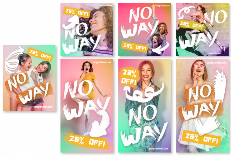
8. YouTube Thumbnail Project: Welcome to Adobe Photo Shop. We're gonna be doing for our first project, a YouTube thumbnail. So as you know, we talked about a little bit about this in the theory sections, but YouTube dubbed nails. And to be simple, not very complex, but a very, very attention grabbing. This is when we use really high contrast colors. We use people shots. We use different things to really help grab people's attention on that very, very tiny thumbnail. And anyone who's on YouTube or works for somebody on YouTube or wants to have a client where they work for and do you tube thumbnails as part of your job? You'll realize just how important it is to do these attention grabbing thumbnails and do him in a way that makes a compelling graphic. So we're gonna do this example right here. We have a few YouTube thumbnails were gonna do in this section. We're gonna walk work on this 1st 1 first, and it requires just three images. I grabbed all of my images from pecs als dot com. There's also unspool ash and a couple of other ones picks obey, but I'm gonna be using these images and feel free, since this is more starting to get into intermediate level to use your own photos in a similar manner, but putting your own spin on it so you don't have to use these photos. But if you want a link to them, they're in the resource guide. We're only gonna use to images for this 1st 1 It's mostly going to be a focus on the typography. Which is kind of a big headline is giving away $10,000 in 24 hours. A very short headline notice. We're not putting the entire title of the video, and there were just really selecting what's gonna grab people's attention. This will give us a chance to really make the typography high impact and larger and really pair well together with the main photo. So here's gonna be our main photo. This is our YouTube guy. Who's of course, I made up fictitious YouTuber. So I got this on pixels, but we're gonna use him as our fictitious YouTube guys gonna be giving away being very generous and giving away $10,000. So first we need to kind of isolate and this is an intermediate class, so I'm gonna kind of go over more intermediate level stuff. So we need to isolate this character. So are we need to isolate this person. So there's a couple tricks. I am using Photoshopped 2020 when I'm filming right now. So there's a couple of cheats that we can dio We could just go to select a subject that is the quickest way I always go to that. This came out in 2019 versions, so if you have a 2018 or prior, you're not gonna be able to have that. But look how beautifully that cut that out that saves so much time. Another reason went upgrading your software's not a bad idea. When you start to do intermediate level projects and paid client work, it pays for itself. So we have this man isolated. What I can do is there's a couple things I could just do a copy and paste, and I have this man right here. We could bring him in into the other area, or we can do a glaring mask. So it's gonna playa layering master right down here, and that does a little bit better job. What I love about layering Mass is I can go in and I can release the layering mask so I could right click and disabled my layering mask, and I'll be able to get my original photo back. So I like being able to do this. It's called nondestructive editing for those who already know or for those who don't know. So I can right click, and I can enable the layer mask again to get my crop, and they're gonna be cropping a lot of things using layering mask instead of just copying and pasting, because I feel like I never want to go back to something When I used layering mass. I can always go back to the original photo, and that's what's so great about it. Really, Saves are your time when you do other steps, that's one way to cut him out. Of course, if you didn't have the new version, you'll probably end up doing for this one. The background is simple enough where I could just do the magic wand, tool and select or even better, I can get the quick selection tool and increase the size of my brush for quick selection tool and just do that and then I have to go back and hand. Select that or use the pick tool. Lots of different ways to catapult objects were definitely be practicing all those later in the course, so let's keep it simple. Let's keep this quick. Well, let's go ahead and right click in an able or layered mass that we made. And let's bring him in to our template so you can access this template. It's a downloadable resource is a part of this class. Each project will have some sort of template that you could open and use, so things are already size the way you need Teoh and you can start designing. But to do this I just did a 12 80 by 7 20 pixel document, and I went ahead and created it in 300 dp. I resolution because I feel like when I do digital images, especially on YouTube and Facebook with social media, it's better to design and that higher resolution format. Then it is a lower one because you never know when you might need to use the graphics or something slightly bigger, and they always downsize the file size for you if they need to. So not a big deal with file size here because they do all that for you automatically with the server. So I like to keep things in the higher resolution than some. That's why I'm doing a nice 300 resolution. A red border. This is just have a border on almost all projects. Just so I don't keep things close to the edge. This is not mandatory by YouTube, but this is mandatory by me because I like to keep things nice and clean on the borders. No type or text on the red border. But you can have photos bleed out to it. Just don't include important eyes or elements. You don't want to put that so close to the edge. It feels anxious. That's just a helpful design practice to keep things within the margin. Okay, so here's our template. I'm gonna go ahead and get our layers panel out here. You can have your windows arranging anyway. Don't have to copy my window system, but just do the ones I just use in my own personal workflow. And at the intermediate level, you're starting to figure out what kind of dashboard do I want, what windows do I wanna have open so you you could start to personalize your own dashboard . So here's the three layers we have. We have a text layer. Would you go and toggle that off? We don't really need that for right now. And we have our margin, which were to keep on for just a little longer. And we have these guides which I have my rulers on. So if you don't have your rulers on and we're gonna really need our rulers here on, we do Social Media Post just go up to view and then have have your extra showing If you want the guides to be on and your rulers, if you want the rulers to be on, of course, you can click and drag from your rulers to create your own guide. Just click over here and drag to be able to create those. So let's bring in our man here looking drag before I reduce him in size. I'm gonna do something a little special. I Right now he is not a smart layer, and I'd like to make him a smart layer because when I if he's not a smart layer and I reduce him in size, and then I make them bigger again. I decided to make a bigger again for some other reason. It'll pixel ate, but if I make it a smart layer, it'll keep that original resolution of the photo intact at all times. So when you're working with photos, if you can keep it in smart layers as long as you can, sometimes you have to. Rass tries to edit a photo in depth. But if you could go ahead and right click and make it a smart layer over here on the right side of this layer into the right, click and get a goat and convert to smart object. So now this is gonna become a smart objects that can tell by that little, uh, icon right there. We're gonna do this to almost all photos until we need to Rast arise them to edit them. So right now I can reduce the size of him. I could make him really tiny and what's great. If he wasn't a smart object and I made them bigger, it would blur. But now he's keeping the resolution even when I make him larger or smaller, so that's just so helpful in terms of workflow and having a nondestructive editing atmosphere. So let's position him in the proper manner. We don't want to have them so big that he's just like, Wow, he's out there, man. It's nice to have some neck and some shoulders, but we also don't want to zoom out. We start to lose that emotional impact. So when you zoom out like this, you're really starting. You're not connecting with his face and his eyes as much, and he already has sunglasses on, which is a little bit of an emotional barrier. So you want to kind of zoom in a little bit more than this, so you can. I want to have this nice halfway point where he is. You're zooming in your connecting with this face, but it's not overwhelming either, and you have a lot of room for text. Go ahead and crop time here. From now, we can always arranged later, so let's go ahead and apply a nice high contrast background. So we're gonna do a nice, dark rich color. It's gonna do our swatches. Let's see if we can't do a purplish blue color. We just gotta go into my swatches and get my paint bucket tool Just making a new layer and just gonna go ahead of pop in a new layer and bring him down. So this is where I'm gonna toggle off margins just so I can clear up everything for me. I'm also going to toggle off my extras, which will be my guides don't need. There's also a keyboard shortcut for that too. I just need a clear picture for right now. Let's go and add in our type. So what is a nice complimentary color to blue? What has the highest contrast color you can think of to blue? If you look at the color wheel yellow, that's gonna pop out as much as possible. So that's what exactly what we're gonna uses this blue and yellow combination for the most high contrast high impact colors. So you don't want to use this for everything and design. But for YouTube, it is all about attention. It's all about grabbing your attention, so we're gonna use it here. So let's select a nice yellow color which wouldn't go into our swatches and yellows. All sorts of things we can do here. Let's get our typography. I'm just gonna go ahead and load it in and I am using. Right now it's a type or it's a font called fieldwork, and it is in the dhobi font. So if you have the adobe subscription, you have access to the spot for free. Feel free to use another free, open source type face that you get from Google fonts. Google Fonts has one called railway, which is very close. So if you don't have the adobe subscription, feel free to go to Google fonts and use railway or another simple sand Sarah typeface. So I'm gonna go ahead and load these in. This is gonna be simple. Copy and paste. I'm gonna put each line on its own type player.
9. YouTube Thumbnail Project - 2: So I'm gonna go ahead and break this up a little bit more. I want to have it be a stacked typography. So what I might even do is just kind of cut this away, create a new text layer. And there's have this as a separate words that this is where we need to really think about How do we work with our typefaces? How do we kind of arrange them in different ways? So giving away, Let's see if we can't put that on stacked when I might do Is the lower case look soft? And I like that. But we really want to have this high impact emotional. I'm giving away $10,000 in 24 hours. So let's do an upper case. All uppercase are all capital letters. I'm gonna go down here to my character panel and just go ahead and do it all cap and I had to go ahead and do that for these two. So Well, at least we're starting to make some headway in terms of how we want arrange it. So let's do giving away. We want to make sure things are tight as one headline, but we don't want it to be too tight because that's overwhelming. But when I have it tight enough where it feels like it's one headliner phrase and so with the in 24 hours, we could make this all uppercase is well, but then it starts toe run into each other and be a feel like a much longer headline. So I'm actually going to make the decision to make that keep that lower case and a little bit smaller and maybe do kind of a different alignment. So just kind of blocking out or typography just like we do with a lot of other projects. And so this is where we go, OK, we need to break this headline up because there's four lines and it's all screaming at me. It's all a little bit too anxious. I mean, it's almost too high contrast, So one thing we can do is we can use contrast with their color and type. So one thing I might do is go ahead and make this white who just making that type white and then the $10,000 really stands out. So you notice how that headline automatically reads a little bit better. It breaks it in half. So giving away pause $10,000 in 24 hours. Just because we change the color, it really helps to make it a little bit less overwhelming. But also it helps it read better because it's broken up. So using contrast with size weight, this is kind of one of those factors in action. It's one thing that's really popular to do is to layer type and photos. So one thing we can do is bring all of this type. Make sure it's below Are layer kind of see if we can't find an opportunity to have a letter or to go behind them just to add the layered look a little bit? It doesn't have to be all the letters because that would make it hard to read. But maybe the G G is a very strong letter, and most of the impact or the readability of the G is on the right side of the G. So I think we can afford to have a little bit covered and then we can just kind of alive this as such. And one thing I like to do is have some alignment. So if I don't have a lineman on the left. I wanna have it on the right so we can go ahead and make that a little bit bigger so that right side these letters are aligned. And then we could even do the 10,000 that way to Aiken Select all three of these just going to do a right alignment. Just make sure everything is the line to the right, and this is when we need to pop in our margins and go OK. Are we going over the margins? You can a little bit. It's OK. It's not. It's not a rule. It's just to help Helpful guide. So you can keep it like this, or I'm gonna see if I can't pull these things away from the margin slightly so it stays in and then you talk. We can also use grids to lose grids a lot in this course later on. So we're getting the basic layout. We need to have some kind of background because right now it's a solid color. It stands out, it doesn't job, but what can we do to make this even more of an intriguing photo? There's a lot of things we can do. So we're giving away money on what entices people about money seeing it right? But let's not make it be totally overwhelming. Let's make a nice background element with dollar bills. So I have this banknote and we're gonna use this photo right here, and I'm gonna bring it into the background. It's gonna paste it in and I'm gonna right click, and I'm gonna make sure I create a smart object. So when I reducing in size and bring it back bigger, it will not get blurry or have the resolution reduced the only issue and this is just a practical issue when you make something a smart object is, it does retain that resolution, which is what you want, but it makes the file size super huge. So if you don't have a new computer, sometimes having 10 smart objects that are photos can really slow down your computer. That's the only downside is it does increase your file size of your Photoshopped document. So let's frame this. Go ahead and bring her layer all the way back. I was trying to frame this. We want to have the one be visible so people could tell That's a dollar and we need to screen this back so we could just reduce the opacity and, you know, that's okay. Let's try to do a blending mode and we're gonna use blending loads. Also a lot. This course, let's try to find one that blends it that also keeps that rich blue to it. So we're just gonna go through these and find what we think would be the best. That's that overlay has a nice modern gun, almost gives it a purplish kind of tone, which is very modern, just kind of cycling through these to find one. We're going to stick with overlay for the blending mode for this, and I want to kind of tweak the background a little bit right now. Um, I just want to kind of add a little more purple to it. It was kind of adding a little more purplish to that. So what we can do is right now we have the background interfering with the type. We can add a drop shadow or we can keep it clean and just slowly kind of reduced the transparency, that background and just the areas where it overlaps the type. So Let's do that using wearing masks. So I have art Dollar selected it. I'm gonna add a layering mask to do this a lot in the class. So on the layering mask, I'm going to paint with the paintbrush. And with most layering mass when I erase or add to the layering mask, I like to paint with a soft round brush. Ah, hard round. It's just a little unrealistic software and gives that nice feathered look. So I'm using a soft round brush usually like to use a nice big brush to have more of a realistic fading. And we're gonna paint is if you don't know this yet. If you have a layering mascot, have the layering mass elected, not the main layer. So the layering mask When you use black, you can paint away an object. So I'm gonna paint away this wherever I paint black on the layering mask and you can see the layering Maskell right here where I paint at the black, and I can gain it back by switching it toe white and painting back so you could gain it back by white and then erasing it is our eliminating. It is the black. So we're gonna do that here with the black where you're gonna reduce the transparency of our soft brush and just kind of subtly get rid of some of that background so it doesn't compete with the type. We don't want to do that. The last thing we want to do, we could even faded a little bit here toward the bottom. So you really, really focus on the type Mrs More of a background element. So one thing we can do here is we can add a pop of color. So right now, we just have a solid color background. But what's really popular now is having that solid color background but adding a rich blending mode or color on top of it. So we're gonna add a new layer, and this is gonna be a layer on top of everything. So we're gonna add a new layer, and we're gonna keep get that same soft round brush. We're gonna make it quite big. So let's make it pretty big. Try 1000 or so. That's probably good. And here's what we're going to do. We're gonna paint on a little bit of warmth right now. We have a lot of cool going on. We have a lot of purples and blues. What if we do this Almost sunset, kind of. I've on the upper left hand side, so I have our new blank layer selected, and I'm just gonna call this highlight and I am just gonna click. I could go ahead and select a nice warm sunset color. He could do orange. You do kind of a pinkish color and let's go ahead and just click once. And right now it's really strong, and that's okay, cause that's what blending modes or four. We're gonna do the overlay or the lighten 11 of those to see what looks better. There's overlay but almost makes the skin look a little to read. So let's try the lighten So the lightning's gonna have this nice, almost an instagram filter tape effect to this, And this is exactly how Instagram filters are created is by using blending modes and colors on top of things. Click again once, but we don't wanna overdo it. We just want to add a little pop of warmth over there. We could also do it to his sunglasses, So if we want to kind of reduce this a little bit. We could not add a little bit of sunset color to sunglasses. Warm those up a little bit. Of course, if I had this on a separate layer, Aiken just toggle that off in a one and reduce the opacity. If I think it's too strong, lots of things we could do so that is before looks great. But this adds a little richness to it. And we're gonna do this a lot when it comes to photography and bringing out sunsets, mawr and doing some things like that later on, we can't add a little bit of a drop shadow. It's not gonna kill us. I'm not a big fan of strong drop shadows. I like very light drop shadows. So let's say I want to add drop shadows to all of the So the quickest way to do that from workflow perspective. Let's go ahead and add it, how I like it on the 1st 1 So I'm just in my layer style panel, and I'm just gonna kind of had a really nice look. How little are moving the handles on those Just a really nice small drop shadow. I'm gonna say this as a style. So I'm gonna say this over here. New style. Look out here and I'm gonna say this. It has dropped shadow YouTube and I'm gonna include layer affects. Don't have to clue blending options because I'm not using it. Look OK now to be able to access that, I could go over to my style's panel right here of my style's panel, and you scroll down to wear mine will be loaded, and I can select all of these and apply the same drop shadow. So it's just kind of a time saver. If I want to add a drop shadow to everything, and I don't feel like going to each layer and adding the same drop shadow. You can use character styles to easily speed up that workflow. And that's exactly what this class is about is improving and speeding up your workflow and finding ways to do things faster and better.
10. YouTube Thumbnail Project - 3: So let's add some finishing touches. We can add a little drop shadow to make sure that his head kind of cast a little shadow on the G, used to add a little bit of that layered effect. Just doing a simple drop shadow and let's bring out the distance and I'm gonna unclip you school little light because I don't want my other drop shot is affected. So I'm just I'm clicking that and finding the right angle of where it's cast right about there would be perfect. Very spiral drop shadow. Not a lot of capacity. Just enough to give it a little bit of that layered look. Little richness. And lastly, there's a couple things we need to do. First of all, we need to do a visibility test, so visible ability tests zooming out quite a bit. So let's do 50% and this is kind of a realistic way to frame your stuff because you want to do visibility tests. You can kind of get a realistic picture of how the viewer is going to see your digital document. So right now this is probably a realistic saw thumbnail size that you'll see on a desktop screen and we could zoom out even Mawr to do a visit. Ability test. So can I read it? Yes, the the type is very clear. I could see the man's eyeglasses. I could make out the dollar signs and you could do one more step and go to 25% and go. Can I still read it? If the thumbnail was smaller, can I still read it? Yes, I can. It checks all the boxes so it passes all my tests, So I'm ready to get a little bit more serious about getting ready to export it. It's been about 20 minutes, and that's about the time you want to be able to do a YouTube thumbnail in its take any more than 20 minutes. You gotta find ways to speed up your process of getting things together because we want to be fast, efficient and do good work. So that's what intermediate to advanced designer needs to start doing is moving fast and getting ideas popping out so that you can charge, you know, for your hour of work for a thumbnail and not overcharge and take five hours to do what should be done very quickly for video. So right now we have this rich, colorful background. We have this rich, high contrast yellow white type going on. One thing we can do is as a lot of you two people do. This is they'll they'll make their photo or the main photo grayscale so that the typography has a chance to really come out. We're gonna try that. Here we have our layer here. We're going to go up and see if we can't make this black and white. So I'm just gonna go down and you'll notice when you have a smart layer on or a smart object on a photo. It's great for sizing it. But when you need to do edits, it does make it a little bit difficult is when I go its image. I can still make it gray skill by going to black and white. But I lose a little bit of my de saturating a couple of different options. If you want to have those options, you're gonna have to rast arise it to get a right click and you're gonna have to rast arise the layer. That doesn't mean you can't You don't have the ability to scale it up and down like you did before. I mean, you still can, but it starts to lose its quality and its its everything. But that's just kind of I think I could still make it black and white without having to do anything. I could just be saturated a couple different ways. I'm gonna go to the black and white option and just do it there. So you noticed that kind of tone down him and brought up the 10,000 the yellow in the 10,000 so you can have it full color. You could have a black and white. I'm gonna click on this man, and I'm gonna sharpen him just a little bit. So I'm just going down and going to sharpen and just get a sharp in him one notch just to kind of crisp up that image a little bit more. So I think there is one thing we could do to make this even better. So if you have another type of photo, sometimes you're stuck the client or you. If you're doing your own YouTube thumbnails, you're stuck with a particular photo. You only have a some set of photos but as designers were always pushing ourselves to make better and better stuff. So what could make this even Morvan high, High impact, YouTube thumbnail? Well, we all connect with people's faces of faces, air, great to have on their smiling faces. A really good emotional faces like angry faces are really good. Neutral faces or not. But what if we had an even more exaggerated facial expression like yes, like an excitement just like this guy, This guy right here, Look at that face. If we put him on a YouTube thumbnail, it would really grab people quite a bit. Of course, you're limited. Sometimes if you have to use the YouTube channel owner, whoever did the video, but just kind of showing you kind of that emotional psychology behind what photos to choose and what convert better and what. It's more effective and digital design. So let's isolate this guy. Let's see how it can do that. Let's see if we can't do our handy dandy select subject. Let's see what it does. I love this tool. One of the biggest reasons why you should upgrade to 2019 if you can afford it. Some people can't That's okay. We're gonna do the same thing. We are going to just do a layer mask and get him. We could probably crop him a little bit. I'm not gonna need all that sky are. We was getting our crop tool in cropping him and let's go ahead and bring him in. So this is gonna be a second version. We're gonna have two different versions. Let's have two different versions, So I'm gonna go to our art board, Could be right up here. I'm just gonna click on the move tool. And I got my art board tool and I'm gonna be adding an art board, so it's gonna go ahead and click and go ahead and click on the addition. It's gonna add a new art board and I'm gonna copy and paste what we had before, So I want to have two different versions to export. So I could do was called a be split testing. So I can try one image out one thumbnail to see how the video converts, and that I could try the other one out. That's called a be split testing your basically saying which one works the best everything an art board one we could copy over to art board to So I just selected are poor one. And I just copied gonna goto art board, too. And I'm just going to paste, so it looks like it already added an art board for us. So that's one step. Now I know that we don't have to do so. That's nice. So went ahead and copied the art board as well. So now it can work on both of these. So I still have our man jumping Bring him over and let's eliminate our man and our highlight, because we'll just have to see about that later. And let's see if we can't just paste this guy in. And of course we want to, right? Click over here in the layer and make that a smart object convert to smart objects, and now we can move him around, scale him around without issue. So where is going to be? We may need to zoom in for this one. Where is going to be the best way to lay him out with type? So what we want to do and this is just kind of common design psychology is we wanna have eyeballs facing type because as humans, we look at people's eyeballs and we're interested in what they're looking at. So if you face the eyeballs toward the type, it helps connect with the type. So we're gonna move him so his eyeballs are facing can always reflect him if we had to. But let's try a different type arrangement. So I'm gonna select all of my type, move it over and see if I can't find a better arrangement. So I'm gonna have to make him a lot smaller. So here's kind of the new cropping an arrangement. We have the full length of the arm. If we were to crop the arm off, he kind of looks more angry than he does excited. So you have to think about how you get a crop. What do you get include in the photo to add that emotional impact? So let's rearrange the type a little bit so he can probably punch through the end and the G and we could move it here to make sure giving is still readable. So the right of the end and the left of the G, those air still readable letters and let's just do a different arrangement in alignment, and we might need to make things a little bit smaller and that's okay. I'd like to have that last zero cover just a little bit, but not so much just a tiny bit to make it look, layer. But we really want to make sure that $10,000 is nice and clear, and in 24 hours we can toggle on our margins to make sure we are doing a good job with that . And we are. Let's add a little drop shadow to this guy as well, because we want to make sure he is casting. See how that shadow is casting on the G, just like that's just really settled. But it makes it feel more alive. Feels like it's really connecting to the peace we could even do. If we want to be really fancy, we can instead draw your own shadow so we're gonna create a new was called The Shadow, and we can draw our own shadows. So let's do kind of a dark color, just a black or neutral color. Get a small soft round brush and we can paint on our shadow here for the man. We could do this a little bit more realistically than the layer styles can, because we can paint it how we like and then reduce the capacity a little bit. So you know, whatever control you want to have over your drop shadows. You can always go back in, trim your shadows at any time, and we could sit there and brighten up that photo and sharpening. But I think we're at a stopping point here, so we have two different versions. Which one do you think converts better? The one on the left are the one on the right, and so the right grabs my attention more because there's more of an emotional response from the man. But the one on the left is is nice, too, if you're trying to build up a personal brand on YouTube because you have this nice, clear zoomed in face Inter getting to know the YouTube creator by having some facial recognition repeated in this thumbnails. So then we're starting to get into marketing in the business side of things, but it's great. Is a designer to be aware of this, especially here in intermediate, wanting to be an advanced lever level designer thinking about psychology of design, thinking about what converts better and thinking about how this is gonna really be used by businesses, clients and yourself is a really important step to make you not just a beginner but an excellent design.
11. YouTube Thumbnail Project - Double Exposure : Let's keep going. We're gonna do this a little bit quicker this time. We're going to do another YouTube thumbnail. This is the double exposure effect. So let's say we want to do a You were working for somebody or us personally wants to post YouTube videos about doing ah tutorial and photo shop. So this is for a tutorial video about doing double exposure effect. We're even gonna do that, affect ourselves to create thumbnail thought that'd be kind of fun and need to do so Opening up a fresh new template here and we're gonna use to photos for this. We're gonna use our girl, and we're gonna use our hot air balloon, and we're gonna overlay those and use blending modes to create that double exposure effect . So let's go ahead and bring in our photos and we're to right click. And we're going to do what we've done in the past thumbnail. And we're gonna make sure it's a smart object. Make sure it's a smart object. It's right clicked. Smart object. I'm gonna bring it in. So now we have maximum control over the resolution. It's not gonna blur such an essential step that I used to not do and incorporated that into my workflow not long ago. And it's been such a lifesaver when I need to make the photo bigger after I made it smaller . So right now I'm just framing the photo, you know, just kind of seeing where I'd like to have it be. So the smart object I don't have to worry about, I could always make it bigger, smaller later. Same thing with this. What's unlock it, right? Click convert to smart object and let's I'm just copying and pasting it in, and we can go ahead and press enter and bring her hand, and I want to really zoom in on her a lot. I want the sky to be ableto reach as far as it can, but it may not be able to reach all the way. Get the size I like. That's okay because we have a couple of really cool, content aware tools that's gonna be able to fill and extend this photo over a little bit for us. So I might even do that just so we can practice some of this content aware tools a little bit. So just framing this and the guides are really helping me frame this too. And I'm thinking about kind of her head and how it's divided and just trying to think of where the type will go is well, we're gonna be having a three word phrase and we're also gonna be having a photo shop icon . So have to think about the type. What I'm composing, this is the type is the most important part of the thumbnail. As much as the image grabs us, the type is what sells the video. So let's start to overlay these a little bit. I gonna bring our hot air balloon on top, and this is how double exposure effect works. It's all about blending modes. So I'm going to be going up to my blending mode panel over here for the hot air balloon, and I'm going to cycle through these and already have the one in mind that I've got to use . We're gonna end up on screen, so you notice how screen gives that really cool kind of vibe to it. And I want to bring this end even further. So let's kind of arrange this how we like it. We're seeing the hot air balloon and the girl. Let's also select both of these layers and let's bring it in a little bit more on a tighter shot. I want to have a little bit more of an emotional connection with the girl, so just trying to see where I can arrange is to make it slightly bigger. And so now what we want to do is we don't need all this excess white. We want to see a little bit more of the sky background. So I'm selecting our hot air balloon and we're gonna do a layering mask having Larry Mask and I'm gonna paint on Wanna remove? So we want a paint on with a soft round brush. Smith, Nice and big, Nice and big. Maybe 300. We're gonna paint on with blacks that's gonna remove anything to be a little bit bigger. Maybe 400. We're just gonna slowly eliminate. Make sure my capacities are 100% and we're just kind of bringing out more of the sky in certain areas just like that. And if we mess up and we overdo it, it's not a big deal. Cause weaken switchback toe white and go in and bring it back. So it's a combination of flipping between white and black and going back and forth. And this is exactly why we're using smart objects. Because now I want to reduce. I really want to show more of the balloon and the girl when I have the top of the blue being shown. So now we have That's no big deal cause we couldn't scale this down without an issue. So I'm just gonna kind of crop this a little bit differently. And sometimes photos don't stretch nicely all the way like this wouldn't does. This has a nice big background to work with. Sometimes not gonna cut this a little bit for you. Cutting this background image. We're going to pretend that this image did not stretch all the way, and we need to somehow stretch it across. What I used to do is duplicate the background and reflected and bump it up there to kind of get a kind of seamless look. But that's not always practical. Now that we have content aware tools, it makes it a lot easier service. Gonna draw a box here, have my background selected, gonna do some content aware fill. I'm going up to edit, Gonna go to content aware fill. So edit, content aware fill. It's gonna ask us where we want a sample this to basically replicates. Gonna duplicate sample with what's in green. It's gonna duplicate it in the white fourth weekend, erase certain parts if we don't want a certain cloud to get in the way or we don't want the cloud to be sampled. We can always brush that away. Click on OK, and it's gonna automatically populate with what it thinks. It's good to sample some of that area and create this guy just like that. As you could see, content aware and content, Phil tools are not perfect. Could see this little kind of distorted look, and we can easily patch that up a couple ways. I have our object selected. When you do, the clone tools have the clone tool that can sample and clone. Or I could do the spot healing brush tool and painted on. The problem with that at having smart layers is when you have smart layers on, it doesn't allow you to do this. It doesn't allow you to edit the layer directly cause it's still a smart object, so you'll have to right click and you will have to rast arise the layer. So I already did that, so I rast arise the layer. Now it's just any old photo that we can edit and do. So that's one limitation to smart layers when you start to get into the editing phase so we could do the clone tool in this clique of sample and clone it out, been included out. Or you could do this spot healing brush tool, which is right up here. Spot healing brush tool. And you can do it that way, too. But I usually find more control with the clone tool with things like that. So it's cloned the top of the thing and just click on that and doesn't look like we did anything, does it? We'll zoom out. It's time to add typography. I feel pretty good about the background image, so we have that, um, top balloon layer. He's on screen, just kind of review, and we did the double exposure effect. So I went ahead and preloaded some sample text all these air on different lines so that we can have maximum control over how we arrange the type. So let's try to figure out where would what would be a good size for the type. Let's make everything a slightly bigger. We also want to make room for a photo shop icon. Somewhere down there, let's arrange instead of trying to do the layer look and get all crazy. This is really the focal point of the photo. We want to keep the type and the photo close, but we don't want to have it all interfere. Let's have a nice clean look with this. Let's have a more traditional look with this is. Well, the last one was this very bold, thick san serif typeface. Let's go for a more elegant Sarah of typeface, and I have one kind of in mind that I want to try out. So I got a double click on this and see if I can't get a Brill fat face. I could just type it in a B are there it is. This is another adobe type face, but there's also several alternatives on Google fonts. If you don't have access to the subscription Ah, the adobe fonts, which you get for free with any adobe creative cloud subscription where she can use character styles to quickly style these. But since there's only three, I'm just gonna manually do all three. So how will we get a fine? But we want to fit these together like a puzzle piece. So let's find a nice arrangement. So you have these double efs going on here, So I wonder if we could tuck that into this little open area. So you noticed I'm not doing it too tight, and I'm not having these big gaps. So if I were to have I see a lot of students do this, we'll have big gaps, but it doesn't feel very connected as a unified phrase. So we want to make sure we closed the gap a little bit. Just finding ways to align things and tuck things in and see if that works would have some spacing, but not so much that it doesn't seem like one unit. So let's bring this whole unit over and find a nice arrangement. And we can even bring this since this doesn't have anything that goes beyond the baseline. So that's your baseline. Anything that dips below. So this is your baseline. You have the P that dips below. But you don't have that in these in the double, so we can feel free to move that in any position we like. We could do kind of, ah, stacked arrangement like that. And go ahead, do our visibility Tests amount to 50%. Can I read it? You know, do I need to cut on nudge things up just a little bit? I'm using my arrow keys to slightly nudge things left and right. I just find it to be easier to use my arrow keys for just doing very small movements and notice. We're not using the grid yet. That's okay. We're gonna use the great a lot. But when it comes to these type of thumbnails, you know the grid is great to use, but it takes a lot of time and you got to really formulate that. So sometimes it's nice toe eyeball specific designs, and some the grid will really come in handy. Let's add a slight drop. Shadow here is adding that slight drop shadow to add a little bit of depth. And now we need one more element to make this complete. And we're done with our thumbnail. So we need a little photo shop icon. So let's get ours. Quebec to view. Let's make sure extras you're showing its dragger. Make sure margin layers on the top. So just get an idea. Is anything outside of it? Can we kind of tweak everything? And we can also be able to find a nice placement for our photo shop icon. So I'm gonna bring in a PNG I found on Google just the kind of your standard creative Commons PNG photo shop icon. And sometimes you might find it with a white background. But your intermediate designer, he could punch out that white background and find this icon. No problem finding these icons. They're everywhere, so I'm just gonna toggle him on. We're gonna find the right placement or margins are really gonna help us guide the placement for our icon. So now we can talk. ALOF margins. Okay, so that's a nice placement. Margins kind of helped us figure that out. I'd love to do a really dramatic drop shadow with the icon. Let's go ahead and do drop shadow and kind of see what we can do here. I am going to do a very wide distance. So it looks like it's cast far onto the background, and I'm gonna do a little bit of a blur here with size. And once again, my capacity is not super strong because that doesn't look very good. But when you reduce it, it kind of gives it a more realistic look click on. OK, so we have that nice look of kind of a far casted faded shadow for the icon, and we are essentially done with this one much quicker than the 1st 1 So we were able to do that very quickly. So let's do one more visibility tests before we export. There it is. Let's go ahead and practice exporting and we can move on to the next project was gonna go file export. Are you going to do an export? As And so this is a new way since 2019 and I believe 2000 2020 version of photo shop also has. I mean, I'm using 2020 but I believe it also did this for the 2019 version. If you don't see these export files settings the same way, you still have the same options. It's just arranged or looks a little bit different. You get a nice preview this time where older versions of Photoshopped did not give you a really nice preview. So this is nice. We can preview, make sure we don't have anything on the sides going off and we can go ahead and check on the size is Everything looks really good and we want to do a J. Peck. So we're gonna go up here to file settings. We want to do a J peg and make sure the quality is 100% because YouTube will always downsize of force if they need to. What's gonna go to export? And while this is of course, everything we do in this class is gonna be an RGB mode. Eso all the templates that I supply and all the new documents will create are all gonna be an RGB mode. So we just to make sure it's rgb look on export and there are you. Tube thumbnails that were created within about 45 minutes were able to whip up a couple of different versions of these thumbnails. So hopefully you'll get fast and quick enough to be able to whip together something that looks this finished in about 20 minutes. That's how long you want to shoot for to do a really high quality YouTube thumbnail with images that are already supplied. Do you want to be ableto create that quickly and efficiently so you can charge your money and make a much money as possible or create as much content as possible, but also keep the quality high. So we got to kind of study YouTube thumbnails a little bit. So next we're going to put together an entire social media and digital marketing campaign. So this is going to include Instagram Facebook. We're also going to be doing display ads as well, so we're gonna have this unified campaign. This is based on real client projects that I did. I had a client for over 10 years, and I did all of their social media and digital marketing items, and this is exactly the type of stuff we would do. It's based on a real client work that I've done in the last 10 years, so we're gonna be hopping into that next
12. Social Media Campaign Project : you. Now we're gonna conquer an entire social media campaign and also some digital display ads as well. And this is very common work for a graphic designer to do. And that's why I really wanted to have a special focus on this type of project and do all the different sizes are the most popular sizes involved. So I have this company fictitious company called Travel Loop that I created, and I have kind of this little bit of a brand board, or I guess, at least some brand assets, like a logo on a tagline and a couple of different colors watches. I wanted to provide this for you. So you didn't have to sit there and come up with your own company. Already have one out of the box to use for our campaign. So they are a travel agency, and they like to book exotic locations, so they kind of have a special, high end exotic, um, kind of feeling to the type of travel packages that they offer. So that's exactly what our campaign is gonna be about. It's a little bit of brand awareness, and there's gonna be a little bit of a temporary discount and some of the advertisements. But we're gonna do kind of a generic Facebook campaign and also some of the things that they're gonna need for their brisk business profile and social media profiles. So you can download this as a resource downloadable resource is in this class. It's called Travel Loop logo file dot ai. It's a illustrator file, and I wanted to talk a little bit about libraries. So here's your library panel. So if you have an Adobe creative Cloud subscription, you can upload certain files to the cloud, which is your libraries. You could access this in your window and go down toe libraries, and you could drag certain elements in. And then when you're popping to photo shop, you can bring that element out. Some is gonna show you how to use this. Not everyone will have access to the Adobe subscription, but for those who do, it's a TSA Nice speeds up your work flow when you're trying to get files from illustrator to photo shop, and vice versa. So let's say I want to get some of these logo saved. I can drag this over to my library, and it's gonna save it as a graphic, and I can also do the color swatches as well. So if I wanted to add these two swatches to my library and recall it out when I'm in photo shop, except to go down here to my in my libraries window and click on the addition sign and we're gonna add the fill color, select this and notice how the fill color changed over here and added, This is a nice way to add swatches. Be ableto pull up in design any other Adobe program, and you'll be able to have the same color swatches throughout. It really helps out when you're doing big branded campaigns and marketing campaigns that span multiple adobe programs. But if you don't have that, that's okay. We can still do some other ways of getting stuff in there. I'm gonna go ahead and save this logo. It's gonna be dragging a few these assets over because I may need a different a couple of different arrangements. Right now we have one. This is why you do this. I do logos and full color, but I also have a all white version that could work on a dark background and you'll see when we do our social media campaigns. How we have. We could have a lot of different background types toe work with a lot of different sizes. So it's nice to have a logo that's very flexible, simple. It can adapt to any color background. So that's why when I do teach logo design, that's why simplicity matters. You're gonna really find out here when we're gonna make some. Really, Tiny adds. We're also gonna make some bigger adds to. So what's going Drag a few these assets over? Well, so let's say I didn't have access to Theodore Be creative cloud. So I didn't have access to this library system because all this is stored on the Adobe Cloud. I can always distract over my logos, So I got to drag this into Adobe Photo Shop, and it's gonna go ahead. If it comes from illustrated a photo shop. It's gonna be a vector smart object, which is really great, because it's gonna be able to scale larger and scale smaller without any losing of the resolution. So that's a really, really good to keep that as a vector smart object, cause we're gonna be applying us to a ton of different sizes. So this is the template that you can download. Like with all the projects in this class, you can download a template. It's already sized for you and with art boards. So you'll be able to have all the size is here for you. So we're gonna first start out with the easiest thing, which is the Facebook profile pic. So that's the little pick that sits next to the the business page on the business page. So this will be probably the easiest thing to do. We're gonna go back into illustrator. We're gonna kind of see what branded elements we have that could work. Now, this is our logo. So we gotta have a gotta take a logo that is typography heavy and very horizontal and try to adapt it to a square size. So this is the square size we need to adapt that to. How do we do that? There's no way we're gonna be able to fit all of the type onto the profile pic. It's gonna look too small, too horrible. Just like this. We could divide it up, split the logo so it's stacked and make it a little bit bigger and have it stacked That is an option. Or we could take a branded element and bring that out instead as kind of an icon. So that's exactly what we're going to do. We're gonna isolate. It's gonna copy this logo, and we're gonna isolate these little rings, cause that is kind of a unique aspect of this logo and brand. So we're going to really emphasize that this is a little bit about branding as well as design. So I'm gonna bring those little loops over and put them in here, and we can do a nice high contrast background. So we're just going to kind of do a nice with broader colors in from her library. So here's my library panel. This is gonna bring in those color swatches where you can distract him in as a solid box from Illustrator and just take the eyedropper tool. I'm gonna add a new layer and it paid bucket tool. And just like that, we came up with a little Facebook profile pic. That kind of talks kind of explains or kind of really shows off that unique, deep branding detail. We need to really find some amazing photography for this project. And hopefully the client will supply you with some custom photography. But if not, you can always purchase that or you confined free photos to use. So we're gonna do just that for this project. We're gonna go to Peck sal's dot com and we're going to type in. We're just gonna simply try type in travel. We're gonna kind of see what images really feel like They connect with the brand. So this is a high end travel agency. They book exotic locations. We really want a wow them with the type of locations that you only dream of visiting because they feel like they're costly. They feel like they're out of reach. But we want to make it in reach for people. We want people to see these photos and say, I want to be there. That is a really unique location. So we don't want to do anything generic like the plane flying, because I don't think people really connect with that. So we're really looking for that image we can really resonate with. This is kind of a generic travel photo, and I've used this one in the past, but it's It could be anywhere. It's just a train station. It's not this amazing, unique location, so this is kind of a little bit more what I'm talking about. That's a very unique location with the mountain there hiking, they're doing something a little bit out of reach are a little bit out of the ordinary. This would be a good photo to use because it's very personal. You have the person right there. It's a very emotional connection. She's looking right at me. It feels very natural and organic. So that would be another option for specific campaign. Photos like this work really well, but I'm missing the person. I really want to put myself in the traveller shoes when I'm looking at AD. So I really would like to find shots that have a person doing something in the background and not just a beautiful shot and why this one is OK. It's a very unique location, probably most likely in Europe. I kind of don't connect with the person. First of all, she's a little blurry. She's not the focal point of the photo and she has her back turned us so it just feels ah little bit disconnected, so just kind of going through the process of when I select photos kind of what I'm thinking about. Now this one is pretty much exactly what I'm looking for. It has this woman. She does have our back turn to her, but she has is very unique. Pose very unique dress. It kind of makes up for it. We also have this wonderful opportunity to create some vertical ads with this because it's very tall. And I like to find a mix of vertical and horizontal photos because we're gonna have a mix Ah, vertical and horizontal advertisement and social media posts. So it's nice to have variety with the cropping of your photos. And this is very tall and grand and exciting and unique. Exactly what the company, the kind of things are company will be booking for our clients. So that's definitely one I'm gonna be downloading. This is another one we're gonna be using. And the coloring can be changed a little bit. We can do that in Adobe Photo Shop. I really want to bring out more vibrant color in this, But that's OK because we're intermediate designers now and we can add sunset and all sorts of things to really make this pop out a little bit more. But I What I love about this photo is it's got a lot of background to work with. So we could put a headline or a type on top of this and have lots of room t have different design elements. So it's just a really nice photo work with lots of space. So we're gonna be using that one, and you can find all these just by typing and travel on pixels and feel free to use different photos. I have links to the photos, the four main ones that we're gonna be using for this campaign. You could find that in the resource guide all the links, but feel free to use different photos. If you'd like to challenge yourself a little bit more in this project, this is another example of a photo. You would think, Oh, how that really grabs my attention. There's a person in it. They're doing something exotic and exciting, but there's not a whole lot of a back. There's not a background to it. It's this kind of sky and it's water. This person could be in a really nice pool somewhere and we wouldn't know. So it doesn't quite have that attention grabbing look to it. And here's another example of a photo that has the location that's got a person in it, but she has her back turned. She does have this nice, expressive movement with her hands, but I just I'm not resonating or connecting with it. I just feel like she's just kind of posing. She's not authentically engaged with the background or the photo. She's just kind of posing, so we kind of want to avoid those photos where it just looks like they're trying to get a nice photo. You want to get the ones where they're doing something there. They're laughing with friends there. They're actually in the middle of a hike. You know, these kind of action shots are much better than these pose type shots for What were you looking for?
13. Social Media Campaign Project - 2: you have several awesome photos that we've selected from pixels dot com that we can use for our campaign kind of some really wow kind of environments with people in every single one of them. So we can kind of connect and resonate with those people. So the next thing we're gonna do is the Facebook cover photo. So cover photos were gonna be pretty easy unless they have a specific promotion they want to promote. But we're gonna go to do a simple logo and a photo and maybe some little brand elements. We're gonna try to figure out how to extend this brand a little bit. So let's find our photo for our cover photo here. This is gonna be further main business page. I thought we'd stick with this one. For now. It's nice and wide, very horizontal zits gonna give us a lot of space to crop this really Well, that's what I can do is I can drag this photo into photo shop, and when you drag an image in, it's going to automatically become a smart object, which is really good for us because we want to be able to scale this up and down without losing any resolution. So we can just do this, pop it into this particular art board and press center. There's also another way you could bring into photography, and he could do that using containers in containers or right here on your toolbar had to switch my work space to be able to find it. But there it is. There's containers. We can do a little container here stretching across, and then we can drag her photo in that way, and it's gonna automatically populate in the container and was great about that is you don't have to sit there and take this gigantic photo and keep sizing them down. They automatically populate in that particular container. So, just another way, another way to skin a cat. So let's find the right cropping for this is when we probably need to zoom in and really get an idea of how this should be cropped so you're noticing it looks a little pixelated. This is a digital image, and it's a particular size, and you can always check the size of our board by selecting the title coming up to your move tool. You'll be ableto to see the size, So this is only 828 pixels by 315 pixels. That's not a very big size, so you're gonna naturally see ah, little bit of picks, elation. It's not anything bad, but when you're used to working with print design and everything is super crisp, you'll go. Hey, it's blurry. And that's normal when you're working with sizes this small. So it's currently in a container so I can double click any container and be able to shift this around to my liking. We want to really bring people in to the photo, so we want to maybe do a center alignment with Hiss Body. We want to have some nice clear sky to be able to place our logo in. So we're gonna go into illustrator, or you can go into your libraries panel or I'm going to do it the other way and just drag it over from Adobe Illustrator. So we have several different items that we could bring in. We I we could do the all white Let's go ahead and try this out so it's really kind of working with your logo variations and finding out which one will work best so we could do a solid white do a little bit of a drop shadow, but it's not gonna be super strong. So let's see if we can try a full color version and see if it really pops out enough against the sky. And if not, we have photo shop. We can always edit the photo to do what we need it to do. We have a full color logo and the orange gets a little bit lost in the sky, but that's not a big deal. So one thing I want to start to do is think a little bit about grids and guides and snapping and ways. We can easily make sure we find the central point, like we want to make sure this is now centered in the document. So I have these guides on, which could be really helpful. So make sure you have your guides on a moving this around. It's giving me indications of where it's center aligned, and I got that little indication right here. It's kind of snap into place for me, and that's super helpful. To turn that on, go to view and make sure snap is on and make sure your extra Zahran as well, so that will kind of help you with a little bit of alignment instead of having to break out the grid and get all involved with that, it will automatically kind of find that center alignment point. So let's double click on this container and see if we can't get a better cropping here. We could even paint on a lighter, wider color. That's kind of a quicker, easier way to do it. So I'm just getting a soft round brush. But my general brushes do soft round make it nice and big. I was gonna paint a little white on a new layer, so just creating a new layer they're gonna be painting white around the logo. But that looks awful, but that's no big deal, because we can use a blending mode on that layer to kind of soften and blend that in or just reduce the capacity. I just need a little white behind that logo. You can also add a layer styles and do an outer glow. But I feel like I have more control when I kind of add a layer of whiteness, so that kind of helps it pop out, especially in the orange and the orange sky. So this needs something. Let's do a visibility test. Let's zoom out to about 100%. So I like the photo. It spans the distance really well. And there's something you need to be aware of when it comes to mobile viewing this and the mobile version of Facebook and that's the mobile safe area. I'm gonna bring out my layers panel so you can kind of see what I'm referring to. To have this mobile safe here, I'm gonna drag that layer on top of her to be able to see where that is. This is where it collapses on mobile view. So it trims the left and the right sides. So you always have to be aware not to put any text on the left and right sides because it's not gonna be seen on the mobile view. So if you have a lot of text on your business page cover image, you need to keep it there in the center so you can talk all that on and off to kind of give you a guide. So let's add another branded element because we're kind of losing people here. Let's get something on those left and right sides that can spill over to the center and really bring people into the colors and the brand theme. So one thing we can do is we have these circles. A little bit of part of the brand is a circle. Let's take that circular shape and expand that out a little bit and use it as a background element. So what I'm gonna do is I'm gonna take both of these. Let's start out with the blue. I'm just gonna kind of make it a little bit of an element that spills off to the side. Nothing too big just adds a little bit of a pop of something going on there in the document . And we also want to maybe get some of that beautiful background shone through here so we can just reduce the transparency of these layers kind of letting a little bit of it behind war. We can look at her blending modes to see if that has a little bit of a better feeling, but it looks like these were quite harsh. Hard light looks pretty interesting, but it's very harsh. So you might just want to do a reduction of capacity. Justo, let just let that background continue on and be ashamed to stop it and have a solid color. When you have such a beautiful background just like that, we added just a little bit of element. And Poppy could do this with any other design element. So that's just kind of your very first simple Facebook cover photo for this project. Now we're gonna start thinking about marketing and advertisement. This is gonna be a paid Facebook ads and there's some restrictions with paid Facebook ads. First of all, there, right now, uh, during this filming, of course, the size could always change. But right now they're 1200 pixels by 628 so it's very ver it's very horizontal. So once again, we have to look for a photo that's gonna be horizontal friendly, and we need to keep text toe less than 20% of the total ad, so they will reject your ad if you have too much text on it. And remember, a Facebook ad also has a title and body copy that goes with it in the post so you don't have to feel like you need to stuff all the words into the Facebook ad. It's really a visual aid that complements the text that goes with the post. So be thinking about that. Try not to stuff too much text on a Facebook ad. I know it's very tempting, and you need to educate clients if they want you to put a bunch in there that it's not allowed. Toe have more than 20% of the total area. Be text. We're keeping that in mind when we do our first Facebook paid ad.
14. Social Media Campaign Project - 3: first of all, when doing and add a lot of times, the photo is the most important part of the ad, followed by the headline and the next, The call to Action. So a lot of times, when I'm brainstorming how to do a paid ad, I'll start off with a photo I want to use and then build on top of that because it always goes. The photo will help me frame my headline and my type. So let's lead with the photo. You have several options here, and they all have kind of a really unique purpose When I when I found them and I wanted to really use this one, I know this is vertical, and we're gonna use this for an instagram story later on. But I think I can still use this as a great option. So I'm going to drag this photo right into Photoshopped or use a container. Let's find a way to crop this. I'd love it if it could go all the way across the screen. So in terms of cropping, we can have her there, or we can kind of show more of this wonderful sky. So I'm gonna crop this as tight as possible. We can always zoom in on the photo later as we start to develop it. So what's the next important thing with an ad? And I want to make sure I bring my margin. This is our margin. You can toggle this often on just to make sure when we add typography and we add a call to action that nothing extends nothing. That's text extends into the margin. So feel free to toggle that on and off as a help helpful guide. So now the headline. So we already have a head. I have a headline picked out. Um, the client supplied it, or the fictitious client would supply that for you. And the headline is Your exotic adventure awaits that. It was kind of nice to throw in the word exotic, since that's kind of what our brand is built on. So I'm gonna go ahead and add the typography just gonna do text box paste it in. So there we go. Your exotic adventure awaits, and we need to find out a way to get this typography to stand out over top of the photo. There's boxes we can put it behind there's drop shadows we can use, but I want to really not take away from the photo by adding big, blocky boxes or anything to help the stand out. So one thing we can do is make the typography nice and bold. So right now I'm gonna go ahead and double click the typography. And right now it's set on light. This is railway, which is a free font you can download on Google fonts. Let's make this a bold wait go down The bold and the boldest on railway is and it looks like up here and look it somehow it kind of got the fonts a little bit out of order and really black is gonna be even bolder than extra bold. So black is always your thickest type, uh, tight face. Wait, So we're gonna select Black For some reason, it's out of order on my list, but that's OK, because I know that black is the boldest. So let's see how we can stack this weaken. Stack this in a left alignment on the right, and we have kind of this brick wall that can really help the typography stand out. That's one thing we can have a nice call to action on the right. That's an option. But now I want to start to bring in some other design elements. So I kind of know what space I have for the headline. We need to have the logo. So let's bring the logo in. And we already have that from up here and what I really want to do, What is may be required by the client is using the logo with the tagline. We have the tagline here. So that kind of helps bring in that word exotic and tie it into the campaign. So we're going to see what we can do with the full color. The full color may not work. So let me see if I can't do a solid white color for this. We have a very detailed photo, not sure for solid color is really gonna work there. So let's bring that in. And this may need a little bit of a background, and it doesn't need to be super big just enough to see the logo and have some brand recognition. So let's continue the circle theme we've had. I'm just gonna hold down option and drag to make a copy and I'm bringing it into this art board. And let's see if we can't use this as a great background over the photo just like that. And I think since we do have a blue background, we might even be able to get away with a full color logo. And what we might need to do is bring in our semi full color. So you noticed how we had a lot of different options here, so we have a just a single color in a full color. We also have this other option that has color but also has white in it, so that it's nice to have options. I think that's gonna work out the best. This is why you have a lot of different versions of your logo, so you could have maximum flexibility with your options when you actually start to use them . So I might need to make the circle a little bit bigger. I don't want it to take up a lot of room because it's such a beautiful photo. We don't want to take away from the photo. We definitely want people to be able to recognize the brand. Names were just doing some positioning. We could toggle on her margin. Make sure we're safe there and it's gonna be snapping because I have guides on this could be snapping for me to help fight a position. So we do need a call to action as well. So we have a headline, a logo, and now we need a So what? Whats are so what? You're exotic Adventure awaits book now Learned Mawr. You know, a lot of times with paid Facebook ads, you can put a button not on the photo but right below the photo. So sometimes your call to action doesn't actually have to be on the photo. It could be a part of the ad, a total ad post. So be thinking about that as well. So in this case, the button is going to be below the photo, so we don't need to have a book now called Action Button, because when you click on add and Facebook, you click on the photo. It makes the photo bigger, but it doesn't actually take you to the landing page. That's what the button below does so that we're gonna let that exist off of the photo, plus We want to make sure we have less than 20% of the total area of the ad not taken up by text, and I believe that's the case here. So now all we have to do is work in our headline and will be pretty much ready to go. I'd love to balance this a little bit, especially on the right side. I wonder if we can bring in just holding down option and dragging our little orange circled is to add a little bit of balance on that right side and enforce the brand colors and the brand assets. So let's get our headline finalized. What I noticed is I like I like the white type. It really pops out down here, but it kind of fades here, so almost wonder if we can find an opportunity to maybe zoom in a little bit more on her and stack it this way, but almost wonder if we can't do kind of a little bit of a jagged edge all the way down. And that could work, but it kind of reads choppy. Your exotic adventure awaits on four lines. Maybe we can simplify this somehow on three lines So maybe your exotic adventure awaits Just like that. We could go ahead and drag that down, and it's very readable on top of her, and it also focuses your eye on her and the type of the same time and brings them together . But we probably just need add a little bit of drop shadows. I'm just gonna double click on my layer styles and just add a little bit of a drop shadow, very subtle, Could not have any distance at all, could expand the size and then increase the capacity. And so now we could have an opportunity to just make sure we have balance and her ad. So right now we have a very left heavy ad. We have this logo, this very strong blue background and the typography all in the left side. So I think we need to balance that out a little bit. We tried to do that with this one circle, but there's something missing on the right. So let's see if we can't shift our typography over to the right and have the headlines start to read around her body area. So now it has a little bit better balance. It flows from top left down to top right, which is a natural reading how people kind of read and digest information and adds. So I feel very happy about this paid ad. We can also do another option of a pay Dad. It's gonna be easy to add that we're gonna go ahead and click on the art board. It's gonna give us a chance to add the same size right next to it. We're going to do a second option just with same headline arrangement, but with a different photo. Have options.
15. Social Media Campaign Project - 4: try a different photo entirely, and you go ahead and bring this one in of the man on the ocean. Let's try to find a nice cropping space for him. We may not know until we start to bring in some of the other elements, but I really want to have a central focus on the man. Let's bring over the same headline and we want to be consistent with her headline. If we have it stacked or kind of ragged like this, a ragged kind of alignment on the left. We need to stay consistent with that throughout most for campaign. So we want to keep the headline about the same type and be consistent, So there's a lot of different areas. Teoh work with this one as well. So let's go ahead. And this could be easy, cause we're already starting to establish ways that we can incorporate the brand in the logo. So we're just kind of dragging over duplicating at this point and also this little orange element. We want to make sure that's consistent. So the more we do this and we're gonna be doing a lot of different sizes, it's gonna go quicker and quicker and quicker with each one we do positioning him a little bit to the upper right, because we have this kind of blank area there. We want to keep the boat there right there. And one thing we can do since this is so dark down here, we can even bring out one of our branded colors here and really highlight or use contrast to bring out a word. So in this case, I'm gonna bring out the word exotic. And I was gonna bring in our orange color, So you notice how that really helps the headline pop out quite a bit by adding contrast, so we have that opportunity to do that. So I'm gonna take advantage of that any time we can add and bring contrast in would be excellent. You notice how the e here and I'm gonna zoom in overlaps this little board here. What that does is not only does that integrate the headline with a photo, but it causes a little bit of tension, which is kind of really good to have that kind of overlap there kind of integration instead of just being totally on its own and isolated, we're bringing it in right here and just having a little bit of overlapping effect. So one thing missing here is the photo is great. It's beautiful, but it's really lacking of vibrance and the saturation and color. So we're gonna add that in ourselves because we can do that here in a photo shop. So one thing I want to do and I want to be able to do some edits. So image adjustments. And if you're pretty good at photo editing, you'll be right at home. I'll go over slowly, kind of. Some of the things I go through first thing that has the biggest impact is exposure. So you don't have to adjust is very much has huge impacts was very small adjustments. So I'm gonna increase and just kind of had a little brightness to the photo. Don't have to do any offset and the gamma corrections really nice when you work with black and white photos. But in this case, I think we're gonna get a stick with one. So just look at that very small adjustment we made. And I just like to go through my adjustments panel. Next is vibrance, so I could add a little bit of that vibrance. This is gonna add a little bit of saturation was gonna bring out kind of your warmer tone color. So you notice how that was before adding a little color to a skin, a little color to hiss environment, just a little bit of saturation, But we don't want oversaturated, cause that's starting to look very fake. Looks like he has a fake tan on. So we want to be very careful with saturation. Just bump it up just a tiny bit to help us. So one thing I want to do with this photos, I want to sharpen it just a little bit. And I like to do this with some with some photos. Just go sharpen at one time, just adds that little extra crispiness crispness to the photo. And so one thing I want to do is and when add a little bit of a kind of a warm sunset color up here in the sky So I'm gonna create a new layer and do what we've done before and get our soft brush make it pretty big. That's maybe a little bit bigger than that, maybe 1000 pixels and we want to get a nice, vibrant orange sunset orange color happening, and we're just gonna click once at the very top here, and we're gonna go to our blending mode and soften that. Maybe pin lights. A couple of those might work out well, screen looks to be the brightest and the lightest. We're just adding a little bit of a pop of color there so you can kind of see before and then after you can kind of see how we add a little more richness to the photo. There's a lot more we can do with this. We could do dodge and burn to kind of bring out certain areas of the water as well. But for this, I think we're pretty good. We have two different options for ads. We have one more thing to do, and we're pretty much done with Facebook. We're going to a Facebook boosted post. Next for the Facebook boosted post. We're gonna do something a little bit different. We are going to be putting a little bit of our promo in this one. It looks to be 20% off all bookings, and we're gonna try to incorporate that text and do something a little bit more promotional and traditional. So let's go back to our photo choices. Have a couple of good choices here, but I want to bring in a totally different image that we have not used before. We could find different ways to crop this, so we really want to see the grandeur of the mountains. So let's make sure we zoom out and get a nice tight cropping. And we also want to put the logo in the skies. I think this guy has enough contrast to fit the logo right there on top so we can bring that end. Maybe is a full color. Let's see. Do we have a full color yet with the tagline? Not yet, but we could go into our illustrator document and get a full color with the tagline and bring that in. So we're already gonna need to have to do some lightning to the background so that that can stand out because that is just not high contrast with the orange against the clouds to be readable enough, and that's OK, because we're gonna be able to do that together. So let's get our offer in, and we have this wonderful opportunity to add offer bubble right here. So let's keep with their bubble theme. Hold down option and bring this in. This could be where offer lives and I have our offer already loaded in here and kind of some default type. It's 20% off all bookings. So let's see if I can't bring this in and do a nice left alignment is gonna snap for me. So one thing I want to do is start to use contrast with our offer. So the most important thing about this block of typography is the 20% off, so we could do that. Add contrast in two different ways. Weaken bold it. So let's go ahead and keep with our railway that we've been using. Let's do a bold or black and you'll notice with railway that I'm not a big fan of how numbers work in railway. That's okay. If you don't like how numbers look in a certain type typography. You can use a similar typography for the numbers, so I'm going to use an open sands, which is also a free downloadable fonts on Google fonts, and I'm going to do as bold as possible. So extra bold. They don't have a black that's OK. Use extra bold and add contrast by bringing out our orange branded color. So you noticed instantly it breaks that entire headline up. Let's also make this railway, and you can also use character styles if you want to keep similar sizes. The only problem with using character styles with social media is you have so many different sizes. It would be hard to manage all of the different character styles you'll need, so I'm just doing kind of everything by hand with each ad. And so we have this small type, which is a talent, and I think it's a nice size of noticed type hierarchy. Here we have kind of bigger than it goes to smaller. I like to add a little visual dividing line here, so let's make a line with the rectangle tool gonna make a line pretty skinny. There is just enough to add a little bit of a visual breaking up of the type boxes. Let's shift that down, have a little more spacing between characters, see out snapping for me and finding out what is the same distance between here and here. saves me a lot of time, so right now it's just a plain line and it looks great. But I want to add a little bit of fading to this line. So I'm gonna get my eraser tool. Or you can even add a layering mass that might even be more logical. Let's add a layering mask, get our black and paved that on with a soft brush. Always gotta find nondestructive ways to edit when you can. So I'm on my layering mass and I'm just gonna click once kind of faded out a little bit, just kind of add a little bit of excitement there. So let's add more contrast by making the off all bookings a little smaller and the 20% a little bit larger. And we can also work on the cropping of her photo. We consume in a little bit. I don't want to lose the grandeur and the awesomeness of the mountains. We got to be careful about how big we could make her, but we definitely want to zoom in and emotionally connect with the woman as much as we can . So here's the issue we need to arrange with the logo Let's brighten up the sky a little bit so we can add a drop shadow. But that's just gonna look too dark. And I try to avoid drop shadows if I absolutely have to. So let's take the sky photo, and we could do the same thing we did before. Add a layer paint on some white to brighten everything up. Nice soft around brush kind of pate on top. We can screen this back so it doesn't look as strong, and it kind of helps with the sky. We could take the eraser tool, make sure the mountains aren't an issue. And let's do a soft round gonna make sure we reclaim the vibrancy of the mountains. Another thing you can do is you could take the clone tool and clone in some skies and light them up a swell, a lot of different options you can do. But I think for now, doing we got it to go quick with ease because you know we're getting paid per project here , so can't spend too long on something. Let's make the offer a tiny bit bigger. So now we have an offer, which is great because we're gonna be using the same offer on other social media campaigns and display ads we're gonna be doing, so it's gonna make everything a lot easier. We were able to do a a couple of different things here that will make the rest of the project a lot easier.
16. Social Media Campaign Project - Instagram: way have our Facebook campaign, and it's time to do instagram next. So we have a lot of one's we're gonna do here. And what's wonderful is we have a lot of things already established. We're gonna be able to copy and paste and borrow from our Facebook ad campaign and bring it over on instagram and whip these up a lot quicker than you think. So let's talk about Instagram a little bit. So how is Instagram different than Facebook? So instagram is more photo heavy. Let relies a lot less on text, so we need to think about that when shifting over to instagram. Also, instagram tends to be a little bit more personal, especially post or boosted post. We want to be as authentic as possible as well. We don't want it. Plaster offers everywhere and leave it really generic. It's just a different platform, and it lives differently. So you have to think about more organic, authentic messages and also engaging with the viewer. So instead of just saying here by my stuff, you have to engage in a conversation with them, so prompt them to tag you or to post an experience. So that's exactly what we're going to do with our INSTAGRAM post. This will be a boosted post. It's not necessarily a paid ad, but it will be, um, put out like a paid ad. But since it's a post, it's gonna exist on the business page are the company page, and then you just kind of boost it to other followers. So we're gonna do this a little bit differently. We're gonna use a different photo to kind of keep with that authenticity of Instagram. So let's cycle through our photos. And there's one I had in mind for this one. It's this one right here. It's going to make him a little bit bigger or go ahead and drag him in. So what I like about this photo is it's got this experience of you. So it's got a picture of its looking out on the fairgrounds or some exotic fund location, and it's got it Looks like it's you that's taking the picture. There's got this personal connection to it. I think that works really well, and I think that'll work a little bit better for Instagram. So, as always, you can toggle off the text and the margin would whenever you need to. And let's add our ah different theme here. So we're gonna do some different typography and text here. So instead of putting our offer is putting our logo or putting our tagline. What we're going to do is we're gonna ask people to post ah, some feedback. So it's gonna be what is your favorite travel moment of 2020? So the end of the years approaching when I'm filming this. So I thought that would be a very time sensitive campaign. What is your favorite travel moment in 2020 and comment below. So our call to action is comment below, and we have our logo. So this is not selling something as much. It is as it is, brand awareness. So I'm gonna bring in our generic copy, and we're gonna try to work on a really nice dynamic typography layout for this. So here's the text we're gonna use for this post. What is your favorite travel moment in 2020 comment below? So we also want to make room for the logo. Since we're not gonna be advertising anything, we definitely need to brand it, so people know it's us. So I'm gonna borrow one of these logos and really, perhaps an all white, but maybe the white with the color and it might work the best. See, how that works Is a nice dark area down here will be a great opportunity. Perfect. And we don't want to make it big and obvious that this is a company we want to talk about the travel moment first. We don't want to say, Hey, we're a big company advertising. We want to try to be more organic and authentic with people, So it's gonna be all about this headline. So what's your favorite travel moment? Once again, we're gonna borrow some things here. We're gonna borrow our little circle of this copying and pasting our circle into this art board. So let's get our typical railway that we have here. It says where character styles can come in handy. If you want to go ahead and set that for this, we have a railway. Black would be what we've been using. What? Let's break this up. What is your favorite travel moment? So that is how it's broken up when you read it. It's kind of a more natural way to break up the headline. So what is your favorite travel moment in 2020? I would love to be able to break this down further. We have a lot of a room here. Let's make that a little bit smaller. So here's where we have a headline. It's a little bit longer, and this is where contrast can once again help us out a lot. We need to break this up. This is too much heavy type all together. So one way we could do that is do contrast with weight. So what's the most important part of this phrase? What's your favorite travel moment in 2020? Well, to me, I read it as travel moment in 2020 being the most important part of headline. So let's make what is your favorite a letter? Wait, let's make that light and notice how it automatically kind of cuts that headline and half and makes it easier to read. And let's also make 2020. Let's make that are open sands because I just like the way they do their their their numbers stew extra bold. And let's do that contrast with orange. So we're doing two levels of contrast here we have contrast with weight and contrast with type. So let's make this just a little smaller, a little bit bigger. And we can also tighten the spacing here between some of these lines. So I'm just gonna highlight this one line and good to go to my character panel and tighten the letting right here to tighten the letting a little bit. Right now it's on 20. Let's see what 18 looks like just tightening that up a little bit. Let's also make that the same. So we need to have this comment below, and we really want this stuff pop out just like a call to Action button. So one way we can do that is by perhaps an orange box. So let's get our rectangle tool and do an orange box. Go up to our fill and do our orange and let's bring this below. Once again, we need to make this consistent type here. So one thing we could do comment below it's nice to have an arrow. You see that with carousel instagram carousel posts where they prompt you with a little arrow to swipe. We're going to do the same thing here. We're gonna do a little downward arrow. So the best way to do arrows or any kind of icons I feel like is an adobe illustrator. I have more control and Adobe Illustrator. So we're gonna do a very quick arrow and I am an adobe illustrator. Let me see if I can't make that a little bit bigger for you. So in Illustrator now gonna get the pin tool. And I am going to make sure that show grid is on because it's a lot easier to do even symmetrical stuff with the grid. And we're going to do a snap to grid. So snap to grid and what's going takes map. Two point offices have snapped a grid off on. It's gonna make creating an arrow a cinch. We're gonna go and click here. It's gonna automatically kind of snap two point and we're gonna do this when we do icon design and a couple of lessons, bring out our stroke pin on. Let's make that a nice thickness and what's also round the caps. So it has, like a nice surrounded. We're doing both round cap and round join to give it a nice, rounded look, creating a simple era. We could do lots of icon and iconography work later on. In the course, which is always fun and exciting. There's are simple arrow. Let's not make it quite as long. It's making a little shorter. Let's thicken up the stroke. And just like that, we have ourselves an arrow ready to go. We can select this and I want to make it white. I believe so. Let's go ahead and change that now before we drag it in. So just like that, we're able to create our own arrow. What I like to do is create a lot of commonly used icons and keep an illustrator file around. So I can always this dragon an arrow when I need it dragging a check box or a check mark. And also one thing we can do is add movement, toe all this, and we might want to add a little drop shadow to this toe, help it pop out, but not super strong. So let's reduce the opacity quite a bit on that and let's add a little angle to this because right now it looks OK. But what if we were to take all of these elements and just angle it a little bit, just to add a little movement and excitement to the headline. It just looks a little bit more dynamic that way, and the comment below does not need to take over. It could be a little bit smaller. The headline is what is most important we could also we reverse the colors to see if that works. Well, good as well. Would you do a visibility test to see how it looks at a distance? What is your favorite travel moment in 2020 comment below? And Aiken clearly read the logo. I think this is a much more engaging post that will work a lot better on Instagram than it would on Facebook. Because Instagram, you gotta prompt people to share post do something. Always have an action with any INSTAGRAM post to do swipe up, do something. Comment. Hashtag There's all sorts of things that worked a lot better on Instagram when it calls for people to interact with your post
17. Social Media Campaign Project - Instagram 2: next is the story highlight. So if you don't know what a story highlight is on Instagram, it's these little bubbles where you can highlight previously posted stories. We're gonna be talking about how to create that particular image to go on there. So this is this is a standard circle and this is just a You're actually gonna be exporting this as a square J peg and it will crop it in a circle for you don't have to export as a circle. So I have this You can toggle this often on to kind of see where it's gonna eventually be corrupt. So this is gonna be pretty easy where to do a instagram story that's gonna talk about the percentage off deal, so that's gonna be an advertising instagram story is gonna be 20% off all bookings, So this could be really, really easy to put together, And we could make this a solid box that bleeds all the way to the edge and make it our full blue color. And we can talk along or cropping here, kind of see where it's going to be. So I'm gonna lock this layer of to my lock icon. Lock it so I can freely move the type. How I'd like it. So this is how it would look. It would go in that little bubble here on Instagram that, you see, it could be very small. So we can't put the small print or anything crazy, so it's gotta be as big as we can, so it could be as readable as we can. You could toggle that off. And then, just like that, we created a story highlight you would export. This is as a J peg. It'll automatically crop everything for you and apply it in the circle. So now let's do an instagram story. That's going to be what we save here. So 20% off all bookings. So what's wonderful about this is we have some great ideas already, and so I want to talk about the Instagram's. So, as you can see, when you do a paid instagram or promoted story, you actually have a swipe up for more information option down here. That's what this gray box on the bottom indicates. This is where that option will be. So any kind of photos will not really be seen. It will be covered up by this black box. So I have this there in the template you don't need to export. Don't export with it. But it's there just to kind of show you where that little swipe up button will be in your story. So let's take that wonderful photo that we have here and copy. This was a very vertical photo. So it'll be works perfectly for instagram story size. Look how beautiful that looks already. I'm just gonna crop this a little bit more, cause I don't think we need that top part. So just kind of dropping her photo a little bit better. And I'm gonna bring it behind that layer. The swipe upto learn more. We want to make sure we keep that in mind when cropping our photo. So we want to have our promotion and our logo. We're definitely gonna need to do a little bit photo shop work to make sure that pops out above the background. So let's do that. Since we definitely want to have the logo up on the top, I think that's a nice balance there. Let's see what we can do to maybe add a new layer and just paint on some white or we can do a sample here of the sky and we want to go ahead and bring in our offer. We already have our offer laid out here and Facebook, so this could be a very simple copy and paste situation. Let's not have that bubble for now. Let's see if we can try to get away with putting it on just her. She has enough contrast where I think the type will be readable 20% off all bookings. And I wonder if a center alignment might work a little bit better here and then we can have . Don't think we need the line. What I will want to do is have a command. So what do you do? 20% off bookings? Now what? We need to have a call to action. So we're gonna ah, have a swipe up for more option. But let's kind of lead them that way. Let's go ahead and have a little button that is going to tell them exactly what to do. And let's make a little bit transparent so I could see that beautiful background. So the only thing I'm not liking about this if you zoom out. It's very bottom heavy. You have a lot of competing text here, so I wonder if we can't move the headline a little bit above here to kind of balance out the logo or balance out d lay out a little bit better. That may mean we need to make this white to stand out on the background. So a lot of different arrangements we can do here with this. I think this is pretty close. We probably need to bring this out a little bit more cause I'd hate Teoh lose that headline there, so we'll have to work on that a little bit. But for just for now and for what we're doing, I think it's a good start. This is what I originally did, a little bit different. I did keep the orange, but the swipe up to book. But I think that works really well. We can add different slides and our story and spread this out and do different photos and and and switch out the photo for each one and have that. We can also add a video video is very engaging when it comes to instagram stories, and that's something you can create at a later date. Not gonna do the Instagram paid ad or the standard portrait post, but I want to just kind of go through the sizes on the template for you. There's gonna be 10 80 by 10. 80 and the standard portrait post. This is pretty much the biggest size you can get away with for a post. You don't have to do a square on Instagram. You can actually do a longer post, and this really maximizes your post visibility on the news feed because it gives you a little more length there on the bottom. So think about that. When putting together your instagram post, you don't have to be stuck with the 10 80 by 10 80. You can even do a 10 80 bay 13 50 if you're doing a regular standard post. So what's great about this is we have a lot of this already established, so if we wanted to kind of go back, I can copy everything in here and then bring it on over and already have a paid ad ready to go because I've already sized it. And so we've already kind of developed the basic template moving forward for all social media campaigns who can move on to Twitter. And all these other options were just gonna stick with Instagram and Facebook for this class. We could spend 10 hours just on social media campaigns. I wanted to move on to the last thing when it comes to our social media campaign is doing digital ads. So as I talked about the theory section digital ads or those little things you see on websites, you might see it. And you're Pandora. Feed all these different places. Were these static adds kind of pop up or exist within blog's and new sites. This is what we're gonna work on next. I did a lot of this for client work. We put together a lot of it. We're gonna do all the ones that you see here, and this is where we could get really tiny. We're gonna do some mobile display ads that are super duper, duper tiny. Some are only 50 pixels and hype. This is we're really gonna push ourselves as a designer to try toe capture this amazing campaign and reduce it down to this teeny, teeny, teeny, teeny tiny size. This is where it's gonna be challenging as a designer. But that is what we're here to do is to do some more challenging things together. So I'll see you there next.
18. Social Media Campaign Project - Display Ads: offering display ads. You can download this template and the course to be ableto work alongside with me, and you already have all these art boards sized. Once again, you can click on these and see what the size is. These are the most commonly used display at sizes, so I thought there's actually hundreds of different display out sizes. But once you do a horizontal and a vertical and also a square, you'll have the templates to do any size imaginable. So that's why we're gonna be doing these sizes today. And I wanted to kind of talk about sizes. So I'm clicking on this mobile leaderboard, which is a mobile display ad that you'll see at the bottom of APS or the bottom of mobile websites. And I want to talk about size, so 320 with by 50 pixels in height. So when you're designing these, you have to think about how tiny they are. So you remember in the design theory section, where we talked about just how tiny it is on a phone screen. So we have to display this with intentionality in mind. Very strong high contrast call to action buttons very obvious design elements were not doing anything subtle here. Everything's gonna be super obvious and easy to find. It's gonna be a little bit different than doing a print ad. So for the first campaign, we're gonna do a display ad. We're gonna basically do this Facebook boosted Post. But since Facebook has that wonderful button that they add below the photo on a post display ads don't have any of that. Display ads are just static. Sometimes they can have animation, but they're just one image. So you have to have the button to send them to the landing page or to the promotion. You have to have that call to action button that says click here book now. So that's what we're gonna do with this. We're gonna adapt this, paste it right here in the square. Add, as you can see, the difference in size is incredible. It's only what, 200 by 300 pixels for a standard square ad. We're really gonna have toe reduce the size here of a lot of our elements. So there's one more element we're gonna want to bring into this, and that is going to be that call to action It's gonna be book now, so we're gonna have to bring in a book now. Button. So that's fine, because we can just do our rectangle. And so what's a good called action for a display ad? So book now might be a little bit better than click here because it's having a defined action. So click here. I mean, we're always tell you always seeing things for click here and all this, but it's nice to have a more deliberate action. So book now it's a little bit different than by now. It's a little bit different than click here. We're gonna do book now as a call to action. So we need to now incorporate a new element into this and notice how pixelated it looks. Don't worry. This is still a high resolution image that we have here because see how we have still icon . We know that it's a high resolution image, but just because the size is so small, everything is gonna look a little pixelated. Let's bring her down a little bit, Maurin this so we can have more sky toe work with. We also want to let's just do something really quick and do an outer glow on this just to kind of help it pop out against the background. There's something really quick you don't have a lot of time when doing these social media campaigns to do everything all custom. So the book. Now let's make that a tiny bit smaller, but not too small. This is our most important part of the ad. Shift all this up and then stack this so they see the offer and then they see the button to click more, and we can have this bleed off the pages. Holding down shift is having that button bleed off and we can adjust. This circle s such that we don't have a whole lot of room for the photo until wow people, but with display ads, it's really about the offer that you're giving them. So this is kind of a quick little arrangement for the first square. Add. It will be the basis for everything we do. And now that we have a square at an end in line rectangle, it's just a little bit wider. But it's got the same height, so what we can do is easily copy and paste all these elements and you have a little more width, so you just adjust the elements. You can add a little bit more of the photo in there, so it's easy, an easy copy and paste. When you're doing these campaigns, let's do something a little bit different for our large skyscraper, so large skyscrapers or 300 by 600 pixels. It's still not huge, but if you look on a website, it really has an opportunity to grab people a lot more than like a leaderboard ad or a square ad. We have this wonderful vertical space. So we did that. We did that most recently for Instagram story. So now that we have that, let's go ahead and use it. So now that we have that ad, we just need to adjust the photo a little bit more. And instead of swipe up the book, that's gonna be our book now. And just like that, we converted that instagram story to a leaderboard or skyscraper ad, and we can make that even more high contrast. I wonder if Blue might work a little bit better, like that kind of pops out a little bit more. We can make this that orange again. So there's some small tweaks we're doing. It's not exact copy. Let's make that a little bit more white. We need to be as obvious as possible with his really tiny ads. We're not messing around at all with ease. We could even do a layering mask on here, and I'm gonna get my Grady int tool and I have a black and white. So just like painting on with a brush, I'm doing a radiant tool on a layering mask. But I wonder if I could just fade the top a little bit, spade it just like this and then bring in a background that matches. So just wondering how that would look that would kind of bring more emphasis on the logo. It also give us a chance to make it a little bit bigger. So now that we have that skyscraper done, and now it's probably time for the one of the hardest things to do in social media and display. Ad is doing the leaderboards, but then working your way down to the small banner ads and the mobile leaderboard. So we're gonna get a different photo because none of our photos were really gonna work in such a tiny space. So let's bring in the absolute necessary elements here. We're not gonna be able to use everything for that we used in the bigger spaces, so things are gonna get reduced. So we got to do a logo. That's nice and big. We have 20% off bookings that we have to use. We're not maybe not gonna be able to squeeze in the small print. That could be for the landing page that they go to later. So that's okay. We need to have a book now called the Action. And let's use let me go ahead and delete this. Let me use kind of this seems to already be the color I like. You notice how quick it is said to drag and drop some of these elements after we set there and and had to work the room. So this is the most important thing. So how can we arrange this? So I think stacking it, that's not gonna work. So we're gonna have to spread this out horizontally quite a bit. So one thing we can do is have the book now kind of stand out on its own out here. Make that a solid color, a little bit bigger, just like this. And let's see if we can't make this a horizontal type arrangement just like that and we might actually even have room for the small print, believe it or not. But we gotta work in a photo somewhere because we're not gonna capture people with his boring offer. We have one more left that we haven't used, and I noticed this has a very horizontal presentation. So let's bring our little diver in. We need to make him where we can see what he's doing, that he's actually diving. And this is going to be the hard part because we're going to make him fairly small. We also want to keep the mountains because it's all about that exotic location. Let's have him kind of fit nicely between these different elements Here. We can zoom in on this one, and we can always fade him. We can do a leering mask, paint on with black to kind of fade that in just like that, we have the logo nice and big. We can always if we feel like the photos too small, we can make this a little bit smaller. Type it in, be able to bring our man a little bit more front and center. So that's the hard part, and it gets a tiny bit harder. So now we have to take this and make it half the size. And here's what we don't have room for. We're gonna lose some horizontal space so we don't have room to put this button out front center. So the buttons gonna have to be stacked below the offer and we still have to incorporate the logo. Could make a tiny but smaller but not by too much. And we could bring in our guy, and this is what we end up with. So you notice how the difference between these two is. I had to shift the book now button underneath. We don't have room for the small print because at 500 by only 60 pixels in height, you just don't have room for the small print does just one thing you have to eliminate. We had to have a different arrangement for the button, and four, I went ahead and did the mobile ad, and you notice is pretty much the same thing is the banner ad above. I just had to eliminate the photo, and that's the concessions that you make. It's really hard to have a high impact photo on something that's only 300 by 50 pixels. So those are the concessions you have to slowly make. It still retains the branding. There's still the same colors and theme involved. You can look at all of these, all these air thematic. You can tell they're part of the same campaign. When someone sees a display at from this company and they see the social media paid post, they're gonna connect the two and they're going to start building that brand recognition that it's so important to get them down to the final sales portion to convert them to a customer. And if you can do that as a graphic designer and think about the whole marketing picture and be able to do graphics that convert well and that our thematic and that have branding, you're gonna be able to charge more eager to be able to be a more efficient desire. So I wanted to go through this. I know this was a little bit tedious. The look at every the whole campaign we just created together we did this all from scratch is a very realistic company and campaign that you would have a client for. It's not this really cool, modern brand. It's a very realistic type of company that you work for, and I like to be as realistic as possible because I want my students to be successful and 2 16 so next we have even more projects to tackle, but we're finishing this one up. So glad to see you for this one. Take a little break and I'll see you in the next project. I have a little bit of a student challenge for you guys, so I want you to go through the same process we went through. If you want to go through the class and use the same photos in the same logo, please feel free to do that. But I want you to do a special project with your own unique brand. I want you to advertise yourself and a couple of different social media campaigns. Feel free to do some display ads, but I really want to definitely see a Facebook cover photo. I'd like to see a Facebook paid ad and at least one instagram post from you. I love you to be as creative. Express yourself with your own personal brand. Whatever you sell, whatever services you sell off your graphic designer or a Web designer, I want your personality colors and brand theme to come out in the student projects.
19. Tips for Growing Your Following on Instagram: I have over 25,000 Instagram followers and
I'm in the design space, specifically the
graphic design space. And I wanted to show you guys some tips and tricks on
how to grow on Instagram, growing your graphic
design or design profile. The best thing you
can do is trial and error to find out which
types of posts and videos are really does best when I'm going
to go over some of my best-performing posts
and talk about why they were good and why some
other ones we're done. So let's talk about, let's talk about the good stuff. Let's talk about what was the best-performing post out of the last five years
of posting on Instagram. And that's gonna be
this one right here. It's got 5,268 likes
and 65 comments. And what it is is
a carousel post, so you can have up to ten
carousel post slides. All of my top five
performed with the posts are carousel slides. They're not real, so I have a couple of rules that did okay. But it's mostly
non-video format. And what the big trick is, is most of these are
highly educational and informational
enough where people will bookmark it and save it. And then all of a sudden, the Instagram
algorithm will start to serve your posts
to more people because they are seeing it as valuable and saving it
and bookmarking it, that's the most important thing. So as you can see, just really highly packed
with information, probably the most of
any of my post I've done just try to
really provide tons and tons of information in just one place so they
don't have to sit there and be spoon-fed these small little
bits of information. They can have a post
where they can get everything about that
particular topic. And of course at the
very end to try to do some kind of
plugging at the end. But I try not to advertise in these informational
posts too much. I want it to be not
self-promotional because that would
defeat the point of trying to get this to be
shareable and book markable. So let's look at the
insights on this. This is a big number and I don't know if I can
ever beat this number. I hope I do someday. But 359,000 people
reached on this one. That is a huge number, that's almost a half
million people with one little post
about layout design. But it was so informational
that people shared it and it wasn't
too promotional. So they felt like they could
share it with their audience and not feel like
they're sharing and add or advertising me. So what I like to look
at is profile visits. So there was almost 3,000
profile visits as 3,000 people, they can come check
out my other stuff and check out my other work. We have 12,220 bookmarks. Holy moly, that is a lot of people that
save this for later. That means I'm this
post is somewhere on somebody saved list and they can always go
back to it later. That is the most
important metric of everything is Bookmark. Then it goes to shared, then it goes to comments, then it goes to likes. Shares always kinda gets those
numbers up higher for you. So let's look at
this for a minute. From the 383,000 impressions. 212 is from home, 160 was from explore, and only, only 4,500
are from hashtags, which means hashtags
can be nice to give you maybe 5% more engagement
and exposure, but hashtags are just losing relevancy and I still use them. I still pick some good mix of hashtags that are popular
and maybe not as popular. But honestly it just, it's only five to 10% of my
total exposure on Instagram. Let's keep going. Let's see what else was popular
and what was unpopular. Because I think we can learn
a lot more from what was unpopular than sometimes we
can from what was popular. So another popular one
is very, very similar. And it's right here. It's very similar. It's a carousel, it's
highly informational pack. This one was about the
anatomy of typography. You can see the very first slide is just absolutely packed, still readable, still readable. I wouldn't want to
put any more on here as it will probably start
to become unreadable. But as you slide through, everything is packed
with information. It's educational, it's
sharable, it's not promotional. I'm not showing off
just one project. And I think that is what
worked with this one as well. So look at this font pairing. I just put, that's
just one slide of ten. So it's like having
ten post packed into one when you do a tense
like carousel post. And I've actually seen other
top creators share that carousel posts are performing
better than reals. For them, they say a
lot, video does great, but I'm not seeing video
doing really great for me. That's kinda something
to think about. So let's look at the
insights for this one. Not as exciting as the last one, but still almost a quarter
million people reached. That is an incredible amount of reach that I just did not have before I started posting these carousel
information will post. And you'll see that
sharing is huge. When I get to that 500
share kind of benchmark, that's when it really
explodes and he get the hundreds of
thousands of viewers. And I don't really, I mean, likes are nice, but I just ignore them and comments of course,
are very important. But really shares and bookmarks. That's what I really,
really am concerned about proposed that I
consider it a go viral. So let's keep going. There is another informational carousel post that did okay. If you look at the
insights on this one, it's still pretty solid
at 30,000 people reached, not as great as the other ones, but still a lot of bookmarks. This is the same thing
I thought color really tends to attract people
when I post about color, this one did not
perform as well. And I'm can't really
tell you why. I'm mostly because I mean, it is information pack, but maybe it's just not as
dense as the other ones. So maybe that's why it
didn't perform as well. A lot of this is
a little bit more entry-level kind of stuff. This graphic though alone, I think a year ago I posted this color psychology
of color chart. Once again, super dense with information that on
its own it's super, super well as well, because it's just so
dense but yet readable. When I do lists, those tend to do really well. So this is a recommendation of who to follow
and graphic design, and this was a solid post. Let's take a look
at the insights. 38,000 reach, That's
pretty darn good. 21 or almost 2,200 bookmarks, not shared as much
as the other one in terms of comparing
these two metrics. So it's not as shareable, but I think the book markable is really good because
they have 2020, 200 people have this somewhere saved where they can go
back and look at it later. They'll continue to come
back to my profile. That's what we want when we tried to grow on
Instagram account. So these lists tend
to do very well. Once again, there's a theme with every single one of these
and that's this density. It's very densely packed
with great information on other one that did well since that listed well,
and I do this a lot. If I have something
that's successful, I try it again and again until it's not successful anymore. So I tried it again
with the list. Um, I did logo design. Let me see if I can find it. Here's the one on logo design. It wasn't as successful because graphic design is a bigger
topic than logo design. Logo design is a subset or a
subtopic of graphic design. So obviously, the
broader your topics are, the more reach, potential reach and interests you may have. So another strong
post, once again, informational pact was graphic design
books I recommended. But instead of just saying
here's a book, I recommend it. I had a little blurb that talked about why I
recommended the book. And I thought this
did really well. It gave me a chance to advertise my little book without
being super promotional. So it's kinda way to sneak that promotion in without
making it look like an ad. But I also had these other
great recommendations because I get this question asked a lot by students is what graphic design books
do I recommend? And I was also able to
tag some of the creators. I follow a lot of the
creators of the books. And I was able to
tag them and they were able to come
back on comment. And some of these people are pretty big graphic design names. And I was able to get them
in my comments as well because I was able to tag them because I
recommended their books. So that's something to do is to recommend something
that a creators done. Tag them, hopefully get them to respond to your post or interact
with your post somehow. So another one that
I decided to do, this idea for this
post and a lot of really good post come from
ideas that, of questions. I get a lot from people
over and over again. One of those questions
is, how long does it take to complete projects,
designed projects? So I decided to make
this infographic. It took about 2 h
to put it together. But I think it was worth the
investment of 2 h because the reach I got with this post on Facebook was pretty good. On Facebook actually got a really good response on this
because Facebook tends to really love informational
packed post Instagram. They love it too. But Facebook even more. Let's take a look at the
insights on this one. This has 45,000 reached and
73% was not following me. So that's, that's a
great percentage. You want to have more
people not following you, looking at your content so
they can become followers. That's a very important aspect. So I want to shift gears. I've talked a lot
about carousel post and single image posts. I want to talk a little
bit about reals. Everybody has been saying
how amazing reals are, how amazing video is. And in some cases that's true, but I have not
experienced that as much. The great thing about reals, if you do enough reals, they'll invite you to be
part of the bonus program. Where the reals
bonus program where you get paid per real play. And the first hundred
dollars is super easy to get because you just need
about 30,000 real place. But after that it starts to
get really hard and you need like millions just to get
an extra hundred dollars. So I'm able to generate at least $100 by posting
three or four reals a month. So I find that
worthwhile to do them. But even so, I
don't find them as successful in terms of
reaching more people. So let's take a look at some of the ones that were
more successful. So this one was a
psychology of color, which I took that graphic
and I was able to walk through different
things about color. Just basically walk
through that one graphic, but with a video and a real And that tended to do okay, It had about 12,000 views. I thought that was
pretty strong. There's a lot of deaths here. A lot of things where I post personal stuff about going
on a hike or my vacation. And those just don't do
well because they're not related to my topic
of graphic design. They're very personal. It's like what an
influencer would post. I don't consider myself an influencer where it is
post about my lifestyle. They just don't do well. And so I want to do those
posts because they're kinda fun and interesting and a break from graphic design. But I'm getting
away from my niche. I'm getting away from my topic and they don't do well at all. So this one did really well. I was able to create
this poster and I ordered it and
actually have it for sale if you want to
get it on society six. But I was able to roll this out, take some pictures of it. And even though
this is kinda like a product advertising for
some reason it really resonated with people and it had some pretty good views on it. So that I think had 17, 17 or 15,000, 15,000 views. And then there's some
that I thought would be good Affinity Designer, which is an
alternative to Adobe, came out with this new
soft big software update. And so I talked about
everything that was new in it. It just didn't do well because, you know, it's kind of
a secondary software. Although I love Affinity
software, most of my students, most of my audience
uses Adobe and it just did not connect with
the majority of my audience. And I have to try to figure out, and I have to try to
remind myself to connect most with the majority of
what my audience likes, even though I enjoy
posting about these other things,
That's about it. There's nothing else
really significant. I don't have any refills
with more than 20,000 views. And if I do, I will tell you how I did that if I
ever get that someday. But right now I'm more
focused on what's working, which is the carousel post. So obviously my when I advertise and I do a
direct advertising, obvious that I'm
selling something. Those never do well and those do well if you
want to boost the post and do some paid money to
continue to boost the post. But if you're just looking
for organic followers, it never does well to do a direct dedicated
posts that advertises. So what I've done
lately is do I do my informational posts and at the very end, I'll advertise. And that does so much better than this where
it's just average, just a straight out add. People see that they're
like, I'm not interested in, they move on and they don't
engage with the post. It doesn't do very well. So this one only
has 174 likes and the reach is probably low compared to what
I was showing you. So what I like to do is Stealth, I guess you call it
stealthy advertising, where you kinda pack it in somewhere at the
end of something. Or you have them download a PDF and then at the end
you're selling something. That's another method as well as to give away something free. And then you have
a little plug at the very end after
you've given them that. Also another one, I really got
to talk to you about this. I, I posted some
things about crypto, and I also posted
some things about some new emerging trends
that are very controversial. One was this crypto one which
I actually lost a lot of followers when I posted this because a lot of
people are like, well, I love crypto and I'm a follower and I can't
believe you weren't a believer in crypto and I
lost a lot of people that way. So I have to remember, OK, half my audience loves
crypto, half of them hate it. I can't post something that
says I'm for something and expect the audience to
respect that unless it's something I truly believe in and this is just
something I don't know. I'm on the fence. I probably shouldn't have posted
something so strong. But another thing I did was
M, AI generated artwork. I experimented with
mid journey and I did a post on just exploring my
process of generating AIR. And I had a lot of my audience
get really, really upset. And when he looked at my
unfollowed and my follows chart, you'll see this huge drop
of people actually lost more followers that
day than I gained it because I talked about a
controversial subject. And a lot of people
are offended by AIR taking over really
hard working artists. And I got some amazing
conversations going, huge amount of
awesome conversations with people who know
me and they know that I'm not out against anybody
or for anything that was good and get had some of the best engagement
with this post, but it also had a lot of
people and follow me. And so I just have to be careful about picking topics that I 100% believe in and not
like half-and-half, especially when
they're controversial. This one I packed with
information It's about is a logo project worth
$100 or 10,000? And the answer is
determined by value. And actually took this from
another book I wrote and I just packed this thing with
lots of really good examples. And I thought it
was gonna do well, but this posted not
perform as well as kinda disappointed because I
spent a lot of time on it. And one of the
things I realize is the difference between the posts that were very successful
in this one Is, this one is very,
very word heavy. It's not as visual, doesn't have as much info
graphics to it that has some But I think that
was discouraging on the Instagram format that I think it was a little
two-word heavy. So after a member,
is there a way I can break down my graphics and make them more visual and create infographics out of paragraphs. And I think that would
have helped us do better. So another thing is
engaging your audience. So you have bookmarks
and shares, which is really what
helps post go viral. Unfortunately,
comments don't help as much as you would think, but it's really good for
your current audience to engage with you and
you'd engage with them. So every once in a while I'll do a conversational
base post to kinda break up all those
informational base posts in any kind of
promotional posts I do. This was just what should
I focus focus on next. And this had more
comments than anything, not anything I posted, but it had a lot of, a lot of really good feedback
and engagement. The Postman before
him super well, but I feel really good. I got a little quicker all great suggestions
from people and direction and I was able to have conversations with
every single person, always get back to every single commentary
unless their spam, that always helps the algorithm. Maybe not as much
as I was hoping, but it still helps to comment
on every comment heart, every comment really,
really get engaged. So once again, here's a post that I thought
would do really well because I spent
hours on this post. It's important moments and
modern graphic design history. And I spent hours
researching this and getting graphics and getting it all together and it just
didn't perform as well. And I'm thinking once again, it's the word heaviness of it. I needed to find a way
to break this down into infographics
is just too much. This is when that information densely pack thing I was
talking about earlier, you can go overboard on it. And this is a good example because I thought
this isn't great. So what I did is I took all
that work and I put it in my courses and
people can use it. It wasn't wasted. It wasn't, this creativity
wasn't right, wasted. This post wasn't wasted. I was sad and do as
good on Instagram. So this one might be a little
tough to hear because I thought that posting some of my personal work would get
the most views because hey, people are interested
in my work. When I found out is that
it's not so much the case. And I think that's the case
for a lot of creators. Some creators have
really unique styles and people really loved
them and eat them up. I was experimenting with 3D. I decided to post my work. And you just, I just got really, really low engagement
numbers with pretty much every time I
just posted work because there was
not much to it. It's let me see if I
can find another one. I mean, there's not
a whole lot to it. Here's some work
you can like it. You might comment and say, Oh, I like it or how
did you create it? But there's not a whole lot
of engagement or reason to respond to a project unless you're
overwhelmingly love it. I just feel like
it's not sharable. I mean, if it's an amazing top-notch project,
maybe it's shareable. And I still encourage you guys to post your work because it can still do really well
if you post your work. But just don't think that
that's the only way to post design projects is to just post your work
and that's it. You've got to post informational posts so you can establish, establish yourself as
a qualified expert. And that's a really great
way to find exposure to possible client work is to
post a variety of things, figure out what works for you. And I am a firm
believer of posting information and just kinda solidifying yourself as
an expert in the field. And that's probably the
best way to establish yourself as a professional and get that extra client work. But also mix some personal
projects in there too. But don't treat Instagram
like a portfolio. You have a portfolio, whether it's on Behance or
it's on your own website. Um, and you might have a separate account
that just post your work. But if you're really
looking to grow an audience and to grow
yourself as a professional. Do a mix, do a mix
of education and some insights into the industry and things to look out for
and those types of posts. Because I think you'll do
really good with those. So they haven't. I just wanted to share with you some insights so that
you can kinda cheat a little bit and get to the five years of work that I did with posting what
worked, what didn't work. And kind of take that
and use it to grow your own Instagram so that M TikTok and all these
other things too. I mean, any kind of
social media platform. I think a lot of these
posters, but on Facebook too, and some of them did better at Facebook and some of them
did better at Instagram. And you're good to go figure out which ones do better
through time. But I just wanted to record a quick video that's
shared some more insights. Trying to create videos
that help you monetize or help you grow professionally
with your design skills. So hopefully you enjoyed
this video and let me know if you want me to
create more like this, a little more
behind the curtain, behind the scenes
of how I have grown in the last few years and
how you can grow yourself.
20. STUDENT DESIGN CHALLENGE: it is now time for the next due to design challenge. This time, your task will be to create a cohesive social media campaign consisting of at least two different posts. Paid ads are digital ads. This could be for Facebook, instagram and Instagram story. YouTube video thumbnail Anything that has an online digital presence on the social media platform. If you want to do an entire suite of sizes or post on different platforms, feel free to do so. But only two is required to submit a project for this challenge. You will have several weeks to put together your campaign. You can post it on the Facebook groups for feedback to submit, or you can post it in the Q and A. Are project sections of your current class you're taking or just message me your work.
21. Animated Gifs in Photoshop : So what about animated? GIFs are animated display ads. We're gonna learn how to do that in Adobe Photoshopped today. We're gonna create this GIF animation for a display at we're gonna take our large skyscraper ad, which will be 300 by 600 pixels. And we're gonna make this animated so we can add a little bit of animation to our ads. And also, you can do animated GIFs for Facebook ads as well and other social media platforms not just for display ads. So we're gonna go ahead and get started here. So I'm taking the basic branded elements we already have developed with our other digital marketing campaign, and we're gonna adapt all of that to create a little bit of a template you guys can download. I'm gonna go ahead and switch over to the template. It's called animated GIF template, and it's gonna be the 300 pixels and with by 600 pixels and height, skyscraper ad and already have some of the logo files and some of the typographer here, we're going to animate all this toe no longer give it the static feel, but to kind of catch the viewers Attention when they're scrolling through on their news site, they can kind of have a little bit of animation and always helps to have video animation as much as you can, if it's possible. So, feel free to open the template or create your own yourself. If you want to create the same graphic all by yourself without using the template, you go to file new. You just go make a 300 by 600. Of course, you can do any size ad he can dio and resolution. I'm gonna keep it at 300. For now, if you file size is a big issue wherever you're placing your ad, you can always reduce that down to 72 but three hundreds. Good. If it's you have a little wiggle room with your file size requirements. Color mode will always be RGB, and that's pretty much it. We're just gonna go ahead and click, OK, and it's gonna create a simple template for you, and I just kind of dragged these in these air just very simple files and make sure you name all of your layers. So I'm gonna go ahead and name all the layers here because when we start to animate each one of these layers. It's really nice to have these titled. So how do we animated photo shop? There doesn't seem to be a whole lot of options here to animate. What we need to do is bring up a whole new window. We're gonna go up to our window option panel and bring out the timeline panels are gonna go ahead and go toe window timeline. That is the key to get started with animation and creating gifts. This is gonna be our timeline. We're just gonna click on the create video timeline option. There's also a ability to create a frame animation. We're gonna do a video timeline. So what it's gonna do is going to take each one of our layers in our layer panel, and it's gonna give it a timeline across a default timeline, so you'll notice that each layer matches up so we have an orange box and then orange box layer a logo layer and then a logo layer, and you'll notice how I select the layers. In the timeline. It will automatically select the layers in the layers panel. So we're gonna edit each one of these one by one and create a different animation for each layer to give it a dynamic effect. So if if you ever done a video editing before, you'll be right at home, if you ever played around and after effects, it's gonna be a very similar set up, but just way more simplistic in photo shop. So let's do something very simple so we can talk about what's called a key frame animation . So let's do something simple with this typography. We'd like this typography to slowly fade in from zero opacity to 100% opacity. Just like the simple gift right here. We just want to get to slowly fade in from 0 to 100. So we're gonna go and find that layer. So you have it selected yoga on the beach. So here's our layer right here. Of course, you can change the size of this by default. It's pretty tight, so it's usually like this, but I like to have it nice and open. So yoga on the beach. So what we're going to do is they're just little arrow and we're gonna collapse it. Our own collapse it and a good to be given several different options. You have transformed opacity, style and text warp the one we're gonna mess with his opacity when when it changes from 0 to 100. So what we want to do is we want to set key frames for each of the animations. So far, Opacity. Well, when I go and click on the stopwatch right here, just click on that icon and it's gonna go ahead and set up a key frame for you. So this very first little yellow triangle will be your key frame. So that's gonna set the tone for the animation. So what we want to do is we want to add one more key frame so we could just move over and this is gonna be second. So this is one second two seconds, three seconds, four seconds. Let's say we want to take about one second to fade it. So we're gonna go over here to this area and there's two ways we can do this. We can sit there and click on this over here to add a key frame, and we can move over and we wanted to maybe do another opacity or transparency animation. We can continue to add key frames depending on what we want to do. But we want to do this very simply. So here's our first key frame. So when we select our first creaky frame, we're gonna go ahead and set the opacity level. So we're gonna go back over to our layers panel right here in the opacity and working to reduce us all the way down to zero. So it disappears. And this is the great thing about key frame animations. So this is the first key frame, and this over here is dragging my little option over here. My timeline and I can select the second key frame and go ahead and establish 100% opacity. So what we have is a 0% and then over here we have 100%. So what happens is photo shops gonna fill in the in between of the key frames, all this area in between the key frames, and it's going to slowly fade the send. So it goes from one key frame to another and transitions the animation so I could see how the typography suddenly appears on the screen. So let's do the same thing with our 20% item. So let's go ahead and un collapse this arrow here and we'll have the option to set a key frame for opacity. So are right here. At the very beginning of the animation, we're gonna click on opacity, were to do the same thing that are automatically adds our first key frame. I want to make sure that key frame is set to zero opacity, so it's gonna disappear, and we wanted to kind of fade in right around this area, so it's got a new or timeline so we could sit there and add a new K frame. But if you go ahead and change the opacity back to 100% it will automatically add a key frame for you if you change the opacity at another time. So they go and do 100%. See how it automatically added a key frame for me, so I don't have to sit there and manually add the second key frame. So let's see how that looks was dragging this across when you could see him both faded. What I really want to do is haven't be staggered so they don't fade in all the same time, but they're staggered and they come in a different moments. That's very easy, with one or 20% since it's later on down reading. Visually, we wanted to spade in last, So all you have to do is shift your key frames over by maybe 1/2 2nd or so, and now we kind of play it back. That fades in, and then it's gonna hit that key frame, and then the second one's gonna fade in just like that, and you can continue to add key frames to change us as much as you want. So if I want to scroll over here, change the opacity back to zero and then scroll over here and change it back to 100% you can see how you can add as many key frames as you want Tim Bergen in and out and in and out . But we just need to do it that one time. Okay, so those two are now animated. Let's see what we can do with the logo. More gotta, actually, instead of just changing opacity, working a change with the position, let's go up to our logo layer and un collapsed. That and it's gonna give us some different options because it's a object. It's not typography, so its object. So it's gonna have some different key frame options for us. So we want to set the position key frame. So before we did opacity, this time, we're gonna do the positions or to click on our stopwatch to load our first key frame. We're right here at the beginning of the animation, so there's our first key frame. And so where do we want this to do? Do we want it to slide from left to right, Right to left. Let's have it go from top to bottom. So I'm gonna zoom out here. What I'm gonna do is this is our very first key frame and our animation. We're gonna slide it up so it's gonna disappear. Gonna move this over. Let's go ahead and create a new key frame. Instead of going here and clicking a new key frame. I can change the position. Let's go ahead and do our down keys or my down arrow and I'm gonna bring it right back into position exactly where I want it to end up. You let go. It's going to automatically create a key frame for me. So let's see how that looks from this key frame to this cranky frame. Let's see the animation because slowly slide into position. And like I said before, we could just keep it like that forever. Or we could add a new key frame and let's see, let's say we want to move it out, just trying to show you what all you can do, so it'll automatically create a key frame. Let's go back so it comes down. Then it slides out just to kind of show you what you can do. And it can keep creating key frames and keep animating this logo as much as you want. But you cannot just select the key frame and delete it to remove it. So the same thing goes with her typography. We don't want everything to all happen at once. We kind of want to stagger this a little bit. We want our logo instead of just coming down full opacity. It be really nice. If it also faded in a swell. I think it would have a much more polished look than just randomly coming down at full capacity so you can create multiple layers here, so we have a position timeline that we have, but we can also do it opacity as well. So let's click on our stopwatch. Never first key frame, which we want to go ahead and set that to zero. Let's move over in the timeline when it drops down to its final position. We wanted to be full opacity. So with opacity selected, we're gonna go up here, change 200% and let's see how that animation goes. And any time you want a preview, an animation, you can click right back here all the way back to the beginning. Go to first frame and then go ahead and click on play, Gonna play it for us. And if you want to see it continuously, loop. So just not having to keep we're whining it and playing it. You can go down to this little settings. You can select loop playback, and whenever it gets to the end of the total animation, it'll start over automatically so you don't have to keep mainly going back and previewing it. Kind of watch it a few times and see how you like the animation. So one thing I want to do is I want to draw out the man animation a little bit longer because I'm seeing this and everything comes on the screen really quickly within the 1st 2nd and I really want to stagger this further out. Let's go ahead and pause. We're gonna go back to our 20% layer, scroll down, go back to our 20% layer, and let's kind of draw this out a little bit longer. So bringing it further along in the timeline. Same thing with this. We have the fades last longer, so it takes longer to fade in. Okay, so now let's see how that looks was press play. That takes a little too long to fade. So just gotta tighten the fade there. But keep keep it starting at a later position. So 20% needs to be later, and then yoga on the beach needs to come in first. There we go. So we have those three animated we've done position. We don't opacity. Let's see what else we can do. We still have all travel packages, layer layer that we can do so we can un collapse that click on opacity. It's going to bring that back to the first brain dragger key frame back. That's gonna be a zero opacity, and we're gonna go over here and go ahead and make it 100% opacity. But we're gonna make this last. We want that because that's further down in the readability. So you want to read, have yoga on the beach than 20% and then that last one. So let's see how everything looks. Let's go back and play it so that drops down that fades. Perfect. Great. So everything's gone slowly fading in. So now what we want to add is a nice background image that will slowly zoom in as all these other elements are zooming in as well.
22. Animated Gifs in Photoshop - Photos: So I found this on pixels dot com. I just typed in yoga and I found the first yoga photo I could find. It looks like she's on the beach. Let's go ahead and take this one. I'm just gonna copy this and paste it into our animated GIF. And what I want to do is I want to right click on the photo layer. I just dragged in and I want to convert it to a smart object because I'm gonna be changing the size quite a bit and I don't want it to get blurry or pixelated. So I'm gonna convert to Smart object and go ahead and title it photo. Let's go ahead and size it up to how what size We want it to be at the starting point. So let's try to find a nice cropping for her, and we're gonna zoom in on her. So let's make her a little bit smaller at first, like a full body shot. And what's dragger? Lower down on the layering system. And let's bring all of our typography up the animation still gonna stay the same on the timeline. Even if I move it up, it's still get a fade in the same way. So don't worry about losing that. Just go ahead and frame her perfectly right about there. So we want her to slowly be zoomed in on during this whole process. So it's good or photo down here in our timeline. Okay, so here's our photo. Let's go ahead. It looks like it starts later on on the timeline, just the way we kind of added that photo in. Let's drag this entire layer all the way back to the beginning of the time, once and out matches up with everybody else. And let's kind of zoom in on her slowly. Well, it's gonna be the transform option. So we're gonna go ahead and click on the stopwatch. We're gonna get our first key frames at the very beginning. So now we're gonna move over and kind of see how we want to move her. So let's kind of this is how you kind of scale out our zoom out. I guess he would say on the timelines we're gonna zoom out so I could see the end of the timeline. And this whole animation will last five seconds. So let's have it stopped at the very end. Let's have her always have some kind of motion, and they're for the photo. So what we're gonna do now is we're gonna make her a little bit bigger and a zoom in on the woman Slowly as the ad ends, just like that click enter. It's gonna add up automatically at a key frame for me. So let's see what that looks like. Just going back things. Amen. Everything loads. It continues to zoom in on her. There's always some animation, and then it ends right there. That's looking really good. We could go and click on play at any time and see what that looks like. So let's say we want to make it shorter or longer. So this is when you can have control over the length. So right now this is five seconds and you can drag anything longer. So let's say we want everything else to fade, and we want just the photo to continue toe last onward for another second or so. We can do that by just dragging that part further into the timeline. We could drag everything else and make it bigger, too. Could make everything six seconds as well. And you can also make it shorter. And just don't let you know there is another option to animate photos. I'm gonna go ahead and show you that right here, so any time you have a photo, it's gonna give you an option right here. See this little arrow at the end? We're gonna click on that. I was gonna have this motion you to have a drop down menu option. Right now it is on custom, which is what we just did. We just did a custom version. We did a transform, but there's also some built in ones. So let's say we want to zoom, which is exactly what we just did. You click on Zoom, and it's gonna automatically do kind of that animation for you and set up the creaky frames . But I kind of like doing it manually, because I feel like I have a little bit more control and click back and do no motion and then go back. Or I could go back in the history panel and get everything back to how had it. Right. So we're gonna kind of make our timeline box a little bit shorter and play this over and over on a loop, so we have our little settings here. I have this on loop playback. So let's see how the length ISS because we want this to be a repeating GIF. Let's go back to the beginning and play. I kind of see how we like the length. Everything fades in. There you go. It's a little long. Some schools shorten it by one second course, he could have some animated GIFs that last 20 seconds, and they continue to have another photo that fades in. So let's say we want to do that. Let's say we have this animated GIF. That's great. What if we want to slide in another offer in the same animated GIF that starts to get a little complicated and long and it doesn't convert as well. I just want to kind of show you how you would do that. So let's bring in a second photo. I have a similar photo used on the campaign earlier that's going to zoom in on her press enter. Let's call this photo to so now what happens from the time? Of course, we can drag this photo pop in at any time but we're gonna drag it to Papa, right? Where are other kind of promotion is ending. So we have this going on, it comes in and then it's gonna hit this point, and then all of a sudden, this photo is gonna come in course, we can collapse this, and instead of just abruptly coming in, we can have it be a smoother transition or fade. It's what we could do a slide this slightly and so there's a little bit of an overlap we're gonna do in opacity. I'm gonna click on here at our key frame. It's gonna be zero gonna go out here, have this fade in when that ends and have the SPEEA pass it 100%. So watch what happens. So we have our animation comes in, flies in, then you have are slowly this other image loading on top slowly, just like that's just a smoother transition, because I did the opacity. And then now we can work on a whole nother set of typography here. So let's say we want to bring in this book now again, let's go ahead and duplicate our book. Now we're gonna have this be book now too. It's a book now, too is right here. I'm gonna slide this over and have this fade in. So let's do an opacity on this one. This is kind of getting more complicated. He could have ended right there at that first series. We did, so that's gonna be a 0% opacity. And then we're gonna have this faded pretty quickly. There we go. We also want to make sure in our layer system that we have the typography above the photos . I'm just gonna drag this up, and in our timeline, it's gonna automatically do that for us. So continue to your use your layering system to get the layers ordered. Now we have a book down button. Of course, we can have more complex a whole new set, a whole new offer here with typography, but we're just gonna try to keep it simple. So let's go back and see how everything looks. Is whoever woman fading in our logo or typography slowly loading in from top to bottom. And we have another photo that will slowly fade in due to preview. This is right now, this is our preview length. So when it gets to this point see kind of the difference between the light gray and the dark ray. Once it gets to this point, it'll start toe loop again. So what want to do is we just want to drag this preview bar all the way out to the ending of her animation. So now when we go back in preview, it's gonna play all the way through. Let's try that again, and it should slowly fade in perfect so we can have other typography come in, and then it can loop right back to the beginning. Wonderful. So there it ISS. It's pretty easy to animate things when you kind of know how to fade. Change the position you can do, ah pan in photography a lot you can do here. So let's go ahead and end this and learn how to export this and the best format possible. So we're ready to export this and test it out in a browser. So here's what we're gonna do to export
23. Animated Gifs in Photoshop - Exporting GIFS: so the best way to export a gift is to goto file export and safer Web legacy. So we're to go file Export Safer Web Legacy This is gonna give us a lot more options, the safer Web than the other export options. So it's to say for Web, and you'll notice it may take a few minutes for this toe load What it's doing, its its components, piling all the images that make up the gift together and giving you the options to export those images so you'll notice the file size right down here, you'll see 4.4 megabytes. I know a lot of certain social media platforms and media outlets that have animated GIFs as kind of an option for you. They should like to keep under eight megabytes, so it's kind of nice to keep a gift file under eight megabytes, but each platform's gonna have their own requirements. So just went before you do the gift, just see kind of the size of the gift that you need to make. And also if there's gonna be any size requirements because there's always ways you can reduce the quality to reduce the file size as needed. But right now, that's a pretty acceptable file size, and it looks like it'll take a little under one second to load in a regular 56.6 kilobytes . Internet connection. There's a couple things we can do here in terms of options. I like to do the gift 1 28 dithered says kind of gonna be optimized. And the higher the number, the higher the amount of colors you have available to you. So if you go down the colors, if you wanted to reduce the colors down to two, you can. And that's not gonna be very helpful. So the more colors that you have, a more detailed it will be, but also the higher the file size, so you'll notice when I do 16 colors. Notice how the file size was reduced by half. So if you ever had to reduce the file size, that's one way you can do it. And most of this, we're gonna leave by default. So working a do including transparency. All this is kind of defaults elections. We're not gonna get to in depth all these different options. We're gonna keep it as a default, so let's go ahead and export. All we're gonna have to do is click on Save, save to desktop. Leave all of that as is. Go ahead and save it. Once again. It's gonna take a minute or two. So there it is, 5.6 megabytes. We have the gift template. So if you double click it, of course I'm gonna apple. You'll be able to see all the different images that make up your gift. As you can see, there's over 130 frames 140 frames just to make up that six second animation. So how did we preview the animation? The best thing to do is to drag it into any browser that you have. So that's gonna drag this into my Let me try Firefox. I'm going to drag it into my Firefox browser, and it's gonna be able to preview for it. And there it is. And this is when we can change the size and the timing. We can really judge it to be like, OK, I can watch this 10 times and repeat and see if I liked the pacing. If I need to make something longer and we were just doing a very simple sample. What I might do is leave that first offer up for another additional second or two. Maybe it wasn't long enough. See, right now, we want to be able to read it. Click on the book now, so we just want to make sure before we go to that second offer, if we even want to have a second offer, we want to slow that down just a little bit. So let's go back into photo shop, get our timeline was Go ahead and remove. Say, we don't even want to have that set. Guys want kind of show you an example. So we have to do is kind of delete that layer. It'll delete it off the timeline. It's like it never existed. Now let's make everything a little bit longer. I know we're kind of going backwards and what we said, let's have it extend out to five seconds. We bring out the photo. Let's bring out that photo animation timeline out here and let's try to export. We can practice is good for practice, so let's do safer Web legacy. Of course, it will take a good minute to kind of compile everything for you. So if you feel like it's got this loading icon forever, don't worry. I don't think your computer froze. It just takes a long time for Photoshopped to compile those 140 different photos to export . So let's practice exporting again. Just have this a gift. Let's try high colors 5 56 K four megabytes. That seems reasonable. And also down here you have this animation options is looping options. You can have it just load once. You don't have to have this loop over and over if you don't want to, you could set this right here when you export it. You can just have it happen once where you can have it happen and loop forever. So we're gonna continue our loop forever option or to click on done. So here's our final one in action. There it is. We don't have to have a loop over and over, and we can just have it loop or have it play once and then it ends so we can do that by just going on our export settings and having it just play once instead of just going over and over and over again. I just wanted to do the one that repeats taken, see kind of our animation in action when you could do such a wide variety of different effects. You just don't have to work with photos and type. You can have all sorts of facts happen with gifts, but I just wanted to show you the very basics how to load the timeline, how toe work with key frames, how to work with the very basic So you can continue to push this even further and add effects and add different layers. You can have over 50 layers. If you really wanted to have ah, complicated gift and have shiny things coming in have metallic effects. There's all sorts of things you can dio, but this is the very basics to get you thinking and to get you started with creating and knowing how to do animated GIFs And the downloadable resource is I'm going to be providing some files for you. So if you click on animated GIF in federal shop file, this is the template that you're gonna want to start with. That just kinda have the basic elements, doesn't have anything animated yet, and this is the final example, I'm including my final photo shop file so you can open this up. You could take a look at the layers and how I have everything set up just to see all the steps who went through in the class. If we wanted to look at a photo shop file and kind of see how it was done, I also have the final gift you can drag in so you can kind of see how that works. So now it's time for your task. I want you to create an animated GIF if you want to. If you choose to accept the project, I want you to create a very simple one. It could be the same size. If you want. You can use the same template, but I want you to maybe try different photo. I want you to maybe try different promotion, just kind of shake it up a little bit and see what you can add to it to make it even better than the one we did in the class.
24. BONUS - Making GIFS from Videos: added bonus video. I wanted to show you how to import a video and create frames and a gift that way from a video already produced video. So I went over to Peck sal's dot com or a Googled Pixels video, and it brought me to this website where I can download very simple video formats and are video clips. And I found this one of this man kind of scrolling, and I thought I can find a place where that can loop very naturally with how he flicks his thumb up. So we're gonna bring that into Photoshopped. I just have a simple document open 1000 by 1000 pixels or whatever format you want to do. But it doesn't matter because it's gonna create its own document when you import the video . So here's what we're gonna do to import the video We're gonna goto file, go all the way down to import, and we're going to import video frames, toe layers, and we're gonna go ahead and select the video we downloaded scrolling through smartphones. Gonna double click it and it's gonna allow us to import the video. So if I click on OK, we're gonna get a warning. What's gonna say? This will produce a large document and possibly take a long time. We don't need to import this entire video. We just need to create a little loop. So we just want to kind of crop this a little bit in some ways. So here's kind of a timeline. We can start this gift at any point, so let's start it when he has his thumb right at the top. And this is the ending and can kind of drive this over here. So this is the beginning. He has this photo one. Let's see where that stop when he has his finger on toppers Thumb on top, he scrolls What's happened? Scroll One more time and let's have it stop a ride about here. So he's starting kind of starting and ending kind of at the same position. So I kind of have our start and end points going. Drag this right here. So this is our little area. It's going to start here, scroll once, scroll twice back to the beginning. So that's kind of the small sample of this larger video we're gonna create a gift from it's going click on OK, It's gonna automatically load all of these into the time frame for us. And if you don't see the time frame window, pop up, just go up to window and click on time frame. And just like that, it created all of these different frames for us. And let's go ahead and click. We have everything on forever, so it's gonna loop forever over it over and let's click on play. So there he is, slowly scrolling through his screen, and it loops, and it could loop forever and ever and ever. And he could export this in the similar fashion as we did before we could, to go to file Export Safer Web. And here we away. We can always change our image size down here, we can change our looping animations. We haven't set on forever, and let's go ahead. This is 24 megabytes. It's pretty high. We can always change our colors down 128 and let's see how that affects air file size and see if we could reduce that a little bit. It takes a little bit of time because it has to do it all on all the frames and that did reduce the resolution a little bit. Not a whole lot, but can always change this down and kind of reduce some of that. Those options to kind of get a lower file size. Of course, it will downgrade the quality. So we click on Done, and we just created our first animated GIF from a video. Give you this by dragging it into a browser, and there he is, scrolling away. Of course, we don't have to make the screen size as big. This is how big the resolution was on the video. We imported it automatically adapted to that size. We can go up to image. We can go down to image size and we can reduce this, and size wouldn't click down here to fit, too. And we could do a much smaller size for this. So just kind of doing a pre selected size click on okay and let's get a downgrade every single frame to that resolution. So now when we go to export it, it'll be half, or if not 1/3 the size so it won't take up the whole screen. So let's say we want to switch this from frame mode to timeline mode. Timeline is the one we had before, where we can control it like a video editor. And this is the frame mode where everything isn't it in a different frame. All you have to do is go right down here to this icon. We're gonna go ahead and click on it, and it's gonna convert it to the video timeline format, which is what we had before. Click on that, and so you can see all these different individual layers. So what's cool about this is we can add typography on top of this animation. So if I scroll down here, let's see what the animation looks like. I could go ahead and go to this top layer created new folder if I wanted to call this type and let's create another new layer and let's actually make that a type player. So let's go ahead and get our type tool. So if we want to have type and there as well, we could make it a little bit bigger. And let's see if we can't find our type and we could put all these layers in its own folders. They don't kind of mess everything up but lets do type and we can add are hello un collapsed that we have Hello, it's collapsed that and then we can bring this into the animation. So now it could do what we did before, but now we have this animated video background as well that we can use. Instead of having her own picture fade in, we can use a video background so just kind of showing you how to bring in videos as background graphics as well as zooming in on photos. So I know that was kind of a lot thrown at you. Feel free to rewatch that a couple times. I wanted to definitely include how to incorporate video because that's a big part of gifts . Is having some kind of video or me more background going on and being able to put your type on top of that, A click now button, all that kind of stuff. We could make some really cool ads with it. Let's say we want to add a quick little animation to this type that comes in along with the video background and go down to our get off that photo type player weaken, go to transform and Let's set the first key frame, so that's the first key frame. Just move over will slowly kind of make it go up and down press, enter school over just a little bit. Spend at the opposite direction economically, had a key frame. Press enter and is keep going. You can do as much as you want with this. Let's get back to neutral so that when it loops, it doesn't have any jumping of any frame. So let's see what that looks like, just kind of going back and forth. You could see how many key frames it takes to kind of do that little bit of text animation , but you can also fade it. You could do a lot of things here.
25. E-Book Cover Project : Welcome back to Adobe Photo Shop today. We're gonna be talking about e book covers. We're gonna be doing the one you see right here. It's gonna be called the little cottage in the city and we're gonna do a little bit of a play on a little tiny cottage that exist among these big skyscrapers were trying to tell a story. We're trying to compel people to click on it as you can see an Amazon, There's tons and tons of e book covers and he got it. Create one that's high contrast, compelling, but also describes a little bit of the book inside as well. So it's a little bit of a challenge because we're thinking of all these different aspects when creating the layout for our e book. With this particular project, we have quite a challenge because we're gonna be mixing a lot of different design themes together. So we're gonna have a composite of several different photos. So we have the house and the buildings. We're gonna be modified ing modifying and creating our own sky by integrating some cloud photography and creating our own background. And then we're gonna be doing some work with typography, so we're gonna be creating the title. But we're also going to do something a little extra special, and I'm gonna show you how to do hand lettering to go ahead and bring a little personality to our headline so you can see right here with the words little we're gonna do it two different ways that I'm gonna show you how to digitize these things. We're gonna first do it and procreate and show you how to bring that in. But we're also gonna draw it with a pen and paper and I'm gonna show you how to take a photo. Bring that into photo shop, lighting everything up so we can grab just that particular lettering and bring that in and make it look like it's part of the headline. So they're a couple different things we're gonna be doing in this project. So let's go ahead and get started. You're gonna need to download a couple of photos. But if you want to use different photos and do a different book cover for your design challenge or your student project, feel free and there's a three photos we're gonna be using for our project. We're going to this little house that that was pretty easy to isolate and cut out. We have some standard clouds you can use any cloud photo you want and also the building, which we're gonna be duplicating and putting on either side of the cottage. So I want you to download and open up the E book cover template. And there's a couple of different size variation for a book covers. But the most standard one and the one that Amazon uses it at the recommended size is 2560 pixels in height by 600 pixels and wit. And that's kind of the standard size. And in the downloadable resource guy, there's a couple of great articles I put in there that talks about the sizes of different e book covers. So, as you can see, they vary, but not dramatically. So Amazon kindle e book covers, which is what we're gonna be doing for this project is 15 63 by 2500. But the Apple E book cover is 1600 so you're not seeing huge differences in the overall sizes. There's usually a standard ratio, and it can go ahead and have access to this by going to the to go into here, there's a ratio of 1 to 6. So for every 1000 pixels, Ah, the other side should be 1600. So that's kind of your standard ratio for an e book. And that's where we kind of came up with this range here. So if you did need to put it on multiple places, you could do this size. But then it would only be tweaked 50 pixels or 100 pixels, and hide there with which is easy to adapt to if he needed to save it for other different e book platforms. So I have our little temple in here, and I just talk it off all the text and I still have our margins on. And I brought in kind of our generic title because we know we need to work this in here somehow. So what we want to do is I want to start to work in the photography and then find a way to get that headline to intermix with the photography. So let's go ahead and get our photos out. Let's bring in our house dragon in there so it's gonna make it a smart object. And if it doesn't? Dragon is a smart object. You can just right click and convert to smart object and so that we can scale it up and down without losing our resolution. I was gonna bring these in as kind of rough ideas. Won't have these nice big buildings kind of overtaking this tiny little cottage. And I'd like to have maybe 21 on each side. So what we want to do is we wanna go ahead and eliminate this background first so we can do that by making that a little bit smaller and let's see some of our selection tools. If we can just do it really easily with the magic wand tool, there's a pretty good job at selecting everything. So now we're gonna go to select, we're going to select the inverse because right now it's selecting the sky. But I want to select the building. So I just did an inverse and then we're gonna add are layering mask and go ahead and mask that building. So now I can duplicate this by holding down option and dragging, and we want to do the other side as well. So now we need to get a sense of size. We might need to make both of those a little bit bigger. So selecting both layers, getting some dramatic we really wanted to be dramatic went to be a tiny little cottage with these big buildings taking over. This is pretty easy, cut out and and doing, wearing masks and bringing in our little images in here. So far, we could even do the same thing with House because I like to create my own sky background so we could do the same thing. Let's just do the magic wand tool. These are really simple backgrounds, and I'm gonna go ahead, mask that to select inverse, and I want a mask. The house and we can also select our layer mask here and paint on with black to get rid of any extra stuff that it didn't cut out. And we probably don't want the antenna. I think that's a little distracting. So I'm just getting my selection tool and just gonna mask that. It's gonna paint on with Black and get rid of that. I don't think that's very attractive. So now we have the basis for our buildings and we want to be able to get a sky in here. So for right now, I'm gonna toggle off a margin because it's kind of in the way and distracting, and I want to bring out my name over top. We might need to have a high contrast bar for the name to pop out because I don't want the name to be on the top and have this really long headline going down here in the middle. I want to be able to separate those two to keep it as clean as possible. So that's not really a big deal. We could probably shift this up and just put this type into a high contrast bar. It's gonna get the rectangle tool and draw a simple bar and put our name in the front. I know that will eventually be white, and we're gonna have to find to the typography and a little bit were just doing some basic blocking out of her layout, getting kind of the idea going. And so the biggest challenge to this one is gonna be doing our type layout. And what's the best way to arrange all these different words and tight? Let's go ahead and add or backgrounds. We kind of know what color we may need to make the typography. So let's go ahead and do. Our backgrounds are gonna go down to the bottom, is gonna add a new layer is gonna be our background layer. I could bring out my layers here so you can see it a little bit better. And I want to do a nice, vivid blue sky. So when I'm selecting my colors, I don't want anything too dark, but I don't want anything to like. Typography needs to be read on top of this, so we need to make it just light enough so that maybe some dark typography will be able to be on top of this. So it's to kind of a light blue, and what's great about this is we can lightness and darkness so it can almost have like a radiant sky effect. And we can do that using nondestructive editing by adding a new layer on top and doing our dodge and burn. Or we could do dodge and burn directly on the layer if we wanted to. But I find nondestructive editing a little bit better for workflow, so we're gonna do that? I'm gonna create a new layer. This is gonna be my shadows and highlights. And I'm gonna go up to edit and go down to fill. And we've done this a few times in some of the photo shop classes. So if you've already done this, great. But we have not done this before. This is kind of the process. So we went up to edit Phil, and we're just gonna do a 50% gray content We're gonna click on OK and is gonna put this 50% gray coverage on this new layer that we created or it's going to one more step. This is this something you have to memorize. We're gonna go up to our blending modes for this layer and said it to overlay. It's gonna look like the layers not there. But we're gonna paint on highlights and shadows by using the brush tool and painting on with black and with white, we're gonna be able to have highlights and shadows to the sky. And what's great about this is we can toggle this on and off and have the background untouched. If we ever wanted to go back and say Well, I messed up in that one area. It's not a big deal. I just like to do it that way instead of just doing dodge and burn directly on the layer because it just gives me more flexibility to go back in time if I decide to change something. So what I'm gonna do is I'm gonna take white, get a nice Brit, big, soft, round brush. Maybe not quite that big. Maybe about 1000. And I might need to bring back the opacity on that a little bit. Just just like a little is adding some some sky making a little bit lighter in certain areas. And then we can also bring out black and to bring out shadows of black will be shadows adding a little shadows down there where we don't need to put type on there standing a little bit of background. And if we don't like what we did because we created a new layer, we can always toggle that off and start over. So that's the great thing about adding that new layer instead of editing, editing that layer directly. If I were to do the dodging the burn tool right on this layer, so burn, That's it. I'm stuck. I can't really go back and and undo it
26. E-Book Cover Project - Shadows: Well, let's bring in our last photo. So let's bring in our last photo. We have some generic clouds we're gonna integrate here. We're gonna use blending modes and layering mass to kind of blend that in. We're gonna bring that all the way back to the background beyond all of the type, and we're gonna do a little bit of a layering Massive. But Adul airing mask and see how many times I use layering mass a lot. Just gonna grab the Grady int tool. I just have a standard black toe white Grady int And just like painting on with layering mass with the black and the white brushes, we could do the same thing with radiance. It just kind of do a nice fade when we do it the other direction. There we go. So just doing a nice Vaid who might be able to reduce the opacity a little bit. Just so it's not so strong up at the top that it takes over the peace. So one thing I wanted to do before we start to kind of finalize the typography, as I want to add kind of almost like a play. So you have a play background to go to a play. And they have, you know, buildings cut out of cardboard or cut out of would and it almost looks like they cast a shadow on the backdrop during a play. And I kind of wanted to have a similar look and style to that. So we have some very dark drop shadows that are casting on the back of this sky. So we're gonna draw that by hand. So instead of just selecting a layer in doing a drop shadow, we're gonna create and draw our own drop shadow Going to create a new layer Call this drop shadow We're gonna drag this way behind everything but the sky Keep it above the sky, and we're going to get her eyedropper tool and we're gonna sample This blue color is probably right around here is gonna sample it. Then I'm gonna double click my swatch and I'm just gonna move it down a little bit to add a little darkness to it. And I'm gonna take my soft round brush right here. We're gonna make it not quite as big. About 400 or so. We're going to just paint our shadows still make it look like it's casting on a backdrop like you would see at a play we're just gonna draw who might need to have maker brush a little bit smaller. We could see how are instantly adding shadows painting. I have my eyes on its own layer the same thing with house, and I may need to make my brush a tiny bit smaller. So it's not so such a big shadow were drawing. I just thought it added a little character, almost like this was put together as a set for a play to the book to make it a little bit more child like a little bit more playful. Why we're doing this and it may not cast a shadow on the top quite as much. But you know, that would be easy just to kind of our race. I'm gonna go back again and just do a little bit of a darker shadow, and I might I'm just doing control Z or command Z to go back one step in my history if I don't like kind of how I'm drawing it. It kind of is a nice shortcut to sir just Command Z. I'm on a Mac, so just adding more shadows in certain areas that I think might need it. And there we go. We can lighten this quite a bid, so that's kind of a full on shadow. So I'm just toggle ing that on and off. Let's reduce the opacity a little bit on that, so it's not quite as harsh and we're really getting there. So let's work on the typography of this. Let's figure out what are the most important words. What's the words that we want to highlight? We want to bring in some handwritten typography for at least one of the words and the words that I thought would be a really fun word. To make a script hand written type would be the word little and everything else could be this really nice traditional Sarah type base. So before I start working with the other type, let's go ahead and get our hand written letter in here because the rest of the headline is gonna be built around that little hand written lettering. So I'm going to go over to my desk, where I have all of my pencils and markers to create the word little hand written in two different ways. So the first thing I'm gonna do is I'm gonna head over to my desk where I have colored pencils and markers and I'm gonna hand write the word little in a little script format. So I'm just gonna be writing kind of some lettering and markers and just on a plane. It's actually a piece of computer paper. It's a totally white piece of computer paper. It's very important that you use kind of a pure white because it's gonna be a lot easier to take a photo and bring it into Photoshopped to integrate it as a digital written letter. So here is what I was able to draw just kind of with a mixture of marker and colored pencil , and I wanted to use of the red color in there to kind of have a pop against the blue. So what I'm gonna do is I'm gonna take a picture and I took two different pictures. You can see kind of how the lighting is a little bit different, but you want to try to take a picture. And I just did this with my iPhone with direct light. So you want to have direct light on top of your picture because you're not going to get any of those shadows from the paper. And naturally, if you picked up the paper and he moved it around, there's gonna be natural little divots in the paper that's gonna create shadowing. And that's okay, because we can bring that into Adobe Photo Shop and lighten that quite a bit so we can get rid of all those shadows so we can easily isolate the lettering. So I brought this photo into photo shop and how we gonna be able to isolate this? Because right now, it just looks like it's gonna be really hard toe lift one of thes off the paper and make it look like it was written onto the blue sky. So there's a couple things we can do. We're gonna need to significantly Brighton and get rid of all these little divots and shadows and on the paper that's naturally created. So let's go to image adjustments. The first thing we're gonna do is we're gonna go to brightness and contrast. We're gonna try to things. We're gonna try to brighten it a little bit, but you don't wanna over Brighton because then you start to lose some of the quality of the hand written type. So we're just going to a little brightness, and then what really helps is adjusting the contrast. So we're instead of decreasing the contrast, we're gonna increase the contrast you could see this little divots slowly disappear and all of the lettering really popping out. So this is always doing and we gotta be careful with brightness. Could see how it's starting to disappear right here when I increase the brightness too much . So let's try to find the right just enough and click on, OK, And that might be enough just to do a little bit of a brightness and contrast. There's always exposure, which is another way to kind of get rid of that background. But see, exposure is gonna be a little dramatic. See how it's going to slowly take away or lettering. We're gonna leave that alone. We're just gonna do the brightness and contrast. I think that's enough to be able to lift this type out of here. So I'm looking at all these different lettering options, and I'm trying to find out which one would look the best on the cover. And when drawing these, I realize the thicker ones we're going to translate a little better. So when you're doing, you're gonna be putting this on a different colored background. It's best to do very thick type because the thin stuff actually tried to cut that thin type out, and it just doesn't stand out enough for the title. So this I'm going to stick with this thicker marker style. So all we get up to do is get the polygon lasso tool. It's gonna isolate this in a copy it and bring it over to our design. So here it is. So now we need to cut out all of the remaining background, so there's a couple ways we can do this. We could do it by hand by getting the magic selection tool and slowly cutting it out piece by piece, just like this. Well, then we're left with these little white parts in the lettering inside, and that would look a little weird because we're supposed to have blue coming through there . It's not supposed to be white, because this is supposed to look like it's drawn on the blue background, so How do we get rid of this little light points inside? Let's try this again. Okay, So what we're gonna do now as we just have the magic one tool or any selection tool, we're gonna go ahead and click anywhere on the white background, And instead of selecting everything we're going to do a little trick we're gonna go up to select and we're gonna select similar. So it's gonna select a similar color selection to what we do selected. So it's gonna select all of the white. And so you notice how magically it selects all of the white pixels for us. Even some of the pixels that are inside of the the stroke. We're gonna go ahead and delete that, or we can do a mask. So select inverse and mask. Or we could just cut it out. And there's our hand written typography. We can bring it up in here, and there's a couple things we can do to kind of change the color cause I wanna have kind of some pink lettering, as you saw in the beginning of the lecture kind of something to match this pink issue. So what we can do is we could double, click, click and do a layer style into a color overlay. But you notice we lose a lot of the natural strokes. So if I go ahead and untangle this, you'll see these nice, natural kind of brush strokes. And the color overlay will just totally destroy that. We want to keep it as hand written as possible. So instead of just doing a color overlay, we're going to go up and do adjustments, and we're going to go down to hue and saturation. So with Hugh are gonna slowly add a little more pink to that weaken course. Make this any color we want. We can make it green, light blue. But I think for high contrast, I think that pink not quite hot pink but just a little pink would really go a long way off course. We can add saturation to it, and we could adjust list like any other layer. So I'm gonna right click this and I'm gonna convert it to a smart object cause I want to make it a little smaller. But then I want to be able to make it bigger if I need to. So I'm gonna convert to a smart object. Now I am free to make it smaller and bigger and find out ways to integrate this into the headline. So we no longer need little. So let's go ahead and get rid of that. But now we have our little typography. We could try to find the right angle for this. So that is one way to bring in hand written typography. This was on a piece of paper and took a picture of it and was able to digitize it very easily. So we're gonna try it in another way, because we're just really exploring different ways to bring in hand written typography. Now I'm gonna head over to an app called Procreate, which is an apple recon digitally sketch. Anything imaginable, including typography. So we're gonna sketch this out using procreate now. See you there in a minute.
27. Hand and Procreate Lettering: So I'm in the procreate app right now. I'm just gonna create a new document and I have the color red selected. As I thought we would just bring out the same red. Maybe I can go ahead and make it that slight pink so we don't have to do a whole lot of color modifications to it. And the kind of brush that I'm using, You can use all these different kinds of brushes. I'm gonna do a calligraphy brush. It's called the shale brush. And what I love about the shale brushes just got this nice texture to it. That looks really, really nice. So right here we can change the opacity of it. We want to have a full opacity, and we can also change the brush size. Who could make it a pretty big, thick stroke if we wanted to know what I love about procreate? It has a really natural look to it, so that looks really authentic and looks like something I'm doing on a piece of paper. So we'll see how it compares to the rial, pencil and paper that we just did. So let's try Drawing are little's so a little bit too big. So let's get the right size just kind of doing one smooth motion. And as we do these, we can increase the thickness. We're gonna do lots of different examples. We're gonna bring him in. All is one sheet a little bit bigger? I'm doing a little bit of a slant because that's kind of how I want the final typography to be in it thus pressure as well on your pen. So if I press harder, it's gonna do like a thick. And if I pressed lighter, it's gonna do lighter. I love procreate for all sorts of things. We're gonna kind of reduce, um, skinnier versions, doing one smooth motion with our lettering. Just like that, we can bring this in a couple things we need to do first and procreate are gonna go to my layers, which could be right up here and you'll notice this little background color. I'm just gonna untangle that and you'll notice the background will completely disappear. This is good. We don't have to do that whole step that we had to do when we brought in a picture. We don't have to do any of that. It's already in a PNG transparent background format. That's fantastic. So now we're gonna export it as a PNG so we can keep that transparent background. We're gonna go up here to export, to share, so export share, and we're going to share as a PNG it's gonna be exporting, and I'm gonna go ahead and email to myself and I'll see you back in photo shop. I have R, P and G, and I brought it into Adobe Photo Shop. And look how much easier it is to do this because we don't have to isolate any of the white background. We don't have to increase the brightness. It's right here. PNG transparent background, ready to go so much more efficient. And I love all the different brush options. I haven't procreate. I prefer procreate over pin and paper. But you know, there's a lot of different ways we can do this. There's even the third option of having a wakame tablet, and wakame tablets could be as cheap as $100 it could put it right into photo shop and use the brush tools with the wakame tablet and draw the hand lettering right into Photoshopped . That's another option that you can do is well, all the photo shop doesn't have quite the organic looking brushes that procreate has. So let's go ahead and grab the one that we think has the best contrast or best thickness or , you know, presentation. So I could grab this bottom one down here didn't spend a whole lot of time on these. I have another set where I did spend a little bit more time on those. So I'm just gonna copy that from this layer and bring it over to our document. And just like that, it's already ready to go. So here's our hand written one. I'm gonna talk all that off. I'm gonna bring this one in and call this one procreate, and we can angle it and add a little shadow. So there's a little hand written tight face That was broad End was from what we just wrote in, you know, five minutes or less. And have another one that I did when I spent a little bit more time with it. I kind of like this kind of more slanted. Look, it just depends on which one you think would work better for this. So we have two different kinds. We have one, and then we have two. So whichever one you think would work the best for this particular layout. And of course, we have the one that we did the hand written, one that we brought in a swell, which we can probably lighten that up a little bit, using some filters to kind of match the same look as our hand written type. So now what we need to do is we need to work on the typography and try to figure out the best arrangement and also really highlighting this as the main word of headlines. We're gonna do that next. Let's figure out what is the most important word here. So the is not a very important word. So what I want to do is I want to make that naturally a little bit smaller, and I want to make it a talent because I think it appear very nicely with the slanted written typeface. So I get a double click and we're gonna I want to try to do a serif typeface because I think if we did a Sand Saref, it looked a little too modern and blocky and Since we have this nice, wonderful handwritten typeface, we have this background set up like a play. I thought we'd be more playful with our type choices and be a little bit more traditional with are a serif typeface. So let's pick a serif typeface. There was one that I already had in mind, and it's called Adoni, which I've used a lot and other courses. So it's called Madani, but you could use whichever serif typeface that you like, and we're gonna try to stick with a book or, in this case, a book italic because we want to make this the metallic. So we just have that established Let's go ahead and make thes. But Dhoni, let's make everything match. We have a couple different choices here, of which one might look good. Let's do an old style bold and see how that looks. Let's do the rest in the is not a very important word once again. So I almost wonder if we can delete this and just bring down a similar type style, make it maybe a tiny bit bigger. And then we have City, which we're gonna make padonia swell old style book who now we have this as lower case and it makes me wonder. We have this little is lower case. We have those lower case. I wonder if we can have a little contrast with our headline by making these all caps at least these two all caps. So let's go and see if we can't go to our character panel. This click on are all caps make it a lot easier for us and kind of adjust. The size City is a pretty important word, so let's keep that a little bit bigger. Let's loosen up the spacing here or the current in between these two characters. So I'm just gonna go and add a little bit more tracking. Set that at 100 and just kind of loosens up that type a little bit. What's it breathe and same thing for Cottage. Let's see if we can't make that breathe even mawr and make that a little bit smaller for contrast. Just like that. And I went ahead and made this kind of a dark blue color because I thought when I made it black switches to black. So we have this on black. But what I thought the dark blue did so that's black. And then this is kind of the dark blue. It helps to kind of pair with that blue background because it's in the same color family. We have this darker blue, and then you have this lighter blue and I thought it played softened it a little bit instead of being so harsh. So now the hard part is adjusting all this and to the right manner. And this is when we can start to kind of maybe think about our margins. Let's see if we can't get our margin all the way to the top. I don't think we're gonna have any problem with margin here because her type is gonna be so far away. We just kind of adjusting the type. And I'd love if the type was a little bit more vertical somehow, because we have this nice, clear space down here that we can use. I liked have city down there, perhaps tightening the spacing a little bit. Maybe just doing 50 instead of 100 could make it a little bit bigger. Really. Take advantage of that. That space and real estate
28. E-Book Cover Project - Exporting: just Oliver elements a little bit because I think we want to put more emphasis on the cottage. And this is exactly why we created Smart Layer so we can make these bigger without any issue. So I really want to maybe bring a little more emphasis on the house. Of course, that may mean we need to make the buildings a little bigger as well and put them off to the side just a little bit so you can see a little hint of the building. But it's not the main focus of the book cover just like that, and that will give our typography a chance toe kind of fill in that area little bit. There we go. So I think I like the balance of that a little better. I feel like it's less emphasis on the big buildings and a little bit more emphasis on the little cottage, and it gives us a chance to have our headline be nicely squared in here. So what I'm gonna do is to spend some time making sure this has the right alignment, and this is when we could put on a grid and we can kind of line it up on the grid. We want to make sure that all this type is center aligned according to the overall peace. So I have my smart guides on. There's gonna be able to tell me. See that long pink line that's gonna tell me that that it's center aligned with the piece with the overall document instead of having to break out the grid? Sometimes you get that little bit of help there. We can also add a little drop shadow to our hand written type. There's a little drop shadow, just a tiny bit you could see you can overdo it just very, very, very, very tight. If that's just a little layer dimension, let's go ahead in position that I was using my arrow keys to find the right little position , just tucking it right there in that little extra space. And there is our little book cover that we created. So now we need to do one more thing, which is to do my name and let's go ahead and make that but Dhoni to kind of keep with everything or I compare and make this a san serif typeface so we could just pick Helvetica just to have something quick and easy. And let's go to our character panel. Let's put some wide why it's facing years. So 666 for our tracking. And let's do in all caps because we dont have big, wide gaps with lower case lettering. We always want to do that with upper case lettering that tends to look a lot better than wide spacing between lower case is there There's our name. We could probably do this a lot. Spend another hour kind of fine tuning colors. We could even change the color of kind of this and kind of clean that up a little bit. We can even add a chimney and at all sorts of extra effects to our building if we wanted to . But for just kind of doing a quick e book cover, I think we did pretty good here. So now the last thing we have to do is export this So one export. This is the final version I did before I film the class. We're just gonna use this as an example and we're going to export this as a JPEG. So it's gonna goto file export export as and some of them have requirements like Amazon. You don't want to upload something more than 50 megabytes in size, so that's just some file size requirements. You gonna have to keep in mind when exporting this. Well, we want to do the highest quality we can. So let's do a J Peg 1600 by 25 60 we. It's an RGB mode. Everything we do in this class is digital, so it's gonna be an RG meat B mode, and that's it. We're gonna export it and let's see what the file sizes and see how it looks for the file sizes. Only four megabytes. So that's fantastic. So we can upload this and get it on a Kindle e book cover, and we have it done, and to make the adjustments for some of the other sizes in that article will be very easy. So in this case we did a 1600. That would be very easy, because that's only 100 pixels taller. So you just go into your document, you would go to canvas size and you just adjust the canvas. So let's say it's gonna change to 1600 by 2400. So now we just do 2400 is gonna be a little bit shorter in size. Go ahead and proceed. You can see it's gonna go ahead and change the canvas size. Not a whole lot. We have to adjust here. We just have to just a little bit of the typography. But it just we just lost a little bit of sky and it's not a big deal. And then we go through the export process again so you can use this as a basic template to work on all those different sizes that you'll need. And as you'll notice they're not. They don't vary dramatically from e book cover type Two people cover type. So there we go. We just did a whole cover together. I loved how we were able to kind of learn how to digitize typography in two different ways . Of course, there's also the wakame tablet, which we didn't cover, but you would just plug in your wakame tablet and get your brush out, and you would just brush just like you wouldn't procreate. But she would just brush right into the Photoshopped document. So lots of different ways to get your hand written typography and flare into projects. It's a super popular thing to do because it adds this wonderful rich touch to your designs .
29. Creating Hand Drawn Digital Assets in Procreate: So we're in the APP procreate right now where it's a digital sketching AP courses in a lot of different options to digitally sketch assets. Who can use a wakame tablet and schedule directly into photo shop using their brushes and Photoshopped. Or you can already have a tool like procreate that has an even wider a range of more organic looking brushes that you can use to digitize assets. That's exactly what this section is all about. Is being able to take a step further and go into a lot of detail on how to create thes organic hand drawn assets and bring them into photo shop or illustrator to create really neat looking campaigns that use this more organic, hand drawn look as kind of seeing some examples of some of that inaction. We're gonna do some hand lettering. We're gonna draw kind of some horizontal bars that we can put promo content in. We're also going to do a series of arrows that we're gonna be able Teoh use on all sorts of assets, so I'm gonna go and get started. This is where we're at right now and procreate. This is the one I've already created and you could see I've used maybe five or six different brushes and created a wide variety of different painted brushes. Of course, we're also gonna go over how we could hand draw it and bring it in just like it's kind of some previous lessons I did when we brought in some typography. It's gonna be a very similar process, but let's start off with procreate and kind of use some other brushes to kind of show you how you can bring some of these assets in. And the great thing about procreate. What I like most about it is when you create these assets, you can get rid of the white background exported as a P and G with a transparent background . And you don't have to go on photo shop and try to remove the white background like you do. If you were to hand draw assets on pen and paper, you'd have to take a photo of it, bringing into photo shop and remove that white page or that background. In this case, that's a step we don't have to do. It's already ready to go, and I'm gonna go through that process, so let's go to gallery a new document, and we want to make sure that document is really big, because this is gonna be exported as a Photoshopped file and it's gonna eventually B, p and G's. So we want to make sure it's as big as we can get because when we really want these to be as high resolution so they can stretch as large as they can without being distorted. So I got to go for this 4000 by 4000 all the way at the bottom. That that's a pretty good, nice square, Candace we can use to. This is 4000 by 4000 and we're gonna get started. So one of the first things I want to do is get the right color and what I like to do with these arrows and has want to make him kind of a light gray or dark gray color. Uh, so I don't want to have a lot of color to them, because in photo show we can change us to whatever color we'd like. So I want to kind of keep it a neutral color. So let's see if we can't get kind of a light gray or a dark gray picking kind of a dark grey here for my history palette right down there on the color wheel. And I want to make sure I get everything adjusted with my brush. So I'm gonna go over here to my left side. I got to kind of change the brush size, and each brush is gonna have its own changing. So once I change a brush, I might go back here and change the size, depending on what the brush characteristics are. And then I'm gonna go down and make sure we're at 100% brush capacity window on any fading going on. And here's what we're gonna do. Procreate has layers, which makes it really easy to export because, let's say it create a couple of different layers. I can export this file into photo shop, and it's gonna retain all the layers. So it's great as I control 20 arrows each on its own layer. And when I bring it into Photoshopped, I'll already have everything on its own layer and separated, which is super, super handy. We're gonna keep that in mind when we do that. You ever wanted to lead a layer just gonna slide to the right Delete slide to the right. Delete. We're not gonna go into too in depth about training because you guys might be using a different application instead of procreate. So what I'm gonna do is I studied arrows on Google and, um, maybe studied some resource packets that are for sale online that include era graphics, aero vector graphics. Just trying to get an idea of some different shapes that are popular with arrows. And I'm also thinking about my own social media at campaign. I would like to have some arrows pointing to a call to action button, and I don't want it to be straight across all the time. I'd like to have some loops, some turns, maybe even a circle that goes all the way. 3 60 We're going to a wide variety of arrows. So let's see what brush we're going to start with. There's some really great brushes in both e thinking and also in the drawing. So these air kind of the two categories we're gonna pull from in terms of doing our arrows . So let's go ahead and start out with this one, and I have procreate five which added a lot of new awesome rushes to it. So if you have it, it's a free upgrade to get the five. So I'm gonna do this. This brush right here, we're gonna get started. Of course, you just do a couple of brushes and you kind of realize when you make that size a little smaller, we're just gonna practice with arrows. I'm not sure how these air gonna turn out cause I'm doing them live, but I already have a set that you can download. And the downloadable resource is that we're gonna use to craft our social media campaign together. We're gonna craft that photo shop, so I'm just kind of creating some generic arrows for right now. And if you don't like, it, can always just go back, press this button, go back in the beginning. It's gonna take a little bit of noodling around to kind of find the right style of thes. Some are gonna be chunky, some we're gonna be thin. So one thing I want to think about when I'm doing these is each time I create a new arrow, um, you don't have to do this, but you it'll save you a lot of time is go ahead and go to your layers and add a new layer for each arrow you do. So when you export it as a Photoshopped file, you don't have to sit there and cut and paste each one out. It's already on its own layer. You just have to remember that that will be a time saver. You don't have to do that if you just want to sketch everything on one layer and go back and kind of use the lasso tool to isolate one and get it out of there you can. So if I created that one to keep going just like that, So when I'm ready to create a new one new layer and I'm ready to try another brush. So let's try Eagle Hawk so they're each gonna have their own different style. You can see this one has more of the ink watercolor. Look to it. Once again, I'm not remembering to do my layers, but just for demonstration purposes. But create that new layer with each new brush. Let's do one that's kind of curly here. Let's go back to our brushes and each new said I do everything looks a little bit different . Okay, so let's try another brush. Let's try Blackburn, where she's air all drawing brushes so they're gonna be very stylistic. And see that brush is so much bigger than the other ones. It's got to reduce the fresh size. Okay, so let's try different brush. Let's go into thinking and try a little bit more of a clean brush. Let's try was tried dry ink. See what that looks like? It's more straight. It doesn't quite have the thicker or thinner stroke. It's kind of more of an even kind of look kind of more of a model line. That will be interesting. All right, let's switch to Marker. That's really thick. Quick, create a few thinner arrows as well. At some point, you wanna have another really stylistic hero that moves so Inca that looks very destroyed. It's got a lot of character to it. Let's take a look at that brush. You can customize brushes as well. If you go into brushes, click on it. There is a lot of things that you can change With this you can change the spacing, the streamline, all of this can really kind of change the characteristics of your brush. I don't want to go too much in detail with that little. It's kind of leave it for default just to kind of get some simple brushes that's could have much more distorted, destroyed look, which could be really cool for, like a urban based youth ad. So there's just a couple of different arrows. Let's just do a couple more. Let's try Mercury. It's a little bit skinnier. That's the skin. Your alternative. I wanted to try. I want to try some thick ones. Then, once he never know the situation, situation and kind of arrow that triggered a need. So it's nice to create kind of a pretty big variety. I'm not creating a layer for each one just so I can cut a show you the process a little bit better. But I would be creating a new layer for each hero
30. Creating Hand Drawn Digital Assets in Procreate 2: So now that we have a whole series of arrows completed, we're ready to export this. So one thing we want to do, which is different than if you're on a wakame tablet, you could destroy all these right into photo shop using layers. And you could distraught on the transparent background. In this case, we have this white background that comes by default, so we want to get rid of that. So we're gonna go into our layers panel, we're gonna go all the way down to the bottom, and there's something called background color which has a fill on it. All we have to do is this fun Check the box. And now it's all transparent, which is fantastic. That's exactly what we want and how we want to export it. We don't need to have a white background to remove later. So now we're gonna export this, gonna go to our handy little settings tool here. We're gonna go to share, and we want to share this as a Photoshopped file. PSD. And I'm gonna go ahead and send this to my Google drive and get it on my desktop. And I'll see you in Adobe Photoshopped And before we head into photo shop, we want to create a couple other different assets we can use as a part of our branding assets that work in the need to create our campaign. So we created a series of arrows. What I'd love to do next is create a alphabet because I want to spell out in our own unique typography, your own unique font. I guess you could say I want to build that out using a series of lettering to create a headline to make it look unique. Interesting. And give it that detail brush. Look, So we're gonna create that we're gonna open up a new document in the same fashion we're do 4000 by 4000. Do something a little bit different. We're gonna create a grid, because when you have 26 letters of the alphabet having a grids, really gonna help us align our font that we're gonna be creating along with the baseline and also the top cap height lines, it's gonna help us really align all of our letter. So they're kind of somewhat close to the same size. So we're gonna do that by going to the settings going to canvas and then just click on drawing guide. It's gonna add some default grids. You can continue to edit drawing guide and we can change the grid size, reduce it a little bit, so it could have a couple more grid lines for us and put on done. So now we have our kind of templates set up here, So we're gonna use kind of black. We're gonna keep our neutral color. And let's pick out a nice brush we think would look really good for that kind of marker for hand brushed, hand painted kind of raw, rugged field. Would you want this to be a useful, rugged brands? We want to kind of choose a particular brush we think would do good. Of course, we could just brush a few times to kind of see which one we like. This is Eagle Hawk. I like this in this 10 bear on. I like the way that looks a lot. So we're gonna go ahead and try that one. Let's start with the letter. A. We want to have a kind of chunky marker appeal to this, so feel free to go back, try again until you get something you like. So there's a letter and you could see I'm kind of staying in the four boxes just so that everything is mostly it comes out of the baseline and the cap height, but not by much. It's gonna all be retained mostly in four squares of the script. So let's create a new layer. That's letter a letter B. Okay, lets try letter C and so on. So a B, C D E f. And then let's try G working down our letters here and feel free to take a pause and study lettering because there's so many different ways to draw. Okay, there's so many different ways to do different elements, and we could do okay that way. Or we could do okay this way where the leg of the K comes off the leg on the top, a lot of different ways. To do that, to kind of study typography and kind of figure out what orientation you like of the K just Google K and then Google the next letter and just study different types and characters. H i J, K and L, with that big thick marker look and go down it doesn't have to be evenly spaced. I mean, it's nice if you can space all these evenly, but in the end, they're all gonna be separate layers, and you can move them all around in a photo shop. The biggest deal is making sure they're kind of a similar size. So if this stays within four boxes, we want to make sure the J stays with him four boxes. So I might need to modify that a little bit because the letters are getting bigger. But when you're in photo shop, you could do anything. This is also a very rough typography, so it's OK if it gets a little bigger, smaller. You may want to develop a custom brush lettering that's very concise. And so use that those grids to keep those more concise than what I'm doing with my particular set. And some of the characters may need to have a bigger rush to kind of get the feel that you're wanting to go for, so feel free to change the size of your brush. It's going to take you a couple times to get a letter right, and I like to do one continuous stroke, make another stroke. It looks a little more even when you just continue and he don't stop along the way. So if I were to do that, you and I stopped halfway and I tried to keep doing the brush to make it perfect. Doesn't have that natural flow that one continuous stroke would have. So just do one continuous stroke come down. But all these would be on separate layers. So what we want to do for the sake of just teaching the class it and do every single one of the layers, But you can kind of see how each one would have its own layer that b 26 layers, we would do the same thing as we did before we were ready to export and kind of see how these look in action. We want to go ahead and toggle off the background, so it's all transparent. Don't worry about the grid that will not export with us. And we want to go to settings share. And we want that photo shop file. I'm gonna go and share this, put it on, open it up in photo shop and see what we have. And there's one more thing I want to develop. I have arrows. I have kind of some characters to make a custom headline, but the last thing I want to do is have some kind of brush stroke to put ah promotion in or a called action end or some kind of button or box. So I want to create something similar to this. See this kind of stroke? This was created not just using one brush and brushing up and being done, but it's created with a combination of a couple different brushes and also a combination of a couple different transparencies and a few shades of different color to create this more rich effect almost a gold effect. So we're gonna try to emulate this and do something just like this. So just like we did before, let's create a very large file. So 4000 by 4000 and we want to get kind of a gold brush. Of course, color doesn't matter quite a much, because we can change that at any moment, and it'll be Photoshopped, So I would just focus on whatever color you'd like to dio. Usually darker Richard colors work better because you can easily change those to any color in photo shop. But we're gonna try to emulate that gold effect some school picked, kind of a neutral gold and add a little bit of black to it to give it more of a gold effect . And let's go to our drawing brushes. Let's try the same one we've been using. Liger, try this one right here and we're gonna do kind of a swoosh. We just want to have a couple of brand assets that we can bring in, so it could put typography on it. We could put a headline in it and a couple things I like to do to make this more rich. Of course, you could put this on each layers. If I just want to have that asset there, I'm done. So I would create a new layer and try it with another one. And when you could bring this in as a layered Photoshopped file, you have all of them a separate little brushes you can use for all sorts of different situations. So let's do the same thing coming back and doing kind of lighter. Of course, I have the apple pencil so you can put pressure on your pencil to create different brush, suck and press really hard or compress really soft and have, like, a nice soft brush. So that's really helpful. To have the apple pencil would be able to do that when I want to do is I want to add different color. You know, this could add one single color to create that rich effect. We need to create it using multiple colors. So what I'm gonna do is I'm gonna bring this color up and take a little bit of the gray out of it and make it more of a pure Hugh. And I can also reduce the transparency of the brush. So right down here. So it's not full on color. We're gonna continue to kind of change color or along the wheel to kind of get that rich. Look, of course, at any time you feel like I just really I'm not feeling that. You just get that eraser tool, make it a big brush size and just try again. And it could be that we need to switch up or brushes. Let's try Eagle Hawk, and when you do, reduce the transparent sound, some of these so Let's say I reduced the transparency to 70 or so and have a pretty big brush size you could draw. Once it's gonna even bigger brush size, you could draw ones and then draw back over it, and it can kind of see that layered look at gives with the transparency gives a more natural brush, like the brushstroke went up and down and up and down instead of just one big flat, kind of like the one you see up top. It's one big flat brush. The one on the bottom looks a little bit more organic with the way the brush strokes. Look, Dr Blackburn, that looks like a nice, big, thick one. And let's reduce the transparency and increase the brush size so we can go down once, twice we can change color a little bit, just kind of adding highlights. So going back to the example I created so you can kind of see how even at the bottom here you could see how that was a whole nother brush entirely, and he could see how many different colors and little brushstrokes that it took to create this. So we're gonna export this in the same way that we did before. And you're gonna be able to download all of the files that we created today. Just gonna go to settings and you're gonna export as a Photoshopped file and you'll be able to have all this. One cool thing you could do is take this example. I went to color dot adobe dot com, and I was able to find a really nice template for a brand I was working on. And you can create different brushes and you can sample the colors here. All I have to do is take my finger and hold, and I'll be able to sample the color and then brush with it. So let's say I want to do this, huh? Color right here could take a brush kind of make different brush colors that I could use his brand assets later on. And I brought this as a photo. You could just delete this photo at any time by going to your layer and deleting that photo and then exporting your assets that way. So it's really great to create these branded assets. You can bring in a photo of your colors and just kind of put your finger on it. Hold it and it will sample that color. And he could brush with it so you can see all these really neat things you could knew. I could take these brushes. I'm gonna show you an example of what you can do with an asset like this. So now we have all over assets create. I will do one more show you this kind of doing a rainbow go and get the background popping up there. So that's one thing I could do. You could have a whole rainbow of watercolor looking stripes and graphics. So now that we have all of our assets were ready to hop into photo shop, take a look at what we have and we're gonna learn how to take these assets and put them to use in a real campaign.
31. Using Our Hand Drawn Assets for A Social Media Project: Now that I have my Photoshopped files ready to bring in a photo shop, let's see what it all looks like. So in the Resource Guide, the downloadable resource guide, you have a digital sketch session section was gwen double click that all these air available to you. So you have him right out of the box. We can help create the social media campaign that we're gonna do really quickly. You're gonna already have those assets. Or if you want to bring in your own assets doing the same method I did with the wakame tablet or with a procreate app or hand sketching. You can do that as well. Here's what we did in the classes. Get a little bit of a of a slightly different version, a little bit more raw and brushy than kind of the one I did in the class. But you'll see they all exported as separate different layers. I had to go back and name each layer, but you could see him all there. And what's great about this is I can drag and drop and create all sorts of headlines with this so I could drag them around and create different words with it. So I want to create a social media campaign that says no way. 20% off have a 20% of called action button. Very simplistic. We're not talking about a big long headline here, and that's good. We want to keep our headlines kind of short and brief. So what I want to do is I want to create the words, no, and then create the words away and have them be two separate words. So this is easy. You could just kind of create the words, so no. And you can overlap these a little bit, too. And since they're separate layers that can kind of have this neat, overlapped look if he wanted to let's bring the end of top. We're keeping separate and then have way. So let's go ahead and get the letters we need W A and then why we're not gonna need anything else. We can delete that for now. And you know, don't say this file cause in the whole race everything. But I'm just kind of crafting headline just trying to simplify it. You can always go back and use that same set to build all sorts of different headlines. So no way. Let's have a speed underneath just kind of arranging the typography in an appealing way. So no way. Of course, we can angle that and change all that as we work on it so that our headline is ready. Let's find some compelling photos that we can use. This is gonna be advertising 20% off. It could be for a fashion brand. It could be for a food brand. We're gonna kind of do kind of a youthful millennial or Gen Z targeted adds. We want to be very fresh when you some really nice color palettes here. So I went to pixels dot com, and I would had found a couple photos I think would look really cool with this. There's gonna be one. Let's create our instagram size will start with Instagram, but this could really be for anything. So let's go file new. This could be for branded assets. A business card doesn't always have to be something digital these assets or just a good as any other asset you can purchase. This is mainly type in 10 80 by 10 80 300 resolution because we like to have that nice high resolution and go ahead and click on Create. That's first bringing our photo good copy or photo and paste it in, and we're gonna make sure we right click and convert to smart object, so weaken size it and not have it be distorted. We could size that, however we'd like without distortion. So let's go and crop her. Let's have a nice emotional connect connection with her, so let's not have it be to zoomed out like this. What's really zoom in on her face? Press enter and let's bring in our headline is copying my layers and bringing it in. We can angle this a little bit and frame it. And one thing I want to do is that I want to make all of these white. So one thing I want to do is let's go ahead and go back to her hand lettering and let's get it in a way, and maybe you're gonna have to go and frame this. I want to be able to join the no and join the way as one layer. So I want to make sure I'm very happy with how this is. Lay it out and you do a little command shortcut, Command E. And I'm gonna be able to merge the layers or you can right click merged layers. So now know is its own word. And now way is going to be its own words. I'm doing command EADS. A quick weight emerged layers. So now have these a separate layers. I'm just gonna double click on these and do a color overlay and just do white. And while I'm here, I'd love to add a slight drop shadow. So it really kind of stands out against the photo. We're gonna do a nice size and opacity. I could do the same thing for the no color overlay. Do a little bit of a drop shadow to pop out against the background. So now we can kind of mess around with position, and with this, we can right click now, and we can convert that to a smart object so we can continue to manipulated and always go back with our size choices. So here we goes. And now let's try to frame her. May weaken, Zoom in on the face a little bit more. I was trying to frame have the typography go around her face and framing it. And we can even angle this a little bit to give it a dynamic pop just like this. We can even overlay this a little bit so you can see how the marker kind of goes over it. And we need to have our call to action. So we have a few things we could do for a cold action. We could make a simple high contrast button. In this case, yellowish orange will be pretty high. Contrast was creating a new button. Let's go down to a rectangle tool and create a simple button. Well, it looks like it doesn't have a stroke. Perfect. And we're just gonna do a type tool and type in 20% off and black 20%. Uh, and I'm just gonna make that black just trying to be high contrast here. That's why I'm kind of choosing these colors. And we're trying to be bright, fun, funky, have a youthful live everything once again, a drop shadow will be very helpful here. A nice size of blurred size and a good amount of capacity. We can once again kind of angle this the opposite direction to kind of create tension. So you have this kind of diagonal direction in this diagonal direction that creates tension , which is good visual tension. So what would be great is to have a little arrow that also points to the 20% off. So we have some arrows we can choose from. This is a little bit of a different set than what I created in the class just a few minutes ago. But, you know, I had a little bit more time to separate the layers and cut all this out for you can be ableto open this and use it yourself for anything you want. You have a free to use this on paid commercial projects if you'd like. So I'm gonna select the arrow I think would work really well here. Let's select this nice, chunky one or maybe ones with this dynamics world. Maybe this one right here and I might use that one on the bottom a little bit later. Let's do the same thing we did before. Let's do a color overlay and a drop shadow and also right click. And we can convert a smart object so that we can scale it all sorts of sizes without losing it, losing the resolution or he's losing the quality. And this is where we can overlap things to create a layered effect. And one thing that would be really great for this ad is some treatment to the photo, because right now it's just full color. It's exactly how I downloaded from the website. But what if we were to create a new layer on top and add a blending mode and put a little bit of, ah, brush color work on here so we can have kind of this interesting color almost like Instagram filter added to it without it being an instagram filter but a little more stylized. So I'm gonna create a layer that's gonna be on top of her, and it's going to be kind of where are blending mode is going to exist. So we want to go down to her blending mode up here and set it on. Try soft light. We're gonna get a nice, big soft round brush, super big, maybe even 2000 or so we're gonna make sure is a soft around. We don't want anything harsh. We want it to be feathered. We're just gonna click wants to see how this looks, and we're gonna get a nice pop of color and nice and modern color, which might kind of be wanted to be too pink Phillips at a little bit of red to it. And you kind of see the effect I'm going for bite, sink this preview image. Really click on the top corner sale bigger brushes and also we contest out or blending mode to see. Maybe soft light wasn't the one that we wanted just kind of freshens up the image a little bit. So there we go. That's a great blending mode that screen. So he's have that set to screen. What we could do is create another one and continue to layer this. So let's create instead of that color, let's kind of do a cooler color, maybe a light purple, yet her brush click down here on the bottom. Right? Look down here on the bottom, right? And of course, we can move this down a little bit and we could set that screen. This adds a little bit of color to the photo, so here's what we had before. Toggled is off. It's great. It's a great image this image would look good black and white as well, but with a little pop of color just adds a little modern touch to it. And I could always take my race or tool, clean up any edges. That or not looking good. And there's our first iteration of our campaigns. We have some custom lettering, accustom brushwork. We have a little called action. We can even add our brand really quickly. So say we have a logo. We don't have a liberties for this, but we could just put on, you know, this kind of generic fashion website dot com, But we're just wanting to kind of place where we would have a logo that we would have designed. We put it probably in the upper left, or we would put it may be down here on the bottom right? It's all going to depend on what we think would be most effective. Both of those are gonna be good placements because there's kind of a nice empty area here, and we can change the typeface on that as well. Right now it's comrade, but we could do something even more generic. This is really just filler tight for now, there would be official logo there so people would know what brand this is from, and that would probably need to drop shadow just like that. So another thing we can do is kind of shift this up a little bit. Shit, All of this up. We have those two placement options and perhaps bottom right might work a little bit better because you pitch it, you pick, you pitch your idea, you pitch what you're selling and then you present your logo on the bottom. It kind of has a more natural blow to it. Although it did have that nice space up there, I could just bring my assets up a little bit to take advantage of that real estate up here . So there we go. That was just kind of my thought process and how I kind of create these high, highly dynamic images of your grab people. This is kind of the final one I did earlier. We're gonna do a couple of different ones now that we have the headline in the arrow already established Weaken, switch out the photo and create an entire cohesive campaign this way
32. Using Our Hand Drawn Assets for A Social Media Project - 2: So have another photo I want to try out. It's a little more high fashion. Who's dragged that in and see what we can do now that we have everything set up? Are these two women hugging? Let's make an emotional Let's have a nice, tight cropped view. We could drag this down in her layering system, but also remove our other photos so we can keep our file size down. So let's rearrange this a little bit so we can have this better arranged in terms of the typography. No, we don't want the why to go on our news. So right here, you kind of see it on her nose. It's just awkward. They're gonna be careful where you're lettering lands. It's gotta look good all the way through. It's what we could do is position this lower? Have a B right here. You could even make that bigger. And we have smart guides on, so it's not gonna mess up if we continue to change the size on that. This might be a instance where the upper right see this nice open area here That's a great way, Teoh A great place to put a logo or some other asset there. It's a perfect little place. Let's see if we can't bring this up and we could use a different arrow because we have a different feeling with this photo. So let's get a more simple arrow. I'm gonna go to our arrows and it's really thick, chunky one I've really liked. So let's go ahead and bring this one in Skopje. Paste it in. Let's do the kind of treatment we've been doing to it. We could even create a layer style and apply the same style. But we're gonna go ahead and just do this manually. Right click. Let's create a smart objects. If we modify, it will be OK. So here's a much thicker era, which I think simplifies the arrow a tiny bit. Make the arrow a little bit smaller. We don't want to compete with the headline ever, and one thing we can do is this Arrow is kind of get lost. This is how we could change color with the assets we started off with. A black color, brought it into Photoshopped, made it a white color, but now we could make it any color. We want to do a color overlay. I want to make it a yellow color. And let's brighten up that yellow, just a tad springing in a little more bright yellow color. Take her call. The actions kind of make sure we have the right positioning for that. So right now we have the same kind of overlay, or I guess in this case would be a screen blending mode on some of these colors that we painted on. We can have a whole new profile because we did that based on the other photo, so we can decide to eliminate one. And I like the purple on the side there. That looks really nice. Let's create another one. Make it a screen. Let's keep it with cool colors. It's kind of like really nice is a cool color. Photos are gonna do a brush. I have it on 2000. It's a soft around. Let's click on the outside, and that's really intense. But that's no problem, because we have opacity. We could just reduce the opacity on that a little bit, and it gives it a really modern photography look. But those cool colors kind of coming, and you have a little purple slight warmness there and you have some coolness over on the upper left. This kind of adds a more modern feel to it. We can reduce. Now that that's on a nice, clean background we don't need to have the drop shadow be quite as intense is it's gonna reduce that Try to use drop shadows only when I really need to are really loose, soft drop shadows I don't like using very hard, harsh drop shadows cause it could make it look dated very easily. So another thing we could do kind of as a last thing is we can add a leering mask to the why and just kind of paint over. So it looks like the why is interacting with the woman. We're gonna go down here and add a layering mask and all my leering mask I'm gonna paint with black and I'm just gonna remove a little bit of the layering Mass just kind of looks like she's interacting with the type a little bit. And there is our modern take on this we're using kind of are raw, hand brushed lettering. Let's keep going and just do a couple more ideas and then we can really have a complete campaign this time. We're gonna make it, have lots of movement to It's gonna be for an athletic brand. It's making a little bit bigger. All right, here. We really want to show her in Motion Cropper right there in the center. For now, it's dragger all the way underneath, and we don't need that other photo anymore. Want to save file size space? So I want to do what I did earlier with the tail of the why, and I want to be able to have her really interact with the type and even have maybe her foot coming through the O of the no and have way down here. So it's kind of a different orientation of the type. Let's size this up so it can have a good position to put Theo outside there. Her website down here. And we can always move our call to action somewhere right about here. So let's do they are layering mass for this. We're gonna go in, had a layering mask, pain on with black, go ahead and paint this off, and better yet, I might be able to do our ankle a little bit better So let's do our ankle right up top. It's a little bit skinnier, in easier to overlay. Okay, so now she is interacting with that. We can have the Why interact as well. So I already had my Larry Mass from the prior project. We did just gonna complete that mask. So now it feels like she's really jumping in and out of that, doesn't it? So let's add our little fun arrow back in. It's good or arrows and bring in that fun, loopy arrow because this is a very fun, loopy type of ad. What's energy happening? And let's do something even more fun with this. So right now you just have a block, just a rectangle. Let's take the brushes that we created and bring that, and instead we have some paint solutions. Here. Let's get that top one. With all the nice texture we could bring us in rotate. It could be kind of are called action stripe, if you will could have a go up like this, and we could make this a different color. So just get a double click and at do a color overlay and adapt that same yellow that we've been using. I have a hint of orange. It's drop shadow just doing the same treatment on all these layers. And we can make that a different type face because we have this very descriptive typeface for the headline. And for this ad, I kind of want to make it a little more simple. So let's change the typeface to something very, very simple. So just doing this, this one right here, I don't want to compete with some of the dynamic stuff we have going on and let's continue to do this one more step. So right now we have our jumping and let's see if we can't move her up a little bit and even zoom in on everything just a tiny bit. We have smart guides on everything or we should. So if we make it bigger, it's not gonna change the resolution that much. So one thing I want to do is something with this website. It's not popping out enough, just kind of have a lot of high contrast background going on, so we need to be able to get that to pop out. One thing we could do is we could take our whatever paint swooshes. Let's take our other one, just kind of give it a background to rest on two so it can pop out among that background. So just bringing that all the way down using all the assets we created. And let's do a contrast to yellow. So what would be kind of opposite on the color will to yellow? It would most likely be a cool color, like a blue or even better, like a nice light soft blue between green. This is just practice and practice, kind of knowing what colors to choose and kind of studying color theory A little bit always helps figuring that out. So we could even change the blending mode on this. Or we can reduce the capacity so her leg, you could still see her leg jumping. I don't want to lose her leg. We just needed a little bit of a higher contrast area to arrest our logo. That wouldn't just be type like that. It would be an official logo. We'll just keep it like this for now. We can always find some better typography later, but I need it to be thicker than that. Just not happy with health in that IHS. But here it is 20% off. No way. We have one thing that can really make this Pappas and maybe some treatment to the photo. So let's add kind of similar effects that what we did before. So let's see if we can't drag the woman below what we had before. We had a couple different options here. That kind of a blue. We had kind of a purple coming from the side, which looks nice. And that kind of a pink coming almost makes it look like a subset, doesn't it? I kind of like that quite a bit. So it can keep that how it iss This is the final version that just spending a couple more minutes with it and kind of what I did before when I was planning the class. This is kind of what I came up with. So it's kind of how the final looks. So, so far we have three great campaigns are three great images already produced for our campaign. We did this all pretty quickly. Within 45 minutes to an hour, we created the hand drawn assets export of those. We got those ready to use as P and G's with without about a white background or anything were able to use these assets. And you can use the arrows, the brushes, hand lettering. You could do this for to create all sorts of branded assets, not just for digital. This can really be for any kind of brand anything that you want to do.
33. Digitizing Sketches - Setup: so we're gonna do something extra special today. So we've already digitised some lettering that we wrote. We hand wrote we were able to bring that in. We're gonna take that a step further, and we're gonna do an entire illustration all from a hand pencil drawing. So this is the hand pencil drawing that I created just the other day, sitting at the table with my five year old son. Kind of got some ideas from him, and we created this really unique alien monster creature. And I thought it had a simple enough line structure that will be easily be able to vector rise this and create a full color illustration. So that's exactly what we're gonna do today. We're gonna follow this entire process so you can see how it's made up of four different stages of Of course, the drawing stage is first, and we need to bring in our photo that we take over sketch and be able to brighten that up . So we have a nice, clean sketch that we can do our pin tool over. And, of course, we're gonna bring that photo into Adobe Illustrator, and we're gonna be able to trace over that, using the pin tools and a couple other different tools. We're gonna thinking up those lines to make it a really strong illustration. And then finally, we're gonna be able to color our illustration. So let's get started. I'll see you in Adobe Photo Shop. So here's the original sketch to sketch this with a number two pencil and took a picture of it by my window. And this is just on standard computer paper, printer paper. Nothing too fancy, Nothing too expensive, Something you can easily find in your home office. And here it is. So this is obviously really dark, and we need to be able to brighten that quite a bit. We're gonna take our later we're gonna do what we did with the typographer. You were just gonna add some brightness and adjust the contrast. We're gonna go upto image adjustments, brightness and contrast, and we're gonna be able to brighten this. We went all those little divots and texture to disappear. We don't want that to get in the way, and we're also going to increase the contrast. So for the most part, But it a great job at kind of getting rid of that gray background enlightened it quite a bit. So we bring this in. Adobe Illustrator will have a nice clean pencil drawing to trace over. So I'm just gonna say this as a J peg and bring it over to Adobe Illustrator. I'm just dragging this into Adobe Illustrator and would have to make it a little bit smaller. I have just a 8.5 by 11 inch document you could do in a four document. Just kind of your standard document. We're making an RGB. Everything in this digital design class will always be an RGB. So we want to go ahead and place him on right here in the center, and we want to reduce the opacity on him. So I'll go to my transparency, just gonna reduce the opacity so that I can see the lines, but it's not going to interfere with me. Determining what? What is a pin to align and what is a original sketch? So just kind of reducing the opacity. I'm gonna lock this layer so it doesn't accidentally get moved. I'm gonna create my layer on top. So here we get to dive into the pin tool. Hopefully you guys are already familiar with the very basics the pin tool. And since this is kind of more of an intermediate level course, So we're gonna grab that pen tool here in Adobe Illustrator and we're gonna use a combination of a few tools to kind of create kind of make it a little easier for us to create this line. Drawing can really start anywhere. I like to start at some of the harder places first and then do some of the more simple places I'm gonna start kind of at the kind of right here in this area so I can kind of come in and do the pin tool over here and kind of complete this first shape first. And then we could work on the eyes. So let's get that pen tool out, and we're gonna get our stroke panel. We want a pretty decent size stroke, but not so thick that I can't see the nuances of the stroke. I'm going to see what a 0.5 point stroke wait. Looks like it's going to start right here and just got a click and hold. Make sure feel is off. That's probably a good way to start with. If you've taken my graphic design masterclass, we do some awesome tracing worksheets where we really get to practice a lot of these complex shapes. And don't be afraid to zoom in a dramatic amount. That's what you have to do to kind of get the right pin tool shape. Horses could probably I could go back with the curvature tool. If you have perfectly round items that tends to work a little bit better, we can always go back. I don't like to be a perfectionist when I'm doing the basic shape. I can always go back and be a perfectionist a little bit later. So just getting the basic outline done. Looking back on my original anchor point, get a nice, sharp point and he noticed It's not perfect, you know, kind of taking some liberties with how I'm drawing, and it doesn't have to be exactly like my sketch, my sketches, just an example for me. It's not gonna be perfectly exact. I may want to make a different design choice when it comes to this. Like for this, I may want to make too little hairs coming out of the genes and maybe keep it simple. You know, it doesn't have to be exactly what I did. That's the great thing about this. Is even though you sketched it, that doesn't have to be a perfect rendition. Make sure you use your command, Z. If you mess up and you need to go back in time, just makes life a lot easier than having to go into your history panel. So Command Z go back a step I may need to find too, in that little area later. But that's later. Okay, I'm gonna go back and complete my shape. And there we go. We have our first outline done. We can go back with our direct selection tool and be able to manipulate some of these. Make him a little bit better. Sometimes you have to add anchor point to get the curve you like, or you can get that coverage or tool and adjust the curves a little bit better with the curvature tool. Don't be afraid of the curvature tool to kind of get the right, and I love the coverage or tool for Guess what curves and really round rounded shapes just like we have here. And sometimes it helps to add anchor point to smooth out, really round on it. Right now. I'm using the coverage tool. Notice how, added a few anchor points, and it smoothed out that area quite a bit. It should take quite a bit of anchor points to make a perfect circle. We could also use the shape builder tool and did a circle outline and joined the lines. That's another little cheat you could do. And also I went around the corners on several of these little spikes. I don't want them to be too spiky, so you notice how they have these really sharp points. There's one way we can do that. We convert this to a round. Join right down here in her stroke panel on that kind of softens it. So that's before that's after. I just like the soften look you could take that even a step further get are direct selection tool, and you can go ahead and pull and do some rounded corners. That way, if you want a really rounded kind of illustration, so that see how that kind of rounded the points there all for us just did that all at the at the same time,
34. Digitizing Sketches - Pen Tool Tracing: So there's our first shape. So let's go ahead and do our eye. That's gonna be the easiest just gonna do a lips tool and we're pretty much done with the eye or at least the outside of the eye. We have a smaller, I hear. And I also want to create another highlight here. Oven. I We didn't have that in the illustration cause it was hard to do that with a pencil. You just had to leave that white. So I'm just gonna do that here. This is a little bit of shadowing, and we'll be adding shadows and highlights using different colors a little bit later in the illustration, I'm gonna show you a quick way. So I'm gonna just press p for the pin tool and click up top, and we're just gonna do kind of go down the middle of this because we're gonna use the width tool to expand this out. So I have a simple stroke all the way over. I'm gonna get the width tool right here with tool, and I'm gonna click and hold right there in the middle. And that is how quickly it was. It was a lot quicker to make a moon shape or it was thicker in one side and thinner and the other by using the pen tool. And we're gonna do the same thing with the eyebrow. Click on one side just a very quick way. Just doing right there in the middle with tool clicking in the middle and just expanding it out to see how easy that was. And that could make sure my cap surrounded and might have round kind of corners going on. So it gives it a nice, rounded finish, so we'll go ahead and start reversing these out. So the mouth, the mouth was gonna be pretty easy to what we could do and click up here. Just have the pin tools. Good. Get my stroke back. There we go. Breast P for pin. I could just do this halfway. Also used the curvature tool here to kind of create the mouth and pull it down. But we're just gonna do the pin tool. I liked around that a little bit. So And get my direct selection tool. I'm gonna double click on this instead of doing all the corners at once. I'm just gonna do 11 corner by double clicking and now have access to one corner surrounding those two edges. And we have our mouth just like that And let's continue to do our teeth. And so it's the teeth or pretty close. I'm just gonna hold down option drag and just reflect this is going to object. Transform and reflecting. It is just gonna be a lot easier. And the teeth will be the same size, which will be nice and want to make sure those air also rounded. So I'm going to select both of these direct selection tool around the points on those teeth . I just went around the points on the bottom. There we go. So now the tongue go back around, I'm gonna trace over this as best as I can. That will end up being a solid shape. So now I'm gonna do that. I'm going to do what I'm starting to do is if you have fine details like the pants. I traced the outside first and complete the shape so I can be able to turn that into a color and have a film on it very easily. They don't come back and just do individual lines to do the details, so that's kind of a little trick. It will help you when we start to color eyes or color the illustration, and you could do this with logos and symbols and all sorts of things. That's why I wanted to kind of review this. This little accent here, this is probably going to be a shadow under the lip, and this is gonna be another with tool cheat right there. So we have the basic outline going on a cantata Gle off our thing just kind of see how it's going. We're gonna thicken up those strokes a lot more later on. So let's move on to the pants. I'm to do the pants. Let's do P for pin and let's just trace the outline. The basic outline of the pants. I like to click when you have a corner like we click on the apex and then go down and you guys will all be different levels of the pin tool. You'll be at a basic level enough to use it, but this is a great practice project. I have a downloadable J peg of the sketch that you could do this along with me if you'd like. And I'd love to see you change the monster even just a little bit, you know, at a different smile or a different anything. And for this I can be a little more liberal. So instead of having to trace all this perfectly, I can just come along here because this is gonna eventually be a fill. Some go back and complete my shape. We don't have to be so concerned about the top of the pants, so that's okay if there's overlay that will be eliminated at a later date. So let's go back in and fill in any other items here. This could probably be a rounded rectangle tool for the belt. Push that out and then turn it. And these don't have to be complete shapes. These congest be open lines. Okay, We can decide to add details. We can always remove them later if we feel like the details are too complicated. So if we have this bottom kind of seem that we want to do, we can do that. So now probably the hardest part is doing the legs because there's a lot of little details here. So once again, I'm gonna try to trace the overall shape and then come back and do these little details. It will make it a lot easier to color eyes. So that will be one complete shape right here. And if we need to go back in and do a detail like the claws, what's great about these feet is I can copy, paste and reflect because they're gonna be pretty close. I don't have to do the feet twice if I don't want to. That looks a little funky. So just going back in here, let me see if I can't round everything. Same thing with the pants. If I wanted to go back and get the direct selection tool round everything to slightly, that just looks a little bit better. And we also need to go back into individual line strokes for this. Great. So now let's see if we can't copy and paste that leg and reflect it, save us a tiny bit of time. Might need to angle it down a little bit more and then change the foot. So that's no problem. We have the direct selection tool and we're gonna change her foot here. All right, so there's our illustration what's toggle off our original drawing or we can unlock it and drag it over. I kind of do a little side by side comparison. So there's are side by side comparison. I don't think we missed out on too much, and I think we're good. I'm gonna go ahead and put this highlight all of the shape, and I'm gonna put this in the front. So we want to put this in front of the pants because when this is a solid Phil, we don't want that line to be shown. So I just could have bring all of that to the front. And that will help when we start to cull, arise. So go ahead and thicken the stroke. So it's a really strong illustration and can be seen really good from a distance. So we're gonna do that next
35. Digitizing Sketches - Coloring: Let's get our stroke panel out and let's thicken our lines here and we can go ahead and slide him over just for now. And we need to find out what's gonna be the right thickness and not everything is gonna have the same stroke size. We might need to go in and loosen some of the thickness on some of them. So let's keep going here. I don't see how thick, so there's a five point thickness, and that might be a little too thick. So let's see what four looks like. Four points and sometimes you couldn't split the difference and do 3.5 was to kind of find the right thickness. And with some of these who might need to loosen the size, some of the accent strokes might not need to be so thick. I'm pretty happy with the thickness and the little details here. Now it's gonna be time to cull. Arise this guy And of course, we can have thicker strokes. We can eliminate some of these complexities, So if we wanted to just have one line here to indicate the pants, we can do that. Make those the same thickness. It was just about simplifying the illustration. Think that could look a little bit better? Sometimes those details get lost and when you zoom out. So that's why I kind of decided to eliminate that. And that's when you may need to like the detail. I wondered if I should have included that. And I think if I eliminate the seam on the pants, it will simplify the illustration a little further. And this is especially true when it comes to icon. Design is Sometimes, you know, those little details are just not meant to be, and sometimes it just makes it a better illustration when it's more simplified. So now we're ready to add color. So let's add color to our little guy, and it's gonna be very easy because we have a few completed shapes. So all we have to do is add a fill onto some of these shapes. So I'm gonna go ahead and maybe pick a green color here. Could be bringing a little bit of yellow kind of warm might do some different colors on what I did in my previous illustration. So let's make sure we move layers up and down, considering there we go So just moving layers up to down and doing my little keyboard shortcut, which is command left and right brackets, I can easily bring things up and down. I don't have to go into the layer system and sit here and try to un collapse that and trying to figure out all that. Let's make that white. That's gonna be an easy one. It's in that backwards inside the mouth, working I want to do maybe like a gray kind of a medium grey for the inside of the mouth, maybe even lighter than that. We want to have some color inside the mouth, maybe a slight kind of pinkish hue. And let's make the tongue a little bit more vibrant of a pink. We don't want to make it to read, cause that starts to get really crazy. So let's kind of back off the red do kind of a pink for the tongue and the teeth could be white as well. It's making those whites kind of clicking. These are all filled objects that's gonna make life really easy for us, and I might tweak that that color here, make him a little darker. Now we have this as a fulfilled stroke. So it's gonna be easy to add a gene color. You want to add a pretty realistic jean color, so adding a little gray to it late gray right there. And this is a fill so we can even change. I can get the eyedropper tool sample that get the same Phil as the pants. But double click on the swatch and make it slightly darker, slightly lighter, just to add a little bit of contrast with shades and colors. Nothing big. And this belt buckle, I guess you want to call it a built, you know, that could be yellow. Perfect. And then we got our feet. That'll just get the eyedropper tool sample or green and we have our feet and then the clause it can remain white. They could be off white whatever you want to do for that. So look how quickly we were able to color this guy. We have some basic flat coloring, the single shades. What we're going to do now is we're gonna up one more level, and we're gonna add a sense of highlights and shadows by drawing in some highlights manually and shadows and using darker colors of the color of the base color. So let's zoom in. We're gonna create a sense of highlights. We need to determine what side's gonna be shadows and what side's gonna be highlights, will you naturally have the shadow in the eye which we can make kind of a light blue. So there's his I highlight. And so we now know that shadows there going to be on the right and highlights are gonna be on the left because this is kind of a shadow cast in the eyeball, and so we'll just use that as our determination. So if highlights are gonna be up here was Let's try a little highlight here, so it's gonna be on the left side, and shadows are gonna be on the right. We're gonna do the same kind of tricks with the width tool that we did before to create a easy shadow or highlight in this case, let's take our eyedropper tool. It's sample the same exact green fills take out the stroke, working a double click or green Phil, and we're just gonna lighten it just enough to be a shadow. So that's the original. That would be the highlight I mean, excuse me. Highlight. Click on. OK, we may have to go in and do our stroke in with tool again on that. That's no big deal and kind of like rounded kind of caps there. So, just like that, we were able to create a really neat little highlight. So let's do a highlight down the left of him. So here's another little trick with the with tools just kind of drawing this. I want to be able to address some of these little spikes here in the in the highlight. So just kind of drew one stroke all the way through. That kind of followed the contour of that area. And once again, I'm gonna get that with tool, and I'm gonna kind of expand it out. Maybe somewhere in the middle we expanded out a little bit And look how instant that highlight is And that nice, very quick. Do the same thing with the pants were just can drawing some of these p for pin tool. We could even just do a small little hand drawn tool there, and then we could get the with tool to easily kind of expand that shape out, get the eyedropper tool. Or we can sample. Go ahead, double click this watch. Any time I like to sample swatches, I can just double click, get the information, copy that hex code, and then bring it in here. That way, I don't have to redo the stroke on that. If I do the eyedropper tool, this is gonna be a highlight. So that's gonna be lighter. And so now it's Ah, we want to do maybe one on this foot, too. So this is when it gets a little bit complicated. So here's what we're gonna do. We gonna get her pin tool. We're gonna trace what we think would be a really good highlight area. So just kind of around this foot, and I'm gonna be liberal with this. I'm not gonna worry so much, cause that's gonna be trimmed off. So that's where I want the highlight. Let's go ahead and make it the color double click. Make it slightly lighter. That will be our highlight color. And so how do we trim this up? Here's what we're gonna do. We're gonna copy the foot. We're gonna copy the shape we just created a paste it over here. would be using the shape builder tool to kind of trim this up. So I don't need the stroke on that. So I'm just gonna grab both elements, do our shape, builder, tool, hold down option with subtraction sign. And I want to be able to subtract that area in that area. And then we're just left with the highlight portion. We don't need that anymore. We can drag this up. It should fit perfectly overtop right there. Of course, we make may need to take the pin tool and make some minor adjustments. So that's kind of how you can at a highlight when have all these strokes going on, too? This was not a filled object. This is something we created from scratch. But there's a little foot highlight and we also have this little stroke here that would be easy to put on top because it's a separate stroke. So let's see that little a little one right there. So let's send this backwards and layering system command left bracket. Send it all the way back so that little line goes on top. So use that shape builder tool to help you out so you don't have to sit there and trace around all those strokes. That could be kind of annoying. So there's our highlight on his foot, so we have highlights done. Let's do a few shadows. Let's do the shadowing on this foot using the same method. So shadows we're gonna be cast on the right side and go ahead and bring it back in a layering system. So and get that stroke over top of it. And, of course, we just have to come back. And maybe it's not perfect, but that's how I'm kind of doing those highlights and shadows, and we could do one more shadow here. We could even just Duplin. We could just draw shadow going down. So what? That we're just going to do this under straw shadow kind of going down the pant leg, and you could apply the same method toe logo, design and symbols and icons. That's why I'm kind of want to review this as more of a complicated illustration, so you can be prepared to do, um, anything, really. So it's making that slightly darker. I don't need the stroke. Send it backwards in the layering system, Do do do do do so there's a highlight. We can even add a highlight on the other side, but I think we're we're gonna be OK unless we want to duplicate this. Reflect. See how that looks on this side. Might be a little too much. You don't want to have too many shadows and highlights, but let's see what we have here. Let's sample that color. It probably should just have a swatch over here, so I don't have to sit there and eliminate. Eliminate that every time. The black I would probably have to redo the width tool here could be a little much, but I think I think it works. There's a little highlight or shadow. We have highlights and shadows added, we have kind of some dimension to our little guy. Here are a little monster whenever you want to call him. So there we go. We have a total vector illustration straight from a drawing so you can see the original drawing and you could see all the steps that we follow to make it of after illustration, and this is what the final looks like. Now you can export this, make it icon. You can make it a little illustration for something greater. It's all vector rised, hopefully had fun. This was a totally fund one, but you can apply a lot of skills that you learned here to vector rise any hand drawn sketch, logo, symbols, icons, illustrations and more.
36. BONUS - Puppet Warp Tool: so it has a little bonus lecture. I wanted to talk about the puppet tool, which is brand new to 2019 version of Adobe Illustrator. So if you have an older version, you won't have access to this tool. But I definitely wanted to bring it up for those who do have access to this tool. So this is the one we created in the class. And this is the version that I created before filming the class when I was coming up with ideas and concepts, and what the puppet tool does is it creates certain pinpoints that you could manipulate. And you can animate this a little bit to get different positions. Um, for certain parts of your character. So here's what the puppet tool looks like. It's right here on the bottom. You can access that if you don't see it in your toolbar. He could just click right here and see if you can find it. It's gonna look like a little pin, so we're going to select our object. We would have group this guy together. Just make sure he's grouped together and get our puppet warp tool, and it's gonna create various points here for us so we can move these and manipulate these points to kind of shift and move his body a little bit. So we can maybe been down Hiss antenna. We could put a point right here to bend it up just like this. You could see kind of how he can really change kind of the characteristics of him a little bit. So let's take this leg. Looks like he's jumping or hopping. He didn't have arms because that would be kind of easier to animate with arms. But all sorts of things we can do with this I just wanted to kind of show and demonstrate kind of what you could do with this the puppet warp tool. And if you want to delete a certain point, you highlight it and then just delete it. If you want to add a point, you click. It works a lot like the Grady, It Mesh Tool and the free form ingredient Tool
37. Icon Set Design Project - Grids and Setup: So now it's time to create a complete, cohesive icon Set. We're gonna create icon set that belongs together Were to create this set that you see right here we're gonna do all this in Adobe Illustrator. So let's talk about grids for just a little bit. When it comes to icon design and the type of icon set we're creating, these icons are not gonna be used on the APP store. We're gonna also do an app icon a little bit later for the APP store. But these air icons that could be used for websites for digital applications, anything that requires a small, um 16 by 16 pixel icon all the way up to 128 by 128 size icon. So these are gonna be your icons that you use for your user interface on all sorts of digital applications, websites, mobile, APS and more. So we need to make sure that icons are going to be able to be small enough to work at such a small size. So during this whole entire process, we're gonna be zooming out, making sure we can really understand what the icon is saying. and they need to be super super simple because icons come and a lot of different sizes they could. They need to be in 16 by 16 pixels, which is very, very tiny, and they need to be able to look great also in the large 256 by 256 pixels. So they need to exist in all these different sizes and spaces. So it's best to have the most simplified logo. It's possible, and one that's also very flexible. And I like to use grids when I do my icon sets. And that's because it gives you a guide to be able to adapt this icon and make sure it has the nice border around it, that each icon has the same spacing, and it just gives you a nice basis to base your design on. Plus, it also helps you when you're doing to you metric shapes as a guide and different lines to kind of help guide you to create a lot of these different shapes and icons. So this is a grid, and this is how I'm creating the grid. It's based off off the Fibonacci ratio, and what you do is you create kind of a square and then you create a circle within that square and then within the confines of that circle, you create another square and then you put a circle within that. And you also have these three or four divi Ah, diagonal and horizontal and vertical lines that run across it as well. That also kind of help guide you. So you have a few different things is kind of a quick showing you how I created this really quickly for you have a nice template where all this has already been made for you, so you don't have to worry about it. But I wanted to show you how this was constructed so you can understand how the how the grid was put together. So before we get started, I wanted to show you this awesome downloadable resource. It's ah grid kind of a grid template for you, where I created that detailed grid. And I have this spaced out on the grid for you and I have this spaced out there's gonna be 16 different icons, so you have 16 different boxes. But this is a great template and great guide for you to work with. So you don't feel like you're just designing an icon and a big open document that you have a nice size and you know the borders of the icon and kind of some of your restrictions with the icon with the set I created before, when I was coming up with concepts for the course, that there is a theme to this icons that we're creating and that theme will be a similar stroke. Wait. So there's similar stroke weight throughout all these different icons. They don't differ a whole lot. They're all three point font. Wait, Major. They were all the same. And so there's that consistent theme that runs through the icon. So when they're used together as a set or when they're used on application or a mobile app , you'll be able to see consistent branding and consistent theme throughout. That's really important to think about when you're doing your own unique set of icons. So if you wanted to work with me through these basic icons, we're gonna go through a lot of tools and tricks to try to get these icons done quickly and especially doing some grid work. So let's do some very quick things to get our illustrator programs set up so that we could make this as easy as a possible easy as possible to work through this process. So the first thing we need to do is go to illustrator good a preference and go to general, and we're gonna make sure our scale, corners and scale, strokes and effect are ticked on. That's very important when we scale these icons larger and smaller, that we don't have any change in our stroke. So our stroke will stay consistent no matter what size it is. So that's really important to do. Another thing we wanna have done as make sure our grids are shown. There's a little keyboard shortcut. I'm gonna be using a lot throughout this section of the course. It's his command quotation, and you can toggle often on grids. If you want to do it manually, just go to view and go down to show grid, and it'll turn on the grid for you. And if you ever wanted to edit your grid to make it look a lot like mine, it should. All the template should automatically save the grid for you, just like this. But if not, I'll show you how I have this set up. We're gonna go down two units and grid, and this is how you can change kind of the coloring and everything of your grid. So here's your grid options. Right down here. I have it. Teoh 32 pixels for every box. That's the kind of icon that we're gonna be doing. That's gonna be what's called our base size. So icons need to come in all different size flavors. I guess you can call it, and I like to pick up based size, which is all on the smaller side, so that can always scale up easy. So our base sizes 32 pixels by 32 pixels. So that's how big this particular each one of these grids are. 32 pixels and then inside you have subdivisions and have 34 subdivisions that seem to work out the best when it came to having lots of little options when it snapped a grid. This is kind of the options I have in my grids and units. You can change the color if you if the gray is a little too strong and it's affecting your ability to see your design, you can change the color. And lastly, let's talk about the template. So I have a few layers here having a zoom out. So you kind of see all these put together. And so we have a place for the grids that she can toggle on and off at any time. So you can always make sure you, um you can really see your icons without any of that gritting. Sometimes it really helps to toggle that off to see how your icons air really looking and have some sample icon. So this is the sample icons. I'm gonna leave these in here so you can see how I've constructed all of these. So when you move throughout the class and you go, how did she do that again? You can go back and look at my raw strokes, and this is where your icons are gonna go. So this is the layer that you're gonna have. I like to keep my grids locked so I don't accidentally move those around. So have my icon gridlock. And this is where you're going to be living for the next hour.
38. Icon Set Design Project - Getting Started: So we're going down are quick little check list of everything we need to have set up. I know it's a little tedious, but it's gonna get really fun. Once we get everything set up. One more thing we want to do, Let's go up to view. And for right now we're gonna make sure. Well, smart guides are nice to have on that's that's got to be a helpful guide. But in addition to that snap to grid is really good. This could help snap our little points and are stroke and pen strokes to the points of the grid. So it's gonna help us make a very good geometric kind of icons where everything snaps. So we're gonna be toddling snap to grid off, on and off. We're not gonna have it on the whole time because it could be a few adjustments we need to make where we need to have it turned off. But for right now, we're gonna make sure snap to grid is turned on, and so we're ready to do our first icon. So we're gonna go to our first little area here and check it out. So since we have snap to grid on and let me go ahead and get a nice stroke going so that we could make sure everything is consistent. So since I have snapped, agreed on, you can see how everything is snapping nicely, and it makes this whole process. I can click through this really quickly, and I don't have to sit there and make sure I do it perfectly. The computer kind of does it for me. First icon is going to be this little envelope icons were to start very easy and slowly get a little bit more difficult. I'm going to switch this from a three to a 1.5 point stroke. Wait. I think that'll look a little bit better after kind of doing some practice. And for right now I'm just gonna make sure my round caps are on and my round join is on just to give things a smoother cap around it, cap in a smooth edge. So it's snapped. A great on. This will be pretty easy. So I'm just gonna get my rectangle tool. I could even to straw box right here over the grid, get my pin tool p for Penn and has draw a triangle, and then I can even just collapse this. And so what's great about the grid is it gives us a guide of the spacing around the top of the bottom so I can adjust this and make sure I have the same amount of spacing between the top and the bottom, and the grid is really great for that. So you're maybe thinking where you're not following those diagonal lines perfectly, that's OK. It's not meant to be the only places that you can put strokes. It's just meant as a guide to kind of for spacings. Don't feel like oh, I just have to use these particular angles. Not at all. It's just there for you to help make sure you have similar spacing. So 12345678 and then eight and then we have some similar spacing on the sides. And so, just like that, I'm gonna toggled my grid layer. We have a little icon, super simple, and I like kind of the rounded edges to it in the thicker strokes. So when I zoom out, I can still really see that icon because it's going to exist in a very very small environment, so that was a little nice practice. Let's move on to something slightly more challenging. So we have this little pencil that we want to do next, so that'll be simple enough. And let's first do it vertical. I like to do things vertical and then turn them on their side 45 degrees, so need to get the right thickness here. So three boxes on either side. We also want to do the point of the pencil, and we want to draw one. Also met get are direct selection tool and make sure that's even. That's why we have the grid to help us figure that out. So P for Pin, I'm gonna go ahead and draw kind of a little bit of ah, and this could be a little bit stylized. So instead of just completing the shape, I'm gonna leave a little bit of a blank area there to kind of stylized the pen just so it doesn't look like just a bunch of geometric shapes. But together there's a little bit of styling there. Let's just draw a little bit of our Inc right there and make that a fill, and there's or pencil What we conduce. Let's size this. Maybe we'll make it one little notch, a little tiny bit skinnier by moving it down two times. We don't want to fat, so I think that looks pretty good, as as is that have a little trick. If you want to turn things perfectly at certain angles, like 45 degree angles, you just select your object. Let's go ahead and group it together and instead of just spending it and trying to guess or going up to transform and trying to spin it that way, you could hold down the shift button when he had this little turn tool, and it'll automatically click it to 45 degree angles, which is super duper helpful. So just holding down the shift button and shifting this over, we have our pencil perfect and ready to go When we zoom out. That looks really good. Let's toggle offer icons to take a look at it and toggle it back on. So let's do our next icon. This will be kind of fun. We're gonna do that same shift and rotate trick. We have just a simple ellipse tool and was take our eye dropper tools to make sure we have consistent strokes. Just want to make sure all of our strokes are 1.5. Sometimes when you make something smaller, it'll change the stroke. But just make sure everything kind of stays consistent with the stroke. And you know what? I might be able to make that stroke slightly smaller, and this is just something you're gonna have to experiment with. So instead of one point by maybe 1.2 thes air, just small changes. But I don't want it so thick that you can't see the details. We might need to make the circle a little bit smaller. So that's no big deal. Is holding down shift and it kind of clicks into place two spots. And then I could put my sun rays and here's what I'm gonna do. I'm going to do this, son top sunray first and then just hold down option and drag it. So just duplicating it, bring it down here and here's what I'm gonna do. I might need to click this down one more time, So now have three spaces all the way around. Click this Ford one time, and I am going to do a little trick here. What I'm gonna do is I'm gonna copy, And you could just do your keyboard shortcut copy, and we're gonna paste in place. We're gonna go up here and paste in place. What's up? To memorize that shortcut, we're gonna paste this in place, and then we're gonna hold. So it made a copy. Hold down shift. And just like that boom. We have our little copies. So we're just gonna continue to do that. Hold down shift, click it over and one more time. Look it over. And we have our son icon just like that. So let's talk a little off to make sure it looks good at a distance. And once again, we'll just have to make sure strokes are consistent. We can always just take the eyedropper tool, make sure they all adapt the same stroke. So there's our son icon. Let's move on to a picture icon. But this one will be even easier because we could destroy all kind of centered onto the grid. Can't imagine doing this without grids. It would just make it a lot more arduous. Let's draw our mountaintops and says clicking right into place the mountain doesn't have to be exactly what I had before. And let's get our lips tool and draw, son. I could see how quickly could whip up a Nikon set on. There's are a little picture icon. We could even make that a little bit wider because we wanted to go a little bit to the edge because this is a very small real estate. So we want to be able to maximize its use, so just making sure we use it. We don't want to bump it up to the edge because we have a nice margin. We want to avoid putting a lot of things in the margin. So I just I just want to do as close as I can, but still having breathing room for my icon. And I might need to kind of snap that back into a perfect circle. There's her picture icon Now we're gonna do a clock, so let's do a simple circle with a snap. Nice nicely in place for us. And this will be easy because we're just gonna get the pin tool and do a simple clock face time. So one is gonna be shorter than the other and we can make that dramatic. So let's do one more higher. So I think the hardest thing about icon design is not the creation of them, but the idea behind them where they get a look like, How are you gonna simplify a complex things like friendship or communication or data bases ? How you gonna take kind of, ah abstract thought and make a Nikon out of it? That's the hardest part of icon design is going. Okay, so I have a clock. How can I simplify that clock as much as possible so that I can avoid having lots of details and lines in here for these this particular icon set. So that's kind of the biggest challenge. And I know we'll get to that with some of these more complex icons of this kind of a microphone icon. You know, a lot of times all source Google photos and I'll look at microphones and I'll go OK, what is the most simple elements of this microphone? You know, we have the round base. We have the stand, we have maybe a power button all the other details can take and melt away. We're just really trying to get the most basic element and basic shape, and sometimes finding a photo of that object really helps or doing study of other icon sets that have similar subject matters in them. Let's do this star and moon next.
39. Icon Set Design Project - 3: So we have a star and a moon icon. So looks like with this, I might be able to do a little bit of a cheat. It's gonna pick a point here, kind of make a crescent shape and maybe not Have it go all the way to the edge. But I could just get my direct selection tool and fix that. This is gonna snap the in places Well, the rounded corner. So that's gonna snap in place. I can get my width tool here and click and drag to kind of create a moon shape. And what I'll need to do is, since this is still one stroke, I want to kind of make it outlined path just like this. So I'm gonna need to go to path. I'm gonna need to outline my stroke so that I can take my eyedropper tool and adapt that same. Or actually I know what it is. It's 1.2 and then take away any kind of fill. So that kind of was a quick way to do an outline. I could make this a little smaller now that I have it outline and then stars air easy because we have a star tool, so that will just whip up some stars making various sizes. We can make these a fill because the stroke this is gonna be too thick to see the details of the stroke, so it might need to make these a little bit bigger. So let's move on to the microphone. So this is when I talked about before how we have to simplify complex objects and make them as simple as possible by using simple strokes. We don't want to have a lot of details in the microphone, but with just a couple of strokes in a line, were able to communicate effectively that that is a microphone. So as long as you're able to make out the icon, that's the most important part of all of this. So let's see if I can do a rounded rectangle and go ahead and get our pill shaped going when I met. Make it the right thickness and we also let's bring it up to the tops. Take advantage of a real estate here because we're gonna need to put our stand. So let's see how, how long we need to make the stand. We'll see if that will work. Make sure around it. Caps are still on. I'm doing my keyboard shortcuts. So what I'm doing is I'm selecting V, which is your move tool kind of un selecting and then going and selecting my pen so I don't have to keep going up there and selecting him. And a is your direct selection tools. This is kind of nice to have those keyboard shortcuts handy. So let's create some kind of round and we want to make this look three d in a way or not. Three D, but at least I like around it so we could take the pin tool and draw a shape here. But then it kind of looks more like a pill on a little bit less like a microphone so we could take our curvature tool click right here in the middle, click down to make that rounded, and we could move that up and then the only thing left to do a little power button. So we're just going to like a little line that goes across maybe not even make it that thick. And what we could do with this is not everything has to be this rounded shape. What we could do is we could just get a rectangle tool and draw over two boxes and just make it a fill so that it doesn't have the rounded edges. This kind of gives it a little bit more contrast. So there is our quick little microphone icon, and if we ever want to make this smaller, we can click it down one. And sometimes you have to click it down to to make sure it stays, even just comparing the thickness of the stroke that I had before. This is the previous icon. It's a little fatter, isn't it? So let's see if we can't click that down once and go back to maybe a little bit of a fatter presentation, and that might need to be pushed up a little bit. So that has two points. See if we can't around that a little bit and voila! We have a pretty good icon there. Nice to toggle off grids and kind of see what our icon set is looking like. So there's what we have. Everything is looking nice on the grid. Sometimes when I see things at a distance, I'll see some errors so that the moon. Maybe I need to kind of move him a little more toward the center, and that's it. So let's keep going. We have a battery next, so battery and we're going to slowly get a little more complex with the kind of objects that were doing so can learn how to simplify complex shapes. And I think the biggest thing is making sure we don't make things overly dramatic. So we don't want to create a battery that is a little too thick because it loses its battery. It is great to look at battery photos. They're skinnier. You know, this is great to kind of keep that in mind as we as we do these together, let's round the corners on that. And batteries always have that little thing at the end of one end. That kind of had indicates that it's a battery, so we could probably do that with a fill. We don't have to do a stroke for that, so let's do a rounded rectangle. You don't have to use strokes for every single object. Sometimes you can get away with just using a fill. We're gonna do that. In this case, we just want to indicate a little bit of the battery. So this is one of those cases where you need to might need to toggle off. Snapping to grid is not. Everything is just gonna conformed perfectly to this grid that's a little too thick for the battery. So what we can do is this Quickly turn off, snap to grid or you can use the keyboard shortcut. So just turning it off so it'll get allows me to maybe make a custom halfway point. So it's not too thick and it's not too thin, and that can quickly toggle it on. So don't feel like you have to have snap to grid and everything has to conform to the grid . Please feel free. Don't ever feel like you're boxed into that grid and snapping to it all the time. The same thing was going. Bring one on the bottom and we want to go ahead and add kind of some juice. You know how you kind of see your iPhone or something charging. And it's kind of 1/3 of the way charged. You're gonna have this juice here. So what we're gonna do here is to straw a simple. Phil, Make that a Phil and get our coverage or tool. We're going to two different points to kind of make it look like a wave We're gonna click down on one point and up on the other. It's gonna create our wave. So it's kind of our juice. I guess you could call it, and then we need one more element. We need some kind of lightning bolt to kind of indicate that this is a charging battery item. It's just that extra icon that helps describe what this is that this could really be anything at this point, it kind of looks like a battery. But I think the lightning bolt will really, really help communicate that effectively so we could do a fill for this. We're gonna do a lightning bolt, so gonna click over to one side, click over, kind of like making a little bit of the sea. Good ago. Might need to make this pretty long click over here. We can always change this after we do it and there's our lightning bolt. Take our direct selection tool. We can snap this course of snapping to grid, so it's gonna give us lots of options here. Let's make that go over straight and snap this way. Make it snapped at the same same angles. This could take a little work to cut a noodle around with this. And this is also when maybe turning off snapping grits. Not a horrible idea if you want to Kind of really fine tune our lightning bolt selection. Okay, that's good enough for now. It's nice and thick. People are gonna be able to see that. So I'm gonna turn back on snap to grid. There's our lightning bolt. I can even if I want to make it perfectly match what I did before. I can just reflect it. It will be nice if I smoothed out the edges because everything has kind of a smooth edge to it. All these edges are smoothed, so we don't want to make it 22 rounded because we want to have some contrast. But let's just around these ever so slightly so just just a little bend in those curves. Hey, there's our battery, and this one's gonna be super simple. Since we've already done some complex icons, this is gonna be where we're gonna get to use the grid quite a bit. So we're gonna click down here, and we're just gonna be using our grid here. We're not gonna go all the way down there, cause that would be a little too dramatic of a narrow. So we're just gonna click a couple points above maybe right about here. This is where we're using Are Fibonacci ratio to kind of determine where we're clicking here and get our 1.2 stroke or whatever stroke you want to use? You don't have to use what I'm using, and then we want to make sure we have our rounded caps on. And that is that We can do the direct selection. If we want to make it more of a dramatic arrow. We can have it conform just like that. Or we can make it a fill. Lots of options here for arrows.
40. Icon Set Design Project - 4: and I think I want to make the tag a little bit tighter up top, and that's not a big deal. Click over twice, click over twice its kind of making it more concise. Looks a little fat to me, and that's okay because we can just bring it in by one notch and bringing in by one notch. M bring this up. So we had a little margin and spacing here, all the way around the icon. Just making sure my spacing is even throughout. There's our little tag. Let's do a quick little Phil circle right there in the middle, and also we want to draw this little circle tag. So we're just gonna do this. This could be when we take off the grid, cause it might not do a nice circle for us on the grid. Sometimes it's a little strict with that. This might be one of those rare cases where you use a slightly less thick stroke. So instead of the 1.5, maybe we can get away with doing a 0.75 because that little string is not supposed to be super thick. I think it will overtake the tag of we made it the same thickness was getting a direct selection tool in adjusting this. Okay, so now we need a dollar signs. We get our type tool and do our dollar sign or whatever currency you want to use for this. And there's our little dollar sign, and I just use what typeface? Didi's myriad pro. But I have a thick stroke on here, so it's giving this nice, consistent, um, rounded corners on it. That's this myriad pro. Let's make sure this is nice and thick so we can see the dollar sign. When we zoom out. It's gonna be a sale tag for probably e commerce store. We want to make sure people can see it good, and it's got some same spacing here. It's got to three spacings here and have some three spacings there, too. And with this overall peace, let's see if I can't knock it down one more size. Do so we have enough margin around there because if you do in icons like this when you save it, it's not gonna have some of that nice margin left over. When you integrate it into a website or you I environment you want to build in just a tiny bit of margin around each icon. Okay, let's move on. We have a place symbol now, so this is really basic. Everything clicks into place so nicely you could do this icon in a minute. But the hardest part, it's figuring out how to do the play icon idea, the ideas of the hard part about this. So for this, this is the most basic elements of a play button. We have the circle, and we have the actual triangle that indicates that it's a play button. So we took some complicated play buttons and just made him a simple is possible by stripping everything out and just focusing on what Onley things that help communicate what the icon is. And that's the big trick. Let's shrink that down one little notch so paperclip this will be a little bit more complicated. And this might be a case where we take off the snap to grid. So this is Ah, we're gonna start kind of at the bottom. We can always make it smaller later. What I'm gonna do is I'm gonna start kind of at this point right here of the clip to maybe right about here, and I also want to make sure have the right thickness. So let's see. We don't want to be too thick, so maybe right about here. And so the for the first round going around the outside, I think snap degrades gonna be just fine. But when we circle around, we'll be circling around here and going back inside and cut it continuing to go on. If I do that with snap to grid, you start to see kind of strange weirdness going on because it's not going back to the original point. It's going in the inside, so let's turn off, snap to grid for just a little bit and see what we can do. Hear clicking back on my original anchor point. Let's see if I can't click on the same point is the other side and I might need to give myself even more room right there, and we could go back and change it later if it's not perfect. So I think we're gonna wrap around one more time if you look at a paper clip picture and that's exactly what I did is I traced a paperclip picture, so this is the paperclip picture. I used to get an idea of exactly how this works. I didn't just come up with it magically. I had to kind of look at one and study one and go. How many times does it wrap around? So let's change or stroke with. Make sure it's the stroke with we need, and we can go back in with the curvature tool and really round these corners a little bit better. Yeah, don't worry about snap to grid with this one. This would be hard to do with the strictness of the snap to grid, so just changing my handles, making sure has a smooth around point, so sometimes have to bring that in. They were gonna is getting a little better. It's not perfect, but I think for this example, we will go with it and let's say I want to. Let's make sure this is center aligned, and I might need to bring one of these clips down. So let's bring this down. I can turn my snap to grid back on, or you can use the keyboard shortcut, whatever your flavor is. And let's say when I kind of angle, because right now it looks up and down. Let's talk all that off. That looks OK, But what if we were to add a little bit of a 45 degree angle? And certain icons in the set can have that same angle? Not all of them, but the ones that are really tall. Sometimes it's nice to have that angle to them, so they don't feel like they're stretching all the way to the top of the bottom. When you do a diagonals, hold down shift in turn, it kind of helps spread it out a little bit more. I can even make it a little bit bigger because I'm putting it on a different space amore diagonal space. And then just make sure I'm always staying consistent with stroke and there's or paperclip . So this one is kind of, Ah, different one because we have two different crossing elements here. So we're gonna use this shape builder tool to build this wrench because if you look at a picture of a real wrench, it's got a lot of things on it. But we need to strip all that off and just focus on that main shape of the inside of where that you put the wrench on the nut to tighten it. So that's what we really need to communicate is that little divot? So we're gonna be creating that and using the shape builder tool to cut it out. So here's what we're going to do. We're gonna build a wrench as a fill and not a stroke. We're gonna do the body of the rich, and we're gonna make it even so, two boxes on each side. Let's do a big old circle here for our rounded part of the wrench and do another one at the bottom, and it looks kind of ridiculous right now, but we're gonna cut out that bolt shape. So let's make that bolt shape. We're gonna draw on White so it can kind of see where it is. Let's draw. It kind of has kind of comes down almost like a house, almost like inverse house just like that. And we're gonna copy paste. We're gonna do shift, and I got to rotate till I get it flipped around, and I'm gonna put it right down here. So now it kind of created a very archaic wrench. I might need to select everything and shrink it down so it doesn't look so stretched of everything selected. And there's our basic wrench and we can adjust this add more thickness to our wrench. And now, the shape builder tool we're gonna get the shape pillar tool is gonna cut this out. I'm gonna hold down option. So I get the negative sign, Pop that out of there and hold down Option Pop it out and I'm not gonna hold down anything . And I still have the shape builder tool selected. And I'm gonna join all these together cause we're gonna make it a stroke, So join it all. I just want to make sure those tops and bottoms are snipped off, so we just have the wrench remaining and let's go ahead and make it our same stroke we've been using throughout our entire document. So there is our wrench simple enough, But let's go ahead and angle. This was going to do a shift and do a nice 40. Everything is kind of going along that 45 degree angle and I just want to make it a little bit thicker. So it kind of matches. See how it's got even spacing on the grid. So let's do our little simplified screwdriver. So look at a picture of a screwdriver. Kind of Think about the basics of what makes up a screwdriver. What really defines a screwdriver. So first of all, we have this really long. We might need to kind of move him out of the way for you to do the same thing and designed him up and down. So they have this really long, middle part. That's a fill, and it's got this little point at the end. So that's not a big deal, cause we could just take at a point and bring it up. Just like that. We can even around these corner slightly and then we also have a handle that tends to always kind of have a rounded edge to it. And let's go ahead and bring that out a little bit more. We don't want it to rounded. We want to make this a stroke, so it's not a solid because we have strokes and almost everything we have. So let's at least you stroke once in this picture, and I don't think it's gonna be quite as thick, and this is one of those situations where we're gonna have to turn off, snap to grid to kind of get the right sizing for it. And we want to turn it back on, Get her pin tool. Let's do like a little element, cause most wrenches I see have some kind of a two tone color on the handle or some kind of design on the handle. So that'll kind of communicate that they're pretty skinny when you look a screwdriver. So let's join this together, group him together. We're gonna make sure snap to grid is on so we can put him at a perfect 45 degree angle to the other side. So holding down shift, bringing him over, bringing this guy toe overlap and let's bring him down below. And this is where I need to change. Size is a little bit because I don't want the handle to interfere because that looks really complicated. So let's try to make just this one element going through. And that's not a big deal, cause I can ungroomed and bring this guy a little bit taller and bring him to this point to see the circle here. I'm gonna draw a circle or just put a circle on my edited video editing software so you can see the circle that helps define where these objects end. So you have the end of the point here and the end of the wrench. That's why having this little grid is really nice to know, make sure everything kind of has even blinks. Okay, so I think we're pretty much done with that icon. Let's do kind of this icon. This is gonna be the basis for our OS app icon. So we're gonna do an Apple Store icon for an application and it's gonna look a little bit like this. This is the inspiration I had for this is very simple, simplified music deejay kind of bored. So you have different volume levels and some different knobs that you can turn volume levels that you can turn. So what I did is I kind of studied different icons that communicated this similar theme. But I also kind of took a look at handles on certain instruments and D J equipment and go well, what's what's kind of the overall theme here? Kind of these handles and buttons kind of a combination of the two help to communicate that it's some kind of music related Icahn, our volume control icon. So this one should be relatively straightforward, rounded rectangle tool. And this is great cause he's got three equal items, so you can just duplicate it. So let's go ahead and do our first volume control. I have the pin tool just gonna go all the way down, and we're gonna do our same thickness that we've been doing. And we're just gonna draw our little this could do a rounded rectangle and do our volume control button. And we also want to make sure we have snapped. Agreed on for right now, Make that I feel make that a little thicker. So it looks more like a heavy duty control, like on making a pill shape. And let's make it a little bit shorter. So we're just kind of blocking things out. And what's great about this one is I can just duplicate it twice. Notice how I'm doing the same spacing, have a bar here bar here, and then two spaces between those we could have different volume levels, so it shows that you can control this. They're not static buttons have some different kind of ratios of spacing between everything . And we might need to move this up past that little square point so we can have room to put the controls. This will be a simple box, so we will be up to margin there. We have three here. Let's see if I could do three. Are two here? Yeah, I might need to bring it up, because sometimes a stroke will bring bring the distance a little differently. So let's do the Ellipse tools. Do three different buttons. This is all pretty straightforward at this point, and there's the very basics of it, so we can kind of toggle the soft to see when we zoom out. How does it look? Kind of cr icon set slowly developing. When you're zoomed in, you kind of lose perspective. You kind of think it's clunky and chunky, and it doesn't look very good. But when you resume out to the levels that people are gonna actually see them, they start to look more realistic and they start to look a little cleaner and better. They don't have those thick trunk e strokes, so please do a visibility test and zoom out on your icons you'll feel a lot better about them once you put some distance between you and the icons. And so with this, now that I'm seeing it at a distance, else I see a little more margin around each icon, so I just want to add a little bit here. So maybe click it down once it's holding everything and shit, holding down the shift button and is clicking it down once perfect.
41. Icon Set Design Project - 5: communication bubble, so that'll be simple. It's if we can't fill out this together, and we're just gonna need to create this kind of bubble that comes down just looking. So what I'm gonna do here is I'm gonna just go towpath. I'm outlining the outlining the stroke because I want to be able to get rid of this section here so I might need it even draw, turn off the snap to grid. And I'm just I'm just want to quickly kind of a race this portion from Is creating any colored shape, selecting all getting our shape, builder tool. I got punched all that out. And I would also want to join these together. So just joining those together as one unit. And of course, we need on the why it adapted the purple. It's get that. So that's now fill. So just need to keep that in mind. But that's the same stroke that we're gonna need. And then let's do the three bubbles because that indicates conversation. He didn't have a cop. The little sort three circles. I think it loses it a little bit. What it iss So looking for similar spacing and trying to get the right size here for a little conversation bubbles, so that one was simple enough. We just have four more to go. We have this little defined glass, its creator top of the magnifying glass. So I like to look at pictures of magnifying glasses. I even did a class where I walk through icon design, and this is We did a more elaborate version where we had lots of details to the handle. But in this case, we need to make it simplified to match her icon set. So we need to simplify a magnifying glass handle, even Mawr. So when studying handles, I'm kind of noticing a theme where he had this little smaller circle almost on the stem. And then you have kind of a longer rectangle for the base. So I think it's this little detail. It's not a very complicated detail, this little one right here, but I think it kind of just looks a little bit more polished than just a straight, you know, because that could be something you blow bubbles with or something. And adding that little detail makes it look a little bit more like a magnifying glass, and we can go ahead and select all of this and hold down shift, turn it 45 degrees and used the's corners to size it for us. There we go. Simple enough in a house. So this is we're gonna use the shape builder tool to build a little house. So let's get a rectangle tool and we're just doing solid shapes or basically building the house first with a solid Phil. So here's what want to do. We want to do it. Ah, a nice door here, big enough where we can kind of see what the door is. Let's do a white color so we can kind of see what's happening. Make it nice thickness and let's do our shape. Older tool. Let's put together these shapes first and then hold down Option or I would probably to select the door now and hold down option. We're gonna punch that out. And then this is what's great about having that direct selection tool of being able to round corner. So I have my direct selection tool selected that's gonna pull down on this and round all the corners at the same time to add that little rounded effect and we're gonna want to do a stroke. Two. So let's adapt or stroke that. We have right over here and there's a little house icon. We could make the roof a little bit bigger. We can make sure it's kind of even on the grid, so it doesn't look too bottom heavy. We'll see if we can't make him adapt to that square right there. Perfect. So he's kind of adapting to that square. So there's our House icon. This one is kind of like a paper airplane type situation. So let's see if I can even just do this on the corner right off the bat, cause it looks like it's just gonna be too simple triangles and created that fairly quickly . Just make sure he's aligned on this grid a little bit, eat better. And I think this click stands out a little bit longer, and this definitely might have been one where I probably should have done it straight so I could make sure my triangles or even and then rotated it. But whatever we want to do, I'm trying to work through these quickly. Okay, so this one there's this one's gonna be a little bit of a trick. So this is your icon and to put on a map to indicate a place on the map. Here's what I got to do with this one. I'm going to draw simple circle and we're going to get the curvature tool. Just gonna select this bottom point and pull it down. When you double click using the curvature tool, you can change it from around corner to a sharp corner. And I just have the curvature tools I'm just ogling between this two. That's exactly what I'm gonna do here to give it a sharp point. And then I'm gonna take it and kind of smooth out the circle a little bit more, adding two points here just to make it more of a round circle. Just like that, we created that icon. And let's make sure we make it maybe a little bit bigger, have similar margin on the top of the bottom. And then we do our little circle on the inside and there's our little icon and I think we have one more. Is this the last one? Okay, okay, so this one's nice and simple. This is just a browser. And so when looking at browsers. I know I'm on a Mac, so it looks a little different, but I felt these three little icons really helped show what a typical browser looks like. You have some options on the top port portion, and this is a download from the browser button or icon, so downloading is associated with arrows. So that's why I kind of included the arrows in there as well. Let's draw a nice big browser window. Bring him down. So these both rest on that grid line right there. And let's make sure we have the right thickness and draw a line across. I hope this isn't overkill for you, but I figured I'd rather have too much instruction on this than not enough. I know we're doing a lot here, so there's that. So now we need to do our three circles they could fill. This might be one of those take off the grid situations so we can align. There's better. 12 three snap it back on and then an arrow so this will be built just like we did the house shape Builder Tool joined those together, and then we can get our direct selection tool rounder corners. If we want to make it a stroke or not. And there's or browser window, let's toggle everything off to see how everything is looking. And let me make sure that's a little bit smaller, cause that's a little bit bigger compared to the other icons when make sure all over icons are consistent with margin and border, so they could all look like they're the same set. So just making small adjustments to anything I see that might need to be made smaller or bigger, just to make sure they all have consistent spacing threw out. So there it is. We just did all of that together. Probably what in about an hour or so, we have a complete icon set. What we're gonna cover is a couple more things. First, we want to present these in a nice way, and we also want to export thes as a couple different versions. I wouldn't be able to export the 16 by 16 we want want to be also to do all these different sizes, exporting it all the way up to 100 28 or 256 by 256 and There's a really quick, cheap way to do that very great way to do that Adobe illustrator, and we'll cover that next.
42. Icon Set Design Project - 6: before we get to the fun part and put Grady INTs and really present this in a really stylistic way. What we're gonna do is we're gonna export the basic icons. Of course, you can add a different color toe all these really quickly, So let's go ahead and go to our layers. And we have the grid. This part Talbot off. Let's go ahead and toggle offer grid command quotation. So now we're seeing all of our raw icons, and now we're just left with what we're doing, and we can change the colors on all of these. So some of these air fills in some of these air strokes. So if you feel happy with this, go ahead and save this illustrator document. This will be your original document, so keep it because it's gonna keep all the strokes intact. This is just If you want to change the color before exporting, we're gonna go upto object path. Let's go ahead, outline the stroke because we want to be able to change all create a fill basically for all of those strokes so that we could easily change and manipulate the color. So let's change the color on all of these we can slap on a really cool, radiant, this guitar radiant tool. And let's say we go up to our swatches and we select a really cool Grady int. It was kind of doing a purple to blue, radiant, and I can take Argh! Radiant tool. Or better yet, just let's join them together with shape, Builder Tool. He could become a part of that. Okay, so let's try that again. Just had to fix that little guy here, select him all get our radiant tool. Let's do We could do a radio. We could do a linear, radiant, just kind of pull it. So we have everything removed, but our basic icons and we're ready to export this. So there's something called asset Export and you could find that in your window panel. It's gonna be right down here. Asset export. Just make sure that window is open. I'm not used this before in a class on. Just want to make sure we go over this slowly, so it's gonna give you a lot of different options to export, so it's gonna export each one of these items. So what we need to do is we need to drag these into the export panel. So let's say we want to drag our little envelope icon weaken, bring him in here, drag him into here. It's gonna create an asset. But you notice that it created two different assets. We want to join them together. So what you're gonna need to do is you just need to right click and group all of these or use the keyboard shortcut and group all of these together. So when you drag him in, they are created as one element. So I'm just gonna go through, just make sure these air all grouped I could select all of them, drag them over and to our exports. Make sure that's deleted, and they will create icons for all 16. They're 16 different assets right here that we can export. So what's great about this asset export is going to do each one and all these different ways we have different scales, so scale one X is going to be 32 by 32 pixels because that's how big I created this template. The template squares were 32 by 32 pixels in size. So that's how how much it's gonna export that icon. So let's do That's gonna be one times right here one times. And we're gonna do these as p and G's because we want to have that transparent background. So all these are gonna be P and G's. What's great about this is we have a 32 by 32 but let's say we want to have a 64 by 64. All we have to do is do it two x, which is double your base size or base sizes. 32 2 X would be 64 three x would be 128 and so on. He could do a four x five X If you want to get these all the way up to 512 which some My concepts, you know, do that. So just kind of doing the basic sizes. You can go smaller. So there is a 16 by 16 and so that would be half size. So half of the one which would be our base size, which is 32 by 3rd 2 will be 16 by 16. So just doing kind of a one through three and a 30.5 And if I want to add one that's click , add it and we're gonna do this four times, so that will be four times are based size. So four times 32 128 actually be 256. So that would be good. Give us 256 pixel by 256 pixel icon and I'm also including was called SPG. SPG stands for scalable vector graphic. So this is the new way to kind of work with icons and browsers because the great thing about this is it keeps it in vector. So instead of exporting as a PNG, which is just a image, it's a raster image it can pixel ate. When you work with it, an SPG you can use an icon and a browser in a retains its factor qualities so you can animate it. You can use it a lot, Ah, when doing Web work, and it's basically a block of XML code, which you don't really need to know too much about that. But just know this is kind of ah, format that people really, really love to see discover the future of icon formats people if you really want to see an SPG. So when I click on this one, it's gonna export all of these 16 icons as S. P. G's, and it's gonna also do all my P and G's. So is click on export and see what happens. So this is what it's looking like. It's given me several different folders, So this is the smallest 16 by 16 pixel size. As you can see wowser, that is tiny. But now you see why we need to simplify our icons as much as possible because look at this very small format and the yes, there are times when you need a 16 by six state. We also have our biggest, which is four X so 256 by 256. And that's kind of it how it's gonna look on my screen at that particular size. You can see how small these are, and that's actually one of the bigger ones and then svg vector format. You could drag these into illustrator, and they're vector so that it's not a picture. I still have control over the stroke. It's really awesome tohave that vector environment you can even drag these within Adobe X D , which is a Web layout program. You can bring in one of these S P G's, and it's gonna be able to be manipulated and be vector. So if I zoom in on this, you could see how I have control over everything. Just one group it. I'm in Adobe X'd. We're gonna be in this program a little bit later. So there you have it. We're able to create all 16 icons rather quickly were able to export them and all the formats that most people need for icon designs, including the scalable Vector format, or SPG. And lastly, let's put a little polish to our icons. We want to be able to present our icons in a fun way on our portfolio, to our clients and to our friends and colleagues. So we're gonna add a little punch of color and add a little radiant background
43. Icon Set Design Project - Adding Color: add a little pizazz to our presentation. I'm gonna open up a new document, and I'm gonna make this a little bit bigger. Let's just make it 1920 by 10. 80 which is your typical Web size keeping everything an RGB mode, just making a bigger document so that we can export this as a higher resolution size. So one thing I want to do is I want to add a really fun ingredient backgrounds and too strong a square, making it a fill. And what I'm gonna do is I'm gonna go to the new tool here, which is the Caridi int freeform Grady in. And you could do the same thing with radiant message meshes, which is right here. That's the older tool. This is a little bit of a newer tool to right over here in your radiant panel, and I'm gonna click on freeform Grady in. It's gonna create different points of light for me, and I'm just gonna kind of click and figure out what I think would be kind of a neat combination. So I'm gonna kind of do some cool colors. Let's do a dark, dark, cool color appear and let's kind of do some warm tones over here, so I kind of have this warm and cool color blending together. Let's do a little more orange on this side. I was trying to do a modern Grady int color, and I have one that I've already created right here, and I'm gonna be able to give you this is a download so that you could just put this background right on there if you don't have the freeform grading tool, if you just want to have a really cool, radiant background to use, so I'll go ahead and provide this one for you. And let's go ahead and make our art board a little bit less. It's a little bit, Ah, horizontal. So I'm just kind of taken. The art board tool has brought in the grainy that I created before. I kind of like the little bright pop a little bit better, but I just want to kind of show you how that worked. So let's lock this layer and let's do a new layer to bring her icons on top. So let's go back to her icons. Here's all over icons and let's bring him in. And since we have scale path on. In our general selection, we have scale corners and scale strokes and effects. When I make this bigger, everything should stay intact and look great. So I'm gonna put lots of margin here so I can really show off the background just like that . So we have strokes and fills represented here. So if I were just to change the path or the stroke, it would only change some of the elements. So what we're gonna have to do is we're gonna have to do a few things. Let's go ahead and go to type and go down to create outlines and that'll create outlines on that little dollar sign and then we're gonna go to path. There's gonna outline the stroke. We're outlining the stroke, these air final icons and let's go ahead and make a white It's going make the fill white. So all these air filled now now they're all white and we can add a little bit of a drop shadow toe, Adul Pops, we're gonna select everything. Let's go and add a slight drop shadow and we don't want them to be too strong. So we want to have a very light opacity. So let's try 22. Let's even try 11. Just a little drop shadow to give them some depth. And I just have a little blur in a little bit of an offset that just adds a little pop of color there. And you can also do Grady Inst to these as well. So let's go ahead and remove the drop shadow and let's put those. Just make this a unlock this. Let's just make this a black, maybe make it a slight light gray and I'm gonna add a little greedy int all of these. So I'm gonna group these together is one object, and I'm gonna go get my Grady int tool are a Grady int swatch. What's this pick one by default? Mrs. Picked this black to Grey, and let's change these. Let's make it a really bright, vivid color. Let's do like a green to a blue green to a blue and maybe adjust that so it's not quite so vivid. Green and a little orange to it. Take her Grady a tool. We could change the angle on this like a 45 degrees that kind of goes diagonal across, and there's kind of a way to slap on a really neat kind of color transition on her icons. So lots of different ways we can present our icons and add color to them. We can add color to these and export them the same way we did the asset s export before we don't crop to export plain black grey icons. We can add color to these and export them in the same exact way. So hopefully have enjoyed this section. I wanted to really spend some good time on icon creation because I think it's something that is a tool that's really gonna be needed, something graphic designers could really get tasked to do or have client work with. And when we start to think about Web development and APP layout, it's gonna really come in handy to be able to do your own icons. His icons could be expensive to purchase. They could be hard to match your style of the website. So to be able to customize and create your own icon set for the use of ah website or a mobile app is so crucial
44. BONUS - User Testing with a 5 year old!: So when I point to a Nikon, I want you to tell me what you think it means. Okay? Like what it is and what you think it's telling you to dio. All right. What is that? 1st 1 That means Wow. What do you think it is? Male? Male. Okay, so you think it's an envelope yet? Okay. What do you think that is a paint self? Okay. What do you think that one is a side? Okay. What do you think? That one is a picture of mountains in the sun, so photograph he is. Would you think that IHS class oclock You knew that right away home? Because how did you know that was a clock? Because it had a circle. And I You re seen numbers in it. But what? Those lines inside the circle that helped me know that it's a clock. Yup. Yup. OK. What about that one that's noon in stars and for you to sleep? What is that one? Unlike your phone, you knew that was so how did you know that was a microphone? Because I has because as a seeing on talk that you can say stuff, have the singing like can stand. The upper has a stand. Okay. What do you think That oneness that would that one is Can you can like a soda can. Do you know what a battery looks like? Yeah. Do you think it looks like a battery with the Yeah, it's a bad Maybe we could work on that one. What do you think that one is? Pero eso when you click on it on a game goes right to the game, right to work or or oval on the side. What left says play? Yep. Okay. So what do you think? That one is down the card and and so once giving it to to someone who who want who gives them money at U wants to give money. The people had. And he's giving that him because because he wants still by Okay. What, like like toils? Okay, what do you think? That oneness. That is where you click on it. I is right to you want it to go? Okay. All right. So it's a video play button. What do you think that IHS that is a tape clip? Paperclip. Okay. What's this one? That one is tools. Tools. Okay, so, like settings or tools. What do you think? That oneness? Ah, you push it down and the sound of lower you push it out. The sound is high. I was like volume control. Yep. Okay. What's this one? That would means aware play Gave their those sold. Who? Who has? That doesn't mean something. What does it mean? What do you think of me? And that means that I have that they have a question. I have a question. Okay. What do you think? That oneness. Um, I find gas. Yeah. Maga, sign glass. Ah, has a house. What do you think the house means when you're on a game or something? What is the house mean? The house means that it's kids, so you can't play that game. Okay? All right. What do you think? That IHS What? Why? You arrived. So being on a piece of paint, you You do that, that you fly it and it goes some monies. How so? Like a paper airplane. Okay. What's this one mean? What do you think? That IHS. What does it look like? It looks like a raindrop upside out our upside down raindrop. Okay. What do you think it's used for when you see it. Have you ever seen that before? Not on a map. Now? No. Okay. What do you think this one means when you click on it? It at Since you write this something that you need to do. Well, awesome. Thank you so much for telling me how you feel about these icons. And that helps me understand how people see the simplified icons, but yet can still recognize the icons themselves. So thank you, Liam. Yeah, five.
45. App Store Icon - Getting Started: So for this section of the class, we're gonna develop from scratch an Apple app store icon for an iPhone application. So we're gonna take the icon we previously did that was stripped down and simple. We're gonna take this to do it for eight D j app. So this apple produced deejay sounds. You can mix music, all sorts of stuff. It's gonna be a music based application. So I thought we would take this very, very simplified version and make a very polished, high end version because they with the Apple App store and also APS on your iPhone and your iPad, you'll notice you have a lot more ability to add effects and colors to really grab the user's attention and to get them to download your app. It could be a little bit bigger, a little bit more elaborate used radiance, colors, all sorts of stuff. So we're gonna create a much more detailed from a graphic standpoint icon. So here is the template that you can download that it created for you guys to make this process just a little bit easier. There's several different sizes that you need to think about when you're developing an APP icon, and you need to have this big, gigantic version for the APP store to display your app in a larger size. But you also have the smaller sizes that you need to be aware of for the actual app icon. It's could arrest on the desktop of your iPhone, so there's a little tiny icons that you see. Ah, one is for the retina display, which will be 1 80 by 1 80 And then you have a couple of different sizes, depending on what phone they're using, because there's more than just one iPhone. So we're gonna be doing all of these sizes, but we're gonna start with the biggest and work our way down to the smallest. So one thing I wanted to talk about is kind of how your app is shown on the APP store and how it really is important to be able to get people to download your app and entice them to take a look at it. So you'll notice. Most of these are basic geometric shapes, but a lot of times will see more elaborate looking, glossy APS as well, so you can kind of it's great to kind of high hop onto the APP store and kind of take a look at what is popular. Take a look at the colors that are being used. You'll notice a lot of wide variety of bright, vivid colors. You'll notice more and more details with ease, as compared to just your regular icon set that we did prior. These are much more elaborate, so let's go ahead and go and look and more detail at some of these APS and how they're effective. So look at this Grady int one right here. So you see, has its overlap ingredients. It's very simple, but with the grading and really kind of entices me to click on it as well. And one thing we need to be aware of is you're not sure if someone's gonna be in dark mode or not. And this is dark mode where everything has a black background, very popular as of late. But some people don't have their dark mode on, and they have a white background, so your APP needs to look good on a dark background, a white background. You also have to think about the users wallpaper as well. They may have a very bright, vivid background. How does your app stand out among a sea of many different wallpapers? That's when we'll get to testing at the end of the design, and we'll take a look and see how it looks on all sorts of backgrounds to make sure Apple's gotta stand out in all environments. So just some things to think about when you are looking at creating your your design. So let's talk about this template. I have a couple different layers on this template that's gonna help guide you through this process. I have this layer called info, and it could be able to talk all that often on. It just kind of shows you the sizes of each heart board also have this cropping cause what's gonna happen is we're gonna design all the way to the point of the APP icon, and apple will automatically add the curve to it, so you don't need to add that curve to your final design. You're gonna export it all the way out to the edge. So this is a great way to kind of test cropping, which will do a little bit later in the course, and this is also the grid. So I'm just talking a few these off. So this is your grid layer. This is that golden ratio grid that we used to do are smaller icon design. We're gonna apply the same grid to this bigger app store icon. So what we want to do to talk along this other app icon layer, this is the final one that we're gonna end up with on the bottom. And I decided to include it so you can kind of see all the different layers I used to create it. We're going to recreate this together, and it's gonna be inspired from this very simple, flat, basic icon. So we kind of have an idea of what we're gonna be doing. We will be doing the three we're gonna make it kind of gold ingredient were also using high contrast. So we have this gold on top of this really dark, deep black color, and we have lots of lights and shadows and highlights and depth to this which is very different than the icon set that we just completed. And that's on purpose, because I wanted to do a very detailed one and all since we just spent a lot of time doing very simple ones. We're gonna practice adding lots of little details here and also textures as well. You can notice a little bit of texture in the background. It really helps to make it pop. So let's first start with one of let's do one of our little lever levers here and then we're gonna do some of the knobs. We're gonna do our volume or control levers here. So it's gonna do some basic shapes and I'm not gonna use the grid for right now. We're gonna do that when we really get into sizing. So let's do a rounded rectangle tool. Create that. Let's make it a nice pill shape. And what we want to do is we want to pick a really nice gold radiant, and I'm not gonna have you create one from scratch or download one. I'm gonna see if we can't get away with using the default radiant pack that comes with Adobe Illustrator. We're gonna go over to our Swatch panel and see what we have here. We can load additional swatches by going down to your library going down to Grady INTs and there's one called medals and we're gonna try to pick from just these. Of course, we can customize it a little bit. So here's our metal. Grady INTs. Let's see if we can't find a really good metal radiant. We want to create kind of that gold bar effect. Let's click this one right here. It's called The Polished Brass, and what we're gonna do is we're gonna get a radiant tool and let's do a downward radiant. I think we're going to go with the radio radiant. So it's gonna be a brass radial, and we're just gonna go ahead and create a radio radiant, and we want to create a sense of highlights. So that's why we kind of chose their radio because it looks like it's a light coming. The light source is coming down and radiating out and creating shadows. So let's make this a little bit more of a complicated button. Let's duplicate this, and we're just gonna draw a box, were just cut in this hat and half. So the easiest way to do that is to make this different colors and can see what I'm doing is using the shape, pillar tool and just popping out that top layer. So now we're just left with the bottom Could slide that up. And this is how we're gonna be able to add a little dimension to our button. So we're gonna take the same radio Grady int we have, and we can't see if we can get some dark colors that start here. You might have to go the opposite way just like that, to add a sense of depth with our button. So, you know, does he have a little bit of highlights here? But it gets to be a lot darker than the one on the top. It is creating what looks like a textured layered. So let's do the same thing with a elongated object. Here, the slider portion get the rounded rectangle. We can always get sizing done later. Or let's make it a pill, increasing my corners to make it a fill. Send it to the back, arrange sin to backs. We're gonna do the same thing and take a Grady int tool. And let's have it radiate out from the center. And we can always go into our settings and Argh! Radiant! It's good and click down, break out ingredient and really fine tuned this. We could make it a tighter transition. Let's make our radial radiant right about here. So now it looks like the light source is coming this way. So what we want to do is we wanna add further depth to this. So right now we know we want to put this on a black background. So let's go ahead and create a back black black backgrounds. We can see how some of this looks. I was doing a dark Let's do like a little bit of a dark, totally dark, but a light, dark gray and we're gonna have This is a separate layer. So let's cut and paste it in a new layer and put on the bottom. This will just kind of help us see how it's gonna look with the gold. So let's lock that layer and go back to this layer. We'll see how that's looking. We can add even more depth and dimension. I'm just kind of shrinking that button a little bit because we have to fit three of those dials on here. So let here's what we can do again. We can add another layer of depth to this. So we have kind of some simple flat shapes. Let's add another layer on the outside and add ingredient to it to make it look like it's kind of got this three D metallic feeling to it. Object path. And we're gonna offset the path so this could offset the path and we're gonna go ahead and click on previews. Let's see how it kind of offsets the path. It takes the same shape and increases it out. You can also decrease it by doing a subtraction sign, and he can decrease it as well. So we're gonna increase it. Let's not do a negative sign and we're just gonna do a little bit. This is really just adding a little bit of a stroke around it. So let's try to and let's try doubling that cause I think it needs to be a little thicker. And so right now it's got the same Grady and applied, so you can't see it. But what if we went the other direction with their Grady int and so notice how it's kind of creating a sense of depth and we could do the same thing with our pill shape to a path offset path by the same amount. Maybe even do it smaller, maybe three. And this do the opposite, radiant. So if it's going down, let's try to go up. So notice how that's adding a little bit of depth and shape to that.
46. App Store Icon - Gold Bar Effects: So one thing to really increase the realistic nous of this is adding a little bit of shadow down here cause this button is naturally gonna be casting a shadow down. Let's just add a little bit of button listens, make sure snapped a grid and snap. Two pixels are off. We don't want to have any of that. We're doing all this custom. That's gonna kind of be our shadowing. We can even I drop do the eyedropper tool. We can drop some of these lighter color. So if we drop that color and just make it dark, who would change the direction of it a little bit and zoom out so I could see how it kind of adds. The more you zoom out, the more you kind of see that realistic looking shadow to conceive. How are buttons slowly coming together? Let's add even more realism here. I'm gonna take this main inside shape we have here for the slider, and I'm gonna add a very small drop shadow to it. So I'm just gonna go upto effect you to do a drop shadow and was going click on preview and it's gonna could cast more of a a drop shadow there we can bring that back a little bit. We could do a transparency as well. We could do an overlay. So multiplies gonna let some of that light in. So it's gonna look like it's also doing the shadow on the shadow. It just looks a little bit more realistic. So let's duplicate this. That will be easy. Group it together, hold down, option and hold down option. And this is when popping on that grid might be very helpful for finding the right spacing between all of these. So let's try to find the right spacing here for this. And we could also make sure there's even spacing between the three by going upto are align and doing a horizontal distribute center. And let's bring it up to this top line right here so we could have lots of room to put our box and volume knobs. We're gonna do that next, So let's just select our button and her shadow. What's group those together? And let's kind of bring him down a little bit more, probably do my down keys or my down arrow and go ahead and change the positions of these lighters get our little volume knob box ready to go. So we're just going to around it rectangle tool and kind of finish kind of get the right spacing for this is Well, let's go ahead and make that a stroke. We're gonna keep that a stroke and we still have our little Grady in here that we created. So we're gonna be creating a series of layers toe add depth and dimension to this little volume bar. So want to show you how I created this effect right here? So this is kind of the box and how it created this bevel effect, and all I did was do path, outline stroke. So I drew this simple, rounded rectangle, and I just did offset path a few times and then expanded that shape out and then did the opposite radiant, So you could see how the Grady INTs were kind of going in different directions. So it looks like it's beveled, has that double appearance, and then this back one. I just did kind of a stroke upgrading and as well. So you almost have four different little layers here that all come together to create this effect. So When you zoom out, it looks beveled. And so we want to add a little texture to this is Wells was kind of slide all these over what's at a nice, dark, rich brown background to this. So we're just gonna make sure this is a nice fill of a dark brown picking a dark brown, sinuous backwards in a layering system command left bracket and also did a drop shadow here on the very last layer. So it kind of cast this drop shadow to it, so it kind of gives it a more layered look, a swell. We want to add a little bit of the texture using circles to make it look like that grated metal material that you see on some some sound equipment. And so we're gonna create a simple texture, right all the way up here, we're just gonna go to a different port part of the art board, and I'm gonna create a series of circles are really just one circle. We're gonna make a pattern out of it. So to make a pattern, we're gonna selector, object, good object pattern, and we're just gonna go to make. So you might have made patterns before, but so this might be new for some of you and not new for others. So it was with the pattern and make and here's kind of option panel. So right now they're all nestled together, and we're gonna put some spacing horizontally and vertically of each circle. And we're gonna do that by increasing the width and the height. So listens. Try 12 and 12. That added a little bit of space, but instead of them all being lined up was do kind of a tile environment or a tile pattern so we could do a couple of different ones. But let's see how that brick by row looks. Let's stick with brick brick by row, and that's pretty much all we need for the pattern. We might want to change the color of the pattern a little bit, so it's a little bit of a lighter brown, and it stands out over that Phil. And if we ever want to save a pattern, we just go up here, too. Save or two done in this case, who done it's gonna automatically add it to our swatch panel. So all the way out here in swatches, we have our pattern saved. Let's go down here. We're not gonna need that dot anymore. We already manner pattern. Here's what we're gonna do it get a little little bit of a distance because our icon is never gonna be seeing that close. So it's kind of view it from a distance, and we're going to get a new layer here on top, and we're gonna click on her swatch and make it a pattern. So let's go ahead and send this backward into the layering system. So it's right behind everything there, and you could see how it looks like a little little bit of, ah, grated texture. There kind of gives it a little bit of a rich environment and have a couple different size circles. If you ever wanted to change, your pattern we have to do is double click a swatch, and I'll allow you to change the size and spacing. And when you say that swatch pick up here and click on Done, it'll overwrite the shape or the pattern. If you want to do a new pattern, you just click. Save a copy so you can have the original and then save your changes a swell. So if you wanted to make that circle a little bit bigger, that's how you do it. So let's cancel and have a couple of different sizes that it created. I think the most realistic one is gonna be that tinier. That looks pretty good from a distance one right there. So we kind of have a larger and a smaller and then kind of a medium shape. So whatever we think would look good about this distance in terms of texture. So that is perfect. That's about the right size to give me the kind of texture I need, but not so tiny that it almost looks like it's messed up, so right there is perfect.
47. App Store Icon - Gold Dials : three different dials skipped our lips tool, Do a dial on this already kind of has the Grady and I'm looking for If you go over to our radiant panel, I believe I just selected one of these default gold radio, not the gold one. I think I did. The brass one, the dull brass. And what I did is I tightened the connection on this, so that gave it kind of that sharper transition that gives it that really shiny metallic look to it. So you see that very, very tight transition there of these two kind of overlapping to see like that. And we might need to do this once we add a couple later. So this is kind of our base of our button. We're gonna continue toe layer this on top of each other, and we could do the same thing with the path offset. Go to path, offset. We want to do a negative this time. Negative 12. And now we're gonna do an opposite, radiant. And then we're gonna do kind of a button in the middle, and we can make this or radial. So let's make it a radio and let's make it look like the light source is coming from the top. Just like the light source is coming from the top up here. We might need to change a few of these things here. Let's go ahead and loosen this up. There we go, making it look a little three D. And what would also help is adding a very thin stroke to this. That's also ingredient. So we're just stacking these greedy INTs on top of each other to kind of give it that layered look and they were gonna add Make that really skinny and add a drop shadow to this , adding depth and dimension with everything we try to do and let's lighten it up quite a bit . And we could even add a drop shadow to this back as well. So this is a very back shape. There's gonna be casting a really deep shadows. Let's do a nice blur. It's a nice distance. Let's make it nice and dark, just like that. See that nice, deep drop shadow? Maybe not quite as darkness to 66%. This adding a knob there. We want to make sure all these air aligned, so let's go up into our line panel do all of our center alignments and there's or dial. We might just need to change the angle. So that is that Grady int Linus hitting Maurin the center right about there, You might need to just move the handles a little bit. You could do that right there on the line, just like that. Perfect. And there is our final dialect and see how it's made up of a couple different layers. We got a stroke on this inside highlight button. We have this very tight radiant right here in a more loose Grady int on the outside with a drop shadow. So this will be easy to replicate. It's creating three of those dots. Turn dials. Let's make sure there's equal spacing between all of them. Another chance to get our grid out and kind of see how everything is gritting up. And we want this to be a rounded kind of icon was Go ahead and add are cropping test here to see how it crops, and with this I made it where you could change it to any color. So if you want to make it white, you could see how it's gonna crop a little bit better. We know all that's not gonna be shown. So that's a great way to kind of test out our app and are sizing of it. So let's lock that crop layer and then we're gonna go back to our icon, and we're going to kind of just make sure we have the right margins and spacing between everything. So I'm gonna group all these main objects together, So we're gonna have this one. This one is grouping them all so I could start to shift them around. This is all gonna be one unit. So doing a little bit of a distance test here to see if I can't shift this up a little bit and use your grid. If you wanna have these lines at the very top right there, see that line going across. You can have this this at the bottom, but however you want to make, we could make it a little bit bigger. But see how it's starting to get a little bit into the curve there. We don't want to have. We won't have a lot. Nice margin. Just like how all the icons we design we want to make sure there's some margin around all the elements, so it doesn't look too tight. So I might actually even bring this up a couple notches just to kind of bring it away from that corner. And there's always the opportunity to select everything and make it a little bit smaller. So there's just a little bit of that margin. Let's go ahead and toggle off that grid. Go ahead and delete these icons and there's a couple more things we want to dio. So we want to add texture and maybe a gold border as well. Let's add a gold border so rounded rectangle tool and we're gonna create ingredient here. We're gonna disuse your little linear Grady int we're gonna create that same layered bubble effect were to make this a stroke, and we're gonna keep our cropping test layer on. So we know kind of where the final APS gonna be. Crops. So we know do how much needs to be coming in here and to hear the border. Let's increase our weight, increasing the weight Oh, and also need toe change the angles to match right about there, the corners and we're gonna add another layer here, So let's knows a little bit complicated, but this is a pretty complicated icon. We're gonna toggle off the visibility and are cropping, and we're gonna create another layer by doing a path offset path. And so it's gonna offset it negatively. And we're just gonna take Argh! Radiant. Keep it the same, but just reverse course. So instead of negative 44 degrees, we're gonna do a positive 44 degrees, and it's gonna give it that devil effect. So when we toggle on the cropping are the testing of how it's gonna be cropped in the final . We got to see what it looks like and it looks like that is gonna be hidden. So we just need to adjust it. Let's bring this one on the inside so you could see it when it's cropped just like that. Okay. And now we can talk. A lot are cropping layer, See how it looks. So it looks a little little bit layered because it's got his two tone opposite Grady INTs. So it's given it that doubled effect. So one thing that's important to note is we need to have all everything go to the corner. This is gonna be cropped by Apple, but we won't extend everything outside of the corner anyway, so let's select the path that's the path on the outside. So let's make that bigger all the way out was making the stroke bigger. So it extends all the way out and you can go down here and have it the align, the stroke to the outside. So it'll just be on the outside. So it's covering all of those corners for us. And we could talk along that cropping that tests cropping to see how it will look in the end. Bring that in, bring that in, bring this and we're missing a few things here. What I'd love to do is add even more texture to the background and add some pops of lightning color. So what I'm gonna do is I'm going to unlock this back layer here. So this layer right here and I'm gonna copy that, put it in the front and I'm gonna add a little bit of our circle texture to it. It's adding a little texture right about here and see what kind of size we need here. Maybe that medium one there and so we don't want it to be all the way across. We want to have some light coming down here. We're gonna do a blending mode. We're gonna do a color burn, make sure it's 100% opacity. And so what we're going to do now is we're gonna add little pops of light. And so this is how we're going to do it. We're gonna get our lips tool, straw circle. Let's make it white. Well, spring all the way on the top layer. You know, we're going to do an overlay blending mode and it's got a blended in to create kind of a pop of light, and we're not gonna have it at 100%. We're gonna reduce that. We just want a little pop a light right here in the corner. Let's send that backwards behind that 1st 1 We just want to do a background kind of light, and we want to blur it because right now, if you look at it, let's make it 100%. If you look at, it just looks like a spotlight. So let's blur this a little bit by going up to blurb going to just do a Gaussian Blur is blurring it a little bit. Okay, so now I kind of see out, gives you a little bit of spotlight. We could even add a little color to this, maybe see if adding gold might help. That is adding a little streak of light there. Since we have this little white circle when could put it over here to add almost a little bling on shine of light? And we just haven't, uh, could do it overlay. We have overlay blending mode, adds a little pop of color, and we could just maybe reduce the opacity on that just a little bit. We just want a little shine, just adding a little highlights and finishing touches, and we're almost done.
48. App Store Icon - Exporting : Now that we're done once toggle off some of these extra layers. We don't need this test cropping layer anymore. This is kind of the final layer we need. So have all this is by final app design and let's give it a test before he adapted to these smaller sizes. Let's give it a test by exporting it and we're gonna put it as a PNG. That's gonna be the universal format for this. I was gonna keep it at a high 300 peopie I resolution and click on. OK, so there's this really great website called the app icon Tester, we're gonna go here to the home page. I have the link to this and the resource guide for this section, and it's gonna be able to apply our app icon to a variety of places so we could see how it looks. So we go down here and you just drag your icon and here we just exported are 10. 20 by 10 20 p and G, let's see what it looks like just kind of getting an idea of how it's gonna look in the final. And this is how it's gonna look on a wide variety of backgrounds. So I feel like it really pops on all different kind of backgrounds, even on the dark, because we have lots of bright colors and highlights in there that help it stand out on a black background. We're gonna scroll down and kind of see what it looks like in the APP store. And it gives us a good idea of how it's gonna look and what I might even do now that I'm seeing it now that I'm seeing it in a little bit of a distance. What I'd like to dio is maybe thicken the border a little bit and make sure it just kind of gets cropped in the right way. So I just need to kind of adjust that a little bit, make the borders thicker and come through a little bit more and maybe make this a little bit smaller. So it's nice to be able to test this out, to see how it crops and how it looks kind of like that, and we can grab all of these given a little more margin. Thought it was a little too tight, so it's great to be able to test it out So you can kind of see these little the adjustments that you're gonna have to make with Go ahead, adapt all of this to the smaller sizes. And when we adapt all of this, if we still have all these strokes and stuff on, we just want to make sure we are in general preferences. And we have our scale corners and scale strokes and effects on so the paths don't get distorted. We make it smaller. So now let's adapt this to even smaller sizes that the APP store's gonna need. We could even do like a snap two point or snap to grid. So it's gonna snap from the right corners. We're gonna do that for the other two. It can export thes as a PNG when you ever you're ready. So file export export as and there's a PNG, we're gonna make sure we click on use art boards we're gonna export as a PNG. You can also do this as the asset export as well. If you're gonna be doing a lot of these, you could do it as an asset export, or you can do it with the template where have them already sized up for you, and you can export them as a PNG and just make sure you just click on the defaults. So here's our final icon. This is what the file looks like, and this is what it's gonna look like in the APP store. So I'm pretty happy with how that looks and just, you know, maybe some small adjustments that I could make. But that's the basic process of creating and exporting an apple app. Icahn. And this was a little bit more detailed, a little bit more complex, with all those layers, dance and highlights and and might have been a little bit too complex of a project to tackle because of it's all these layers. But I wanted to kind of show you how how this process works, because I think it's good to kind of know how to do this, especially when you're working developers and Web developers, and they're gonna need kind of the graphics and the branding for this. You can say, Hey, I could do an app icon. You know, I've gone through that process before, so there it is. I had fun with this one
49. Website Landing Page in Adobe Xd - Getting Started: welcome to the Web design and layout section, and the section will be tasked to create a short, quick landing page for a client in the online dating space. We were provided with some basic logo files and branded elements. Users will click through on a social media or display at to arrive onto this landing page. Where it's our job is graphic designers to bring consistent branding over to this landing page and create a nice clean layout for this project. As graphic designers, our main job is to grate the visual branding system for this website. Our job is not to code the project, although some designers will also be in charge of coding and development. We're gonna assume for this project there's a developer who will take our assets, encode the website, or we use a company like Squarespace to adapt the template that's fairly close to are designed to make it happen. This section will focus mostly on design and layout, side of things, there some basic elements we will need for the simple landing page. First of all, we need to grab users when they first land on the page with something compelling. We need to have some sort of called action or have a sign up button that will send them to the Web main website to sign up. And lastly will need to show the promo video on the page somewhere. The brand I created for this project is called Finding Love. It will be a generic dating website that follows a typical three step process. You can download the resource in the course so you can have all the basic assets we will need to construct the landing page. Lastly, for this particular project will be using a program called Adobe X'd to put all this together in a layout and even show the client a workable wire frame in which they can approve the design. And we can move this process over to the coder or developer. You can also create this using Adobe Illustrator and Photoshop without any issues. Adobe X'd is currently totally free to download, and I'll provide that Lincoln the Resource Guide. Or it can simply just Google Adobe X'd download going to briefly learn the very basics the program so I can show you how it's so much easier to put together website layouts and concepts using Adobe X'd. So let's get started by taking a look at our brand assets and Adobe Illustrator Illustrator , you can download this file. As I said prior and I just have some basic assets here, we're gonna be recreating some of these so we can go through the process of how to work with illustrations and how to kind of create these all belong shapes that are very popular today in the design world. We're gonna be using this in overall website design. So what I want to do is I want to kind of create some color palettes and create some typography we can use. You can already see it here, but we're gonna kind of thinking process through some of that stuff. We're gonna assume that this client has already supplied us with the logo and some very basic branding. But it's up to us to really make that come alive in a website landing page form. You also noticed some of these icons might be kind of familiar. We're gonna be using a few these icons in our website design, but this is also the icon pact that we designed, so we're gonna be able to work with those files that we exported or illustrator files to be able to bring this icons toe life in Adobe X'd. So if the client has already supplied you with a color palette fantastic, that's one less thing you have to do is a graphic designer. But as designers or main job is creating the visual system or the design system for lots of different things with branding on a lot of times, that means the logo, the color palette, the icons. So all this is stuff that is in our, uh, court. These are things that the graphic designer is really responsible for less so the coating and more so this kind of stuff. So I'm gonna show you how it created all of these things. Of course, we created the icon set earlier. So we have all those established and some of the typography. You know, we can come up with a nice headline typeface and come up with some nice body copy or sub line copy that we can use, which is what we did here. I found this typography on Google fonts, so let's go and hop there real quick. So with our typefaces, if this is not already established. Ah, well, what I like to do is sometimes for a headline adapted type face that's already in a logo to be to be used as a main headline every once in a while, just kind of a special bringing out the theme and branding of that's already in the logo. In this case, it's a tight face called Pacific. Oh, and I found that on Google fonts, and what I wanted to do is I was looking for a really soft since we're talking about love and finding love and softness, and kind of I wanted to have a fun, illustrative, bright, vibrant, jewel tone color to all this. So I wanted to find a typeface that could match with that. And so a script typeface is exactly what I was looking for. But I need to find the right one. I don't want to script face that's to traditional. So just in Google fonts and I'm using Google fonts because not everybody has Theodore B font subscription. If you have the adobe creative cloud, you have that subscription. But a lot of my students don't have that, so I'm using something more open source and free for everybody to use. So I'm sticking with Google fonts for this project. So let's go ahead and narrow it down by type. So we definitely want to see if we can't find handwriting mano space or display. So some of those are the three that were nearing it down to and weak. I'd like to nice, bold, sick one so we can actually change the thickness. To be able to narrow down are tight face. So a lot of these air really traditional, and some of them are really hard to read. That's the only issue with hand written scripts is. Sometimes they're very hard to read, and we want to have a nice, clean typeface that's also thick. So I went ahead and settled on one called Pacific. Oh, right here and then Railway is a a very flexible Google font that has a lot of different weights to it. So we're going to use that for all of our body copy and sub headlines to have a clean sand Sarah option because we don't want to over use your script typeface. We just want to use it sparingly. Maybe just in the main headline on the top, and that's it. Maybe we might use it in one other little area. We don't overuse a script typeface like this. So now that we kind of established this, we want to kind of look at colors. And a lot of this is hard to establish in isolation. Sometimes you need to work on other types of projects with the brand to figure out how to adapt the brand. So sometimes I may figure out typefaces after I start to design and layout the website to figure out what works so you don't have to figure out the typefaces before you start. Sometimes you could start laying out the basic layout of the Web design and then figure out what typeface might work best. Considering what illustrations you use and went layout. You have but to talk about how I developed this color palette. You can go on to color dot adobe dot com and find some inspiration on the color wheel, or you can even go up to explore. If he know a particular trend, you can kind of type that in and go through it. There's actually a trend one as well, so I know I want to stick with some kind of jewel tone. So I'm just getting some inspiration here for color palette, just typing in jewel tones and trying to source some ideas. Some really bright, vibrant colors that remind me of love and romance, and you can even put together a brand board. I downloaded photos from pixels dot com and other free websites to try to put together a brand board that had some of these colors I'm looking for so I could take the eyedropper tool and sample them and create a cohesive color palette. So just kind of showing you those basic processes of how it came up with these colors. They didn't just pop in my head. I had to do some research. I had to study. I had to put together a brand board, had to go find some trending colors to try to find out this final color. Palin. So this color palace is actually a screenshot from Adobe X'd, where we have all over hex codes, which hex codes is what we need for Web design in terms of the color. So I just took a screenshot of that so you can easily get the eyedropper tool and sample that as we create Thies this illustration, which we're going to do next
50. Website Landing Page in Adobe Xd - Illustrations : So we want to use a real photo. Well, you definitely use a real photo to kind of grab people in. But I'd love to use this illustration when I talk about our three step process. And I wanted to kind of bring this in as an overall style. Very simple, Flat designed, very trending right now. And the shapes air really trending right now. So I wanted to kind of talk about this as, ah style option and talk about how I put this together. So what I'm gonna do is going to slide this off. You have access to it if you don't feel like doing this step. But as designers, this is part of your job to come up with this type of work so we can hand draw those characters or have a little bit of a cheap to make this whole process just a little bit faster because we have a lot to get to. There's a website called humans dot com, so it's human, but with three different A's in it, and I'll provide the link in the resource guide and they have a library of some wonderful vector assets. There actually s V GS, which is a different form of vector. But it's still a vector file, and you can download these and you can adapt these any way you like. And they're free for commercial and personal use, which is fantastic in our case. So here are some of the basic ones. Let me see if I can't slide this, you can see a little bit better, so they kind of come in a couple different formats. You could put an iPad or ah, you know, any kind of screen there. You can add that in an illustrator, you can adapt the colors of the clothes. You can change anything you want about these these types of people. So there's a couple people that I thought would look really good. I wanted to have kind of what you saw where two people are coming together with their hands , kind of like they're wanting to find a match. So I found two of them and I brought them in to Adobe Illustrator. Here's the two. There's one. There's two. I'm just gonna copy both of these guys and bring them on in, and we're gonna have to change the orientation of them as well, which is no big deal. We could flip one around, so let's take her and just flip her around. Transform, reflect. I want their hands kind of coming together, kind of like they're finding love. So the position of these air already great. And another little trick is we can get our puppet tool If you have a newer version of Illustrator and you can even transform, find different points on him to transform, and you might have to delete certain points and Adam where you want them to go. So if you want to kind of slightly change him, it could be a little wonky to work with. But have you ever wanted to dis change one portion of whom you can? So we want to kind of put them in a shape, and we want them to kind of come out of the shape to to give it a layered look. So let's create our little ob long shape here. We're gonna go down here, and all I'm gonna do is get the Ellipse tool, draw it, and we're just gonna take the curvature tool, and we're gonna pick one point and push it out. So we have the curvature tool selected. It's gonna click and make a anchor point and push it out. And we kind of instantly created that kind of all oblong shape that's very popular. You could take it in and create all sorts of cool shapes. All I did was his. Take the Lips stool and add a few anchor points to it with the curvature tool. So that's all it is. The Ellipse tool with a couple of a couple of curvature tool points injury. That's how a lot of these people create or a lot of designers create these oblong shapes. You could see him in all different sizes, will create a couple for this particular website. So that was simple enough. So let's kind of create and set the tone for this illustration. Let's bring this to the back. We want to kind of position these where there have a foot or ahead, or something kind of coming out of the shape kind of makes it look like the are together as one by crafted illustration. So the colors let's get our background color done, and then we might need to change that orange because the orange and love I don't know. Orange is not really part of our color palette. What we could easily on group thes and change the colors. But let's do the background first we have a new tool and, ah, think it's 2000 19. They came out with this with Adobe Illustrator Ingredient Swatch panel. We have something called Free form, Grady it. We can click on this, and it's gonna create several different points just like the puppet warp tool in a way. And you can create several different points of light, and you can usually take one point. Get the eyedropper tool and sample from our color palette. Different things. So just kind of sampling. Definitely like that dark purple in there. And I'd love to get kind of a lighter version of that. So it's almost like a nice color transition from this deep purple kind of to the lighter pink and it kind of transitions really nicely. So that's just made up of three points along the line, and I like having this brightness in the bottom kind of gives it a nice modern look to it, but if you didn't have that tool, you could still get that same Grady, in effect by going over and clicking on your mesh tool and doing it the same way with the mesh tool. So let's say we're using the mesh tool. You'll click anyway here to create different points of light and double clicking this or double clicking on this watch. You can change it that way to It's a little more precise and accurate. You can create a lot of three D images by doing highlights and shadows with the great mesh tool. It's definitely more complicated and more rich of a tool. But if you need to create something quick that Grady and if you have a nup dated version of Illustrator there freeform grading tools definitely quicker as. And we can create several different versions of this if we want to put this on a white background and have the bottom fade. So let's make this white. We could have the shape kind of fade just like this so it looks like the illustration is blending in with the background. So that's another option we could do. It could take this little handle and expand that white out a bit. You could see I could put that on a white background. It looks like the illustrations blending into the background, but we could do that at another date. Let's go back to what we had to see. That looks. Let's changes orange because it's not working well at all. With our nice jewel toned color palette, we're gonna ungroomed these could have one group. I'm quite a bit a nun group, Um, until I could have access to just the sweater. So I need to UN group that one more time. I just need the orange, and I could do a little trick. I can individually change these three different vector objects, or I can go up to edit edit colors and just doing a little bit of a trick going to adjust color balance. And there's also re color artwork, which will go over here in a minute, get to click on convert, click on preview, and we can change all these at the same time. We could make it red for love, just kind of a quick way to change colors. And I kind of like a more pinkish color for this because kind of goes with our theme a little bit better, so I could do the same thing with her. There's also something in the same menu system. So go up to edit and it colors. We can re color the artwork, so it's gonna select everything that's orange here, and we can totally change the color. So this is the current color, that dark orange on the sleeve, and we can change this and we could just go down. The list is kind of the lighter color, so you can re color artwork that way as well. So lots of different ways we can do this, make that a little bit lighter. And there we go. We just re color that we can also do the pants if we want to. But we're just gonna leave that, as is. We can also add a very small drop shadow or keep it flat. So if we want to keep it a total flat design, we can keep it this way. We can also group this together and just create a slight drop shadow, or even better, let's just group them as individuals so we could have a little bit more control if we gonna use thes illustrations again somewhere else. So I'm gonna select both and add the smallest, subtle little drop shadow is going to style eyes drop shadow and just want to add a little one. So you notice how it doesn't have a lot of blur to it, and the opacity is very little. So this adds a little bit of that three dimensional pop to it. We could do the same thing with our circle. We can make this come out a little bit more in the distance from the object and maybe just add a little bit of blur. So nothing big. We can keep it flat if we wanted to, or can add a little bit of a drop shadow. So that's kind of the basic process of how I created the graphic working to end up using. I have this on its own art board. So when I do export this, I can export this as a PNG, and there's an even easier way if you're using other adobe programs to put together your layout every using adobe illustrator to do a Web design, you just bring this right on in. You're ready. We're gonna be using Adobe X T, and it's gonna be very easy to bring this asset in because we're just gonna copy and paste it into Adobe X'd when we're ready. So now we have some basic assets to work with. We have the icon design set we created earlier in the class, and there several of these are thought could be very useful for this website. And they have a nice, clean, flat style which will work great with the brand that we have. So I just took those icons and just started to bring them over to use them. And once again, if using another adobe producto layout, your Web design you get is copy the icons and paste them into wherever you're gonna be designing.
51. Adobe Xd - Crash Course: so I wanted to show you what we're going toe end up with at the very end of the project. So this is kind of were animating. We're just doing a few click throughs where we can show the client how things fly in or animate. We could show them what happens when you click on a particular button like the watch video button or what happens when they click on the start process now button. So we wanted to kind of show the client how Ah, the user flows through the landing page and this is how we're gonna do it. This is why I used Adobe X'd to do Web layout because not only is it designed for this, and it's very easy to create shapes and text, it's also very easy to establish our colors and our hex codes. It's also very easy to establish our character styles, so we're establishing a headline or establishing how big it is. The point size were starting to establish that Web type hierarchy right here in the program . It's very easy to export that for the developer. We're gonna open up a new document and they have some built in Web sizes. And of course, we can always do the iPhone version. But this is supposed to be kind of a desktop landing page. We're going to click on the Web 1920 by 10 80. That's gonna be kind of your standard high resolution desktop browser window size. And this is the basic size. So I'm gonna do a quick 10 minute crash course on Adobe X'd for those who have not been into this program yet. This is a new program for some of you guys. If you've already been in Adobe X T and you've done a project with me in a class I teach a class were I teach Adobe X'd and detail we do a mobile app design. If you've taken that class with me or you already have prior Adobe X'd experience, feel free to skip this one particular lesson and get onto the layout section of this. So welcome to Adobe X'd. If your brand new, this 10 minute crash course will give you just what you need for us to do a basic layout together. So we went ahead and open the new document. We have a 1920 art board this is called art board, and you can create lots of different art boards. And this is where it's gonna work with this one when we get started. So this is kind of the name of your art board. You can rename it Main Home page and Adobe X'd lives with art board. So we're gonna end up creating lots of different art boards and eventually connect them all . So if you're used to adobe programs, they're gonna be very used to Adobe X'd. You'll notice how simple the U. I. R user interfaces of adobe Extinct is a very simple program. There's not a ton of tools to learn or figure out compared to illustrator or Photoshop. So you have some basic shapes here on your toolbar that you create and create squares and circles, ellipses, all sorts of different shapes. Is there pretty standard when it comes to doing Web, Web building and Web layouts and you'll notice by default, it adds this border. So if you over here to the right here, is kind of your properties panel, our properties area, and by default it does a border so we can un connect the border. If you want and then just have the fill and then just do a fill. So just like Adobe Illustrator photo Shop, it's pretty simple. Once you kind of mastered a couple of those other programs, so you get our move tool select. Both of these were gonna remove the border and then add a fill. Did these air just basic shapes? You could move around each other. Let's make that a slightly different color. And there's course, a layering system and Adobe X'd as well, and you can get down the layers. It's a little bit harder to find. Um, if you go down here to this little icon that looks like it's layers, click on that and then you'll be able to see all the different layers. Here we go down to shapes, you'll be able to kind of reorder these in the layering system. If I want to bring the triangle down in the Larry system and just drag it down, you can go down and you could do it by all items, just images, shapes or text. That's kind of how you get to the layering system here in Adobe X'd, but we're gonna use some shortcuts to kind of change the layers here, you to do my command left bracket and right bracket to move it up and behind. So, just like any other Adobe program, you could be able to just kind of change the layers. And also there's a pin tool in Adobe X'd, and it works very similar to photo shop and illustrator. So you just click and you'll be able to create all sorts of different shapes, just like we dio did an illustrator and you could change the border, which will change the stroke. So border is basically your stroke, and he could change the size right below. So let's make it a very thick stroke. And you can also change the caps just like you would in the stroke panel and Adobe Illustrator. You can do that down here. This is kind of how you change your cap. So we need a nice round cap and we have some nice rounded caps off the edge of our stroke. Get even at a shadow. So let's change the filled something bright, and we could add a drop shattered to this object just by clicking on the shadow, and it's gonna have some input buttons. The X is gonna be your your X and Y are gonna be the distance from the object, and B is gonna be your blurring. So if you have zero blur, it's gonna be a flat shadow. And to change the transparency of a shadow, you have to double click on this layer. And this is where you change the transparency. So if I want it very strong, I can type in a number. And also you can change the shadow color. So it's it's slightly different than than illustrator and photo shop. In some ways, that kind of condense everything in one panel in this appearance panel instead of having a separate stroke panel on all this stuff. Just kind of all condensed right here for you, so you can quickly do some effects. So let's go back to our art board and let's just create some basic shapes and create a top bar here on click border and then just looking at a bar and let's say we want to add a logo on the top. So what we're gonna do, you could bring any asset by dragging it from your desktop and loading it into the open space and adjusting the image if you want to bring in a vector asset. So let's say we want to bring in our logo. I'm gonna take this logo file and I'm gonna take the white one because it's gonna show up better over a border. And I'm just gonna copy. And if you just paste it in here, it's gonna automatically bring it in. If you want to make it bigger, hold down shift and drag it to make it bigger. We can copy and paste objects ends, or you can drag them in. And if they're vector objects, they remain vector, which is really nice. So let's say we want to create a quick menu system. They have a type tool just like any other tool. We're gonna go ahead typing on many one, and we want to make that bigger. So we're over here in our text panel when we're just gonna make that a little bit bigger, gonna fill, make it white, and we could change all sorts of things. We can change the spacing between the characters. We could change the leading or the spacing between the lines. A couple of different alignment options There's all caps. There's a sub script, everything you would see in a normal text area. So let's say I want to have four different menu items I can do the long way and copy and paste or do it a Knop sh in drag and create for, like, this and then kind of Maine and we find the spacing. Or there's a really cool thing that they have an adobe x t that they don't have another adobe programs, and that's something called the repeat grid. So I'm gonna click on this repeat grid tool right here to repeat grid, and I'm gonna be able to expand this out, and it's gonna copy it over and over, just like a pattern. So 123 Let's go ahead and do five. Why not? And before I un group the grid or do anything like that, they have a area where you can adjust the spacing or padding or gutter. I guess you could say change the gutter on these as well, so I can have it extend all the way out. Was great about this is I can change the font size on this 1st 1 It'll change it globally. So if I wouldn't make all of these smaller, I just do 22 and it made them all smaller. And it's just really cool because you could do it horizontally or you can drag it vertically, and now you can create as many roses he won as well. So this is perfect for creating and multiple column layout, and we want the columns to be the same size. So let's say we have a box here. We would have a three column layout. Let's do a light gray Phil, and we want to do some rounded corners on this to make it look nice and slick. We have the same thing that we have an illustrated. The rounded corner tool was going around the corners. And let's say I want to repeat this three times, click on repeat grid and repeat it just like that. And then I can go back and extend the gutters out. And I have a three column grid layout just like that, and you'll notice I have smart guides on It's on by default. It's gonna help me find the center point of the documents or right there would be the center point It also tells you the pixel sizes on the top on the bottom. So you noticed how the pink areas change when I bring it up and down. And also you can see the pixel, us Ah, gutter on the left and right as well. So it's very, very helpful to kind of know your sizing of your overall document in terms of pixels that way. So what? Sam, I'm ready to kind of ungroomed this. I'm ready to move these around in different shapes and sizes. I can simply go toe ungroomed grid, and now they're individual assets and I can change them. And they don't change globally there their own individual assets. So that's probably one of the strongest and best reasons to use Adobe X'd. Is that repeat grid tool? You could do Web layout? Super duper quick you system. Let's say we want to change the gutter Strack that in and on group the grid, and now they're individual at menu assets. So if I wanted to make one a little bit bigger, I can select this one and make it Helvetica bold and have that be a different kind of menu system and also with icons. We can take a Nikon copy pace that icon right in here, and we can even change the color toe white. So we have this here where you can had Grady INTs and Adobe X'd. Now which that wasn't the case before. But now you can argue to create a basic shape. Go to fill and you'll notice you have a drop down option when you click on your double clickers watches so they could do a solid color, a radio or a linear radiant. So if you want to do a linear radiant, you can and you can also change the direction of this as well. So what we want to do with their icon that we have in it automatically saved the little Grady INTs that I have here. We want to make that appear. White icons were to select our icon in this remote switch, the radiant to a solid color, and there's her white icon. And so, for grids, what you want to do is select the top art board, and when you select the top art board name, you're gonna have an extra kind of option area right here on your right side. It's gonna be cold grid. We can click on grid, and it's gonna give us a standard 12 column grid layout with kind of your standard gutter, and you can change the gutter with so you can make the gutter with a lot more dramatic or you can tighten it and you don't have just the column layout. You also have a standard square module modular. I guess you could say grid where you have just the squares, which could be helpful when you're doing very fine layout details. But I'm gonna stick with that 12 column layout. You can change the color so it's not the strong, so it can continue to design and not have it interfere with anything to switch it off, select the name and just unclip cred. We could just drag in a photo right here and then resize it looking around the corners. If you just want around one corner, hold down. Option the option key, and you could just do one corner at a time so you can bring in a photo just like that, where we can do it in a container which all you to do is create a shape. So let's say we have the pen tool and we want to create kind of, ah weird ob long shape sorters creating a shape, nothing too fancy. We could go back and edit the handles if we wanted to. So let's say we want to drag it into that kind of weird shape. So what we're gonna do is drag the photo onto any shape, and it's got a crop it for us, which is kind of nice. You could double click the image to change the position or click off and change the whole shape at the same time so you could bring in photos. That way, you could bring a men using standard boxes. You could do this. You can create a repeat grid, have a three column picture layout, and they can drag photos right on in Boom. And when you create a repeat grid, it'll put the same picture in all of them. Or you can unde group the grid and the now their individual boxes, and you can change them so I could see how easy it is to use Adobe X'd. And now they're individual box elements, and we can add type and speaking of type we have a standard type tool. We can click and drag and create a type area box if we want to have a lot of different type light. So let's say we have a lot of type here. We do our text box, but we have our type area box that we can collapse and make columns of information. You can also just click instead of clicking and dragging to create a area text. Boxers like this, we can click once and create just one line of type. So headline goes here. This is great for headlines, and then you could take this little element and it can make it bigger. Or you could make it bigger here or do what I do. And there's a little bit of a shortcut that Ideo, which is command shift right and left greater than in less than signs it's Cat helps me change. It's just keyboard shortcut. That's headlines. So you have two different type body of the type area tool. Then you just have a standard type box as well for headlines. If you want to manually do line breaks on the headlines, you can and you can go over here and change spacing. Changing that to 99 and align it So you have your line tools that are really good. Help you snap to the grid. So this is the very, very, very basics of Adobe X'd. It's nothing. Nothing to Berlian are exciting. We're gonna be doing a really polished layout here in a minute. But I wanted to give those who have never been in Adobe X'd, ah, chance to kind of learn the very basics we'll talk about assets and creating are different assets and also our character styles and components and colors. We'll talk about that war in the project, but this is the very basics. So let's say we want to create a second page, so that's like they click on Menu one and they'll go to a different page. What you're going to do is we're gonna use the art board tool, which is one of her last tools left to use and just click on art board tool. And they're gonna be able to click and drag and create any size you want, or you can double click nearby. If you double click, it will copy the same art board size double click or just click once and we can create as many as you want. You can create all sorts of different sub pages of your design, and then you can link all these up. Eventually, that's gonna be in prototype mode. We're not gonna touch on this in the very basic section will do that. When we do, our project will be able to do that also with assets. We're gonna talk about assets in the project where we can link together globally, create global styles, global colors. So if you change one color here, it will change them on all the art boards at the same time. So that's a very helpful Adobe X'd tool. So now that we've covered the very basics, let's hop right into our project.
52. Website Landing Page in Adobe Xd - Getting Started: so I have a headline that we're gonna be using for landing page. We also have this watch video button that we somehow need to incorporate in this top half of the design. So let's start bringing in some of our colors. So we have our colors over here that we can add and we're in the assets panel, so you get to assets by clicking right down here into the assets were gonna click on the assets, and we're gonna link some of these assets. We're gonna bring in all of our color palettes that we developed an adobe illustrator and we're just get a double click on our swatch and grab that hex code and bring the hex code in or even better, do that one by one for all of those. Or we can just copy paste this in here and let's say these air already swatches. So let me just create lives. Watches of these is getting the eyedropper tool we're take off the border. We're just gonna have a regular Phil. So all these their lives watches and sees the eyedropper tool to sample. Um, I'm gonna put him in some kind of color order based on the shade that they are, I could select all of these. This is what's really cool. So all my different swatches selected that can click on this edition sign. It's going automatically input all of the hex codes in here for us. All I had to do is get just create a swatch and then click on add, and you can add it to the list. So let's say I create a new color. Mike, I want a different color for this. Let's do, Ah, another darker shade of blue. So let's say one add this I'll have to do is have this selected click on add, and you're gonna add it to your global styles so you'll always have access to your palate. Or you can right click and delete it if you no longer want that color. So we're kind of broader bringing our assets slowly in. So I thought, what we do is have a really bright, vivid, colorful background. I really want to grab people. I don't want to use a whole lot of white here because I really want to grab people and have passion and love and lots of deep bridge purples going on. So let's get our square tool and just create a background. Let's on Click the Border and what we could do is we have our color palettes here we could select. We could send this all the way to the back. We want to probably make our type white. We could even add that as a color white just so it can easily select that color. We don't have to go all the way over here. This watches. And what if we added a slight radiant to this cause? Right now, it's just a single flat color. What if we selected Phil and we went up here and instead of solid color, let's do a radio Grady int and lead selector colors. So for the top color I wanted to be are very bright, vivid color. And then over here, I'd like it to be our deeper color. It's going to take this right one or the one that's gonna be over here and just make it slightly darker, just like that, to create kind of a rich environment just like that. So we just have a radio, grainy it going on our art board, and now let's go ahead and get all the basic text laid out because I don't want to do too many graphics until we figure out the text, which is the number one most important thing with layout design and the web is getting that text in the right position and the right size first. Then we can add in all of her photos and illustrations, so we're missing our logo. So as we learned, we could just copier logo in vector format in Illustrator and just and just paste it right in, we want to find the right sizing for a logo, and you might need to hold down shift to get it to scale dimensionally. I want to make sure we have nice margin. We don't want to have a too tight or too close to the edge, so we're gonna try to find her right margin, and this is when toggle ing on our grids is gonna be a great idea. So, selecting our art boards could a toggle on the grid. This is our 12 column standard. Typical layout, you see. So I'm gonna keep that standard default gutter start to find ways to kind of bump all this together, so feel free to toggle that on as much as you want. Grids really help you find that right. Positioning. Let's go ahead and add the menu system. We're gonna do that using repeat grid tools. We're gonna get her type tool. What's do menu Once this is menu item one, it's awfully large text, so I'm just gonna reduce the size. We could go and try 22 points, and sometimes this is a pretty big browser window. This is like 1920 pixels, so sometimes it's nice to kind of zoom in to get a better perspective of size. Let's bring that in. So that is 22 point size and I will say I want to get it perfect. So let's use our railway and let's instead of a light. Let's do a medium medium railway and let's say I want to repeat this Instead of having to copy and paste, I'm gonna use our repeat grid tool, click on repeat grid and we're gonna drag it and create 12 Let's do four menu items. What's that's a nice spacing. Between them was 2 50 pixels of spacing, and we can, of course, talk along our grid to find the right placement of our menu. Kind of have it over hanging out over here. I wanted to kind of bump up, but I wanted to go beyond that gutter. It also dragged us to find the center point between the logo and the type, and there it is, right there, just dragging until it kind of clicks in. So there is our basic menu layout. Will say Want to have some kind of diagonal dividing lines? Let's create that. Using a line tool, I was gonna create a very simple line we might need to zoom in for. This is creating a simple straight line. You could hold down the shift key to create a nice, simple, perfectly straight line. Let's do a nice surrounded cap to that and make it our white color. Or we could make it kind of an off white color so kind of our light purple. It won't be if you've made it white. It would compete with the type, but if we make it a little bit of them, an off white that matches the background, it's a little lighter. It doesn't compete quite as much, so zooming out. I might need to make that. Vickers. Let's make it a four stroke weight or even a three. We can use the repeat grid tool here again to kind of save us having a copy. All this, we're gonna need three dividing lines. And let's change the gutter on this too right about there and we can ungroomed the grid, and now they're treated as individual little elements. We could change the spacing here so that because right now it's equal spacing between each ones. But our type is a little bit longer. So let's let's on group the grid here. And I'm just gonna shift a few of these elements together so we don't have quite as much spacing. We're really just our ideas, really get the the design going so we don't have to get as technical. At this point, we can really kind of get the design approved first, and then we can get really technical about spacing and pixels and all that. So let's add a little icon to the home because we have that available. And I think icons and visual cues are always helpful when it comes toe just having plain text or having a visual cue or icon with it always helps. So let's get our home icon. Let's go ahead and make this white because we know we wanna have it white. Let's do a white swatch. So now when I copy and paste it, it's already the color that we like it and I'm just gonna make it smaller. So let's bring our icon in. It's making a little bit smaller and bump it up together right about there. Now we have a little home icon. We have our menu. Look how quickly this is coming together. We're gonna go ahead and take a pause and we're gonna do the photo next.
53. Website Landing Page in Adobe Xd - Photos: before we bring in the photo. Let's do one more thing. Let's kind of create a But here we're gonna want have a watch button video so we don't want to make it bigger than the headline. The headline is usually first, there is making it slightly smaller. Words were starting to establish some type hierarchy, and we can save all these and our character styles when we're all done with the first page . So when we create all the other pages, we can easily adapt our character styles and sizes. Create a button. We're just gonna get a rectangle tool, create a button. Let's send this backward in the layering system and let's make it a high contrast color. So if we were to make it this light color that pops out pretty good. But it's in the same color family, and so it doesn't have quite as much contrast. So let's try to do this peach color that could have a lot of contrast there. We're gonna have to maybe change the type so that that button really, really pops out at me. We really want people to watch the video. Let's do some nice rounded corners to this. We don't want anything too dramatic. Maybe a pill shaped might work or just do some slight cause. What was popular is about this. In the past, I get click off border, and now we're starting to see more people. You straight edges or pill. So dramatic or or not, you're not seeing a lot of people using that in between pill shape anymore. So let's either go dramatic or all the way. So we'll see what style is gonna work when we start to integrate some of the other illustrations. And it might be the rounded style will work. But let's just do that for now. We want to make this nice and bold, or you know that wait might work pretty good. So let's make the button even just a little bit smaller. So just take it both of those elements. You can even group together elements I'm grouping this button created. I didn't do the type area tool because the type very tools gonna act differently when I try to resize the button. So now I can either do that to resize or can take both of these elements and just hold down shift so they'll scale dimensionally. So we developed kind of a typeface that we can use for the headline then. So let's see what Pacifica looks like. And this is when we we've got to be very careful here. So it's very tight. So let's loosen the spacing between the characters over here in our text panel. And what I'm finding here is there's a lot of competition between the logo and the headline , so we can either make just one word matching with the headline of Pacific Oh, and make the rest of very simple tight face. Or we can take our railway typeface and just use more of a plane. Thicker, tight face. Wait. You never want to compete. You never want to have elements fighting with each other. So if we use extra bold and then tighten the spacing again, so let's say we do. Maybe 104 Some good spacing that makes it less competitive with the fighting, because that's a very strong part of logo. We don't want to compete with it, or you can make one word that Pacific. Oh, if you can get it to work. But for right now, let's keep it simple. There might be another chance for us to work in that Pacific. Oh, not required. But it's it's an asset or another typeface that we have chosen that we can use. So let's bring in an illustration or a photo or some kind of element what I want to bring in as we have this really cool bubble I thought it be need to bring that bubble in. And here's kind of a refined one already have with the kind of some colors I like And, you know, we just created that using adobe illustrator. What I can do is copy it and paste it in, and I want to make it large kind of make it a background element here, and I'm just going to send it backwards in the layering system to command left bracket. Send it back all the way back here. So I just want to kind of really highlight the logo, but also the headline. And so it really stands out among this Grady int C. So its able to kind of really define it. I want to bring a photo of people in love, some kind of photo to tie all of these elements together and I kind of want to use that same rounded shape. So I'm gonna be an illustrator. And whenever you have free form Grady int tools and you're using those kind of special effects and illustrator sometimes when you copy and paste to shape in its not gonna allowed to use it as a photo container like we can other shapes who create in Adobe X'd We're gonna do this kind of more plane shape and it's a little bit of a different shape. So we're having to Different shapes were not just copying, pasting the same shape. I'm just gonna copy this. It's a solid color, there's no effects on it, and we're gonna be able to use this as a container. So let's take the photo I already picked out on pixels and drag it right in, and it's gonna go ahead and crop it for me, and I can double click this and kind of change. The positioning kind of have a tighter shot on the lovebirds. We don't need the mountains as much as we need the people. That's the emotional connection point right there. Now we can click on this and kind of drag it out right here. I'd love for these toe overlap somehow. Now have these overlapping shapes, and we can add shadow to that layer to the photo layer. If we wanted to. Let's make it kind of a wider distance so you can see it. It's on my shadow section to make it a little shadow there, so there's kind of the basic shaping up. Let's kind of make this a tighter photo, and we can also change the shape a little bit here. Little flexibility with that now, like how this kind of bleeds off So it looks like it's continuous instead of just like having this perfectly crop shape bleeding. Bleeding it off kind of gives it this continual look to it. So this button, I'm not convinced that black is the right color choice because you have these beautiful Hughes is jewel tone colors, thes sunset colors, and you have this black and it just looks dull. Let's see if we can't find a good color that's gonna look good on the Peach and also complement some of the purple. Let's go down our list. Here we have this deep purple that might work really well, just like that and also icons use them. Icons are fantastic. Ways to add additional touchpoints for users are visual cues for users. So watch video. We just happen to have now fantastic little play icon here and we're still switch that toe all white, cause I believe it's gonna continually be on all white. Let's make it the purple color that we already have, and I think that really helps to pop it out. We can also add a little bit of a shadow to our button here, make a little blur the little dimension to our button. We can also do the same thing to our type. And let's change it to zero and just have a little blur on that. Nothing big, nothing enormous. We could also change the opacity of any object. So let's say we think that's too strong. We can change the on the appearance. We select the object. We could change the appearance, the opacity at any time to make it less strong. But we want to reduce the capacity, this little small, subtle changes. Of course, we need to toggle on our grid every once in a while and kind of see how everything's lining up. So there is. It's coming together. Weaken group these elements together, we can ship them around, change the sizing. It's a great landing page. We have a call to action. We have clear type hierarchy. The call to action will click on a video which will pop up so they'll be able to watch a video and get a nice introduction of the process and of the website. And that's really what we want to do is drive him to the video because video converts really well. So any time we can get video on the top portion of a website, the better video always converts really well because if you can answer so many questions with a simple one minute video as opposed to type and photos, it can take many pages to explain what you could easily explain in video. So video is really important to this design. It's the main driver of this design
54. Website Landing Page in Adobe Xd - Landing Page Details: have in our landing page. We do need to describe her process in text as well. Not just have the video and that's it. We also need a sign up button to We need to be able to get people to go to the main website so they can actually sign in and create an account. So one thing we want to do is we want to have this be scroll herbal because right now it's just the top half of the page are above the fold, as industry people call it and we want to extend this downward. So we're going to select the art board. The name is gonna give us a chance to extend this out. It's gonna be ableto chance to double the size and have it Scroll. We could do parallax websites. This way you can have it scroll all the way to the bottom. You could see this example right here of kind of one where I kind of you can scroll it all the way down, so we're just gonna need to probably double the page because we want to have a section of about the process and then a button. So we don't need to have anything too long. So let's add a little bit of our process here. And we have some icons that we can use to help us explain the process. And we have our awesome little illustration that we want to kind of add. That's just like a little bit of a flavor. Let's take the one I did earlier. It's kind of a little bit lighter colors because when I put it on the white background, I think it blends in really good. So I'm just gonna bring this on over. I can copy it and paste it right into Adobe X'd. And we have a nice illustration, really helped draw the users in what I'm gonna do. It got to do command shift. I'm holding down command and shift and then dragging. If you drag in a multiple layered or grouped element from Illustrator and you don't hold those keys, it'll kind of resize them a little funky. So just do command shift and then drag will do it dimensionally if it's a multiple layered object in Illustrator. So now we need to have a three column layout. We have a three step process that we need to do, you need to explain. So let's do go ahead and create our three column layout. But one thing I wanted to do first is go ahead and copy this. Take off the shadow and let's bring in our deep purple and I need to have a headline here. So let's do our process and we're starting to develop that visual hierarchy and type hierarchies is exactly what we're doing. We're establishing what size font we need for a headline. What size font we need for the next step down headline. And we're doing that right now. So let's not compete with the main headline. Let's do a nice, um, medium, maybe even a light. It's doing a light and making a little bit smaller. We don't need to have it be the same size as their main headlines. So this is our H one, our main headline. This probably might be Rh two, which is the headline for things after the main headline, so establishing that type hierarchy. Okay, so let's do our three column layout. So I think I'd like to have icons with circles in him, so we need to create our type elements and one way we could do this is we could do repeat grid and make it easier on ourselves. So let's let's try that. We have our a little icon here, a type tool area type tools. We're gonna click and drag to about the area we wanna have was going type in our text. Maybe that's H two. Let's have an H three and have a little headline here. So take the test is the main headline for this column. Let's make that even smaller. So let's do. We're gonna try out some sizes here. Let's try 45. Let's try 45. Let's try a center alignment and we need to establish some body copy or some paragraph copies, so this will be your P. If you're used to coding in CSS, this will be your P or your main body copy. So we want to make. This may be a light gray, and we want to make it significantly smaller. It's gonna be your smallest, some of your smallest type on the website. It's gonna be kind of what you would read paragraph warm, and let's collapse the spacing on that. We don't need that much spacing and Let's adjust our column. So we're starting to get that type park even further established. We have an H one and H two and H three in a paragraph copy already. Because this type size, I think it's 33. That's pretty big. We'll see if we can't make it 25 and then collapsed that So just testing some sizes out the right size. Make the center line. You have some alignment options up here when he select multiple objects to a center line. And let's do our handy dandy repeat grid tool. Repeat this twice. 12 collapse the columns. So let's get her icons dragged in. So for take the test. I was looking at the icons we developed in the class and was thinking of ones that would really help to complement the item. So the first step is taking a test. So what? I think it test. I think of a pencil, something like that. So what I'm gonna do is I'm gonna make life really easy on me. So I'm gonna make sure I'm gonna go to path. I'm gonna outline the stroke on this because when we bring it in without the stroke, outline. It's gonna you go to be able to still change the stroke in Adobe X'd, but it just makes re sizing a little bit difficult. So I'm just outlining the stroke. Get a copy. Make that white. Of course, I already have this for you in this guide. We're making all of these white so it could easily bring him in. Let's make that white copy and paste it in for taking the test. Drag it right about here. We're gonna do the same thing and find icons for the next stage. So we need to find the icon for the second stage, which is? They search the database stage, so ah, magnifying glass would work out just perfectly for that. Let's copy and paste it in. And then lastly, start a conversation that would be your little speech bubble Micklewhite, Copy and Paste. I wouldn't mind making this a little bit older, so let's see if I can't set a light. Let's make that regular just a little afraid that it's not gonna be seen very good from a distance. So let's do that and let's were just make it some small type adjustments. Let's make that a 40. Just establishing her type are key. Now is is when we do it just like that. So we're starting to get something going here. Let me see if I can add a little more contrast that's gonna bring this up. We do our grid, make sure everything is kind of lined up perfect. And let's add a little pop of color down here below. We could just copy and paste disc radiant, bringing down below. It's making a little bit lighter. We could make it this color or this color just kind of bringing in a little color that would continue on. Or that would be a footer. You'd had some footer contact information there, and I like kind of this rounded look. And it's kind of continua continual theme throughout all this. So let's not have straight edges here. Almost wonder if we can angle this just a little bit. So just angling this top, expanding it out just a little bit of an angle. What's match it with the spot on one? Just a little angle. Nothing too exciting. Something to shake up that perfect grid look just kind of giving it a little bit of a whites and maybe going around the corner just a little bit more on this. So just kind of seeing the overall design and able to make some more design decisions now that I'm seeing everything together making sure we have enough margin for all of our type. So here is what we ended up with very quickly were able to put all of this together. We have a menu, we have a photo, a headline. We have some type Harkey established, and now we can start to set everything up. So we have all over color set up, and now we want to go ahead and set up our type Arche so we haven't set up. So how do we save it so that when we start to create other pages, it's gonna be very easy to click and get the same exact size on every single page. So what we want to do is we have character styles here. We're gonna add this the same way we did our assets or color assets. So let's say we want to save this. We would have that headline be exactly how it is. We're gonna highlight that headline and click on add to character styles and is gonna add it railway 107 points. So if I have another typeface, I can click on it. It will automatically make it the same size so we can re title this. I like to do H one. That's gonna be your big headline, H one. So now we need her age to which is gonna be believer process one right here. We're gonna add that. And then we have an H three, which it gets a little bit smaller, which is right here. So I'm gonna highlight that and at it. And that's gonna be H three. So we're just establishing this so that when we do other pages, we have all this established. When the developer wants to know what size typeface to use for h two, you can tell him all this. You could tell him the hex codes. You could tell him or her the sizes as well. Of the typefaces. This is our body copy right here. So let's had that call that p for paragraph, basically your body copy and print design, but Web design the Collopy. I have some very basic type park. He can keep going, keep going with even more. But I think this is probably a good starts. We have our colors. We have our type hierarchy established. We even have components which will get to next, which is saving icons and linking them all together. So you don't have to sit there and change every icon. If you want to change the color of an icon, it'll change it globally. We'll get to that next. And one thing we really want to make sure we add, is our final called action. Our first called action is Watch a video, but we want to convert them over to a customer. So we need to have our final call to Action Button and it's gonna be start. The process now was creator Button. Let's even take the same one we have here. Make it across the bottom here. This is kind of where we're selling, having or selling language here. And let's change his background to because I don't want this to compete. So let's do a radio. Grady in for this collapse is a little bit. Let's click on Phil and do a radio Grady Int. And let's use a couple of her colors. Here, take her eyedropper tool would see if we can't sample that peach, but also sample a darker Richard color kind of getting a little bit of a radiant to help pop out. And now we can change your button color quite a bit. I'm deciding to stick with my type, are key and stick with H two. How it is. You make it slightly smaller. This could be a we could save. This is button type a swell. So if we want to add, this is a character style and say called Action or button. So let's change this back to her high contrast purple, just like that. So we ended up making the text a little bit smaller, and that's okay. So here's our final website. I have everything blocked out that we needed for the client. It's our basic landing page. What I also want to show the client is what happens when you click on watch the video and also what happens when you click on the start. The process now button, because a lot of these buttons will end up going to the main website. This is a landing page, so we want to kind of show them what happens when that process happens and also what there's landing pages look like. So this is what we're gonna end up creating. We're gonna end up creating a couple of different pages, so this will be kind of your video pop up screen, and this will be what happens when you do to start the process. Now we're gonna go to the prototype mode and adobe X T. So the client can have a riel clickable kind of test website so they can see what are designed, really looks like in the end.
55. Website Landing Page in Adobe Xd - Pop up: first focus on what's gonna happen when they click on the start The process. Now there's gonna be a little pop up box and they're gonna be able to fill out some very basic information and click on Sign up so they can start that process. So what we want to do as we want to duplicate this art board So we're gonna go up at the top and select the name we're gonna copy. Just do it a command, see, And then a command V paste and we're creating a copy. Let's put a little spacing between the two, and what we're gonna do is we're gonna create the landing page, as it it would look like after we press the button. So we want one thing we want to do is we wanna have all this blacked out and we want to have a little pop up box that pops up right here. So one way to gray this out is we're gonna take the square tool, let's make it white. And there's something called background blur right here. So we're gonna click on this background blur, and it's got a blur, everything behind it, and it can change some of these settings to make it brighter or to make it higher blur or make it darker, we're gonna make it a little darker where they're gonna get a little pop up box. So that's what we're gonna design now is a little pop up box right here. And let's make it that same ingredient that we had before. So we can even take the same square we had before. And just use that and adjust it back to her square. That'll save us from having to do that, Grady. And again, course we can click and change the Grady in a little bit. Here, make it a linear. We can round the edges here of a little pop up box. I wanted to put some of our type here first. So what is gonna be kind of click on this? What's gonna be the main headline here? We have our main headline type. We could just copy and paste this or we take our type tool. Make sure we have our h one character styles when can adapt the same headline as our front cover. So let's type in our text here. Love is just around the corner. Let's center align that and collapse the spacing. And if we do need to make a different size for this, we don't have to use a Chuan. We can create a different size for this if we think it's a little bit too big and we could make a new character style if you want. If you want to have it be a pop up box headline size you can have all. Usually in the end of a website, you'll have 20 or 30 different character styles, all of the different quality to him. So button type, large button type, so don't don't feel like you're stuck with just 81 H two h three and paragraph. You do all sorts of different character styles. Love is just around the corner and have a little slight drop shadow here. We also gonna have a sign up button. Let's create a sign up button right about here. Let's make it that peach color to match kind of what we did before. Maybe it's a very slight roundness to it, not much at all. Just a little bit and they're gonna need to fill out something so it's gonna be a very simple form of two objects. Let's get our body copy selected P, and we want to just do a little fill out bubble and a rectangle tool. This can be a pill shape if we want it to be just like that. And remember when we talked about the usability and the theory section, the Digital Design Theory section. There's an accessibility less than we talked about how some people put the name inside the bubble. But it's a lot easier for people special with very short forms to be able to have the name above. So we're going to do just that. You just duplicate this name, and probably email would be two very important things to get from them. Let's add a little pizazz to this button was making a little bit wider. It's gonna be a pop up box, so let's first adult X. We could easily do that using the line tool. Zoom in and draw Simple X. That's gonna be a white, and it's gonna have kind of around cap and make it a nice, big, thick size. Let's make it eight or nine. It's gonna copy and paste it and reflected are moving over to the other side, creating a simple X could do icon design and a Doobie X'd. It's not quite as good as illustrator, but it is possible because you have a pen tool and you have kind of these basic stroke and shape tools was creating a simple X kind of the are same rounded, pill shaped style we've been using Group that together as an element. And let's make sure this is also even have the same on each side. Let's bring in our characters. So let's go to Adobe Illustrator. Let's ungroomed them. They're already individual characters, so let's bring one at a time springing her. People look like they're kind of running toward each other, wanting to meet, wanting to get together, lovers that are separated. So it's kind of telling a little bit of a story that kind of coming together. I'd love to be able to interact some of these a little bit, so maybe have a leg, go out or hand overlap something, something to add a little visual interest just like that. And let's say we want to add a little bit of a background because we have this kind of graphic which is kind of cool, this little rounded background. Let's do the same thing. But down here, we're gonna do the pin tool for this one. We're just creating kind of those well shapes, rounded shapes appear. And let's make that a lighter color. Maybe this color, and send it backwards in the layering systems. Adding a little papa, Papa color and pizazz there some kind of visual interest. Try not to make it look too busy to something small. And there we go. We have our little pop up box where they can sign up and we kind of have our first page developed, and we're gonna eventually link these get too deep into prototyping because it can get a little bit more complicated. And you're just really trying to set the tone and the design system here for everybody. And when you get into U X, you I design and I happen to teach a class on that where we create 50 different art boards and link them all together and make kind of this fully functioning website, it gets a little bit away from graphic design and a little bit more into the you are you X user experience design side. So I just want to be careful not to cross too much over into Web development. But we do want to talk about creating other pages and linking them together. So we're gonna talk about the very basics when it comes to linking things together. We're not gonna get to in depth in this particular course. So we have two different websites. How do we connect them? So what we're gonna do is we're gonna switch. We've been in design mode this entire time. We're gonna switch for the four for the first time into prototype mode. So we're switching into prototype Mo by just switching it right up at the top. And now we're gonna be ableto link these two together. So what you can do is you can click in art board and you can Lincoln entire website over. So if I click anywhere on this page, it's gonna just automatically load the next page. But what I want to do is have it linked to just a button. So when they scroll down on the website, they click on this button, it'll go to this pop up module. So this is what we're gonna do is we're gonna select just the button and it's gonna give us this little arrow indicator that we're gonna be able to click and drag over to anywhere on this part board. So that's gonna load this page next. So we're gonna see what that looks like. And you can click on your connection here at any time and on the right, your debatable. See what kind of connection it is. You have a couple of different options. A tap is basically a click, so they click anywhere on that button right there on the button. If they click on tap, it will load. The next screen drag is gonna be more for mobile apse. Where you to be dragging an element? So you're not gonna use that quite as much for this. So you pretty much have tap and there's a couple of actions that could take place. There's auto animate, which kind of gives it a more animated feel. There's overlay, which kind of just blends it in, and there's transition which will just transition it, and we're gonna try a few of these out. But I want to try auto animate for this one, so we have tap, which is basically click auto animate, which will animate the next page coming in. This is kind of how how it transitions between each page, what it looks like. And you could change the length of how long it takes to transition from one to the next. So I'm just gonna do one second for now, kind of see how that looks and that's it. So to test this out, we're gonna press the play button right up here. It's gonna play our website basically. So I'm gonna click right on the top of my art board. I want to start right here, click on play, and here's our website preview. Go ahead, make it all the way full screen. That's what it's gonna look like when we get on the page. We could to scroll down, gonna do the rest of our art board and let's say we want to click on. We have this link now, so when I have her over, you'll notice it's linked. Let's start the process now, and it's gonna pop up our box. So now the only issue is this is not linked back, so I can't do anything. I'm stuck. I want to be able to click that and go back to the previous screen. That's no problem at all, because we can click on this screen. Let's get our X here and we have a chance to do that little arrow. Where you gonna take that arrow? Drag it right back to this art board. We're gonna do the same thing, the click or tap on it. It's gonna do auto animate and could take one second to transition over to the other side. And that's it. So now that we press play, we're gonna go back to our first art board and press play scroll down click on start Process now is gonna transition to that next dartboard, and then we're just gonna click this and Scott a transition back toe our previous art boards. You can really see how you can link up websites and created kind of a little bit of an interactive experience. This doesn't code the website, but it gives you a great example of what it could look like when it's coated
56. Website Landing Page in Adobe Xd - Prototype mode: So what I want to do is I'm gonna show you how to create this. So you have those two little circles kind of coming together when they first get on the Web page, It kind of shows the developer what kind of animation you're looking for. So we're gonna do that right now. What we're gonna do is I'm gonna copy and paste this art board. I gotta go back into the design. That's how we can work with art boards. And we're gonna copy this very first landing page and paste it. I'm gonna paste and put it right here. We have a copy of this. So here's what we're going to do. We're gonna call this animation call. This home page is really nice to name your art boards and call this call to our sign up. So when we kind of this helps us a lot when we we name them. So here's what we're going to do. So how auto animate works as it takes the first screen, and when you connect it to the second screen and you have auto animate between the two screens, it'll take the state of the 1st 1 and slowly animated to bring it to the state of the 2nd 1 So, for example, let's say I move the sad. I want that I want this to slide in and I might need Teoh change the top here of these. And let's say I want this to slide out. So I might need to put a little more space between my art boards, and I want this to slide out. So I want this to slide in and slide out. We could even do the logo, too, but let's keep this very simple. So all I did was I slid those two elements out and they're gonna come together this way. So let's go back into our prototype mode, and that's link them together. We're gonna link this art board all the way for the 2nd 1 We're gonna do a couple of different things here. So instead of tap, we now have something called Time. So what happens with tap? I have to click on the Web page to be able to get the transition to happen, but if we do time, it's gonna happen automatically after a certain amount of time happens. So let's say we do tap. And would you auto animate? Let's go ahead and play. Let's click on this art board and play. It's not gonna automatically just start to animate. I have to click and then animates. So to change that I want to go down to time and we're gonna have a certain amount of time happen. So the delay could be just very small partials of a second 2.4. And he could play around with the settings and get used to kind of how the length works and the duration. I like to have a nice long duration because it makes the animation longer and makes it more dramatic. So I'm gonna type in 1.5 seconds and you have different easing options. We have snapped, easing that easing out. It's just the way the animation kind of works. It can snap a little bit. It can be rob school, leave it at the default snap. So now that we have it on time, auto animate, let's see how it looks. Let's click on that and play It did it automatically, and it had this nice little bounce to it, didn't it? So I guess that's what the snap does. So you have snapped. So we get a place he comes in, kind of snaps back a little bit of that very endpoint. So there we go. And now we could scroll down and everything is still linked because now it's gonna go to that next dartboard, and then we can close it down and go back to the original art board. And any time I want to see that again, you just click on play. Could see the animation slide in. It was a great way to kind of show animation with your layouts as well. So not everything is just static. So we have one last thing to do, And that's what happens when you click on the watch. Now video you to do. What we're gonna do is we're gonna copy this home page and we're gonna paste it, and we're gonna bring it up. Top is what I want to do is I want to show different paths. So right now they can click on the watch video now and they'll go up here. Are they Click are the start process now and they go down here. So it kind of starting to set up this user flow and it gets complicated when you start doing like a mobile app design. You could see how complicated that user flow is. But I like to kind of have it set up this way. So you can kind of say, Well, the user can go this way where they can go through a different path this way. You're just kind of laying out the art boards now and easy to digest way for you so you can keep track of all the different ways and passed that users can go. So let's say this is the watch video one. So we're gonna just copy and paste this darkened kind of area, so I don't have to do that again. We could also probably bring in our A little X button and want to have a little pop up box . So we're just gonna create. I'm gonna go back to design so we can get kind of our elements back, wants to kind of a white square, maybe some slight roundness to it. Let's do a drop shadow kind of showing what happens when they load the video. We want to have some kind of X, so that they could No, um, how to get out of that box, Go back or close it down and let's bring in. Let's do a container. So I'm just doing a square that's gonna be very quick and archaic. It's not gonna be anything exciting from a design standpoint. We have a square and let's drag in a photo. We have our photos pretend like this is our video come screenshot. I could spend a lot of time on this, but just really showing you the basics. With this project, there's our Xbox. We could even do a little video player just to kind of show an example of what the controls would look like so we could do this and make it a pill. What say it's this color and looking? Zoom in. Make that a pill shaped take off the border. We could duplicate that. Make it a slightly different color, make it look like it's moving along. The video player. We have a little control dial here, maybe out of shadow. It's real, simple stuff, and there's even ways you can animate that as well, so you can slide it and it changes color to make it look like you're actually sliding along the video player. That's definitely more advanced techniques. You could even put a date or time here for the how long the video is or how long it's passed since he started the video. But for right now, we're just doing some basic set up. Let's group this together, making a little bit smaller, perhaps, and bring it on up to the top. So now let's link this together. Let's go back and prototype mode. Click on our home page when they click on this button down here, they are going toe. Go to this page, clicking over and for transitions. We're just gonna do a tap because it's gonna be a click, and we're gonna keep it on auto animate and that is it. We're gonna make the duration a lot shorter because we want the video to be able to pop up right away. So let's test out our website. We have four different states here. It's good. Bring this closer. We have a little animation that automatically happens on a time transition. Everything pops in. This is our main home page. Then they can either click on the watch now video would go up to the top or click on the start process. Now we have everything linked together. Art board and we click on the play button. Everything flies in. Looks really good. Let's watch the video. Great. Let's say I want to close it. Fantastic. That X is already linked because we copied that X. Remember, we copied the exit will copy the transition as well. So when I copied that X and I place it up here, it would have a copy to transition back to the home page. Let's go back and try it one more time. Take a look at what we put together and probably what? About an hour and 15 minutes we will put all this together. Not bad. Start the process. Now. Love is just around the corner. Okay, Close it. Scroll Back up. Watch the video. It's gonna pop up. And he could do the same thing. And it could go to another page. Same process. You just do a tap transition on just this button, and it would go to a sign up page, or you can go to our process page. I mean, you could do anything you want with this. This is just the very, very basics I wanted to show you and introduce you to Adobe X'd. I wanted to show you how you kind of created type hierarchy and how you brought in colors. There is just one other thing I want to go over is kind of a bonus, and we'll do that next.
57. BONUS: Global Styles: one more thing. I wanted to talk about. Way talked about colors. We talked about character styles. There's one more thing. Cold components, which could be really cool because you can select a component. Let's say it's an icon. And let's say you have 20 different art boards, anyone to change the color of that icon instead of having to select all 20 art board icons and change the color. You could just change it on your component, and it changes it globally. So it's just like global styles. So, for example, this home button. So we have this home button on every single screen. So let's say we want to change the color of that home button. What I want to do. Let's go back to design and I want to right click and I want to click on Make a Component, or it can go over here to this addition sign and bring it over so you could see her little house icon. So now it's a component, so any time I want to bring out the house anywhere else. So let's say here I can click on component. I have my little component here, right here, so Let's say I want to change the color on both of these. All have to do. Let's go to any of these components and change the color. So let's say I make it peach. So now it's peach. But now all I gotta change the other one. There are all the other 20 ones will now that it's a component and loaded in as a linked kind of global style. It also changed. Here is well, which is really nice. So what kind of building these out? You're getting lots of different things. Any time you have a something that's gonna repeat on multiple pages, go ahead and make it a component. So if you change it all our if you just change one of those, it'll change it globally. Let's do one more example. So let's say I make this logo a component so I can just go up here at it as a component. Call this logo. So if I make all my components and I duplicate the art board, so let's say I duplicate this art board to create an animation, so I'm going over here and I'm duplicating the art board. It'll automatically copy over your components. So now if I change this, let's say I want to change it to something else. So you want to change it to Peach? It'll change it automatically on the other one as well. So it's nice when you're doing your home page. If you want to set up any global connected icons like this, it's great to do it and your first home page. So then, when you copy and you start to do animations and make things up that you know, it's gonna be easy to change things global. Because imagine if you had 30 art boards one time so nice to use that components, um, as a global style, so just kind, a little extra. I wanted to kind of go over. So here's our final design, all linked up and ready to go. This was really, really, really fun. We will spend a good hour and 1/2 with each other, maybe even to close to two hours to do this project. A great introduction to website layout design, and you gotta introduction to Adobe X D, which is a really nice asset to add to your graphic design skill set. It's a great software to have and to know it's a high in demand skill to be able to do this . And the next step would be to export all of these to a developer. Send this to a client for approval so we can actually get some of this stuff ready to be coated.
58. Exporting Assets from Adobe Xd: way export all of this out, so there's a lot of different things we could do here you can save. If you're part of the creative cloud, you can save it as part on your cloud, and you can invite other people to edit it, invite other people to see it. So that's really nice. If you're working with another designer, another developer who also has Adobe Extra, you could share files really easily and show them the live frame you can also record. If you click on this play, there's a record button so I can record my animation if I wanted to or my whole process so I could go on here, click play, and then I can click on record and then click off and I could take a video of me working through everything. That's a great way to show clients kind of the overall process so you can record your video . You can share it with the developer. You can see how this would look on a mobile website. If you click on the sole mobile thing, you have to get some things set up first, so you have to connect a ni os or an android device to X'd. So there's an adobe x'd app that you can download on your phone, and then you can get it all set up so you can share documents with your phone and see how things look on your mobile phone, which is really, really candy. So let's say you want to share assets with the developer and also hex codes and topography information. There is a share button right up here to 1/3 1 over is actually a newer button for newer versions. Or just make sure you have the up to date Adobe X'd version and you'll be able to see this . So this is on the newer versions of Adobe X T have the share button. Other than that, it was over here in this section, so just go over to share their could have this new panel that arrives on the right side, and we're gonna be creating a link that we can share with a developer or with a client, a lot of different things we can share here. So all you have to do is go down to view setting, and there's a couple of different versions that we can send them are a couple of different links we can create. One is a design review where they can give comments on feedback of the design and also the flow, which is very helpful. Ah, development. This is where you get to be sending all of the CSS kind of information. So hex codes and the typography and other elements presentation, which is gonna be a little bit more like we showed before where you record a video. But in this case, they'll be able to walk through your whole presentation if you haven't linked up. And, of course, user testing, which is fantastic for testing your website if you have a more completely connected website . So let's go and do development. We want to share this with somebody else that's going to be helping us. Code this. So let's click on development, and we want to go ahead and click on downloadable assets. We have 13 assets that are a part of this design, and we could require a password if we wanted to. But let's just go ahead and create a link and it's gonna take a few minutes. Here we are. We have the link right here we can save it or copy it or go right to it and the link is gonna open. And this also what I just showed you is only available for Adobe subscriber. So if you're a subscriber to the Adobe Creative Cloud, you'll be to have this option. Adobe just recently closed this option to people who are not subscribers. So just keep that in mind as you're exporting the other two ways I'm gonna show you to export are open to all users. So if you go down here to the little brackets down here to the left, this will icon or to the right, you'll be able to see all of the assets here. So it also exported some of the assets we brought in, like our photo or illustration in her background. Also brought in all colors used and are able to show the hex code as well. And also, our character styles air here so you'll be able to have those all if we were to title these it'll cover is that as the title. So the developer will know if it's a 20 each to paragraph whatever. It's four and we have some interactions as well, but they could review the different interactions. It also make a comment here in the comment section and pennant so they could. The developer can go. Hey, I have a question about this animation. How or how does this need to link up and you don't have to sit there and get on the phone. It could just communicate through this shared link, and they can also select assets. They can hold down, shift and select all the assets, and they can download this and they could have access to these assets. And there we go. There's a couple different ways we can export and share our files from Adobe X'd. It's in another program. What say it will be illustrator. One thing we can do to get this out of Adobe X T and this is not perfect, but this is just a way to do it or take our art board, and we're just gonna goto file export and we're going to the selected as an SV geese or just getting our main home page layout as an SPG, which is a scalable vector format. So there's gonna be a vector format. We're going to save it as is And go ahead, export. We're gonna bring our drag that into Adobe Illustrator, and it's gonna take a long time to render. That's okay. Could take up to five minutes. So be patient. Even my top of the line computer takes a while to get it to get it ready. So this is what it looks like when you get on to it. It's not perfect. It's not gonna transition perfectly over. But we're going to Right click. We're gonna release the clipping mask it made who may have to do that a few times when May need on group it. So right, click on group And you do have access to some of the main elements here. So if you wanted to bring it into a W illustrator to continue to edit it or to be able to export these files eventually to a developer, this way you can It's not gonna bring it over perfectly. Let me on group this one group that it didn't kind of do that properly. Okay, like icons and type and other elements come through pretty good. But there's something about the containers that don't always come over as well. But everything else is pretty good. These buttons were the same, and I could even still have access to the rounded corners, so that's pretty awesome.
59. Introduction To Building A Wordpress Website: we can design a website and Photoshopped and Adobe X'd. There's a lot of great ways to design the branding and the layout and the idea of a website . But what if we won't have a client who has a limited budget or you're doing a branding package for them and they come to you and say I would love a small website or kit? Do you do website design and a lot of a scrap of designers say, Well, you know, I have to work with the developer. I don't know how to code. I don't feel comfortable with that. Well, I want this section to make you feel comfortable with adding a little Web design to your skills assets. And to be able to offer that to clients in this section is gonna prepare you to be able to get started offering Web design services as a part of your branding packages or individual skill set. We're not gonna go super in depth, which is gonna be a two hour section, and they'll be a later course that will go away more in depth with us. But I really want to get you started and get you going thinking about how this entire process works. So where do you go to build a website without knowing in encoding knowledge there. So out of the box software's like wicks dot com and squarespace dot com, that could be able to be these nice. What you see is what you get editors, which are basically drag drop. You can add modules. It's very easy. T build a complete website build out without knowing any detailed coding languages. There's a really big list of some great options for Web building. There's a new one called Web Flow, which have heard a lot about and would love to future that sometime later. But for right now, I'm gonna focus on the two most popular out of the box. What you see is what you get. Editors are content management systems. That's gonna be WordPress. That's gonna be the most well known with your client base. It's also gonna be the most well known with your colleagues. WordPress is the biggest CMS or content management system out there, and we're going to use that and there's also an alternative called squarespace, which is wonderful because it kind of has the all in one solution and the templates air really not that bad. They've really improved their template design. I prefer squarespace over weeks, any day just because of the template options. So in the next few minutes, I'm gonna talk about the very basics of how Web hosted works domain name works and how to install kind of a WordPress. So this is gonna be for people who have never done this before. If you already have some WordPress dollars and experience or you already have wordpress installed on hosting planned Great. Go ahead, skip this lesson and go on to the next one. So how do you get started with a wordpress website And one of the reasons why I also chose website as I held a poll with all my prior students and current students, and you guys overwhelmingly chose WordPress as your choice editor at Website Builder. So there's gonna be three main components you need to build a client website or a personal website. The 1st 1 is the domain name. Every website needs a professional domain name. We're not talking about w w dot squarespace dot com slash duh duh duda. We want a very clean Chris professional domain name. I do design work dot com Lindsay marsh design dot com Always very simple. A domain names We need to purchase those. This is basically or your u R L. They didn't go to go Daddy and type it in among Go daddy dot com, which is a really popular hosting plan, and you can also purchase domain names as well. So let's say I want Lindsay Marsh design. Let's see how much it costs and you would purchases as a separate item. So for 11 99 I could have Lindsay marsh design dot com from my website. If you're doing client work, you would try to fight a great your l work with the client on finding out what that you are ill will be very important when you do landing page work. When you're doing paid advertising to make sure you have the shortest, most concise, you're Ella's possible. So we have that one first component that every website needs is that domain name, and we need to link that domain name to a hosting account. So hosting account is going to be the place where it stores all of your files and all of your website and will store the WordPress installation. So the host is really kind of everything that brings your entire website together so your domain name will eventually be linked to your hosting account. So it's great to get a decent hosting account for this case or for this example I've used Go Daddy in the past for over 10 years. Very cheap, very affordable. You'll be able to buy your domain name and you're hosting account all in one website, which is very convenient. So it's glad and go to hosting. And I have a list of a couple other great alternatives and the reason why I like Go Daddy and Blue Hostess. Some of these are larger, and they have more support, but they also add an automatic WordPress install widget, where you can automatically install WordPress onto your hosting account so you don't have to go through the manual process of installing WordPress on your own, which is makes everything a little more simple. So we want to do Let's say we want to do Web hosting, and of course, there's a lot of different options. It's going to depend on what your client can afford. What you can afford. Whatever the purpose of the website isn't, it are very, very cheap options. So for 5 99 a month, I get one website. That's all I need. I only need 100 gigabytes of storage and less. I'm going to be running a video based website and look, I even get a free domain so I don't even have to pay for the domain, probably for the first year. So that's very nice. That can kind of bundle those together when you purchase a hosting and a domain name at the same time, you have a chance toe link that domain name to that hosting account. So it's important to kind of link those together. And once you sign up for these really large Web hosting platforms, they make it very intuitive and very easy for you to follow all these steps. So when you sign up for a hosting account, usually have something called a C panel or control panel or a place we can log in to your specific hosting account and usually have something called popular APs or APS sections or add ons. You're gonna want to click on WordPress. It's gonna go through the installation process for you. They make it very intuitive, I promise. And you'll have WordPress installed on your hosting plan. So we have the three elements we need. We need a great your l. We have a domain name. We had a great hosting plan, and we also have installed WordPress on that hosting plan. And so our domain name is linked back to our hosting plan, and we have wordpress installed, so everything is kind of set up and ready for us to hop into WordPress and learn how to get that going.
60. Wordpress Crash Lesson: if this is your first time, this lesson is designed just for you. We're gonna walk through the very basics of WordPress. The dashboard pages and everything you see here on the dash on the menu system. If you are, have already have some comfort level with for press, and you're here just to learn how to use L a mentor or to build out a Web page for clients . Then go ahead and skip the next lesson or two. This is for those who really want to walk through the very basics of WordPress. So feel free to skip this. If this is too basic for you, usually the first thing you see when you get onto the dashboard is the dashboard, which will give you updated news and let you know if you need to update your wordpress, we're gonna go down kind of these list of items and kind of go over the basics of what they do and where they come into play. So the first thing you'll see is post. So post is basically the block at on that every wordpress website has so think of post as Blawg post. So this is where you would build out your post, and then you can add your blog's onto your website later. This is separate than pages, so the pages will have its own little I item and menu option and post or differently there just for block post. And they have a different way to edit them. So if you ever wanna edit anything, you just highlight a different option and go into edit and you'll be able to go to an editor. You could also add new posters Wells. He could build up a list of different block post, and you can set to release them at different dates as well. And then we have our media section. So this is gonna be where if you need to upload a video directly to were oppressed or directly to your hosting account, this is a great way to do it. You can just click on, add new, and you can add new video and everything that you need. So let's say we want add up. Load this video that we want to use for the website. Eventually you can upload it here and title it. So let's say we have this image that we uploaded And sometimes when you're building a website, it will call for a link. Ah, to to it on your server. And this is where you can find the link right down here. This will be for later. So don't worry too much about this. I'll show you how to do this again. Will we get to building the website? But yeah, This is where you upload all photos and media that you need so pages. This is where you're gonna really live. This is gonna be the most used option available cause this is how you're building out the different pages of your website. Your contact your about us frequently asked questions, your gallery, all these kind of separate pages. This is where you get to be building those you can add new and you can also click on edit. And it's gonna be a very simple um, I have the brand new version of WordPress, and so it kind of looks it may look a little bit different than what you have. Just make sure you update your version of what we're presents. Totally free. Let's use the standard editor. This this new thing, I haven't really explored it too much yet, but it's another kind of editor builder. We're not gonna be using that. Go ahead and click on new standard editor. Click on. OK, so this is very standard Editor. If you know how to use Microsoft Word that you goto be very at home with this, you can add pictures, delete them. This is the very basic Web builder we're not going to use, the one that's built into WordPress. We're going to use that even better. Land Very advanced. One called L A mentor and we're gonna go over that and a little bit. You could save and update your page, and you can create new pages by adding new. We're going back to your pages here. So this is kind of where your pages live. This is the pages that we can add to our menu system later on down the road comments are just for blog's and managing the comments that you have a lot of times when you're doing client websites, I don't even have comments enabled. So this is usually not something to worry about ninja forms. This is something extra. I added for my client, cause I'm kind of using this as an example for my class, but you don't need to have any of this. Oh, any time you install a plug in, you might see extra options attitude room in your system. And this is just one of those. This one's it's extra form builder that I added on as a plug in. And speaking of plug ins, the one we're gonna be using throughout this class is called Element or and there's a free version and I'll go over that a little bit later. So let's skip templates because these two are connected together. So let's go toe appearance. So this is where you probably heard of downloading themes. This is where you would install a theme that you get from the Internet, and I have a great downloadable resource that lists, um, great theme options if you're wanting to do something other than the elementary that we use in the class, just kind of shooting you some great paid and free templates that I selected based on certain layouts that I thought were really good, if you just want to explore that, but they have a new one called 2020 and this is the default one that WordPress has. We're gonna make sure that is activated. If it's not activated, you just hover over a theme and you could activate it. And it will adapt the style of that theme automatically when you activate it. So I could activate this and it'll activate that theme, or I can activate this one. Go back to my 2020 and activated, but you can download, and this is where you install any theme you grab from the Internet. You just go to add new up here and install the latest theme. You could even look for themes within the WordPress system so you can search for themes if you know a name. So if you ever want to customize a theme, you go down here to customize. Sometimes themes have their own kind of menu item that's added after you install it. Needed to go through that, or some have this option where you can edit specific colors. And I'm going through this fast because as we build our website, we're gonna be able to go through all these different video items and use what we need to use all right, so plug ins you probably heard of plug ins. There's a lot of great ones you can download to be able to add and really beef up your website. A lot of them are based around security to big toe. Add extra added security to your WordPress website cause they could be easily gotten into if you don't keep it updated. There's also ones on S CEO plug ins that allow you to add extra S CEO options. There's ones for analytics. So this is where you would add a plug in that you would find online. He would just go up to just like you would themes. And he would add new right here. So if you ever wanted to pass us over to a client, this is where you would add a user. Or maybe the client has a marketing manager who's gonna be making all the updates whether you're making the updates or the clients making the updates. This is where you would add a new user, and I'm just blocking out some information because this is a real client website are based on real client WordPress account that I'm using, so just blurring out some names. But she would go ahead and add new and you give them the role of administrator. And there's a couple of different roles you can assign to clients if you want to give them total control to take over the website after you're done designing it. So this is the very, very basics of the WordPress system. And now that we've kind of gotten over the very basics and you're familiar with at least what some of these items do on the left, we're gonna make sure we download elementary er and get started on that. We're gonna do that in the next lesson.
61. Getting Started with Elementor Plug-in: So in this lesson, we're going to learn a little bit about the page builder we're gonna be using for this. This is the most popular page builder for WordPress. So what is a page builder? So a page bill builder helps you. It's an add on for a plug in that you can install on your WordPress, and it will help you build out pages and a little bit more detailed fashion that's way more in depth. As you could see from the video from the website, you're able to add a heck of a lot of stuff. And what's great about this builder? It's up to date. It keeps up with trends, and the wonderful option about it is there is a free version that you can use, and that's exactly what we're gonna use for this class. There's lots of premium options you can purchase, but in this case, we're going to try to get by without only using the free version of Element. Or so we're going to download it, and you don't even have to download it on the Web site. But I just wanted to kind of show you the website and also the pricing. The premium version comes in all sorts of bells and whistles. We're gonna find a way to work around that, so don't worry. But if you do enjoy liking this and you're doing a couple of paid client projects and you do want to start to upgrade to built in templates that already done for you, then this is something you can pursue. But you don't have to pursue that for this class. So we're in plug ins. It's technically, it is a plug in, and we're gonna go to add new, and we're gonna go up here and searching the keywords for element. Or and there it is, the very first with here. I already haven't installed, but you would normally get uninstall now, button going, click on install. It'll automatically install. If you want to see your installed plug ins, go ahead and click up here the top and you get a list of all of your installed plug ins. Just make sure you activated. Once you activate the element or plug in, it will be. You have to new options added to your menu system element or and templates. So this is when you hover over element, or you'll get a drop down menu with a couple of different options that you can set up. And then you also have templates, which you could say, we're not gonna mess too much with. Templates were really just gonna mess with this option right here. So it's activated. So now it's a part of the page builder. So when we build out, pages will be able to use Element or as our page builder. So it's going and click on pages and the first thing I want to do if those who skipped the last lesson because they're already a little bit familiar with WordPress. For those who skipped that, we went down to appearance themes, and we just made sure the 2020 version, which is free, comes by default. With the latest version of WordPress. We went ahead and made sure this was the active theme. So now we're gonna go back up to pages and that this could be a little complicated. If you're brand new to this, we're going up to pages and we're gonna be building out our website here so everybody has a home front page, and that's what is gonna be our home page that we're gonna build today, and I'm gonna show you quickly what we're gonna do in this section of the course. So I'm gonna refresh this previews. You can see what we're gonna We're gonna build out this entire little landing page of a website. So we're gonna have a top section up here. We're gonna have kind of a video background. We would have active button. We're also going to be able Teoh, create a couple columns, have some click through button, and then down here, we're gonna be able to do show you how to do a little animation to add a little bit of pop to your designs and also do background images and all of that jazz. This is what we're gonna be able to build with element or system. So how do we get started using element or we can't go through there. It's not giving us an option to get started. We're gonna have to go through pages and click on our home page. So we're gonna edit our home page, and there's a little quick option here. If you don't wanna have to click on edit, go all the way over here to edit with element. Or so we're gonna do that. So it's gonna bring out that element or system here that's gonna overwrite our front page. So this is already built out from things I was experimenting with. So let me go ahead and start a new fresh home page and I'll be right back. We're gonna add a new page that we can edit adding a new page and we're not gonna add a title. I guess we could do a whole page. Linguine saves a draft, go back two pages and see if it's listed. This is our draft. We're gonna use this now. We're gonna go to edit is a fresh new page, and we're gonna click on Edit with Element, or it's gonna blow this whole new page builder for us. So that was loading the plug in. So welcome to element. Or so this is the plug in. This is what it looks like. This is how we're gonna be building our pages in this section of the class. So one thing we want to do is right now it's loading part of the theme. So here's the thing about this web builder is for the free version. You don't have a way to add a menu option. It's what we need to do is have a hybrid of our theme, which is the 2020 theme. That's default by WordPress that we installed. Are we activated? That's gonna be this top portion. So this is where it gets a little bit complex. But just hang with me. So we have. This is the finished website. And so the top bar with the logo and the menu system is imported from our theme from our 2020 wordpress theme. Everything below it is going to be from element or so element towards building those middle parts of the pages for us and the WordPress. Steve is loaded on the top. Same thing for the footer. So all this is built with element or, and this bottom footer is loaded from the template. So if we ever want end at the bottom footer or the very top menu System bar, we're gonna edit that through the WordPress dashboard and the themes settings. If we want to edit anything that we're building in the middle, that's gonna be element or and it could always change this by going down to your bottom options here and you click on settings. There's gonna be something called page layout, and this is where you can load all this end. So by default is gonna load the top many system and the bottom footer from the theme and everything in the middle is gonna be element. Or you can do element or canvas, which will clear out that top themed menu and footer and just give you a blank canvas of element terse. If you don't want to have anything brought in, you could build from scratch without anything being brought in from the theme The WordPress theme to just know you can get to that by going to settings and going to page layout. Let's go back to our settings. Let's remove the title so we have the page layout on default, and we want to just click toggle this, too. Yes, it's gonna go ahead to hide the title for us and for page layout. We're going to do L. A mentor, full width so element or full with is gonna be able to make this top bar a little bit skinnier and so you could see how the top and the bottom are brought in from the theme and this is the middle part. That element er is gonna be in charge of the spittle section. So if you want to change the menu, we don't do that element, or we're gonna go outside back toward dashboard to change the menu. So let's start at the very top. So the very top is gonna be this. So this is not gonna be done an element or if you have elements or pro. There is some menu options where you can add a menu in here without using the WordPress theme. But for the free version, we're going to do it from the theme. So let's go ahead and go back to our dashboard. So we're back into the dashboard, The new system and what we want to do is we want to edit the theme that we have. We're gonna go down to appearance and themes. And remember, when we set this 2020 theme, we're gonna be able to customize it. And this is where you can add the local up top. So we're gonna go down to cite identity, and we're going to add a logo, and I have the logo available as a downloadable resource. So go ahead and download that zip. Go into your Zip folder and you'll be able to see this section and be able to see all of these available files for you so you don't have to go back and create all these from scratch. You can plug it in and learn along with me or put your own logo in there. Go ahead and add your logo. Make sure it's a decent resolution and we want to make sure we check on retina logo because that helps t take larger resolutions and display that when you have a nice retina, high resolution screen. So that's as easy as that. We can go ahead and add the logo. We now want to be able to go to colors, and we have a brand here. So this is a brand that we previously developed a whole social media campaign and we had some branding elements from that. So we have these two colors, these two hex colors that we're gonna try to use throughout our website, and we want to have that be consistent, so we want to have the menu options over here adapt either the orange or the blue. And I figured Blue is gonna be more associated with links, But it's also gonna be a little bit higher contrast with white and be have a little bit better readability. So this is how we edit the minute, which is gonna be on the upper right Here's kind of the menu options here. There's also colors that you can change the color theme to and to change the u R L links up at the top. You're gonna have this little slider and you notice how it changes as I slide this. So this is apply custom color for links, buttons and feature images. So we want to go ahead and change that to our blue color. So now it matches our logo and to do the menu and actually add which pages are going to be on their U conflict down on many. There's also a menu option back in the dashboard, but you can also do it right here so we can set different menu items. So this is our primary menu. You can create a new mini if you wanna have one down on the footer, and you can set the different many locations. So right now, the desktop horizontal menu that's gonna be your top one. We have that set to primary. So let's say we want to edit this so I'm just clicking through two Primary mini, which is the only one I have set up. I already have some of this already set up these air different pages I created in the page area where you can add new pages to the website. We have a home, a gallery, services, these we're all gonna be click through clickable through. Then you can add it item so we can add, Let's say, portfolio we don't have. So we could just add that to our menu system. And now we have a new menu item, and you can move these around so you could have a different order. And let's say we would have a drop down menu. So let's talk about drop down menu. So let's say we want to hover over contact does, and we wouldn't have a lot of drop down menus over that, so you to do is take a main page and drag it cut of a little bit inward, and it's gonna create a nested link. So this is your parent link and this is your child link. So it was ingested. And now when I roll over, contact us, we have a drop down menu, so that's how easy it is to create drop down menus. If you don't want this to be a drop down menu, you slide it back out and change the order. So that's how you edit menus. There's also another way to edit the news. If we exit out of this theme customized theme, we're going back out here. You can also get go down to appearance and go down to the menus here. You'll also be able to edit menus here in the same fashion. You'll be able to have a little bit more options when you do it this way, as opposed to going through the customized theme. The same thing here we can, um, add, add them over. So let's say we have a frequently asked questions. We can add that it's gonna add it right over here to our menu system, and we can change the order. We can remove it so we can remove this one So let's say I want to add a custom link I don't want to add just linked to my own website. I want a link to somewhere else. You can click on custom links, and we could do test right here. We could have the Cisco to google dot com for a test and add to menu. So if you ever wanted to add a page that had a custom linked to it, you can and it could simply delete it. So for more detailed options, you go through the appearance and menus panel instead of going through the customized themes. So there's always a couple different ways to edit things, and we're press, which can make it seem a little complicated. But once you go through this process once or twice, you'll get familiar with it. It won't seem so complicated. So if you ever want to do your top menu, this is how you do it. If you want to change your logo, that's how you do it. So everything else we're gonna be doing it's gonna be built with the Element tour system. Let's go back to our pages now that we customize your menu and added our logo were to go down to our test and we're gonna go to edit with Element, or it's gonna load that same page again. And there we go. We have everything updated. And now we're gonna learn all about how to build all over elements and build everything out and add video.
62. Wordpress Website - Header Video: to think about the design side of things where everything's been technical. This is how you get this set up. Let's talk about our website planned. So I had a plan for this. This is a travel company. We really need to grab people from paid ads. People are gonna be coming from social media ads and paid ads. So we need to grab him with a nice visual so we could have a wonderful, static, dynamic picture with some maybe some text that flies in or we could do something better. Video, video, video people love motion. People love video. They really connect, and it grabs them. So what I wanted to do is do a background video instead of a rotating banner carousel. Let's see if we could make this top portion of video and overlay a call to action Button and a little bit of a headline. So how do we do that? Using element or so what we want to do is the first thing we wanna. Dragon is an intersection. So this intersection is kind of your default. Wait at a container and add different columns. We're gonna add in an intersection right in here drag widget in. It's good to create a default to column container, but it's also gonna have this outside containers well, but then it's also contained within a parent container. So this is the parent section container, and it created this kind of two column layout for us. So what we want to do is we want to add that motion video to the background of this main container. We want to have a background video going through this area. We could go back over here and add a video, but when you add a video, you can't put things on top of the video. So, for example, if I at a video section here and add the video on here, it's not going to allow me to add another intersection. Inside is going to do it on the top so we can't do it that way. So that's why we're going to create an intersection and add a background to the main parent container. We're gonna click on the main parent container, and we're gonna add the background video instead of a background image. So we want to make sure instead of box that this main section is set to full with, so that's gonna stretch everything to the outside. So now let's add our video. We're gonna go to style, we're gonna go to background and it's going to give us a couple options. Classic is a solid color. We could add a Grady it background. We can add, Ah, slide show that goes across or in this case, we're going to add a video so you can copy and paste our YouTube link that we have. Or we can host the video on our own website as well and and hosted natively. So where do we find this link? We're gonna find that in the media section of your dashboard. So let's go back to our dashboard, where to go to our options, this little hamburger menu, and we're gonna be able to go back to our dashboards and is going to right click open up our dashboard against we're back and our wordpress dashboard. We're gonna go to that media section we reviewed earlier, and I'm just gonna upload a video, and I have this available for you as a downloadable resource. If you open up that zip folder I gave you for this section of the class, you'll be able to see where have that video for you. It was going to add a new video, just kind of show you the process and notice the small file size. You don't want to use four K video or anything that's super super big because you want your load times to be reasonable. This is a nice low resolution. It's just gonna be used as a background video. So gonna go ahead and upload that and I already have it uploaded here. If you click on once it finishes uploading, you just, uh go ahead, click on the video and there's gonna be a little copy link area right down here. This is the link that they're asking you for. You just get a copy, that link go back into your element or and now we're gonna go back into our main section and there is the links or just gonna pace that link in there and you could see it automatically starts to load the motion video. You can have a certain start time or in time with your video. You can play at once or loop it. So I'm gonna click on No, for play once because I wanted to continue the Lupin Lupin Luke because it's kind of more of a decorative background, attention grabbing image. So you can also exclude this from the mobile view. If for some reason you don't want to see it on mobile, you can exclude specific elements to not load on a mobile version of the website. Also, there's a background fall back. This is great for people who go on here. For some reason, they have disabled videos or auto play on videos. You wanna have a background image that would work just as well. Sometimes they'll open up the video and take a screenshot and use that as kind of my my background fallback image. And so there we go. We have our little background image added. So let's say we want to change the size of this whole section and show and reveal more video. We can always change our padding, so I'm right here in the same. I've been in the same main section edit section area the whole time of going over to advanced, and we can add a little bit of padding to make that extend hours. We would have a higher impact viewing area. We can just add a little more padding. We can adjust that at any time. So that's our main container. So to kind of review, we have our main container. We have it the content on full with and not boxed. And we have our in the background. We have our video, so we're using videos, a background, and we made our settings that way. This is our main parent container, and we have these another container in here, Another section. This is a nested child container and it's gonna exist within this parent container. And this is working at a called action button on the right and a headline on the left. We have this default to column grid. Of course, we can add columns to that will do that a little bit later. But what we want to do is we want to go back to our main section, which is right here. Go ahead and click, and we can get all of our different items and elements that we can load in. The first thing we want to do is add a heading. So it's at a heading to this little box right here dragged that in, and now we're gonna want to get a called action buttons. We've got a button to connect back to that headline and really have something more concise along with the movable background image. Was Glenn change or type? You're exotic. Vacation starts here. We're going to really need toe. Make this type pop against that motion background. Let's go ahead and change our style here. Amarin style right here in the text box. And we're gonna make sure our text color is white and we could make it a little bit bigger as well, by going to typography and changing the size. You can also change the line height a little bit so you don't want it too tight and you don't want the gaps too far apart. You wanted to really feel like it's one headline. You can also change a letter spacing, but with lower case letters like to be very careful and either keep it at zero or a little bit negative. I don't like to have wide gaps because it starts to look a little bit unprofessional. The school collapse that back to default zero. We could even make this old slightly bigger and we can even do a drop shadow on this is well, so tech shadow. We definitely want something to help it lift above that motion video. We're going to a little bit of a tech shadow, very small. We could double click on this to make it very apparent or not. So just to like a subtle drop shadow. Let's not have too much of a blur on. It was a little blur. Just helps it really lift above the video. And I like to lead with the Senate's Let's go ahead and lead with a capital. We could keep everything else lower case. So we have this call to action button that really needs a lot of help. So let's go ahead and get some branded colors on here and typography. So just clicking over here on the button, it's gonna have some options that you can edit. So book now will be our kind of call to action, and we want to make sure this is center line, so it's in center aligned with the paragraph. We can also center align this typography as well. So let's do that. While we're here, we're over here and content and we're just going to center. Align that. So both of these are gonna be center line. Let's go back to where Button. Let's change the color. We also could add a little icon here, which I tend to prefer iconography along with buttons because it helps to provide a visual aid along with the button. We'll see if we can add a little icon and he can upload and spg as well member. When we created some SPG icons earlier in the class, you can upload a Nikon and it can enable those, and we can do the icons that way. But for this case, we're gonna use a default icons from the icon library. We're gonna find an icon that's gonna connect with book now. So for me, it's a check mark. Some kind of indication of this is the next step in the process. Let's do this check mark box. Of course, you can insert any kind of name to search for one. So now we have a little icon to the right, which is nice, and you can change the icon spacing and make it a wider gap. I don't like to widen the gap you could put a before or after, but I like it before That's up to you and what your needs are. Let's do a large button or even an extra large button, and we can go ahead and put our link in here or weaken do link options. We can open up in a new window. There's a lot of different options you can add to wherever this is good to go so you can add your link. We're gonna go over to style so we can change a little bit of typography here. Let's make the typography a little bit bigger right about there. Let's change the text color. So this is where we want to bring in our hex codes because we want to have that blue and that orange. So I have this branded document that you confined in the social media section of the class . That's gonna be helpful for fighting these hex codes. So the 1st 1 is blue. We're gonna double click on that. We have this hex code right down here. First, get a copy and paste that, and so it can save these hex codes who don't have to keep entering those in Let's add our orange color. You don't have to do that ever again. What has already added in there? Okay, so we want to make the button. We can make the button blue or make the button orange. Which one is gonna pop out more on this kind of a little bit of a busy video background? And my guess is it's gonna be orange, because if you do blue and that's for the typed out the background. So let's keep that white. Let's go to background color. So that's the tax. Let's go to background. So would Orange Workout or Blue. Which one would really pop out to you guys if we can even do orange text over blue? All the contrast is not going to be quite as vibrant. I feel like in some cases, especially with the first part, you have blue on blue with the background. I'm thinking orange might overall be kind of a more attention grabbing color. We're gonna keep it to orange. So now the next thing we need to do is win what kind of center align these two because right now this is positioned at the top and this is kind of positioned. I would love for this to come down a little bit. What we want to do is we want to shift this button over so it gives us a chance to position this button, See this little edit button, We're gonna be able to click and drag it down. We can really kind of move it where we want. Let's go ahead and click it right about here. Here. And this is just an option with a button. For now, you can't really click this and take the text. The Texas kind of in its own container. So this is kind of a special thing you can do with button positioning. Let's go ahead and update our website here so we can go ahead and save what we have here. You can also save as a draft or save as a template as well. If you want. You're not ready to publish it yet.
63. Wordpress Website - Creating other sections: So this is what I hope to create. It's just the higher contrast orange box after the video that will just have a selling point of the client, which is the highest rated travel agency in 2020 with a little five star icon. Because I love to use icons along with any type just to kind of really I have a visual with text. This is kind of the high contrast bar I want to create. So we're gonna do that in our own new box. So we want to drag that end here. We're gonna go back to our elements here that we can drag in. So what we're gonna do is drag in a heading right here with the heading here, and we're gonna go ahead and type in everything that we have food. The best travel agency in 2020. What we're gonna do is we're gonna go to this main section. We're not going to do the text. We're gonna go to the main, the second new section box member. How we had a main section up here. This is a main section down here, and we want to add a solid colored background. We're gonna go to style background type, and we just want to do a classic single color fill. We're gonna go down. We already have our branded orange. We're gonna tuggle that on. We can even add a background image instead of just a solid color. We could do another video, although you don't have to videos back to back. Let's go to advance and kind of collapse this a little bit. We don't want too much padding. We're just adjusting or padding here right about there. So now we can go back to our text box DoubleClick. And of course, we can change this worst. Setting up your head headers. So H one H two and paragraph is kind of nice because you could go right here to content and make everything kind of similar. Size is we want to make sure it's center aligned and style. We want to make sure it's white. Perhaps we could make it a tiny bit smaller right about there. We don't want to overpower the headlines, so we don't want to have this because now it's the same, says Size is the headline. So let's say our headlines h two. What if we made this one H R headline is H one. And what if we made this h two? We just made a little bit smaller, so it doesn't try to compete with the top course. We can always go back to remain section and adjust the Patty. So here's all we have to do is we just have to right click this little box up here and we're gonna be able to add a new column. So now we have a two column layout, but I don't want the stars to overtake this. So here's what we're going to do. We're gonna need to change the percentage that this column is taking up. So what we want to do is we want to drag in something special. I believe it's called star Rating. They actually have a little widget you can use for stars. Drag that end. This could be a little star rating here. We could make that a little bit bigger, give it a five star style, making a little bit bigger, had a little more spacing, and we want to change the color to blue just to kind of add that really high contrast pop. So now we want to change the columns because right now you have this and this together, we want to kind of change how that looks. We want to reduce the column size here of this column and increase the column size of this one to do is we want to make. This may be a 70% column with and the other 1 to 30% we're gonna click on this one, and we're gonna go by the stars and for call him with Let's Make it 30 And over here we want to make the column with 70 so it's gonna automatically change it if there's only two columns, so there is kind of our two column layout. We can, of course, make this smaller. It's going click on this. We can make it 20% and maybe let's align it to the left. This is how it looks in the preview, and this is where we can change some things around. So if we feel like the orange button book now, um, interacts too much with the same orange button here, we can change the shading on here slightly. Make it lighter. Find some way to differentiate the two or unless we want to connect the two with colors, that's good as well. So just tryingto preview each stage of this website and trying to make good design decisions as we work through the Web layout. So this is when we need to start thinking about the mobile and, you know, mobile sometimes comes first, So let's let's go ahead and start seeing how this works in Mobile because we're getting all this set up in desktop, and that's great. But how does it look out on a mobile device or a tablet? It's incredibly important to always be checking that throughout this entire process. So let's go down to that. A little option down here at the bottom called Responsive Moods. It's going click on that is gonna have us have a default preview. Its downside to desktop, but we can set it for tablet so I can see what it looks like. A tablet. We can edit this whole thing and tablet mode, or we could keep it on mobile. And when we go back to here, we can continue to the end of the website just with this view, which is really incredible. That's one of the big benefits to element or is being able to preview in all modes pretty easily. So let's see how it looks on mobile view, and we're gonna have to go back and tweak to make sure it looks good at all. Three. So let's try the tablet first so the tablet looks pretty good. Might need to maybe collapse the size of this typography. Maybe right about there, you know that maybe we could make the buttons slightly smaller. There's little tweaks that we can make to make it look good. So I think it looks great and tablet. It looks great. And desktops still, Even though we made the type a little bit smaller, let's try mobile. That type really starts to overwhelm. We kind of have our menu here that we can click. So here's our little menu dropped down many that will just be like a hamburger menu travel down and the stars aren't really doing a good job here. He's probably need to be center aligned. Phyllis is make sure those air center aligned Let's go back to content center line the star . So that looks better. It looks like our button here kind of overlaps the section, so they're small adjustments that we need to make. We'll see how it looks in desktop now that we made changes still looks good on desktop. So perhaps we might need to reduce the padding here and not have bring this up a little bit . Thing in Mobile is gonna look good on desktops. So there's some tricks we can use for to display mobile stuff where we can exclude a certain thing we're having issue with and do something else on mobile. In this case, if I go to responsive mode and go to Mobile, we have a little bit of problems when it comes down to this button kind of overlapping the voted best now area. So what we could do is we can click on the button or really click on the voted best agency right here, and we can exclude it for mobile view. We go down to responsive. We could hide it just on mobile, so advanced, responsive, and we can hide it on mobile so it won't even be there. So what we might want to do is hide this section, go down to responsive and hide on mobile, so that whole section won't be viewed, and we can continue to add the other sections, and we can also create a new section here, and it's just could exist on mobile. So if we want to kind of have a different arrangement, what we could do is we can create a new section, hide it on deaths type and hide on tablet, and only have it on mobile, so you can kind of switch things around and kind of do your own custom mobile out. If you have an element that looks fair tasking on desktop, you want to keep it that way. You could always have kind of a different section for the mobile version only. So that's kind of how you do that briefly. Of course, I can go into more detail on a lot of this, so let's go back to the desktop version. There we go. So I think it looks great and mobile. Great desktop. I think if we eliminated that section and added a new section that works just for mobile, I think we can get that little section toe work as well. So we need to do this as we go through the website, continue to preview in all three modes. It's gotta look great in all three. And if not, we can modify a section to make it work on just show on the mobile device. So let's add our next section. This is what it's gonna look like. Scroll down. We're gonna make this happen right here. We want to have kind of a headline called Action Button and we're gonna create this little graphic that's gonna slide in from the right and animate just like the top version did. So let's build it out. I would add a new section, go back up here to her module, and we're gonna add an intersection right here. It's gonna create a two column grid for us, and one is going to be a tight box Dragon type editor Scott, a dragon type editor, into this box. We're also going to need something else, too. So if I were to change this type, it changes the whole entire type. It doesn't let us isolate one type and make it a headline. It'll change all the type in that box. So what we're gonna do is to have heading and drag it right on top of this box. So what is going to do is we have our main section here, and we have our two columns left and right. And what we did is we just added a header on top of this box, and now we have to box on the left and one box on the rights we ever headline and body copy . And this will be our photo that will eventually be added. I don't want to use this default peach color. So I'm gonna go up here to this main section up here and has changed the background. Two white. There we go. So now we have a white background and let's go ahead and add in the type, and then we can adjust the the typography style in a little bit. So I'm gonna go ahead and add the type and I'll be right back
64. Wordpress Website - Creating Our Instagram Feature: So it's all about being in exotic locations and wishing that you were the one taking that instagram photo. So it's make that dream. Instead, Instagram account your so just doing a little bit of copyrighting, a little bit of storytelling. So let's just kind of adjust that Obviously, Blue is not gonna work. So let's adjust our type. We could do in Orange, or we could do a blue or we can do a gray and have it be neutral. That's really up to you. If we feel like we're over using color, we could stick to a neutral dark gray, which could work because I think it it kind of neutralizes all that color working stick to a branded color. So we're just gonna kind of see how that looks. Let's stick with the branded color for now. If we need to make it neutral because there's too many competing colors, we could do that later. Let's also make this a little bit smaller. See what H four looks like h four. And let's also make this the paragraph so he's going to content that is paragraph type, and we can go to style and adjust the size of this like shirts readable in all formats wants try to do 16. So let's make this neutral now that I'm thinking about it and seeing it. Let's make it in neutral gray and make it a tiny bit bigger. C H three h three. It works pretty good. So make your dream, instagram count yours. Let's even make this two paragraphs long. That's just gobbledygook for now, but I think that'll work. So let's say we have a lot of padding here. We have a lot of extra padding here. We want to kind of close the gap here. Let's click on our main image here and see if we can't change some of the padding. Let's see what zero all around does and zero margin. There we go, so it kind of brings it up a little bit, and we could always change our columns. Remember, we can click on the lefts here and do column with Make this 40% so that we have a little bit more. We have 60% on this side, so that's it's between 100%. So it's divided to make up 100% so 40% 60%. I feel like the picture should be a little bit more showed off. We're gonna have a 60% column with to show off her picture. So let's create our little Instagram picture. Took pair with this headline. So I'm gonna see you in photo shop. So I'm here in Adobe Photo Shop and you will have access to this template I adapted from another template. But I wanted to adapt it to this particular website. But you'll be able to have this exact Photoshopped file. You can work along with me. You don't have to recreate the whole instagram from scratch. But you're pretty experienced designer now, so you can easily do this and recreate the instagram icons and everything. You have all the tools you need to re create it from scratch, but here it is already done for you. Let's go ahead, replace some of these images. So let's go and keep that one. So right here I have this as a clipping mask. So we're just gonna right click and release the clipping mask. Delete that photo and we have kind of just a great box here, and we're just gonna bring in another photo. I have You don't have to use any of these that I'm using. Just go ahead and bring that in. You could also bring it in as a container. So if you want to make a container up here creating a container up here using this tool container tool, you could do that and drag your picture in. That'll make life a lot easier for you to. So I went over here to my container, clicking on the right side so I can have control over this particular image. We want to have an emotional draw to the viewer, so let's zoom in a little bit. I'm going to drag this on top and kind of spend it a little bit here, kind of given a little bit of a dynamic pop. You want to see both photos? We have plenty of room carved out for this so we could cut a figure out how we want to arrange this, and we could go ahead and crop. This is well, we don't need as much space. It's crop that a little bit right about here. We don't have too much white space because it's gonna add a lot of natural padding. We could always add padding in our container. So let's do just enough to get that little bit of a drop shadow showing press enter and just kind of showing you how to bring in assets when you're building Web designs. So we want to export. This is a P and G. We want to put this on a color background. We want to make sure there is no nothing going on in the background. So I'm gonna go ahead and export this as a PNG. Let's go down to PNG. We don't want to make it so large. So if we have a 1919 20 pixel width of a desktop and that's probably the biggest user we're gonna have, we're using just half of that size. So let's say let's say 1000 1000 pixels. I was gonna automatically adjust it for us, so let's go ahead and bring it in as an image. So let's go to our elements and let's just drag in a simple image widget. Now we're gonna click over here to choose image, and we're gonna upload it to our media, and I already have one created from a previous version, so I'm going to click over here and is click on Insert Media and it's gonna update for us. Those limeys up a little bit better. So let's go ahead and click on our main left container. Not just the headline, but this whole left column, and we're just gonna unlinked this and we just want to put a little bit of padding on the top to kind of bring it in line with the photo. We could make our image a little bit larger, so right now we have it by 10 24 by 10 24. But we can always change the size anytime we want and also the alignment. It also link it up as well. So what I want to do is I want to add that same animation. Let's go back to the large because I wanna wanna have too much of a gap down here. I mean, it just depends on how much type you wanna have down in this area. So let's do that same animation where this little block slides into the right, so let's go to Advanced Motion affects. We could do a fade in assuming a bouncing. Let's continue with our slide in, slide into the right and we can have this slide into the left. So just clicking on this column advanced motion effects, Let's slide to the left. We're gonna have this delayed a little bit, so the image is delayed slightly on the right, So emotion effects. Let's delay it by just five a half a second. I don't want too much delay, Okay, so let's update and see what we have so far for this. Click on preview changes and let's see how it loads. And also, if you tend to have problems with loading time, you want to make sure you optimize exporting. So let's say this is I think it's 800 kilobytes, which is pretty big, but it's high resolution. We see what it is. 863. You could always export it differently out a photo shop. If size is a concern or load time is a concern. It's goto file export instead of just exporting, as you can say for Web, and it's going to give you some more control over reducing the file size. So if we zoom out, we select PNG eight course. We could change her image size back down 1200 that will reduce it. So now this is down the 319 k so we were able to reduce the file size by 60%. So there's and there's some quality reduction you get when you do that. But it's it's all of you. Just need to make sure everything's loaded correctly. Tried another. Computers. How? How quickly does it load? If you're having trouble loading, check your video, make sure it's not requiring too much data and same thing with photos This photo optimization for the Web and making sure your load time is a priority. Let's go ahead and do our test here. Here's your test scrolling down. Go ahead and refresh that one more time, so everything kind of sliding in. Looks nice. We can delay that a little bit. We can have a slower bring in and slow. We're gonna have an additional delay by a second and have a delay here by two seconds. Or maybe 1500. A second and 1/2. Let's see how we're just testing things and seeing how things update. There we go. Nice, beautiful. So now we're ready for next section when you do websites when you have a big area. So let's say this is very white. So we have a lot of color up here. We're using our colors. We have a lot of white down here, and in this case we could even change one of these two blue. Let's do that really quickly, cause I'm kind of looking at this going. You know what? We really need some blue here. So let's change this bar to blue, which is different than when I originally planned to go into style to going to our container, going to style and let's do our branded blue. And then we just need to change this toe orange, the stars or orange. Here we go. So now what do we do with the next section? So we have this big white area. What I like to do is have a lot of contrast, especially after I have a big white area
65. Wordpress Website - 3 Column Layout: Since we have the strong blue bar, let's add an orange section down here where the backgrounds all orange to add a little bit of that black and white contrast where you have a high contrast background. Then you have a light and then you have a high color and it kind of really shakes up the layout instead of doing just another white area with three icons. Let's shake up our background. It's what we want to do. We want added a new section. So what we want to do is at a three column section, we want to add three icons, three body paragraph sections and we want to add a cool background that's gonna match with our orange. So what we're gonna do is we're gonna bring in our intersection, and by default it's too. So let's make it three to go right here, and we're gonna add a new columns. Gonna add three columns. So I clicked right here on this row. That's where we're adding the third column. So what we want to do is go back to our elements here and drag in a few things, so we wanna have a Nikon, So let's just do an image right here in the middle of the box were to drag it right there. We're also gonna want to have a header, some kind of title to it. So let's do a heading right underneath, and then we want to do lastly, a text box. We'll text editor right underneath. Make sure you get it in the right box. We're gonna do one, and then we'll be able to duplicate this to be able to save time and editing. So the first thing we want to do is let's change our image. I want have three icons that we use for this so that we can just not have boring type. We could have some kind of image that goes along with it. So I have these as downloadable. Resource is that you can upload. I have all three of these is the three icons we created earlier in the class. Just click on her image. Let's go ahead and find those. Let's do this one first. Go ahead. Answer that in. Let's change your heading. Let's do the background because what I want to do is I want to be able to find the right type style. And if I set the background, I'll be able to find the right contrast for the type. So let's add our backgrounds is their main section, just like we did in the very beginning. We're clicking on our main section and we're gonna go to style. We're gonna add a image so we'll click on classic Could do one image. I had this already set up, but it's in blue. So we're gonna do this together and Photoshopped using orange instead. So we have our orange color from our branded packet where it's gonna make sure we have that X code available. We're gonna go into photo shop and we're gonna use this image right here. You can use any image you want. This is just a background photo. Could be any travel photo you want. We're gonna go ahead and change this so I'm going to. Sometimes it's easier. You can just do a paint bucker tool into your hex code or you do something even easier. Just make a square and illustrator and just drag it over top. And we want to switch these around. Wanna put this photo on the top and we wouldn't do a blending modes. We're gonna go down all the way over to find which one we think would look good and still retain the orange. We don't want it to look washed out. We don't want it to not look like the branded color. So a lot of times luminosity works really well. And then we'll just reduce the capacity on here so that we could see type on top, just like that. And now we don't really need it. Quite is large, but that's OK cause we can crop it how we went there. But listens crop a little bit of this guy out, and we also want to reduce the file size. So let's reduce the image size. So image image size 6000. That's a pretty big high resolution size. So this is just gonna be a background size. So let's see if we can't get away with 2000. And since this is a background, I'm not quite as concerned with quality. Would goto file export safer web and we could do it in a little bit of a lower quality. Make sure it's on P and G, or in this case, I guess we could do J peg simply because we don't need anything to be transparent. So let's do a J. Paige that's always a little bit lower in file size. We could reduce the quality a little bit to bring it down and then go ahead and click on Save. Now we can go ahead and upload it, and I have the blue one. Therefore, you also put the orange one in the downloadable file so you can go ahead and have this done for you insert. And now we could put White there. We could start to do our text close to a center line. Let's make it age four. We don't need this to be too big. Let's make it white style text color. Get really used to all this after you do it 70 times. So let's change the padding here on this isn't a lot of padding here. Let's kind of condense that it was going up to advanced. Set it off zero first said our margins zero just kind of bringing that up a little bit more . Same thing for this. We can click on the main container kind of set a zero padding. It's gonna really tighten it up, but that's OK, because we could adjust that. Who knows how to change the padding on this big container and also on the main section container, so feel free. If you're not getting the results you need, make sure you go to your main container and check your patting there as well. So what I'm seeing here? Let's change the image position because it's not seeing really anything in the image of value. So it's go and select our background image here, and we could change the position. Do a center center left or, if you do fixed, it'll do poor of a parallax style. So when you scroll down, you can kind of see how it's the images static. You could kind of see more of the image this way. So I just went to Attachment and Major was on Fixed Scroll. And as I'm doing this, I'm realizing it's really hard to see on the orange, and I really think my original idea with the blue might work better, but that's no problem, cause I can switch it over put in blue. That looks a lot better, I think, in my personal opinion, let me just adjust the padding at a little more breathing room, going back and adjusting because I really want to see that cool photo. So one thing we can do is we have this. We could do that all over again. Dragon, a photo dragon, a header. Or we could duplicate this whole box. So that's what we're gonna do is click up of the top, which is gonna be this whole box, right click, duplicate, right click, duplicate, and then delete all of these was right. Click delete right Click deletes. And now all we have to do is replace our images and replace Oliver text. And then we're done with our little three column thing. It's gonna flow just like that. So how can we add a little bit? And it looks like this is off a little bit. Looks like See how that's not on the same line. Well, it's adjuster icon slightly So I'm just here in style on my just for my image, just kind of making sure everything lines up. So just changing the whips go and change the width of this image style. I want to make all make sure all that lines up pretty good. It also changed the heading to our orange. Who might need to make one shade lighter, and that's okay. You're gonna have instances where you need to have it be on a darker background. That's why, in your branding, you have multiple shades of orange, not just one shade of orange like we do. You have multiple shades, so what we could do is we could save the shade, add that right about they're perfect. I thought that added a little more contrast, but still wasn't overwhelming. So let's go ahead and save this and see how it looks in live preview. So here's everything kind of coming in. Your exotic vacation starts here. You can click on to another link the best travel agency. Make your INSTAGRAM account yours. It would be nice if we had a little animation when we scroll down here, so let's go back and let's do a little animation on these boxes. I'm clicking on this main box, not just on the one image, but the whole main little box here, and we're going to the same thing. We've been doing advanced motion effects. What's have this slide slide to the left? Let's have this one slide sliding upwards and then have this one's like the opposite direction, slide and rights. It's light and left light and right and slide upwards. So let's see what that looks like. And there it goes. All that looks great, and we have this kind of parallax average scroll of the background that looks really good. And I might even change that. Reverse that back to orange since we wouldn't hadn't flipped blue. It's no big deal. Go back up and swap these out, and now we have that lighter orange. I'm almost wondering if we can add instead of having these be the same exact color, we could change your button so it's not competing with the bar. Change it to our lighter blue colors to see how it's a slightly different shade, but it's still in the same family. I think that looks a lot better, so there we go. Let's go ahead and view it one more time. This is our last kind of test here. There's one more thing I think we could really adhere and I feel like there's some kind of structure missing here, like I feel like there should be some kind of dividing bar somewhere dividing kind of these three elements up. So let's add a divided bar to this. So all we have to do is go back here to divider. We're gonna slide divider right in between here. We could change our line here to anything we want it to be. So I wanted to try something curvy. So let's try curved, and we could change the width so it doesn't go all the way across center. Align it, go to style. We could make that white change. The weight and thickness and change the size was adding a little bit of a border there, adding a little more of an amount or reducing it just a little something gap. What's reduced that a little bit just adds a tiny bit of dividing area there who can add that to the other two as well. We can even right click, duplicate and distracted all over right click duplicate at Dragon right over. I think that looks pretty good. I think we just need to add this is the final when I created before filming the class. So I want to make sure we do that last step so I can show you how to do a call to action button. So for this and not, I don't think we need as much text. Now we would have a called action button, which is really nice. Let's go up here and just do. There's a button. Had it right here. When I want to do is center align it, making a medium added icon that I think would match really well. Let's do an arrow. I get a little bit bigger when going and swap out the colors of this. And there we go. We have it all set for us.
66. Wordpress Website - Responsive Design: Now it's time to test this out. We added. Our call to action button here adjusted the padding on this to have the nice spacing here. So let's go ahead and test it out. Let's go to responsive mood. Let's see what it looks like on the tablet. The top looks great. The little bar looks great. This might need a little bit of padding here. This probably could be reduced in size. Maybe like a little padding added between the columns. Let's go ahead and do some of these tweaks. Maybe this type doesn't need to be quite as big, so we could find a number that works. So maybe 22 or maybe something in between that 30. Change the width of that icon to match the others, just like little tweaks we could do. Let's see what we could do about. Call him. So let's do this Main parent here Super can adjust the padding to have a little more spacing Each little these air have these air nested as well, so we have this main column, but we also have these as well, each individual column. Let's click on the left column. Yes, and now that looks a little bit better on, uh, that desktop we can also change. This is well, to add some padding. Let's go advances unlinked that and do some left padding. There we go. So just making some slight adjustments to the mobile view. So let's go back to desktop. Make sure there was nothing really compromise dramatically. Everything looks really good. Looks great. Tablet looks good. And here's the big kicker. How does it look? And mobile. So we excluded that. So that's gonna be great out. So we're just gonna have your exotic vacation starts here book now, So you have some adjustments we need to make. That's gonna be a hardest thing. Is balancing How's it look at the desktop? Hasn't looked on the tablet and have, is it look on mobile. And it could be that this three column grid doesn't collapse very well when you reduce it down to mobile. And that's OK. You could have you could exclude this whole section clicking here, going down to responsive and hiding it on the mobile. You hide on the mobile, it won't even be shown. You could add a new section that is just four mobile and he could hide it on the desktop tablet, and it's just for you. It's gonna be a little bit easier to read, so there's a lot to think about when designing a website, and this is just the very basics. This is just the free out of the box version of Element or and just using the default widgets. This is nothing that when you sign up for a pro count, there have pre made templates for you. They can drag and drop and change things. You don't have to build it from scratch. Once we update, we could go back to our drop down hamburger menu here, and we can go to exit the dashboard, go back to our WordPress dashboard, go back to our pages. And now we know that this test, which is now what was our home page, is now available. And if you ever want to go back and edit it, you just go over here and click on edit with Element tour so you can create new pages and have them all link up and create the same thing with element. Or so let's say we want to edit our gallery page. Can you edit that who hadn't added with Element Tornado to go through the same process. Course you could save templates on here, so you don't have to start all over from scratch, but you might want to do something a little bit different gallery. So once again, that title is showing, so we go back through this process all over again. We go down to the settings, could hide the title, get the page default with element or full width. It's gonna change to what we did before. So that's how he set up the page to get started, and it should give you a fresh start. So here we are in the final website. We're all done. This is just the home page. We still need to link up all the other pages. There's anchor links you can do to make it more of a parallax style website. There is so much more toe work, press and so much more to element, or it be hard to do that in just a small section of a much bigger class. So what I might do is do a full, um, process. Will we work through the entire website process, you know, attend a 15 hour project. If you guys were interested, please let me know. I'd love to teach something like that. We go more in depth. But I wanted to introduce everybody to this to show you how easy it is to do your own custom work. And the same thing can be applied to Squarespace to Wickes toe web flow. They all have a similar builder. They're not gonna all work exactly the same. But the concepts air there. And as long as you know how to design properly for the Web, you'll be able to keep all the same things we went through in mind. Even if you decide not to use wordpress or you decide to use something else, hopefully the section was still helpful. So you're no longer intimidated by adding Web design to your skill. Set as a graphic designer,
 Lindsay Marsh, Over 600,000 Design Students & Counting!