Transcripts
1. Introduction: Developing consistency
in your artwork can feel a little vague and
frustrating at times. A lot of the advice you'll hear when you're first
starting out is just to continue to draw and to practice a lot and that your style
will eventually emerge. And although that is true to an extent, for me personally, I found more consistency
once I was able to develop a process that I could
repeat time and time again. Hi, I'm Kelly. I'm a
surface pattern designer and illustrator based
out of Washington State. In my own work, consistency
came less out of just sheer practice
and more out of intentional decisions
regarding my process. Process usually starts
in my sketchbook, where I draw rough draft, and then I'll take a picture of that and bring it
into Procreate. Using my Procreate brushes, I draw my linework and color. And once I get my motifs looking
and feeling like I want, I'll take that file
into Illustrator. Using Illustrator, I
vectorize the motifs, and I will build
my final pattern. This class, I'm going to use
my process as an example, but the goal isn't for you
to necessarily copy it. I want you to develop your own process that
works for you best, and I want you to choose brushes that feel the most
natural for you. This class is designed for beginning surface
pattern designers and people who are looking for more consistency
in their artwork. Specifically, artists who use Procreate as their main
source of creation. You'll need an iPad
and an Apple pencil, as well as the
Procreate software. And if you'd like, you can have a sketchbook if you want to include that as part
of your process. Also going to include a section about vectorizing
in Illustrator. So if you have Illustrator,
you're welcome to do that. But that is an optional
part of the course, and you don't need Illustrator to do the
first part of it. For the class
project, you should have a final test
sheet of your brushes, a toolkit that you've created
of your selected brushes, as well as three
final motifs that you can submit to the by
the end of the class, you won't be locked
into a permanent style, but rather you will hopefully develop a process
that feels natural to you with a select number of brushes that you can then
continue to take forward, redefine, and evolve
with as an artist. So let's start building a
drawing process that you can return to time and time again.
I'll see you in the class.
2. Class Project: For the class
project, you're going to use a simple motif sheet and experiment with
different brushes to find the ones that
you like the most. And this will help you start to build your repeatable
drawing process. When you're all
done, you'll share your completed test sheet along with three motifs that you've drawn using your chosen brushes. Included some motif sheets that I've drawn in the
class resources. You're welcome to
download one of those or draw your own motifs. It's
completely up to you. Choose whatever option
allows you to focus on the brush testing
process and not necessarily focusing on
creating perfect motifs. First, you'll choose
your test motifs, and then we'll go through
a couple experiments using different linework
brushes and fill brushes. You're also welcome
to experiment with texture brushes as well. And then once you find brushes that you
enjoy using the most, you'll go ahead and recreate your motifs using your
selected brushes. I chose this project
because I felt like it was an easy process to help build consistency
in your artwork. And I hope that you'll
be able to come back to it time
and time again and continue to evolve your style
as you grow as an artist. The first step is creating
your motif sheet. Or downloading one
of the ones I have available in the class
resources, it's up to you. If you are creating
your own motif sheet, remember to keep it simple and feel free to move on
to the next lesson. Welcome to draw
Along while I talk. When you're finished, make sure to upload your test sheet, your final brushes
that you selected, as well as your three motifs that you drew to the
project gallery. I'm really excited
to see the work that you also love to hear what you noticed during
your experimenting and if your brush
choices surprise you. By the end of this
course, you're not going to be locked into
a permanent style, which I've already said to you. But rather, you're going to
have a practical process that you can return to
time and time again. You'll also have a tool
kit that you can continue to refine as you
grow as an artist. So let's go ahead
and move on, and I'll see you guys
in the next lesson.
3. Selecting Motifs: For this exercise, you're
going to need a sheet of simple motifs that are easy
to draw over and over again. And as you can see, I
have the one that I've put together right
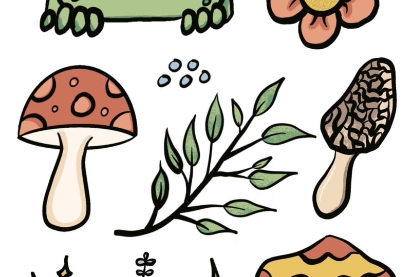
here in front of me. I chose to do a woodland
theme for my motif sheet, and as you can see,
I chose some, like, mushrooms and twigs and
flowers and just kind of some random woodland themed items that I thought might work well. Goal is not to have
the perfect motifs. It's to have a variety
of motifs because you want to be able to test the brushes on different things. I spent some time
making sure that I had different shapes included in my motif sheet, so
there's some circles. The leaves have some
fine points on them. And I included some
larger elements, as well as smaller elements. So I have some of
these little dots and the stars on here as well, along with the larger motifs, like the flour, the mushrooms
and the frog in the middle. And you want a variety is because you want to
be able to test how the brushes will work on both large and
small scale motifs. So I do have a variety
of those included. Our main goal is simple
and easy to repeat, so just keep that in mind
while you're drawing yours. I understand that
in some situations, creativity can feel
like it's non existent. If you find yourself currently
in one of those spots, I don't want you to feel discouraged and you can't
participate in this. So please feel free
to download one of the class resource motif
sheets that I've provided, and go ahead and walk
through this experiment. I found that playing
around with brushes and experimenting is a great way to start to spark
your creativity. Don't give up if that's where you find yourself currently. Please go ahead and
keep jumping in. So either create your
own or download mine, and then we can go ahead and move on to
testing some brushes. Not quite ready,
feel free to move on to the next lesson anyways. I'm going to talk
a little bit about repeating processes and
creating consistency, and then we'll move on to
experimenting with brushes.
4. Consistency Through Repetition: Before we jump into
testing brushes, I wanted to talk a little bit
about why having this kind of a process helps you build
consistency in your artwork. Style isn't just
about what you draw. It's about the decisions
you make while drawing, what tools you're going to use, how you're going
to do the lines, how you're gonna fill
them with color, and any final touches that
you make to your artwork. As artists, we all love
to experiment with different mediums and brushes
and all of that stuff. Every time we make
a new decision when we're drawing
a new piece of art, we risk it looking a little bit different than
what we've made before. Sometimes those
differences are fine, and it still falls
within our style. Other decisions we
make can throw us off into a completely
different direction. So we just want to be mindful of the decisions we're making and the tools we're incorporating into our style for the long run. At a point where you feel like your work isn't consistent, it doesn't necessarily mean you're drawing the wrong things. It might just mean you're using the wrong tools or
too many tools. So we're going to
explore how to pair those down and choose
the right ones for you. As I mentioned
earlier, my process usually goes sketchbook, photo, procreate,
then Illustrator. Your process may end up looking different than mine,
and that's okay. But when we're starting out, you can follow along with mine, and then if you feel like something I do doesn't
fit what you do, feel free to change
it at any point. My process works for me, but I would never claim that
it's the perfect process. Recognize that
everybody's process is personal to them and the
art that they want to make. So this course is just aimed at helping you find
one that works for you that allows you to create art on a regular,
consistent basis. As we're using different tools, try and notice which
ones work best for you. You want to pay attention to
which brushes feel the most comfortable and work naturally
with your drawing style. Also keep in mind which brushes you feel you could use for a large amount of motifs if you're having to draw a
large amount of flowers. Which brushes do you
realistically think you could use Toolkit should be
considered a starting point, not the end of your style. This is simply where you
can begin, and as you go, you can adjust as your skills and your interests and
your artwork develops. Now that we know what
we're looking for, let's go ahead and
move on and make sure our motifs are
ready to work with.
5. Motif Preparation: So for this exercise, the Canvas size in Procreate
isn't a huge deal. So I have just a screen
size document open up here. And so I'm going to
open that first, and then up here in
the upper left corner, we're going to click
on the wrench. I've already taken a
picture of my sketchbook, so we're going to
go ahead and go through the process of adding that picture onto our
first layer here. So I clicked the wrench
in the upper left corner. Now I'm going to click Add. I'm going to click Insert Photo because I took the
picture on my iPad. I had taken the
picture on my phone or any other device
and maybe sent it to either a Dropbox
or a Google Drive, you would click Insert File, and then you would
have access to that. But I'm going to go ahead
and click Insert Photo. And I'm going to click
this first one here. And there's our image of my motifs that you
saw me drawing earlier. I'm going to go ahead and
zoom out a little bit. I want to be able to
see my whole canvas so I can make sure
this fits well. One of the things I like
to do Procreate will crop anything that you release
that's off the canvas. So one of the things I
like to do is I will use that function to crop images that have a little extra space. So I'm gonna bring this
one up to the top. Drop that there. I'm gonna pick it
up again. Now I've cropped that image a little bit, just a little bit cleaner. I'm going to size this up. I'm gonna fit that
as much as possible. There you go. That looks good. Once I have my photo placed, I can go ahead and come up into my layers panel and
click on the N, and I'm going to go ahead
and drop down the opacity to about with about 60%. I think that'll be good.
Doesn't need to be perfect, just in that ballpark.
Now I have that set. I'm gonna go ahead
and lock this layer. I am one of those artists
that is prone to drawing on reference layers or layers in general that you
don't want to draw on. I'm gonna draw on them. So to avoid that, I'm gonna
go ahead and lock this layer. So that way, if I
do start to draw on this image, it will notify me. And I'm going to go ahead
and add in a new layer. I'm gonna find a
pretty neutral brush to use for this exercise. And I'm actually You
know what? I'm gonna actually use this one. This is a brush
pack that I bought from Jazza studios on YouTube. They made a giant brush pack. It has a ton of different
brushes and textures and all sorts of really fun
things that I enjoy using. One of the ones I enjoy the most is this construction pencil. It's basically like one of those blue pencils
that you would get for sketching your rough drafts. So I'm going to go and
use that. All right. So now I have my brush selected, and I have my canvas here. Going to go and
bring the brush size down just a little bit. I'm going to start with these
three lines in the corner. I made these three lines with the intention of
testing brush width. So I'm going to bring
this down fairly low so I can see what the
smallest one is like. And that is I'm not even sure
you can see that. You can. But it's basically invisible. That is a very, very fine line. So we're going to drag
that up. Just a smidge. Also these are for
my references, so they don't need to
be the exact sizes of my actual brush
experiments will be. I just want them to be
some variation in them. All right. I got
those three done. I'm also not going to save
sizes right now with brushes. As we get into experimenting
with linework and stuff, if you find a specific size of brush that you like to use, you should feel free to
save that size or bookmark. And if you don't
know how to do that, I will show you how to
do that in later lessons when we get there. Alright,
I'm going to come in here. I'm going to draw some of these smaller elements that I drew. And then some of
these bigger ones, I have some of these little
they're like cattail shapes. And again, I'm not trying to add any more style than what my rough drafts have
down currently. Right now, I'm just I'm getting
my rough drafts basically transferred onto Procreate.
You're welcome, too. If you don't want
to do this process and you want to
just basically do your test draw your test sheets directly from the image
of your sketchbook, you can do that for each
brush that we experiment, and you can skip this part if you've already got
your image added. I'm doing this because when
I drew in my sketchbook, I had some images that ended
up kind of cramped together, and I would like to
take the opportunity to adjust those
maybe and give them just a little bit more
breathing room on my page. So now I got these cat tails. I don't want to forget to
draw the stems for each one. I almost thought I was done and then didn't have
the stems drawn. I go go and come in,
and we'll do some wine. I'm gonna keep the
shapes simple. I am gonna clean these
up a little bit. These ones I got a little wild with when I was drawing
them with my pencil. So as I go through,
I'm gonna kind of make sure each one is close. I'm making them a little bit
more uniform than they were. And I'm also making sure that they're directly across from each other because that was
one of the elements I wanted. And then we'll get
them all on there. And I hope you're working
along with me in tracing your motifs and getting
them all transferred down. And if at any point you
decide, you know what? Like, you don't want to
transfer all your motifs. Maybe you've already decided which three are going
to be your final three. You can just transfer
those ones into Procreate and move on to the next lesson. It's
completely up to you. I'm gonna go ahead and continue tracing my
images and getting them laid down here in my Procreate document so they're ready for
our brush tests. And you're welcome to just
keep working alongside me. No M. Alright, now I have
all my motifs drawn. I'm going to go ahead and come
back up here and turn off the layer with my image on it. And I'm going to go ahead and do just some minor minor tweaks and moving some
motifs around just to make sure they have enough room. So when I'm tracing
them, I'm not accidentally tracing
on top of each other. The one that I'm trying
to make some room for is this little one down
here 'cause there's a lot of it's kind of cramped, so I'm gonna bring this
up. Move that there. I think I'm gonna
move this flower. Just center that a little bit. I'm grab a leaf and
move that. Perfect. Okay. I'm gonna grab that one and
move it down just to smh. I'm gonna bump these ones. Once I have them
all moved around. So everybody has
its own little kind of breathing room. I
think that looks good. Alright, now that I have
this guide built and I have my motifs laid out in
a way that I want them, I'm going to go ahead and
actually export this as a JPEG so that I always have
my original guide sheet. So if something
happens down the road, I need my original guide sheet, something happens and
it gets messed up. I can come back here
and I can bring this actually, I'm
going to do a PNG. That way I can bring the
PNG back in if I need it. So we'll go and click on
the wrench or go to share. I'm going to do a PNG. And then I'm just going to
click Saved Image. Or save image. Sorry. Alright.
I got it in there now, and we're ready to go
ahead and move forward. If you would prefer to save a version that doesn't
have a background, you can go and turn
off the background and then export your PNG, and it will just be your guides. But that's up to you. You can do whichever one you prefer. Alright, now that we got
those all ready to go, it's up to you whether
or not you keep your original image in here. I'm going to choose
to delete mine just because I prefer to keep my
layers as clean as possible, and I am done with
the original image. So I'm gonna go ahead and swipe it I can't delete it because
it's locked right now, so I'm going to go ahead
and swipe it again, unlock, and then I can swipe and
delete, and now it's gone. Before I lock my guide, I'm going to go ahead and
come in here and click on the N and then we'll go
and drop down the opacity. I like that. I think
that looks good. And then we'll go ahead
and lock our guide layer. We can go ahead and click
the add new layer button so that we have our
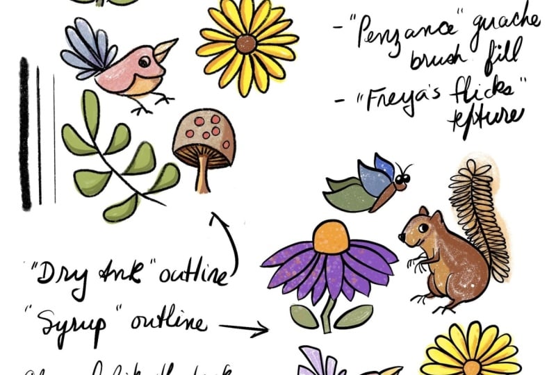
first layer for our first line work brush. The first brush I'm going
to use is called syrup. It's actually from the
old Procreate library, it's an inking pen. So I have that selected here, and I'm going to go ahead
and come into my layers. I'm going to rename
my layer to syrup so that I know what brush
I'm using on that layer. So click on layer, click Rename. So. Alright, so that layer
is ready for us to start testing the
surrep brush on. I'll also be using a
black ink for the test, and I'm going to keep
that color the same. I plan on vectorizing
at the end of this, and I find that black vectorizes
the best when it has, like, a black and
white contrast. So that's my preferred color. You're welcome to use
other colors because, again, this is about
finding your process. So if you have a set of colors that you
already work within, feel free to use those
colors as you go forward. If you don't, you can
use black or you can use another color experiment and find what you enjoy
using the most. Have our guide layer all set up and our first
brush picked out. Let's go ahead and move on to the next lesson and get
into experimenting.
6. Linework Brush Test #1: Alright. We have our
page all set up, so I'm going to go
ahead and move on to using our first brush. The first one I chose to
test out is the syrup brush. This is one that I
have used before, so I have a little
experience with it, but it is a very clean brush. It's pretty controlled. I did want to show something that a setting that I
tend to adjust with pretty much any
brush I use because I have shakier hands
when I'm drying, so I will adjust the stabilization for
each brush that I use. So the stabilization currently
on this one is about 30%. I might pull that up
just a little bit. I'm going to bump it up to
40 and see what that does. Sometimes, if it's a
little bit too much, I can back it off, but that's where we're
going to start first. This brush should be a good
baseline for us as we move into brushes that have more texture and
variation in them. So I'm going to go
ahead and start with these three line
widths at the bottom. I have it set relatively small, so we'll go and test that out. So I like that for
my first test line. So I'm going to
go ahead and save this width so that I
can reference it later. So over here on the
little size adjuster, I'm going to click on it.
I'm going to hit Add. And now that little bar appears, that will mark on there where this size is so I
can return to it. So let's go and pick a midpoint. Feel like that's
a great midpoint? This brush gets
relatively large. I don't want to work
huge because I don't usually work on very
large canvases, so I don't need a giant brush, but for the largest setting, we will bump it up a little bit and see what that gives us. And I like how this kind of
shows the variation of how it starts out thin and then gets
fatter as you draw with it. So I'll go ahead and
save that size as well. If at any point you decide
you don't want one of these sizes or you want to
change it and remark it, you can just click on it again, and there's a minus sign. Once you cook the minus
sign and it'll disappear. Alright, we'll go and
move on to some of these other motifs here. I'm going to come from
the small motifs. I'm going to go ahead and bump my brush back down to the small one. We'll see how that works. I like the stabilization of
the brush that I bumped up. I don't really think I need
to change that at all. We'll do this one
down here. This one has some round elements
on it, which are nice. I can test it round tear drops. As I'm drawing with it,
I'm just going to think about how easy is
it to draw with? Is it creating the shapes I need it to create
without me having to manually adjust it
or constantly redraw, for me, that
stabilization setting, bumping that up usually
helps me not have to redraw things as many
times as I generally do. That's a little tip
I want to pass on to anyone who's
watching the class. I think I'm going to move up to this little cattail
one because it's kind of a a wonky little shape, and I want to play
around with this. One of the things I'm
noticing about this brush is that it is very
pressure sensitive. So as you can see, like,
when I first start out, it's very small cause I'm not pushing down as much
as I push down. I will give me some
variation. So that is nice. I do like that in a brush
because you can start to get some line weight variation without having to,
like, go back in. Trace. The only downside I find, especially for me personally, is that I tend to be a
heavy handed drawer, and so even brushes that have pressure sensitivity
tend to come out pretty thick when I'm using them because I have a
hard time drawing lately, so it's something
I'm working on. It's something I try
and remind myself of as I'm drawing
and to remember to let my line weight vary and let my pen do some
of that work for me. But I don't always remember. All right. That one came out a little bit little
wonkier than I like. I like this, like,
kind of thinner at the top look that I'm
getting for these stems. So I'm gonna go and
keep doing that. I come through all of these. And you should be also just experimenting with
the brush that you chose and your motifs and just kind of thinking about how is it feeling in your hand? Is it easy to draw with? Do you like the
lines that you're getting? I really like this. One of the thoughts
I'm already having is that this is my thinnest
setting that I save, and I already feel
like, personally, this is more of a medium
line weight for me. So in that case, I think what I'm actually going
to do is I'm going to get rid of the
biggest line weight that I save. And I'm
gonna come down here. I'm gonna actually come
down to the bottom and see what that
gives me real quick. You know, it's a little bit
lighter than I want to. So here, I'm gonna
get rid of this one. Yeah, 'cause that's
coming out just a hair. It's just coming out a
little bit too heavy for me, so I'm gonna ahead
and get rid of the lightest one
that I have too. I'm just gonna drop it
just a tiny, tiny bit. It was a very small adjustment, but I do feel like it makes a noticeable difference
in the line weight. So I'm gonna go ahead
and say this is my smallest I think I might
save that as my biggest. And I might just skip a medium. Yeah, we're going to add
that medium back in. That's roughly
where I was before. Alright, so now I have my
three new line weights for this brush that
I think I prefer. So I'm gonna go to
the smallest one now and experiment with
that. That's much better. This is going to give
me a lot more control on smaller motifs like these
leaves and stuff like that. So don't be afraid to adjust your size after you've
already maybe picked it. Remember, you're not
locked into anything. This is all experimental. With the same small line weight, I'm going to go ahead
and come into some of these smaller
details I have over here. I'll work on those. I'm going to go
ahead and go into this branch that I have here. I'm going to play a
little bit around with both the pressure and size of this brush
because this brush does have some good variation
with the pressure. If I start out really light, I get nice thin, push down. That works really good
for these branches that I need to be a
little bit thicker. At the base, but I want them to be pretty thin at the tip. So this brush is
working well for that. So that's something
to know if branches are a common thing that I
find myself drawing a lot. Then having a brush with
good dynamic pressure is something to keep in mind. I'm just going to go ahead
and keep on drawing, and you should keep
working on yours. And when we're all finished up, we'll meet up at the end
to discuss what we found. No. So as I review my
finished sheet, I'm going to just
kind of think about how that brush worked for me. Personally, I really enjoyed
the brush that I chose. I thought that it
wrote very smoothly, especially with the stabilization
increase that I made. I also really liked the
dynamic pressure that it had. So I was able to get thinner and thicker parts of the lines without having to switch the
actual size of the brush, which I liked a lot. I also feel like it had
a good range of sizes. I felt like it could
get pretty small, but then it could
also get pretty big. I don't think I actually used the largest size that
it could get to. So I appreciate that in a brush. Having a lot of variation
in size is nice. I'm going to go ahead and keep
those things in mind as I move forward and I
choose my second brush. For the second brush, we're going to go with
something a little bit looser or rougher and see what kind of a
result we get then. And so I will see you
guys in the next lesson.
7. Linework Brush Test #2: Alright, so for my second brush, I went ahead and I chose a
brush that has a little bit of a looser texture to it just to see what kind
of variation we get. Since our motifs are
going to stay the same, this will give us
a chance to really focus on what changes the brush makes to our
art as we create it. Alright, so let's go ahead
and go into Procreate and add another layer
for our new brush. I have my existing
layers in there, the one with the motifs on it, and then the first
brush that I tested. I went ahead and
locked that layer. I did that just to be
safe so that I don't accidentally delete
it or draw on it. It's just personally, I prefer to do that
because I am prone to moving really fast and not always realizing that
I deleted a layer. Just to be safe,
I got it locked. For this brush, I chose
one from the new library. Procreate did a recent update, and they added new libraries. And so this is from the new one, and it's under paints, and it's called Make Peace. So I'm going to go
ahead and use that one. And I'm going to do
the same thing that I did to the syrup brush. I'm going to go in here and
I'm going to go I'm going to up the stabilization
just to see. I have done some test drawings with it just to see
before I started filming, so I do kind of know how this
brush is going to perform, but I'm going to bump
up the stabilization just to see what it
does differently. So we got our brush
picked out. Let's go ahead and rename our layer to the brush name,
which is Make piece. Perfect. Make sure we're
selecting our layer. Now we're going to go ahead
and get started on drawing. I'm going to start with
the three lines in the lower left hand
corner just to get a feel for the variation
and what it looks like. And so, right now, it's already set to
a pretty small one, so I'm going to go ahead
and leave it there. And we'll see what it gives me. Now we'll go about middle. That is huge, obviously. So let's see how
big this one goes. So this is a very large
brush at its largest form. I'm not gonna be using it there. So we're probably
going to stay in the bottom half, I'm
actually thinking. So let's try that one
for our thickest. That's about good. I'm going to go ahead and save this one so that I have a visual for where my largest
brush size is at. I don't know that I'll save
all three, but we'll see. Let's see. See, that ends up actually being
about that size. Let's go and get
rid of this one. We'll go even smaller
for that one. It's like little speckles. I'm gonna actually do two
a few goes at the line. There you go. That looks
pretty good. I like that. Alright, so we can go ahead
and move into the motifs. I am going to bump it
up just a tiny bit. Let's see how this works
with the smaller motifs. It's actually working better
than I thought it would. It is also a square brush, and I don't usually use
a lot of square brushes. I tend to use the brushes
that are tapered at each end, but that's okay. This is still working. It's very, very patchy, which again, I'm not I'm not making a ruling
for or against it. I'm going to work all the
way through all the motifs, and then I will kind of
review it. Let's see. The other thing to keep in mind, if you are an Illustrator user and you do vectorize your work, vectorizing things will
change it as well. So what you get in Procreate
is kind of your first draft. And then when you vectorize
it, that's your final draft. So that's something else
to keep in mind that don't fall too in love
with a brush in Procreate, if you're planning
on vectorizing it because ultimately it probably won't maintain a lot of what you're
seeing in Procreate. It'll maintain the vibe
for the most part, but the exactness isn't
always translated. I like to just kind of buffer my hopes in that I'm like, oh, I'm excited to see how this is going to turn out,
but I'm not, like, really banking on it
looking exactly like it did in Procreate. Especially for more
textured brushes like this, it can get a little I can get a little crazy when you vectorize these ones,
but that's okay. I'm just going to see what this looks like without the
blue underneath it. I do like the direction
this is going. I'm gonna go ahead
and keep going. I know it seems it's a little odd to have
such patchy lining, I think, but I'm
gonna go ahead and keep moving forward with it. Next up, I'm gonna
come up here and do some round elements
and see how it functions on a round shape. I also functions
pretty well with the like auto snapping
shapes that Procreate does. Sometimes that
will change, like, the width or the look of a brush when it snaps it
into a circle or whatever. And for this one,
for the most part, I feel like it's doing a pretty good job
of maintaining it, even when I let it snap it
into the line or whatever. Alright, let's see how small
a circles I can get in here. Is kind of cute. Alright, let's get in here with the branch. I will say this
one does not have very much pressure variation. Those are settings, of course, that you can mess with
if you like to do that. I'm not a big fan
of messing with settings beyond the
stabilization setting. So I just kind of put
up with how it is. Alright. Getting these
leaves all filled in. So as I'm drawing this, I am noticing that it is working a little bit different
than the syrup brush from the first go around. It's a little bit harder to work with, but not impossible, so I'm not against it.
It's just different. Yes. And these are the kind of things
you want to make note of while you're working. Is it easier to work with, more difficult to work with? Are you enjoying yourself
while drawing with it? Are you getting frustrated? Because if you're getting frustrated and you're
finding yourself like, I don't even want to
finish this exercise, then I would go ahead and
move on to a different brush, pick something different, it
should not frustrate you. It should be more of an
exercise of curiosity. And if it isn't drying any excitement out of you
while you're using it, then I would say it's
probably a good sign that it's not the brush for you. So just go ahead and move
on to a different one. Got a flower done there.
Let's go ahead and move into. I want to try these little
these little motifs. I might have to space
them out just a little bit the brush is a
little bit thicker. I'm going to make some
smaller ones over here. I think I have to go around a couple of times with this one. When it's really small, it's really, really patchy. And I do plan on vectorizing
these at some point, so I need them to be
somewhat filled in. So I'm going to kind of go
through a couple times. Let's try this branch. Just keep tracing like that. Looks pretty good. Got
a little crazy here. I'm gonna clean
that up. All right. Let's go ahead and
see what we got left. We have this big mushroom. Let's go and bump
it up. I'm gonna do a slightly bigger
outline on this one. Bring it down just a
little bit for the stem, but not much. And
I'm gonna leave it. I'm gonna leave it
kind of big 'cause it's already kind of patchy and this top of this is already
kind of like a patchy look, so I'll leave it like that. I'm gonna start
coloring these in. I'm not going exactly
with the lines this brush is kind of large, and
there's a lot of lines. So I'm not sure it'll work, but I am just go to kind of
go randomly and fill it in. Alright. Got that mushroom
done. Gonna do the frog. Got his eyes done. Let's see if I can
get the body done. I have to have to drop
this down pretty small. I feel like to be
able to do the body. Okay. Okay. This is a trickier brush to
work with. I will say that. I can already tell, which is why I tend
to gravitate towards smooth brushes like
syrup. All right. I just got a few
more elements here. I'm going to finish up,
and you can go ahead and keep working on your
motif sheet as well. If yours is a bigger motif sheet or you're maybe just
taking your time. That's totally fine.
Keep doing that. And then I will meet you at the end of this lesson
when we're all done. Alright, so here's my final
sheet with brush number two, and the result is
very interesting. It's much different than our
first brush that I used. I used to like the
look that I got. It is a patchier look
than I'm used to. I generally draw with
pretty strong line work. So this is a little bit
patchier than I'm used to. I'm actually really interested to see what this
is going to do in the vectorizing part of this lesson that I'm going to do because I do vectorize my work, and I know it has the potential
to change it quite a bit. And so I'm interested
to see what this brush looks like
when I vectorize so, I'm going to go ahead and
move on to a third brush, and I'll see you in the next lesson when we go
ahead and pick that out.
8. Linework Brush Test #3: Alright, so I've picked
out a third brush. I am I did a bold line first, and then we did a
paintbrush last. So I'm going to go with
a pencil this go around. I think it'll still
give us a rough look, but I think it might be
more filled in than what that paint brush did
on the last go around. So I went ahead,
I added my layer, and I'm going to go
ahead and name it. Huntsman is the name of the pencil that I'm
going to be using. Again, it's in the new library
under pencils Huntsman. Got my layer named, I locked the other
layers just to be safe. I got my pencil ready. I got my motifs on the sheet, and now we're ready to go
ahead and start drawing. I'm going to go ahead
and start in the lower left with our lines. I'm going to bump this
up as big as it will go and see how big that is. It's not that big. It doesn't even fill in my test
line all the way, so we'll go and drop it
to about medium width. Alright and then we'll
go as small as it can. That's a very, very,
very fine line. So now we're going
to bump somewhere between halfway and
the lowest one, and we'll go ahead and
draw these stars first. Like they're a good test. They're one of the smaller ones, but not the smallest
detail I have on the page. And then we'll come
up to the cats tails and start filling those in. Again, just making note of
how the brush is drying, how the pressure works. Does it have dynamic pressure? The last brush I used, it didn't one does, I believe. That was said with
a question mark because I'm not 100% sure. But it does I'm pretty sure
it does have a little bit of dynamic pressure going on. I didn't change any
settings with this one. I'm just going to see how
it works from the get go. I didn't test this
brush ahead of time, like I did the other one, so we are seeing its results
in real time together. Also, just a reminder, if at any point you decide you picked a brush that just is not working with you and
won't work for you. There really is no point in testing it on the whole sheet. If you know that one
or two motifs in, go ahead and switch
to a different brush. It's okay. If you need to pause the video and start your
sheet again, that's fine. I want you to be successful with the brushes that
you're choosing, and I don't want
you to just, like, force it just to
finish the exercise. This is about This
is really about you finding tools that will work
for you in the long run. And if you're just
rushing it and just doing it to get it done, it's not really
serving the purpose, so take your time. We'll come up to our most
round mushroom up here. I'm going to bump up my
width just a little bit. Let's see if I can get.
Okay, it does have. There is some dynamic
pressure stuff with this one. All right. It's all built in. We'll move over
to the bran Oops, move over to the branch. So I can tell you,
from the get go. I like this brush much
better than our last one. It has a good mix of the pressure dynamic that
the first brush had, as well as, like, I feel like I like the roughness of
the brush, as well. It's not as smooth
as that first brush, but it's not as patchy
as the second brush, which is nice, so it's just some of the things I'm
noticing as I'm using it. Little mental notes
I'm making before we move into our review process. Actually see how
these all came out. You can go ahead and
keep working on yours. I'm going to keep
drawing my motif sheet. Again, take your time. Don't rush yourself.
You can pause the video here or you can just
keep it running, and then I will see you at the end when we have all
of our motifs all drawn. No. No. Yeah. Alright, so here's my final
sheet with the pencil brush. This brush, I feel
like gave the motifs a rougher quality
without being as patchy as the paint brush that we used in the
previous round. So that was a nice surprise. Overall, I did like
how this one worked. I didn't make any changes
to any of the settings. I used it as it was.
And I enjoyed it a lot. So now that we have our three
line work brushes done, we're going to go
ahead and move on to trying out some fill brushes, and then we'll play
around a little bit with texture before we compare them all and
make our final decision. So I'll see you guys
in the next lesson.
9. Fill Test #1: Color Drop: Alright, so we're
back here in Procrit, and it's time to start testing some fill brushes to go along
with our line work brushes. So I decided to go
ahead and work with the syrup line work brush
that I worked with earlier. So I have that motif sheet
pulled up currently, and I want to show a couple
of different ways because I understand that for some of you, maybe coloring in and
filling in, painting, all of that isn't really
what you're looking for, and you're kind of looking
for quick fill ideas. In that case, what
I would recommend doing is creating a new layer. You'll bring that down.
Below your line work layer. So I'm using my syrup layer, so it's going to go
underneath syrup. And then I'm going
to click on syrup. And then over here
in the list of things third from the
bottom, it says reference. I'm going to go ahead
and click reference. Let's go to rename this
new layer to fill. I'm going to do all my
fills on the same layer because I'm not really I'm not going to do
the whole thing, so I'm just going
to add one layer and I'll just add
colors to that layer. So now with that
setup, what that's going to allow us to
do is that's going to allow us to actually pick
some colors and start to drop them into our fill lines. I have a color palette here. You can actually download
this color palette in the class resources. So if you don't want to choose
your own, you can do that. And I have this one and
a few other options for you if you'd like
to download them. But I'm going to go ahead
and start with this yellow. I'm actually going to
lighten up just a little bit. And I'm going to grab it. And just like you would
with any other time when you're filling an object, you grab your color
from the corner, drag to where you want
to fill and drop. I'm going to show you
what this looks like in the layer now that
we added some color. So as you can see,
the color was only added to the new layer
that we just added, but it used the syrup
line work as a guideline. So we can go ahead and
add some other colors. Let's go with this light pink. For this one, I'm going to
continue filling at the top, which will then allow
me to click each petal, and now we have the
flower filled in. I'm going to go with
this green color here. We're gonna go and drop
it into the leaves. Click continue fill.
Let's see if we can fill in all these leaves.
Zoom a little bit. Once we're done filling,
click the little check box. Let's try these guys too. Make them light blue. But now we've done a few
motifs with that style. We can look in our layers, and we can see we can actually
look at just the fill. So we have our fills just
from the color dropping. If this is a style of color fill that you want
to do, totally fine. It's a great way to do it. It's very fast. So you can
do that moving forward. And then if you are someone
who also does Illustrator, you can go ahead and take
that into Illustrator. So if you want to keep going
forward with this method, you can actually
feel free to fill in your whole sheet or a
couple warm motifs, whatever you want to do. And when you're ready, you can move on to
the next lesson. If you are a painter or someone who prefers to
color in your work, then let's go ahead and move on to choosing another brush.
10. Fill Test #2: Paint Brush: So for the first brush
that I'm gonna use to fill in some of the motifs, I'm gonna actually use one that I used for the line work brush, and it was the paint brush
that was called, what was it? Let's see. Make piece. That was the one I
used on the linework. I'm gonna use that
again for paint. If I'm being honest, I didn't really like how it
worked for the linework. However, I think I might
enjoy it more for filling in and painting like I think
it's intended to be used. So that's gonna be the
first one I'm gonna use. And I'm gonna go ahead
and start with Let's see. Let's go with this green. I'm not coloring this frog. I'm trying to remember the
brush width of this one. It's a little bit
big. That's okay. I'm not too worried about
going outside the lines. I am This is just
an exercise after all. Not the end of the world. I can also clean
it up. Maybe you decide that coloring
outside the lines is part of your style,
and you like that. So I might go through and
clean up just a little bit. Link in the eyes and right
around here around the face. Maybe some of these bigger
aerials I'll get as well. Let me get this one here. All right, so I got
that filled in. Let's go to go with
a lighter color and a smaller brush. Men see. Ah, yes. This one is really patchy when it's small.
I forgot about that. So, in that case, let's see if I can bump
it up a little bit. I'm not really seeing
shows up a little bit. Not really. Let's see here. I'm gonna bump the
brightness up. Let's see what this
looks like. This is not showing up at all. Alright, so I'm gonna switch. I'm gonna go with this
Ghost hawk brush. I'm just gonna go
through with this brush and just do some highlights and shadows with it. I'm not gonna actually
switch brushes. I'm just gonna keep using
the same pen brush. M Take your time while you're filling
in and drawing. There's no rush. Play around
with it. See what you like. So I think for this mushroom, I'm going to do a mix of
the first technique with the dropping of the color
along with painting. So I'm gonna start off
with the make piece brush. I'm gonna go ahead and
fill in the cap here. I'm gonna bump it
up a little bit. Gosh, this brush is huge. A lot bigger than I met. Okay, we'll just do that. That works. We'll just clean it up a little bit
here with my eraser. I'm going to go ahead and go
with this dark purple for underneath using the same brush. But in a smaller size, 'cause that is way too big. So we'll just fill this in. And again, when I
make this brush small, it does get patchy, but I do like the texture
that's coming with it, so I guess I'm putting
up with it a little bit. All right. I am going to clean up right here on the stem I think I want the stem color to
come all the way up. Alright. And what should
the stem color be? I think I'm gonna
go with this kind of Biji mushroom color. Once I get that filled in, I'm going to actually
switch what I'm doing. I need to pick this
lighter pink color. And now we're gonna drop
that into the circles. Okay. Not too bad.
Leave that one.
11. Fill Test #3: Oil Pastel: Let's go ahead and
go into, let's see. Maybe paints. Another paint. Or a marker.
Let's go with a marker. I'm gonna go with what was that? I'm gonna go with
this flin marker. Let's try that one out
and see what it does. Ooh, that's big. Interesting. I think
this color is too dark, so I'm gonna actually lighting this green just a
minute. Just try that. This marker kind
of gives me like it reminds me of when your
marker is kind of dying. It's kind of the look I'm getting from it. I
don't think I like it. I'm going to abandon this brush, and we're gonna pick
a different one. Let's try this one. I'm not a fan of markers. Okay. Not a big fan of markers, so I'm gonna go
ahead and move on. I'm gonna choose. Let's
try one of these pastels. Oh, I kind of like that. Let's go back to that
green that we had. It kind of gives a gives a
very interesting texture, but it fills in
really, really easily. It actually feels it kind of feels very buttery,
like an oil pastel. Is kind of what it's
reminding me of. Almost like if you push
really hard with oil pastel, how it lays down really heavily. That's kind of what
this is doing. But if you're light, it
lays down a lot lighter. Okay. So here, let's
play with this. I kind of like
this brush. So I'm gonna fill these in solid first with this
dark green color. I'm actually gonna
bump up my size also. All right. I'm going to leave the roughness on the
outside of the line work. I'm okay with that, again, we're playing with styles,
we're seeing what we like. So not everything has to be perfectly in the line
or outside of it. So this one I'm gonna be a little rough and let
the color fall outside. And now I have a lighter
green. I'm gonna come in here with
the same brush. I'm gonna drop it down. I go really, really
lightly with this along. I'm gonna go along these stem
lines with the light green. And I'm making sure
not to push too hard because as I mentioned, this one is sensitive
to pressure. And if I push hard, it's
gonna fill in a really, really strong line, and I'll
lose all of that texture. And I like the texture, so I do like this pastel. I enjoy how it's working. As I mentioned, it is
very, like, buttery. I feel like I can almost feel how it would work
if it was on real paper. And I feel like it's
very similar to my experiences with oil pastel,
so I kind of like that. I always like a brush that
could kind of mimic the real the real thing,
especially if you're, like, a traditional
medium artist where you're maybe you make oil
pastel work normally. Sometimes I feel like
the brushes you can use, it's like watercolor
brushes aren't always like this isn't really giving the same effect that
watercolor does. But I like this one a lot. Alright. I think I'm gonna go ahead and
stop with those there. I think I will do one
of these mushrooms. I'm gonna go with
this mushroom here. And we're going to go ahead
and stay with the same brush. I still have that
same pastel brush, and I'm going to color
in the stem first. And then I think I'm going
to add some details here. I think I'm gonna
go with the really dark brown for the cap, but I'm gonna lighten
it just a little bit. And then I'm gonna
actually go, let's see. I'm gonna bump this
pastel brush up, and then I'm gonna go really, really light because
I'm trying to maintain as much of
this texture as I can. So we're gonna do that,
let's go ahead and switch to round one, let's switch to a
different lighter brown. I'm gonna do the same thing. This is our stem brown. Just kind of coming
back in with that. And I'm still staying
very, very, like, Oops to maintain that texture. Alright. And then let's I think I, I have a good medium brown here, which I'm gonna actually
darken just a smidge. We'll come in with that one. And I'm just kind of layering these browns to see
what I can get. Go back to the darker brown. I'm actually going to fill in this large mushroom
in the corner, too, but I'm going
to do the same drop method as I did earlier. I'm gonna do that because I think I'm going to
play around with some texture brushes on
this mushroom specifically, 'cause I'm gonna take it into Illustrator and vectorize
it in a little bit, and I kind of want
to see what some texture brushes might look like.
12. Fill Test #4: Texture Brush: For this one, I dropped
some color in there. I'm gonna pick some I
have been using I want to clarify when I say
texture brushes because I have
been using brushes that have a lot of
texture in them. But I mean when I
say a texture brush, I mean something
that makes, like, a spray, a splatter. I have a cloud brush that I've used as a
texture brush before, like, not in a cloud context, but I vectorized a cloud and
used it for other things. So for my texture brushes, I'm going to use
this, what is it? Raglan speckled one first. Have my mushroom that I drew, and I'm going to go
ahead and come in here. Let's go with this dark brown. I'm also going to clip
to my fill layer to make it a little bit
easier to draw on here. I'm gonna go ahead and just
draw along the stem here. Put some texture down, and then we'll switch
to a lighter color. Oh, that's the same color. That. Perfect. I'm
gonna take this blue, and then I'm just gonna
darken it a little bit. I pull a bit along
the bottom here. Also gonna go along
the top here. And then we'll go with the teal. We'll do the same
thing. We're gonna darken the teal up a little bit. And then we'll
come glow and fill in with the same speckled brash. I'm going to add
some of this texture up here to this one also. This mushroom, we'll go with the same dark color
along one side. And then we'll go
with the really light white on the other side. So I think that's enough. I
have some texture brushes and fill brushes and line
brushes that I've tried out, and I'm enjoying the
result I'm getting. I'm going to go ahead and
move on to my next lesson, where we're going to kind of compare all the brushes and make some decisions to build our toolkit. I'll
see you guys there.
13. Review Linework Brushes: So I have my linework
brushes done, my fill brushes, and I experimented a little
bit with texture. It's time to start reviewing and deciding which brushes I
want to use going forward. I'm gonna go ahead and start by looking at my line work brushes
first without the fill, so I went ahead and
turned off my fill layer. I think what I'm gonna do
is I want to be able to see all of my lineworks
together at once. So what I'm gonna do is
I'm going to go through, and I'm going to
go ahead and turn them all on and unlock them. I'm gonna select one of them, and I'm going to go ahead and swipe to the right on each one, and I'm going to group them. I'm going to duplicate my group. And then we'll go and turn
off one of the groups. I'm doing this so that I can preserve my original sketches. I want to be able to shrink these down and put them all on one page so I can
compare them easily. But in order to do that, I
have to change the size. And in Procreate, if you
change the size of it, especially shrinking down, you will affect it permanently. If you shrink it
down, make it big, shrink it down, make
it big, it will start to affect the
quality of your image. So I just try and be very careful when I'm doing
that type of stuff, and I usually
duplicate the layer that I plan on shrinking. I've duplicated the
group, turned one off. Let's go ahead and select
the groups that are on, and we'll go and
shrink them down. That seems good enough. I think I'll be able to fit
all three of them there. Let's go ahead and move them. This is the huntsman. This is the pencil that I used. Here's Make piece,
the paint brush. And the one over
there is the syrup. Brush, which was the
first one we did, and also the one we had the layer we used for
our fill experiment. So now I can kind of look at
it. It's very interesting. It actually kind of looks
like they are almost like copies of the syrup one. They get a little bit
duller on each one. While I'm looking
at these, some of the things I want
to consider are what line brush felt the most natural in my hand
while I was using it? Which ones were the
easiest to use? Which ones gave me a
result I was looking for? Did any of them provide any
stumbling blocks that made it difficult to draw or made me give up on
them completely? For me, personally,
when I look at these, the ones that worked the
most naturally for me are the syrup brush and
the huntsman brush. I really enjoyed those too. I thought they
wrote really well. They had some good
pressure dynamics, and overall, I like the result that I got
from both of them. Huntsman, I really
like the pencil look. I enjoy that really rough line. I do like strong bold
lines in certain contexts. And in a lot of cases for
my own personal style, I will do a mix of these two. I will do a mix of rough pencil lines and
smoother bold graphic lines. So just right off the bat, those are the two
that I'm drawn to. Far as Make Peace goes, a little bit of an ironic name. I am not at peace
with this brush. I found it very
difficult to work with. It is very patchy
when it's small, so you kind of have to work with it on really large scales. Which it is a paint brush, so I think it's intended
to be painted with. I will get into how
it performed as a paint brush on
the fill layers. But for now, as far as a line
work brush, I'm not a fan. I will say that I'm just going to put it out
there right now that this is this is not one that I will
use going forward. So I can go ahead and
cut this one out, and I'm going to
go ahead and turn it off because I don't need
it. I'm not going to use it. So I'm going to go
ahead and look at these two now on the page. So, again, like I mentioned, I do tend to use a mix of really bold lines
and rough lines. I like how rough lines vectorize when you take
them into Illustrator, which is why I tend to prefer to work with this type of brush. You can touch to see, sorry. I don't know if
you can tell that. It's a little bit starting to blur already because I shrunk
it down and made it bigger. I don't know if you can actually see that on camera or not. So for me personally, I am going to actually
choose to keep both of these line brushes
because as part of my style, I like to mix rough and smooth. I am going to keep
both of these as potential line work
brushes in my tool kit. So I'm going to go
ahead and leave them on the page as they are, and we're going to go
ahead and go back to the larger versions of them so we can look at
what they look like with
14. Review Fill Brushes: Now I have just the
syrup layer on. I'm going to go ahead and
turn on our fill layers so we can see what it
looks like with color, which we've already
seen, this is the layer that I used
while I was filling it. I do like how these turned out. I would like to see
how these fills and textures work with the
Huntsman linework, which I also saved. I would like to
just point out that I did sketch these
two separately, obviously, so the sketches
may not line up perfectly. Therefore, the color may
not line up perfectly. But we'll go ahead and turn off syrup and turn on Huntsman,
which is our pencil. Then I can start to
look and see what kind of result I got in this. You can see as I mentioned, the flour isn't quite isn't quite perfect,
but that's okay. I can still get the
gist of it all. I'm going to duplicate the
fill within this group, and then I'm going to put
one under each layer. So I have one under
Huntsman, one under syrup. And now we can go. I have this fill selected, so I'm going to go
ahead and swipe to the right to
select the huntsman on top. Shrink it down. Then we're going to
take the syrup layer, turn it on, swipe right
on the fill below it. I shrink it down to this corner. Alright, so now I have my
fill layers turned on, and this allows me to see what they look like with
both of the linework. Again, as I mentioned, the lips are a little bit
different on the frog, so the lines aren't
matching up perfectly. But as I'm looking through at the fill colors and the
texture and all of that, I want to kind of ask myself, which combinations
look the most natural? Which ones are I
drawing to the most? And which ones do
I think I could repeat on motifs
over and over again? And as I look at this, I do again, I'm drawn to
a few different things. I like the I like the ease of
the reference drop in fill. That's a very, very easy
way to get color down, especially if you're
going to take it in to vectorize it in Illustrator. I mean, there are I just want
to throw this out there. If you are an Illustrator user, there are ways to add your
color in Illustrator. So there are times I only
do linework in Procreate. Then I take that linework
into Illustrator and I use the I believe it's paint.
I can't quite remember. I think it's paint
bucket. I know the keyboard shortcut is K, but I'll use that to add color. So that's also an option. Again, this is all part of your process and
what you like to do. If you like to add
color in Illustrator, that's great. Go
ahead and do that. If you want to add your color in Procreate and then take
it into Illustrator, this is how you do that as well. So Again, coming back to this, I really liked the fill
and drop reference option. That was really great. I'm also really drawn to this
mushroom over here. I really like this texture of
the oil pastel that I got. I really enjoyed that. I like
the highlight that it did. I also like the general
blending that all of this blending I was able to get without using the
smudge brush at all, which I really like. I do like this mushroom with the speckled
texture that I added. It's kind of hard
to see on that one. I think it's easier
to see on this one, the speckled texture here. I do like this So I do
think the texture is something that I
probably will take into my toolkit, as well. So as far as building a toolkit
with the brushes I use, I would probably stick with the two linework brushes
that I talked about. I would keep both of those and
put them into the toolkit. That way, I have the option
to kind of switch between a rough line or a smooth line depending on the project
that I'm working on. Or the fill techniques,
personally, the ones that I enjoyed doing were the
dropping of the color. I liked using my linework
as a reference and then dropping color in to
get a nice solid base. And then I really like
how this stem turned out. I like the pastel, the oil pastel brush
and how it works. So I think I would
move forward using that as well to add
highlights and shadows to, like, the flower over here
or something like that. Things I've already
added solid color too. Similarly, the texture brush, I would continue to use
that going forward. So I think I will also add it to my tool kit in Procreate, so that way I have them
built and ready to go.
15. Build Your Toolkit: As far as building
the tool kit in Procreate so that you
don't have to hunt for the brushes every time
you want to use them, we're going to go up to our brush here and we're
going to click on it. In the upper right hand
corner, there's a plus sign. You're going to go
and click that. It gives you a few options. You can create a new brush
or create a new set, or you can import
brushes if you've got maybe free brushes from
somewhere or bought brushes. We're gonna go and
click Create New set. Now we're going to name it.
I'm gonna name it my brushes. That way, I know these
are the brushes that I curated and put in here. As far as putting
the brushes in here, we're going to start with
this pastel that I used here. This is the one that I used for adding the shadows
and highlights. So I'm just going
to go ahead and long click on this brush. One of the options is duplicate. Click that. Now I
have two of them. I'm going to go ahead
and click on it again. Now I can drag it
up to my brushes. And drop it in my brushes. And now I have my
oil pastel in there. You can if you want to move
your brushes, you can. So I could drag the
original brush and I could put it in here.
That is an option. I choose not to do that
because sometimes when I'm following along with someone else and they reference a brush, I want to be able to
go find that brush. And if I've moved
it or renamed it, then I don't know what brush they're
talking about anymore. So, I like to always duplicate and then
move them into my set. So let's go ahead
and go into pencils. And we'll get
Huntsman. Here it is. Long tap, duplicate. Grab the one with number two. Bring it up, drop in my brushes. Double check. It's in
there. It is. All right. I'm gonna go ahead and get
the speckle brush as well. This is the texture
brush that I use. So we'll go ahead and
long tap and duplicate. Going to get back
up into my brushes. Alright, so now have my
rough linework brush, my texture brush, and
one of my fill brushes. Technically, my other
fill brush isn't a brush. It's more of a technique,
but that's okay. I have my main fill brush that
I'm going to use in here. All right, so I need
to add my syrup brush. And my syrup brush comes from
the old Procreate library. So I'm going to actually
have to duplicate it over there and
then bring it into the new library because
that's where I set up We'll go ahead and click
on the arrow up here. Back to libraries. We'll
go to the classic library. You can see this
is a set that I've already created
called My go tos, and it has a lot of
different brushes that I've collected
throughout the year. Syrup is one of those
ones that lives in here. It is from the old library,
but it lives in here. I'm going to go ahead
and click on here. We're going to duplicate it. I'm going to grab the syrup too. Make sure I can drag it.
Drop down the arrow, click back to libraries, click on the new library, and drop it in our new brushes. I went ahead and
reorganize them, so I have them buy my
smooth line brush, my rougher line brush, my fill brush, and
then my texture brush. Now that I have my kit picked
out and built in Procreate, I also want to make just
some notes about my process. Personally, the way my
process is starting to look is that I will sketch things
out in my sketchbook first. Take a picture of that and
bring it into Procreate. I will trace my sketches
in Procreate to get my linework using one
of my line work brushes. Then I will use the reference and
drop fill method to add color to my linework. Using my other fill
brush and texture brush, I can then add shadows,
highlights, and texture. And then from
there, I'm ready to actually export
into Illustrator, where I will then vectorize. Rising will ultimately
have the final say of what my art looks
like in Illustrator. But these are the tools
that I have chosen to set me up for what I think
will give me the best result. With all of our decisions made, we can go ahead and move
on to our last step in this exercise where we're
going to go ahead and redraw three of these motifs. So I'll see you in
the next lesson.
16. Create Final Motifs: Fill: The brush test helped
us make some decisions, and now we're going to
test those decisions out with our motif sheet. I have more motifs on
here than you need. I think originally I said three. That's totally fine. You
can pick three of yours. I have a few more because
I'm going to take these into Illustrator for
the next lesson, and I wanted a few more options to demonstrate within there. But you're welcome
to just do three, so that way you have your project to submit
to the gallery, but it's completely simplified my motif sheet to just the
ones that I'm going to use, but I am still in my
original documents. So I have all of the original
layers that I created. So I think what I'm actually going to do is I'm going to go to the gallery and
duplicate this document, so that way I can just have the layers that have the
motifs I'm going to work with. So to do that, we're
going to go ahead and click on Gallery
in the upper left. Then from here and
the upper right, you're going to click Select. We'll click on the
document that we want to duplicate and I'm
going to hit Duplicate. Now we have two of
those. I'm going to go ahead and click the checkbox. So I'm going to go ahead and open this one up,
and from there, I can go ahead and delete all the layers we're
not going to use. Oh, that one's locked.
So I got to slide it, unlock it, and then
I can delete it. You'll notice I have
two layers still. This one, the bottom one
has smaller motifs on it. Like I mentioned earlier,
I'm going to take these in to vectorize
them in Illustrator, so I wanted some larger and smaller motifs to use for that. I am going to keep them
on two separate layers. And I do that as part of my process because I want
to be able to vectorize things that are small
on a different level than bigger items if so larger items I generally
want heavier line weight, and so I can just go
with the 128 threshold. But with smaller details, I may want lighter line weight. And so I want to pull
that threshold down. I like to keep some
things separated. And so when I'm
drawing my linework, that is something
I keep in mind is what threshold do I
want to vectorize this? If it's going to be a
higher, lower or standard, and then I draw those linework
on that layer accordingly. So I have two in here. I
have one that's going to be vectorized probably
at the default 128, and then my lower one, which I'll probably drop down. Again, that's going to
be in the next lesson if you are an Illustrator user. If you're not, you can just
disregard what I just said. Let's go ahead and get
into filling these. So I'm going to add
two layers since I have two linework layers. I'm going to go
ahead and add those. One is going to go
underneath my top layer. The other one is going
to go underneath my small motifs layer. So now that I got my
fill layers added, I'm going to go ahead and change this top one to a reference. I can only do this with one
of the layers at a time, so I'm going to go
ahead and just do the larger motif layer first and keep the smaller
motif layer turned off. You click on our layer for
fill and then our brush. And I'm going to start
dragging some colors in here and dropping
them into the frog. I want to have a lot
of brown variations in this pattern or
in this palate. So I'm going to add a
couple of browns, I think. I'm going to give myself, like, a nice midtone. Add that one. All right, this
one's going to be a little intense to fill. So let's get in here
and get all these hops. Did not mean to click the line. I'm going to go and switch to a brush and select my fill layer here and fill in some little
gaps that I see of white. The paint drop
color didn't quite get everything, so Alright. That's looking pretty good. Let's go ahead and
drop some colour in this mushroom down here. And for the cap, I'm
gonna go with this wren. I'm gonna put the yellow here. Perfect. What do we have
left? This mushroom. I'm gonna go with the I think I'm gonna
go with this rust color for this mushroom, and we'll go with
a lighter one for the dots. It looks good. I'll go with this one.
Go this one here. Actually I'm gonna
take this darker tan, and then I'm just
gonna trace over. This one. You can just stick
with an outline. For now. Alright, let's go ahead and
bring in our small motifs. We're gonna add another layer underneath the
small motif layer. And now we're gonna change the reference layer
to the small motifs. Here go, select
fill. I want a blue. I think I need a good blue. Let me find one. I
like this one here. I can do some little
blue details. I like that for these dots. Alright, that one's
not filling in. So turn that off, go
to our brush. Perfect. All right. Got those filled in. Now let's go and
switch to this yellow. Perfect. For this one, I think I'm going to go
back to that same blue. So it's going turn to
the previous blue. Let you zoom in here. All right, we're going to start dropping that into
these little leaves. So I have my base layer
of color laid down now. I can go ahead and
move into adding some texture with my
pastel brush that I saved.
17. Create Final Motifs: Texture: Just like my linework,
I like to keep my texture layer separate
from my base color layer. I'm going to go ahead and
add in two more layers, one above this fill layer, and one above this fill layer, and we're going to go
ahead and start with this top one because I'm going
to work on this frog here. Then we're just going
to go and start adding in some texture and color. And you can feel free to start doing the same thing on yours. With your motifs, welcome to do as much or as little
detail as you want. Again, this is an exercise. This is intended to be fun and relaxing and a way
for you to be able to experiment and find
things that work for you and hopefully start
on a path towards discovering your
long term style. Got that added. We'll
come on down here. I'm leave that
mushroom as it is, but I'm gonna come
and do this one here. Just add a little bit. Almost like a little shadow
highlight situation. I'm going to do the
same thing here. This one I'm actually going
with the darker brown on this side to match
the top of it, and up in the top, I'm
going to come back to this tan this up. Oops. I'm going to do
something real quick. I'm gonna clip this
to my fill layer. All right. All right,
so that looks good. I have another texture brush
that I'm actually going to use the little speckled
one that I saved. I'm gonna use that
for this flour. And for the color, I'm going to take that
same yellow color, but I'm gonna
actually darken it. So then I go kind of
small. Too small. Too big. There you go. Perfect. There you go. And we'll go back to our pastel brush and add
some texture to the flour. Petals. This mushroom cap here. Let's see. I'm gonna use the
darker one, I think. Then on these little spots, I'm going to put some textured. All right. I think for
these leaves also, I'm going to do just for the
really light brushing of this pastel trying not to go too hard because
this pastel is prone to laying a lot
down if I push too hard. So I'm okay with on on
these smaller leaves. I am intentially making
them more heavy. But the bigger leaves I'm trying to go a little bit light around. So at this point,
the question is whether or not our motifs are working together and whether or not they could
work in a collection. I feel like personally, what I got as a result
does work together, and I feel like I could use that going forward
in a collection. If that's also the case for you, if you got a motif sheet that
you're very satisfied with, congratulations. I'm
excited for you. Just remember it's not
a permanent toolkit and always spend time experimenting
and trying new things. It's important as an
artist for your style and also just for your
creativity and inspiration. If you are someone who created a motif sheet that
you are not satisfied with and you didn't
like the results from tool kit, please
don't be frustrated. I understand the frustration, and I want to encourage you
to not give up and to take a step back and just evaluate what it was that wasn't working. Was it a linework brush?
Was it a fill brush? Was it too much texture, not enough texture, maybe
the wrong kind of texture? Just take some time
to think about those things and kind of ask
yourself those questions. And maybe you need to cut one of the tools out of your tool kit. Maybe there's one that
you tried out that you were kind of on the fence about and you ended up
cutting it at first. Maybe you want to
add that back in and try experimenting
with it again. Don't give up, keep
experimenting, keep trying new things. You will find something
that works for you. And eventually, your style
will start to emerge. So don't give up, keep at it.
And I promise you'll there. Completed motifs,
you can go ahead and submit those to the
project gallery. I'm really excited to see the
work that you guys created, and I would love to hear any feedback that you have
about your experiments, what worked, what didn't work, any roadblocks you ran into or anything that surprised you
that you really enjoyed. I would love to hear all
of that from you guys. I'm going to move on
to the next lesson, which is an
Illustrator extension. If you're an Illustrator user, I would love to
see you in there. We're going to talk a little bit about vectorizing our motifs, how that will change them and also the best ways to
try and maintain some of what you've created
and Procreate when you vectorize an Illustrator.
So I'll see you guys there.
18. Optional: Illustrator Extension: Alright, so to move
this into Illustrator, we're going to have
to get it into a file format that
Illustrator can open. So we're going to go ahead
and come up here and click on the wrench in the upper
left hand corner. Make sure you're on share, and then we're going
to choose PSD. That's a photoshop format. And so Illustrator's
able to open that. You can save it in your
Dropbox or locally on your iPad or wherever you prefer to save it.
I use Google Drive. I'm going to go ahead
and save it in there, and then we will go
ahead and move into Illustrator and vectorize our
motifs and see what we get. So we'll go ahead and
start by opening up our Photoshop document you
open a Photoshop document, it's going to pop up this
window import options here. You'll want to click
on Convert layers to objects and click Okay. Alright, so now we have
our document open here. Now I have my Motif
document open. I'm going to go ahead and start vectorizing layer by layer. So if I go into my
layers panel here, I'm going to see I have
a background layer. This is my large motif linework, my large motif fill my small motif linework
and my small Motif fill. Background image I
actually don't need, so I'm going to go ahead and
delete that layer right now because need it. And then
I'm going to go through. I'm going to turn off
the small and I'm going to turn off the fill
layers for the large. I'm going to start with the
linework of my large motifs. And now I can go ahead and
click on the motif layer. And then click I'm
going to come over to my side panel here and
open up Image Trace. If you don't have image trace
in your side panel here, you can get it through your
Windows option up here. Just click Window, scroll down to Image Trace
and click it. Mine has a check next to it
because it's already visible. If yours doesn't have a check next to it, go ahead
and click on it. It should pop up a window. If it's a loose window, if it comes up and
it looks like this, and you're like, but I
want it in my side panel. Drag it over to your side panel, and you can just drop it
in there where you want. So Alright, we got
image trace selected. Right now it's not
giving me an option to trace because I don't have
my motif layer selected, so let's go ahead and
click on the motif layer. Now it'll give me
an option to trace. This is my boldest line. It's also my largest motif. So I'm going to go
ahead and go with the logo preset option that
they have in Illustrator. The logo always
defaults to color. I do like to change it
to black and white, even if it's still worked fine. I always change it
to black and white. And I mentioned
earlier that I will likely keep this
threshold at 1:28. That is the default when
you're image tracing. And in general, it's a decent default for
me. I don't mind it. As you can see,
nothing really changed a whole lot from this
brush, which is my goal. I want to have predictable artwork from
Procreate to Illustrator. If my artwork is changing
drastically from its original form to what
Illustrator is putting out, I personally don't want that unless the final result
is something crazy good. I'm like, This is
everything I wanted to. And maybe that is the case that you're in, and
that's totally fine. For me, personally, I like to
try and preserve as much of my artwork from Procreate
in Illustrator. So using a nice bold graphic
liner does that really well. I do use another rough liner, similar to the pencil
huntsman brush that we were using
in this exercise. And in that case, it does give me a
rougher line vectorized, but still pretty clean, very similar to what
I'm getting right now. So, this looks pretty good. I'm not going to make
any changes to it. I'm not going to change
the threshold at all. I think the only thing
I'm going to do is I'm going to ignore white. Since I do have my
own fill colors, I'm going to go ahead
and ignore that. And now we can go
ahead and expand. It's going to turn on
our fill layer for our large motifs and make
sure we have it selected. And then we'll go in
here to Image Trace. Right now, my image trace
panel is grade out, even though my
motifs are selected. And if you've ever run
into this and you're like, why does this happen?
You have two options. You can click Image Trace
up here and it will just kind of do a default
image trace for you, and then you can
adjust the settings. Or you can click off of the layer and then click
back onto the layer. Now, it's giving me the
option to do image trace, and I can actually
change the setting. So we're going to
stick with Logo. Again, and it's going to default to color like
it did the first time. And in that case,
I'm okay with that. The colors look
relatively the same. Right now, the colors
are set to 30 colors, which is not how many
colors I used in this. So let's see, I have one, two, y four, five, six,
seven, eight, nine. I have roughly nine
colors that I used. So I'm going to drop
this color down to ten and see what happens. So it changed a little bit
of the leaf pattern work. Interesting. It got some green over here in this mushroom, which that's fine.
Not a big deal. We can fix that later. I'm gonna see what happens. What happens if I
drop it down to nine? Which I think is
the actual number that is in the
documents. Let's see. Alright, well, I like that. I'm gonna go ahead
and leave it at nine. We're gonna ignore white again, and then we'll go ahead and
expand that once it's done. Okay, that gives us
our large motifs. I'm going to go
ahead and now that I have a group of linework
and a group of fill, I'm actually going to
move them both onto the same layer in Illustrator. One of the things I like
to do while working is I like to work as clean as
possible in my layers, and that goes from starting in Procreate to coming
in to Illustrator. As I mentioned in Procreate, I am usually thoughtful of how I want to vectorize the
things that I'm drawing. And then I draw them
on layers according to how I plan to vectorize
them, if that makes sense. So if I'm planning to use
logo at 1:28 on everything, then I will draw all
on the same layer, assuming it's linework
and then fill on its own. If I plan to adjust the
threshold of the image trace, or if I plan to use a different
style of image trace, there's a few
different options in here that I use maybe
when I'm using, like, a rough or brush
or something like that to maintain some
of that texture. If I do plan to image trace
with a different setting, then I'll also put
that on its own layer. So always consider that
while you're working. And then when you move
into Illustrator, maintain those layers
while you work. So right now, I'm going to keep them in the groups
that they're in. I will eventually go and group each motif with its
linework and fill, but I'm not quite
to that point yet. So I'm going to go ahead
and group just large motif linework large motif fill
work all on the same layer. And now I can go ahead
and delete this layer. And what we're left with
is our small motif, so let's go ahead
and fill those. I'm going to turn
off our large ones. We'll start with the
linework, turn off the fill. I'm going to click Image Trace. I already have my
linework selected, so it's already popping up
ready for the settings. I'm going to do logo again. This is a bold
liner, which is why I'm using the logo for it. If I had a rougher brush, I tend to use the sketched
art preset because I like how that works for
a rougher textured brush. But for a nice clean brush,
I always go with logo. I'm going to ahead and change
the color to black and white. We're gonna ignore white. And before I finalize it, I do want to play with
these, as I mentioned, these are my smaller motifs. I would like their line
weight to be a little bit lighter than
my larger motifs. So let's go ahead
and drop this down. So it doesn't really it doesn't really affect the
line weight until I get pretty low. Whoop,
that was too low. Okay, so about eight
is about as low as or nine is about as
low as I can take it. And nine kind of gets patchy
with some of the circles. So I'm gonna pull
them up to about 15. And now I have to
decide if I'm okay with the breaks in the circles or if I want them to
be full circles, 'cause they technically are, but okay. I think I like that. I'm going to leave
threshold around 25, and I'm going to ignore white. Perfect. We're going to go
ahead and expand those. Let's go into our fill
and turn that back on, we'll select our fill layer
and go into Image Trace. Again, it's not
showing, so let's click off and then click back
onto our fill layer. Now we're ready to Image trace. We'll do logo again, and it's
going to default to color. And let's see I only
have two colors on here. We'll see how many
it defaults to. Alright, so it defaulted to 30, so let's go ahead and
reduce that down to two. And let's actually see
if it keeps both colors. Occasionally. Oh, it did it. Yeah. Occasionally it if you do two colors for
whatever reason, it will change it to one color. Alright, let's bump it up to three and see if that
yellow comes back. There it is. Alright.
Let's go ahead and expand that. Now I
can come in here. Turn all the layers back on, and we'll group our
small motifs with our large motifs. Oh, sorry. We'll group our
small motifs with each other and our large
motifs with each other. I'm gonna delete
that extra layer 'cause I don't need it anymore. And now I can rename
these large motifs. And small motifs. So I
know which is which. Personally, the last
step that I do in my process before I move
on to pattern making is I'm going to
group all of these together individually by
their motif. So we'll select. We're going to ungroup. And then we're also going to
ungroup the color. You can also do Control
Shift G. We'll ungroup them, and now you can see our
layers panel is insane. But that's okay. I'm I'm
going to hit Q for the Lasso. And we're gonna select
select. All right. We're gonna select this frog. Control G. I'm gonna turn
off our small motif, so I stopped trying
to select them. Okay, here, let's go like this. We're gonna select this
flour. We'll group that. Group this mushroom.
Just hitting Control G after I lasso. Oops. Sorry, I want to make sure I wasn't getting any
of that leaf down there. So I Lasso motif, and then group it. Perfect. All right. Now we can do the same thing, turn our small motifs on. Control Shift G on that one. Control Shift G on that
one to ungroup them. Now we're gonna circle
them, group, group. Control G. Control G. Control G. Alright. Now I have my small motifs and my large motifs all grouped
with their fill colors. There is more cleanup
work that I go into before I start pattern
making an illustrator, but I'm not going to
get into that today because that's not what
this video is about. This video is about
experimenting and helping you start on a path of
finding your style. And if you're an
illustrator artist, vectorizing your art is a very important part
of that process. So I never want you to discount what vectorizing will do to your art when you get into Illustrator because
it does change it. And if you want to
maintain the way your art looks in
its original form, it's important to know how vectorizing is going to impact. So you should just spend some time kind of
looking at what you got in Illustrator
and asking yourself, do you still like the final look from
Procreate to Illustrator? Are there things you would have changed or maybe
brushes that you would have included had you known it was going to vectorize
a specific way? Consider all those things. It's okay to go back
and edit and change your toolkit as needed,
again, not permanent. So just keep experimenting,
trying things out. If you got a good clean, final look, I'm very
satisfied with what I got. It carried over pretty much exactly as I expected
it to from Procreate, which is always nice
in Illustrator. So I'm happy with this. I hope
you like what you created, and I'm really excited to see
it in the project gallery, and I'll see you
in the next lesson where we'll share
some final thoughts.
19. Final Thoughts: Thank you for taking this
class and congratulations on completing this style
exploration experiment. You selected and created a test motif sheet and experimented with
different fill brushes, line brushes, texture brushes, and considered all of
the results you got and made decisions to
build your toolkit. You have your toolkit
now in Procreate, so you can continue to
revisit it and use it. Feel free to refine
it at any point, add or take away or
even do this experiment again to try out new brushes
that you may come across. Remember to upload
your final motifs to the project gallery with a little note about what your tool kit ended
up looking like. I'm really excited
to see your work, and I would love to hear
any feedback that you have. You can also follow me here
on Skillshare and leave a review so other students know if this class would
be helpful to them. You can also find me on social
media at Maloney Design. And my website is maloney.com,
and I have a blog. I have a newsletter, and I
have all sorts of things, so I'm excited to connect with you guys wherever
you can find me. And thank you again
for taking this class, and I wish you all of
the best going forward. May your pencils
always be sharp? Your erasers never smudge, and your iPad always be charged. I'll see
you guys next time.
 Kelly Maloney, Artist & Surface Pattern Designer