Transcripts
1. Introduction: Hi. Welcome to the third class in the designing with procreate Siri's In this class, I will share how I create my singles patterns and textures. We will take a look at two of my favorite APS in creating these patterns, and lastly, I'm going to show you step by step, how we use these patterns to create a greeting card. This class is a ton of fun, so get your iPad and we'll get started.
2. Using iSymmetry: Hi. And welcome back in this video, I'm gonna take you through Ah, one of the apse that I use in designing my Seamus patterns. It's called I symmetry. If you want to pick it up in the APP store, it is free. But there's also add ons that you can get in. Those obviously costs some money. Not much, though, so go ahead. If you want to download it and follow along, I do recommend starting off with a free version, though you may or may not end up liking it. And I hate for you to spend some money on something you don't like. I want to mention to that this is the easier of the two, not you'll see why here throughout the class. So go ahead and open it up and at the top, right? You're gonna see a plus sign, and we're going to get all these different symmetries that we can draw on. If you've taken my other two classes, you'll know that we have to import brushes and a square template or in a square period so any of these will work, except for probably these bottom ones here on then. I think everything else that I tried out. Even these rectangular shapes work to just find in the same with this diamond shape. So if you haven't taken my first class, you'll know, uh, if you take it, you'll know why we don't use these shapes to do that. There are ways around it, but I won't get into that in this class. So if right now, just stick with the square shapes this square symmetries. Okay, so I'm just gonna pick up one here. I'm gonna quickly go through the interface down here. It's very, very simple. Here is your opacity slider here. Whoops. We don't want that s We have that. This is where we're gonna export our work. Next up is our brush. And this is where I believe the, uh, the Adams come in. So I think that you were only getting a part of these brushes. So, uh, are undo and redo buttons. And then, of course, our brush size. So I'm gonna go ahead and start with a black brush, and I know that we normally import transparent PNG's, but in this case, we have to work a little bit differently. But But if we're working in black and white. We should be just fine. So go ahead and start drying out whatever you want to draw. So I'll just go ahead and draw a simple shape here, a couple lines and they're gonna come here to my export, and it's gonna bring us back to this screen. So from here, just click here and click save image. That's why you have to dio we're gonna come back in a pro Great. I suggest when you're trying out your brushes, make it a darker background and then make your obviously your brush source of your pattern a lighter color. So OK, again, If you've taken my earlier classes, you're gonna know everything there is to know about, uh, designing the brushes and then importing them all of that. So I'm not gonna go through any of that. I'm just gonna go ahead and open up a new brush. I'm gonna select my shape, and this shape is gonna be just a square. So I'm gonna come in here just down to eye blink, which is actually a grain source that I normally use. And for our grain, we're gonna go back to our photo and import that, um, that pattern. So if I try it out right now, I get this little dot So that's definitely not what we want. And in order to change this, first of all, we're gonna come to general and we wanna make this huge. So I just up my size limits to the max. And now I've got a full pattern here, and it's just based off the square, so we're not using any kind of other brush sores or shapes. Worse yet, if you come in and you find that after you've already upped your size limits, it's still acting strange. Come into stroke and adjust this facing just a bit. So if I lower that a little bit, you'll see that my brush size isn't filling my screen up. Go ahead and just you'll see it kind of snap are where you'll see it kind of move into place and you'll know that it's worked at that point. Okay, so since this is our grain source, we can come into grain and we can start working with scale. So if we want that bigger, obviously the higher we go with her scale, the bigger are shaped source is going to be are bigger pattern is going to be Excuse me. Uh, anything else? Right now we're not gonna use in the mood or in the, uh, in the grain will just leave it as is everything else again is just we don't use anything else. This is just basically just the seamless pattern on, and that's it. There is one other thing that you can do, though, on if you go into the select shape and we go into the pro library. Uh, I use these a lot in backgrounds, some of the background, uh, that I make or it could be digital paper, things like that, if you want, Like, a grungy look. But you still want that pattern. And there this is great toe layer up. So if you kind of add another layer on top, this particular pattern, I would say it's not working very well. Ah, but it works really good. If you use a different shape source. Then again, you can come into your grain. Uh, and you can adjust the scale. The movement, obviously right here hasn't really not a lot to do with it yet, But if we bring our minimum down to out here. Come back to a grain weaken, Start adjusting our movement, although we're gonna lose our pattern. But that's up to you again. Scale. We can scale this down on then. Zoom is well again if you've not taken the second class. I explained every single brush source, um, and give you a demonstration of what they dio. Eso. If you're kind of confused, is what the's do. You could head back to that second class and I'll explain it all to you. Okay, so that's pretty much how this works. And those are the basic settings in one more little trick to once you have your brush set and you've got one made I have to do from now on is duplicate and then come in to your source and change your next grain. So if you want to add a new pattern, you just come in, pick it up, pick it out, place it in on it's already set. So there's no messing with settings anymore. So that's it. That's all that there is to, uh, the ice summitry right here. It's very easy to use eso. I highly recommend it. And the reason that I like that app right there. As opposed to a lot to a lot of the ones that I looked at in the past is because one this was updated recently. Most of the pattern APS were like from 2012 and they weren't updated on a lot of them. Also, they kind of already had the penance created you just end color or details or a photo. I didn't want to take a photo and make like a kaleidoscope pattern. I was more interested in. Kind of like what we did here. I used these a lot in my in my work, so I used them in illustrations. I use them in my type in my lettering. Eso I wanted them more personal to me. Uh, anyway, in the last video to I'm gonna go ahead and I'm gonna show you how I created this. Here s so I hope that you can see it pretty well. I can move my iPad here, so maybe you can see it better. Uh, but I did this on the iPad with one of my patterns, and I'm gonna take you through how I did this. In the meantime, go ahead In download. I symmetry and see what you think
3. Painter: Hi. And welcome back in this video, I'm going to go through infinite Painter, which is right here, and I'm gonna show you how to create a pattern. Seamless pattern for procreate. Uh, I highly recommend checking out painter because it is actually more powerful than procreate . There's a lot more going on in it. And if you're in the water color, their brushes are exceptional. So I find myself using appropriate Ah Thanh of the time. But I also find myself by using painter just about as much. So when I use them together, I really like drawing my creating Myhill lettering in procreate. But everything else I kind of do in painter. So anyway, we're gonna go ahead and open this up. I'm gonna go ahead and clear this were to create a new canvas. When you do this, make sure that your canvas is pattern. You don't want to do anything else but this one here, we'll go ahead and discard this one and open up a new one. You can come into your layers palette and you can change the color right now so you can see what you're doing. Because what we're gonna be doing is working with a white brush. So over here, you'll see this little tab that has all of our our brush our right, Our eraser elicits a smudge tool. We've got our brush size are color and we have opacity here in the bottom. So our brushes here, we've got sketching, inking painting. Ah, there's spray water, color, harmony. And then whatever brushes that you create going to start off just using a basic ink brush, I want to make sure my brush size is not too big. And then I want to make sure that I have a white um wait brush. So I'm gonna bring that pick this one, and we're ready to go. So what you can do with this, I'm gonna show you just your basic pattern is just obviously start drawing in your patterns . So if I just come in here and start drawing one thing just be aware of when you start getting towards the edges here because this whoops, because this I's gonna start running into that and you want to make sure that you keep your keeping an eye on the opposites opposite sides. Eso they don't start hitting anything else, Okay, uh, So I'm just gonna go through this really quick. I like this because you're not limited to just lines and things like that. And a lot of the a lot of the pattern APs that I kind of tried out in the past were one they were updated regular regularly, so they were, like, from 2012. And it was just like they just gave up on him. So I didn't want to use those. Second of all they were is almost like the patterns were drawn for you. And you just had to add color or whatever on I didn't like that. So I love using this, and I also love the ice summitry. So, uh, okay, we're done with. The pattern we're gonna do is come up to export. Make sure that you're saving as a transparent PNG, not the regular PNG here that you see, right click that make sure you click, save image and come back to procreate will come back into our canvas, gonna go into my brushes, and I'm gonna just We already created a brush so we know how to do that. Come into my last one, and I'm gonna change this up with a photo that we just finished up. So we've got it in there. I hadn't delete these layers and will try out our new pattern and we're good. Looks perfect. There's no lines. There's no ah, seems you can't see where one one side of the pattern starts, and then it ends. So that's perfect again. We can scale this up or down so you can see that it's repeating. Ah, and you're not getting any of the lines that you would see if you missed part of your pattern. So if you've ever so if you've ever created pattern and Illustrator and you've left a small little line or something in there could event of just a piece of of the artwork kind of left hanging out. You see that in the pattern? So ah, and here, and that's why I like using these APs because it kind of takes that, uh, that part of the work out for you. Okay, So, back to painter, there's a few things that I want to show you. If you want to clear your layer, just come up to your layers and click clear. It'll ask you if you want to clear. And then if you come into this icon here at the top, you can also do, like radio or kaleidoscope. You can do vertical or horizontal, so it's just cemetery. If you do a radio and just put it where you want it, then click The lock kind of locks it in place. We can come up here, we can start making a little bit different again. This is where you have to watch where you're pattern running runs into each other. But I just wanted to point this out that this is possible. You can use this along with your your pattern. So I can also come back in here and do a kaleidoscope styles always leave that right in the middle. Click lock. Then again, I could just come out in, you know, make different shapes and then, you know, if you didn't want a full page uh um patter and you can just do a one shape in the middle in and off course, make it a pattern for you. Ah, and then if you zoom out, you can see your entire pattern here. So anyway, that is another thing that you can do in here. I'm not gonna go too much further into this at because, like I said, there is a huge amount of of things to do. There's there's everything. So others shapes here that you can use if you're not, uh, you don't like the way your lines are looking. You can draw straight lines like this. So if you wanted straight lines, my hand hit that, they're apologize. Let's see. Okay, take that off. Oh, and it Once you do that, you'll see, Like if you put on radio, you've got a button here that showing you that that is actually turned down. If you turn that off and take it off, it will remove it. So now there's perspective lines you've got Fill your radiant of this again. This right here is not the pattern like you think If you click on this on you start putting in a pattern. Ah, there are actually patterns in here already. Eso that are made. So this is not the same as creating your own patterns. So don't get those two confused. Okay, so that is pretty much that's it. That is all that there is to this for making a Let's exit this out for making a pattern in Painter. Hopefully, I'll be able to get more involved with this in another class. Maybe I'll create a new one. We'll see. There's a whole lot left to do with procreate. So, uh, anyway, try those two out and see what you get. See how you like it. The project for this class is just a pattern or uh, texture like you see here. If you'd like to include it in something that you printed it made and send in a photo, that's great. If you want to do a mock up of your pattern. That's perfect, too, like a tote bag or a greeting card. If you just want to send in a photo of your pattern or your texture just like this. Uh, that's perfect, too. If you have any questions at all, please contact me. I'm always here to help. I hope this help that I hope you learned a lot
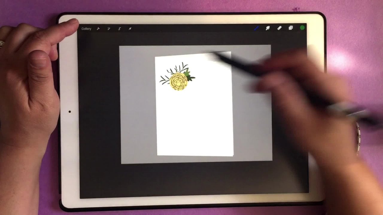
4. Greeting Card Pattern tutorial/Class Project: in this video, I'm gonna show you how I created this card. And I'm gonna also talk about the project. Uh, if you want to use this tutorial that I'm showing you now as your project, that is perfectly fine. You're welcome to print it out on a card or wherever you want. This would actually look really cute on a tote bag or, uh, really, anywhere. So it's totally fine with me if you want to use, Uh this short tutorial is your project. First off, what we're gonna dio here is my project here, and we're going to create a new one. So I did a four by six or six by four. Uh, greeting cards size. And what we're gonna do first is our pattern. So pick out a color that you want to use. Just gonna grab that green color again and I'm gonna find my patterns here. Somebody use something similar. I will show you that if you're using a pattern that looks, let's see if I can find one here. So if you're using something like this, this is a pattern that I created for for illustrator, and I brought it in to procreate so I could use it in my work here. It's a little too detailed to do what we did here. So if you want, you can try it. But I think that something little our basic works better. So go ahead and grab that pattern and then go to your source. We want to invert this. We want that to be our pattern shape to be knocked out. Eso its opposite of what we created it as. So it's just like this. And what we have is, uh we want that color underneath. So, um, so that's knocked out. Okay, so, second, we're going to duplicate this. We're gonna grab a black color, take our bottom layer, we're gonna select and fill it with black. So your background color has a lot to do with this because it's gonna show up. And so what will kind of mess with that in a minute? But just keep that in mind that you want these Tuto kind of blend. So go ahead and come up here to adjustments, blur it just a little bit. I wouldn't go to too much, but whatever you think looks good and then just start lowering the opacity a little bit there. Okay, So this is where you come in and kind of a play with those colors below. So if you wanted just kind of Ah, a different color green. You can do that. It doesn't really matter. You can leave it white if you want it as well. It doesn't matter. But you're going to see that, uh, that blend. It looks like it's cut out of the paper almost. And I do want to mention to that if you are printing this, um, you want to go darker than what you think that you need one? Because I printed my 1st 1 looked like this, so you can see that that was really to light. So I came in, I adjusted my color and I just darkened my my this cut this layer here. So this is my shadow. I darkened this up of it, and then I changed my color. Ah, here to a darker color. So what you see here, this green was actually my bottom layer. I had a white layer here, and you could also do this as well. So if you fill this top with white and then change your background color, you can get a totally different look. So again, it's up to you. However you want to do it, I'm gonna leave it this way because I actually like this better. But you can do it the opposite. Teoh. It does not matter. All right, so next up, we want to get those border, that border around it. And the way I did that was again if you took one of my other classes, I believe it was the 1st 1 where we read where we created Ah, hand lettering brush. We used the app graphic. So I just came in and I created a simple frame on, exported it and brought it into appropriate. That's what I did. But right now I'm gonna show you another way of doing this. And you can just use a basic round brush. So I'm gonna grab a little bit of Ah, I don't know. Maybe, uh, kind of an off white color here so you can see it. And then I'm just going to make a quick line here and then kind of straighten it out the best that I can and that's it. And I'll go ahead whips also make sure you're on a new layer and try that again. Okay? So go ahead and duplicate this, and then we're gonna go ahead and we're gonna move it over. I like to use magnetic in this case, because then it kind of stays where it needs to go. And I don't mess up the positioning of it like I just did. So we'll just move this over just a bit. Okay? So it's a little bit off, but that's OK. All right. So I'll create a new layer and again with my round brush, I'm just gonna create the top part of the frame Quick line. And if you find that it's too thick, just start over. You know, you don't have to leave it. And then what's nice about a pattern like this is you can kind of use that. You can eyeball it to see if you have your line straight. So that's what kind of what I do a lot of the time. So I don't I think that was too thick. Okay, somebody start down here a little bit lower. All right? Close enough. Okay, So there is our frame, and I'm gonna go ahead and I'm gonna merge these altogether. And I'm just gonna pull these three together to merge them. And then I'm gonna create a new one of that. Somebody duplicate this again the background, The back one is gonna be black, so select and fill. Or you can just drag your color in, Um, and we're gonna do the same. Things were gonna come up here, we're gonna blur just a bit. And if you want, you could bring your capacity dot It depends on how how deep you want your drop shadow to be again. I don't like the border color but doing this so you can actually see it. So just imagine that it's lighter and white. All right, so we're good there. If you want to create a little shape, you can do that as well. If you go into the procreate website. There's a lot of designers that did a lot of shape brushes and you can get them for free. But that's what I used here is just a basic square. I lost my color. So let's get that color back, and then I'll create the basic square, which is really big, so just kind of pull this down and I just put it right here. And then I kind of eyeballed it again to where I wanted it. And then I brought in some text. Or you can even hand letter your message or whatever you want to put their on again. You can put in a duplicate of this, and you can color this black as well. So select and fill or just drag it in and then you can come up and blur. This is Well, uh, that's really it. You can even take a different shape and put it above here. So if you wanted this shape Ah, here, he wanted it in the middle. You can do that as well. Again. I would probably change the positioning of the drop shadow in this case, or you could even get rid of it. Um, so it doesn't matter if I change all of this back to the color white. I think it look a little bit better than it does with the yellow. So it's nice and spring looking. It has, uh, you know, a nice feel to it. It's also look really cute. Is while our this that's high. Did It's really truly simple. Um, just play around with it. See what you think about the APS I would definitely start off with I symmetry. And first of all, see, if you even like doing patterns, I think that you will. And I think that you're gonna sit here for hours in draw and draw and draw, because that's what I dio. So I get become so addicted to this, uh, anyway, and then go onto Painter. If you feel like you want to spend the money, I think you really like it. Uh, anyway, the project for this if I haven't already told you, you are welcome to use this tutorial that we just went through. If you want to use this style is your project, you are more than welcome to you. Do not have to print it out unless you want to. Ah, and if you do, I would love to see a photograph of it. So again, you can also do wrapping paper like I've done here. And if you want, you can do a wall art piece. You can dio uh, if you have a cricket, if you want to print it out and maybe put it on a bag tote bag. You can do whatever you want with it. So if you want to as well. If you don't have the time, you can always just post up a picture of your, um your pattern that you created. So I'd love to see everything that you do. And I hope this helps. And I hope you had fun. So thanks for taking the class and I'll see you in the next one by
5. Adding your text to Procreate: They're just a quick on video for you guys. I was recently asked about how Teoh bring in my bringing your text in appropriate. So in my last class created custom stamp, I go into the app using the at any fund. And this is where you can bring in or download, Um, maybe funds that you purchased or funds that you've created yourself. So, like, an O. T. F file into the iPad and that enables you to use this or use that in different APS on your iPad. But I'm gonna show you how to actually bring in that text and Tuapse that we used to. I used to do that eyes called what is called Assembly on. This is a really good app for shapes and things like that. It's good for text as well. The only thing that I don't really care for in this is that you're limited to the amount of funds that you have. So what I install new funds into my iPad, They don't update in this app, so you're just limited. But there's a really good selection here s so I really do like using assembly for this. So go ahead What you do is just coming here. You'll see you down at the bottom where it says tax, Let me delete this. So just quit. Cook new text object, and you're just gonna put in the text that you want. You can change the color here three size and then to change the fund, just click this and this menu will come up here and you can choose which ever one You what ? And we're gonna resize this a little bit smaller. Okay, So really, that's all you have to dio if you want to adjust anything else just going to edit tax and you can make the changes here. Come back out or come back up to your menu. Click export. Make sure it's a P and G and make sure that it's transparent. Click save image. You can come back in appropriate insert. Insert flat image from your photos or wherever you saved it. It's gonna be black. So if you did your text black in, uh, assembly PNG file is gonna show a black background. So obviously the entire image I's gonna look black because our text was black. So just click this and there's our text If you want to change the color of this, you can just drag in the colors that you want. If this was all connected here, this word text, we would only have to drag that in once. Otherwise, if you want to click, select on the layer and then fill it will fill it all at once. So okay, that is assembly. But the one that I use most often is graphic on again in the first class. I go through this at pretty pretty, a little bit better s so I'm just gonna fly through this here. I've already got a canvas open right here. Get some tax right here. And the way we do this, I'm gonna move this off to the side here. We're gonna go ahead and click the tea, which is for text, and that is gonna ask you to double tap to edit. So right now I have my fun, which is Calypso, and I created this one, and it's an actual like O T F file. So I was able to import that into my ipad, and now it updates and do all the funds that I have on here. So if you watch the previous class that had do Customs Stamp. I will go through how toe use any funds and how to install your funds. So I know that this fund here I just imported as well, and I'm gonna use this one, so we'll just do the same word. And I'm going to go ahead and select my entire word and I'm gonna adjust this so you can see that 1 44 144 points is the biggest we can get it. There was a way to change this. You're gonna come up here? We're going. Teoh, convert text outlines and then come to our ruler. Make sure that the aspect ratio is locked and you could go ahead and increase the size of your text. So that's it? You're gonna do the same thing. What? You're happy with your text? You go ahead and click the back button in this AMP. Click save. Come up here to the export, saved the photos, or wherever you want to save your work. Select the document you want to save and click share here at the right. This is important. Here again, it's 300 DP eye for the image resolution and you watch you not include the background to make sure that that is unchecked and click Save. That's it. Come back to procreate. Go ahead and add a new layer here. We're gonna insert well, just like we did before. Come to photos again. It will be black because it's transparent and there's our text. So you can see here that if I bring this in because these three are connected, other gonna fill all at once, otherwise would have to bring it into this separate. So I hope this answer the questions that were asked. And if you have any more, please let me know. I'm always happy to help. And I'll see you in the next class. Thanks. Bye.
6. UPDATE: How to correct the transparency issue in IOS 11: Hey, guys, I just wanted to take a few minutes to show you how to fix the image issue that we're having with IOS 11 with the transparency. First of all, you're gonna just go in your settings, come to your photos and then all the way at the bottom where it's just transferred to Mac or PC. Click on keep originals. That's all you have to do. That should fix it. And then you can come into whatever app you were working in. I have the word image here, and this is gonna go out as a transparent background. PNG So in export, PNG, This is very important here. Do not click on standard, click on transparent. And once we do that, we can click, save image. I'm gonna come out and I'm gonna show you how this looks in your photos app. So this is the one I just exported right here. If I open it up and just happen at once, it looks fine. If I tap on it again, everything goes blank. So I just want to make sure that, uh, if you're doing this and you accidentally see this Isa black, uh, image, it's really not eyes because your image itself is black and the transparency shows as black on here. So I have a white one here that I already made. And this obviously is gonna look all wait. Ah, but if I tap it again, you'll see that it's gonna show up when I do a full view of my image And just to show you how this looks in appropriate here, the both are Anthony, Lighten up this background here so you can see this is the black one here that I imported. And then here's the white one. And these are all transparent backgrounds on everything. Imports fine and works perfectly fine. So I wanted to make sure that you guys understood how this worked and how to fix the IOS image issue that we're having. So if you have any more questions or you have any more issues with it, email me or something, a message and I'll try to figure out how to fix it. Thanks for watching by
 Kim Miller, merriemoore.com