Transcripts
1. Welcome to Designing with Procreate: Hi. Welcome to designing with Procreate. This is part of an ongoing series of classes for the iPad. My name is Kim Miller, and I live in Michigan with my husband and two dogs. I'm a graphic designer who in the last year has gotten quite addicted to the iPad in the pro great app. I'm also the owner of Marie More designs where I create patterns while art brushes, textures and short tutorials. I have found that I really enjoyed teaching and sharing what I know, and that is why I decided to create this course. If you would like to take a look at my work, you can find it at mary more dot com creative market or just find me on Instagram. I'm always happy to help anyone who has questions, so please know that I am here to help you Before we begin. I wanted to recommend going over the appropriate website and downloading their handbook. I suggest keeping it open while you are working because the handbook is very well written and it was a huge help for me in getting to know the app in this course will be learning the basics of setting up our campus correctly to import a brush source. I will go through all of this with you and show you step by step. How to do this? Next? We're gonna take a look at a couple other APS that we can use to create a brush source. We're gonna move on finally to creating our hand lettering brush again. I'm gonna go through everything with you, step by step, and I'm also gonna show you the settings that I use in creating my brushes. I will discuss the project the class project with you as well to get you thinking about what you would like to create. And I'm gonna show you how to export your brushes and market them if you would like to give them away or sell them. Ah, there's less to do. So let's get started
2. The Basics setting up our brush template: in this video, I will go over some of the basics. We're gonna set up her canvas for a brush source and we will create an organic style brush source using procreate. There's a couple of things to remember when creating your brush sources, and one of them, most importantly, is the size and what you create your source. I will show you how creating your brush sores in a nine square canvas will distort the brush once you import it. So here I haven't a 11 by 8.5 canvas that I created, and I'm gonna go ahead and I'm gonna put the circle, which I put in earlier. It's just a basic circle that I blew up, um, that I enlarged in procreate s. So what we're gonna do first is remove the background and then we'll export. This will share artwork we always share is a PNG where we're creating a brush Sources. We do not want a background in our brush source itself. Okay, so we'll just save the image. We'll come back in appropriate. And if for any of you who are new this is where all your brushes restored and what I'm gonna do here is I created a skill share folder here, and in order to do that just hit new set. So once you hit this, you can rename it. So I suggest when you're starting out and you're just kind of messing around and getting used to things, create a new set and keep your brushes there, then what? You're more comfortable and you want to create, like, maybe a hand lettering collection or watercolor collection or some sort of collection, Go ahead and then keep making new sets. But for now, I'm gonna work in the skill share set, and then I'm gonna go come up here to the plus sign. We're gonna select that shape, so click on where it says shape, source, click select shape and then choose wherever you ah added that photo that we just exported, um, go to photos will pull that in. So now you can see that my shape source got smushed into a an oval shape because we did not import. This is a square. You can see that here procreate imports all of its brush sources and all of its sources as if it were they were square. So when worse creating our brush sources are textures and every everything. We want to make sure that we we create them in a square canvas or template. So I'm gonna go ahead and I'm gonna cancel this. I wanted to show you that we're gonna come back to our gallery, and now we're gonna set up a canvass. And you guys were gonna found along with me because you're gonna be using this to create your brush source, um, down the road. And then this way, you'll also already have this sitting in your gallery. And you don't have to worry about recreating it every time you wanna make a new brush. So okay, inner gallery. We're gonna come up to the plus sign here, and then if the bottom laughed, it says new canvas click. Here. You can work in any any measurement you would like. So millimeters, centimeters, inches or pixels. I'm gonna work in pixels and you want to create this. So what Big I usually do about 2000 by 2000 pixels and definitely make sure that you're your resolution or your DP. I is at 300. I wouldn't worry about anything else in this, Um, this here. We just want to make sure that we have this set up with the right size and making it a little bit larger. Just kind of your butt brushes. Better resolution. It doesn't pick Salaita's much when it's enlarged on it just looks better. So same with a resolution. I'm all about making sure that it might be a little bit too big, but I'd rather have it be too big. Ah, then too small. So then go ahead and just create your new templates so you can just make, uh, brushed template and then click done. So we're in now. What you want to do is change your background color because the way it works when you with color or with opacity and transparency is anything that's white eyes full opacity, so it's fully opaque. Have black is completely transparent. So if you create a brush that's a circular brush that's all black. You're gonna see nothing. So I always work on a black background, and then I'll remove the back room before I'm done. Ah, in later courses or classes that I'll be teaching, I'm gonna show you how to create more watercolor more textured. And, um, you'll have more grays, whites and blacks involved in the brushes. But for now, we're just gonna create Ah, totally white brush just to get everybody used to the creation of brush sources. So So make sure that in your color palette you are on white and then make sure on a new layer, and then whatever brush you have, it doesn't matter. We're just gonna create Ah, very organic brush here. Just it could be just a splash. Just it could be anything you want. So I'm just gonna create just this little spiral here, okay? Yes, I mean, super easy. So make sure, though, that if you create it, if you created a pretty small go ahead and large it. But if you make it too small, let's say like this and then enlarge it. You run the risk of a lot of picks, elation, and you don't want that eso try to create it as big as you can. So if I only want three different swirls in it, I might do it like that. Um so trying not to create it small and then transform it because it gets pixelated. We want to keep that Christmas crispness to our brush. So I'll go ahead and leave this one here, and then you can go ahead and center this if you want it on an angle you created on an angle. Um, if you create it this way and you leave all this white space over here, your brush is gonna show up like this when you use it, you'll have all this white space there, which is fine. If that's the way you want it, try everything out, be creative. And, um, you never know how it's gonna look. So, um, you know, just letting you know that if you import it that the white space or that that space that has nothing in it will show up in there. That is a color, but you'll see the space. So Okay, let's do this. Okay, so come up here. Two layers. Remove the background color. So we have just our brush, our brush sores, and then come up to your wrench, which is your actions. Click share artwork and make sure though this is important that you save it is a PNG file. We want it completely. Ah, the background to be completely transparent we don't want. Even though it's black, we don't want anything. We just want the brush source in there and then click save image. Okay, so we'll come up here to our newly find your new set and lines right here. Ah, the upper right. You're going to see a plus. Click on that. Where is this shape source? Click select shape and then find your photo and bring it in. So now you can see you can see that are shaped. Did not get distorted because we created it on a square. So that's perfect with grain were going to come in and simply just put in a blink, um, texture or grain source. Usually when most most of the time. Actually what? I'm starting a new brush. I never had a texture or grand source. I want to see how my brush is going to react to the settings. I add to it first. In a lot of the time, I don't end up adding a green because especially for a hand lettering brush, I kind of like it without a grain. So it's up to you, but I usually wait till last to kind of experiment with that. So all right, our brushes created Also, if you want to name your brush now, feel free to do that. Otherwise you can wait until later. We'll come back to our layers, will turn on our background, and we'll turn off our brush source. And I always keep it here. Um, just in case I want it may be, Ah, add something. So maybe I want to add, like a you know, something here or Ah, it doesn't matter. But as long as you keep it that way, you don't have to recreate it later on. So we'll just create a new layer. We're gonna test out our brush something resize this a bit so you can see it. And this is what I've gotten just with our basic settings, the way it was set up. So we haven't done anything to the settings yet, and we're not going to in this video. This video was just a little demonstration of how toe correctly set up for your brush source creation will get into, um, the brushes in the next video. I just wanted to make sure that everybody understood how to set up the importance of setting up in a larger size file and then making sure that you're setting in us, you're setting your source up in a square template or canvas. So, uh, so that was it. That's really what you have to do. Those those are the basics of starting your brush. So in the next video, we are going to go over Ah, few APS that we can create our brush sources in Ah, you can Oh, you're always welcome to to use just appropriate app. If you want to create more organic shapes, that is totally okay. I just want to show you what your options are and the things that I dio to create my brush sources. So I will see you in the next video.
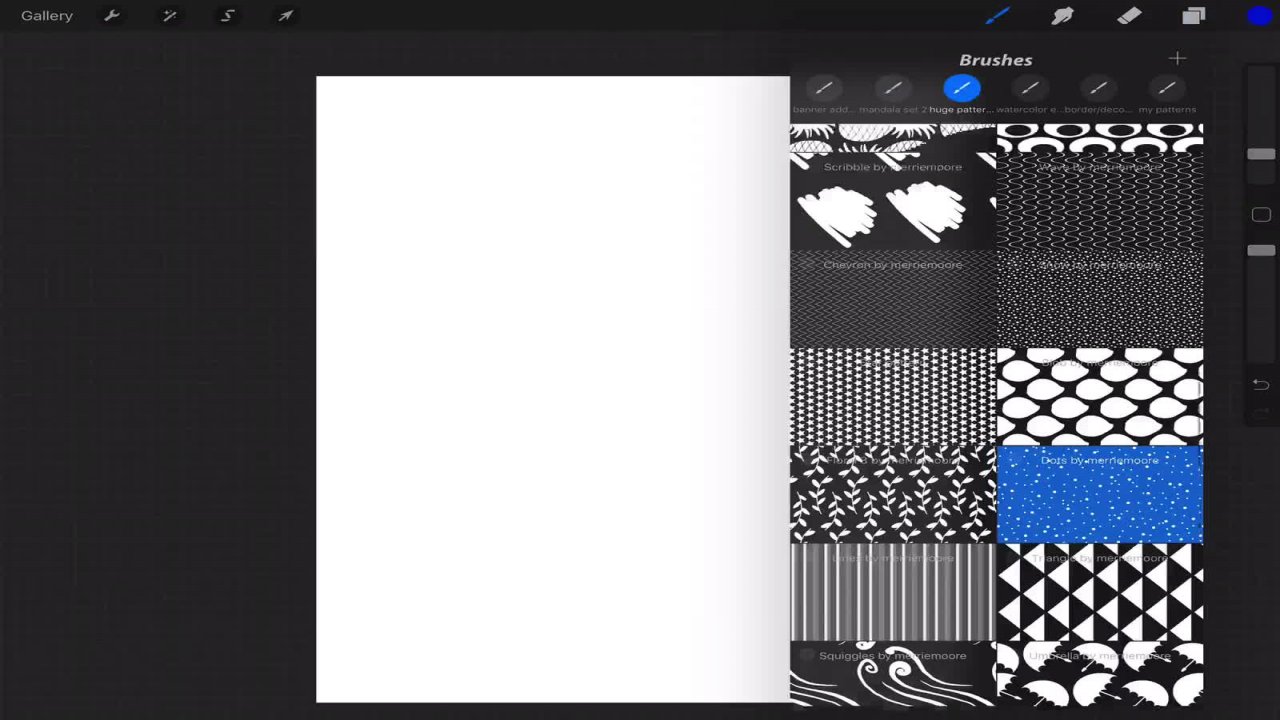
3. Using other apps to create our source: Hi. Welcome back in this video. We're gonna take a look at Tuapse that I find very helpful in creating my brush sources. I want to point out that you do not in any way Ah, have to use these APS. These were just too that I've found very useful. But there's so many other APS out there that work just the same. These are both. I think they both have free versions. I have paid for both of them. Ah, and I'm gonna show you the 1st 1 We're gonna be working with his graphic. The second is assembly. So you may be familiar with these already. These were just the two that I use mainly in creating my brush sources. So another good thing about both of these and why I like them is because I can set up in a square template or square canvas so I don't have to bring anything back into pro grade and re size. So Okay, the first we're gonna look at is graphic. And to create this works a little bit differently. So it took me a little bit to get used to this one. Uh, but we're gonna come up to the tapa left and click the plus sign. Just click on the blank canvas and again it's gonna bring it right back. So make sure you just click on it to open it. And then to resize it come up to this wheel, you're gonna see Canvas grid and rulers and preferences. Make sure that you're on, um, the canvas. We want to resize this to a square. So again, we're gonna do 2000 come to height 2000. Now the resolution will take care of them. We export for this app. Okay. All right. So there we are. We have our square. Next, we're gonna work out our shape. I'm gonna go over some of the tools that you can use to create your source. Ah, there's the pen tool. So obviously, if you want to use that, you can create shapes using the pen tool. Ah, there's the brush. There's a pencil, a line tool. So it works the same. We have the ark tool, the ellipse tool rectangle tool rounded rectangle polygon. And to adjust your sides. You can just come down here. It will automatically adjust those and change that for you and then the star tool, which will be using today. So Okay, now that we have our square canvas, we're gonna go ahead and draw out our shape, so I'm just gonna make it as big as I can. That fills the canvas, Come back up to your selection tool and just move this around. So it's centers correctly inside. Okay, Uh, so right now you see that we have a black stroke, so we can't use that, because if we import it is a brush, we're not gonna see it. If you remember, black is transparent and white is opaque. So we want to make sure that we change this, um, to a white stroke. And right here, Israel, you find your stroke, you can lower the opacity, which turns it off, or you can come down and change the color again. You have a color picker, which you can drag and color pick, and then you can slide here and change your like. If you want a color wheel, you have RGB. You can enter a hex code, so I prefer to work with the color wheel. So but it really doesn't matter. We're creating brushes right now because we're only working with black or white in this class. So go ahead and change that. And now it looks like we have nothing on our canvas. But if we pull this out of that, you can see that art are stroke changed a white. Okay, so you can always come into and Addis Phil, if you wanted, so we can have the stroke of the fill. Or we can have a fill or just a stroke so you can see that that change. Now there's a little trick, and I'm gonna leave that. I'm gonna show you in a little bit, but I want to leave this. Leave this just it with stroke. So again, make sure it's just a stroke. Bring it back in. Make sure it's centered inside and not falling off are coming off the art board. Perfect. Okay, if you want to change the stroke size, by the way, come up here to this little I We've got appearance effects and styles, so we're gonna work with an appearance and we're just gonna change the stroke size so you could enter it manually. Or you can come over and just click the minus button or the plus, and it'll automatically change that for you. So OK, moving on. We're gonna ready to export this now, and this is a little bit different, Aziz. Well, I'm not used to this. It took a while, but Export, just click the back button in it back. I mean, the word back and not the undo button. Um, it clicks save. It's just gonna take you out into, like, the gallery again. So come up here to the export and just do a save the photos. So now you have to re select. So select here and then click share. It will bring up a different menu. Um, you just leave the scale as it is. If it says 100% leave it there. If it doesn't make sure it says 100%. This is where the image resolution comes in. Yours might pop up at 72 or 1 44 Makes you change this to 300 and then your image background may come already checked. This is another thing. You want to make sure it's important that you uncheck this because if we do include the background, we're gonna be importing just a 2000 by 2000 pixel square into our brush sores. So we want to make sure that we see are star shaped and then just click save. And there we go. So now we can come back to procreate, go right into our brush, it will create. I'm gonna get rid of some of these little easier to see. Okay, So it created new brush universe to select the shape will find where we added that which was to our photos. We'll go ahead and import, and you can see that it imported it pretty well. It looks like a square. We didn't lose any of our shape. Um, it's not squished. So looking good, come over to your pro library for your grain and just put in a blank grain. We don't want any put anything within that yet. We'll work on that, um, later. So go ahead and test out your brush. Open a new layer. So there we have it. We have a new brush. It looks really good. It's not blurry. We can raise the size a little bit. So of course, we haven't gotten to setting jets, so it's just the basic settings. But there is one thing. I want to show you in the reason I created this shape with just a stroke. Because if you wanted this to actually have, um, let me adjust this really quick so you could see it better. I know that we we imported it with just a stroke. But if you wanted this to have a fill, you don't have to create two different brushes. The little trick to do is just come up here and hold and grab this color and just fill it in. So that was the look at graphic. We're gonna move on to assembly, which is probably my favorite. Ah, another. This is another vector at, but the shapes are already, uh, drawn there. Already done. So come in. When you open it up, just click a new project, and automatically, you're gonna be, uh you're gonna have your new canvas and it's a square. Ah, a little bit about assembly. If you go back to my work, this is gonna bring you back to your gallery. We haven't export. You can change the background color of your and the size, so I leave it here and then if you want to change the color you can, but again, I just leave it it white because we're gonna be exporting is, um PNG files. Anyway, so we're not concerned with the background. All right, So, like I said, this app that everything's already drawn for you. And when I use this, I recommend, um, being creative. And you want this brush to be customs. You wanted to be one of a kind. I don't recommend coming in and just, you know, using a shape that's already drawn out for you and using it as a brush. Um, I feel like it's I don't know. You want to be creative, right? So try adding other things to it, or, you know, taking things away from it and being creative. So what? I use this. I usually just work with simple shapes, So I know that procreate has an oval shape, but maybe I want an oval shape that looks a little bit different than the one that's in appropriate. So I personally like oval shapes for hand lettering brushes. So, um, but I might want a different size brush. Um, let's try coming and we'll add It will kind of add a had into this so maybe we want Let's see here. We'll do this. So maybe we want our are oval to have some circles in it. So what you're gonna do in order to create and combine two shapes is to select on both by clicking and dragging over both of them. This tab on the bottom, right click so you can combine these cut out or intersect. If we cut out, it's gonna cut out that top shape. So we have a oval with circles cut out of the oval, and that's what we're looking for. That's what I'm looking for. Uh, just go ahead and test different shaped different shapes so you can come back, undo at the top. So we wanted to come in and we wanted to combine. Obviously, that's not going to do a whole lot. Um, so go back, okay. We'll re select, and then we can do an Intersect so that there is going to give us the opposite. It's a series of circles made out of the shape of the oval, so either one would work really well, we're gonna go ahead and we're gonna try this. So, uh, that's it. That's all you have to do so. Good, creative. Create your shape. Make sure it's within your square template, and then we're gonna export it. But first we wanted to be white, right? Because you wanted to show up. We could do Gray. But if we did this gray, it's gonna be semi transparent, which is fine. Um, but, uh, you want We're working with just white in this class, so go ahead and change that colored or white. As you can see, it's still there and then just center it and that's it. We're gonna come up to our menu, click export, make sure it's a PNG and that it's transparent. Save it to your images Also. I want to point out, too, that if you export Panji transparent, you can come in and export this right to procreate. Um, but it's gonna end up what it takes a little bit longer, but to you end up with it as an art board. So if you come into gallery, you're gonna see it here. So this is only in the event that I have to resize it, that I use that otherwise I just save it to my photos on, then import the photo is a brush. So again, back to procreate. Click the plus sign selector shape from her photos looks good. And then our grain We're going to start with the bait. The blink mulch will test it out. So you see what happens here. So again, totally different. Look, that's up that size and see what we get. So this they all have a different look to it. Um, and like I said before, you'd be surprised at what works for Ah, hand lettering brush many, many, many different shapes. So again, this is all about creativity. Try things out. Some of my best brushes came from things that I it kind of happened by mistake. So you never know. Don't give up on a brush. Hold on to it. If you don't think it's working, come back to it later and you'll you'll find something. But anyway, in the next tutorial in the next video, we're gonna work on our actual hand lettering brush. So decide how you want to import your, um your source. If you want to use procreate hand drawn. If you want to use one of the apse, it's up to you. However you want to do it, but we're gonna go ahead. We're gonna gonna go through each setting. Ah, that I use in making a hand lettering brush. And we'll also be looking at the project for this class. So which is it gonna be really fun? So I'll see you next video.
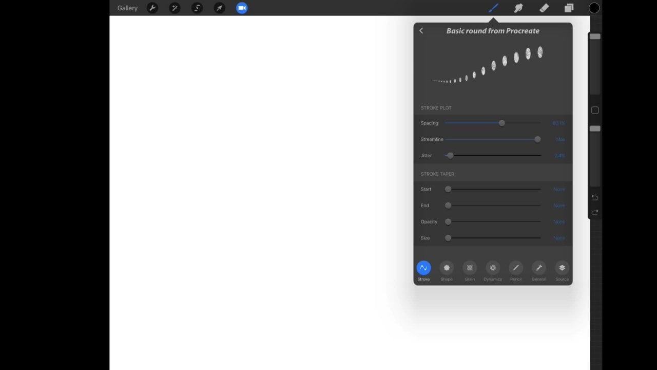
4. Create your Hand Lettering Brush: Hi. Welcome back. We're at the point now where we're gonna create our custom hand lettering brush. I'm gonna go over the basic settings. These are all the settings that I use when I create my brushes. I'm also gonna go over the project for this class. So let's get started. You're gonna start off with any canvas you wanna work in. It doesn't matter. We're just creating a brush, and we're gonna test it out. So I recommend if you're using a higher resolution. So if you're like me and you're right really big are you write really small. Uh, that way it looks nice and crisp and clear. So you know how to import. Just click the plus button at the top selectors shape. Oops on then import as a grain. Just your blank. So again, we're just gonna start off with a blank texture grain source. We're gonna short start off with our pan made shapes. Or so whatever you decided to use, whether Ukraine into shape, source in appropriate or you created it in another app. Ends like in, uh, assembly or graphic. Just important that. And let's get started with this Here. This is my rush that I created. And I went ahead and changed this back to my original shape source. And I have the texture or those circles within my shape source, which is what I wanted. Okay, so what you have your brush reported? Come over to the stroke. We're gonna start off of the top, and I'm gonna show you that with the spacing. If you don't want to add a texture if you add this facing all the way obviously, it just adds face in between your brush source. But you can also use it to kind of create, uh, a texture Look. And for this one, I wanted a lace kind of style. So that's what I got here with that brush source. And I wanted the coast scalloped edges. So I got that here. So for me, it worked out because I got the look I was after. And I didn't have to add that that grain source here. Okay, so I'm gonna take that off and I can still use This is a basic Hamlet or in brush, which is great. Um, but streamline. If you're not familiar, a streamline, try your hand writing with and without it because this is my hand lettering on my hand, right? Without it, if I turn this up and I'll try to recreate that same exact H, it's completely different. It looks so much better. So whether you need that or not, it's up to you. Go ahead and try it out. Jitter. This won't give you again a different look. But it's more to the edges. So if you wanted, like a tarpaper look, you can just adjust the jitter of it again. If you go to high, this is what you'll get. So for some other kind of brushes, this is perfect to use that for. Okay, Stroke Taper, if you are not a user of the apple pencil, this is where, uh, you might want to adjust these settings. I'm gonna turn off other pencil, um, settings, and it comes back to the taper. So I'm acting is if I'm not using the apple pencil. If I want that stroke Taper I had to push push this up here that adjust the size. So if I put it to the max, I'm gonna have a nice stroke. Taper, um I can also influence the end and then opacity again. I'll show you that I turn it all the way up. You can see I have a slight change capacity at the beginning of my stroke if I turned that , uh, it starts out at full capacity. So, uh, this is one way to do it. I know that you're not getting the pressure, so you're not getting the ups and downs. One way to take care of that is to just draw out your word, your letter, then come in and draw in your own down strokes your thinker down those drugs. So it's just kind of, uh, I guess my best advice for someone who is not using the apple pencil, but, uh, otherwise, you can use it if you're If you even if you're using the apple pencil, it doesn't matter. But for hell lettering brush. I do not use it. I just address my pencil sighs so shape. Uh, depending on the only thing that I use here for hand lettering, brushes, rotation. And if I use my brush like this, you can see the shape I know. I'm getting pressure. It changed the look of my source, so it's almost like my brush was flipped this way, and it wasn't so. If I come in and change my rotation to follow stroke, see now it's kind of changed the shape from turned off so you can see it again so you can see the difference in the stroke. Uh, so that's really it for that. You can play around with these other ones here. Scatter again is if you want to get some kind of an edgy, uh, kind of style to it. You can do that without eating a texture grain. I'll come back to that when we had a grain. I will not be using anything in dynamics for this class and the pencil. So this is where we get our hand lettering style. From here, I take off the pressure and we no pressure. So it is just a basic flat, a single wit, a stroke. I just the pressure here. I'm gonna start to get more control over my up and down stroke. So I'm gonna go ahead and this fact go. So again you can see with light pressure. I'm getting those strokes there. So one thing I want to mention this is pretty important is I had a few people come to me about brushes that they've gotten from me and that they didn't work or didn't seem to work out the way they were showing. Maybe in my Mac ups or on Instagram. One of the reasons that this is this could happen is your pressure curve. So depending on how to get to the pressure curve, just go to your actions and going preferences and then hit the pressure curve. Uh, so if you're pressure curve, let's say it's just set Teoh pretty basic and normal, drawing with the same brush. You're going to get something that looks like this. If I come back and I added it, change it this way. I'm gonna have even a totally different look if I over the extreme and maybe bring it here . This this is what I'm gonna what I'm gonna get. So depending on how your pressure curve is set on, it's gonna be different for each person, depending on how you write and how much pressure or how little pressure you use. So mine is usually set about here in this upper right hand corner. So and then also your other settings. We're gonna take into a account of how this is gonna look too. But for the most part, if your brush just doesn't seem to be working correctly this check this out and see if this helps the situation so again. And I have to get my brush back to the way it waas. Okay, so we'll leave that there for right now. And that looks good. All right, next up or into iPad screen. This I don't use because I always work with my iPad in landscape mode. So if I right now, I'm gonna turn it off. And right now I am with my iPad is facing me, obviously. But it's in landscape. So if I draw a line here and I flipped my iPad over So I'm in the pro portrait mode now and I draw that same line, I will get the same, uh, the same line. It's not gonna change if I come in and turn this on. And now I'm back in landscape mode and I'm gonna draw that same line, and I'm gonna flip it in, turn my ipad into portrait once more and draw that same line. It changes the orientation of my brush. So you can see here. Um, you can see that. My brush Here, you can see it. It's changing. Now, a trip to that When you're using your brush. If you come into preferences If you want your brush curse brush cursor to show Come in and click that So now you can no longer see it I turn it on, you'll be able to see my fresh cursor kind of where it's going So But anyway, those are two things that you can use I prefer toe Leave it off because I'm always working in the same, um, same size the same landscape. So, um, anyway, size limits again, you can control the size. Here I leave my at Max and that I control my size from here. So if I wanted a smaller brush, I just change it there a minimum. Same thing. You're gonna see how there is just gonna be one flat so you don't lose your pressure with that. So you want to leave this down capacity? Just what ISS. So if you want full opacity, just leave the settings like I have, um, and that's that. Okay, let's get a grain. Come here. Pro library I'm gonna grab this here. It's sort of a pattern. If you have a texture that you have created or you found somewhere else to use whatever you like. I'm just going both the settings with you real quick. So we'll put these back to kind of how they look originally. Okay, so here is I wouldn't call us a pattern, because that's what it is. I would say it's not a grain. Uh, so if we wanted to take this and, um, we use it as it is, that's fine. If we change the movement, you can see if we take this away and it's more it's a stamp. Um, it's kind of just stretching it out, is what it's doing. So if you want to use it a za pattern, make sure it's under rolling. So that way it's moving with your with your strokes. So Okay, so what? What I'm gonna do with this is I want to make this look like it's a brush. So I went like an old kind of old crusty brush look, So I'm gonna change my movement, And to bring that down se was scale. I don't want it too big. If I go too big, I'm gonna start to see big sections missing from my brush like this and kind of just losing my brush or my lettering. So we bring this down and I want this very subtle kind of like that. I click the zoom. I'm also gonna get a different look, And it's again, even more subtle. But I don't want it that I might actually want this pretty much off. So that was good. Right there in the rotation. I'm gonna show you rotation with this up. Um, see here. Okay, so it's gonna brush back. There we go. OK, so rotation, this is going to as I move, you can see how it's kind of rotating our texture header. It's following our stroke, so it's actually stretching along with us. So I move this. There we go. So I don't have it. I changed this here. You can see how it's moving as we move our brush. So if we go the opposite way, which is the inverse, it's obviously just gonna stretch it the other way. So that's universe. That's the following the stroke. So I didn't see how the changes happened. Like right here compared to here and then here, in here. So So that's what that does. Otherwise you could just leave this off filtered. Yes, I commit. So here's our brush. Close up with filtered off. Pay attention to the pattern. What? I'm gonna draw the same thing again. So was that on? You can see that we're getting a little more. Uh, that is defined. I guess. So it's a little more crisp over here, and then we're kind of getting a little blurry, but yet it's not as pixelated. So, um, anyway, that is what that does again for brush lettering or for him lettering. I just leave that off. Okay, so we went over the grain, and again, streamline is important. And then the apple pencil, uh, you want to change the pressure size? All right, We go the opposite, By the way, you're gonna get the opposite. So we start off, we'll get the opposite kind of effect again. When you're we get more into this, you're going to tilt opacity in size more. You'll see how that works. But for him lettering. We're gonna leave the size to the max and we'll get our nice up and down strokes. Okay, for this project, this class project, you're going to come up with your favorite quotes saying any word on name. It could be whatever you want. Uh, you're gonna use your custom hand lettering brush, and you're gonna create a quote. We're gonna do this on a high rez canvas, and so start off by funding quote or a saying or whatever you want to write with your new brush and think about what you want to create this for. So it might be while art it could be a digital print. It could be a greeting card. It could go on a canvas bag. A mug notebook? It doesn't matter. But when you think of what you want Toe wanted to say and then think about what you want to put this on. Um, I also think about how you want to lay it out. I'm gonna show you in the next video some layout techniques and I've also attached with this class for appropriate brushes that you can use toe help you with your layout. We'll go through that in the next video, so take your time, think about this and have fun with your brush. I'll see in the next video
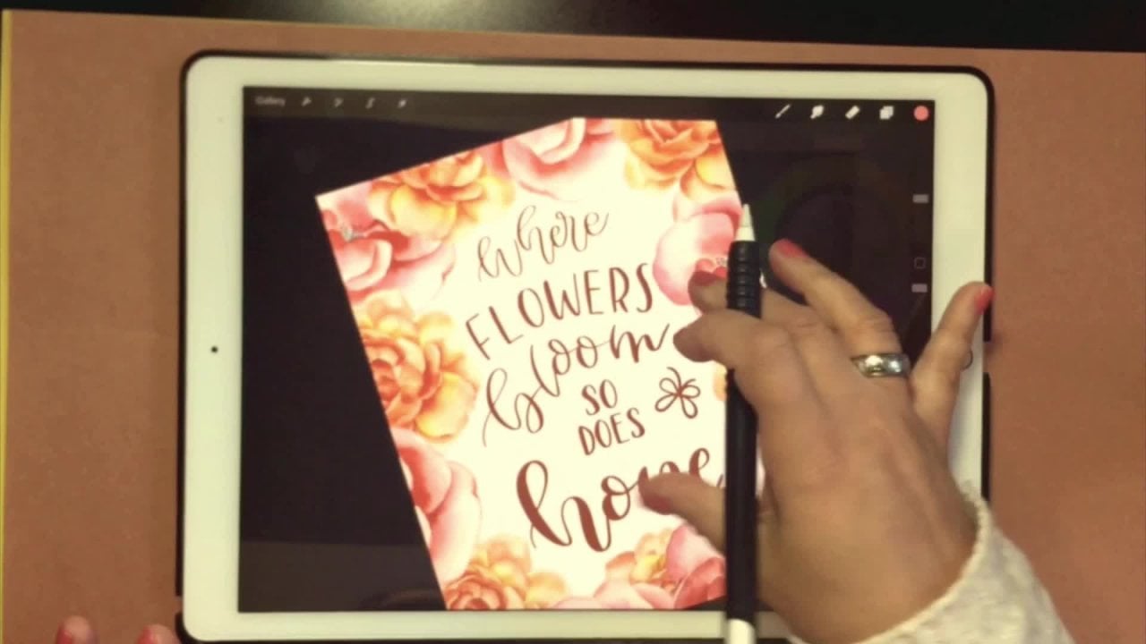
5. Layout your Lettering: in this video, we're gonna work on our layout and finally get do some hand lettering up again. I want to just point out making making sure that you're aware of what you're creating this for. I hate for you to create this wonderful work of our too small and then not be able to enlarge it later without losing quality. So best but is that create your, uh, your canvas is Bigas you can so mind right now is that 3600 pixels by 3600 pixels, which is also 12 inches by 12 inches. And I'm also at 3600. Let me go in my canvas here. So I'm a 300 g p I. That's very important There is that the the resolution is high, so it's not so much the size you're working on. Uh, but the dp I Although you don't want to work in something too small, So Okay, so get your canvas created, have your brush ready, and then your quote what? You have those go ahead and download the brushes that I gave to you. There's four brushes and there the ah circle. Let's see here a circle square started a heart if you want the circle. But yet you really would like an oval Go ahead and enlarge this toe What size you need, Um, and however you want it to fit again, This is just a guide. So this does not matter. It's just there to help us. So I am actually going to use the heart. So I'm gonna grab a dark color here, and I'm gonna rotate this because I want to use it upside down. I'm gonna fill the canvas because I want this to be pretty large. You could even go off the canvas if you wanted to. That's fine. Again, this is just a guide. And then I'm gonna come to that layer lower little passage e pretty low and immediately make a new layer. We don't want to start drawing or writing on our guide layer. So again, I'm gonna make sure that you name your layers. It's just super helpful. If you have a really large quote, I recommend putting each word in a separate layer. You can set this up beforehand, or you can do this after I'll make a new layer for my other. Only half like four words of mine. I just get this done quick for you. Just love what you dio the reason I love at the top. Um, it's because that's gonna be my first word that I create. It's gonna also be my big biggest. So I would go to my brush, which is here. We're gonna start Just kind of just play around with this. If you don't like it, delete a layer, Undo redo things like that. You can always creates multiple layers. It doesn't matter. You're working digitally. So again, I'm not foul. I'm just following the basic shape here. I'm not actually, um, making my shape or my words look like a heart. I just want to stay within a certain parameters or shape. So it just makes things kind of look nice and readable in the Okay, So next time you start with a word, do. But before I do do that, I wouldn't make some separate guides. And I'm just going to take my brush or my pen, and I'm gonna quick line some street somebody straight lions. If you're not familiar with a quick line, dry your line out and hold it. It'll snap into place and then you can, uh, move it here. However, where do you think it? Straight again? This is another set of guides, so I'm gonna rename. This is my guide. That's too again. I'm gonna lower the opacity here, and then I'll make sure I'm back on my other layer. I'll start drawing the word. Do. Perfect. Take that guy. Move it down and we can go on to her next word. Make sure on that layer, Charlie's out. One thing I wanted to mention is that this is hand lettering. It is not meant to be perfect. Uh, it's supposed to look handmade. So, uh, I wouldn't get too crazy if you want it. Perfect. You could go ahead and type this on a computer because that would be more of Ah, perfect. Look. Okay, so come back again. Your guides bring this down. Don't worry about spacing or anything. The reason that's the reason we put everything on separate layers. It will be very easy route things around in the end. So, um, just making sure paying attention to what layers were putting, um, where I'll do the word. You okay? Also with hand lettering. Uh, as you may or may not know that this is a form of art. So we're not just gonna Russian scribble out words. We want to take our time and I'm not an expert on hand lettering at all, But I do know that you want to take your time on each letter, so each letter should be created separate from the others working what at a time. So it just has a much neater look in your pay More attention toe one letter and time rather than what whole word. So that's just my little tip. What I've learned and right there, I know that that do what you is way too small. So what I want to do is start with a word you would kind of start coming in here and making these a bit bigger. This is good, because it was all of the separate layers I don't have to worry about. Maybe if I wanted the word do bigger than something else. I have done that, Uh, so OK, so I'm gonna take off my hurt guide and check it out there and see if I liked the land, which I really do like the layout of This isn't. I can tell that it was in the shape of a heart, but it looks It looks nice. It's readable. It flows. Well, if I wanted to, I could always add some kind of shapes in here. Maybe flower. It could be anything. Or I could just leave it the way it is. And it looks great. So, um, some of us things that I did with this is here. I know that we talk. We're gonna be talking about this in the next video is mock ups. But this is one of them that I did. This is another one. And this was with Steve Brush that I wanted to look like lace. So I wanted it a little more feminine because it was gonna be on this photo with address. Here was another one where I actually used the the star and I traced it and kind of made a little decoration around it. And then this isn't someone here. Photo from UN spice that come and I used it is a mock up, so we're gonna be doing that next. So if you have never been on on slash not come check it out. Are we going through that with you? If you have your own photos, you'd like to use that. Great. That's perfect, actually. Also, if you are foot of shop user, please feel free to go ahead and export your work and use regular Mac ups and Photoshopped one quick thing before I go. It's the next video. Is that I included in the files for the project Uh, this PNG here that you can import inappropriate. If you want to add some doodles or some filler to your artwork or lettering, feel freedom, Go ahead and use this. Oh, it's yours I have to do is upload it to you. Upload it to your photos. You can upload it to Dropbox and then bring it in. It's probably gonna pop in with that background color and there, So just turn that off and then come in and grab whatever whatever you want to use. So just got a very select jewel and draw around the shape you want to use with three fingers swiped down and select copy. Come back to your gallery, go into your original artwork, and then what's it? Lois White down once more and click paste and it's got pop that in there. So we're gonna go ahead and just literally is off here since start fresh, and then we'll just go ahead and a justice and move them to where we want them to set. So you have one side already in here. You don't have to go back out into the PNG file to get the other side. Just go ahead and duplicate this layer and then transform and just rotate wherever you wanted to sit. So that's it. So, uh, by all means uses commercially or personally, it doesn't matter. These all yours for free. Eso go ahead and get started. I will see you in the next video.
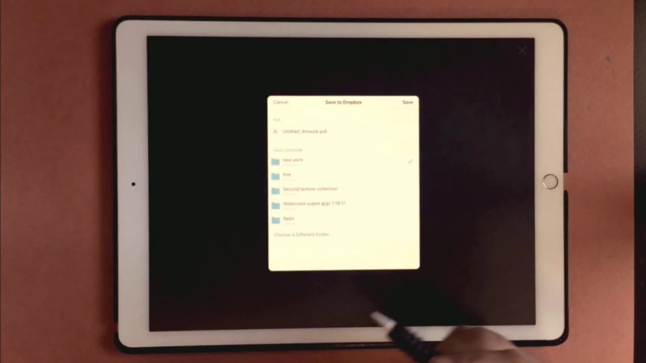
6. Exporting your brush/Creating a Photo Mockup/Thank You: in this video, we will explore a brush and learn how to use on slash dot com to set up our mock ups if you're a photo shop user, but I want you to know that you can definitely use Photoshopped doing back up so you're not , uh, strictly using the iPad here. If you do want to use photo shop. So if you are strictly and I pay user and you want to showcase your work, unscratched dot com is a great resource, so you can also use your own photography, which I think is a great idea. But this is what I use. I travel a lot, so I don't always have my Met book ready and available, so I'll use on the spanish dot com how to create mock ups. First, I'm gonna go through how to export your brush from procreate. You can export to your computer, dropbox or any other device or storage app that you have. Ah, highly recommend saving a copy of your custom brush just in case on this is even if you are not planning and selling this or anything like that, just in case something happens to your iPad or you accidentally delete a brush this way, You have a backup. I mean, you can always, uh, reinstall it. So I'm gonna go into this document here, and then I'm gonna go to the brush that I created. So this is the brush that I created. This is the original. What you're gonna do is just swipe toe left and you're gonna get this many that says delete duplicate in share. So obviously we want to share this. And here is where I just go ahead and I export into Dropbox. This is where I store all of my brushes and most of my work. Anyway, it's always just a good idea to back things up even more than once. Uh, so seemingly drop boxes go, You can send it to an external hard drive, save it to your computer message. It airdrop is another one that I use if I'm close to my Mac. But normally what I do is I just go ahead and save to Dropbox. So here we are. I've set up the folder called APS, and I'm gonna send it there and click Save. It's already in there, so I'm gonna click on replace and That's it. It's done. It's in Dropbox now. If I come back into my Dropbox at, I can see that Here it is. It was Monet's modified seven seconds ago. Eso Now it's there. You've got it to upload to your website. You can share it with anybody want email it. It's very small in size. So I've emailed several brushes at one time and it was no problem at all. And then that's it. That's all you have to do. Okay, so next up, we're gonna head over to other splash dot com and which is here. So, uh, go ahead and take a look through here. If you've never been on the site, I suggest signing up in this way. If you do, you can create collections. And like my collection, here is everything that I want to save, whether I've used it yet or not. I know in the beginning I found a photo that I loved, and I didn't have a collection set up and I would searched for it for probably two days. Um, somebody decided to go ahead and start using the collections. Okay, So what I search for normally with him lettering is called a flat lay. So if you just click, type that in. They've got eso up here at the Takis See where there's 500 photos that called flat lays. These were just different photographers that may be set up different folders for their work , so you'll find a ton of different photos for everything's lose photography. Food art. So if you're on your iPad, we're gonna do is click on the photo if you want to view it, and it should come up like this, and if you want to take a better look at it and allergic sized, go ahead. If not, just click your back button. You can add it to a collection by clicking the collect button and picking the A collection that you want to add it to. Or you can hit the down button to download this so on the iPad to download. There's obviously not a download button, so you're going to go ahead and click and hold on the photo itself and then click the Save image. What, you have your photo and you're happy with the one you've got. Go ahead and go back to procreate. First up, I want elsewhere mentioned here. If you're using the photo in your work and your website, however you're using it, it's always a good idea that credit the photographer. So they make it really easy here for you. And I have to do is copy this code and put it into your website. And it will automatically give you this badge here. Tells you who, Uh, who took the photo so Okay, back to appropriate. Come to our gallery and ministry. Two ways of doing this. It depends on if you want a printed or not. If you do not want to print this and this is just just basically for our whips that use go ahead and import that photo. So it's here. The reason I say to do it this way is because if we come into our canvas metadata, we can see that the dimension of the photo is huge. But the dp I is that 72 which does not print well. So if you're using this just for Web, use this one here. If you're not and you want to use it in a print, go ahead and create your own canvas. Um, that you want to use So let's say that we're using the 3600 by 3600. You're going to get your baby, uh, crapping off some of the photo. But we'll just go ahead and put it here, so obviously that doesn't look really good. So we're gonna go ahead and blow this up. I just find where you wanted to set. And I believe that there and then you can go ahead and endure artwork, so I'll go back to my gallery and I'll find my original work if you've already exported. This is a PNG. You can just import that back into that canvas. So I'm gonna go over here to copy, come back to my gallery, and I will with three fingers just wait down and click paste. And we know that that is really big. Um, what, you couldn't leave it like that. You could always lower the opacity on the photo and kind of change the background around if you wanted to. It's up to you. So there's lots to do. Or you could, uh, leave this photo with the opacity all the way up and resize your I work. But you want your artwork to be the star of the image, not the image, because we're trying to show off your rush here, not the photog of the photo. So So I suggest going in and kind kind of lowering capacity, maybe on the photo and then coming up in your artwork. Is Thea the main sitting here? So, you know, I just leave this that white. And then again, you could even lower it more. Adding a drop shadow is another way to kind up. Haven't stand out a little bit more. I would change the, uh, main color of the photo. So maybe we'll pick out this green here can do our original at work in that color. Come here down to your shadow and just kind of move this off and down to the side, and they will bring the opacity down. So Okay, so obviously what I love is to eat. So, uh, it's just a just a demonstration here, but, uh, anyway, those were just some ideas. I'll show you. Ah, few of the ones that I came up with and this was one of them. Um, here. I want to show you this to you can always do you saturate the photo if you want. So working on that layer where the photo is at, come into your adjustments and go to hue, saturation, brightness, and just come in And, uh, that middle here, um, just bring that down. Total de saturate your your photo. So if you were running a black and white photo, you can do it that way. Sorry for not to mention that. Okay, so that was the one here that I did. And this was the original photo. I did not de saturate this. Um, this was the other one that I did. And I think in the beginning of the class, I wanted to brush. That was kind of Lacey looking. And this is how it turned out here with the same brush, Same brush stores, and I went ahead and turn this into this. So I went to unspool s dot com. This was the original. You took my photo, added it, and I thought it was too, uh, bright for this photo. So what I do is I added a copy of the photo that the work that I did and I changed the blend mode, and it kind of blends more with the the environment of the photo. So, um, this one here I created another photo from un slash dot com and I just took my artwork and erased everything on my artwork where her hand was sitting. So it looks like she's actually writing on. Then the last one I did here again, this is another photo from one slash dot com. Can I just took, um Well, I started erasing here, but this was their original photo. Uh, and I just took the image that I created and placed it over the top. So again, these are not like the mock ups that you would use in a photo shop. But it's really helpful for me anyway, because I travel a lot. And I don't always have access to my iPad and my Mac book at the same time. So this works perfectly for me again. I do use Photoshopped quite a bit on and use mark ups, But what I'm traveling this is my way of showcasing my work. So anyway, that's it. You have just created appropriate style mock up on the iPad. Save your final work is a 72 d p i for Web and then you make sure you're using the 300 d P I for printing for this class in the projects. Just upload at 72. Don't make anything too big, So I wanted to say Thank you so much for taking the first designing with procreate class. I hope you had fun and learned something new. If you have questions, please feel free to leave it in the comments. Or you can reach me through my website and Marie more dot com. Have a great day. I hope to see you in the next designing with appropriate class.
 Kim Miller, merriemoore.com