Transcripts
1. Introduction: Hi, I'm Paul Richmond and
welcome to my course. Designing paintings
in Photoshop. I wanted to create a
course for painters like myself who are interested in exploring new ways of using technology to design
their paintings. When I was in college, digital art was around. They were teaching photoshop, a very early version of it. But it just didn't appeal
to me at that time. I liked being in the studio. I liked getting my hands
dirty and smelling the paint. So I avoided it
for quite a while. But after I graduated, I started doing some
commercial illustration work illustrating covers for novels. And everyone kept telling me, you have to try photoshop. It just makes the process
go so much quicker. And I resisted and
resisted, but finally, I gave it a try and
they were right. I loved it. But I still
love going to my studio. I still love getting
my hands dirty, and I still love painting. So I wanted to create this
course that could share some of what I've learned
about photoshop with fellow painters. It is a valuable tool. For conceptualizing a piece. With very little effort. You can explore a variety of compositions, colors,
concepts, everything. It's a lot easier to
move something around on your screen than to
paint it on the canvas, decide you don't like it, paint over it, and
paint it again. In this course,
I'm going to take you step by step through the process that I used to
design my oil paintings. Digitally. I'm an
artist who likes to have something to look
at while I'm painting. It doesn't mean that I'm
going to follow it strictly, but it gives me a
starting point. And the closer I can get that reference to where I would like the
painting to end up, the easier it makes the process. Why not make things
easy for yourself? Artists do not have to
suffer. That's a myth. I graduated from art school
in 2002, and since then, I have illustrated the
covers for over 400 novels, but I've also
utilized photoshop, in particular, to aid me in
my process as a painter. My paintings have
been displayed in galleries and museums
all around the world, and I've created commissions
for Disney Netflix and even some really
cool celebrities like Troy van and Dolly Hartin. In fact, when Dolly
asked for a painting of butterflies for her living room because she loves butterflies, I designed the painting
and photoshop. They wanted the colors to match specific
items in her decor, and it's so much easier to
move the butterflies around on the screen than to draw them and redraw them and redraw them. So I created some options
digitally and sent those off. She picked the one she liked,
and then I painted it. I'm all for anything
that gets me into the studio quicker and
lets me start painting. And that's what I want to share with all of you in this course. If you've been resistant to
technology up until now, It's time. Let's do this. In this course, I'll
be providing you with all of the images
that I'm going to be importing into photoshop
and manipulating to create a reference
for a painting. You can follow along and
do exactly as I'm doing, or if you get
inspired and want to do something a little
different along the way, please go ahead. That's
what art's all about. If you have never used
photoshop before, but you just have it sitting on your computer and
you've been waiting for that opportunity to dip
your toes in This is it. But also, if you do have some
experience with photoshop, but you're interested in
learning specific techniques that can help with
conceptualizing paintings. This would also be a
good class for you to. My goal is to provide
you with skills and techniques like
photo manipulation. How do you select an image? How do you drop out
the background? How do you combine images? How do you enlarge,
shrink, manipulate, play with all of the
different effects that photoshop has to offer so that you can create
a design that's what you envision
for your painting. Once you know these techniques, you can apply them to
any subject matter, any reference material
that you want. Create your own work and future. So, I don't know
about you, but I am so ready to get
started. Let's do this.
2. Project: In this course, the project that we'll be creating together is one photoshop file that is a design for a
potential painting. You could decide to paint it or not, that's really up to you. This is all about demonstrating the techniques that are
necessary in order to combine different elements and manipulate them and create
a mock up for a painting. Each lesson, we
will dig a little deeper into steps that I use in my own artistic
design process to create my own artwork. One thing I want
to mention is that every artist who uses photoshop uses it a little
bit differently. So please don't think that
what I'm sharing with you in this course is the only way
to do it or the right way. I'm simply sharing
with you what I do, and then you can take
it from there and develop a process
that works for you. Alright, let's start designing.
3. Materials: Okay. In this course, the materials list
is really short. That's one of the
wonderful things about working digitally. You don't have to
haul a lot of stuff. You will need photoshop
and a computer, and I'm using a WakeM tablet
with a styus to draw. That's not essential. You
could just use your finger on the track pad of your laptop
or you could use a mouse, whatever's most
comfortable for you. Lastly, you'll need
the image files that I'm providing for you. You can download those
from the project section on Skillshare before we get
started, and that's it. So go get all your materials
and let's do this.
4. Starting A New File: P. Hi and welcome to Designing
paintings in Photoshop. I'm Paul Richmond
and in this lesson, we are going to get
started just by learning how to
open some files in photoshop and going over some of the basic navigation of the
program. Okay, let's do this. Right. This is what photoshop looks like when
you first open it. You can see it's showing some
recent files that I had up. And when you go up here
to the top at file, That's where you
create a new file, and it has some
different options for some standard sizes
and things like that. I always just come over
here and enter my own. Now there's a few
things that I want to point out over here. So first of all, right now, the measurements that it's
defaulting to is pixels. Pixels are the little
dots on your screen. So 3,450 pixels is
really not that big. What I like to do is change
it to inches because that's something that I understand
better and can visualize. And then you would enter whatever width and
height you want. But before you even do that, I want to jump down
here to resolution. That may be a word that
you've heard before. Usually, if people
talk about it, if they're looking at a photo on the screen that looks blurry, they might say the
resolution is too low. What does that actually mean? Well, resolution refers to, you can see right over here, it refers to the number of
pixels per square inch. So the more pixels
per square inch, the better quality the
image is going to be. Now, this all seems boring and I'm sure everybody is like, Can we please get to making
some pretty pictures soon? I know. I'm right
there with you. But this is super important because This is something that you establish at the very
beginning of your project, and you can always
lower the resolution. If you start out and you make some really massive
file and it's slowing down your
computer and you don't really need to be able to
print it at that size, you can always come
in here and lower it but you can't
increase that number. You can't add pixels back into an image that weren't
there to begin with. I mean, you could go in and
type in a higher number, but it's not going
to actually change anything about the image,
if that makes sense. So it's important to know what you want that
resolution to be when you start. And I'll give you some
tips for how I do that. Now, 300 pixels per inch is a standard resolution if you are planning to print something
because things on the screen, can look good even at
72 pixels per inch. But if you printed it out, it's not going to look as good
as it looks on the screen. I sometimes like to print
out my reference photos or definitely if I'm designing something that is
meant for print, like a book cover or something, then you definitely
want it to be at least 300 pixels per inch. If you're doing any kind of commercial work, for somebody, if you're creating
an illustration or a logo or a poster or
something like that. If you know where
it's being printed, it's a good idea to actually
reach out to the printer and find out what
resolution should I use? Also, what color
mode should I use? This gets a little confusing
for people as well. Generally, what I use is RGB. Okay. That's a good
standard screen color mode, and if you're printing it on your home printer,
it'll look good. So if you're not sure, if you're just doing it to design a painting,
that's the one you want. If you're doing, you
know, down the road, commercial illustration
for somebody, sometimes certain printers
will want things in CMYK. But we're not going to
worry about that for today. We're going to keep it at RGB, and I'm going to use the 300
pixels per inch resolution. Go ahead and make sure that yours are set
to both of those. Then I am going to just go
with a standard size here 8.5 as the width and
11 " as the height. Now, one other thing
I will mention here. Is that it's really a good idea if you're
designing something for a painting to know ahead of time what dimensions
the canvas is. So 8.5 by 11 is
what I'm choosing. But let's say for example, you are using a 24
by 30 inch canvas. Now, you could put
24 by 30 in here, but 24 by 30 " at 300 resolution is going to
be a pretty large file. Another thing that you can do is Create a file that has
those same proportions, but with lower measurements. If I was designing something
for a 24 by 30 inch canvas, I might make my file 12 by 15, same proportions, but a
little bit smaller file size. For today's example, though, we're just going
to do 8.5 by 11. That'll be nice and
easy to work with. It shouldn't slow down your computer, it should
be easy to work with. Once you have
everything in there, the way you want, click Create. Here we go. Look at that.
There's your white canvas. Just like sitting in
front of the easel, except you're not
going to get as messy. I'm a very messy painter. So this is a good thing for me. Okay, so now we are going to open up those
photo files that you downloaded that we'll be
working with today and combining to create a design. So go up to file open. Now, I already have it here set to that folder,
but let me just go back. You can see this little bar
here at the top allows you to navigate through your system
to find stuff. All right. So once you find the folder, then you'll see that there
are four different photos. They should be labeled
exactly the same for you. And we're going to
start with photo. Click on photo and
then click open. There's Photo one. Okay. Now, if you look up here at
the top of the screen, you'll see that there
are two different tabs. You can click back and
forth between the two. This one here that
says Untitled one, that's our painting
that we're designing. And then every other
file that you open, we'll just kind of
file in right here next to it. So
there's Photo one. You can click over
there. As we open up other photos, they'll
just keep going. But I'll wait and open
them as we need them. It's a good rule to not have unnecessary files
open that you don't need. Anything that you have
going on in photoshop is just going to potentially slow down your
computer a little. Take it one step at
a time if you can. Now, over here on the left, are some various tools. These are all tool. This is
the tool bar. Makes sense. These are the tools that
you can use to paint, there's a paint
brush, paint bucket, if you want to dump some paint. This is the burn tool
that it's showing you. If you want to add type, it's a magnifying glass
to zoom in or zoom out. Photoshops really nice, will tell you what each
of these things are. You see as I hover over it. I'm not actually
clicking on the tool. I'm just hovering
over top of it. Okay. So you can explore those, and as we go along today, I'll explain to you what
the various tools are that we are using for this
process. Great job, everyone. Now, this is a good time to take a moment and save your file. We'll do that at the end of each lesson because I want
to drill it into your head. Save, save. There's nothing worse than
working forever on a file, and then forgetting
to save it and having your computer
crash or losing it. So be sure that you save
your work in progress. The next lesson,
we're going to start importing some images into
the file and learning how to move them
around and how to begin working with
layers. I'll see it.
5. Getting Started: Hi, everyone, and welcome to designing paintings
in Photoshop. In this lesson, we are
going to get started. We are going to import some photos into our file
and begin moving them around and also learning about
layers. Let's get started. The first tool that
I want you to use is this little
rectangular marquee tool, it's called And just as
photoshop is telling us, you use it to make a selection in the shape of a rectangle. You can see my cursor. Now, I'm actually touch. I'm not clicking yet. I'm just hovering over. I'm going to click down right outside of the top
left corner and then drag that rectangular marquee all the way across to
the bottom right corner, and then I'm going to let go. Now it is selecting
that whole area, You can look over to the
right to the layers palette, and you can see that there's
only one layer here. When you open up an image
that's a photograph, it will only have one layer. Now, we've got that selected. I love the little dash line
that goes around there. I think that's cute.
We're going to go up to edit. And copy. Our goal is to copy
this image and bring it into our canvas that we're working on to
design the painting. Now you remember where
that is right up here. Click on that tab and
go up to edit again. This time, can you guess what we're going to
do? We're going to paste. Paste. Now, a few things
that you'll notice. First of all, the photo file was much larger than our canvas. We're only seeing a small
part of it, aren't we? Here's the original
C. Here's our canvas. Now, are we stuck with that? No, I'm going to show
you what I mean. Another tool that I use
a lot is the move tool. We're going to come over
here and click on that. Sometimes, whenever I
should point this out, when you see most of the
tools, if not all of them, except for the magnifying glass, have a little triangle or a little arrow down
here in the corner. That means that when
you click on that tool, you get different options, if you're not familiar
with the program, you might have
already accidentally clicked on something and had that little side menu come up and you'll see
there's different things. But we're going to actually
just use the default, the move tool, and
then come over here and you see how that changes
the way your cursor looks. What that means is
the move tool allows you to you can hover over the image without
doing anything. But then when you
actually click down, like I'm doing, you can
move things around. Okay. Now, our image file, like I said, came in too large. The way to adjust
that, one of the ways, as I mentioned before,
I think there are 1 million ways to do
everything in photoshop. So one of the ways
is to go up to edit and free transform. You see how it added
these little grabby guys here on the corner. You click on that and drag. Now I'm just going to scooch it back over because you can see I made it so small that it just jumped right
off the canvas. For the purpose of this
composition today, I want to be able to fit that whole picture
on the screen. Well, maybe not. Actually, see, I'm changing my mind as I go. I often do that
as I'm designing. I think I want to
make it that big. You can line it up however you like whatever
looks best to you, I like this little trail of trees and I like the way that mountain top
looks over there. That's where I'm
going to leave it. But before I commit to that, I want to show you
one more thing. When you just grab on one of the corner grip or
tools like that, it keeps the image
in proportion. But if you come up
here to the top and click that I
think it's a chain. Then when you grab on a corner, You can actually manipulate
things and stretch them out or squash them,
however you might want. Can look really weird if
you do that with a person. Now, I don't want that
though, so I'm going to undo, I just use the key
command for undo, but I'll show you if
you want to actually undo something and you
don't know the key command, go up to edit and click Undo. The key commands are always
over here to the left. If you want to
learn those as you go, they come in very handy. I use them a lot now, but I'll try not
to use them today. But the key command
for undo is command. Z. If you only learn
one key command, learn that one. That's
an important one. Now let me put this
back where I want it. You can see how it
will allow you to have elements of the photo that go beyond the edge
of the canvas. I usually do that sometimes if I want to make
sure that there's not a little white gap along the
edge or anything like that. I like that placement. Now, when you're doing a transformation to the
scale or anything like that, once you have it
where you want it, then you're going
to press return or enter on your keyboard. And then all the little
gripper guys disappear. That means you are committing
to that placement. Now, another thing I want
to point out to you, if we jump over here and look at our layers palette again, you can see that we
now have two layers. We have the background layer, which is just the white paper, and we have layer one, which is our photo
that we just added. If you want to be a
good photoshop student, and I'm going to pretend
I'm going to try to be one two today and you want
to label your layers, you just simply click on the title and type in
whatever you want. I'm going to type Mountains. It was a double click, I should
say, not a single click. Then you just click again
somewhere off of the text and now it saves it as that. We have our first image
placed into this file. It's a good time
for me to introduce you to another very
important thing that good photoshop students do actually everybody needs to
do this one. I do this too. It's very important. Go
up to file. And save. I cannot tell you how many times when I was
first starting out, I would work on a document
for hours sometimes designing a painting or a
book cover or something and then forget to save it and my computer would
crash or something, power would go out, anything. And it was gone. Photoshop does not
auto save stuff. So decide where you
want to save it. I'm just going to
save it right here in the same folder with
the reference photos. You can come up here to the top and name it whatever you want. I'm just going to
title it painting. And this is also
very important down here where it says form I
think I'm saying that a lot. I think everything's
important, huh? Hang on every one
of my words people because it's all
important. All right. So down here, format, photoshop. That's what you want. If you are you want to
be able to have this remain editable and use all those layers and have it be exactly what
you're seeing here. If you want to create something that you're
eventually going to maybe e mail to somebody or maybe you want to post it to Facebook or something like that, Photoshop is not a good
format for those things. You could also click on
this and save a copy. And then maybe you want to save it here, I'll go
ahead and show you. Maybe you want to
save it as a JPEG. That's a very good
standard format for something that you want to be able to share
with other people. Sometimes I use TIF as well, but I think Photoshop PDF, if you ever wanted to
make a PDF of anything, you can do that. But I'm going to cancel out of that and just do a
regular old save, save it as photoshop. Painting, oops typo and save. And this is all fine. Just click Okay. And now it's saved, and you can see up here
in the tab it changed the name from
untitled to painting. And then dot PSD is
on the file now, and you'll see that
even if you go navigate to that file
on your desktop, it will have that dot PSD
that stands for photoshop. You can see the photo that
we brought in over here. The file name for
that is a JPEG. And now that you've
done that once, as you're working,
ever so often, you just want to hit save again. The key command for
that is Command S. And that's pretty standard
in most digital programs. So I'm going to just use the key command for
that as I go along today, and I'll try to remind
you to do the same thing. So command S for saving. Great job, everyone. Now don't forget to save your
work in progress. And then in the next lesson, we're going to add an
additional image to the file and begin working with some other ways of
manipulating it. I see.
6. Working With Another Image: Okay. Hi and welcome back to Designing
paintings with Photoshop. In this lesson, we
are going to import another photo into our file, and I'm going to show
you some different ways that you can manipulate it. Let's get started. All right. So now we are done
with this photo. I clicked on the tab
for the photo up here. We're finished with that. We already have it
placed on our Canvas. So I'm going to click on this little X that's right
next to the file name, and that's going to
just close that tab. Now you see that there's
only one tab up here, the painting tab again. All right. So now we
are ready to bring in another layer. Are you ready? I'm excited because
now we get to start really putting
some stuff together. File open. And you see there, it placed my painting PSD file in that same folder
where I saved it. All right. Next, we
want Photo two. Open. There's Photo two,
looking gorgeous. Now, do you remember how we get this from here over to here? There are different ways, but the easiest way
that I'm going to show you is to use the rectangular marquee tool
just like we did before. Click a little bit
out past that corner, it all the way over. Go up to edit. Copy. Then
I'll go back to my painting, and I'll do edit
paste. There it is. If you look over here, see, we have another layer now, background, mountains, and
now we have Layer one. Go ahead and rename that. Double click. I'm going
to call this one sky. Okay. Now, that's not exactly
how we want that placed. I intentionally chose this
one and designed it so that I would get to show you now
how to rotate something. So first, if you remember, we're going to click off of the rectangular marquee
tool and go back over to the move tool that lets
us just move it around. But we need to do
more than that. I actually want to
be able to rotate this 90 degrees
counter clockwise. We're going to go up two. You remember Edit. There to go free transform. Now, before you
do anything here, I want to I want to
show you a few things. Don't follow along with me yet. You'll see how you can still
grab a hold of a corner. Now, look what's happening. Because I checked that
little chain earlier, it's letting me squash
and stretch it. I'm going to do that. Even while I have it still selected, I'm going to go up here
and click on the chain. Now it will stay steady. Then I'm going to just
shrink this down a bit. You can go ahead and do
that part if you want. Then just wait a minute,
and let me show you this next step first before we do it. So You can enlarge shrink
by grabbing the corner. But if you move your
cursor just a little bit outside of the corner. You see how it has this
curved angle to it. That signifies rotating. You don't want to actually click on the little grabber box, you want to go just beyond it, and not when it's like that, not when it's like that, it
has to be that curved angle. Don't do it yet. But
then you can click. And rotate. But what I
want to show you is, if you know that
you want to rotate a photo to a very
specific degree. I know that I want this
photo to be rotated, as I said, 90 degrees
counter clockwise. What I'm going to do
is come out here and before I click
down to rotate it, I'm going to use my other hand and hold down the shift key. What that does, it
makes the rotation happen in bigger increments. You see before when I did it, it just like you could see all the little
steps in between. But if you know that
you want it to be at a 45 or 90 degree or
180 degree angle. Listen to me, sounding so mathy, then hold down shift and it'll jump to those
increments for you. Then you just let go of shift, unclick, and then you
can continue moving. You can continue enlarging, Shrinking, positioning,
however you want. Now for the design that
I'm creating today, I want this little
glowing bit to be towards the top and
not really dead center. If I made the photo exactly
to the edges of the canvas, it puts that right in the middle and I want
it to be just a bit off center to the right and
a little bit up, Okay. So I like that placement. I think the size looks good. It's been rotated to
the degree that I want. So do you remember what you do? Once you have the photo in place and you know that it's
positioned the way you want, you press return or enter, and that gets rid of all
the little grabby guys. I actually don't know
what they're called, but from now on they are
called grabby guys. Okay. Okay. Now just in case you forgot what's under there,
if you recall, you can always click
on the little on each layer and that turns
the layer on and off. It just makes it invisible,
basically. It's still there. But I'm going to click on that and we can see the
mountains underneath. I'm going to click it back.
There's our sky layer. Another thing that's cool to do when you have
multiple layers in a piece and you're
just trying to see everything and figure out how
you want to position stuff. I'm going to come over here.
I'm going to make sure that I have clicked on the sky layer. Whatever layer you
want to work on, you need to actually
click on that layer. When I click on Mountains, that means that's the
layer that's activated. Anything I do is going to be on the mountain layer if I
have that layer selected. But I want to work on
the sky layer right now. Okay. And I'm going to
come up here to opacity. Opacity is another
word for transparency. That means how opaque
or transparent it is. Right now it's at 100%. But if you click on that down arrow and move that slider over, then you can make that
top layer transparent. You see, we see our mountains
underneath there again. You can dial it back up. And it's back to 100%. You can also
highlight the number. Let's say you want it at 50%. You can type the number and
it will do the same thing. I was going to go up to 100%. Now, this is a
good time. We have two photos in good time to save. I'm going to do Command
and it saved. Okay. Now we're ready to do some
more fun stuff. Are you ready? My idea for creating
the background of our image was to combine
these two photos. I want the sky at the top to merge with the sky
in the mountain photo. What we're going to
need to do is race away some of the sky
on the top layer. Make sure you have the sky layer selected and then come all
the way back over here. We're going to come down
to this little tool that's called the eraser
tool, click on that. It does exactly what
it sounds like. It erases, your
cursor now becomes a circle and don't
actually do this yet, but I'll just demonstrate
for you when you click, I erases, see? There's
our mountains. But I'm going to undo
that for a minute because I want to show you a
few other things first. When you have chosen
the eraser tool, you get some new options
up here at the top, and one of those is right here, This is the bh, the actual
brush that you're using for the eraser and also the size of that brush and the
hardness of the brush. So I've got it on soft round. I think that's just
the standard default. That's what the eraser
usually opens up to unless you set it
to something else, and then you can make it
however big you want. I think I'm going to go
up to about 1,000 pixels. You can see over
here how big it is. And then once you have
it where you want, just click somewhere in this outer area so you're not
actually erasing anything, but that'll make that
little menu go away. A short cut for
enlarging or reducing your brush is to use the
bracket keys on your keyboard. The right bracket makes
the brush bigger, the left bracket,
makes it smaller. Now what I want to do is
erase away that bottom layer. I'm sorry, the bottom
of that layer. That makes more sense.
And just a race. Let's see, now I went too
far because look how you can see that straight edge of the
top of the mountain photo. I'm going to undo that last bit, that looks better.
That looks good. The smaller you make
your eraser, you know, the more that you're
going to see that stroke, and the more you'll have
kind of a straight edge between sections. So I like to use the
bigger brush when I'm creating a background
effect like this where I want more of a gradation
between the two layers. Because then you
just get it kind of fades more from one
into the other. Okay. Great job, everyone. Be sure and hit
that save button. And then in our next lesson, we are going to start working on the sky in our image and
playing with the brightness, the saturation and all the
different ways you can manipulate the elements of
an image. I'll see you.
7. Finishing the Sky: Okay. Hi and welcome back to designing
paintings with Photoshop. We are going to start working on the sky in our image and
playing with the brightness, the saturation, and all
the different ways you can manipulate the elements of
an image. Let's get started. The next thing I'd like
to show you is how to adjust the brightness
of a layer. Because right now,
I still feel a little bit like that sky is a bit too dark to go with the
mountain landscape below. It feels still a little bit like it's two separate photos. If you like it like it
is, you should leave it. As we go along
through this today, please feel free to make any artistic choices
that you want that differ from
mine, doesn't matter. This is just for practice. But if you want to adjust
the brightness of an image, you go to make sure you're on the layer that you want
to manipulate first. I've got my sky layer selected and I'm going
to go up to image. There are so many
awesome tools in here. Oh, my gosh, I just
wish I could spend 20 hours with all of you
and show you all of them. But maybe we will, a lot
of people like this class, then I'll definitely
do some more of them. This is very much
a beginner level, but we can go a lot deeper. I'm going to go up
to adjustments. I'm going to choose the very top one brightness and contrast. You see how when you
go down on that menu, whenever there's a
little arrow over here, that means that you get
a bunch of choices. I would encourage
you actually even on your own to go
and play with a lot of these Vibrance is
one that I use a lot, levels is one I use a lot. There's so many great ways of manipulating images in here. You'll have so much fun with it. But we're going to just choose brightness contrast,
very straightforward. As long as you have this
little preview box checked, then as you make the
adjustments in here, it's going to show
in your image. I'm going to just brighten
the sky a little bit, and I think I'm going to try turning down the
contrast a little bit. There, I like that better. I think that fits
a little bit more. Once you're happy
with it. Click Okay. By the way, before I do that, if you change your mind and you thought, Oh,
that looks terrible, just click Cancel and
it'll close that menu and the image will revert
back to how it looked before you made
any of these adjustments. But I'm just going to
click because I like that. Then I want to show you one other tool up there
for right now. I I feel like the
sky it's pretty, but it feels a little too
vibrant for the lower portion. I'm going to go up
to image again, adjustments And this time, I'm going to actually
choose hue saturation. That gives you some
really awesome tools that I actually use a lot also. You can see this top slider lets you I'll show you don't
want to actually do this, but you can go through
and change the color. The overall. As you slide it towards the different
sections of that bar then the whole image changes color. Isn't
that cool to watch? It's hypnotic. Don't
go to sleep on me. You can select the number and
just type in a number two. If you know you wanted
to go back to zero, just click type zero. Now, what I want to
do is to just turn down the saturation of that sky level a
little bit so that it aligns better with
what's underneath it. I'm just going to click on
this slide it over a little. I think it's okay that we have a little bit
of color up there, but I want it to fit
a little more with what's underneath. I like that. Now, to make them
sync up even more, come over and click on
the mountain layer. Let's actually make it
just a smidge darker. Instead of making a super
drastic change to one, we can actually play with both layers and have
the meat in the middle. I want to show you a different
way of doing it this time. I'm going to navigate
over two levels. This is actually the one
that I use a little bit more myself rather than
brightness contrast, but it accomplishes a
very similar thing. Over here are the darks,
here are the lights. Here are the middles. If you click on one of those little
arrows and drag it over. That's going to pull more
darkness into the image. You can go really dark
if you go all the way. Probably don't want
to do that. I'm going to go just a little ways. You can also grab
the middle one. That's why I like levels
a little more than brightness contrast because
brightness contrast, you just get one
way or the other, but with this, you have
three different ways. This we can pull those
mid tones over as well. I like that. I think that
fits together nicely. I like that there's
a little bit of a glow above the mountains. That's a winner to me. Yours does not have
to look like mine. As long as you're happy with
it, that's all that matters. Now, I'm good with that. I'm going to click
back on my move tool. Whenever I'm not
actually eracing or painting or using
one of these others, I always tend to
just click back on that so that I don't
accidentally do something that I might regret race something when I'm not thinking about
it or whatever. I'm going to save again. Because we are doing good. I like where we're
headed with this, and I am all finished
with Photo two now. I'm going to close that, save a little memory
on my computer. Now we are ready to bring in Another photo
element. Are you ready? Now, one thing I want to mention here before I even
open the file, before we copy and paste the
next image into this one. Whatever layer you have
selected over here, when you paste a new layer in, it's going to go right above it. So if I kept it here on the mountain layer and then I went and opened up another file, copied it, and pasted the
photo into this canvas, it would position it between
the mountains and the sky. That's not what I want. I
want to actually bring in the next layer and have
it be above everything. So I'm going to go ahead. It wouldn't be the
end of the world. You can always move,
you know, layers, but I'm just going to go ahead
and click on sky that way, when I pull in the next image, I know it's going to
go right above that, which is where I want it to go. So let's go up to file and open. This time, we are going
to do photo three. I love that picture.
I think we're going to have a lot of
fun with that one. Let me show you the
magnifying glass. It's just a random thought, but I think it's a good one. When you click on the
magnifying glass, if you want to zoom in,
you can click like that. If you hold down the option key, see how the plus in the magnifying glass
turns to a minus, then when you click,
you zoom out. If you want to zoom in more strategically
rather than clicking, you can actually click and drag. There you go. If you drag
to the left, you zoom out, if you drag to the right, you zoom in. Do do do? Sorry. Great job, everyone. Be sure and hit
that save button. Then in our next lesson, I am going to show you
a really fun tool. The Lasso tool. I see.
8. Detail Work: Okay. Hi and welcome back to Designing
paintings in photoshop. I'm Paul Richmond,
and in this lesson, I am going to show you a really
fun tool, the Lasso tool. Let's get started. All right. So there she is. Now, this time, instead of
using the rectangular tool, I want to show you
a different way of selecting this figure. There's always, like
I said, a bunch of different ways
to do everything. Let me get a first, a little coffee to
keep me go in here. Okay. Now, instead of
using the rectangle, we're going to
select this figure using this little lasso tool, right here, we're just going to lasso her and bring her over. Now, the lasso tool lets you you click and drag and then you
can go all the way around. I'm just bringing in a little
extra of the background because I think it's
easier that way. You can't really make a
perfect selection like this. It's better to select
more than what you want. Once you've gone all the
way around the figure, you want to go right back
to where you started. And then let go
and look at that. It turns into another one of those moving dotted or dashed
lines around the figure. And this time
instead of bringing the whole rectangular photo, it's only going to bring in
that area that we selected. Give you guys a
minute to do that. If you're still working, keep going, you might want to pause. Then when you're ready,
unpause and we'll keep going. Now go up to edit and copy, and then come back
to your painting. Edit paste. There she is. How cool is that? All right. And just like
with the other layers, you can move her around. I wanted to be able to
position her so that her hands reaching up
right around there. Actually, I don't
think that in my case, I need to resize her, but just in case maybe you want to scale her a make
her smaller or bigger. You can go up to edit. Free transform. Even though this layer is not a
rectangle, it will draw. I'll give you the little
grab little grab guys. I'll create a box around the layer and you
can still resize. Rotate, do anything you want. But I don't need
to do any of that. I'm just going to undo. I
like her just like she is. Okay, we don't
necessarily I don't necessarily want
that weird outline around her with that background. I want her to feel more
like she is in this scene. The way that I'm
going to accomplish that is by first clicking on the magnifying glass and
I want to just zoom in really close because
we're going to be doing some detail work now. Then I just start at one side. You can go wherever you want. We'll be working all
the way around her to erase away that background
that we don't want. I'm going to click
on my eraser tool. Now, I cannot even
see the size of the eraser brush because it's bigger than my
screen right now. Do you remember how
to make it smaller? There's two ways
that I showed you. You can either go up here and
slide that down. See there. Now you can see it it's smaller. The other way is to use the brackets the right
bracket makes it bigger. The left bracket
makes it smaller. I'm going to go small and
go all the way around, I'm going to make it
even a little smaller. Go all the way around and erase. This is detail work, but it's going to be beautiful. Okay. Now, when you get so far that you don't have any more to erase because everything
is hidden on the screen. One thing that this little
hand tool over here. See that little
like a high five. If you click on that,
it basically lets you grab your canvas
and slide it over, then you go back to the eraser. And erase some more. It's a nice way to not have to zoom out and zoom in again, can just grab that
little high five. I guess it's like a
grab or what do they actually call it hand tool. That makes sense. Now, I'm using the air brush because I erase along
the edges of something, I tend to like to have a
little bit of a soft edge. I think it can feel a little artificial if
the edge is too sharp. But there may be times when
you want a really sharp edge. Since we're using the eraser, do you know how you would
make it go from being an air brush to being a
hard edge paintbrush? That options right up here. You can see if I'm
just going to I'll do it so you can see if you
click on hard round, instead of having
a soft ah look, you get a really edge. But I like the
softer look myself. I'm going to go back to
that and keep erasing. This is probably the part of the process that's going
to take the longest. But it is worth it. Okay. I'm going to go ahead
and hit save right now. You should too. While I'm racing, this gives me a break from constantly
explaining every little step so that I can talk to you
all about what I'm actually using to do this work. I am not a big fan of trying to draw or do photoshop
work with a mouse. I like to use Wake tablet. It's WA CO and then
I use a stylist. Basically, instead of
holding a mouse in my hand, I'm holding something
that looks like a pin. It's a pin tool and you draw the Wakem tablet
is like a mouse pad, I guess would be the
best way to describe it. So you draw with the pin on the tablet and then
wherever you move it, that's reflected in where
it goes on the screen. It can be a little
awkward at first. If you've never used one before, it's probably going
to look a little bit like a child that's first
learning how to write or draw. But I promise if
you stick with it, you will get the hang of it. It is so wonderful
for doing artwork. You can get them very
inexpensively online. You can order them
from Amazon or wherever you like to order
stuff or I you know, most computer stores,
we'll have them. I actually think I got
mine at the Apple store. They have different sizes
of Wakeham tablets. But if this is something
that you plan on doing, Then I would invest in one. I like the small
tablet, actually. They have giant ones that
are more expensive and a lot of professional artists
will use the bigger ones. I personally prefer
the smaller one because it makes me a
little bit more portable. I can go to a coffee shop or wherever and do
my work that way. You can still going
from one corner of it to the other no
matter how big it is takes you all the
way across your screen. For me, there's not really any advantage of
having a giant one. It just makes it more awkward. Working my way through here. I'm not worrying about
erasing all the extra yet, I usually go back and do that at the end
with a bigger brush. This is the detail
portion, I guess. Oh, I wanted to show you. Earlier, I think I've just
been doing this and I wasn't telling you
what I was doing. Is that nice to me. Instead of having to
go over and click on the little hand tool each
time you want to move it. What you can do,
if you have a map, you can just use two
fingers on the track pad. That's what I'm doing right now, and you can move around,
navigate that way. Or you can hold down
the space bar and that turns the cursor into the hand tool and you
can do the same thing. There's multiple ways, like I said before
to do everything. Whenever there's a shortcut, I will likely take it. Okay. So just in case
you were wondering how I was managing to sort of slide it around without having to go over and click
on the hand each time. Just hold down the space bar
or in my case, I have a max, so I'm just using two
fingers on the track pad, and it's basically like just
sliding the canvas around. I think that's why I like that a lot of these
functions and using the pen tool and the
Wakem tablet and even just being able to
use my fingers on the track pad and do
different things like this. It feels like I'm making
traditional artwork. I love that. I love
that about this. It's very hands on. I think that was
my biggest fear. When I first started doing digital work is that it
would feel too technical or I wouldn't I wouldn't feel like I could be creative
in the same way. It would be too
mathy or something, which is a big turn off for me, thankfully, that
is not the case. All right, so I've gone
all the way around. Now, I'm just going to zoom
out a little bit. Slide. Let's zoom all the way back
out so you can see what I've done erased all the way around
the edge of the figure. So I'm going to save again.
Great job, everyone. Remember, hit that save button, and in our next lesson, we're going to be
doing some work with the eraser tool.
I'll see you then.
9. Last Details: Hi, and welcome back to Designing
paintings in photoshop. I'm Paul Richmond,
and in this lesson, we are going to be working with the eraser tool.
Let's get started. And now you can see we have some negative spaces
inside of her arms, between a couple of her
fingers, that kind of stuff. So I'm going to zoom in
and work on those areas. Don't worry if this process
is taking you quite a bit longer than it is me because
I have done a lot of this, so you take all
the time you need. Now, I see how I erase a
little too much there. I was just bragging about how much of this I've
done, and I messed up. I'm just doing command Z. You can always undo anything. There we go. Looks better. Now there are other ways to erase that allow you to
preserve what's underneath. It's called masking. That would be
something that is a little more complex than what we're going to get
into in this video. But Definitely something that would be good to look
up if you want to explore that or
perhaps we can cover that in a future video
too if you guys want to. I do use image masking a lot. Basically, it creates a mask. It does essentially the same
thing that I'm doing here, but it preserves everything that's underneath that
you've erased away. If you want to bring
it back, you can. But I'm pretty sure I don't
want that background here, that's really not an issue. I'm not worried about
making it super perfect. I mean, you can if you want to, and a lot of times I do. I mean, you could zoom in
really close if you want. I just said I'm not going to, but now that I'm
here, I want to. You can zoom in close in
a race away, you know, individual little
openings in between the strands of hair
if you want to get that. Detailed about it. It's probably not necessary
for what we're doing. Especially if you're not actually intending to create a final piece of digital art, but if it's really meant more to be a reference for a painting, there's no need for that level
of detail in the erasing. But it just depends
on what you want. That's totally your call. I'm taking the shortcut
approach here, so I'm not going to worry
about all that here. We're just going to give
her a little trim. Okay. I'm just going to go ahead
and erase all of that since that's kind of a small area. All right. What else did I miss? Okay, this side. Is that. I'm already in my head getting excited
about the next step. I've got to try to tell
myself to just rein it in. I get to show you some more
cool stuff here very shortly. One of my other favorite
parts about photoshop. Okay, Paul, keep it together. We've got time. Just
the era for now. This is one of those times where you just want to I'm sorry, save frequently because you're doing a lot of work and it
would be a shame to lose it. So I just hit Save. Might be a good idea
for you to do that too. Just build that habit. That is one good habit that
is definitely important. Constantly hit command S. Okay. We're getting there. Okay. If you are trying to do this right now with your mouse or the track
pad on your laptop, whatever it is you're using. It might be just know that if it's a little bit
harder for you to follow along the line using one of those other methods,
that's normal. I mean, I struggle
to do this with a mouse or with the
track pad to you. So definitely worth thinking about getting a Wakeham tablet. But again, if you're just
doing this for right now to create a rough mock
up for a painting, maybe you don't need
that level of detail, and it really doesn't matter. It's up to you. Whatever works. Just going to raise
some of that hair. She's going against a rather
dark background anyway, so I don't think that
those little strands of hair would even
show up anyway. All right. Okay. We'll let you have some
eyelashes, though. There we go. Okay. One thing that's fun
when you're looking at magazines next time
you're at the grocery store. Look at magazine covers
and pay attention to how the artists the models, especially look at their hair. You can always tell
when there was a good designer who took their
time and really cut around the hair and used all the tricks to make the hair look good or when somebody was doing a rush job and it
just looks like they've got a helmet
on their head. Because a lot of the
models that you see on magazine covers that
they've been cut out of one photo and placed against a solid color background or a less distracting background
for the magazine cover. The type will be legible. Once you start playing around
in photoshop a little bit, you're going to quickly
become very critical of all the photoshop work that you see out
there in the world. Like, Oh, come on. You could do better than that. All right. I get everything. Nope, one more spot.
Do you guys see it? Two more spots. Hello. Can't
forget this little space. What I love about this. When
you do cut out a figure like this and place her
into a new environment, once you get the background from the original photo removed, it just feels so much like
she really is in that space. I think it's really cool. It also will make you feel like you just
can never again believe anything that you see
in magazines or news or anything because
you can just do so much with this program
and people do. Sometime we should
do a class on how to take your selfies and make
them look like glamour shots. Not that I would ever
ever do such a thing. All right. There we go. She's all cut out
around the edges. I'm going to hit again to have a drink of coffee. All right. Now. When I'm erasing
away this outer part, I actually like using the hard edged brush because I know that it's going to erase
all the way to the edge of the brush
shape and for me, it makes it a little
bit easier just to go through and wipe
out all of that. I'm going to go around
now with my bigger brush. Erase era. Look at how
cool it looks already, just that hand
sticking up there. I love it. Looks so magical. All right. Very satisfying,
don't you think? Okay. Just zooming in, and you're seeing me zoom in without clicking
on the magnifying glass. You are using a track pad, if you have a mac anyway, pinching your fingers together, zooms out, spreading your
fingers apart, zooms in. That's the short cut
I'm using there. Sorry. But when in doubt,
you can always go grab the magnifying glass. Trust me, the more
of this you do, the more shortcuts
you will figure out. Okay. We're almost
there, almost there. Look at all those stars. That's a lot of stars. Look at that. Oh, my
gosh. It's gorgeous. Save save, save. All right. We've got her placed. We've got the background
looking good. We are on our way. Awesome work. Be sure and
hit that save button. In our next lesson,
we're going to be learning about blending modes, which are one of my
favorite ways to play with the effects on a
layer. See that?
10. Stylistic Experimentation: Okay. Hi and welcome back to designing
paintings in Photoshop. I'm Paul Richmond,
and in this lesson, we are going to
start working with the blending modes.
Let's get started. Now, everything else
from here is just going to be stylistic stuff, and I really want to
encourage you to play. Your image doesn't need
to look like mine. I'm going to show
you different tools, different ways of playing. We do still have one more image that we're
going to bring in, but that's more of
just a textural layer. And I like doing that a lot as an overlay when I'm combining
different photos like this. To drop in something
on top of everything to unify all of it. Because right now
you can look at that and it still feels somewhat like it is from one environment and the
landscape is from another. I'll show you some
ways that you can make the images feel a
little bit more harmonious. But first, now I
finally get to show you one of my favorite
things in photoshop. Are you ready? Okay. All right. So this is going to
take us back over. I'm going to click
on my little because I always just go back
to the move tool, so I don't accidentally
do anything dumb. All right. So I'm on, and I'm going to title
this layer Lady. Okay. All right. We have our three layers, the lady, the sky,
and the mountains, and then we have our
background layer, which we don't really need anymore, but we'll
keep it there. All right. Now I want to
introduce you to blending modes. Blending modes are essentially
effects that you can do to an individual layer
that manipulates the way that that
layer interacts with all of the
layers beneath it. That sounds weird. But you'll
see what I mean shortly. I want to first
make sure you have the lady layer selected. Then the blending
mode options are literally right above right
here where it says normal. It's right above the layers, this little pool down menu
that is defaulting to normal. And you can see
all the others are set to normal because
that was the default. But if you pull down that menu by clicking on the down arrow, you'll see that there are
a lot of other options. And basically, I'll just
cycle through them. As you go down if you
don't click on it, if you just hover over it, it will show you what
that blending mode does. For me, this is always a
very experimental time. I can't even after
doing 400 book covers and all the other photoshop and designing most of my
paintings in here, I could not tell
you exactly what each of these
blending modes will look like with this
particular model because there are too many
factors at play. I have an idea. You see how they have
them kind of grouped. So the group the lines that divide the
different sections. So there's the section
that starts with darken. Everything in that group
is going to kind of darken that layer in
one way or another. The one that starts with lighten obviously is going to lighten the But let me just show you rather than
mmering on about it. So dissolve. Oh, it's not
even doing it. There we go. Dissolve isn't really doing
anything to this image. So I will tell you that I have never once used
dissolve in my life, but maybe you'll
find a use for it. All right. Dark Not
too useful here. Basically, it's taken
all of the areas of the photo that are lighter
than the background, which is most of it
and drop them out. Okay, now, multiply is
kind of interesting. It kind of almost like
burns an impression of the image. Isn't that cool? That's not the one I think I
want to use this time, but, color burn is
similar to multiply, but it has a little bit
more intense color. Linar burn is also similar. Each one in the grouping
is still different, but there's just
subtle differences. Something like that
could be really interesting if you wanted
more of a silhouette look. So now let's say if
you wanted that one, then you would just click on it, and then now that layer
is set to linear burn. When you click on
the other layers, they're still set to normal. Okay? But that's not
the one I want either. Let's keep going. Darker color
is very similar to darken. Kind of weird in this case. Don't want that. All right. Lighten. Takes all of the areas of the photo
that are darker than the background and lightens them basically drops them out because the
background is lighter. Screen gives her a ghostly
feel. That's pretty cool. I like that. Color dodge. They're all interesting,
aren't they in different ways? It's just a big old experiment. Lighter color. I don't
like that one too much. Overlay. That one's cool, very subtle, soft light. Hard light. Same idea,
but more intense. Vivid light. You just experiment with these on your own and see what
you like the best. But I want to show
you one other trick for how I like to use these, especially when it
comes to manipulating paintings. Oh, that's cool too. Oh, my gosh, there's
so many good ones. I really like that one. But there are certain parts
of it that I don't like. I don't like how
we lose her hand. That's interesting
too. If you wanted a more graphic look.
Now, difference. This section down here, all in invert images or play a little bit more with
reversing things out. See how you see the
mountains through her and how her hand almost kind of looks like a negative. Subtract. They're all neat. Oh, that's magical
looking. Mm hmm. Okay. So I'm going
to go with penlight. That's the one I like. But now I want to show you
another fun trick. I like most of that, but I don't like how it made
her hand disappear. I do like seeing the
mountains come through her and I like how some
of the shadows dropped out and
you see the stars, and there's a lot
about it that I like, but there's some
things that I don't. What you can do, make sure
you have that layer selected. Okay. Go up here to the. There are three horizontal
lines in a row. That's a pull down menu
for this layers palette. Click on that, and you get
a whole bunch of options. The one that I would
like for you to do is duplicate layer. And it lets you retitle
it if you want to, I think Lady copy is fine.
So let us go with that. All right. So now we have
two versions of Lady copy. And because I copied
it when I had the Pin light blending
mode selected, both layers are
set to Pin light. But what you can do. I'm going to Let's just take that
one to normal for now. Now I've got a normal layer, and then if I make that
one invisible underneath, I have the pin light
layer right here, and you can see it up there. I'm going to turn
that layer back on. And over here, we've used this before the opacity.
You can do that. Turn that down a
little bit and see how we now see a
little bit more of that background through her because what we're
really seeing is the copy layer is becoming more transparent to reveal
this layer underneath. I feel like we're getting
a little complicated here, but I can't help it. Just rewind a few times if
that didn't make sense. Okay. So now, I'm going to maybe
turn this layer down to about I sort of like the mystical, you
know, feeling of it. I like being able to see
the mountains through her. I like being able to see like the stars kind of showing
up in the shadows. So I'm kind of like the
way that's looking. I think I might leave that. Before I commit to
it for sure, though. This is the beauty of photoshop. You can try everything you want. I'm just going to go down. See, there's dissolve.
Don't like that. I'm just going to see if any of these other blending modes might work well on
the second layer on the lady copy layer
because then you have two different blending modes on two different layers
affecting the image. They're all kind of interesting. You just scroll through
and see what you like. Maybe if you ended up I'm going to get
off of here for a mi. I think I like normal
of the best actually. If you set your first layer, your first lady to a
blending mode that you liked and you don't feel that it needs anything else.
Then just leave it. You don't even have
to do the step of duplicating the layer
and manipulating it. But I wanted to be able to have that you can do that as
many times as you want. You don't need to do this, but
I'll just show you you can duplicate layers as many times. You can move them, see that
isn't that interesting. You can just get so many interesting effects
with this program. Now since I duplicated it, and I don't really want
that to stay there like that because
now it's making her more opaque than I want. Whenever you want to
get rid of a layer, you go down to the
very bottom of the layers palette on the right and click on
the little trash can, it'll prompt you to be like,
are you sure about this? Click. There you go.
Now it's deleted. I'm going to save. I love that. It's looking gorgeous. I'm going to just show you one one more thing for this one, and that's bringing
in a textural layer on top of everything else. I think that should
give you a good amount of tools to play with here. There's so much more
I could show you, oh, my gosh, but I don't
want to overwhelm you. I want you to feel
like you can open up this program and
come in here and just start playing around
with collaging together images for
your paintings. So hopefully we've
accomplished that today. If you've made it this far, and especially if you have not really used photoshop
much before, then Good job. Great job. Okay. Hit that save button, and then in our next lesson, we are going to continue doing some work with blending modes, but we're also going to start using the brush tool.
I'll see you then.
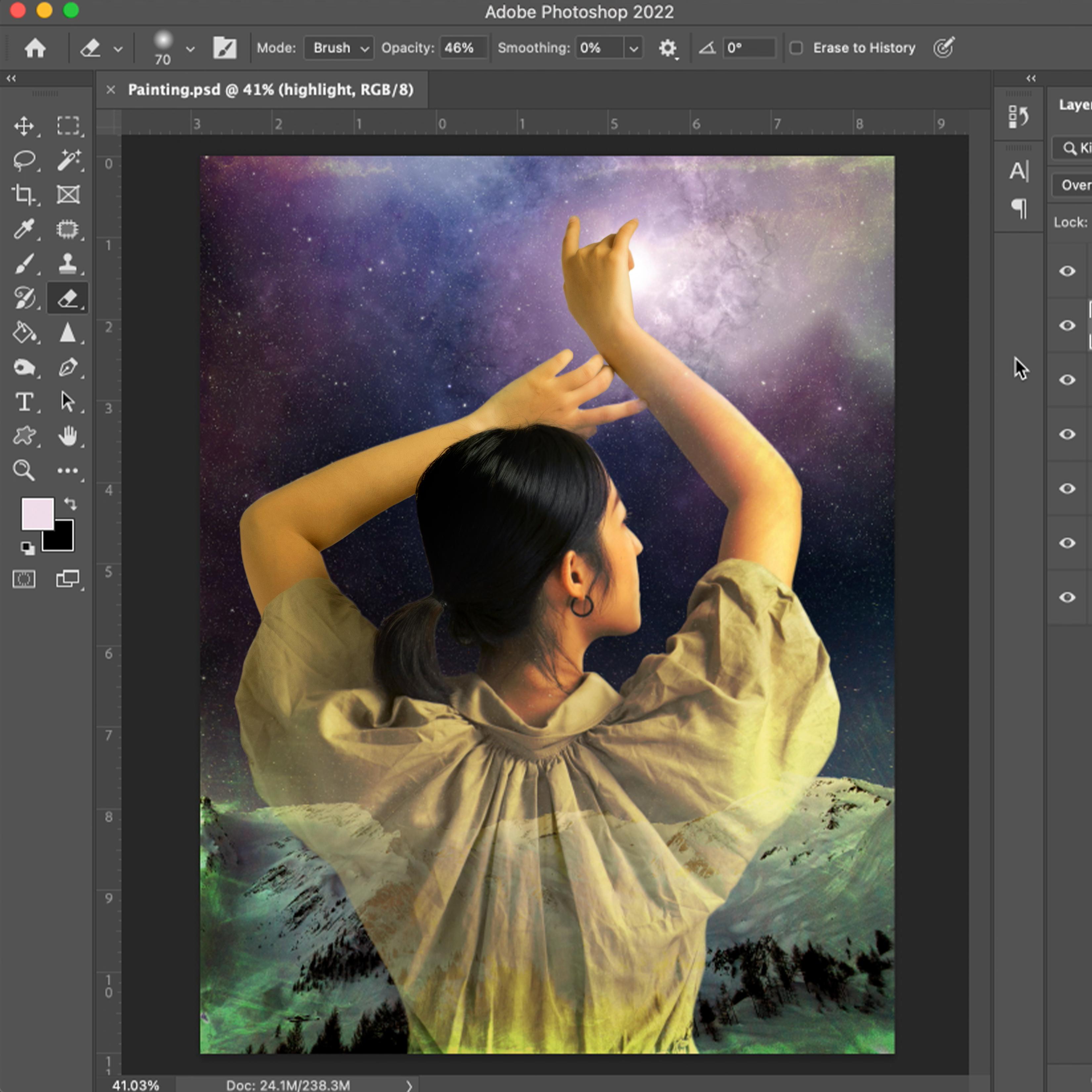
11. Finishing Touches: Okay. Hi and welcome back to Designing
paintings and Photoshop. I'm Paul Richmond,
and you have reached the final lesson in this
course. I can't believe it. You're already a photoshop
P. In this lesson, we're going to continue
playing with blending modes, and then I'm also going to
introduce you to working with the brush tool to
finish up our piece. Let's get started. All right. So I'm going to
close photo three. That was the photo of the model here that
we are finished with. And I'm going to
open photo four, which is really pretty
watercolor textural image. Since I want to bring
in that whole thing, we can go back to using our
rectangular marquee tool, if you remember that
one, that's for selecting a big rectangle
or small rectangle. You can drag that to
any shape you want. But I'm going to select the whole thing and
go up to edit, copy. And then I'm going
to jump back over to my painting layer and I'm
going to do edit, paste. Now, I brought it in. It's
also larger than my canvas. I'm going to click
on the move tool. You remember how to fix
it or how to move it? First to move it, you
just drag it and move it, but to resize it, you go up to edit. Free transform. If
you look over here, you'll see the key
command for that. If I haven't overloaded
you with key commands yet, this is another really
handy one command T, but I'll just go ahead
and select it from here. Now you can see how much bigger that image is than the canvas. Since I've got this little link, the proportion checked, pushed, whatever, it's selected,
you can drag any of these little grabbers and it will stay proportional. Okay. And then if you click in
the middle of the photo, you can move it around
without re sizing. I kind of like some of that
darkness at the bottom. But I also like the top stuff. Hmm. What I might
do is uncheck that, then that would
allow me to squash this just a little bit so
that I can get both sides. Since it's an abstract image anyway, it doesn't
really matter. You can get into trouble
pretty quickly if you start doing that with anything
that's recognizable, it can just feel distorted, weird, but I think that's okay. I'm going to name that texture. Just by double clicking on
the name, typing it in. The way that I'm going
to get this layer to relate to the other layers rather than just
covering them up, trying to take over
and be the star. I'm going to use the
blending modes again. We'll come back up to
the blending mode pool down where it says normal. Let's see what it looks
like under some of these different blending modes. When I turn the
layer on and off, you can see what it has done. In this case, not a whole
lot. Don't like that. Multiply. It's interesting. Let's turn it off and on. Only in a few spots, is it really showing
the textures. I don't think that's our winner. Color burn, that gives it
a very dramatic dark look. I don't think dark is really
what I want necessarily. Let's see what light. No. Light is because it's basically just because it's such
a light image already, it's not really
doing much to it. It doesn't really
need lightened. I think pretty much everything
in that section is out. Overlay interesting. It's a little too strong, feels a little over, we
could work with that. Soft light. Not vivid light. Not one hear light. None
of those difference. These often tend to make it look like a negative or reverse. I mean, that can be
interesting effect sometimes, if that's
what you're after. I actually really like this divide. I think I'm
going to go with that. It's almost taking the colors and going almost the opposite. Purples are turning yellow or green and it's just bringing out some
interesting colors. But I think I think
it's interesting, but I think it might be
a little too strong. I like the subtlety of the
original image a little bit. So let's see if we dial down
the opacity a little bit. Maybe take it to about
Wherever you like. I'm at 60% right now. I like that. Now, let's
see how it looks. I'm always turning layers
on and off to see what they look like. Now
what does it look like? If we drag that beneath
one of the layers of her, I kind of makes her jump out in front of that texture
a little more. What if we bring it
down beneath both. Yeah, I still like
it better up above. I feel like at least 75%
of everything I do in photoshop is just
trying something because I think I wonder
what that would be like, and then changing my mind. So I think this looks
awesome. I love it. Else can I show you
while we're here. I want to give you a few
little bonus tips for everybody that isn't
totally burn out yet. Let's just make one more layer on top. This will
just be for fun. Actually, let me say first. I'm going to close
this photo layer. I want to just give you maybe one or two more tools that
you can have to play with. The paint brush tool
is a really good one. If you click on the paint brush. It works similar to the eraser. You have options up here for different types of paint
brushes hard soft. You can also Go next to it
to the left of the size, and this pull down will actually give you different
paint brushes. Now, I may have a
few more than you. I've bought some brushes. You can buy additional
brushes and add in to your toolbox. But even if you've
never done that, you will still have a
variety of brushes in here. I'm going to choose maybe
an oil paint brush. I just click somewhere
out here so that that menu goes away.
And I don't know. Let's say you wanted to paint a little highlight on
the front of her face so that it feels like
the light from up here is really shining on her. So I'm going to move
this layer down, so it's right above the model. And choose a color. So you click whatever
see these two boxes, sorry, I jumped ahead
without explaining. So you click the paint
brush to choose it. And then down here is where you select the color
that you want. There's two different boxes
containing different colors, and the one that is on top is the one that you are currently
using on your brush. So if I go to paint, it's black. If I want it to be white, you can click that and
it reverses the order. Now I paint white. But if you want a different color
besides black and white, just make sure you're
on the top box. I mean, you can
always switch it. But I think I want to use. Now this is cool. When you have the color picker menu pulled up. You can actually go anywhere on your canvas and your cursor turns into a medicine dropper, and when you click, it
will sample that color. Let's say I want to
pull a little bit of that color in as a
highlight on her. Click Okay. Now you
see the color of the box changed to that
pinky lavender color. I'm going to zoom
in really close. This is going to
look weird at first, but just follow along with me. I'm going to go right along
the edge here where I think there might be a
little bit of a glow. Don't worry if it
looks too harsh or too strange for right
now, we'll adjust. You can really just paint
and color and play very freely without being
afraid in this program because you can
always change it, can always undo it. Okay. Now I'm going to
switch my brush to a soft and just go in. You can also turn down the opacity of your
brush right here. That makes the brush not
cover quite so solidly, if you wanted to have a
little more of a glow. I'm going to go beside my
previous brush strokes and just blur out at. It still looks way too strong, but don't worry. Don't panic. Okay. Like that. It would do a
little bit up here. Just imagine where
the light might hit. I don't know. It's play.
Wherever you want it. Okay. Now I've got the highlights, but they're way too strong and
they look weird right now. I'm going to change the
blending mode. Let's see. Maybe overlay. See the difference.
That's overlay. That made the color pick up a little bit
more of the color that's underneath versus normal where it's just only
the color of the paint. I like overlay for
highlights like this. Then I'm going to turn
the opacity down on that layer so that it's
just a subtle touch. Let me name the layer two,
so we know what it is. I'm clicking on layer one, and I'm going to
call it highlight I like the way that
looks on her face a lot. It's too much on the arm though. I'm going to take my eraser. Choose soft round. Turn down the opacity. You can do that with the
eraser to, and just soften it. It's still there,
but it's softer. Just adds a something I think. I might soften the edge
of this highlight too. That's a little more advanced
than where we were earlier, but for anybody that
wants to go further, you can, I often
will, like that. See, it's subtle, but
look at the difference when you turn that off
versus turn it on, she just feels a little bit more connected with that
light source now. I like that. All right. We did it. What's the last
thing we need to do? Save. Okay. All right. Thank you all so much for sticking with me
through this whole video, putting up with all of my jokes. I hope that this
has been helpful, please keep an eye on art mesos.com because we will be doing a lot more
classes like this soon. I hope that you just dig into photoshop and have so much fun experimenting and exploring. Don't ever be afraid. You can't hurt anything
as long as you're saving. I have to put that little cat in there because I don't know, you might be a little sad if you do a lot of work
and you lose it. But otherwise, it's all just a big experiment.
See what happens. This could really open up
your creativity in new ways. I know that it's
done that for me. And I hope it does
the same for you. Awesome work. Okay, be sure
and hit save one last time. I hope that you've
learned some techniques in this course that will help you design all kinds of
awesome pieces in the future. Now, of course, we've just
scratched the surface. There's so much that you
can do with this program. And I want to encourage
you to continue exploring and playing
and being creative. The computer is
just another tool. You might as well
take advantage of it. Happy art making,
everyone. Bye bye.
12. Closing Thoughts: I hope you enjoyed this course. I hope that I managed
to make photoshop accessible for you,
not too scary. Everyone can use it.
It's just another tool. It takes a little while
maybe to get used to it, but it has been a lifesaver
for me as an artist. I love being able to throw a whole bunch
of different things onto different
layers and then play around with how I'm
arranging them. What colors I'm using,
what compositions, and then using all those
different blending modes and effects to manipulate how one layer interacts
with another. There are endless possibilities. And as a painter, I love
that because I can see those possibilities
in front of me rather than just having them running
all around in my head. I tend to think a photoshop
is another sketching tool. If I wasn't using this, I'd probably be doing
a whole bunch of thumbnails in a sketchbook
before I start on a painting. But the benefit of
this is that you can actually see the details, you can see the colors, and you can do so much more For me, nothing will ever
replace the joy that I get from being in a studio
and working with paint. That is my first love. But it is wonderful
to be able to bring my computer and
design paintings, when I'm on the go,
when I'm on a plane, when I'm in a coffee shop. It's just another
tool that you can add to your artists tool belt. And we can never have
enough tools, right? I hope that you'll keep trying photoshop and designing
painting concepts with it. And please share them with me in the project section
here on Skillshare. I would love to see what you come up with using
these techniques. I have a lot more classes
here on Skillshare, so come back and make some
more art with me soon. Until then happy art
making, everyone. Bye bye.
 Paul Richmond, Everyone is an artist.