Transcripts
1. Introduction: This class, I'll take
you behind the scenes as I'm redesigning
a real family room, a space filled with
life, memories, and a lot of things into
one that feels calm, cohesive, and easy to maintain. Along the way, I will highlight the key design
principles that make a space feel simple
and organized, not through de clattering,
but through design. Is a big misconception
that the only path to an organized room is
through declattering, minimalism, or just
having less things, and that's really not the case. Declattering is one of the
last things you can do to keep a room organized
because if you design it well, keeping it tidy
becomes effortless. So in this class, I
want to highlight all the other steps you can
take to avoid declttering. Learn about how to diagnose what is working and
not working in a room. Some of the biggest reasons that keep a room cluttered
and disorganized, will learn about visual
and spatial clarity through zoning, alignment,
and simplification. We will look at how to
choose storage that fits your lifestyle and
the function of the room, and finally, we will look
at how to use shape, style, and color to
create unity and calm. Is probably one of the most in depth classes
that I have ever made, because you will
essentially look over my shoulder through the
entire design process, and I will do my
best to highlight what design principles
I'm using and how implementing them
impacts the design of the room so that hopefully
by the end of this class, you'll be able to understand
what aspects of your room make it look cluttered and disorganized and what
you can do to change. If you're new here, welcome. Anna, I'm a licensed architect based in Europe and
in these classes, I distill decades
of architecture, education and experience into small bite size lessons to
help you design your home. To go even deeper, check my class minimalist versus maximalist interior design
and my YouTube videos, room organization
with AutiClattering, and color room simplification
with AutiClattering. They're really going to expand your understanding of
space organization. Enjoy this class, leaving
a review really encourages me to do more classes and
helps others find them too. If you'd like more personalized
help with your own space, feel free to reach out
my contact details, are the description,
and in my profile. If you're ready, let's
start the class.
2. Class Project: The class project,
I have prepared a downloadable PDF worksheet which can be found in
the class resources. There you can find a checklist with questions group by lesson. After watching each lesson, I would like you to review
the questions connected to the lesson and reflect on the room you are
trying to organize. What small change might
you make for big impact? Which of the lessons
speaks to you the most? Which seems to be the
easiest to implement for? Point of this class is not
to implement everything, but to understand the root
cause of chaos and make those changes that will make the biggest
difference for you. In the class project, do
share a photo or a page from your worksheet with
some thoughts on what your next steps for
the organization of your room will be. I look forward to seeing them.
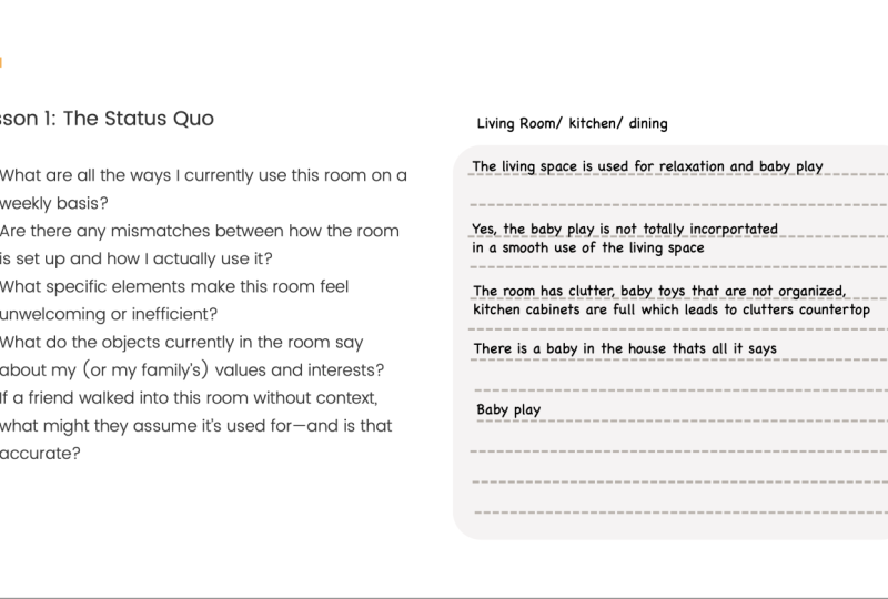
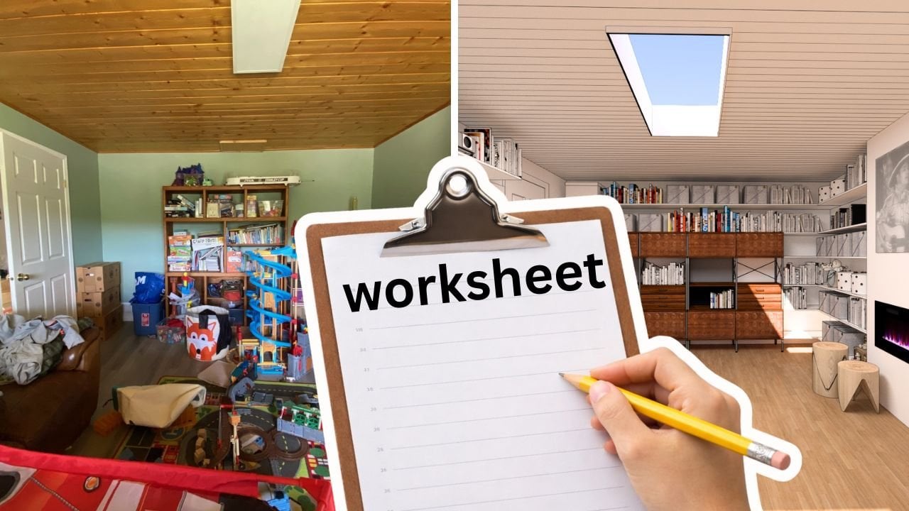
3. The Status Quo: Before we start designing, we need to understand exactly
what we're working with, how the room is used
now, what's working, what's not working, and what the space is
really asking for. The way I typically start my design process is
now the Pints board, but by assessing the
possibilities of the room and the needs
of the people living in. The rumor about to transform
was submitted by Sabrina, a stay at home mom
in Canada with two boys aged four and
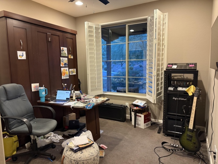
eight, here's what she. Are having a bit of a problem with our family room downstairs. We want to feel
welcomed a place where our entire family can
relax, play games, maybe watch movies, read a book, be together, and have fun,
create lasting memories. We have approximately 500 books that need a home, 1,000 CDs. Yeah, we still have
those and many, many toys, as you can see, with very little storage. We also use the space
as a little office, mainly to print
things at the moment. How do we analyze a room
before designing it? The first thing we need to do is to understand the user needs. If I quickly remove
all the toys from this image and just
look at the furniture, I can see that this could
indeed be a living room, a room where sitting and
relaxing are the main focus. However, if I look at
how the room is used, considering all the
toys, the keyboards, and the art, I can see
that the demands of the room encompass a multitude
of creative activities. Sitting is only a side gig, it's not the main
gig of this room. So there is a
mismatch between how the room is furnished and
how it's actually used. Sabrina also mentioned that there is a living
room in this house. The requirements of the room
don't need to be the same. They could in fact focus
more on activities, on creative activities and making things rather
than sitting. Number two, we have to identify the challenges
of this room. In a later email, Sabrina mentioned that this
room is located in a semi basement area of the house and has a
vinyl floor on concrete, which makes the room feel
cold and uncomfortable. It is also heated
with a gas fireplace, which she wants to upgrade. Not clear to me if this is the only source of heating in this room, but I suspect so. There's also an electric
panel to the right side of the fireplace that
must remain accessible, an architectural constraint that will influence sound
design decisions. Finally, Sabrina mentioned that the current ceiling
light is too harsh, which affects the overall
comfort of the space. Are three challenges that will have to be addressed
in our design. Number three, designed to
support the family values. Upon examining the
items in the room, I can see that this
family is very creative. The room is filled
with toys that involve building with tiny
pieces a keyboard, paintings, books,
CDs, and tools. These aren't just items. They're expressions of how this family lives,
learns and connects. That tells me that
this space needs to support a large variety of creative endeavors which might change and
evolve over time. Number four, define
a design style. Sabrina likes mid
century modern, a style known for
its warm mood tones, clean lines, and
playful use of color. That gives us a great anchor when selecting furniture pieces. But rather than making the entire room feel
like a mid century set, we'll use a few key
pieces to reflect that style and build a functional
updated context around. Summarize a successful design
starts by reading the room, identifying how it's used, what problems need solving, and what aspiration the
family holds for it. In this case, we're dealing with a creative multifunctional
space in a semi basement with temperature and
lighting challenges and a strong potential to become a hub for family creative connection
and expression. In the next lesson,
we'll jump into the biggest design
challenges and look at the three hidden reasons most rooms stay stuck
in a state of disarray.
4. The Biggest Challenges: Some two, the biggest
design challenges. Before you dive deep into finding solutions
for your design, I thought I talk about
the three core reasons that will always keep a room
in a state of disarray. When I tell you what they
are, it will sound obvious. But at the same time, many
of you will face one, two, or all of these challenges and would have done
nothing about it. I just want to bring
these problems to the surface and give you a chance to take them
seriously. Let's get into them. Number one, lack of comfort. The room that is very likely to remain in a state of disarray is a room that no one wants to use because it feels
physically uncomfortable. In Sabrina's case, her room
is in a semi basement. It's cold because it relies on a gas fireplace for heat which likely only
runs intermittently. Add the Canadian winters and a vinyl floor to the
equation and you have a room that while
it has a lot of potential simply isn't
comfortable enough. For people to be
there all the time. There are many other reasons a room can feel
physically uncomfortable. Rooms facing North in
the northern hemisphere never get direct sunlight and are particularly
dark and cold. Rooms in older homes with poor insulation can
also feel unwelcoming. Traps, mold, and
poor window closures all contribute to discomfort
that prompts people to stay away from this room
for as long as possible. Before designing
anything, you need to address the reasons this room
feels uncomfortable first. Only when you enjoy
being in the room, are you able to have
a vision for it. But as long as the room
remains uncomfortable, no design and
certainly no budget will ever be available for it. For Sabrina's room, I recommend
radiant floor heating. I find this one the most pleasant and luxurious
forms of heating. Imagine walking
in the house from the cold Canadian winter and stepping onto warm
oak engineered floor. Oak is not just beautiful, but the matt wire brushed finish is practical for spaces where
wear and tear is expected. This should make the room both comfortable and functional. As for lighting,
the problem is not the land size, but
rather the light. One type of light that
has become increasingly prevalent on the market is
the skylight simulator. They're not actual skylights, but they are very
good at mimicking the sky and also
the natural light, changing color
throughout the day from crisp blue light in the morning to warmer tones in the evening that supports
the body circadan rhythm, making the overall
mood more comfortable. I have to say that they
really fool the eye and the body into thinking that you are looking up at the clear sky. Problem number two,
lack of storage. Here's a truth that
needs repeating. Messiness is not a character
flaw, it's a storage flaw. Most people aren't
inherently disorganized. They're just trying to live in a space that lacks
sufficient storage. If everything is visible
in this room, tools, toys, art supplies, it's because there isn't a good
place to put them. Is the solution here?
Even a simple addition like more shelves can
transform chaos into order. Sabrina already has a small
library on this wall, but it's stuck to
the brim with toys. Just expanding this in all directions to make
this a wall to wall and a floor to ceiling
storage is going to do a lot for the
tightness of this room. The third problem is
a lack of vision. The final and most
paralyzing issue is not having a clear vision for a space where you don't
have enough space, functions just get stacked
on top of each other. But when you do have space, it can be challenging
to determine how a room can truly contribute
to your family's life. Sabrina described this
room as a family room. Now for everyone who is
not from North America, me included, family room is
distinct from a living room. A living room is a polished
space to impress guests. The family room is the
kick off your shoes and spill popcorn real
life living space. These types of spaces are typical for the 1950s homes that were designed with
both status and function in mind. But
here's the thing. The 1950s homes are designed
to represent a 1950s life. In the 1950s, the TV was the latest technology
and it became the reason around which
families came together. The family room had
a TV centric layout. In this day and age, however,
things are different. We cannot escape screens. While I'm not saying we shouldn't have
screens in the house, I think that would
be unrealistic. I think the centering
the TV and the activities that require
no interaction between family members to refocus on activities that positively
engage the family members with each other would be
a more meaningful use of the extra space and a better solution for
the century we live in. From what I can
see from the toys, keyboard, and the
materials already here, this space appears
to be intended as an arts and crafts room
rather than a TV centric one. Not just a playroom, but a creative family
hub where playfulness, creativity, and making things are encouraged and expected. A place that welcomes
a little messiness, embraces experimentation
and supports every family member's
creative spark. To summarize this lesson, there are three hidden
reasons why rooms fail. There's discomfort, lack of
storage, and lack of vision. Address these upfront and you're setting yourself
up for success. Now that we understand
the primary reasons that can hinder our designs, let's begin shaping the shell of this room to better
suit our needs.
5. Simplify The Shell: Simplify the show. Before adding furniture and the
core in a room, you need to shape the shell of the room to support
the new functions. This is the time when you look at shacks that cross the room, things you might have
to hide or reveal, you might redirect
electrical wiring, break walls, reshape walls, increase or decrease
the ceiling height. And so on. I don't want to overwhelm you guys
with technicalities, but for the purpose of making a space look simpler
and more organized, we are going to look for
ways to adjust the space slightly to support the
subsequent functions better. Arts and crafts rooms are naturally messy
because they always pack a great variety of items
in all shapes and colors. To prevent this space from
looking even messier, I'm seeking ways to tie things
up from the architecture, which will make the
space appear even more cohesive when
everything is in its place. How do I implement this
idea in Sabrina's room? Let's start with the fireplace. Since Sabrina has already expressed interest
in changing it, we are using that as
an opportunity to redesign it to serve the space's
ultimate purpose better. The current stone texture of the fireplace isn't terrible, but it adds unnecessary
complexity to a room that is going to
look highly complex anyway. Moving it doesn't just make
the room look simpler. It also opens up fireplace design options that weren't
previously available. Since Sabrina already mentioned
wishing to change it, I picked a simpler looking one. The second thing I
want to do is to increase the depth of the
fireplace protrusion from 14 centimeters or 5.5 inch to 30 centimeters
or 11.8 inch, about the depth of a
standard bookshelf. Why is that? This creates
space for built in shelving and a variety
of fireplace options. Sabrina already has
gas infrastructure and I've heard that gas is cheaper than
electricity in Canada, which is definitely not
the case in Europe, we'll add a modern
gas fireplace. The fireplace won't be
used for constant heat, but rather for ambience. Is visual design becomes way more important
than its power. A sleek embedded unit will add that cozy touch without
overwhelming the space. Next up is the ceiling. Based on the proportions
of this room, I'm assuming that the
oom height is around 2.3 meters or 7.5 feet. This is a rather
low ceiling room. When the ceiling of the room
is painted in a dark color, it makes people even more
aware of it and it makes the room look and feel even
smaller than it actually is. By contrast, painting it to white or very light
pastel visually raises the ceiling and makes the room appear
taller and more airy. The wooden ceiling slabs
don't need to be removed, but painting them
in a light color would help them disappear visually and contribute to that quiet unified
shell we're aiming for. Then there are the walls. When color comes in
contact with light, it radies around it and mixes with the colors it
comes in contact with. To give an extreme example
for you to understand, if you're painting a yellow
painting in a red room, the yellow painting is
going to look orange. This is why a clean
white or off white color would be very useful for a
creative room like this one. It keeps the focus
on the art and the creativity projects rather
than on the background. This also helps maximize
the room's natural light, an important feature
for any artist. Summarize our
lesson, you simplify the shell by neutralizing
architectural distractions, flattening textures, lightening ceilings and
using neutral wall colors. This creates a calm, flexible space where everything else, storage, furniture, and
creativity can shine. In the next lesson, we'll
explore how to define zones within your room so that
each activity crafting, storing, relaxing
has a clear home.
6. Zoning: Lesson for zoning.
In this lesson, we will discuss zoning, a principle that brings
clarity and calm to a room, especially one that's likely
to become visually busy, such as an arts
and crafts space. Here, I want to share
an architect's trick with you that decorators
tend to overlook. Aligning the furniture with the architecture makes a space look much
simpler and clearer. An architect will
always trying to do is to make the furniture look like it's merging with the walls or springing
from the floor. You can't do that with
every piece of furniture, but wardrobes, benches,
cabinets, beds, and kitchens are often
examples that architects will design to make it look like the furniture
merges with the wall. You will notice that
these examples of interior design typically make
the space look very clean, simple, and well structured. How do we implement
this idea in our room? Start by the door.
On the left side, I plan to install a
tall storage element that spans from wall to wall
and from floor to ceiling. Sabrina has already had the intuition to add a
storage element here. I just want to make it bigger. This transforms what
could have been a wasted space into a
structured storage zone. To the left of the fireplace, which now puts about
30 centimeters, we can place another
vertical storage volume. This balances the
architecture and continues our wall to
wall storage area. Now on the right side
of the fireplace, I'm creating a small desk
zone. It's a good spot. There's already an
electric panel and a TV here, connectivity
is available. This can be a casual
workspace for Sabrina, allowing her to supervise the
kids or have a home office. Next to the desk
underneath the window, I'm adding a low bench. This page serves multiple rows. It provides storage. It has a flat surface for kids to play on or display
their artwork. It is a seating area
for adults when needed. This layering of functions is key in multi use
spaces like this one. Opposite to the fireplace, I'm introducing a seating area with additional
storage underneath. This will serve the family while the kids are still young. Later, as they grow older, this area can evolve into a large workspace table placed either against the wall or
in the center of the room. This keeps the room
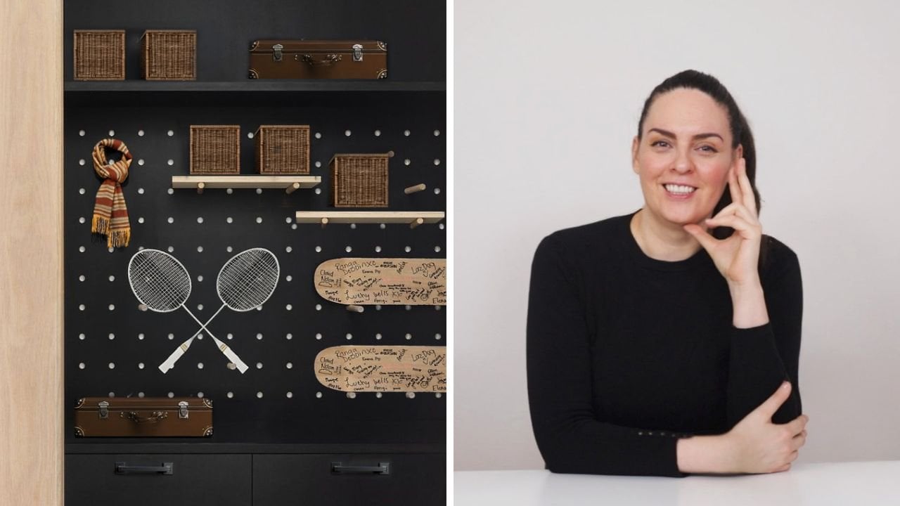
flexible and future ready. Of this area, I install a pegboard that spans
from door to wall. Pick boards are one of the most versatile elements in organizing a creative room. They can adapt to the changes
in interests of the family over time and can store a wide variety of
objects and tools. It also acts as a wall protector against toys and objects
being slammed in the wall. You can see, every
piece of furniture that I have suggested
in this room also has storage included because creative rooms definitely
need a lot of storage. To summarize this lesson, creating zones in the
room really helps the eye navigate better and it creates
more clarity in the room. Use large simple
furniture volumes to carve out zones
and align them with architectural
elements like walls and windows for sense
of order and ease. In the next lesson, we'll
look at how our choices of style can affect
our overall sense of clarity and organization.
7. Style and Shape: Style and shape. In this lesson, we will explore how
to create unity in a room through the use
of style and shape. If you break down a
style at its core, it's a collection of
shapes and colors. For example, the mid century
modern style with Sabrina is is characterized by
clean, sharp edges, modularity, dark
brown walnut wood, and geometric shapes such as circles and block of
contrasting colors. Using matching pieces of furniture is appealing
when selecting objects for a room as the language of the style is repeated in
the room consistently. Repetition creates
rhythm and structure giving the eye a sense
of unity in the room. It doesn't perceive the space as a group of different items, but rather as an entire organism working together spread
out through the room. When it comes to Sabrina's room, I didn't want to
cover the entire room in mid century modern
design pieces. That can quickly feel
like a thin part. Instead, I selected a
few statement pieces that embody the
spirit of the style and pair them with custom and more
contemporary solutions that allow those
pieces to stand out. One of my favorite pieces is the IMs storage unit, EU 420. Designed by Charles and
Bray IMs in the 1950s, these storage units are
iconic for a reason. They came in
different heights and could be customized
with drawers, panels, and open spaces in
colorful or neutral finishes. Charles and Ray Imes were incredibly versatile
designers and they brought a playfulness
to their designs, which I think is visible
in the storage jots and it is very fitting to the
type of room we are creating. Feel a lot like lego
pieces that can be stacked together and customized to
create various designs. The circular shapes
on the panel also serve as a subtle
reminder of lego pieces. One of the finishes
that I like in the storage unit is the
one in dark brown color, which is very typical
for the time. For this room, I have chosen
400 series units to anchor the main storage wall and 100 series units to build a
low pinch under the window. That brings me to the
second key element in this lesson, repeating one of the unique
features of the EU 420 is the circular
shape on the panel. To make this room feel a
little bit more cohesive, you can see this circle on other parts of the
design as well. You can see it on
the pegboard cutouts behind the seating area. You can see it in the
round tree trunk stools. You can also see it in a
few well chosen art pieces. Finally, you can see
it in the form of the iconic Verner
Panton flower pot lamp. The flower pot lamp is another
famous mid century design. Still in production today, this playful circular
lamp brings a joyful energy perfect
for creative space. Its soft curves echo the circular forms already present in the Em
storage details, helping to unify the space. Circles are gentle, friendly,
and non threatening. They make a space feel
approachable and light hearted, which supports the overall
purpose of this room to be a place of joy,
creativity, and connection. Using a consistent shape like this not only creates unity, it also guides the
eye and offers visual rest in an otherwise
busy environment. Summarize our lesson, you
make a space feel more organized by choosing a
consistent array of shapes. In this case, they
represented in the SO 420 storage
unit and the circle. This repetition reduces
visual clutter, creates con and rhythmic
flow throughout the room. The next lesson will
dive into color and how it can support the feeling of
structure and organization.
8. Color: Color. This lesson
is about how to use color to make your space look
simpler and more organized. Clearly, the bigger the number of different shades
of color you use, the busier a room gets. In a creative hub
like our room here, a large number of
colors would be inevitable because
of all the items that will be on display. All the games, the books, the art, the tools, the devices, all of them will bring their own
color into the mix. There's nothing you
can do about it. In situations like this, you want to start with
the smallest number of colors possible. As you move up in the
number of colors, as you will inevitably
have to do, you can go two ways. You pick shades of colors from the tone you
already started with. This makes a space
feel more unified. Number two, picking neutrals, colors like black, white, or various shades of gray will work well with whatever
tone you have going. How do we implement this idea? When it comes to this room, I made a clear decision
early on that I will use mid century modern pieces and the ones I picked featured
a dark tone of wood. This shade of color has to be in my scene, no way around it. The other shade
that I have to work with is the oak
wood on the floor. I wanted to have a lighter wood so that the room
doesn't get too. But also oak is highly
praised for its durability, which would match the
functions of the room. From the outset, I already have two shades
of natural color, a dark, slightly reddish brown and a light brown
with tones of yellow. I need to stay focused here and keep the number of
colors to a minimum. I made a few very
conscious decisions. One is to pick all the
elements of the SO 420 in this dark brown color, all the shelves and
all the panels of both the 400 units and
the low 100 units. It's not a given
because they come in many different
variations and you can make them as
colorful as you want. However, that would
have added to the complexity of the room
and I didn't want to do that. Then I picked the wood
shade of my chair, the seating area, and the wood trunk sto in a
similar shade to the floor. They could be oak,
but they could also be other similar
shades of wood. The idea is to have tones that are very close
to each other. When items are physically close together and have
a similar color, or I subconsciously
groups them together. Feel like they could be
from the same family. That's a neat trick to remember. Finally, I picked some neutrals. The seating cushions
on the bench are gray. This keeps the overall
complexity of the room low, but it is also a shade
that can withstand some wear and tear without
looking too shabby. I also picked gray for one of the storage elements on
the shelves by seeing the same color in more
places in the room gives the impression of order
and cohesion in the room. Repetition of the storage
elements together with the color really helps me
group them in my mind. I personally am not a
fan of open storage, but mid century modern was a style that was very much
a fan of open storage. To combat having too
many objects on display, I'm using storage
boxes that when repeated simplify the
complexity of the space, making it look more unified. The other neutral that the
room is abundant in is white. White maximizes the
light in the room, which is critical for any
space where detailed work, creativity, and
focus are required. It reflects natural
light into the corners, making the space feel
brighter and more expensive. This is also the color of choice for other
pieces of furniture. Example, every other shelf, except those that are part
of the sun 20 is white. This is a deliberate
decision to create contrast between the old
and the new shelves. This makes the old furniture
pieces stand out even more while also making
the room appear lighter. The pegboard and the
additional table are also kept in white. This consistency helps them blend into the
shell of the room, reflecting light and allowing the more expressive pieces
to take center stage. To summarize our lesson, you bring common cohesion to a space by sticking to
a defined color family. Your furniture blend into the walls and use a
consistent palette, especially neutrals to make the bold elements and your
creativity stand out. In the next lesson, we
will talk about alignment.
9. Alignment: Alignment. In this lesson, we're talking about visual
and spatial alignment, specifically how to align
new furniture elements with existing structures in your space for a
more cohesive look. Alignment in interior design is about more than just
straight lines. It's a visual cue that
connects elements across rooms creating harmony and
a sense of intentionality. When things line up,
whether it's shelving, furniture or architectural
features, your eyes relax. There's a subconscious sense of order and the space
feels calmer, more balanced and often more
professionally designed. How do we implement this idea? Let's go through some
alignment decisions I have taken in the process of designing Sabrina's room and hopefully by the
end of this video, you will understand how to do it for the room you
are redesigning. Let's look at the shelves. I wanted to start with
the Em storage unit 420, but I also knew I wanted to expand the storage
area around them. When adding new shelves, I use the existing
ones as my baseline. If the old shelves have a
specific spacing between them, I match that with the new
shelves and I continue that with the shelves
on different walls like the ones next
to the fireplace. The upper shelf where the beamer is matches the shelf
basing as well, and so does the shelf
above the table. It continues at
the same height as one of the shelves on the
other side of the fireplace. These continuous lines create a sense of order and
stability in the room. Also wanted to align the
fireplace to the shelves. Again, not a crazy detail, but it's little details
like that that make the space feel simpler
and organized. Is it the end of the world
if they're not aligned? No, but a little bit here
and a little bit there helps the eye feel like it's in a well planned room
and it helps it relax. Number two, the bench, the pegboard holes, and
the shelf above it. Another alignment
that I wanted to see was the beaver shelf, the pegboard holes,
and the seating area. I didn't wish to extend
the shelf all the way to the door as it might scare
you when you enter the so I aligned it with the seating area and
the pegboard holes. This creates a tight modular
feel almost like a built in. It's also a fun detail. The pegboard itself, however, is aligned to the
wall and the door, providing both wall protection
and ample storage area. When is alignment not worth it? Not everything needs to
be aligned perfectly. Example, I initially wanted
the seating area to match the height of the
IM storage unit for a clean line
across the room. I use the ideal seat height didn't match the IMS
storage unit height. Enforcing the alignment would
have compromised comfort. I also don't think
that the proportion of the seating area I created
would have been nice. In cases like these, remember that function matters
more than blind alignment. Alignment should serve the
space, not constrain it. It should work around function, not the other way around. Summarize our lesson,
you achieve alignment by referencing key existing
lines such as shelves, furniture, and architecture and ensuring new elements
visually relate to them. This creates rhythm and order. However, not every alignment is worth pursuing if it
compromises usability. In the next lesson, we're
going to talk about function, how to make sure everything
in your space not only looks aligned but works
seamlessly with your daily life.
10. Function: This lesson, I
want to go back to the overall vision for the room and show
you how I want it to work now and how I
imagine it working in the future when the kids are older or perhaps
gone from home. There are essentially
three things I focus on. The first thing I
wanted to do is to make this room a paradise
for small kids, keeping furniture low and
accessible to their size. Number two, I wanted this to be a breeze for parents to keep tidy by adding storage to all the major furniture
pieces of this room. Number three, I am
also focusing on multi functionality
so that the space can adapt quickly to new family
interests and hobbies. For example, the large cushions and pillows can become forts, or they can be put
away in one of the drawers to make space
for a large play surface. But when the grandparents
or parents are there, it can be used as a
normal seating area. Designing a room it's not
just about its utility now, but also how it
would work later. Being able to plan those
changes in the design from the beginning really makes a massive impact on
your time and budget. Once the kids are older, I imagine the seating area being replaced by a
large workshop table, a place where things
can be made or built. It can also serve
as a larger table for art or any other activity. The location of the pegboard
opposite to it would be just as useful as it
is now to store tools. Board serves dual function. It stores various toys,
gadgets, and tools, and extends all the way
to the floor to protect the wall against toys or other objects being
slammed against it. I'd also like to discuss the
TV situation in this room. As you are aware, the
objects we surround ourselves with
influence our habits. Big objects placed centrally in a room tend to capture
a lot of our attention. Consider your
couch, the kitchen, and the dinner table, all place centrally
in an open space. Large items placed centrally
will naturally draw our attention to them and encourage us to
engage with them. Our attention
directs our action, meaning that with
a big screen TV in the center of the room, one can easily get into the habit of turning on
the TV all the time. I don't want to pretend
that a TV should not exist, but I don't want
to make watching TV the most important
activity of this room. When Sabrina discussed
her vision for this room, it centered on connectivity
with her kids, creating memories, crafting
and nurturing creativity. So a TV can be somewhat of a hinderness towards her vision of connectivity with her family. To make sure that the TV does not get turned
on all day every day, I want to make it invisible for the room by adding a beamer. I want watching TV to become a deliberate and
cinematic experience with the family rather than
a mindless distraction. There's also a computer screen on the table next
to the fireplace, which can be activated
to watch things. However, because it is smaller, I hope it does not become
the focus of this room. Should that be the case, perhaps a laptop would be a more
suitable option here. By designing the room this way, the mindless decision in
this room should be to create something rather than
zone out in front of the TV. Next to the seating area, a low bench provides
additional seating for adults, a play surface for children, or a display surface for art. It also offers ample storage for toys and games that
kids can easily access, allowing them to be active
in keeping the space tidy. Also place the printer inside this bench for
occasional printing. The printer is connected to
the computer at the desk. The floating desk can
be used by Sabrina for remote work if she needs
it when the kids are small. In the long term, it can serve as an additional
work surface. It can also be a place to paint and exhibit art for
the painter in the room. Art can also be displayed on the bench for family
members to admire. Over the table, we have a shelf that exhibits
various paintings. These just lean against the wall hiding the
electric panel, which can be accessed
at any time. Let's have a final
look at this room. Let me know what you guys think
about it in the comments.
11. Final Thoughts: Final thoughts. Congratulations
for completing the class. Designing a simple and
organized womb takes intention, creativity, and a willingness to rethink what is
possible in your space. I hope you found many
takeaways in this class. But the one I hope
you remember is that messiness is not
a character flaw. It's often a storage flaw. If you do nothing else but
create more storage in your you'll immediately notice
an improvement in tidiness. If you're looking for
more design inspiration, I share more ideas and room transformations
on my YouTube channel. If you like this class, I
would appreciate the review. It encourages me to do more classes and it helps other people discover the class. Your feedback truly
makes a difference. If you'd like personal help with your space and be happy
to hear from you, you can always reach out to me. Details are provided in my profile and in
the description. Thanks again and
happy designing.
 Ana Marcu, Home Wellbeing, Licensed architect