Transcripts
1. Let's Make Bookmarks!: Hey, there, Are you
a book lover or do you have a friend
who's a book lover? If so, you might have a lot of fun creating your own bookmarks. They can be so expressive and
fit anything that you want. There's no need to use an old receipt or a gross
gum wrapper anymore. I'm gonna show you
today how to make all your own design bookmarks that you can then
print out at home, print professionally, or
sell as digital downloads. This class is for people who
are familiar with Procreate, but you don't need to be an advanced user is perfect
for anyone who wants to gain a little more practice in
Procreate by creating a really fun laid back project. We'll be using templates
that I've created for you. And I will also supply
a couple of brushes, a color palette, and a
few other fun freebies. My name is Melanie best and I am a professional
artist and educator. I actually used to teach those in-person Paint
Night events where people would gather together
with IRB, drink of choice. And we would complete
an entire painting in two or three hours. You're in really
good hands today. I have a very friendly, laid back, easygoing
approach to making art. Last and not least, make sure you follow
me on Instagram so you never miss a new class or fun announcement from
me and this swimming al on both Instagram
and my website. You can also follow me
here on Skillshare. Just hover over my
name and hit follow. I'm so excited for you to
join me in this class today. So let's dive in
and have some fun.
2. Your Project - Create 4 Bookmarks: By the end of this class, you will have at least four or five beautiful bookmarks to use. Gift or so. Maybe even more. We're going to start by
setting up our Canvas, pulling in a bookmark template, and then making some
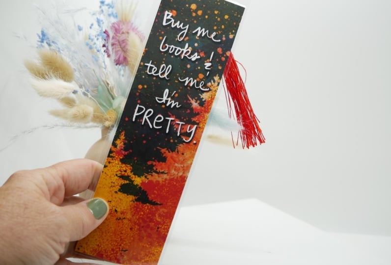
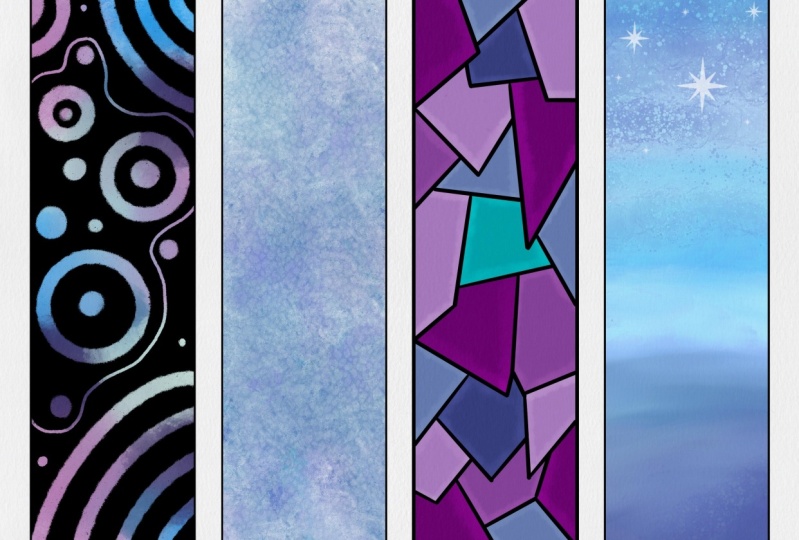
beautiful and unique designs. Please share your work with us. You can either share JPEG with all of your
bookmarks like this, or if you print
them out and glue them together like this, we would love to see that too. Just a little pro tip to keep in mind if you do want to glue your designs together to
make a front and a back, you may want to use the
same color palette in a similar theme so that
they really go together. If you decide to
sell your bookmarks, let us know where to
find your artwork. To share your artwork, head to the projects and resources tab and
hit Create project. You're going to
upload an image to the cover image section, and then you'll upload more images in the
description below that to add other photos
other than that cover image, hit the image button
under, add more content. Next, let's discuss our
supplies really quickly.
3. Supplies + Downloads: The supplies for this class
are really straightforward. You're going to need your
iPad and Apple pencil. First or second-generation. You need the app Procreate, and all of its native brushes currently procreate is
on their version 5.2. As of the recording
of this class, I'm also going to be giving you some freebies that you're
going to need to download the, the projects and resources tab. Ideally, you're gonna do this
from a desktop computer, but if you want to do
it from your iPad, you're going to
need to do it from an Internet browser and
not the Skillshare app. For the freebies, I've included
some bookmark templates, a color palette, a
couple of fun brushes, and a paper texture. Lastly, this is
totally optional, but you may want some card, stock or paper and a printer to print out your
beautiful bookmarks. We're ready to jump in
and set up our canvas.
4. Setting Up The Canvas + Template: Okay, we are ready to
talk Canvas settings. You can either make a full
page of bookmarks like this or a single bookmark at a time
on a template like this. If you plan to
print these at home or you want to sell them
as a digital download, I would go ahead and
make a full page of four bookmarks to
make things easier. If you want more flexibility
in the design later, and I want to upload a
trip professional printer, the single bookmark is
probably the better way to go. But today I'll be
designing our bookmarks on the template of four,
on a full-page. You can set up your
Canvas one of two ways. I've included the
procreate file for this so that all you
have to do is download that file and then import it into Procreate
and you're gonna be ready to roll other than
adding the paper textures. Or we can start an entire
new canvas together. To import that Canvas
that's already to go. Make sure you've
downloaded it to your iPad or Dropbox
or your iCloud. And then at the
top of Procreate, you're going to hit Import and then find that
procreate file. It'll say dot Procreate at the end and you're
just going to tap it. It's going to import
an entire canvas. And it's already going to have that bookmark layer built-in. The only thing you're
going to need to add now is the paper texture. And you're gonna have to lock your layer and I'm gonna show you how to do that
in just a minute. But I'm also going
to encourage you to back out to the
gallery again and duplicate that Canvas
so that you have one as a backup that's
always ready to go. Now, if you're
having trouble with the procreate file and
it's a little buggy. Sometimes I have trouble getting it from
Dropbox like that. Let's just make an entire
canvas from scratch. So go to the plus,
hit New Canvas. We're going to go two
inches and we want it to be 11 by 8.5 at 300 DPI. I leave the color profile
at Display P3 for now. And everything else
should be set. You can then title
it if you want to. We're going to hit
Create. From here you need to add the
bookmark PNG template. So wherever you've
downloaded that, you're gonna go to
Add, Insert a file or if you saved it as a
photo, insert a photo. So I'm gonna go
to Insert a File, and I'm gonna go to that
for bookmark template. It's a PNG so that there's
no background. There it is. Now, I didn't make
these a little bit taller than
your normal two by six bookmarks so that
we could fully take advantage of that
full sheet of paper. But you'll notice that
the other template is a two by six because
that's what most printers, most professional printers are going to start with
as their size. The first thing we
want to do is lock this layer that way we can never accidentally draw
on this template. Now that's safe. The next thing we need to do is tap this and set
it as a reference. That's going to allow
us to drop fill colors into these individual
rectangles. One more step, and this
is totally optional, but I like to add to
paper texture layers. You don't have to do
this step at all. It's just that the paper
texture gives you, gives your bookmarks
and extra special look and takes away from
that digital feel. I've included that paper texture file for
you to download. I would suggest
downloading it and then saving it as a photo
in your gallery. That way you don't always have
to access the Internet in order to get that paper texture. So first we're gonna
go to the wrench, add, insert a photo. I'm gonna go to albums and
go to my paper textures. And click that paper texture. I'm going to rotate it and
fill the whole screen. For this first one. I'm going to set
it to color burn. Now I'm going to
add another one. Same paper texture. Rotate it again. And I might make this one at a slightly different
angles so that they're not totally in line with each other. To give even more texture. In this layer I'm
gonna set to multiply. Then I'm going to
turn the opacity down just a little bit
because sometimes this paper texture
and multiply can dull our colors way down. I just turn this
down a bit and I can always adjust that later. As we work today, we want to keep both of these paper textures at the
top of everything we do. I would go ahead
and give yourself a couple of layers in between. And then I'm also going to lock both paper layers so that way I never accidentally
color on those. From here, That's it. We are ready to get started
on making our bookmarks. Lastly, your option for just making a single bookmark is
you're going to want to set up a two by six inch bookmark at 300 DPI because most printers
do start at that size. However, some printing companies
do offer custom sizing. So if you intend to print your bookmarks professionally
decide on your size beforehand so that
you're starting off on the right ratio
and you're not having to adjust your size and potentially pixelate
your artwork. If you're ready to
begin, I will see you in the next video and
we're going to start creating some bookmarks.
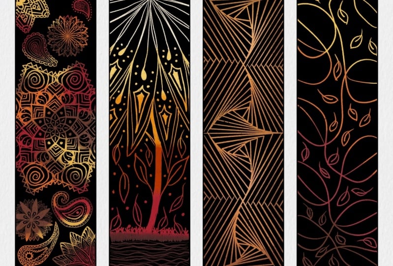
5. Scratch Art Bookmark: For this very first bookmark, it might bring you right
back to your childhood. If you ever did any scratch art, which were those
pieces of black paper and you'd use like
a wooden stick and you'd scratch away
different lines and patterns and whatever
you wanted to draw. It kinda looks like this. We're gonna do that digitally today for our first bookmark. You should have your
Canvas, so I'll setup, make sure you've got
your bookmark layer set to a reference. You've got your two paper
textures at the top. And make sure you're
starting your layer, your new bookmark
in-between these layers. The first thing we want to do is you can go ahead
and set your palette. I am using the palette that
I've given you guys is called Galaxy dreams that I have set. I'm on the disk version
of the color palette. The first thing I want
to do is select white. I usually do that by
tapping up here at the top to get a pure white. And we're going to drag and drop into one of these squares. Now because the paper
is already white is very hard to see if
anything happened. But when we go to our
layers over here, we'll see that sure enough
there is a white rectangle. Now. We're starting
with that as our base. And that's going to
allow us to make clipping masks on top and just make a single bookmark instead of painting
all over the page, we're gonna make a new layer
above that white rectangle. I'm gonna go ahead and make
a couple of layers here. Just to keep plenty of buffer. Now on this new layer, we're going to put this
as a clipping mask. Now what we want to do is we
want to start painting in a background very randomly with a lot of different colors. To give us that marbled
multicolor background. I am an I use the wet
acrylic brush painting and wet acrylic. But you could really use
any brush that you like. That's under the
painting section. Now here's where
things get really fun. I'm gonna make my
brush nice and big. Almost full opacity. And I'm just gonna
start painting in some sections, purple. Maybe this nice bright color. You just want to this up. You cannot do this wrong. Now the brighter you go, the better it's going
to show up later. What I tend to do afterwards
is I will up the saturation. There's no right or wrong here. We're just making
a lot of variation in color so that as
we scratch through, it will change a lot. You can, from here
you can smudge this hold down on
the smudge tool. And you'll choose the wet
acrylic to keep smudging with. And you can kind of blend
things together if you want. You can also come
up to the wrench, oh, I'm sorry, to the
little magic wand. Go to Gaussian blur and blur this if you want
it to be softer, I like it to have
a lot of textures, so I'm gonna leave it like that. But what I am gonna do, I'm gonna turn up the
saturation on this layer so that the colors
pop even more. So come to the
little magic wand, go to hue, saturation
and brightness. And then you can bump
up that saturation. You can even bump up
the brightness a bit. Like I said, it will
help it show up better. When we go to scratch. I'm pretty happy with that. It's nice and bright. It's got a lot of texture. The colors change a lot. Now we need to open
up our layers, make a new layer, or
go to the layer above. We are going to do a fill layer. We're going to fill
it with black. So double-tap at the bottom of your little wheel down here. Or if you are in one of these
sections like the classic, just pull everything to black. I just double-tap and we're
going to drag and drop. Until that new layer with black. Next we're going to make a mask on this layer and that's
going to allow us to scratch things away without ruining any of our
layers beneath. So tap on the layer
and hit Mask, not clipping mask but mask. Then we choose our eraser and
I'm going to go to inking. I'm gonna choose the driving. I like this one for the
texture that it goes. But really you could
scratch away with one of the pencils
under sketching. You could use ink bleed, play around and see
what textures you like. Again, I am using dry
ink, inking section. Now you can do whatever
design you would like. What I'm gonna do is a doodle around the edges with
a quote in the middle. Just like this one here. You're going to want to play
with the size of your brush. I'm going to zoom in and I'm
just going to start making some marks and see how
pretty that looks. Let's see, I'm probably
going to do some kind of little design,
some little stars. And then my quote, I'm just gonna do
some wavy lines. Really let your inner child, it just go ahead and play here. If at any point
you're not liking something you did
just two finger tap, undo or redo with
three finger tap. You can play with
thick and thin lines to get even more
interesting looks. Bring back any
memories for anyone. Did you do this as a kid? Okay, so now that I have this
just very simple design, I'm gonna go ahead
and add in a quote. I'm gonna do it with
my dry ink brush and I'm just going
to hand write this. I'm gonna do the same
quote from my example. It's we read to know we
are not alone by CS Lewis. That looks pretty
good and I'm not worried about my
handwriting being perfect. I really like it like
this. It's more simple. But what I am going to do
now is you can in either like scratch away a
little frame around this quote or something
that's kind of fun as you choose the selection tool and you're still on
your mask layer. Any draw around what
you just wrote. And then hit the arrow and
then resize it just a bit. Resize it and then kind
of drag it around. Then that kind of
makes this fun frame. Then what I do is I go in with my dry ink brush and I just
erase away where there's that harsh line to soften it up and give it
back that texture. Like that. I just find this kind of fun because
it shows off more of that really beautiful color
that you've got underneath. Draws a little more
attention to your quote. If you're not sure
what you want to do, you can open up
Pinterest and type in bookish quotes and you'll goods so many options or choose a quote from one
of your favorite books. Choose something that
means a lot to you. After all this
bookmark, it's yours. You are making it from scratch. Unintended. Can say
whatever you wanted to. The last thing I want you
to do is we're going to group all of our layers
together because this bookmark is
pretty much done. I might add in a few
more little stars now that I see how much
empty space I have. But we need to group our
layers and then we're going to name it so that we
stay really organized. To do that. Open up your layers. You're going to, These
two are already selected. So we're going to push
the layers to the right, and that's how you
select them and when they're highlighted blue, that means you have it chosen. And you're gonna come
up here and hit group. Then hit this little arrow
next to where it says new group and it will
condense that down, tap where it says New
Group and hit Rename. I'm gonna call this
one scratch art. Okay, we're all done with our very first bookmark and we're ready to
go make another one. See you in the next video.
6. Watercolor Galaxy Art Bookmark: This next bookmark is
probably my favorite one, and I can't wait to show you. This is gonna be a
watercolor galaxy, and then you'll have
the option to add like a silhouette and landscape
at the bottom if you want. Or you can just keep it a really pretty watercolor
galaxy like this idea. To get started, open
up your layers. I've added in a couple of extra layers above
my scratch art. And I'm gonna start
on this middle one. Again, I use these
as kind of buffers. I'm going to choose
white double-tap. And we're gonna do the same thing as on
the scratch out where we're going to drag and
drop a white rectangle. There, we see it. Next we need to make another
layer above that and turn on clipping mask so that
it contains what we paint. Within this white rectangle. Clipping mask. You'll know it's turned on by the little arrow pointing down. We're ready to start painting. For the colors. Again, I'm
going to use this same galaxy dreams palette so that all
of my bookmarks go together. And often when I'm doing
this watercolor one, I will bump the
saturation up because these watercolor brushes tend to duller colors down a little bit. But we can also do that
same little trick where we up the saturation on the
entire layer afterwards. For brushes. If you come down to water. Any of these brushes can be fun. I find that the wet
glaze works the best. Wet sponge fills
up bigger areas. Then the water flicks
are fun towards the end. Under artistic. The other ones that I
really like our old bleach, the Laura Puna and wildlife. I like starting with this old bleach brush and then adding in some of the
water brushes later. This old bleach brush really keeps the colors
nice and bright. And what I suggest doing
when we start painting is we want to go from light to
dark so that you build it up. Because if you're using
those watercolor brushes, you can't necessarily lay light color back in
over a dark color. Work from light to dark. What I tend to do
is choose one of these lighter blues
or the light purples. And then I just start
lightly painting this in with this old bleach brush. The harder you push, the more it bleaches
out the color. Here you're just going to play and you're going to fill up this entire bookmark with a
sky or a galaxy background. It can be really
easy to overdo this. Sometimes you may find that
you'll need to start over. Sometimes. Backup a little bit. Just bounce around
between your colors. Change up your brush. You can change up the
opacity of your brush. I've been using old
bleach this whole time. So maybe I'll jump over
to the Lara and see if we can add back in a little
bit of that light color. Now come down here to water
and go to the wet glaze. With this wet glaze brush, I tend to stay on the outside. And then the harder
you push them or the Paint shows up like that. So I'm pushing really hard right now and just kinda
wiggling my brush around. I'm going to undo that. That way. I can kind
of like dark and up the edges a little
bit like that. When you're making
a galaxy painting, it's nice to have
some dark areas where you can put in a lot of little stars because
they show up so nicely in those areas. You can also use the
smudge tool with whichever brush you'd like
and you can kind of blend things together for
more of a watery look. I really like the texture though that that old bleach brushes giving the wet sponge
makes a nice texture too. You can see how
easy it is to get lost in this and start to
overdo it a little bit. Really, we're just
building up lots of layer, layers here until you find something that looks really
interesting and fun. In K, I'm gonna go
back to old bleach. Some brighter colors
back in here. Lower my brush size. There we go. I'm starting to like this
a little bit more now. For the sake of speeding things along and not keeping
you here all day, I'll go ahead and call
this good for now. But keep playing
until you really love the look of your
galaxy background. What I am gonna do now, like I mentioned before, is I'm gonna bump up
the saturation on this. Go to the Magic Wand, Hue, Saturation and Brightness. Make sure you're on
your painted layer. And it's going to bump this up and bump up the brightness. Just a bit much
happier with that. Now. Now that we're happy
with our painted layer, we're going to add
in some split, others come to your layers, make a new layer. We're going to set
this layer to overlay. And we're going to
do clipping mask. Make sure that that little
arrow pointing down is on. Come back to your water
brushes and go to water flip. We need to choose
a lighter color. Something like this
minty green or the light purple or
this almost white. Play with the size
and opacity here. We're gonna make some
splatters on here. And I'm varying this so that way they're not all
exactly the same. And the harder you tap, the bigger your
splatters will be. That looks pretty
good for that layer. We're just making some softer
stars in the background. First, with this overlay
and the water flux. The other brush you can
use is under spray paint. And it's just called flicks. That's going to give you
a much wider splatter. Be careful not to do it too much because we do want to put in some hand
done stars to. Lastly, you can go to, I believe it's under luminance
and there's glimmer. This can kind of give you a really cool glittery
looking effect. I would probably switch to something even closer to white. So that it looks more
like a trail of stars. Again, play with
the size of that. Sometimes I'll just kind of
follow these light patches. I have to make a trail of stars. Well, there is one other
brush I wanted to show you. It's called ferns. Excuse me if I'm saying that incorrectly, It's
under materials. So it has this
almost kind of like animals skin pattern to it. But it makes a really cool, almost star-like pattern
in the background. I'm still on overlay and I'm gonna come in
here and just really softly put this in and
see how cool that looks. Just be careful not to overdo that one because it
is kind of wild. This one is like a
repeating pattern brush. If you continue to go back over the same spot, it usually, unless you've
tilted your canvas, it usually will just keep making that spot
brighter and brighter. So if I go here really lightly, then I come back over
it and over it again, it just keeps lightening it up. But if you tilt your Canvas
at all in-between those, it then starts a new pattern. I'm just going to carefully
add in a little bit of this, a little bit more
interest and fun. And after this, we're
going to add in some more defined stars with a either pencil or
a dry ink brush. Okay, so let's make a new layer. You can either put this into Overlay or you could
put it into ad. I like the add mode. It's going to be a lot
brighter than overlay. I'm gonna go to an inking, dry ink brush. Inking, dry ink. I'm going to choose something
really light, almost white. Now I'm just going to put in
some more like define stars. Some will be clusters, some will just be
really large ones. Here. You can just have fun. They don't have to
just be circles. You could put like these. Cool rings around one. You could do the more fun
star shapes like that. You can do clusters. You could put your own star sign in here if you wanted to do. I kind of liked to vary it up. Just to make a lot of
interesting marks on here. You can make little
shooting stars. I think that's gonna
be pretty good. Next, that fun
thing that you can do now is duplicate this layer, swipe to the left
and hit Duplicate. On the bottom one. We're going to select that bottom layer
that we duplicated. And we need to turn
on clipping masks. These because I saw
that some of mine, we're going outside the
bookmark on this bottom layer. Go to the magic wand and
go to the Gaussian Blur. And then drag your pencil to the right and it's
going to give a glow. I don't know if
you can see that. But it's making. So like if you pay attention
to this star right here, you'll see a glow fading
in and out the more that I changed my pencil
from left to right. So I'm gonna find a spot
that I'm happy with here. So maybe about 7%. I'll show you what that
looks like on and off. So checkout that glow. No glow. I think that just adds an extra
touch of magic there. If you want, you can also
then change the opacity here after you've
clicked off of that. If you want to make
it more intense, you could duplicate
that glow layer again. From here. You can
either call this done because that is really
beautiful as is. Or you could write in
another quote or do some, some type of silhouette. The other thing you could
do that It's a lot of fun, is you can add in
some bursts of light. I'm gonna come over
here and show you that really quick under luminance, you can go to flare. I'm going to drag this beneath my star layer
and then I'm going to tap to make like a flare of light behind
some of my stars. You don't want to do too many of these because they are kind of, there are a lot.
They're really fun. Again, you could either add a
quote now or you can add in a silhouette at the bottom
of like trees or mountains, or a skyline or cactus. I'm going to show you what
pine trees could look like. We're going to go above
all of our layers, make a new layer, turn
on clipping mask. I'm going to go find
that Wild light brush. The old bleach. I think the wild
light looks the best. And it works really well
without watercolor feel. So wildlife is under
the Artistic section. And I'm gonna choose
that almost black. I'm not quite dark purple. To make some pine trees, I usually let my hand wobble a little bit and
I make a line down. And then I vary up
the pressure that I get some really thin lines and similarly thick
water down spots. Hopefully you can
see that happening. So the harder I press, the more watered
down the paint gets. So I'm pushing extremely
hard right now. The lighter, the moral, thin the line is
and darker it is. We went to let your
hand wobble back and forth here to make the
different branches. You're just going to repeat that same idea as many
times as you want here. To make a silhouetted treeline. Try not to make
them symmetrical, really makes them
sides like longer and more intense than the other to make it
look more natural. That's why it's
nice to have like a wobbly hand right here. That's the idea of that
silhouetted background. Or you can do without and
just leave it as a galaxy. Or add your coat on top. I would do it with a
dry ink and white. I did forget one important step that we always need
to remember to do, Let's go ahead and
group these layers. Stay organized. Again, swipe to the right. Blue means you've highlighted
them in selected them. Hit Group, hit that little
carrot and rename it. That's your Galaxy bookmark. Buffer layer. Make a new layer. Now we're ready to move
on to our next bookmark. Join me in the next video, we're gonna do a
broken glass pattern.
7. Broken Glass Bookmark: This next bookmark
is another fun one. We're gonna start out the
same way we started out with all the other ones by filling
in a white rectangle. This is going to be a
broken glass pattern that is inspired by art I
used to do as a little kid where I would take a white
sheet of paper and take a black sharpie and
you'd draw all of these different
crisscrossing lines. And then you'd fill in the
different sections that they made with different markers
or colored pencils. We're gonna kind of
imitate that idea. Make a new layer, double-tap to select white. Drag and drop it in. And it made a nice
white rectangle. Perfect, so make another layer. And now we're ready
to get started. The first thing we need
to do is make an outline. So now we want to select black, double-tap at the bottom. I'm going to zoom way in and
I'm going to drag and drop. To outline. I need to make a brand
new bookmark outline by dragging and dropping and top
on top of this line here. So drag and drop onto that line. You should see that
it made a new one. And if you come over
here in your layers, you'll see a new
bookmark line there. That's what we want. Now we need to go find an
inking brush and we're going to make all of those crisscrossing lines
like I just explained, to make that pattern
come up to inking. I am going to use
the Studio Pen. Same black color. You might want to play with
the size of your brush here, Let's see what this looks like. That actually looks pretty
good minds at about 15, 16%. Somehow I just chose
white, black again. Make sure I'm on
the right layer. I want to stay on that layer
with the black outline. And I'm just going to fill
this in now with black marks. What we're trying to
make here is this idea. We're putting in these
black lines right now. You can either
make these kind of sharp and angular or they
could be loopy and wavy. It's up to you. I'm
gonna vary the weight so that there are some
thick spots and there are thin spots and
I'm gonna cross over. And I'm trying to end my
lines at the bookmark edge. We want to make sure
these shapes are closed so that way we
can drop fill color in. I'm just going to
erase that away where I went over a little bit. I don't want any
spaces that are too small because those
will be hard to fill. Again, I'm just
pressing light and then hard and light again. You can't do this wrong. Make your lines however you want if you'd like
them to be more like this style instead
of sharp like mine, you can, if you want them to
be full on wavy like that. That's great too. Just make sure you've got a balanced look to your pattern. That looks pretty good. That might even be a few, too many lines, but that's okay. That's going to be a
lot for me to fill. So now that we have this done, we actually need to
set this layer as our new reference
layer so that we can drag and drop
into these spaces. So come over here to
your Layers panel, find your outline that
you've been working on. Tap it, hit reference. Okay, now we're gonna make our layers from here
on out are going to go underneath this
reference in order to keep these lines
crisp and clean. So I'll tap on my white rectangle
and hit new layer here. And I'm gonna go ahead
and make a few of these. When we drag and
drop our colors in, we want each color to
be on its own layer. For this bookmark here, the pinks are all on one layer, the orange is all on its own
layer. You get the idea. I'm going to use that
same galaxy palette. I'm going to select a color. And I'm just going to start
dragging and dropping. So I've got this
teal chosen here, and I'm gonna drag
it in and then hit continue filling with re-color. And it's automatically going to put this crosshair in the center of the screen and fill the color wherever it happens to land. To change that, you just drag
it to a different space. Then you can just tap. And it will fill
color wherever you're tapping. Just like that. What I try not to do is put the same color next to itself. So I wouldn't tap here
and then also tap here. I tried to keep them separated by either like a cross like that or entirely far
away from one another. That's probably pretty
good for that color. I could do this corner
and go to another layer, choose a different color. So maybe I'll
choose this purple. And drag and drop. Continue filling with re-color. That crosshair went right there, but I don't want it there.
I'd rather have it there. So I just drag it and tap, tap, tap to fill in some spaces. It looks good. Go to the next layer, choose a new color. Choose this light mint. I have just a couple
more spaces left here. I'll choose one more color. So that for me is
gonna be four colors. You can do four to six. I wouldn't go to
many more than that. You're gonna make yourself a
little bit crazy trying to fill that all in. Later. Here we go. Okay. The next thing we're
going to is turn Alpha lock on on each
of these layers. Use two fingers and swiped in, you'll know it's on
when you see these little check marks behind. I've turned alpha lock
on on each of those. If you have trouble doing
that with your fingers, just tap in, tap Alpha Lock. The next thing we're gonna do
is above each color layer, we're going to make a new layer. We're going to add in a little
bit of shading to do that, go down to your
bottom colored layer, hit new layer, put
this into Color Burn. So you're going to tap
where the little n was and slide up to color burn. We're going to add
in some shadows with a fun textured brush, like maybe the wet
glaze brush or the old bleach brush that
we were using previously. So I'm gonna come down to water. I'll go to wet glaze. And then you're going
to choose kind of like a middle gray to
color burn with. And what it's gonna
do is it's gonna make a darker color version of whatever color you're
going on top of. So I'm going on top of this teal right now on a
Color Burn layer. So it's going to make
an even darker teal when I tap it like this. You see that? The other thing that I forgot, we need to turn this
into a clipping mask because we don't want to accidentally have that go on top of our other
bookmark over here. It's only going to do
this on top of our teal. I'm just going to paint in some shadows to get
it just at the edges. You can see I'm not even on the bookmark when I'm painting. I'm way out here on the outside. And the harder I press
with this brush, the more dramatic look becomes. Then I can always turn down the opacity on this layer
a little bit later. Just hitting these corners. I still want some
nice bright spots. Now I'm gonna come over here. Let us turn that down just a
bit so it's not so dramatic. And I'll call that good for now. I'm going to repeat
this same idea above the purple new layer. Hit the N, go to Color Burn, turn on a clipping mask. And I'm gonna do
the same idea of painting on the corners. You can again switch up
the brush if you'd like. You could do that
old bleach brush or any other textured brush. Anything in the artistic
section would be fun. I'm just going to
stick to the wet glaze to keep it consistent. But definitely play
around and have fun, get to know those
native brushes in Procreate because there
are some really good ones. I know we all want to
go buy new brushes, but truthfully you can have a lot of fun with what's
already built-in. I'm going to turn
this down. It's a bit so it's not so intense. And we need to keep repeating this step for every
color you have. So if you have a lot of colors, you're going to have a
bit of work to do here. And that is okay
because it's fun. Work. Again, new layer
above your color, Color Burn clipping
mask, painted. Now because this is such
a light color already, I'm going to have to
push really hard to get some of that color built
up with this glaze brush. The other thing you
can do is choose a slightly darker gray. It'll be more intense
right off the bat. Again, I'll turn that down. Just a hair. One more layer for me. Color Burn, clipping mask. I don't have many of these, so I almost didn't even see where I was
going to be working. It's just this purple here. Might want to make my
brush a little smaller. These are pretty small. I'm kind of rushing through this process just to
show you how this works. Don't feel like you have
to rush, pause the video, slow it down, whatever you need until you're happy
with how these look. I am now done with my Color Burn layers for each
individual color. The next thing we're
gonna do is we're going to combine down our
layers so that we can add more fun textures
on top of everything. You want to make sure you like the way things are
right now though, before you do that. Or you could group everything
and duplicate it and then turn one copy off so that you can always go back
and make a change. I'm happy with things the
way they are right now. I'm gonna throw
caution to the wind and go ahead and combine. Come up to a Color Burn
layer above one of your colors and you're
going to hit Combine down. Oops. Nope, you're gonna hit
Merge Down, excuse me. Come to the next
one, merged down. It's the Color Burn layer
that you're merging down on top of the original
color. Merge down. Merged down. Now, again, I'm happy with the
way things are if you are not make
copies of things, but I'm gonna go ahead
and pinch these together. So now I can make a layer
on top of all of these. And it's gonna be another
Color Burn layer. And I'm going to add some
fun splatters in here. In order to do that though, I need to be able to make this a clipping mask that
hits the entire bookmark. If I didn't have
a clipping mask, then the splatters would bounce over onto these other bookmarks. I'm gonna make a clipping mask. I'm going to find a
fun splatter brush. You can use water
flicks, mad splashes. These are underwater. You can go up to
spray paint and use that flicks or the splatter. Whichever ones you like, you're gonna vary up the size. In placement. You can change the opacity. You can play with the
color a little bit. The darker your gray is, the more intense those
splatters will look. You come back down to the
water and use this big Blache. That one's really fun. Let's see here. That
one kind of like randomly goes wherever
it feels like if you find yourself getting a little
frustrated with that. I apologize. What I might do is this feels
a little bit dark. I'm gonna come back down
to my bookmark layer, go to the magic one and just brighten this up
just a little bit. You know me, I'll probably
bump up the saturation. There we go. That's better. Now you can add another
layer on top of all of this. Make sure it's under
the reference. For this one, we're gonna
do another clipping mask, but this one, Let's
put into overlay mode. Let's choose a bright
color or white. Either one will choose another fun textured brush
and just kinda go wild. You could do more flicks, you could do where is
the wild light brush? You can make some fun
little patterns in here. This is another one of those where you could just kind of go crazy and you don't know
when to stop yourself. Like, I should probably
stop myself right now. But we know that brush that we did in the galaxy would also be fun
under Materials. There are no, oh
boy, that's cool. Just play this again. This overlay layer is
just going to make a lighter version of whatever
color you're working on. At this point, this
is pretty much done. However, to make things
even more wild and crazy, you could play with some
gradient maps or the saturation. So luckily, we've already
combined everything. So this is gonna make everything
super easy. From here. Go ahead and merge down. Once you've merged down, now you can either play with a gradient map or a
saturation shift, but we're gonna make a
duplicate, turn one off. So that way we
have our original. We're on this layer. Let's go to Gradient Map first. You can just shift
through these. I may have some you
don't have because I've made some for myself. That's pretty just see if you like any of these
more than your original. That one's pretty,
that's called the Venice neon is pretty. If you don't want any of them
or if you want to preview, tap somewhere on a screen, you can toggle on and off
with the Preview button. You can apply it
or you can cancel. I'm going to cancel. And what I'm gonna do
instead is come up here to the one go to hue,
saturation brightness. I might just shift like this. I like that a lot. I'm gonna keep
that as an option. You can play with any of these sliders though to make
it completely different. And then hit Apply
up off of there. But I still have my
original saved below. I'm gonna keep it
on this one though, because right now I'm
trying to make for bookmarks at all
really go together, but I have this one
saved for future use. The next thing we
need to do though, before we move on to
our next bookmark, we need to group
everything together. Let's rename it. I'm going to call that
one broken glass. We are now ready for
that final bookmark. I'll see you in the next video.
8. Acrylic Gradient Bookmark: All right, so this last bookmark is a little bit more simple, but it's still a really fun one. The first thing we need
to do is go back and reset our reference layer since we changed it
for this bookmark. So what we wanna do
is go back down to that original template
with the four bookmarks. Hit it. Hit reference. That steps really important. Go above your
broken glass layer, make a new two layers. Again, that's just my buffer. Same ideas before select
white double-tap. It does not like there we go. Drag and drop it in. Now we have a new
canvas to start with. There. We see that it is there. Make another layer above that. And now we're ready to begin. Let's turn this layer
into a clipping mask. And what we're gonna do
is paint in a gradient. So we're kind of doing
this idea this time. You can go light to
dark or dark to light. Really crazy rainbow. This gradient can be
whatever you want. I'm gonna stick with
the same color palette we've been doing though. I'll probably go light to dark. You can use four or five colors. You could use more,
you could use three. That is up to you do whatever
makes your heart happy. And you can also use
whatever painting brush you would like the texture of. I'm gonna go to the wet acrylic
that is under painting. Wet Acrylic. I'll probably keep the brush somewhat small so that I
keep some of the texture. I'm gonna start with this minty green color and just start painting in a gradient. Now remember with
this wet acrylic, if you're using that,
the harder you push, the more intense the paint is. I switch my color. I'm going to up my size just to just do this work your way down. I'm going to increase the
saturation of the hat. Although you know me, after I've finished this, I'm going to bump
up the saturation and the whole thing again. Switch to a little
bit of purple here. Last color shift here
down to a deep purple. That's a really pretty gradient. Now the next thing
you could do is you can smudge these
colors together. Or you could use that Gaussian
blur by going to the wind. Go to Blur, drag it up and you can make things really
smooth if you want. I like the texture, so I'm not going
to do, if I do it, it's gonna be very minimal. The other thing I
can do is go to the smudge tool
and make sure it's chosen the wet acrylic brush. And I could come in here
and I could just kind of blend this out
a little bit more. That looks really good. That actually has a hand
painted acrylic field to it. Next, I'm going to
go ahead and bump up the saturation on
the whole layer just a bit, go to the wind. Saturation, up, just a tip,
bump up the brightness, just a little repro, I'm happy with how that looks. I'm going to make another layer. Go to Color Burn, really like Color
Burn in this class, you guys go to unmask. Choose either one of
your darker colors. Maybe I'll do like this teal. Drag it over this
way a little bit. Go to the wet acrylic brush. And now I'm gonna do
is just kind of paint in some dark lines in here. Just for a little
bit more interest. I'm going to smudge
this out and soften it, so don't worry if that looks crazy and you're like,
What is she doing? She's ruining it. Smudge it. I am going to turn the opacity down so that it's
even less than. And with that just adds
a little extra interest. Here we go. That looks good. I'm gonna go ahead and merge that down because I'm
happy with those together. I'm going to make a new layer and it's gonna be at
their color burn. And this time we're gonna
go and find a fresco brush. Remember to turn
Clipping Mask on again. The fresco brush is going to give us some
really cool texture. Believe the Fresco
brushes under painting, painting and it's down here. And it looks like
these blobby marks. The other brush you can use is the freebie brush
that I gave you guys. That brush is called
water and splashes. You can do that one on here. This brush is kind of fun with. You push lightly, the
splatters will be dark and the blobs in the
background will be light. If you push hard,
it reverses that. It might be easier
to show you up here. If I push lightly the
splatters or dark, the out side blobs are light. If I push really hard, it reverses it in
the splatters are light and the blobs or dark. That makes sense. That's a fun one to play
with if you'd like. I might do the light pressing
hard version of the top. Probably reduce that opacity. Then I'll go back to the
fresco brush under painting. Added some of those as well. For this one, I tack way
out here on the outside like that so that it doesn't go way into
the middle like that. Then we'll turn that
opacity down again. You can do these on
different layers to, you can build this up. If you wanted it to be lighter, all you would do is you
would make a new layer. You'd put it into
overlay or add. I can show you really
quick what that would look like and make sure your color is lighter
than everything else. You would paint in like that. I like the darker version. The last step for this
gradient bookmark is just to add a fun quote. I'm just going to redo this one. It's just kind of a silly one. Can't busy reading
today. To mine. You can either hand
write this in. You can use the bubble
brush that I've included that will
make an outline. Or you can use any inking or
calligraphy brush you like. I like the dry ink. I'm going to make a new layer
above all of these layers. Choose white. I'm just going to go ahead
and hand-write in my quote. You can also make a text layer
that you then right over the top of on a
new layer to give yourself a guideline
if you want. Again, I just like the lower pressure of just
handwriting it in and being okay with my handwriting
not being perfect. You can then center this
by tapping on the arrow, moving it around if you'd like, I'm going to have
mine be slightly off center and towards the top. Now that I have my
quote written in there, we're going to make it
a little extra fun by adding a fun shadow
layer underneath. We're going to duplicate
our text layer. Come down to the bottom one, turn on Alpha Lock, come up here and choose
some kind of middle gray. Go back to the layer
and hit Fill Layer. Now, we're going to
change the blend mode. I bet you can't guess which
one we're gonna choose. Forget to go to Color Burn. Turn alpha lock back off. Now we're going to slightly move this down into the right. So hit the arrow. Just tap a couple of times. Tap towards the
right and tap down. You'll see that it's moving
back Color Burn layer, just one little pixel at a time. It'll move in whatever
direction you tap. I always tend to go this
way with the shadow. To make this a
little less intense. Now, we can, because we
turn alpha lock off, we can soften it under
Gaussian Blur just a bit. You can see how it gets
like it looks like the shadows farther
away when you blur it. I'm gonna do it just
a tiny bit like 3%. If you still had alpha lock on, it will not allow
you to blur it. So that's an important
thing if you're wondering why it's not working, you probably have alpha
lock still turned on. Next, I'm just going
to lower the opacity just a little perfect. From here. You can call this good. Or if you know me, you know that I like
to add a little bit of extra stars and fun magic. I'm gonna come up
here to an ad layer. As my dry ink brush. I'll choose some
kind of white color. I'm just going to add in
some fun little little stars in Twin Falls. Then you can apply that
same technique that we did in the galaxy painting, where you can duplicate this layer and make a glow
behind, if you'd like. Perfect. I think that looks
really pretty. If you want a reminder on the
glow, duplicate your layer. Come to the bottom one,
make sure it's on. Go to the magic one. Gaussian blur. Zoom in so you can see
what you're doing. When I go to about 4% or
even three, that's plenty. Then I'm going to
lower the opacity. And then I have
just a little bit of glow behind those stars. Little extra pretty. That's it you just made for
super beautiful bookmarks. In the next video,
I'm gonna show you a bonus bookmark
that you could make or for bonus bookmarks that you can make
time-lapse style. And I'm just going to
talk you through it. Not gonna show you a
step-by-step because you can actually learn this step-by-step in my second Skillshare class, which is about making
a coloring page. So join me in the next video for a quick little time-lapse on how to make coloring
page bookmarks.
9. BONUS Coloring Page Bookmarks: Okay, so for the
bonus bookmarks, I encourage you to try making
coloring page bookmarks. There so much fun. If you've taken my
second Skillshare class, I'm making coloring pages. You know just how
easy this processes. To make a page a
coloring book marks. You're going to start
by sketching out your designs on each bookmark. You can do any theme and
you can even pull in photo references to get you going or to trace over the top. After you have finished
your sketches in pencil. You'll then turn that layer down and opacity make a new layer on top and you're going
to ink a final version. I like to use the studio pen
and the inference section, section to get a
nice clean line. And I also turn off the streamline and
stabilization a bit on my brush for smoother
lines because I tend to have a little
bit of a shaky hand. Then you're just going to
turn your sketch layer off. And while I, you've got for
fun coloring page bookmarks, you can then either
color these in yourself, give them to your friends
or kids to color, or you can sell them as a digital download for other people to print
at home covered. I really hope you enjoyed
making it as these bookmarks. I had so much fun teaching you.
10. Printing Ideas + Options: Alright, now that you have
a full page of bookmarks, you are ready to print them
out if you would like to. I get the best results
color and contrast wise when I print from my
computer instead of my iPad. That way I can choose
the exact paper and quality settings. So what I'll do is I will
share the JPEG version of my page to my computer and then print it out on my printer. And I have a Canon printer
in case you're wondering, if you have Apple products, you can actually try
the AirDrop feature, which is life-changing. To do that, you're going to hit the wrench in
the top corner. You're going to hit
share and then hit JPEG. From here, you can then AirDrop if you have an Apple
computer or a MacBook, or you can send to Dropbox, you could email it to yourself however you need to get
it onto your computer. Now pro tip for printing. I like to choose the mat
photo paper setting on my printer that's in the
advanced settings for any kind of non
glossy paper like a card stock because it then the printer will really
push more ink into the paper and saturate
the colors a lot better. You can see I printed these
out on my printer at home. And then I cut them in,
glued them together. If you have a printer
that allows you to download an app for it, you can print your bookmarks
directly from your iPad. You'll need to save
the JPEG version of your bookmark onto your iPad, into your camera roll. Then you can select that from your camera roll in your
printers app and print it out. I hope you have a lot of fun if you cut them out and
glue them together, I'd love to see what
you've come up with, share it with us in the
projects and resources tab. Now alternatively, you
could choose to have these printed professionally to
sell or gift to friends. The thing about that
is most printers, most professional printers
aren't going to want to print just one
bookmark for you. So it's not really cost-effective
for just yourself. I went ahead and researched
three companies really quickly to give you some
options to start off with. One is called you printing. They've got tons of options for the bookmark size,
the paper choice. You can round the corners, which is really like
a nice elegant touch. The smallest quantity, quantity that they
will print is 25. That's not too big
of an investment for a small batch of
really nice bookmarks. The next one is
called got print. Now, unfortunately the lowest quantity they will do as a 100, but the cost is extremely cheap compared
to the other companies. It looks like they
have the same options as you printing as far as
customizing your bookmark. The last one I looked
at was a vista print. The nicest thing
about that is that the lowest print quantity you have to do with
them is only five. If you were just wanting
to gift these to a friend or a group of friends, that might be the best option. The bummer is that they don't
have as much customization. So you will be locked in
at a two by six size. The paper stock is
all the same like a 16 wait for the paper. And it looks like your front of your bookmark will
have to be glossy. There's no matte option. So I hope those three
printing companies gave you some options
that you can look into. I'm sure there are so many
other companies you could research if you want to get
these printed professionally. In the next video,
I'm gonna give you a quick glimpse into how you could sell your bookmarks
as a digital download.
11. Selling Digital Downloads of Your Bookmarks: The last thing I want
to talk to you about is if you would like to
dip your toes into selling this
beautiful artwork you just made as a digital download. The best ones would be your coloring book or
the coloring page ones. They're the easiest to do and you're going to
have at least amount of problems if people
were to say that the colors weren't matching,
et cetera, et cetera. Coloring pages are easy to
print out at home for people. You could sell your
finished artwork ones for people to download
and print as well. I have the most experience with selling coloring pages, though. I actually sell
coloring page bookmarks and coloring pages
in my Etsy shop. And I do get bookish
folks who purchase them, they print them at home and they color them to use
for themselves. When I do this, I make sure
that I have a JPEG or a PNG and a PDF version of the page that are
bundled together. And I sell that as a download
for a couple of dollars. It's available to my customers instantly and it provides
a bit of passive income. So in order to do that, you're just gonna
make sure to save the different versions
of your page. To save a PNG, you're
going to need to turn off that background white
layer. Hit Share. Go to PNG, save a version of it, save a JPEG, and save a PDF. This just gives people several different
options for printing because that's going to work
better for different people depending on what devices
they're printing from. That's just a fun idea for
you on how you can make a little bit of money off of
the artwork you just made.
12. Thank You + BONUS Timelapses: Wow, we accomplished
a lot in this class, and I hope you had as much fun creating these
bookmarks as I did. Thank you to the
moon and back for joining me and
taking this class. If you have a moment, make sure to share your
finished bookmarks with us in the projects tab, and then leave a review telling other folks how
much fun you had. Decay updates on future classes. Don't forget to hit
follow up above. And then come say hi to
me over on Instagram. I also have a newsletter you can sign up for my website for even more exclusive
announcements and freebies. This is where I'm
gonna leave you today. I hope you enjoy the
rest of my time lapses to get you a little
bit more inspired for more bookmarks that
you can and should make happy creating my friend, I'll see you next time.
 Melanie Bess, Painting By The Light Of The Moon