Transcripts
1. Paint A Dreamy Cloudscape In Procreate: Hey there, creative friend, let's paint this
beautiful dreamy cloud. Scape painting together. Right now, you know
when you're in the mood to create something or you
feel like being creative, but you just don't know where
to start or what to make. And sometimes you get
stuck in that rabbit hole of Pinterest and trying
to decide on something. Well, a class like this
takes the pressure off. You can just follow my lead, and together we will create a super magical painting
in just one sitting. This class is for both beginners and advanced procreate users. If you're a beginner,
then you're going to be able to
copy what I'm doing exactly and learn in a super practical way by
completing an entire painting. If you're an advanced
user, that's awesome. You can bring the
skills that you already have to this painting and
really make it your way. And enhance it in ways that
I might not have thought of. No matter if you are
new or old to this app, you are going to
have fun today and I can't wait to see
what you create. Hi there, I'm Melanie. I'm an artist and an
educator that really just wants to be your
creative cheerleader Today, I love to create cozy, colorful whimsical art,
and it's usually for products and picture books these days you can also find me
on Youtube or Instagram. If you'd like more
happy art in your life, make sure to follow me
here on skill share too, so you never miss an
announcement about a new class. For me, just hit the
green follow button. I also have a super casual
artist newsletter that you can sign up for if you would like more updates for me
about new classes, books or new products. And you get some fun
freebies when you sign up. Okay, grab your ipad and your Apple pencil and
let's start painting.
2. Your Project: By the end of this Paint
With Me style class, you will have completed an
entire painting on your ipad. We will be using
an assortment of native procreate brushes and one freebie brush to paint
an acrylic style painting, much like a painting you might make at a paint night event. But the fun part is
that you can do this at your own pace in the
comfort of your own home. I encourage pajamas and
hot drinks and seriously, feel free to pause or slow this down or replay it
and take your time. Another thing I always told
my in person students is to feel free to make any changes you want throughout
this process. Make this painting your own and as different from
mine as you wish. For instance, you could change the orientation of your
canvas and paint this in a landscape orientation or you could use completely
different colors or brushes. I often had students
change the orientation of their painting and then paint their backgrounds a
completely different color. And this small change
immediately made everyone's painting different
and unique to them. And one quick note
before we get started. Please remember that
this painting that we are about to create
is for fun only. And you cannot sell the
completed painting since it is based on my original
artwork we're working from. However, you can use the
painting skills you are about to gain to make your
own original artwork and concept. That can be. You are of course, welcome
to share your painting on social media or even gift it
to a friend or loved one. In fact, I encourage
you to print it out and hang it
up for yourself. All right, let's
talk supplies next.
3. Supplies : The supplies for this
class are pretty simple. You're going to need your Ipad, the Procreate app, and your Apple pencil at the
time of this filming. We're currently on version
5.3 0.6 of Procreate. I am using an ipad Pro 11 inch. However, you don't need an ipad Pro to be able to do this class. As long as you can fit about 20 to 25 layers
into your canvas. We're going to be working
on an eight by ten at 300 DPI. You will be just fine. I have provided a canvas
for you to get started, and it's already set
to the right size DPI and has paper textures built
in so you are ready to roll. It also has my initial
sketch included. You would like the guidelines
while you work today. If you have trouble opening that procreate canvas file
for any reason though, you can set up your own canvas and add the paper
textures in yourself. Those are also included
in the downloads. I'm also including a
color palette download and a brush set file that has all of the brushes that
I'll be using today in a neat little folder
called Paint It Set. It includes one brush
that I have made for us. You will need to download all of these files from an
internet browser, not inside the Skillshare app. And I recommend
saving your files to a storage system
like Dropbox. Then you will also want to
save the paper textures as actual Es on your ipad to make using them
easier in the future. Because then you can
just add them as a photo in procreate to any
file that you're working on. Once you have
everything downloaded, we will be ready to set
up our canvas and paint.
4. Set up Your Canvas: As I said in the previous video, I have included a ready
to go canvas for you. And all you need to do is
import that procreate file. Inside of procreate,
find the button where it says import locate. Wherever you've saved
that file for me, it would be in Dropbox, tap it, and it will
automatically pull into procreate and should
look just like this. Should have two paper texture
layers on the top and then the sketch down here that
is set to a multiply mode. If you have trouble doing that, then we will set
up a new canvas. To do that, I want you to go to the plus symbol right here. Hit the plus sign again. That's inside this little
black symbol here. And you're going to set
this to eight by 10 ". I'm going to change this
to inches and do 810. I'm going to do this at 300 DPI. The number of layers you
have may be different, but you just need about
20 to 25 if possible. For color profile, it's fun to leave it on
display P three. If you're just going to be
sharing this on social media, your colors will look even more vibrant on our digital,
on our screens. If you want to print this, you might want to go
ahead and go down to SRGB Next, you'll
want to name this. When I'm making these,
I would call this an acrylic canvas, eight by ten. Pretend that we are
going to name this here and hit Create. It will open up this file. Here's where you're going to
add in your paper textures. To do that, go to the wrench. Hopefully you have saved
your paper textures onto your ipad as an image,
go to the wrench, hit add, hit, insert a photo, and then find where you've
saved your paper textures. In your ipad, I have
an entire folder that I've called paper Textures and add that paper texture
that I sent you that is basically like
a canvas texture. We're going to do
this times two, You have one right now, we're going to swipe and
duplicate for this top one. We're going to put it
into multiply mode. This bottom one, we're going
to put it into color burn. We're also going to flip this bottom one on this
bottom layer that's set to color burn your arrow and hit flip, horizontal,
flip vertical. On this multiply layer, I am going to lower the
opacity to down a bit. Now we're going to have lots of really cool texture
on our painting. The reason that I flipped
this bottom one is that way the textures wouldn't
show up exactly the same, in exactly the same spot twice. This puts more texture in
different areas by flipping it and making sure that it changes it up just a little bit. Now if you want to,
you can also group these paper layers
so that you don't actually paint on
them on accident. Then everything that
you do is going to now be below those paper layers. They're going to
stay at the top. You can also name
this layer if you'd like to to keep
yourself organized. You can also import the
sketch if you would like to, that's saved as a PNG file. You'll do that the same way you just did the paper textures. If you do pull that
sketch file in, I want you to place it on
top of everything and make sure to put that layer into
multiply mode as well. You can also lock that
layer to make sure you don't accidentally
paint on that layer. We just want it to remain above everything as a guideline. And you can lower the opacity as needed while you're working, so that you don't always see it and it's not super intrusive. Then delete it when you
don't need it anymore. The next thing I want to show
you though is how to set up a reference photo At any point
in the painting process, you can have a
reference image on your screen in a
few different ways. To set one up and procreate, you need to save an image to your camera role
or your gallery. Then we go to the wrench, go to Canvas, hit reference. We can move this all
around our screen, hit image inside this window. And then we need to import an
image to be our reference. I'm going to find the actual
painting that I created. That way we can
keep our eye on it and know what we're trying
to create here today. However, if you are working
on another painting, you could pull any
reference image open inside this little window. That's just really handy to be able to have that
while you're working, there is a way to
make this smaller. It's a little bit tricky
and not totally intuitive. You have to squeeze it in on the sides to make the entire
window a little bit smaller. This is something
procreate needs to work on fixing a little bit because
it's not very easy to use. But you can make this
a little bit smaller, you can zoom into
this reference, zoom out, et cetera. The other feature
I love about using this reference photo is
that you can actually color pick directly off of
that reference image by holding down until a
little color picker pops up. If you want to get rid of it, just tap on here and hit the little x and that will clear
out the reference image. The other way we can
open a reference image is to use split screen mode. There are three little dots that are up here at the
top of your screen. You can tap those
and hit Split View. And then you could pull open your gallery on the other side. I could pull open my gallery. I could pull open my gallery
and choose the photo. And then make this a little
bit smaller or larger by pulling on this
little bar right here. I don't really want it to take
up that much of my screen, but this is okay.
This would be fine. Then I can work on this
side of my screen. If you want to get rid of this, you can either tap up
here and close it, or you can pull this
bar all the way to the edge to get rid of
that reference side. Lastly, another cool feature is adding in a private photo. This feature allows you
to have an image on your canvas that will not
show up in your time laps. You go to the wrench, hit Ad, then where it says
Insert a photo. You actually are going to
swipe this to the left. And there's this little
hidden setting here where you can hit
Insert A private photo. Then select your
reference image, and it will only be for your eyes then if you decide to save your
time laps later. Now obviously if
you're recording your screen on a
phone like I am, it's going to show
up in that way. But your time lapse,
it'll be hidden. Okay, next let's
discuss brushes.
5. Exploring Brushes: If you have not already, you're going to want to
download the brush set file that I have included
in the resources tab. It's called Paint It Set. However, throughout this class, I encourage you to try
different brushes. And don't feel like you have to use my recommended brushes, because there are tons of
great native brushes in procreate that you can and
should experiment with. Here are the brushes that
we'll be using today. The ones near the top are the ones we'll be
using the most. The ones at the bottom are more for you to experiment with. The brush that I've
made for us is a modified wet acrylic brush. You'll find it here
called loaded with paint. It has some color
variation in tapered ends. The reason I call it loaded with paint is because
it acts a lot like a brush that you have fully loaded with paint that
you mixed up yourself. You're going to get
some variation in color and some nice bold
strokes of color. Before we jump in, I
encourage you to make some practice marks and explore some brushes for a few moments, check the difference in texture and how the brush behaves. Sometimes you're going
to want to brush with more control and
sometimes you won't. It's helpful to know
which brushes are going to give you that
control when you need it. I actually made this
little brush sheet for you to remind you of the textures and
brush behaviors. I included this sheet in
the downloads for you, but you can also make your
own exploration sheet. And I encourage you to, okay, let's dive in and get started
on painting our background.
6. Paint The Background: All right, we are ready
to start painting. I will be showing you my
process in real time today. That means you're going
to see and hear me talk through my choices
in hopes that it will help you also
develop that instinct for painting and making choices throughout the art
making process. The beautiful thing
about digital painting is how flexible the process is. We can try out textures and colors and then delete
and redo if needed. It makes creating and
painting super low pressure. You'll also see throughout
this painting that we're going to follow a
simple formula. For each element
of this painting. We'll put down a fairly
flat base of color and then build up the texture and
color on top of our base. Often start with a very large painterly brush
and then add in several other brushes
and textures and some smudging over
the top of that base. Okay, let's begin. Let's start by making a brand new layer beneath
our paper texture layers. If you don't have one here, you might have to tap
on your paper textures. Hit the plus and drag it below
the paper texture layers. These paper textures
need to stay on top to make things
easier for yourself, to make sure you don't
accidentally paint on them. You can even lock this layer. To do that, I have selected the paper textures
I'm going to swipe to the left and hit lock. Now, I will never accidentally
paint on those layers. Come down to your layer here. I'm just going to delete this
one so I don't confuse you. This is going to be
where I'm going to start painting my background. I'm going to start with the
oil paint, large areas brush. This brush is super great
for covering a lot of ground and making a really
smudgy textured background. You can then change up the size to vary the texture as well. I like to keep this brush
at a super large size. I like to make big
circular strokes. When I'm painting
in a background, I'll often then even
lower the opacity of this brush and start putting in different colors
and more textures. Remember, we can
always blend things away with this little
finger blending tool here, if we need to soften things up, to choose the same
tool that you've just been painting with
to also smudge with. All you need to do is hold down on the smudge
tool and you will see a little pop up
that just happened that says smudge
with current brush. Now, I'm actually smudging
with the oil paint brush. I'm going to come back to my
paint brush for this sky. I want it to be super textured. Also, if you can see
in the reference, I like to make it
darker at the corners and brighter and glowing
where our moon will be. I also made this
like peachy color down here towards the bottom. This is what we're going
for, but to start, we just need to put
in one big color. I'm just going to start with one of these colors at the top here. To begin with, maybe this
right near the middle, it's almost periwinkle
color again. Big circular motions and
filling up the canvas. I love how textured
this brushes. This is a very fun
brush to play with, which you will
definitely see once we start adding in some
other color too. Okay, now we're
just going to start playing and adding
in more variation. I chose that lighter,
more sky blue. I'm just going to swirl that in. Then I'm going to
choose something. Maybe this dark purple
here near the corner. Things down here aren't really going to show up a whole lot. Don't spend too much
time or worry down here. Focus on this top area. I'm going to go even
darker at this point. This is when I should
probably go ahead and lower the size of my brush
and the opacity. I've come down to 20% size, 60 years is opacity. I'm going to start
putting in some of these brighter colors. Now what I like to do is sweep some of this
color in and then smudge. All right. I'm going to
smudge a little bit, so I just held down to make
sure I had my oil chosen. And I'm playing with the
texture here a little bit, instead of making it
circular motions, I'm going to see how this feels. A little more cloud like
making these scribbly circles. Okay. I need to add
in some more color back to my paint brush. I want to pick
this purple again. I'm just looking at the
photo that I created before so that we can
create something similar. This is definitely not going
to look like this again, because if you try to replicate
your own painting twice, it is not going to turn
out the same both times. I need some brighter, blue again, some more light. I have one other
trick up my sleeves. This is not how this
background will stay. Because I have one
more little thing that I always do after painting a layer that will affect the color and
brightness of this layer. Okay, I'm going to come
to this peach color now and go ahead and put
some of that in down here. I know it can be really
hard to see past this initial stage where things are looking just like a mess, but see it through, keep going. I'm really just bouncing
around between my colors to lay this in here and get things looking fairly close
to how I might want them, this assessing my colors here. Okay, I think towards
the top here, we need to go a little more
blue then potentially even a little bit darker towards
those corners in the top. I'm going to lay some of
that back in there since I covered it up. Okay. At this point I'm
going to smudge I'm going to make the
smudge tool a little bit smaller and really lower
the opacity so that I don't totally get rid of what I have going on
in the background. If you smudge too
much right away, it will just get rid of a lot of your texture
that you've got going on. We want to make this a very
soft effect work our way. I think I'm going to lower
my size a little bit. I'm bouncing between small circular
motions with this much tool. And then a back and forth or almost even
like a figure eight. You'll get a feel for this
and you'll figure out how you like to do it the
more you play with this. Okay, again, I'm going to bounce back to putting
a little bit more paint in here like that. A little bit brighter,
blue up here. And I want a little bit
more of a saturated purple. I'm going to come to the disc
mode for my color wheel, and I'm going to bump this
up in this direction, more saturation and a
little bit lighter. And then I'm going to paint some of that in now, I want a little bit more
of like a deeper purple. So I'm going to come in this direction and maybe make it a little pinker and just
paint some of that in. All right, back to our smudger just a bit to
fix some of this area. What this is behaving
like is if we were adding a little
bit of water or white paint and really making our paint a little
thinner so that we could blend our
colors together. That's what this
smudge tool is doing. Okay, so at this point, I think I gotten rid of a lot of
that bright, peachy color. So I need to put a
little bit back in. This layer is going
to remain on its own, so we can always come back in
and edit it if we need to. That's one of the
most beautiful things about digital painting, is that this layer
doesn't have to remain the way it is after we've started adding in
clouds in the moon and realizing that maybe it doesn't work exactly
the way it is. Okay, I think I'm going to
call this good for now. Here comes my little trick. Come over here to
the magic wand. Come to the hue saturation and brightness
adjustment. Tap that. I'm size this down a little bit so I can
see the entire thing. I'm going to bump up the
saturation quite a bit. I'm going to come
all the way up to 62 and I'm going to brighten it up just a little
bit, maybe 52. Then I can preview this
change before I make it permanent by tapping
anywhere here in the screen, and there's a preview
button in the middle. You can actually toggle
this on and off. This is what it looks like
without the adjustment, and that's the adjustment. You can either apply, undo, reset, or cancel. I'm going to hit Apply
because I like it now. My entire layer just got a really nice bump in
saturation and brightness. Feel free to keep working on this until you're
happy with it. I'm going to go ahead and
leave it like this for now. And I'll come back to
it later if I need to.
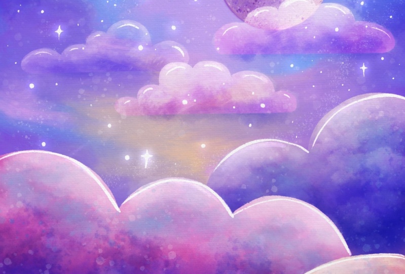
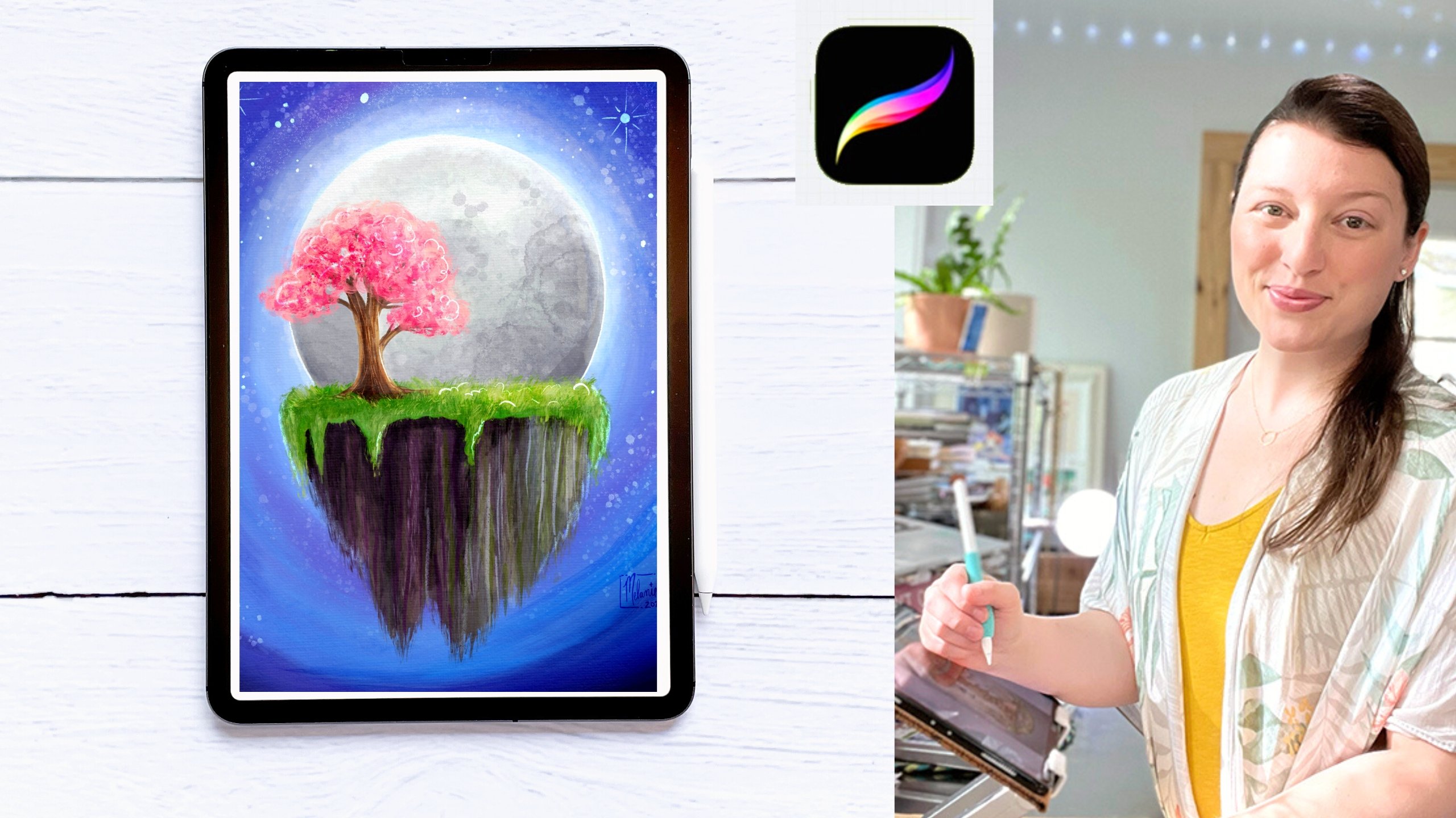
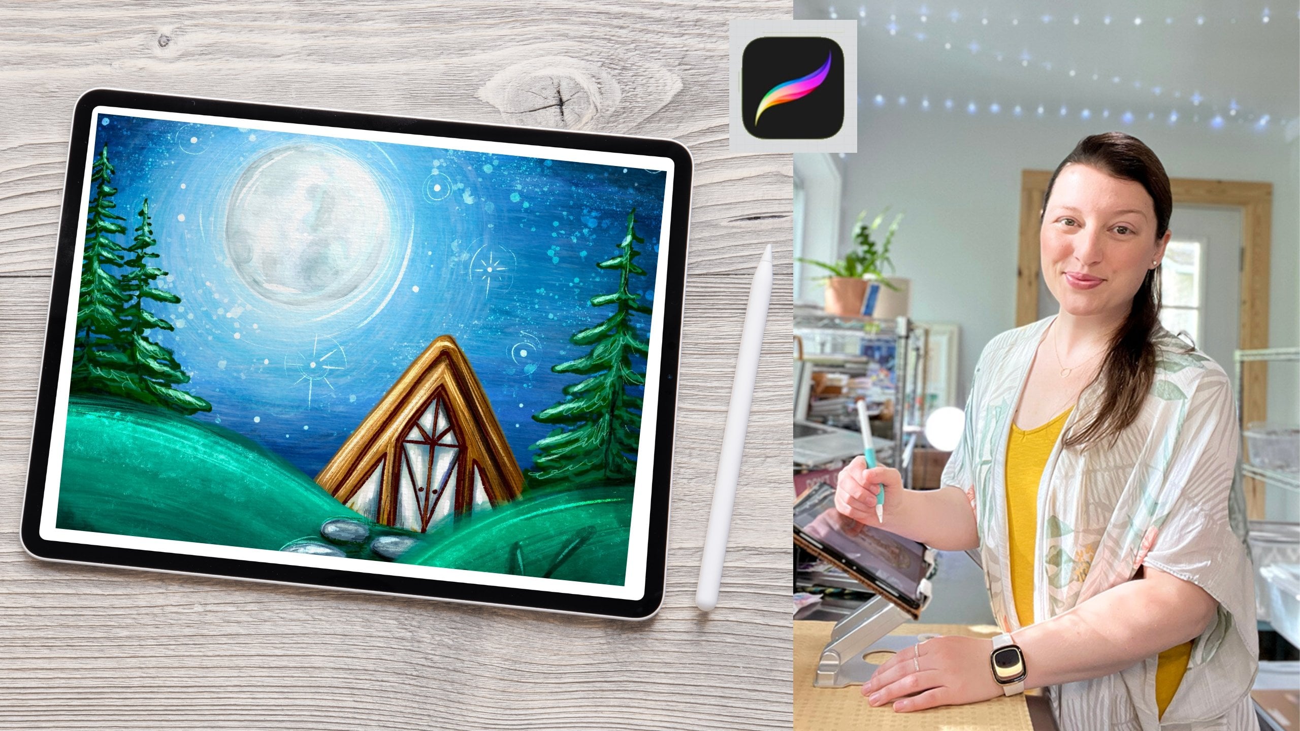
7. Paint The Moon: Okay, next let's add in
our big beautiful moon. To do that, come to our
layers and we need to make a brand new layer
above our background. If you want, you can
rename this. Tap on it. Rename, we can just call this background or sky,
whatever you'd prefer. While I'm selected on this, I'm going to hit the plus
to make a new layer. If you want, you can go
ahead and rename it now. Pretty intuitive, right?
To make our moon. We want it to be
about right here. I want to choose
the dry ink brush. That's what we're going to
draw with. Select that brush. I'm going to turn the
opacity up. The size. Let's see here,
That's a good size. We're at a, somewhere
between 678, 9% Now we want to
choose a lighter color. I'm going to go
with probably like this light peach color in between these other
two darker ones, we are going to use a very helpful tool to make
a perfect circle First, just get a general circle drawn and hold down
with your pen. Don't lift up. You will see a tool pop up
here at the top. That's going to help us
fix this tap where it says Eclipse and
change it to a circle. Now don't close out
of this tool yet, because we can now use this to change the shape still
or change the size. I'm definitely going to use this to change the size a bit. To do that, don't pull
on the blue circles, instead pull anywhere else. The blue circles will
change the actual shape. We don't want to do that, we still want it to be a circle. To fix this, I'm going
to tap circle again. Then anywhere else that
I drag on the circle now will allow me to change
the size, which is perfect. Let's see, I'm going to zoom out here so I
can see what I'm doing that looks a
little bit small. About like that looks good if you have my
sketch layer turned on. You can obviously see that right now if it's on multiply mode. In fact, I'm going to go ahead
and add that in right now. Guys, I forgot that I
had set up a new canvas for people that weren't able to import the procreate file, and realized I didn't actually then have my own sketch on here. I went ahead and
imported that as a PNG. I've got it above
my painting layers, but it's below my
paper textures. And I've got it in multiply
mode so that it's just barely there and it's not a solid
line over the top of my work. I'm turning the opacity way
down on this sketch layer. You can see it here, but it's not too intrusive. Now I have a much better
idea that actually my moon is a little bit
too big that I've started. I'm just going to go ahead and resize this and
move it down a bit. Doesn't need to be exactly
the way my sketch is. This is a little bit
bigger and that's fine. I'm going to zoom back out. Now that I have my
circular shape, I'm going to go ahead
and drop fill color in. I'm going to drag this circle
of color into this circle, and it filled it very nicely. If this happened to you, your threshold is too high and you need to be
still holding your pen down and dragging back to the left until you see it
only filling your circle. Alternatively, if you see like a big gap happening between
your line and what filled in, then your threshold
was too low and you need to pull in
the other direction. I'm going to undo this
and show you that. Again, my threshold is only
at 12% I know that's too low. I'm going to pull,
pull, pull, pull, and I didn't have enough
room. That's another issue. You got to make sure you have enough room to pull your pen across the screen dropping, pulling my pen up until
I ran out of room again, drop pulling my pen up. Try not to make such a
big sweeping motion. I know this is too far. I'm going to come back
until it just fills the circle right
there, 81% for me. If I look around, there
shouldn't be too many gaps here. But if there are, I can
color them in with my pen, but sometimes I
actually like to leave that because it looks
like really nice texture. It's up to you, that's
a personal choice. All right, next step is that we need to turn Alpha, lock on, and paint over the
top of our moon to add in that
moon like texture. Turn alpha lock on.
Come to your layer, find your moon layer and either tap and choose
alpha lock this way. And you'll see the
little checkers show up behind at the
little checkboxes. And that means alpha lock is on. Or you can also do
it the other way, which is to use two fingers
and swipe this direction. And it will also turn alpha
lock on with a gesture. Just double check
that that's on. Now we can paint
within the boundary of this circle and nothing will
spill out over the sides. Now we want to add
some gentle texture. I'm going to find the
old bleach brush, I really like this for creating the initial bit of
texture for the moon. I'm going to choose
a darker color, like one of the purples. I'll maybe start with
this purple here. I'm going to lower the opacity
way down on this to start, and I'm going to make it
nice and big. Let's see. Nope, I want it even bigger, but I want the opacity
bumped up just a bit, maybe. Let's try 50% and I'm just
going to gently sweep in and I'm actually going to turn my
sketch layer off for a minute so I can really
see what I'm doing. I'm going to tap
some of this in, then I'm going to choose
something even darker. I'm reversed what I did
on my original paintings. So I'm going to make this side darker and the
other side lighter. Let's tap some of this. In this brush has really
interesting edges, which is why it gives such
a good moon like texture. You can see where my brush is actually showing up
with this outline here. This is something you can
turn on if that would be helpful for you to see
what your brush is doing. To do that, you're going
to come to the wrench and go to preferences. Then just turn on your
brush cursor if you want to see it like I can see
it. If not, leave it off. Again, just playing a little
bit here with the color. Okay, now that we have
one base of texture here, we're going to add some more. Let's switch to our fresco brush and
we're going to tap in some crater like marks with
the fresco brush which is, should be right beneath
your old bleach brush. This is one you're
definitely going to have to play with the size
and opacity on. Let's just see what
it's set out for. Now that's not showing
up super well. I'm going to make it
a little smaller. I'm going to choose this
really dark purple. Okay, that's what
happens if you tap just once and hold down just briefly, it should make an
interesting crater mark. If you hold down, it just
keeps making that texture. This brush takes a little bit of playing to get things
how you want it. You could also put this on
a new layer, hit new layer. You want a clipping mask
turned on That way, it will only create this texture inside the
shape of the moon below it. Then what I can do is I can tap around the edges like this and say I wanted to be
able to turn down the opacity on these because
those are super strong. I can then because
this is its own layer, I can now come over
here to the end, turn the opacity
way down on this, change the blending
mode, et cetera. It gives me a lot
more flexibility. Now with these crater marks, I'm going to go ahead
and delete those, but that just gives
you an option. I'm going to go back to just
painting on my moon layer. Okay, I'm going to go ahead and paint in some lighter color. Now with this brush, I'm just going to kind
of tap this in around this edge and then brush
it in really hard. And then a little bit over
here, a little smaller. If you're making
things you don't like remember two finger tap. Just undo and back it up as far as you need to or even
hit the undo over here. Then you can also redo to redo it with a gesture
is three fingers, two to undo, three to redo. Okay, let's go back to
another dark purple again. Don't be afraid to experiment
here and try things. You're not going to
mess anything up. Now that I've got
that base crater, that base crater texture, let's add in some even smaller
ones with the flix brush. The flix brush should
be up above here. And these are like little
watercolor speckles which make really
nice crater marks. And you're going to use a
combination of purple and white and sprinkle them
around to your liking. Again, you'll have to play with size to get some variation. I'm going to come to
an even darker purple. I'm going to lower the opacity, make it maybe a little bigger. Tapping harder or lighter also changes how
this brush behaves. Now I'm going to come
to this bright color, maybe make it a little smaller and up the
opacity, there we go. I tap really hard and
makes some nice big marks. This is a really playful moon. I like this. It's got a lot
going on, but I don't mind. Lastly, I want us to switch
back to our dry ink brush. We're going to
darken the edges of our moon and even mess
it up a little bit. I don't like it to
be this perfect, very smooth line on the outside. I like it to have
a little bit of wobbly texture and a
handmade feel to it. First I'm going to switch to my dry ink brush and
I'm going to come to this purple color first. I'm just going to, while
Alpha lock is still on, darken this up
just a little bit. With Alpha lock on,
I don't have to be super precise just yet. I'm going to gently
brush in darkness. Now that I'm coming
to this lighter part, I'll lower the
opacity just a bit. This is just going to
help this stand out against the background
a little bit better. Okay, that's pretty good. Let's see. Yeah, I like that. Don't forget to zoom out
every once in a while. It can be really easy to
get so focused and zoomed in that you forget to look at the big picture and check
how things are doing. I'm going to brighten this
color up a little bit, just looking a little dull. I got a little crazy. Don't forget the little trick. This does look a little bit more dull and not quite
as colorful and bright as this magic
wand. Hue saturation. And brightness, bump up
that brightness a bit, bump up that saturation, preview it much better. It's a very good little trick. Okay, now I want to mess the
moon up just a little bit. It's too perfect on the
outside for my taste. I'm going to turn alpha off. There are two ways
we can do this. We could smudge with the
dry ink brush a little bit. Again, hold down to select
the same brush that I was just using or just
tap it and select it. Then I might come in here
with a very small size. Just soften this
up a little bit. That gets almost like this
blurred feeling to it. If you don't like that, draw in a little bit of
wobbly, crazy texture. Or don't do this at all. Again, don't feel like you have to do any of these steps
that I'm telling you to do. I'm just going to quickly
and messily sketch in this outer line. I just feel like this really
makes it feel more like a handmade acrylic painting and a little bit less digital. When I'm working digitally, my goal is to almost trick
the eye and make you ask, wait, how was that made? Now I'm coming back over that
area where I was smudging, where it was starting
to just look soft and blurred there. I like this much better. That one got a little bit. I don't like this
spot super well. I'm going to select the color
of my moon in this area and just draw back over the top where it got a
little heavy on the purple. You could also hand draw in some craters with
this dry ink brush. That could be fun. Also,
with the dry ink brush, with the side of your brush, you'll notice that it's much
larger and much softer. That can be really fun to brush in some large textures too. The angle of your pencil will change how some
brushes behave. All right. I'm pretty
happy with that. How do you feel about yours? If you need more time, stop here, Work on your moon
until you're happy with it. Otherwise, the next
step is going to be to put in these
three bottom clouds.
8. Paint The Bottom Clouds: Okay, we are ready
to start painting in some nice fluffy clouds
on the bottom here. I'm going to go ahead and
turn my sketch layer back on. Come up to sketch, make sure I can see those bottom
cloud layers. Now, it's very important that each cloud goes
on its own layer. Okay, I'm going to say it again. Each cloud needs its
own layer First, let's make a new layer. I'm going to tap on my
background and hit the plus. I'm going to choose my dry
ink brush and I'm going to start this first bottom cloud with this peachy color here. I'll just go ahead and make
my brush a little bigger, opacity at 100%
I'm just going to roughly trace over this sketch to create this
first bottom cloud. As long as my line touches both sides and isn't
broken anywhere, I can drop fill color into that. Now again, if you're
having problems, remember to check out your
threshold and slide up or down with your pen remaining on the screen if you
need to fix that. Let's make cloud number two. Beneath this first layer, hit the background and hit plus again for cloud number two. Let's go with this
fuchsia color right here. Again, just roughly
following my sketch. Yep, try that again. I have to come all
the way down though, if I want to be able
to drop fill color, even though you can't see
that you're doing that, just make sure that it
extends all the way. My threshold might
be a little low, so I'll just fill this in
a little bit. Here we go. And we need one
more cloud layer. I think I'm going to go
with a purple this time. And hit background and tuck it again underneath this
second cloud layer. Let's see. Let's, let's
try this purple here. Here we go. Very nice. Feel free to change those
colors if you want to. But now we need to make them interesting by
adding some texture. What we want to do is turn alpha lock on on all three layers. Can either do that again by
tapping and clicking it on, or using three
fingers and swiping. I tend to have a little bit
of trouble with the gestures. Sometimes I usually
tap and click. Alpha lock is on on
all three layers. I can tell because I see the checker boxes behind
all three clouds. Here comes the fun part of adding in the texture
to these clouds. There are several brushes
you can play with here. They're not even
in the paint night set that I've included for you. You can go and find them though. The first one I want
to recommend to you is down in the
materials section. This is built into procreate, so you will have this
go to materials. There's this brush right
here called Glover, makes a really fun texture. Next we're going to
come up to organic. Where it's down looks like the little leaf
shape hit organic in the rain forest brush and the cotton brush both make very beautiful
texture for clouds. Next, come to the elements
section and go to clouds. Isn't that nice?
There's actually a brush that will make
this fun texture for us, but please feel free
to try those out. See which one you
like. We want to do now is start varying
up the color and size and textures that
we put onto each cloud to get them to look like this really fun, yummy, fluffy cloud. Start on one and
then feel free to bounce around to get
them how you want them. Then again, don't forget, you can always tweak an
individual layer with that hue, saturation and brightness tool. My general technique here is
I like to make the clouds darker at the bottoms where they meet another cloud and
then brighter at the top. Imagine this moonlight hitting
the tops of our clouds. It's going to make
them brighter, right? If we're playing with the
actual rule of light here, which this is a very
fantastical scene. It's not exactly correct,
but that's okay. Brightness at the top,
darker at the bottom. This also helps the clouds
stand out against one another. I'm going to go
ahead and start with my peach cloud layer. I'm going to make sure
I've selected it. I am on it. I'm going to come back up to
my paint night set. I'm going to choose
my rainforest brush. I'm going to start by making the bottom darker and work my way up to
the lighter colors. Let's start with
this color here. I'm going to make my brush very big and lower the opacity. And just gently sweep this in and tap it in. It's
a combination. Then I'll start working my way through like some of the pinks. I'm building this up. You might want to
play with your size until you find a sweet spot. I'm just working my
way darker and darker. I like to leave it zoomed out a little bit so that I can
really see what I'm doing. These are also going to get a
little bit darker in one of our final steps
where we are going to be playing with
some blending modes. Don't feel like it has
to look exactly like this just yet because we're going to come
back in and add some. We're going to come
back in and add even more dynamic lighting
with our blend modes. I'm going to come back in
and adjust that brightness. And you know,
what's messing with me right now is my sketch layer. I'm going to turn that off so that I can't see
that right now. I'm going to come in
with this very bright color and tap that in just a bit lower my size. Add even some more texture here, Let's see, maybe even some
more color. There we go. All right, I'm going
to go ahead and bounce to my next cloud. I'm going to go, yeah, go down to the fuschia
cloud and again, make sure your alpha locks on. I'm going to start by putting
in some darkness down here. Bigger brush, here we go, and maybe some of this blue. And then back to the lighter
pinks over the top of that. Now lower the size of my brush. Brighter color, I'm going to choose this pink
and then make it even a little more
saturated and brighter. And brush, okay, that
looks pretty good. I'm going to bounce
to the next cloud, to the purple layer. Now alpha lock is on start by making it nice and
dark down in the corner. Maybe I'll go with this
purply blue here to start. And then even deeper, we need a bigger brush to help that blend
a little better. Then I'm going to come back to this color here
and layer this in. This is looking super dark. I know I need to brighten it back up with some
lighter purples. I know I want it pretty darn
bright up here at the top. I'm going to go with a
smaller brush, all right? I want a little bit
more blue in here, which we are going to come
back in just a second and really tap in that sky blue
at the tops of things. But I'm going to play with a little bit
of that there too. Okay, Keep playing
around with these until you're happy bounce back
and forth if you need to. I'm going to go ahead and use the hue saturation trick
on each of these layers. Now I'll go ahead and start
with the layer I'm on. Just brighten this and add some saturation to come
up to about a 54.60. Come to the fui, this one's
already pretty saturated. I'm just going to
brighten it a little bit, maybe not that much. Here we go. And lastly, the G cloud need to zoom out a little
bit so I can see what I'm doing. There we go. That one, I'm really going to
turn up the saturation on. Might leave the
brightness where it is. Yep. Much better. All right, this is starting to
look really dreamy. The last thing I want
to do is come back to my rainforest brush
and I want to add that pop of sky blue to
the tops of my clouds. And then even maybe throw in some blue dots with
the flicks brush. Just so that way you
can turn this back off. If you don't end up
liking this effect, let's put it on its own layer. I'm going to make a new layer
above all of these clouds. I'm going to choose
this sky blue color. And I'm even going
to brighten it up just a little bit
and come a little bit more towards
this turquoise blue. Let's see how it's looking. I'm going to turn the
opacity up a little bit, make it a little bit smaller. And I'm just going
to gently brush this in and tap it in in
a couple of spots. Gentle brush and then tap. Gentle brush and tap. I like that. This
is like mimicking the sky a little bit
and bringing some of that blueness from the
top sky into these clouds and really helping
them work together. Okay, now I'm going
to switch over to the flick brush and just put in some really playful little
sprinkles on these clouds. I'm going to make
them fairly big and lower the
opacity just a bit. And I want them to mostly be on these clouds
and not on the sky. I'm going to undo if it
pops up here and try to keep them contained
down here there. I like that. That's fun. You could also erase
away, if you liked, how it looked at the edge, but you didn't want it up here. Say this happened. I could keep these sprinkles here and then, let's see, Come up
here to this and choose my dry ink
brush as my eraser. And make it nice and big
and erase away the strays. Here we go. This brush is a
little unpredictable. Which is both fun and can be a little bit tricky
to work with sometimes. But I really like that. Feel free to play with
other colors too, if you don't want
just the sky blue. Some of these brighter
colors could be really cool. Boy, it doesn't want
to go where I want it. There we go, there. That's fun and
playful. All right. If you decided you did not
like that effect though, remember you put it on its own layer so you can get
rid of it if you want to. I really like it though.
I'm going to leave that on. The next step is
we're going to put in these top very, almost
translucent clouds.
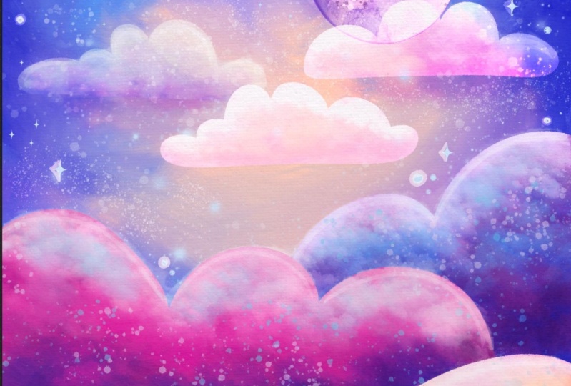
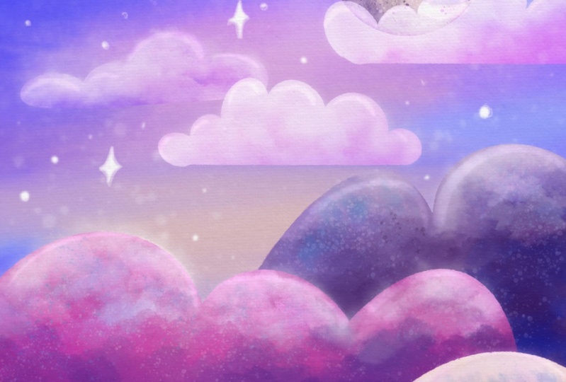
9. Paint The Upper Clouds: All right, our painting
is coming together here. Now we're going to work
on the top clouds. If you look closely at your reference of what
we're working off of here, we have two layers
of these clouds. One layer of these clouds
is in the middle ground. Then these really soft, these two here are even more, they're further away, They're behind this front
layer of clouds. We're going to start by
putting in these three clouds. First, come to
your moon and hit. Plus we want these to be
in front of our Moon. For this layer, we're going to start playing with
blending modes. I want you to come to the N
and come down to overlay. This is one of my absolute
favorite blending modes. It's super magical and creates a lighter version of
the colors beneath it, but also takes into account the color that you've chosen
to paint with as well. Make sure your layer
is overlay mode. You'll see a little here
letting you know that it is. Let's choose our dry ink brush. To get started, I'm going
to choose this light pink. I'm going to turn my
sketch layer back on. I'm going to go
ahead and draw these in and drop fill
color into them. Look how beautiful
that is that it picks up the texture beneath it. Feel free to change the shape
of your clouds as well. And then one that goes
in front of the moon. I mean, I need to correct
this one just a little bit. That got a little bit funky. Don't be afraid to rotate your canvas to really
make it work for you with whatever feels the most comfortable or
the most natural. I'm going to try to keep myself from rotating
too much though, so that you guys can
see what's going on. Okay, let's turn alpha
lock on on this layer. Now, tap alpha lock and we're going to
stamp some more texture into the top of this. I'm going to choose
my rainforest brush and I'm going to go with
this darker pink here. I'm, I need a bigger brush and I'm just going to
stamp some of this in. Remember the overlay
mode is still going to allow texture to come
through that's behind, but it's going to
take into account the color that I'm using. This dark pink, I think
that looks really nice. If these feel a little
bit too bold to you, you can either come back in with a lighter color
and stamp that in. Alternatively, we can also turn down the opacity on this layer, which I might do
just a tiny bit. Tap the O and see this bar here where
it says opacity max. I'm just going to drag this
down to like 80% for now, I think that looks really nice. I feel like they need a
little bit more brightness at the top though, Let's see, I need a smaller brush and
I'm just going to brush in some brighter
colors at the top. There we go. And don't forget, you can also make a change here. All right, Next we want to make that second layer of
clouds that are even more translucent beneath
this cloud layer, but above the moon actually, we want these to be beneath. This is my light blue
colored layer on my clouds. I'm going to hit the
plus right above that. These are going to be
the even lighter clouds. And I'm going to put this mode, this blending mode,
to soft light. It's going to be even more of a subtle look than
the overlay mode. I'll stick with this
light pink again. If this does not
look subtle enough, remember to lower
the opacity again. Oops, need to go back
to excellent this. When I hit undo,
keep an eye on that. If you ever accidentally hit undo and you see
something pop up here, but nothing changed
on your canvas, something changed
with your layers. This has gotten me many a times and I've accidentally
painted on a layer. I didn't mean to because it unselected a layer
by hitting undue. Okay, I'm going to come back to my layers and double check. I'm on my soft light
layer, perfect light pink. Choose my dry ink
brush and draw. In this second set of clouds, I'm going to drop
fill color again. One more up here, I guess. I don't actually have that
cloud on my sketch layer, I'm just going to
add it in anyway. Feel free to add this
one in or leave it. It's up to you. There we go. Same thing. I'm going
to turn Alpha lock on. This time I'm going to
choose the rainforest brush, but this time I'm
going to put in a little bit more
of like a purpole or a blue to add a little bit more fun color and interest. Let's see what this
color looks like. I like that. And then maybe
this bright purple and then some brightness
again towards the tops. If your clouds are looking similar to the ones in front and they're
not subtle enough, feel free to go ahead and
turn down the opacity on them by tapping where it says
L and lowering this bar. Okay, I'm going to brighten
these up just a little bit. I want to show up just
a little bit more. I want to add a little bit
more texture to this sky. I'm going to come
back to this layer, choose my rainforest
brush, choose a pink, and then just tap back in, there we go, because that one
is such a center element, I just want to make
sure it looks good. Just like that this painting is really starting to come to life. But if you know me or if you've taken a
class with me before, you know that we need
to turn up the sparkle. Let's add some stars next.
10. Paint The Stars: Okay, we're ready to
add some magical stars. Let's add a layer above
our background layer. Come down and find
your background and hit plus, remember, you can always drag these
layers around to where you need them to be by holding
and then dragging. If your layer did
not pop up where you needed it to
be, just move it. We're going to put this
layer into color dodge, which is, again, one of the
brightening blending modes. It makes a lighter version
of what's behind it. It does take into consideration the color that you're
working with as well. We need to choose
a lighter color to work with in order for
this to be effective. To make the first
layer of stars, I'm going to use the flix brush. I'm going to choose
a light blue. I'm going to start with
this color here and then move it up and over
to make it lighter. You'll want to
play with the size and opacity of your brush, but for now, we're putting
in some more subtle stars. Then we'll hand paint in those bigger stars
in a little bit. I'm going to tap
some of these in first at a light opacity
and a slightly larger size. Then I'll put a few
more in that are smaller but more
concentrated, easier to see. Because they're going to be
a little bit more stark. That maybe a little bit more, again, if something goes where you don't like it, undo it. Sometimes I like to
make little trails of these like that, but that's a little bit intense. You could do
something like that. Your call though, add
your sparkle your way. Okay, that looks
pretty good for now. Next we're going to make one
more layer above this one. Right here is the
first star layer. By the way, I haven't
been naming my layers, but you are more than
welcome to this one. We're going to put into a mode, this is like the
brightest of brights. This makes really
beautiful stars. Let's choose our dry ink brush. We can either stick with
this light blue color or you could choose
a light pink. It really doesn't matter. It's going to be
almost close to white. Now you can make any
shape star you want. I usually like to make a
combination of circular, round stars and then some of
these fancier style stars. My brush is a little big, so I'm just going to lower
that, Go star crazy. Start putting them in
wherever you want. There are so many fun star
shapes that you could do, don't feel like you
have to use this style. Then you can also
vary up the size. And then make sure to add a couple of little
clusters here and there. This helps it feel a little bit more organic and
less planned out. You could even put
your own star sign in the stars or a
constellation you really like. It would be a really fun
way to personalize this. Again, I need to zoom out and double check
how things are looking. I'm really liking it so far. Just look for a balance. Make sure you didn't
accidentally add like an unintentional pattern
that you didn't want. For instance, sometimes you might do something and
then back up and realize, what is that perfectly weird, almost dice like
pattern I've added. That's why zooming out is a good thing every
once in a while, I usually like to have
things in odd numbers. I think it's more pleasing to our eye to make sure I
have three of those. I don't want them to
line up so well though. Let's I'm going to use
my selection tool. It's the little
ribbon tool up here. I drew around that star. And then I'm going
to hit the arrow. And I'm going to move this
and make it a little bigger. Then come down here and choose the ribbon
again. Select this one. And move it this way, that way, well, they still
look like they're lining up. I'm going to make
this one a little smaller and then maybe just
make this one tad bigger. There we go. That's pretty
dramatic, but I like it. Okay. Now that our
stars are sprinkled in, we are going to
have even more fun with some blending modes and we're going to
do what I like to call turning on the lights.
11. Using Blending Modes To Turn on the Lights: All right, we are so close
to finishing this painting, but we have a few color
blending modes to add because we are really going to turn up the drama
and turn on the lights. Now we'll be adding at least
two layers to do this, but maybe even a
third if you like, a lot of extra dreamy light. First, let's add a layer at the top above all of
our painting layers, not above the paper textures. And if you want, you can go
ahead and delete the sketch. Now if you're starting
to run out of space on your ipad or something,
you could get rid of that. Now at this point we're going to make a new layer up at the top and we're going to
put this into color burn. This is going to give us
some nice deep shadows, but still taking into account the color of our painting and the color
that we're painting with. I'm going to lower the opacity
of this layer right now down to about 50% We can
always turn this up. Okay, I've got this
color blend layer and now I'm going to
add in some shadows. I'm going to use the
cotton brush now. Can use any brush that you like, the texture of though that's
going to have a soft effect and I want to lower the opacity down to 50% To start with, I want to choose
something that's going to give me a
pretty shadow color, either a purple or a blue. I'm going to start with
this warmer purple here. Instead of this bluer purple. We're going to start
by tapping this in to the corner
of our painting. Let me see how this
color is looking. It's very saturated,
but I like it. I'm tapping it in to make
these deeper, darker corners. Let's see how it looks on
the sky. Yeah, that works. I'm going to brush
this in at the corners here, around the edge. I'm going to come to
more of a blue color now and do the edges again. The corners, I should say. That's really pretty.
This Nash blue here is making a
very pretty shadow. I'm going to make
my brush smaller. Now I'm going to paint
this in to some of these areas to really help these clouds separate
from one another. I'm being careful to
not paint it too much into the tops of the cloud here. Then like here, I tried to
avoid this a little bit. I'm going to go a little bigger. You can play with either
tapping or painting. That makes a pretty fun texture. Oh, that was dramatic. You can play with
painting this into the sky in smaller
areas a little bit if you'd like even onto the moon. It will work on that layer too. You can switch up
your color again. I just think that playing
with these blending modes is super fun and really adds
magic to your painting. All right, so this
is pretty dramatic. I'm going to lower the opacity on this layer a little bit. I might come down to about 60% Let's toggle it on and off to see
how it's looking. Find the little box
with a check mark in it and just tap
it on and off, and then you can really
see what you did. I'm going to cover
this up so we're not paying attention to
this for a second. You see the drama
turning on there. It looks beautiful.
Let's add another layer. We're going to put this new
layer into color Dodge mode. Now we're brightening things. I'm going to lower the o opacity of this layer down to
about 40% to start with. Can always change that later. I'm going to select the
wild light brush now. And then a light color, maybe like this, light
pink or peach or purple. Let's lower the opacity of
the brush to 50% or so. We're going to gently paint
in some highlights on the tops of the clouds and then maybe even on
the moon as well. This brush is way too
little, much bigger. I'm going to tilt my
brush a little bit. I'm to lower the
opacity even more. I want this super soft. First I'm going to paint this in on the tops of these clouds. If there's any areas where
it looks a little too like, the lines just look
too stark like that. You can blend it. I'm
going to hold down to choose the wild
light brush and I'll blend that out
just a little bit. I'm painting this in on
the top of the clouds. For now, I'll put
some in on the moon. This brush is unpredictable. It makes some really
interesting textures. If you don't like how
it's looking though, feel free to switch
back to either like the rainforest or
the cotton brush. And I'm going to put some in on these big clouds down
here at the bottom. I'll definitely do some
smudging here in a second. Make it a little bigger. Swirl it around. I'm even going to turn my pen on its
side a little bit here. Just bounce around
with this and look for areas that need a little
more work on them. This is something that
will come with time. With more and more painting, you'll notice an area that
needs a little more work. Lots of zooming out
to look things over helps for sure with
this color dodge mode. Let's try switching over to our rainforest brush
for just a second. I'm going to come to an
even brighter color. I'm going to tap
in some cloud like texture I like that may be a little bigger
for these bottom clouds, then up here I got a little bit wild outside of this cloud. So I'm just going to
erase some of that away. That's getting really finicky. I could have left that and
it would have been fine. But I'm just trying to
show you my process and how I think and how I
would be working on this. All right? Now, if you
want even more drama, we can add another light layer. But if you like the way things look right now and
you want to leave it, I totally respect that you could pretty
much call this done. But if you'd like
some more drama, let's make another layer
and put this into add mode. Remember, I told
you, add mode is the brightest of the blending modes. The first thing I'm going to do is put in some really playful light
with my dry ink brush, I'm going to lower the
opacity down to like 20% I'm going to draw in some very
soft white highlights at the tops of things. Then around this bright
part of my moon, I'm add in this very
bright highlight. Now another thing that I do
for my personal style is add in stark, playful
white highlights. I would put those on
their own layer just in case I end up not really
liking them later. And I choose a slightly
smaller brush up. For now, I just draw in
these playful white lines. This is a personal
choice though. You may not like this, look at all the other thing I think we should
add is some glow behind our hand drawn stars. Let's add one more
overlay layer. New layer overlay mode. I'm going to keep my dry
inkbrush and a light color. I am going to opt opacity
up this just a little bit. My dry inkbrush
is going to be at 70% and like a size seven. And what I'm going
to do is draw around these stars to make a glow. Another way that you can
do this is to duplicate your star layer and put the
bottom one into overlay mode. And you can add a blur
effect to that layer. Then you would not have
to hand draw these in. But I like doing this on just a few select ones and
not every single star. All right? I think that
looks really pretty. I'm going to soften
this just a little bit. Okay, I'm just looking
at my overall painting. I'm feeling really
happy with it. I think I want to add in a little bit more brightness
to a couple of areas. But overall, this is really beautiful and we're
pretty much done. Other than signing your name, I'm going to make a new
layer above everything, put it into color burn
mode or a lighter mode. I'm going to try
color Dodge for now. And I'm going to choose a
bright color, like this pink. And then I actually
have my own stamp that I have created with
my name and the ear, if you would like to
learn how to do this. I have an entire class dedicated to making your own
custom signature stamp. And it takes like
less than 20 minutes. You can take that class in
my skill share profile. If you'd like to
learn how to make your own really
fancy name stamp, I might lower the opacity
on this just a little bit. Just like that, I have a very professional and
beautiful signature. It is such an easy way to instantly level up
your digital artwork. Next, I have a couple
of fun bonuses for you and how you can take
this painting even further.
12. Bonus 1 Color Alternatives: All right, for this first
bonus, it's color alterations. I always have so much
fun with this step. Let's start by hitting the
wrench and hitting Share, and then hit Jpeg. We want to hit Save Image, so that it saves it as a
photo inside our ipad. Just like that. Boom,
it's saved to our ipad. Then we want to come back
out of here, out here. We want to hit Photo, so that it imports
this painting that we just saved as a Jpeg and
now it's a flattened, We don't have to worry
about flattening layers, which can get really tricky
with blending modes. If you don't know how to do it, we have a flat image
ready to roll. Now we can play with our colors. The first thing you
could do is just start by going to
the hue, saturation. And brightness, you could
simply up saturation, if you wanted to play
with the brightness, change the hue, which changes the entire painting completely. Holy, wow. Yeah, look at that. This is super fun in a
way to immediately make a completely different painting
out of just one artwork. I really like even this
muted look is really pretty. I'm going to go ahead
and cancel that out. But now you've learned one way to change the look of
the entire painting. Let's try a different way. The next way is to come up to the magic wand and
go to gradient map. This has a huge selection of different color variants that you can apply to
your entire image. I like to turn down
the intensity of this. I like to turn down
the intensity of this by sliding my pen down. You see this blue bar sliding so that it's not 100%
I like to do it at about 20 to 25 depending on
the gradient that you choose. I may have some here that
because I built some of my own. But I would highly
suggest you to just flip through these and see if any of these
look really beautiful. Like this blue gradient I
built looks really nice, breeze looks pretty, wow. So many of these look amazing. This is just a really
fun way to make an alternate of your painting when you find one that you like. Again, remember you can play
with the opacity of it. If you find one that you
end up really liking, save that as a version of
your painting to save that. If we hit Preview, if you like it,
that's pretty subtle. Maybe I should choose something
a little more dramatic. Let's go with that
one and apply. Oops, that was too much. Only apply it once, please. Thank you. Then we want to
share and save this again, and then you have an
alternate of your painting. I hope you had fun with
that bonus, the next one. It's a super unique
idea for you.
13. Bonus 2 Adding Text : Okay, so for this final bonus, I'm going to pull in the flattened version
of my painting. Again, as a photo, I'm going to make a new layer. I'm going to put
it into ad mode. For this fun bonus, you could treat this like either a journal page or maybe you're going
to gift it to somebody. You want to put your own
hand lettering on it. I'm going to choose a dry ink, a nice bright color. I'm an ad mode. And then you could
write a phrase in the clouds or you could
journal on top of the clouds. Really, anything that would personalize this and add even more meaning
to your painting, you can play with that. It's
just a fun little example. You could resize it, move it
around whatever you want. You could even add
little doodles on top. Just go ahead, have fun with. This was just a fun,
silly little bonus.
14. What Now? + Timelapse: Oh, you did it.
Thank you so much for joining me for a
fun painting session. I hope you've gained
some new skills and confidence in your
painting abilities. Remember that with
each painting, you are only going
to get better and your instincts are
going to get stronger. For digital painting,
You're going to keep gathering information on
what tools you prefer, what colors you
like to work with. And you're only
going to get better and better and
better. I know it. If you like this class
and you haven't already, please hit that Follow button so that you can take
more of my classes. Lastly, please consider leaving a quick review if
you don't mind. It really helps me
and other students know what you found
helpful about this class. I would love to know what tip or lesson you found the most helpful in this
class or what was your favorite part about
creating this painting today? Okay, so here's where I'm
gonna leave you for today. But please enjoy the rest of my time lapse of my painting and I really hope to see you in a future class. Happy painting.
 Melanie Bess, Painting By The Light Of The Moon