Transcripts
1. Class Trailer: Hello, my name is Jon Brommet of Crusoe Design Co, and welcome to The Logo Design Process, tips for efficiency and success. In this class, we will be breaking down all the different tips and rules for every stage of the logo design process. From asking the right questions and discovery, to sketching more efficiently, to understanding the basic principles that will improve all of your design work moving forward and then all the way to sending off your final files. The goal of this class is to make you a better logo designer and have your designs approved faster with less revisions. If you'd like to know more about me. I'm a graphic designer and illustrator, and I've worked on a wide variety of design work over the past 13 years professionally. I now specialize in logo design and branding, as well as, merchandise design. I've worked with bands like Blink-182, brands like Hi My Name Is Mark, and RPM Training Co, and I've collaborated with great companies like New Era to produce my own merchandise. I'm also a long-time Skillshare top teacher and I've taught nearly 75,000 students, and they've watched over 2 million minutes and my content. But enough about me, this class is aimed at intermediate and advanced designers that have already made logos, but they really want to elevate their skills and save time in the process. If this class sounds interesting to you, keep watching and we'll get started.
2. The Class Project: Hello, and welcome to the class. As may soon realize, this class it's going to be a little different from any Logo Design classes you may have seen in the past. Rather than you watch me create a single logo for a made-up situation, I'm going to be breaking down the entire process, showing examples along the way. I know you're busy, so I packed this class with a ton of tips. The goal is to not only make your next logo better, but to give you enough information that it improves all of your logo work moving forward. I know that not everyone's going to be on the exact same skill level. Although this is aimed at intermediate and advanced graphic designers, there is some information that might be slightly basic with the principles of logo design, for example, but I think even the intermediate and advanced users are going to get a little something out of those videos as well. Stick with me for the couple early ones and then we'll get into some real heavy learning on the next stuff. For the class project, I want you to take three logos that you've already created in the past, whether they are your best logos or your worst logos, and let me know after watching this class, what you've learned and what you would change now if you were making those logos in the present. This way, hopefully, we can all learn from each other and other students in the class can learn from your projects as well. Without further ado, in the next video, we'll get into the core principles.
3. The Core Principles of Logo Design: Let's talk about the key principles that apply to all logos as a whole. As designers, we often want to make the most beautiful logo we can, we may want to infuse our own style or aesthetic. Although those are good goals to have, those can often interfere with what a logo should do best and that is identify. The main goal of a logo is to be the face of what it represents. Whether it's a brand, a product, or service, etc, the logo is what the target audience will remember it by so it must be easily identified and remembered. Simple and versatile. It's easy in the pursuit of beauty to get carried away with too many details. However, in most cases, a logo needs to be as simple as possible. If your design is too complicated or it has too much detail, maybe too many colors or effects, for example, it often will be more expensive and difficult to print or it won't work in small spaces. Logos are often used in a wide variety of applications, from business cards to billboards, transport trucks to app icons. Chances are, you can't even think of all the ways that your logo will eventually be used. This is why you need to design a logo that works everywhere, and if it's simple, it will be versatile. Memorable. Will the target audience remember your logo after seeing it for the first time? If not, that might mean that your logo is too generic or too complicated. A great way to test if you're onto something is to put your logo next to, say, 3-4 other logos that someone may not recognize. Then ask your friend or family member to look at those five logos and just give them a couple of seconds to look at it. After that, take them away and see which ones they can recall. Maybe you even have them sketch out the designs. If they can recall yours or sketch yours out fairly accurately, that's a good example of knowing that you did a good job. If they have trouble recalling or remembering your logo, you may need to consider what you did wrong or what you could change to make it more memorable. Appropriate. When creating a logo, you need to make sure it fits the style of what it represents. For example, if you have a suit company, you probably don't want to use a cartoon font or smiley face. However, if the logos for kids cereal products, then that might actually be very appropriate. We'll actually cover font selection more later in the class. Lastly, unique. This is most likely the most difficult part of creating a logo. If you understand the basics, you may find it somewhat easy to come up with a logo that's simple and versatile, memorable, and appropriate. But coming up with something unique it requires a lot of trial and error. Unfortunately, it only gets more and more difficult as countless logos are being copyrighted and trademarked. I also find that sometimes this concept can counteract with the idea of keeping it simple. Because the more simple your logo is and the more you distill your idea down to as simple as possible of a form, then the more likely it is that someone else has arrived at a similar solution or maybe even the same solution. Really the goal is just to find the balance of all of these principles and tie them all together. That will ensure that you have a really great, useful logo that's going to be awesome for whatever purpose it's made for. But let's talk more about the idea of uniqueness with unique ideas. Let's talk about that in the next video.
4. Unique Ideas: Let's talk about unique ideas. I understand that that can be very stressful, but really you actually don't need to worry as much about it. The reason for that is because most logos actually aren't all that unique or brilliant for that matter. When you think of uniqueness, you might think of brilliant or clever and that's what makes it so unique. But in a lot of cases, logos actually aren't brilliant or unique, especially not famous great logos. You may have seen some examples of these online that actually are very clever and smart. What happens in most cases that people don't realize is that those are made by designers and designers just had an idea to put two things together. Then they came up with a company name that marry those two things in a way that made sense and then they put it online. A lot of the time those are just for fake companies and they're just an example of like a really cool, clever logo. But realistically those are just self made, fun projects. Of course, there are some real examples of real companies, but generally speaking, the most well known famous amazing logos are not brilliant per say. But if you think about the most famous logos that come to mind, a lot of the times they're not brilliant. That's not what made them so good or so effective. Let's talk about a few that come to mind that are very famous. That's so about Apple, Target and Coca-Cola for example. Target and Apple are really just logos that are the names. For example, Apple's logo isn't an apple. Target's logo is a target. Those in theory aren't exactly brilliant ideas. Also, Coca-Cola is a unique, really nice script, but it's not really all that unique for the time period, it was made that had that really classics, hand-drawn script, which dates back to the error that it was made in. None of those logos are particularly brilliant, but they are really well executed and they're great designs and they're very memorable. They follow a lot of those key principles I talked about in the last video. What you can learn from this is that, when you're trying to come up with something unique, you don't need to break the mold. You don't need to come up with something that's just mind blowing right off the start. You just need to come up with something that's really effective and follows those key principles and most of the time you will end up with a logo that is plenty unique enough. Try not to stress that. I understand how easy it is to get stressed out when you're trying to come up with something really mind blowing. But again, that's not what makes a logo effective. A great logo is a great logo. It doesn't need to be brilliant to be unique.
5. The Rules of Sketching: It's time to talk about likely the most fun aspect of logo design, and that is sketching. But the problem is that sketching is not where you should actually start your logo design process. You should started with something called discovery. If you're unfamiliar with discovery, that's basically when you're going to ask the right questions. You're going to get some answers. Make a creative brief, maybe do a mood board, and go back and forth. It really make sure that you're on the right track before you get too involved in actually creating a logo. A lot of the times this is the difference between you showing logos to whoever it is that you need to get approval from and them feeling like, wow, this person isn't really listening to me or maybe they didn't read my mind because you didn't ask the right questions. That's why the discovery phase is so important. That being said, I know it can be a little less interesting with some students. I'm trying to make this class available to wide variety of people. For that reason, I'm actually going to put both the discovery and the mood board later in the class. You can either go down there and watch those now and then come back. Or we can carry on and we'll rewind and hit the Discovery and Mood Board section. Let's get back into sketching. Many of us rely on digital software like Adobe Illustrator to build our designs, but it's important not to skip the sketching phase. That doesn't mean you need to put pencil to paper, although it is great option. Of course, you could draw digitally with Photoshop, with a tablet, or an app like Procreate on your iPad. The key is something that mimics pencil on paper, as it's the fastest way to get an idea down. I'll show you some of my sketches here. I'm a 100 percent guilty of jumping straight into Illustrator, grabbing a font, and moving forward. The vast majority of my best work actually came from sketching first. Really, the reason for that is your first idea is not usually your best, and it's easier to produce quantity by sketching. This is a rare situation where quantity actually does equal quality, because the more ideas you come up with, the more options you have to narrow down from. I think in general, you should sketch quickly. As you can see here, all of this is fairly sloppy. Nothing's really nicely drawn out. Honestly, I'm skeptical of those people that have perfectly rendered logo after perfectly rendered logo. Maybe that's later in the phase, but those people that have flawless sketchbooks to me, they're not trying to get ideas out as much as just render perfect illustrations or perfect designs every time. In general, I think you should sketch quickly. I would suggest you draw each idea in 30 seconds or less. Ideally, under 10 seconds. You don't even need to write out the full words. You can just block them in. The idea is to experiment as quickly and efficiently as possible. Perfectly drawing every concept will just take way too much time and most of us don't have unlimited time to create your design. If you look at, for example, this McLaren Masonry logo that I was doing, sometimes I would actually write out the words and other times I've literally just scribble into these circles, or even just block in the shape and things like that. The idea is simply just to get the layout down and see if it'll work. Also, of course, I randomly sketch other things in my sketchbook. You can see I'm a very slope sketcher, even when I'm doing illustration work. But that's the idea. You just want to move quickly. You can see here too, and I'm doing trade winds. Once in a while, I'll play around with blocking out the letters. But for the most part, I just write quickly and san-serif my normal handwriting. Unless I'm doing an actual word mark where I'm thinking about how that's going to work out, then you can see I'm starting to add different types of serifs and things like that. But for most of my work, I'm just moving quickly. I just want to get the idea down, the random layouts out, and move as quickly as I can. Sometimes I'll even just put down a bunch of words that relate to whatever it is that I'm drawing, and I can refer back to those later. But for the most part, I just want to move as quickly as I can. Again, the goal is quantity over quality. Of course, that's figuratively speaking. What I mean is you want a lot of options in a short amount of time. Then you can choose what's best and narrow down or find. Obviously, you want the best options possible. Sometimes you need to draw 30 ideas to find one that's worthy. For me, when I'm sketching, I'm mainly trying to figure out the layout of the words or crania assemble, otherwise, known as a mark or a logo mark. Another tip for sketching is to draw small. As you can see, all of these illustrations are really small. This piece of paper is tiny, and I fit a lot of really tiny logo into it. I don't draw massive logos because, they take up a whole lot of space and I don't need them in this phase. If I draw small, as in under two inches, then I'm forced to keep the detail low. Logos need to be simple. This is a great way to make sure the design works at a small size right off the bat. As you can see with this logo, for example, I definitely drew a lots of different options and sometimes other projects get in the way. Then I'll just keep on drawing more and more ideas. You'll see later on that this is one I arrived at, but the idea is just keep drawing and come up with an idea. Sometimes it takes days and sometimes you'll get it right away. But I'm trying everything that I can possibly think of. Abstract, more on the nose, find animals, and so on and so forth. Just everything that I can possibly think of. Also, if you're refining or using reference images, say your logo is a face, for example. Make sure you do not trace off reference images, unless you actually took the image. You want to be sure to draw separately from the image because that'll make sure that it's unique to you and that you're not copying anything. So you're not getting sued or anything. Also, a logo usually only has space for one idea. For example, if you're designing a logo for a marketing email about software, you don't want to try and communicate a computer, and code, and mouse, etc. It's almost always too crowded and muddied. Try and pick one thing at most, representing the logo. Sometimes what I'll do here, for example, with this Edinburgh wardrobes. I'm just doing a w, sometimes I'm doing an ew and trying to make sure the v. It doesn't look like a v. But that's the idea. It's this one concept, and some concepts I tried like a bird. But again, I'm not trying to do too much. If you try and incorporate too many things all at once, then chances are it's going to just not work out. It's going to be sloppy. Same idea with trade winds one. Sometimes I try a turtle with some text, sometimes I try a ship, or any of these different elements. But again, just one thing. If I try to mash in a turtle with a ship wheel, with a flag, with the ship, and so on, it just gets crazy. A lot of the times smaller businesses, if you're working with them, they'll try and cram way too much in the logo. Just try and keep it as simple as possible. It leads me to my next thing. That is, a logo does not need to explain what it represents. There's a mistake that I see tons of small companies, big brands do it to. For example, Apple's logo is not a computer. Nike's logos is not a shoe. A logo is not meant to communicate a story or information. It's meant to identify. Then once you've drawn enough options, and you follow this idea to get as many concepts down as possible, don't be afraid to sketch quickly and dirty whatever kind of tool you want to use. I use the iPad all the time. Once you've got everything done, that's when you jump into the computer. That's when you start refining. But we're not going to do that right now. Instead, I'm going to talk about whether you need a symbol or wordmark. Let's talk about that in the next video.
6. When To Use A Symbol Vs. Wordmark: Let's talk about when to use a symbol and when to use a wordmark. I just hopped into Illustrator here and maybe you didn't know this, but did you know you go to view, over to presentation mode and it's going to turn my artboard there into a nice presentation. This can be useful if have someone hovering over shoulder and you want to show them some of your work, and then hide all the distractions, so it's neat. Then you've also got your mouse pointer implant stuff like the word what? Anyways, so the question is, what is a wordmark also known as a logo type? A wordmark is essentially a text-only logo. It can have unique properties, but it rarely features a symbol within the design. In this case, you can think of Google, Canon, Sony, etc. The idea is that these don't have any symbol accompany them, it's basically just the name of the company and whether it's a more simple font like the word Sony, or whether it's heavily customized like Canon. Again, Google's in a fairly straightforward font just with some color alterations. But these are great examples of famous wordmark logos. If we move on, we can say what is the symbol also known as a logomark or mark? There's lots of different ways to refer to these things, so whatever you're most comfortable with. I've started calling things a symbol because if I'm talking to someone that doesn't necessarily know design lingo and I say a mark, people think who's this mark either you're talking about? You could say a logomark, but I just go straight to symbol for people seem to understand symbol. These are great examples of symbols. A symbol as I mentioned, is referred to as a mark or logomark, and essentially it's just an image used to represent the company organization, service, product, etc. But these are all great examples of symbols. Sometimes they can be made up of letters or just illustrations, pictorial, that kind of thing, totally abstract. There's lots of different ways that you can create a symbol. Then the last category is what is a combination mark, also known simply as a logo? These are great examples of combination marks, and essentially they're used in both a symbol and a wordmark together that makes up the entire logo. The great thing about this is that they work very well together and in most cases they also work very good separately. You can make a combination mark and that's probably going to be your most versatile logo design, because at any point you can pull away and just use just a symbol or you can use just a wordmark. Again, just to highlight this, in the case of Under Armour, this UA here, that is the symbol. The word Under Armour is the wordmark, and the two of them combined is the combination mark or just the logo. Same idea with NBC. Wordmark, symbol together makes a combination mark. Pretty straightforward stuff, but it's good to make sure that everybody knows and understands what those terms actually mean. That means, when should you use a symbol or when should you use a wordmark? It can be confusing when you're creating your own logo. Let's look at some famous logos that don't use any symbol. That's FedEx, Sony, Braun, Ford. There's a lot of different examples of these types of logos. Technically, FedEx does have the little arrow in it, so you can call that a symbol, I suppose. But more or less these are just simple word marks. The reason why that these don't need a symbol in one instance is that they are all very short names. As you can see, they're only made up of a few letters, whether it's five or less in this case. That's a great way to know that you probably don't need a symbol. The reason for that is that these logos will all work at a small size and a large size be very readable and there's probably not the need for a symbol. For example, if we take a look and pretend that these are now app icons, you can see that the FedEx, Sony, Ford, and Braun, all fit fairly nicely in those small spaces. If we were to take a long name, like Mercedes Benz for example, it doesn't fit as well. You can see the text has to be really small in order to fit in that space. That's a good example of when you may need a symbol, either a standalone symbol or a combination mark would work pretty well in those instances. You can have that little Mercedes symbol above the text to actually make a combination mark. But regardless, you can see that the wordmark alone is definitely just too big, and that's one great reason why you may want to add a symbol. If the name is long, you might want a symbol, if the name is short, you can probably get away without a symbol. That's one instance to know. What is another reason? Well, marketing budget. If you consider creating a logo for something that doesn't have a large marketing budget, then you may consider not having a symbol at all or making sure that it's only ever used in conjunction with the name or word mark. The reason for this is if you have a symbol on its own, you may not have the budget to market that symbol, so most people won't know what it actually represents. Let's look at this Volkswagen symbol, for example, most people know what it is because there are giant international company. They spent extraordinary amounts of money in promoting their brand globally. If they didn't or they weren't famous, most people would have no idea what the VW stands for or what it represents. Side note, did you know that a symbol using one or more letters is actually called a monogram? Monograms are actually a really easy option if you run out of other ideas for symbol, because whatever logo you're creating will generally have a name. You can use the starting letters for one or more words of that name and try and piece it together in a cool design. In the case of Volkswagen, you could have either used a V or VW in this case, and then experiment with as many ways as possible to intertwine those two letters. I personally love creating monograms, and most projects will use a new combination of letters and while you experiment until you arrive at something like really cool or unique. Name what this company is. Exactly. You may have a hard time because it's not a famous company, but it's the same idea as that Volkswagen logo. This is an example of when a symbol on its own is effective. I think this is a very cool symbol. I'm very biased because I created it. But it is for barber shop. Maybe you are able to see that this is a barber pole here, and maybe it relates to a bear in some way and you're able to start to piece those things together. But generally speaking, you don't know what it represents because this company doesn't have the marketing budget to push the symbol to millions of people so that they understand. In this case, a more effective option would be either a wordmark. There you go, black bear barber co. Really straight forward. You now know the company name, barbers in the name, so you know that they're a barber company. Very straightforward or an alternative option, of course, is to use the combination, which is allowing a symbol and the wordmark to all play nicely together. Now you have the best of both worlds because you've got a fun symbol that makes it very unique. You've got the wordmark which explains what the company is. But again, this is another great example of why you wouldn't be able to get away with just a symbol for a company like this. I do want to say that I personally love symbols. For me they're the most fun and free form of logo design. That's basically why I got into logo design or being a graphic designer at all. Depending on the project, you can really go off the charts and call it with something like abstract or strange. Or you can flex the ability to draw something common in a clever way, whether it's an animal or building, for example. Symbols are great way to add variety and they're very versatile. They're always fill in the gaps where wordmark can't fit, like I explained with Mercedes Benz. In short, feel free to add a symbol to a logo with a long name or large marketing budget, if it's a short name or low budget, consider a wordmark alone, if that will be okay, or play it safe and use a combination mark that features both.
7. Typographic Decisions: Making typographic decisions can be natural for some, but difficult for others. There's so much information I could go over in this section. It can be turned into a whole class on its own. Although technically most of these sections good. But the hope is to give you a great overview of the process and give you some information that you didn't have before. So you can bring it along with you, for your logo process, for years to come. One of the more obvious points of typography is picking the right font. You're already likely aware that the main font types are Serif, Sans-serif, and Script. There are many offshoots of these main styles, but we'll skip those for this. It's important when choosing a font to pick something that matches the project in hand. If you're making a logo for an email marketing campaign and you're promoting high-end jewelry, you might consider a serif font, because it's more traditional and often associated with a luxurious brand. Let's look at Cadillac, for example. They've gotten the script root. It's traditional, it's classic, but it also gives you that luxurious feel. But what if they went with a different font option? Here's an idea of what it would look like as san-serif, which is very modern looking, of course, the normal script font that they already have, and then comparing it with a serif font. As you can see here, using the san-serif font, looks weird. Sure it's modern, but it just feels weird with that symbol. Although to be honest with you, that symbol looks modern too. Maybe it would work better than you think, we're just so used to the script. Of course, in the middle of the traditional script. The third option would be a serif route. But as you can see, each font choice matched with the exact same symbol, gives the logo a very different feel. Don't judge me too much on the kerning, I just quickly typed these out. I didn't want to go crazy spending too much time. Here's another example of using a different font with a logo you may already recognize, especially since I've already shown it, but this is the Under Armour logo. As you can see, these two symbol and word marks, they don't really match very well. They don't work that well. Using this overly feminine or ornate type doesn't really make sense for a brand that predominantly sells men's clothing. I know they sell women's as well, but regardless, even if that weren't the case, if you were to look at this big, bold chunky UA logo, it probably just doesn't work well with this ordinate, thick and thin script fonts. This is what I mean by trying to make sure that you're choosing the right fonts that not only match the company, but maybe match the symbol that you're creating along with the company. Again, these are all general rules and they can of course be broken. Once you've picked a font for your logo, you may feel a need to use another font or another weight of the same font in your logo. I recommend that you only ever used two different weights of fonts at the most, or two fonts of the most. It'll give you a nice balance trying to use the same font in different weights. Just don't go more than two weights, or you'll find that the first word which is in bold, doesn't work really necessarily when next to an ultralight, but it works okay with regular or a book. Let's say it's not too big of a jump, which is basically what I'm trying to illustrate here. This is arguably maybe too big of a jump. It doesn't look too terrible, but this works nice and cleanly. Again, although this doesn't like too hard, again, arguably, it's a bit too big of a jump. A little too much contrast from this really thick black font to this thin regular font. I think that this is a much happier medium, but again, I'm biased because I made this one too. While we're talking about fonts, I just want to throw in a quick fun tip. If you see a logo that you really like, either on the internet or out in person. If you take a photo of it or screenshot, there's a few great websites that'll help try and identify that font, so you're not spending forever trying to figure it out. Of course, it will work better on some fonts and logos than others, but it's worth giving it a shot. If we have this Adidas logo, for example, I do recommend that you try and crop out any distractions you want, just the font. Then we'll just take a quick screenshot. I'm going, Command Shift 4, and I'm driving over top of that. Then I've opened a website called, WhatTheFont, just Google, WhatTheFont and it'll open up in my fonts here. We're simply going to click right here. Then we're going to grab our screenshot and upload it. Wait a moment, as you can see, it did nicely identify all the texts because obviously this is a very clean black on white image. We'll click Next. Then we'll find here with variants success, it'll find the font. In this case it is ITC Avant Garde. It's not the demi version, but it is the right fonts, so it got pretty close. This is a great tip if you're trying to figure out a font and you don't know exactly what it is. Just a little side tip for you. Also, if you're running around to find fonts, we're living at a great time to find free or cheap legal fonts. If you've already gotten Adobe subscription, Adobe Fonts is a great option. If not, or even if you do, Google Fonts has a ton of really good options as well. If you can't find what you want there, try looking at Design Cuts or Creative Market. So that's designcuts.com, creativemarket.com. Those are really fantastic sites that have commercial fonts and they're really reasonably priced. It's important that you use fonts that are legal for your usage. If your logos for a brand product, etc., you need to read the commercial license information, because some fonts will cost more if you intend to use them to sell something in large quantities. For example, a t-shirt you tend to sell thousands versus a web font for a mailing list logo, you might have to pay a different amount. Okay, now it's time to talk about Kerning, so important. You're an experienced designer, I'm sure you know what kerning is, but it's essentially the space between letters. It's very important because as you can see here, it doesn't read very well, if it's not done well. There are some examples of this that are a little bit funny, like this for example, cover your home in a click. Of course, the kerning is a little tight there. You might know you not read that as a CL and you might read it as a D. It's a little bit a kerning error there. Here of course, to the 10 Flickering Lights that L and I, are a little bit tight. Probably might want to space out the kerning a little bit there. But again, the kerning, as we can see here, is space between the letters. Tracking is the space between all of the words. It's similar to kerning where everything is all spaced out evenly, but the kerning is specific to two letters, so that space between two letters. Normally you would track at first and then go in there and make some changes with the kerning. This is important stuff, it's pretty basic, but it's also a good reminder. I'm embarrassed to admit, but for years I didn't kern my logo very well, I didn't pay much attention to it. I knew how to do it. I knew I should do it, but I found I was lot more focused on the overall design. That the tiny fractions of space between letters just didn't seem that important to me. But the truth is, you can really see the difference between an amateur and a professional. Professional always make sure to go that extra mile and properly kern and track and do the lighting and make sure that everything is crisp. That makes their logos that much better and that much more timeless, which is always our goal as designers. Another fun tip, whether you're new to kerning or not. I found this cool website, type.method.ac. It's this kerning website, where you can go in and you move the letters around, and you hit next, and it'll add, it'll basically rate how good or close you are at kerning. It's not great and that it doesn't tell you why or what should work, but it is a fun thing. You can go and check it out, and see what score you get. Maybe you can beat mine. I'm not going to lie. I didn't get a 100 on all of them.
8. The Importance of Presentation: This is often one of the most overlooked aspects of logo design, that is presentation. It's easy to get wrapped up in the process and create great designs that you're able to visualize in the real world. However, when presenting your work, you cannot assume that people looking at it are going to be able to visualize it in the same way. This is why you need to spend some time showcasing your concepts in places they'll actually be used. Sometimes this is the difference between a logo getting approved or not. As you can see here, this is a logo I did for Edinburgh Contractor. This is all the different logo concepts I like to get variations for the logos, which I'll explain in a later video. But I'll go over, of course, I put their name, I put a little bit about what we spoke about, some of the keywords, things basically from our creative brief, our discovery. Then this is what I mean by actually trying to spell out what it's going to actually look like. Let me turn my smart guides off. Basically what I'm trying to show is that here is this logo that I created for you. Here's how might look in the real-world, on your vehicles, or this is photos from their social media. Again, more social media. Here's what your logo could look like on Instagram. This is actually a photo they sent me of their vehicle in front of their shop. The idea is I'm trying to spell out, here's how this logo will actually work in your world, in real-world usage. The best thing about doing that is that they'll be able to visualize what you're visualizing. As designers, we can often visualize things very efficiently. We're very good at it. But not all people are like that, so you need to try and spell it out for themselves. That's something that I try and do whenever I'm creating a deck or a logo presentation, especially if I have photos in the storefront. I'll start to lay out storefront signage, vehicles. If I don't even have all that stuff, you can start laying out a basic web ideas or even just showing different ways that the logo could work like this embossing. Maybe that's on a business card. There's lots of variations for how you can present your logos. You can present them. Anything like I'm showing here. But the idea is that you do want to show those real-world scenarios because that'll make sure that they're able to visualize it exactly how you were thinking it could actually be used. It just eliminates all of the guesswork. Also, if it's in the budget and you have the time, definitely go the extra mile, found some great mock-ups or create your own. Spend some time making mock-ups in Photoshop if you have some free time, this way you can effectively show all of your logos being used. This is another part of the presentation, some of the behind the scenes, but essentially what I was working on for actual part of the branding. Then what I ended up doing is I actually spent some money because I think it's definitely worth it. I bought some mockups. This way I can mockups and t-shirts. I can mock up stationary and things start to look a lot more authentic and they look a lot cleaner and nicer. Again, whenever you can go to this little extra mile to make sure that your work is presented the best way possible. A lot of the times that's really going to land well with whoever you're presenting it to and they'll be able to see how it could work. Sometimes that might be the difference in getting the logo approved or not approved. I think this is key. Make sure that you focus on presentation. Do not skimp on presentation.
9. Dealing With Criticism: Admittedly, when it comes to criticism, it's kind of an easier said than done approach, and that is you need to learn that logos are not your babies. Your design work are not your babies. You need to be willing to take criticism and to let things go. Most of the time when you submit a variety of logos, it's very rare that the people in charge are going to pick one logo and then say, no changes, you nailed it, it's perfect. Most of the time they're going to have changes, and the higher-ups are probably going to want to put their stamp on it as well, or whoever you're dealing with is going to want their little edge or input. Even if you feel that it's not beneficial to the logo, sometimes you need to be able to take a step back and understand that they have input, and sometimes it is valuable. Sometimes what happens is, say you've created a custom logo and you spent hours, let's say you put 20 hours into this one beautiful word mark that you created. The problem is you're going to be so attached to it because of the amount of work that you put into it that you're going to feel that it's perfect, and you put all that work into it, it has to be awesome. But sometimes someone else that didn't put all that time into it is able to say, you know what, this is a great design, you did a good job, but it just isn't right for the project, or it needs these changes, and that's going to be hard for you to hear, especially if you've put so much time and effort into it. But the best thing you can do is learning right away to deal well with criticism. You just have to be willing to let things go. Again, they're not your babies. These are just logos, this is your job. You just have to be willing to accept some criticism. I know it's easier said than done, but the sooner you are able to do that, the easier your job will become, and chances are you'll actually make better logos, because you won't be so attached to them. If time's willing when you create some logos, before you submit them to be seen, if you have some time, take a night, take a couple of days, and re-evaluate whether those logos are as good as you thought, or if they need changes. I totally understand that it's great to fight for what you believe in and try and push your opinion as well, but you just don't want to be a difficult person to deal with, and you'll find that in your career you'll do a lot better if you're willing to take criticism, and you're willing to work with people and their opinions. Sometimes they'll be making your work better, and even if unfortunately they're not, you still have to just bite your tongue and work with it. I know this is not necessarily the advice you want to hear, but take criticism, be willing to move forward, they are not your babies. Sorry.
10. Discovery for Better Communication: Discovery is all about communication. It's making sure that you're asking the right question to the person in charge and you're actually listening to that information and putting it into your project. If you skip a step or you try and rush it, you may find that you will end up with logos that miss the mark or are totally incorrect and you lose the job completely. If you're lucky enough to be given a creative brief rate from the start, then you can sometimes jump right into creating a mood board or maybe even sketching. If not, it's super important that you ask some of these basic questions so that you can make your own creative brief. If you have a marketing background, chances are you know how to make a really great in-depth brief. As a graphic designer, I just try and make a fairly basic one that gives me enough information then I have a great chance of a successful project. At the very least, you're going to want to know the name, when it was created and how it was created or how it works. Of course, this is going to vary a ton depending on what the logo that you're designing is for; is it a service, a product, a brand, is it for an email campaign. It can be such a huge variety of things. That's why I can't cover every question that you want to ask. But hopefully these basic questions will at least get the ball rolling, so you can think of what really matters for each of your projects. You're going to have to custom tailor these questions depending on what the logo is for. The next thing you're going to want to talk about is your target audience. You might want to know the age range, their interests, their gender, if it's applicable, and maybe even their income, these questions are really going to vary a lot depending on what the logo you're making is for. For example, if it's for a clothing brand, you may need to know the gender that it's aimed at, unless it's aimed at unisex of course, if it's for a children's cereal or if it's for adults, you're going to need to know that as well. Knowing things like the target audiences general income can help you decide whether you need to make the logo luxurious to appeal to high-end customers, or maybe more grounded and approachable, so that you are aiming towards the middle or even lower class. That's why certain questions like money can be really important. Sometimes defining a target audience can actually sound offensive. One time I was hired by a large beer company to make something, and one of the products that they were selling, their target audience they claimed were superficial and they cared more about looks than taste. That's a pretty harsh thing coming from a beer company that's making a product. Especially if that target audience actually heard that. But of course they don't hear that, and that's why it's important. Whether it sounds bad or not, you need to get into the mind of that target audience as best as possible and know what they care about. If you can use that information, it will help you make better design decisions when you're moving forward. Not only in logo design projects, but any project. Some people actually even go as far when they're defining their target audience as giving them names or characters. They could say, here's Sally, here's Jake, and then they're going to give them certain interests. Sally really likes playing baseball. Jake really likes playing basketball. I don't know rough examples, but essentially you'll define all these different traits and characteristics about each person, and then that might help you visualize what they like and what's going to be important to them. I don't go that far, but I definitely know that some designers do love that, and if you think it's useful for you, give it a shot. The next thing you need to know is about the competition. Who are they? What do they do or don't do that they should be doing? What do their logos look like? In general, you want to be doing the discovery phase before you start sketching. It doesn't necessarily mean you can't put a couple of rough ideas down really quick in your sketch book, but before you really start the brunt of the lifting, you want to make sure that you've got the discovering nailed down, so you're making important decisions ahead of time. In that way you'll be more efficient and more productive. That being said, sometimes, especially when looking at competition, this is where ideas can start to get in your mind whether you realize it or not. For example, let's say that you look at a bunch of different logos for whatever are the same theme is the competitors of the product that you're doing, the problem is you may start to notice, oh, they're all using blue or they're all using a San Serif font. Certain things may filter and you may not even realize it, and those things that you're seeing may actually impact the type of logo that you create and when you're sketching and so on. The problem is, it can affect how you start to think. You may be really good at turning that off or you may do it subconsciously and not even know. Sometimes that's why I do recommend actually having some rough sketching before you get too far into the discovery phase, and then definitely finish the discovery phase and get back to sketching properly. That way you can have a before and after, and you can make a really informed decision as to which one of your designs is better. Sometimes those designs early on will actually be pretty good. Sometimes they are going to be way off the mark because you didn't do the discovery phase, but that's okay. This way you have both options to choose from. You can't go wrong. Next thing you want to ask about is the design objectives. That might be what color preferences they have or font preferences. Maybe they have an idea for a symbol and maybe they want to bear or something that represents whatever thing. Again, it's hard to define when there's so many different reasons to make a logo. But this is really where you can start to narrow things down, and once you've asked all these questions leading up to here, you can start to make some really informed decisions about what you need to do when you get to start working on the design. I find for me personally sometimes being told the sky is the limit can actually make it more difficult to make any decisions. Sometimes it's better to put a designer in a box with a narrow focus before they can start to be creative and break out of it. Sometimes just saying, Hey, come up with whatever you want is actually counter-productive. Although these answers are not necessarily hard first rules, it's really helpful to ask about color preferences and sometimes so you're not getting an arbitrary answers from the person in charge, like, they like the color red, but that actually has nothing to do with this project. Sometimes it's better to phrase it from the target audience perspective. So when you're talking to the person, you would say, what do you think your target audience color preference might be? If they don't actually have one, then you'll start to rely on emotions and color theory. That's something that you can look up, but basically, different types of colors will convey different types of emotion are a common in certain industries as well. So take a look into that if you're not given any indication as to what colors you should be using. When it comes to fonts, we'll break this down a little later, but there are three main categories, and that is serif, sans serif, and script. Get an idea of what their preferences may be for those, again, if they don't have a preference, that's totally fine. But if they have strong preferences, this is good to know right up front. Lastly, the deliverables. What do you need to actually supply in the end to complete the job? This may seem obvious, it may seem just like you need to give them the files for the logo and be done. But some people may be expecting a full brand guide or maybe patterns or other complimentary elements that may go into the branding. You need to make sure that you know the full scope of the project right up front so that you're efficiently managing your time. Now that we've covered the five main phases of discovery, it's time to move into the mood board. That's the last step that I use before I get into the sketching. This way, you can take all the information you learned in the brief and really drive home and make sure that you're on the exact same track that you should be. You'll put together a mood board, show it to the person or people in charge and make sure that they are feeling the same thing that you're feeling and all is good to keep moving forward. Let's talk about mood boards more in the next video.
11. Do You Need A Mood Board? : Now that you have a design brief, we want to talk about making a mood board. A Mood board is basically a collection of images, as you can see here, that represent the style or direction you think the logo would fit in. The great thing about a mood board is that it can help make sure that both you and the person or people in charge of approving the design are on the same page before you spend time actually designing. In general, I try to mix a collection of designs that I think will fit the look we want as discussed in the discovery phase and I'll add some lifestyle image as well. If the project is large and the timeline is reasonable, you can even create multiple mood boards with different themes. Then you ask which board style they prefer. If you do create just one, try and ask the decision-makers to pick what they do and do not like. In this case, they did not like this steel and oak concept, something resonated with the way that this shape was and how clean it is on this container. Again, these are just examples of logos that you think are designs that you think might work for the project. I like to go through afterwards and actually circle and cross things out after we discuss what they did and didn't like. These are all just little images and color palettes and you're easily switching these. I don't go too crazy with my mood board and at any moment I could pop in here and place a new image in and I can use the same layout for another project. I don't have to create a different layout every single time. But that is something you can do if your timeline and budget actually warrants it. For example, I've definitely seen other designers or agencies that take the mood board way further they'll add custom elements and they spent a great deal of time fleshing out the style they have in mind for a project. Of course, that's a great way to make sure you're definitely exactly on the same page. But in my experience, time is always a problem so I always need to move fast. Usually, I want to get the mood board phase over quicker so I can focus on the design phase. I do, as you can see, create my mood boards in Illustrator, but you can use any software that you're comfortable with. I also recommend using linked images and a standard layout because then you can simply compile reference images and then swap them out and just replace them every time it'll save you a ton of time. Lastly, try and consider copying each mood board you create into a mood board folder for future use. Chances are you have similar projects in the future and you might be able to reuse some mood boards or in the entire board, maybe with or without some tweaks. Anytime you can save time it's super ideal.
12. Layout Variations: A Must : When designing a logo, it's difficult, if not impossible to make a logo that's going to fit in every space that may need to be used in. If you want to make a logo that fits great in a profile picture, it likely won't fit well on a long sign, like a storefront sign, for example. The best way to tackle this and maintain brand equity is come up with some alternative layouts for your logo designs. This is generally easiest if you have a symbol and a wordmark, basically a combination mark, sometimes you can get away with simply having the symbol large above the word mark or smaller beside it or remove it altogether. I like to break these layouts down by primary, meaning use this whenever you can, then the secondary option than the wordmark alone and the symbol alone. I actually taught an entire class on Logo Design for versatility, which you can see on my Skillshare profile, but I covered a ton of examples but here's a couple of quick ones. This is what I'm calling a logo sheet, this is for McLaren Masonry that I made, this is just a simple form for if they're going to send this to other people to use, it's not a brand guide, here's some different options. In this case, we've just got this wide version of badge, the open badge stacked and symbols. I've given you a few options. Sometimes it'll be as simple as like I said, primary, secondary, wordmark, symbol, that thing, but the idea is that in different scenarios, you'd be able to use different logos. Let's say that we have a big long storefront sign that's like the shape roughly. If the logo was simply just this badge, as you can see, it would not fit very well, it would not be very efficient in that space. Ensure there's ways to get around that but your best-case scenario is just to give them another option, another layout that's going to work, and it's going to work well with the brand equity. Now you have that logo, which will work really well in that space. Alternatively you may have a circle that's like a profile picture for example, so this was the only logo that I gave them. Of course that's not going to work well, in this case they could just use just the symbol alone,or I've given them the option to be able to use this badge, or we could use the open badge. It's nice to be able to give them some options. I've actually been following and other design firm called Lincoln design co, they're very cool and something that they've been doing a lot that I've noticed. A lot of variety is a lot of different logo options to use for t-shirts and stuff. They're going away with the traditional one logo fits all. It's something I have been experimenting with, so in this case here, for instance, BlackBear Barber Co, I showed earlier, we've got our primary logo but then we've got some other options. We have just the symbol, they could use, just the wordmark but I've given them some fun, different options that I think still fit very well, they still have a brand equity you can clearly tell is the same company, everything fits nicely. But they've got some variety, they can do some different things. Now maybe they're going to make some t-shirts, they're going to make some hats, they can play with different things. It doesn't all need to look the same, it gets a little bit boring, if you're just using the exact same logo on everything. It is best for brand equity arguably but, you got to try new things and try some fun ideas. This is why I think logo variations are super important.
13. Supplying Final Logos: The Easy Way: Let's say you have a final logo like this. Now it's time to set up the files so that you can pass them along and they will be used for eternity. Well, there's a few different ways that you can do this. It's way more efficient, so you're not spending so much time. One of the ways I do it which you can see in my actions class if you want to learn more, is I have this saved multiple file-formats which I've made. What I would do is probably I'll just grab my artboard tool, double-click my logo here and you can see it just snaps to proportions pretty nicely. I usually give it a little bit of whitespace on it, a little bit just around that logo, just like so. Then what I would do is I would run this. I have a quick key setup, but I'll just go ahead and press "Play", and essentially, I'll navigate to this folder called Tiki. I'll just call this TikiCove. As you can see, it'll save as an AI. I'll click "Save". Then it's automatically, you're going to give me some next options. I've got my PNG which I'm saving at 1,200, and then a JPEG, so it doesn't have a transparent background, and then I can close it. That's how easy it is and I can make various versions of that. That's one great way to do it. Another option is to go to File export and then go Export for screens. The great thing about this is it will use this artboard which you can then name, and you can add the various options. You could say one times or you can say width, and usually go with something pretty big. Let's say 1,200 pixels JPEG, and then you could go with the same thing, 1,200 pixel PNG. Then you can basically go through all the different formats. Maybe you want an SVG, maybe you want a PDF, and now it'll save that logo and all of those formats, just like that, just that artboard, and we can make more artboards. I want to show you something that's really cool. It's not going to work perfectly in all instances, but something that could be really useful that I've only been trying to experiment with recently. Let's go ahead and we're going to separate for the moment the symbol and the wordmark. Let's say we have this wordmark just like so, and this is something you're going to want to supply and say that you want to supply it in a variety of different colors and formats, so you're going to make your different artboards, you're going to make one black and one on white and transparent or maybe you do a colored version, and then maybe you're going to save every single one of these as different files. I'll just close that for now behind that one. Let's say we're just doing this word mark and we're going to have a million different artboards, but you just say you want to make all these different files. Now the problem is once you've made all these files and I've showed you some ways to do it quickly, you may find out that the person comes back and they say, "Oh, we need this one small, it will change", and now you've got to make all these changes to all these different things and this can get annoying. Well, here's a really clever thing that I've realized. If we were to actually just go ahead and go to Window and go open our Symbols Palette. Let's just select all of these and hit "Delete". Now, if we simply drag this into our Symbols palette, I'll just call it TikiCove. We're going to change it to Graphic. Leave it as a dynamic symbol. You go ahead and hit, "Okay", now we have this as a symbol. What's cool about this is if I copy and drag it here, I'm just using my quick key to center it, then what I could do here is you would think "Just go change the color. Oh no, that doesn't quite work." But there's a hack. If we go in here, and for their appearance panel, and we add a new fill and change that fill, and now the symbol will appear in the color that we chose. Let's go ahead here, hit "Fill". Now the symbol will appear in the color we chose. Now, you can see that this is essentially the same result. Well, what's cool about this is if I go ahead to my original or any of these symbols for that matter, and I hit" Edit Symbol", this little warning will come up, we'll hit "Okay", and just to be dramatic, let's say they've decided that they want these smaller. I don't know, this is not going to look at, but this is just an example. We're done. When we leave, you can see that it automatically updates all the other instances equally. That's really cool. This also works with black and white artwork. Here's the trick to do that. Say we have this guy and we want to make him like a black and white version. If we take him and we open our symbols, we'll just drag this in. We'll call it TikiHead, go to graphic again, leave it as Dynamic. Now if we drag another one down right here, then what we would do, the little sneaky way to do this is again, appearance, we're going to add a new fill. You can see now it's blacking out or going to opacity. We'll change that to something like hue. Now we have our black and white version of the same design. Once again, if we go in here and we need to make any changes, we'll just go ahead and hit "Okay", and I don't know, again, this is going to be silly, but let's just say that's our change. As you can see, it's automatically going to apply to all instances. It's a really clever quick way so that you can have a ton of different artboards, but they're all linked to one main thing, and you can also easily swap out pieces. Then you can either use the action or you can use the export for screens to make a ton of different logo files really quickly. I'm not going to break it through all that because again, I'm assuming you've done this stuff before. But tell me, is the simple thing cool? I'm I onto something with the symbols? Again, if you want to know any of those actions, I taught an entire action class about how to auto center things like so, and how to auto export a file by clicking something on my keyboard and then blam comes up and I can make all the changes I want. Just like that.
14. Past Logo Critique: Before we wrap up the class, I wanted to talk a little bit more about the class project, and that was to pick three logos you've already created. Now that you've taken my class, try and decide what changes you would make or do differently to these logos if you were to make them now with the information that you have now. I'll admit that this part is just tricky, it's so uncomfortable to show old logos, I think most of us designers, you're always going to look back if things are always going to change, you're always going to realize what you did wrong. The other thing is, generally speaking, you are going to have input from other people again, so they're not necessarily perfectly what you were hoping for, anyway, so that always makes it difficult. There are so many different logos that I've actually opened them. I was looking and I haven't been able to actually finish compiling them, but I've started compiling all of the approved paid-for-finished logos that I've ever made. These are actually 206 artboards, as you can see some of them aren't filled in, but I have a bunch more to add. I've literally done hundreds of logos over the years, and many of them I'm, of course, not happy with, and many of them I am happy with, but that's how it goes as a designer. In regardless, these are the three logos that I'm going to choose. Going with the information that I've covered in class, I'm going to talk about a couple of things that stand out to me. Again, you don't have to go too crazy, it's definitely hard to critique your own work and put it out there for people to comment on, it's awkward as a designer, but nonetheless, I'm just going to pick a thing that I noticed with each one. Starting from the left here, this old mill and turn my smart guides off. I've got this texture background, that's not really part of the logo, but nevertheless. I think the issue with this logo in general is I am falling onto that too many ideas thing, where I've got this log that's cut in half to symbolize firewood, but then I've also got the house, which is the old mill here, I'm trying to incorporate this wood and the house separately. It's a little bit confusing and then to make matters worse, it's a bit detailed like that house is that weird blob thing at the bottom of it, I think that's where I would change. I'm just trying to incorporate a little too much. I'm going too crazy, it's a little too detailed. Of course, there's tons of stuff, I'd probably change to all of these logos. These definitely are not my best logos, but that's the idea. I'm picking ones that I can think of things that I've changed that are too embarrassing. Looking at this Kahshe mechanical ink logo, a thing that stood out to me is the weight of the fonts being far too drastic. We've got this super thick black stencil font. I think I self-made that stencil and then I've got a much thinner font, a San Serif font, and I think it's just way too drastic. If we zoom out actually I don't know if you can tell that text is basically gone completely, I think that font is just too thin, there's way too much contrast, I should have found something that was bolder and not such a big weight difference here. Again, it is trying to incorporate a lot of things, but I know from working with small businesses they want to get across all the things they do, you got to work with that a little. This oak wood one thing that really stood out to me and I have to look through my sketchbook is, it's just a little too detailed. I probably drew this moose bigger than I should have, and when I zoom out, things are just getting filled in, these eyes, these areas here, and even where are these eyebrows I mean those are really turning into mush once I zoom out, and the antlers are probably too detailed. I could have simplified those antlers, I could have gotten a similar result, but that's how it works. Then talking about kerning, I don't think the kerning is too terrible, but there's something interesting going on. I know that I did obviously purposely connect this K to the W, but I'm noticing this font has this weird upside down letter thing happening. It's noticeable with the K and that it's bigger at the top, smaller at the bottom, and I noticed that with this S. Once I saw with this S it blew my mind. I can't unsee how wrong this S is. If we look, it should be flipped upside down and mirrored, and that is a proper S. I don't know what's going on with that upside down letter, I don't think it's something I did, but boy, that really bothers me looking back. Those are some changes I'd make. I would simplify this definitely, and I would thicken this and I would try either get rid of the house, probably get rid of the house frankly, because this container works, or just do something, but again, trying to do too much in that. I'm doing this verbally. I've made a video of it, but I would love to see your class project, and again, I know how difficult this is to do and critique yourself in front of the world, and even if you just want to pick one logo, that's totally acceptable. I'd love to see what you guys have created in the past and maybe what you would change now and see if we can all learn from each other. Awesome, let's move on to thank you and goodbye.
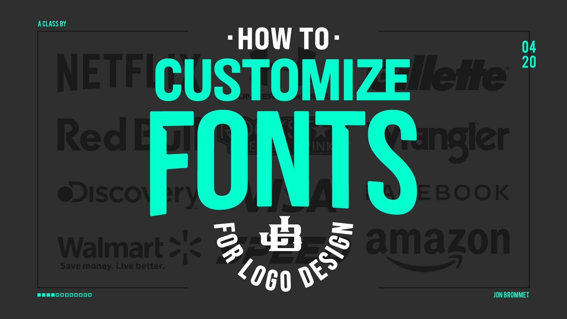
15. Thank You!: That's it for this class. I hope you really enjoyed it. Thank you so much for taking it. If you did enjoy it, please do leave a review as it helps this class grow on the platform and also head on over to my profile and click, "Follow" and you can follow me on all social media at Crusoe design co as well. If you do have any input or you have any advice or anything you think I should have changed or I could do better in the future, please leave it in the discussion. I'd love to chat with you guys. I love hearing your insight. Sometimes it's tough, I'm just looking at a camera and I don't get to communicate with you as much as I'd like to. Leave it in the discussion or even in the class project. I'd love to hear anything you guys think. If you'd like to learn more, do click over to my profile and check out all of the classes I made. I've made over 30 already, and they range in a ton of different graphic design and illustration and Photoshop and Illustrator. I've even done some in designs, some hands-on, things like block printing. Taught quite a wide variety of classes and I think that you'll probably find one or two that you enjoy if you like this class. Do take a look at those. If you want specific to logo design, I definitely recommend that you check out my logo design for versatility class and also my new most popular class, how to customize fonts for logo design. In that class, I show some famous logos and I show what fonts they use, and then I show the changes and alterations they've made to those fonts to make their wordmarks in their logos really unique. It's really great logo design building and it's a good way for you to figure out how to use fonts and efficiently change them so that you're not necessarily having to draw everything from scratch. It's a reason why that's become my most popular class, I'm super proud of it. I hope you check it out. Lastly, if you're a graphic designer like I think you are, you probably also really enjoy my Adobe Illustrator Speed course, which is over my profile, as well as my time-saving actions in Adobe Illustrator class. Both of those are, in my opinion, must watches because if you're using Adobe Illustrator daily like I am, I've learned so many different tips because I've been the nerd that goes through every single setting and every single menu, as well as reading all of the manuals and making sure that I know the most efficient way to do things. I spend the time so that you don't have to and I relate to you the most important and efficient ways to make yourself super fast in Adobe Illustrator. That way you got time to watch more TV or maybe make more logos. That's it for me. Thank you again so much and will see you next time. Bye-bye.
 Jon Brommet, Crusoe Design Co.