Transcripts
1. Intro: Think of a favorite mobile app. How easy is it to use? What makes it easy to use? What makes it your favorite
app? How was it made? Have you ever stopped
to think about how the company behind
it designed it? Before any line of code was ever written for
that mobile app, someone sat down and designed
every single part of it, every screen, every
button, every image. Someone designed that.
And in this class, I'm going to show you
exactly how to do that, and we'll do it step by step. I'll show you how to design your own beautiful and interactive multi vendor
shopping app in Figma. Figma is one of the best, if not the best UIUX design platforms
in the market today. This class is meant to
be easy on beginners. Even if you're brand
new to UI design, this class is meant to accommodate everyone,
including beginners. By the end of this class, you have a fully
designed mobile app UI that includes a
stylish starter bar, a smooth bottom tab navigation, clean authentication screens, a beautiful home screen, a single seller screen, a chat screen, and other cool parts of a
powerful everyday app. We'll work through the design of each screen step by step, starting with UI essentials like the starters
bar and the tab bar. Then we'll build out
real world features, including the featured
sellers page or screen, product categories, a
single seller screen, a real time chat
screen, and much more. You will also learn
how to refine and upgrade your designs
using visual hierarchy, spacing, and color choices. Once the layout is done, we'll clean
everything up and add interactivity to bring
the project to life. This class is perfect for Figma beginners or intermediate
Figma users who want to sharpen their skills
by working on a real world project that they can add
to their portfolio. It's hands on, practical, and packed with tips and
tricks you can start applying to your
workflow right away. So if you're ready to level up your Figma skills by working on a mobile app UI that looks
and feels professional, this class is ready for you. The next lesson, let's
go ahead and look at the demo of the app
you're going to be building. So I'll see you shortly.
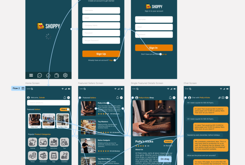
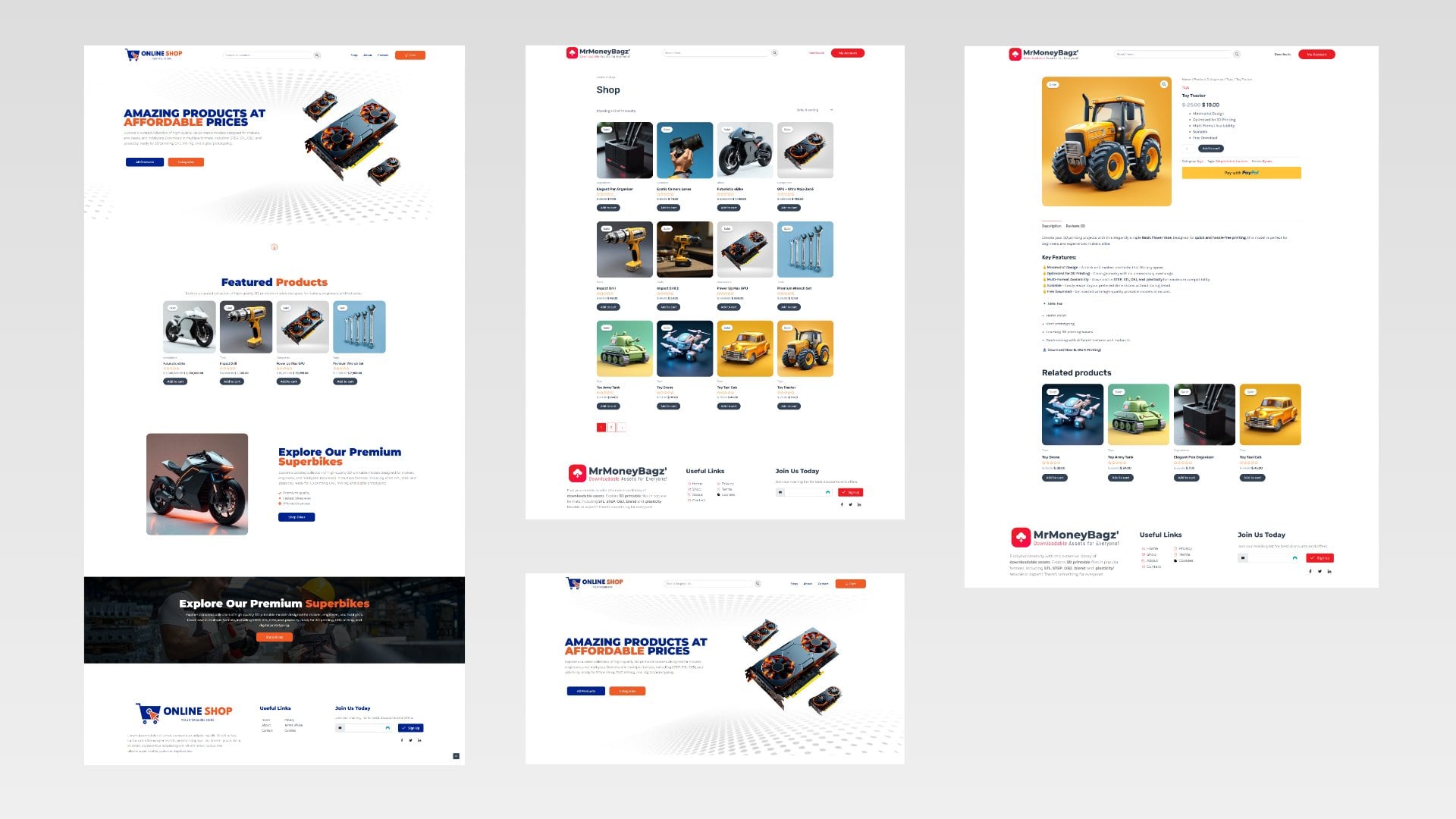
2. Project Demo: So here we are inside Figma, and this is a presentation
window for Figma. So I want to show you a demo of the project you're going
to build in this class. And so when someone loads the mobile app
for the first time, this is what they will
see on their phone. And now, once this
is doneloading, it will take them to the
authentication screen where they can sign up or sign in. Now, this is the sign up screen, and if they already
have an account, they can go ahead and sign
in instead of sign up. So if I click Sign in, they'll just go ahead and
provide their username, email and password,
and then sign in. In case they, for some reason, found themselves on this screen and they don't have an account, they can go back to
the sign up screen. Now, with that said, we
can go to the let's assume they finished
authenticating and now it's time to get
into the mobile app. So if I click this logo, we're taken to the
home screen here, and as you can see, we
have a nice search bar. We have the log in user details. We have some nice icons,
notifications here. We have the status bar. We're going to see
how to create that. We have a featured
sellers section. We have a popular products
categories section. Each of these is clickable, and we have other product
categories section. Now, if they want to see all featured sellers and
not just these three, they can click View all, and they'll be taken to the
featured sellers screen, and they can scroll upwards to view the rest of the sellers. Now let's say we're interested in finding out more
about Police kicks. We want to visit the shop. We can just click that. We're taken to the
shop and we can read more about Police kicks,
the details about, we can click this to
view their products, or we can click this chat
button to chat with them. So if I say chat, we can go to the chat area where we were chatting
with Police Kicks shop. We can always just
go back and back. Now, this should open the phone app on their
phone if they want to call. So going back, if we're here, we can just always click
the home icon to go back to the home screen and
start right there. So by the time we finish, you will end up with an
interactive mobile UI like this. And this is something you
can share with your team or potential clients to show them what you've been
able to design for them. It's also an added
advantage to you just in case you want to
build an actual mobile app. You can share your design with the people who will
develop the mobile app. That means if they're sharing a quotation for building
this app with you, they should not include the UIUX design because
you've done it yourself. They can quote for the
coding and the programming, but you've done the
design part yourself. So that's an added advantage. You're able to not
incur the cost of paying someone to
design your UIUX. And so I think this is
a good introduction to FIGMA mobile UI design. And so if you're ready and excited to get
started with this, I'm very excited to
show you how to do it. So without wasting
any more time, let's go ahead and get started. See you in the next lesson.
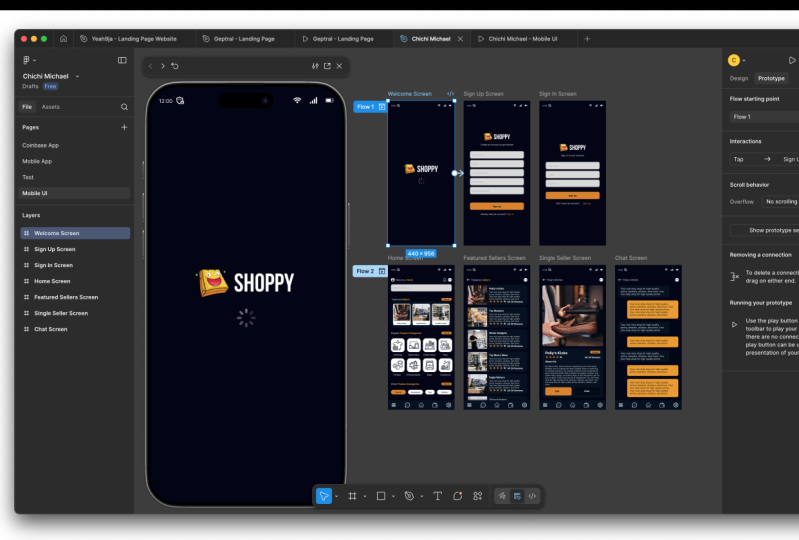
3. Status Bar: Now here we are
inside our simulator, and we want to start by
building our status bar. This is called the status bar. And I can quickly switch
back here to my editor. This is where I created
the sample reference app we're going to refer to. But I can go here
and back to files. That will take me straight
to the current team that's holding my projects
for this specific team. But I can also come here, and the team is called Kyoko. So I can come here
and say create new. And I had already created a new team called New
Skillshare CLASS. So I'm going to click
New Skillshare Class. Or let me just create
a brand new team. So mobile shop Team, and I'll create TIM. And in case this is
your first time using Figma, we're going
to look at this. In case this is your first
time using Figma and you don't understand what a
team is, what a file is, what a pages, you might
want to check out my previous Figma class where
I covered that in detail. But right now, we're
just going to skip for now because we're
creating a team, and I'm going to choose
starter, the free plan. And now we're inside
the mobile shop Team. Inside the mobile shop team, we have one project. We can't create more
than one project. But inside one project, we can create several
project files. So I can rename this let's
give it a different name. Mobile App. Let's
say Mobile App, Enter, and now it's
called Mobile appuI. If I double click it, we don't have any files. So I'm going to create
a new design file, so I'm just going to say design. And now here we are
inside our Figma editor. We have one design file that
doesn't have a name yet. We can give it a name
mobile UI, and there we go. So I'm going to create a frame. When you click
that, we will have different templates
we can start using. I'm just going to use
the iPhone 16 Pro max. There we go. And I want to
give it a background color. So while it's still selected, I'm going to select this, and I want to give it a dark
Color maybe up to that spot. We want to give it a dark
theme, just like that. The next thing, if
you look at this, we have the time. We have a few icons here. So I'm going to select the
text tool and types 12 noon. I'm going to put that there. And now you will notice
if I switch here, we have several icons. Now, I had already downloaded several images
we're going to use. Let me just expand this. All these are icons I
downloaded from flat icon. And I'm going to
share this folder right below this video player. You can download all these
icons so you can follow along. So right now we're
working on the Sara Spar, so we have the
starter Spar icons. I'm going to open that. Okay. And I'm just going to
drag and drop them in there, just like that, as
simple as that. So now, let me just
put that there. The battery comes
somewhere there, and the Wi Fi comes there. To drag around, I'm holding
down the mouse wheel. To zoom in and out,
I'm holding down Control and scrolling
the mouse wheel. So I want to select this hold down shift to select multiple. While holding down Shift, I'm going to reduce the
size up to that spot. And let's drag this
up to that point. I'm going to put this VPN
right there because I'm assuming the user has a VPN active on their
phone right now. I think these two are bigger
than we want them to be, so I'm just going to
resize them like that. Select all of them. Control G to group them. Now, when we group them, they were given the
name group one. I'm going to call
them start aspaEnter now each of them has the name it had when we imported
it except the time, so we can just call this the time or just
leave that like that. So now we have the status bar. We're ready to move
on to the next part, which is the bottom
navigation bar. So in the next lesson, let's see how to
create this tab bar. It's called the tab bar
or the bottom tab bar.
4. Tab Bar: Now it's time to create the tab bar or the
bottom navigation bar. So switching back to our file. Now, before we move on, remember, we had this. Let me just zoom out. This
is the welcome screen. So this is what we're
working on currently, and we're going to
work on the rest. So switching back
to our artwork, I'm going to call this
the welcome screen. And inside the welcome screen, we have the starts bar, which we created up here. I can hide it and unhide it. So I'm going to hold
down Control and zoom in with the mouse wheel and
let me create this shape. Let me just draw anywhere there. Size it accordingly. Let me hold on control
and zoom out with a mouse wheel to see the
relative size. There we go. And now, selecting this, I'm going to give it a
relatively brighter color compared to the background. Let me just push that.
Yeah, somewhere there. I'm just doing it freestyle, but you have to use
your brand colors. So keep that in mind. Now
we have this rectangle, and as you can see, it's
called the rectangle. I can call it the
tab, but background. And now I'm going to
go back to our folder. And in the folder here, the Assets folder, we
have tab bar icons. I'm going to select all of
them and drop them in here. When I drop them, they're not
inside our welcome screen, so I can drag and drop them
inside the welcome screen. I can also do the same
for the tab background. This. Now, we have the starters bar. Let
me just hide that. Now, these are not
visible because after we put them inside
the welcome screen frame, and they're outside this
frame, we can't see them. So if I select all of
them by selecting this, then hold down Shift and this, I can drag and make them visible within the home screen
the welcome screen frame. Now I also want to
reduce them in size, holding down shift to make sure we resize them proportionately. In fact, I'm going to select all these then Control G to group them and call
them the tab bar. So now, inside the tab
bar, we have the icons. I'm going to select that up
to the Control G. Tab icons. Inside the tab bar, we have the tab bar background. Let me just put it below. Tab bar background, and the
tab bar icons as a group. If I expand the group, we have all of them. Now I'm just going to
select the home icon, then put it in the
center like that. Select the wallet,
put it right here. Settings icon. The burger menu. And finally, the messenger or chat icon. As you can see, Figma has some nice highlighters to show you when you're
moving in a straight line. If I select the home
icon and then drag, as you can see, it's helping me see that I'm moving
in a straight line. Now, if you try to select this, you're going to select
the entire group. If you want to select any
of these individual items, you can hold down Control and then select. Then
you can drag it. Hold on Control,
select, drag that, hold down Control.
Hold down control. I can move it with
my arrow keys. And I think we're
very well positioned. Now, let me select the tab bar icons group and push it up with my up key
on the keyboard. I want it somewhere up to there. Hold down control and zoom out. And now we have a nice tab bar. Let me unhide the stars
bar, and there we go. So to finish this off, I think we can just go ahead and add the logo and
this loading icon. So going back to our folder, Assets folder, other icons, I
think that's where we were. I don't think I have
this loading icon, so I can just download
it from here, but I'm going to
include it for you. You will find it in the folder. Going back in here, I'm going to select
that export as a PNG. All right. Export loading. Now here we are going
to look for it. There we go. Cut that. I'll put it in the other
icons and paste it there. Now going back in here, I can drag and
drop that in there and put it in the
welcome screen, as you can see, loading. Going back in here, I can take the logo and
drop it in here as well. And there we go. We're done
with the welcome screen. I think we're making
progress here. In the next lesson, let's
create the sign up screen. The sign up screen. I'll see you shortly.
5. Sign Up Screen: A, welcome back. So now it's time to create
the sign up screen. Let's just have a quick look at our sign up screen here.
That's what we have. So let's go ahead and switch
back to our team space. Now, with this, let me just collapse everything
we have inside this group. That's the welcome screen. Now, to make a new screen, I can start all over
again from scratch here and have to create all
the colors and everything, or I can select this. Or, let me just select like that from the layers
menu and then hold down Alt and drag
holding down shift to move in a straight line. So out and then shift. Just like that. So now
we have two screens. This is the second
one. Let me just drag and put it right below. I want them to move downwards as we move leftwards,
rightwards. So I'll call this
the sign up screen. If I expand it, it has everything that
this other one has, but I want to get rid of the tab bar because sign up
screen doesn't have that. I'm going to leave the logo
but delete the loading. Push this upwards. Control and Musewel
to scroll zoom in. And now let's create
our sign up form, create an account to
get started, copy that. You're going to have to type. So I'll select text,
paste that in there. I'll pick that and drop
it there in the center. I'm going to select
this and make it smaller holding down Shift. Then I'll drag it to
the center like that. Next, of course, let's use a rectangle tool to
create the form fields. Let me just draw
up to that spot. Now I can pick this and drag it to make sure
it's in the center. Then select it, zooming in. We can edit the corner radius, go here to appearance,
then corner radius. Let's give it ten.
Yeah, ten is good. I'm going to pick
the text tool type inside here. Use a name. Let's push it,
position it properly. Then I'm going to select a light color for the text
while it's still selected. Use a name, just like that. Now select this and
this and group them. Remember, we're
working from inside here because we drew
inside this screen, the text and the field were placed automatically
inside the screen. And now we've grouped
them. I'm going to call that Warm field. Let me just call it
username. All right. So I'm going to
select the group, hold down Alt and drag, holding down shift to
move in a straight line. And now let's give it that
spacing. Drop it there. Then Control D to repeat
the same move you did last. With Control D, you're redoing
what you've just done. So now email company
name password, hold down Control to
type this directly. Email control. Company name. Control, password,
hold on control. Retype password. There we go. I like it. Going back in here, we have the sign up button and already have an
account going up, going to select
this out and shift, then space it out
a little bit more than the rest because
this is the button. And right, we will have to rename all
these, but no problem. I'm going to double click
this and say sign up. And I'm going to put it
in the center like that. In fact, I'm going to align the text to the
center like that. Hold down control to select
the background directly, and let's give it a color. I'm going to select
the eyedropper tool and sample somewhere here. Let's say that. Hold down control to select this directly. I'm going to select this and give it that
background color. I think this is the background
color, just like that. I'll also say Control
B to make it bold. Now, I'll select this text, hold out and shift to
move in a straight line. And here I'm going to copy this. Of course, remember I told you you're going to have to type this paste that in there. Now, in fact, I want to
make this a separate text. So I'll drag with
out to duplicate it, hold down shift to move in
a straight line and then paste that in there
because I want it to be separate and you'll
see why later. So holding this and this, I'll group them and
call them a have count. All right, so
selecting this group, let's rename it to email. One field, select this company. One field, Enter, select this password one, We field, and finally
Assword two form field. Now, I'll also
select all of them. Then Control G to group them, and I'll call this
group Fm fields. I'll collapse the group, collapse the Han account. Then this is the sign up button. Enter. Have an account, create an account, Sharp logo. Now we can always just rearrange them according to how they
are arranged on the screen. Create an account
comes below the logo, then we have the signup button, then the form fields. Zooming out, holding down
Control. There we go. So now I can select all of them and push them up with up
arrow key on the keyboard. And I think right there, they're very well centralized. So that's it for
the sign up screen. In the next lesson, in fact, let's just go ahead and do the signing screen because
it's a replication of this. So I'm going to select this. Holding down control, I'm
going to select the screen, and then I can t and drag, then hold down shift to
move in a straight line. And when that second measurement that shows that
the spacing is equal appears, I'm going to let
go, so we can have even spacing between
all of them. And of course, now this is the hold down control
to select the frame. This is the sign
in screen, Enter. If I collapse that and expand. In fact, I'm going
to drag it below. So it's the third. I'm
going to expand that. Now, let's see, we need to get the username
and password only. Remove double
click, remove that. Holding down shift to move in small increments and
in a straight line. Double click remove that. So we can leave these three, and I'll select these
two holding down shift. Hold down shift to select these, push them upwards,
and there we go. So now, basically, that's how to create the signup
and signing screens. In the next lesson,
let's see how to create the homepage,
this homepage. I'll see you shortly.
6. Home Screen: Let's see how to
create the homepage. Switching back to our workspace. Before we move on, I feel like
I should select all these and push them downwards a
little bit after that spot. I'm just eyeballing it. The goal here is to understand
how to use the tools. You will have to take
time to understand design principles if you want
to create an actual app. So now, I'm going to hold down Control to double
click this, of course, to change this to sign
in to your account. Let me just put it in the
align it to the center, and then let me push
it just like that. They should also change
holding down control. Already have an account, don't have an account yet. Don't have an account sign up. I'm going to drag that
closer just like that. Now, let's go ahead and
create the home screen. So I'm going to collapse that. Hold down Control,
then hold down out and drag and just
align it below there. And you can double click this or double click this to
rename it to Homescreen. And I'm going to drag and put it below the signing screen. Expand it like that. In
fact, it's very funny, but we shouldn't have put this right here on
the welcome screen, by the way, I don't know
why I put it there. I think it's because
initially I wanted to show you just how
to make that tab bar. But then we ended up
putting it there. We're supposed to remove it
from there, so Control X. And I'm going to select this
by holding down Control. Then now paste it right there. It's going to paste it in place, exactly where it was
in the other screen. Now I want to get rid of all these because
we don't need them. So that's how the welcome
screen should look actually. So going in here, let's just have a quick look
at what we have here. So we have that navigation area. So let's go ahead and
create the search bar. So I'm just going to select that rectangle tool and draw our search bar, maybe that size. Let's give it ten corner
radius, just like that. We have these three icons, so let's import them. Going to switch to our folder. So, in fact, let me just pick all these in the other icons inside the other icons folder. Let me just drag these
into our workspace here. So I'll put them
here on the side. Because we did not place
them inside a screen, they're not in any screen
right here in the layers. Now we can just go ahead and
arrange them relatively. Let me just put that there. We have the user. We have the notifications. For now, let's use those, hold down shift to resize
them in small increments. Put those there. Hold down control to zoom in
with your mouse wheel. Going to hold down shift
to continue resizing them. Pull this all the
way to the end. All right, let me just put this on the side because
we don't need it for now. And remember, the reason
we can see it out here is because it's not
part of this frame yet. Remember, we just
drop them out here. So now zooming in. I'm
going to expand that. And in here, we can just control and select
this copy, zoom in. I'll paste that in
there. Search products. I'll select that and group them, Control G, and rename
them to search bar. I can call this.
I'll select these three and maybe group
them Control G, and I'll call them context nerve because you navigate with it
according to the context. Double click this and push
it maybe to the left. I think now it's well balanced. I can also take this text. Hold down out and
drag and put it right here because as
you can see here, we have the name of the
person who is logged in. So hold down Control
and double click that. Welcome Kim, select
that and delete it. Oh, now, let's replace that with this because
Kim is a user. Just like that. Next, let's create
the featured sellers. So I'm going to select that rectangle tool and
draw somewhere in there. We'll give it a border radius
of 20, just like that. Now we can draw another one
or we can select this and drag I'll give this a
different color for now, and then let's resize it
maybe up to that spot. We can make it a square by
giving it maybe 121 by 121. And now it's a square. And for the border radius,
let's make it ten. Let's put it somewhere
there. All these kicks. And in fact, this is supposed to be an image, but no problem. Holding down sheet,
we can resize it. Let's pick the text. Police kicks center
align the text, and let's put it right below. And now I'm going to switch to our assets folder here and
I'll go into the thumbnails. Let's say kicks. Going to drop that
there. There we go. And now holding down Shift, I'm going to resize it. I had premade the
images to be squared, so they're 512 by 512 pixels. I can put it right
there, then hold down shift to resize
it proportionately, and then we can give it
a border radius of 20. Before we do that,
let me just put that to the side
and delete this. That was just a guide. Now we can take this and give it
a border radius of 20. No, ten. And there
we go, police kicks. We can push this
upwards like that. Now, holding down shift,
I can select those two, hold down out and
shift to move in a straight line up
to maybe that spot, and then Control
D to repeat that. Then holding down shift, I can select all of them. Hold down shift to
resize proportionately. And now we have three
perfectly fitting objects. Now I'm going to expand that going to make sure this is properly
aligned to the image. Select that, resize
it accordingly. And now let's give those two different names, Eagle motors. Paste that. And ta menswear. Copy that. Paste. I think I had
given this size 14. Oh, that's size ten. All right. So selecting this,
I'll give it size ten. Select the names,
push them downwards. All right. So now I want to give the same color as this tab bar. So holding on
control to zoom out. While this is selected,
I'll select the color, then colored pico two.
Then I'll select that. Then let me give this the
white color. Just like that. Then I can double click this
and upload from computer. We go to Assets, thumbnails. This is supposed to
be the Eagle Motors. Then double click this
upload from computer. This is the shoes, teens wear. We can double click the name
Control B to make it bold. We can also give it
a different color. This color we selected
for the logo. Going back here,
we can also create the featured sellers
and View button. So now I want to select this entire thing and
call it Control G. Featured sellers, Enter. And I'm going to push it
downwards with the arrow key. Then I'll select
this, hold down Alt. And I'll say featured sellers. I think, let me just
drag this button here. Hold down control to select
the background itself. And Let's give it
a border radius of 50 to make it rounded. View. Make it smaller. I can place it right there. Hold down shift to
reduce the size. Hold down control to select
the text directly and reduce the size to maybe nine. Control to select the
background itself. Hold down shift to reduce
the size, select the text. I think now we're good. Let's push it inwards. Let's push the text inwards. I think this is a good
spot to end this. We don't want to make
this lesson too long. In the next lesson,
let's see how to create the popular categories section and maybe this other section. So I'll see you shortly.
7. Refining Featured Sellers Cards: Just realize there's
something we forgot in the previous lesson. If we switch back to our
reference design here, as you can see, we have a
thumbnail that's inside a card. This is called a card, the white part, and that card is holding the
thumbnail and the name. But here in our
implementation here, we did not have a
card for each shop. Let's create a card. What we want to do is I can hold down Control to select
the background, then to duplicate it. Then let me just give it
a white background color, just like that. Close that. For the border radius, let's give it ten. And now let me just drag
and put it right where the image where it meets
the image corners. And I want to drag this and also I want to give it the same size
as the image in short. Then now if I expand
that, we have a card. Now I can select the
text, text color, pick the eye drop or two.
And then there we go. Control to select this directly, then resize it just to make sure we have the
same spacing as up here. We can just select
this and this and this and position it like that. The image should
be much smaller. So let me select
the image directly. Hold down Shift and out to
resize it from all corners, shift and out while
selecting and dragging. And I want to give it a
border radius of five. Just like that. Now we can select the image
here and here, select all these
and delete them. Hold down control to
select the image directly. Hold down shift to select that and now you have
all of them selected. Hold down out and shift. Let's move it up to
that spot maybe. Then Control D. Now,
I'll hold down. In fact, before we do that, while we have these
three selected, let's just group them and call them featured seller card. So now we have featured sellers, and inside featured
sellers, we have one card. This rectangle can be the
featured seller background. That's the background.
Then we have the card. We can just Control
D to duplicate it, and then drag Remember, we've controlled deed
to duplicate them. And now, as you can see, both of them are well spaced
out, evenly spaced out. Without selected, I can
hold down shift to select these others so I can position them in the center like that when you see
those red highlights. Now, holding down control, I can select this background and resize it
because at the top, it looks a bit off
in the bottom. I think they're well
positioned now. Control Shift select multiple. Was that there. Control, double click
there, copy that, control, control, select the image directly.
Double click it. Click outside, Control
to select that directly. Double click that,
upload from computer. Then I think we had
these kicks right here. Close that. I think now we've made the improvement
we wanted to make. We have a card we can reuse
all over if we want to. So now in the next lesson, let's see how to create the popular sellers category
section, this section. I'll see you shortly.
8. Popular Product Categories: Now it's time to create the popular product
categories section. Let's go back to our home
screen. That's what we have. Of course, as you might
have already guessed, we can just pick these two, hold down out, and then drag while holding down Shift
to move in a straight line. There we go. I just want to
double click this and copy. You will have to type that. Control, double click paste. Then now, let's go ahead and
create the clothing art. So I'll just pick
the rectangle tool. And draw just a small
card like that. And in fact, let me yeah, it's a square 89 by 89. We can go with that for now. Let's give it a radius of 20. I should have downloaded
icons for these different. Did I download them?
I think I did. Let's go in here and look
at the product categories. Yes, I already downloaded
them. So clothing. Go No, we're in the wrong place. So let me just drop
clothing there. Holding down shift to resize it. I'm going to put it right there, and I should have
made them black. But no problem. I'm going
to show you how to do that in a future lesson. So let me just put
that right there. Hold down out and shift.
This is clothing. While it's still selected, I'll align to the center, and then I'll just put it in the center of
that card like that. With that selected, in
fact, I'm, first of all, going to select those
two, group them. And rename them to et me just call them loathing
product category. And I want us to be organized, so I'll just take
a moment here to collapse everything
we're not using yet. Since we're working
on the home screen, this is automatically
on the home screen. So now if I drag this, I can space it out like that. Maybe let's say, how many do
we have here? We have four. Control D once again. In fact, before doing that, now, this is the clothing
product category. I want to also include
no, this is not a group. So let me just Control
Shift G to ungroup that. This is just text, but because
we copied it from here, we duplicated this
and we duplicated this from this and
from a previous group. I think we duplicated
it from this group. So while this is selected, I can just say Control Shift G, and now it's no longer a group, it's just popular
product category text. So I'll select this clothing and this group right
here and group them and call them thing product. Card. Let me just call it card. Clothing product card. And now, if I select it, I'm
selecting all of it. I can drag while holding
down out and shift. Then Control D to repeat
what I just did twice. And then selecting all of them, I can hold down Shift
to resize them. I want them to be Let me
put them in the center. Just like that. Hold down
control to select the name. We can give it size ten, hold down control here, size ten, hold down Control
and Shift to select multiple. Then Electronics,
home decor shoes. Hold on control,
select this directly. Electronics. Control Home Decor. Control, double click shoes. Now I'll select the three, four of them, duplicate
them with out and shift. And I think that's a nice spot. We need just two rows,
fitness kitchenware bags. So now, of course, holding down Control, you
can select this. Then double click it to
replace it Electronics. I'm going to the Assets
product category, Electronics. Click Outside. Control
click, then double click. Like I said, I'm
going to show you where you're going
to get these images. Don't worry. In fact,
let's do that right now. I'm just going to flat icon. Flat icon. What is this? Three icons. All right, let's just remove
that free text. And let's say clothing. So this is the one I
selected, I think. While this is selected, you can choose to
download this or this, but I prefer this, and then you can edit icon and give it
whatever color you want. Once this is loaded,
you can select this color wheel and choose
to make it whatever color. But now I chose
to make it white, but I'm supposed to make it. Let me just give it
this background color. So selecting this, I want
to give it this color. So double click that copy because that's the
background color. I want it to have the same
color as the background color. So paste that in there, Enter. And now I'll download
it I want it at 64. Now, let's make it 256. Free doownloadFashion. So going back in here, I can go in here and just
drag and drop this in here. And now holding down shift, I can resize that and then Control click
this to remove it. Click this and
place it in there. At shift to resize
it from all sides. This is not inside that card. Where is that card?
While this is selected, I'm going to select
the original group, then Control G, just to make sure I have
them in the same group. Then I'll call this
the clothing card. Clothing category card. Now, I'm going to select
these others and delete them. Select that shift. Then shape D. I'm going to repeat the
same for electronics. Now that we've already
created these three, I'm going to select
these like that, then drag them and
put them right there. And now if I Control click
this and double click it, I can upload from computer
and go to Downloads, and here is the one
we've just downloaded, and now it's loaded there. So I'm going to fast forward this part by just replacing what we have
in these duplicates. Decor. Let's just
speck that edit. Control, pick the background
color here, copy. Double click Paste. Download, 256, free download. Going back in here. I'm just going to control, select that, double click
it, upload from computer. Self. So here we are. I've just
finished replacing everything. Let me just select
these and push them downwards, just like that. Zooming out, holding
down Control. Our app is coming
along just fine. So one thing I want to
do is select this and this shift just to create the final section right here because we
can combine those two, push these two up. And the final section here
is other product categories. So I'll double click that
and paste it in there. And now you will
notice these are just buttons that can be scrolled in this direction that can be dragged and scrolled. So we're just going to select
this and put it right here. Holding down shift, I'm
going to make this bigger. And because this is a group, I'm going to select
this directly. Yeah, we can leave that view. In fact, let me remove that. Select this, control select
select the text directly. What is this accessories? Control to select the
background directly. Then let's make that
maybe a light gray. Hold down out and
shift toys, vehicles. Hold down control to
select the text directly. Toys. Hold down control
to select that. Control to select
the text directly. Control vehicles. I think that's a
nice spot to end that can bring them
closer together, hold them down just like that. You can push this downwards. Hold down shift to select all these and push
them downwards. So I think we're
getting somewhere. The app is now starting to take shape and I'm
really liking it. Now, we can also select these
and holding down shift, we can resize them
proportionately so they can be in line with that
button right there. Push them leftwards, by the way. And I think now we
have a nice homepage. Remember, the goal here is not to make the
perfect app UI. The goal is to show
you a workflow you can use if this is
your first time using Figma and you're interested
in learning UI UX design. I just want to show
you a nice workflow. But when you're working
on a real project, you have to remember
the design principles. So that's a goal here. So in the next lesson, let's see how to create this section before moving
on to these other two, which are relatively easy. So I'll see you shortly.
9. Featured Sellers Screen: Now it's time to create the
featured sellers screen. So let me just switch
back to our reference. So this is the featured sellers. So when someone clicks the
featured sellers view all, they're taken to this screen
right here where they can scroll and view all
the featured sellers. So how do we create this? Going back to our artwork, zooming out, I'm
going to Control, select this frame, and now and drag holding down shift to move in a straight
line, and there we go. Now, the good thing about Figma is we can just reuse
most of these parts. So I'm just going to get rid of everything else we're not
using holding down shift. Or just simply select
inside the frame and drag. I think I'm going to drag
all the way to there. Now, one thing I wanted
us to do before moving on is select that, hold down shift. Yeah, let's say size 15. So I'll select this as well. Size 15, just like that. I just wanted to resize
them to make them slightly bigger
than the card text. Now, switching back to this, as you can see, if I zoom in, we have an image, then we have some text,
then description. Let's see how to implement this. I'm going to select this, copy it, control, select this frame and
paste it in there. Double click that and double
click that, get rid of that. Now we have these two I want to select that and
put it somewhere there. And in fact, as you
can already guess, we don't have a name here, so Control, select the
name and remove it. In fact, let's Control
select the background. Then Control, select the image, and let's increase its
size while holding down shift to increase
the size proportionately. Just like that. But let
me zoom in on this. And I'll select the text
tool and type a As kicks. Right, so I'm just going
to select this dummy text. I'm going to select the
text to once again, drag in order to paste a
paragraph, just like that. Now we have this star rating. So I'm going to select
this drop down menu, then select the star and draw
a star holding down shift, maybe up to that spot 16 by 16. That's 18 by 18. Let's give it a spacing of two. Then Shift Control D.
So we have five stars. We can out select that and drag it up to
there to duplicate it. We have a five
star rating space, three k reviews,
three K reviews. Can push this with
keyboard arrows. Now I want to select these five, group them and call them
star ratings or stars. Those are the five stars. Then the group is
still selected, I can select that then
Control G to call it rating. Now inside rating,
we have the stars, the five stars and the rating. Let me just copy that, paste it just to increase
the amount of text, select this group,
arrange it properly. Let me increase this size
slightly to maybe 16. I think I like how it looks now. Or maybe we can push this up, hold this down so that the spacing right here is the
same as the spacing here. All right. So now,
selecting this directly, I can hold down Control and
Shift and give it this color. So this is a four star rating. Click outside. And now we have one single featured seller
called Polis Kicks. All right. So now I
can select this in its entirety and
Control G to group it. Then call it featured
seller card. Collapse it. Now I can
drag with out and shift. Let's give it that spacing of 17 or whatever
spacing you want. Then shift Control D to
duplicate it several times. Now, you will notice if you
want to duplicate it further, let me just undo
that undo Control D, then Control D. It comes
in front of the tab bar. And that's because
the tab bar in the hierarchy here
is below this card. As you can see the card is up here and the tab bar is here. So we can select the cards. And in fact, let me
just group all of them. Featured seller cards. Cards in plural. And then drag it right
below the tab bar. And now it's appearing
to be behind the tab bar because the user expects to
be able to scroll. So there we go. Now, we
can select this tab bar, and let's see if we can add
some border drop shadow. Yeah, drop shadow. Here we are. So for the X, I
want to say maybe negative five if I zoom in, negative 20, negative five. Let's say negative five. Yeah, as you can see,
there is that drop shadow. Let's also say negative five. What about negative ten? I zoom out. Now, as you can see, there is some drop shadow
right behind there. All right, play
around with that. I don't want to dwell for
too long on that point. Now the next thing, of course, is to change the detail for
every one of the sellers. So Control, select
this, double click it. Then this could be Eagle Motors. Let's go back to Figma
classes, assets, thumbnails. Click outside. Control
click, double click again. That can be the toy shop. Close that. Control. Double click. Eagle Motors. Now, let's switch
back to our reference and see if we have
everything correct. Now, as you can see, we have different icons on
different screens depending on the context, but we're not going to
spend time trying to update the icons because you already know how to place
those icons there. So it's up to you
to do that job. Have we forgotten anything else? I don't think we've
forgotten anything. In the next lesson, let's
now create this detail page for one of the
sellers because if someone touches this or
selects this on their phone, they'll be taken to
police is shop details. Now they can read more about
police shop or call them. This will open up the phone up. This will open up
this screen and they can chat with police kicks. They can also click products
to view police products, and they can have a quick
overview of the company. So let's see how
to create this in the next lesson.
See you shortly.
10. Single Seller Screen: Welcome back. We're making progress, and I'm
happy about that. When someone clicks
the Police Kicks card, they're supposed to be
taking to the detail page of Police Kicks shop. All right. So switching back to
our workspace here, I'm going to Control
Select Inside, then out and drag
to duplicate that. And in fact, I forgot we were
supposed to rename these. So this is the home screen. This is the double click that featured seller's screen. And this is supposed to be the single single seller screen. So now I'm going to delete all
those switching back here. I can see we need an image. We can just Control, select this, then copy, Control C, Control select this, control V, and I'm just
going to hold down shift to scale it up from all
angles, just like that. Then let's create this card. My seat keeps sliding down. All right, so let's go
to this drop down menu. And then rectangle too. Let's draw our
rectangle right there. I think that's a nice spot. While it's selected,
let's give it maybe 20. Select the image as well. Let's give it 20. Yeah, I
think I gave them ten each. So ten, ten. Let me
align that to that. Push it up with the
keys with arrow key. And I think now we're
getting somewhere. So selecting this, then let's go to the
color color picker. Then let's give it
that same color there. Select outside. Next, let's give it a name. So I'm just going to
select Eagle motors. Control select because
it's in a group, Control select then out
drag to put the name there. I want to select
this Alt and drag. Let's put that in there. We also need this rating, double click that, then
double click that. Alt and drag that. And let's put it right there. We're just reusing what we
already spent time creating. That's the advantage
of using Figmre. You can reuse components. All right, so let's
go to the about. So selecting this and Alt drag, then double click
this Alt drag it. I'll expand it up
to maybe that spot. Drag and drop this
somewhere here. Hold down shift to
increase the size. Control, select the background. I want to control, select the background so
I can change these to ten border radius, control, select the texts. I hole. I want to make this 15. Control, select it. Let's
put it right there. Then I'll drag. Let me just give them
that spacing of 14. And while that is selected,
I'll hold down Shift, then resize the two of them
while holding down Shift. Push them leftwards, slightly
upwards. Hold down control. I want to give it that
background color. So I think this was the color. Then for the text, let's
give it a white color. I'll just double
click that copy. Paste Paste. Let's end it there. And we have our card.
Double click this. Let's push this to
this other side. Now, let's increase the size of the company name
maybe up to 24. Let's push this downwards. Scrolling outwards. Think we're now starting to
get something meaningful. Control select this. This is chat. Yeah, I think now we have
something awesome. I don't know what's left. You can always update the icons and whatever
details you need. This is now here, let's make more
sense, by the way. This is Police kicks. You're viewing Police kicks. And in fact, we actually
do need to have this we had an arrow. Other icons. Yeah,
we had this arrow. I think we actually need
it in places like these. So let's push that and that because we want to give
the user a way to navigate backwards to go back to
where they came from. I think that's the same case right here because if you
select featured sellers, view all you're taken here
and you can always go back. Selecting these three copy. I Control select here. First of all, Control select, then Control V to
paste in place. And now this is supposed
to be featured sellers. Control B to make it bold, and let's give it that color. We can maybe call
this Polskiks shop. We can give it that bold in that so that the user knows they're viewing
police kicks shop. If they say back, they're
taken where they came from. Featured sellers,
if you say back, you're taken back
to the homepage. Let's see what we had here. So we don't need the user profile right there because you're just
viewing featured sellers. Even here, you don't
need that Yes, but overall, I think now we have a nice single seller screen
with all the details. And yeah, let's make
this slightly bigger. And control, select the
text inside products. Push it downwards slightly. Now, if I'm viewing this on
my phone, I can select this. Let's make it 11. Push it upwards.
If I select this, I'm going to be
taken to a list of all the products that
Eagle Motors is selling. There we go. So in
the next lesson, let's go ahead and wind
up the screens with the chat screen because we
also have this chat screen, which is something I can
give you as an assignment. But let's just see how to
create it in the next lesson. I'll see you shortly.
11. Chat Screen: And welcome back.
So now we're just about to finish
making the screens. We just have this chat
session to finish. So let's go to our artwork or our design, and here we are. Now, I'll Control,
select this as usual. Then I'll drag, and
let's make sure it's evenly spaced and holding down shift to move
in a straight line. I'll let go there. Then this is the chat screen. Enter. Let me just
get rid of the image. And some of these, what do
we have here, by the way? We just have the chat. So I want to be left with
this box and the texts, push them upwards,
just like that. Select the text,
push it upwards. Let's assume that's a query. We asked that question. Let
me increase the size here. Zoom in. Select the text
up there, push that there. Now, it's supposed to be up to maybe that spot because you
want to allow the user to know which is their
speech bubble and which is the seller's speech
bubble, just like this. So I'm going to
select these two, drag downwards,
maybe that spacing, but push this to this side. We can vary the size. So I'll just drag
this and copy paste. Maybe it was a long reply. Let me just drag that downwards, so I'm able to select here. Then let's give it this color to maintain
that brand consistency. Then for the color of the text, let's give it the
background color. So now I can just
select all of them, then I drag, give them
the spacing of 21. We gave the original ones. This can be shorter. How to drag. Just like that. And now we have our chat screen. So I think that's enough
for the chat screen. In the next lesson,
let's do some cleaning up because
we lost track of all our groupings and organization generally
for our project. So let's see how to
organize everything so that we have a clean,
readable document. I'll see you shortly.
12. Cleaning Up: Now it's time to do
some cleaning up of our design because right now everything is
all disorganized. It's not very disorganized, but we lost track of where we are and what group
belongs to where. So let's start with
the home screen. This is the home
screen. First of all, let's just get rid of
these two, delete that. Now let's start with
the welcome screen. Inside the welcome screen, we have the logo. We have the loading icon
and the status bar. That's okay. Inside
the sign up screen, and in fact, I want
to hide that screen. Inside the sign screen, let's hide the rest. Inside this here,
we have the logo. That's okay. We have
that intro text. Then we have the phone fills, the button, and they have
an account text group. Then we have the Sarus bar, which we can put
above the shop logo. To be in a good hierarchy. So that's all right. Next, so let's hide
that and unhide this. The signing screen,
it has a shop logo. We have that text. We
have the form fields. Inside the form fields, we have the password. Email and user name. Let me collapse the
user name and put it above these others. The email is supposed to be in the middle, and
that's all right. Then we have that text. We have the sign up button, then the Srtus bar. You
can put it right there. Then next, let's move
on to the chat screen, which we should have put at
the very end right here. Then this one before
it. Then that. So collapse, high that. Then let's go to the
home screen first. Inside the home screen, we have the let me collapse. Let me select collapse
everything first. Alright, we have the clothing category all the way to here. Those are the different
product categories. So with all of them selected, Control G product categories. These are the other
product categories. So all the way to there, no, we need this, this holding down
shift, and this. Then Control G,
other categories. Then we have that
button. View button. That's also a VWA button. View A featured seller's button. And this is the view
product Gore's button. And in fact, I want us
to group everything in here from that to that
and this group Control G. Let's call it popular
products categories. Then let's also group
this and this group and that Control G. That's
the featured sellers. And hide and unhide it. We can also hide the
popular sellers categories and unhide that
other categories, text and the group itself, control G, other categories. In fact, we can call
these sections. Section, popular
categories section and featured sellers section. And of course, the featured
sellers section comes first. Then the popular categories,
then other categories. And we have the profile user, which is supposed to be up here. In fact, before we move that, let's just select it together
with the name and these two and group them and
call them context, nerve Vgation or
nerve collapse it, and let's put it above
featured sellers. Then we have the search bar, which comes below it. Then we have the tab bar. Which comes at the bottom, then we have the status bar, which should come at the
very top. All right. So the home screen is
now well organized. As you can see, we
have the status bar, then we have the context nerve, the search bar,
featured sellers, popular sellers, other
categories and the tab bar. There we go. So let's hide that. Now, let's view the
featured sellers. And in here, let's
select this is Control G. Context nerve. Collapse it. Then we have that. And then
so let's collapse that. Then we have the starter bar, which should come at the top. This should be below the tab bar because
of this section here. Remember. But now,
inside the tab bar, no, inside the
featured seller cards, we also need to get organized. Let's collapse everything first. Yeah, we have five We have all these
featured seller cards. You can call them featured
seller card one, too. You can get very specific, very detailed about what
each of these components is. Because if you open one, you will also find you
have other groups. So get as detailed as possible and as
organized as possible. So at least to understand
how to organize your groups. Collapse that, hide that. Let's go inside here. This is very quick
and straightforward. Collapse all these.
Let's start by putting the starter
spar at the very top. Let's create this
context nav Control G. That's the thumb nail. This is the card. Let's just
call them seller details. Control G. Seller details. This is the seller thumbnail. Then the tab bar at the bottom. So we have the starter bar. Context nerve, seller details. Seller thumbnail
should be above it. Alright, collapse
that now, finally. Let's do this. A text. So now, I've grouped all
the chat text groups. And of course, you
can rearrange them. And then we have the tab bar, then we have the starter bar, which we can put up here. And there we go. So
let's unhide everything. And there we go.
Let's see how to add interactivity
in the next lesson. I'll see you shortly.
13. Adding Interactivity: It's time to add
interactivity and links to the different parts to allow for navigation
and presentation. So to do that, first of all, you have to make sure
you're inside design mode. If you're in draw mode, you won't have this option called prototype,
which is what we need. And that's because
if we, for example, Control select this screen or frame and switch to prototype, you will notice we have
these plus icons appearing. And if we're in drone mode and Control select
this, we won't have them. And those are the hooks
you're supposed to use to link to other
parts of the app. So make sure you're
in design mode. And now, if I select this, Control select it and
switch to prototype, I can drag this and
put it right there. Pointed to that. As soon
as you see the highlight, that means those two are linked. If someone clicks this, they'll be taken to this screen. So to commit, I'll
just click outside, but I can also
choose the behavior. You can choose the destination, action, navigate to or
all these other things. If I select that, now if I go
to I have two options here, I can preview or present. If we preview, it's
going to open up a simulator here and
if I choose present, it's going to open up a new tab. Now, back in here,
we're inside here. If I select this,
it's going to take us to that sign up screen. Now, let me just close that. And we can also close this. If I select it, as you can see, it's taking us to
the sign up screen. Now, going in here,
I want to zoom in. And remember, this was a group. I wanted us to just have this
by control selecting this. The reason we did
not make it one continuous text to the end was because I wanted us to
make this a single link, not the entire text so that
when someone clicks this, it's a link on its own, and I'm holding down control
to select it directly. And if I select that, I can drag and take it
to the signing page. If you already have an
account, you can sign in. So you'll be taken to the
signing page if you click this. So let's see that in
action. Preview that. If we click to go
to the signup page, if we already have an account, we can sign in and we're
taken to the signing page. Now, let's do the same here. I can hold down Control
and select that, then drag it to that
and click outside. Now I can say Okay. Now if I click this once
again, select that. We'll be taken to
the sign in page. If we don't have an account, we'll be taken to
the signup page. Just like that. Zoom out. Let me close the previewer. Let me just adjust my seat. Zooming in. Zooming in. Now, here we can say if
someone clicks this button, they're supposed to be taken to the featured sellers,
this screen. So I'm going to
connect it to that. If you had a popular
categories screen, which you should have
and click View all, you're supposed to be taken to the popular categories
screen, but we don't have it. So we're not going to worry
about that. All right. So we also have this homepage. All right, so we
also have the tar. We're just doing random
connections here. We're not trying to
follow a specific order. So if we're on the
featured seller's screen, we can select this. So Control select,
and I'll select that and take us back home because
if we select the home icon, we're supposed to be
taken to the home screen. The same case applies to this. Select control, Control select. Then let's go to the homepage. The same case applies to
this, Control select, then go to the
homepage. All right. If we click the chat button, we're supposed to be taking
the chat with this shop. So I'll hold down Control
and take us there. Click outside. What else? If we click the B button here, I want to hold down Control
to select the icon, then we can go back
here because we came to the chart
from this part. If we're inside the shop, we probably came from
the list of shops. So we can select this back icon and link it back
there, select outside. If we're inside the list
of featured sellers, we probably came
from the homepage. So selecting Control,
select that, then put it back
there. What else? Now, if we're viewing
this as a group, I'm just going to select Control select the
background itself. We're going to be taken to
Police Kicks Detail page. Because it's a card,
you select it, you're taken to the
details page there. Have we forgotten anything? Let's see if we
need anything else. This is Police Kicks shop. So we can also link this shop
here, holding down Control. I'm going to link
it to that shop. I'm also going to
do the same for the thumbnail so that
wherever you touch, you're just taken to the shop. I'll also make the name
a link to the shop. And that's actually
the same thing we should have done for this because we want to make sure they're pointing
to the right shop. So if someone clicks
the name of the shop, they're taken to the shop. And now I think you understand how to
create interactivity, how to link every single link
to the right destination. Yeah, I think
everything is right. So let's switch to presentation. I want us to view it as a
presentation. Let's close that. Now, if I click that,
we're taken to that page. And in fact, I want the logo
to take us to the homepage. But for now, we're
in the sign up page. If we don't already
have an account, we're taken to the signup page. Alright, now I wanted us
to be able to navigate to the homepage by
clicking this logo. And this as well. So now let's click Play again. There we go. If I click this, we're taken to the homepage. Now if I want to view all featured sellers,
I'll just click that. We view all sellers. I can also go back. So now let's go back
to all sellers. I can also go to the home screen again from the featured
sellers page screen. In here, if I select
the background, the card or the name, we're taken to the
detail shop of the shop. And if we are very
curious and want to ask more questions to the shop, we should be police kicks here. We can start a chat with them
and start communicating, find out how much
their products cost. So I think this is a
good spot to end this. This was just a quick
introduction to Figma and mobile app UI design. Of course, there
are many more tips and tricks up my sleeves, and I'm going to share
them in future classes. But for now, we're
going to stop there. But before you go, I have a few more things I
want to share with you, so I'll see you in the next
lesson. Don't go anywhere.
14. Final Thoughts: And that's a wrap. I want to say congratulations
for sticking with me from the beginning
to the very end. You finally finished it, and now you have a mobile app, UI that you can showcase
to your friends, clients, or potential employers. Now, I would like to see what
you've been able to create. On Skillshare, we like to upload our projects and get feedback from fellow
students and teachers. So Go ahead and click the Projects and
Resources tab right below this video player and click the submit button to upload screenshots of your
mobile app UI. And one more thing, if you
found this class helpful, I would really appreciate
it if you could take just 1 minute of your
time to leave a review. Let me know how I did. Let me know how the class
was. Did you like it? Would you recommend would you recommend it to beginners
or intermediate? I would really appreciate any feedback because it
really helps make this class more visible on the platform and allows more students
to be exposed to it. So just go to the reviews
tab and click Labor Review, and I will really,
really appreciate that. Also, don't forget to
check out my profile where I have several more
classes on web design. Three D modeling with Blender and other different software. Check out my classes and see if anything is
of interest to you. We're living in a digital era where digital skills
are very important, and that's what I specialize in. Don't forget to
follow me also to be notified every time I
have a brand new class. So until next time,
stay creative. Peace.
 Ken Mbesa, Web Designer | 3D Artist