Transcripts
1. Introduction: Everything that you deal
with on a day to day basis, whether at a professional
level or at a business level, revolves around data, in which you are going to
deal with data points, datasets to make
informed decisions, whether you're finance
professional, accountant, marketing professional,
data analyst, an entrepreneur, business or whatever it is, even students. You are going to
deal with data on a day to day basis in order to help you make informed decisions in terms of how to
proceed further, what makes sense and what
does not make sense. What has a positive impact, what has a negative impact. And one of the best ways
in order to make sense of the data is
data visualization where we take raw
data and actually transform it to visuals which
help you find patterns, get insights, and create connections between
various data points. And this is the whole core of this current class in
which we are going to utilize a very powerful
Microsoft Power platform tool, which is Power BI. Which is considered to be a very powerful data
visualization tool, as part of data analysis
and data science, which will help
you make sense of the data that you
have through visuals. In this current
class, we're going to walk you through from A to Z, how to set up Power
BI, what is Power BI, how to go about
creating your reports, getting your data sources, creating your visuals,
various types of visuals, up to the point where
you are ready to actually export
that lovely report, which will help you make
sense of your data, whether your own
professional career or your own business,
not just that. You'll be provided with a free
trial to help you actually utilize the tool and practice easily,
completely complimentary. In addition to providing
you with raw data to help you practice and apply all
of these core concepts. Such that you don't have to find data or try to dig for
data to help you practice. All of these things are
going to be provided to you in this current class, which is very powerful, very up to the market trends
right now since all of the industries are going
towards automation, performance enhancements, efficiencies, processes,
workflows, these are crucial lessons that you need to be equipped with
in today's world. And one of the most
important thing that we're dealing with in the
modern world is data, how to make sense of data. And this is what we're going to be covering in this
current class.
2. Your Project: Your project for the
class revolves around creating your own Power BI
report where you're going to utilize the data set
provided to you in order to use this dataset to create
your own Power BI report. Feel free to create
your own visuals, your own report based
on your own preference, after which you're
going to be sharing it with the rest of the
community for feedback.
3. What is Power BI : Welcome back. Now we're
going to learn about one of the Power platform
tools and components, which is the Power BI. Power BI is considered to be
a data visualization tool. Basically, it helps
you take some data, turn it into one
of these reports. Every single element on this page that you see
is part of Power BI, which is created from scratch, and you have the ability
to build it every single every single time and
every single item by itself. So the visual board
that you see over here is part of a Power BI, which helps you create interactive reports
and dashboards, which helps in
making data driven decisions by turning
raw data into insight. This is very powerful because when you're dealing
with Power BI, simply you're able to collect
data from the data verse, and then you're able to
make sense of the data. Highlight certain elements,
highlight certain features, display them
graphically, add colors, add annotations, add labels. All of these things
they help you drive your business
forward and create proper decision making processes
rather than just simply dealing with an L file and trying to find the
patterns in the data. Power BI is considered
like an analytics tool. Think about it it's a hub that combines all the data for
you but transforms it to something which is
visual for you to make decisions based on the visual representation
and analysis.
4. Power BI reports: When we're dealing
with Power BI, we need to understand there are some key important terms
that we need to focus on. First of all, we have
what we call as reports. What are reports? This is
an example of a report. It's a multi page document that allows users
to explore data. This is one through
various visualizations, the same way we see them over
here, we call them tiles. You got Pie chart, you got
bar chart, you got curves. Such as charts, tables and maps, and reports are typically
used for in depth analysis. We collect data from
the data verse, and then we present it
visually, enabling users, which is us or us to dive into the data and filter information
and uncover insights. You're able to
actually see patterns, you're able to see figures, you're able to highlight the
areas that need attention. You're able to see patterns. All of these are presented
through the reports on the Power BI so a report
is a detailed document. As we're going to see
this once we dive into the application
of Power BI, we'll learn about
this from scratch. It's a multi page document which includes in depth data analysis, data visualization to help you draw some insights when it
comes to your business.
5. Power BI Dashboards: Previous lesson we
learned about reports. Now we're going to
learn about dashboards. So what are dashboards? If you recall, we
said that reports are basically in
depth pages, yes. So a report is a single page. It's not a multiple page scheme. It's a single page.
You think about it as a high level view
that aggregate, it means collects data from key different metrics
and visualizations, which are designed
for quick insights to help us monitor and get important information
at a glance. So what does that
mean specifically? If I take a look at the
following schematic, if you notice in the middle, this is what we call
as a dashboard. A dashboard is a
group of insights or visualizations
which have been collected from
different reports. Let's say, for example, we have the first report over here. We have collected some data. This is our data set
from an Excel file. Now, we have created some
visualizations in this report. Some of it is important. Some of it does not need
that much attention. We select the important
parts and we are able to represent them on
a part of the dashboard, which is this part over here. Then we go to a second report, different pages,
different data source, let's say, SQL file and another Excel file or another
part of the data verse, then we have the
visualizations in report number two and we
select one part of it that we want to share in combination with
the first report. This is the part over here. This is the second one and the same logic for
the third one as well and we share it over here and over here.
You get the idea. A dashboard is a
high level view, which takes elements
or parts from different reports and displace
them at one location. So in case you find a
report which is quite too detailed and another
report which is quite too detailed
and another one which is quite too detailed, you do not need to go through
every single one of them. A dashboard is like a summary. This is the best way
to think about it. It's a summary of all the important items
within a report. So within a report,
you could take one part and inject it
into the dashboard, or you could remove it and substitute it by something else. So the way you need
to think about this when you're
dealing with Power BI, in order to be able to
deal with it easily. You have two core elements
reports and dashboards. The reports are the
detailed multi pages which include all
of the information that you would
like to highlight. At dashboard, think about
it like a single page. It's a summary page which
takes information from various reports and displays them to you at one
central location.
6. Accessing Power BI: Navigate directly to
the following website, which is power
platform.miicrosoft.com, which is right over here. Okay. Let me just simply
go through the tab. Again, I'm going to type
in Power plat form. Dot miicrosoft.com. You can do the same thing with me in order to follow up.
And why am I doing this? Because like I've said, I'm
going to be sharing with you a way for you
to get a free trial from 30 days to 60 days to actually tinker with
these apps. Click on Enter. Now you'll be directed to the actual Power platform designated area
within Microsoft. And here, once you
click on products, you're able to see all of them, the Power BI, Power Apps, Power Automate Power
Pages, copilot studio, where you need to have a company or an
educational account. So how do we claim
our free accounts? Simply click on Start
Free over here. Here we go. Now we're going to have what we call
the free trials page. You're going to select your free trial based
on your own preference.
7. Diving Into Power BI: Welcome back. Now we're
going to dive into one of my favorite Power Apps tools
within the Power platform, which is the Power BI. This is a great visualization
tool for creating reports, and how do you go about it? Just simply you can go to
the l app.powerbi.com, click Enter and you're able
to land on the homepage. In this current lesson,
we're going to navigate the layout for Power
BI before we dive into building and
creating reports and dashboards and getting to see the interface with
in depth details. So on the front page, we have the current display, which is just simply
material to get you started, where you get to click on
some samples, for example, if you click Open, we get to see some visualizations
to help us draw some inspiration
when we are building our own reports or dashboards. Feel free to tinker with
these just to have an idea. Then you do have
the go to option, which is create in
which you click on this to actually start building
and creating your reports, Browse to take a look at any previous reports
or dashboards. One Lk Data Hub is when you save data within your
organization, for example, or you've added some material to be added in a certain
place to manage that data. Apps is basically
when you integrate some applications that could be added to the Power BI apps. Once you click on this,
you can see there are different integrations
that could go within your Power BI visualization,
dashboards and reports. Once again, these are
on case to case basis. Since we are going through a generic approach to help
us get up and running. Obviously, we're not going to go into every single app and how it integrates with all the cases within the world,
which is doable. So then we have metrics. It's a new addition, which we're going to be covering
later on in which you create some key
metric charts for certain performance metrics such as KPIs within
your organization. Workspaces, is when you are building a certain
report or dashboard, it's better to create
a workspace that way, if anyone within
your organization would like to go and
take a look at it, then they have the ability to go access it and take a look
at it and modify it. Then the workspace,
my workspace, which is the space that
I'm working at right now, you have the tables in case you've added tables,
you're able to see them. Also, you do have
the untitled reports is basically when you are going to build a report from scratch, and then you are going to well, you're going to actually
visualize the data first. You add some visuals, and then you're going to
connect the data with it. So if you've uploaded
any data source, you'll be able to find it, and then you're going to
map it here and modify it. If you're just simply
getting started, you'll be able to find
your first report here or it's your untitled
report over here. This is basically it in
terms of the navigation. Now you have a clear idea. Obviously, there are many
features for it to be covered. Once you click on
the three dots, you have the monitor of the usage on the
accessibility of the tool. And once you click
at the bottom, you're able to
actually navigate to other power platform related
tools which are once again, quite advanced for
this current context. And frankly, speaking,
they are not that handy, since we're not going
to be using them. For the majority of
the applications within the day to day activities
of your organization, your company, or
your personal use. As we are focusing on the core functionality and we're diving into the essentials
that we need to know. And in case of any
relevant updates, that will be added to help us leverage our growth and take
it to a different level. So that being said,
we are good to go. We have a clear idea
about the navigation, the general layout about
Power BI platform. Now we are ready to dive
deeper and start to get quite technical with building
our reports and dashboards.
8. Setting Up Power BI and Data Sources: Back. Now we are ready
to start building our reports to have some
visualization to a dataset. The first thing we're
going to do is we are going to navigate to create, click on Create, and this
will pop up for you. Add data to start
building a report. Now, this depends
on your account. If you have a premium account, a company account,
a school account, then you're able to do so. Otherwise, you have to
manually add the data. Keep this as a side note. So you have the Excel option, CSV, paste the data manually, which is what we're
going to be doing. I'm going to be sharing
with you a sample dataset, feel free to download it and to use it to help your practice. Then you pick a published
semantic model, which is a model provided
by your company, for example, if you're
working on this with a team, they're going to have
datasets which are going to be available within your
organization as a whole, either here over Wake Data
Hub or as part of the tables, it's going to be
present as part of a company structure where you have a data which is provided to you or data which is accessible
to many individuals. Now, for the usual cases, you have the EXL, CSV, and paste or manually enter. Now, both of these, for
the regular trial version, they will not going
to work, but I'm going to walk you
through them to help you see how do they look like
and how to navigate them. So once you click on
an EO, data source. First of all, you
have the option to link to a file.
What does that mean? If you click on this
and you put in a URL, if you find something
on a website, for example, or if you have something stored
on your drive, or you have something
that you have spotted in the form
of an Excel sheet on a different online platform, and you're able to
get the link for it, try to paste it over here, and it will collect
the data for you. The other option is to
actually upload the data, but since we're having
a trial account, we cannot upload the file. So once you have a premium
account or a business account, you're able to upload
your Excel file directly. Other option is to
link to a file online. The third option which
we are going to use, which does the same job
is manually uploaded. And once you do
this, automatically, the connection credentials are going to be verified
over here to sign in order to establish a connection
between a data source, for example, if you are trying to connect to your
One Drive directly, you need to verify this as well. That way you have access
to the information. Now, let's go to the CSV. For the CSB option, the same logic as is. You need to find a
path or upload a file, and then you have to
establish the connection if you're going to connect
it to your One Drive. For example, the
same logic follows. Finally, we have the paste or
manually enter data option, which is the go to option if
you have a trial account. Over here, you have
a certain layout, the same width looks like an l where you need to
enter the data, and it will populate it
in the form of a column. Now, at this current stage, make sure that you download
the data provided to you in the segment of the
course and upload it.
9. Setting up the Data : And welcome back. Now, the
first thing we're going to do is to actually
add the dataset. And like I've
mentioned previously, Excel and CSV files, they're available directly to upload when you have
a premium account. But with the basic
account trial version, you have to manually
add your data. And this is what
we're going to do. It's quite straightforward,
by the way. So now I'm going to paste the data that I have
actually populated for feel free to download your own copy to
practice as well. Now, the data
presented is basically for video games
related to consoles, types of the games,
the number of sales. It's a very powerful dataset
that you can tinker with. I provided for you a
sample 100 data points, where you have a total of
100 rows all the way here. And I'm going to be
sharing with you as well about 1,000 more. That way, you're able to take
some data from it and to play with the
interface such that you're able to practice
by yourself as well. Keeping in mind, once
you're on a trial version, the data point
limitation is there. It means you cannot add the
full file where you have thousands of thousands
of data because once you click the report,
nothing will happen. So this is very important
to keep in mind, in case when you're
adding data on a trial version and you're not able to create the reports. Now, this is basically
the format of any Excel file, what
you notice over here, we got the number
of the columns, and then we got the titles
of the columns, right? I would like to
have the first row to be the title. So this
is what I'm going to do. I'm going to click over here, use the first row as a header. So this is going to remove the previous row and just
simply add the title. Why is this important?
Because when you are displaying data visually
on your reports, it's very important to have clear indicators about
the data points. And it's very crucial
at this stage to actually clean your
data. What does that mean? When you are creating
on a Power BI report, data should be easily
understandable. So that's what I'm
going to do right now. Here we got the title. Let's modify this.
Game title. Okay. Here we go. Then console. Then genre. Then we have publisher, then we have developer, then we got critique score, whether people like it or not. Then we have total sales, then we have basically
depending on various regions, different types of sales,
North America, Japan, based on the various regions, then you have any updates, you get release
date, other sales. These are important.
Let's call this. Let's keep it as
is because these are simply sales numbers. They will not make
a difference, but they help me
understand the region. So release, they're to
keep it as last update. There's no harm in
that. These are the key areas that I
need to focus on first, the total sales, critique score to give me
some information. And this applies to your
own case to case basis. So we have our data
up and running. Now we are ready to click on the generation of
the report part in order to see how could
we navigate PowerBI?
10. The Fundamentals of Power BI and Initial Draft: Welcome back. So now we're
going to click on Auto Create. And the whole purpose of this lecture is just simply for you to understand the elements of the Power BI reporting part to help you build
your first report. So in the previous lesson, we have added our data source. In order for PowerBI
to work properly, you need to have data in
order to make that happen. So either you have the option through the data verse or you upload this manually like we have done in the
previous lesson. Now in this current lesson, we are going to explore
the navigations before we actually get
quite hands on and to create our first report. Before we get to
the creation part, you need to understand
actually how to use the tools and what are
the tools presented. In the previous lectures, we have learned about the
interface over here and the various commands and categories that you can
just simply select on. But the interface
over here right now is going to change why? Because we are going
to be building a report and we have tools
that we need to use. Now, we do have the prompt
over here which says, You report is ready, and we just simply click
on to verify the report. And as you can see, we had the
option to pre select data. Why? Once we select
data which is important to us from
the data tab over here, it will automatically make
connections of the data. This is very important. It will make connections of
the data to help us understand basically how datas are reflected with
respect to each other. Now, at an advanced stage, we will have a discussion. We'll have a preview. How could you actually
create connections? But this is advanced
at a later stage. For the current stage, it's satisfactory to have this fundamental or
foundational knowledge to help you get started. So I'm going to be selecting the data, which is
important to me, for example, what is the
console? Who is the developer? The critique score, the
game title, the genre. The sales, the last update and the different types of sales on the regions and the total sales. And if you notice, when I'm
selecting the data over here, this is the data stab. So anything that
we have added in our columns in the uploading
part in the data source, we have the ability to
see all of the tiles over here and everything which
is related to that column. And then by default, you will notice I have
what we call over here. These are called tiles. It's an actual tile. Which has been
populated directly, and the whole thing
is considered to be my own report. This
is very important. So every single page that you create is considered
to be a report. And that report
could have this is one page then I can have on another page and another
page on another page. So I could have multiple
pages within the same report, every single one of them reflecting certain
amount of data. So if you notice over here, this is basically
the general layout for the dataset that I have. I can have the option
to see the table. I have the option
to actually edit. I've can switch to
edit mode in order to start editing my data. If I would like to edit my data, explore this data in order to take any one of
them by itself. For example, I could
take consoles over here and then take the
developers over here. It will make connections for me based on the data
I drag and drop. If you take a look
at choose data, it will tell you to arrange the data based
on rows and column. That way, you're exploring
specific datasets, not every. Okay. I'm walking you
through this for you to help help you get some idea. Then you could save this
and you could export this. We can go through this in details in the
upcoming segments. But as of now, what you notice is once we have
uploaded the data, we selected important
data for us, and then we have
the ability to see all the data columns which
we have in our table. So relationships have been populated already
in front of us, right? So this is
very important. I have the ability to click on filters to filter any dataset. Take a look at the quick
summary over here. Now, at this current
part, if I click on this, I have no ability
to modify this. I cannot edit this. Why?
Because it has been populated. So I need to go to the edit mode in order to start to
tinker with these. But let's walk
through the interface for every single tile to have a clear idea what we're dealing with so if
you notice over here, for example, I have the title, which is sum of other sales, which is this dataset over here. We got other sales. Compared to the year,
connected to the year, which is relevant information. That way, when you are
scrolling through this, you have an idea
what's happening every single year in
terms of the sales. Then I have the option to set
an alert in case something gets popped up where
something changes, for example, or
anything that pops out or something gets triggered. Let's say your team is working
on this and then you hit a number of millions
of sales per year, that will send a notification
to all your team members. So you have the
ability, which is quite advanced to
set alerts as well. Now, being said, we have the
option to personalize this. What I mean by personalize this. If I click on this, I could change the elements present
in every single tile. For example, the X axis and the Y axis, I
could change them. For example, the X axis, which is over here, the Y axis, which is over here. Here we go. Now, I could change
the X axis too, let's say, the day, it
changes completely. Now, last update, I
could change this as well to remove the
field completely. Then on the Y axis, I would like to have
the game title. Look what happens.
So on a day right? Count of game title by day. So every single day, which games were sold? So I'm able to have that
display for me, right? So this gives you an idea. How could you modify this? For example, the legend part. Let's add a new legend which
gives me some details. If I have a certain element, let's say console, I'm going to add the
consoles over here. This is the legend,
it means anything which is on the graph,
what does it mean? The color, the codes, et cetera. Then you have add
small multiples. Let's add multiples
for the sales. You could see the increments
for the sales count. For example, from one sale
to another, it's one right? For the days, it's
going at 0.01. So these are a bit advanced, and they go based on your
situation, by the way. So you don't have to go
through all of these details. They are not necessary, but the further you go ahead
and you start to build your course or to build your report during the
course of your design, you have to be careful
with the process. Why? Because when you
are getting your data, it is very important that
you make sense of the data. And this is the whole part of the connections to keep in mind. So if you have, for example, created connections
which are not proper, it says error fetching
data for this visual. So I need to modify this.
So I'm going to go for, for example, critique score. And how about we go
for the developer. You need to make
sense of the data. That way, when you are
presenting it to your company, for example, actually, you're
able to make sense of it. And if in case such a
visual makes no sense, then you have the option
to change the visual type. So instead of a line chart, you have the ability to try different items as we
are going to see next. For example, let's
switch this to a pie chart. Here you go. Now you have a different
visual display and the same logic applies to every single
one of those tiles. This report has been
generated by default, like we got in this report
when we uploaded our data. We did not build
it from scratch, even though we have the ability
to go on create and then just simply create
a blank report and start building the tiles
and connecting the data. Now, this is not favorable. Why? Because you're
going to waste a lot of time. This is the case. Now, I can see the data
table as well to take a look at the information which
has been connected. This is very, very powerful. This is the dataset that
we have actually uploaded. You could see the game
title, the console the John. If I click on it, it will
adjust every single point. Here we go, based on the game, I will show me the implications. This is very pro, this is very powerful. When you are clicking on the
show or hide the data table, it's very important to become a professional
in this where you visualize the data and then you represent the data which
is your core dataset. This is very powerful. If you
click on any one of them, you're able to see it within
the grand scheme of things. This is very powerful. So
in this current lesson, we're just simply getting
into the interface. We are focusing on
the relevant details. We are going to ignore the stuff which do not
make a difference, which are advanced and based on specific cases which might not cater to the 90%
of the population. Because frankly speaking,
what we need to do, since we are going
for a no code, zero code, low code approach, we need to utilize
these tools to their full potential in a fashion which makes sense
to our application, right? So since the majority of the individuals concerned
with this current course, they are not code dependent. They'd like to have
straightforward solution up and running without getting too much into the depth
of the coding part, but getting the best out of it, because at the
end of the day, the whole power
platform is based on the concept of no
code or low code. So why so there's
no point in going to tinker with the codes and tinker with the
extensive elements, which fall beyond our
daily application. This is what we're
trying to achieve in this current course
to help you acquire 90% of the skills for power platforms with
fraction of the time. That way, you're
able to get up and running and get up to speed with this new highly powerful
platform which will change the way you go about your personal activities
and your business. So in this current case, we have learned how we could
actually add our data to connect the data that we would like to see
by simply clicking on this. I'm able to regenerate the
report to include all of the elements that
I would like to be present in this current report. Yes. Then we've explored some basic ideas about the
navigation tabs at the top. Then how could we see the data
and how it gets affected? How could we change what we call as tiles? These are tiles. And every single tile, I have
the ability to set an alert for the premium
version to notify anyone in case of an update. Then I have the ability
to explore the data, by the way, and can show it in the table. I can spotlight this. Take a look at this
just simply to showcase on this part over here. And then I could modify this
in terms of the visuals, the legend, the
values, the details. On a tile by tile basis. So now at this current
stage, you are ready. You are ready to actually dive into building your first report. You have a clear idea. You have a clear foundation, or you have a clear perception. How would you navigate this? So once we're done with this
part, which is right now, we're going to transition to
building our first report.
11. Hands On Example Part 1: And welcome back. So
now we've learned the initial setup that
we have for Power BI. Now I'm going to
walk you through creating your first report. This is the core of the current lesson, what
we're going to be doing. So we're going to continue
where we have left off, and we need to actually start
to edit this report and make it look in a way which is reasonable and related
to our application. So the first thing
you're going to do is you're going to click
on Edit over here. Tap on Edit, switch
to edit mode. And notice what
happens right now. When I switch to edit mode, the first thing that
pops, I have pages. It means my report now
could have multiple pages. Every single page that
you add to the report, it includes certain details. And the visualization tab
has popped over here, which includes different
types of visuals. So now we are going to
actually incorporate our data. Let's display our data, and now we are going to build our report which is
related to video games, the number of sales, the region of sales, the
console, et cetera. That way, it makes sense for us. So for example,
this current tile, I would like to change it
to something different. How about we go to what
we call as a funnel? Notice what we have over here. We have different
types of visuals. In this current lecture, I'm going to incorporate as much as possible for you to help you see how could you use them and to get some
inspiration from them. So once you click on
the Builder visual, you have the ability to actually select different visuals, then you have the ability to modify the legend of the visual, the values which are going
to be added to the visual. Then you have this option
which is drill through. What does the word
drill through mean? If you have data, which is
extensive, for example, you got dates, date,
month, day, hour. So once you click
on drill through, it means go through all the data from the general category
and zoom in all the way. So add drill through
fields here. It means, for example, if I
take in the release date, it's not going to just
simply include the month. I include the month, the date, the year, and you get the idea. Then if we transition
to format your visual, here I have the ability to
actually add the legends, remove it on or not. This mainly is related to
not the interior part, but the exterior part. You have the ability
to change the colors, for example, you have the
ability to add some labels. So you have the ability to rotate as well,
which is quite good. You have the ability to
actually rotate your display, as you can see over here. So this gives you the ability to have a general modification, and then you have the ability to further analyze your visual. So analyzing further details on the visual you need to have certain visual that has the ability to
go into analysis. This is something a bit
advanced, for example, sales, you have different
items, not just simply visual displays where you have calculation of data. This is a bit of specific
case to case basis. So what we are concerned with is the area of
application over here. If you notice I
have the ability to select any of these
items at the top, these small tiles, and when
I click on one of them, it by default, changes
the field over here. So notice what happens. If I click on this,
every single one of them represents certain
amount of data, which is very, very powerful. Also, I could open
the data model. Once you go back, you
have the ability to actually switch the data. So if I click over here, it opens the data model, the data that I have used, and then you have the ability to actually alter the
view that you have. You could show some grid
lines. Here you go. You can see the grid lines.
You could lock objects. You could have copilot
available as well. And then for the file, you have the ability to either download it as it or save it. And if you're working
within an organization, you could add your team
members as well to help you with the display. Then you have the
option for the buttons, right arrow, left arrow. You could add these buttons
based on your preference, and every single one of them
could mean a certain thing. Advanced stage, let me give
you a bit of an insight. You could add a button
which says, for example, click here in order to go
to a following website. So once you click on this, you could actually play a video. You could go to a
certain website. So these are advanced tactics. But for the current
case scenario, we are going to have the
basic implementation of building our reports. So enough set on that, let's get to the building part. So I have the following tile. Now for the following tile, I would like to have I'm going
to clear everything out. I would like to
have the game title and the number of sales, for example. Here we go. So this will show me the count of the game and the
sum of the sales. But it doesn't look like it
should be in a pie chart. So I'm going to have
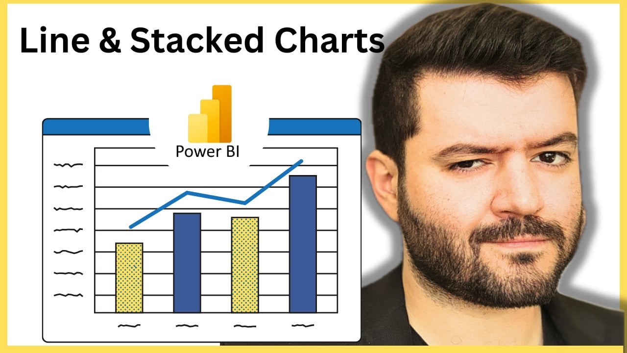
a stacked column. Sounds doable. How about here? You have a horizontal column. Let's go for something which
is line and stacked column. So it shows me the
different types of the count of the games
based on a game title, but I need to add
the game title, yes. So let's take a look
at this. So I need to modify the details over here. So on the X axis, I would like to have, for
example, the game title. And then on the Y axis, I need to have the sales. Look what happens. Here we go. So over here, I can
see the game titles, and I can see the
sales per game title. Then I have the ability to add line on the
XX on the Y axis. How about we add also
sales to the Y axis? Here we go to showcase the
lines along with the bars. Column legend, what would I like to call the
column legend? Well, I do have the column legends over here and
the small multiples. Forget about the small
multiples for now. It's not useful at
this current stage. Column legends
just simply add to have some data about the
legends. Here we go. Take a look at this game title. Excellent. Look
what happens now. So I have a legend for
every single game, which is based on
a certain color. That way, I have
the ability to see the sales for every single
game. This is very powerful. Yes. So you have the
game title. Here you go. And you got the sales
for every game, and now you have the ability
to see which game is being sold the most.
This is very powerful. Now, let's create
another visual. Now, for this current visual, I'd like to have a
certain metric or a card. I'm going to click on this.
And I would like within this card to have the number
of sales. Here you go. This is quite good. Now,
I'm going to change it to how about GP sales.
Let's remove this. And I'm going to have how about the critique score,
which is a helpful term. Here we go. Critique score. So this is the overall
critique score for all of the, all of the games, the
sum. This is the sum. So it means we've added all the critique score to every
single one of them. Once you click on this, you have the ability to remove the field, find the minimum, maximum to count it or find the average. So let's go for the average
critique score per game. This is one. Then I'm going to have another one,
which is another card. To showcase, not the average, but the maximum critique score. Now this is the sales. So
we're going to remove this. Let's go for the
critique score, yes. And the maximum over here
is a ten, obviously. And then I'm going
to remove this, and I'm going to
delete this part, and I'm going to change it to how about the minimum
critique score right now. So you
get what I'm doing. Yes. So I'm basically
trying to show the critique score in
terms of the average, the maximum and the minimum, the number of sales created. This is very powerful. Now
you are building a report which makes sense
based on your data. This is a first page,
the first page. What we have created so far, we have created the game
title sales per game. We added some
legends and visuals. Then we've added
some scorecards. These are cards that show me the critique score for
every single one of them, I selected from here to showcase the average, maximum
and minimum. So think about it as
ways to get data, to showcase the data in
a way that makes sense. Now I'd like to see from top
to bottom like a funnel. Now for this funnel,
it's going to show me the categories
from higher to lower. So what would I like
to have? I'm not going to include dates. I'm going to have, how
about the critique score, which is helpful. Here we go. And then some of the sales By critique
score, which is good. Then let's have some
publisher data. Here we go to include
some publisher data. So this way, I have the
ability, for example, to click over here to
find out, first of all, which game has the highest sales per critique score,
which is good. So I have the ability to modify this. Look how
powerful this is. So once I click on here, I have the ability
to spot the game. Yes? Now, this game does
not have a critique score. How about another game? Yes, take a look at this. Now,
I'm able to find the game. Here we go. This is
the game that I have. If I click on this game, what's the name of
the game? Here we go. I'm able to find it.
Yes, this is the game, which is by this publisher. So you get the logic behind it. Now, the data is interlinked. So whenever I select a certain sum of
sales PiB publisher, I'm able to find the games
created by this publisher, the critique score for
every single one of them. This is one way to look at it. Now let's take it
one level further. How about we're able to add some ribbon charts and make
it a bit, you know, um Techie. Now, for the X axis, which is here and
for the Y axis, what do I like to have? Let me add every information that I would like to
have in the X axis. So I'm going to go for the
game title. Here we go. And then for the Y axis, the sum of the sales,
I could have this. Also, I would like to have
critique score and the Y axis. I could also include this
for the critique score, the sum of the total sales and the sum of the
critique score. Now, it's not the sum
of the critique score. I don't want to have the sum, simply count like
an actual number. Then you could add a legend. You could add multiple fields. So sum of total sales and count of critique score by game title. So every single game, you
have the ability to find its sales at the same
time, the critique score. If I click on here, notice what happens, I have this game. Critique score and
the allocation of it in terms of sales, which is, again, something
very powerful to have in mind as you are collecting
or refining your data. So let's say now I have created this basic representation for my information where I have
my average critique score, the sales per game, and I need to have
more information. Yes. So this is one page. Now, on this page,
I'm going to change, first of all, the name from the sum of sales
to different regions. How about we can go for
the critique score. And what you can do over here, you have the ability to make every single page based
on a certain parameter, for example, for the developer, you could have the same
data for developer. You could have the same
data for game title. The more details that
you would like to have, the more pages you add to your report based
on your preference. Some of the critique score,
we don't want a sum. We need to have a
minimum critique score. Here we go which is
nine, some of sales, which is good, some
of regional sales based on different areas. We don't need, again, the sum of the critique scores
doesn't make a difference. We need to have the median, which is like the
middle value, okay? So we have a clear dataset, and I'm going to call this. I'm going to change
this. And by the way, once you click on any
verbal or written words, you have the ability
to change them. What I'm going to do right
now, I'm going to change those summary report
of video games. Okay. And now I have the
ability to make them bold, change the color to blue or red. Again, it's up to you.
Then here you go. And that's mainly it. You
have a title. It is a title. Then we have the ability to change the font or
the background color. Let's change it to red. And text wrap, subtitles, dividers spacing, how
about some effects. Now we could have let's
go for black color, with something which
is quite here we go in sync with our displays. Good. Transparency, you're able to adjust this visual border. Yes, we'd like to
have a visual border. Let's modify the border to
put it in red, for example. And then would you
like to add shadows? How about add some icons? Here we go. You could add some icons and different colors. Here you go. You could pin this. You could change the
visual appeal of your icons and I'll text. If you'd like to
enter a description to be read by the reader, for example, this
is here you go. This is a report on
game sales. Here we go. Now, we could add this
data such that it represents the content of the
table, and that's me lid. So I'm going to
click Enter right now in case I'd like
to add some space, and that will get the job done. So if I go up right now, but you notice, it doesn't
look quite proper, yes. So I need to have a
proper alignment. How about if I increase
the size over here, Summaries report of video games, and I could drag it
all the way over here. Excellent. Now, we do have a
visually acceptable report. Everything looks
quite proper about. And I have the ability now to personalize every single
element of these tiles. For example, if I click here, I can just simply click to
visualize or personalize this. Now, once you go about here, you have the ability to
change the visuals, okay? You have the ability
to change that color. Let's turn it to
red. Here we go. So once you click here
and click to personalize, it's going to drop
this pain over here. That way you have the ability to alter every single
element by itself. You have the ability
to give it a title. You could add some
effects for backgrounds. You could have a header icon. You could tinker with these
based on your preference. Let's go for a background color about this color. Here you go. So every single one of them, the most important
details for you, you're going to highlight
them. This is very crucial. So now we have an initial
setup for a report, which includes basically
a summary report of video game sales. We have the game title,
the sum of the sales, the average critique score, maximum critique score,
minimum critique score. We have the sum of total sales
and the count of critique, buy game title, and sum of sales and first publisher
buy critique score. So this is a very well
rounded piece of information, a good report which shows me the median critique
value, some of the sales. And again, you can draw
some inspiration from it. So let's say I would like
to have more details. So I'm not done yet.
I'd like to have extra details to my application. So this is where we're
going to transition to having another page.
12. Hands On Example Part 2: I back. Now we are
going to take it one level further by
building our report, and we are going to go
through this together. We're going to tinker
with this the same way. I'm going to experiment with
this straight with you. That way, you're able
to see the mistakes, see the trial and error to help you go
through the process. So I'm going to
add another page. Let's consider this
page as a playground. So now I am going to add and build my visuals
based on my data. So let's say, for example, I can just simply drag
the data over here. I would like to focus
on the console. This is one, and I would
like to include within the console the game
title about that. So I'm including the data that I have over here to show me, this is the tabular version. This is the actual data, yes. So I'm going to have the
console and the game title. Now, how would I like
to present this? Let's go for field map. How about some regions? But we have to be careful here. Map and field map aren't
enabled for your organization. This requires a premium account, so you have to be quite
careful with this. So again, once you have
the full on account, you have the ability
to tinker with these and to add extra details. How about we add
some information? Actually, we cannot because it should be on the
premium version, but the intent was to actually showcase the location
of every single sale. But there's nothing
to be worried about. We are going to have
a different report. Now, I'm going to
show you what's called as the PagnatedRport. The pgnatedRport is
basically when you have a print ready report.
This is very important. It's a bit advanced
when you are going to connect this report
to this page, to the report that
you have, if I drag this over here,
for example, fully. And then I'm going to connect
it to one of the reports on the previous pages to create a pagnated report
or page ated report, it means this report
is print friendly. You have the ability
to print it. So this is something
on the side note because often when you
create these reports, you cannot print them on a piece of A four
paper and such that. Now, let's modify
further details and try to have additional
insights on our reports. I would like to add some
KPIs, key performance index. So the data value that
I have over here, how about the sales total sales? Here we go. I'm going to have total
sales, which is right here. Here we go. This is
the total sales value. This is the sum of
the total sales. It's displayed as
an overall layout, but I need to add a target. Let's say the trend axis to show me how things are going
are based on the console. So I can rename this or sum of total sales based on the
console, we wanted this. So it's showing me a trend. This is one. Target,
add data fields here. I'm going to get other sales. Here we go. So as you can see, my target is to
achieve this number. So the value that I have, based on a certain trend
should reach this target. You get the idea,
and now it shows me a check mark means we
have crushed our goal. Our goal we are way
higher than our goal. This is called what
we call as a KPI key performance index
is very powerful. Let me go for a
different target. How about other sales with Rd, how about certain
critique score? This is very good.
How about we go for the critique score? This is one. This is the overall the sum of
the critique score. I would like to have the
maximum critique score. This is the maximum, which is 9.3 based on not the console, based on the game
title, it will change. My target is my target is the value that I
would like to reach. The target should be the
value that we have for the critique score should be as close as possible
to cross this target. So my minimum value
in this current case, I'm going to add the
minimum critique scores. Let me go for the
critique score again. But in this case, I'm
not going to have the maximum critique score to match the sum of
the critique scores. No, I need to go for the
minimum. Here we go. Let's change it to the
minimum critique score and swap the values. Here we go. So
this will go here. Minimum critique score. There's going to be
the sum, minimum. And over here, we're going
to have the maximum, right. So as you noticed, my
value, my minimum score, my minimum critique score
should have within the trends, of course, should achieve a target of the maximum
critique score, which is 8.7 over here. This is our goal. So our
goal we need to have or to reach the maximum
critique score of 8.7. So one of the minimum
critique scores should be reaching the
maximum critique target, which is of 8.7. Let's try something else. So instead of the game title, I'm going to have the sales. So the value of sales
in a certain location Here we go. I'm going to go for the total sales
based on the game. Let's pick any region. Here we go. So our goal is the sum
of the total sales, I'm not going to go for the sum. Let's try this. The minimum sales per game title should reach the
target sales over here, or instead of going
for the target sales, I'm going to go for the
minimum sales over here. So if you notice, it means
the minimum of total sales, a minimum of pal
sales by game title. So it means we have
crossed this KPI. It means our values, the data that we have gotten, we have achieved our goal based on these datasets
where the minimum total sales and the minimum regional sales based on
certain region by game title, our goal is to go for 1.9. This is the KPI. We have
crossed it, and it's 5.01. So you get the idea. This is a KPI application. Let's
have something else. So what if I would like to have another application
where I'm going to just simply showcase the publisher if you'd like to add something, just simply add it and drop it. And based on the publisher, what is the critique score? So I'm going to add this
piece of information for me, and I'm going to pick a visualization which
is quite reasonable, not a KPI, not a slicer,
how about table. You could add a table. How
about key influencers? Here you go. This is helpful. So this will show me
the values that I have. But since this is
limited in application, this means that I have
too many data points. So when I have the data points, which is quite a lot,
the key influencers, it will take less than ten. So I have more than ten. So it's not going to be
functioning quite properly. So I'm going to try to select just ten of
them, one, two, three, here you gs have one,
running the analysis, EA Sports. Here we go. So these are the key influencers
that I'm trying to have, but I'm not able to adjust them because I'm
having too many data points. Here we go. So when I fix this, when is a publisher more
likely to be rock star game? These are the top segments.
This is good. For the Sega. So these are the influencers,
key influencers. Here you go, I was able to
modify to showcase this. So when the sum of critique
score goes up 0.8, the likelihood of
publisher being rock star games increases by 1.09. So this is very powerful. You get the idea
behind this. So if you have ten data points, ten data this will
be quite solid, but more than that,
you have to go about selecting your segments. So let's go for
this one over here. How about Ubisoft. So I'm going to click on
Ubisoft. No segments found. Try adding some more fields in the explain into the explain B. So my analysis over here, analyze the publisher, explain
by the sum of critique. So I don't have the ability to explain this by
the sum of critique. H explain this by
the sum of sales. So let's add sales. So this
is what's going to happen. As part of the analysis, you have the ability to see which subject or object is influencing a
certain parameter. Let me remove the
critique score. Sum of total sales,
analyze, not the publisher. Let's go for game or
console game title. Running the analysis, we
have more data points, more than ten unique values. So this is where it
gets quite problematic. When is the game title more likely to be Assassin's Creed? Key influences. We
need to add more data. So we don't have
sufficient data. How about sum of total sales? How about critique score? Let's say if we
have some data that we could analyze,
we don't have this. Let's go for a different game. How about call of
duty, for example? We're not getting data.
FIFA, for example, there are no segments found. How about Battlefield,
for example, Arkham City so as you can see, this requires a
bit of tinkering. It means we need to go
about the process of finding which data has some sort of correlation
between them. So this is something quite
important to keep in mind, especially if you do have more than ten unique
values because the key influencers
is mainly focusing on certain elements which
have the biggest changes. So I'm going to remove this because we don't want to have on our report something which is not generating a
lot of data for us. So I'm going to transition
to another tab. How about we gauge? So I'm going to select. Here we go. Let me gauge this. So as you can see,
I'm walking you through the process from A to Z, including the trial and
error, the iteration part, just to help you see the
real life application of this instead of going through end results without
you seeing the process of fixing them and the
thought process behind them, which is crucial for
your learning curve. So select or drag fields
to populate this value. So add data values here. Let me go for the minimum value. Let me go for the
critique score. Here you go. So for the critique score, I
want to have the sum. I need to go for the
maximum, which is ten. Okay? Minimum value for
the critique score. Let me show it as a gauge. This is a minimum value. And then we have the
critique score as well. This is the maximum value. Then we go for the
average in the middle. Target data value. Okay. So what are we trying
to compare this to? How about game title? Average of critique score, minimum of critique score, maximum of critique score, and count of game tool
tips at data fields, and this sounds okay. So this means this
gives me a range. So between the minimum
critique score, maximum critique score, and the average between them, this way you have a
clear display that the majority of the games are going more than the average. So this is very nice, very good. It gives you the
spectrum, the grid. You're not doing average,
you're going more than average. Let's add another
important tool, but I'm going to be shifting
this to the bottom part. How about we reduce
the KPI display. And then I'm going to add the
tab over here, the gauge. Okay, this is one. Excellent. Let's
add something else. How about we are
going to be adding? We could have
narrative. Here we go. Choose narrative. Custom. I'm not going
to go for copilot. A narrative is basically
when you type something. This explains certain
elements that you have. So at 4.9 minimum of total sales has exceeded
the target goal of 0.01, which is good, and this
is where you type. The KPI here we go. The KPI for the following following
year has been achieved as displayed and the current dataset
visualization. Here we go. So as you can see
now, I was able to create a verbal
summary as a commentary. I'm able to comment on this. I'm able to add
some own context. You could add a link as well. So it's up to you to get quite
creative with the process. Let me try to fix this. Okay, so this is part
of the visualization. You have the ability to move and expand the sizes
of this. Here we go. So the KPI has been moved for the following year has
been achieved and as displayed in the current
dataset visualization. So you could add your
own texts as well. Let's try to build
it even further. Now I'm going to
have something which is more of a trend line,
which is very good. So I'm going to add a
trend line over here to show me full datasets
from A to Z, and I'm going to allocate
this to the top. Excellent. Quite centered,
increase the size. Here we go. We got 24. Excellent, and put
it at the center. You could add some colors
to it about red colors, and you could add a
link if you'd like, and you can just simply click on the link to refer to this page. Now let's select or add our data to include as much
visualization as possible. So what I would like to have
over here for the X axis, I'm going to just
simply go about this carefully because
we have a lot of information that we
need to make sense of. For the X Aces, I would like to have the game
title. This is one. And I would like to
have the console. This is two. For the Y axis, I would like to have
the total sales. Now it's going to flip, as you can see, I can
see the pattern. Also, for the Y axis, I would like to see the
sales based on genre. This is one. Okay,
can add the data. Now for the line,
the line display, not the bar, I'm going to add
as well, the total sales. To see the pattern.
Now I'm going to add the regional sales based
on every single region. So here you go.
This is one region. This is another region, and this is in another
region, you get the idea. Now, I'm building my data such that you could see
patterns easily. You could add the column legend. How about we add
the column legend? I would like to add the
console or game title. Here we go. I'm able to add
this. It's already there. How about the
developer? Okay, it's already present as well
as part of the data. So we do have the legends
actually in place. We have the sum of total sales, count of sum of total sales. So everything is
quite present for us. As you can see on the X Ax
we got the console, Y Axis, we got the total sales or the total sales and
count of Jenre. So this is very extensive data, which shows me a
better representation of my sales based on a game. And that way, I'm able to check how every
single sale or how every single genre has actually modified or
had influenced my KPI, at the same time, the rating for every
single one of them. So if I click on
this, click on this. Notice it keeps on flipping. We got 8.2, we got nine. Here you go, 8.8, 5.13, 8.64. Then there are no
ratings for this one. Then we have a basic rating, then it keeps shuffling
back and forth. So you get the idea how it goes about representing
your data. So now, our pages are our
report is quite extensive. For the first page, we
have a basic summary. We are able to modify this. We included average
critique score, maximum critique score,
the sales per game title. Then we get into more
details where we have seen whether or not we
have reached our KPIs, the average critique
score in grid, and the count of the game title. And we have seen a
more extensive detail. We added a bit of
verbal summary, and we've shared a
visual representation of bar graphs and charts. So now you have
successfully managed to actually create
your first report. Keeping in mind, the
subject is quite extensive. You do have a lot
of options to add. You do have a lot of things
that you could incorporate, but up to this current stage, you have learned about 80 to 90% of the things that you're
able to do with Power BI.
13. Hands On Example Part 3 (Adding Functionality): Welcome back. Now in
this current lesson, we are going to take
it a bit further in which I'm going to
teach you how to incorporate additional
elements to add some flexibility
to your reports. So we are going to pick
things up where we have left off in which we are currently at the second page
of our report. Let's say I would like to add some external resources or
the ability to actually incorporate additional
information which goes beyond our report. This is where I'm going to
use the power of buttons. So let's say I'm going
to reduce the size of this chart over here
up to this margin, and I'm going to
utilize the space over here to add some
information that will direct people or direct the readers or your colleagues
to a certain reference. This is where I'm going
to navigate to the top. Over here, you can add shapes. You could add buttons. So you're able to tinker with these. So we have shapes and buttons. So you're able to pick whatever
shape that you'd like. That's one thing. You could also add a button for
navigation purposes. For example, if I would like
to have a button for Q&A. If you got questions or answers, I'm going to add this button
over here. Here we go. Then I have the option to change the shape and change the
appeal of this button. Shape should be rectangle, how about oval, and then
we're going to have rotation. If I'd like to rotate this, certain style or text, I'm going to add
some text to it. Got questions. Click to
contact our team. This is one. Okay. So we're able to change the phone
color to make it pop, alignment in the middle. You could change increase or decrease the
padding. Here we go. Now, let's take a look
at other options. We have the icon,
which is Q and A type. You could change the icon color. It's up to you or
the icon shape. Let's put it in red
color. Here we go. Then you have the weight
to make it look dense. Is it transparent or
not? This is one. I'm going to reduce the weight. To make it three.
Excellent. So everything is quiet in check. How about adding some filling
to give it some borders? I'm going to go for,
let's say, a black fill. Okay. Then we have
the transparency. You could modify the
transparency for this. It's quite transparent and
looks a bit professional. And once I hover on it, it's going to change the shape because I've added
this hover effect. W like to have borders
or shadows or add some glow in case you would like to draw
some attention to it, and the glow will be, let's say, yellow in color and blur effect. Here we go. So Sounds doable. Sounds okay. The most important
part is the action part. This is the action
feature. So it's a type of Q and A type, yes. So you have the ability to
change this for drill through. We have the ability
to page navigation. You have the ability for web
URL, which is very powerful. So once you click
on the web URL, once you click on the action, you change the functionality. So you have to be careful
this. If you got Q&A, it means you have to add some information over
here as part of the Q&A. But once you'd like to
navigate to something else, click on the web URL, and then you'll be prompt
to add a website over here or a video or a
link to something external which will be helpful to your team or your colleagues to
actually explore. So you've got questions.
Click to contact our team. You could add whatever link, and as they browse
through the report, they have the ability
to click on it and to navigate to an external page.
14. Exporting Your Report: Come back. Now we are
ready to actually export and publish
our basic report. So we have multiple
options over here. First of all, if you navigate
to the top right side, you have the option
to download this on your Power BI
desktop application. If you notice once
you are logging into PowerBI for the first time, you have the option to download the application on your desktop, which gives you
more functionality. Here you have the ability to go for paginated Report Builder, which gives you the ability
to create pages for printout, Power BI for mobile
ExleOLekFle Explorer. These are different. Think about them as apps or locations that you will be downloading
the Power BI Report too, and then you'll be able
to work on it from there. However, if you'd like to work, to just simply use it
for your own company, for your own reference,
you're going to navigate to here. File. Click on file. Now
you have the option, first of all, to save the
report, make sure that you do. You click on Save Report. Then you have the
option to print it. The other option is to
publish it to the web, and then you can embed
this on your website, on your company's website. You could export it
to a PowerPoint. You could export it to a PDF. You can just simply download it as it is to your computer, and then you're able to upload
it to a mobile phone or any other Power BI application. Let's say, I'm going to
export this to the PDF. I'm going to click on this it shows me exported with
the current values, then I click on Export. So this is going to be
exporting my PDF in progress. And here we go. So this
is the end result. Here we go. You got
your first PDF report. You're able to scroll
through fully. You're able to print it out. And if you have added links, we have the button ability
to click on the links. And congratulations. So far, you were able to actually create your
first report from ATZ based on the
case that we have, which is reporting video
game sales and statistics. Like I've mentioned, make
sure that you download the data set from the resources section
of the current course in order to make sure that
you're able to access this information
and to be able to follow up with us as you are practicing and building
your first report. And congratulations. Now you have managed
to actually get up and running with Power BI.
15. Wrapping Up: What do you think?
I truly hope that you found the class
quite helpful. It helped you develop that
awareness and understanding about the importance of data
analytics, data science, and visualizations in
order to make sense of the data regardless of your own profession
or your own career. Make sure that you
follow my profile for the latest releases and update and feel free to share your feedback on
the current class, and I'll see you
in the next class.
 Engr. Hussein Attié, Entrepreneur I Engineer I Educator