Transcripts
1. Preview: Hi and welcome to my
Skillshare class, where I will teach you how
to paint daffodils using the negative painting technique and bright, lively colors. My name is Chris and I'm a professional watercolor
artist and teacher. Back in 2012, I discovered
my love for watercolors, and ever since it has
become my greatest passion. In fact, I turned
my passion into my profession and since 2019, I've been teaching online, sharing my knowledge and helping others understand the
beauty of this medium. For this skill share class, we'll be focusing on
painting daffodils. I'll guide you
step-by-step in creating a realistic painting of
these beautiful flowers. Throughout the class, you will
learn and practice skills, techniques and
concepts that will help you to create
this amazing painting. I'll provide you with all helpful resources that
will help you get started. This includes a
comprehensive list of the supplies I used
for the painting, ready to print a
line drawings in various sizes along with
the reference photos. You can also refer
to my finished painting for inspiration
and guidance. If you're ready to start
creating something beautiful, Then let's jump right
in and get started.
2. Your Project: For your class project, I invite you to
create a painting of a daffodil,
flowers and leaves, using the negative
painting technique, you can choose to follow the entire process and
paint the entire picture. Or focus on painting just one
flower with a few leaves. Whatever approach you take, I encourage you to share your process shots and final
painting with the class. You can upload them to the
projects and resources section by clicking on the
Create Project button. Adding a short description
of your process and any challenges you faced during the creative process can
help other students, as well as myself to provide
feedback and support. If you have any questions or concerns throughout the process. Don't hesitate to ask in
the discussion section. I am here to assist
you in any way I can. I also highly recommend
that you watch each lesson before
diving into painting. It will help you become
more familiar with the techniques and better
prepared for what to expect, leading to a more confident and comfortable
painting experience.
3. Resources: To help you get started
with your project, I've prepared several
resources that you can access in the projects
and resources section. Please note that these
resources are only available on the web version of
Skillshare, not the app. Among the resources, you
will find a PDF file that includes a list of all the supplies I used
for this painting. While you don't necessarily
need the exact same supplies, I recommend using 100 per cent cotton
paper for best results. You are free to use your
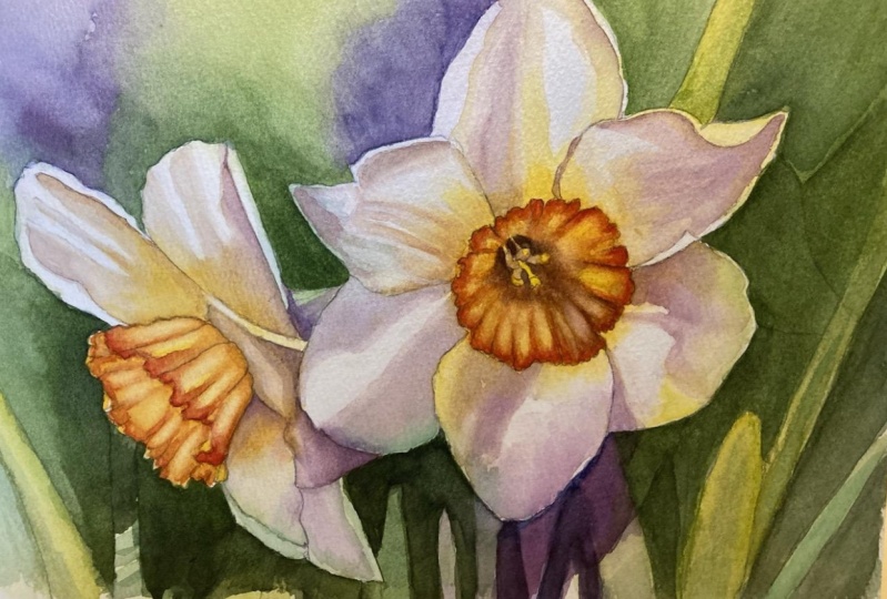
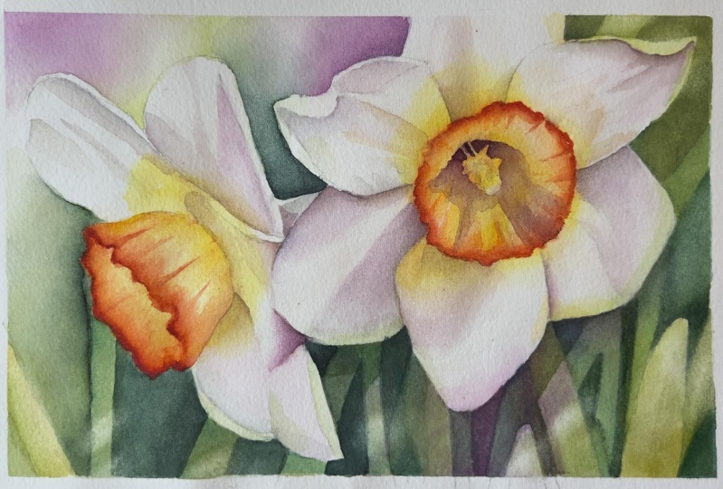
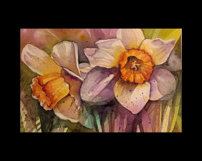
preferred paints and brushes. In addition, you will find reference photos at tonal study, a color study, and my finished painting
for your reference. I've also prepared
a line drawings in different sizes for
you to choose from. You can print the one that
suits your needs and transfer it onto your watercolor paper using your preferred method. I painted the daffodils
in 12th by eight size, but you can choose to
paint in a different size.
4. Introduction: Hello everyone. So today we're going to start painting some
beautiful daffodils. This painting isn't too complex. So even if you are
new to watercolors, I encourage you
to give it a try. The shapes are fairly simple and the colors
are really lovely. The only tricky part may be the use of negative
painting technique. But don't worry, I'll guide you step-by-step through
the process. You can usually tell
when someone has used this technique
because the colors flow across different shapes,
creating unique effects. Also the shapes itself
are very distinct. E.g. in this painting, you can see that the
purple partially overlaps the background and partially
covers the pedals. The same goes for the green. Normally we wouldn't
paint like this, but that's the beauty
of negative painting. The colors do their own thing on the paper and we
just react to it. But before we begin painting, let's briefly review what
negative painting is. In the next lesson, I'll explain the concept
behind it in more detail.
5. Negative Painting: Negative painting is a
technique in which we paint around an object
to bring out its shape. Rather than painting
the object itself. In theory, it is a
straightforward technique, but in practice, it may
be quite challenging. Let's take a look at some
examples of negative painting. Imagine we have a
daffodil with six petals, are stem and the bad
in the background. Before we begin painting, we will create a sketch
of the daffodil. And if we were to paint the
main flower and the bud, our main subjects, this would be considered positive painting. Some artists referred to this as positive painting in contrast
to negative painting. However, for me,
positive painting is something different. And I will explain this shortly for the purpose of
this demonstration, let's call it positive painting, or just regular painting. The negative space refers to everything around
the main object. If we were to paint the
entire negative space, we would be creating
a negative painting. Instead of painting
the daffodil directly, we would paint a rounded shape to create the desired effect. Let's consider another example. Here we have a daffodil and
we drew a sketch of it. We can see that
everything around the flower is the
negative space. However, a negative
painting involves more than just painting
the negative space. Let's take a closer
look at the process of painting this daffodil using the negative painting technique. Stage one of the painting
process involves applying the main
colors to the sketch. This step sets the
overall mood and colors scheme of the painting is important to have
a clear idea of the desired mood before applying the first
layer of color. This decision will impact all subsequent layers
of the painting. E.g. warm colors may create
a friendly atmosphere. High contrast
complimentary colors can be used for a dramatic look, or a light pastel colors can be used to create
a peaceful mood. In this example, we are applying
yellow to the daffodil, warm greens around it, and a touch of a worm, pink to suggest maybe pink
flowers in the background. During this stage,
the colors are not confined to
the pencil lines. The colors of the main subject can bleed into the background, and the colors of the background can flow into the main subject is possible to control the
colors to some extent, but the objective is to cover
the paper with base colors. Some white gaps can
be left as well. Once the first layer
has completely dried, we can move on to
the second layer. It's important to wait
until the previous layer is completely dry before
applying another layer. Now we can start using the
negative painting technique. Our goal is to paint around the main subject to
bring out its shape. We carefully paint around the daffodil while going
over the background. Once again, this helps to bring out the shape
of the daffodil. Now, there are two
important things to keep in mind at this stage. Firstly, we don't have to paint the entire background, e.g. in this demonstration,
the pink color in the bottom-left
corner disappears as I go over it with green. However, I could have
applied the green only close to the daffodil and then faded
away into the background. This way, the pink from the previous layer
would still be visible. Our aim is just to bring out
the shape of the daffodils so we don't need to cover the entire background
with the paint. Secondly, it's important to
consider the use of color. We always need to think
about how colors interact with each other and what happens when
they mixed together. If I applied green in
the previous layer, then in this layer I
would also use green. I could add in some
blue or yellow, as I know that when I
apply them over the green, I will get some nice colors. However, I wouldn't apply e.g. red because I know that it
would result in muddy colors. We need to choose
colors wisely to avoid getting
unexpected results. In general, the first layer
sets the color scheme, and the following layers are
repetitions of those colors. Unless we really want to
make a change along the way. Now that we have established
the negative shapes, we can proceed to. Another negative layer. Let's say we want
to include a leaf. We can either use a
pencil to draw the leaf. Or if we have a clear
vision in mind, we can paint it directly. Once we have the leaf outlined, we can paint around it. I used here purple color to make it visible so that you can see
where I applied the paint. As we applied the paint, we blended away from the leaf, allowing the colors from
the previous layer, like the pink from the first
layer to show through, It's important to note that
we can choose to paint around both the leaf and flower, or partially over the flower. To create an interesting effect, we can add as many negative
shapes as we want. And when it comes to
the daffodil itself, we can use regular
painting techniques to finish the flower and
not negative painting. I previously mentioned
positive shapes, which for me are simple silhouettes of
shapes without any details. They are typically painted
using a single color or a few colors and they
feel negative spaces. Here are a few examples to
help illustrate this concept. This is my painting
spirit of hope, which is a great example that shows everything we
have discussed so far. The flowers, buds, and
most of the leaves are painted using regular
painting techniques. While some of the leaves are painted using negative
painting technique, you can easily identify
the leaves painted using negative painting
technique because they were created by
painting around them. In addition, you can
also see examples of positive painting
in this piece. For instance, the
leaf shapes painted as flat silhouette
without any details. Fill out the negative spaces and add depth to the painting. These leaves, which look like little leaf spirits at a
unique touch to the piece. This is what I call
positive painting. Let's examine this painting. The leaves and stems are painted using the negative
painting technique. But in the background, you can see some
faint silhouettes of leaves painted positively. The positive painting technique helps to create a sense of space and balance in the painting
and it adds more interest. Another example of
positive painting, you can see here
in this painting, in the upper part
and on the left, while the bottom section
features negative painting. In this final example, you can see some leaves painted using the
negative technique and some rows sepals painted
using positive painting. Now that we have a
better understanding of negative painting, we can move on to
the next lesson, where we will apply the
first layer to our painting.
6. Initial Layer: For our first step, we will be painting the basic colors throughout
the entire painting. To establish the color
scheme and mood, it's crucial to select
the colors carefully as they will set the tone
for the entire piece. Here you can see me
using the Procreate app to sketch out decomposition
for our painting. I also created a value
study in the app where I painted everything using different shades of gray. It's essential to
establish the tonal values before the colors as
they are more important. With the value study ready, I could experiment with
different colors schemes and select the ones that would
work best for the painting. In the end, I had a value study, a color study, and
to reference photos. I made a collage with
these references and had it displayed on my computer
screen while painting. This helped me stay focused and have all the necessary
information in one place. Before we begin applying
the colors to the paper, we need to prepare our paint to create a
fresh, vibrant green. Let's make this
transparent yellow with Winsor green, yellow shade. I don't want to completely mix
these two colors together. Instead, I prefer to let the
colors meet in the middle, allowing me to pick
up more green or yellow as needed for different
areas of the painting. This gives me the
flexibility to adjust the hue and achieve
the desired effect. In addition to the green mix, will also need purple. To create it. Let's mix ultramarine blue
with quinacridone magenta. Both of these colors
have a purple undertone, which makes them perfect for creating a vibrant
shade of this color. Now it's time to apply
water to the paper. For this step, I'll be using my old one-and-a-half
inch flat brush. I have a separate container
of clean water at the ready. Begin by applying
a layer of water evenly over the entire
surface of the paper. Hold the painting at an angle to ensure that the water
is distributed evenly. You should see a nice
sheen on the paper, but no puddles of water. If you do notice any
puddles forming, simply spread them out to ensure that the surface is evenly wet. Now, using a round
brush size 12, pick up some purple and apply it to the areas where
you want to see it. Of course, you can choose different colors that
suit your preferences. For this painting. I thought a color
combination with purple, green, and yellow
would work great. I decided to have three main purple spots
in the background. Green and yellow are
analogous colors, and purple is a complimentary
color to yellow, which gives that nice contrast. Next, pick up the green and
apply it to the background. Remember that the surface
of the paper is wet, which means the paint
is continuously moving. You can control the paint
to some extent by tilting your painting and forcing the paint in a
particular direction. But you can't
control everything. The most crucial thing
to remember is that the petals of the
daffodils should be white. Don't allow too much color
to flow into the pedals. You might want to
apply the colors slightly further away
from the flowers, not as close to the
pencil lines as I did. If you apply the
paint further away, it will flow up to
the pencil lines. And even if it
doesn't, that's okay. Because in the next
layer we will apply another layer around
the pencil lines. For now, make sure
that only a little bit of those colors flow
into the petals. We want them to stay white. If you see too much
paint flowing in, clean your brush
and with a clean, damp brush just leafed
out the excess paint. The spread of paint is
inevitable and uncontrollable. But that's the beauty
of this technique. Also notice that I'm not using my brush to force the
colors to mix on the paper. Instead, my brush is just delivering the
paint to the paper. And all the mixing is happening automatically without my help. I'm just tilting the painting
to get the paint moving. And the colors are
blending by themselves. The fewer brushstrokes,
the better. If you start fiddling
with your brush and push the paint here and
there to mix the colors, you will get an overworked look. It's better to avoid
that and let gravity do the work for you while you
just delivered the paint. Also, in order to avoid
that overwork look, you need to use a brush that is big enough for
this particular painting. And I'm painting on
a size 12 by eight. I think the brush number
12 is a good size. Lastly, drop in some
transparent yellow to the trumpets
of the daffodils. And again, don't
worry if this color, we'll go over the pencil lines. Here. You can see me lifting
out some of the pain to where it has spread too far. While the paint is still wet. Tlt are painting in
different directions. Keep doing this as long as you can see the paint
moving on the paper. Once it settles
down and there are no puddles of paint, let it dry. If you need to remove any excess paint
with a paper towel. Notice how nicely the
colors blend together, creating smooth transitions without any visible
brushstrokes. Such color gradients are difficult to achieve
with a brush alone. Wet on wet technique is
best for this as you simply apply the colors and let them do their own
thing on the paper. Now, leave this layer
to dry completely. Once it's dry, we can move
on to the second layer.
7. Second Layer: After the previous layer
has completely dried, it's time to apply
the second layer, which will be actually
the first negative layer. Since the colors from the
previous layer are already dry, I'll add a bit of water
to reactivate them. To get a slightly
darker shade of green. I'll mix Payne's gray with
my upper green color. I'll continue using the same round brush
size 12 as before. The purpose of this
stage is to define the main shapes by
painting around them. Our main shapes are, of course, the flowers. But we can also begin to
create some of the leaves. We'll be painting along
the pencil lines. So pick up your green and start from the bottom left side. It's important to
note that the paint should be very watery
at this stage. As this will allow you
to create smooth washes. If the paint is too dry, it will create
visible brushstrokes which we want to avoid. We want to seem
nice, smooth washes. And since we are
painting wet on dry, not wet on wet, the paint must be watery. Paint around the
flowers and leaves, trying to use the same colors
as in the previous layer, in the same places. If you use the purple, use purple again, and
if you used green, then use green again. However, if you want to change the color or add a
different color, feel free to do so. Using very watery paint not only allows for smooth washes, but also gives time to
paint intricate areas, e.g. between the petals here. I can take some time to
paint carefully because the edges I left hire remains
wet for at least a minute. To achieve smooth washes
and avoid hard edges, we must pay attention
to the edges. If an edge starts
to dry out quickly, add more water to make it wet. Again, referring to
the value study, I'm using darker tones in places that will
ultimately be dark. Here I'm painting around
and between the leaves. You can see that I'm
also painting over the leaves and I'm creating
those diagonal shadows. After finishing this layer, let it dry completely. Each layer must be bone dry
before applying another one. In the next part, we'll
darken some areas and bring out more leaf shapes using the negative
painting technique.
8. Darkening and More Leaf Shapes: Now that everything
is completely dry, we can assess the
values of the painting. Dry paint is usually much
paler than wet paint. So we can now see whether some
areas need more darkening. By comparing our painting
with the value study, we can determine
which areas need more work to create a darker tone will
prepare more green. This time with slightly
more Payne's gray added, will use a brush size 12th. Start by picking
up a watery dark green and apply it
to the left side. Quickly urines and blood the brush and then
smooth out the edges. Darken the area under the flower and add some
shadows to the leaves. When painting the
negative spaces between the leaves and creating
the shadows on the leaves. It's important to use
a very dark green, but makes sure that the
consistency is still watery, not thick and dry. If you come across a situation where one leaf overlaps another, apply more paint to the one in the bag to push it more
to the background. Now here is where
I made a mistake. I created this triangular shape, which didn't really make sense. I guess I wanted to create
a petal shape but a failed. So feel free to change this
area however you like, maybe go higher with the paint and paint this entire
section with the green, or maybe create
another leaf shape here in the bottom right corner, create another leaf shape. Notice that there is also one more small leaf shape
in the final painting, which we'll add in
the next layer. To darken the area
between the flowers. Apply more dark
green and purple, but don't cover the entire
section with paint. Instead, add more
paint and soften the edge to blend it
with the background. We want the colors from the previous layer
to show through. Now that this layer is finished, we'll move on to the
final background layer. In this layer will create more leaves and darken
some areas even further, especially under the flowers.
9. More Leaves, More Darkening: Always make sure that
everything is completely dry before proceeding
with the next step. Now, our focus will be on the
lower part of the painting, where we aim to create more
leaves and darken the area. Overall. The flowers cast
a shadow on the leaves, and this whole area
should be darker. For this step, I'll be using
again, brush size 12th. Prepare a large amount of
darker green paint by mixing Payne's gray with transparent yellow and
Winsor green yellow shade. The mixture should be dark, but again, it should be
watery, not too thick. Begin by painting the darkest negative
spaces between the leaves. Imagine the shape of the leaf and paint the
background around it. If you prefer, you
can draw the leaves with a pencil and
follow the lines. I noticed that lightest leaves in this area stood out too much, so I applied a light
green layer over them. Next, darken the entire
area under the flowers by applying a thin layer of green and purple
under the petals. This will push this
whole leaf area further to the background, and it will bring the
flower shapes to the front. In the upper-right corner. I wanted to get rid of
that triangular shapes, so I added more paint to
make it a bit less visible. If you did not create
this shape, good for you. You do not have to
do anything here. Look at your painting
as a whole and consider any areas you think
you should darken. If you are satisfied
with your background, allow it to dry completely. And in the next step, we will begin
painting the flowers.
10. Trumpets - Initial Layer: We'll now begin
painting the flowers, starting with the trumpets. The trumpets are a
slightly smaller, so we'll switch to
a smaller brush. And I think that the size
ten will be a good size. I'll be using a brush size ten. Before we start, let's
prepare some colors. I need to clean my palette
to make room for yellow. We should also change the
water in our water container. For the trumpets, we will
need yellows and oranges, and perhaps even some reds. Let's start by preparing
the brightest yellow, which is Winsor yellow will
also need a warm yellow, which is Winsor yellow deep. Lastly, we will need a
deep orange red color. To create this, Let's mix Winsor yellow deep with
quinacridone magenta. Since we've already used
magenta for the purple, we can also use it now to create orange, maintaining
color harmony. Begin by painting with
Winsor yellow, wet on dry. Applied this color over
the entire trumpet, leaving some lighter
gaps for highlights. Next, use a Winsor, yellow deep and applied inside the trumpet to create
a variation in color. Now pick up your orange red and applied on the edges
of the trumpet. Since the yellow
paint is still wet, the orange color will
spread on the paper. Although this is just
the basic layer. If you prefer, you can wait
a minute for the yellow to dry a bit more and then the orange will not
spread as much. I'm using a slightly
thicker paint consistency for the orange, allowing me to
control the spread. The thicker the paint, the less it will spread. Pull the orange color towards
the center of the flower, creating a beautiful shape that resembles a folded
piece of paper. Use a mix of Winsor
yellow and Winsor yellow deep to apply color around
the trumpet on the petals. Since the pedals are white, they reflect the colors
from their surroundings. Therefore, the colors
of the trumpet should be reflected
on the petals. Repeat the process. On the second flower. Start with Winsor yellow. Then paint the edge of
the trumpet with orange. Finally, use Winsor
yellow deep to paint the lines running from the edge to the
center of the flower. As you can see in
the final painting, I made the entire trumpet
darker and warmer. However, you may want to retain more of that pure Winsor yellow, as it is in the reference photo. Allow everything to dry. And in the next part, we'll paint the
shadows on the petals.
11. Shadows on the Petals: Before we begin
painting the shadows, I'd like to discuss
two types of shadows. Cast shadows and core shadows
are cast shadow is created when an object abstracts light from a source like
the sun or a lamp, and can often be seen on
the surface of the object. Cast shadows usually
have defined shapes with hard edges that are determined by the shape of the object blocking the
light on these petals, there are several
cast shadows visible. E.g. we can see a cast shadow created by the trumpet
that blocked the light. Since the light source is
in the upper right corner, the cast shadow appears
on the opposite side. We can see that the shape of this cast shadow is
determined by the trumpet. The core shadow,
on the other hand, is the darkest part of a
shadow on an object itself. It is the area that is not heat directly by the light source and is therefore the darkest
part of the object surface. The core shadow
is used to create depth and dimensionality
in an object. If we examine this pedal, we can see both a cast
shadow and a core shadow. The cast shadow has a
sharp edge and is created by the folded pedal that
blocked the light source. The core shadow,
on the other hand, is just a dark portion of
the petal with a soft edge. When painting white flowers, shadows are the most
crucial component. It's actually the
shadows that we have to paint to give form
to the petals. I really enjoy painting
white flowers because they are quite simple
to work with scenes. We only need to focus
on the shadows. Shadow color can be
nearly anything, since it is frequently
a neutral color. With the addition of colors from the
surrounding environment. To create the shadow
of our flowers, we will use the
colors that we have already used, yellow and purple. These two colors are complimentary colors and
they neutralize each other, resulting in a worm
neutral brown. Because we need to reflect
the colors of the trumpet. We want to use some
yellows in our shadows. And the natural compliment
to the yellow is purple, making them a great pair. You can see that in
the reference photo, the shadow color is much
cooler than in my painting. And the reason for that
is because I like to make my paintings generally to be
warmer in town, not cooler. So I very rarely
use cool colors, especially for the shadows. But if you would like to create a shadow that is similar to the one in the
reference photo. You could also use marine blue mixed with the
burnt sienna and Winsor yellow deep to create a neutral gray that you can shift more towards
yellow or blue, depending on how much ultramarine
blue or Winsor yellow, deep you will add to the mix. That is also a good option
because we have already used ultramarine blue for the
purple in the background. So we can now use it also to create the shadows
on the petals. But as I mentioned, I like to use a bit warmer
colors for the shadows, and that's why I
decided to use yellow and purple for my shadows
in this painting. So begin with the Winsor
yellow and add a little bit of purple to achieve a nice
yellowish neutral brown. Start with a very light tone, followed by a darker
tone using a watery mix, paint the shadow on
the first petal and switch to yellow when approaching the
center of the flower. Shadows cannot be flat and dull. So it is best to use
at least two colors, making them more interesting. In this case, we're
using purple and yellow. We need to make sure that
they are both visible. Pure purple would make
the shadow appear flat. But adding yellow gives it life. Apply the shadow colors to
each petal where you can see a shadow using wet on dry technique and watery
paint consistency. Remember to drop in yellow
close to the trumpet. Cast shadows usually
have sharp edges, while core shadows
have soft edges. If you like, you
can always soften this sharp edges either by
softening them with a clean, damp brush while the
paint is drying, or with a scrubber brush when everything is
completely dry, I usually choose the
second method because it's just easier and I
think it's more effective. Notice that I am
simplifying everything. I'm not trying to paint
every little detail. If you look closely
at the pedals, you will notice that they
have a very distinct texture. If I wanted to
create this texture, it would take a long time and
we would have to be very, very detailed for this painting. We want to simplify things so we won't go into so much detail. Our petals will have
a smooth texture. After painting the shadows, leave everything
to dry completely. And in the next part, we'll add details to the trumpets and
finished the painting.
12. Trumpet Details: Before starting, make sure that everything is
completely dry. I'll be using a brush size ten. For this step. We will need the same
colors as before, which are an orange mix of Winsor yellow deep with magenta, Winsor yellow deep itself, and maybe Winsor yellow. However, we will start
with our orange color. Our aim now is to create a
more distinct shadows on the trumpet and a more
defined orange edge. To achieve this, we will use
the wet on dry technique. Paint the orange shadow and
define the orange edge. Then rinse and blot your brush
and use a clean damp brush to soften the edges and blend the orange with
the previous layer. Keep one edge sharp
on one side to create a clear contrast between
light yellow and orange. Work slowly and paint
each shadow individually, remembering to put more emphasis on the edges and
define them clearly. On the edges. Add
a little bit more magenta to shift the
color more towards red. A few of these shadows
on the inside of the trumpet applied the
paint on the edge and blend it our way towards the
center to create a gradient from orange to the yellow
from the previous layer. Sharp edges here and
there also help to create that characteristic shape
that remains folded paper. For the second flower, we'll need a smaller brush. I'm switching to a size six. We have to paint some
details in the center. For that, we also
need a darker color. This time, let's mix Winsor yellow deep with quinacridone, magenta, and ultramarine blue. To create a more brownish color. Start with a light tone of
the color and apply it in the darkest areas to establish where the
darkest tones are. Switched and orange and use a bigger brush to paint the
main shadow on the trumpet. Let it dry. I'm using a hairdryer here to speed
up the drying time. However, when you finish, wait a few minutes
for the paper to cool down before
applying the paint. As the paper may become hot
after using a hairdryer. When you apply the
paint on such paper, the paint will dry too quickly. Now switch back to
our brush size six. Prepare a dark brown
mix of quinacridone, magenta, ultramarine blue,
and Winsor yellow deep. We need a slightly thicker
paint consistency now, but not too thick. It has to be fluid. Carefully paint
around the statements in the darkest areas. We want to create a
deep dark area that makes the trumpet look
more three-dimensional. Rinse and blot your
brush and use a clean, damp brush to soften
out the edges. Next pickup, light orangey brown
color and use it to paint some
shadows on the anthers. We just need to
darken them a little bit because they
are in the shadow. But tried to maintain
the longest one in the center light as it
catches some sunlight. Mix quinacridone magenta with Winsor yellow deep to create our orangey red color and work on the edges
of the trumpet. As before, apply the paint on the edge to define it better. And then pull the paint toward
the center of the flower. In the shadow area, mix the orange with the dark
brown to make a darker tone. Once you've completed
your painting, take a break and come back
to it with fresh eyes. Take a moment to analyze the painting in terms
of tonal values. Are there any areas that you
feel should be darkened? I usually find areas like this. Remember that tonal values
are crucial in a painting. And you need to make sure that your darks are dark enough. Often when you feel
that something is not working in your painting. It's usually because
of the tonal values. Very often darks are
not dark enough. For instance, in my painting, I think I should darken
some of the cast shadows. I'll use the same colors
to apply another layer to these areas and add more depth and contrast
to the petals. Finally, the last
step is optional, but I do this often, especially when
painting white flowers. I use a scrubber
brush, specifically. It, Windsor Newton's
Galleria brush, size four. With this damp brush, I soften some of the hard edges. Dip the brush in water, remove the excess by
dabbing the brush on the paper towel and wrap the brush gently on the
hard edge back and forth. When you activate the dry paint, remove it by touching
it with a paper towel. This step is not necessary, but sometimes especially when painting cast shadows
on white flowers. I prefer the shadow
edges to be less sharp. I think that when
they are less sharp, it gives the impression of stronger light shining
on the pedals. If you like, you can also create some highlights
on the leaves. This step is also optional
and things just an idea. Okay, So I think that the
painting is finished. We can remove the masking tape
and cut out the painting. I'm quite pleased
with how it turned out the shapes were
big and simple. The colors were really
nice to work with. And there were not
too many details. I hope you enjoyed
watching the videos and I look forward to seeing your
version of this painting. Thank you for watching
and happy painting. Bye.
 Krzysztof Kowalski, Watercolor artist