Transcripts
1. Introduction: Hi, I'm Mary Ann. I'm a self-taught artist. Since I was a kid. I have always been interested in drawing and creating out in some way. More than a year ago, I fill enough of watercolors. Since then, I developed my own style. And as you can see, I am drawing Cute Girls most of the time. What I love about water cooler is that, that the such an easy and relaxing medium to use. Besides creating cute characters, just makes me happy. I would love to share my passion with you. Teach you how to design your own cute characters and use simple techniques to paying it. Who fall the collar. You don't need any knowledge to participate in this class. For everyone who is interested in using watercolors, of creating cute characters. In this class, I will first share some tips about which materials use. After that, our present every step, starting from an idea to the final illustration. It starts with finding inspiration, using references to help your sketch finish it up of line out. And finally, using water color to paint and shake your outward. Every step of the process is very variable. You can use other media, takeout or add some steps. Be creative, and find what works best for you. At the end of the class, you would have a watercolor illustration with your own cute character. Next, I would like to tell you more about class project. So let's go and start with the class.
2. Project Introduction: As you probably know from the introduction, the project for this class is a finished watercolor illustration with the acute character starts symbol. As it gives you more focus on your one character and makes it easier for you to learn new things. You can always add more details or other characters later. For me, by solving simple, it takes away the pressure of creating a masterpiece. Just having the basics makes it easier for me. And I feel more comfortable to add more and more things. This helps to improve my skills and my illustrations over time. I can see in the last few months or weeks, I have improved and backgrounds and clothing or accessories. If you want to know more about the details of the project, you can read it in a project description. There you can see a step-by-step guide, but you have to do and what you can expect from all the lessons you can follow along and drove me. Or you can watch everything and create your project afterwards. Because as I told you already, every step is very variable. So you can change up a silicate. What works best for you. If you come across some problems, needs some help, or just have a question, you can always ask me, just put it in the discussion. The first lesson is about materials that you will need for this class. Although you might not learn a new skill, you can definitely learn a few things about how to choose your tools. And there will be some useful tips as well. See you then.
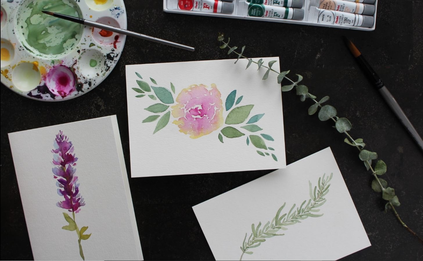
3. Materials: For today's class, he will need some materials. In this video, I will show you what you will need some tips to choose your tools wisely and fold I will use for the project. So what you will need for the sketching, our pencil and eraser and some sketch paper. For the nine out you only waterproof pants. And finally, for coloring, you will need watercolors, watercolor paper, brushes, a color palette, one or two glasses or mux, enter towel or tissues. I will go into detail later. But overall, be careful if you're using tools from the kitchen as colleagues can be poisonous for the same reason. Be careful one pets or children around. I myself, advocates and the ferret and I'm overly attentive if they are close around. Anyway, you don't need the most amazing and expensive materials, but some kind of quality would be great to enjoy the process and be more happy with the end result. Personally, I think it is important to look out for good price quality ratio. Therefore, our give you some tips, which helped me to find materials I'm happy with. So let's start with the paper. In my opinion, the right watercolor paper is the most important bonds, even with the cheapest and most chunky watercolors, you can still manage to color a beautiful illustration on good paper. While the other way around with not work. If the quality of the paper isn't good, there's a chance the paperwork girl, thus making it impossible to call on it properly. So what are the things to look out for when it comes down to choosing the right paper. These three things, thickness, cotton and texture. As from a thickness, it should be as thick as possible. Personally, I think 300 years M is ideal and I would recommend getting something around these measures. Furthermore, on the person cotton would be ideal. When it comes down to the texture of the three options, cold pressed or not pressed. And they are something also called rough textured paper. The letter is very uneven, hence the name cold press is this. As you can. You really can see the texture. Although there's not this unevenness, rough textured paper, It still feels a bit rough. As for hopeless paper like this, you can see that, that this very smooth and even when it comes down to choosing the texture that is totally based on preferences. However, I prefer to call press paper, since I experienced better control as to hot press paper. This is because the water's better absorbed by using the formula. When using the smooth hot press paper, the water will take longer to absorb. Hence, the water will be laying longer on the paper, which makes it more difficult to handle properly. However, there's an upside to using hot press paper as well. Because of this MOOC is much easier to sketch and do the liner on this paper. Thus, when you want to add more details into your illustration, you should consider using HathiTrust paper. Concerning the size of the paper. It simply depends on how large you want illustration to be. What I'm using is this watercolor PET by Artesia. It is 300 GSM and each paper has textured and the smooth side. Although I don't think it's a 100% cotton, I do think there's pretty good enough verbal paper. Let's talk about the watercolors. Honestly, if it's not one from the dollar store, everything is fine for a beginner. Or if you're not sure about investing and watercolors, you can always get higher quality paint later on. If you are unsure which brand or set you would like to have, you can look out for samples or you can do with eyelids by one or two health plans from different brands. Try them out and compare. However, be aware that not only the brands different quality, but there can be a difference in quality within the same brand as well. As for this project, I'm using the white knight Set of St. Petersburg, which consists out of 12 whole pens. I was very pleased with the price quality ratio. However, for me personally, I'm not supportive to light blue color as it is less pigment than, than the rest of. And so that's it about colors. The next things you will need a brushes. Again, you can try out one or two pressures from a brand or serious before you buy a whole set. In general, the most important thing when it comes down to brushes is how much water can hold and how even the brush releases to Walter on the paper. The more water it can hold anymore, even it releases the water to better. Which size you should use depends on the size of the paper or your illustration. This is difficult to generalize. As for me, what I am using most of the time around brushes and size 24 of the vinci, the serious nova. I used them for illustrations that easily on an A5 sized paper. Although size 24 are fine. If you are planning to make use of a lot of details, say C rho would be better. However, when I want to cover the whole paper evenly with a base color, I use my biggest crush, the number two, quail brush off the vinci, the series particularly peer. Thus, if you're planning to make an illustration on an A5 size paper, just like me, I would highly recommend these brushes from the vinci. However, if you think that eventually Nova brushes are to pricing the brushes of the series fit of the vinci are good alternative. I use these brushes when I start off with water coloring. The reason that they switched to the Nova series, that the hairs of the brushes started to lose more and more overtime. However, you can surely use these precious a fair amount of time before this happens. Although the quality of the watercolors, paper, and the brushes are pretty important regarding the rest of them and theorems, anything will do. Just make sure you have a pencil and eraser and sketch paper you're comfortable with for the sketching. As from liner, you will need waterproof pants. Again, when it comes down to choosing the right size, depends on the size of your illustration and how thick you want your lines to be. What I am using most of the time, our science is 0.3.5 and blank for small details. However, I like to use 0.1. Although in today's class, I'm using black pens for the liner. You can use color pens as well. If you want to have a softer online, you can even use color pencils or watercolor pencils. As watercolor pencils do dissolve with water, that can give a very interesting soft look. However, I would recommend experimenting with the lineup later. Furthermore, you will need one or two max or something to food, water, and clean your brushes. I used to max, like I know many other watercolor altruists, due to. The reason for this is that the Walton, the first mark gets 30 pretty fast. This will be problematic if you call them off light colors like yellow. Therefore, a second muck with clean water is quite handy. So what I'm doing is cleaning my brushes and the first mark. And when any clean water I can use the second map. Besides a color palettes of something like plate would be great to mix a collars on and make them ready for coloring. I also recommend having a novel or tissue around to dry a brush. Hotter, drier paper if there's too much water on it. A lot of information. So here again, the list of what you will need. Make sure you have everything before you start off the class project. And again, if you have some questions, you can always ask me. Just put a question down in the discussion. Now let's get ready for the next lesson. Finding inspiration.
4. Finding Inspiration: Hi again. Now we can start with the process. The first thing you have to do is come up with ninth year for your character. You can find inspiration by looking at pictures of Pinterests, Google, or other sources. Besides, you can make pictures on your own of things that inspire you. Just to be clear, I don't mean tracing or copying out, especially now, move out crediting the original Owltest. What I mean, look at all the odds and find what makes you happy and wanted draw something that fuels your imagination to get my creativity going, I love to use Pinterest, where I have multiple balls of hairstyles, poses, fashion, et cetera. One bolt is even filled with cute pictures of food and drinks. For example, this illustration is inspired by bottles of strawberry and banana milk. So you see everything can be used as an inspiration. For the new illustration that I am about to draw. I already had some idea of girl with thinker. I search for hairstyles that I liked and for an outfit I wanted to use. Furthermore, I wasn't sure which scholars have wanted to use with being. And therefore, I searched for color palettes and look good with it. I start with the sketching when event in not reference pictures on my board. So if you want to follow along, make sure you've found your inspiration and have some idea for your character. Don't forget the reference pictures because it helps a lot. In the next lesson, we will start sketching and I will tell you some more about reference interest.
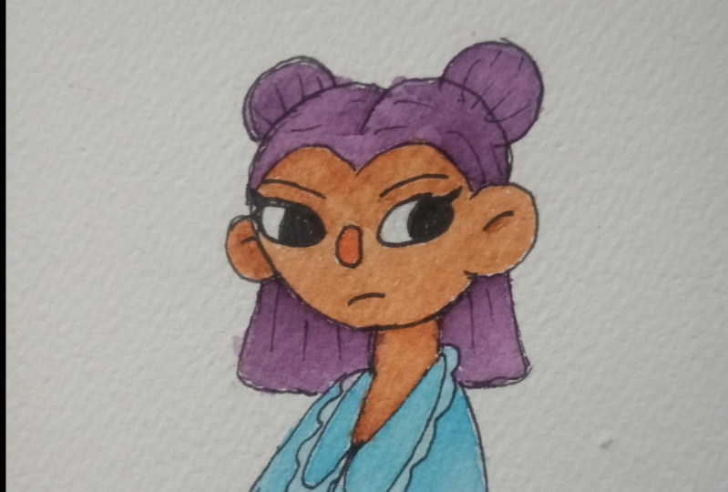
5. Sketching: Now let me have found inspiration. We can start sketching and develop the idea of or character even further. Before we will make the final sketch, we will do some quick sketches first. But you will need for this class is some paper for the quick sketches. And of course a pencil and Teresa, for final sketch, you will need watercolor paper. You can see how I sketched out some quick ideas, tried different poses and outfits until I found something I am happy with. Personally, I always to define a sketch and multicolor paper. However, you can also do it. The normal pair prefers and trace a later on watercolor paper by using a light box or window. When you sketch out your character solve of simple shapes and feel free to experiment with different poses and body of face features to make acute character. Keep in mind in general, and the hat is bigger in comparison with the rest of the body. Furthermore, the eyes should be big and placed in the middle of the head. Thus, only the face. Sizes of the mouth and nose can be very small, and the nose should be about the same height as the ears. Although these are the basic words to create a cute character, you can still play around with the features. It's important to find your own style and something you are happy with. I myself after tendency to make my characters very simple. But you can add as many details and extra ESRI like. If you have trouble with drawing poses, you can use references or make your own pictures. For example, when I have trouble finding the right Bruce, part of the do some poses for me. But thereby I can move his body the way I like until I find the perfect posts. I am very thankful for that. And if you can find someone that is willing to do that for you, you are very lucky. So far you have learned to find inspiration, make with use of references and scheduled some ideas. Besides, keep in mind the basic rules that makes the character cute. Before we start with the next step, make sure your sketches on watercolor paper. The next step will be the line art.
6. Line Art: Hey, great to see you back to this point. If you've followed along, you will have your final sketch on multiple a paper. In this lesson, we will do the line not for this, you will need your sketch, waterproof pants, and an eraser. It should be noted that this step is especially variable as there are so many materials that you can use for outlining. You can use waterproof pants and black as I do, or even a lot. And for softer look, you can even use watercolor pencils or call up pencils. Furthermore, you can even skip this step if you don't like outlining at all. Besides, it's also possible to do the step after you've done the coloring. In any case, I will show you what I do. However, I personally think that this step helps you a lot. If you want to make you illustration look more clean. But again, be creative and find what works best for you. Now, what I am using most of the time are the 0.3.5 might convince. And black. Sometimes I use 0.1 foot or background or other details. At this moment, I'm using 0.3 for the character and data, 0.1 for the flowers and butterflies and the background. In total, I'm going two times over the illustration. The first step is to trace the sketch lines. Thereby, if I see a mistake, I have the possibility to adjust it. Here after I'm erasing every bit of the pencil sketch. However, before you do this, it's important to make sure that the ink is dry to prevent smoking. I have to admit that I am very perfectionistic and both erasing and use even three different erases to make sure that every little bit of the pencil is gone. But you definitely do not have to do that. Now, I go over the second time. This is the interesting part of the line and I go over some lines to make some thoughts more thick. The fonts that I draw over again, other files were lines are meeting each other or in the middle of a curve. This makes it more than emic at some depth and makes the illustration in general look more interesting. Saas and some, first of all, use a waterproof pen to go over a first-time and traced sketch lines. Secondly, erase every bit of the pencil sketch. And finally, go over again a second time to add more dynamic and depth, thicker time. And if you're happy with your Leinhardt, we can solve the next step. Coloring.
7. Coloring: So far, if you follow it along, you will now have sketched out your idea and finished it with the line out. In this lesson, we will start with the coloring. Once you will need are your illustration. Watercolors, Russia's a color palette or something to mix a color on. One or two glasses or max, filled with clean water and a towel or tissues as well. Caliphs influence on your character's appearance and what kind of fielding all those get when they look at your character. If you want your character to look happy and warm, you can choose scholars like yellow or red. Keep it simple. A limiting your colors. Three to six are found. Again. Preferences can help you with choosing the right college. As I said earlier, I wanted to use pink for my character because being is a very feminine color and I wanted to embrace that and my character. Then I looked at color schemes on Pinterest infantum. I liked that, that violence in green Senate. If you look at the color wheel, then you see that while it is not far away from think, so these colors look always good together. However, we do not want to make look to barring. So something further away on the column we'll like green, will make it look more interesting as it gives more contrast and makes it pink and violent stand out even more. In addition, make sure you have mixed enough of your columns before you start coloring. Besides, check that the columns have enough Martha and the right tones. You can use some sketch paper or your tissues to swatch teal colors. Thereby you can even make some thumbnails, the illustration to decide where you want to put Which color. Keep in mind. In general, warm colors are more used to grab your attention. Therefore, they are more use some characters. What you want to highlight in your illustration, whereas cool colors are more used in backgrounds. This means for my illustration, our use pink and the two terms of violet or the character itself, and the green tones on backgrounds. When you have your corners ready, you can start with the first layer. As for me and cola, everything. And once before I do the shading, sometimes if a colored section dark enough in comparison to the surrounding sections, I add one or more layers. Most of the time, I'm using the wet and dry technique, which is using your webcam on Thrive paper. However, sometimes I'm using the wet on wet technique, which is making the paper wet before coloring. This makes it easier to evenly color in the big part. Therefore, this technique is quite useful for backgrounds. Although watercolor dries pretty fast depending on how much water you use, it's still can take some time. You should be aware of this when you start coloring in the section which connects to a wet part to prevent the colors bleeding into. If you don't feel like waiting, you might as well start coloring in the section which does not connect to a wet part. Although in the beginning it may be difficult to get a feel on how much water you should use and how fast this drying off the wire you will get used to it and it comes natural. If you want to speed up the process, you can use a hairdryer to make it run faster. So what did we learn in this lesson? First of all, it is important to choose the right cause. Besides, you can use references for health. Secondly, color in the first layer, but make sure you call us already before you start. Next, you can use the wet or dry technique or the wet on wet technique for your character or background. And finally, if you are coloring every section, be careful and make sure you call us and try to prevent bleeding. After coloring in the first layer, we can do the next layers. The next lesson is about shading.
8. Shading: Now that we call it in the first layer, we can start with the shading. The shading, I mean, adding shadows to illustration to create more depth. I will show you how to do this by adding a second and the third layer. You will need the same materials in the previous lesson. First, you have to choose where the light comes from. Naturally, the light would come from the sun from a certain angle. However, if you have a different light source like a fire or light bulb, it will come from that direction. Of course. You can choose if you'd like to share those to be more on the left or right side, but keep it consistent. What I like to do in general, to make the bunny look mom around. This, adding light shadows both sides on the edges of some parts of the body to the shading where this logical to have shadows like underclothes. If, for example, you don't feel comfortable because of this your first time, you can slow easy by adding one layer at a time. When the layer is dry, you can add another. By repeating this, the shadow gets darker and darker. You decide when it is dark enough. At least this technique helped me to be more and more comfortable with shading. For some time, I hardly did any shading. This may illustrations look flat. And this was the reason I started to experiment with shading. Eventually, I was surprised for the effects of the shadows. Since I started shading, my illustrations are looking way more interesting and lively. Nevertheless, the colors are useful to shadings, or the same colors are used for the first layer and the precariousness. The only thing that they did to make it darker is adding more of the same color to the color of it. This way you add more pigments to the color, thus making a darker. Another option is to add a little bit of a contrast in color. However, be very careful with this option, as the color can change very quickly. When you've finished a second layer. In other words, the first shading layer, you can solve, making the color even darker. Although you can use both mentioned options, I would recommend you use a contrasting color and order to make the color even darker. This gives you an illustration, that little extra, which makes it look more interesting bakery thing. More depth has in comparison with the first option. Thus, for the first shading layer, you can use either one of the options. And for the second shading layer, I highly recommend the second option. In general, the second layer of shading is for places like Jen on the clothes and for some edges. And some shading is important to give your illustration more depth and therefore to make it look more interesting. You can do the shading by adding a second and the third layer of watercolors. Depending on how you want your shadows to be. To make your colors darker, you can add more pigments or at the contrasting color. Shading was the last step of the process. So after you finish of shading, your illustration should be complete. Let's wrap this class up in the next video.
9. Conclusion: Well done, you made it. If you followed every step, you should have finished your illustration of your own cute character. If you still have to start with the class project, You have now learned everything you need to create your illustration. To sum it up. First of all, you have learned about the materials that you can use and how to choose the right tools. Secondly, by now, you know how to find inspiration and how to sketch down your idea. Besides, you have gained an understanding about the basic rules that make a character queued and how references can help you to improve your sketch. Furthermore, you've learned double-blind out how to make your illustration of more dynamic and how to make it look more clean. Following, you have acquired knowledge to color in your illustration by using the Web on dry or wet, on wet technique. And finally, you've learned to shape illustration. To put it simply, you have learned how you can create a watercolor illustration with your own cute character in just a few simple steps. Anyway, I would love to see a final illustration. So please upload your project that protects Gallery on the class page. Fear free to marry. Good luck if you want to share it on Instagram. And of course, if you have any questions about any step of the process or have some trouble, let me know in the discussion and I will be happy to help you. Please let me know if you enjoyed the class and want to know more. I will depreciate your honest feedback as a lacked improve a review with tips and tops would be great and says, well my first class and I would love to do more. So if there's something you want to know a C in the future, please let me know. If you want to stay updated, feel free to follow me. Anyway. Thank you for taking this class. And hopefully on the next time.
 Mary D