Transcripts
1. Intro: Let's bring another layer of dimension to
your digital art. As an artist, working
digitally can be a dream. I know I personally have
found great freedom and flexibility with my art since I started
drawing in Procreate, and I'm sure many of
you feel the same. But I have to admit that
I do occasionally miss the tactile joys of
working with paper. There's just something
magical about transforming a blank sheet of paper into something new and
uniquely yours. In this class, we're
going to bring a bit of that magic into our world
of digital drawing. Hi, my name is Gia Graham, and I'm a professional
illustrator, hand lettering artist, and top teacher
here on Skillshare. I'm super excited for us to explore and play with
paper in this class. First, I'm going to guide you through the process of drawing this whimsical greenhouse
illustration in Procreate. Then we're going
to crossover from digital art to analog art. I'll show you how to make the
illustration literally pop off the page by incorporating
cut paper details. I will walk you
through the sketching and planning process. I'll share a few tips on
cutting and assembling the paper shapes and then we will put it all together
to create a beautiful, hand-crafted piece of artwork
with detail and dimension. This class is ideal for
digital artists who want to experiment with more
tactile techniques, but you don't need to
be a digital artist to enjoy the class. If you paint or illustrate
with traditional mediums, you can still explore
this fun way of adding another layer of
dimension to your work. Whether you simply want to
create something beautiful to display in your home or
to give to a friend, or whether you're a
digital artist looking for new ways to express
your creativity, these crossover techniques will hopefully help you step out of your comfort zone and into a whole new dimensional world. I'm super excited for
us to get started. I'll see you in class.
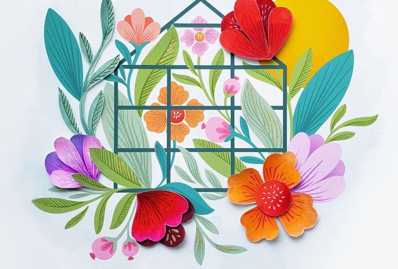
2. Project & Supplies: Our project for this
class will be to create this whimsical greenhouse
illustration by combining either digital or
traditional illustration with cut paper techniques. When you've completed
the project, be sure to take a photo
of your final piece and upload that photo
to the project gallery. Scroll down below
the class video and go to the Projects
and Resources tab. Then click on the
"Class Project" button, name your project. Upload as many images as
you would like by clicking the image icon here where
it says Add More Content. You can also type notes or ask questions within
the project area, and don't forget to
upload a cover image because that's what will
appear in the gallery view. If you have any
questions for me, you can type them here
in the discussion area. For the digital
portion of the class, I will be using an iPad Pro, the Apple pencil, and the
newest version of Procreate, which at the time of
recording is version 5.2. Of course, you're
welcome to use whichever drawing app you feel
most comfortable with. If you don't draw digitally, you can also draw the base
illustration on paper. Now here are the analog supplies I'm going to be using
throughout the class. Keep in mind that
you do not need to use these exact supplies. You can use whatever you have at home or what you're
more comfortable with. But if you want to use
exactly what I'm using, I will include a full
materials list in the Resources section along with links for where I
purchased everything. You'll need paper to draw on. I'm using this Strathmore
300 series drawing paper. This particular pad is
nine inches by 12 inches, which is the perfect size for
this project we're doing. But of course, if you
have a larger size pad, we can always cut the
paper down as needed. Now I really liked the
weight of this paper. It's 70 pounds, which is perfect because it's thin enough
that it will cut easily. But it's also sturdy
enough to handle the marker pigment without
the ink bleeding through. If you don't already have
a similar sketchpad, a light to medium
weight craft paper, or even a really good quality
copy paper can also work. Just keep in mind that you
don't want the paper to be too thick or too flimsy. For sketching, you're
going to need a pencil. Now you don't need
a fancy art pencil, in fact irregular HB pencil would be best because you don't want the lead to be too soft
and too easy to smudge. I'm going to be using this
Rotring Mechanical Pencil just because it's my everyday go-to pencil that I use
for scribbling notes. It's nice to not
have to worry about constantly sharpening the lead. Now these are both
the same pencil, but you'll notice this
black grip on it. The pencil comes with
a textured grip area. But when I'm writing
for a long time, I prefer just to add this rubberized grip because it's a little more
comfortable for me. Along with your favorite pencil, you'll also want to grab
your favorite eraser. Mine is just a basic Staedtler
Mars Plastic eraser. For color, you can use whatever
medium suits you best. I'll be using these
Tombow Dual Brush Pens, which have a flexible brush tip on one end for filling
large areas of color and they have a bullet tip on the
other side for details. I'm also going to use this
colorless blender from Tombow, which has no ink on either
the brush tip or on the bullet tip and it's just going to be used for
blending colors. Now these are not
at all essential, but I'll be using a couple of Posca Paint Pens during
the class as well, one in white and one in gold. Both of these have
an extra fine point. Now of course, you do not
need to go out and buy Tombow Brush Pens or Posca Paint Pens in order
to take this class. As I mentioned before, use whatever you feel
most comfortable with or whatever you already
have handy at home. You can add color to your
piece using colored pencils, craft paint, watercolor paint, or even everyday
classroom markers. For cutting, you're
going to need a knife. Some may call it a hobby knife, a craft knife, or a scalpel. I'm using an X-Acto
knife just because it's been my go-to
brands since college, but there's several
other brands out there. This particular one
is the X-Acto X-3000, which is my favorite
because the barrel is rubberized and it has a
little bit of a curve to it, so it makes for a really
comfortable no-slip grip. This particular one has a
handy compartment at the back of it where you can store
up to five extra blades. Speaking of extra blades, having a box of extra
blades is a handy bonus. These are size 11. It's also helpful to have
a small jar or container nearby to safely store your
dull or broken blades. I just keep mine in
this used jelly jar. If you don't have a knife or you're not comfortable
using one, you can also cut with the
scissors if you prefer. Just to know that it would be a little bit
challenging to get into really small spaces and cut fine details with a
standard scissors. If you have a small detail
scissors similar to this one, that would be ideal just
because you'll be able to get into tight spaces with
the smaller scissors. Another option is this Fiskars micro-tip
easy action shears. I really liked using this. It also has a nice pointy tip, just like the detail scissors. But for some reason I find
it a little bit easier to maneuver this one around
corners and so on. Again, this is not essential, but if you already
have one handy, this is a great option
as well for cutting. If you'll be cutting
with a knife, you'll need a good
surface to cut on. A self-healing cutting
mat would be ideal. Not only does the cutting
mat stay nice and smooth and resist the nicks and scrapes that the
knife will create, It also helps you cut
more smoothly and safely because it creates a bit of padding under the knife. Another bonus is that it
helps extend the life of your blades since they won't be scraping against a hard surface. If you don't have a
self-healing cutting mat, a sturdy cardboard
sheet could also work. This would be the thing that
you would get packaged to keep a calendar sturdy or a
poster sturdy in the mail. If you have one of
those lying around, you can try that. Or even one of those smooth plastic kitchen cutting boards could be a sufficient
alternative. It's not ideal, but
it would be better than cutting directly
on your table. You're also going to
need a good ruler, ideally 12 inches or longer. I prefer using a
metal ruler with a cork backing because it doesn't slide around
when you're using it. I will be using two types
of tape during the class. First is this
double-sided foam tape. Now the reason why I'll
be using foam tape instead of a flat
tape or even glue, is because we want to
maintain some separation between the layers when we assemble the cut
paper elements. This little tiny bit of thickness is going to
give us the look we want. As you can see, there's
a background layer on one side of the tape
and once you peel that, both sides are sticky. Although not essential, it
would be helpful to have a basic low-tech tape to hold your paper in place during
some of the lessons. I'm using this
artist masking tape. But if you don't
have that on hand, any low-tech craft tape or even washi tape
will do the trick. To display my final piece, I will be using this
10-inch square shadow box. The reason why I chose
a shadow box instead of a regular frame is because the cut paper elements will
add dimension to the art. I don't want that effect to be flattened by the glass
of a regular frame. Another option is
that you can use a regular frame
without the glass, just keep in mind that the art won't be protected from dust. Again, I will leave a
complete list of supplies for you in the Resources
section, which by the way, will be easiest to
access if you're viewing the class on a browser versus
on the Skillshare app. Now, let's start sketching. I'll see you in the next lesson.
3. Digital Sketch: As I mentioned in
the last lesson, we'll be using a 10-inch
square shadow box to display the artwork. I'm going to first create
a canvas at that size, tap the Plus Sign, and again here where
it says New Canvas. I need to select Inches for
the unit of measurement. Then enter 10 for the width, as well as for the height. If you plan to use a frame or display box in a different size, you'll need to set the size
of your canvas accordingly. Whenever possible, I like
to keep the resolution at 300 DPI to ensure
good quality. Here you have my maximum
layers with a file this size. Now if you have a smaller
iPad or an older iPad, you may notice that
you have fewer layers. On my smaller iPad, for example, this size document has a
layer limit of 55 layers, which will still be more
than enough to work with. If your device has a much
smaller layer limit, one way to work
around that is to reduce the file resolution. Now if I change that
from 300 to 250 DPI, as you can see, my layer
limit has increased. If I were to change
that to a 150 DPI, it goes up substantially more. Now, I would not recommend
going any lower than 150 DPI because you'll start to notice the drop in quality
when the file is printed. I'm going to change that back to 300 and then I'll hit Create. Now we're going
to set our canvas guides to a specific size. Go to the Actions menu, then select Canvas, Drawing Guide, and hit the toggle button to turn
on your Drawing guide. Now we're going to adjust
the grid size so that it's 10 squares across
by 10 squares tall. To do that, just hit
Edit Drawing Guide, and here where it
says grid size, just increase that until
you get to the right size. Let's see, one,
two, three, four, five, six, seven,
eight, nine, 10. That's 10 across and 10 down. Our canvas size is 10
inches by 10 inches, and our grid is 10
squares by 10 squares. Essentially, our grid is acting as a ruler because we know that each square is one inch
wide and one inch tall. That's going to come in handy as we work through the project. Now let's sketch the central
focus of the illustration, which is going to
be the greenhouse. Right away we're going to
start relying on our grid. Find the center of the canvas, which will be five squares
across by five squares down. Just put a little dot
there to mark that spot. Now on another part
of the canvas, create a rectangle which will be four squares wide by
three squares tall. That's four wide, three tall. Now select that rectangle and move it so it's
centered on the canvas. You can use your dot as a guide. You see this marks
the center point on the vertical axis and
this little blue dot marks the center point
on the horizontal axis. You can just align those up so that they
align with your dot. That way you'll know
that your rectangle is exactly at the center
point of your canvas. The peak of the
greenhouse roof will be two squares down from
the top of the canvas. Align with the center of your rectangle and
mark two squares down and then just draw two diagonal lines to connect
that to your rectangle. Now we're going to draw
some vertical lines to create panes in
the greenhouse and a really quick and easy way
to make sure that they're evenly spaced is to
use the symmetry tool. Go back to the Actions menu
and hit Edit Drawing Guide, and then choose Symmetry. You'll see instead of the grid, you just have one guide down
the center of your canvas. If you look on that layer, you'll see that it says Assisted so you know that
drawing assist is on. With the symmetry tool on, we can just draw
one line vertically and it will be mirrored and
we know that they will be evenly spaced from the
edges of our greenhouse. Now let's switch back
to our 2D grid guides. I'm just going to
finish my greenhouse by creating a couple of
horizontal lines. I'm actually going to extend these vertical
lines here as well. There we have a simple
greenhouse and next, we're going to add some florals. The florals in this
illustration will be relatively free form but
I want to make sure that everything is well
balanced and that no elements are going too far in one direction
or the other. In order to do
that, I'm going to create a border for myself. I'm going to create a new layer. I'm going to make
a border that is two squares from the top and two squares from the
bottom of my canvas and about one square
from each side. Since this is just a guide, I'm going to reduce the
opacity on that layer. Now I can just create a
new layer and I can start filling in and around my greenhouse with
leaves and flowers. The key to making the cut paper
part of this project work well is to use simple shapes
when drawing your florals. If you're new to drawing flowers or you don't have much practice with using simplified shapes
for your flower drawings, I highly recommend
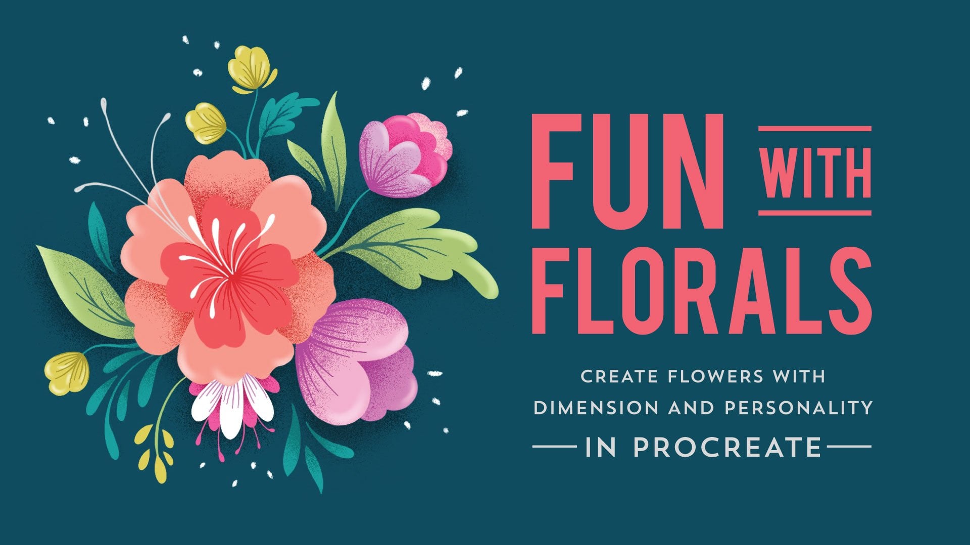
that you take or revisit my Fun With
Florals class. There's even a handy shapes guide in the PDF
guide for that class, which might help
spark a few ideas. Remember that we want this
to feel dense and layered so feel free to have some
shapes overlap others. Here's my final sketch. Up next, we're going to
make a plan for how to incorporate the cut
paper elements. I'll see you in the next lesson.
4. Cut Paper Plan: Remember, we want
the final piece to look layered and dimensional. Rather than just having
the greenhouse sit on top of the
leaves and florals, I wanted to bring some of the flowers and leaves
to the foreground. I did this simply
by removing some of the lines on the greenhouse. For example, I removed this
line here so that it looks as though this leaf has wound its way to the
front of the structure. As you can see I've also done it here and with this leaf as well, and with this one
towards the bottom. So with your illustration, see if you can find a
few places where you can bring the leaves or
flowers to the front. The next step is to
decide which part of the illustration will be
made out of cut paper. First, reduce the
opacity on your sketch, then create a new layer. For the sake of organization, I'm going to name
this layer cut paper. Now, think about which
elements you want to pop off the page as cut paper pieces and trace those on
this new layer. On my illustration, I think this flower is a
good place to start. It overlaps this flower
so when it's made of cut paper it will really
add to the layered look. I'm just going to trace
that on my cut paper layer. Now your trace doesn't
have to be perfect. This is just for the
sake of planning. This flower at the top
is also a good choice since it's already
overlapping the greenhouse, it makes sense to have a cut paper flower there
pop into the foreground. I'll trace that one as well. Since these leaves
on the left are all attached to the central stem, that could be one cutout, so I'm going to trace
that one as well. I think I'll round it out with
this flower and this one. Now a couple of things
to consider when you're making your cut paper plan. Depending on the layout
of your illustration, I would suggest choosing no more than five
or six elements to create out of cut paper. Also makes sure the position of your cut paper elements
feels balanced on the page. Try not to have too many cut paper pieces clustered
on one side or another. Ideally, you'll want them to be evenly spaced
around the artwork. As I mentioned in
the last lesson, the key to making the
cut paper part of this project work well
is to use simple shapes. You'll want to make sure the flowers and the
leaves that you've chosen will be easy to
cut and easy to assemble. I'm just going to think
through how I'm going to layer these flowers when
I cut them out. For this one, I feel as though these three petals make
sense to be a top layer, while these two petals
would be a bottom layer. I'm just going to map that out. That will be the layer behind, it actually makes
sense for me to drag this behind the sketch
so that I can see what I'm doing and these three can be grouped
together as a top layer. The pink would be a
bottom layer of paper, and the red would be
a top layer of paper. For this big flower, it
makes the most sense for these petals
to be one layer of paper and then the
center circle can be stuck on top of that
as the second layer. In my planning here, pink will indicate the
bottom layer of paper, and red will indicate
the top layer of paper. Here, this little
section of the flower makes sense to be a bottom layer while these are a top layer. This is essentially the
same shape as this. The leaves will just
be one layer of paper. If I just remove my sketch, I see where my
bottom layers are, which are the light pink and
the shapes of my top layers. I'm just going to make quick
note of that so that I can refer to it once
I start cutting. The last part of
this planning phase is to measure each element so that we have a size reference for when we sketch
these on paper. I'm going to hide my full sketch and my
notes on the shapes, turn back on my cut paper layer, and then I'm actually going to duplicate that cut paper layer. I'm also going to
rename it Measurements. Then I'll turn off
that cut paper layer. So what I'm going to do
is I'm going to select an element and move it so that it aligns with a vertical
and a horizontal grid line. Now I'm going to just use
the grid as a ruler to approximate the measurements
of each cut paper element. So this is one square, maybe one-and-a-half
squares wide and about one-and-a-half
squares tall. Which of course means
it's about an inch and a half wide and an
inch and a half tall. I'll just go through and do the same with all the other pieces. Now we have a plan. I know what size each of my cut paper
elements needs to be and I also know what
shapes I'm going to use to build each of these
flowers out of paper. In the next lesson,
we're going to finish the digital part of
the illustration.
5. Digital Color: Now that we know which parts of the artwork are going to
be made out of cut paper, we can finish the digital
illustration with that in mind. Here's my layer with
the full sketch and, this is where I traced
the cut paper elements. Since I don't want the
cut paper parts to be included in my final
digital illustration, I'm going to remove
them from the sketch, but I don't want to accidentally
erase the wrong thing. Here's how I'm going to
avoid making any mistakes. On my cut paper layer, I'm going to turn
on Alpha lock and, I'm going to change those
elements to a bright color. It doesn't matter
what color you choose as long as it will stand out. With that color chosen, I will go in and tap fill layer. Then I'm going to drag that cut paper layer below
the full sketch layer. I'll turn the opacity back
up on the sketch layer. Now make sure you
have the sketch layer highlighted because we're going to be working on that layer. Select the Eraser tool
and start erasing everything that has
a colored duplicate. Wherever I see purple, I'm going to erase the
corresponding black sketch lines. I'm just going to
make sure to only erase those areas and
nothing else surrounding. Now, I have one layer with the cut paper
elements in color. I have another layer with the cut paper elements
completely erased. Now, what I'll do is create
a new layer and drag it below both the sketch
and cut paper layers. If you've taken any of my
other digital art classes, you'll know that I like
to do a quick color test. I have a solid plan
before I start inking. That's what I'm going to
do on this new layer. Before I start playing
with the colors, let me reduce the opacity on both my sketch layers so that they don't become
too distracting. Now, on my Color Test layer, I'm just going to go through and start adding some rough color. The goal here is to make
sure the colors work well together and that
they're evenly spaced, and you don't have too many of the same color
clustered in one area. There's one other thing to consider when you're
choosing your colors. You'll want to make sure that
the colors you choose for the cut paper elements are colors that you already
have in your supplies, whether you're using markers, paints, or colored pencils. There's my rough color test. I quite like how these bright colors are
working together. I feel like
everything's balanced. I'm pleased with the placement. I'm going to take a screenshot, and I'll use this color test as a reference when
I start inking. Now I'm going to turn
off my color tests layer and turn off
the cut paper layer. What I have left is my sketch with the cut paper
element removed. Now, I can go to
the Actions menu, turn on my Reference window, tap "Image" and import that
screenshot that I just took. Now, create, a new layer, making sure it's at the top
of all of the sketch layers. I'm going to use the
mono-line brush for this and, I'm going to ink all
the leaves and flowers, making sure I leave the
greenhouse for last. As many of you
might already know. I prefer to start my
inking in black and, I also ink on separate
layers based on color. First, I'm going to ink all the bright green leaves and stems together on one layer. Then I can use Alpha lock to easily change the color of
everything on that layer. Now, create a new layer and move on to another set of leaves. Then you'll just follow
the same process for all the leaves. Once you've got the
leaf shapes inked, you can go back in and add a few line details to
stylize them a bit. Before I do this, I'm
going to turn off my drawing guide because it's getting a
little distracting. I'm going to start with these
bright green leaves and, I'm going to use
a clipping mask. I've got that layer selected. I'm going to add a new layer, tap on that, and tap
on clipping mask. I've already selected a
darker shade of green. I'll just go in and
add a few lines. With the clipping mask, whatever details
you draw will be confined to the leaf shape. You don't have to worry about
drawing outside the lines. For the flowers, follow
the same process I taught in my fun
with florals class. Draw the top layer
the bottom layer, and then add shading for
dimension where necessary. Now, this process means that each flower will be
made of several layers. If you're not sure
of how to create layer groups or how to
organize your layers, be sure to check out
lesson 7 of the Fun with Florals class where I demonstrate how to
manage your layers. I've got almost everything
inked and my layers are all nice and organized and
sorted in layer groups. Now I'm going to move my
sketch up to the top of the list and I'm going to turn
back on my drawing guide. Now it's time to
add the greenhouse. First, create a
new layer and make sure it's on top
of all the others. Choose the color you want
to use for your greenhouse. I'm going to go with
really dark green. I'm going to use the
monoline brush for this. Procreates quick shape feature
will come in really handy here to ensure that you're
drawing nice straight lines. Draw your line, hold, it will snap to straight, tap and it will snap to vertical or horizontal depending on what direction you're
drawing your line. You can just go through using that feature to complete
your greenhouse. Now when you're drawing
your diagonal lines, you can draw and hold, make sure that it's perfectly straight but it makes
more sense to just keep your pencil down and move your line manually to get
it to the right angle. If you try the tap method, it might give you an angle
that you don't want. I'm just going to turn
off my sketch layer and I can turn back
off my drawing guide. Now rather than erasing parts
of the greenhouse that I want to be behind the leaves like we
did with the sketch, what I'm going to do is use a layer mask to
hide those areas. Make sure your greenhouse
layer is selected, tap on it, and then
select "Mask". As you can see, another
layer appears above the greenhouse layer and
it's titled layer mask. I took a screenshot
of the final sketch, which I'm going to pull up in
my reference window so that I can remind myself of which
areas need to be hidden. First, let me reduce the opacity on the
greenhouse layer, that's going to make
it easier for me to see what's happening below it. When you tap on the
layer mask layer, your swatch should
automatically switch to black. Now I'm still using
the monoline brush, but I'm going to reduce
the size a little bit, making sure that the
layer mask is selected, meaning that it's in the dark blue versus the
greenhouse layer. With the layer mask selected, just go in and draw over
the areas you want to hide. As you can see here, this vertical line
is hidden and a little bit of the
horizontal lane here should be hidden as well. I know it looks like I'm erasing but if you look here
on the layer mask, you can see that I'm
actually drawing in black. If I turn off the layer mask, you can see that the
lines are still there. I'm just hiding
it with the mask. Go through and
identify all the areas where you want to remove
the greenhouse lines. When you've done
all your masking, you can go back in
and turn back up the opacity on that
greenhouse layer. As you can see, it's creating that look that we were
going for where some of the leaves and some
of the flowers are winding their way out
of the greenhouse. There's one final detail
that I would like to add. Since all of my colors are
pretty vibrant and bright, I want to add one
element of softness. I'm going to add a wash of
watercolor in the background. For this, I'm using the
everything watercolor brush set by Abby Uproot. The specific brush
I'm going to use is the AN Stain Smudger. I'm going to choose
a pretty light blue. I'm going to create
a new layer and drag it to the
bottom of my stack. I'm just going to test
my brush size here. That's way smaller
than I want it to be. I'm going to increase that
size, almost do a 100. Let's try around 67,68 percent. Like I said, I'm
just going to add a nice light wash of color
behind the illustration. It's pretty light. I hope you can see it on camera. I'll just give a little extra
detail on the final print. I'm not sure if you can see it, but it's a nice subtle
bit of texture in the background that I
think works really well with the rest of the
vibrant illustration. The digital part of the
artwork is now complete. I'm going to export
it as a JPEG. I'm going to AirDrop
it to my Mac so that I can go ahead
and get it printed. If you have access
to a color printer, go ahead and print
your illustration. If you don't have a
color printer at home, which is the case for me, there are lots of online
photo printing sites where you can have
the artwork printed. My two-go site is MPIX
because their prints are reasonably priced
and they shape quickly. For this project rather than going with a typical
glossy print, I opted for a Giclee print on fine art photographic paper, which is a lovely map paper
with a textured finish. I ordered two prints, so I have a backup just in case the price for the
prince was under $20, then there was a shipping
cost and in a couple of days, the prints were
delivered to my door. Now that the digital part of
the artwork has been done, let's start working with paper. I'll see you in the next lesson.
6. Paper Sketch: Alright, now it's time to get these
leaves and flowers on paper. For this lesson, you'll
need drawing paper, a pencil, eraser, and ruler. If you have a cutting mat and low-tech artist's
tape or washy tape, those will also come in handy. The first thing we're going
to do is set up our grid. As you can see, my
cutting mat has a grid with
measurements in inches. I'm going to place my
paper so that it is aligned horizontally
as well as vertically. Doesn't really matter where you place it as long
as it's straight. Now you can go ahead and
secure it with tape. Just so it won't move around. The plan here is to
make the grid of one-inch squares on the
paper so we can use it as a guide when drawing
the leaves and flowers were basically mimicking
what we just did digitally. I'm just going to line up
my ruler with the grid. Basically just
fill the page with horizontal and vertical lines. Here's a quick tip.
You don't want to draw a heavy dark lines. Make sure your lines
are nice and light, so they'll be easy
to erase later. Now remember we want these
to be one inch squares. I'm only marking lines along the inch marks and I'm just ignoring these smaller
lines in between. If you don't have a
similar cutting mat, what you can do is you
can use your ruler to mark little dots
one inch apart. Starting from the
edge of your paper, just mark one inch increments
all along the top. Then do the same along
the bottom of the sheet. Then just join those dots
to create your lines. Then you're going
to do the same on the horizontal axis as well. Line up with the edge
of your paper and then draw your
incremental marks. There you have your grid.
Now we can start sketching. Now I can start drawing
the flower and leaf shapes using this
grid as a guide. Open up your digital sketch
for reference and re-create those sketches on
the cut paper layer onto the drawing paper. I'm going to start with
the stem and leaves, which was about
four inches tall, or four squares tall 2, 3, 4, and about 1.5 squares wide. I'm just going to mark that. I'm just going to use this
grid to guide me so that my pencil sketch is as close to my digital
sketch as possible. I can already tell that
I've made this curve too wide based on the
digital sketch, it should fall just
inside the first square. This first leaf
should come to about the halfway point on
the second square. I'll continue sketching using the grid as a
guide in this way. Make sure to add a little
thickness to the stem so it won't fall apart when
you cut it out of paper. Now keep in mind that
the flowers will each be built out of
more than one layer. We have to draw each
layer separately. Now with this flower, I'm going to make sure to leave a little space
between the petals because it's going to
be made of two layers. I want the color from that back layer to show
through a little bit here. Rather than joining
it right here, I'm going to open it up
and leave a little space. Now this is the red flower
that's going to be at the top right side of the
illustration that I'm making. As I mentioned before, this shape will
be the top layer. Then I've got to teardrop
shapes behind it, which will make
the bottom layer. I'm going to draw those two bottom layer petals separately. Here's a tip. You can use one of
the vertical lines as a center point to help you
draw the teardrop shapes. It might actually
be helpful to draw these a little bit wider
than you think you'll need them because it'll be much easier to trim them
down after the fact. Then end up with something
that's a little too small. Now I'm going to move on
to the lavender flower. It's essentially the
same shape as this one, just a little bit smaller. Next is the big coral flower. I'm going to just estimate the size of the
circle in the center. Again, it's better to draw it a little bigger than
you think you need. Then you can always trim
it down after the fact. That last red flower, which was approximately 1.5 inches tall by just
over an inch wide. Remember this flower
also has two layers. I'll first draw the first layer, which will be the top layer. I'm going to try that again. I actually think this
will be easier to draw if I change
the orientation. I'm going to turn my
digital sketch upside down. Thing about switching
from analog to digital is it reminds you to be
patient with yourself. It also reminds you that
sometimes things just take a few tries. That's my top layer. Let's see. My bottom layer is going
to be right around here. I'll draw that here. Just have to
guesstimate the size. Then when everything is cut out, we can adjust accordingly. That's why it's always better to go bigger than you
think you need. There all of my shapes. Now that everything is sketched, next, we're going to add color. I'll see you in the next lesson.
7. Analog Color: For this lesson,
you're going to need your color medium of choice. If you've decided to use
paints or colored pencils, go ahead and gather those now. As I mentioned
earlier in the class, I'll be using Tombow
dual brush pens. I love these markers
because they're available in many colors, the pigment is really vibrant, and they're water-based,
which makes them great for blending if
you want to mix colors. I've amassed quite a few
colors over the years, so I'm pretty sure I have colors that will
work with my piece. But to narrow it down
to the best options, I'm going to do a
quick swatch test. Create swatches of color
with the brush tip. Make note of the color number. Then write it above the
swatch using the bullet tip. With all the colors laid out, you can now decide which ones work best with
your illustration. Now back to the paper sketch. I'm going to start with
the stem and leaves, and I've pulled a
couple of greens. I've got a number 312 and number 177 for
some darker details, and I also have my colorless
blender handy as well. I will start with these leaves. With the brush tip of the pen, follow the center-line
of the stem and then double that to
give it some thickness. Remember, you'll be
cutting this out. You want the stem
to be thick enough to cut out without
falling apart. I will sometimes use the
blender pen to smooth out the areas where
my strokes overlap. After you blend, you'll
notice that the tip of your blender now has a
little bit of color on it. But the great thing
about these Tombow pens is that they're self-cleaning. Just scribble a little
bit on a clean side of your page and the remaining
ink will disappear. Remember to do this
before you use the blender pen to
blend another color. Now back to finishing
the leaves and the stem. Now just like we
added line details in the leaves of the
digital illustration, we can do that here as well. I'm going to use this darker green and using the bullet tip, I'll just go in and
add a few lines to bring a little bit more
interest to the leaves. For this red flower, I'm going to try a
subtle gradient. I'm going to use these three
slightly different reds, as well as the
colorless blender. I'm going to start at the tip of the petals with
the lightest red. Then I'm going to
work my way down to the darkest color blending
as I work my way down. Since I don't want my
ink to get too dry, I'm going to work on one
petal at a time rather than using one color on all three petals and then adding the second
color and so on. Don't forget to clean the
tip of your blender pen. There's the first red flower, at least the top layer
of the first red flower. The gradient is subtle, but I think it works well. Now the bottom layer will
be these two petals. Remember, they're going
to be peeking out behind these open areas here. I think it will work best if
they're in a darker color, so they'll stand out
against these reds. I'm going to use the
darkest of my three, so I'll use this darkest red. I've also pulled
this really dark, it's a maroon, almost a brown. It's color number 757, and I'll use that towards the bottom part of
the back petals. Same process here. Starting with the top
and the lightest color. I'm just going to color that in, and then add my darker
color and blend it. Now I want this back area to be pretty dark
so I'm going to push the dark color
up in my blending. So this whole petal
feels nice and dark in contrast to these. I'll do the same with this one. Again, when you're blending, you want to push the color in the direction you
want it to blend. If you want the darker
color to be more dominant, push it towards
the lighter color. Once the ink has completely dried on this first
set of petals, you can go in with a darker
color and add a few details, similar to what we did here. I'm going to use the
same color that I used towards the bottom
of these petals. I'm going to use the
bullet tip for this. Now onto the next flower. These are the colors
I'll be using for the lavender flower, and of course, I'll also
be using the blender pen. Again, I'm going to start with the lightest color at
the tips of the petals, and then blend my way down
to the darkest color. If you picked up too much of the dark color on the
tip of the blender, you can just clean
it off as you go. To these two petals
which will be the bottom layer of this flower, I'm using colors number 603, 665, and again, my
colorless blender. Now the thing to keep
in mind when you're blending a really rich, deep color like this is when
you start to push the color, it will want to completely
take over the lighter color. You just have to think
about how much of that deep rich color
you're going to add and how dark you want
your final outcome to be. Next, we're going to move on
to the second red flower. I'm going to add a little
pink to the blend. The reds will be a
number 845 and number 847 and I'm adding a
pink in number 725. Of course, I still have
my colorless blender. These will be the top layer of petals and this will
be the bottom layer. I'm going to add the pink to
the tips of the top layer. That way it should
really stand out if the bottom layer of
petals is a darker color. For this bottom petal, I'm going to bring back
that really deep maroon that I used on these petals. Rather than doing any blending, I'm just going to fill this
with this solid color. For the coral flower, the lightest color
on the tips of the petals will be number 873. Then I'm blending
down to 933 and then 905 and the darker colors will be towards the
center of the petals. Of course, still
using my blender. The center circle of
this coral flower, I'm going to use
colors 885 and 847. I'm just going to come
in with a darker color. A little shadow on one side. This is completely dry, I can go in and add
a few line details. I'm going to do the same here, but this time I'm going to use the brush tip rather
than the bullet tip. I'm just going to use
it really lightly to make some nice wispy lines. Now when all the ink
is completely dry, you can go in with
your eraser and just erase all of the pencil marks. Up next, we're going
to start cutting. I'll see you in the next lesson.
8. Paper Cuts: Let's start cutting. Grab your knife and your jar for blade disposal and
make sure you're working on a flat,
sturdy surface. For this project,
you probably won't need more than two
or three blades, but it's always a
good idea to have a pack of replacements on hand. When you're starting out and getting used to
cutting with a knife, it's really easy to apply too much pressure and break
the tip of the blade. Cutting with a broken tip or a dull blade can completely
ruin your experience, so be sure to keep
extra blades handy and don't hesitate to replace
them as often as you need. As I mentioned before, you can also cut with
a detailed scissors. Choose your preferred tool
and let's make our first cut. First, I'm going to unstick my sketch from the cutting mat, because I'll need
to move the paper around when I'm cutting. In case you're new to cutting
with an X-ACTO knife, I want to share a few tips. Hold your papers steady with one hand and get a comfortable
grip on your knife. You don't need to hold
it in death grip, but slightly relaxed so you
can maneuver it easily. Always pull the knife towards
you and you're cutting. This means you'll need
to move your paper around frequently to
get the best angle. Start at wide areas and work your way towards
narrower points. When you're cuts meat
at those narrow points, use the tip of your blade to pull those areas free as you go. That will make it easier to remove the piece when
you're done cutting, Remember to keep your
non-dominant hand at a safe distance
from the knife, so you don't accidentally
cut yourself. Now I know my fingers are
getting kind of close here, but I've been cutting with an
X-ACTO over over 20 years, and I've learned how
to cut carefully. Believe me, when I was
just starting out, I cut myself enough times to quickly learn to be cautious, so please remember to keep your fingers at a safe distance. You'll want to cut
as close to the edge of the colored area as possible, so you don't end up with too much white space around
your leaves and petals. As you can see,
some tiny areas of white along the edges
will be unavoidable. But if they're really small, they won't be very visible
in the final piece. Getting perfectly
round cuts with an X-ACTO can be tricky. Once you've cut out your shape, you can always use a scissors
to even out the curves. Sometimes you also have
to cut in sections, but it can be difficult
to see where you are. You can just lift it up
slightly and then you can see where you need
to pick backup. Sometimes you'll think you've cut all the way around a shape, but it's still attached
in a tiny spot. When this happens,
do not pull it free, because you don't want to
risk ripping the paper. Just go back in and
cut that area free. Again, if the edges
a little uneven, you can use your scissors
to round it out. Go ahead and continue cutting until all your
shapes are cut out. Once everything is cut out, now you can position your layers to see what the
final flowers will look like. If something is not quite working
the way you hoped, make whatever adjustments
you need by cutting down, reshaping or completely
recreating that one element. These back petals are
definitely too big. You can see how they come out the bottom side of this flower, so I'm going to trim
this down quite a bit. You'll notice I'm trimming off the top rather than the bottom
and that's because I want this color to show
through between the petals. Now, get your printed
illustration. I'm going to test
the placement of the cut flowers onto the
printed illustration. Once your composition
is finalized and the cut paper pieces
are ready to go, now we can move on to adding
the finishing touches, and we'll do that
in the next lesson.
9. Finishing Touches: Now let's finalize this piece. For this lesson, you'll
need a shadow box or some other type
of display system that won't flatten your artwork. You'll also need your scissors, or in this case, I'm
using the shears. Your cutting knife. You'll need your
double-sided foam tape. This is completely optional, but I will be using a couple
of Posca paint pens as well, one in gold and one in white. In case you're not familiar with Posca paint pens, they're
pretty fantastic. They're water-based,
so they're non-toxic. You can use these markers
on just about any surface; rocks, glass, plastic,
wood, anything. They're a great option to have in your stash of art supplies. Everything is positioned
and I really like how everything is
coming together so far. But before sticking the
cut paper pieces in place, I want to add one
additional bit of detail. That's where the Posca
pens are going to come in because I'm going to use these pens to add a few white and gold
details throughout. I don't have a
defined plan here. I'm just going to go in and add a few gold lines on both the print and a few of
the cut paper pieces as well. I can do the same with
the white as well. I want to add a few
gold details here, but I think it's going
to sink into this ink. What I'm going to do is
make white marks first, and then add the gold on top of that so it stands out
a little bit better. Now the other thing I want to do is add a little dimension to the printed
illustration as well. Now remember, we
brought some leaves in front of the
greenhouse structure. Well, I want to make
those feel even more dimensional by lifting
them off the page. What I'm going to do
here is I'm going to cut an outline of the part of the leaf that falls in front of the
greenhouse structure. You're going to want to
make sure you have a nice, fresh, really sharp
blade for this, especially if your print is on a relatively
thick piece of paper. Go slowly, take
your time so they make sure your cut is
as precise as possible. I'm going to start
with this leaf and just cut out this area. I'm just going to cut to
that part of the greenhouse. Now I can just hold
it up and push up from the bottom until it
pops out a little bit. I had initially planned to place this lavender flower here, but I think it would
be nice to have it nestled between
these two leaves. I'm going to do the same with
this leaf and this leaf, where I will cut around it so that I can lift it
off the paper a little. This first leaf, I'm not
going to cut the whole thing. I'm just going to cut two right there where the
greenhouse starts. Again, once you make that cut, hold the print up and press
gently until it pops out. I'm going to do the same
thing with this leaf as well. I'm going to stop
right there because I don't want it to come to too finite area because we don't want it to
accidentally rip off the print. Now, when I'm putting
this together, I can nestle this flower
between these two leaves. I think I'll do it in
a couple more areas. I can do it with this leaf that's coming in front as well. I'll set those aside again. The same with this big leaf. As you can see, we've got some shimmering gold
details on the print and some parts are cut out and creating a little bit
of added dimension. Now we're all set to start
sticking everything in place. First, I'm going to
assemble the flower layers. I'm going to put this out
of my way for a minute, and we're going to start
sticking leaves together. First, let's start with one of the easiest flowers because
we're just going to be sticking this onto this
fairly straightforward. You're going to want to
grab your foam tape, and you're just
going to cut a piece of foam tape to
the size you need. I'm sticking this on. I'm going to cut a piece of tape a little bit smaller
than that circle. Once you've cut the tape to the size
and shape you need, stick the tape to your
first layer of paper, then stick that to the
rest of the flower. Just give it a firm press so it stays in place. There you go. Now, remember that we want
these flowers to feel dimensional like they're
popping off the page. To further emphasize that, you can gently
curve those petals a little bit so that they're
not laying completely flat. Be gentle with this.
You don't want to rip or crease your paper. You just want to give
it a little lift once we put it onto the print. That's flower number 1. The other thing to consider
is that you don't want the foam tape to extend to all ends of your cut paper because you want those ends
just like we did here, where you want it to
lift off a little bit. You want the edges to be
able to lift off a bit. Cut your foam tape a little bit smaller than you need it to be. Again, you can lift these petals a little bit to help create
that dimensional look. You see how that little bit of thickness with the
foam tape creates some nice separation which helps with the dimensional feel. These flowers will
be a little bit more tricky to assemble because the bottom layer
has two separate pieces. We want part of that bottom layer
to show through the opening of the top layer. Rather than just cutting
a big piece of tape, what we may need to do is
assemble these in strips. I'm going to cut three
narrow strips of tape, which I'll stick to the back of each teardrop shape
on this top layer. Then peel the backing paper off those strips and stick
the back layer of petals on. Now we just need
to add a piece of foam tape to the back of
each assembled flower. Wherever possible,
put the tape in the center so that the
edges will remain free. Also, don't peel off the
backing paper just yet. Now for the leaves, I'm going to add a
couple strips of tape, maybe on the first two, maybe this third leaf as well. But I'm going to leave a
couple of leaves free of tape so that they'll
lift off the paper. All of my pieces are taped
and ready for assembling. Grab your print and reposition everything
where you want it to go. This, I can actually tuck behind
that leaf that I cut. Everything is in place the way you want it. Now you can go through, peel off your back layers, and stick them down permanently. I actually think I am going to stick
one tiny little dot of tape behind this leaf. If you'd like, you can gently curl some
of those leaves and petals to help separate them from the
background a bit more. There's the final piece. Now you can put your
finished artwork in the shadow box or whatever creative way you
decide to display it.
10. Thank You!: Thank you so much for
taking this class. I hope you had fun merging these analog and
digital techniques. As usual, I'm super excited
to see your projects. Be sure to share your artwork in the project gallery and support your fellow classmates
by liking and commenting on their
projects as well. If you enjoyed this class, I'd love it if you'd
leave a review. Be sure to follow my Skillshare
channel so you'll be alerted whenever I
post a new class. You can also follow me on
Instagram @iamgiagraham, or sign-up for my monthly
e-mail newsletter for behind the scenes, sneak peeks, creative props, color inspiration, and more. As always, it's
been a pleasure to share this creative
space with you. I look forward to seeing
you in the next class.
 Gia Graham, Illustrator & Lettering Artist