Transcripts
1. Let's Go!: Do you want to learn how to turn your art into an entire collection of various color palettes like this? With just a few clicks, you can transform one piece of artwork into an assortment of color options. In this class, you'll learn exactly how step-by-step. Duplicating artwork and creating color collections is my forte. I never release just one colorway for a design. Instead, I create as many as 5-10 different color palettes for every piece of artwork I make. It's fast, easy, and really fun to see my original artwork bloom into something much more colorful. This class is a two for one. Not only will you get hands-on with your arts and learn the practical steps to turning your artwork into a variety of beautiful color combinations, but you'll also get a peek inside the art licensing industry, I will share what color palettes perform incredibly well, and how to track color trends for yourself. This way, you can maximize your own artistic potential. Spoiler alerts. There are a few color palettes that I use all the time in my artwork because one, I love them and two, these colors sell really well on products. Creating more color options out of one piece of artwork isn't just fast and easy. It's also a really solid strategy for increasing your chances of getting noticed and earning an income with your art just like I do. More color options equals more sales opportunities. A Potential customer might pass on this design because they don't like pink, but in blue, they turn into a paying customer. Right there, I've earned a sale that I might otherwise have lost just because of color preferences. My name is Cat Coquillette and this is actually my 18th Skillshare class. In addition to teaching creative classes here on Skillshare, I'm also an artist and an entrepreneur. I create designs and license them out to big brands like Target, Urban Outfitters, HomeGoods, and a bunch more. A huge component of my brand is choosing on-trend colors. The right color combinations can make a world of difference in terms of scoring sales. By the end of this class, you'll have the skills to turn your art portfolio into a flourishing collection of vibrant use. My usual fashion, I'm also hooking you up with a bunch of freebies, just for taking my class today. You'll get a high-resolution paper texture to add some oomph into your designs plus a collection of metallic textures to infuse into your artwork. Don't worry, I will actually be showing you exactly how to use both of these assets and more freebies. You'll also get a color worksheet to download so you can follow along and make some delicious color palettes with me. Last but not least, I'm also providing a sample piece of artwork for you to practice with. Of course, you're welcome to use your own artwork as we go, but this way, you'll have the option to follow my exact steps if you're a beginner in Photoshop. If you have some basic knowledge of Photoshop, this class will be easier for you. But if not, no problem, I'm breaking everything down into simple steps so that everything is beginner-friendly as well. If you don't have Photoshop, no problem, you can download a free trial. I provided a link down below in the about section. Guys, it's about time to dive in, but before we begin, don't forget to follow me on Skillshare by clicking that follow button up top. This means you'll get an email as soon as I launch my next class or have a big announcement to share with my students. You can also follow me on Instagram @catcoq, and I am all about social media engagement. If you share your class project on Instagram, don't forget to tag me @catcoq, so I can see your stuff. Without further ado, let's get started with color.
2. Your Project: Before we begin, I'm going to go through a basic breakdown of this class and show you where to find all of the class assets. These freebies are totally
optional in this class. Think of them like
an extra perk. You're welcome to download these freebies
assets to use today, or you can follow
along and complete your class project using your own personal
favorite textures. It's entirely up to you. Either way, you're
going to wind up with a gorgeous class project. You can download them by going
to catcoq.com slash color. Once you're there, you
can enter your email to unlock access to
the Dropbox folder, which contains all
of the Class Assets. You don't need a Dropbox
account to do this. In this folder, you can select all of the
files we need for today's class and download
them all in one go. These files are the sample
artwork, the color worksheets, the paper texture, and the metallic tones that I'm providing for you to use today. The paper texture and the metallic tones
are created by me. You have my permission to use them for whatever
project you want, whether it's a personal
or commercial project. You don't need to credit me or pay me royalties or
anything like that. Consider this my gift to you. So I'll give you
a quick overview with how this class will work. We'll start by exploring
some color basics, including color schemes and a quick explanation of how
the color wheel works. Then you'll learn how to build your own custom palette
based off of a photo. Later on in the
class will infuse that Palette directly
into your artwork. We're going to have a lot
of fun with this bards. You'll be learning about
color trends and insight or industry tips into choosing the right palettes for your
audience and your artwork. I rely on trend
tracking to ensure that I'm choosing palettes
that will sell well. Then we'll get into
the hands-on learning. I'll show you how you can
take an existing piece of art and turn it into several
different colorways. For this part of the class, I'll be providing a
sample illustration that I drew so that you can download it and practice right alongside me
for every step. Or you can use your own artwork for this part,
whichever you choose. If you've never used
Photoshop before, it might be a little bit
easier for you to follow along with a sample artwork
that I'm providing. That way, every
step is the same. If you already have
some experience with photoshop or manipulating
your artwork digitally, you can probably skip my sample design and follow
along with your own artwork. All of the tools and techniques that we will be using
are going to be the same regardless of what your design
looks like on screen. So regardless of your
artistic medium, whether it's watercolor,
digital art, acrylics, ink, the steps that you learned today will work
across the board to transform your original artwork into an entire color collection. I encourage you to follow
along with your own artwork. But if you want to
stick with a sample, then that's totally fine. And when you're finished, I would love to see
what you creates. Please share your
color explorations in the student projects gallery. You can find that under the projects and
resources tab down below. When you post your work, there we'll all be able to take a peek like it, and
leave comments. If you have any questions
throughout this class, please post them in the discussions tab
down below as well. If you see a question that you already know the answer to, feel free to chime in. This is the community
discussion board for the entire class, so everyone's input is welcome. I think I covered everything. The jist is go to catcoq.com slash color to
download the class assets. Feel free to follow along with my sample artwork or
your own artwork, and don't forget to post in the student gallery so we can
all see what you created. Let's go ahead and get started.
3. Color Schemes: In this first portion of the class, we'll be going over color tips, how to combine colors into pallets, what's working, what's not working, and how that directly applies to your artwork. The second half of this class will be taking this knowledge and using it on a hands-on basis to turn one design into a variety of color pallets. Let's go ahead and dive into my best tips for all things color. First things first, this is the color wheel and this is where it all starts. All color relationships are established by each other's proximity to another color on the wheel. I'm going to walk you through some basic examples and show you what I mean with real-world examples. Color scheme 1, monochromatic. Monochromatic pallets are the most basic and simplest to create. What monochromatic means is all of the colors are in the same hue. Like they're all blue or they're all red. But there's a little bit of variety within the value, which is lightness and darkness, or there's variety in saturation, which is how vivid or dull the color is. It is really hard to create a bad color palette if you're just going with monochrome. Because you're using the same color, you can't really mess it up and you can't really create anything too jarring. Monochrome is always a safe bet. But monochrome palettes can be boring. If I'm going to go with monochrome, I like to break it up a little bit with a neutral, like a black or gray white, even something with more tone like brown or tan. I absolutely love working with limited color palettes and I will be talking about these a lot throughout this class, and monochrome hits the nail on the head in terms of simplicity, you cannot get more limited than using one basic hue. Color scheme number 2, complimentary. The second basic palette that I want to highlight is a complimentary palette. This means hues that are opposite one another on the color wheel, like red and green, orange and blue, purple and yellow, you get the gist. If you mix two complimentary colors together, you'll get black. I do this all the time when I'm painting, I rarely use black straight out of the tube or pan. Instead, I mix red and green together to get a really vibrant and interesting black. By mixing red and green or any two complimentary colors, you're going to get a lot more depth. If I want it to be warmer, I'll add a touch more red, and if I want the black to be a touch cooler I will add a little bit more green. You can make black by mixing any two complimentary colors together. But if we're building our own custom color palettes, starting with complimentary colors is a great method. Personally, I find complimentary palettes to be among the most visually appealing color pallets out there, which is one reason that I love mixing blush tones with mints. Blush is in the red family and mint is in the green, which makes these complimentary colors even though they're pastels. If I want the pallets to feel even more sophisticated, I'll add a metallic tone like gold or champagne. The key with using complimentary pallets is to choose your dominant hue. In this example with the Victorian house, pink is the primary color here. But I've added some touches of mint to contrast all that pink. In this case, I've also utilized neutrals like black and tan to balance out that pink and make the overall artwork feel a little bit more sophisticated. In this case, the neutrals help tone down the boldness of that pink and make the pallet more refined. To sum up complimentary palettes, they're created by choosing two colors that are on opposite sides of the color wheel. My favorite complimentary combo is definitely red and green and all the subsequent tones and shades of this, and I have that all over my art portfolio. But you can get there by choosing any color then looking across the color wheel to find its opposite. Don't forget, this color combo works best when one of these colors is dominant and the other is just an accents. You can always expand your pallets with neutrals, metallic, or small amounts of other colors that aren't necessarily complimentary. For example, I did this here with this cactus, which I painted in acrylic. The dominant hue is green and red is the complimentary accents. But I also added a little bit of yellow orange to make this contrast a little less than jarring and more balanced. Last but not least, the final color scheme I want to highlight today is analogous colors. Analogous means three colors that are right next to each other on the color wheel. Red, orange, and yellow works as an analogous pallets. Really, it's just a grouping of colors that are all touching each other on the color wheel, and remember, you can add so much more interest to your palettes by playing with the vibrancy of the color, the light and the dark, and the balance of the hue. These are all considerations when you're building your own analogous pallets. For me, if I'm using warm toned analogous colors, like I did here with this sunshine, which I drew on my iPad using the drawing app appropriates. I like balancing the analogous red, orange, yellow with some more neutral tones. Not only does this keep the palette from looking too naive, but it also gives it this cool retro vibe, which is one of the reasons that this particular design sells so well. Nostalgia is a very successful theme in artwork when it comes to getting traction and sales. On the opposite side of the color spectrum, here's an example of using cool toned analogous colors, green, blue, and purple. I painted this example by hand with watercolor. This analogous color palette is a little bit more serene and calm. I use a tiny bit of neutrals here, but the simple composition of repeating shapes already gives this a minimal vibe. Again, analogous colors are found right next to each other on the color wheel. These are the three basic palettes that are all formed by each other's relationship to the other on the color wheel. Now that you have a basic understanding of how the color wheel works, I'm going to show you how to find color inspiration.
4. Trends & Inspo: When I'm coming up with a palette from scratch, the first thing I want to start with is getting some color inspiration so I know where to begin, and I find inspiration all around me. I see color palette opportunities in nature, whether it's a personal experience, or a photograph that I'm looking at. I also get a lot of color palette inspiration from Pinterest. Pinterest is one of my favorite resources for creative inspiration in general, and color palettes are no exception. Just by searching color palettes, I have an endless scroll down the page to look at predesigned palettes. If I want to see actual examples of color being applied, I can find that too. I can look at designs, paintings, interiors, still lifes, fashion, even food styling. There is color in everything. Pinterest is an incredible resource for all things creative, but especially color. Let's talk about trends. It's important for me to know what's on trend so I can incorporate it directly into my designs. That way my artwork stays relevant and I have a better shot of strong sales. For colored trends, the first thing I look at is Pantone. Every year, Pantone decides a color of the year. It's a really big deal in visual industries like fashion, design, interiors, everything. This doesn't mean that your artwork just needs to be one color. For example, let's go way back to 2011, the year I graduated from university. That year Pantone chose honeysuckle as their color of the year. Not only did you see a bunch of hot pink in the fashion and design world that year, but you also saw the accompanying tones for honeysuckle, colors that worked really well with a vivid pink. In that case, not only did bright pink have a huge surge in popularity, but so did the colors that worked well with pink, like navy, light gray, and charcoal. Pantone isn't the only resource for color trends. I also look at New York Fashion Week's color projections for upcoming seasons. This way, I can find opportunities to incorporate the fashion industry's insights into my own artwork. After all, fashion is always at the forefront of visual trends. If you're seeing a ton of yellow on Gucci's runway during their spring show, you can expect to see that trickle down into home decor, basic apparel, makeup, stationary, anything that requires color and commercial sales. Last but not least, for color trend inspiration, I look into my favorite brands especially those that align with my audience and I choose my palettes based off of what's popular there. Like I mentioned, I sale my artwork through Target, so I want to know what their popular home decor products look like. If I see similarities across the board, then that cues me in that this is a color they are actively pushing and I should get on track with it. Even for brands that I'm not selling through, Free People for example, which is a really popular fashion brand for women. Their audience aligns really well with my audience, it's young millennial women. If I browse through their site and I see a lot of repeat palettes, I know that that is going to be a really strong contender for being an on trend palettes, and I should probably consider incorporating the same color palette into my own artwork. If you enjoyed learning about trend insights like this, I recommend checking out another one of my classes, how to discover profitable design trends before anyone else and create artwork with mass appeal. I know that class name is massive, but that class is exactly what it sounds like and it's basically a deep dive into trend forecasting. Color is just one of the sections. We've got a handle on color trends now, let's create some actual palettes that can be used in real-world applications.
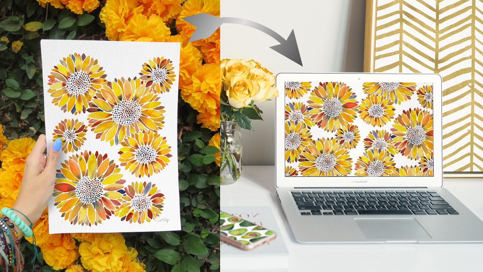
5. Build a Palette: First things first, let's go ahead and locate our files. To do that, just go to catcoq.com/color, and from there, you'll see this big blaring sign that says "Unlock here", you really can't miss it. Once you type in your e-mail, the page will redirect to Dropbox. When you're there, you can download all of the class assets without needing a Dropbox account or anything like that. Just select everything like this and click "Download". Now that we've downloaded all of our class assets, the first thing that we're going to open and actually use is the color worksheet. Mine is right here, it's called color-worksheet.jpg. Go ahead and click and drag that straight into Photoshop, cool, and there it is. I want to focus just on this color palette worksheet, so I'm going to enter full screen mode, and I can get there just by pressing "F" on my keyboard. If you press "F" again, it'll remove all of those pallets and tools in the background, and if you press "F" one more time, it goes back to normal. If you ever find yourself in something like this and you're trying to figure out, how do I get out of this? Just keep pressing F on your keyboard and it'll get back to default. But again, I want to press "F", get into full screen mode, where I can still see all of my pallets, toolbars, layers, everything. I've just removed all that background stuff so that there's no distractions. For this worksheet, I pulled together four different photos. I found all of these photos on unsplash.com. If you're unfamiliar with Unsplash, what it is, is a stock photography website, where photographers contribute these royalty free and commercial use images, which is an awesome resource in general, but especially for purposes like this. I also use Unsplash photos for presentations, documents for clients, and I use them in my classes. You don't have to attribute the photographers, but I like to give credit where credit is due, so I included their names up top on this worksheet, so back to the worksheet. Let's reference these photos to create four custom color palettes. Let's start up here on the left with this vintage bus. Not only is this just a pretty cool photo in general, but it's also a really great example of a complimentary color scheme. Remember, complementary means opposite each other on the color wheel, and that's exactly what orange and blue are. Plus there's a really nice neutrals in there to help break it up a little bit. You guys know love using minimal palettes, and this is a perfect example of one that works really, really well. Let me zoom in a bit and I'm getting there by tapping "Z" on my keyboard and then simply pulling my cursor in. If you press "Z" again, you can zoom out by pushing out, or you can pull in, it's pretty intuitive. I'm going to zoom into this first photo right here of this vintage bus. The way that I make pallets in Photoshop, is with the Eyedropper tool, and you can find it over here on your Toolbar, it looks like a little dropper and go ahead and tap that once to select it. If for whatever reason there's a different tool selected here, just tap and hold, and make sure out of all these options, you're selecting this first one, Eyedropper tool. Cool. Now, what the Eyedropper tool is, is it samples color from anywhere on your page. What I'm going to do is find some colors within this photo, sample them, and then fill them in, in these squares to create a really beautiful palette. I'm going to start with just right in the middle and click somewhere on this orangey-yellow. You'll notice down here at the bottom of my screen, in my foreground, background color area, that foreground color has changed to this yellow that I selected. If I selected something like blue, you can see down here at the bottom it changes to blue, if I select black, it changes to black. Just keep an eye on that and that indicates what color you've selected. Again, I'm just going to tap right here in the middle, I have samples that are yellow, you can see over here, it's there, and then using my Paint Bucket, you can get there by pressing G on your keyboard or by going over here to the Toolbar and looking for the Paint Bucket. Again, if there's some other icon selected, just click and hold. We don't want Gradient and we don't want 3D Material, we want Paint Bucket, so go ahead and make sure that's selected. Now, I'm just going to click right there in that first box, and it is now turned to that yellow that I've sampled directly from that bus. Now let's get our secondary color, which is going to be this blue from the background. There's a little bit of a range of blues in this photo, but I want to start with a darker one. I'm going to press "I", on my keyboard again, to get to my Eyedropper, tap somewhere in this dark blue over here on the left of the photo, makes sure it's changed down here at the bottom and press "G" again, to get to my Paint Bucket, you can also get there over here on the Toolbar and just tap within my square, cool, that has changed to blue. Last but not least, I want to capture that neutral. I want to start by getting this really dark gray neutral over here. Again, I'll press "I" to get to my Eyedropper. I'm going to tap right here, in that darker part of the tire, see it's changed, press "G" to get to Bucket and click and fill in that square. This is the base palette here, and the way that I like to build pallets, is by using a light and a dark variant of the same color. This top row up here, this is going to represent the darker shades and the bottom row will represent the lighter shades. To break that down, what that means is, this will be the darkest orangey-yellow that I use, so I want to find a lighter one of this composition and put it below. Same thing with this blue. I want to find a lighter version and fill it in this area. Let's go ahead and do that next. Again, I'll press "I" on my keyboard, to get to my Eyedropper, and first things first, I want to find a lighter version of that yellow. I'm going to click somewhere over here where it looks like it might be a little bit lighter, on the panel lean of this truck and then press "G" tap and fill in. Cool. It's very slight, but you can see that the top color is a little bit darker than the bottom, which is a little bit [inaudible] and lighter. The reason I like having this option in color palettes is because when I'm working on my actual artwork, it's nice to have a few different shades of that same hue. In this case, it'd be nice to be working with a darker orange and a slightly lighter orange. We'll get into this a little bit more later when we start color adjusting our actual artwork. Let's do the same for the blue. I'll press "I" to get to Eyedropper, and it looks like there's some lighter blues back here, through these windows. I'm going to go ahead and tap, then press "G" to get my fill Bucket and fill in, that's pretty nice. Last but not least, I want to get a much lighter gray, so I think I'm going capture something from up here. I'll press "I" to get to Eyedropper, tap once, press "G" and come and tap my square. That's actually a little too light from what I'm going for, so instead, I think I'm going to sample something from the ground here. If you sample a color and fill it in and you don't really like it, no problem whatsoever, just go ahead and redo that step. So "I", will get to my Eyedropper, I'm going to click somewhere here in this pavement and press "G". Before I tap to fill in, this is one of the tricky things with Photoshop, you need to go ahead and watch this Tolerance up here. The default Tolerance is usually 32, and if I were to fill this in at 32, all of that background changes. The reason that's happening, let me back up by hitting "Command Z", the reason that's happening is because this white is really similar to what's going on back here with this white. I'm just going to go ahead and change this Tolerance to one. If you're not seeing a Tolerance option up here, go ahead and press G or make sure that your Paint Bucket is selected, and that will open up this Toolbar. Now with the Tolerance of one selected, I'm going to click and fill again. As you can see, it only fills that box. We have our first palette established. From this one very simple photo, we have created a really beautiful palettes that aligns with the photo, so the photo inspired the color palette. Now, we can use this color palette in our artwork, our designs, whatever we want it for. It's our pallet to use now. I created this worksheet with four custom color pallets. What I want to do, is go ahead and fill in the rest of these.
6. Color Worksheet: Cool. This is where we left off on the color palette worksheets. What I'm going to do is just briefly go through and fill in the rest of these three palettes. We've already gotten that first one down. Later on in this class, I'm going to show you how you can take one of these palettes that you've created and spot edit colors in your actual artwork. That's going to be pretty cool. But in the meantime, let's go ahead and fill out the rest of these palettes so you get pretty comfortable, eye dropping colors using the Fill tool, and then deciding what areas of color are going to look good to include in the palette from your photo. First things first, let's go ahead and get started with this first one up here of the waves on the beach. I'm going to press "Z" on my keyboard, and then just pull my mouse in, so we get a nice close-up view over here. First things first, I'll press "I" to get my Eye-dropper tool. Within these palettes, I'm going to start with the darkest areas of this turquoise, which I'm seeing up here on the top left. I'm going to eye-dropper out, maybe from this area right here, sample that color. I verify it over here that it's changed as my foreground color, and then press "G" for paint bucket and fill in that box. Remember, the way I like to do palettes is to have the darker color up top and the lighter variation of that same hew down below. I'll press "I" again, find a slightly lighter area within that turquoise, click to Sample, press "G" to get my paint bucket, and then fill in that bottom square. Cool. Now I want to get some of this blue that's over here. We've already gotten this green tone, now I want to go for some of the blue. I'm going to look for this slight dark patch in the blue over here. I'll click to eye it. I've pressed "I" by the way for Eye-dropper, and then G to get my paint bucket, and I'll fill in this box. "I" again, for Eye-dropper. I'm going to find a lighter version of that blue maybe right here, that's pretty. Then G, fill in my box. Then these last two, I've reserved for neutrals in this case. So the first neutral I want to grab is the sand. It's that really nice, very light brown, almost yellowish tone. So "I" for Eye-dropper. I'm going to grab this darker area over here, tap once, press "G" and fill in my box. Then I'll get to "I" again. Go for this lighter area of the sands. Click once to sample, press 'G", fill in my box. I'm sure you guys are going to be absolute pros at this by the end of the class. Last but not least, the other neutral I want to get from these palettes is this white within the waves. So "I", and I'm going to select a slightly darker tone within that wave. So maybe something right around here, and G to fill in. Then I again, and I want to get a really brighter white. So I'll select this area and fill-in. One thing I'm noticing is, I really like this white, but I think this tone if you get a little bit darker, so I'm going to redo that one. So "I", and I'm going to find a darker area instead, maybe over here, and G, fill it in. Perfect. So this is going to be a really nice sophisticated palette later on if we want to be using some tools and turquoise that balance out really well with some soft neutrals. Command+0 will snap back. I've got two palettes down, and I have two more to go. For these other two, I want you to fill them in at your own pace. I'll be filling them in on-screen. But if yours start looking a little bit different from mine, no problem whatsoever. Just to remember, i is the Eye-dropper tool. You can also get there over here in the toolbar, and g is the fill bucket, and you can also get there down below on the toolbar as well. I'm going to press "Z" and pull in, and start filling in the palette of these really beautiful fall leaves. Starting with i for Eye-dropper. Cool. So the leaf palette is finished. Again, I kept the darker variations of those tones on the top, and then the lighter variation of that same tone on the bottom. Next up, this really beautiful limited palette, it almost looks like paint swirling together. I love it. Starting with "I" for Eye-dropper. Perfect. I really like this color combination over here too. It reminds me of the Pantone colors of the year from 2016 when Pantone chose Serenity and Rose Quartz as their two colors of the year. It was the first time they ever went with two colors of the year. So it was a really big deal at the time. Totally shook up the design world's guys. But yeah, anyway, it's a great color combination and I might be using this later, we'll see. All right, Command+0 to zoom back out, and we have completed our color palette worksheet. So a round of applause. It's just a really fun exercise to loosen up, play with colors. Really focus your eyes on noticing those darker tones, the lighter tones, and the ways that colors work together really well. I chose these specific photos because it was a really nice combination of different types of palettes. With this bus up top, we had really nice complementary palettes. We had some nice monotone colors paired with neutrals up here with these waves. The rainbow leaves were a really good example of analogous colors, with a really unexpected green thrown in there to break it up a little bit. Then this blue and blush tone pink is an example of using a limited color palette that works really effectively. Just a heads-up, you can create these same palettes out of any photo. If you took a really cool travel photo in the city when you were in Paris, or maybe in the jungle if you were in Guatemala, or even just in your own backyard, you can turn that into color palettes just like this, and then infuse these color palettes into your artwork. I do this all the time, especially with the photos I take when I'm traveling, so I can show that this photo I snapped directly inspired the colors to create this piece of artwork. It's a pretty cool thing. It makes my artwork even more personal to me, and it makes it a really intriguing story to share as an artist. So feel free to take these, and roll with them, and make even more color palettes with more photos that either you took or that you found online, and let those color palettes inspire your future artwork. Later on in this class, I'm going to show you exactly how to do that. So we'll take one of these palettes that we made here and we're going to use it to spot edit the colors of our artwork. So you're going to learn those exact steps. But for now, let's go ahead and move on and start prepping our artwork for color variation.
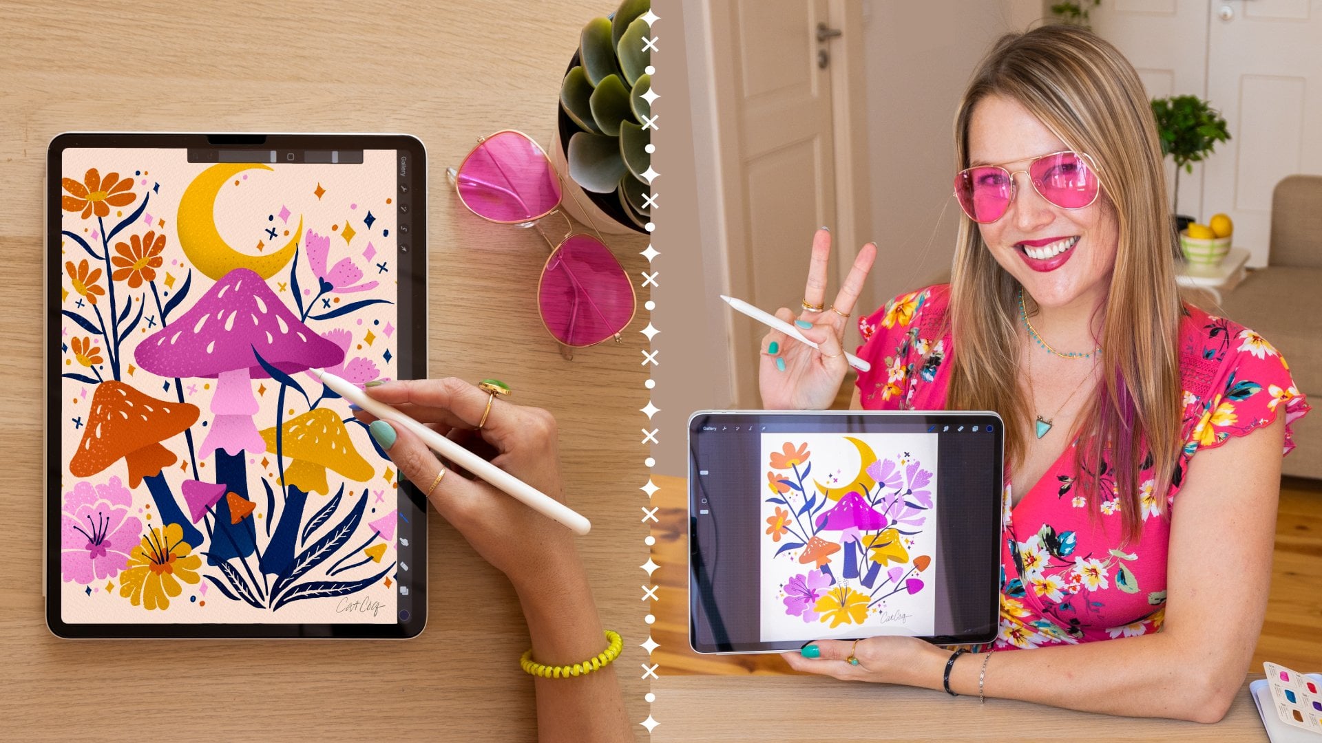
7. Prepping the Art: Now it's time to turn one piece of artwork into a series of different color palettes. This is the whole point of the class. I learn best by being hands-on, so that is exactly how I'm going to teach you too. I'll be using this illustration that I drew specifically for this class, and you are absolutely welcome to follow along with the same design. You can find it in the class downloads, or you can use your own artwork, whichever you prefer. I already downloaded all my files in the build a pallet video, but remember that you can find them at catcoq.com/color. The first thing I want to do is go into our class assets folder, remember we downloaded this off Dropbox earlier, and then go ahead and find that file that says Butterfly-sample.psd. This is it right here, so I'm going to go ahead and click it and drag it right into Photoshop. We've got our file open, the first thing I'm going to do, same as before is enter a full screen mode. Remember, I can get there by pressing F on my keyboard, and really all that does is expand this giant or board so that there's no distractions in the background, I do not see my desktop, I don't see other windows, I just see my beautiful piece of artwork. Remember, you can get out of this by pressing F again, which will remove the toolbar and remove all those layers, and then one more time, same thing, press F will go back to normal. If you ever find yourself stuck, just keep pressing F and you'll get back to where you want to be, but I want to be right here. Before you even begin adjusting color and getting into all those fun color variations, I want to do some housekeeping on this one file. I drew this butterfly on my iPad using the drawing app Procreates, if you have an iPad and you want to learn how to draw like this, definitely check out my other classes, I've got a bunch of Procreate classes and they range from beginner level to intermediate, and they pretty much show you exactly how to create cool illustrations like this, but anyway, let's go ahead and get to that housekeeping I was talking about. There's a few things I want to do to this file before I start plane with color, and the very first thing I want to do is verify that I am in the correct color mode. You can get up here by going to image, mode, and here you have a bunch of different color options. I want to verify that I am in RGB color mode and I am because there's this little checkmark next to it. The two main color modes that you're probably going to be encountering most often, are RGB and CMYK. RGB is generally for any files that you're viewing onscreen, it's for web files, and CMYK is generally for artwork that you print out on a printer. So I use RGB for pretty much 100 percent of the artwork that I'm creating and designing and licensing out, and the reason I do that is because most print on demand sites, actually every single one I've ever worked with, always requires RGB color mode. Now it sounds a little counterintuitive because you think, RGB, that's for web, that's for viewing onscreen, but for whatever reasons as ID 6 red bubble, all those guys prefer RGB colors. If you upload a file and it's in CMYK color, then what's going to happen there is those colors are going to be pretty far off when they're printed on these products, this is ID6 makes. So just make sure you're always in RGB color mode if your intention is to license these out or sell online, I'm not going to mess with bits or channel anything like that, but I will just keep it on RGB color mode. So I checked, we're good, time for the next step. Next step, I want to look at my file size and my DPI. To do that, I'm going to go up to image, image size. Let me pull this in the middle so you can see. Right now it's set on inches and it's 10 inches by 10 inches, so a perfect square at 300 PPI. I made this particular file 10 inches by 10 inches because it's just for practice today, and I wanted a small file size so that your computers aren't just completely overloaded as you're working and following along with me. But, if I were going to upload this artwork to a print on demand site or Etsy or license it out, then I would be working with something at least three times this large. Again, this is a very small 10 by 10 inch file just because it's for practice for us today, but if this were a real life and I was doing this for actual arch licensing, then I'd be working with a much larger Canvas. So in Procreate, which is the drawing app I use on my iPad, I illustrate on the absolute largest Canvas size imaginable for my iPad model, and that gets me 27 by 27 inches at 300 DPI, so that's the max I can use and I definitely use it. If I'm scanning in my watercolor paintings or my drawings onto the computer, same thing. I scan at a super high resolution, usually like 1200 DPI if it's something like an 11 by 14 prints. The point is, I like really big files because this means I have a lot of flexibility with how my art is being used. If I saved a file and it was really small, like five by seven inches, then that's the highest I could print that thing. I wouldn't be able to print it on tapestries or pillow cases it would be really restrictive. When in doubt, work with a much larger file size. Last but not least, don't forget to take a look at your resolution, 300 is perfect. If I was going to save this image and upload it to my website or Instagram, and I was really conscious of making sure it's a small file size, I might change this to 72 or maybe even 150 if I want people to be able to zoom in, but for our purposes today, let's keep this right at 300. That's one more thing we've checked, everything is good here, we are all on the right page, I'm just going to press OK, even though we didn't make any changes, and last but not least, I want to take a look over here at my layers. I've given you guys a little bit of a head starts and included three layers here, so we have this paper texture, you can also turn it off or on by clicking this little eye for visibility, then we have our art layer, again, off and on, and then we have our background layer. I went ahead and already made this into three separate layers just to make it easier for you guys today after all, this class is all about color, so I want to focus on that, but I do want to explain real quick why it's important to have your artwork isolated on its own layer, separate from that background. As we're making all these super fun colored changes today. We're going to be changing the background color, the artwork layer itself. We're going to find little bits and pieces within the artwork to change. We're going to be doing a lot of really cool stuff. In order to do all this, I want to make sure that this art is isolated from that background. If you're following along with me today on this exact same artwork that's on my screen, everything is ready for you to go. No need to do anything else here. This file is ready to be optimized for color exploration. But if you're following along with your own artwork, maybe it's a scanned in watercolor you did, or a digital illustration that you drew in procreate, or maybe an Adobe Illustrator, you just want to make sure that that background is separated from your main layer. The reason that I put this paper texture in is because for all of my artwork, especially the digital stuff, I really like putting an overlay of texture on top of everything so that it just feels a little bit more hands-on and personal and artistic. Here I'm going to zoom in so you can see the difference. So with this, the paper texture is applied. But if I turn off the visibility of that layer, it goes back to flat artwork. Again, let me turn it on and off. I like having this paper texture on because it just adds a lot more dimension and interest to my artwork. If you'll take a note up here, these are all the different blending modes that you can do four layers. So when I'm applying a paper texture on top of my artwork, the defaults is up here at normal. Here let me zoom out so you can see, command is 0, will fit to screen. So if you're ever zoomed in really tight, just press command 0, and it'll fit everything back to screen. Take a look at this paper texture. Right now it's on normal, which is the default transparency effect. If it's normal, it just blocks all these other layers. But if I tapped normal and change it to Linear Burn, then we're able to see this paper texture coming through on this artwork. It's pretty neat. We'll get more into transparency effects and blending modes a little bit later on. But just know that if you're going to be throwing a texture on top of everything, to go with the blending mode. The two I use for textures are linear burn and multiply. They are very, very similar, but for white paper, I prefer linear burn because it's a little bit more dramatic. One more thing, if you're following along at home with your own artwork, and you really like this paper texture, you are definitely in luck because I have included this paper texture in the class assets. It is commercial free, royalty-free. It's my own paper texture that I created by scanning in a piece of watercolor paper at a really high resolution. You can go ahead and download that paper texture from the class assets folder and drag it right into your artwork and use it as well. Last but not least, if your artwork is all flattens and you don't have that background separated from your main illustration, you'll want to go ahead and do that before we get onto our next steps. If you're unsure how to do that, I have another Skill share class you can check out. It's called from paper to screen, digitally editing your artwork in Photoshop, and specifically within that class, video three is called cleaning up your work into Photoshop. It walks you through exactly how to remove that paper texture background from your analog artwork. If you're an acrylic painter or watercolor or anything where you're drawing on an actual piece of paper and scanning in, that video specifically, will show you how to remove that paper texture backgrounds. But again, this class is all about color palettes, and I don't want to get too far off topic. I'm going to leave that for you to explore if you'd like to learn how to do that. The last thing I want to check with my layers over here is to make sure everything is looking good. They're properly named, they're in the right order. If I'm doing something like a paper texture on top, the correct transparency effect is applied. If you're working with this exact same file, you're in luck because everything is already named and grouped and organized in the right way. But I'm going take this one step further and select my arts layer, hold down shift, and also select backgrounds. By holding down Shift, it means that I can select more than one layer at once. Then I'm going to drag both of these to this folder down at the bottom. You can also group by hitting command G. A group is exactly what it sounds like. It kind of keeps these little collections together. You can view the elements within your group by clicking this caret to the left. Here we have art backgrounds. I'm going to double click where it says Group one and call it original. So this is going to come in handy for our further lessons where we start creating all these different color palette variations. It's really important to stay organized and I do that with groups. So by the end of this class, we're going to have so many groups over here and each one is going to be its own custom color pallets. So now that we have our layers organized in place, we're aware of where everything is and everything is properly named. We are ready to get going. That is it for the housekeeping were doing on making sure that our work is ready to be adjusted. So to recap, before we even start plane with color adjustments and creating these color variations, I want to check my file for specific things. One, I want to make sure that I'm an RGB color mode. Two, I want to make sure that I'm not a big canvas size and a DPI of 300. For procreate arts, I used the max dimensions for my iPad Pro, which are 27 inches by 27 inches. For everything else, 30 by 40 inches is a great starting point for your canvas size. Remember, 300 DPI is always where you want to be at. Three, makes sure that the illustration is separated from the background. So for Digital Arts, I don't have to worry about this because it's already separated from the background as I draw. But if I've painted something by hand, I'll spend some time removing that paper texture background from my painting. Remember, if you want to learn how to do this, check out my class from paper to screen, digitally editing your artwork in Photoshop. I cannot recommend my class enough. It's basically ten years worth of my knowledge, summed up into a 45-minute class. Number four, last but not least, we want to make sure that our layers are properly named, organized, and grouped. Once all of these things are in order, our file is officially ready to be doused in color exploration. Let's go ahead and get started.
8. Color Exploration: All right, now it's time for the fun stuff. Our file is all prepped and ready. We have a basic understanding of color relationships, and the color wheel and color schemes. Now we get to take all of that knowledge, and that preparation and start creating some really fun pallets. So this is exactly where I left off. I've got my layers panel over here, and I've already got that original tucked away in its own group. This is perfect. The first thing I'm going to do is make a copy of this original group. I am all about non-destructive editing techniques. I never want to overwrite anything of importance, and this original is really important to me. Let me show you how to make a copy. Go ahead and select this entire group. Make sure you're not just selecting one or two pieces within that group, but the entire group name where it says original. Now click and drag this down here to this tiny little plus sign. You'll see that it's made a copy of that group. You can also get there by selecting the group name, and hitting "Command J" on your keyboard. That will also make a copy of a layer or a group. I'm just going to go ahead and close the carriage on the original, so that everything looks nice and tidy over here and not too overwhelming. So the way I always start with color is by looking for fun surprises, and just seeing what all of my options are. I'm just going to walk you through exactly how I go about doing this. The first thing I'm going to do is select my background color. Then I want to change this to white, so I can start with a completely clean slates. It looks like the last color I used over here is orange. I want to go ahead and switch that to white. The first thing I'm going to do is press D on my keyboard. D stands for default colors, and as you can see, that orange changed to black. So defaults in Photoshop is for black to be foreground and whites to be background. If you've ever got some crazy colors over here, and you just want to reset them all, go ahead and press D on your keyboard to reset to defaults. Cool. But like I said, I want to switch to white. I'm going to go ahead and click this little switcheroo arrow. Now that changes foreground, and background color. Now my white color is selected. I'm going to be using that paint bucket tool, same as before. You can find it over here on your tool bucket, or you can do what I do, and be lazy and just use the key command which is G. With that paint bucket selected, I'm just going to tap anywhere, has gone from that blush pink to a pure white. Again, the reason I like to change the background to white for the step is, because I like to start with a really clean canvas. The next few moves I'll be doing is just about exploring colors. See more to options are see what looks good, what does it look good, and just getting a handle of this palettes. The way I like to start to do that is by going to hue and saturation. So first things first, my background is selected right now, I want to change that and select my Art layer. You can do that just by clicking on your Art layer. Now I'm going to go up to image adjustments, hue and saturation. You can also get there by hitting command U. Remember, I love those keyboard shortcuts. This is how I like to start every single color exploration. I want to see on a broad spectrum what everything can look like when the colors change. Under hue and saturation, we have three different spectrums, hue, saturation and lightness. The magic for me right now is going to be scrubbing along this hue spectrum. I've just grabbed that arrow, I'm dragging it really slowly to see what happens when these colors change in a really drastic way. When I go all the way to the left or all the way to the right, it's the polar opposite colors. It's those complimentary colors. It's blue inside the butterfly now, that used to be pink. It's just basically pulling those exact opposites. Let's see what happens if I bring hue back to the middle and now scrub all the way to the right really slowly just to get a feel for what colors are working, what's looking really good, what's appealing to me, and what's really catching my eye. Interesting. Again, when I get to the polar opposite 180, these colors are going to be the exact same as these colors. It's a 180 difference. Cool. I just wanted to see what things were looking like. Take note of what I was liking, what I wasn't liking. Let's go ahead and reset this back to 0. You can go ahead and press "Okay." We didn't make any changes. We were just looking and seeing what was happening. The next thing I like to do when I'm in this kind of exploration mode, and looking for happy surprises is invert my colors. To invert, I'm going to go ahead, and make sure that that Art layer is selected. Go to image, adjustments, inverts. You can also get there by hitting "Command I." Okay, cool. To be honest, I don't really like it. I do invert every single time with my artwork just to see if there's going to be something really cool. I would say like, I don't know, five percent of the time, it looks absolutely epic. The other 95 percent, I'm not really that crazy about it, but I always like to check and see, because it's such a delight when you get such a happy surprise like that. But in this case, invert, I'm not into it. I'm going to go ahead and back up by hitting "Command Z" on my keyboard. The last thing I do when I'm in this very open-minded color exploration mode, I want to see what's working, what's not working. I like to change the background color to the polar opposite of whatever it was before. I'm seeing it here on white. I think it looks really striking to be honest and very modern on white. But I want to see what it looks like with a black background. Remember, you can change your color to black over here just by pressing D on your keyboard. That resets the default colors. So now black is my selected color. I'll go back to my paint bucket over here on the toolbar or by pressing G on my keyboard. I'll just make sure that this background layer is selected and tap anywhere. Now this is pretty cool. This is why I like having this very loose exploration phase to kick things off before I start getting really nitty gritty with my color palettes, I just want to see in a big broad spectrum what's working and what's not working. Having this black background, I think is incredibly striking. This is something that I'm really taking note of and I think I'm going to optimize it a little bit and use this as my first alternate pallets. Now that we've loosened up and gotten a big picture, look at color exploration. Let's hone in on this black background that's working really well for us, and optimize it as our very first color alteration.
9. Dark Background: We did a quick look at overall color, and once we switched the background to black, it became very clear that this should be our first color alteration. Let's go ahead and optimize it. It looks awesome. I'm really interested in this. I think it has a lot of potential, but it's not quite there yet. One thing I'm noting is that there's some areas here like this navy, these really dark blue leaves and the dark blue on the butterfly, they're getting a little bit sunk in with that black. I want to bring them back a little bit and make them a little bit lighter. First things first, I'm going to go ahead and make sure that my art layer is selected. Then I'm going to use my magic wand tool to select out all of that navy. I can get to the magic wands by pressing W on my keyboard or going over here to the toolbar and making sure that the magic wand is selected. Again, if you're seeing another icon here that's not a wand, just go ahead and click and hold, and make sure that it's your wand selected, not any of these others. Magic wand is selected. Before we start doing some magic and clicking around, there's a few little settings I want to change first. The first thing I'm going to look at is right here on tolerance. Right now it's set at 15, which should be totally fine. There's not really any other colors that are even close to this navy. I can leave it at 15 and I'll know that the navy is selected, but it's not going to select anything else. If I were selecting something like this orange right now, here let me show you. Let's say the tolerance is at 100, it's really high tolerance. Then I try to select something like this lighter yellow, orange. What you can see is not only has it selected this orange, but it's also selected this coral color that goes with it. The reason that's happening is because that tolerance up here is way too high. If I just want to select one color, but not colors that are close to that color, I'm going to play around a little bit with the tolerance. Just for this example, I'm going to find a tolerance that works really well for only selecting this yellow-orange, but not the coral. Let's see what happens if we switch it to 50. Now I select the orange. Actually, yeah, that did it. Let me zoom in really tight. It got a little bit of the coral, but not too bad, so 50, maybe even 35 is going to be a good place for tolerance for the rest of the colors. Remember I snapped my artwork back to the screen by hitting Command 0. I'm going to go to select, deselect and start from scratch. That was just a little example of tolerance to show you. I have my magic wand selected, my art layer is selected. My tolerance is at 35, which is great because honestly no colors are even really coming close to this navy blue right now. I want to make sure that contiguous is checked off. What that means is when contiguous is checked on and I select a color, only that one color with no touching colors is selected. But if I turn contiguous off and I select that color again, suddenly it gets all of that navy blue across the entire art board. This is a really important technique. If you want to change all of your blues or whatever color all in one go, make sure contiguous is turned off. But if you only want to select this blue and nothing else, go ahead and turn contiguous on, and then you just get the one piece. Pretty simple. Then there's a bunch of other settings up here. But to be totally honest with you guys, the only ones I really ever mess with are tolerance and contiguous. It's really just a balancing game. If you're working on this artwork, it looks like 35, contiguous checked off, is the way to go. But if you're following along with your own artwork, you may have to do some wiggling around in these settings to find what works best for you. I'm going to select everything by clicking that blue. Now, all of my blue is selected. I'm going to zoom in. Remember I pressed Z on my keyboard and then I just pulled my mouse in to see how much of this it got. It looks like all of the blue was selected, which is awesome. Command 0 to snap back to screen. Now what I want to do is make this navy a little bit lighter so it doesn't get so sunk in on the background. To do this, I'm going to go to my hue and saturation. You can get there by going to Image, Adjustments, Hue and Saturation. Or you can do what I do and hit Command U on your keyboard, which is the shortcut. Before I start messing around with hue, saturation, and lightness, all this stuff, it's hard to see with all these boundary lines. They're all wiggly and moving and bright. They're great. It shows me what's selected, but I can't really differentiate between that blue and the background very well because that boundary is defined. If you want to continue having the selected, but just hide all those little wiggly lines, go ahead and hit Command H on your keyboard. All those blues are still selected. We've just hidden the visibility. Command H will bring it right back. This is just a little trick I do when I really want to be very precise with my color adjustments, and I don't want to see all this wiggling around. Command H will hide it. Now when I make adjustments, I'll have a very clear picture of what I'm doing. Like I mentioned, I want to make this a little bit lighter so it's not so sunken into that black background. I'm going to grab this scrubber from the lightness spectrum and bring it up, just a smidge, not too far. If you bring it all the way to the right, it becomes white and all the way to the left puts it at black. Zero is always where you originally started. I just want to see what happens. It doesn't need to be super bright, but just a little bit lighter than it was before. It looks like 21 is a pretty good space for me. Now just out of curiosity, let's see what happens if I make it more saturated. Now that's fun. Then if I bring that saturation all the way down, it goes in a complete grayscale. I think what I want to do is just make it a smidge more saturated than it was before. It was feeling dull when I made it lighter. I'm bringing that saturation up about plus 14. Last but not least, let's just out of pure curiosity because we are opening ourselves up for fun surprises, let's see what happens if I just make really slight adjustments to hue. When I drag it to the right, it gets a little purple, not really digging that. I liked the blue. Let's see what happens if they bring it a little bit to the left. Actually, that's nice. It started at zero. But if I bring it down to about negative 10-ish, we get this really nice cornflower blue. Personally, I think that's a better color balance with these other colors when you have this black background here. This is not an exact science, this is just about visuals and aesthetics and what you think is working really well for your own composition and your own art work. But for me, I like bringing that hue into a little bit more of a blue. Before it was ranging a little too purple for my taste. I made that saturation slightly amped up and I brought that lightness up by about plus 20 percent in the lighter direction. Go ahead and press "Okay" and that will set those color transformations that we made. Awesome. I'm really liking this color balance. I think it's incredibly intriguing and it feels very different from the original that we started with. Here let me show you real quick. This little icon here stands for history. If you click that, I'm going to drag this down a little bit. These are all the steps we took as we've been building up this artwork. If you ever need to go back one step, two steps, 10 steps, you can do that. But just to make sure that you don't change anything at this level, otherwise, we're going to lose everything here. I'm going to go back to exactly where we left off. What I want to do is show you where we were before we changed the blue and after. This is where we netted out, this is the color we like. Before it looked like this. You can see way too dark. It's really sunken in. It's not really optimal. But with our edits, we made it work way better with this black background. Sometimes I like to get into my history and then see the before and the after so that I can pat myself on the back and be like, "Okay. You're such a great designer, you made some amazing changes. " If you like validating yourself that way too, go ahead and take a look at history and you can see where you were and then where you got to. To close this box, I'm just going to tap the double carets and get that out of the way. Before we move on to our next palette, I want to show you one more thing I do specifically for when I'm using really dark backgrounds. For this, I'm going to zoom in quite a bit so you can see. I press Z on my keyboard and then I can just drag my cursor in to get a really close up view. We have this paper texture up here, and you can definitely see it in the lighter areas of this composition. But you're losing it pretty much entirely on that black because it's black, there's no texture coming through because it's already as dark as it can possibly be. I really like that texture and I really want to see it coming through in that black. I'm going to fudge it a little bit and make this black a tiny bit lighter. I'm going to select that Background, go up to my Opacity, and just bring it slightly down. As you can see, check this out over here. You can really see that texture coming through. That's just bringing it down slightly, like 85 percent. But I think what I want to do is get it a little bit closer, I think 90 percent is what I normally do. Perfect. It's still black, it still looks like a black background. But what I've done is made some little adjustments to the opacity where you can really see that texture of this paper layer coming through. I'm going to snap back out, Command 0 to see the full composition. Awesome. It still looks black. I wouldn't have even guessed it was 90 percent. It looks as black as black can be. But in fact, it's only at 90 percent so that we still have that paper texture. That's just a little insider tip of what I do when I'm working with a pure black background. It's almost never pure black. Before we move on to our next color variation, I always like staying nice and organized and tidy. I'm going to double-click that layer where it says original copy and change it to charcoal. Whenever I have a black background, I usually refer to it as a charcoal palette for no other reason than it just sounds a little bit more refined as an art piece. Take note. Charcoal sounds a little bit nicer than black background. It's like, "Wow, she really put some thought into that and called it charcoal." You don't have to do that. It's just something I do. Go ahead and tap that caret to toggle it back into place. Now we can go ahead and click that eyeball to hide the visibility of our charcoal layer and see the original. Put it back on, turn it off. Even though we just made a really slight change, it looks like a world of difference with that color palette. The only things we changed were the background color, and we made this blue a little bit lighter and a little bit more saturated, but it just seems like a completely different illustration. Congratulations guys, we have made our first color alts off of that original palette. I hope yours is looking just as lovely as mine. Let's go ahead and learn how to make a different color alt using some different techniques.
10. Color Balance: This is exactly where we left off, and now it is time to make our second color palette variation. The first one, pretty simple, all we did was swap out that background color and make a few minor tweaks. Now let's try something a little bit more extreme. First things first, I'm going to go ahead and select that original group. Remember, select the whole group, not just a layer within that group. The whole group should be selected, and then we're going to make a copy of it. You can either drag it down here to the plus sign or hit Command and J with that group selected. It just made a copy of the original. I'm going to click it and drag it so it's at the very tip-top of our palettes. Make sure that you're not accidentally dropping it in that charcoal palette. If you do that though, no problem. Just tap that carrot and bring it back on top. Cool. Remember we are all about non-destructive editing techniques, that's why I'm making so many copies of this original, always preserving that original file down there without touching it. Let's go ahead and toggle down that carrot and see what we're working with here. We have our art layer and our background layer, exactly how we've set it up. Just like before, the first thing I want to do when I'm coming up with a palette from scratch is to change this background color back to white. That again, it just gives me a clean slate and it lets my eyes only focus on one thing at a time without being distracted by a background color. If you're not already on your default colors, go ahead and press D on your keyboard to get to defaults. Then click that switcheroo arrow, so that your white becomes the foreground color, and then press G to get to your paint bucket tool. You can also find it over here. Then with that background layer selected, just go ahead and click anywhere on that background. You know what? One thing I want to point out, you can see over here on my thumbnail, that background actually did fill in, but not at all in the way I wanted it to, and the reason this catches me every single time, guys, so beware. If you use that same technique we did last time, where we had a selection, and we hit it using Command H, don't forget that selection will stay in place until you de-select. I do this all the time. In our last lesson, we had just selected these Navy leaves so that we could change the color, and we did the Command H to hide that selection so that we can make all those adjustments. But that selection is still in place until you decide to de-select it. If you just did the same thing, I did, no worries. I always get slipped up on that. What I'm going to do is, go to Command H. Sure enough, there it is. It is still selected. To de-select that selection, you can either go up here to select, de-select, or you can hit Command D on your keyboard. Let's try that one more time. As you can see in this thumbnail, some areas are white and some are pink, so I'm just going to scrap this altogether. I'm going to do Command A, which will select the entire layer. Then on my keyboard, I'm just going to hit delete and that gives me a blank canvas. Now using my paint bucket tool, which is G, I can just click and fill in that space. Even people like me that are pretty advanced in Photoshop and use it every single day, we still get caught up on stuff like this. If you're struggling with something or you get a little bit mixed up, don't worry, it happens to all of us. Remember there is a discussion thread down below. If there's any step that you're getting stuck on or you need some help, please feel free to post in that discussion thread, and that thread is for all of us. If you see a question that you know the answer to, feel free to jump in and help out your fellow classmates. I'll be browsing through the discussion thread as well. I usually look at it at least a few times a week. Back to our illustration. We've changed that background to white, which means clean slates. As you can see, everything is still selected. Don't forget to go to select, de-select. Don't make that same mistake I just made. Now it's time to make some color adjustments on this art layer itself. Go ahead and click that layer to make sure that it's selected, and let's go back into our hue and saturation. That's Command U as the shortcut. You can also get there by going image, adjustments, hue and saturation. We've already played with this in our color exploration step that was just so that you can get a gist of all the color options that you have available. Now it's time to actually do something with it and make a really beautiful pallet. Remember by scrubbing along on this hue spectrum, we see a lot of color variations. If you go really slow, you'll be able to see even these most subtle differences. But if you ever get some more weird and you don't really like it, remember, you can always go back to zero. Zero is the starting point. That's where you originally started before you opened up this window. I play with hue and saturation a lots. But if I'm going to be changing the hue and saturation of an entire piece of artwork, not just spot editing certain colors from within the Illustration, then my preference is to go to a complete 180. That's bringing it all the way to the left or all the way to the right of the Hue scrubber. The reason I go with 180 is because when you choose those polar opposite colors, again this is the exact opposite of where those colors are on the color wheel, so everything that's blue used to be that pinkish red. Even those dark navy leaves are now a dark warm leaf. It's finding the opposite colors on the color wheel for everything. While you could net out here, say negative 55, we're getting a lot of lost information in here. It's hard to differentiate between this really bright pink and this magenta and these leaves. To be quite honest, I don't find it as striking and I feel like I'm losing a lot of information on that original illustration. But if I take it all the way to 180, that contrast is still there. When I'm making color changes like this, I usually go to a complete 180 from the original, and I don't spend a ton of time here on these mid-tones like negative 70, negative 20. I like having the complete polar opposite because I feel like it really keeps the integrity of those color relationships. This really light turquoise against this blue, it's still working out pretty well. But one caveat here, if I'm just changing one individual color like just this flower, then I'll go anywhere I want on this hue scrubber. But if I'm changing the entire illustration as a whole, I generally prefer to do a 180. Now that we have done the complete polar opposite colors, go ahead and press, Okay. But I'm definitely not going to stop here. This is a really good starting point for me, but I view that hue and saturation scrubber as a jumping off point. There's still a few more adjustments I'm going to make so that this palette feels optimal for what I'm looking for. Consider that hue and saturation, this guy up here, consider this like your base, but you have some more flexibility and some more tweaks that you can make along the way. Let me show you how. With that art layers still selected, I'm going to go up to image, adjustments, color balance. You can also get there by hitting Command B on your keyboard. This is where the real fine-tuning begins. One thing with this illustration that I'm not totally into, is this murky, muddy, darker color. Looks like a dark yellowy, reddish-brown. I'm really not into it. I think, it looks gross against that blue, let's address that first. Within color balance, you have those spectrums that again, you can toggle right, left, right, left, and you put it back to zero, but the real magic and color balance is happening down here. It's in shadows, mid-tones, and highlights. For me, this kind of a key, neutrally brown, sewer water color, that's what I'm wanting to address right now, and that is the darkest part of this illustration. If I want to start editing that color, I'm going to find it over here in shadows. When you select shadows and you make any changes up here, it's only going to be made to those darkest tones of the illustration. Right now, It's a gross neutral. Let's go ahead and bring that blue up. That's cool. Immediately you can see as I start grabbing this scrubber and bringing it more blue, we're losing all of those yellowy, dirty tones, and it's getting a lot more blue and even black at this points. Let's see what happens if I bring that cyan a little to the left. This is nice too. It's a really minimal, let me zoom so you can see. It's a really minimal, but it's doing exactly what I want it to do. Let me go back to zero. Well, just about, and it's dirty brown. That's good in some situations, but against this bray blue, it's just super gross. When I bring this blue in, it's getting rid of all those yellow warm tones and switching it back to cool tones, which is helping to key in with the colors of the rest of this illustration, a little bit of blue goes a long way in this case. I'm going to zoom back out, so we can see the full illustration. Command 0, and now, I want to address some of those mid-tones. Go ahead and select mid-tones. Right now, what I'm seeing is it's a little bit too saturated for my taste, especially this really bright green right here. It's a pretty green, but using it against this blue, there's just a lot going on with saturation. I want to find a better balance for this green specifically so that it has a more harmonious relationship with the rest of this blue. To do that, to help it feel a little bit less intense and saturated and feel a little bit more sophisticated, remember I've got mid-tones checked, I'm going to amp up the reds and magentas. First, let's see what happens if we bring our red a little more intense. To be honest, I can't really see too much of a difference there. Let me zoom in. Let's see what happens with our magenta. There we go. That's what I'm looking for. Again, back at neutral, this is what it looked like, but when you bring that red up, you can see it really tones in and deepens these blues, and then we add the magenta, it really enhances it. These blues went from this very light washed out saturated blue to something that feels a lot deeper and has more intensity to it. The last thing I'm going to do, remember this green, it's not really jiving with me, I want something that aligns more with the rest of these blues, is to go into my highlights. With those selected, I'm going to take the scrubber between yellow and blue and make it much more blue, and that is exactly what fixed that green tonality for me. I don't know that may have been too extreme, what if I bring it back down towards the middle? No, it wasn't too extreme. That was the right place. Sometimes I'll mess with cyan here if I'm trying to fix a green but in this case, I'm not going to because it's affecting the other blues that I like a lot. Out of curiosity, what happens if we bring this magenta in? No, it's not working because then we're losing those really dark navies. Again, this is all based on my personal preferences. This is an opportunity for you really to get creative with your color choices, be as opinionated as you want, but it's actually fun, like that green is not working, let's tone it down a little bit. That's the stuff that I really like about being an artist and being an illustrator, you have full control over this. If you see something and you think, "That's an achy brown and let's make it a little bit more desaturated or bring some more navy in," these are the color choices that you have at your disposal. This is the fun part. To set all of these color balanced transformations, I'm going to go ahead and press "Okay", and because I love seeing before and after, let's go back into our history over here and see what it looked like before and after. I love it. Before, these color relationships weren't really working, and it was feeling a little bit washed out, this weird sewer brown wasn't really jiving with the rest of these colors, but afterwards, when we just made some slight adjustments and that color balance, we were able to get this to a really, really beautiful place. I'm going to snap back to screen, so you can see the full thing, command 0, and click that double caret to hide our history. Beautiful. Right now as is, this is actually working really well with this white backgrounds. In my opinion, when you have a white background, things feel a little bit more modern. If you're looking for that very modern approach, great, stick with white, but for me personally, with blues like this that are really bright and vivid, I love pairing them with a very neutral tannish brown to neutralize that really vivid palette and make it feel a little bit more sophisticated. Let me show you how I do that. My background layer is selected, and I'm going to go back into my hue and saturation, so command U, and now I'm going to check this box called colorize, which looks like it did absolutely nothing because the background layer we have selected is just white anyway, and I'm going to bring the darkness down, bring the saturation at the smudge, and we're already really close to 10, but I'm going to take that hue scrubber and make it a little bit more yellow. Perfect. That's looking really nice. I think I might actually bring that saturation back down just a smudge, and let's see what happens if we get a little bit darker. That's nice. Cool. Yeah, I'm really liking this tan brown background. It almost feels like it was printed or drawn originally on kraft paper, and now I can go ahead and press "Okay". The other benefit here of using a brown background instead of a white background is with white. We were losing some of these elements like our leaves over here that are all white and our signature down at the bottom, but that doesn't mean we can't ever use white backgrounds. What I'm going to do is a little bit later, I'll show you how to use a white background, but then bring that signature back, bring these little white areas back. Anything that's getting sunken and lost, I'll show you how to retrieve it. Our very last step is to go over here to our layers. Let's go ahead and close the carets. Double-click where it says "Original copy", and let's change this to blue and tan. Again, keeping some semblance of organization over here will go a really far away. That is another color palette variation down. I think it looks very beautiful. Let's go ahead and do another one.
11. Ombré Gradient: This is where we left off, this really beautiful blue tan combo. Let's try something entirely different and super girly. Pink ombre is one of my absolute favorite color palettes. I infuse it into a lot of my artwork, and I'm going to show you exactly how I do it. Just like the others, we are going to always start from the original when we're building up new color palettes. With my original layer selected, I'm going to hit "Command J" to make a copy of that folder, and I'm going to drag it up to the tip-top, make sure I'm not dumping it in the blue and tan folder, but putting it on its own new top of the stack layer. Let's go ahead and open up that caret and see what we're working with. Same thing as before, I'm going to select that background color, go ahead and change it to white. White is already my default. If it's not there for you, go ahead and press "D" for default. Click the switcheroo arrow, press "G" to get to your paint bucket, and fill in that background. By now, I'm sure you guys are absolute pros at doing this. When I build my pink ombre effects, I do those with color gradients. Let me show you exactly how. First, I want to add a new layer. Not copying over any existing layers, but just making a brand new blank slate layer. To do that, at the very bottom of my layers palette, there's this little plus sign in a box, go ahead and click that. You'll see here, layer 1 is brand new, it just got added. Let's go ahead and click and drag it to the top of the stack so it's right above that art layer, but it's still contained within this group. Now it's time for the fun part. We are going to make a bright pink gradient. To do that, go over to your paint bucket. You can also get there by pressing "G", but instead of using the paint bucket, I want you to click it, hold it, and then select "Gradient Tool." You'll notice up here, our settings have changed a little bit between paint bucket and gradient. I'm not really going to touch anything over here. The only thing I want to adjust is the color palette itself. Mine's already set to hot pink, but that's because I make these pink gradients all the time. Yours probably doesn't look like this. Let's go ahead and all get on the same page. Go ahead and click whatever your gradient looks like up there. Now we're going to build our own. You know what? I'm just going to start with the basic. I'm not sure if this is exactly what yours looks like, but it'll be good enough because we'll all get to the same place by the end of this. This is a really basic gradient, it goes from white to black. But what I want to do is add my own custom colors in here, my own red to pink ombre effect. If you're following along, you don't have to do a hot pink gradient, you can do whatever colors most suit you. But for me, I'm a girly girl, I like hot pink, and so that's what I'm going to be going with. The way that we change these colors up here and make them custom just to us is to go ahead and double-click this little teeny-tiny bottom square. We're going to change this color and this color down here. Don't mess with these top squares, that's not how you change color and gradients. You get there by double-clicking one of those bottom squares. Cool. Now I'm going to go up here on my spectrum, tap somewhere in that pink area, grab my circle, bring it to the tip-top. Actually, I wanted more hot pink, so there we go. Cool. Go ahead and press "Okay." I will do the same thing for the other ones, so go ahead and double-click that bottom little square. I'm going to go back up to my hot pink. I want it to be close, but still enough contrast between them. You can see this is a really bright magenta over here on the right, the left, it's getting a little bit more fuchsia hot pink. Let's see what happens if I make it a little darker. No. Yeah, I think this is netting out pretty well, so it's almost red, it's like a really magenta red. It's a pretty subtle gradient as you can see, but that's exactly what I want. That's exactly what I'm going for here. It's a very slight gradient. There's nothing too jarring happening. Go ahead and press "Okay" for the color picker and "Okay" for the gradient. Then you'll see up here that your gradient has gone ahead and set. Now we have a gradient tool selected. I'll move it over here so you can see. It looks like a little cross hatch, like a teeny-tiny cross. But one thing I do want to change too is this little box over here. This is the linear gradient. Before I was on radial. There's all these different types of gradients you can make, but I want to be on linear for this. This means that it will be an up and down gradient. If I was on radial, it would all start from the center and expand outwards, which is cool too, but for our purposes today, make sure you're on linear. Now is the fun part. I'm going to click and hold my mouse on the top of the screen, drag this line down. If I want it to be perfectly up and down, go ahead and press "Shift" on your keyboard, and that will really lock that line in place along the y-axis. Starting from the top ending at the bottom, I'm still holding my mouse down and then ready, set, release everything. Cool. If you're thinking, why did I just turn my beautiful illustration into a big, gaudy pink mass, I will show you exactly why. As you know with layers, that top layer is the most visible. Right now, all of our artwork underneath is hidden because we're on a normal blending mode. Remember, over here on the paper we're on a linear burn, so when I zoom in, you can still see this paper texture. What I want to do is pretty much that same idea with this gradient. I'm not going to be using linear burn, but I'll be using a different type of transparency effect. "Command 0", we'll snap back to screen, and now with this hot pink gradient selected or whatever color yours is, if you're following along, let's go ahead and tap where it says "Normal". We're going to go through some other types of blending modes. If you just let your mouse hover over these other blending modes, you'll see exactly what it does. Color Burn, Linear Burn. We're getting some cool stuff, but this is what I want to draw attention to. When I'm doing these ombre gradients like this, lighten and screen, these are the two I use most often. Obviously, there's a lot of different options here, there's a lot of cool transparency effects, but when I specifically want some gradient that overlays on top of my colors, lighten and screen, these are my two best friends here. Between the two of these, it's really just a personal preference. As you can see with lighten, it's bringing in some more of those orange and peachy tones, especially up top. Then when I go down to screen, everything feels a lot more pink, you're not seeing as much color variation. I like to keep things interesting. I'm going to have it on Lighten, and I'm going to go ahead and press that and go ahead and set it. Now, on this layer, the blending mode has been changed to lighten. Go ahead and toggle off that transparency to see the original and then you can put it back on to see what that transparency looks like. One thing that I really want to hammer in with gradients is right now, it's working pretty well because that background is white, but if this background were a darker color here, let me show you. We want to press and hold on my gradient, go back to paint bucket, change it back to black and fill in. See, if there were this darker color, all of this background, it's just getting filled in with that gradient, and that's happening because of the lightened transparency effect. That doesn't look good at all. You can't even really tell it's a butterfly. You can't see any of those extra elements on the side. One solution is just to go back to white and call it a day. Technically that does solve the problem, but for me personally, sometimes I save artwork like this with a transparent background so that it can be printed on things like t-shirts or stickers that have a transparent background. In certain cases, I don't want this paper to be here, I want to have the flexibility to make that transparent if I want to. It's a little bit of an extra step and it's not going to make too much of a difference now because it's on white, but I'm going to show you exactly how to do that, because chances are at some point, you're probably going to encounter the same problem. Or you know what? If you're on any other color other than white, like let's just say our background is, you don't have to follow along for this, I'm just going to show an example. Let's say our background is blue. It's still going to be affected by this gradient up here. I'm going to Command Z to go back to my white background and show you how to fix that. With my art layer selected, I'm going to, on my keyboard, hit Control and then click my mouse at the same time. That brings up these options. What I want to do is hit this one right here, "Select Pixels". Now every bit of this layer that's illustrated has now been selected. This is another reason why way back when, in those earlier videos, we removed the background, it's so we can do stuff like this when we're changing color. Now what I'm going to do is basically make a mask out of this transparent effect. But before I do that, because I am very nitty-gritty and very picky in particular with how my arch looks, I want to go ahead and feather those edges and soften them just a tiny bit so it's not going to be this harsh cutout line when I make this mask. With everything selected just like it is, I'm going to go to Select, Modify, Feather. I'm only going to feather it by one pixel. You're not going to notice any visible difference on your screen right now. Imagine a pair of scissors just cutting through a paper, it's a really harsh solid line. When you feather edges like this, it just makes it a teeny bit softer and blends it a little bit more so it's less jarring and it feels a little bit more natural and integrated. It's a completely optional step, but for me, I am very particular about my artwork, so I always do that, modify feather effect when I'm going to be cutting something else. So everything is selected from this layer, we've feathered out the edges so they're nice and soft, let's go ahead and click to select our gradient layer. Now all we need to do is throw a clipping mask on there. At the very bottom of your layer's pallet, there's this little rectangle here that has a circle in the middle of it. Go ahead and click that. That is a layer mask. You can see over here where it's been applied. Basically what that means is now everything on this layer, this gradient has been contained and clipped into this mask. Let me show you what that looks like real quick. You don't have to follow along for this step, I just want to illustrate it for you so you can see what this clipping mask is doing. Basically what this link means is when this layer moves, the clipping mask moves right along with it. If I were to click this link and break it, and then go into my transform tool, Command T, if I move this transparency around, check it out. The mask is staying in place, but this gradient is moving around. You can see how it's really hidden behind that mask to change the color of the butterfly. In a nutshell, that's pretty much what a mask does. Let me go ahead and Command Z a bunch of times to go back to where we were. Command Z is my favorite tool, I always need to go back and fix something that I did, so Command Z gets me there quickly. Let's go ahead and put that link back in place. Just tap between the middle of those layers. They have now been connected again. Now when I move this layer, because it's linked back in place, both the gradient and the mask will move together. If you've never worked with clipping masks like this before, I know they're a little bit daunting and complicated and they can be confusing sometimes. So we're only going to be using them in very small amounts in this class. But as you become more proficient with Photoshop, if you're not already, you're going to be using these guys all the time. They're an absolute lifesaver when you're editing your artwork or any sorts of files. Masks are a great tool for non-destructive editing techniques. I know I mentioned in the last video how to address these areas that we're losing when it's on a white background. You can barely see these blobby circle shapes, the leaves are hidden, my signature is gone, almost entirely. Let me show you how you can get those back. Go ahead and select your art layer. For this, we're going to be using our magic wand again. This is really one of my favorite tools in Photoshop, I use it all the time. You can get there by going over here to your toolbar or by pressing W on your keyboard. Now up here, tolerance is at 35, that's probably fine because there's no other similar light colors in this composition, contiguous is turned off, which is great because that means when we select one area, all similar colors will be selected at the same time. Go ahead and find one of those really light areas that we're almost losing visibility to and click it once. Awesome. Now all of those similar really light color areas have now been selected. What we want to do is make it a little bit darker so that we can actually see it against this white background. For that, I'm going to go into Command U, which remember, that's the shortcut for hue and saturation. Let me move this our board to the side so you guys can see. Now I'm simply just going to take this lightness, drag it down, and make it a little bit darker. I'm going to do that same trick I did before, where I hit Command H on my keyboard to hide the selection. This time I promise I am not going to forget to deselect at the end. I brought the lightness down. It really doesn't need to come that far for us to be able to see what's going on here. I'm just going to wiggle around, adjust it a little bit. Looks like negative 26. That's pretty much doing it for me. Everything that was lost before is now visible. I'll go ahead and press "Okay". I told you I would not forget, I'm going to Command D to deselect. You can also get there by going to Select, Deselect. That way my hidden selection is no longer going to read its ugly head in the next video. I think this one came together really well. Let's go ahead and double-click our layer name. I'm going to call this Pink Ombre. Then I'll just click the caret to keep those layers nice and tidy. It's fun to see now. We've done these three color all based off of our original palettes. You can hide the visibility of each group and go through and really see all the fun stuff we've done. It's coming along really well. I still have some more color tricks that I want to show you. It's just different techniques you can do to achieve really vibrant or sophisticated or seasonal color pallets. Whatever it is that you're going for, we're going to cover them all.
12. Metallic Gold: All right. This is where we left off and we are about to embark on the technique that I get asked about probably the most out of anything for any of my colorizing or archery touching techniques, and that is infusing metallic axons, especially gold, into your illustration. First, I want to clear something up real quick. When you see metallic gold or any sort of metallic tone in my art portfolio, that is not painted by hand with acrylics. I do use golden acrylics from time to time, but I really only use those as original pieces that I'm intending to give to a friend or family member because metallic paints is just simply really, really hard to scan into your computer. But the method that I found that works really well for me instead, is I fake it in Photoshop. Let me show you exactly how I do this. Another bonus you guys get for taking my class today in that giant class assets folder, it's all those little freebies I'm giving you. One of them is a big folder just called Metallics. Within there, I've got a bunch of different types of metallic tones. These are all commercial used, royalty-free. I made these all myself, and I'm giving them away to you. Feel free to use them on personal projects, commercial projects, you don't need to give me credit, this is my gift to you guys. These are the metallic tones that I use to fake adding metallic into my artwork. It's a pretty cool effect. But do keep in mind that if you're putting a metallic tone into your artwork and you're selling it somewhere like on Society6, that's going to be printed exactly how this looks like. It'll be a simulation of a metallic. Society6 doesn't have the capability to actually be using metallic inks in their printers, it's just too expensive and it doesn't make sense for one-off printing. The only time I ever have real metallics printed on my work, is when I'm working with a partner that has a massive quantity that they're going to be doing, so they'll spend the time and money and offset printing to make sure that those metallics will come through. But situations like that aren't so common. Most of the time when I'm selling a piece of artwork off of Society6 or Redbubble and there's some metallic effect to it, when that gets printed, it will not actually shine, it'll just be a simulated metallic. Imagine printing this off on a piece of paper, that's what happens. I still think it looks beautiful that I do want to put that little caveat in there, so that you're not completely blown away or surprised when you order something in the mail with your artwork on it, and it doesn't actually shine under the lights. Disclaimer aside, I still use metallic in my stuff all the time. They sell really well and I think it makes for a very striking aesthetic. I'm going to show you exactly how I do this. First things first, let's go back to our original artwork file. We're really building up the layers here, so it's getting pretty chunky. If you haven't already done this, go ahead and save this to your desktop or your drive, wherever you're working from. Just in case Photoshop crashes, it would be a big bummer to lose all this. At the very end of this class, I'm going to go through all of my best saving techniques, best-practice. We'll do that much more thoroughly later, but for now, just save a Photoshop copy somewhere, so you don't accidentally lose it. Let's get started with our gold. Same thing as before, go ahead and select your original layer. Make a copy of it by hitting "Command J", and then bring that all the way to the tip top, and this will be the base for what we're working with. I'm going to open up that carrot, take a look at both of these, and let's go ahead and drag our metallic gold in. I'm going to go back to that Class Assets Folder, and I included a lot of options here for you guys to use. Use whichever one is most resonating with you and the artwork that you're following along with, but I really like this flat gold. So I'm going to go ahead and open it directly into Photoshop. Now remember, we're on full-screen mode, so you can't see tabs, so I'm going to go ahead and press "F" twice. Now, I can go ahead and click this gold, drag it directly into my artwork. Press "F' again, and now place it. Right now, this paper texture, it gives a cool effect, but it's annoying because if I'm trying to drag this gold around, it's just that texture moving. With that texture layer selected, I'm just going to go ahead and throw a lock on there, so it no longer is getting in the way or moving when I don't want it to move. Gold layer selected. I'm going to position it on the page. You can zoom out a little bit by hitting command minus. Then I'm going to go to Edit, Transform, Scale. You can also get to transform by hitting Command T on your keyboard. Now, I'm just going to make it a little bit smaller. I just want it to be big enough to cover that artwork. As long as all those leaves and elements are covered, I'm good. I don't really care about this background because the gold won't be covered in that area. Go ahead and press "Enter" to set the transformation, and for now, we can go ahead and hide that layer. Click that eyeball to go ahead and turn it off. The layer still exists, it's still lives right there, but we just turned off the visibility because we don't really need to see it right now. It would be too distracting. Command 0 will fit my illustration back to full screen, and now I'm going to select my main art layer. Now, is the fun parts. Now we get to decide what areas of our illustration we want to be metallic gold. This is always super fun for me. I'm going to select these areas by using, you guessed it, my magic wand. You can get there by pressing W on your keyboard. Because I don't want to necessarily select all the blues to turn gold, maybe just a few of them. I'm going to go ahead and make sure the Contiguous is turned back on. This way, I can select this blue without also having to select all the others. Remember, Command D will deselect. Last thing, I'm going to change that tolerance down to about 15, because some of these colors I'm selecting, I want to make sure it's not also selecting a similar color that bleeds into it. I want to make sure, for example, if I'm selecting this coral, I don't want it to also grab this orange, so by reining in on that tolerance, that's less likely to happen. Command 0 to go back out, and now, let's look for some cool gold areas. First of all, I think I want all these little pink elements of this flower to be gold, so with my magic wand tool selected, which is W on the keyboard, I'm going to press and hold "Shift" on my keyboard, and then click through each of these petals individually. Command Z will back up a step, if you accidentally click outside the color area. Now, I'm going to hold "Shift" again, and continue grabbing those pinks. I think I also wanted this big leaf and this big leaf to be gold. As I'm tapping through when selecting these, just make sure that you're holding down Shift the entire time. If you're not holding down Shift and you click something like this, you're going to lose the rest of the selection. Command Z to backup. Just remember to keep holding Shift down. I think I went this whole orange part to be golds, same with this one. This is where you really get to have a lot of artistic choices here. You get to go through and choose which areas you want to have them metallic and which ones you want to keep that original color. I'm going through, Command Z. I'm going to press "Z" on my keyboard and drag in, and then go back to my wand by pressing "W" holding down "Shift". I can continue grabbing the rest of these guys that are a little bit too small for me to grab from my full screen mode. But if this was golds, and this little guy, maybe this one and this one. Command minus minus minus will zoom out a few times, so I can see the rest of the composition. I'm still holding down shift as I just go through and select the areas that I want to turn metallic. Let's get these inner orange areas. Well, Command Z. Command Z is seriously my favorite key command because I need to use it all the time. What else? Maybe the inside of the butterfly here and here. I'm going to zoom in and grab the inner parts of this flower and its accompanying flower. All right. Command 0 will go back to set the screen. I pulled a lot of chunks, I think I'm just going to grab two more, this one and this one. Now, I'm going to go ahead and make these metallic gold. If I decide later that I want to add some more gold, it's super easy to do and, I'm going to show you exactly how. But for now, I think this is a good starting points. I'm going to go up to Select, Modify, Feather. Same thing as before, I'm just going to feather it by one pixel. Again, what that feather does, is instead of cutting out a really sharp edge, it just blurs it a little bit, just by one pixel. It doesn't look blurry, it just softens that edge, so things don't look as jarring and just hastily cut out. It just helps the illustration feel a little bit softer and integrated. Press "Okay", and now let's go ahead and turn on the visibility of that gold layer. Select that layer itself, and this is the fun part. I'm so excited. With that gold layer selected, go down to the bottom where you have that rectangle at the circle, click it once, and that adds our clipping mask. This is looking pretty cool. I love seeing all this metallic golds in here. I want to show you real quick, if there's some more areas that you want to be gold that aren't yet gold right now, let me show you how to add those in. Where's a good spot? These guys. Let's pretend they want these white circles to be gold, I'll show you how you can add that to this gold. Go ahead and select your Art layer, go back to your Magic Wand, and holding down Shift, I'm just going to grab all three of those circles and all four of these circles. Don't forget to go to Select, Modify, Feather by one pixel. Now let's go back to our gold layer, but instead of selecting the gold itself , you want to select the mask. It's this guy right here. Make sure that mask is selected, not the gold gradients, but the mask. Now what we're going to do, is just paint those areas right into the mask. Make sure that your default color is white, because the white areas of the mask indicate where it shows through. Then I'm going to use my Brush tool, which you can get by pressing "B" on your keyboard. Let's just take a quick look up here. Great, Opacity is at a 100. That's exactly what I want to see. Now, you can just click and move around and paint that gold back into place on that screen. Cool, that's looking awesome. Just like we did that, you can also paint the gold back out. If you select your mask over here, again, make sure it's mask that's selected, not the gradients. With the mask selected, and then pressing "B" for brush, if you change your default color back to black, go up to your Brush, make it super hard, and we can bring the size down quite a bit. You can literally go through and get that gold back out of there. You can paint it in and you can paint it out, you have a lot of flexibility here. What I'm doing is, I'm just changing the mask itself. If I turn off this gold, these colors are all still here' we are not deleting any of them. All we're doing, is adding a gold layer on top of them. Again, this is another big hip hip hurray for non-destructive editing techniques. This is why masks are so great, because if I were just to change these original colors to gold, but then I wanted to paint them back in later or I changed my mind. If I didn't have a mask, I wouldn't have that option, but since we have a mask in place, we will always have the option to add more gold, remove a little bit of gold. That's the great thing about using layer masks. Another thing I want do, is go ahead and change this background back to white. The reason I'm doing this, is there's a lot of colors happening on the screen right now, and when I use things like metallic gold accents, I think they look really nice and modern, and I don't really want dull them down with having this blush pink background. I think it will look much more striking on white. I'm going to press "D" for my defaults, hit the Switcheroo arrow, press "G" for my paint bucket. If for whatever reason you still have that Gradient tool selected, just go ahead and tap holds and get down into your paint bucket. Now with that background layer selected, I'll tap anywhere. There we go. I think that gold really pops off the page really well when I have that white background, as opposed to that really light pink. The very last thing I'm going to do with this color option before we move on, is to bring some of those whiter areas back. Remember, there's leaves up here, there's the signature down below that we've lost. Let's go ahead and get those guys, and bring them right back up into the action. With this Art layer selected, I'm going to press "W" to get my Magic Wand tool. Make sure Contiguous is checked on because I'm going to get these one by one. If it were checked off, then it would pull the whites from right here inside the butterfly. I don't want to change those whites, I want to keep them white because it has a nice contrast. Command D will deselect. With Contiguous on, now if I select a white, it only gets that one area. Holding down shift, I'm just going to go through, find all these little white areas that were getting lost. Here's two, forgot about those guys, and same thing with my signature. It's a little bit tedious, but this is the best way to get it. Commands 0 to get back out, and I'll take one more look. I think I got all the white areas. Now, I have to decide what color I want those to be. Looking at this composition, I think I want to turn all of those whiter areas into this exact pink right here. I don't want it to be a brand new color, that would be way too much going on. I really like the pallet, so I want those white areas to match this pink exactly. I'm going to show you how to do that. Everything is still selected, and I'm going to press "I' on my keyboard to get to my color dropper. Remember we used color dropper earlier when we were making those custom pallets based off of photos. Now with my color dropper, I'm going to select right here in that pink, and you can see down here on our pallet then now our default color is that pink. Then let's go ahead and zoom in, and now, everything is still selected. I'm going to go to Command U, which opens Hue and Saturation. Go ahead and toggle on colorize. Bring that lightness down a little bit, so we can actually see what we're doing and that saturation up. Here's something cool, because we eyedroppered straight out of this pink earlier, the default here when we turn on colorize, is going to be matching what ever color was in this section. Let me show you real quick. Don't follow along for this, it'll just be an example. If I color dropped let's say, this yellowy gold, and you see over here that it changed. Then I went back into Hue and Saturation, turned on colorize, brought down the brightness. You can see it's completely changed. That hue spectrum, that defaults there when we turn on colorize, is based off of whatever or dominant color is over here on our toolbar. It's just a nifty technique to have when you want to match something to an exact color. We go to cancel, and I'm going to go back to where it was before, so pressing "I" to get the eyedropper, selecting pink, make sure it's over you're changed. Commands U, to bring up Hue and Saturation, and now same thing. Just turn on colorize, bring that lightness down a little bit, so that it matches what's going on here. It definitely needs more saturation, and be a little darker. Cool. I think that's a pretty good match. The only things I'm adjusting right now, are saturation and lightness. I'm not touching anything on that hue spectrum, because it's already been keyed in for me when I used that eyedropper tool. Go ahead and press "Okay", and now I'm going to Command 0 to fit to screen, Command D to deselect, and I can take a really nice look at my artwork. I think this is looking awesome. I love seeing that metallic gold coming in. It's a really nice balance of colors, but nothing is really too overpowering at all. I think it's coming together really nicely, and having that metallic, automatically sophisticates the design, it makes it feel much more high end. Again, we can turn off that gold to see what it looked like before, and then put that gold back on to see what it looks like now. I really love that effect. Before we move on, let's go ahead and toggle down the carrot to consolidate those layers, and I'm going to double-click it, and rename it Original Plus Golds. Now, it is time to take this gold to the next level. I'm going to show you how to create one of my personal favorite color combinations, which is gold and mints together. Let's go ahead and learn how.
13. Gold Monochrome: All right, cool. Here is where we left off. For this next palette, it's actually one of my personal favorite color palettes. Now I want to show you a little bit more that you can do with this gold. We've already gone to the effort of infusing this metallic gold into our composition, so why stop there? Let's do some more things with it. For this one, I'm going to show you how to create one of my personal all-time favorite color palettes, which is gold and mint together. Our goal of this lesson is to learn how to infuse metallics with a monotone palette. Remember, monotone just means one hue, so the hue in this case will be a minty green, but it can skew darker and lighter in value. If you want to follow along with me with this minty green, definitely go for it. If you have another color that speaks to you, that you really like seeing in combination with gold, you'll be able to do that as well. Mint and gold is a palette that I use all the time in my artwork. I'm going to show you exactly how I do that. Over here is what our palettes are looking like, look how nice and tidy and organized they are. Let's go ahead and all of these other palettes that we built, they'd been built off of this original palette. We've been making copies of this original and then building pallets off of it. But this case is going to be a little bit different. I'm going to be copying this original plus gold group and building off of that instead. The reason I'm doing that is because that gold is already in place, and it just cuts out of stuff for me. Let's go ahead and duplicate that group. You can do that by making sure that the whole group is selected and then hitting Command+J on your keyboard. All right, let's go ahead and toggle down the carriage and take a look at our artwork. Like I mentioned, I want this one to be monotone plus gold, so this gold part, that's already done for us, we don't have to do anything there. Awesome. Anytime that I can do shortcuts like this is a big win in my books. What we're going to be adjusting here is this art layer. Go ahead and select that layer. We're going to open up our hue and saturation. You can get there by pressing Command+U on your keyboard. Let me move this over so you can see, perfect. The first thing I'm going to do is toggle on colorize. Now, we used colorize in an earlier lesson when we were spot editing colors to match other parts of the palette, but in this case, I'm going to be colorizing this entire layer. Pink over here, that was the last color we used. Right now, it's going to default in that same hue. But that's not really a problem. We can just go ahead and grab that toggle on the hue scrubber and get it to a place that we like instead. I mentioned that I really like using a minty green with a gold. I'm just going to very carefully adjust this scrubber until I get to a place that feels like it's the right hue. I can see what happens if I bring up the saturation. They bring it up too much. It almost looks like turquoise or like a bright blue. For mint, I like having a pretty desaturated, so I'm going to keep that saturation hanging out down here towards the left end of the spectrum. Then for lightness, I'm not going to touch this one at all. The reason that I don't like adjusting lightness right now is because if I bring this toggle up towards a lighter area or down to the left towards a darker area, everything in this layer is changing and we're losing out on a lot of that nice contrast we have when we keep it zero. If I want some areas to be lighter or slightly darker, I'm going to show you a separate way of how to do that. Again, just to reiterate, if I change lightness or darkness on this hue and saturation scrubber, when the entire artwork layer is selected, then it's going to lose some contrast, and I love having contrast in my artwork, so I don't want to do that. If you ever have a hard time getting it back exactly to zero, you can just type zero in on this little area right here, and it will automatically reset to the middle of the spectrum. Okay, cool. I'm really liking that color. I like that it's not supersaturated. I'm really liking the tone of that mint, I'm going to go ahead and press, "Okay." Cool. Real quick, I'm going to show you how I adjust that darkness and lightness without doing it in that hue and saturation box. I prefer using levels for this. You can find those up here in Image, Adjustments, Levels. You can also get there by hitting Command+L. If I want these dark areas to be as dark as possible and these light areas to be as white as possible, I'm going to be using levels for this, not the hue and saturation box. The reason why is because you have so much more control when you're using levels. Don't get overwhelmed. I know there's a ton of options over here, but the only thing that I want to be showing you for this specific instance are these two scrubbers, this one on the far left and this one on the far right. If I take this one on the far left and bring it inwards a little bit along the spectrum, you can see up here, I'm going to zoom in a lot so you can see, you can see that these dark areas are getting really black. Let me go back to normal. This is where it was before, and if I bring it over slightly, you can see that it's making really slight adjustments, but it's getting a little bit darker, but it doesn't affect these lighter areas at all, and that is exactly why I like using levels instead of the hue and saturation box for something like this. If I'm just wanting to increase contrast and make the darker tones much darker and the lighter tones much lighter, I can take these scrubbers from the right and left, bring them inwards towards the middle of the spectrum and achieve that contrast in a much more hands on meticulous way. Let me zoom out so you can see the little composition, Command+0. Cool. I'm going to go ahead and press, "Okay." Then go back to my history and show you what it looked like before I made those level adjustments, and now after. For me, I'm really liking this because it's exaggerating these darker tones, and it's adding a lot more contrast in here, which is important for me because this is all a monotone pallet. In our earlier palettes, a lot of these segments are all different colors, so different things are popping and you're able to differentiate between the little areas of the illustration. But when we turn things into a monotone pallet, it can be a little bit trickier to differentiate between color areas. Using levels to amp up that contrast, is just a little trick I do, so that we don't lose all of those beautiful tonalities. Before we're all set and done with this palettes, I want to do one more thing. When we used levels, the darker tones got much darker and the lighter tones got a little bit lighter, and the result was that we got more contrast. But also in doing this, it became a little bit more saturated. If you like saturated palettes, I think this looks absolutely beautiful, but for me personally, I want it to be more of a desaturated mint. Think of that tone that you see on Clinique packaging, that's the kind of mint that I'm going for here. Right now, it's skewing a little blue. I'm going to go back into my hue saturation one more time just to make a polishing touch. So Command+U brings that right back. I know we started here and then we change to levels, but it's okay to go back and tweak a little bit more until you get perfection. In this case, I just want to take that middle hue scrubber, bring it a little bit more to the left so that we get a little bit more green and take that saturation and bring it down just a tad. Perfect. Go ahead and press "Okay," and I'll show you the before and after. Before, right after we played with levels, it was this bright baby blue. Then after we made some minor tweaks, and hue and saturation, just now, we got it back to this nice green. Even small touches like this can make a big difference if you're going after a very particular palettes, and in this case I was, I wanted that mint and gold combination. I'm going to show you one more cool thing that you can do with these metallics. I'm going to go back to Finder, open up my metallics. Let's pull in something totally different. Let's do this rose gold texture. I'm going to open it up in Photoshop, press F to get my tabs back and drag it straight into the art board. Press F again to get back to full screen, Command+minus, minus a couple times to zoom back out. Then Command+T so that I can shrink it down a little bit more to fit that composition, and pressing "Enter" will set the transformation. Okay, check this out. I can take this mask and apply it to a different layer instead. Don't forget, you have to go ahead and hide that gold layer if you're doing something like this, but yeah, check it out. You can see what a different type of metallic looks like in here just by switching this mask around. I can always bring it back to my gold. Don't forget, toggle off the visibility and toggle on the visibility. This way you can really explore and see what different metallics are looking like. If you really like this flat gradient metallic, but maybe you want it to be something other than that rose gold, silver, or gold that I provided in the class assets, you can also change the color of this. You can do this by clicking your metallic layer. Don't click over here on your mask. Make sure it's your metallic that's selected, and then Command+U to open up hue and saturation again, and now, if you drag along the hue scrubber, you can actually get a lot of other metallic tones, an entire rainbow in fact. This is something pretty cool too. If I'm working with a gold metallic and I want to really quickly get a rose gold in there or a copper just to see what it looks like, instead of dragging in that whole other metallic file, sometimes I'll just be lazy, open up hue and saturation and make it a little bit more golden like copper, or a little bit more pink like rose gold. It's just a faster way of accomplishing the exact same thing. If you ever want a bright pink metallic or maybe like a bluish indigo metallic, you can get there by using the same metallic file and then just scrubbing along on that hue scrubber until you get to a color that you really happy with. But for this, I'm going to stick with gold. I'm going to go ahead and cancel. I didn't make any changes here. Let's go ahead and clean up our layers a bit. Because I didn't end up using this rose gold textured metallic, I'm just going to select this layer and hit "Delete" on my keyboard. Then I'm going to double-click the layer name and change it to mint plus gold. Toggle down that carriage to close it. We have completed this mint plus gold iteration or whatever colors you guys were following along with at home. All right, and while we're at it, this is another plug for that project gallery. If you guys are doing some really cool stuff with your metallics or maybe changing the colors and it's looking totally different than mine, or maybe you're using your own artwork and it doesn't even look like this butterfly, I'd love to see what you've been working on. Don't forget to share to that project gallery on Skillshare, so I can see where you're at. Plus everybody else taking this class can go see your work as well. All right, let's go ahead and do another palette. This is another personal favorite. It's using limited colors to come up with a very striking color pellets.
14. Limited Palette: This is where we left off, and I love seeing all these palettes over here that we've been building. They're all incredibly unique and different from the others, and we've got a few more to go. For this one, I'm going to show you how to do one of my favorite things, which is create a very limited palettes. Limited palettes basically mean that you're just using a few select colors. It's not an entire gamut of the rainbow, you're just picking and choosing maybe two, maybe three colors and using that as your palettes. The reason I prefer these is because they usually feel a lot more sophisticated than when you're doing something with a ton of different colors on the page. Also, it's easier on my hand. If I'm just working with a few different colors, I can get through these color edits much faster than if I was working with an entire rainbow. Limited palettes for the win, they usually look better and they're faster to do. I'm going to go back to my original, make sure that group is highlighted. Command J to make a copy of it. Then I'm going to drag it all the way back up here to the tip top. Go ahead and toggle down the caret to open it up. I know we've mentioned how with color variations, I usually like to start with a white backgrounds as my blank sleet when I figure out the colors. But for this one, I think I want to start with something dark actually. If you toggle through a lot of these, you'll see that we've been working with a lot of whiter backgrounds. For this, I want to try something really dark and dramatic. In this case, one of my favorite color palette combinations is navy and blush. I think that's what I'm going to be going with for this one right here. Let's go ahead first and change our backgrounds to a really deep dark navy. To do that, I'm going to go over here to my default colors, double-click whatever my foreground color is, and that opens up this color picker box. First I'm going to toggle the spectrum down to blue, and then just click and drag anywhere in this box until I find something that feels like a really nice dark navy. Don't worry, we can adjust this later if we need to. This one right here is feeling pretty good. I'm going to go ahead and press Okay, press G to get to my paint bucket. Then making sure that this background is selected, I'm just going to tap anywhere in the composition. Cool. This is now filled in with navy. I'm going to go ahead and hide my art layer real quick so there's no distractions. One thing I'm noticing right off the that is I think I want it to be a little bit more desaturated. Like I mentioned, you can always choose your color, fill it in, and then make some slight tweaks. In this case, I want to make it tiny then more desaturated, so I'm going to open up my hue and saturation. That's Command U. Now I can simply drag that saturation down. Perfects. Maybe make it a little bit darker as well. Nice, nothing too drastic. It's still navy blue, is just a little bit more desaturated and a little bit darker, which is going to be perfect for me because it's going to allow that butterfly artwork to really pop. I'll press Okay. Now, it's time to toggle that artwork back on by clicking that eyeball next to the layer name. Then I'm going to select my artwork layer. Because I want this to be a very limited palette, I'm going to key all the colors and do the exact same hue. In this case, I want everything to be variations of this blush pink. Art layer selected, I'll go to Command U, to open up my hue and saturation. I'm going to toggle on colorize, which right now everything is keyed into this blue because that's foreground color over here that we have selected. Now I'm just going to grab this scrubber on hue and find a place where it feels like a nice pink. Think I might have to go to the other end of the spectrum. Perfect. It's definitely not a blush pink at all, it's this deep maroon in some places and maf in others. But this is actually a great starting point to get to pink. It just doesn't look like blush pink right now because the saturation is so low. Let's go ahead and bring that up a little bit. Cool, it's a little bit past center. I think that's working out pretty well. I mentioned before that I don't really like adjusting lightness and darkness when we're here on the hue and saturation, if I want to make things slightly lighter or darker because we lose a lot of that contrast. But in this case, I actually want this butterfly to have far less contrast than it has now. Right now it's pretty high contrast. We see these really dark areas over here and then we have these very light almost white areas within. But what I want to do is get things a little bit more even down in tonality. Remember, if I wanted to amp up that contrast and make those lights even lighter and darks even darker, then I'd be using levels for that. But in this case, I wanted to still have less contrast. For that, that means I can go ahead and use this lightness scrubber in hue and saturation. Let's see what happens if I bring it up a little bit. As you can see, check out these areas, we're definitely losing that contrast. I'm just going to bring this not all the way over, otherwise it would go whites. But pretty far up, maybe about 54 is really nice. Check this out. You can really see the loss of contrast in here before these detail areas within the wings really popped out and had a lot of contrast, but now they've almost blended into the back of that wing shape. But for me, that's what I'm going for here. I'm going to go ahead and press Okay. Cool, I'm really liking where this is going. I'm getting a very limited palette, it's that blush pink against this very deep desaturated navy background, and I think it feels pretty sophisticated. Pink can sometimes look like a childish color, but if you pair it with something more sophisticated like a dark desaturated tones maybe a navy in this case, then it can help that color palette feel less childish and naive and a little bit more refined and modern. When I'm working with colors like pink, sometimes I like to pair it with neutrals so it doesn't feel as young, it feels a little bit more mature. Before we say goodbye to this palette and move onto the next one, I want to try something out real quick. I'm going to toggle that caret on the mint and gold, select that golds layer, hit Command J to make a copy, and then drag it here above that artwork layer on menu pink palette. That's pretty cool. Let's go ahead and close that mint and gold and take a look at this. I'm finding this thing really interesting. We still have the monotone, it's primarily pink but now we're infusing a little bit of metallics and everything is really popping off this very dark desaturated navy backgrounds. One thing I'm noticing though is that this really shiny gold seems to be competing with this pink. I've either got to change the pink or change the golds. In this case, I'm really liking the tonality of the pink. I'm going to make some adjustments to this gold the metallic layer, so that it balances better with this pink and doesn't feel like it's so directly in your face. With my gold selected, again, make sure you're not selecting your mask, you're selecting that gold gradient itself. Let's open up hue and saturation, so Command U. The first thing I want to try is desaturating that gold and seeing if that helps. That's actually nice, it's feeling more like a desaturated champagne gold. Let's see what happens if I change the hue a little bit, maybe make it a little bit rosier. That's interesting too. By toning the gold to be a little bit more pinkish red, it's actually holding in with the rest of these pinks a little bit better. The whole point of this was to do a limited palettes, and by keying this gold in with a rosy tones of this pink, it really helps balance that pink with that gold and key it together a little bit more. Just out of curiosity I'm going to go back to zero. Now I'm going to go back to where I was before, about negative 28. Yeah, I like that. I really like seeing that coppery rose gold. I'm going to go ahead and press Okay, and the last thing I'm going to do, I think I've said that a few times before I move on to the next palette, is I just want to see what happens if I make this gold a little bit deeper and a little bit darker in value. Again, that gold layer is selected. I'm going to go to my levels, Command L. Before we were pulling from the left and the right scrubber to make things have more contrast, but this time I want to find that middle scrubber, drag it slightly to the right to make things a little bit darker. That's nice. Now these outside tones have gotten a lot darker because the gradient goes from dark to light back to dark, but in addition this middle area has gotten a lot of darker as well. Before when this was perfectly in the center, it got really light here in the middle. But if we drag it slightly to the right, you can see how the entire layer gets a little bit deeper and darker. For this, I like it. All I did was grab that middle scrubber, drag it slightly to the right, not even that far, but in my opinion it made a big difference in here in that composition. Now, I'm going to go ahead and press Okay. Perfect. That is a really good example of a limited color palette, we've even infused some metallics to make it more visually appealing, and we used one of my favorite color combos which is blush against the navy. I'm really liking what this one ended outs. Let's go ahead and I'm going to show you how to use those earlier color references so that you can spot-edit your own colors and have ultimate color control. Let's get started.
15. Spot Edit: It is time to bring back this color worksheet. Remember this thing from a thousand years ago. We started our class with his color worksheets and it's time to resurface it. What we're going to do is choose one of these palettes and use that palette to spot edit the color on our artwork. Let me zoom in a little bit and take a look at all these palettes. I'm going to go ahead and use the color palette of this retro bus image. I really like it. I think it's a really beautiful palette. It's a great use of complementary colors with some really simple neutrals. This is going to be the palette that I'm choosing to spot edit my own artwork illustration. If you guys want to follow along with one of the other palettes, definitely feel free or if you have an entirely different palette that you built off of a photo you took yourself or found online definitely go for it. There is no one right way to do any of these things. I've got my color palette worksheet filled out, all of these colors are already in place. What I want to do is grab these palette and pull it into my artwork as a reference. The first thing I'm going to do is go to my marquee tool. It's up here at the top. It looks like this little square with dotted lines around it. If you're not seeing that or you see something different, just go ahead and click and hold and make sure that you're choosing the rectangular marquee tool. Now I'm just going to simply click, make sure that I've encompassed my entire palette, it's all selected, doesn't have to be a perfect selection, and then I'm going to copy it. So edit, copy. You can also get there with command C. Now let's go ahead and paste it into our actual artwork file. I'll press F a few times to get out of here, go back to my butterfly file, press F again to get into full screen and before I copy it over, I want to really quickly clean up this layer. I still left it at original copy. I want to go ahead and change it to blush plus navy. Cool. Go ahead and toggle that caret down. I'm going to go back, select that original layer, command J to copy it, bring it all the way back up to the front. Toggle that caret down, select the art layer, and then paste. Edit, paste. As you can see, this palette pasted on its own layer. It's not part of that artwork layer. You can turn it on or off or move it around and it won't affect this actual artwork layer. No worries there. But I want to make this palette a lot bigger, just so it's easier for me. Command T will open up my transform tool. Then I can just click it, drag it, make it big, and I can even rotate it. You see how my arrow changed to this curved arrow when I go to a corner. You can just go ahead and rotate it like this. If you hold down shift, it'll rotate it perfect 15 degree increments. Again, it doesn't really matter because we are going to be deleting this later but I just like having things nice and tidy. Press enter to start the transformation. I'm just going to move this palette over here out of the way a little bit and even drag it underneath that art layer so it's even more out of the way. Again, don't freak out if this is over here. We will definitely be getting rid of it later. It's just going to live there for right now to make things a little bit simpler for us so we don't have to toggle between tabs all the time. Before we start adjusting anything, I'm just going to make a few tweaks over here to my layers panel. The first thing I'm going to do is toggle off the eyeball to turn off the visibility for the paper texture. The reason I'm doing that is because when I sample these colors, I want to make sure that I'm sampling this pure flat color, let me turn this back on to show you, not one of those darker areas here that's caused by that paper texture. If we turn the paper texture off, it's all just one flat color which is perfect. That's what I want to be sampling. I'll turn the paper texture back on when we're finished. For now, it's off. The next step is to select that background color and change it back to white. Press D on your keyboard to get to default colors. Click the switcheroo arrow, press G to get to your paint bucket tool, and then click anywhere on that background. Perfect. Let's take a look at this artwork real quick. There's a lot of different colors going on and the whole thing that I want to do is minimize it to just this palette. The way that I'm going to start is by deciding my first color that I'm going to change. In this case, I think I'm going start with blue. The first thing I'm going to do is select this navy blue that you see on this illustration and change it to this blue right here of our palette. To do that, I'm going to press I to get to my eye-dropper tool, sample right here from the blue of our palette by clicking once. You can see down here in the foreground color that it is changed to that blue. Now I'm going to go to my art layer, top it to make sure it's selected. Then using my magic wand, which is W, I'm going to click and sample out all this navy blue. First, I want to make sure contiguous is turned off because I want to select all the navy, not just one element of it. Tolerance is at 30. Again, this is fine for now because there is no colors that are even close to this blue. If we're selecting colors that are close to each other like this yellow and orange right here, we may need to play with tolerance a little bit and maybe turn it down to 15 or so. We can explore that later, but for now, this navy blue, there's nothing else like it. We can go ahead and keep that tolerance at 30 and not have to worry about it selecting anything besides the navy. One more thing I want to point out up here, make sure that sample all layers is turned off. I almost always have this thing turned off. If it's turned on and I select a color, it's going to select that color from every single layer over here in my layers panel, which I definitely do not want. Contiguous is turned off and sample all layers is almost always turned off. I've got my wand tool setup. Everything up here looks ready to go. I'm just going to click anywhere in that navy. We can see that it's now selected all of the navy in this entire layer. I can even zoom in a little bit by pressing Z and pulling in and making sure that we got all the way to the edges of this navy, which we definitely did. Command zero, will zoom back out again. Now it's time to key that color in to this blue right here. Because we already, eye-dropped it, it's already over here in our foreground color, which means when we open up hue and saturation, it's going to be set to that blue as a default. Command U will open up hue and saturation. I'm going to hide the selection again, so it's still selected, but it's just hidden. I'm going to try really hard not to forget that I hid the selection. Command H. Everything's still selected, it's just hidden from view. I promise, promise, promise I will not forget about it again. I tell myself this all the time. Honestly, half the time I forget anyway. Let's go ahead and toggle on colorize. Let's bring that saturation up a little bit and let's bring that lightness way up. Cool. As you can see, the hue has already keyed into that blue. We don't need to change that at all because that blue is down here in the foreground color. The only adjustments we need to make are the saturation and lightness to get it to match this area pretty well. I'm going to do command plus, plus, plus and then move my mouse so that I can pair the color we're changing to the palette itself. First I think I need to bring down that lightness just a smidge. Actually, that might have just done it. Let's see if I bring that saturation up just a tiny bit. Perfect. So command zero will back back out. I think we've matched that swatch pretty perfectly. That was an easy one. They're not always that easy I promise, but this one just happened to be. Go ahead and press okay, and command H to remind yourself that you have just hit in the selection. There it is again, but we can command D, which deselects it entirely. We have the blue taken care of. For the next step, I want to take all of these pinks and corals and oranges and key them in to this orange right here on our palette. This time it's going to be a teeny tiny bit more complicated. We're not just selecting one color, we'll be selecting several. Make sure that your art layer is selected. Press W to get to your magic wand. We're not really changing anything up here. We can keep that tolerance at 30 that's just fine. I'm going to press Z, pull in a little bit so that I can see what I'm doing. Then W gets me to my magic wand again. The first thing I'm going to do is just click really any of these warm colors. Let's start with this flower. As you can see, all those similar pinks in the composition have now been selected. Now I'm going to press and hold down shift on the keyboard, and grab the red around those petals. Awesome. Now, all the pinks and the reds of the entire composition have now been selected. Now, let's do the same thing and just grab the rest of those warm colors. Let's get this orange next. I want to press hold shift, and click into that melon orange. Press and hold Shift, and grab this coral tone. I think I actually grabbed everything I wanted. Let me zoom out a little bit. Command 0, perfect. I've grabbed all of the pinks, the corals, the oranges, and what I'm going to do is key them into this orange right here. After this the only color will have left to change will be the white and the brown. But for now, let's not get ahead of ourselves. Let's go ahead and key in everything we've selected to match this orange. First, I'm going to press I on my keyboard to open up my eye dropper, and I'm just going to click once within that orange palettes, verify down here in the foreground color that it's changed, and then open up my hue and saturation, so Command U. Perfect. I'm going to go ahead and Command H to hide that selection so there's nothing distracting, and I'll tap colorize. Now all of those colors have keyed in to the hue of that orange. I know it looks like brownish and desaturated right now, but that's just because the saturation is down. Remember, when you're keying in colors like this specifically by that color that we chose as our foreground color, you don't really want to mess with hue. Photoshop did that step before you. The only thing you need to adjust at this point is saturation and the lightness and darkness. I'm going to bring that saturation way up actually, and maybe bring that lightness down just a smudge. Perfect. I can tell over here that the color swatch is slightly more desaturated than what we're working with over here on the colors. I'm going to bring that saturation down just a tiny than more until it feels a little bit more in line with the color palette swatch that we made. Lightness, I didn't really tweak that much, I just put it at negative 10. But as you can see, I'm still losing some contrast over here. I think what I'm going to do is not adjust the lightness at all here, I'll just do it in levels. Let's bring that back to zero. Press Okay, and instead of adjusting the lightness there, we're going to do it in levels so that we have more control over that contrast. Remember Command H, you can see everything is still selected, so whatever may change in levels will only change to the selected area. But Command H again, because I don't want to see it just yet, and then Command L will bring up levels, and now what I'm going to do is grab that far left scrubber and bring it in words a little bit to deepen those oranges. Perfect. I could grab this far right one and bring it in even more to amp up that contrast. Actually yeah, that's nice, and then for the mid- tones right here, I'm going to make them a little bit darker. From this middle scrubber, I'm just going to grab it slightly to the rights. Perfect. I'm going to press Okay. Don't forget to select, deselect, because we had our selection hidden. Perfect. We've got the main part of this composition change. We've changed all of those pinks and corals and reds to match the orange tones of this palette, and then we've taken all those navies and change them to this cobalt blue that also matches our palettes. Next up, let's take these brown leaves and make them this really dark gray. It's almost a black gray. With my art layer selected, I've got my magic wand by pressing W. Everything up here, don't really need to change I'm just going to tap one of those leaves, and now they've all selected. Press I for eye dropper, go ahead and sample right from that palette, and then Command U will bring up hue and saturation, click colorize. This one is actually pretty simple, all we need to do is take the saturation, bring it way down, and then take this lightness and also bring it way down. I'm going to press Command H to hide that selection so that I can really zone in on this area, and make sure that I'm really matching that really dark gray. I'll bring the lightness down even further. Perfect, I think that looks great. Then just to clarify, the reason that I used the lightness scrubber right now, in case you're confused because sometimes I say to adjust the brightness and lightness here on hue and saturation, and sometimes I tell you to do it on levels. If you're ever confused about why I'm choosing what I'm choosing, it's all a contrast thing. If I'm adjusting the lightness and darkness from more than one color at once, like I was doing here within that butterfly, I want to control that contrast very well, in which case I'll use levels. But for this, all those brown tones with the exact same color, there was no variation in color, so I don't really need to be that nitty- gritty with it. I can just bring the whole lightness down or whole lightness up and everything will change to be the exact same color, because I only selected one color not several at once. I hope that makes sense. Go ahead and press Okay, and then select, deselect. You can also get there by hitting Command D. We are very nearly finished. We just have one more step to do, and that is going to be finding these really light areas and changing them to this gray. Again, my art layer is selected. I'm going to press W for magic wand, and click one of these white areas, and now all of those really lighter areas had been selected on the entire composition. I for eye dropper, I'll sample this gray, Command U to open up hue and saturation, press colorize so that everything will be based off this gray. I'm going to command each to hide that selection so that I can actually see what I'm doing. I'm just going to bring this lightness down slightly, and I'm going to bring that saturation down a little bit as well. Perfect. Go ahead and press Okay. Now what we've done is spot edited the colors of this entire composition to match this palette that we created earlier based off a photograph. We're finished with the palette now, so you can go ahead and select that layer and press delete. I forgot to deselect. I always do that. Select, deselect. Very cool. Now we can take that layer and delete it. Seriously you guys so many times when I hide a selection because I want to get really nitty-gritty in detailed by those changes, I always not always but most of the time forget to deselect. If you do that too, we are totally in the same boat there. Now we have our beautiful art layer with all those colors that have been hidden from that color palette that we created earlier which is super cool. Don't forget to turn your paper texture back on. Again, the only reason we turned it off in the first place is because we wanted to sample those pure colors without having any of that paper texture jeopardize the integrity of those colors. We just wanted those flat colors to sample. But yeah, paper texture is back on. I'm going to go ahead and close the [inaudible] for this group, double-click the name, and I'm going to call it, orange plus blue. Perfect. We have gone through and made a ton of different types of color palettes based off of this one original that we started with. Whether you're following along with this butterfly I created, or you're following along with your own artwork, I hope that you guys you are seeing something on your screen that looks like this, a bunch of different folders and within each folder, different background colors and then foreground colors for that artwork. We could continue doing this all day long and make 20, 30, a 100 different color palettes, but I'm going to go ahead and stop this right here because I have shown you all the different techniques that I use when I'm coming up with different palettes. In terms of learning the steps it takes to change colors, you guys are complete experts by now. You understand all the different techniques you can employ at this point, it's just up to you to choose what colors you like to work with. I'm going to show you real quick and the next video how to save this in the best most optimal file size and type. Let's go ahead and learn how
16. Saving: Now that we've done all the fun stuff, which is exploring color in different types of pallets and color schemes and color balances and created all of these really cool color compositions. It's time to learn how to save these in the most optimal way possible. I know saving sounds boring, but it's actually really important because we've gone through all of the time and effort to not only create an illustration from scratch, but also to create all of these really beautiful color profiles. The very last step is saving to make sure that this artwork is as high res and beautiful and perfect as it possibly can be. So I save three primary file types and the first and most important file I save, is the working file. Working file, means the file that you open up and it's going to look exactly like this. You're going to have all of your layers intact, you're going to be able to open up these folders, move things around. The working file is the editable file, it's the file that we've been working on this entire class. So after I've gone through and created all of these color palettes, I want to make sure that the very first file I'm saving is going to be a file that I can close, open back up again, and see all this information over here. I'm going to show you exactly how to do that. Go to File, Save As. This file is a PSD, that's the one we've been working on this entire time. PSD, down here, the format is Photoshop. If you ever see an extension.psd, that means it's a Photoshop file. Now if you've been working off of this file that I sent you for this class, your default is going to be PSD because that's the way that I built this original file. If you're working along from home, make sure that you're saving as a PSD as well. But, and I want to put this one caveat in there, if you're working with really big dimensions, which let's be honest, most of the time we usually are, then PSD might not cut it for you and the reason for that, is PSD limits file sizes to two gigs. Now I know two gigs sounds like it's absolutely massive, but if you're going to be making all of these adjustments over here on the right and making 10, 20, 30 different color palettes, then that file might be over two gigs. What do you do in that case? That is when you go over here to formats and you change it to large document formats, and that changes the extension up here to PSB, used to be D, now it's B. If you see a PSB file, it'll be the exact same thing, it's still a Photoshop file, it's still got all those layers. The only difference here, is that this allows you for your file size to be over two gigs. If you're working on a 40 by 40 inch canvas and you've created 10 different color palette options and there's all these layers over here to the right, chances are your file might be a little bit bigger than two gigabytes. If that's the case, don't worry, you don't have to delete the entire file or make it smaller. What you can do instead is save it as a large document formats. So it's the exact same thing as a Photoshop file, it just allows you to save as a larger file size. The first type of file I always save is that working file and it can either be a PSD file for Photoshop or a PSB file for large document format, which is also a Photoshop file. That's first and foremost what you should be saving. I don't make any changes to these guys down here, I just let it stay defaults. For me, I can see right now this file is 182.6 megabytes, which means it's not yet two gigabytes, so I don't even have to worry about that. I can keep saving it as a Photoshop file. But I just want to let you know if you ever get an error in the future that you're files too big to save as a Photoshop, no worries, just change it to a large document format, which is PSB. That is first and foremost, working file, very important. That is arguably the most important file type you're ever going to save. That means if you ever want to come back and open up this file tomorrow, or a year from now, you're going to see everything over here, just like it was when you saved it last. I open up old working files all the time. Sometimes clients want to see a very specific color combination and a piece of art and instead of having to repaint or recreate the entire thing, all I have to do is open up the working file, copy a layer, change the color exactly like we did today, and save it. It takes me probably five minutes to do, it's not a big deal whatsoever. My clients love it because then they get to have their own custom color palette, so it works out for everyone. Don't forget, always, always, always save a working file, that's the most important. File type number 2 that I save, is a JPEG, so File, Save As, the format is a JPEG and the extension there is JPEG. What a JPEG does is it flattens your artwork into one layer. Let me show you an example. I'm going to save this as butterfly sample, orange blue, I'm saving it as a JPEG, that's the extension, there it is down there and I'll press Save. I always keep the quality at 12, which is the absolute maximum, and I don't change anything else here. Go ahead and press Okay. Now in my class assets folder, here it is right here.JPEG, it's that JPEG file that we saved. Then I open this up so that you guys can see. It's a much smaller file size, it's only 6.6 megabytes compared to that working file, which is 182.6 megabytes. But check out what happens when I open up the JPEG. All of these layers over here have disappeared. In fact, they've all flattened together. If I want to go through and make some color adjustments to one of those earlier palates. I can't do it from this JPEG. This JPEG takes whatever that top layer is and flattens it against everything else. JPEGs are great for things like uploading to social media, sharing on your Instagram page, sending in an email, attaching in a PDF. So really JPEGs are great for final artwork files. It'll be just as high res as you're working file. I upload JPEGs to print on demand sites like Society6 and Redbubble, they work out really well. You can't upload working files, those PSP files, to Redbubble or Society6. If you put them in an email, good luck because they're giants and chances are the recipient might not even have Photoshop, so they might not be able to open it. JPEGs are great for when your artwork is completely finished. You want to save this big, beautiful JPEG, upload it to your Society6 shop, or share it on Instagram and it'll be good to go. I'm going to close this and go back into my working file. When I save JPEGs, literally what I do, is I go through each and every folder individually. I've already saved the orange and blue version. I turn off the visibility. I go back to File, Save As. Then for this one, I ended with blush navy, change it to a JPEG and save it in that same folder. If I have all these different color palettes, I would just go through meticulously and turn off the visibility of layers, save it as a JPEG, turn off the visibility of that one, save it as a JPEG so, that by the end, each and every single one of these color palettes exists as its own individual JPEG. That way I have all my color options all as their own individual flattened file. The very last file type that I save as is a PNG. The reason I say the PNG is because I get a nice transparent background. This is something that I can't do with JPEGs. If the background here is whites, it'll just save as white, even if the background of this file is transparent and I save it JPEG, it's still going to save as a white background. Sometimes I need to have a transparent background to my artwork, so that I can upload it to products like t-shirts or I don't want that white paper background there, or stickers that have a transparent background. These are instances in which a PNG comes in handy. Let me show you how I do that. First, I turn off the visibility of all the other layers that I'm not saving and I also turn off my paper texture layer. Then I open up the color to my file and turn off the visibility for my backgrounds. Now you can see this gray and white gridded background, that's Photoshop's way of indicating that it's a transparent background. Now when I save this as a PNG, so File, Save As, the filename will also be orange and blue. I can just click that once and it'll automatically change up here, except the formats is going to be PNG. Awesome, I can go ahead and press safe. I always save it as a large file size. Go ahead and press Okay. Now over here you can see not only do I have butterfly sample, orange blue JPEG, but you can see that I have the exact same thing with extension PNG. If I press space bar, you can see a preview of this file. Now this background here is transparent, so I can upload it to things like t-shirts and that white background will be gone. The only thing that exists in this file is our actual artwork drawing itself. That background has been removed because we turned it off over here and saved it as a PNG. I would do the same thing. I would go through each individual group, turn off the backgrounds and then save as PNGs of those versions. By the time all is said and done, we would have one working file saved, then we would have JPEGs of every single one of these guys saved. Eight JPEGs in total, because we have each different color palettes. Plus we would have eight transparent PNGs, so every single different color pallet would have its own PNG. There's a lot of files that come out at the end of this, but they really really important to have. Then just one more heads up, your JPEGs and your PNGs will save in the same color mode, resolution and dimension as this primary file we've been working with. For this one in particular, it's 10 inches by 10 inches at 300 PPI, plus we're in RGB color mode at eight bits. Every single JPEG and PNG we save, here is going to be based off of these exact same dimensions. But remember, this is just a sample file for us to practice with. If you're working on your own final file that you want to upload to Redbubble or Society6 or make large arch prints out of, you want to be working with a much larger canvas size. I just made this 10 by 10 because it's only for practice and I didn't want to overwhelm anyone's computers with really, really huge file sizes. That is the ins and outs of how you save this file to absolute perfection.
17. Final Thoughts: Congrats on making it all the way to the end! I hope you've created some incredibly cool color palettes today, and more importantly, have the knowledge and confidence to take what you learned today and continue infusing beautiful color alterations into your own artwork. As always, I would love to see what you made today. Please feel free to share in the student project gallery, which is under the Projects and Resources tab. This is the group gallery for the class, so you can share your own work and check out everyone else's. It's pretty cool. If you're feeling up to it, these are great projects to share on Instagram as well. If you tag @skillshare and me @catcoq, I will be able to like and comment on your post if I see it in time. Same thing with Instagram Stories. If you tag me with your class project, I can reshare on my end, so all of my followers can see your artwork as well. Again, this all depends on if I see it in time because stories only last 24 hours. I am all about engagement on Instagram and I think it's great when artists support one another. Community over competition is how we grow together, and that's why Skillshare is so incredible. If you enjoyed this class, it would mean that the world to me if you leave a review. I read each and every one of them, and these reviews are a huge source of affirmation for me as a teacher. So thank you. If you want to check out my other classes, head over to my profile page and you'll see the full lineup. At this very moment, I've got 18 classes altogether that range from fine art skills like learning how to paint with watercolors and acrylics, to business growth classes like social media marketing and learning how to get involved in art licensing. I've gotten really into Procreate lately, which is a drawing app for iPads. So if you want to learn how to create lovely digital illustrations on your iPad, check those out as well, they range from beginner to intermediate. iPad illustrations have been so helpful for me lately since I travel the world 24-7 and live as a digital nomad. Using Procreate to illustrate is basically like having an entire art studio on my iPad, which is great since I like to pack light. Right now, I am in Playa del Carmen, Mexico. I've also lived for months on end in Chiang Mai, Thailand, Bali, Indonesia, Tbilisi, Georgia, the country not the state, New Zealand, and Denver, Colorado. Those homes were just in the last couple of years alone. Altogether, I've been living out of my suitcase for over four years and creating art from all around the world. You can follow me on Instagram @catcoq to see my journey, my art, and my advice for other artists. Go ahead and click follow up top so that you can be the first to know as soon as I publish my next class. If you want to be even more in the loop, I also send out a weekly e-mail newsletter. Each week is a little bit different, but I like to highlight student work, share personal stories, offer advice about art supplies and equipment that I use, share info about upcoming art retreats that I'm hosting, and I share discount codes to my online shop. If you want to subscribe, go to catcoq.com/subscribe. I'm also providing a link down below. Thank you so much for taking my class today. I hope you feel inspired to continue rocking along your own creative journey. All right, and I will see you next time. Take care.
 Cat Coquillette, Artist + Entrepreneur + Educator