Transcripts
1. Class Introduction: [MUSIC] Hi. I'm Kimberly, a new surface pattern
designer who's enjoying discovering all the ways to be creative when making my artwork. I have found that one of
the problems with creating digital artwork is
lack of texture. Solid lines and solid
images lose the quality of real brushstrokes and
other textures that bring warmth and
life to a design. How do you create
texture digitally? How would you do
that with Procreate? Procreate is a program I use to create a ton of my artwork. But Procreate is a raster
pixel-based program, and when I make patterns
and other artwork, I use Adobe Illustrator,
a vector-based program. Turns out there's a tool in
Adobe Illustrator called Image Trace that can turn raster images into
vector images. In this class, we're
going to learn more about the texture of
Procreate brushes. I will be sharing
my favorite brushes for using with
Adobe Illustrator, brushes that really shine
with texture when vectorized. We will learn about
working in layers and Procreate and
how to properly export our image files for successful conversions
in Adobe Illustrator. Then we'll dive into
the Image Trace tool learning about its settings. We'll add color to our images and learn how to
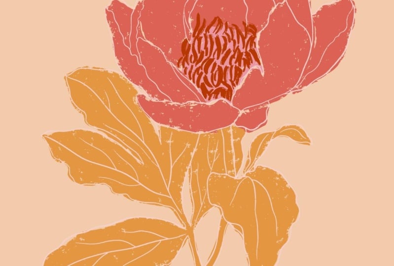
make adjustments, giving us more creative control. For this class, I'm going to show you a specific example of a flower image and
how we can use Procreate brushes to bring the
flower texture and warmth. But this technique could be
applied to so many images, animals, vehicles,
food, and so much more. The possibilities
are quite endless. If you're looking to
bring more life, depth, and texture to your
digital artwork, grab your iPad and
let's get started. [MUSIC]
2. Raster versus Vector: [MUSIC] Before we can start
creating artwork with all that wonderful texture, we need to understand the difference between
the files that Procreate makes versus the files that Adobe Illustrator makes. Procreate is a
raster-based program, and Adobe Illustrator is
a vector-based program. They are two different
types of files. One is not necessarily
better than the other, as they each have
their own strengths. In this lesson, you'll be able to see the difference
between the two and understand why we
prefer one or the other. Showing their differences will also help explain
why we need a tool in Adobe Illustrator
to make them work together for our art. Let's look at the
difference between a raster-based image and
a vector-based image. I'll start and procreate a raster-based program
and we'll draw a shape. Raster images are bitmaps, which essentially are a grid of individual pixels
that make an image. As I Zoom in on the shape, you can see the individual
pixels clearly. If I were to continue to scale up or make the shape larger, the edges would become
even more pixelated, making for a less crisp image. The results when printed
will look blurry, not the desired outcome when creating artwork for production. Now I'll create a shape
in Adobe Illustrator, which is a vector-based program. Vectors are based on
mathematical formulas. As I Zoom in, the
edge never changes, there's no loss of resolution. The same happens when I increase or decrease the
size of the shape. When creating art
for prints, cards, stickers, wrapping paper, fabric, and more, the ability to be
able to increase or decrease the size of an image with no
loss to the quality, is a huge bonus, which is why I choose to work in Illustrator for
my final artwork. [MUSIC]
3. Procreate Brushes - A Closer Look: [MUSIC] Procreate is a fantastic
drawing app for the iPad. The brushes in the app are
what truly set it apart. Take a look at a few of the
brushes in the program. These are a few of
the examples of the incredible brushes that
are natively in Procreate. Look at the texture and
layering abilities. While these brushes are
unreal in Procreate, their unique properties
do not always translate well when turned
from raster to vector. After experimenting
with a ton of brushes, I've created a
download for you with my favorites, including
the settings. You can find it in the
class resources section, but I strongly encourage you to use my list as a starting point. Get adventurous and experiment with all the
different brushes in Procreate and all
the settings in Adobe Illustrator's
Image Trace tool. Some of my best ideas happened by accident
during creative play. [MUSIC]
4. Procreate Brushes and Favorites Folder: [MUSIC] Procreate brushes are
quite remarkable. Their texture and
ability to build layer are incredibly fun
and creative to play with. The program itself comes
with a variety of brushes from basic drawing
and painting brushes, to wild textures
and even patterns. For the sake of this class, I'm only going to
talk about brushes that are native to the program, meaning these are not purchased
from an outside source. With all the brushes available, I like to keep my brushes for
this technique in one spot. You can see I've labeled my
folder, texture for vectors. Here's a quick peek at some of the brushes I keep in there. To create your own folder, scroll to the very top
of the brush library. At the top will be a blue
box with a plus sign. Tap the box and a
new folder will appear. Name your folder. The folder can be moved
anywhere in the list. I'll move mine down just so
it's near the native brushes. To add a brush to
your new folder, tap, hold and drag your brush
to its new location. However, I'd like
to keep mine in the original location also. Instead, I duplicate my
brush and move that. Swipe to the left and
choose duplicate. The copy will have the brush name with a
number 1 behind it. Tap, hold and drag the
brush to where you want it. Do not release your ''Hold''
until the folder opens. Now you have a place to save
all your favorite brushes. [MUSIC]
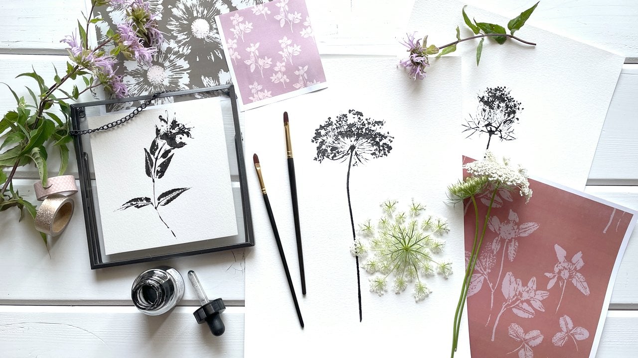
5. Drawing in Procreate for Use in Adobe Illustrator: [MUSIC] When drawing
in Procreate, the key is to use layers, especially with this
technique because we will need those layers later
in Adobe Illustrator. The outline of my flower
is already drawn and with one of my favorite
brushes, dry brush. I'm ready to begin what I
call coloring the image, and the first step is
to create a new layer. Before I begin coloring, I also like to drop the
opacity on my original layer. Tap the N and slide
the blue circle down. This isn't necessary,
but I find it makes it easier to see
what I'm working on. After making certain I'm
working on the correct layer, I choose a brush for
my favorites folder. Something that offering a soft and antique-looking texture to my flower petals. With the brush selected, I begin coloring the entirety
of the flower petals. A base is being created
that we can use later. Using black is also
important because later, the color can be changed
to whatever we desire. Black also allows
more texture to come through in the
translation process. While coloring, feel free to adjust the brush size as needed. Depending on the look for
the piece going outside the lines isn't
always a bad thing. Some brushes can
create a pattern of texture which can
be pretty obvious. Color over those places until the coverage looks the
way you want it to look. Once the flower
petals are finished, create a new layer and
continue with the leaves. I often shut off the layers
that already colored, allowing me to see the
current layer better. Feel free to adjust the opacity instead if that works
better for you. A new brush was chosen
for the leaves, just to add some variety. [MUSIC] Here's a look at
each of the layers. My favorite layer
has to be this one, with the unique brush to
create the flower stamen. Have fun being creative
with all of your layers. Now that our image is
completely colored, it's time to export it
to Adobe Illustrator. [MUSIC]
6. Exporting from Procreate to Adobe Illustrator: [MUSIC] Now that every layer of our image has been colored, we're ready to export this
file to Adobe Illustrator. Tap on the "Actions Panel" icon, which is the wrench
image on the top left. In that panel will be an option labeled Share, tap "Share". We're going to choose
to share a PSD. Using a PSD file allows
all the data to stay with the image and it keeps
our layers separated. An important part when we use this file in Adobe Illustrator, tap "PSD" and the export
process will begin. Once the file is ready,
go ahead and choose the place you desire
to save your file. Name your file, select
where you want it sent, click "Upload," and here
comes the fun part. [MUSIC]
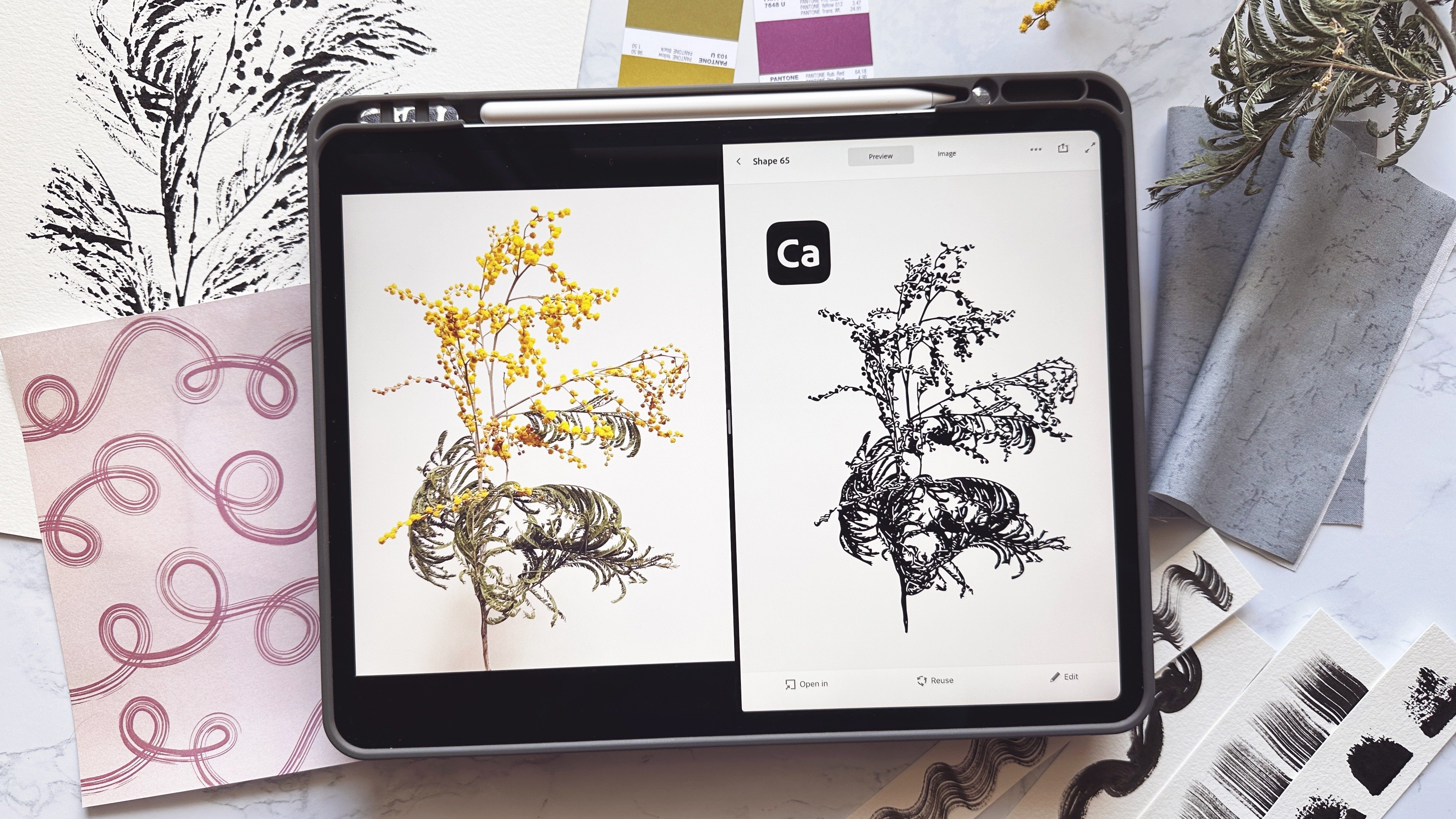
7. Image Trace Tool in Adobe Illustrator: [MUSIC] On your
desktop or laptop, open the program
Adobe Illustrator. Under file choose new. I simply choose to
use an art board the size of a piece
of printer paper. For this process we're just
creating our vector images. Once the images are
all vectorized, we can use them however
we need and want. When the art board is open, go to file and choose place. Then, select the image you wish to trace from your folders. The image will then appear to
be attached to your cursor. At the top of your art board, click and drag the image
out to your desired size. While we export the
image in layers, those layers are currently
grouped together. To fix this, go to object at
the top and then ungroup. We can see what is happening. Click on the layers window. After expanding the group, go ahead and select the background layer at
the bottom and remove it. This background layer is the white layer in Procreate
that we were drawing upon. I chose to use the ungrouped
tool one more time, but I still couldn't
separate out the layers because of all the
details and our coloring, sometimes splitting things
apart can be tough. To work around this, go back to the layers window
and select one layer, then click and drag it
away from the rest. I want a ton of control and visual
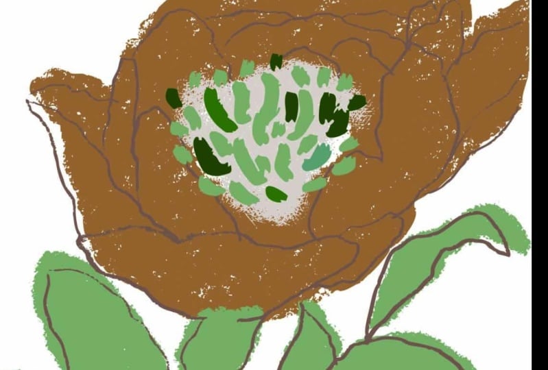
control of this process, so I move each layer aside and work on each one individually. Let's select the main
flower image first. I'm going to go to
object and then scroll down to image trace. Image trace will
run automatically. But to get even more
creative control, let's open the image
trace tool window. It can be found on the side, but if not go to window
and choose image trace. In the window under threshold will be the word
advanced with a caret. Click the caret to reveal
the rest of the options. My first step is always
to click ignore white. Look at the change
that made already. After that, I pop
up to threshold. Threshold brings out the black
lines more if you slide to the right and reduces the black
if you slide to the left. Try sliding both directions to find the look
that you desire. Next step is paths. Paths control how closely the traced paths follow
the original image. I always push this
to the upper limits, usually landing in
about 90-95 percent. But watch the number of
anchors because it could slow down your computer and your
computer's processing. Corners can make the angle
sharper or smoother. Because of the intricacies
of these images, I'm also going to push this
up to 90-95 percent as well. Once again, be aware of the
number of anchors which show in the panel
we're currently using. The last is noise, and noise is my favorite. It brings out all the
wonderful texture and I change this
to one every time. Feel free to adjust each of these settings to your
own personal preference. Sliding and adjusting
can be undone easily. Keep experimenting
until your image trace looks exactly how
you envisioned. When the image looks perfect, you must click "Expand" at the top for it to
become vectorized. When that is complete,
your image will be made up of tons of dots which
are actually anchors. The image can now be enlarged or shrunk and you will
not lose any quality. Set this image off to the
side of the art board and start the process
again with each part. I'm going to speed
up the rest of the video so that
you can watch me finish [MUSIC] image tracing of the rest of the
layers of this image. Once I finish that, we'll be ready to move on
to adding color. [MUSIC]
8. Coloring Images in Adobe Illustrator: [MUSIC] Now that all our
layers are vectorized, it's time to add color. Click the three
lines at the top of the swatches menu and open up your favorite color palette. I get rid of the rest of
the riffraff by clicking the red color box
and then holding Shift while clicking
the last color box, this will highlight
all the parts and you can delete them by clicking the trash
can, so much prettier. Select your outline image, click the desired color, and voila, it's beautiful. You can continue
that process for each layer and start
bringing them all together. With the leaves,
you can see that the solid part is in
front of the outline, so to change that, right-click, pick arrange, send back. Sometimes you might
need to arrange and bring to front as well. Continue to choose and adjust colors to match your
creative vision. The scale and placement of each layer could be
adjusted as well. You can see how
the creativity is really starting to
become endless. Once your image is
exactly how you imagined, go ahead and group the
entire image together, then save it as an AI file. It is now ready to use as a single image or in
a group of images, or even as part of a pattern, the sky is the limit. Look at all that
glorious texture. [MUSIC]
9. Adjustments and Fixes in Adobe Illustrator: [MUSIC] Let's say you wanted this leaf to
be a different color. You can see that
it's connected to the rest of the leaf image here. To separate them, we're going
to use the eraser tool. Select your image and
then click Shift and E. The eraser tool will pop
up and look like a circle. It can be adjusted smaller or larger using
the bracket keys. Click and drag the eraser tool where you want to
separate the pieces. When you're happy
with the results. Go ahead and ungroup the object. You can go to object ungroup
or you can use Shift Control G. Select the part of
the image that you want. You can see it's smaller by
the small box around it. Go ahead and choose a
new color for the image. The entire image
may not colorize, so simply highlight the parts of the image and continue to change the color until it looks
exactly the way you want. This process can be done
for any part of the image. Watch how to change
the colors of the flower stamen [MUSIC]
with this exact same process. If the image is not lined
up the way you desire, that can also be adjusted. You can select the part and move or even rotate
it as desired. Sometimes, when the object gets moved or even during the
image trace process, small parts can get left behind or in places
we don't want them. If you do not want
these parts to show, go ahead and choose
this solid arrow or click A on your keyboard. This will bring up the direct selection tool
that lets you grab smaller pieces so you can highlight and delete
what you do not want. The importance of working in layers is once
again evident here. Each layer is its own object
and it can be manipulated, allowing [MUSIC] our
creativity to be able to run wild and free.
10. Class Project: [MUSIC] Now that we have a
beautifully textured and colored vector image, let's use it to create
a greeting card. Within the class
resources section, there's a free
downloadable five by seven card template for
use in Illustrator. The template is set up
with cut and fold lines, making your project
ready for printing. I'm going to start by
making a rectangle that measures five by seven
inches for the background. Right-click to arrange and
bring our flower to the front. Scale the flower to size. Next, let's use the text tool or T on the keyboard and
type out a sentiment. "Happy Birthday" is
always a great one. Choose your font, the font size, and the color for your
sentiment as well. Type up the other half
of your sentiment and repeat the same process. Arrange the words
to be located on the card where your
eye likes them best. With those simple steps, you now have a gorgeous
card ready to print and send to someone special or
even put into your shop. For your own class project, consider a card, a piece of
wall art, or even a pattern. I cannot wait to
see what you share with the class in the
class project section. I know your work will
inspire us all and will fill my day with
joy and sunshine. If you need any help
uploading your project, please reach out and it'd be more than happy to assist you. [MUSIC]
11. Class Wrap Up: [MUSIC] We have only just started to explore
the possibilities of creating texture with Procreate brushes
and vectorizing those images in
Adobe Illustrator. Not only can we add
texture to an image, but we could even consider a brush to make a
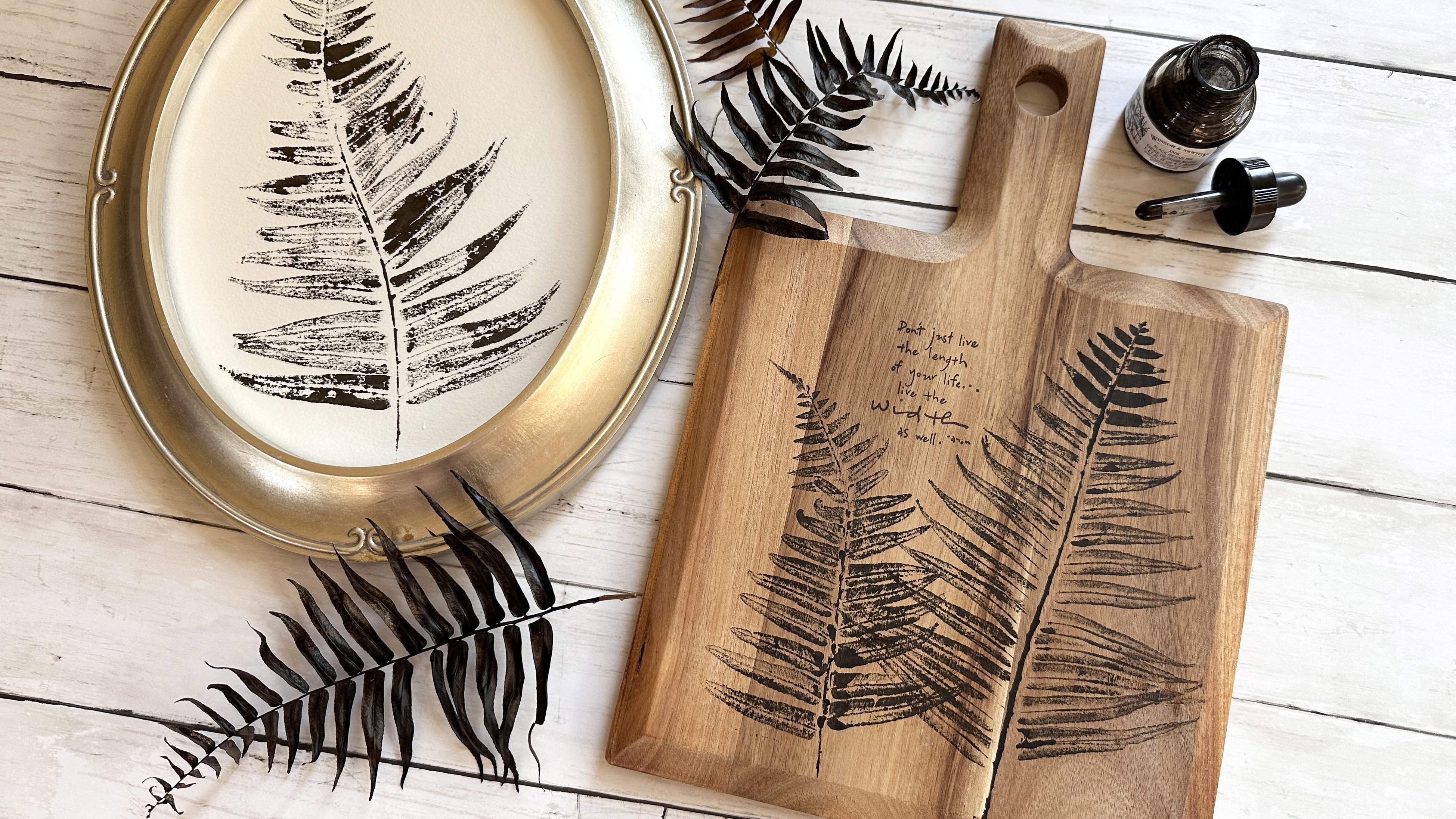
unique background. Adding texture will
bring our designs to life with the unique
and warm touch. As I continue to
explore and learn, join me on Instagram
to follow along. I would love for you to be a part of my little
community there. You can find me
@SincerelyYoursKimberly. If you share any parts of
your project on social media, be sure to tag me
because I would love to share your
creativity with others. Thank you for taking this class. If you'd like to learn
more about using the Adobe Illustrator
Image Trace tool, checkout my class, Inking Natural Elements
for Design Work with Adobe Illustrator. Have fun being creative. [MUSIC]
12. Bonus: Adobe Illustrator for iPad: [MUSIC] Illustrator for iPad works with JPEGs when it comes to
importing from Procreate, which is different than when we go from
Procreate to computer. To accomplish exporting my
Procreate layered image, I'm going to export each
individual layer as a JPEG. Turn off the rest
of the layers and export only one at a time. I always choose to save
the JPEG image to my iPad. Repeat this process
for each layer, being sure to turn off and
on the layers as you export. [MUSIC] Open the Illustrator
for iPad App. Once again, I use
a standard piece of paper sized art board, 8.5 by 11 inches. Start by importing a photo, you will find the photo
icon is on the left. The vectorizing tool
is on the right side. When it opens, you can see many similarities to
the computer version. There are presets for tracing and all of
our favorite tools. [MUSIC] You can see threshold, paths, corner, noise, and don't forget, ignore white, which I almost
always start with. After the first tracing paths, I go through the
tools and settings that I'm familiar with
from my computer. I continue to experiment with each until I achieve
the look I want. [MUSIC] Just like when we're
using the computer, don't forget to click
the "Expand" button. It's down at the bottom and
it says expand vectorization. Once I'm happy, I shut
off the other layers. I create a new layer and
import the next image. [MUSIC] Even after working at trying many combinations of settings, I still don't quite get
the look I'm going for, especially when I
know how I was able to make it look on my computer. But I think it's
worth trying and to see how your creative
eye takes to it. The best part about using the app is if you're logged into the Creative Cloud and have Adobe Illustrator open
on your computer, this file will be on
your computer as well. It can also be exported
to other locations using the box with
the arrow on the top. [MUSIC]
 Kimberly Crawford, flower obsessed, surface designer