Transcripts
1. Class Introduction: Hi, I'm Kimberly and I'm a new surface pattern designer who's inspired by flowers and nature. So inspired that I'm literally using those natural elements to create my designs. Let me show you how to capture the beauty in details in nature for your own work. This past spring while attempting to watercolor a pine branch, my frustration hit a high level. My painting didn't contain the texture or feel I'd hoped to convey. The voice in my head for my days of working in the paper crafting industry said, "If only I could ink up a stamp, it would look better." Then, with a puddle of Black India Ink before me, and a pine tree out the window in the yard in front of me, I thought, "Why not stamp the real thing?" Off to the yard I went scissors in hand. Back in the house, I covered the branch in ink and pressed it down into a piece of paper. Then again, and a few more times, just for good measure. Magic. It was magic on paper. Now I'm obsessed with inking every flower and stem that I see, watching the beauty of nature go from outside to a piece of paper back to life again, and design work fills me with joy. In this class, we will learn about taking the objects we find in nature and combining them with India ink to create motifs for design work. Flowers, leaves, twigs, grass, even rocks can be looked at in new and inspiring ways. Once captured on paper, those images can be turned into a digital format with a scanner or photo and then using Adobe Illustrator's, Image Trace tool. We'll learn about using this tool even if you don't experience using the program. Within a short amount of time, we'll have digital images ready to be used on a variety of projects. If you're looking to expand your design ideas, or simply want to use inspiration from your own yard or garden, this class will help you grab that moment in nature and capture its beauty tangibly. Let's get inky.
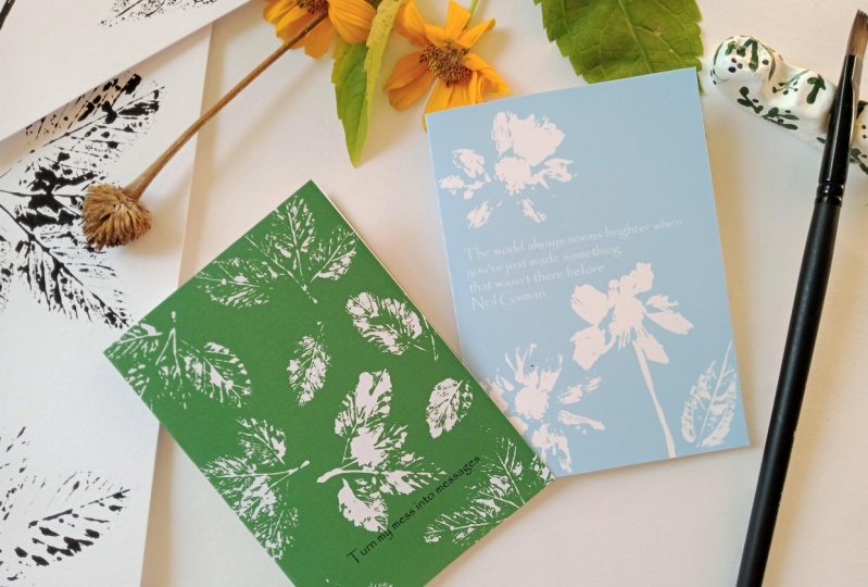
2. Supplies and Class Project: Let's talk about the supplies that we're going to need to make our inky impressions. To start with, we are going to need natural elements. That could be flowers, leaves, twigs, rocks, grass, anything you find in your yard. Make sure you have those on hand. The next thing we're going to want is we're going to want to use some of this India ink. This is black India ink. I love the liquidity of this because it gets into all the groves and spots and really brings out great detail. It's also permanent once that dries. Once it dries, you can't reactivate it with water and I think that's a really valuable thing to have for something that you're trying to make impressions with. You can buy large and small bottles of this, but I really like this top because it has a dropper which lets me control the ink a little bit more when I'm putting it out on my palette. The next thing is, let's talk about paper. I'm using a watercolor paper because this is a variant of watercolor and I really just like this Canson paper. It is a 140 pound paper, it is cold press and it's thick. The best part about this is it's readily available anywhere. For our ink, we need a place to put it like a palette, and I don't like to use plastic or glass because it can stain and make a huge mess. What I have started using is palette pads. What this is is, it's a pad of paper that has a waxy coating on it and you can put your ink right on here. I tear the pieces into quarter sizes so that I'm just using a little bit for each time. The other thing you can do is if you want to be a little more conscious about what you're using when you're creating is when the ink dries on here, you could use it again because it can't be reactivated. You could use a palette piece of paper many, many times over again. But I find that's really helpful for working and for cleaning up. The next thing I want to talk about is paint brushes. I really like flat paint brushes for applying the ink directly to our natural elements. They come in a lot of different sizes but one thing I will say is this needs to be a dedicated brush to your India ink because eventually it can be really harsh on your brush and you don't want to use one of your really good, really expensive precious brushes. Those are that. A couple other things you might like to have is some tweezers. Sometimes it's helpful to pick things up and place things with tweezers. If you don't want to get your hands inky, you may want to have a pair of gloves. Another bonus item, you don't need this to make it, but I love it is this Mono eraser. It is a sand eraser made for ink. But what it can do is, if you get stray ink marks on your impressions that you don't want, either from your hands or from the object, you can erase a little bit of ink with this, and it's quite magical. Now, to take our inky impressions to the computer, you're going to need a scanner or if you have a smartphone with a camera, you can use that. You'll also need Adobe Illustrator. That is what you need to get started to make all this beauty. Next up, the class project, the best part about taking any class at Skillshare. This class project is going to be in three parts because I want you to share your creative process with everybody else, so that we can be inspired and we can learn from what you're doing. Step number 1 is so much fun. I want you to go and collect some natural elements and go ahead and make an inky impression. Share your inky impression with us so that we can be inspired by all the unique things that you have found and all the unique designs that you are going to create. Step 2, I want you to go ahead and scan or take a photo of and digitally turn your image into digital. I want you to share what you create. The reason I want you to do that is, I want everybody to see the decisions you make as you take your actual image and turn it into a digital file format. We can be inspired by your settings and all the different ways that you make your image look like. That's your second part. The third part is probably the most fun and that is creating an actual project with your beautiful impression. I have for you in the class resources section a AI file, an illustrator file that you can use to make a five by seven card. You can take and put your elements on here and you can create some beautiful cards that you can print off and send to a friend with your new impressions. I cannot wait to see what you're all creating and what you are designing and I cannot wait for you to share it with everybody here.
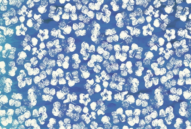
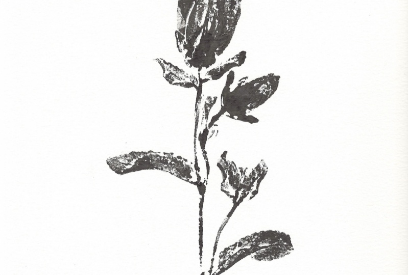
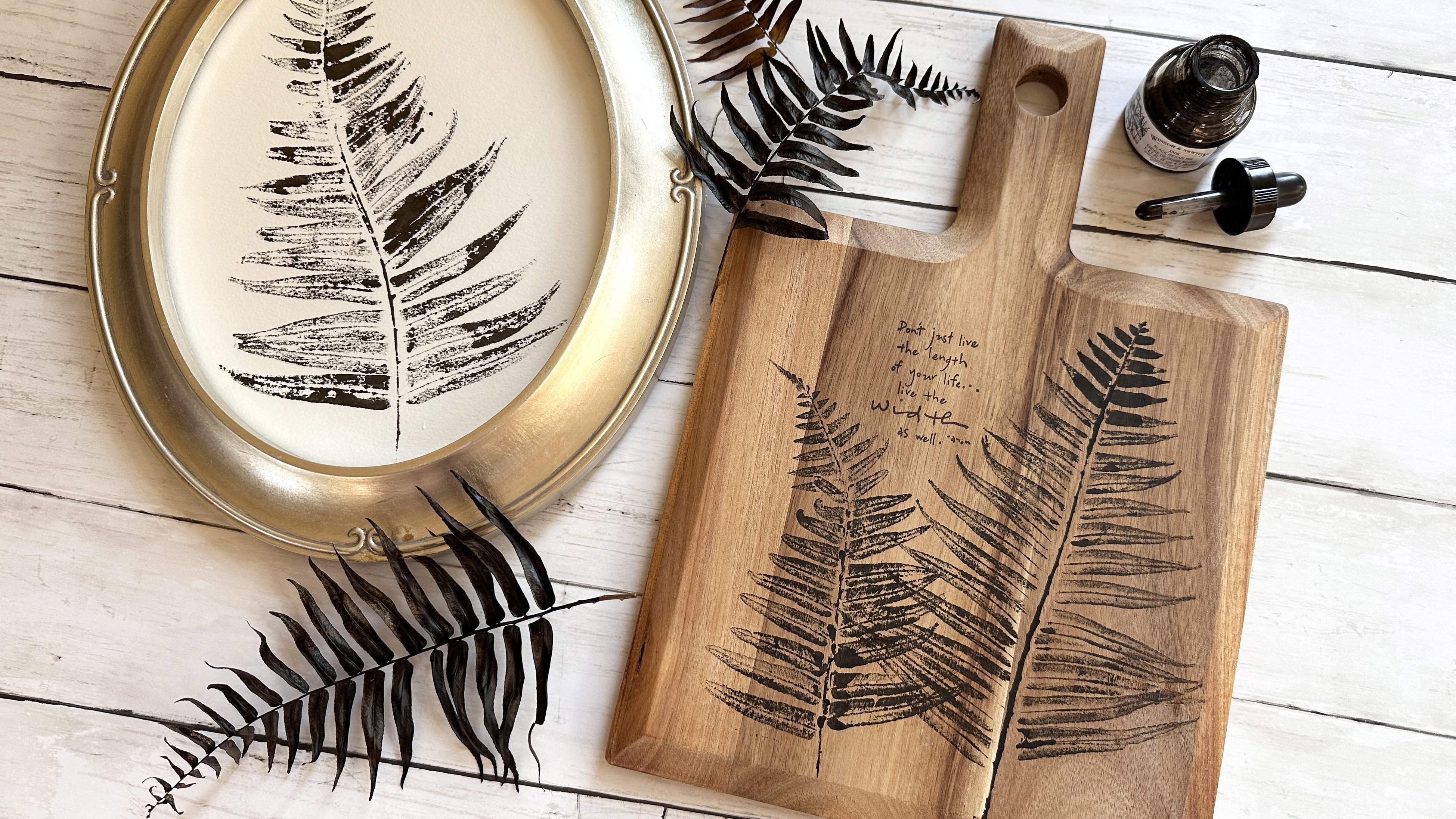
3. Inking Natural Elements: What exactly are we doing with all this paper, and ink, and natural elements we've collected? Well, what we're doing is we're taking and we're making an impression of the actual element on a piece of paper so that we can scan it and turn it into something that we could use for digital work. For example, I took and made an impression of a pine branch, and what I did is I I this into the computer and then used it to create this pattern. By taking something we've created with ink in a traditional art way, we can turn it into something we can use digitally. Let's go ahead and see what it takes to get inky and get making nature impressions. Here's the good part. Here's the part where we're going to get inky. What I'm going to demonstrate to you today is I'm going to demonstrate to you using one of the gerbera daisies from my garden. I just went and picked this out of my garden, and for this one, for the ease of stamping and I just cut the stem off of it, and we're going to go ahead and we're going to put ink onto this. What I do is I use my flat paintbrush and I go ahead and just apply the ink right to the flower. The other thing I might do is a lot of times I'll take a dry piece of leftover palette paper I have and use that to help me flatten it out and get a good, nice even coating of this ink on here. If you wanted to, you could just go ahead and dunk this flower right into the ink. Just not even painted on, just go ahead and dunk it in. It will give you different results, and I think that's probably the coolest part about this technique is every different element that you choose to put ink on is going to give you different images, different styles of images, different types of images. I really wanted to show you this gerbera today because I wanted to show you the detail that this ink can bring out. We're going to just get a little bit more ink in here, and now we're going to go to the center. You will find and different elements and different parts, you're going to need more ink or less ink. But that's the fun part about the experimenting with all of this. I already have an impression that I made with one of these flowers the other day. I'm going to show you again. I'm going to do on my paper is take and turn this flower upside down. You could go ahead and push it down with your hand. But I like to just grab a piece of leftover scratch paper that I might have laying around and go ahead and use that to help me push these petals down into the papers so that I'm giving a really cool look in impression, and then I'm going to very carefully push on the raised center to try to get the impression from it. You can just see I'm gently feeling through the paper to get the ink added. It's stuck in the stem. But look, look at that impression that we were able to get from the ink and just pushing that flower in there. Isn't that incredible? I love the detail of the petals, the detail of the center. It is amazing. Now you could go ahead and you could ink this, put this down right away again and see what happens for results. Why don't we go ahead and try that. This little messier also indicates to remind me, protect your work surface. This ink is permanent and so if you get it on your work surface or on your clothes, it won't come off. It will come off your hands, but it doesn't want to come off other surfaces. Let's go ahead and try this without any ink, reinking I should say, on it and see what we get for results. Just feeling pushing a little bit. Let's lift. This is my favorite part, the lift and see what happens. Oh my goodness. Come on. How beautiful is that just on its own? This is absolutely incredible. You can keep applying ink to this and stamping it over and over again and using it and get some absolutely amazing impressions doing that. One important tip I want to give you when you are making these impressions of nature images is some objects like for example, this leaf here. You're going to get a different impression depending on which side of the object you use. For example, the back sides of leaves definitely have more of the stem and the veining sticking out, and that's more of what we're going to want for an impression. That is something to keep in mind. Let's go ahead and let's ink up this leaf and see what it turns out like. Again, my biggest tip is apply the ink with nice even amounts. I find when I get a blob of ink in something that I don't get as good of an impression, I might it a dark spot, might do that. You can also see sometimes things like leaves will resist the ink just a little bit, but you will still get a really great impression. Let's go ahead and let's just take this right over to our paper here. Let's find a spot we can work in. This looks like a good spot right here. I'm going to go ahead and just use my hands on this one. I don't mind getting a little inky, and you can just see once again, like I was with the paper, I'm just gently pushing down into the spots that I'm trying to get an impression from. There we go. Let's go ahead and lift it and see what we got. We've got a very interesting impression, but you can see how it brought the veins and all that out by using the backside of the leaf. That's one tip to keep in mind. Look at your object and see where you're going to get the best impression from and which side. The next tip I want to give you about getting good impressions from your nature elements is doing something not rocking. If I look at this flower stem, if I push here, you can see how this end lifts up and vice versa. If I have inked up this entire thing and I go to press it on my paper and I pushed down on this end and this end flips up, this could leave impressions of ink all over the place and get this shadow effect. That's definitely not what we want. That is one of the reasons that I use a piece of scratch paper over the top when I pushing larger objects like this down because it lets me keep a hand here and keep a good pressure on all of the rest of this while I'm gently pushing down so that I don't get a rocking motion. Make sure that whatever you're doing and however you're getting your impression, avoid that rocking motion by keeping a steady hand and keeping the object completely down on the paper. But I want to show you a couple other things that I've done that could really add some unique ways of using this technique to your own work. Let's set these aside. I'm going to bringing some examples over of some work that I've done, and I want to show you what I did with a daisy, one of these gerbera daisies that I did a long time ago. I stamped the stem and did it a couple of different directions so that I had a stem I could use if I was making things. I also pulled all the petals off and just did the center.I think there's some amazing possibility, and I did the center here, but I just twisted it. Think about the different parts of your element that you could use and create some really unique impressions that way. This one, I took the center and I inked, and I just rolled it on the paper and got some really interesting unique pieces that I really can't wait to use into some of my design work, on some patterns. Some great blender patterns I think are coming there. This one here is actually twigs from our cherry tree out in the backyard. I just inked them up and pushed them down into the paper. Again, some really cool elements, maybe potentials for brushes here, a lot of interesting pieces. Then this is the one I wanted to share. This is what I did with all the pieces from my cherry tree out front. I stamped and inked up the blossoms. But then I also went and used just the center and actually made a pattern from the center. It's really unique and beautiful. You can see some of the leaves here. You can see some of the centers, and then this is the backside of some of the flower blooms. That's the part that holds the flower to the branch. Some really unique possibilities here for what you can do when you're inking up some natural elements.
4. Flower Pressing for Highly Detailed Ink Impressions: In this bonus lesson, I'm going to talk about using a flower press. You don't need to use a flower press to get any of these impressions. In fact, you don't even need a flower press if you're going to do creative things like twigs or rocks or even things like this pine branch. But if you wanted to get into some more detailed impressions, and especially if you're interested in florals. All of these florals were pressed before they were inked in order to bring out some of the detail and to get some better surface area. In this bonus lesson, I'm going to talk about a flower press and making one. I'm also going to talk about if you want to try pressing things and you don't want to invest in or you don't want to make a flower press. Stay tuned and check out all the details on the flower press. For some flowers to get the best impression, a lot of times the flowers need to be pressed. What a flower press is is essentially something that just flattens a flower. Now there are people who flower press to preserve flowers, but for this case, we're just flattening them to ink them up and get them onto a piece of paper. I typically just press my flowers for about 24 hours and I've made my own flower press here. I have taken two cutting boards. We've drilled holes into it with carriage bolts and some wing nuts. Now I'm going give you instructions on how to make your own flower press and I will leave those in the class resources. If you want to see how to make your own flower press, you can do that. This has two parts. It has a top and a bottom. What I'm going to do to press my flower is I'm going to put down a piece of cardboard. This is just backing from the watercolor paper that I have been using. I'm going to go ahead and put that down. The next thing I'm going to use is some blotting paper. This blotting paper helps soak up some extra moisture from the flowers. Some flowers are very moisture heavy and they don't take the ink very well, so by using this and pressing them, it removes some of that and helps me bring out better detail. I put a piece of that down and then I put my flower down. Depending on how I want this lay, I could force the petals to be open. I could leave them closed. I think what I'm going to do is I'm going to go ahead and leave it closed. I'm going to top it with another piece of paper here, and then a piece of cardboard. I've made this little sandwich here. It's time to replace the top. Again, I'll put the top back on. To help flatten it out, I'm going to use these wing nuts to help hold this in place. You can see this end is a lot thicker because of the flower center. Sometimes you have to push really hard to get the piece to close. There we go. Now I'm just going to turn these until I can't turn them anymore and that is what is going to press this flower. I usually let these sit for just about 24 hours because I don't want them to turn paper brittle. I just want them to lose a little bit of their moisture and get flatter so that I can have some more creative options with my flowers. There we go, the flower press. Like I said, you can check out how to make your own flower press in the class resources, I'll have some instructions there for you. If you don't want to buy a flower press or make your own flower press, you don't need one. I'll show you what you can do really easily without having one. I just know that I love to press a lot of flowers and so making one for me made sense. But if you have a big book, go ahead and use a giant book. All I used to do was just take a piece of wax paper and then put my stem in there and arrange it the way I wanted it. Just put a little more wax paper on it and close down the book. You can stack heavier books on this if you want or just let the weight of the book go down on it. If you don't want to get all fancy with a flower press, go ahead and use a really great big book.
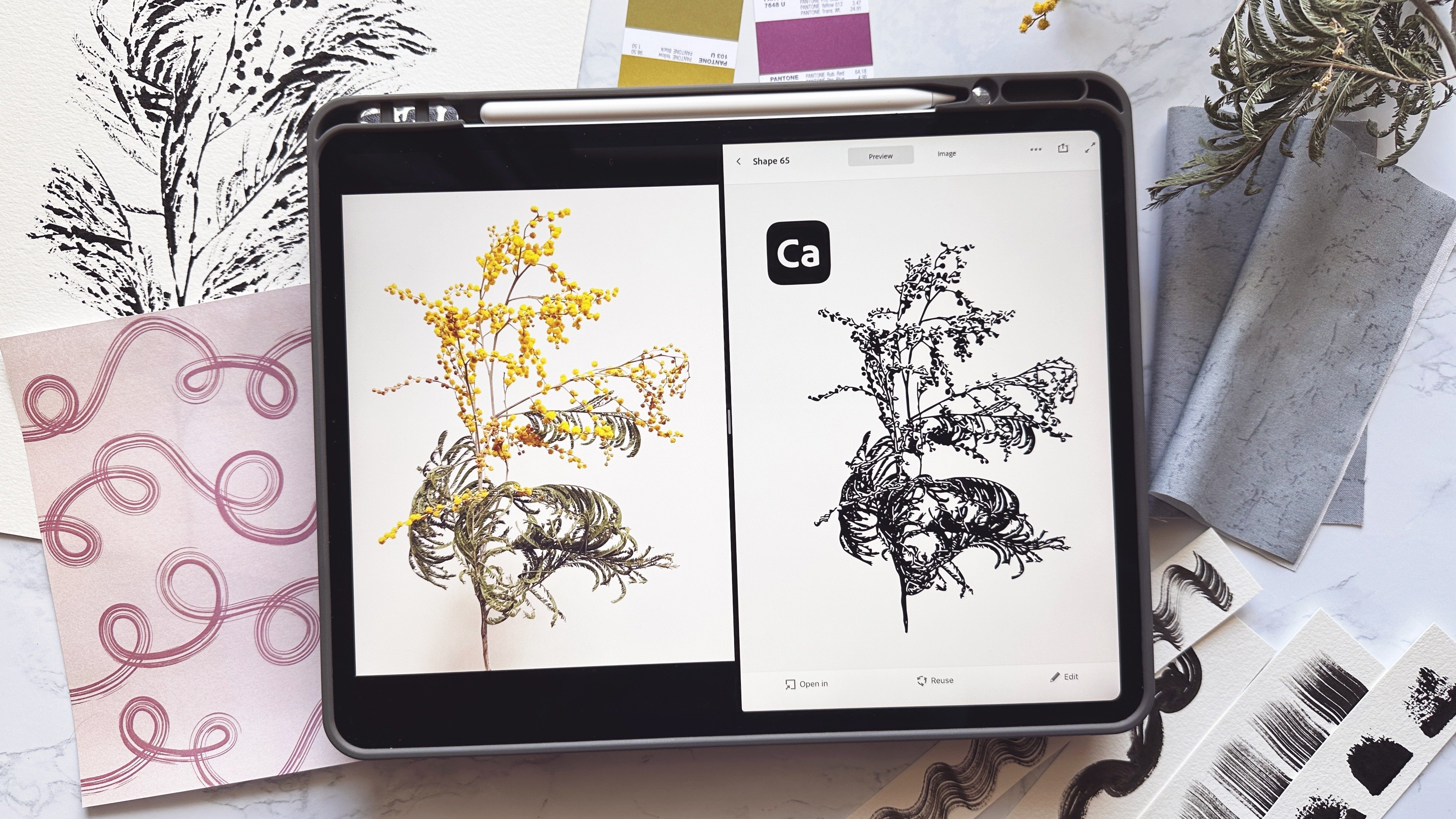
5. Scanning or Photographing your Ink Impression: We have made our gorgeous inky impressions, and now, it is time to take them from the paper to digital format. Now, if you have a scanner, you are going to want to scan this picture in as a JPEG. You're going to want to do it at a high resolution. I would recommend at least 300 dpi. You could go 600 even if you wanted to. I'm not going to go over scanners with you because everybody's scanners are different. It's just focusing on those main things of JPEG, and high resolution, and getting it saved in your computer. Now, if you don't have a scanner, you can go ahead and take a photo of it. I want to talk about a couple of things. You want to make sure that as you're taking a photo, that you get the image nice and lined up, and you want to make sure you don't have any clutter. You don't have a paintbrush in the way or anything like that, and you're just going to want this clear, sharp photo that you're going to take and use. We're going to go ahead and get this photo in taken and put into the computer so that we can go ahead and turn this into a digital format.
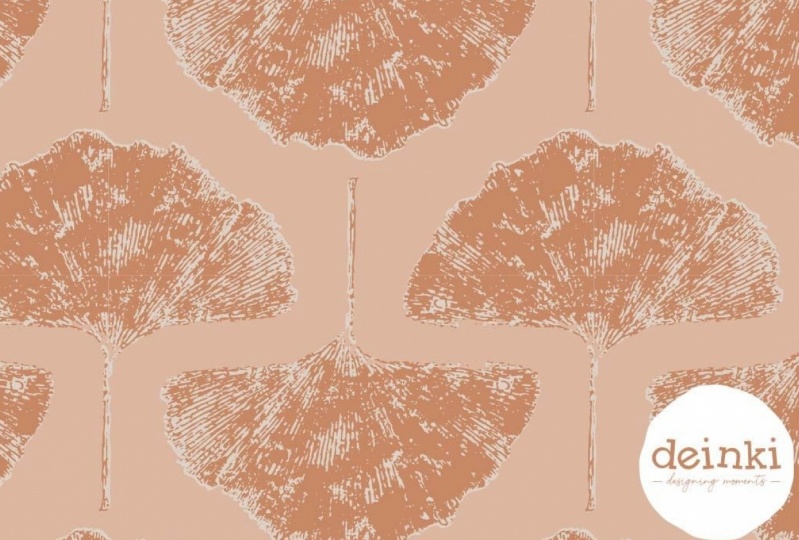
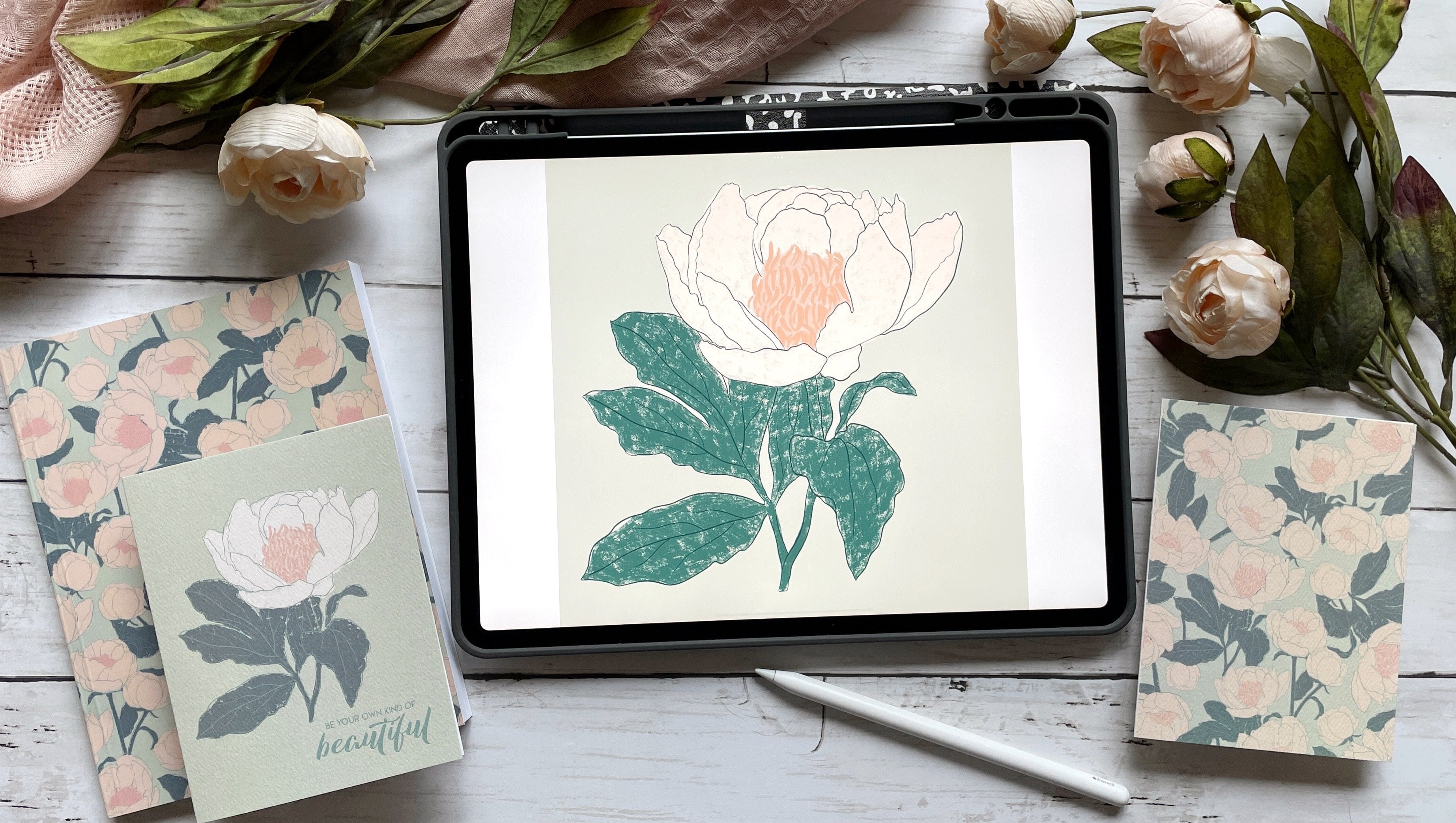
6. Adobe Illustrator and the Image Trace Tool: Welcome to Adobe Illustrator. I'll be using the CC or Creative Cloud version of Illustrator. Some menus maybe in a different location if you are using an older version. To begin with, launch the program on your computer. You'll not be able to use the mobile versions of Illustrator to complete these steps. The first step is to find the top menu bar. The first option is file. Click "File" and then choose "New". This will create a new document. An option menu will pop up. For the purposes of turning our scans into digital format, let's create a standard piece of paper sized file which measures eight and 1/2 by 11 inches. The settings may show points or pixels, but by clicking the drop down menu here, you can change to whatever measurement you're comfortable with working with. Because we'll end up printing our projects, use the CMYK mode and also use a 300 DPI setting mode for the same reason. Click "Create". Here is our new document ready to be worked on. Go back to the top menu and click "File" again. This time scroll down to place. We want to place our JPEG into this document. Click "Place" and find your file. I should mention that I'm using a PC and not a Mac. My file finding may look different than yours. Once you click "Place", after you have located and selected your file, you will notice that it shows up in your mouse cursor as a teeny tiny rectangle document. Align the cursor with the top-left corner of the document, then click and drag the mouse until the image fills the document. Release the mouse button and your image is ready to be image traced. Keeping the image selected, which will be indicated by the blue border around the edge and the small white squares of the corners, go to the top menu again and select "Object". Under object, towards the bottom third, you will see Image Trace. Place your cursor over it, and when the flyout menu comes out, choose "Make". This will automatically trace your image. It might look fine, but we could adjust quite a bit more of the trace. If you do not have the Image Trace tool in your sidebar, it can be found in the top menu bar under Window. Click "Window" and choose Image Trace. A box will pop up with our options. But to access even more, click the small triangle next to the word advanced. It's about halfway down the box on the left side. My very first stop in this menu is always ignore white. Because we used a white background to make our impressions, we want to get rid of any white parts for our image. The next option I choose is paths. Paths control how tight of a fit the parts of the image have. Because I want lots of details, I bring my settings up to 95 or 96 percent. This will increase the number of anchors greatly. If your computer is having trouble processing this, choose a higher percentage that works. Let's move on to corners. A higher percentage means more corners, which for our images is a good thing. I feel like it, well, no pun intended, really rounds out the image with fullness. Again, I use about 95-96 percent. Then it is time for noise. The higher the value, the less noise or the messy bits there are. Watch what happens when I push the slider to the top. Hey, mess around with these adjustments all you want, discover the look you want for your own images. You can always undo anything you do. For our purposes, I want to bring all the noise. Give me all those little spots and marks, I always drop this to a one. The final stop is above the word advance, and that's threshold. Threshold turns pixels darker than the threshold level, which basically means it makes the image more solid. You can see as I move the slider to the left, it basically makes the images disappear. As I move to the right, it becomes more and more solid until it's almost completely solid. Because we really want the texture, I find staying in the middle-ish ground help works best. But again, it's your design, choose what makes your eye the happiest. The next step is of the utmost importance. You must click the "Expand" button, which is located under the menu bar at the top of the screen. Without clicking expand, the image does not turn into vector format and that's what we need. If we don't do that, our file will not work. You will know that the expand was successful because all of the anchors will be blue on your image. When the images are traced, they can create stray marks or marks can get created that you may not want to have stick around. To clean up our images, let's start by selecting our object. When it's selected, it will show a blue box around it. Go up to the top menu and choose "Object". Under object is the command ungroup. Click that. It will separate all the pieces and parts. Click anywhere on the screen to de-select. Now with the direct selection tool, you can highlight and grab the parts you want to remove. In fact, you can even move parts around. There's something super satisfying about cleaning up traced images. Once you're happy with the clean up, select the entire object. When the blue box shows up, go back to the object menu at the top and choose "Group". This will bring the entire image back together and it is ready to use. Yes, it really is that easy to make a digital vector file. It's incredibly beautiful and incredibly easy. Many times I will put more than one image on a piece of paper. When I scan it in, I have multiple images. But a lot of times I don't want to use all of those images. After I get everything imaged traced, what I can do is go up to object and ungroup everything. Once I've ungrouped everything, now I can go in and isolate the piece I want. Let's say I want this bloom. Now I can go back up to object, group. Now this is all put together for me and it's one I can use. If I don't want the rest, I'll highlight them all and delete them and get rid of them. Now I have one gorgeous image to use. Keep that in mind. Feel free to save on paper and put as many impressions on one piece of paper as you would like. I have moved all my new vector images onto one new document so that I can keep them all in one place. I want to use these images together eventually. What I'm going to do is just save these as an illustrator document so that I can access them anytime I want. Choose "File", "Save As", find the place you'd like to locate them, name them, and choose "AI" at the bottom. Once you click "Save", you will have a new grouping of vector images to use in all your artwork.
7. Digital Design Options and Creating a Greeting Card: Now we have this quite lovely vector file. What do we do with it? We can do anything we want creatively. To begin simply, the color of the vector image can be changed. There are many ways to change the color within Illustrator, so, have fun exploring the possibilities. You could also create a pattern. Because the image you created is now in vector format, the object can be scaled up or down, rotated, flipped, and more. There are several wonderful courses in pattern design in Skillshare, and I encourage you to check those out. Let's take a look at creating a simple greeting card. In the class resources section, I have included an Illustrator file that is set up to make a five by seven greeting card. The cut and fold lines are already designated, which will make this quick and easy. After opening the file in Illustrator, click your favorite color. Then use the rectangle tool, which is also an M on the keyboard to create a rectangle that fits the template by clicking and dragging. Go back to your original vector image and copy paste your image onto the card template. If you have the CC version, you can click, drag and drop onto the template as shown. Now the vector image can be adjusted for scale, orientation, or a duplicate can even be made. I love the power contained within a vectorized image. The sky is the limit when it comes to your creativity. Don't forget to add text by clicking the Text tool on the sidebar or using T on the keyboard. Now your card can be customized with the perfect wording for any occasion. Once your card design is finished, print it out, trim, and fold it according to the lines, and make someone's day with a special card.
8. Design Inspiration and Class Wrap-Up: We have barely begun to scratch the surface with all the creative possibilities with inky nature impressions. Whether it's flowers, flower centers, twigs, or a feather, the ways to use the elements of nature with ink is limitless. Once we scan the inky images into the computer or take a photo with a camera, we can begin to explore all the digital possibilities, especially, now that you know how easy it is to use the Adobe Illustrator Image Trace tool. How about creating backgrounds and textures for digital design work? Or Photoshop or Illustrator brushes, patterns, art prints, a greeting cards, fabric, of course, phone cases? Yes. You can use these images on all of it. As you create your inky impressions, vectorized images, and final design projects, be sure to share each step with us in the class project section. Seeing what other artists are creating is so inspiring and we learn from you at the same time. Aren't we lucky to have such a wonderful community? My journey with exploring inky natural elements has only just begun as I continue to learn and experiment and have way too much fun. Join me on Instagram to follow along. I would love for you to be a part of my little community there. You can find me @sincerelyyourskimberly. If you share any parts of your projects on social media, be sure to tag me. I would love to share your creativity with others. Thank you for taking this class. I hope that you are inspired to explore the natural world around you, and that you find ways to capture the beauty of nature.
 Kimberly Crawford, flower obsessed, surface designer