Transcripts
1. Introduction: Hi, I'm Shannon McNab. I'm a surface designer and illustrator and I'm crazy passionate about patterns. I got my start in the scrap-booking industry nearly a decade ago. From my experiences there, I learned the importance of having strong coordinate patterns for your main prints and how it can really strengthen a portfolio. In this mini class we'll focus on what components make up a successful pattern collection. I'll walk you through strategies for creating two types of coordinating patterns. My hope is by the end of class, you'll be inspired to strengthen your own pattern portfolio with the tips you've learned. Let's get started.
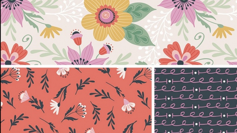
2. What Makes a Strong Collection: For this class, I'm defining a collection as three patterns. One, the main or hero pattern. This pattern contains the most visual interest in detail. Often has the most, if not all the colors in your palette represented. Next, a secondary pattern that pulls elements from the main print. It's important that the design complement but not compete with the hero pattern. I'll be discussing strategies for developing secondary patterns in the next video. Finally, a very simplistic coordinate. For me, that often means a design based on geometric shapes. We'll be discussing this type of coordinate in Video 5. Personally, this is how I design most of the collections in my portfolio. Not only does including one or two coordinates add value to your collections, but it also shows clients that you've thought about how multiple patterns can work together. This obviously, is not the only strategy you can use to create pattern collections, but it's one that I've particularly found helpful in my business. For those of you who want to design larger pattern collections, you can still use this approach. Just break a larger collection down into small groupings of three patterns each. This will not only allow you to design in smaller, more manageable chunks, but also make sure your large collection has a nice assortment of each pattern type. Of course, I could go on and on and talk about patterns all day long, but I thought it would be more helpful and a little more fun if I actually showed you some examples from my portfolio. You can see in my spring strawberries piece, that the main pattern is the most detailed, yet is well supported by the two coordinates. One pulls several simple floral shapes from the main print, while the other, is a simple geometric with the complimenting vibe. This holiday pattern collection, Christmas bubbles, was so much fun to create. Just like the previous piece, these coordinates follow the same pattern. One pulls elements from the main print, while the other is a simple geometric coordinate. This strategy can also work well with illustration pieces in your portfolio. In my cute as a buck design, the illustrated type is the star, but I utilized all the bugs in that design to make a fun coordinating pattern, and finished it off with a simple, quirky geometric.
3. Coordinate #1: Tips for Success: As I mentioned in the last video, a great secondary pattern often pulls elements from the main print but utilizes them in a different way. Here are a few things to keep in mind when developing your secondary prints. Don't try to include too many motifs. You want the pattern to complement the main design without it looking just like a modified version of the original. In most cases, choose no more than five motifs from your main print to keep them from looking too similar. Or you can keep it really simple and just use a single motif. Use an alternate background color. Another way to add dimension to a secondary pattern and make sure it looks unique enough is to use a background color that's different from your main pattern. If your main design utilizes a light background, try a medium or dark background or maybe give it a pop of color and try a background using the brightest color in your palate. Keep scale and spacing in mind. Just like the background color, the scale or spacing of your secondary pattern should contrast with your main pattern. I would say in most cases, the main print should feature the largest motifs. The secondary pattern should have somewhat smaller ones, especially if it includes many motifs. Beyond scale, spacing is equally important. If your main print is tightly spaced, try a secondary pattern with more breathing room and vice versa. Well, it's not always necessary to use all three strategies when creating a secondary coordinate. I found that when I at least use two of them, my secondary coordinate is a lot stronger.
4. Coordinate #1: Design Demo: Now that we've covered what to look for when creating a secondary coordinate and things that can help make a pattern stronger, I thought it would be good to show you a quick demo of the way I would go about creating a secondary coordinate for a pattern. You can see here, this is my autumnal owls main pattern. There's a lot of different elements besides the owls that I can pull to make a secondary pattern. I've decided that for this, I would use the leaves and the acorns so that it's not going to be too similar. I've got my elements right here that I want to use. As we talked about in the last video, I don't want to have the same scale as this right here. I would probably scale these guys down first so that they would appear a little bit smaller. Then I can do a couple of different things to play with a pattern. I could do a little back and forth line. This is something you can just play at. You don't have to get it perfectly the first time, you can just experiment as you go. I could do something like that and maybe make them all centered. If I repeated that out, maybe I want to reflect that so they're not all in the same direction. This is obviously a very quick example, but you can easily see how different this looks from the way you [inaudible] but obviously, it's still cohesive because it uses the same elements. Another thing you could do is more of a toss which is what I have going on here. It would be different elements that look like they were just tossed on the ground. Obviously, I'm just quickly placing these guys and I'm putting them pretty tightly spaced because this has a little bit more breathing room. Spacing is another thing that we talked about that can make a difference. Obviously, this isn't exactly how I would make it, but something like that that you can, then play with space. Then the last thing that I would do is since this has a light-colored background, I would want to utilize a different color. In the actual design, I use this light medium-ish pink, but it might be nice if I try a few different ones, like that's actually really pretty. You need to do it a little bit later so you can see all the stem work. Or I could try one of the boldest colors in my palate. It's actually nice doing that color. Then obviously, I would have to change the objects that are in that color to a different color. But those are just a few ways that I experiment with creating a secondary coordinate that works with this one. If you'd like to see how the full collection actually worked out, you can see all three right here. I obviously went with the yellow for the geometric coordinate which we'll cover in video five and went with the pink as the final design for the secondary print.
5. Coordinate #2: Geometric Experimentation: Once you have your secondary pattern nailed down, it's time to complete the collection with a third very simple coordinate. My favorite strategy is to sketch a bunch of geometric or abstract shapes. Here's three different ways you can approach it. One, take a blank sheet of paper and cover the entire page with random doodles and once you've found a few shapes you like, you can even sketch them several times, making small adjustments as you go. Here you can see how I utilize some of these shapes for geometric coordinate, for this floral design. Two, while you're sketching out motifs for your main pattern, use the blank space on the page to sketch geometric shapes. By sketching your geometric at the same time, it's more likely that the completed coordinate will vibe with the main print. Like these mid-century inspire coordinates for my space dogs collection. Number 3, sometimes when I'm feeling really organized and especially inspired by a theme, I create a series of thumbnail sketches of possible patterns for a collection. During this process, it's natural for me to include several simple coordinate ideas alongside the more interesting designs. You can see that this simple starburst type design, ended up as a coordinate for my lemon zest hero pattern. No matter which method I use for collection, the fun part comes after all the sketches are in the computer because it means it's time to play an illustrator with just a little experimentation, one or two motifs can be used to create several different patterns within minutes. Here's what I mean. Take this football like shape I sketched during a random doodle session, for example. I could take that shape and duplicate it so it creates a chain, and then if I repeat that out, now I have an interesting little stripe. Looks a bit like DNA to me. But I could also use the shape by itself in a dot pattern and now this reminds me of leaves. Or what if I try rotating it 45 degrees and then having another one flips the other way, and then repeat it out. Then I'd probably try playing with the rows of this pattern to see if I could create something else like this. Of all four of these designs, this last one is probably my favorite and the one I'd be most likely to move forward with, and that took me less than two minutes. Think of what you could do with 10 minutes of experimentation.
6. Final Thoughts + Your Assignment: Creating stronger pattern collections shouldn't take you days or feel overly daunting. That's why I like this approach because I know once my main pattern is completed, it's usually smooth ceiling when designing the two coordinates. Now let's quickly recap what you've learned since as they say, repetition is the key to mastery. Including coordinates with the hero pattern, adds value for your client and shows that you understand how patterns can work together. When designing a secondary coordinate, don't include too many motifs, use a different background color, and keep scale and spacing in mind. Complete the pattern collection with a simple geometric or abstract pattern. Try not to overthink this part of the process and remember that the pattern's vibe should still relate back to the main and secondary pattern. Also, the same principles of color, scale and spacing apply to it as well. Now it's time for you to take what you've learned here and apply it to your own work. Take an existing hero pattern or if you're really feeling ambitious, you can create a new one and apply the techniques of this class to create two coordinate patterns for it. Once you're happy with what you've created, go to the your project tab just below this video, and click, Create a project. From there, add your final design and any in-process images you may have so I can see what you've created. I can't wait to see what you come up with.
 Shannon McNab, Surface Designer & Illustrator