Transcripts
1. Introduction to the Course: Hi everyone. Today I'm going to
show you how you can build interactive
dashboards on Excel. Now, these are
very simple to set up and can really
help you in your job. I'm a data analyst
by profession. I know how important data is, n, I know how important
displaying data is. The good thing is that you can create a dashboard on Excel. Excel is a popular tool. Most people have used
it before and are actually familiar with
the basic functionality. Now, this is great
because you can create the dashboard and
anyone who has Excel, we'll be able to read it
and interact with it. But dashboard can be a great tool when it
comes to tracking KPIs, comparing data, and generating
reports that can help you or your stake holders make
some important decisions. Dashboards can be interactive, where the user can filter the data based on
the requirements, which makes it way better
than your traditional report. In this class, we're
going to create some interactive dashboards
that are easy to set up. We're going to learn how
to create pivot tables, pivot chart, and then use
those to build our dashboard. We're then going to add
some functionalities like slicers and timelines to make our dashboard
more interactive. These awesome cool concepts in Excel and are really
important to understand. I'm also going to show you some best practice processes of creating a
dashboard in general, the project we're
going to be doing in this class is creating
a sales dashboard for a company called Company X as A1 to present this dashboard
to the investors. So let's get going. In the next lecture, I'm going to discuss the project brief.
2. What are Dashboards and Why are they Important?: So before I get started, let's talk about what
exactly is a dashboard. A dashboard consists
of charts and tables, typically on one page
that helps stake holders, like managers or
business leaders in checking key KPIs or metrics. Dashboards are made so that their stakeholders can
make decisions off of it. Dashboards generally are
customizable to meet the specific needs of a department or even
the company as a whole. Now, this is really important. If you create a dashboard, your customer is a person who is looking at the dashboard, their opinion matters,
say dashboard will essentially become ineffective
if people do not use it. Now, behind the scenes, a dashboard connects
to your files, databases, APIs, and outputs this data in
a visually appealing way. Ideally, dashboards should be interactive where
the users can opt to fall to the dashboard to see a specific date,
range, product, etc.
3. Project Brief Review: So now that we know why
dashboards are important, let's find that what
we'll be doing, let's open our project brief. You are the data
analyst for company X. They would like to present the Q1 2022 sales to the board. However, they're not tissue
how to display the data. The main dataset
is the sales data. The link to the
dataset is below. Ideally is a board
generally likes to see the following sales by certain characteristics
such as month, branch, city and payment type. And the board would
also like you dashboard to be interactive, where they can choose to
filter the data by month, city, Branch, and customer type. Great, So we have
all our information. Let's go to the next step.
4. Step 1 Looking at the Data: Step one, getting the
data first things first, you need a dataset and we're going to be using sales data. The file is called
company sales dot XLSX. Let's open it up and have
a look at what's here. We have sales data, great. And I'm assuming this data
stores every invoice. So every time a customer has bought something
from company X, it gets stored here and each row represents a sale or an invoice. Let's live in columns
of the data invoice ID. This represents your
unique invoice number. We get date, the date
of the sale was made. There is something
called branch. The branch that
actually made the sale. We have city so the city the sale is made him we
have customer types. So whether the customer type was a normal customer or a member, and I'm thinking for
this case, maybe mmm, the probability means part of a loyalty program that they
need to sign up to gender, the gender of the
customer product line. So what product was bought
by the customer unit price. So the price of one product quantity is the actual quantity
that was sold. And in sales, which probably
means a total sales, which is unit price
times quantity. And then we have payment types, so how the sale was made, okay, So we understand the data
and now it's really good to do this as a first step because if you don't
understand a column, you would go back to
the stakeholders such as a sales manager and
ofs them about it. So it's often good to
review the whole dataset. There's nothing that
we are unsure of, so let's proceed on
to the next step.
5. Step 2 Designing the Dashboard: Step to designing the dashboard by added this step because
designing the dashboard before you actually
develop it is important and this generally means creating a simple mock-up or sketch of the dashboard. Why would you need to do this? Well, I mentioned earlier
that dashboards are customizable to meet the
specific needs of a department, a person, or even the company. If you are creating
the dashboard, your customer is going to
be the person using it. If they aren't happy, you are just going
to waste your time and the dashboard will
just never be seen. A good step to avoid that would
be to sit for the person, will people and
sketch out a mock-up. So if you want to give it
a try, pause the video, get a piece of paper and sketch out what
you think would be a good dashboard layout based on the project
brief requirements. Okay, So this is what
I've come out 12th, but by the way, if you add something different,
that's totally okay. Your version may even be a
better layout than mine, but since I am the instructor, we're going to be
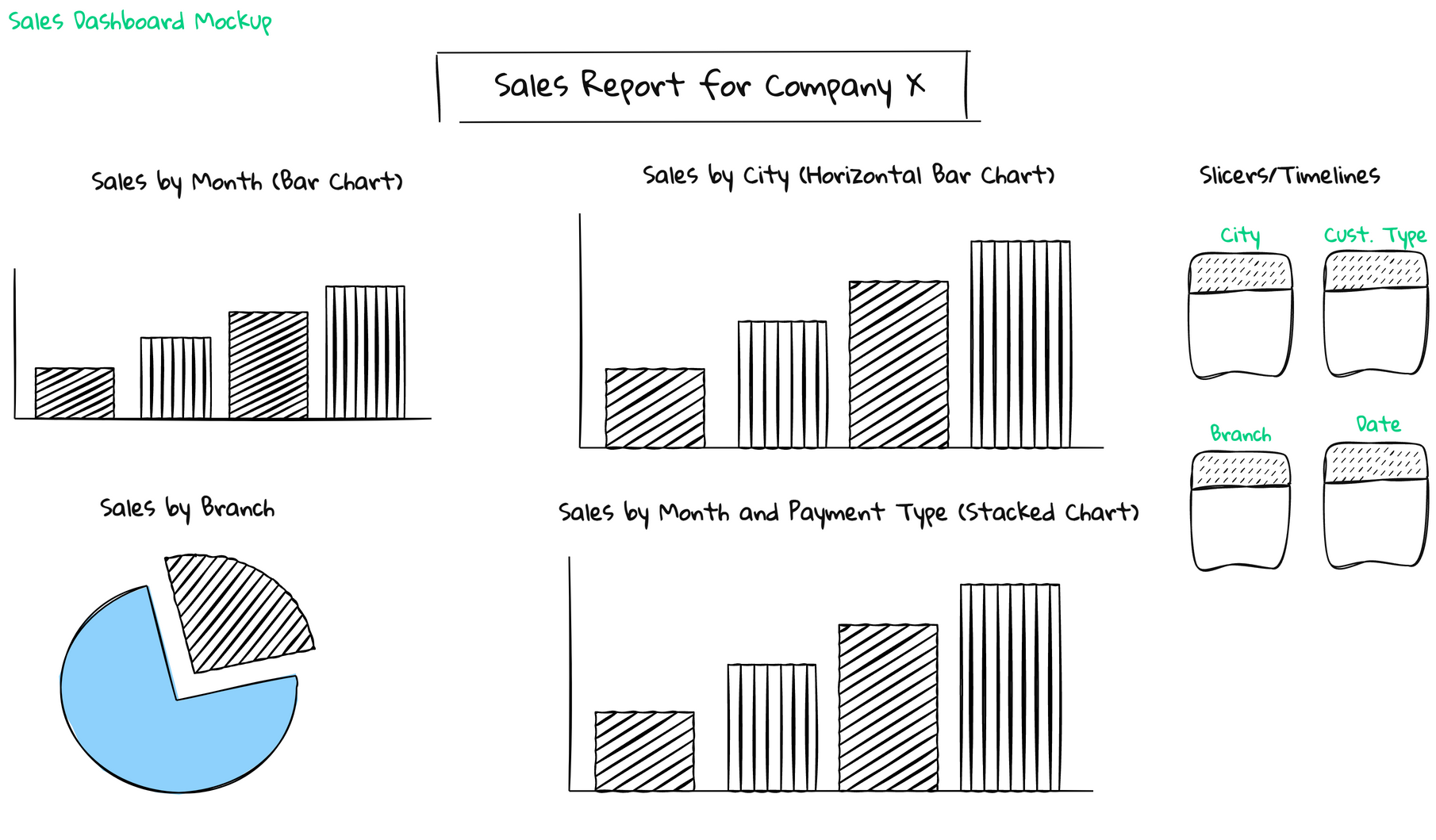
using my layout. So I have a title
and to the left I have a sales by month
chart, simple bar chart. I then have a sales by city, which is a horizontal chart. So essentially the
excess will be swapped. I didn't have a pie chart
for sales by brunch. Then I have a stacked
bar chart for sales by month and payment type. And then to the right, I have my options and I
can filter the data worth. I can filter the data by
city, by customer type, branch and date, slices and timelines on Excel
or basically filters. So essentially you would
have sat down with your stakeholder and
you would have drawn this up together
That way you know exactly what your stakeholder
ones from the start. This is also the chance where
maybe if the stakeholder wants to create a chart
based off of a calculation, you can ask questions about it. E.g. maybe the stakeholder wanted you to add a chart
showing profit per month, then you would ask the stakeholder harvest
profit calculated, whereas the cost data, etc. So again, this just ensures
that there isn't any back-and-forth and you have a good structure starting out. There may be a few
iterations in the future, but generally your first draft should cover the basic needs.
6. Step 3 Process of Building Dashboards: Okay, Here's a core
of the tutorial. Let's create some dashboards. Now before I do, just
want to show you the whole process of creating
a dashboard on Excel. So this is essentially an infographic
detailing the steps. Ideally, to summarize this, we are going to be
creating pivot tables from their create pivot
charts and then add those pivot chart
to our dashboard sheet. Finally, we will create
slices of timelines. So let's recap. To create an
interactive dashboard, you start with pivot tables. You then create pivot charts. You didn't move the charts
to dashboards, cheat, and then you create your
slices to fulfill the data. Now that we know what to do, Let's go ahead and start
developing our dashboard.
7. Step 4 Creating Pivot Tables: Okay, so we're on step four, which is creating pivot tables. So here we are on our sheet. So I am on the company
sales document and my tab is called
data at the bottom. And we are going to create our pivot tables because
we do need PivotTables. Because from our pivot tables
we are going to be creating pivot charts and then sending those charts
to our dashboard. So let's start creating
some pivot tables. So to start, you can click
on any cell on new table. So I'm clicking cell A2 and we are going to go to
the Insert tab here. So I'll click on the Insert tab here and click on Pivot Table. Now the Create PivotTable
window pops up and Excel will ask you to
select your table range, which as you can see, it's
already selected for us, which you can see by the
green dotted or dashed line. You can also have the option of using an external data source. And here's where
you actually decide where you want to place
your pivot table. Do you want to place it in a new sheet or on
an existing sheet? If you do want to place
it on an existing sheet, you would need to indicate
where you would place it. Now, I like to place all my
pivot tables on new sheets. And the main reason
why is because if you ever need to
add some data in, maybe if this data is from Jen to March 2022 and you
want to add April 2022, then it will be
easier just to have the sheet just representing
your raw data. And you can add and change
the raw data how you want. And then the other sheets can be all of your private data, which essentially is
your transformed data from your role or source data. So with that being said, let's select New
Sheet and click Okay, and you can immediately
see that new sheet has been created called xi2, and now we have something
called Pivot Table one. And to the right there should be a pain called Pivot
Table fields. Now, the pivot table
feature is perhaps the most technologically sophisticated
component in Excel. Just a few mouse clicks you can slice and dice your data in many different ways
and produce just about any type of
summary that you want. Essentially, we can create these rolled up or
aggregated tables from our raw data and answer those questions
from the investors. I'm just going to zoom in here just so you can see better, but you obviously don't need to. So we can see on the
right that we have this pivot table fields
window or pain that appears. So if we see on the right, we know this pivot table
fields pane has appeared. And this here, or columns in
our main data spreadsheet. How this works is
that we can place these columns in
specific positions here. The pivot table
will be outputted. So here's an example. Why don't we slipped city and you can see
if you click on it, you'll be able to drag it and
drop it on the field rows. So now we see that the different
cities appear as a row. And maybe you want to see the
sales related to each city. So let's look sales and
we're going to drop it by the sum value sign or
sigma values, right? So what we see here
is we see city on rows and it's giving
us the sales per city. And if we look at our
pivot table fields pane, we can see we've added
satiety rows and we've added sales to the sigma values box. Now, Excel is telling us, well, it's taking the sum of sales. So whatever we add to this box, it will take the sum or count or average of depending
on what we want. So if I didn't
want sum of sales, but I wanted the average, I would right-click this field. Click on Field settings. Here. I can change how
wanted summarize by, so if I wanted it by
average and click Okay, It now gives me the
average sales per city. And then you can see our box changes from some of
sales to average of sales. So this essentially
takes our value, which is a column that is
a measurement quantity like sales, quantity, cost, etc. And it can sum it
up, it can average, it can give us a count, it can give us a Mac sales, are men sales, etc. Based on what we put on a
rose or even our columns, Let's change this back
to some of sales. So we're going to right-click Field Settings and
let's click some again. I'll click. Okay, Perfect. Now let's add
something, two columns. What if we want to see brunch? So essentially, I
want to see city here and I want to
see branch here, and then the sales for
each branch by city. So let's click on branch at the top and it's
dragged two columns. Now our pivot table changes. So what do we notice here? Well, we have our cities, we now have our branches
are branches are called a, B, and C in this dataset
and actually tells us by city and by
branch how much sales. So we know that
Yangon, for brunch a, has made about 101,000 in sales for cities
Mandalay and branch B. We've also made very
similar 101,000 and so on. We also get grand totals, which is quite nice
because then we can see the total porosity
irregardless of your bronchi. In some older we
get the grand total yeah, at a row level. So we can see the total sales per branch regardless
of the city, which is quite useful. We can also decide if you want
to filter our pivot table. So maybe I want
to filter just to see a specific customer type. Let's click on customer
type at the top, and let's bring it into folders. Now you'll notice that there is a another row appearing here. Essentially we can filter the data based on
customer types. So if we click on this
drop-down and B1, and let's select member
and click out of it. Now we can see is just for
our customer type member, we can see the sales
by city and by brunch. And then if we want
to select Normal, now this will show
the sales by city and branch for normal
customer types. And then if we want
to select everything, this will bring us back
to our previous position. But we are not going
to use photos here. I'm just going to click
customer type over here and just drag it out. Perfect. You can also take a
few minutes just to play around with
this whole concept. But essentially, as you can see, the theory behind pivot
tables is quite easy to use. That's why it was designed. It was designed to be
very user-friendly. And essentially we're using pivot tables to
summarize or aggregate our data based on the questions that the
investors have asked us. So with that being said, let's go on and create
our first pivot table. So I'm looking at the mockup and we are going to do
a sales by date. And it's just going to
be a simple bar chart. So let's start by
renaming our sheet to double-click on it backspace, and let's call it sales by date. And I'm going to use
the same pivot table, but let's just remove our branch from columns such
as click and drag it out. And let's remove city
as well from rows, Click and drag it out. And essentially four rows, I just want to show
the date here. So let's go ahead and do that. So let's bring in
date from the top and drag it and drop it to
the bottom of rows. Perfect. So now we have Gen Fab much. We can also expand and contract
to get the actual day. But I think we can just
leave it with the CEO, Jan, Philip, and March. This is our first pivot
table, quite simple. Let's create a
another pivot table because we want sales by city. So two ways you can do it. You can go back to the Data tab, go to Insert, go to Pivot Table. Our data range is fine. We're going to be creating a new worksheet and click Okay. And now we have a
new pivot table. And now we can start
working on that. Or some people, what
they do is they just make a copy of this tab. So sales by date, if
you just right-click, you say Move or Copy, you can just click on Create
a Copy and click Okay. And then it will just create
an exact copy of this. So you can see sales by day two. And then what you
do is you can just remove all your field and you start off with
a new pivot table. So either one up to you, I'm just going to
right-click and delete this sales by date. And then just start with my
new sheet, which is xi three. And let's call this
sheet sales by t. I'm just going to zoom in again. And now exact same concept here. We want sales by city. So let's take City
and drag it to rows. Let's take sales and
drag it to values. Perfect. Now what we need according to the mockup is sales by branch. Why don't we create
another pivot table? So let's right-click any sheets
so you can do salesperson TO sales by date, Move or Copy. Create a Copy and click. Okay, it's changed the sales
by side2 and let's call it sales by brunch. Make sure you click
in your pivot table. If you have any other Windows, you can just click
out of it until you get the PivotTable Field pain. And let us do instead of
t, Let's get rid of that. And let's do brunch. Let's find bronchi
and drop it on rows. Perfect, So now we have our branch and I'll
sales quick and easy. And last one we need to do a sales by payment
type end date. So again, let's right-click
go to Move or Copy. Go and click, Create
a Copy and click. Okay, awesome. So now we have a sales by branch to its double-click and rename that and call it sales
by payment and date. Click on the Pivot Table. And now instead of brunch, let's get rid of that. Let's due date. So let's click on Date
and bring it to rows. And let's find payment here. And it's bringing two columns. So now we have for each month, we are our sales separated
by payment type. So e.g. in January made
an E9 thousand in cash, that is 6,000 and credit card, and then 34,000 in e-wallet. Okay, so we have created for pivot tables,
quite simple ones. Obviously, you can make them
how complicated you want, depending on how you
want your pivot chart. The next step would
be PivotCharts.
8. Step 5 Creating Pivot Charts: We have our fourth pivot tables. Let's start creating
some pivot charts. And create pivot charts. It's actually quite easy. So let's start off with
our sales by date. And according to our mockup, we want that as a
normal bar chart. So click on New
Tab sales budget, and then just click
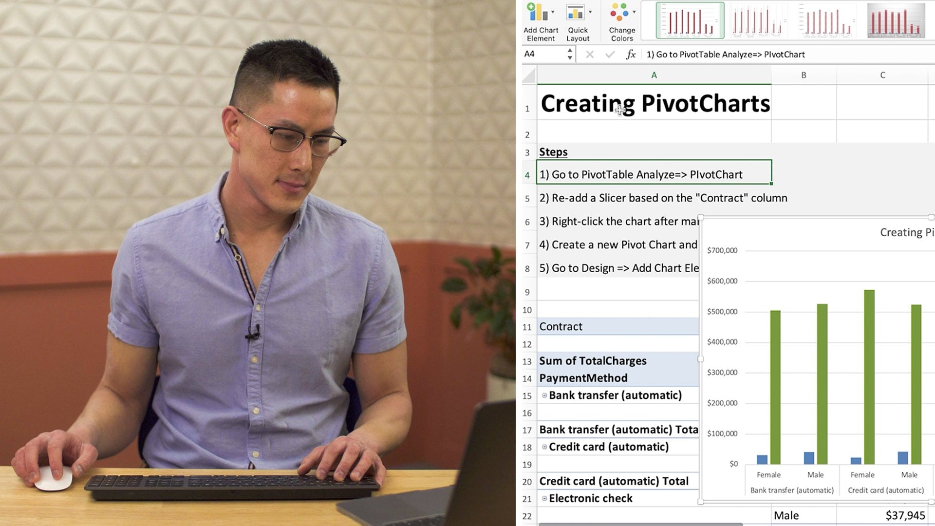
inside your pivot table. If you go to PivotTable Analyze, you can see an icon
here for pivot chart, and if you click on it, it
now creates our pivot chart. So this is our chart and we have a bar chart, which
is what we wanted. We have the months, Jan Peerce much and we have the sales. Let's do some formatting. Let's maybe change the
color of the bars. Let's add some axis titles. Let's just clean it up a bit. So if you click on a charge, you can go to Design. And here you can change
the colors if you want. I'm just changing the
colors to this one here. Or you can do whatever
color you want. You can even leave it if
you do like the blue. And here you can change
the design if you do want or prefer a better design. Generally, I always
use this one here just because I like the way it looks, but please go ahead and
do whatever you want. There are a few things
I wanted to change. Like I said, I want to
add some axis titles. We want to rename this title, and I wanted to actually
move these labels. So let's do that first. So
let's click on the labels. So this just represents
the actual amount. And let's right-click on a label and go to Format Data Labels. And here's where
you can decide how you want your labels to look. If you want to rotate the text, if you want to change
the label position here, make sure you're on the
Format Data Labels pain. If you go to Label Options and click on this last
bar chart icon, go right to the bottom. And let's do outside
it and perfect, Okay, If we click our chart again, and let's go to Add
Chart Elements. This is where you can add
things like access titles. You can decide the position of your chart title if
you wanted above, if we don't want it, if you want it centered overlay, you can choose from grid
lines, Legends, etc. So what I want to do
is add an axis title, and click on Primary Horizontal. That should give us
x axis. Perfect. Let's double-click this
and let's call it date. And in brackets. Like that. I can click our chart again and let's
add a vertical one. So go to Add chart element x is title and go Primary Vertical. And let's call it sales. Perfect. Let's click
on this chart title, double-click on it backspace, and let's just call
it sales by month. Okay. I'm happy with all this. Looks if you want to change
the colors, you can, you can do so here
on the Design tab. Or you can click
on the actual box, right-click and click
Format Data Series. And if you go to this full
bucket and click on full. And if you've got a solid full, you'll be able to
change the colors. So I'm not going to change
the formatting a lot. So my best advice when it
comes to formatting charts, it's just play around, see what fits, see what
looks nice to you, and that's how you learn. But in general, I think the
quickest way is to start with a default format over here and then customize
it how you want. Okay, so we've done the first one which
is sales by dates. Now that we've done without
chart or we need to do is repeat this across
all up of a tables. So let's move on
to the next one, which is sales by city. So I'm on my sales
by city pivot table. And again, we're going to
click inside our pivot table, go to PivotTable, Analyze, and click on Pivot Chart. Now, sales by date tab, we've already set of formatting and we
can do a shortcut to apply a similar formatting and our sales by date to
our sales by sub t. So what you do is you
go to your chart, that you have done
the formatting one. You click on the chart and you right-click and say copy or Command or Control C. Go
to our sales by city. Select this chart, then right-click and
you can say Paste. Now you notice we have
very similar formatting, but it's now sales by
set T, which is great. We don't need to
waste any more time. The only thing I want to do
is actually move this to a horizontal bar chart just to have a different
option for our dashboard. If you click on the chart
and click on Design, you can see we have an
option to change chart type. So I'll click on
Change Chart Type, go to column and
move down to 2D bar. Now what we can do
is maybe just rotate these labels because
they look a bit off. If you click on date,
month, and right-click. And say Format Axis title. You should have this
pane here opening. If we go to Text Options and
click on this last icon, which looks like an a
surrounded by a box. We can change our
text direction. If you click on Text direction, Let's go to rotate all
texts 270 degrees. Perfect. Let's do the same for sale. So if we click on Sales
and then click here, and let's do horizontal,
that looks way better. Final thing we need to do
is just change the title. So let's call this
sales by city. And that's it. Let's
go ahead to sales by branch and its create
our pie chart. So click on your pivot table, go to PivotTable, Analyze. Click on Pivot Chart. And now we want to
apply formatting. So let's go to sales by date. Let's right-click sales
by date chart and copy. Let's go back to
sales by brunch. Let's click on the
sales by broad chart. Let's click on the
sales. Right-click. Select Paste. Perfect. And let's change
this to a pie chart. So make sure your
charges still clicked. Go to Design, Change Chart Type, click on pi, and you can decide about
pie charts you want. I like the donut ones. Great. We can do need to
change the colors here. So why don't we go
ahead and do that. So what I do here,
I go to Design. And let's just select that one. So the second one, perfect. And now I want to move
our labels outside. So let's right-click
on our labels and say Format Data Labels. And for Label Options, click on the last icon
and let's just show percentage as well because I
think that's also important. And category name. Then for separates,
let's do a new line. Okay, so that looks
a bit better. Now, I'm just going to move this out just so we can see it. So you just click on
the label and drag it. Okay, perfect, Let's change
this to sales by branch. And the one thing I want to
do is I've been using green. So I just want to make
one segment green. So if we click on the Chart, got to change colors. Okay, and I'm using
this color palette. So I'm just going to click
on that just to maintain the same palette
throughout my pie chart. And I also made a typo here. So I'm just going to change
that to sales by branch. Last one, we need to do a sales
by payment type and date. So let's go to our sales by
payment type and date tab. Let's click on that pivot chart. And according to the mock-up, I want a stacked bar chart. So go to PivotTable, Analyze, and then
click Pivot Chart. And now let's change this
to a stacked bar chart. So go to Design Change
Chart Type column. And I think it's
the second one here with 2D column called
stacked bar chart. Great. Again, let's keep
the same formatting. So go to sales by date, thick on the chart,
right-click, click on Copy. Go to sales by payment and date. Click on your chart,
right-click and paste. Perfect k. Let's change
the colors here again. So I'm going to change colors. And I'm just changing
my design to match my same design
that I've been using. This looks great. I think my labels should
definitely be rotated. So let's click on our labels, right-click format. Data labels. Go to Text Options. This last icon. And it's changed
the text direction to rotate all texts to 70. And let's do that for
all our data labels. So click on that and change the text direction
to rotate or two to 70. Then this one as well. Click on it. Ticks direction, rotate or two to 70
is called a sales by payment type and date. And now, why don't we move our labels to just have
it inside the box, just because it's actually
clashing with a title. So if you click on the label, Label Options, click
on this last icon. And let's move it to inside it. And you can do that
for all the labels. I'm just moving all of
them to incite end, just so it doesn't
clash with that title. Okay, so now that we've
created all our charts, they're all looking great. We can create our dashboard. So we'll move on
to the next step.
9. Step 6 Building our Dashboard: Okay, so let's go ahead
and create our dashboard. Now, you might have
an empty sheet. If you don't want to
just click on this plus sign here at the bottom. And you'll create
an empty sheet. And it's just rename
this to dashboard. So let's click on this
corner button here, and let's just fill
it with white. So click on the full
bucket and click on white. Alright, so what we're
gonna do now is move all up over charts to the sheet. So let's start off
with sales by city. Click on the chart, right-click
and select Move Chart. And now Excel move our chart. So you can either move
it to a separate sheet or you can move it as an
object in another worksheet, which is what we're going to do. So we are going to
select object in it. And we are going to select our dashboard sheet
and click Okay. Then you'll see our
sales by city pops up. And you can just move it
wherever you want to for now. Let's do the same
for sales by date. So go to our sales by date tab. Click on the chart,
Right-click Move Chart. And we're saying
object in a dashboard. And click Okay, perfect. Let's do sales by brunch. Click on sales per branch,
corner chart, Right-click, Move Chart, object in
dashboard and click okay. Then the last one, which is
sales by payments and date. Click on the chart. You can see it
actually didn't move to a stacked bar,
but that's fine. So let's just click on Design. Change Chart, Type,
column and stack bar. There we go. Let's right-click the chart, Move Chart and object in. And we are going to say
Dashboard and click. Okay. Let's just move this
down. Alright, perfect. So we have all our charts here. And now in the next step we are going to just
lay it out a bit bitter and sit up our slices.
10. Step 7 Adding Slicers and Dashboard Layout: Okay, So let's just move the
charts how we want them. So this is fine as is. But what I'm going to do is maybe just make
some, a bit bigger. I actually do want
to make some space for our slices as well. So this is what I have so far. I like to leave the
space here just for the slices and filters. But everything else looks pretty standard, which is great. Dashboard is set up and now
let's bring in our slices. And I felt as I'm just
going to zoom in here, if you click on any chart, I'm clicking on sales by month goes, you
PivotChart Analyze. And let's add in our photo. So let's do a slicer first. Okay? Now, slices are good with dimensions which are things
that you can't measure. So e.g. payment type, customer type branch, you can perform
mathematical operations on them. You can measure them. Slices work well. If we select Branch and click, Okay, we have the
slicer coming in. And if we select a, we can see that the sales by
month, we'll filter by a. If we click this clear, it removes the photo. Now if we click sales
by month again, go to PivotChart, Analyze
and Insert Slicer. And let's select a miserable
field such as sales. And click OK what the slices do. And it's a measurable
field is that each unique number
becomes a filter. Just doesn't make sense. Nobody wants to fool. So
the chart to just see any transaction having a
sale amount of ten comma 17. That doesn't happen.
And it's just going to give us a
one transaction. So that's why we don't use measurable quantities as slices. And we can just delete that. So you can click on that
and backspace or press Delete. Broad, just fine. And let's click on our sales by month chart and add
some more slices. So PivotChart Analyze. In such lifestyle, we don't
add data as a slicer. Data's they own separate
format called timelines. But anything else that's not
measurable, you can add. So according to our
actual mock-up, they wanted to filter by city branch which we have
and then customer type. So those two and click okay, you can just resize
them however you want. Just to make them fat. Can always resize our
whole dashboards. Dot worry, and just
leave a space at the bottom for our timeline. And you can also change
the design of your slicer. So if you click on the slicer, click on the Slicer tab. And I'm just going to
change the slicer colors to all green just because
my dashboard is green. So if you just click on each one and click on slide set and you can change through here. If you click on the slicer, you'll notice that only
one chart filters, which is not what we want. Okay, let's remove
the filtering. And if you do, when
a multi-select, you select all of these
check icons in your slicer. And I can select more
than one option. Great. Let's bring in our timeline. So click on sales
by month again. Click on Pivot Chart, Analyze, and click on Insert timeline, click on Date and click Okay. Now if you click on a month, so I think we just need
to click on either Jan March because we only have data for Jan favorite much. But if you click on it,
then you'll see that our sales by month chart photos. And then to remove that photo, we click on that cross
icon at the top right, we click on the timeline and
go to a Timeline tab here. You can also change the format. Yes, I'm just changing
it to green as well. Okay, So let's sort
out the issue of just one chart filtering because we now want
to click on one. I want all my charts to filter. While we going to do is we are going to click on the slicer, right-click and click
on report connections. This is where we connect our slices to whatever
charts we want. So we're going to
connect our slices to all of the charts
on a dashboard. And click Okay, now
let's click on brunch. Perfect. And now we can see that our dashboard is filtering. Now we need to do the same for customer types of tea and dates. So let's click on customer type, Right-click report connections, and select all of our charts. And click Okay, click on study. Right-click report connections. Select all our charts
and click Okay. Click on Date, right-click. Report connections. Select all of our
charts. And click Okay. Now if we click on any option, will notice that the
whole dashboard filters, which is what we want and
it's looking so good. Our final step would
just be adding a title. I generally add titles
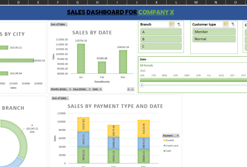
with textboxes. So go to Insert. And let's click on Text Box. And let's just bring it here. And let's call it
sales dashboard. For company X. Let's just centralize it
vertically and horizontally. Let's just select everything. Bold it. Perfect. And that's just select everything again and change the color to maybe
a gray like that. Great. If I click on the
text box, go to Shape, Format, Shape, Outline,
and click on null outline. It will remove the
borders there. And then you can decide
if you do want to remove the borders here or if you
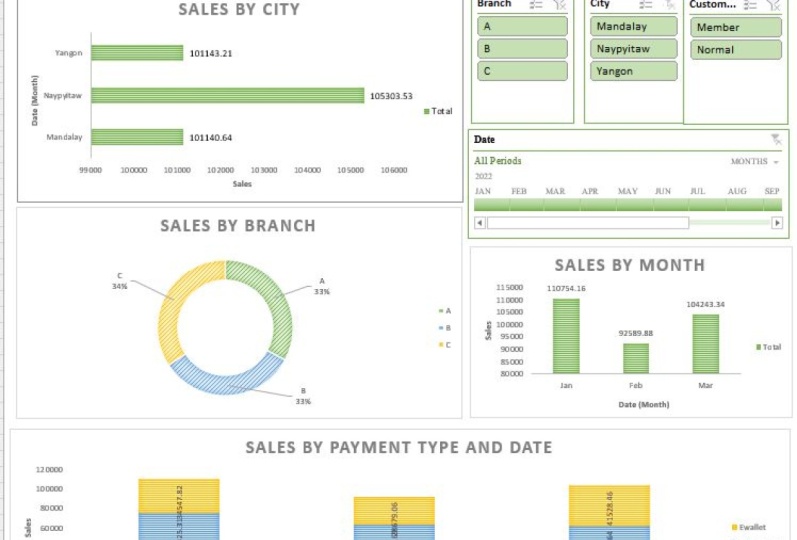
just want to line it up. But this is your dashboard. It now filters everything based on the options that
the board suggested. We've created all the charts that the board or
investors once. And now what we can do is
you can send this to anyone and there'll be
able to work with this dashboard and
interact with it as well.
11. Conclusion: Thank you so much for
watching this course. I hope this will help
you really level up your data analytics and
dashboard creation skills. And you get to create beautiful
functional dashboards on Excel to share with anyone
that you like until next time. Bye.
 Dee Naidoo, Data Nerd