Transcripts
1. Intro to class: Hello, my name is Kimberly and I'm a
surface pattern designer. I'm an educator, and I am obsessed with flowers
and botanicals. I'm so inspired by
them that I literally use those natural elements
to create my designs. I have been using ink
impressions of flowers, leaves, and more in my design work and
getting amazing results. Those images are incredibly beautiful and they
really need to stand on their own without
getting turned into a digital image and then
set aside in a pile. Instead of simply capturing those gorgeous details on paper, I've been using objects that can be turned into home decor, home textiles,
clothing, and more. In this class, let me show you how to capture the
beauty and details in nature on objects that will make stunning pieces of
decor for your home, or to create gifts with heart
for friends and loved ones. You will learn about
different surfaces, you can apply impressions
of botanicals upon. Also, learn about how
to prepare the surfaces and which mediums are the
best for application. I'll show a ton of
tips and tricks, so anyone can try this
technique can be successful. The goal of this class
is to inspire you, not only to try these
techniques but to be creative in how you use
your own ink impressions. If you enjoy flowers, gardening, being in nature, or even a stroll through your
local garden center. This class is for you. Join in, get your
hands a little messy, and let's have fun creating.
2. Class supplies and project: Because of the variety of
projects we'll be creating, our supply list is
quite extensive. To see the complete list with links to where
to purchase items, you can find it in the projects
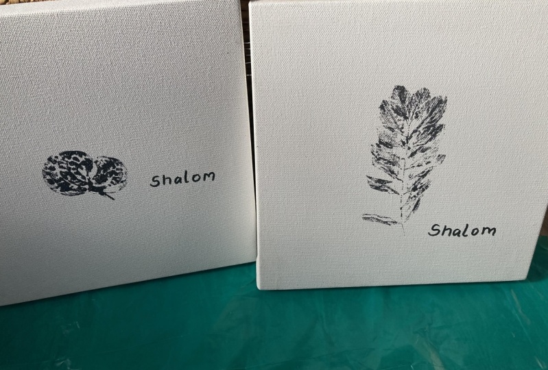
and resources tab above. For your class project, I'd like you to make
an ink impression of a botanical or flower
and place it in frame. Choose a botanical
that has meaning to you or meaning for
someone special to you. Display it in your home
or give it as a gift. Be sure and share your project with the rest of the students in the class by uploading an image to the class project section. I really want to see where you display your ink
impression piece. Sharing your project is
quick and easy to do. Honestly, I find everyone's
projects so inspiring.
3. Card Making - Basic Inking: [MUSIC] Let's start off
with a great project, one that is easy to create
and is a gift you know will be totally appreciated
by everyone, cards. To begin with, card
bases need to be made. Find a basic card stock with
a matte or flat finish. A very basic sized
card called an A2 measures 4.25 inches
by 5.25 inches. Cut your paper to that size and from each sheet
of card stock, you'll get two card bases. You can purchase
pre-made card bases at your local scrap
booking store or big box store, if you prefer. I'm pretty partial
to the crisp look of white card stock
in black ink, but go ahead and use any
color card stock you want. If you're cutting
your own card bases, when you have finished cutting, you'll want to score
each card base. Scoring the paper is
what makes the fold. I have a tool here for scoring, but you can use a ruler
to help you as well. Do not fold the card
in half yet though, you'll want to leave it
flat because that will make for a much easier surface to apply your ink
impressions to. For our set of cards, I'm going to be
using wax flowers that I put in my flower
press the day before. First off, I'm going to
check the size of the stems to make sure that they'll
fit on the card front. Then I'm going to check
the flower and decide which side I want to
get the impression of. I'm looking for more
detailed blooms, defined stems, mostly good
surface area for ink. I paint the ink on the
stem with the paintbrush, coating it evenly,
building up the coverage. Not knowing how my first
impression would turn out, I didn't want to go
straight to my card base. I grabbed a piece of
scrap paper to practice. I press the ink
flower into the paper and then I topped it with
another piece of paper to help get a good impression. I pressed through the paper, feeling through it,
pressing down evenly. When you're finished, lift
the flower up carefully and voila, you have your
first ink impression. Fortunately, these wax flowers can be inked over
and over again. Keep making impressions
until the petals fall off. Now, let's ink the flower again and create impression
on our card. We're going to repeat
the exact same process. For a more detailed look at
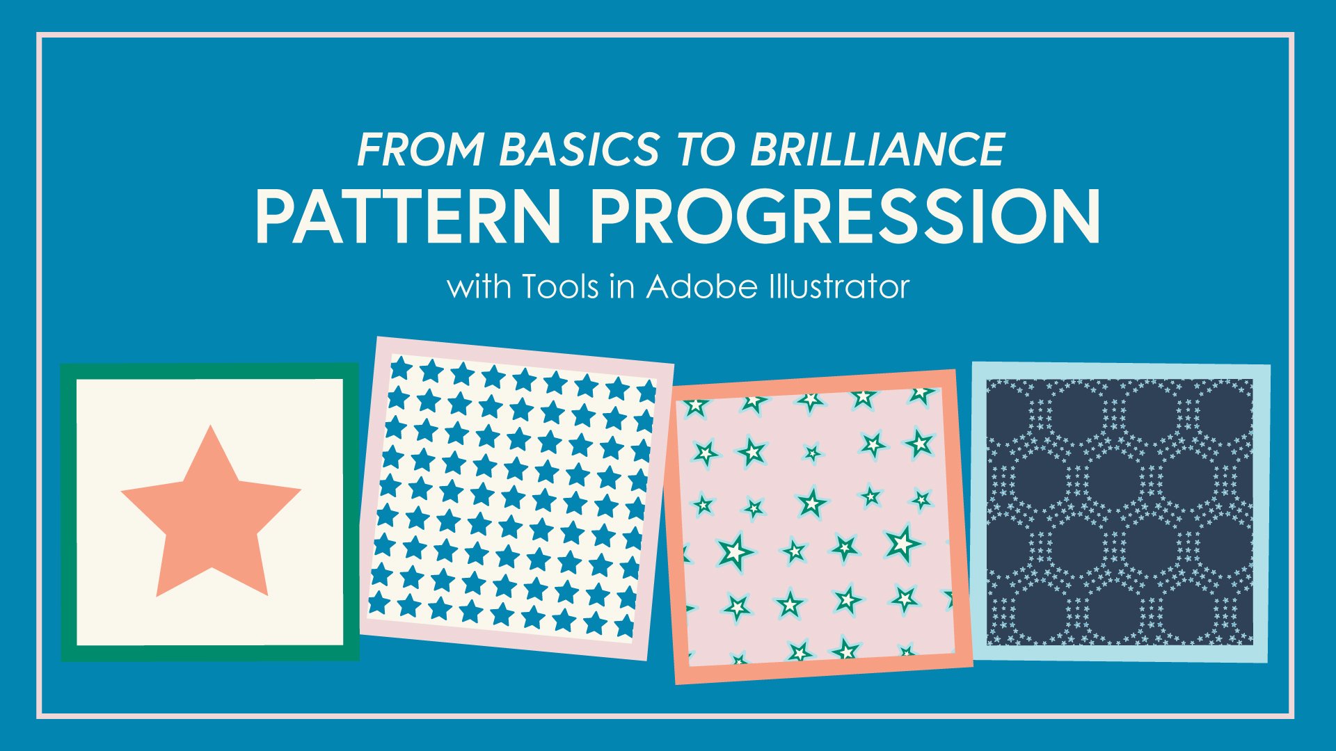
this process I'm sharing, check out my other class
here on Skillshare called inking natural elements for design work with
Adobe Illustrator. In the class, I cover
supplies, techniques, tips, and talk about flowers
and other botanicals that make beautiful
ink impressions. As you make each card, be sure and set them aside and give them plenty
of time to dry. The ink can take quite a bit
of time to set in place. Once the ink is dry, go ahead and fold up your cards, they are ready to gift. I really recommend four
to six cards in a set to give to someone
and don't forget to grab some beautiful
coordinating envelopes. To inspire you further,
I did want to share that there are colored
India inks available. The colors are bright and vivid and they're like these inks, but keep in mind, they dry much more quickly
than the black ink. They can be fussy to work with, especially when you're trying
to get a solid impression. But the gorgeous colors
are worth a try. Look at these gorgeous, detailed, and elegant
cards we have now. Meet me in the next lesson and we're going to
take it a step further and do some gold
foiling. [MUSIC]
4. Card making - Gold Foiling: Gold foiling is a personal
favorite technique of mine. It's how something beautiful
gets even more beautiful. This process requires a
few specialized tools, but if you're into the look, it's totally worth
the investment especially once you
see how it works. To start with, you'll
need a kit made for toner ink stamping. I will give a link in the
class resources section for this specific kit. The kit includes two
stamp pads, the ink, and a measuring cup for dispensing the
correct amount of ink. Be sure and follow all the
manufacturer's instructions. To make a gold foil image of this little fern
leaf from my garden, I'm going to start by pressing
the leaf into the ink pad. Use a piece of scratch
paper to protect your hands from getting
ridiculously covered in ink. You could press the ink pad
onto the top of the leaf, but I felt like
doing it this way, I would lose less ink from
the ink pad to the paper, but do whatever
works best for you. Now that the leaf is covered evenly and completely with ink, it can be placed on a
piece of card stock. This is the same card stock that I used for the card bases, flat, matte white card stock. Once again, I'm feeling
through the paper, making sure that I have
pressed down all the edges and all the way to the end
of each of these leaves. This ink reacts differently than the India ink we
used on the cards. You'll find that you'll get
less of a solid impression, which is okay. Be sure and set this aside
to dry for a few minutes. The next products I have
are laminating machine, heat reactive foil,
and a carrier sheet. Any laminating machine will
work for this technique. The carrier sheet is what
will pass through the machine with a paper and the
foil inside of it. Finally, heat reactive
foil is necessary. This foil is available
in a rainbow of colors. I have cut a small
sheet of the foil to fit over the fern image. The foil has two sides, the color we want to see and
the dull silver backside. When the foil is
put over our image, we want to be sure to
put the color face up. Place the image inside
the carrier sheet and top with the foil. Smooth everything out and start passing it
through the machine. It moves slowly and is
very warm, so be careful. The sheet goes
through the machine by itself once it starts. See, I told you, it's hot. My absolute favorite part about this process
is the foil lifting because what is
underneath is glorious. [MUSIC] This was supposed
to be about cards. I mean, feel free to adhere
this to a card base, but these impressions
were so pretty. I just had to pop
them in small frames which leads us to the
next lesson, wall art.
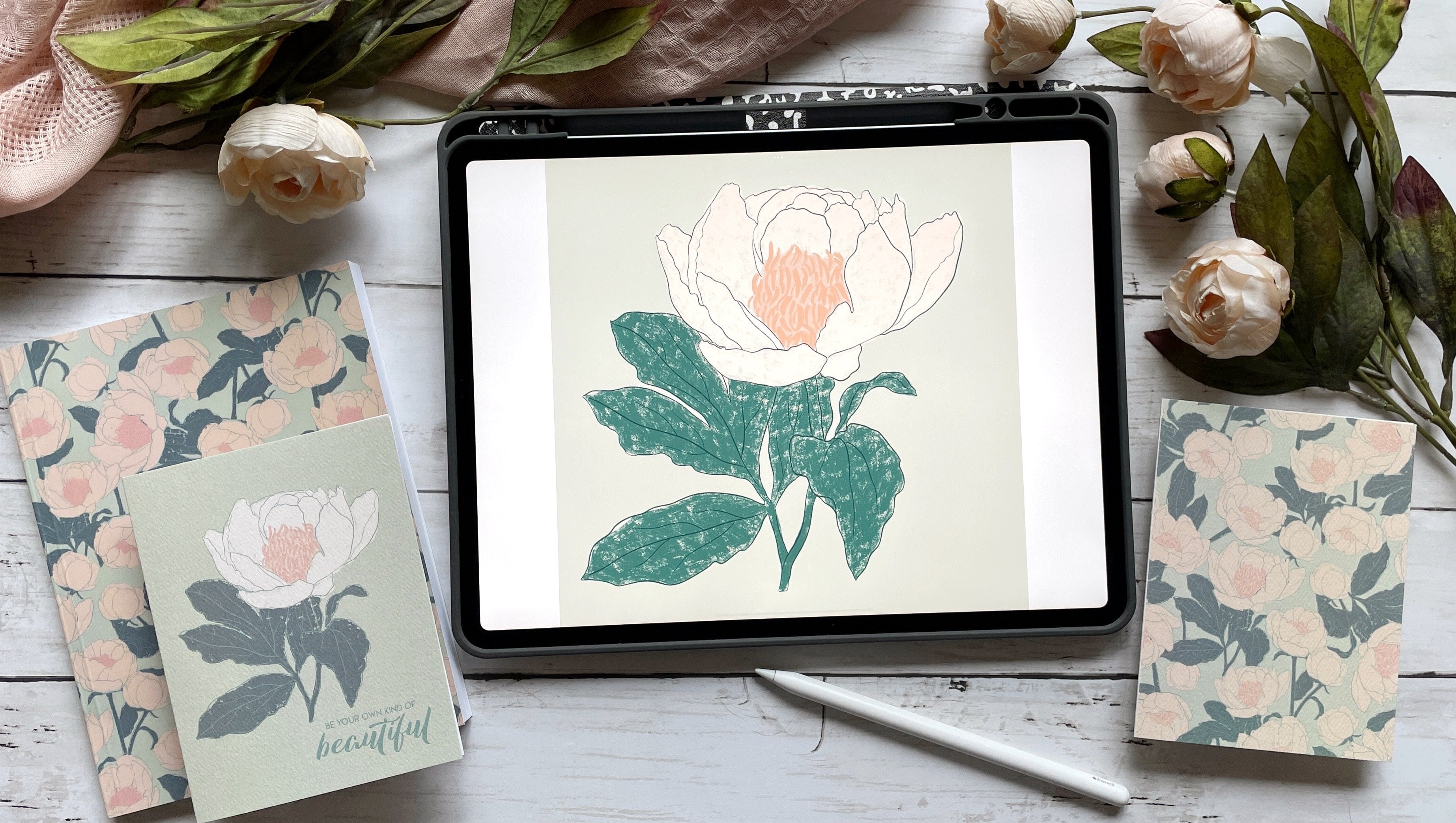
5. Wall art: These ink impressions
of botanicals make the best wall art. Not only are the
image is gorgeous, but the botanicals
themselves can have such personal
meaning to you. There is nothing better than personal wall art in your home. This fern leaf image was created with a few different
colors of India ink. I love the mix of greens,
blues, and yellows. When I made the impression, it was on a nine-inch by 12-inch piece of
watercolor paper, which is too large for the eight-inch by
10-inch frame I have. Using a paper trimmer, I'm able to cut down the
paper to size pretty easily. If you don't have
a paper trimmer, a ruler and a pair of
scissors works just as well. I know that my paper
is nine inches wide, which means I need to get one
inch off the width total, or a half inch from each side. Sometimes the image isn't
perfectly centered, so I carefully check and
recheck before cutting. Looking at this image, I know that losing a bit off
the bottom where the part of the stem image is
located will have little impact on the
image as a whole. I know I can trim a little
bit more from the bottom. Framing up these ink
impressions is crazy easy and makes striking pieces. When I saw this oval frame, I knew it was going
to be perfect for framing of botanical
ink impression. But making sure the image fits inside the frame can
be a little tricky, especially when it isn't a
standard rectangle frame. To give myself a guide, I took the fake photo
from the inside of the frame and used
it as a template. By tracing the
outside edges of the oval under watercolor paper, I now have a place to line
up my ink impression. Now I'm ready to begin the same inking process
as I have done before. Let me speed things up
a bit so you can watch. I start with applying an even coating of
ink to the fern leaf, then place it on
watercolor paper. I press down on the leaf, making sure to press
all the edges and all the way to the tips
of the individual leaves. You can see this fern
leaf is rather twisted. Because of that, I
made sure to keep one hand down on the lower
part of the stem at all times, helping it stand contact with the watercolor
paper so it doesn't create a second impression
or a halo impression. While I use black India ink, of course, you could use colored inks for this
impression as well. Set the ink impression
aside to dry. Give it a couple hours
and once it's dry, it's ready to be cut. To cut it, I simply grabbed a pair of scissors and followed the line I traced with pencil around the liner
from the photo frame. More than likely it will need a little trimming along the
edges to get a good fit. Once it fit well, I check the placement
in the frame. If for some reason the
ink impression is in the wrong location or
it doesn't look right, go ahead and make
a new impression. The fern will easily be
able to handle making multiple images and watercolor paper is
pretty cost-effective. [MUSIC] Are you excited
by the possibilities yet, what special flowers leaves or plants would you like
to see in your home? This quick lesson is
meant to inspire you to start creating in your
own unique voice. If you're ready to
get even more ideas, meet me in the next lesson
about textiles. [MUSIC]
6. Textiles: [MUSIC] Putting
botanical impressions on paper is beautiful, but how about textiles, like
dishcloths or a T-shirt? For this technique,
fresh flowers work best. Normally, flowers are pressed
before giving an impression, but because of the
nature of the paint, we aren't going
to use that step. Sturdy flowers work
the best as well. Gerbera, daisies, and
zinnias have brought me the best luck with this
technique, along with leaves. The impressions will
have less detail than the ones with India ink, but they are no less impressive. To start with, prepare
your textiles according to the directions on the textile
medium you will need. My personal favorite is Delta, as I've had excellent results, but feel free to use
any brand you can find. On the bottle will be the
preparation directions for your textiles
as far as washing and preparing your fabrics, and the instructions
for the mixing ratios for the medium to acrylic paint. Mixing with a medium
allows you to choose any color your little
heart desires. How great is that? Mix the paint on a pallet
or a piece of paper, or even a paper plate. Evenly apply the
paint to the flower. You will visibly be able to see if you need more paint or not. It will also take a few layers as the paint dries on initially. It will have a wet
look on the flower when it's ready to
place on the fabric. Per usual, I like to test out a first impression on a
scrap piece of paper. Press on the petals to
get the paint to adhere to the surface of the paper. Go gently as petals
can fall off. Don't get too worried
when they do fall off. Often they're on the
bottom of the flower and they won't impact the image. Fabric is porous. The paint will go
through the layers, so be sure to protect the
surface underneath your fabric. When I make the official
impression on the dish towel, I also switched over to
using a piece of paper to help me push the petals down. It keeps my hands cleaner and I feel like I get
a better impression. This beautiful flower
needs some leaves now. Because I added paint to the
entire surface of the leaf, I grabbed a tweezers to
pick up and place the leaf. That way the leaf loses barely
any paint from the surface. Continue this painting process
until the entire dish towel is covered the way you desire. Follow the instructions on
the textile medium bottle for drying time, heat setting,
and washing instructions. This T-shirt is my favorite. I love wearing something
that I not only made but made with flowers
from my very own garden. The process for adding
images to a T-shirt is exactly the same
as the dish towel, but I want to share a
couple of helpful tips. First, I found that
with colored fabric, the white paint almost tints to the same color as the shirt. The details were not as defined. To help, I used a
smaller paintbrush and the textile acrylic paint
mixture and added them back in. Second, because the paint will bleed through
the T-shirt fabric. I add a barrier on the
inside of the shirt. I took a piece of cardboard from the back of one of
my watercolor paper pads and wrapped it in wax paper. The surface can be wiped clean and it fits inside the shirt. [MUSIC] One final
lesson up next. This one will really
blow your mind. Let's call it other surfaces.
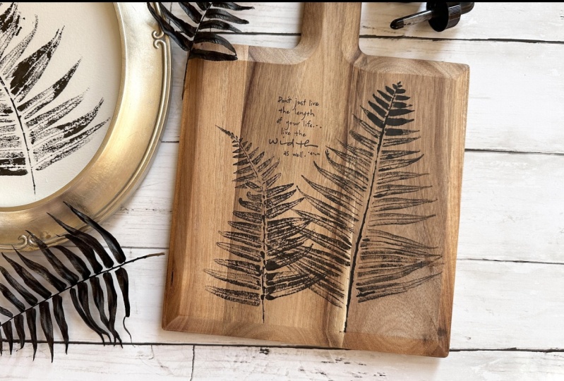
7. Wood: How many surfaces are you wanting to try these
techniques on? I know when I walk through
a craft or fabric store, I am dreaming of ways to capture botanical
ink impressions. This final project of mine is already being displayed
in my kitchen. The key to these impressions
is unfinished wood. Nothing with a stain or varnish. While the wood on this smaller
cutting board is darker, it wasn't treated and it took
the India ink beautifully. Let's return to
the same processes before inking and pressing. This time, I noticed
that part of the stem didn't leave
a good impression, using my paintbrush without
reloading more ink. I very lightly and
carefully added a bit of the stem
back to the image. Feel free to add back those
details when they're needed. I did not use any finishing
spray on these pieces, knowing I would only
be displaying them. Please keep in mind
that this project is also not food safe. To complete the cutting board, I added a stamped sentiment. It was the perfect
finishing touch, encouraging words alongside
an ink impression. Also, the perfect way
to end this class.
8. Class wrap-up: We've only scratched the surface of the ways to use botanical impressions to
create home decor or gifts. These lessons are a starting
point for your imagination, creativity, and heart. Use your new knowledge
from these lessons to find a million more ways to create meaningful
home decor and gifts. I cannot wait to see what you design in the class
projects section. Be sure and share your
project with the rest of the students in the class
and inspire us all. For more on ink
impressions of botanicals, join me on Instagram. I would love for
you to be a part of my little community there. You can find me
@sincerelyyourskimberly. If you share any parts of your projects on social media be sure to tag me
because I would love to share your
creativity with others. If you would like to learn more about creating ink impressions, check out my class
Inking Natural Elements for Design Work
with Adobe Illustrator. Thank you for taking this class, I hope that you're
inspired to create some heartfelt gifts
and home decor.
 Kimberly Crawford, flower obsessed, surface designer