Transcripts
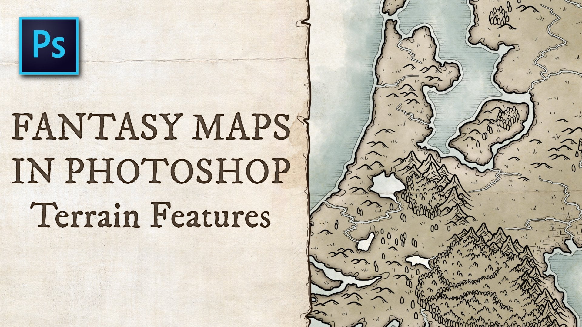
1. Introduction: Hi there, Welcome to my
class about creating fantasy maps with
natural textures. Today we are going
to be going through a Adobe Photoshop tutorial. So you'll need to
have that software, or if you are familiar
with software that does similar things to what I'm going to be demonstrating
by all means, use what you have available. I'm a storyteller. I love creating
stories and making maps has been something
that I've always enjoyed. That love of maps has stemmed
from my first experiences with classic fantasy stories like JRR Tolkien's The Hobbit, where you flip open
that first page and you see the map and it brings
your imagination to life. I love creating my
own style of map. It's a little bit different. I like using natural
textures and so I'm going to introduce you
to my method and my style. It's going to look something
like you see here. It's not your ink,
black and white. Black on paper style of map. I'm gonna be showing you
how to use photography, actual photos of grass,
trees, vegetation, stone formations, and
water textures to create the textures that you're going to see
on the land and sea. I encourage you to open up your software and follow along. I will be demonstrating
my process of creating map outlines, creating the lakes and rivers, applying textures using clone stamping,
creating mountains, trees, roads, applying labels to everything
that's on your map. Plus a few extra details
that show you options of different color choices
or alternate styles. And those styles
might look like this. You can dramatically
alter your map once you get the foundation
in digital format, you can begin to play
with color layers and flipping textures around. You can come up with a
dramatically different look based on what we create. So just so you know, your map doesn't have to
look identical to mine. You can play around with it, adjust it to your own
preference and taste. You'll want to take a
look in the description. I'm going to point
you to some assets where you can find
some textures. I have been using free textures from websites like unsplash.com. You might have a
particular style of tree. From an aerial view. You'll need to
find aerial photos of these various landforms, textures, natural things that
you can apply in your map. I'll give you some links
below in the description. I also do you stock
photography from websites like Adobe.com where they have great stock photography options. So that's something that
you'll need to figure out. Again, my name is James Prozac. I am a professional
designer and illustrator. I love making stories. I've been doing this
since childhood. Creating, illustrating. My style has evolved
and changed. I loved doing things that
involve imagination. And you'll see that in the
style of the things that I do. I love color and that's why
my maps probably reflect that tendency towards
colorful creations like this. This is a fairly long tutorial, so you're going to need to find a little bit of time,
but let's get started.
2. Drawing the Map Outline: So here we go naturally, we are going to be
starting with the base color for the ocean, which will be the backdrop alarm happens using the
polygon lasso tool. So it's all straight edges. As I begin to draw
the land sources, I would recommend drawing
this out on paper first, you might scan it in. And so you're tracing the map. First. For me. I'm just going to
freehand this because I'm just doing this
from my imagination. I don't even know what the
land sources are getting. The land formations are
going to look like. But if you are basing
this on a storyline, some kind of theme that
you're going with. Maybe you have a map planned out already that you're trying
to produce digitally. And so sketch it out. And then as you're
going through this, you're not just free handing
this like I'm doing. And you know exactly where
the coastlines should lay, where the islands will be, where the dips and the
peninsulas and all those things. It's land formations or
they're very, very organic. They need to feel organic. You don't want to have
long straight edges. Probably. Just got to
think about the coastlines where there's gonna be things
jutting in and out where the water might come in
a little bit further. For me, I'm just
doing this style of map where you're not
seeing the entire world. You're just seeing
perhaps a section of the world that are
storyline will isolate. If you're doing a full world, obviously you probably wouldn't want to go right to the edge. I'm filling this in now, it's just a green color. I created a new layer. I filled it with a base
green color can change depending on the color contrast that you want between
the land and the sea. That stuff will evolve and we'll get into that
a little later. Now, I'm going to go into a little bit more details
and then just a pinch. And we're using our Lasso
tool to select an island. We're going to fill
this into with the color that we selected. You can get as
detailed as you want. It depends on how many
islands you want. This can be a lengthy process. This could be a simple
process. In general. I like to I'd like
to make sure that there's a fair amount
of islands surrounding. It's kind of more realism. Feels more natural and organic to include a
variety of islands. Okay, So now you notice here
there's some sharp edges. And those sharp edges, again, I like things to be a
little bit organic. So you typically wouldn't see like a box at the
end of land formation. And so I pull up my Erase tool when I get to a certain stage. And I just began to clip
off the sharp corners. And sometimes I might even
do a little bit of a jagged. Use my eraser and you know, like jump in a little bit. It's all very organic. There's no rhyme or reason sometimes unless you have very specific things
that you want to do, you're just kind of
feeling it out as you go. I'm going to pull off recording
this section right away. I'm going to get into
rivers and streams. As I'm doing this, you're going to see how the
opportunity now comes in where you can start
building in the inlets, end, lakes and streams
that go inland. And it kinda goes hand
in hand with this.
3. Lakes & Rivers: Again, we're just working
along the coastlines were just softening edges. This is where we left
off in the last video. You're creating kind of a jagged dynamic
around the edges. But now you wanna go inland and create some
rivers and streams. And this is, there's
multiple ways of doing this. I like to use the eraser tool just to kinda work your way in. You have to make sure you have
enough pressure to try to not leave little stray points. You'll see why from
my technique a little bit later because I'd
like to apply outlines. If you have little stray points, they're going to show
up a little bit later. So make sure you're
pressing fairly hard. Try and do it as confident, as competently as you can. And you're trying to
create dynamic feeling. So no straight lines are trying
to avoid straight lines. It helps to look at references of real maps
so you have a sense of the shape of lakes
and water forms. But this is very forgiving. You can be very creative. I tend to plot these
things O2 specifically, I just kinda go with
the feel of it. As you're looking at the shapes take take place as it's
unfolding right in front of you. You're just like, Oh, I
think I'll turn left hero. I'll make it extend this way. We'll have a curve in
the river over here and you can think
of winding river. So some of them might be a
little bit more straight. Some of them will
curve like this. It's a winding river
and that's just the way that the geography tends
to occur in nature. So try and mimic that
as best you can. You know, big lakes, lakes. Not every lake has to have
a river water source, but I like to do that. I tend to like to have it connect to the ocean.
Let's just my way. There might be multiple ways
into a lake or water form. You can play with
that a little bit. There can be different widths. Some might be very wide, some might be very thin. There can be a fork in
the river like that. So it's water source is coming from multiple
places leading to a lake. There could be an inlet
coming from one side, one coming from the other. You could even leave little
islands in the middle of a river and that's up to you. You can get rid of them
if you don't want that. I'm going through here,
I'm going to soften some of the corners again. I didn't do that
throughout the whole map, but just play around
with that soften edges, create a more organic coastline. Make sure to use a not
an airbrush when you're doing that because
you don't want to get really soft on the edges. You want to have kind
of a solid edge. So I'm using kind
of a diamond shape. Brush at the moment. Again, I tend to not overthink this so long as
it looks natural. That's kind of my my thought. You can see I got
a little bit thin on the pressure on that
particular stroke. That's something I'll
have to go back and fix. Again that comes into play
later when I tried to apply a stroke outline to my
what my island shape. I'm just trying to clear
that out a little bit. I'll probably have to clean
it up a little bit later. Alright, You get the idea. I'm going to speed
up the video here and we'll get to
the end of this. Alright, As we just tidy
up the last bits of the water and river
structures on the map. We're going to be
heading into doing textures in the next video. And that's where we begin to
kind of give a little bit more dynamic to the map and the land structures
and all of that.
4. Applying Grass Texture: Okay, so we're gonna
do something a little bit more technical here. You have to bear with me. So what I'm doing
is I'm creating a folder in which I'm going
to put my land structure. I want to create a mask because I want to
contain everything that I do within the land structure to protect it from
bleeding over the edges. We're gonna be applying texture
to the landmass as well. So you're going to see
a couple of things take place here in this next section. Right now I'm taking a
look at my pattern panel. You can open that up in the Windows section of your main menu if you
don't see it here. And you want to make sure that you can see your
thumbnail is pretty good. You can see there's already
some default things in here, but you can also import
certain textures. So there's some grass in here, there's gonna be some leaves, none of these the grasses, okay, I think we might be able
to use some of those. I've already imported
some things myself, but we'll take a
look and see if we can bring in a
couple more things. It's good to have
seamless textures so you can find them on
websites like Unsplash. You can purchase them. And so I'm in Photoshop. This isn't a separate
Photoshop document. This is a texture that I found. I'm not sure if I
purchased this one or not. There's a lot of free
textures online. But you, you can take this and you can go up and save this. I don t think this
is a seamless one. So we're going to see what
happens if it's not seamless. Because you'll,
you'll, you'll see the edges when you
bring it into the, into the map that we've created. And what you wanna do is try to prevent the edges from showing. Otherwise it's going to
look a little bit messy when you're when you're
in your other documents. So what we're going to go up
to as the menu under Image, There are under Edit,
Define pattern. When you select Define pattern, you can name the pattern
that you created. And all you're doing is you're, you're, you open
up your texture. And what's going to
happen is whatever is on your Canvas at the moment
is gonna become a texture. This is opened to this. You can see in my, you can see in my
pattern palette toolkit that pattern appeared once
I define the pattern, I can drag it to
the area I want. So I want to do it in with
the other grass elements. Now I'm going back to my map. And I've selected that
layer and if I just click, it, converts the entire
background to that grass texture. So we saw that one that
I just brought in. It had kind of a
you can see here, you can see the edges. I don't like the look of that. You want a seamless
texture like this one. The next thing that
we're going to do is to create a mask for the layer in which all the land masses and the textures will be
contained within. And so right now, we are going to do a
selection of the land layer. And we're going to apply
that to the entire folder. We start off by
selecting the folder. We hold down the Control key, we click on the land layer, it creates the outline. We go down to the masking
tool at the bottom, and there we have a mask
applied to that entire folder. So now anything that we
add within when we start coloring and adding
some dynamic textures, it's all gonna be
contained within that. We'll do the water separately
on a different layer when we begin working around the edges and that
sort of thing. So that's it for this section. The next section we're actually
going to begin colorizing the grass that we just laid down and we'll make
it more dynamic.
5. Colorizing & Depth: So what we're doing
here is creating a color layer in which the color settings
for that layer, the overlay is going
to be a color layer. And once you set that, you select a color that
you want, now, just imagine you're
going to be applying some color to the general grass. This the texture
that's underneath it. So grasses and all
uniformly green, you might have different
tones of green, you might have dead grass, you might have just
different tones. Dry areas, more lush areas. And so here I'm selecting a, I'm going to call
it a dead grass. It's kind of a brown
grass coloration and it's going to give
a little bit more dynamic to the kinda
general green, lush look. So as I zoom out a little bit, and that's going to
allow me to see a broad, you can zoom in and you
can get really detailed. But seeing it on a
broad view is probably more ideal for doing
this kind of coloration. And you're just kind
of glazing over the areas of the map amino and my mind, I'm
thinking north-south. I'm thinking probably
more on the south side. We're, you know, I don't, I don't see an equator on here, but South tends to be
dryer, more desert-like. So that's the general feel
that I'm gonna go four, you get down south. This is mean you
can't dance along the edges in various
places. There's no rules. You're just making
this up as you go. But here we're going
to, we're going to try to introduce this dual tone. And that'll help to
give a little bit more dynamic to the grass, a little more
realistic, a little bit more texture than the flat. Now, after you do that, we might want to introduce some kinda depth to
the, to the map. Right now it's very flat. You're not seeing any indication
of valley and height. We have no mountainous
areas defined. So what I've done is
created two layers. One is going to be
a shadow layer, which is what I'm on right now. And one will be a
highlight layer. The shadow layer should
have a multiply. I'm going to try using
a multiply overlay. And then the next one, it's going to be
a screen overlay. And that's gonna give you
the multiply will darken areas and the screen will
highlight and lighten areas. So we're on the shadow
layer right now, and it's overlaying the
color at the moment. I think we might
switch that around so that you're applying the
color to the shadow. And I'm gonna do the same thing
like when I was coloring. Yeah, here we will
move the wall, moves the colors color to the
top because that'll allow their color layer to
influence the shadows. Much like when applying
the color though, we're just gonna go
kind of an overview and begin to lay in some shadowing. I'm using a dark green color. I'm kinda to mimic the because it's generally going to
be overlaying the grass. You're mimicking the grass color and thinking about
a shadow side. You also have to think about
there being a light source. So from the way that
I'm doing this, I'm imagining the
light coming from the right side of the map. So anything that's
on the left side will be in the shadow areas. It doesn't mean you have
to stick strictly to that. This isn't like a
general painting, but it'll give you more of a consistent feel if you're
sticking to the light source. I'm just going to
dance around the map. And you're gonna begin
to see depth will begin to happen in various areas and you might have to refine it. You might have to
lighten the darkness or lightness of this. You might be laying
it down and think, oh, that's a little too dark. It's a little bit
too much shadow. And if you think of it this
way to, the more shadow, the more you're implying depth and the more sharp the incline. If I get really dark
in certain areas, it's going to indicate that
there's a lot more height. I'm reversing now I'm on the highlight layer and we're
overlaying with the screen. And I've picked a
lighter green again, because now we're thinking
in terms of light source, this is going to be the
lighter side of the contour and we're laying on the
right side of these hills. So on the left side of
the ridge, it'll be dark. On the right side
where the light is hitting, it will be lighter. And that's what's going to
give you your three-dimension. Just dancing around. I like to when I get into the river areas, I'm thinking river
tends to be in lowland. It's a bit of a valley, so I'm just it's just
my way of doing it as you're kind of
following the river. And by lightning it
you're making it indicate like it's
at a lower spot. You don't have to do that. That's just a
technique that I do. Also, the more fine, more fine detail
do you make your, your ridge lines in terms
of brightness and shadow? It's also going to, it's going to imply
sharpness of slope. If you really spread things out or if you use a wide brush, it's going to, the
detail is less fine. You notice in the bottom areas, it feels a lot softer. And if I, if I draw a sharper
line like I'm doing here, It's going to, it's going to imply kind of a steeper slope. So that felt a little
bit too sharp for me, so I lightened it a little bit. All of this. You just have to
have it in your mind where you think there might be hills and valleys and
that sort of thing. And that's all you're
doing is you're just there's no right or wrong. It's all where you
want the hills to be. Again, we're following kind of a valley where the
rivers are running. So just in this process of
adding the color and adding the dark multiply layer and the brighter
highlights screened layer, you're getting a lot of dynamic. And just by flipping
on and off the color, you can see the dynamic all on its own just
with the grass. That might influence how
dark or light you want to make the color
layer over top, you might really like that
green looking for me, I'm actually beginning to lighten the color because I just really liked the look
of the green itself. So just, I'm, I'm
taking an eraser. Um, I'm not fully erasing, I'm leaving a little
bit of tone there, but just pulling back
the color, just a pinch. Again, totally taste
and preference. Little bit of shadow on the
top islands and there's a few other islands which
I may get to later. I don't know if I'll do it. All right Now, again, this is something that you can also do right along the coast. If you add shadowing that, you might be implying
that there's cliffs along those edges. Steep drop. If I really, really wanted
to get into the detail, I might zoom in really close and sharpen that up
again when you're, when you have it softer, it's going to, it's going to
feel as though it's sloping. It's not a sharp line. If you did want it
to be really sharp, get in there, use
a sharper brush. I'm using an airbrush
for a lot of this, but if you really
want it to be sharp, like real cliff, get in
there with a straight edge. To find those edges way more
than what I'm doing here. When we get into the mountain. I'm going to add
some mountain areas. These are more rolling
hills, highlands, lowlands. When you get into
the sharper areas where they're
mountainous, then yeah, you're going to see I'm
going to really bring up the sharp edges because that's what mountains
tend to be. Play with. The levels, the opacity levels to get the sense of
depth that you want. You might not want
it to be as intense. You might just want to play with the percentages
just a little bit. And we'll end off here
for now and we'll just start preparing our layers
for the next phase.
6. Rough Terrain: All right, We're
going to continue on with this tutorial by moving into some rock textures and we're not talking
about mountain. I think. I think it's kinda cool to add. No, I don't know
what you'd call it. Bad land type environments, areas where there might be
some more rugged terrain, not Mountain, but
almost like mountain. It just doesn't have
the elevated height. And what it does is
it adds a lot of texture that can be
really attractive. To go about this. We're gonna do something
a little bit different. I'm going to create a new layer. I'm going to call this rocky. And I'm going to add
a few items here. So we're going to create
just a few objects that are going to act as a stamp area. So all I'm doing is using
my rectangular tool, creating an object,
which let's see here. Sure that it's then, oh, I have it under the mass
and I'm going to move it up. I have to move this above. Up here. We've got one object. We have two objects. I'm going to create another one. And these are rock textures that I've imported in the same way. And just to remind you
how to go about this, you would open in
a separate window. You would go to a rock texture
that you've downloaded. Here I'll open some textures. So here it is in Photoshop. This is a file that's on my
computer. You can see it. You know, it's just a nice
deserty looking area. So when I say rock
textures that I'm going to add to the map, they
could be like this, that could be just desert
areas with dry land, barren land, dry
inland Rocky land, any kind of terrain like that, which adds ruggedness, is appealing in my mind to it adventure story
and there might be an area that you'd
want like this. So what I tend to do is I
re-size it just a little bit so that it's
not a massive file. You could probably leave it
the same size, but I tend to, because the map isn't full
scale, full resolution. This degree, you want the detail to be
reduced a little bit. So I reduce this. And then if I want it
to be a map or sorry, a pattern which I
can add to my panel. Just as a reminder, I'm gonna go here under Edit. I'm going to go Define Pattern. We'll define it, we'll
call it a desert one. Now you notice it got added
to the side panel and that's now a pattern that I can
apply when I come back here. So currently we have
these two rock patterns. We're going to add a third one. We'll put it here. And this one we're going to colorize with that new
pattern I just imported. So there we have three
different kinds of textures that I think might
look good in my design. What we wanna do is
we want to combine these onto the same layer. So currently they're on
three different layers. I'm going to combine
it onto one because what I want to use
is the stamp tool. And when they're on
separate layers, It's not easy to
access these stamping. And I'll show you what
I mean when I use it if you're not familiar
with the stamp tool. So here we're going to
reduce this now, merge it. Merge Shapes. I see that's interesting. I'm going to have to
make these image, I'm going to have
to rasterize these. Rasterizing them makes them kinda flattened
versions or merge them. Now these exist on one layer. And what I wanna do
is I want to keep them off to the
side a little bit. And if you've never
used the stamp tool, the hotkeys S, I'm going
to zoom in a little bit. I'm going to start on
this side of the map. Now. I'm going to keep it
above this layer here, which has the mask,
because if I move it under the mask, it disappears. It's still there. It's just been masked
out and it's over there. I want to keep it above for
now so that I can draw. Over top of these sections here, I'm going to use S
as my stamp tool. If you hold them. And I don't know
what it is on a Mac, but if you hold
down the Alt key, notice that my cursor changes to this and that's a target. What that does is it
says I want to select this area wherever I press. So I want to use this stamp
area first, this texture. Select that. Now you notice my
cursor here has changed to that texture. So that when I start
painting over here, actually going to take that step and know what
you didn't notice. Over here. You can see there's a cursor paralleling what I'm doing here. And that's how it works. It's basically stamping,
copying that texture. So if you notice, it's falling, if I went down here and try
to paint down here, it's off. It's off that texture. That little crosses now
there's nothing to stamp, so it doesn't copy it. But if I move up, you notice
it catches that edge. It's kinda cool how that works. I don't want that obviously, so I'm going to undo that. If I want to change the
location of the stamp, I would just hold
the Alt key again. And I can stamp in that area. I can also switch
then to this area up here and begin to
stamp from there. It just takes a little practice to play with it to be familiar. But here I'm creating
a desert area along here by using
that stamp tool. And currently it's
going into the water, but that's okay because once
I move it under the mask, as you will see here, It's now masked where the
river is supposed to run. If we look at that bigger, you can see now that my my map now has this
cool textured area. If I drop it underneath
the coloration, well, it'll start taking on the colorations that
I've drawn in this area. If I want to add more color, paint on my color layer, Let's do that just for fun. Let's say I want this
to be red, a red rock. Now I can start choosing tones that are
kind of like that. Doesn't look great. I was just doing that for
example, but yeah, it's, it's a very cool way to
begin adding textures. I'm going to bring
this back out, and I'm just going to work on continuing to build that up. Let's switch my stamp
so I hit S, it Alt. We're now going to incorporate this kind of texture up here. The different kind of desert
has a more of a red rock. I might use an airbrush
as my brush so that it's, it's kinda has a soft blend. It might blend a lot
nicer to do it that way. Let's go back here and bring
that right to the coast. So I guess I'm designating
this as my rustic desert. And they noticed that
crossed into this area here. And you notice my
cursor on the right. It's it's at that intersection. So I'm not catching
that lower part. So that's where I
would have to reset my stamp to make sure
I'm not catching that. If I don't want that in my painting and I
don't want it there. Let's change that. Let's correct that. Let's paint over with this. I'm not loving loving it. I just want to mix up these
texture is a little bit. I'm catching that. Rock again. We'll drop this down here. And the fade, fade down
here isn't very smooth. Smooth that out, just a pinch. Maybe it goes across the
river bank just a little bit. Let's drop it down here
just a little bit. There we go. We'll call this R. Let's catch this
down here. Right? So that's kind of our
designated desert area. Maybe I can do another
section down here. The dry salt of the map. Alright, so again, if I move
this underneath the mask, you'll see it crops
everything nicely. There, you know, and I might, I might move that desert
texture elsewhere on my map. You don't. Maybe I
want it to also. Maybe I want it to
also be somewhere over here in this southern
area. Little spots. You can just again, you could just touch it in different areas just to
change up your dynamic, the textures of the
ground across your map. You get to it. It just kinda begins to add degrees of interest
in the terrain. Maybe this this island, I didn't even do anything with this island over here so far. Now you can do that. Stamping the anywhere
like I can begin to stamp this because this is on the
same layer as these three. So I can stamp from somewhere
over there if I want and bring it onto somewhere
else, like over here. I can stamp this right here. So we're just kinda catching the stamps on different areas
of the map now. Dry island. Looks alright. Let's try this rocky area. Now. You haven't used this. Let's, let's make this area
along here like it is. The ridge, maybe the edge
of a mountain range. A little bit of a canyon
thing happening here. Now I am painting over top
of some of my contour. Depth painting where I
added shadow and light. So now maybe I would want
to drop this underneath the shadow and light just
to see if it looks okay. Maybe I like that, maybe I
don't want it to avoid those. You just kinda have to play around where you
want the placement. And let's just do that. One more area of my-map. Add that rocky texture. Let's do it somewhere over here. In my world, maybe this is
like a canyon of some kind. Kinda has a canyon look. I'm going to use my eraser tool. So you can you can really play with how it actually integrates
with my eraser tool. I can, maybe I want that hard line to be
there on the edge. Same here. Maybe I want it to harden
a little bit right there, rather than it
blending too much. Do whatever you want. That stamp tool is effective. So if I zoom in a
little bit more, take a look at the detail
that we're capturing here. It ends up having just a
real nice looking texture, very realistic, very
interesting to look at. And this is a style of map
you might not like this dull. There's a lot of other types
of maps that look more ink. This is definitely,
this is more of a realism, texture,
different style. And that's, that's a choice you'll have to make when you're
developing your own map. Okay, let's, let's, let's
play a little bit more. I might end up coming
back and adding some more of those textures
that just really, it really is up to you. We never did really
add anything up here. Let's add a little bit. So I'm going to borrow from these textures
that I laid down here. We'll just add just a pinch. Now let's take a stamp
from this area here. We'll add it. There, kinda fits good there for a little
bit of this here, and we'll combine
it with that rock. There. It looks okay to me. Things might be spread
out a little bit, but now we're still going to
add trees and we are going to add a little bit of mountain, and this kinda has
a mountain look. You could even
borrow that texture to develop your mountains. It's, it depends on how you
want to construct that. Let's add trees, or let's, let's get into the
mountains next, and that'll be the next video.
7. Mountains: So now we're going to be
going into mountain ranges. And mountains are a
little bit trickier than all the other
things that we're going to add to the map. And the reason is our
map is an aerial view. And we're looking
down at contours and textures from an
aerial position. Because we're using textures and for photography and using that stamp tool as our way of transferring
textures across our map. We would want to try to
get an aerial view of a mountain range so that it matches the perspective
that we're developing here. But as you can imagine, it's not very easy to find photos from
that Ariel position. So to use this same
technique of stamping, yeah, it's, It's a
bit more challenging. Let's put it that way. So I go to websites
like unsplash.com. There's a variety of stock photography
websites that you can go to try to find
some good aerial photos. You just kinda have
to be resourceful. Go looking around and try
to find something that seems to match the
color that the tone, all of those types of things and see what you
can do with that. So what I'm gonna do
is I did find a photo. It's not perfect, but I'm
going to show you how you try to manipulate
it to make it fit. So I'm going to paste
it into a new layer. You can see the color
isn't quite right. I'm going to move it above my mask layer and we're
going to change this. So it's called Mountain. My typing. The color
doesn't feel quite right. I do want it to have a
little bit more of a gray. I also need it to have a little bit more contrast to bring up the shadows
just a little bit more. So we're going to just, I'm just using my brightness
contrast tool. Let's see here. I'm just adjusting the
slider is just the train. Try to get it to be
a little bit more. Get a little bit more pop
in some of the color tone. And it's not gonna be perfect. I don't think this
is a perfect photo, but let's stop there and we'll just see what
we can do with it. I'm also going to change
under image adjust, I'm going to change the
hue and saturation. And the goal for this is to make it a little
bit more gray scale. So it has that
stone kind of look. Not too much. There's a bit of a brown tone, green tone, very earthy color
scheme going on right now. Just a bit. Let's, let's leave it there. And I'm going to
slide it over here. Now I might play with
the scale a little bit. I might, I might
condense this a bit. The pinch. So I'm going to position it over here and now we're going to
use the stamp tool. So again, hot key. Hold down your Alt key. On a Windows machine, not sure of what a Mac select an area where you're going
to begin to use as a stamp. So let's select right here. And I'm going to use this area here to become a mountain range. Play a little bit in here. I'm not going to add
too much mountain. I don't want to spend
too much time on this. But for example, let's
begin painting here. I'm going to switch my brush to something a little
bit harder edge. Again, when you get
close to the edge, you might want it
to be a little bit harder because these are rocks. And even though it's
blending into grass, you do kinda wanna have that hard edge to capture the
essence of rock rather than it just blending.
It can blend a bit. It's always better to soften when you get right to the edge. There might be a little bit
of blending that goes on. I'm just going to make
it kind of trickle out into a bit of a transition. Let's look. It kind of
goes into a rocky land. You go. So I mean, if I
pull back a little bit, you're going to see
it doesn't look bad. As far as implying that
this is a mountain range. You may end up having
to hunt a little bit for photos that better represent
what you're looking for. I'm gonna do a little bit
more here, just just touches. You also need to be mindful of the lighting or the light source that you've kinda settled on. And we did have the
light coming from the right to match
the color of the map, the lighting of the map. When you're looking
for source photos, you do have to be mindful
of that as well. Alright. I'm quite like this shape
here, this color here. So I'm going to see me erasing this mountain
area here jutting out. I might like the
texture a little bit different somewhere
else in the map. So let's pull something
from this side, just a little bit
blended in the pinch. A little bit harsh there. Alright. And I'm going to
slide over here. And also I'm going to borrow now from this
area here as a stamp. And we'll kinda blended into this dry land texture
that we used earlier. If you really, really want
to get into like blending your maps and the textures
that you are selecting. You definitely can go to other textures from other
areas like up here. If you wanted to stamp something from
a different texture, a different type of rock, definitely you can do that. So there we have
our mountain range. Now we want to get
this mountain photo out of the picture. I'm just going to push it
over a little bit so it's not overlapping anything and
we have it above our mask. But I'm going to pull it
below the mask again. And it's going to be covered now by the mask and disappear. Now remember if you need to
colorize anything in this to make it better, blend in. We definitely can also playing with this area here because it looked a
little funny to me. Stamping with that. Okay. So if you think that the color
doesn't look quite right, go to your color layer, which we did in a
couple of lessons ago. When the first ones,
I'm on the color layer, I could select a color
somewhere in here if I want it to overlay a bit. You can colorize some of these areas here a
little more strongly. To try and get the coloration
a little bit better. I'm just overlaying just
a little bit of brown. Very subtle. Not much. Maybe even in the grass
here just because it's you. Maybe I even want to go into
the gray a little bit to imply this is like not
lush, It's more rocky. And if you did want
to get some snow cap going on some of
these mountains, because these aren't really
snow-capped mountains. You could manually paint
a little bit of that on. So i'll, I'll do
an example here. Know if it will require
a little bit of, I don't know how
much of an artists or how artistic you are. But absolutely you can.
8. Trees: So here we are where
we are moving on to adding trees to this map. Trees are without question and easier find when
you're looking for aerial photography to
use as stamping tool. There's a few places in
here when we get up here that there's not a lot
done on this island. On this northern area, this island here is
also pretty plain. The trees are a great filler. There's some really
great textures. You can find different
types of trees. Of course. What I
found was this, and I'm going to
pull this over top. So you can see now very dark. I don't like the
darkness of this. So this is one of those things where you
play around with color. Once again, I'm gonna go into the brightness contrast settings and I'm going to bump
up the brightness. I want this to be
a lot brighter. And we'll also play
with the contrast, bring that up
significantly as well. Here we have a good snapshot. We need to bring this
size down significantly. Better scale too, match our map. And maybe something
like that is good. Let's, let's drop
in and take a look. Probably something like that. I'm going to name
this layer trees. And we are above the mask line. So let's use our
stamp tool and let's begin to transfer
some trees over. So let's just start along this area here and
you'll begin to see it. Come to life. Brush tool again,
it's up to you. I tried to use an
airbrush a lot, but when you're
doing things that maybe have a bit of an edge, when you get to the
edge of the tree line, maybe it needs to
be a lot harder, so I'll just continue using
this kind of square brush. You might need to
keep readjusting the placement of your
stamp because there's, there's areas of
trees where they're a little bit more dead. The angle of the
tree might change based on the stamp location. I don't like the darker trees nearly as much as
the brighter tree, so I'm going to keep dropping back into the
brighter areas here. Once you're stamping
or you begins to grow, where you're painting,
you can begin borrowing. Now the stamp, you notice my little cross is right there
where my stamp references. It saves you from going
back way over there. Now, this is only one step. You might want pine trees, you a different kind of tree. And you definitely have the
option to go into reference. Find a different kind of tree so that there's variety
throughout your map. For me, I don't
really want to spend the time getting too
worried about that. I like the style
that I have here. I'm going to switch
my brush to it. I'm going to airbrushing, just want to see
what it looks like. The softer edges. Blend a little bit nicer. Alright? Alright. Let's zoom out and just take a look at how that's influencing the map. So it's definitely changing the quality of the
map a fair bit. Let's go down here, start introducing some trees. The mountain areas
pretty dry down there. So maybe there's not a lot of them along here. We'll get some treeline. Get some on this
island which is. It's completely barren on here. Why don't we try and
change things up a bit. I'm actually going
to re-paste this. And I'm not going to
shrink it as small. I'm going to leave it
a little bit bigger. I just want to see the
effect of changing the scale of the trees. Play with some
brightness contrast. There's ways of creating different textures
and different size of trees might have a nice effect on the feeling that we have. So even though they're
the same trees, it's giving it a little bit
of a different feeling. Looking for ways of
creating variety. Nice little lush
area here along the. You may also be
trying to think about where cities might
go in your map. So that might influence
location of treelines. You might even want to add
your city locations first because there might be roads that you also
want to consider. And maybe roads is
what I'll add next. Let's try a different
tree altogether. All go back to my reference. I could find a different
quality of tree. These trees feel very different. I'll bring it in right now. They're just puffier,
fluffier trees, more lush. The color contrast. Now let's size a little bit. Maybe they won't look
enormously different. I'm not sure. So currently I have three different tree layers
now because I've brought in, I'm going to actually
combine these layers so I'm not confusing myself. In our last tree layer, they're going to combine
these three layers. Alright, so let's borrow from this tree area and it'll have a little bit of a
different feeling. Just slightly different. They look much more lush. I kinda like that. Let's put some more
trees up here. We have nothing up here. So on this island up here, get some trees going.
9. Cities, Roads and Labels: On a map like this, Bob, cities can be represented
in a lot of ways. You could use iconography. You can just use kind of
like on a standard map. You would normally see a dot. So I'm going to keep
it pretty simple. For maybe small cities, I'm going to use a circle. And I'm going to fill
this with what can I, maybe I'll just
stick with white. We'll just keep
it really simple. Maybe the white can have
an outline that is orange. Make that a few pixels thick, so you see it a little bit. And we'll add a drop shadow. Okay, So we have one city there, Let's say we have another
city over here on this side. We'll do the same
thing where, you know, bigger, bigger the
bigger the city. Maybe squares are castles. The style of the city. Totally up to you on how
you want to execute that. I mean, I'm not gonna
get too carried away. This is just making
this up as I go. So maybe this is a
little little one. Then we have right here on
the edge of the mountains. One little part right there. All of these are kinda
randomly being positioned around my map layer. So I'm going to condense these. All these cities. Typing is horrible today. Cities start another one. We'll call this castles. Castles. We are going
to make square. And we'll make
them outlined with green filled with white. We're going to have
a big castle there. Will apply a drop shadow. You definitely can get way
more creative with your, you know, iconography is great. You can, you can go and hunt for nice little castle graphic, whatever, however
you wanna do that. City names, of course, you can get into, you know, I'm gonna make up a town
like this is Springfield. Well, we'll call this, make this 26 pixels too big. Drop shadow to that. New field. Carbs healed. However you wish. Whatever feels good in terms of naming, positioning of labels. These might be too big for
you and you might prefer, know, for a smaller
one to be 14. Might prefer it to be
positioned underneath. The rules are yours to make. I'm just going to move a
bunch of these around. Don't mind the repetition. This one, we'll give it a 20, we'll call it his castle. This one will be Queens castle. You can name forests. You can do as much as you want. Let's get some roads in here. So the reason I
put the cities in first is because I
might want to connect city to city and have something that
makes a lot of sense. So we're going to make this, I'm going to make my roads. Let's make them orange so
they stand out in contrast. Let's now I'm going to use, you could freehand paint these. You can also use the Freeform
Pen tool that will allow you to draw like that. We gotta get rid of the fill, turn off the fill. Let's crank up the stroke width
so it will make this ten, so it stands out a little bit. And because it's a stroke, a free form stroke, you can adjust the placement
of the points if you, if something doesn't make
sense, like for instance, I'm looking at how this kind
of intersects the river, doesn't make sense the
way it's positioned. So if you make a mistake, you can easily
correct it like this. We'll make this
layer in a group. And that says roads. Maybe I want to drop it
underneath the cities so that it goes underneath. If there's if it's actually
touching the city, we'll kinda pass
underneath the city. You can apply color effects. So if I want it to not like to almost blend in and have a
little bit of texture. You can do things
like, you know, on. We'll make this a dodge, a linear dodge or a color dodge will drop the
opacity just a little bit. So there's a little
bit transparent. You can see. So let's
do another one. Following that same style. Freeform Pen Tool. Go up around right
there to cause ill. And it's gonna share the same color values because I have the settings the same. We're gonna go
across the bridge. Now. I said bridge in
my mind was thinking, well, we could actually
create a bridge here. And that would look kind
of cool here to this one. Let's make this path now
kind of fork to this one. See how that's working. Let's add another one here. This one is gonna
go down tonicity. Let's cut across up here. Cross the castle. And then we're going to
have it branch off here. And we're gonna go to the city. So there we have now a network of roads and paths
that go between. Maybe we want to add
another one down here. And we're going to
connect this guy. Bring it up. Round. Join that path there. Not looking too bad. You can name for us, of course, there's labels that you
can put on anything. Town up here. There's nothing
on these islands here. I'm going to add just a
couple more texture things. While i'm, I'm gonna do
that in the next video. So we'll end off here. I might fill in some holes where there's missing
town names here. It's kinda sad that they're
all named cubs field, and I'll add one more here. Let's call this new Caps Lock, new URL. For that matter. Before I move on to
another video, let's, let's create a bigger type set for the name of the island. So this might be obviously I've, we'll call this,
um, king's land. Now this is gonna be
our primary title. So obviously a
little bit bigger. Add some shadow to that. This island here has no cities
or towns at the moment. So we'll make this a
little less significant. We'll call this queensland. This one up here. We'll call it new island, very creative and RTI. Labeling sometimes
is the coolest part of maps because you can, you know, when we think of JRR Tolkien and
you know, all the, the little places, the
little mountains, the, the forests, they
all had unique names and that's where it
can be a lot of fun. This is fingering forest. I might change the
font to something a little bit different
for the effect of a different type of labels. So these would perhaps
be it a different font, maybe even a different color. Maybe we, maybe we make all the forests
into kind of a yellow. It follows a different
scheme in mind. Actually don't like
that font for this map. I'm going to change it. I don't know what
to make it offhand. Maybe we do do something
scripty. Don't like that either. But I'll just leave it for now. You can see how you can
get right into the detail of everything and creek, everything that is
necessary for say, a game or a story that you're
in the process of creating. Let's end off this
video. With that.
10. Extra Details: So this last video
we did labeling and now we're going
to move into just, I'm just going to add a
little bit more texture, a little bit more. A little bit more of that
can fill in some of the, you can go as far as
you want with texture. You can also just
not go overkill. But there's, I just
wanted to show a couple more things for sake of just showing how full and I just want to show a little bit more so you
can see how full and diverse some of the areas
of your map could get. You know, there's areas
that are very open, that could be farmland. You can add snow. You can do a lot of
things like that. I'm going to open up another photo that I found and it kinda
had a farmland field. So I'm thinking the Shire a kind of a different kind
of landscape farmed land, some kinda little community. It has a nice feeling and I just thought
it would look really cool to add this
as a floor effect. So I'm going to pull
this outside of the mask area and
reduce it down. I'm just going to add this
to a few places for effect. And then there's one other
thing that I thought looked really cool that I'd
like to bring in. And I'm going to open it up in a different layer or in
a different document. This you see how there's
like the shelves. I thought that looked
really cool and kinda looks like Some more rugged along the coastline near the Scottish Highlands
or something like that. Not quite an even more
exotic than that. It might look really cool
in context of our map. So I'm going to pull this
over also into our map. Reduce this down. So these
are two little detail areas. And I'm going to add and we'll throw it in
somewhere along the coast. So, alright, so we're gonna
start with this farmland area and we're just going to
select part of the map here. And I'm gonna do
nothing other than just to add another day, another layer of
texture that I think, you know, it'll just again
adds to the story of the map. You can even see a little
town if you wanted to say little building there. I mean, you may want that there, you may not want that there. But it definitely
adds a little bit of character and story to that. Might be too bright. So maybe we adjust the how it blends in. These Layer. Layer Styles can really come in handy if you're not
used to using them, playing around with them, the color effects, it
can look really cool. So maybe that's even
all I am going to do is just maybe I'll do it one
little area over here as well. So we'll just pull
in a little bit, just a little bit of texture. Nothing more than
that. Just a touch. Let's do another one over here. Just a touch. It looks like little
pieces of farmland. Touch. As to the story of your map. Farmland around the castle. Small little touches like
that make a big difference. We'll pull this underneath our masking layer so
we get rid of that. Let's go back to the, yeah, see, that's
a little bright. I'm gonna, I'm gonna go back to that pin layer because I thought that layer effect worked
for this. Just subtle. Let's go now to that other layer where we
have this and let's add that to this island
here for one. We're going to add a
little bit of this. So this exotic island
has a little bit more. I'm interests behind it. Again, we're using sharp edges, so I tend to stay away
from the airbrush because the sharp edges might look
better when they're crisp. All of this is going
to, I'm disappear. You see I painted over
the edges that will all even out when
I get to the point of moving it
underneath the mask. And we're going to
do that also here. Just subtle. It's like it's like
this area here is a bit of a rugged
section on the coast. I'm going to drop this
now underneath mask. This doesn't look good here. It looks a little messy. Now that I see a mask off. And we'll play with
the layer effect a little bit so it blends
maybe a bit better. Yeah, there you go. You can continue adding details, stone textures,
different farmlands. You go as far as you want. The goal is to make it arrive at a place where
it's telling the story that you want to tell and lays out the landscape
the way that you want to have it laid
out all up to you. And I think that's the
cool part about using of the source photos as textures because you can find
the texture that works for you in
the environment. You can build the world
in the way that you want if you need it to have
a lot of water texture, for example, you can really
get into the water textures. You can. I'm gonna
do that right away. We're gonna get
into the water and next, we'll leave it off here, just some final details that we just did to fill up
the map a little bit more. And let's move on now to the final touches
of of the water.
11. Color Options & Water Details: So here we are at the
end of the tutorial, and I'm just going to present a few little
optional things that you can do to try to maybe give a
little bit more oomph to your map creation. And that is some
coloration variations, some highlighting things
that I'd like to do, make things pop a
little bit more. And it depends on
maybe the style of the map that you want. Maybe you want it to
look a little bit older, a little bit more
of a rustic feel. There's a few little details
that we can play with that might make it more appealing to you
for your purposes. One thing that I
do is I will make a duplicate of the
original map outline. So at the beginning we created the first base outline of all the islands and
the primary land base. And what I do is I create
an outline and a glow. I'll show you what
it looks like. So I'm just going to turn
on I made this previously. You can change the color
of it however you want. It can be very intense
or very light. It might not show
up a lot right now. But what I'm going
to also do is I'm going to show you what
it would look like if we change the background
color just a little bit. And maybe you want it to have
a little bit more richness. Right now it's kind
of a sky blue. And you might prefer to
have something like, I don't know what
you would call this. It's muted though it's
not quite as vibrant. It kinda makes it look
a little bit older too, because it takes the color
down to a washed out, look less vibrant, less bright. And then also makes the green a little bit less
vibrant as well. It has that effect. So this is before, this is after for
that matter though. And I'll show you, you could you could drastically change the color to something totally different. There's no reason
that you have to even stay in the same family. Maybe you want it
to have a paper. Look. And I'm not saying that this is the
color that you would pick, but you could really go
in a different direction. But you can also now see
that outline that I did. So I'm going to play
with that just a pinch. What I did was I added a
stroke and an outer glow. If I change the opacity
of this layer itself, you'll notice that the
glow gets a lot dimmer. The outline gets a lot dimmer. I'm going to turn off
that brown because I don't think that's
working for me. But now that the
blue is a little bit more muted and darker, it stands out a little bit more. When I do increase the
intensity of that outline, that glow, it might add too
much detail to do that. And even overall, you might
be looking at the map and thinking there's maybe a
little bit too much detail. It might feel a little
busy at this point. Quick ways to change the, the feeling of detail to
mute and bring it back down. A little bit more simple look. I would go down
to the shadow and highlight layers that we created to create
the rolling hills. That the rolling
hills definitely add a lot of dynamic to the map. So quickly you could do
is to drop the shadow. That's going to flatten
everything a fair bit. Same with the highlight. And
just by flattening the map, it makes it look a fair
bit less busy here. If we go back to what it was, we were looking at
something like that. Does something like that.
It just reduces detail. Might feel a little bit more comfortable like this for you. So I'm going to leave
it somewhere a little more muted than the original. Let's call it right here. You can also change the
opacity of the roads. If they're feeling
a little bright. You can have it full
intensity, but again, to mute it a little bit, you could bring it down. You can also change the
color of the roads. There's a lot of little
subtle things you can do. You can make the roads thinner. If you wanted, even to show the predominance of
one road versus another, you can begin to massage the feeling of everything
just a little bit. Um, things that
you could also do. You can create a
little bit of a glow. This is something I enjoy doing. Also, just to create
a little dynamic. You can create a glow behind the island as though the water
is glowing a little bit. And it makes the island
pop a bit as well. So if I zoom out a
little bit more, just a subtle little thing. Again, this is a more simple, this adds a little
bit more visual. But it might not be
desired because the muted, flatter look would be this. And it's up to
you. Another thing you can do is add water
texture. So I brought in. A water layer. I pasted it in. It's
already in the background. You can see it appeared
on the left here. And you might not
want it that intense, but I'm going to make
it full intense. And I'm going to,
I'm gonna do some, Oops, sorry for the sound. I'm going to begin to stamp it and spread it
out a little bit so so we can make it kind of encompass
the area of the island. I'm just a little nooks and stuff and I wouldn't
do it everywhere. But you can just kinda fill in little spots around the islands. Filling in a little bit. Subtle details around add some water dynamic
beyond just being flat. I'm going to erase some
of this here because it fuels obviously a little
bit much in sections here. I'm actually just going to add a layer mask rather
than deleting it. Unmask a lot of this out softly. And I'll bring back that. Knock it back a little bit so the intensity is
reduced, just a pinch. Just subtle stuff you may
or may not like that, but that allows you to add a little bit of dynamic
around the edges. When you zoom in. There's a lot of
detail to look at. And depending on
why you're using this or what you're
using it for, being able to zoom in. By the way, I made this at a very high resolution,
very high resolution. I think I'm at 88
thousand pixels by 6 thousand or
something like that. Reason I made it really big. So that I preserve detail when I'm creating it
and then I can reduce it. I always like creating
things overly vague depending on what purpose, because maybe I want to
use this on a poster. Maybe I want to use this
some kind of print element. And the size might be important
for me down the road. You can always create
a big and reduce it. You can't do the opposite. If you make it too small, then you want to stretch
it, it doesn't work. This allows you a little
bit of flexibility, but this is the final
product I'm at right now. You can do things like adding
a paper texture over top. If you wanted to create
some color dynamic. I'm going to drop that
color pop behind it. We got that. I'm going to add something
else just to show you. So if we did want to colorize, say the map a little bit, I'm going to add a color
or hue layer over top. You can completely
change the color of your map by just adding a layer over top of everything, making, maybe making the color the layer style into
hue or you could change it to color as well in
color would do that. Allows the air to
be a little bit more dynamic and the color, but we can reduce the opacity of that layer and look at it. Again, it changes the field, it feels a little bit more old. The style changes rather significantly when you begin playing with colors like that. Another layer that I had previously created
and played with. It's a different feeling.
Now, if you change the color, this might be preferable. You can always adjust
things, tweak things. That's the beauty of working in digital for a maps and
that sort of thing. Yeah, so I'm going
to end it off here and I'll go into a little
bit of a conclusion.
12. Conclusion: I just wanted to thank
you for taking all of these lessons with me if you've made it all
the way to the end. Congratulations. I hope this is helpful for whatever you
might be creating. If you're a storyteller like me, maybe it will be useful. Maybe you're using
this for a game that you're creating,
whatever your purpose. Thank you for giving
your time and I hope to see you in another
tutorial. Thank you. Bye.
 James Rozak, Design, Art, Illustration & Coffee