Transcripts
1. Crafting Engaging Picture Book Mockups: Hi, everyone. This
is a class about creating professional and
engaging picture book dummies. It's about taking a
picture book story and then breaking it down
into pages and spreads. And then crafting compelling illustrations
to tell that story. Knowing how to create book
dummies is a skill that a picture book illustrator needs at all points of their career. As a beginner, book dummies help you draw your
characters more consistently and also help you develop your visual
storytelling skills. You get a taste of what illustrating full
projects is like and use illustrations from your dummy to expand
your portfolio. And as a professional
picture book illustrator, you create picture book dummies for each project
that you work on. I created this class to
make it easy for you to create a digital
picture book dummy that you can then use
to add pieces to your portfolio to catch an
agent or an editor's eye. Or if you're self publishing, you can develop your
picture book idea to make finished illustrations. Crafting and engaging
picture book dummies is a great class for illustrators who are kind of in the beginning to
intermediate skill set. And here are the main topics that we're
going to be covering. In this class, we'll look at
how to break your story into pages and how books are
made, book structure. Then we'll talk about thumbnailing
and creative layouts. And then after that, we'll
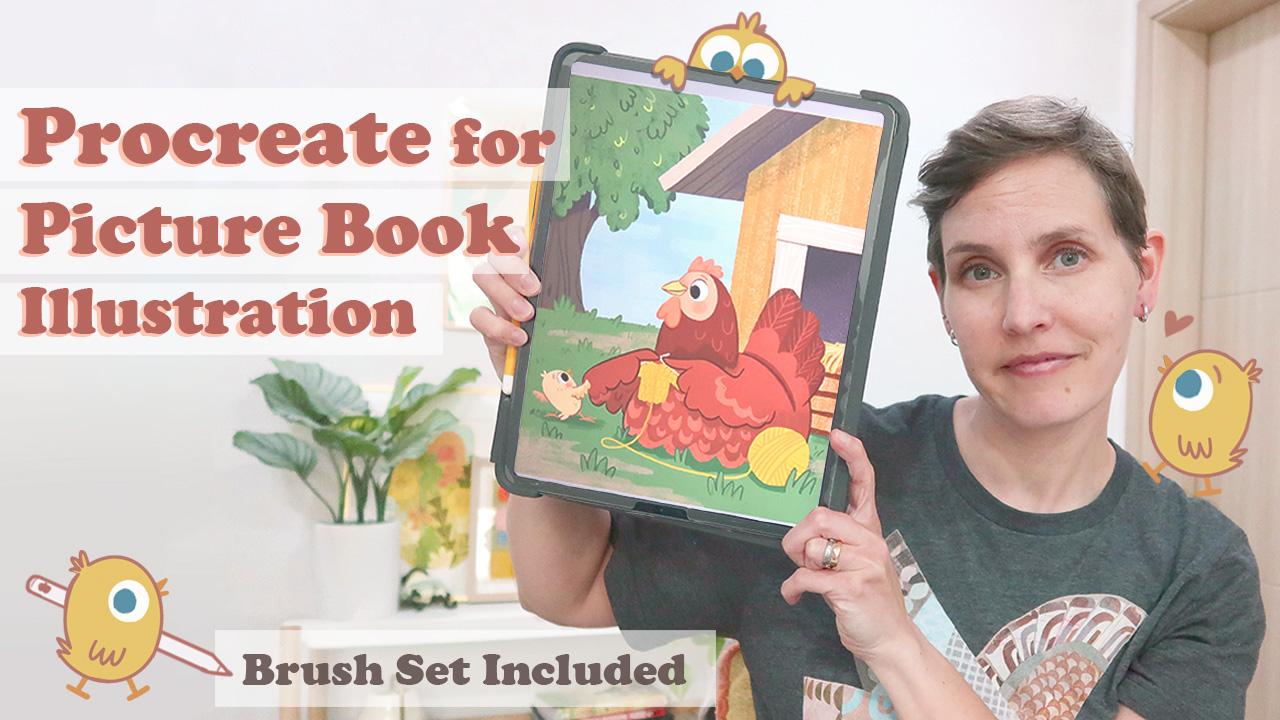
look at final sketches, making final art, and then exploiting your art in PDF form. I'll be creating my art
and procreate digitally, but I am including a small section in the
class where I'm showing you how to take paper sketches and then making a digital
PDF copy from those. I'm Mica Hokanen
and I'm an award winning picture book
author and an illustrator. I'm the creator of the
graphic novel series Mass and Tweed and the non fiction series Little Seasons and the
picture book series Kitty. And at, if you want to
become more confident in your narrative
illustration skills and creating digital
picture book dummies, then this class is for you.
I hope you'll join me. I'll see you in class.
2. About This Class: Welcome to today's class. In today's class, we're going to dive into picture book dummies. We're going to look at the
structure of a book to best understand how to
set up our dummies. And then after that,
we're going to look at pasting our story
and thumbnailing. After that, we'll go over some layout ideas and then
move to sketching your dummy. You can work either digitally
or sketch on paper. I'll be working
digitally and procreate. It's fairly easy to follow
along if you're working in a different digital program
like Photoshop or affinity. Or if you're working
with pencil and paper. See the short bonus
video on how to scan and create digital dummy
from paper sketches. At the end of the
class, I provided you with a manuscript in this class that you
can practice with. It's the folk story of Henny Penny and it's
in the public domain. Which means that you
can freely edit it or rewrite it or change
it how you want. If you want to use
a different story. One tip is to just
Google folk stories and many different ones will come up that
you can choose from. Examples could be
Hansel and Gretel, the three little piglets. Just make sure that it's
in the public domain. Or then if you're a writer, feel free to use your
very own manuscript. If you want to be a
picture book illustrator, you need to know
how to make dummies kind of at all different
stages of your career. In the beginning, for example, you might feel a little
bit lost at what you should do in your portfolio. And taking a story and
then illustrating it is a great way to build up pieces that you can include
in your portfolio. And it kind of gives you
a scaffolding to work on. And doing a full book
dummy will also give you an idea of how much work
goes into making a book. And it'll give you an idea of what this career is
going to be like. And it helps you think
creatively and explore different kinds of layouts
and different kinds of ideas on how to illustrate
the different pages without putting the
pressure on you of actually having to work
with the publisher. You'll also get practice at drawing characters
more consistently, putting them in
different poses and also testing out different
emotions for them. After making sketches, it's good practice to pick
out a handful of different illustrations from
your dummy to make into illustrations and then include
those into your portfolio. It's a great way to
show art directors that you can draw
those characters consistently and show them in different environments
and different poses with different emotions. Then lastly, if you are new to illustrating and you're not sure what your style is doing, a whole book will also give you an idea of what
your style is. Because you're having
to draw a whole book, multiple illustrations, maybe 20 illustrations,
in the same style. For the intermediate
illustrator, you can delve much deeper into character design and
interesting layouts. And pick the best pieces from
your dummy to include in your portfolio that
you then try to catch the attention of art directors and editors and agents with. So if you're just beginning, it might feel a bit daunting to work on a whole
book all at once. But we're going
to be breaking it down step by step in this class. And hopefully it's
going to make it easier for you and also
make it really fun. Working on thumbnails
and sketches is the most fun part of
making a book for myself. I really like the
creative process and kind of being able to just throw a whole bunch of thing at the
wall and see what sticks. And just get really
creative with it and try different layouts and work with characters and figure out what designs I want to
do for the whole book. Before we jump and
grab our pencils, let's demystify how books
are put together so that we don't get bogged down by the nitty gritty of
the book formats. So let's jump to
the next video and look at parts of the book
and proper page accounts.
3. Parts of a Book & Page Count: Let's talk about parts of
the book and page count. Most picture books are going
to be 32, 40 pages long. The page counts go in
increments of eight. And that's because the way
the books are printed, they're printed on large sheets that are then folded and cut. If you imagine this being cut
and then you cut the top, then you have
12345678 pages on it. Then each one of these groupings would be called a signature. When we first look at a book, first of all, most
hardcover books will have what's
called a jacket. Sometimes it's the same
as your book cover, and sometimes it's different. And we have a hard cover, sometimes they're
soft, but in general, books come out as hard covers. First, this would be the cover, and then we have back cover. When you open the book, what we usually get are what's
called the end pages. Then after the end pages, we usually have a
copyright page, and then we have a title page. We actually have that inside or the meat of the
book, the text of the book. Then when we get
towards the end, we'll have the end pages again and then we'll
have the back cover. And sometimes there's
changes to these pages. Like the copyright page might be actually like one of the
last pages of the book, so there's a little
bit of finagling. But if you stick to
the regular template, if you want to pitch a
book to a publisher having the end pages and then the copyright page and then the title page and then
starting your story. That's kind of a sure fire safe way of pitching a
book to a publisher. And then at a later point, if an editor thinks
that, you know, some things need to be
switched around or whatever, then they might make the
decision that maybe will include the copyright page
at the end, for example. All right, but just because
we have 32 pages in a book doesn't mean that you divide
your text for 32 pages. Let's look at how this
book is put together. If we look at the
spine over here, you can see we
have the cover and then there is where all
the pages are attached. Actually, this first page from the signature
is glued down. This book is called
a self ended book because the signature
itself is glued on, glued onto the
hardboard of the book. If we look at a schematic, so if you look at
this schematic for a 40 page picture book
template that is self ended, you'll notice that
the first page is the part that's actually glued down to the hard
cover of the book. And then when you open it, you have the two end pages. And then you'll have the
actual pages of the book, the copyright title, and
where the story starts. If we look at a
separate ended book, sometimes there's an extra sheet of paper that's glued down. And then the signature
or the actual, like the pages of the book
are glued down to that book. How these first two pages are glued down at the
bottom over here, This blue paper
stock is different than the actual signatures and the paper stock of the book. These books are, in general, a little bit more
expensive to create. The end pages are usually
either colored or they might be printed with one or
two different colors, but they're usually
pretty plain. But the benefit of this one, it gives you more
pages to work with. Your book, actually your
page one is over here. And then page 2345, this is where the story starts. So it's pretty easy to tell if it's a separate ended
or a self ended. Two big differences are that with the
separate ended books, you will get limited
printing on your end pages. But you get more leverage. You get more inside
pages of the book. And then when you have
the self ended book, your end pages can be
printed in full color, but then you have a few
pages less on the inside. So in general, I feel like I see more of the self ended
books on the market. And so when I'm working
on my own dummies, I usually set my page
count to a self ended, either 32 or 40 page book. When you're choosing page count from talking to different
editors and art directors, the general consensus is
that they would like to see your books formatted to the
32 or the 40 page books. If for some reason
you can't do that and your book ends up being a few pages over or
a few pages under. It's not a deal breaker for
an editor to acquire a book, but they definitely know that. Then it will be their
job to help you edit it, either up or down, to fit
one of those page counts. So it just looks
professional if we are able to create our dummies so that they're the
correct page count when we submit them
to the publishers. All right, now that
we know what parts of the book book are and
what page count to use, let's look at how to get our story to fit
onto those pages.
4. Pace Your Story: All right, now that we know how books are book put together, let's dive into our project. But before we can
illustrate a book, we need a manuscript
or text to illustrate. And so you can use Henny Penny, which I provided the manuscript for as part of this class. You can look at it, look for
it in the download section, or you can use whatever
story that you want. Doesn't matter which
one you choose. So the first thing to begin is to read the
story a few times. I know there's been more than
once when I read a story for the first time
that I didn't quite understand it or get
the nuances of it. And so it's important
to read it kind of slowly and read it a
few times and kind of make mental notes of
what you're thinking about illustrating or what
kind of word pictures come to mind as
you're reading it. And since we're
using the folk tale, you are free to change
the characters. Maybe it's not a
chicken, maybe it's a, a squirrel, or maybe
it's rhinoceros, or maybe it's a giraffe. I don't know. You can make them into
different characters. You can change the
names, You can make the story shorter if you want, and that's the great part. And especially if you take a folk story that's
been done many times, if you want to make it
your own and, you know, do kind of a fractured
fairy tale or put it into a different time
or a different setting, then that book becomes something that you
could actually pitch to a publisher because it
becomes a different story or it becomes your own
version of that story. I recommend that you think about doing that too if you
feel adventurous. All right, then as using one of these
templates as a guide. So we have 32 or 40 page, we are going to use one
of these as a guide to start pagenating the text
for the spreads in general, you want to try to
spread it out so that each spread of the book has roughly the same
amount of text on it. There might be some
places where it varies, like if there's a pause in
the book, like a big emotion, you might have no words
or only a few words on that page to make
it easy for you, I've actually included your
pages and spreads over here. For a 40 page picture book, you get 16 spreads and 32
pages to tell your story. But out of those, you lose two pages. Then you get about 15
spreads to tell your story. A lot of times I like to
work on 40 page books, but if you want to do an easier version at first
and get your feet wet, you might want to try
the 32 page book where you'll end up having
11 spreads to work on. If you're working on paper, I often print out the
text to keep it on hand. Or if you're working digitally, I copy and paste my text
into my thumbnail document and then or have it printed out next to me so that I can
reference it easily. If I'm going to do a
32 page picture book and I'm going to
have 11 spreads. I'm going to start looking
at my text and start figuring out how can I do 11
spreads from this right now. The way that it's
just the way that it's paragraph, it's 12345678. We have eight that will give us the three more to work with. A few of these we might
want to split up. Now would be a good time
to make sure you read the whole thing and
we have a couple of pieces that are really long. Maybe those are the ones that
we're going to split up. Or in the beginning, because we're setting
the story up. Maybe we want to split
some of these pieces up so that we can set up
our story in the beginning. And then because it's repeating the same s over again,
then it's easier to, I could maybe cut down
the word count on some of these other paragraphs to
make it easier to fit, less text per spread. Once you have your story
pasted out to 12, 16 segments, we can kind of work our
way to the next step, which is to decide of
the format of our book, whether we want it
vertical or horizontal.
5. Book Size & Format: Before we start on
our thumbnails, we obviously need to figure out if we're going to be doing a vertical or horizontal book so we know what size to
create our dummy end. The exact inch measurement isn't something that you
should get stuck on. Because if you ever do
end up selling your book, then the publisher will decide what size they
want to print it on. But I'll give you some
basic guidelines on what sizes in general
publishers work with. Your book can be either
vertical, something like this. It can be horizontal
something like this. Or then it can be
square, like this one. When deciding about
what format to pick, think about your story. How do you see your
book reading out? Now, if you have trouble
envisioning your book format, a good idea would be
to visit a library or a bookstore and browse through some other books that have
a similar feel to them. In the case of our
folk story, Penny, you could look up other books of folk stories or you could look up character based stories. All right, so here are
some general guidelines of like the orientation
for your book. So if we're talking
about vertical books, they are a very
traditional format of the way that books are made. They fit really easily
into bookshelves. They fit neatly
into book displays. They are economical
to produce because of the way that the pages are
printed and bound on a sheet. And they're a great format
for buildings, characters, and stories where
the visuals are kind of in a vertical
format in general. And the second format is horizontal books or
landscape books. And those books are great if you have books
that rely heavily on illustrations where
there's landscapes or like expansive
views of locations. It's great for if it's like
a journey where a character, you're moving a character
through a journey, that format works well for
those kinds of stories too. Then the third is
a square format, obviously that's in between
both when you think about it, obviously when it's a
square, it's a square. But then when you open it, then you can get
expansive views. Personally, I really like
square picture books and I feel like they offer
benefits of both. One thing that I would
recommend against is either in the vertical
or the horizontal format, I would avoid going
very far from like the general or sizes of books. So if you have a
book that's really, really tall or really, really wide, then they
become difficult to shelve, they become difficult
to display. If you think about a library or a bookstore where they
have books facing out. If you just have a really
odd format for a book, then it's really hard to display that book and
to sell that book. If you're just starting out and you're trying to
figure things out, my recommendation is to stay at the same size as most of the other books at
the library bookstore are. And as I said, the size
of the book dummy is not super important because if you end up submitting
to a publisher, the publisher will be
the person you know, the people who decide the size. If you are self publishing, then I would recommend that you go onto the platform
that you are self publishing on and look at what the sizes
that they offer, look at the sizes before
you start working on your dummy so that
you know what sizes they offer so that you can create it perfectly to whatever
size they have available. So some of the sizes
that are normal are we have eight by
ten or 8.5 by 11. So kind of normal letter
size, sheet picture, frame size pieces on either
vertical or horizontal. Or it could be a little bit
smaller, like seven by nine. And then for the square format, it's not super crazy anywhere. If it's like let's say
8-2 by ten inch square, you should be fine if
you don't know if you're really more advanced and you're working on your own story and you're working
on your dummy. You could be working
on it as a ten by ten. And that's probably
about the biggest that your square book would
be published as, because you're doing
it as sketches, you can always zoom
it up big later. All right, now that we have the story and we have
all the technical, nitty gritty stuff figured out, let's jump into the
super fun part and start working on
thumbnailing our story. In the next video,
I'll see you there.
6. Thumbnailing: Oh, all right. This is my favorite part of
creating a picture book. So the thumbline part, I love this part the best
because I can get really creative and it's like you get a bird's eye view of your
whole book all at once. And you get to figure
out really fun page turns and how you're
going to surprise people, you know, the people who
are reading your book. Or how you're going to build
up anticipation and how all the different pages
flow from one to another. And for me, it's just
the most creative part. And the most fun part
is just coming up with all the different
ideas of what I can do, what you can do with the book. And so, you know, it kind of feel kind of
daunting, like, oh my gosh, I don't even know if I
can do a whole book, but you know, you don't have to draw anything really detailed. Like you're just kind
of putting ideas down and kind of thinking in your head how different
layouts would work. And so don't stress
out about it too much. And you can always go back. You know, your thumbnails
are going to be teeny tiny. You know, you can try ten different thumbnails
for a spread. And, you know, it
doesn't take you long to draw little shapes
on a little square. And so don't stress
out about it, you know, just let
your imagination flow, do some fun research, look
at different layouts, different ideas, and
let's get down to it. So let's get our ipads out, or your paper and
your pencils out, and let's get to work here. I've edited some of
this text over here. Each spread of your book is going to have its
own little set of text. And a lot of times
I'll either have this printed out or I can copy this. And then I can come over here and then paste
it over here. Now I just have it for
reference over here, and I can just move it off
to the side somewhere. So, for example, the
beginning of our story reads, One day Henny Penny
was picking up corn in the corn yard when whack
something hit her upon the head. Goodness gracious me,
said Henny Penny, the sky is going to fall. I must go and tell the King. We have the main event of Henny Penny being whacked
in the head by an acorn. Then we have the
choice of choosing which moment to
illustrate that event. You can think of
this event as like a film strip or like a
little piece of a cartoon, and you need to pick the
best stale shot of it. You have the moment before the acorn hits says it's
falling down on the head. You have the moment
when the acorn hits and then the moment
after the acorn hits. And you'll have different
expressions and different feelings for all
those different moments. And so there's no
right answer to which moment to pick
is the right one. But you can make some little thumbnails or think
in your head, which moment might
be the right one for this part of the story. Are you trying to
build anticipation or a surprise for
an upcoming page? Or what feeling do
you want to convey? On the spread you can think
of the emotional impact that you want to have
on the reader and how the story continues
on the next page, over here as we're thinking. Let's try to illustrate the
moment right before Penny. Penny is struck on the head. Maybe we can do two
illustrations, or one. Maybe she's picking up
corn and she's over here. And so this is one way
to illustrate this. But then now that we've picked our moment
that we want to illustrate, then we also want to think about the best camera angle
you can think about. Do you want to, do you want
to have this really close up? You can think if you want to
have this really close up, maybe we want to crop it so that if we crop it too
close up for this one, then we're not going
to see the acorn. And maybe another option could
be to crop it really far. And then we could actually illustrate a lot of the
background over here. You can also think
about, if you want to illustrate it from the top, maybe we could have Henny
Penny Seen from above. If this is her head
and here's your feet, whatever and then maybe
the acorns coming. I don't know if you wanted
to illustrate it from below, from like a worm's eye view. Maybe here's the corn and then Henny Penny's over
here trying to pick it up. And then we'll see the acorn. We'll see the acorn. Maybe
it's going to be really small because it's farther away as it's coming towards the head. You can think about the different
camera angles close up, up, down, far away. You could think of looking
at it from behind, looking at it from profile, looking at it from the front. Think about turn your camera. You turn things in
your mind and think about what would be the best
way to illustrate things. In the context of your book. If I'm thinking this is
my first page in my book, over here I've had
the copyright. Title. Or a copyright and
I'll have the title page. So this will say Henny Penny, for example, in my name
over here. I don't know. Maybe I'll have a picture of Henny Penny walking
over here or something. Maybe she's carrying a basket. I don't know. Then I don't know. We could do maybe acorns or
whatever other fun things. Maybe there could be a
acorn tree over here. So just thinking, maybe
for my opening spread, I want to do an
establishing shot. A lot of times in the beginning
of your story you want to do one shot that's a
little bit further away. You're starting to
establish your story. I could either include some
of these elements over here or I can do that
on my first page. Maybe there's going to be a
barn or maybe a barnyard. I don't know if we want to show other characters over here. Maybe there's going
to be the tree where the acorns coming from. Oh, it was in the hay field, so I don't know. Maybe we're showing some
corn and then maybe the farm is going to be
further out on a hill. We're showing something
similar to this that we have, like this little
farm yard going, maybe there's a tractor
over here or something, then we're in our cornfield. As we're looking over here, maybe that could be like
our first thumbnail. And then lastly, as you're thinking about
your thumbnails, remember that books are read from left to right
and from up to down. And think about how you are
moving your reader's line of sight through your composition. A lot of times we have action
moving from left to right. A lot of times it might be something from one
picture to another. So for example, in my thumbnails that I've been
working on a different book, I have this series of
where there's going to be a rainstorm and there's
this theme of this water. So these are my
thumbnails for that book. And so there's going
to be a picture of a turtle going into water. And so we have this
kind of movement that our characters are
walking this way over here. We have this
movement that starts kind of from the bottom
and it grows up. And then it goes,
there's a river. And so it moves with the river. And then there's going
to be a rainstorm. And so you're moving. I'm trying to move
my readers eyes. End this story kind
of in this wavy way, way, in the way that you
could think water moving. And then when I move to a different subject
matter in the book, then I'm changing my
compositions to something else. So as I said, thumbnailing is a great way to think of
your book as a whole. And in general, you don't
want to use the same type of illustration through
the whole book because it's going to
be boring to read. You want to vary the
illustrations up, so you might want to have a
full spread illustration. Then there may be
some vignettes, maybe a single
page illustration, as you're working
on your thumbnails. Be mindful of how
much text you have going per page and then
leave room for that text. With this much text
going on over here, I might want to put that, leave kind of a space where the corn is kind
of a light color. And I have my text over there. Or I might want to make my barn really tiny over here
in the background and then have the sky area to
include my text in over here. You just always want to
make sure that you know how much text is
going on a spread. So you know, if you have
multiple illustrations, if you want to just
add text in between or you want to have text under or however
it might want to be, Just be mindful of leaving
that room for that text. Once I'm done with adding all my different spreads and
figuring everything out, I go into my settings
and then I share this as an image, what do you call it? Onto my tablet. So I'm going to save it as an image and then
export it. All right. As I'm working on a
few more spreads for this book to repeat, here are some things
that you can keep in mind while you're
working on your thumbnails. So think about which moment and emotion
you're illustrating. Think about the viewpoint. Think about your action lines, different kinds of layouts, variety of layouts, and
leaving room for your text. You might be feeling a bit stuck for some of the
spreads in this book, which is why I
compiled a list of different types of illustrations for you in the next video. And I hope that you
can use those as an inspiration for when you're working on your thumbnails.
7. Layouts & Page Turns, Vol 1: I wanted to make this video
for you as an extra resource, we're going to look at
different layouts for books, for full spreads or half
pages or vignettes and spots. The terminology isn't super
important at this point, but I just wanted
you to be aware of all the different
ways that you can lay out a page or a spread. And then maybe take
some inspiration from some of the books that
we're going to be looking at. The list for all the authors and illustrators that I'm
going to be featuring in this video is going to be in the class handout if you want to look at any of those
people more closely. So let's look at
some of these books. The first illustration
that I wanted to show you are full bleed
illustrations. And what full bleed means
is that the illustration goes off the page in all
different directions. When you're drawing
your illustration, you're actually drawing
your illustration a little bit larger
than your page. And then it gets put into the template for
the book template. And then a little bit
of it gets cut off. Then we have a river
by Mark Martin. This book is a journey, you'll see through the
whole book full spreads, how the river runs through. And there's a little
girl in a boat. In all these compositions, she goes on a fun journey. In this book, these are all full spread illustrations
to tell a journey. This is one of my books, Kitty and at Bent Out of Shape, I use spreads in pretty, almost the whole book. They change from
spread to spread, and some of them are more paired down with the
backgrounds than the other. Then this is another one,
little seasons, spring seeds, I like to have a lot of
white area in my books, you'll see a lot of my skies
are white, it's full bleeds. But you could almost think that this was a spot
illustration because it's almost white
in the background. Then we have Island born by Diaz and illustrated
by Leo Espinoza. Here I want to just show the full bleed illustrations Can also just a
single page here, it's a single page, it bleeds
off on all four sides. Then this book also has this really great
spread that I wanted to share the characters two times. This is them in the current day. The story is telling how they're
imagining the hurricane, or the storm blew
through their island. You'll see this whole full
spread going through over here with a fun
placement of the text. Then I wanted to share
My Baba's Garden by Jordan Scott
and Sydney Smith. Here, there's a spread
illustration as well. There's lots of full spreads. Is a single page and
then there's also a box illustration that is cropped from a
larger painting. All right. Those are your
most commonly seen options, Full beds, full bleed
spreads that you can do either a full
spread or single pages. Then I wanted to show
a variation on those. This is the Rock
from the Sky from John Klassen and in a
lot of his books you'll see where you can have
full bleed illustration, but it's cut off at some point
to make room for a text. Sometimes the text
is on the top. I don't know if this book
has it on the bottom. Sometimes he'll put
it on the bottom. Sometimes it can be
a panel on the side, but you can also make room for your text
in different ways. Then this is a similar spread. If you go down to
the woods today, poems by Rachel Percy and
illustrated by Freya Harts, we have almost a
spread illustration and then it's also cut off. Then there's a text over
here, there's a poem, and then things
defined and there's some little illustrated
elements on this side too. All the spreads are similar, but they're just broken off. They're spreads,
but then they have these little vignettes
for the text instead of the page of text
with vignettes for the pictures since we talked about that box illustration
in the Baba's garden. This is curious story of Edward Nonsense by
Laurie Mortensen and illustrated by Chloe Bristol in the style of Edward Gory's
illustrations in his books. Laurie has also done
some boxed illustrations over here and then the text is shown on the side. So
that's another way. But she has many different
kinds of illustration, so there's full page vignettes, things mixed together
in this book. All right, so let's talk about
some spots and vignettes. When I think about vignettes, it's in an old word for me. And I think about those
Victorian portraits or old time portraits
where you'll have a person and then they're in an oval picture
frame or framed in some way. Vignettes are kind of just that. They are usually, they're
not full bleed, they stop. But a lot of times their
edges will be kind of blurred out or they're not
super regular. This is Backyard
Fairies by Phoebe Wall, and she's got the whole
book is these vignettes. Then here's the what ifs, and these ones are circular and you can have one per page. You can have multiples per page. Then, once upon a unicorn's
horned by Beatrice Blue. And she has a couple of
vignettes over here. I just wanted to show this
full page illustration real quick before we
go to the next one. You can see it's the same
illustrated multiple times, but it's a passing of time. And the text says, then he shook his soft fur and fluttered
his sparkly tail. It's showing us how he's
fluttering his tail. And it's given us this
sense of movement by putting the character on
the page multiple times. Then there's spots which
are usually more of a fleet free floating
motif with no background. But in all honesty, a lot of times I'll hear the words vignettes
and spots being used, those two words used interchangeably in
book illustrations. Here's one where we have
three illustrations on a page and you can see it's
telling a passing of time. These little spots or vignettes are really
great for that, for showing us a
passing of time. Then this is Mother
Bruce by Ryan Higgins. So you can see on this spread, there's four different
spots and some of them are overlaid on
top of each other, and then this is, Grown
ups, never do that. By David Kale and Benjamin Shad. He's put a whole bunch of different illustrations
onto this spread, just showing crazy
things that adults do. The text only says
they're never clumsy. And then it shows
all these things where adults are clumsy. Then lastly, I
have a leaf thief, and it's got three
illustrations on it. And I just thought this was
fun because you can see how the text is also laid
interestingly in there. The text says, try to
relax, Breathe in and out. Just relax then see, we have the second page that
has no text, the last word. And then we see the lights on at the end of the night as he's having a hard
time relaxing. It's a fun placement of the
illustrations next to each other to tell the story of
what the text is saying. Then for these next two pages, I wanted to talk about what I feel is like meandering
illustrations. And a lot of times they will have white areas and
the edges are raggedy. And I like the way
where there's that play between the illustration itself and then the
white space around it. Matthews. In the gold leaf
written by Kristen Hall, illustrated by Matthew Forsyth. He has several
spreads like this in this book where it just flows really nicely
from one spread to another. But then you have these empty areas where you can put text. You can see he's got that almost a full bleed with
the text on the bottom. And then here's just
another one where he's left this effect of the
raggedy edge on the bottom. Then here's just another
version of it where we've got the shadow of a
Christmas tree and all the action happening
within that shadow. And then that leaves space
for our text on the outside. All right, and then last
we have this story, Mary Poppins by PL. Travers, illustrated
by Genevieve Goodbout. And she has kind of a
different variation of this. And so on this spread, we'll see, you know,
kind of a lot of the illustration on the
bottom, text on the top. But then, I love the way as she's pulling these things out, instead of just showing them on the floor or showing
them on the table, we see them kind of
floating through the air, as Mary Poppins is
kind of magical. And then here's just
a different spread from later on in the book where, you know, everybody, Uncle
Albert is up in the air. And then and Jane and
Michael start laughing. And we have everybody kind of floating,
floating up in the air. So that's kind of
a fun spread too. All right. The next thing I wanted to look
at really quickly was just using several spreads to kind of build up a story. So in this first book, it's just The Octenauts and
the Growing Goldfish by Momi. In this one we have three, four illustration
with a little spot over here on the side text
on the side, some over here. In this one the river seemed
to disappear in the sky. This is one of my
kids favorite books. Then it was waterfall. Then you turn it up and then
we always yell, waterfall. And then a little bit
of text on the bottom. Then we have this sequential
imaging actually. And Bear came along
by Lewin Fam. She has a similar thing
we're building up. There's bear who's floating on the river and you'll see how she's using
different camera angles. We're far away, We're
getting closer, and we're getting closer. They run into a duck, and then the duck
is on their pile. Now you can see we're building up tension over
here with illustration, no text on this page. Then we get a really
far away shot. Wow. And then they all fall
down the waterfall. And you can see how in a similar way as they're
tumbling down, the text has been
placed on the page too. And then they all end up having a good time and floating down together in case
you can't tell yet. I absolutely love picture books. We looked at a lot
of books already and I wanted to take a
break at this point. If you want, there's a volume
two of where we look at several more picture
books and look at really interesting page turns and building up
tension in your story. Or if you would rather just go to the library and do some of your own research and find your books that
you are drawn to, then I encourage you to do that. And then skip on to the next
video after video eight, which is all about sketching and setting up your
file and procreate.
8. Layouts & Thumbnails, Vol 2 : Welcome to volume two of
Layouts and Page Turns. We're going to look at a
few more interesting books that I just could not
help but share with you. And I hope you enjoy a couple more as we look at
interesting layouts, or how to build fund tension, or some other
interesting ways to solve issues with
your storytelling. And then I wanted to
look at Nosey Knight by Mac Barnett and Brian Biggs. The way that this story, it's really interesting the way that Brian Biggs figured it out. It's basically a
story that happens in a tall house and you're going like one floor at a time. A kid was sleeping and
then he woke up on the bottom floor and he's
wondering what's going la, la, la, above my head. And you can see this
break on the top. Then we see the guy, and man is singing
opera above my head. And then it keeps moving up. What's going above my head? A baby is cooling above my head, Ma, in every spread. We're moving like an elevator, Seeing every single floor and the characters on each floor. If you notice, he's also
used different fonts. I don't know if he's hand
lettered everything, but you can see that
with the Cowboys, it's a Western font. Then there's a girl,
there's the Crow saying. Then there's raw, raw, and cheerleaders are cheering. And then there's Chacha,
which is a different. Fawn, blah, blah, blah. It's just a fun way to solve visually the book
where we're moving up then I wanted to do Grab That Rabbit by Polly
Faber and Brioni Maysmith. This one is just the fun book
because Brioni Maysmith, she's using a lot of
different angles over here. This is from like
rabbit's point of view. We've got this bush
that we're looking into the sun with the gardener and I love it with the
little pieces coming out. Then we get to a spread.
We have a full spread. Then we get to this page
where the hawk comes down. We're looking at it from below. We're looking at it from below. Then we're looking at it from above and looking
down at the bunny. There's just some really
fun illustrations in here and the ladies
stumping inside. And you can see the
light coming through the doorway over here. It says Penelope Rex was
very surprised to find out that all of our
classmates were up until now, we've just been seeing
these dinosaurs in this book and all of
the dinosaurs were. And it's leaving
us a cliff hanger. So we need to turn the page
then it's children and you'll see this full spread of the kids and Penelope
Rex over there. If you look at
this illustration, see how Ryan, this is a
book by Ryan Higgins. How everything in
the classroom is just a single red color. And so that way it's
easy for us to spot the children and the
teacher in the classroom. So he's using color to direct our eye through
this illustration. Over here we have a
white background, is Penelope is not quite sure. Walter looking at him and then Walter the goldfish stares
back and licks his lips. And so we have this
menacing background. So we're going from
white background to like the moment of ah with Penelope with a red background
and then he runs off. Dinosaurs are
delicious in the end. And then I wanted to look, this is Wordy Birdie,
written by Tammy Sauer, illustrated by Dave
Matrem. Over here. Every spread in this
book is really busy because all the characters have their little
speech bubbles. And then there's
some text around. But as you can see,
it's really busy. And everybody's trying to tell Wordy Birdie to walk around. And then we get to this spread, you'll see there's
all this text. And then it just
stops and we have the big eyes and the
dark in the scary. We get to this
moment of wondering, oh my gosh, what's going on? And then we get the bear word. Birdie just goes, oh, and then it goes on from there. And then we have collecting
cats by Lorena Scobeat. For this one. I love
the way that she builds up the tension
in this one too. So you want to keep turning the pages and reading to
find out what happens. So we start with one cheese
and it's got a little mouse, and then there's more mice, and then there's more mice, and then all of a
sudden you get cats. And then you get lots of cats. Then after you get
all kinds of cats, and then, oh my
goodness, a big cat. And then the story changes. It's just a really
great way to keep your readers turning pages
and wondering what's happening on the
next Bread metal. If you're looking for
interesting layouts, Sophie Blackhaw has a lot of really great ones
to look out for. Finding Winnie is
another one that won the caldicott that has
great layouts in it. If you think about
this book about a lighthouse that's
very long and skinny. And you'll notice this book
is also very long and skinny. There's some really interesting, we have a view
that's from above. And then we have
this really fun cut out of the lighthouse. And then if you think
about the bottom of a lighthouse is circular. She uses a lot of these circular vignettes in her illustrations, and most of them are not
on a white background. They have some picture or illustration or
something underneath them. I just wanted to share a few. For example, on this Fred, we have that circular
illustration and it shows the passing of time as the
wife is going into labor. Some really fun as we imagine her running down the stairs and the way that the
text is laid out. Over here we have
another illustration. It straight down, we're
looking at the circle. Our viewpoint is out this way. But then see how
things are backwards. Going down, we have another illustration with a
little vignette on the top. Some really strong illustration, there's little messages and then our vignettes on the top. But the vignettes are cut out, bleeding off to the sides. Some fun layouts in that one. Then lastly, I wanted to
talk about the passing of time and graphic novel type
paneling in picture books, and these are just a
few examples of that. This is mighty in by Melissa
Castillon over here. She's using these four panels and it's actually
just in one scene, but we have the same
characters in it. Over here, there's an owl that grabs her over here.
We see them flying. It may be a little bit smaller. Over here, they're flying
closer to the house. And over here he's
dropping her off. So it's kind of one
scene that's broken down with the characters
shown in it multiple times. And this could either,
you could also show this where there's no lines
and you would just show. But for the reader,
it sometimes makes it easier if you are showing that. And another thing that I just wanted to show from
her book really quick, that I love what she
does is she'll do, she'll do these full
spread illustrations. And I love this spread, how they contrast
between each other. And so we have this full
bleed illustration on this side and then how it
frames the text in the middle. And then over here
it's the other. This is her coming home
and how brave she was. And now this is them
having their dinner. Now all the characters
are still framing. The illustration is in
the middle of the page, and then we have the text
in the middle of the page. I love the contrast
between these two pages, then wills in the pigeon books, this is pigeon finds a hot dog. In all of his books,
he usually has the spread where
pigeon gets angry. And then he has all
these lines and they're shown in all these
different little squares. It, as he goes through all these different emotions and they're fun to read
with the kids. Then this is super pop and Wiz Kid Potty Power by Eunice
Moyle and Sabrina Oil. This book, there's a, these small little
panels as you'll see. Multiple panels to
just show, like, the different parts of the text for that page, I
wanted to show those. Then lastly, for Colettes Lost
Pet by Isabelle Arsenault, she uses a lot of this paneling. They could be spot
illustrations, but the way that
they're laid out close to each other and they all
line up with each other, it's almost more like a graphic
novel paneling over here, the way that she's got it,
there's three over here. And then I just wanted to show, I thought this page was really fun in the way that she just, kids are chiming
in trying to find the parakeet and it's just their heads with their
little speech bubbles as they're all chiming in. You can, you can feel
the scene in your head. She's sad and all these
kids are coming up to her and then trying
to help her out. And they're asking
her these questions. Hopefully some of the
books that we looked at will be lots of inspiration. What I always
recommend is going to the library and borrowing
a bunch of books. And just reading a bunch
of books and being exposed to a lot of different
kinds of illustrations. If you look at all these
books that we saw today, they're all illustrated with different media in
different styles. Some are very graphic, some are more wispy, some are painterly, some are traditional, some are cartoony. You know, you can find inspiration
for both style and for all the different layout issues or problems that you might
be having in your own book. All right, now that
we've thumbnailed, hopefully your whole book out, let's move on to taking those thumbnails and
sketching them larger. And I will also
show you how I set up my dummy files in procreate.
9. Sketching and File Setup: Let's set up our dummy
pages and procreate. And I've decided I'm going
to do an eight by ten book. And when I work on book dummies, I like to work on spreads
instead of individual pages. That way if I'm working
on an actual spread, I'll be able to
get my drawing to flow from one side to
the other instead of having to work on individual pages and then
trying to connect them. To set this up, I'm going
to start a new canvas. And then if I'm
doing a full spread, if I'm doing full bleeds, I usually add a quarter of an inch all the way
around my canvas. If it's an eight by ten,
then I would do 10.5 tall, make sure I have
inches selected. And then ten, a two tall. And then for the width, it
would be two times eight. Then I would add the
quarter of an inch around, so it would be
16.5 for my width. Then I'm going to
have it at 300 DPA. And then I'm going
to hit Create. Now this would be one
spread for my book. Once I have that set up, I usually go to my canvas. I go to my drawing guide. Edit, Drawing Guide. And then I change
my grid size to something a little
bit bigger just so that I can get
my middle line. I make sure that I'm
working on a layer. I have my pencil selected, and from there I'm
going to draw a line. And then I'm going to tap, which makes the line
straight up and down. Actually, a lot of
times I like to make my margins and gutters
just a different color, so it's easier to see, to undo. You just tap with two fingers. I'm going to start
in my middle line, draw it down, tap and hold. That's going to be my gutter. That's where the pages
go on top of each other. And then most of the time, I like to add lines
around the edges just to remind me to stay
out of the margins. I'm not super concerned if they're a quarter
of an inch or not. It's just for my brain to remind me that I just don't draw
anything in those areas. And then when I'm
done with those, I go back to my actions panel and I turn the drawing
guides off because they're usually a little bit
just distracting for me. All right, this is
going to be my gutter. I usually name this something
like gutter in general. I try to keep this on top, but you've got to make sure
that you don't draw on it. I usually lock
this layer just to make sure that I don't
do my drawings on it, so I can just keep
everything separate. Then I'm going to
start another layer. Then what I do is I'm going to add when we were
working on thumbnails, I saved that file and I'm
going to insert a photo. I'm going to insert
my thumbnail photos. I'm just going to, if you've
illustrated everything, then I leave it so that I can
see on my pages like this. I just leave this on
my page like this. It's on a separate
layer over here. I'll add another layer. This was our 32 page template. And so we have, and so when
I go back to my gallery, I'm going to duplicate
this 16 times. All right? And then from here I label
my different panels. And so my first one
is always going to be front and pages. And so now I've gotten
everything labeled. Then I'm not going to worry
about my end pages first. I'm not going to worry about my copyright and title pages. We'll start over here where
our story actually starts. The reason why I always paste my thumbnails on the top is I usually like to blow up
my sketches over here. That just makes it easier for me to start working
on my illustration. I usually don't do
all of them at once, but I'll just do another one. Just so you can see now I would be on page eight and nine. I always bring my capacity down and then bring my
gutter up to the top, so that gives me
make sure that I get everything where I
need them to be. I'm working on my illustration, You'll see we have
the gutter over here. A good rule of thumb is you can try to keep everything
within about an inch, half an inch, away
from the gutter. We don't want our character in the middle with their head in the middle or part of
their body in the middle. We, in general, want
to have things on both sides and then
leave the gutter alone, or put some interesting
things into it. Then when you start sketching, if I'm feeling a
little lost if I haven't figured out what my character design
is going to be. A lot of times I will take
a little bit of extra time and I will just work on my characters on a
different sheet. I might work on some
chicken sketches. Over here you can see these were some of
the sketches that I did for Mass si the Nome for one of my mass
and tweet books. These were right in the
beginning and I was trying to figure out what does his
face look from the side. Thinking about how
I already have him posed in the book for
all the different pages. And this was just me trying to try different poses for him
and see which way it works. But what I really find is, even when I do sketches like
this and I figure stuff out, a lot of times once I actually start
working on the dummy, I really figure out those
last couple of kinks on how my character
is going to look. And sometimes that means
that I have to go back and revise my illustrations. But I feel like that,
at least for me, that's part of the process. But sometimes you might want
something as a reference. So let's say this is going
to be my Henny Penny. And I want to make sure that
I'm going to be drawing her consistently in my book. What I might do
sometimes is I might take my sketches and
the ones that I like the most I might crop so I don't have
extra room around it. And then I'll save this then when I come back to my
sketching over here, if I'm working on my
sketches and I want to make sure that I'm consistently
drawing my character, then I might go to
my canvas and then hit Reference and then
import my drawing over here. This is going to be
my sketch layer. I'm going to lock
this one to you. Then I'm actually going to start working on my sketch here. We have the corn. My sketching is always loose
in the beginning. Maybe I want to make it so that this is framing Henny
Penny over here. I usually sketch several
different times. I'll do just a
very loose sketch, but that's a little bit more detailed than what
I already had, just refining my initial
idea a little bit. I'm just trying to think about elements that can
add interest into my piece and give us a sense of place and setting
if we wanted to. You could also think, since we have these
other characters, you could also maybe show the other characters
farther away if you wanted. A lot of times I will actually, I forgot to do it this time. But once I start
actually getting to my end or more refined sketches, I usually always do my
characters on a different layer. So I just did my select tool, I dragged a line
around it and then I three fingers swiped and I'm
going to cut and paste this. Now I have penny, Penny on its own little
layer over there. Then that way if I need to resize characters or
move them around, then it's easier for
me to move them around instead of having to redraw. Then once I get
more of my sketch, I take that other layer out
from behind, over there. Just so that I can see
what I'm working on. If I'm thinking
about time of day, maybe this is middle of the day so we could have a
sun over here, maybe. Well, we know we're going
to have our text over here, so I'm going to just
mark that down for me so I don't draw stuff over here. Make sure I leave this clear. It's fairly loose in the
beginning and I might be working on things And
then a lot of times I'll have my characters on that different layer, like I said. And then, do I want to have
the character smaller? Do I want to have the
character bigger? If this is dropping from here, I got to make sure it's
going to drop on her head. If I have her here, then it's going to hit
her in the neck. Another thing that I try to be careful about
when I'm drawing is tangents or making things
kind of run into each other. Right here, the
henny Penny's head is kind of at the same
edge as this board. And so I, it might be that maybe I move that board
a little bit over. Then another thing
you got to decide, am I doing a human sized barn or is this a animal size barn? The animals, the creatures who live over here and
everything is sized to them. I was thinking it
would be funny. Henny, Penny and everybody else, if they actually had
more personalities, they would all have
professions and personalities and that might make a fun story. I've given everybody, the rooster is going to be
chopping wood and then the. One of the other
characters would be chopping watermelons. So they're all doing things that are maybe a
little bit dangerous. My thing was folk tales
can oftentimes be a little gory or lit off
for today's readers, Like in this story, their heads get chopped off and then the fox tosses them on the shoulder. It's a good idea to
maybe think about that. The way that I played
it out over here was that they all have knives or something tucked under their wings when
they go into the cave. We have a dark scene with everybody's eyeballs and then
the birds come back out. But we don't, I'm not
showing anything happening, but it leaves it a
little bit open, like in John Clauson's books, to interpretation on what
happens in the book. You're welcome to
make those changes. You're not drawing
beheaded turkeys and roosters in your books. Okay. A lot of times,
once I have my page sketched out or even before I
start sketching things out, I will come over here to my text and I will copy what I have and then come to me or to my illustration and
then add a text layer. I'm going to change my size to, let's say 14 regular done. Then I'm going to paste my text over here and
then leave it over here. I actually already
moved my clouds over a little bit to
make room for the text. Now, this would be a
great start for me. I usually do all my
pages like this and then I look at them
from this angle. Just when I can see
all my layouts all together to see if I see some things that are not working or if I need to
change something. And then once I have
everything roughly sketches, sketched, then I would go back and maybe sketch things
a little bit better. Or you don't need
to have everything super detailed sketched. You want it to be about this where you're indicating what
everything is on the page. But what I would
want to do is just have it cleaned up a bit instead of going around over
here and trying to erase little lines over here, Just trying to neaten things up. It's much easier for me. I usually just bring
down my capacity, do another layer on top
of it and then I'll do my final sketch layer on top of this to make it into
the final form. I thought it would be
helpful to share a few notes about character and dummy
drawing dummies consistently. So I'll share my notes on
those in the next video, and then we'll move forward to doing some final
illustrations.
10. Character Consistency: I wanted to make a quick
second little note on keeping your
characters consistent. It's very important when
you're drawing your dummy, that your character
is drawn consistently through all the different
spreads and pages of the book. I'll often save that
character sheet onto a separate file and
then use it for reference and keep
it here on the side. Then I'll make some
general notes, either in my head
or on that paper, of things about my
character in Masan Tweed. I'm obviously drawing two
different characters. Some of the notes
that I had in my mind when I was drawing these
characters was that both of them have about
the same size head. And it's the same
shape of an oval, but for Tweed it
was up and down, and then for Mass
it was sideways. The length of the leg that was showing was a little bit shorter
and a little bit longer. On Tweed, their boots were the same size
for both of them. All right, so for mass,
when I was treating, or both of them really
kind of both of their shirts were
kind of the size or shape of a trapezoid. And moss was a little
bit more kind of straight up and down
and short and stocky. And then Tweeds was more
of a long and narrow one. And then, as far as comparing
them to each other, when I would draw them
next to each other, Massy's head was about at the same height as
Tweeds shoulder. Whenever I was drawing
them next to each other, even if I was drawing them
sideways, I would imagine. If both of these characters
stood up right now, would that be the length that they would be
in every scene? When I drew them,
I would make sure the same length if they were to be standing up
next to each other. Those are just some
of the things, not just think about shapes and relationships in a
character themselves, but then also think about the relationships between the
characters to each other. Then another thing you
could think about, if they put their hands
next to their side, where would their hand land? Would it be down here or
would it be down here? Where would the sleeves go? That just helps you keep things a little bit more
consistent as you're moving your characters
through the pages. And then think about
things and simple shapes and their shoes are basically
just almost a square, a little bit of rectangle
with a triangle on it. And then if they're facing you, then it would just, the
triangle would be in the front. Then Massy's hat, it was
very easy to think about. I would split his head
in two and that would be the top of his hat. And then there would be an ear. And then I would just draw the hat would just go a little bit outside of that with a little thing that
went past his ear. I would have all
these little rules in my head when I would draw these characters that
made them very easy to draw them consistently
as I went along. Or oftentimes beginning
illustrators myself included, will say that they can
work in multiple styles, in all these different styles. But once you actually
start working on a picture book and
you're on a deadline and you have to create
illustrations in a specific style, dozens
of illustrations. You fall into an
idiosyncratic way of drawing, like the way that
your hand just works, the way that you're comfortable
drawing backgrounds, the way that you're comfortable
drawing characters. You might realize that
you don't want to draw every single item in
a room very detailed. That you want to do
maybe a flatter style or a simpler style that
works for picture books. This exercise is really great in figuring out
what your style is as an illustrator and
then trying to keep it consistent within
a picture book. Once you have your
illustrations worked out, maybe after your first or
second round of sketching, you might want to take a week off from your project
and just take a break, which helps you
forget what you've done and then come back
to it with fresh eyes. A lot of times I'll
either ask somebody to read it for me or I
will read it to my kid. That's a great way to test
how your dummy works. Figure how the pacing goes. If something feels off, or if people aren't
laughing at the right time, or they're not anticipating things or wanting
to turn the pages or they get bored when
they're reading it. It's just a great way to test what you've
done if it works. And then you might
need to go back and tweak some of your
layouts or pages, or where the text
is on the page to make things run smoothly
through the whole book. After that, a trial run, you might have to do it
again, but at this point, your dummy should be
in really good shape, and there's only a
couple of steps left. In the next video,
we're going to look at picking out a
few illustrations from your dummy and then finalizing them and then including them either in your
portfolio or then in the dummy submission to
a publisher or an agent.
11. Final Illustrations: We're almost done with
our book at this point. We still are going to talk about pages and our copyright
and title page real quick. And we'll pick our final illustrations
and finish those up. All right, we're almost
done with our dummy. Let's really quick
discuss pages and our copyright and our title
page of our template. And then we will pick our final illustrations
and finish our dummies. And so the four year end pages, they can be a lot of
different things. They can have some sort of
a simple pattern on it. It's something that relates to the book or for
like Si and Tweed. I wanted to include
a map so that people have a sense of what kind of world I'm trying
to build with it. With Kitty and cat
opposites attract. I chose to do a scene that sets also the
mood for my story. Then in Kitty and Cat, because it's a shape book, I'm using my end pages to actually show the
shapes in my books. And fun thing between my front and my back
end pages is that then the end pages have in
all of those shapes, there's a lot of different
things that you can do with your end pages. And you can go to
the library and do some research if
you're feeling stuck. But in some way, they just should relate to
your story and enhance it. And then for our title
in our copyright page, there's in general,
a decent amount of text that needs to be
laid out on this page. For example, in Kitty and
cat bent out of shape. I have these little
spot illustrations here that tell us a story of T is mad because he doesn't have his food and then
he goes and he gets dirty. And then on the title page, we're showing the illustration
of cat coming home with being all stinky with a rotten piece of
fish and some flies. And then when our story starts, I've set up the story
on my title and my copyright page for
where I actually start. That's one way of doing it. Sometimes this page can be empty if you don't want
to do anything for it. And sometimes your title page would just have a little
spot illustration. It's up to you what
you want to do with it when we're working on
our dummy for this story, for the title pages. I was thinking because we
have the acorn tree and maybe it might be fun to have some just an acorn tree up
on the top or oak tree. Or maybe there could be a oak leaves or something
related to our oak tree. Then our copyright
information would be in the middle because
it's a folk story. Decorative elements
I feel like would go well then over here
I thought I would, I could hand letter Henny Penny. Then it would probably have
my name maybe right here. And then I thought it would be cute to show her as she's going. Maybe she's carrying, she's got her little basket
that she's maybe carrying. This might be a cute
little front page, or if it's a folk story, maybe I might want to
do a cute little wreath of oak leaves with acorns. Or it could have the
different characters. There could be a
rooster over here, and then my ducky
could be over here, and then maybe the
foxes where over here. So you could think about different ways of
how to illustrate your cover page and
your copyright page, but just be aware that all
those things might change once a book is purchased and the editor or agent might
want to work on it. Oh, once you have
everything sketched out and everything's
looking nice and everything's
reading and flowing smoothly, then in general, I pick about 345 tops, maybe six pages of illustrations
that I will finish, do final illustrations
for the book. In general, it's nice to have them together so that when
somebody is reading the book, they get a nice
sense of how things are working in general. I like to have the first
two to three spreads worked out if, but if there is a
page that's somewhere further down in
your book that you just think it's just a dynamite, absolutely gorgeous spread
that you want to illustrate. Then you could pick that as
your piece to illustrate. Picking the illustrations out in the beginning and getting
all this set up would then be a great way for you to export this PDF and then use it as
part of your submissions. Now if you're more of a beginner illustrator
and you want to use pieces for your
portfolio, then I would. Then it doesn't matter if
they're the first spreads or, you know, it doesn't
matter which pages or spreads you pick. But what I would recommend is, since you're picking them
all from the same story, that maybe one of
the illustrations is going to be a foul
full page spread. And then one of the
illustrations that you're going to finish is going to be a single page spread. And then maybe the
third one is going to be some vignettes or
something like that. That way when an
editor, or an agent, or an art director looks at your portfolio, they
can look at it. And they can look
at it and see that you're able to move your characters through
different spaces. They're able to see that you're showing different expressions. And you are showing
that you can do different types of
illustrations nicely. Especially doing a
really great job with spreads is
important to show art directors if you want some help on how to work on final illustrations
and Photoshop, I recommend this
class that I have. You're ready on skill share, you can just go and
perfectly the theme already is a chicken
and a chick and I just go through how to work on different textures and drawing
your characters and having the different layers that
class might be helpful for you at this point if you
are still new to procreate and how
to draw digitally. Okay, so at this point you should have finished
sketches for your whole dummy and a couple
of finished illustrations. And then in the next video, let's see how to export our files out of
procreate as a PDF.
12. File Exporting: Now we have all the pieces
ready for our dummy. We have the sketches,
and then we have all the final
illustrations. Let's export our files as a PDF. So it can then be sent
out to critique partners. Or if you want to go
out on submissions, it can be sent to
agents or publishers. And it'll look like a nice
professional package to send out to export your
files as a PDF. I would tap Select, then you have little
circles over here. I would just tap on each one, each page that I want
to include in my PDF. Then I would hit Share, and then you go to PDF. Then you choose the quality. In general, I do the good quality because
I don't want huge, it's a huge file, then
I can't e mail it to anybody or it takes just
room up on my computer. I either usually do the
good or the better, but even the good one
seems to be okay, good. Then from there, you choose
where you want to save it. As in general, I save
it onto my file, onto my Google Drive, but you can also save
it into my files over here over here. I always like to
change my file name. Over here, I could write, hey, good guidelines
would be to have Penny, you might also want to
have your name on it. If you're sending it off to submission the most of the time, it's a good idea to also have the time and the date on it. Today is March 19. So I could do three 19 then. That way when I save it, I know what story it is. If I'm sending it off to
my critique partners, they know who sent it,
whose story it is, and then I'll have the date. If I make a revision
on this later, then I'll know which is my new story and
which is my older story. Then I just hit Save,
my file is done. Then if I want to open, then when I come over here, I can open up my PDF
and it's already, and so that's how you
export your files.
13. Bonus: Paper to Digital PDF: This is a little bonus video for everybody who has been
following along in this class. If you don't have an
ipad and procreate, or you don't have access
to Adobe Photoshop, which can be a pricey program
to subscribe to if you are just traditional
and you've been working on some with
pencils and paper. This bonus module
is for you on how to take those drawings
that you have and then convert it into a
digital PDF that you can then either print out or send as a digital
copy to somebody. You might have
pictures that you've drawn or you might have
everything in a sketch book. What I recommend is just
getting your phones. These days, phones have
pretty great cameras in them. What I would recommend is just photograph all your pieces. Try to make sure they're as flat as possible
so that the pages aren't curved like if
they're in your notebook. Sometimes I'll actually cut
the pages out so that I can photograph them flat or lay something on top of
it to keep it flat. Then a little tidbit
that I have for you. If you've been working
on thin paper and you see lines poking from behind, over there from the other
side of your sketchbook, what I recommend is
just getting a piece of dark mat board or just
a dark piece of it, can be construction paper, even if it's dark
blue or something. And then just laying that behind your page and then having just that dark thing behind
over here is going to keep those lines from showing up from the back
side of your paper. So that's just a little tidbit, a little tip on
how to try to get the best possible photos
of, of your sketches. And then another important
thing is just to try to have even lighting when you're holding your phone
over there that you're not casting a big shadow
in the middle of it. What I usually do
is I'll either have two lights shining on it or a light shining
from the front. So when I put my camera on
the top, there's no shadow. Or then a great idea would be to just be
next to a window, so that you're not
in direct sunlight, but just right next to where
the sunlight is usually, that's plenty of light
for you to take photos. And then you're
usually not casting shadows because
sunlight is so strong. After you have
things photographed, then what I would do is usually I just upload my photos to Google Drive or you
can load or you can E mail them to yourself,
whichever way possible. You just need to be
able to get them onto your computer and
then download them. Then let's jump onto the
computer and then we'll look at Canva over there and how you can create
a PDF in Canva. Okay. I've downloaded all
my images onto my desktop. I've created a separate folder where I have put them all in. And I have a free
account on Canva, so you don't need to pay for it. And so I'm going to go into creating a new design
with a custom design. I'm going to be doing a
square template today. Let's put eight by 8 " and then you can
also do storybook. If I wanted to do this,
I guess I can try that. I think the difference
if you just make one or if you make
the book format, it just shows it differently
underneath over here. All right, then from
here I'm going to upload my images and
then upload files. And I've actually
already uploaded, so I would highlight all
my pieces and then open. But I've uploaded some of
my sketches over here. What I usually do, this
will be my first page. I always have my copyright page first just in case an
agent is looking at. I'm hoping that everybody
is going to view my books in the
double page format. I usually include this in here. I might take this copyright out, I might even hold on, let me crop this extra stuff. A lot of times I might just
add something to the effect, let's move this out of the way. I might put basically whatever I want the person who's reading this
to know about this. I'm going to write
nonfiction book. Then usually it's nice
to have a word count. People know what to expect. Let's say my book is 450 words. I'll just usually put that on this page in the beginning so people know or if there's
anything else that I want people to know then. We'll go back over here. And then this is the
second half of this page. This doesn't have my name on it, so I want to make sure that
I'm adding my name over here. Then I'll move it down this
way, we'll make it bigger. Since I'm just trying to do it this fast, just to show you, you could play with
different fonts over here, but I'm just doing playing. Then I would just keep
adding pages and keep adding all my uploads so I
could do multiple pages. Let's do my end pages for the, make sure I highlight
the right one. I don't use Canva a whole lot, but it is very useful if
you don't have access to Adobe Photoshop or an
ipad with procreate, it does come pretty handy. I don't claim to be a whiz
or anything like that, but I just know the
basic functioning of how to get stuff
done over here. I just want to make sure I've gotten everything
going in pairs. I can also duplicate the
page or duplicate my image, and then just move that
over to the next one. That might be a
faster way to go. All right, let's pretend that this is my whole book
dummy over here. I've stuck all my
sketches over here. If you have a piece
over here and Canva will allow you to do
a little bit of editing, but it's not as extensive as, it's not as extensive as what Photoshop or maybe
procreate might offer. All right, let's say
I'm going to bring in one of my sketches
over here just so I can show a little
bit how I would edit something that isn't so clean as what I've
done and procreate. I'm going to drag this over
here and I'll place it. It's not quite the same format, but we'll go pretty close. In general, remember the
reason I was trying to say, photograph everything
as square as you can because then
you don't have to worry about cropping parts
of your sketch off. But I'm just going to bring
this to be big enough. As big as big is my page. Let's go with that. All right, now I would
go to Edit Photo. Then I would probably
bring, first thing, let's see, I want to
probably up my contrast. Then I want to bring my shadow. It's just playing with
these with my whites. Bring my brights up, but see
if I bring it too far up, then I lose my sketches. It's a matter of
adjusting these things. It might just be my highlights bringing my whites up
and then going down over here and bringing my saturation all the way down so I can have gray scales or instead of that yellowish tone that
I was having. Okay. So that might be in the
best that I would get, but it would still
probably work. Maybe I would have to need
to crop it a little bit. I wouldn't want my thumb in it, but yeah, that's how I
would edit my photo, at least to get it a little
bit better than what it was. The key is if you don't have image editing software and you feel leery about
downloading anything, then it's always
nice if you can take your photographs
as bright as you can and as evenly as you can. At this point, we
are ready to it. I have all my pieces over here. I'm going to go up over here
on the top and hit Share. And then I am going to
go down to download. Since I want to
download it over here, I'm going to change
this into PDF. You can decide if you
want print or standard. The standard is going
to be a smaller file. One of the reasons that you
might want to be making a dummy is because you want
to take it to a conference, for example, or show at
like an in person critique. Then you might want
to choose the print. But in general, the
standard is enough, especially if you think you're
going to be e mailing it. A lot of times I will
just flatten it so that other people can't make
changes into it as easily. You can choose all your pages. I'm going to obviously
do all my pages. Then I'm going to hit Done. And then then it's going to
take a moment to download and then we can go
to our download folder and open our file. That's how you would take your paper sketches and
make them into a PDF dummy. All right, thanks for
joining me for this video. In the next video, let's start wrapping things up.
14. Next Steps and Final Thoughts: Thanks so much for
joining me in this class. I hope it's been really eye
opening for you and you are excited to jump
into this project of creating your very
first picture book dummy. Before we jump off,
I just wanted to go over some next steps for you. If you are either a beginning or an intermediate
picture book illustrator, so you know how
to use the skills learned in this class
to further your career. If you are a beginner now you
have a picture book dummy. And hopefully you have some
finished illustrations from that dummy and you are able to put those
into your portfolio. Hopefully, this exercise
has helped you figure out the style that you are
comfortable in illustrating. And it's given you an idea of what it would
be like to work on an actual book project for a publisher or for somebody
who's self publishing. If you are planning
on self publishing, this has hopefully been
a great exercise for you on designing your book and trying to figure
all the pages out. And now you can move on
forwards to creating final pieces for all
of your spreads, and then getting them
ready to self publish. If you're more of an intermediate
illustrator and you've done some picture
book dummies before, maybe this wasn't your first. Hopefully you've learned
some new tips and tricks. And I've been able to help you
kind of figure out what is a great professional way to submit for an agent
or for a publisher. What I would love
for you to do is really hone down on that style. Use a lot of those pieces from your dummy in
your portfolio. If you're going to
any conferences or any in person events where you're going to be
able to get a critique. What I've done in the past is actually take that PDF dummy, and then print it
out in booklet form. And then put that next to my portfolio on the
table at an event. And then at events
like CBI conferences, editors and agents are able to see that you can actually
complete a book dummy. And they will take you more seriously as a picture
book illustrator. And you're more likely
to get hired if you can show that you can actually
complete full books. And then the pieces that
you've created for everybody, I hope that you
are proud of them. And they are something not
only to put in your portfolio, but also to put on social media. There is a great event on the first Thursday
of every month called Kidlet Art Postcard. And a lot of times I will take one of the
illustrations that I've created in the last month and make
a postcard of it with my information on
it and then I post that online on my social media. That's another great way to take the illustrations
from these class and use them to promote yourself out in the
Kidlet community. For the class project, you can either post your
thumbnails, like that, one page of thumbnails, or you could post the
individual final illustrations that you chose to
do for this class. Either one is fine or
you could do both. I'm happy to critique anything. If you would like a
critique on your work, just mention that in
your project description and I can give you
feedback on some of it. I love to cheer everybody on, and I know everybody loves to see what other people
have done in the class. I really hope that
you take the time to post in the class gallery. And if you decide to
post anything online, you can always tag
me on Instagram. I'm under America draws, and then on pretty
much everywhere else, I'm under Mirca Hogan. You can always tag me and then also use the hash tag
Merica skillshare. And I just love to
repost student work and cheer everybody on on the awesome work
that you're doing. I have lots of other picture
book related classes coming up and you can always follow me
and then that way you get notified of
new classes coming up. I hope you've enjoyed
this class and I'll see you at
the next one. Bye.
 Mirka Hokkanen, Illustrator/Author/Printmaker/Educator