Transcripts
1. Creating Artwork for Woven Fabrics Intro: Hi, I'm Laura Adams. Have you dreamed of getting your artwork onto woven fabric of thing it and
upholstery applications sometimes to hotels. Why ovens are beautiful and durable alternative
to print fabrics. They offer texture and
depth that you don't often find in print simply due to the nature of
how they're made. Not that I don't
love prints, I do, but I have a special
love in my heart for weapons and soon I
hope you will too. I've been a weapons designer
for the last 29 years. I'm an expert on
designing them and both the residential
and commercial markets. There's nothing I love more
than a good challenge to take a beautiful piece of art
work and turn it into a breathtaking woven that
cells into these markets. It so gratifying to happen upon something I've
designed out in the world. Now there's a skill
to creating weapons, but there's also a skill to
creating artwork for weapons. In this class, I'm going to
give you a glimpse behind the technical side of Lovins as it relates to your artwork. Explain what you can do to make your artwork more appealing
for these applications, and give you some insight on
how color comes into play. Our class project will
be a simple exercise and creating a basic web and
design image in two ways. First, we'll create one
that's set up as he would set up your artwork to be
used by weapons designer. Then we'll create one that
allows you to experience how your artwork would
have to be adjusted bioweapons designer in
order to work for the loom. You'll have a class
handout to reference and worksheets to download
to complete the project. You can find all that at
textile design pro.com, backslash artwork
for woven handout. I hope it opens your eyes to the why behind why it's
important to prep your files a certain
way and how that will make them more appealing to designers looking for artwork. Most importantly, I hope it
helps you to build repeating relationships with designers and design teams that work with you. I can't wait to tell you more. Let's get started.
2. Loom Basics: Now if you follow me at all, you know that I have a deep
love for textile history, especially the y
and the process. I fully believe that
understanding the why and how something has come to be gives you an advantage as you
approach your design work. So I'll not only show
you how to do this, but why we do this, why we do it this way, and how it came to be this way. Are you ready for some digging
in with that art lesson? Don't worry, it really
is fascinating. And a deeper understanding of
the process will make you a better designer and one that
stands out from others. At the end of this class, you'll be begging me
to tell you more, or maybe I'll be begging
you to ask for more. We'll see, unlike
printed fabrics, a lot has to happen to
your artwork to make it come to life as
a woven wasn't, after all, is a 3D product. It has layers and moving parts called yarns and a lot of math. What you're not a
fan of math either. You're about to learn a
little woven design secret. Math is beautiful. Let me show you now in
order to understand what kind of artwork
designers are looking for when it
comes to woven fabrics, it's helpful to have at
least a basic understanding of how the wounds will utilize
the artwork you create. Now there are two types
of machines used for weeding Dhabi looms
and Jacquard looms. Jacquard looms are the
ones that we use for detailed pieces that
require artwork. Whereas Dhabi limbs
are used mostly for what is referred to in
the industry as planes. However, since Jacquard looms
were born from Dhabi looms, understanding Dhabi
looms will better help you to understand
the process as well. So this is a good
example of a Dhabi line. What I want you to
take note of here is what is known
as the harnesses. These not only serve to help
separate the warp yarns, those are the vertical yarns
running up the loom so that they can remain
individual threads throughout the process. They also determined
the complexity of the wave or the pattern. Now since this loom
only has two harnesses, There are only two lines that can be allowed
in the pattern, which means that the only
way that can work on this loom is a plane wave or a slight variation
of a plane wave. You can see here the
graphic layout of a plane wave into its side
and illustration of it. This is the most basic and
smallest wave that exist. And you actually find it
everywhere around the world. Take a look at your sheets
as you get into bed tonight. Chances are they're
woven plane wave. This wave is also called a tabby weave or calico or taffeta wave. But this tiny little grid of four pixels is the
entire pattern. Can you see how
restricted this is? The only variety of luck comes from the yarns more
than the pattern. Even Dhabi limbs in production
today typically only have 12 to 16 harnesses with
many happiness PheWAS for. Now, did you just catch what
I said about that pattern? Or did you notice
anything else about this wave is broken down
to its most basic level, which is essentially
a pattern of pixels. Why am I showing you all this? Because I want you
to understand that these waves are pixel based. Just like programs
like Procreate, photoshop, corral, and affinity. The CAD systems used in weaving and the mechanical
systems and the loom, read these pixels and react
based on what is shown. Just like computer
systems rely on the numbers 10 to code. Looms rely on pixels
that are shaded, are unshaded to tell
them what to do. Now here's a fun fact. Did you know that
Jacquard looms were the first computers ever? It's true computers were based off of what we
learn from these looms. So not only would the world
be naked without textiles, the majority of
today's technology wouldn't exist if it weren't for the innovations made in
textiles hundreds of years ago. You're welcome. At the end of the day, our beautiful artwork has
to speak the language of computers in order for it
to become something else. The language of computers
is very exact and mathematical and boils down
to single square pixels. These are the original
looms and the most basic, but they're also the
most restrictive. But everything has to
start somewhere, right? And all creativity is born
from within boundaries. How else can we break them? Let's take a different
look in the next video.
3. The Role of Pixels: Okay, so we know that all computer-based woven
fabrics and prints, by the way, are made
up of a single pixel so that computers can read
them and make sense of them. Computers are very precise, very black and
white and only work based off of the information
that we give them. Though, our artwork
might be very complex and
devastatingly beautiful, it still has to be
broken down into the most basic and
simplified version of itself in order for the computer to be able
to do anything with it. Let me show you what I mean. In prints. The
pixels are square. When you create a
file that is 300 DPI, which is based off what
the machinery can handled. By the way, you're
creating a file in which every inch is composed of 300 square pixels
in both directions. Those are so tiny that
I can't even see them. It's not 300 pixels
total in an inch. It's 300 in both directions. That's 90 thousand
pixels in an inch. And yet the machinery
is so advanced, it can be that exact. Now here are some examples of different pixelated squares. The first is a one hundred, one hundred pixels square, and obviously this is
larger than an inch, but I can't even show you what
a 100 by 100 pixels looks like in an inch
because it becomes too fine for the odd to see. Keep in mind that the
standard DPI is 300, which is three times this and
also held within one inch. So imagine shrinking
that down to one inch and then tripling the number
of squares in that inch. That is 300 DPI. Beside it you can see
50 by 5025 by 25. Can you see how
unrefined the edges become as the pixels
become fewer. If you were to create a print
where the dots per inch, we're a 100 instead of 300. You can see from this how the individual squares
will be larger, which would make your
artwork not as crisp. And some applications,
the higher the DPI, the more detailed and
refine a print can be. Now when printers first
arrived on the scene, the DPIs were lower. And as you can imagine, the result was not as impressive as what we
can achieve today. I can't even begin to think what we might be able to
do in the future. Now here's another example. I've drawn a diamond using
three different pixel sizes. On the left, there's
50 by 50 pixels. Then you'll see 25 by 25
pixels and then 12 by 12. The dominant at
50 pixels is much more refined and smooth
than the one at 12th. And these aren't even
down to a one inch scale. But you get the idea. The higher the dots
or pixels per inch, the better the
image you achieve. And weapons, we aren't just putting ink onto a base cloth. That is a straightforward
and consistent process. While the fabric
basis may change the way that the printer
works will always remain the same as putting the
color pixels onto the fabric in the exact place at your digital artwork
has told it to go. What happens, however,
we're creating a 3D object with
endless variables. The shape of a single
pixel isn't necessarily even a square and will change
based on these variables. A print designer may purchase your artwork because
they love it and can use it exactly as it is going into production
fairly quickly. But what happens? Designers have to style a
fabric based on the artwork, as well as the yarns,
the machinery, and finishes available
for them to use. They could take your same
piece of artwork and make a 100 different
fabrics based on using different combinations
of yarns and finishes. So really in order to create a woven from a piece
of digital art, a highly skilled weapons
designer must come alongside you to help you cross the
finish line with your fabric. Or you can learn these
skills yourself. Now this is why woven meals
have in-house designers. You can't just drop a piece of artwork onto a loom and
press the Go button. There's a lot of
other things that have to happen and be considered in order to turn a piece of
artwork into a woven fabric. But just like a print, woven still have to break
the pattern down to a single pixel in order to
talk to the computer as loom. Now next, I'll show you how
a common pixel setup for woven so that you can better
understand the difference.
4. How Pixels Translate to Wovens: Now as we've just seen, a standard pixel for
prints as a square wave. And the only way
that you could use a square pixel as a building block would
be if you were using a yarn that was the
exact same size in the horizontal and
vertical directions. Remember that as loop pot
holders he made as a kid. These are the perfect
example of a yarn that is the exact same size
in both directions. The way that it translates digitally is into
a square pixel. And you can see on this
image shown in yellow how that square shape would
look in a digital file. This is the plane wave
that we saw earlier. However, more often than not, that is not the
case in textiles. In fact, for home decor
is almost never the case. What is most common is a rectangular pixel that
is created by having a vertical warp
yarn that is much smaller than the
horizontal fill yarn. This has done for many reasons, but the main one
is for complexity. It's much easier for a
manufacturer to keep a single-sided warp yarn
in the vertical direction, Loom and then just
vary the size of the fill yarn in the
horizontal direction. Now for the sake of
this explanation, we're going to say
that the warp yarn is half the size of
the filling yarn. So you can see here when
the warp or vertical yarn is half the size of the
fill or horizontal yarn. It creates a rectangular pixel, shown here in yellow. And that is the component that caste systems used to
create the pattern, not a square pixel, as in other programs. It has to allow for different
size yarn choices and it has to be able to vary
from fabric to fabric. Because of that,
when your artwork, which is squared pixel-based, is used by a weapons
designer to create a fabric. They will have to adjust your artwork into
whatever set up they are using based off of
the yarns in both directions. It's not a simple process and
90% of the time they will have to completely redraw your artwork based
on their choices. Then if they change their mind and decide on
another construction, they will more than
likely have to completely redraw it again. But honestly, they don't mind
As part of that process. But you understanding that
process will help you to help them through the artwork
that you develop for them. Now I notice is a lot. I truly believed that knowledge like this is
rare and if you know, it only makes you stronger
than someone else who might not understand
the why behind things. And knowledge is powerful. So last thing before we get
into setting up your artwork, a little show and tell. As light as the early 990s, weeding meals were just beginning
to transition over from hand painted weaving charts
to computer aided design. My first job out of college was as an in-house weapons designer. And in order to make the loom
read the computer files, we had to write a
computer program for every single pattern. I was literally writing code in an old computer language called Unix and I didn't even know it. I couldn't write that code today if my life depended on it. Now, at the same time, there was a woman working
beside me that only a few years before had been hand
painting graph paper to be translated into cards. We're hung on the loom and read, almost like reading braille. It's incredible to think
about and amazing to see how far technology can
come in such a short time. Now, here's an example of a hand painted piece of
textile art from 1907. It's over a 100 years old. You can see where the
artist's hand painted the pixels in gouache
paint on graph paper, which is called point paper, that allowed for
rectangular pixels so that the different
sized yarns could be represented and the pattern can be figured out
in the right scale. Are you taking out
or is it just me? It's okay if it's just me. But I hope I'm
opening your eyes to the whys behind how we
set up files today. It's important to
know the y's because once you understand
how things work, you can push the
limits and go on to create incredible things. Now, does this mean you don't need to vectorize
your patterns? Will not necessarily. And I'll show you why
in the next video.
5. Setting Up Your Files: Now as an artist, the
types of artwork you're creating can only be
replicated on a Jacquard loom. On a Jacquard loom, the artwork is the star and the waves are created to
showcase that art work. A weapons designer's job is to envision and design a
piece of fabric that makes the artwork come to
life in a way that's usable and durable
and beautiful. Remember those pixels
we've talked about earlier and how the
higher the pixel count, the more detailed and
refined a print can be. The same is true for weapons. And when it comes to machinery, Adobe loom essentially makes
it very pixelated patterns, like the plane wave
that we looked at. Since in general, most are using only 12 pixels in both
directions in a Jacquard loom. However, each pixel is
individually controlled. A Jacquard loom is only restricted by the
size of the repeat. It can wave, and
within that repeat it can be patterns that
are, so we're fine. They look hand painted. Creating a beautiful Jack or fabric begins with
choosing the artwork, which of course is
where you come in. And now that you
understand the why behind how it has to be
set up in a certain way. Let's talk about what
you can do to make yourself so appealing and easy to work with that
designers will come to you again and again when
they need artwork. You'll also see the value
of extras artwork here. Of course, your pattern must
be in a seamless repeat. The design needs to have a seamless repeat
in both directions. That's a given. It shouldn't have any
flaws or trash or errors or lungs in either
direction indefinitely. This is your most important role as a surface pattern designer. They are relying on you to do
this part of your job well, and if you do, they will
appreciate you for it. Surface pattern
designers that don't do this well aren't used as often, even if their
artwork is amazing. Because it puts
the burden back on the woman's designer
to go in and clean up your artwork and essentially recreate your idea into
a seamless repeat. It's a lot of additional work that they just don't
have time for. And it shows that you
aren't concerned with how your work will
look out in the world. The repeat must fit into
a standard loom repeat. Horizontal loom repeat
sizes vary from limb to limb and manufacturing
facility to facility. The designer may need
your file to repeat at 9.5131827 or even 54 inches. If you have a vectorized file, they are possibly
you, if they ask, would easily be able to reassess the file to
accommodate the loom, while the designer
will still have to restaurants the file so they can re-size it to allow
for rectangular pixels. Starting at the right
repeat size goes a very long way and keeping that
process a smooth one. You'll be much
appreciated for that. You can refer to
our class handout for a list of standard sizes, yeast, solid areas of color, and what isn't design. The colors in your pattern
will be replaced with waves. Each color in a pattern
represents a single wave, and each color has
to be a solid area with no trash or extra
pixels use for shading. Vector S files are perfect for this artwork that isn't
designed in solid areas of color will again put the burden of doing this work onto
the woman's designer who will have to clean
up your artwork into solid color areas
before they can use it. Used 300 dots per inch minimum. Set up your file with
at least 300 DPI. This allows the
designer to start with the Christmas
version of the file and as of right now is the max
size machinery can handle. It's not likely that
the fabric will ever be woven at this high
of a thread count. But it gives the weapons
designer the ability to start with a clean version
and adjust as needed. Remember our diamond example, a piece of artwork or the
low dpi that's pixelated, will again put the burden back
on the weapons dishonor to redraw your artwork into a more refined version
that they can use. That can not only be
challenging, but time-consuming. Make lines at least two pixels
wide in both directions. Finally, one last tip. As we saw in the Dhabi law, the smallest way that exist
is to pixels by two pixels. When you design,
keep in mind that any lines you use
have to be made at least two-by-two pixels to even be able to apply
a wave to that area. Keep all lines a
minimum of that. You can see on this pixelated
version of a heart that the outline is only one
pixel wide and high. In this example,
the outline would disappear on the woven because there's literally
no wave that can be placed on top of this
area of the design. Are you taking good
notes? I hope so. Keeping these things in
mind and pointing out to dishonors that you've taken
the extra steps to do this, we'll give you a serious
edge over other artists. Everyone needs someone
on their side, right? If you can show the
designers that you approach, that you're doing
your best to help in the process, you'll
be invaluable. Now, one last thing, a word on color and how it comes into play in
the next video.
6. A Word on Color: While it digitally
printed fabric can allow for hundreds of
colours and shading. If you want. A woven typically only has about eight to 12
tidal waves used, which means they only need
eight to 12 title colors. Vector as files with
solid areas of color are much easier to reduce colors
down than those that aren't. As you can start
your design at a max of 12 colors or
even work at eight. You'll be appreciated for that. When coloring your artwork, understand that the
final piece may not reflect your
coloration at all. The reason for that
is that what happens, designers are limited to the colors of the yarns
that they have in stock. If you paint with a neon purple, but they don't have that color, they'll have to adjust it to their liking or to a color
that they have on hand. You need to approach woman's
understanding that it's not a direct copy of your
artwork like a print. Other things come into
play and you need to allow the woman's
designer leeway to interpret your artwork
as best as I can while maintaining as much
of your vision as possible. Now one last helpful tip. Above all else, color cells. If you can gear your artwork toward the industry
you are pitching to, you're more likely
to get the sale. It helps the Lovins
designer formulae a stronger vision
of the end product. I've personally not purchased artwork that was
not colored wheel because I had a hard
time envisioning how it would look
in the final state. Even if the artwork is amazing, a harsh coloration can make
it look dated or unusable. Now on the other hand,
I've purchased artwork for projects in the past because
it was colored beautifully, only to realize
later that the art itself didn't lend well
to a woven product. Now I should have seen that, but I was wowed by the color
and fell in love with it. So we can both live and
learn from that, right.
7. Class Project: Are you ready to put
all this knowledge into use for your class project? I want to make sure that you understand how you can
help in the process and what your artwork will go
through as it moves from digital art to a web and digital file that then
speaks to the loom. Using the attached
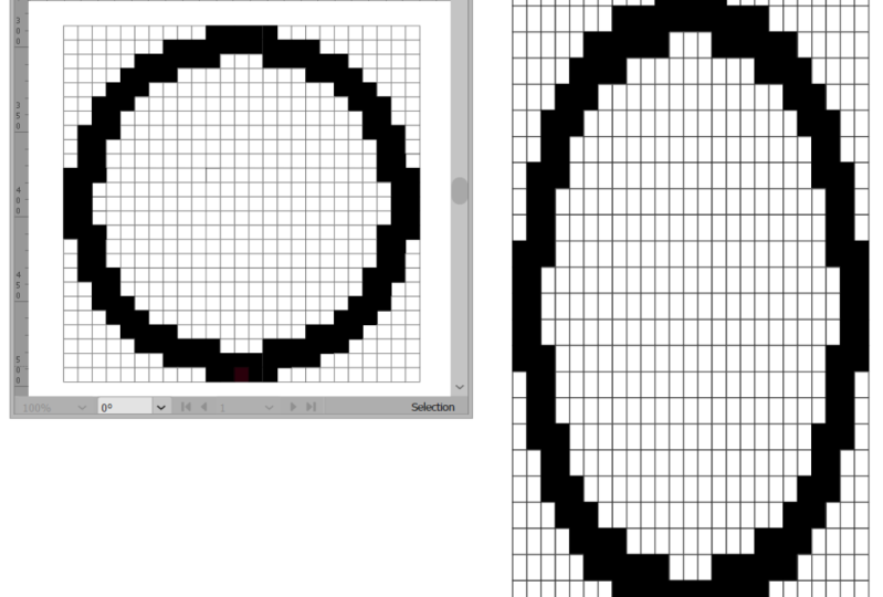
Illustrator file or printable PDF file, draw out a circle that is 2525
wide using square pixels. You want to make the
edges as smooth and as much like a
circle as possible. If you're using the
Illustrator file, you can simply fill
in the squares. If you're using the PDF, you can simply color
in the squares. Once complete, this represents the file that the woven
designer will get from you. Next, using the attached
Illustrator file or printable PDF file, draw out a circle
that is 25 wide and however high you need using
the rectangular pixels, making the edges as smooth and as much like a
circle as possible. If you're using the
Illustrator file, you can simply fill
in the squares. If you're using the PDF, you can simply color
in the squares. Once complete, this
represents how the Lovins designer will have to adjust your file for the womb. Post your work in the project gallery and let me know what you think about the differences
in these two files.
8. Conclusion: I hope you've
enjoyed this class. And not only have a better
understanding of why ovens, but a new appreciation of the path that your artwork
must take to become a weapon. As the artist, you and the weapons designer play an
equally significant role. Understanding your part
and how you can help will make you a more valuable
artists to the designer. If you haven't already
downloaded it. The handout for
this class can be found at textile design pro.com, backslash artwork
for weapons handout. Also make sure to
post your project in the project gallery for
feedback and encouragement. I can't wait to hear what
you think of the process. As always, thanks
for allowing me to share my deep love of
woven textiles with you. I look forward to seeing you in future classes as I spread my love of textiles to as
many of you as possible. I'll see you soon.
 Laura Adams, Surface Pattern & Textile Design Pro