Transcripts
1. Welcome! | Class Project: Hey. I'm photographer and illustrator Tracey Capone and welcome to my quick tip class series. A new series are shorter classes that focus on one quick topic and the first of the series, I'm going to show you how you can easily create frame and Canvas mockups for your work right on your iPad using Affinity Photo. I've been selling my work online for over 10 years and one of the best tools in my marketing [inaudible] has been using room mockups and my listings to get potential buyers, and idea of what my work will look like, framed or on a Canvas. The problem is mock-up sets can be expensive and they're not always easily customizable to my needs. I began creating my own using Affinity Photo. First of all, Photo has a built-in stocks studio giving you direct access to thousands of free use stock images from Pixabay and splash and pixels without having to leave the App. I'll show you how you can find them, download stock images as well as analyze the light and shadows in them that your frames and Canvas follow the same pattern giving them more realistic feel. Next, I'll show you how to use the rectangle tool to build up your frame and Matt as well as add shadows to each layer for depth and dimension. I'll show you how you can easily change the color, size, and shape of your frame as well as add texture and create duplicates for framesets. I'll also show you how you can use styles within the FX studio to quickly add a new look to your frame as well as how to save your own styles for future use and finally, we'll convert one of our frames into a Canvas and I'll show you how to add a slight emboss effect that lends authenticity to the overall Canvas look. The project for this class will be to create a frame and Canvas for your own work by using any of the methods taught in this class. It's always helpful for potential students to see what they'll be able to create by taking the class. I'd love it if you'd share your mockup in the project section of the class. There's no time like the present to start creating new marketing material for your website. Let's get started.
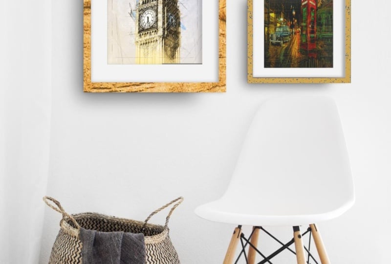
2. Before We Begin...: Before we begin creating a frame mock-up, I wanted to show you one that I've already created so that you can get an idea ahead of time what makes up one of these frames. Let me go ahead and open up my Layers Studio. Now, I want to note that my interface is setup for a left-handed person, so yours maybe flipped opposite of mine, but the tools all work exactly the same. This frame is made up of a series of rectangles that I created using the shape tool. One for the frame, one for the mat, and then rectangles for each of the shadow layers showing between each of those layers. In this class, I'm going to show you how to use the geometric operations, otherwise known as Boolean operations to effectively punch out key areas of some of those rectangles so that the image shows from underneath. Now speaking of the shadows, those are key in what we're going to be creating in this lesson. If I were to turn all of those shadows off, it really looks like just a flat image and doesn't look at all realistic. If I turn them back on, you can see just how much depth and dimension that they add and frankly make it look more a part of the actual room. Now that you've seen the breakdown of the layers, let's get started creating our own frames. We're going to start by pulling in a stock image, which we'll do in the next section. I'll see you there.
3. Using the Stock Studio to Find Stock Images: We're ready to begin creating our frames Mockup and the first thing we want to do is create a new document and pull in our stock image. Now, I have a few here that I have created as master documents that I just duplicate. For the purposes of this class, you can see the entire process. I'm going to start from the scratch. I'll get the plus sign and I'm going to select New document. I'm going to create an 8 by 10 inch canvas. You can create your whatever size you want. I just find that 8 by 10 is just enough to make it easy to put online and people can see things very easily and I don't run into any situations where an image is too large. I'll go ahead and tap and select Eight, and then 10. I'm not going to print this, so I'm actually going to knock the DPI down to about 144. I don't need a transparent background and my orientation is of course portrait, so I'll click OK, and that's going to create my new canvas. If you've watched any of my other [inaudible] classes, you know that my first step is typically to add a background layer, just to knock back the white. In this case, I'm actually going to be adding one of the stock images, so I'm going to skip that step. Speaking of this top image is one of Affinity photo and Affinity designer's best assets is the stock studio. I don't have to go outside of the program to Safari or to Pinterest to find a photograph, I have an entire library of stock images at my fingertips right here in the stock studio. I'm going to access that by tapping on this little icon here that has a mountain on it. If you can't find an icon, you can always Tap and Hold on the question mark and labels will pop up. Go ahead and tap. If it's the first time that you've used the stock studio, it's going to ask you to click that you agree that Serif, the company that makes Affinity photo, hasn't provided these photos themselves are being pulled from Pixabay, Pexels and Unsplash. Once you do that, you won't have to do it again. Now you can tap through to find each of the options or you can just tap and scroll here. I'm going to use Pixabay. I'm going to tap into search here and I'm going to look for a living room. I'll hit Search and all of my options will come up here and not maybe difficult to see here on the video but it gives you a number of options. I'm just going to scroll through and what I'm looking for is a few things. The first and most important is I want a space that is looking head on. I don't want to work with any angles so that actually knocks out a bunch of these stock images here. I also want a room that's relatively minimalist. I don't want a lot of distractions that are going to distract from my work because the whole point of making these is to show off my work, not the stock image. I want something that doesn't have a lot of stuff in the room. I also want to avoid one that's cropped in too close to something so this one has a sofa here and it's cropped in very tight above that sofa. That doesn't give me a lot of room to work with. I'm really looking for something like this brick wall that's just blank and doesn't have anything in front of it but I think I'm going to go with my go-to here and I'm going to tap and hold on it and I'll release and it's going to automatically pull it into my document. It's just that easy. It's a matter of just finding the image you want and it's right there for you. I'm going to grab my move tool. Now I have my snapping on. If you don't have yours on, just go to your document menu up here at the top. Look for snapping and make sure that enables snapping is on. This is really important for the first few steps, at some point we are going to turn it off but for the first few we are creating the frame pieces, it's going to come in handy. I'm going to go ahead and I'm going to put this in place. This is a little bit taller than an 8 by 10, which is fine. I have my image in place there and the first thing I want to do is lock it, because I don't want to accidentally move it around while I'm adding elements, so I'll go to my layer studio. I want to tap this little lock here, and that's going to lock it into place. Well, let's try that again. I'm going to tap Lock and now it's going to lock it into place and I can't move it around. If you don't see the lock here, just go to your [inaudible] menu and select a Show Unlocked and that's going to change it so that all of your layers will have this little lock and it'll be much easier to turn that on and off. Now that I have that in place, I want to take a look at my image here and just analyze the light and shadow in the image itself so that I can figure out exactly how I want my shadows to look on my frame. We're going to do that in the next section. I'll see you then.
4. Creating the Frame with Shapes & Geometric Operations: Before I begin creating a mock-up frame, I'd like to take a look at my stock image and just analyze the light and shadow in the original photograph so that I can ultimately match it with the mock-up. It's really important that you do that because while most people wouldn't notice it, if you're shadowing is off it's never really going to look like an organic part of the original photograph. But taking the time to take a look at where your lighting is in the original photograph goes a long way to helping you do that. Let's take a look at this one. If I look here, I have a high concentration of light here on the floor as well as the right-side of my chair here and here and then there's a lot of shadows here, which means my light is coming in from the right-side of my image. If I look at the basket there's a really heavy concentration of shadowing here even though it's under the entire basket because the light coming in from the right it's a lot darker over here. When it comes to my frame, the shadow underneath my frame needs to be in a higher concentration to the left and the bottom of my frame, so really concentrated around this bottom corner. When it comes to this space between the image and the mat as well as the frame and the mat, my higher concentration is actually going to be on the right-side because of the way the frame is created. Because of a real life frame has depth to it, you're going to have the majority of your shadowing on the right-side in this case because my light is coming in from here. If it were coming in from the left I would have the majority on this side. So I know this looks a little bit crazy but it always helps just to take a look at your original image and just determining where your light comes from just to make sure that you can match it with the frame itself. When we get into creating the frame you're going to see exactly how we're going to do that. Let's go ahead and start. I'm back in my original blank stack image and I'm ready to begin creating my frame. I mentioned previously that I do that by creating a series of rectangles using my rectangle tool. If you're coming from designer, this works exactly the same way. There's a number of shapes that are pre-made in photo that you can create and in our actual vector shapes, so you're going to see curve layers or rectangles in your layer studio here. You can also choose your fill and stroke. In this case I'm just going to choose a black film. I make sure that my rectangle tool is selected and I'm going to drag out a rectangle. I'm not worried about the exact size or shape because I'm going to change it in a moment. Now, I know that the image I'm going to pull in a portrait orientation image that has the same ratio as an eight by 10 image. I'm going to go into my transform studio with that rectangle selected. Again, if you can't find something, just tap and hold on the question mark. That's my transform studio and I specifically want to go to dimensions here. I'm going to change this box to an eight by 10 inch box. Again it's not going to fit in here but I at least wanted to get the ratio correct and then I'll size it down. I'll tap and select eight and then 10. Now, I want to size down but I want to keep the ratio exactly as it is. I'm going to hold three fingers down on the iPad while I dragged in and that will keep my ratio as well as size down into the middle and I just want to get an idea of how big I want my overall frame to be. This black rectangle represents the overall frame, it's not the image. The actual image is going to be a little bit smaller than that but have the same ratio. I'm going to use this just to place where I want and get an idea of how large I want it. I think that looks fine. We can always size it down but I just want a starting point. Now, that I have this rectangle in place. I'm going to duplicate it three times so that I have four total rectangles. I've gone to my Edit menu and with it selected, I'll tap duplicate three times. Now, if I go to my layer studio you can see I have four rectangles. Now, this confirms that initial rectangle is ultimately going to become the shadow behind the entire frame. I'm going to change the name of my layer here just so I can keep track of everything. I have a layer selected and I'm going to tap on layer options, tap on the name rectangle and I'm going to change this to frame shadow. I'm going to turn it off right now because we don't need it. This next one, I'm actually going to turn these top too off. This next one is going to become our mat. I want to change the color of it. Now, normally I would have a white mat and eventually I'm going to change the color but I'm going to start with an off-white just so that you can see it in the video here and I'm going to go back into the layer. Go into layer options and I'm going to change this to mat. This next layer is ultimately going to be used to punch out the image size in this mat. I'm just going to leave that alone for right now I'm going to leave it off. This final rectangle is going to become my frame. I'm going to go ahead and change the name of that to frame and I want to drag it down underneath my mat and you'll see why in a moment. Let's go ahead and bring in our image just so that we have a starting point for the cut out from that. I'm going to go to my edit menu, select place and my image is in my Cloud so I going to place from Cloud? I'll choose this image I took in Paris and I'm just going to drag this out and it's the right ratio. I just want to size it down a little bit and place it. Now, a snapping on a places really easily. I don't need a lot of mat. I don't want this to be a really tiny image with a big mat. I know that can be the style sometimes but the point of this is not to show the mat, it's to show the image. I'm going to make it large enough that you can see the image but you still have a little bit of mat around it, how that looks. Let's go ahead and turn our frame on and I'm going to go ahead and select that. Now, I want to drag out my frame to get an idea of how big I want it. Because it's behind everything, you're not going to see the majority of it but you're going to see a peak out from behind once I start dragging. I'm going to hold three fingers down again, just so I can keep the ratio of my frame. Now, just like with the mat I don't want this to be a really large frame. I'm not looking for this to be some interesting framing twice. I really just want this to show off the image while still showing it in a frame situation. I like how that looks, that would roughly be about an inch or an inch-and-a-half frame and I'm going to turn us to brown. We have our three elements in place. We have our image, our mat and our frame. What we need to do though is in order to be able to create shadows between the mat and the image, and the frame and the mat, we needed punch out some parts of both a mat and the frame to be able to do that. Now, the first thing I want to do is I'm going to punch out what is the size of the image out of this mat. I'm going to take this rectangle, I'm going to turn it back on and I'm going to drag it down so it's the exact size of my image. It's going to snap right into place, you don't even have to hold fingers down. Just snap it into place and you can see that as the same size of the image. I'm also going to change it to cut off white color that I selected for the mat. Again, if you're coming from designer and you've use Boolean operations, you know that what normally happens is the color of the final object is the original color of the lower layer. In this case it works the opposite. It actually takes on the color of the upper layer. I'm going to change this so that I don't get a black mat in place there. I want to select this rectangle and I'm going to select my mat. This rectangle is going to punch out a hole in this layer the size of my image because we sized it to that exact size of the image. With the two selected, I'll go in my edit menu, I'm going to select geometry. Now, these are the Boolean operation. These are the operation that use geometry to take a two or more objects and create another object out of them. In this case, we're going to use these two objects to create a rectangle that has holes in it. I have these two selected, I'm going to tap subtract and what that did is took that top layer, punch it out of the bottom layer and moved it up to the top. Now, my mat is sitting where it needs to be on top of my image. Now, we need to do the same thing with the frame. I want to create a rectangle that is the size of my mat and that's ultimately going to punch out a whole. I don't have any more rectangles left, so I'm going to go ahead and grab another one. I'm going to deselect my mat and with my rectangle tool selected. Let me then change it back to that brown color though. I'm going to drag out a rectangle that's the size of my mat and again, with snapping in place, it's really simple, it pops into the corners. Now, I have my rectangle that's the overall size of my mat and I have my frame and I want to select both of those. I'll go back up to edit, go to geometry, tap subtract. Now, it's taken that top layer that was sized to the same size as the mat, it's punch that out of that lower layer and I'm left with my frame. Let's take a look at the layers we have here. We have our frame laying on top, underneath it we have our mat and underneath all of that we have our image which is exactly how an actual framed piece would be. Now we're at the point where we want to begin adding our shadow because while this looks nice. It's not exactly realistic looking and that's where the shadows come in. We're going to do that in the next section. I'll see you there.
5. Adding Shadows and Dimension to the Frame: We're at the point where we have our framing place and we want to start adding our shadowing to give it more depth and dimension, we're going to start by using that original rectangle to add our shadowing underneath the frame itself. Now the first thing I want to do before I proceed is to go back out to my Documents menu and select Snapping and I'm actually going to disable the snapping. I find that it's a lot easier to work with small moves when I have the snapping off and you'll see what I'm talking about in a moment. I have that original rectangle layer turned back on. If you remember from our conversation about which direction the light is coming from and where the bulk of our shading needs to be, we want it to be concentrated here in this lower last quadrant of the frame. I'm going to take that rectangle and I'm going to drag it out just about there, then it get smaller. I don't want a lot of shadow here or here. It's really going to be concentrated here, just like the shadowing here with a basket. Obviously that doesn't look anything like a shadow, we need to give it a little bit of a blur. But before I do that, I'm going to go into my Layer options and I'm going to change this to Multiply, that's going to help it blend more as a shadow. Now I want to add a Gaussian blur to it. With it's selected, I'll go to my fx studio here and it's labeled fx, I'll tap, I'm going to turn Gaussian Blur on, and then I'm going to tap the name and that's going to allow me to change the radius of it. I'll just start dragging up here. Sort of a feel thing, I don't want it to be too much, but I also don't want it to be too little. I want that to be a good concentration of really dark areas closest to the frame and then it comes out a little bit here and back out of that a little bit. I want to change the opacity of it though, it's a little too intense. You can actually do that right from the fx studio, I'm also going to turn on Scale with Object because I don't want the size of the Gaussian Blur to change as I change the size of the image. I'm going to go ahead and scale this down. It needs to be subtle. If it's not subtle, it's not going to look real. You can always change it once you're done the entire thing, if you find that it's not quite where you want it. I'm might grab this and just make it a little bit taller. I linked it to a good start again, I may end up changing it once I add my shadowing here, but let's go ahead and just start with that. Now I want to add my shadowing between my mat and my image as well as my frame and my mat. Because we think about a frame, if you look at it from the side, the actual frame itself is set up from the glass about a half an inch or more, which means you aren't going to get a substantial shadow here from the light coming in from the right. You also have a little bit of shadowing here because the mat is sitting on top of the image and it's typically a few millimeters high, so you're going to get a little bit of shadowing here as well. I'm going to go ahead and I'm going to tap on my mat here, and I'm going to duplicate it. We're going to create that shadow first. I have a duplicate of the mat layer here and I want to change it to black, and I'm going to drop it below this. I could have just changed the bottom layer to black instead. Now I want to move this in from this top right corner because again, I want the concentration of my shadow for the inside here to be from the top and the right. I'll just move this down from the top. I don't have anything showing here when I add a blur to it, you're going to see a little bit on the sides here. I like where that sat, I'm going to go ahead and again I'm going to change this to Multiply. I want to go back into my fx tap to turn Gaussian Blur on, tap on Gaussian Blur itself to turn on the contextual menu and I'm just going to start dragging up. Now, it looks like a lot because I haven't dropped the opacity yet. The first thing I want to do is turn on Scale with Object and then I'll just go ahead and drop the opacity of the layer. I like how that looks. We have our highest concentration of shadow here. There is some here, and that's fine because if you look at an actual framed piece, you're always going to have shadowing around the entire thing, but one side is going to have more than the other based on the light. Now if it seems like too much, you can always back this side out, and this side out a little bit more, I think I'm going to leave it like that. Now we have the mat sitting up from the image a little bit. I might back that out, just a little bit more as far as the opacity. I'll go into my layer here and drop that. I like how that looks. Let's go ahead and do the same thing with the space between the frame and the mat. Again, I'm going to go back into My Layers studio, I'm going to select my frame, I'll Duplicate it and I'm going to turn this bottom layer to black because that's going to become our shadow and just like with the mat, I want to drop this down a little bit from the top and a little bit from the right side. I'm going to leave the left and the bottom alone. I'll go into My Layer studio here, I'm going to change this to Multiply and drop the opacity a little bit now. I'm going to go into my fx studio, turn Gaussian Blur on, tap into the name so that I get the contextual menu, and I'm just going to drag up so I start getting a little bit of a blur. I went a little too far. If you find it hard to use the scrub method, you can always tap in, I'm going to change this to five and just see how I like it. I'm going turn Scale with Object, I'm just going to turn the Opacity down a little bit. I like how that looks, we have a nice area of concentration here again, where the frame is set up and it have an inch or more from the glass, it's creating this shadow from the light coming in from this side, we have the shadowing with a mat. I think that might still be a little bit too heavy, so I'm going to go back in and just turning Opacity down a little bit more on the mat. The mat is not as high off of the image as the frame is, so you're going to have a little bit more subtle of a shadow, but it still there. Let's back out here and just see how it looks. I just accidentally turned that off. Sometimes I turn it on full screen just so I have a better view without all the other stuff in the way. I like how this is looking, again I have my shadowing here and I have my concentration here and here. I don't think I need to change anything, I might change the size a little bit, it's a little bit overpowering. The first thing I'm going to do is I'm going to tap on my bottom layer here and two finger tap on the top and I'm going to group the whole thing. Now I can turn it off and on, I can move it all together, I can also size it together. Again, I'm going to hold three fingers down to keep the ratio and I'm going to drag in and I'm just going to make it a little bit smaller. I might, now that I've done that just drop, I might move this a little bit. There we have a framed piece that has the nice shadow in mat. If I were to turn those off, you can see where we started from, where it was a very flat image and adding the shadowing gave it more dimension to make it look like it's actually on the wall. Now what if we wanted to change the color of the frame or add some texture to it, change the color of the map to white, we'll take a look at how we can do that in the next section.
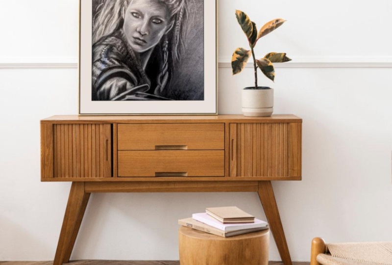
6. Changing the Color, Size & Texture of Your Mockup: We have our framing place and all of our shadowing. Let's say we want to make changes to some of the elements within it. Well, it's actually really easy. If you want to change the color of the frame, this is still a shape, which means I can go into my fill tool and I can select another color. Let's say I want something complementary with the color of this metro sign. I'm going to choose a really subtle teal color. I highly recommend, if you use any color. That you're really careful with which ones you choose because again, this isn't about selling your freeman mat, it's about selling your piece. If you have anything that's too overbearing, you're going to distract from the image itself. I always try to select complimentary colors when I'm doing something like this, just to make sure that it plays into the piece over all and doesn't become center of focus. I've selected this subtle teal color. I want to go ahead and change my mat to white. I'll go ahead and tap on that layer, go into my color studio and select white. You can change this to any color you want. I stick with white just because it's the standard mat color and again I find that it keeps it from being distracting from the image. If you look at the difference between the two, it competes with the building here, so I like to keep it pretty neutral. I've added some color and I wonder if I wanted to add some texture to the frame. Right now, I have a pretty basic, what looks like it could possibly be a plastic frame and I want it to be wood. Well, it's really simple. Again, this is a shape, which means I can add any sort of texture to it and I'm going to do that in the form of a place image file. I'm going to go ahead to my "Edit menu" and in photo again, if you're coming from designer, it's in a different spot. It's actually in the Edit menu. I'll do place and mine is in the Cloud. I'm going to choose the wood texture that I provided with the class. This is a really quick photograph that I took of some wood around our house, so please feel free to use it for the purposes of the class. I wouldn't necessarily use it for texture for other things but I'm going to go ahead and drag this down and I'm going to clip it to my frame layer. I did that again by dragging it until I saw the blue line over that layer and then I release. Now it's sitting inside of that layer. I can move it around. I can rotate it if I want to actually, in this direction. If you hold your finger down when you rotate, it will rotate in 15 degree intervals. I just like to move it around, so that I have some variation here in the wood grain just to get it more of that would feel. I'm going to go back into my layer studio and I'm going to go into the layer options for that wood texture and I'm going to change it to soft light. I really just wanted to be subtle. I'm going to drop the opacity a little bit. There is the quickest and easiest way of adding texture to your frame. Now you could also use your paint brush tool and a texture brush if you wanted to. You can do it anyway you'd like. I find this is the quickest and easiest. What if I wanted to create a square frame out of this. Well, that's really easy. Let's take a look at how we can do that. I have this rectangular image in place and I want to create a gallery wall out of it but my other image is a square image. Well, it's really easy to go ahead and make changes to this because these aren't shapes and we can use our transform studio to do that. I'm going to duplicate those group. I'm going to turn this one off, just so that it's not in the way. I'm going to make changes to this one to make it a square. When I open this up, the first thing I'm going to do is remove my image because I don't need it. I'm going to turn this shadow off for now because it's a little distracting. I'm going to go into each of these layers and use the transform studio to change my dimensions, so that it's square and I'm going to change it to the dimension that's the highest one, which is the height. I'll tap my width and I'm going to change that to 3.6 to match the height. I'll go back to my layers studio, am going to tap this shadow layer and I'm going to do that all the way down. I'm just going to match the largest size and you're going to see as I do that, everything is moving over. Just keep going into your transform studio and changing each layer until you are all done. This is the last one. I'm not going to worry about changing that bottom shadow because it's actually already a square almost and it doesn't really matter anyway, I just need to move it out a little bit here. Now I want to grab my image and I want to place it underneath the frame. I'm sorry, this shadow here underneath the frame. I'm going to go to my place image again, that place from Cloud and am going to grab this other photograph of mine and I'll just drag out. I'm going to turn my snapping back on because it's going to make it a lot easier to do this. Now that I have snapping in place, I can very easily snap it into that opening in that frame. I hurry her because I have it under that shadowing. I have the shadowing there. I have the shadowing with my frame and everything is a square. I'll go ahead and I'm going to size this down. Again, I'll hold three fingers down when I do it. I'm going to move it over. I'll turn this other one back on. Now I have a nice little diptych set here. If you have sets that you put on your site, go ahead and create complimentary frames. You can create them in different sizes and if you find the right stock image and give yourself enough room, you can create something as big as a gallery wall to put on your site. I'm going to show you one other quick way that you can make a change to the style of your frame using one of the built-in tools within photo and that's the styles under the FX studio. The first thing I'm going to do is select my frame because that's what I want to make the change to. I'm going to duplicate it up here in the Edit menu. The reason I do that is because with the styles, I find it difficult to get back to the origin point sometimes if I don't like how it's looking. So I typically duplicate that first one and just tuck it aside in case I need to get back to it. I'm actually going to turn that off. I'm going to remove the texture from the duplicate because it's not needed. I'll go to my Fx studio and I'm going to tap styles. You're going to see a number of default styles come up that are built into photo. Now some of them are a little zany and they're not going to make for a great frame but some of them are actually really subtle and make frame nice. Elegant frame for half an illustration. You can just tap through and see if there's anything that you like that works with your work. The great thing about this is it's editable. If I like something but I want to make it a little bit of a change to it, I can simply, with it selected, go back to my Fx studio and you'll see every effect that was applied to make this up. I can turn things off. I can adjust them by tapping the name and using the contextual menu at the bottom. If I wanted to, for example, add a color overlay to get a little bit different feel, I could do that. I've taken that original style and change it to suit my needs. Now let's say I like this particular style. I like this subtle teal with some bronze beveling going here and I want you to be able to use it for future frames. Well, I can do that. I'll go back to my styles and you can either add it to the default or you can tap on the burger menu at the top and hit "Add a category". I can rename this by going back up to the burger menu. Let's just rename this frame styles. Now I'll make sure I have that selected. I'll go back to my layers studio here, tap the "Burger menu" and add style from selection. Now every time I want to use this particular look, it's there for me in the style section. Again, this is just another quick way to change up your frame to give it a different feel from what you originally created. In the next section, we're going to take one of our frames and we're going to convert it into a canvas. I'll see you there.
7. Creating a Canvas Mockup: We have our two frame pieces here, but what if I wanted one of them to be a canvas. Well, it's actually really easy to convert this from our framed piece to a canvas. When you do that by, I'm first going to turn off as larger one just to get it out of the way. I'm going to make this one larger so it's easier to see. I'll drag this over. Now the first thing I want to do is start turning off some of the frame elements, and that's the map, the frame and the shadowing for both of those. Now, right now this looks like a floating in edge. That's not what I'm looking for. I'm going to move this into place. I'm going to turn my snapping off quickly, so that I can move my shadow here a little easier. Make sure you grab the right layer. I just wanted to drag that in. Now this still looks like it's just a floating image. What I need to do is give the actual image itself a little bit of a bevel. I'm going to do that with the FX Studio. I'm going to tap my image to select it. I just want to make sure this is still a square and it is. If you find that you accidentally changed the ratio, you can always go into your transform studio and check the dimensions and change it. I'm going to enter my FX Studio and I want to turn on bevel emboss, and tap on the name to open a contextual menu. Now the default is that it gives it a bevel and that's not what I want. I actually want emboss. I'm going to go to the type and I'm going to tap and select emboss. Now what this does, it gives the impression of the image wrapping around the wood to create the canvas wrap. This is a little bit too much. I actually want to back this off a little bit and soften it up a little bit. I usually just play around with the settings until I find a depth that I like as well softness that I like. You can even change the elevation and the location of it. You may find that you need to change it based on the image that you use. In this case I have a lot of dark values here in the image. It plays into this type of bevel very nicely. I think I soften it up a little too much though. I'm going to back that out a little. Just change the depth. You can always tap instead of drag. I don't want it to be too much. I just want it to have a slight feel of being wrapped around a canvas. Now go back to my layer and I'm going to turn on, I already have the shadow one, which is going to move it out a little bit and maybe back in up. Now if we back out of this, it doesn't so much have that feel of just floating on air because you have that little bit of light there and the dark here that gives it that impression of a bubble. That's a really easy way of creating a canvas. Now you can do that from the beginning and simply not create the frame pieces and just add a bevel to your image. Or if you already have a frame in place and you want to change one, just again, remove all of the frame pieces and just add a bevel to your image. I'm going to go ahead and wrap this quick tip video up with a few final thoughts in the next section. I will see you there.
8. Final Thoughts...: We're at the end of this quick tip class. Let's recap what we learned. I showed you how you can easily pull in a free use stock images directly into photo using its stock Studio, as well as how you can analyze the light direction and shadow in the photos so that you can match it when you create your frame or canvas. Next, we created our frames using a series of rectangles that we created using the rectangle tool as well as the transform tool. Then we added the every important shadowing to our frames using duplicates of our map and frame layers, as well as the Gaussian blur in the FX Studio. We took a look at how you can easily change the colors as well as add texture to your frame, as well as make overall shape and size changes to your framed pieces as well. Finally, we looked at how you can easily convert wire frames into a canvas, using the emboss effect in the FX Studio. Now, I have a few tips before I close out this class. The first is that I recommend creating a master document out of these frame pieces. The reason I say that is that way you don't have to recreate them each time. I have a rectangular frame out here, a square frame, and I have a square canvas out here. Then all I have to do is tap on the burger menu and have duplicate and go into the duplicate copy instead of the master. It's just a quick tip just to keep you from having to reinvent the wheel each time. You can always make changes to the stock image you're using because again it's on its own separate layer. You can change the color, the size, the shape of the frame, but you don't have to build it up from scratch that way. My second and most important tip, if you're going to use mockups in your online shop, whether it's FT or your own website, make sure it's very clear that these are mockups and your final product does not come framed if you're selling prints only. From personal experience, I can tell you that many people don't realize that there are mockups. If you don't note it, you can run into some very unhappy customers. I recommend adding verbage to your listings, as well as adding some badge on one of the photos. For example, in my Asset Studio here I have this little star thing I created here that says illustrative only work is sold unframed. Just something so that not only do you have to rely on them reading and description, which doesn't always happen. But you also show something in at least one of the photos so that you always have that to refer back to. Thank you for joining me in this first of my series of quick tip classes. I have a lot more in store for you for tips on affinity photo and designer, procreate and much more. You can stay up to date whenever I add a new class just by clicking the follow button in my profile. Thank you for joining me and I can't wait to see your very own mockups in a project section. Bye bye.
 Tracey Capone, Illustrator, Photographer & Designer