Transcripts
1. Class Introduction: I love flowers and I
love botanical out, but I also love patterns. Why not put all these
passions together and come up with a
botanical pattern? Hi, I'm Katia and I'm an
artist and online teacher. This is the first part
of a two part class. Whatever teach you to
go all the way from idea to painting your elements
and botanical elements, and to digitizing them and make a button
with the elements. And the good thing
is that I will not only show you how to
do this in Photoshop, but also in Illustrator. And without losing the painterly
style of your elements. Are you curious yet? So in this first part, I will briefly touch on the
botanical pattern, history. Very be flicking the way. I will show you how to find inspiration and how to choose the elements
for your pattern. To paint the elements from first wash to the second Layer, and then third Layer. And then the final details. Since this class doesn't
focus on drawing, I will not teach you
how to do that here. But you can watch
my other classes on drawing flowers and leaves. But I have included here
are downloadable tracing. All of the elements that I use. You can download that and
use that to practice. So you don't have to draw
the elements yourself. You don't want to end. You can still follow along
with what I'm doing. By the end of the class, you will have learned
my technique on how to paint your elements. And also you will have all your elements ready
to go to the next step, which is the second
part of the class. So if you ready,
Let's get started.
2. Class Project: The project for this
class is of course, to get your elements ready. You can use watercolors
like I do and follow the steps they take. But also you can use
other videos as well, because the focus of
the class is to get your elements ready for the
next part of the class. But it would be great
if you would also post pictures of your elements
on in the project section. And if you like my feedback, just ask and I'm here for you. So get your brushes in Paint 3D. And let's go
3. Materials: They materials you will
need for this class. Basically these ones. So you will need some, something to sketch with to do your motifs, your elements. So I have here a sketchbook. So just a normal pencil
will do and some erases. So small eraser and a big one. You can just use an
eraser like this. So that's fine. Then you will need some paper. For this class. I used the Fabriano
listicle, 100% cotton. This is 300 g and
is hot pressed. So it's quite smooth
and it makes it easier to actually scan and clean
up your work afterwards. If the vapor hasn't
got much truth, then of course you
will need paints. So you will need
this many pains, but just a few watercolor or even different type
of pains you can use. Gouache if you want, or colored pencil, whichever medium I
work with, watercolor. So that's what I'm showing you. And you will need rashes. So these are my
favorite brushes. And they are Winsor and
Newton, Series seven. And most of them are
miniature brushes, except for this one. You can see the difference. This on the right is the
miniature number one, and this is the
normal number one. The miniature are much shorter. But you can use the
brushes that you feel comfortable working with. It didn't have to be these ones. These are quite expensive to, so you can use whatever brush you have handy that is good for the sides of your painting. And of course you
will need a Palette. So I have here ceramic palette. Again, you don't
have to buy this. You can use plastic ones. I love to work with
the ceramic palette, so that's what I have in. I have different shapes, flats and we whales and so on. So you need a Palette and
some containers for water. So you need to one
for clean water. I want to wash your brushes. And you will need
some math paper. So kitchen towels. Or you can use like some cotton. Just a little rag for
your brushes to try them. If you want. You can use the tracing
that I provided you with. These are quite small,
but you can print them much larger if you want. And do them that way because of the ones say working with
actually they are larger. So I don't remember
the exact percentage. I made them bigger but you can make them
as big as you like, as big as you feel
comfortable working with. So I think that's so
for the materials. And we're ready to move
on to the next lesson.
4. Botanical Patterns: If you look around you
patterns are everywhere. You can see them on
Flowers, Leaves, and also on insects and shells, and even on snakes. And of course, animals
display different buttons. Some really stunning
botanical Patterns of adorn the creations of various
cultures for centuries, representing a deep connection between humans and
the natural world. And the intricate
depiction of plants, flowers and foliage reflects
the appreciation and reverence our ancestors add
for the beauty of nature. This patterns are adorned, palaces, places of worship, and even humble homes. One of the earliest forms of showcasing botanical
Patterns was to tapestries. These exquisite women artworks adorned the walls of
castles and manor houses. And they usually depicted gardens, landscapes,
and wildlife. And this type of stays not only added beauty to living spaces, but also conveyed stories and historical events through
the language of plants. Botanical motifs found a way onto pottery and
ceramics as well. Showcasing the mastery
of Artists in capturing the essence of Florida
on functional objects. Answered, civilization
such as the Greeks and the Chinese infused the pottery with fluoro and
botanical designs, bringing elements of nature
into their everyday life. One of the most famous
botanical pattern designer was William Morris. He had a profound
love for nature and dispersion deeply
influenced his work. He found inspiration in
the English countryside, celebrating his beauty
through his designs. Morris believed that
a connection with nature was essential,
human well-being. And he sought to bring the outdoors indoors with
his botanical Patterns. Morris's Design often feature intricate botanical
Patterns with richly detailed depictions
of flowers, leaves, fruits, and animals is patent, characterized by their
organic form and harmonious color palettes
grace various decorative arts, including wallpapers,
textile, and carpets. The influence of William
Morris and the arts and crafts movement transcends time, leaving a lasting impact on
the contemporary design. And today we see
designers and artists continuing to draw inspiration
from botanical elements, infusing them into textile
fashion and interior decor. Henges, the outer William Morris as influenced my patterns to. This was a really, really
quick introduction to the history of
botanical Patterns. And in the next lesson, we're going to see how
to find inspiration for our motifs and our patterns. So I see you in the next lesson
5. Finding Inspiration: In this lesson, we're going
to talk about inspiration. And I know Mathias
said once that you shouldn't wait for inspiration because it will come
while you're working. But sometimes you just
feel so stuck there. You just can't even
start working. So it's nice to have some places where you
can find inspiration, some things from books. Something that gives
you that Creative SPAC. And also is good sometimes to just leave your desk and go for a mold and then recharge basically your creative
juices if you wish. So I'm going to talk
about what inspires me and I will start with
the books and magazines. These are some of my favorite books to go
through every now and then, just to keep my creative
juices flowing. And these books are actually
becoming a bit rare to find Swedish books. It was FUN to try
to get hold of them because I found them
on a Swedish website. So you can imagine. But they are lovely. If you do find them. They're full of colorful plates. There are a bit old, but I'm illustrations
quite beautiful. And there's different types. So there is for flowers, insects, butterflies
and so on as well. So different I think
beds and Wildflower, Garden Flowers, all sorts
of different illustrations. And I just loved
to go through this and get ideas for my next work. And there's one even for
like fruit and vegetables. So if you want to
create something more of this type of subject. But if you can't
find these books, because I understand there
is a bit difficult to find. There are the books. This one's for a sample. And these books you
can find on Amazon, and they are reprints
of old books. So this is on wild flowers
and is month-by-month. So you will find each
month spread like this, sometimes more than one
spread for each month with all the flowers that are all the plants flowering
in that month. So it's, it's quite lovely. If you want to do
even a themed work. Pieces work than which
Flowers are flowering. This is specific for
England, I think if you, if I'm not mistaken,
but we can give you the inspiration for your
own research, your own work. And as you can see, there
are fruits as well. This is lovely. Then there is the country
Diary of a new Edwardian lady. She recorded, was told them she recorded the life
in a garden and the entries, what she was seeing
and different thoughts and then
illustrations as well, the plants and animals
in the garden. And this is a country
Flowers of Victorian lady. And this is also quite
nice for this patient about Composition as well. The illustrations with different flowers and
fruits altogether. So you can get
inspiration from that. Make your own illustration. So these are really
lovely books. And there is one book
that I really love. This one here, which
contains the works of pH yourself ready to take the books of the
bouquet of flowers. And this is an Italian
and French edition. I'm pretty sure they must be
an English edition as well. And it contains many of
his botanical paintings. I don't think it contains
all of them because he painted thousands, I think. But it's an incredible
source of inspiration. There's so much here. All the different types of flowers and the
composition as well. And it's just a wonderful book. So I would advise you to
get this book if you can. Then of course, you
can use magazines. So I have some
Italian ones here. But you get this type
of magazine everywhere. So you get, as you can see,
inspiration for Leaves. And just by chance, I picked the one with a
Leaves With the patterns on them, which it's incredible. Then of course the
other images as well, you can get Inspired. So these are quite good. Same thing here. This is about roses. You can just go through one of these
magazines are more than one. Then I even have one
of these which is a catalog for Flowers. This is for iris. They are incredible inspiration for a Composition,
For a painting. If there is a particular iris
to you like you could look for other images and
you can buy the bulbs, grow them yourself like
many of my flowers. And then there have all the flowers here
as well besides iris. And then just paint them. As you can see, there's lots of respiration that
you can get from books. And of course, you don't have to use books and magazines
for inspiration. You can go to a park or to botanic gardens if
you're lucky enough to have them nearby, you can go to see an
exhibition and you can do things that don't seem directly
related to your Painting. For example, go to a museum. But don't just look at
Flower paintings and go to, I love to go to Impressionist. For example, at exhibitions or the impressionist
winging in a museum. You can go for walks or running. Or you can even start learning an instrument and
just play a little bit. So you will get inspiration by listened to music
or reading your book. There's plenty of
ways to get Inspired. So don't just try to working. If you, if you are stuck, just step back for a moment. And then the one of these things there's lots you can
do and then go back and you will see
that you will be recharged and you will
be ready to carry on. Now that we talked
about respiration, we are ready to move
on to the next lesson
6. Choosing The Elements: When it comes to choosing your elements for your
botanical pattern. And you should
consider a few things. For example, well, first of all, the flowers and
leaves and elements, the, you know how to paint. Don't use anything
too complicated. If you just starting out, For example, if
you're a beginner, don't go complicate
your life with really integrate Flowers
like hydrangeas, which are more
difficult to paint. Choose something simple,
but also consider the Color Palette of your Flowers in the
elements that you choose. So for this class, I chose to paint Rebecca's
and white puppies. And I chose the white
pulp is because they, Rebecca, I've already
a very strong color. The orange and red, almost brown coloring the petals and the brown of the
center of the flower. So the colors are strong. I didn't want to
put another Flower, which are the column that would
clash with the Rebecca's. So I chose the white puppy because white is neutral color. And you do that with a gray, and so it won't it
won't be a distraction. Anyone clash. Then you have the green
of the leaves which will go well anyway
with any Flower. And I wanted to add
some butterflies. And as you will see, the butterflies, the lectures
have orange in the wings. So the orange is a little bit different from the
orange of the bakers, but links nicely with the
color of the Flowers. So it's not crashing. Do some test runs. Look at many pictures. And if you helps, you can do them a mood board. You can see if the colors
work well together. So you can build up
your color palette. And that way. And if this is the first
time you try and less, don't use too many elements. As you can see, I used
Rebecca's poppies and butterflies and possibly
will put a, B, C. But the bees, they
won't be a problem because they are the yellow, orange-ish color,
so that's fine. And the black is neutral color. But again, don't
over-complicate it. And I think that's
all I wanted to say about starting to choose
your, your elements. I will look at your pictures
if you have any of Flowers. And our look at your
books magazines, go to the garden center
and start prepping. Start sketching and see
what you come up with. Something simple that you can do without stressing about it, because most of all, this process should be fine. Okay, so let's go
to the next lesson.
7. Color Mixing: In this lesson,
we're going to mix the colors for the flower. So I start with transplant, a yellow and transparent orange. And this is the color for the
lighter part of the petal. And I take us watch of
full strength and also a watered-down version so
I can see what the color looks like when he's
water is added. Then I find the color for the darker side of the
Fab, all the petal. And this is transparent yellow, Permanent Alizarin crimson and a little bit of Windsor
blue, green shade. And I call my mixes
with letters. So the first one is a and
then this is mixed B. And then to this Mix, I add a little bit more wind, so blue-green shade and
Permanent Alizarin crimson, and then make it darker to do the brown color that I can see in the
center of the flower. And if you add a
little bit more blue and it will make it
even a bit darker. And then there was Mix see to that Mix adds
the darkening Mix. And it makes it almost like a
brown, black, almost black. Then I start mixing the green. And the green is quite a
brilliant light green. So I use Winsor blue green
shade and lemon yellow. And then I add a little tiny bit of Permanent Alizarin crimson. And as you can see, I tried to use always the same colors. Pain. So if I can the same pigment because that makes the colors more unified. And then so that one was
Mix E for the stock. And then the next Mix
is for the Leaves. And it's Winsor blue, red shade, lemon yellow, Equador, magenta. And then add a little bit of the darkening Mix and darken it makes a
use is Winsor blue, green shade, quinacridone,
magenta, and lemon yellow. And when you mix them together, it gives you a black. Now that we have our
color or Mix and ready, we can move on to the
next lesson where we will apply the first layer and
see you in the next lesson.
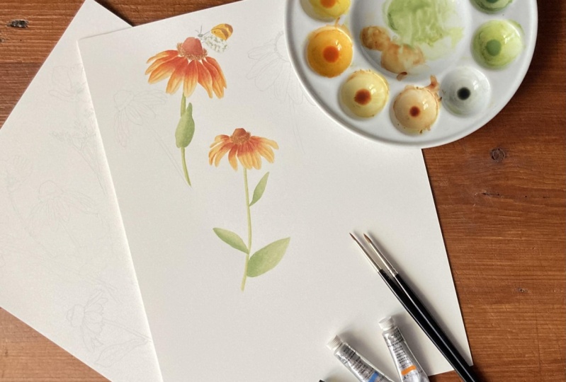
8. First Wash: We are now ready
for the first Wash. And what I do normally is to do Wash almost like a flat
wash with the main color, which in this case is the
orange for the petals. And I will apply water on the area that
I want to do the wash. So in this case, the petals
just to play clear water. And then you just need to wait until the water is absorbed. But it's not completely
dry and it's not too wet. So there is a like a
sheen on the page. And then you take the
color and apply it. And it should be quite light. So maybe this, It's
a little bit dark, but it will dry, lighter. So I suppose this
should be okay. This is a nice and
colorful Flower. So as you can see, I don't really worry about
shadows at the moment. Just give the, the base color. I just do it in sections because otherwise
they, the paper will dry. So just by applying the
water and then the color. And at the moment I'm
using my number two brush. So if you feel you have too
much color in your brush, just touch it on
your paper towel. And I'm going to
rinse it a little bit and dilute this color. And just keep doing this
for the rest of the petals. So just apply our orange color and just finish off this side. These two petals with just
a little bit lighter, but that doesn't really matter because this is
already the first Wash. And then you can do the
same for the leaves and the stoke and the
brown fat as well. So I'm just going to apply
some water in this talk. And I will apply some diluted
down color in here as well. Just make sure your
petals are dry. And you can apply the green. Because otherwise they
might run into each other. Which is okay if you're
looking for that effect. But in this case that
we've tried to do not a scientific representation, but I sort of Botanical Art. Then you're the one that
Alice to run into each other. And then I'm going to do the
same thing with the Leaves. So the first base wash
is just the same, is like blocking out colors. Play your clear water, and then apply the color. As soon as you see Design. Or I should say the sheen. And it's always
best to start with light washes because I'm It's easy to correct
mistakes if you make any. And you can always add more
color to make it darker. So I'll apply the
water here as well. Maybe I could use a slightly
bigger brush for this. Use my number three because
this is a bigger leaf. And then I just apply the paint. Even if this is more
or less a flat wash, I always tend to start from the darker side or what is going to be the darkest
side of the leaf. With this wash is
not too important, but we the next ones, it will be good to start to
where the leaf is darker. And I'm going to go back
to my smaller brush. And I'm gonna do this. Again. I'm going
to wet the paper. And if you put too much water, you can always dry your brush on the paper towel and just soak up the water and then
add the brown. And in this case, I left it here a
little bit darker. But I'm you know, it doesn't have to
be done like that. You can just do a flat wash and then make it darker
here the next time. And then as soon as this dries, I'm gonna do this bit here. So just wet the paper and the paint. So again here, lifted
a little bit darker. And wireless still wet. You can always add a
little bit more paint. But then we're
going to make this darker anyway, so that's fine. And if you rinse your brush and tap it on your
kitchen towel, so it's just dump and
you can sort of smooth out the color that don't touch it too much because
otherwise it's going to start you're going
to start reading it. So just a little
strokes and that's it. And then as you can
see, this is tied almost the same like flat torus, but that's alright
because we are going to do more Wash easier
to sort it out. And this is the first step. And then in the next video, I will show you the second
Layer and we're going to start giving form to the petals. Alright, so ASU,
in the next lesson
9. Second Layer - Flower: Now that the first layer is dry, we can carry on and
apply the second Layer. I'm going to start to give
some form to the Flower. And I do that with a slightly thicker color is
the thickness of the milk. And I start to do this. I start to where the
darkest areas are, and then I soften the color. So here we have an area
where the petal is turning. So it's this dark underneath. And then here as well, can hardly see it. But he's doing the same thing. Just make the paint a
little bit lighter. And so here we have a petal, those on top of the other. So we'll start from there,
applying the color. And then I rinse the brush and just touch the color
to make a transition. So it's basically a graded
wash that you apply. So we have the same thing here. So this petal is on top of this. So I'm going to play
the color here. Then. Instead brush tested
on the paper towel and then do the graded wash. Rinse it again on
the paper towel, and just feed the color. And I just show you what I mean when we say
rinse our brush. So I just go like this, touch it once and then
on the paper towel. So you don't clean
your brush completely, but you take some
of the color away. Then here, I take off the excess water basically when I tap it on
the paper towel. And that way you do all these graded washes and
you get form on your petals. These petals here, the back. So I'm just going to add
some shadow on this side. Then they become lighter. The tip the same, this petal here, it's
underneath the other petal. So just add the color. Don't let this dry. What do we be more difficult
to do the graded wash? And if you want to see
how I do the graded wash, you can always watch my other class on the
Basic Techniques. This petal here,
sort of curling. So this side is in shadow. Yeah, to some color there. And then this petal, despite TAs, a little bit
darker because it's a turning. And then this petal here, this area is a bit
darker because it's a sort of going
away from the light. Matter of observation. Look at your Flower or
your reference picture. Maybe there's a little bit of
a darker area here as well. Then you keep doing
this graded washes. And that's it really is not, it's not too difficult
and just takes practice. And then we have this little ridges in the
petals which form some shadows. So I'm going to do
the same thing. So add the paint, too much water and
then just feed it. And don't worry if you
add too much water like I just did. It happens. You can just go
back to it again. Just don't don't touch it
too much when it's too wet. Just leave it die and then
you can go back to it. Just don't panic. Okay? So we can add the
shadow areas in the petals. And these pedals are too light, so I'm just going to add
a little bit more color. Then add some more of
those shadow areas. And you can do this
with two brushes. So if I take my number two
brush and just dip it in water so that it's done. So I can apply the paint with this brush and then use the
other one to fade the color. So whichever away, it's simpler for you,
more comfortable. I'm just strengthening
this shadow here. And you can see the
petals just pop. When you add the shadow. I'm going to add some more here. And there vantage of using two brushes is that
you don't have to rinse your brush with
a paint all the time. So you can play more than once
when you have your paint. And then constraint
and this side as well. And this pedal bike
here is quite dark. All right? And now we can do the same
with the, with his folk
10. Second Layer - Leaves: Gonna get my my green. And I'm probably going
to change brush. I think this is a bit too big. I'm gonna use my number one. And I'm going to apply again the paint where the
darkest area is. And then the brush just
to the the fading. The graded wash. It's
a bit difficult to do in this area is so small. So don't worry if
you don't get this. The first time around. You need the vision
small brushes. You can make the Flowers
much bigger. Of course. It's easier to do this back. And then you can always change the sides when you're
doing your pattern. And you can do this in sections. As you can see, I'm not doing the whole
stock all at once. Because otherwise
the paint will dry and you won't get this
effect of fading. And I'm doing this
in this small areas. So I'm doing a wet-on-dry
but with a Leaves, I'm going to with
the leaves again. So I'm going to do wet on
wet again because there's a much larger area and is quite warm while it's very
hot in here today. So the paper would die too quickly and you will
probably leave a line. So I just applied the
paint and then in the darker area and
then ties it with the other brush slightly so that it forms
this shadow area. Here. I like that so you can
leave it like this. Then you sweat the other one. Again, wait for the sheen
and then apply the color. So I'm going to do this
side a bit darker. And with a damp brush. Just ties to paint a little bit. So this is smooth transition. And until it's wet, you can always reapply a
little bit more paint. Once you start dying, you shouldn't touch it anymore. And let's do. The biggest. Leaf. Leaves are always
a bit scary to, especially to Beginner
Watercolor Artist, but they enrich your
composition so much. It's very important to add them. So the shadow is gonna be here, near to the stem, possibly a little bit here. And just the T is to paint. We, you'd dump brush. Alright? And if you think once it's dry that this area is too light, then you can always
apply another Wash, just the flat wash, with the same color, maybe a little bit lighter
than the one you applied here. And you will keep
this area dark, and it will darken a
little bit this area. Now we can do this area
here, the stamens. And this is an
area with texture. So what I'm going to
do is I'm going to add the paint with
a stippling action. So more concentrated
on this side. Then I will rinse a
little bit the rest, the brush, tap it on the paper. And then keep applying the
with the stippling action. Though the side where
there is the delight. You can't really see too
much the texture just yet, but it will be more evident
as you add the layers. And it's nice to work like this. You already prepare
the texture in there. And then for the top fat, which is where the statements
I haven't opened up yet. We do the same thing. So it's a bit more reddish this part. So I just added a little bit of permanent alizarin premise on there. And I do the same. I just rinse the
brush a little bit. So just dip it in water basically and touch
it on the side. And then keep applying the paint so it will become
lighter on the left side. Alright? And we ever
played the second Layer? And then for the third Layer, we can add the details
and finish up the Flower. And we will do that
in the next lesson.
11. Third Layer - Flower: In this lesson, we are going
to do the final layer. And maybe then we'll see if
we need anymore details. And what I'm going to
do is I'm going to add the darker part of the petals. So I will add this now
because this is quite dark, so we can add it after
we've done the petal. And I find that it's easy
to do the petrol faced with a base color and then
add the darker color. So that's what
we're going to do. And I'm going to have a look at the reference photo
and then just add these sort of
a darker areas. And I do this way, I just use a dump brush
just to fade the color. And there is a main area here. And I'm basically just using the same technique that
I've been using so far. And of course, this is not perfectly botanical
illustration. So it doesn't matter if
it's not exactly the same. But you can keep looking
at the reference photo and try and make it too similar and to
the reference photo. But it doesn't have to
be completely accurate. And as you can see
what this method, it fades the color quite nicely. Just leave the edges a little bit uneven
and then damp brush. Just pull the paint. And I've added a
little bit more red because I can see this
in the real flowers, a little bit more
reddish in color. So I'm just adding
this reddish version on top of the previous one. And you can see changes
back to what it should be. So watercolor is
quite versatile. You can always adjust just a little bit here. So I just go round. You need to keep rinsing the brush because
it will pick up the paint and then
transfer it to the rest of your
pencil other ways. Alright, so we can let
this dry a little bit. Maybe just a little bit. The transition here, let it dry. And then we can add texture
to the center of the Flower. This bottom part is darker one. And I'm going to use this
sort of stippling technique. This time the paint
is much drier. And I'm not going to pick
up more paint on this side, so it stays darker on the right. And here we have some
little filaments coming up. So I'm just going to do a
little like little strokes. I'm just going to add this
little strokes to me, make some like a
little filaments. I'm not sure filaments
is the right word, but I'm Mr. word that
comes to describe it. They're just little tiny
strokes and you can always try this on
another piece of paper. And then the very top of the
flower is much smoother. So I'm going to
leave it a bit more smooth against that
from this side. Then we rinse my brush, then carry on on the other side. So we give this impression of form that the light
is coming from the left. And in the next lesson I'm going to strengthen their
stem and the Leaves
12. Third Layer Leaves: For the statement, we
use a smaller brush, so I'm going to use
my double zero brush. And start again from the
side where it's darker. Then just feed the color. Basically do this.
For the length of the stem. Is going to turn this. You can see how I
pick up the color. So I pick up the color and then tap it on the
side so there's not too much left on your brush. Okay, and then we do the
same with the leaves. I'm going to change
back to my number one. The normal brush. And the paint I'm using is a little bit thicker than before, but still remember not to
make it to take. Otherwise. It won't spread properly. Then with a damp brush. Just painted the color. And here it looks too light, so I'm going to add, since it's still damp, I'm going to add a little bit of paint and just ties it
all the way up to the to the point here. Okay. It's the same year I feel
decided is too light. So I'm going to drop in a
little bit of paint and just spread it
with a dump brush. And then lastly, this, I probably needed a
bigger British actually button. No mind. I just use this one. And again it just a little bit of Paint. But because this is a bigger
leaf, I think I will just, once it's dry, we just
do a wash on top. And then once everything
is done in dry, then we can look at it again and maybe add a little
details here in there. And we will do that
in the next lesson.
13. Adding Details: Alright, so we are in the final phase of
painting the flower. And if you want, you can even leave it as it is. It doesn't have to be any
more detailed than this. I just wanted to show
you a little bit of the dry brush technique. Just to have a look. If you want to do
something else, if you want to refine
it a little bit more, then you can do it this way. And what I'll do is
I pick up the color. And then once I for
the unload the brush, I just tap it on
the side like this. So it's not Does not
too much paint in it. And sometimes I just do little strokes on
a spare piece of paper so that you don't have too much paint
in your brush. And then you can do is you
can do little tiny strokes. Almost like crosshatching. And it looks like
you're not doing much, but you are adding more paint. And you can define the sides, the contours, and make
it nice and neat. And I'm using a very
small brush for this. And then maybe with
the darker paint. And you can use a little bit even more
thicker paint for this. So just get rid of the
excess paint and just do more small strokes like this. A little bit more. In this case, I can leave a little bit more
paint so you can see the little strokes. And then you can do the same
for the for the petals. Again, just get rid
of the excess paint. And then, for example, when the petals are on
top of it, the other, you can add the shadow, which makes the petal pulp. So you use your brush
almost like a pencil. And then on this side as well. So small strokes,
nice and light. And it will make
all the different. Then in here, there is the
line of this little ridge. So we can strengthen this line with the
darker color as well. So you have continuity
in here as well. You just do this
very light touch, almost like you coloring. And then in there as well. So I'm just going to pick
up a little bit more color. And they're very small brushes, but they hold a lot of color. So let's add this
shadow here as well. Maybe there. So just go around. You pay those and see what were the shadow needs to
be strengthened. Then here as well. So I will add the shadow there. Then when you don't have too
much painting your brush, you can do this little
tiny strokes here just to further distant transition
between the two colors. Then this area here, I want to strengthen
it a little bit. So what I'm doing some make
it a little bit darker here. And it'll be lighter
on this side. So with this, you can strengthen the color wherever you feel it's a bit too light. And of course you
can do that with the green areas as well. The only thing I wanted to show you because I'm not going to dry brushes on the on the leaves. But I wanted to show
you the the wash. I was telling you because
that area is a bit too light and when you transfer
it on your computer, it might be a bit
more difficult to, to clean up this area because the computer might not recognize the specific pixel in thing is, it's all white paper. I've diluted the color for
the leaves that are used. And you need to be careful, in this case not to disturb
the paint underneath. So just a flat wash.
And I might add one on this leaf as
well. And one here. Why not? Alright, so I think we
can call this finished. And I hope you enjoyed
painting the flower. And I will carry on with
the rest of the flowers. There's no need to show
you all of them because I'm just going to use
the same technique. So I will finish all
the flowers and then we can transfer them
to our computers.
15. Final Thoughts: Congratulations on
completing the class. I hope you have all
your elements ready and I hope you
learned new skills, something that can
be useful to you. And I hope everything is
ready for the next step. Make sure you post pictures
of your elements in the project section
so I can give you my feedback and I can
mail, admire your work. Part two of this
class is coming soon. I'm working late already. If you liked the class, please leave a good
review because it really helps and I would
really appreciate it. If you'd like to keep in touch. Don't forget to hit the
follow button here, somewhere on dot there. And also you can find my
social media links down here. And you can check out my profile here on
Skillshare for more classes. Okay, so I hope to see you in
the next part of the class. Bye
 Katia Galante, Botanical Artist and Illustrator