Transcripts
1. Introduction: Hello there, My name is Maria Graham and I'm in Illustrator, filmmaker, animator and artist. And welcome to my course. Now have you had a childhood dream to become an amazing illustrator? This amazing illustrations that you've seen in your books, you've seen on TV, you've seen on cartoons, while this is your lucky day. Because now this is available for you. And in this lecture, I'm going to teach you everything from a to Z of how to design this amazing illustrations and how to start making your books come true. Throughout my career as an illustrator and animator, I have learned the struggles of the artist. Starting with character design. How do you design your characters to start with? But also both kind of style ditches, which is the best way to tell story because each image tells more than 1000 words. So what are you going to learn here? You're going to learn how to design your characters, how you go about design different styles. You're also going to learn how to put those elements together. We're going to talk about composition, color palettes, how to design foreground, backgrounds and middle grounds, and how you can convey an idea from one single painting or drawing. You need to have the right tools. You need to have the knowledge, practice it on your own. But if you have the right knowledge right away, you can become this amazing illustrator. This and much more you're going to learn here. So this is a once in a lifetime opportunity and why whites, this is packed with courteous and waiting for you to 1 and step 2, career to become a great illustrator.
2. Materials: Hello there and welcome to this new course on how to illustrate cartoony illustration from start to end. And I'm going to start here with showing you the materials that we are going to use. Now, I'm choosing the most simple materials that you can use them, we will suggest alternatives because it's the most important here is that they are very accessible to you, that it's easy to find and easy to use something that you may be already used like watercolor or colored pencils. So we are going to start off with designing or characters on Sketch, Sketch block. It's, this one is a big one because I want you to use your whole arm to draw them. But you can also use a small sketch book like this one. It doesn't matter if it's a little yellow colors. The most important is that the paper is a rather thin, it's not a thick paper is thin paper. You can also use, for example, printing paper if you have, now this is my sketchbook that I draw and you see that the paper is rather wise and in it's rather thin cell and it's not grainy, so it's smoother than the paper I'm going to show you later, the watercolor paper. And here I have drawn even characters phone for the other course on this paper. It's very forgiving him. In a paper that's very easy, easy to draw. And this one we are going to use to sketch and design or characters before we start. So later when we are done with our design and, or preparation for the illustration, we're going to move on and draw all dot-dot-dot we've done on the watercolor paper. And here is our Quirrell paper does what it's called professionally. A chorale is basically a watercolor because you use water to want to color it. And this is what I used, for example, for my other characters. This is another character that I have done and I'm going to show you through this process later on. And this is a small paper. And if you're not comfortable using big paper because it demands more patients basically on this one. And of course more things to color. You can use a smaller paper. This is like an A4 paper. And you can find in your local store and What I'm going to use here for a bigger illustration because you can add more details to your illustration without having to be afraid to make mistakes. This is another watercolor paper. This is an illustration I have done for, for another project of mine, a book where I've used this paper, uh, why is it so important in this watercolor paper? Because it's, it's a grainy as this one as well. You can see it's rather odd grainy now this one has a larger grain and they give different effects of watercolor. But you can go into such detail when you get a little bit more advanced. For now, I want you to remember just this grainy paper where it says water color or a chorale for the final illustration. And smooth or paper thinner for the sketches. So now what I'm going to use as well, going on, start with pencils besides the paper. So I want you to have a blue pencil and some black pencils because we are going to design our characters using first a blue pencil and then defining them on with black pencils. Why I'm doing that? For those of you who have already been enrolled in my previous courses, you know that why I'm doing that is that we have this mental attitude towards colorings dealt with black because we'll see the finalized drawings with black pencil. So every time you take a black pencil and you start drawing, your brain is saying you need this. You need to have these finalized. You need to have this being nice and looking good already. And now one doubt that both blue pencil, when you draw with blue pencil, you basically tell you brain that whites. Now, I'm just trying things out. I'm not going to be perfect here. I'm just going to try it, try it out before I finalize it with black paper. Like for example, I can give you an example how I did it for a previous course as there's something that you can see in other courses. In this block here is how, how this works when we looked at a time. So you see, I have drawn and sketched this cow character or with a blue pencil underneath. And later on, when I color with, color it with black pencil, you kind of get the real design. But before that, I need to have some help lines and need to be messy. I need to try things out so good those of you who are just our drawing and illustrating, remember that. This is not your fault. You are not untalented. Quite the contrary, if you hear in this course, you have a drive to draw. So the fact that you think you control is because you've been trying to start from, from the other way around is like starting, start to build a house from the roof and know what I mean. So thus, that's what we're going to go over. So a blue pencil, this one is there once. I mean, it's a very soft pencil like that. And this one is a black pencil. You can use also softer pencil because you need to hold your hands a rather loose. You don't have to draw like a really, really heavily know, you have to feel pleasure. You have to feel the movement of your arm when you draw, when you draw your characters. Some kind of ease because you don't have to force it. There is always another time, there is always another paper. So this is very important to know. And these characters you can find in my course join cartoony farm animals, by the way, if you are interested. But anyway, here we are going to go through the whole process. So when you have, when you start painting, I'm going to use a watercolor and my watercolors are very messy. So if you've heard your parents or your close ones I've done, be messy. Of course you will be, you are an artist, you are allowed to be messy. Well, the fact is that I actually should be cleaning up this these colors after I use are bad. Yeah. I'm like Dad, I'm messy and waved my colors and follow my inspiration. So that's how it looks like. So we're going to need maybe one or two small brushes, and one or two larger brushes for watercolor, if you buy it on your local storage. Children's doctor might look like that. It means that they may not have a tip here. But that's fine to use as well for the broader area. But it's good to have a smaller one like this. I think I have another one like this that doesn't have as much tip as this one for the details here. So this one can be quite expensive. So if you can't afford it, just pick up your children's brushes. It doesn't matter. It's not what brush you have, but what kind of painting and you're making what kind of illustration? Later on when you get more advanced, when you get used to, you will find the pleasure of buying such fancy stuff for you. And you will, you will find the pleasure even at discovering other watercolors. From my prefer, preferences, I love a Russian. Watercolors are not Russian, so, um, don't make it our own. Promoting Russian stuff is just, I love they have such a good intensity of color and are quite cheap in comparison to, for example, Rembrandt or other colors. But if you have your children's colors, watercolors, hand, just use those later on when you get more advanced and those colors are not enough. You can buy watercolors by the number. So you're going to have a small thing like dat of smallpox though give you and you can pick each color depending on what kind of color range you want for your designs. You can have done n. I'm going to use pens. I'm going to use pencil later on. I can, you can see is because with watercolor, you can EU done or you don't necessarily have definition of the lines. Sometimes and sometimes you want them to have more defined. So I'm using these pencils. They are Cauchy nor for this one. But again, you can use a basic one, all of them just geocode job. And why other pencils are more expensive? Then the basic ones is because there are a bit softer. Pencil is software. It means that it gives you a slightly more color, more intensity than the harder one and the harder one can damage your paper. So if you're super picky or if you become super picky later on when you learn how to design, you're going to want to have softer pencils for your illustrations. As for example, I can show you this painting you see it's contained. I have here a watercolor line and then I have a pencil that I have a drone around the cat. So it looks kind of nice and more defined. So that's what, that's all we're going to use. And we're going to use an eraser to erase the lines before we start painting. So we're basically not going to use the eraser when we draw, because that's our kitchen. Basically we want to experiment. They are, we want to find the design before we go into the serious work of going through all the illustration, designing the illustration, we want them, we wanted tidy and clean there. So that's where we're going to you use the eraser. And here I'm particular about my eraser, especially one I'm going to paint because they don't leave black and dirty traces behind it. So fable Faber Castile is one of my favorites. And you see, when I erase here, it's very easy when you do that to take away the dirt from the from the eraser. That's why this is something I prefer. So this is something that is more important than, for example, having your kids eraser, they can leave dirty spaces, dirty traces on your on your drawing, on your painting my second not on your drawing because a new drawing, it can be messy, that doesn't matter. So that's basically what I'm, what the material section is going to be about. Nothing too expensive, nothing, nothing to unknown something that you haven't used before. So let's get started. See you in the next lecture.
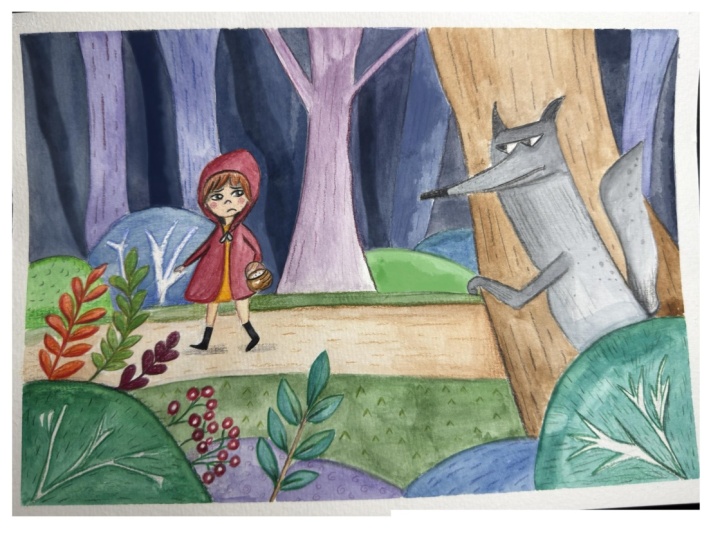
3. A Simple Cartoony Design of the Girl: Hello there and welcome to this first lecture of our course, how to design and how to draw cartoony illustration from a to Z. And this is basically the chapter. So before you start drawing anything you need to know, you need to get to know your characters. You need to find the style. So we're going to draw here the little red riding hood. And we're going to start by designing the little girl because she's our main character. And there are so many styles that you can work with and eventually you will find your own style of working. But I'm going to show you here a method of how to find the right style for your, or how to, or how to experiment of what kind of style you like best. So I'm going to start drawing different styles of the Red Riding Hood, the curves character. And I'm going to use a technique that for those of you who have taken my previous lecture of familiar with already, but you use basically spheres to design your character. Everything can be summarized with spheres and you start with designing the head. And I use the whole arm, my whole arm to design character. And I just move my arm for from back until I see a clear sphere shaping. And it's very easy because that's how you're actually avoid of making a mistake by trying to make a perfect circle like that. And saying like, Oh my god, I made a mistake. Let's start over. No. You just draw and find the circle. Let your arms, and let your arm find the sphere. So this is the head of our first character. And now I'm going to try to find the middle line. The middle line separates the face into. So basically, if you draw a line in the middle of your phase or the noses, you will find the symmetry between the two eyes. So I'm going to draw a middle line like that in three-quarters. Three-quarters, it means that the head is termed a little bit at the site. It's not incomplete profile, but it's not a frond either. This is a very comfortable pose to draw from because it gives you a more specific for this character. You can see both character, arms and hands. And it's something that I have become comfortable in drawing. I don't have everything too symmetrical. So I'm going to split this phase in 20. And thus why the gnosis. And I'm going to design the character's body. Now, I don't really know exactly how I want the character to be. So I'm going to use all of my previous knowledge of a girl to kind of look for this character. So I'm going to design the upper part of the characters party. And when you design the cartoon character, usually. They're exaggerated, they have exaggerated features. So for a girl, for example, a kid, children, children's heads are quite larger than their body in comparison to their body, comparing them to grow now, for example. So if the kid has a larger head, then look cuter. So if you exaggerate that, a new character design that will give you a QTL look of your character, ME want or character to be likable. So I'm going to define the upper part of his girl's body or with a sphere as well. And lower part with another sphere. She's not going to be a snowman. Believe me, even though you might see justice Gnomon, we're just trying to find the placement of the girl's body by choosing her proportions, doing this way, just using spheres. And we're going to do the arms like that on both sides. So we imagine that this is the girl's shoulders, this and this. And we're going to build the skeleton for the little writing code. So it, the skeleton, her arms are going to be approximately here. And I'm just going to eyeball it like that. And and her legs are going to be ending life approximately here because we want her hand, her head to be large and that her legs, we're going to imagine that we see through her clothes underneath and through her body to imagine where her skeleton is going to be. So her arms are going to be equally big on the upper part of the arm is going to be one part and the law part of the arm, It's going to be another part and they are same in size like that. We're going to signify them miss fears. And we're going to do that with the legs as well. Very, very roughly like that. And here are her feet. So we have kind of a human character kind of already. And what we're going to do here is I'm going to draw a line similar to this one to find the middle of the curves body. Because I want to know how to put her clothes on. So she's going to have this sphere is going to be her dress basically. So I'm just going to draw her a nice dress like that. And I'm going to give her even Puffy Puffy arms like a doubt. So this is a design that I'm choosing, that I'm starting went. And it's very much a cartoony design, which is a little bit more complex. And I'm going to show you some other designs later on. Does you can choose from that are more simple because I can see definition of legs here. And I'm going to give her some nice, nice shoes. Like that, they can be undefined so far, we're going to define those later on with a black pencil. And let's, let's give her now her facial features. I'm going to push her head a little bit up so I can draw a little neck here. And I'm going to draw her and the mouse on this line. And another thing that is very typical for children, they have very large eyes. So if you exaggerate the girl's eyes, she will look even cuter. And the important thing for, or characters or protagonists, what protagonist mean is, is a word in storytelling. Describing the good character or hero basically is that they need to be likable. They need to be cute and they need to be likable. So these are her eyes. You see that they're shadowy eyes and they look pretty scary right now with a black pencil, with a blue pencil. And I'm going to draw her a very large, small pupils in comparison. And this is some, a trick that these new users, that it puts the eyes a little closer together, then the character looks cuter. And now we're going to design from this sphere here. Some chicks, you can even add the cheeks like that with the sphere so you know where the chicks are like that and are various monos. And we are going to have the girls smiling. So we can have some cuteness to her, even, even more like that. And we can define the features. We don't need to have this large, these very big chin. So we are going to define that and we are going to add some ears here. And now let's add her hair, a chunk of hair falling down. This is something that is, makes a character very 2D. And another one over here. Chunks of hair makes, makes, makes the characters cuter. And, and now I can define her face even better now that I can see how these lines suggest to me whether that her face is going to be. And let's design her hood because it's Red Riding Hood. So let's put a hood on her. So this is a part of her costume that we already know that she needs to have. And it's going to be maybe just another sphere like that. Again, you see how loose I draw on purpose just to be able to find the shape. So I know what is the best for my character. Again, you know, to working for yourself here, even if you think about our own Garmin, get a lot of credit for my drawing. You're basically working for your character. As soon as you see data you start. Drawing these characters, you'll realize that you are making a service to them because they become real. The better you draw, the more believable your characters will be. And the more you will be. You will be able to serve them in your story and in your illustration. And that's how you become better. Masada writing code like that assignment, this is our first character. Now, let's define her with a black pencil. And here I have a pencil that's eight B. The number before the B means the, how soft the pencil is when you go down the numbers, then, then there's also a letter H on a pencil that when you have another age, it means that the pencil is hard. It means that you have to press a really, really hard to get a thick line. So I usually work with soft pencils because they don't destroy my paper and they give me a nice thick line. So now I'm going to trace this character because my eyes are already seeing where the shapes are and how this character comes to live, how this character looks like. So I'm just going to trace it with a black pencil on top of that. And I'm going to as soon as possible draw the eyes because they give me the soul of the character. They gave me her personality. So when I do that, it's kinda of a satisfaction also for me that I see I've drawn a real character and I can see her coming to life. So that's why I choose that. But you can start from any way you like, because you basically heavier character already with a, with a blue pencil. And all you can do is just defines the character. Now, I don't need to draw her cheeks because these were only the help lines. And the chunks of hair. The final and the chicks are here that defined her face. These lines. And this is a shadow here from the hood that she has on. So I'm going to just fill it with with some black and just have her face looking cuter. And another chunk of hair here. Vehicle look like little girl. And maybe just give her some eyelashes to enhance skull look. And here is the not from the hood. I feed where the hood is coming from here, the lines. So I can immediately draw just some not here from the hood of her and just define her dress. Many of us have grown up with this story. So many knows the story. And that's why I chose it for you because it's nice to be familiar with the characters and to have a feeling, to have a sense for them. Because when you design, when you illustrate something, it's very important to know who your character is. So you have, so you can be able to design a very nice and very storytelling illustration. Because when illustration, you have to do more than just a drawing and you have to tell a story with it. And there are so many other elements that you need to think about. That's why is important to know who your character also. So you can give them the right personality. And your viewer can just understand the story you are telling by just looking at your illustration. And that is your job as an illustrator. And I'm going to give her some socks like little girls have. And her shoes here. Legs and her knees. Like a dot. So now here we have our first Riding Hood. I'm going to give her a dress, just the middle line here. Now, let's continue. M design some other Arieti hoods.
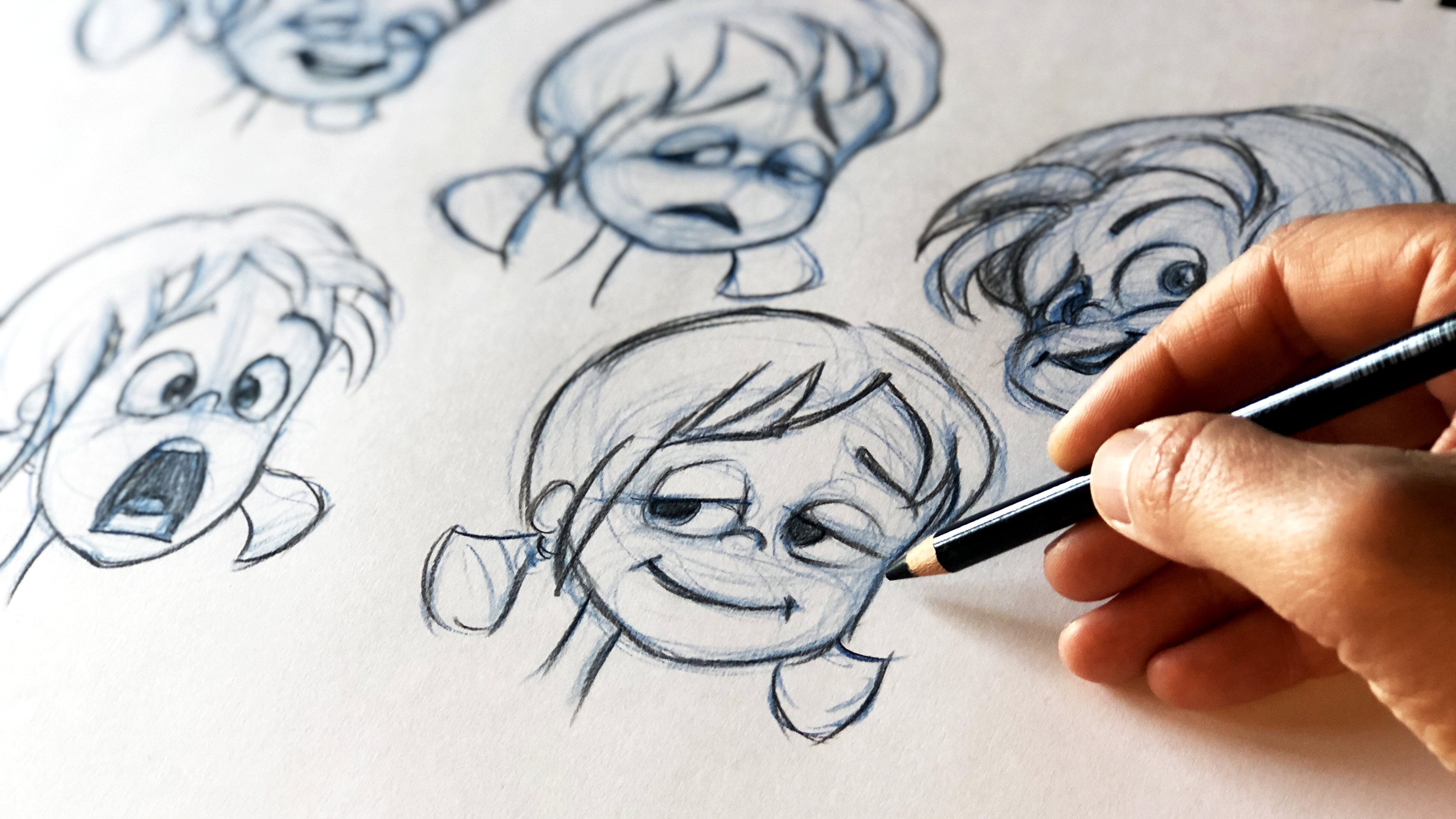
4. A Stylized Design of the Girl: So let's, let's design on couple of other characters for the Red Riding Hood. And let's do even simpler character than this one. So I'm going to start with the face. And here I'm kind of going to use a stick figure to design a character. This is another method. You need to use all kinds of possible methods to, to do a nice character. So I'm going to define the hips like that. And I'm going to do an arm with a stick figure and some, some legs like that. Now we have some kind of our character here. And this other arm, I'm going to assume these are her shoulders. And I'm doing her spine here as a line. Always a little bandit. And here is the other arm falling down. And I'm going to find the middle line of her face like that and put the nouns over here. So I'm going to have a small mouth, rather stylized character. And I'm going to have her eyes being like that, that just drying. I'm just trying different things, different characters. And have her eyes being more like a human, eyes like that, and a pupil, something like that. And see, let's, let's see how this looked like. And I'm going to have her hood being on her on her head like that. And I'm going to try a haircut. I'm going to see more of her hair like that. And now I can dress her over the long. Let's just go with the shorter dress. So just draw our triangular shape on top of this skeleton and have her arm being still stick, some stick figures and just draw a little square for her hand. We're going to have a tiny, tiny hand and tiny arms, more like a stick figure. It's a very, very simple design. So for you, for those of you who have a difficult time drawing anatomy and who are beginners. This is a good method to draw a very, very simple characters. Again, as I told you before, the character by character design is endless. The freedom is enormous. So don't be afraid that you have to do a certain type of design and just play with that design, see what it gets you. So this is another design of a red riding hood. So let's start with exploring this design. How would that look like? And let's have her face around that like dots. You see that is it's the same character we are drawing. But is completely different design. And they all look, the above look appealing. Just a little stretch, forum mouth, mouth. And we're going to have her or red hood may be closed like that. So we have the hood here and maybe we can have just a chunk of hair like that. And these chunks of hair coming out like that. And just have her hold visible and her arm. And we can just use two edges inside this square shape to define her arm, her hand. A very tiny arms for the Riding Hood, and very, very simple shaped legs. And let's have her having boots. So these are going to be black boots. And here we are going to have occur hold here. And let's even complete this dress like that. Her shoulders, the other arm behind the dress. And let's design her eyes. Now, what is going to be challenging for you? Maybe it's just to have her eyes not being cross-eyed. But don't worry, this is challenge for everyone. I mean, you have to draw it a couple of times to see how this works. This happens to me too. And we all have like or sensitive area in drawing. And for me, is basically this, the line of where she's were characters are looking at. This is still hard for me. I don't know why. It's a matter of feeling. Some people do it immediately. But for me I have to just try it out. So don't worry, if this is hard for you to, to make the character looking straight ahead and not being crossed. I just tried a couple of times and you will get there. So let's have her eyebrows. And this is just another design of war arrived Riding Hood like that. And let's give come maybe some freckles. That's cute. Omega, right? And neat fits that designed. So it's much simpler than this one. Much different in style. But we're not going to be satisfied with just a few designs. Let's just go for another one.
5. Simplified Design of the Facial Features of The Girl: Hello there. So let's try another symbol design over here. Let's have the girl again with a round head. And this time, just let start with her dress. And just say that the body is going to be big. And here are going to be her legs, and here are going to be her feet. So let's just have a 100 now's a little bit like that. And have her eyes being just dots. And very, very simple design, really. Just ahead like that. And maybe less have some lips, maybe some eyelashes. A chunk of hair here and here. And let's have her hood. Very, very simple. Thus, I want to show you that there is no end to how different the design can be. And what I'm showing you, even the simple style is that you're going to find your own style later on. And that you know that there is no only one way of doing things. And I'm going to have her have a very cute dress. And I'm going to have her arms being just straight. With Genki fingers. There's not going to be elbow or anything. It's even even better. Just small chunky fingers on her arm. And we're going to have just chunky legs. There is not going to be any anatomy that we know of here. And we're going to do maybe even know why their dress and some new design here of this dress that you know? Because the story is written long ago, they had still a different style. And we're going to have some design elements on her dress. And he gone to have the feet being just stretched like that because this is a design manner that we want to choose. So now let's just around that. It's a very stylish design. And let's round her head. They're not going to have chain noisy thing, not any design. Things that we did here. Very, very simple design. And we can even enhance her eyes, made them a little bigger. And even leave just a glance here as if these are her pupils. And you can yourself try all kinds of different designs. Even though if you follow me on this exercise and you draw exactly as I do, you're going to get different designs because we all have styles. We have our own personal style. So even they will make copy someone or what style come through. And you see that you get a completely new design. You will be surprised at what you can do here because it's such a simple design. We can add some decorative chicks. We call them decorative because I mean that there are not anatomically correct. We don't have chicks like data, we don't block like that. But because this character is so simple and stylized. And we have this decorative kind of expression on the design. Maybe the chicks like dot and here. Or we can have the lines even thicker. And we can have the hood. I'm going around her face and have the mouth here. We're just much bigger and we can have just small amounts like that. The ending of this and her arms. And this is just a suggestion of our design that we're going to explore before we go ahead and start drawing the main illustration. This is a, you have to know your design before you even start the preparation work. Basically. This is, again, I'm going to take the analogy of building the house. You'll have to know, you have to have the the skis on the house where everything is supposed to be. You need to know what kind of materials are you using. And you need to start from the ground up. You need to know what you're building before you start. To have to do a good job. You have to have to do the preparation for your work. That's how you will be very secure when you start with a real illustration. And even if you start coloring, adding other elements, you will know what to do. So her next will be just like that because does the expression with Johnson, and these are three completely different designs. Let's fill up here this space with other designs. Before we choose which designed to work with.
6. A Complex Design of the Girl: So here I'm going to choose another design that is not as simple. And M is a little bit more of a this new kind of approach. And to start with that, I'm going to split even the face in two parts. And the upper part of the face, I'm going to draw a largest fear. And the lower part of the face, I'm going to draw a smaller sphere. Now why is that? Is because children, they have bigger foreheads instead of the lower part of the face. So that makes them look cuter if I exaggerate that part of the face and also give them larger area for the eyes. So this is going to be the girl's hand. And I'm going to have a middle line going through the upper sphere and another medulla middle line going to the lowest sphere. And I'm going to form the chicks here of this girl. Still keeping it loose. Because I'm, I want to have the whole worked out first before I define the features. And on this bar, out the sphere, on the upper part of the sphere, I'm going to draw the nose on the upper part of the sphere are going to be the law bar of the eyes of the girl. And now I'm going to draw on ice like that, like they're a little bit like an unmanned ice. This is something that make the girls look very female like their eyes. And they're very known in Disney designs. They opened up their faces. I mean, we do have our own eyes because the lower part of our eyes is always a little lower than the ending of our eyes. And exaggerating it makes it look even better. It makes her eyes look bigger. And I'm going to have the mouth some way here. And the cheek. And this girl is going to be looking at us some just going to define where the pupils are going to be. And now I'm going to draw her, her body. So to draw her body, I'm going to put her neck first. I'm talking more about how to design human characters in my lecture of designing cartoony humans. So here I'm going to give you just a brief example because here we are working with the whole illustration process. And of course the character design is a part of it. So you need to have that. Part 2. And so I'm going to have her design her body by loosely trying to place her shoulders, her lower part using both spheres and end lines. And I'm not going to draw anything concrete before I see where everything is because it changes all the time. I can move things around. I don't necessarily know exactly what everything is. I'm playing with the shape. I'm going to have her upper part here, the shoulders, here is the spine, here are the hips. She's going to look like more of a brave little girl. And she's going to be rather photorealistic. So I'm going to draw her legs here. They're going to end over here. And the other leg. And she's going to end over here. So this is basically the proportions. This is how your work with proportions altogether. If you find this difficult, don't worry, you'll get used to it. It's all about training, exercising, drawing more. And now I'm going to draw her arms again as a stick figure and as a rule of thumb, the elbow is almost where the waistline is. So if the elbow ends here, and this line has to be exactly the same as the lower part of the arm. So I'm going to measure approximately and it usually ends in the middle of the tie. So this is going to be the arm of all Riding Hood. And I'm going to see approximately where it is arm ends by defining it. Where is this point? With this point, but here we have perspective change because she is going to bend her arm. So you can just follow these instructions for now. You don't need to know more. And this is the other arm and now the knee. And here are around the hips. But her body is actually ending here. If we are to draw a sphere and this leg, this part of the layer has to be exactly the same as this part. So her knees are going to be approximately here. Now. I'm not measuring them completely. I'm just eyeballing them. So you don't have to be super precise. And if you are, if you let your feeling guide you, then you'll get even a different kind of design. I mean, you don't have to be super precise about everything in the sake, for the sake of your design. And I'm going to give her a rather realistic feet as well. And I like smaller thighs. She's still a little girl. And I'm going to draw her. Her dress, her dress is going to be our model. Have these kind of design. It's kind of cool. This is something I'm just thinking out because I've read Red Riding Hood and on IV, imagine how she would look like for you. Maybe she could look differently. But this is my impression of Red Riding Hood and what she's wearing. So I'm going to give her this these clots or maybe even I'm going to give her long sleep, long-sleeved dress. And the other arm is on her tongue, is on her hips. But we don't see it because the address is of that model that we don't see. A really nice, cute dress of this old-fashioned style. We come see the dresses anymore on children that have cool clouds, that have Jains and have our while they do have hoods, right? So there is possible Red Riding Hood, the dorsal gonna be white, black hole, something for kids now are cool. All right. But for that time she was cool and she was brave little girl. So I'm just going to give her boots as well. She's going to be a little cold in my design as well. And I'm going to even make her knees a little more stylized. I'm still just trying to find her features. I'm not too worried. And everything these can change later on when I pick a design. Right now, I'm playing with the shapes. I'm playing with what I know about the design and what I know about this character, how I've seen her, my imagination. I'm just taking into consideration different aspects of just the cultural part, anatomical part of the stylish part, stylization part. And I'm just trying to find a character. This is the, this is the process. There is no difference in, no matter how much training you've had in drawing. This is the process of how you find the character. You start with messing around with different characters and you try to find the right character. And now I'm going to give her some long hair. Pony tails. I'm going to keep her pony tails because she feels cool to me. So pony tails, all maker, even more, even cooler. Just a completely new design. And I'm going to give her the right Hold on top of it. Like a dot is going to be on the back. I'm just going to signify the right code with another color with thicker lines and chunk of hair. Cutout and her pupils and her mouth. And now let's go with a black pencil and see how our character looks like. Actually, when we know where the shapes are. And I'm going to start from the eyes to give him some expression. Mri bras. I'm gonna let chunks of her hair fall, fall down on both sides, framing her face. And also when you design, you can just give them a nice expression because these are your main characters. This is the hero or heroine of, of your movie, of your book. So she has to look nice. She has to look appealing from the get-go. And just draw some eyebrows. Now here, you can have problem with the eyes again, but don't worry about that, you'll get used to it then this is just a design. You're going to explore the design in the later phase. So just follow the steps. You can reduce this design later on. Again, I'm going to give her some lips since he does not good. Well, maybe not so I can take it away later on. I like the design actually without the lips. But now I drew them in this exploration phase. So now I know that I don't want them on the later stage. And I'm going to round this up. You never, you never draw a perfect design from the first sketch. Or very rarely. When you find some design, you need to redraw at a couple of times to be able to find the real design. And let's draw her hood. Here. Let's draw first her arms and the dress. Of course. I mean, she looks like a brave little girl. Like it doesn't look as someone that can be tricked from the wolf. But also she's very nice and trustworthy. So that's how the wolf managed to tricker. If you know the story, I don't want to spoil it for you. If you haven't read it or you haven't heard it. So if you're older than, you probably heard that, but if you're younger, maybe you haven't so heavy apparently read it for you. I know that. There are all kinds of different people that are enjoying the courses. I'm very glad for that. Very grateful that you are enjoying the course and I hope you are having a lot of fun because that's the most important. I am having fun doing these courses because I'm drawing. And thus what I used to do when I was very little and when I'm not very little cell, I keep on doing it. So this is for life and I hope you're enjoying it. Because if you do enjoy it, you will have fun for life. This is something to look forward to. And the more you draw, the better you will get. No more fun you'll have. And basically, you will never ever grow old. You always think M2 as a little kid, as you were when you were kids. And the things that parents used to say like, well, you're drawing now, but when you get older and you have all these problems, wow, Well, you know what? That never grows old. You keep on drawing and if you're here, you probably want to make a living out of it, which is something that you should do because you don't enroll in drawing courses without having passion for it. And if you have the passion for it, you have everything. You need to make it easier leaving. And then you will never have a working Dao, a working day in your life. It's going to be fun everyday. And even if you go on vacation, you along for conduct to work. Well, actually you will be drawing on your vacation, so don't worry about that. And so here we have or other Red Riding Hood. And now we have four different characters from four or Red Riding Hood. And you can see which one you prefer. You can do a couple of more designs using this approach, the other approach. Or you can choose one of these characters and enhance their features to see what you like the most. But this is an endless process and you can continue forever. But now we can choose two of these designs and do different illustration take on them. To see that with each design of firewalls, a certain style. So that is applied 2D other character and to the environment they are in. And also to the way your drawing and painting later on the whole illustration. So let's choose one simple design, like for example, this design, and one more complex design, this design. And let's turn them into an illustrations. First of all, we need to only choose these characters. We need to also explore their personality. To do that, we need to sketch them in many poses to see how they look like or how they behave in different poses. So let's start with this character and explorer her personality and how she moves in the next section of our course and know more about her and how to, how we can draw her. So see you there.
7. Drawing a Surprised and a Running Pose of the Girl: Hello, and good morning, good day or good evening, wherever you are doing now. But for us, it's time to break down this character that we've chosen, the simple one in different poses hour we are going to start from the simple one, because as you see, this is more complex. And you can make a really nice illustrations with very, very simple characters. So you don't have to draw Disney characters to be able to draw nice illustrations. So just have a drawing in hand close to use so you can see how the character looks like. And we will try to break it down and draw this character in different poses. And we have used the math out with lines here. So we're going to continue with that. And here we are going to try to see how this character looks like when she loves, when she walks from different positions. So let's have this character might be from the site now. So I'm just going to draw it out from the head. And I'm going to think about whether her shoulders are over Charleston line and you'll see she has tiny shoulders. And I'm going to have the line, her spine. As soon as you have the shoulders, the spine, the hips, and you kind of eyeball the proportions. Because even though you don't have exactly the same size on this paper, what is important is to watch for the proportions of the head compared to the proportions of her body and the legs. So if they have here is slightly bigger than this one, that means that even the proportions of her body will be slightly bigger than this one. Just go with the feeling. We want to get to know this character. It doesn't need to be doing a derived from the first time. So I'm just going to have her maybe do a wandering pose. She's gutsy girl. She's wondering, she's, she doesn't look like a girl that needs help. She looks like a girl that she knows what she's doing from the design of her. So I'm just going to have her hands doing like item now. This is not my business, something like that. Oh, wondering pulse. So I'm just going to use the stick figure method. And Giles have that for the hands as well. And this is going to signify their fingers with another line here. And now I'm going to signify the thumb here as a wonder impulse and this one here as a wandering pose. And so I'm going to draw her hips like that. And then the dress is going to be. Maybe approximately here. And now I'm going to draw her legs as well. So imagine that I can see 40 her dress and through her skin and connect each leg to do the hips. It's important here to also follow the rules of gravity because we support ourselves in the unknown visitors on the invisible line that goes from the top of our head down and, or weight needs to be equally split between this line. This is a little bit more advanced for you that are beginners. And if you want to know more about that, you should check my other course on how to draw humans from, how to sketch from life, humans from life. Because there I talk about how we can learn to draw balance, how we can learn to draw proportions of real humans to sketch basically. And observing live will give us an extra edge evenly me draw cartoony characters. So I'm going to do her leg is like that here. And her boots. And her boots are just like triangles. Very easy, right? Nothing complicated here. And I'm going to have her, her eyes, her face being like that here. A little bit to three-quarters. I like things to be a little bit unsymmetrical because that gives them more life to the picture. When some behalf too much cemetery, it becomes that in a way. It's not as interesting as we break this down. So I'm going to pull her eyes with just ellipses here just to find where the eyes are. Again. And no one has been born thought, no one has been born. An artist. You develop a desire to be a notice and then you pursue it. You just observe and your pursuit and just you get better and better. And thus how it works with everything. And then I'm going to do the eyes here. And I'm going to try to make her look straight Eros with her eyes like that. And I'm going to shape her hair around here. You see I'm doing it so much. So roughly I have unlike just doodle on top of the hair where the head is going to be even shaded a little bit with the pencil. So I don't get just the line. I get the whole shape basically. And I'm going to get give her this Triangulum. Very simplified shape of a hood that ends over here. Like that. And and now I'm going to define it with the black pencil. And m basically a refine everything that I haven't defined well with the blue pencil. So maybe the eyes here are way too close then the original design. So I'm just going to follow that instinct of IC now what is wrong with the model, with the character? And I'm going to try to refine it and draw the eyes like that. And the eyebrows give her an expression. As soon as we give the character expression, they come to live. They become, they become real to us. So the sooner you give the expression, the better it is. And here is a chunk of hair that I can see on this one. And I just go ahead and draw different parts of the model of the character. I'm calling it's a model because I'm used to call that one. When we create a design for a 3D modelling. And we just talk about the model. So I'm not talking about any forum model. Why anything? That's just how we choose to talk, is basically our professional thing. So I'm just defining her hair. And every time I draw this character, I'll find something. I will learn something more about her and I will make her better, which each time. And before I go to go ahead and illustrate her, she will become better and better as the design. So she doesn't even need to be exactly like this character. She can be much better, she can improve with every drawing. And eventually that will also affect my final illustration. And this is the whole point of doing this exercise, redrawing the same drawing over and over. Even though you may feel a little bit impatient and say, Come on, When am I going to actually paint this? Baeza have some patients because you want to London steps and you want to have a final result be enjoyable to you. And the more you know about your character, the more you can draw it better, the better your design will be. Saw. You just refine that core hood. And here we have the NOT of the hood like that. And we have her dress or her lower part of the hood. Very simple. Just straight and very tiny head. Just draw a double line on top of this blue line that you've already drawn as, as a sketch. As a line only and you just be right without just draw on both sides of it. The elbow. And the finger and because her, her fingers will all be so gentle, you can just specify them just with very, very small lines. Like that. She's saying, I don't know. I don't know. Now, this is that the palm is turn on the other side. So this is the pinky finger is over here. And this is something actually another mistake that I do. You have to watch yourself how the hands are term indices in this pose? Because from you see them from your point of view. From the other point of view, you actually see the backside of the hand. And you see here is easily to make it as like what something feels wrong does because the power Mr. upwards. And then what you see here are actually the pinky, not not that the thumb, the thumb is farther away, but because the lines are so thin, we perceive the silhouette of all this pulse. So and just design the boots here is known. The more, withdraw them, the more the better we get. And again, this is, this is also your kitchen. This paper you're exploring exactly this character for. Here, you try to find different characters. Now we've chosen the character, we're trying to explore it. They will try and to learn how to draw it, to know who she is and how she looks like from different poses. So here is one pulse was this character, or Little Red Riding Hood. Now let's do another both now. Let's have her laughing or let's have her maybe running. So I'm just going to grab the blue pencil. So I'm going to grab the blue pencil and have this poles really rough. And I'm going to again do this middle line into recorders. You see how easy it is you just like make an ellipse like that, that you, you let your arm move freely, not trying to make perfect lines. And then you, suddenly you get a character. It's magic right? Now. We draw the spine, we draw the neck. Here. We'll draw the spine. And the spine is in motion. She's in a motion forward and one arm. And here are the shoulders signified him with two spheres here. The spheres, of course, you don't see them later on on the design of a neuron. One armies forward, the other one is behind. So again, the hands are tied in feasts. So just have one fees as a ham here. And the rest is just. The arm. And you see now I see that when you get the sense of the character, you can see if you have done some, some parts of the character shorter or longer, just corrected. That's why does why you studying in here, you, you have never drawn this character before. I have never drawn this character before. This is something I've done in front of the camera. So I also need to learn how these character is and how should it look like from different poses. And this is why we have this sketch book. So not only will have to see how this character or react so when she runs, but also we need to follow the simple design. Sometimes when you do complex movements, you kind of want to add more muscles. You want to add more complex shapes because you want her to look like, like a real human. And this is the other danger. And one thing is that she's just simple, that you, you, you cannot see her doing complex movements. The other thing is they'll just to to have the motion look like human. So I'm just going to draw her leg. One leg in front with stick figure, less defined, her hips. We're now one eye and the spine here, I kind of like know already that because the space from this hip here to the dress is kind of here. So I kind of felt that this is going to be the hip. So one leg forward like that and one leg bent. And because she is a more declarative, stylized, you can allow yourself to break even. And the perspective, she doesn't have to be banned in perspective as if it's a real, a real characters. You can play with the perspective as well. This is the good thing of joining home simplistic drawings that you've done, that you don't have to count these things as I'm mistakes. You kind of, you count them as a style. And there are many, many styles. Again, and sometimes they're even, even better. Not sometimes many times. They even better than the photo realistic style. I prefer it in many, many occasion. And photorealistic style is just more interesting, is unexpected, and it's about balancing. The, balancing the shape, the form, the color, everything does. The illustration is all about. And now I'm going to give. Get her hood, maybe just stretch Two With the Wind like that to give her some kind of other direction. So it's non-straight up, but it's going to be straight this way behind her. And now I'm going to draw her face again. The nows needs to be lower down. She's going to be scared. So we're going to have her mouth, very small mouth scared. Again, placement of the eye, the almond eyes approximately here, adjust and draw them as an ellipsis. When you draw them like that, they do look a little bit like an alien. An alien look. That's fine. And draw her eyebrows. An enol scared look in that direction. And even have her hair chunks just follow the direction. The opposite direction to where she's running as they're blown from the wind. And even this one here. And this one here. Use E1 dot and she is looking for running. When you, when you shade it, I like that. You get them more clear. Definition, clear feeling of whether the character is cross died or not. So dry it out with a blue pencil before you go in with a black pencil because that will give you a guide, a guideline, how the character looks like and cow or she is looking at like a god. Now, let's go ahead with a black pencil and define that or refine it. And here I can see that this position of the feast was better. And now let's look at our hand. How does it feel like use your body to feel the pulses? Yeah, something like that. Very small hand. And you can just do some lines for her home, for her arm, for her hand. And let's do her face. Just the eyes in this boss and shaded. So we can see clearly how she is becoming these character in a different situation, in a different mode, in a different mood. And let's get her mouth being small, dragged down in a set pulse with tiny teeth. Keeping the proportions of the face is also important even though. You give the character expression. So don't make this big mouth. Now she has this tiny mouth. And this is important also to watch the proportions of this character. And character. Basically that's how you deal with and that's why you're doing this exercise that you will all be ELB able to do that many times through the process. And you see that the chunks of hair, I don't draw different hairs. I draw chunks of hair because this is so symbolic, symbolic way of drawing hair. All right, may have heard of freckles. And, and you see that the more I draw her, the better she becomes, she's even nicer than the first original drawing. Original design. That is what happens. The more you draw, the better you will become. And by the time you're ready to start your main illustration, you will know the character so much more and you will be able to give your best for the final result. And sometimes you, you kind of invoking get lazy insulin. Do I have to do all these things to just draw? Two, just to paint an illustration? No, you don't have to e-mail. There is no rule for how you how to work. Sometimes you just want to sit down. You wanna go with your first design. You just want to exploring, just want to make one single illustration. This is also our sampling that you can do. Sometimes the inspiration we get for something comes from adjust the snapshot, just an image we have in our heads. And it's very important to get this image down. Because when we have that kind of burst of inspiration, if it means that there is something that is getting born in asp dot, we need to get it down. And sometimes that single image or illustrations started from the get-go. Just designing the whole image will give you basically the idea for the rest of your designs, or your book, or your film, or whatever you're doing illustrations for. So just listen to your intuition and to your signs of inspiration because they will guide you. And that's really the best bet when it comes like that. I've had many episodes like that. And it's so nice just to see the whole image. And to know this is exactly how I want until now I see that this foot is a little bit to, to not unsymmetrical, but it doesn't feel right, therefore to be here. That's fine because now I can just depends at what a black drawing like that. So and, and this is another design and we're getting closer and closer to or to getting to know our character and know how show you how to portray her. So now I'm not quite sure if I want to keep her face around here, I guess idea. So I can do another design here before we start with the other lecture. I'm gonna do that in the next video.
8. Drawing poses with a facial expression: So welcome back. So here I'm going to do another bowls of this girl laughing. And I'm going to start with her head. And I'm going to have her kind of like bam, in this gesture like, Oh, I don't want to love anymore. So I'm going to have her turn her head downwards. This is going to be challenging, but that's what we're here for. We want to challenge oral cells. This has been easy. This policy was a little bit of warm up because it's very similar to this pulse except her arms are different. This was a little tougher to see how she will look like when running and still be stylist, still be a stylized. Now let's do a balls when she is laughing. So I'm going to keep her in a little bit in profile and silhouette. This is something we can talk about as well. One needs time, like how you do the silicon for example, here you see both arms, both legs. So you would see how from the front, if you squint your eyes, you need to see the character as a shape without any lines. The cleared silhouettes of this action is, the more, the better your illustrations is going to be. So don't, don't draw your character from, from the straight and put all the elements, all the body parts inside the body. And so we don't really see what she's doing, what they're doing. So I'm going to choose this pose for her that she is laughing. She's like bending forward and her arms on her knees. And here is her spine, and here are her legs. So here are the hips. And here are her legs. And they're a little bit gathered at the knees like a teenager. Teenagers loved way. No, they bring the knees together. Very, very kind of cute, cute way, childlike way. And I'm going to have her arms as a straight lines, hence, support her cellphone, her knees as if she is dying of laughter. And I'm going to do her novels like that. And I'm going to have her eyes squint. So I'm just going to do the placement of her eyes. Now I see that I need to to enlarge the head because in proportions with Belt body, it's a little bit small. You just readjust as you go. And just have her eyes squinted. And maybe the nose a little bit here. And when we love or eyebrows are kind of in a painful position almost. So I'm going to bend that dress a little bit but still keep this clean lines. I'm not going to have any any wrinkles on the dress. I'm trying to keep the design very, very clean. So and that's how you can prepare basically if you're going to do a book. So you need to do a lot of drawings like that. You prepare by studying new character in drawing this poses as much as you can. And no, I'm not sure we're not gonna see the mouth here, but a little bit. And let's give her the chunks of hair falling down, not skewed. And let's design her hood like that. Don't give her too many wrinkles or banding on the whole because it needs to be stylish. It needs to be consequent with this design. And yeah, sometimes that's the hard part. Not to, not to do too little. Now this is a dot. And now let's go ahead with the black pencil and define this character. And we can have her eyes like that. Her mouth is still small. We see a little bit of her mouth. Maybe we see some chicks. The round face, the other one closed. And the eyebrows in kinda painful, painful position. You know, if you if you struggle with doing that, just do a couple of times, redraw this a couple of times, follow this exercise, follow the guidelines. And what is important here is that that you see something that idea from scratch, something that I haven't done before and I haven't practiced on it is how you do things, how I do the things and the first time, because I have a lot of experience of that and still the process is the same. So you get to see that you don't. No matter how much knowledge you have, your kind of start from scratch on a blank sheet of paper. And you, when you go along, you try to find a character that poses. You use the knowledge that you have of, for example, the proportions, the body proportions, and apply them to the proportions of this character. How we exaggerate characters, how we exaggerate to make cartoon characters. Yeah, I have a lot more on dots on, in my other lectures about cartoony characters for Das who have taken those lectures. So, so you know that it's, this is a part of the process. And is this in the same way? For example, if you make if you want to cook, I mean, in VMO, want to make a dish. It's not like you start cooking and you make a perfect dish from the get-go him. And even if you follow the recipe, the person who is giving you this recipe has their own experiences. So you do a couple of times to get better and you don't get born and can cook right away. While in fact, I still can't go because, I mean, I'm really for me. I tried to experiment every single time. And I can never make one recipe as it's set because I want to put something extra I meant and he doesn't get the same recipe. Yeah. So but anyway, you'll need to do something couple of times before before you know how to do it. That's Does applying for everything. And you have to redraw got many, many times he's not like you go to Jim once and then you have super nice body and you are super fit. Or for example, you brush your teeth once and you have clean teeth or your life. I mean, we would like to do that but, you know, or you eat once you fall for the rest of your life. Now, well, repetition is the way we'll learn things later on. Maybe I don't know if we find something that we can learn faster. Not all brain can perceive things faster. That will be another part of the story. So now we have three pulses with these characters. And we kind of know how to make things like, for example, we don't we don't have her too many wrinkles. We keep this thing stylized for this character. So now let's go ahead and design the wolf. And we are going to design the wolf, Not for each of those characters, but only for this character, because we have chosen this design to start with. I'm going to do that in the next lecture. See you there.
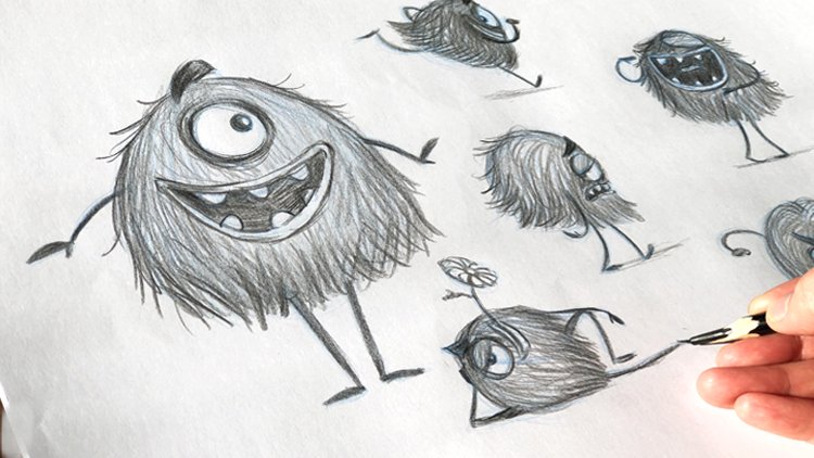
9. A Simple Design of the Wolf: Hello there, and welcome back to the next section of our course, how to paint and draw illustration, cartoon illustration. So the next step we need to do for the illustration now var, Little Red Riding Hood is actually designing the wolf. And because now we have chosen this design out of this four designs, as you remember. And this design is rather stylized, so we need to design or both now to match the style, it is important to match the style of your design so you don't have like a photorealistic wolf. Two words are very stylized character because the, your, your design will look out of place. You want all the elements of your design to fit together. So for this, to do that, we will try to create a wolf that fits this character. And what, how do we do that? And then we'll have this character on our side to see. Also, I have taken of Googled some wolves basically to see how a wall look like approximately. The thing is that you don't need to look too much at the wolf because the moral try to copy this wove, you will make the wolf looking for a realistic. So just see elements of the wall and name, named them, that the wall has like a nose, like a dog, has these sharp eyes. It has the legs, their defense, this curvature here. It has a rather long legs. And there are walls like dotted has just a rather longer nulls then the dog has it has of course similarities with a dog. So just named these features, what you know, and let's try to simplify this character. Another thing that you have to take into consideration is delta wolf is your antagonist. Antagonists mean that if the bad guy in your storing your movie as we know it. So to design the bad guy, it needs to have features that are rather sharp. Sharpness is a sign of danger. So if we see a naive, if we see scissors, you know, they're sharp. So the old design needs to contain a forms and shapes that are sharp. So to simplify the wolf, let's experiment. Let's play around. You don't have to just shapes here. Let's do basically shadows. So let's, and this large nose. And what we see here is elements of the shape here of the girl. She has kind of like a triangular shapes with her hood here, with her legs being just like a triangular like ending. Or here. There is the sharpness to her shapes and some kind of a simplicity. So thinking, sharpness, thinking, exaggeration, simplification. This character having that in mind, I'm having to in mind that we are designing an evil character here. Let's do a couple of takes. So if this is the walls nose, and let's have the wolf's mouth. Let's have his face being over here. So just around with some rhythm ellipse. And let's have his body be in this shape and that triangular shape. So the wolf, he will have a larger body like that. And just doodle that Doug just draw it as a shape. Because here you want to see the silhouette of your design. And let's have the wolf sitted down. So we'll have the bag legs of the wolf. Like like a shape like triangular shape like that. And we'll have maybe the back legs like that. So another thing we'll give from the design of the girl is her legs and her arms being just lines. So let just give this wall also just the line with thicker line here too in 2D shape to design where the legs are. And now this is the face of the wolf. Let's draw the ears on both sides of the face. Like maybe large sharp ears because we want this is going to be an evil Wolf. Again, even though your or design in this mode narrows down to trying to find this simplification of the wolf. The variety of your design, even in this shape, are endless really. So let's go for a couple of takes to show you that there's not only one way of doing it. And hear what makes the character evil is having his eyes kind of like squinted, like having this eyebrows lower down and having that as a normal expression to the wolf. And also having these almonds shape or triangular shape, like, like for the girl here we have this almond-shaped eyes and we will add that to the wolf as well. Although this time it's going to be like an evil Wolf. And you have the pupils here looking down. And let's have the eyebrows given for the wolf. And now let's try to find the features. So we will have these nouns being large, maybe the front of the nose coming in here. And this is going to be the mouth. And this is going to be the lower part of the mouth. And this is something that you get an interesting design when you do it this way, when you experiment. And it will lead you to design that you have unexpected. Because most of all, when you start to drawing or painting, you have in mind an artist that you liked or you have in mind a film that you've wiped. Maybe you've seen frozen with your kids and these are amazing designs. And you try to copy them and you think that if you don't do the design like that, then you're not a good designer. Well, does completely wrong because then you're just stuck with one design. I mean, this design is already done and you want to come up with something original. And your subconscious mind have the ordinality in itself. And the fact that you cannot draw, you don't know all the rules. You in a way free to experiment. You just have to trust yourself, you. Because usually you start with just the line and try to follow a shape, a memory of something that you know and you become scared that you will fail. But when you experiment with a blue pencil like that, you will come with such a interesting designs that you wouldn't expect. So this wolf now is something that came out, out of them. The explanation that they followed me wanna follow a design that will fit this girl in our illustration. And we named the features of the wolf at the same time, we named that what an evil character has to have sharpness to, sharpness to the features. So we'll sharp the ears will sharp, the nose will sharp the mouth here. We will try to make a more of a triangular shapes rather than rather than round of face. It needs to look evil in, and it needs to affect, affect us in subconscious level. And it does that when you add these features are sharper shapes. And also this is because the design of the girl is in this way simplified. So we've looked at the wolf and we took these features and we start experimenting in adding the features that the girl hub like for example, now you see the wolf head is long legs compared to the dog. But as the girl, it doesn't have it doesn't have any anatomically correct anatomical shapes on it. It doesn't have nice it doesn't have it doesn't have Yvonne phi2 gone just going into do the Paulson going to be a lag black shapes. And this gives you OXO also flexibility to be proud of your drawing. This is not any difficult designed to do. And if you're a beginner, one thing you need is find a find that you can do this thing, that you're good at it. And if you start with something difficult, you will be discouraged very easily. But if you start with something simple and you know that the variety that of designs that you can do are so many. You'll be encouraged to continue and you will even improve your style in many ways. So this is one of the walls. We can also add a features like that. You see now these scribbles that we did on the wall with the blue line are actually pretty interesting even as a design. So we can add some hair like that, like a graphic element. A graphic element is an element that completes the design, that it adds texture to my shape or form and that makes the design more interesting. So like senior simulating Harry Wolffian gotten matter with just adding these kind of shapes or lines. It just makes the character more interesting. So this is enough for the shape of the design end. You see that these two characters fit together. They come from the same book or the same movie. Can you compare this designed to go, for example, this one? Well, it doesn't look that they come from the same movie. The design is way too simple to match this girl's character. So for this one, we're going to design a different wolf later on to see how many possibilities you have out there. But let's do another take on the Wolf and see what kind of shape we can design and how we can approach this the designing process. In another way. I'm going to do that in the next lecture.
10. Exploring other feature of the Wolf: So let's continue with another design for the wolf before we choose one of them to see which one fits best to your story or which one we like best. So let's do another take. Let's start again to the links. So just do though are sharp shape being the, the ending, the upper part of the wolf. Like God, like a triangular shape for example. Because what if said that we want a wolf to have sharper features. And now let's doubt be like the upper part of the wolf. Just doodle, let you know. Don't, don't keep the lines clean. And now let's have the face of the wolf being inside this sharp shape, like over here. And let's have the nulls being slightly smaller this time. Let's give this shape and overtake of the designer for opposing. So we'll have a sharper or smaller nose than this one. Because in design world you can do whatever you want really, you can experiment with all kinds of shape. And we want to have the wall for little bits sulking in because it's me, it's a bad character. And here we're going to design the nose. And here on that part, we're going to use to design the eyes. And the eyes will be larger then those one in comparison to the nows and the whole shape basically. So he's going to be even more evil. And let's do the eyes here like that. And just brain the eye and this eye closer together and you can keep the eyes as a shape, as a shade. Until the moment that you find actually a wider pupils are looking at more clearly. And now use this shape to design the upper part. And here you can have the wolves ears. And let's, let's form this shape as the head of the wolf. And this year here. And let's give the wolf some eyebrows. As a graphic element. We are going to shape it like that. Undefined. We're still looking for the character, we are still looking for the right design for us. So first of all, play with the shapes. You don't want to have just one option to go away. And now this wall, Let's have him have some smaller body. Let's have him standing instead. So we'll have the wolf having this body here. So does signified with a line and maybe another triangle. Let's play with some triangles. And here we have the backside of the wolf user or you're a member when the wolves legs like kinda like went backwards and then down. So let's have that line going backwards like that. And then down. Both because we want to simplify the wolf. We don't need to have any special features. So let's design the front legs as well. They need to finish almost in the same position like this one because we don't want a wolf to be it and disproportional, we want it to be stylized but non disproportional. So so dust and the other legs in the same manner as the legs and the girl and even this design. And let's just summarize this design and simplifies even more to have a more appealing look. So we will just continue the head being like a big hair chunk of the wolf. And the wolf being really like dominating this dish shape of the body. And having, have him have a smaller tail like that. And defined even the body on top of this shape that we did. And the legs. And here this leg, and let's keep the lower part of the wolf. Darker, mean the same way that this girl has boots. We can imagine that the wolf and the wolves lower part of the legs are darker as if the 4 there is darker. So this element will repeat. And the same way that we did with the girl. And given here. And we are going to see even the back leg of the wolf. So we will repeat this leg, but slightly in perspective. So this length will be forward because we are looking at the wall from this side and we see this leg behind. So we need to see on this leg in this position. And we will just repeat this pose with the leg just being as a stretch, like a belt. And this is like another a wolf design. Let's see how this looks like. If we bought it for the black pencil and see what do we get. We can refine it, we can take away some features. We can enhance other features. And how we can make this wolf looking interesting, maybe even funny, because you are designing the new designing illustration for children or cartoon illustrations, you need to have these characters look interesting. So, so let's design the eyes like that. And this one, do we need to have eyes that are so big? Let's try to have them just a stretched like that. Like to have more scary, well does kinda more appealing Iran and the eyebrows. Let's have them like a triangle, like gut and not fluffy. As we started with. This is the discovery process. So, you know, it's not done until it's done. And you have the freedom to do whatever you want. And sharp ears. And another one here like that. And let's have the hair of the wolf. Maybe even signify it with some chunks of hair like we have here with the girl. There's chunks of hair. And let signify that this part of the wolf being kind of chunks of his hair. And even here, bring it out as an element or graphic element that enhances that design and fits the design of the girl. Being simplified as well as looking like a wolf. Basically. Sometimes as well can tell you that sometimes the simpler designs are maybe a little bit more difficult to find. But that is because if you see the walls picture, I mean, it's easy to follow. But to simplify it further, for the first takes, it might, it might seem difficult. But then the truth. If you, if you've drawn as a kid or if you are a kid and you have started and you have done this drawings that are very simple. And you see, you think that, well, I used to draw very badly. But in fact, there is something there that you can take from these drawings because they're very, very simple. You can take these drawings and simplify them. And maybe just do them as shades, as shapes instead. Just take your simple drawing and start like Giussani. Fill it up like a shape and see how you can break it down. How you can make it a shape and see what you get what you get there. No, I'm going to shade it is leg on that is behind more because this is a signifying that this leg is not in the same level as this one. And it gives more depth to the character. Even though it's declarative. And decorative means that it has this more simplified style. Why it's called decorative and because this kind of shapes are used in making the curations in VOC, for example, patterns for your bed sheets or for your pillows, or even ornaments that they used to do my income to do on a waltz. They uses decker decorative, very simplified art. And luckily, we're living in such age where we've had all the styles. I mean, it's open for us to do so many different styles. Because before, you know, at a renaissance, for example, you had to only draw realistically. And then later on on the expressionists than all different. Like cubism, for example, from a big castle style. It was very popular to draw just cubistic stuff. And now we're so free That's week have so many styles to explore. And now I've given some shades to the wolf. Intuitively, it felt to me that I can make this wolf even more scary by having him having his eyes shaded black because his eyes look more shiny, more evil when it's shaded like that. And it just fits this shape. So I can shade even the tail like that and maybe use this triangular shape here is you added on the ending of that tail to use this elements. And this is also a wolf dot fulfill fits this character with almonds, Ives shaped eyes with the hair like that, with the legs being used. This principle, that is their only aligns with a thin legs. Where dM, the theme elements of the face, the ears, and the hare jumps here. And so now we have two different designs here of the wolf. And I can add maybe some elements here for the the nose. So now let's do a yet another design and ventures want to reach one to choose from those designs for our illustration. And I'm going to do that in the next lecture.
11. Designing the Wolf with more triangular shapes: And so let's do another character design of the wolf here I'm using the same principle bot and trying out a different approach. And now these wolves are kind of like standing on there for under four legs. But what if we design a wolf does more human-like and let's abroad. Again, the design by using shapes. And these shapes are kind of like a sharp triangular shapes. So let's start with maybe having this character. Having Laika, triangular shape that is going in this direction. So just let's turn this shape on the other side around. So the phase is going to be like over here. And it doesn't, it doesn't have to have perfect shapes, perfect triangular because you're still experimenting. Then you can shade it like that just to see the shape altogether and not an ongoing into too many details to start with. You want to see the silhouette as well. So if you squint with your eyes, you need to see like clear shapes. You don't have to see details because the details to start with when you add details to begin with, That's just gets you stuck because you don't know how to approach it. You want to do everything right, and just doing that will make it more difficult for you. So let's add the body being here and we will use shape of the wolf. Being in this shape. Also evil characters, evil male personalities, for example, does have w1 to see that they have strengths, that they're strong personalities. They would use this masculine trait of being stronger on the upper part of the body. Because one, someone were me appliance to rent on the upper part of the body. It just is a sign of masculinity of strength. And we want this wolf in this design to look scary, to look stronger than the little girl dad is like, fragile and gentle, but she's still managers to trick the wolf in the end of the story. But when you design something and stories, you're the more evil and the most wrong your character appears in comparison to your hero or heroine. The better the more dynamic you create in your story and the better the wind. Because when a little girl like that who wins over a very, very strong and evil Wolf, the wind is so much greater than having the bad character being like NO fragile. Although in this design, these characters are more sneaky and this one will have a stupid wolf that has large body. And we will signify these legs here with spheres. That two spheres and new design the legs as if this is spending. So the sphere on the other side of smaller one and another leg here as the wolf is standing and signify where his feet are going to be, you see very, very simple shapes. And let's design the arms here or just signify where the arms are going to be. We don't have to finish anything for now. We can change that later. And we're going to add the tail like dots just as a, as a placement of something that we think is going to be there. And now what we can do, now we can see clearly that this, this kind of shape with the hair on the Wolf. And here we can continue this shape over here by ageing years on this, on this shape. Instead of being a father or a bar like this one, we can add them here. And they are sharp again because it's a warfare needs an evil character. What else can we do? Let's add the nose now here. And let's have a triangular shape again for the nows. And it's going to be on the upper part of the phase. So the phase looks much smaller in comparison to, for example, disguise. But why not? You can do anything, anything really with your design and experimentation. And we'll get you there. And let's get this Mao being like sulking evil Mao for him. Maybe we can open it here to show some teeth and some sharpness of the teeth. And this is the nose. And let's signifying that nonce. And also here I'll take the perspective like Don, because actually what we need to do is actually see the front side of the face. But that's how we're not going to see the sharpness of the nose and InDesign work, especially when you simplify that design and you stylize, it is really allowed to break the perspective and to break the shape see in the, in service of the graphic language, in service of getting more impression to your work. And let's have the eyes, the eyebrows here, and the eyes being smaller. Like really, really much smaller than the others. And here is some pupils, angry pupils and the eyebrows. And let's shade the ears like that. And here, what we want to do, like as we did here, where the chunks of hair, what we can do actually is add some elements of this hair inside this shape. So it's more of a signifying like the shape of the hair here. Like adult and sharp edges. Sharpness to the edges just makes the character more evil. And if you want to know about how you design an evil or A good character. How to approach archetypes? What an archetype means is a certain personality of a character that has certain features. That is an archetype. And now we can design the arms here being sharps, a sharp again with some very Lai Ni. So some, some lines here about also, we can design here some elbow and we can repeat this pattern here of the triangles on the elbow. And we can have him have some pulse here, so dark as the girl. And we can shade this part here, darker. And we can add the body here, we can define it. And you're being smaller. And these legs here and less, less Judas elements here and design even more triangular and more sharp legs. And even here, this leg can be like just a stretch here like that is going to be like who's going to be standing like a human walking one data source, the little writing and language writing code and design. The tail also repeats the elements of that triangular shape. And also here we can have these element on the tail. And in the other arm here we can have also the poll. Just being with lines. So just to be, may have it easier just to the weld like that and, you know, just don't don't worry too much. Doesn't let like that. And I could chunk of arms and that's why they mean that the thick pencil here, if you don't have to sharp pencil, it will not allow you to make too much, to give too much detail. And that's a good thing. Because if you start he know like doing details, the lag data, you will not be able to see the whole shape. So let's define this character and where the black pencil and see what kind of character we got. And now actually you can use each one of these characters for this little girl's girl design for illustration, because they fit car design. And now this is all about preference, what you choose to do. So, so it's up to you. But now when you have this option, unless design some ears here with darker color. When you have so many option, it's much easier to choose than if you only have one design and you don't know why you are doing this design. The whole point here is not only to teach you how to draw exactly these designs, but to make you think. When you design something, why you're doing what you're doing, how you approach something. This is an important than know-how of the design work altogether. Because you don't necessarily, well, we'll do justice designs and you will be able to draw these designs flawlessly, of course, if you follow this exercise. But this is not the whole point. The point here is to show you that the way you think about the design work, the freedom that you allow yourself first when you start designing. And when you do it with shapes, when you do it with lines, when you do it without any hesitation, that this has to be the perfect drawing when you allow yourself to explore. And when you know why you're exploring your, you're looking for the elements that you've already applied on a previous design. So you looking for to match that design, to be able to feed it into a one style of the illustration. And it, there are endless designs. I can do a whole bunch of those designs here and your, just for you to continue and do a whole bunch of these designs know just starting from the end, the triangular shapes of the nose or their upper part of the body. There is endless are really and don't be afraid to explore. Or you can do a wolf or just one shape. I can do one of them here. And this is another design on the Wolf. And lets you just a quick one might be here like one shape wall. And just having this nos here and just doing without any legs or just one shape using this shape, but just for the whole body like that. And having these ears here, you'll see that we just saw few strokes. If you have something looking like a wolf, you when you shoot, don't have any legs or anything else. And you can add maybe the legs over here just as stretch. Another triangular form. And here is another one. And here you can have the arms of a here, which stretches, make the poor little, little thicker. Just to balance it out as a shape. And another nose here. And you can use the triangular eyes here again. And and this is also a local, so very simple design that also feet, feet or current need for the wolf design. This is more like a sneaky kind of wolf, is more realistic and he's more like sneaky and evil in that way, coming like dot. So just try it out. You see how, uh, how many different designs you can get. And they all remind us of wolf actually, none of those designs are like Arial walls. You see here we can have the possibility to add a leg to this design here like that. And another one here. And continuing this leg over here in the large pore instead. And what it can do here, we can add another graphic element of a wolf. The more simplified you have a design, the more of those graphic elements you can add because they look more decorative. And it adds an extra layer to design. Just simulating hair. And you can have the tail here being maybe just larger than it actually is. And collaborative and darker. And you see that it's endless, really possibility. Just try, try them out and do some more doodles and find out different designs and they all fit with this kept it actually is very simple. So I'm just thinking like which one shall we choose? And you can, you can have your own preference of all of these design sense and you can choose another wolf on, or you can find your own character. I kind of prefer this wall because it looks more coming to me. And I liked the graphic style of this world being with this large body and these legs inside and these nows is kind of like it. I just prefer this one. You might have your own favorite, It's up to you. But I will continue the illustration using this simple Wolf and it's also more new beginner is going to be very, very simple for you to do on my new illustrate that. And it says go eight is good to start with. So I will see you in the next lecture.
12. Designing the Elements: Hello there and welcome back. So now we have our two characters for this illustration. We've chosen this girl and according to the design, also this wolf. Another thing before we continue, you can break down this wall The same way you did with a girl. But I'm going to do another thing just to get you going as soon as possible and not keep you waiting too long, you know, because you want to get your hands dirty. You want to start with this illustration. So what we need to do here is designed some backgrounds. And we're going to choose some elements. Are the backgrounds also according to those designs. And we're doing this decorative style, simplified style, and we're going to place or characters in the woods. And we need to have some elements of the woods, align branches, trees and bushes, flowers or whatever we need to do to, to have in hand and to know like how would they look like in the illustration? And they have to match the style. The style. They shouldn't be photo realistic or a shouldn't be a realistic to start with. So we can maybe start with the branch and say that we are going to do a branch that has a decorative leaves. They will be around it in this way that are similar to the girl's eyes and the wolf's shape. The kind of like our mom, like shapes and very decorative. I mean, we don't see a realistic branches like that. But this is also a pleasant process for you to do to have some relaxation basically because it is very relaxing. Designing ornaments, designing flora for 40 or designs for your character or four illustrations. And this is one type of design. We're going to fill up these branches with a possible color that we're going to choose later on, but now we're just going to shade them like that for the purpose of creating a silhouette, to see what do we want to do with this branches and how we want them to look like, something like that. We can do maybe the branch don't have too many different styles because it's going to get too confused as much as a simplified. And the fewer elements you get for this illustration, the more you can actually focus on new characters. Just do as much as it necessary to give you some environment. And I'll show you what I talk about. Later on, maybe you can do. And branches of these type leaves that are a little more sharp arm, a little longer. Also in same kind of way. Very decorative as if you're looking up, looking at the lead from the front all the time, which won't happens. In real life. They have completely different structure and different different motion basically to their shapes. But we don't care about that. Stylized, stylized style of illustration invites you to experiment more with some decorative styles. And it's easier if you're a beginner because maybe something that you use to, to start with. And you don't have to deal with anatomy because you know what the everything has an anatomy. I mean, even even flowers and branches and trees that have an anatomy. And we're going to explore dots later on on the design that is a little bit more involved. And you can see how you can approach that from the more anatomically correct ORM, or rather photorealistic way. Or even do that and just make them even cartoony soy to feed this tab because even or other design is not completely cartoony. What else do we have? I mean, we can have some branches that are the half some fruits on it. So we can design branches, have just some just spheres on top of that. As thinks we can find in the woods. Just to make some more, some branches like that, come up with, with some things that you can find in the woods and simplifying them in that matter. Just have this grown basically on top surrounding the whole Brahms. You can use that as a bush as well as the graphic element. This is something that we've talked about, a graphic element that we had on the wolf. That we also can have these branches do they can be a graphic element of our illustration. Just have completing a complete our illustration, make it looks not look nicer. So another thing we can do here is maybe create a type of bush. How would the bush look like? Well, we want to have this symbol and stylized. So one way to do that is to have the bush have this around shape as we think the bushes have. And inside the bush, we can give this graphic element of branches. So just simulating as dialyze the bush. So you can just basically draw a branch and with small branches. Inside it goes almost at the end of them brand of the bushes shape. Just to symbolize this is some kind of var, Bush. And strangely enough, even though this doesn't look like a real bush, we perceive it as bush. You see, how easy is it to trick our mind to have something symbolize something else, just with very, very small tricks and simplify it. Because our brain is very good at connecting the dots, at reading symbols and reading and drawing, basically illustration. This is really creating symbolic language. It creates an illusion of reality. No matter if you draw it for the realistically or if you simplify it. Or brain tries to explain what it is. And it tries to make the connections to real life, basically something that we recognize. What else I will do here is I will have maybe a tree. How would I represent a tree or something like that? Maybe the trees in the oil illustration are going to be pretty large. So I don't want to draw the whole tree because we're going to do just the law part of the trace where the girl is and the girl is not so much is not so big, slow she's we are going to see just parts of the tree. So we're going to see the trunk of the tree. And the tree may be, will have this shape. So if we can see the whole tree, we will see justice shape of the tree. And if we happen to see on top of the tree, it's going to be in the same way like the branches. It's going to, the shape of the tree will contain the branches and of the whole of the tree. And it will simulate as if we see a real tree. It's also a very symbolic language of a tree and very, very simplified language. It reads well, and it creates a very interesting style of illustration that fits with our illustration of the curve, the current design that we've chosen. What else can we do? Similar, in similar way of like the wolf, like we've decided we want to have this scribbles here be like a four of the wolf. We can also give some similar texture to the tree, like having this as a graphic element inside the tree. Given in basically some kind of texture. This is something we can choose. Later on when we designed the whole illustration, will peek into those elements to see what fits to in our illustration. Where is the limit? How can this be too much or too little? And we can adjust it later on. But here we have a certain direction, how we want the elements in OEM, in, or drawing or painting to look like another part of the trees. Something that you can just make some leaves here on the tree as you've signifying, that may be this is a summer or spring weather also containing just maybe one or two lives. I mean, you never see just a few leaves on the tree, but just a symbolic language here tells you that, well, there are leaves on the tree, and later on we are going to paint the whole crown of the tree. And these limbs will go just as an element. So I think this is enough, enough for elements for us to start and to see where we can use these elements and can we design other elements when we start with a real illustration? So I'm going to continue on with the next lecture, talking a little bit about composition. I'll see you there.
13. The Golden Ratio: Hello there and welcome back. Before we start to paint a real illustration, I'm going to talk about composition. Composition is important. Composition is basically how you put the elements, the characters, the background, and the foreground of your composition of York image together. So you point the attention of the viewer who are the most important things happened. And when we talk about composition, something that is known in the illustration world is something called golden ratio. Golden ratio is a mathematical formula about where or attention is drawn when we see our composition, when we look at a picture, this is just a rule of thumb. It is not something that has to be are written in stone, but it's just something that we think about when we design or image, one-way design or illustration. And it has been noticed in nature, this golden ratio is that, well, if we split an image in three parts, diagonally, horizontally and diagonally, or attention is drawn somewhere in those three corners. So it means somewhere outside of the image center. And this is the same, the same thing here. If we split this composition, this paper, we might assume that this is the A4 format of paper of our composition. And we split it in that way. The most important things, or I, will be drawn to one of these corners or approximately in this areas of attention. So if you play something in the middle of this composition, and even here, it's not necessarily that this going to be the center of the viewers attention. So you try to compose things in does matter, so you avoid the center of the composition. And this golden ratio is basically this mathematical equation that is seen in nature, described by a curve that is going this way approximately here. And you can turn this around. And this is something that is a rule of thumb in composition. You just tried to avoid the middle of the paper basically. So this has, this can be done by several ways which I'm going to talk about in the next lecture. But what you need to know here is the rule of the golden ratio is something that we need to think about. And let's continue with the next rule of thumb in the next lecture and start to explore the composition even more. So, I'll see you there.
14. Foreground, Middleground and Background: Hi there. This is another lecture where we can talk about a little technical term, Code, foreground, middle ground, and background. And why is this important? If we have a composition like that and we follow the rule of the golden ratio. We also need to think about the depth of the composition, like how we design a depth. We designed them. When we imagine all characters placed in different layers in perspective, for example, perspective creates depth. One thing to think about perspective when you have a decorative style does you can keep things flat, looking flat, for example, but you can still add perspective by adding elements on different layers. And we have a foreground. A foreground is something that if we see in perspective, it is the first layer of, of, of where we have things like, for example, in this area which is a foreground, it can be darker. And here we can place maybe bushes, we can place trees, something that is darker and leads us into the composition. Some something that is not going to stick out, but it's going to frame the elements which are inside the composition. Think of it exactly as a frame. Usually you have trees or bushes in front and sometimes you have leaves in the foreground that are kind of blurry. Maybe you have seen that you have in the, even in the old paintings, in the classic paintings, you have a tree here that is darker. And you'll kind of lead the eye in a very nice castle here and so on. And no matter if you drew painting or an illustration, cartoon illustration, you can use the foreground to lead the DI, somewhere inside the composition and let this base plate be just the framing. And the next thing is the middle ground. And the middle ground is basically where the most important things happen. Here. You can put your character, for example, you can put or a little girl, the little red hood. And we can have, again, using the golden ratio, we can avoid putting her in the middle of the composition, but just placing her face and her eyes a little bit at a side, signify where her eyes are by just lines. Just to find the strength of your composition and to find the best the elements and how you need to lead the action. I'm going to talk about the action in the composition when we start designing the next lecture, here, you just need to know how to use the layers of background, a foreground, middle ground and background. And it seems like this layer, it's most closer to us. The middle ground is somewhere where, for example, you picking out and you see where things are happening. And the background is basically what is behind this main composition where things are not going to draw our attention. So maybe here or in the backgrounds are the woods, for example. And this is something is just to complete where the girl is in. If it's in the words or if it's like a nice landscape on the background. If it's a house on the background, Where is she in her world? Is he just leaving? You can have if she's just leaving the house, you can have her mom and the house in the background, and y is in the background. That can be also a part of a story telling element. You can say that she just left the house. You can decide that. But we are going to use the element of the woods here as the background. And the tree that we designed we are going to put in here. So this is kind of elements that we have roughly decided for how our composition might look like and where it can put the wolf next. And this is, we're going to put all these elements together. Does the golden ratio, the form of middle ground and background and combined with psychological meaning of the composition, what is going on storytelling wise in this composition? What's happening to our characters? This is the next level of how you can place the elements of your composition before you even start painting. So let's talk about that in the next lecture.
15. Storytelling in illustration: Hello people and welcome back. I hope you are enjoying this lecture so far. Here we're starting the best part. Where is the storytelling part? And you need to know these things. You need to have them in mind when you design your composition because that's how you will become a really good Illustrator. Once we do basically is we convey an idea of storytelling idea to our viewers. We're telling a story with just one image. So it's very important for the story that they grasp every aspect of the image, what the image is about, who these characters are. Even if they don't know this character, they need to perceive the characters as real and the need to perceive the situation as real. So there are a lot of elements to think about. And that's why you need to use all this help that you can to convey this idea as best as possible. And when you have these elements in mind, it's going to be easy for you to choose a different perspective of the composition before even you start painting it. You will be, you will be equipped with knowledge to do the best for your illustration. So let's use the knowledge that we have so far and design the composition already. Starting from the format. So we want to have the composition being in the horizontal. You can do that even in the vertical if you want, for example, to design a cover of the book, and it's an vertical position. But there are a lot of possibilities. I'm going to give you the tools here and you can explore them. What's your competition with your specific book later on. So let's use the elements that we talked about before and add the psychological element. So what is this story about? We're going to use the moment of the story. Water Little Red Riding Hood is gone from home. She's in the woods and when she's meeting the wall for the first time. Now, what can we add psychologically about this, this image that we can convey the idea that first, the wolf is scary. He's not just a nice, friendly wolf. He is not little kitten. So we need to know that there's something hidden about this wall, something scary. And use the foreground and the moments are the middle ground and background. To create the store, we need to have the foreground being around this area. So just roughly with a blue pencil, just signify how we're going to frame the image. So around this area, things are going to be darker as you see. I'm not painting and not drawing any bushes or trees or anything. I'm just trying to design where the point of attention is and where to where can I place the most important moment of the character? Also, I'm not drawing any characters first, because if you try to draw just one character, you will be out of sync with the rest of the elements. So to get a better view of what you want to design, you need to have an overview of what everything else. What you can do also is just approximately draw these lines to make sure that you place the image later on in the composition when you're going to paint. You can see in each corner of this composition, once you have in place that you can easily use as a measurement later on to, to translate this image here to the real illustration where you're going to use watercolor later on about you can, you can skip that for late for now if that's going to be difficult for you to see. So I'm just going to take away these just to see clearly how I want the composition to look like. In the middle ground. I'm going to put Little Red Riding Hood and her head is going to be approximately here. When we talked about the golden ratio, you see that it's going to be a little bit outside of the middle of the picture which is here. So she is going to be a tiny one. I'm going to put her being a small little girl because I want to increase the feeling of danger upon her. So having her smaller in the image, I'm just going to signify her as a stick figure and as a silhouette. Here you can see that we are talking about silhouette. And I'm putting her in three-quarters of water. I can see the Riding Hood. The hood here. I can maybe have her hood being here and at the back and her walking just as a stick figure. That's easy for you, right? And here I'm going to give her even a basket. She's going with the baskets. You, her grandmother, and one of the arms here. And I'm going to signify a basket just with a sphere. All I want to see justice silhouette of this girl. How would she look like? And maybe add another hand here, of course, walking and her eyes, her face being turned in this direction. So why is that? Because I need to add the wolf. Now. I can do that in different ways. I can add the wolf being next to her already talking. I can do that image like maybe in the next image. But also I can add, again, use the foreground and threatening black, dark space to hide the wolves inside here. So you gave me won't read through her. So I can do that. I can think of maybe the world hiding in here. And we use the wolf that is very simplistic and actually plays him behind a tree. Here I end. I can maybe have bushes in front of him. And what I want to have is just his nose sticking out here in the dark, the long nose that we prefer to have. And now that we have this dark figure, dark for, we can just design the wolf as, as a silhouette. Again, talking about silhouette, we see that i, I have the wolf visible already before I have any features. He is just a shadow. And I can have his Paul might be sticking out here, just hugging the tree and peeking out from the tree and increase the tree here, ending in here. So this is one of the composition. And here on the background, I can have the trees as we had in the other composition, just very roughly. And play with the shapes here rather than the shapes. Because you can clearly see how your composition play out. And if this image is threatening is if it tells the story. Well, of course it does. You can see a little girl walking, walking down in the forest, in the deep forest. And you can see a wolf hiding and she's not seen yet. Even if she turn in this direction, we can have her eyes look maybe past the wall. She's not seeing the world he's hidden, and there is a danger of her walking down the forest. So this is one composition what we have, we have used the foreground as an element of storytelling. And among elements, we have used the center of the composition, which is not in the middle of the composition following the golden ratio rule. Illustration. And we have used clear silhouettes to place our character and the psychological element of data. Now, let's do another take the same moment of time in the story. What else can we do? I mean, we can have the wolf may be those little Red Riding Hood being here. She can be, may be bigger. Let's do another element of that. She can walk down the path here and how we can design maybe the foreground. We can have her foreground being less of a problem here, and we can have her conversating with the wolf. So so this is the middle ground and we can have her closer to us, so we are not sneaking out from here, but we can have her walking with the wolf already, so he's already close to her. How can we make this, this image threatening? We can still use the silhouette like she's walking from the side and she's turned towards the wolf. So we can see her Riding Hood. The basket here. Again, only with, with lines. You don't have to add any elements. Adult stage, you're only trying to discover the composition. Now we can see that we can place the wall behind her. And the wolf just turned a little bit to work her towards her. That's an element that's where we see that the wolf howls have something to hide. He's not, he doesn't have clear intention. He's walking behind her back. He's trying to hide his intention. This is something of psychological element that you can use. Just thinking about what this wolf mine too. And you can add his foot with his following her. And maybe his tail here. His ears here. Just use this and these elements to actually and the shading. Just see how your composition will look like. So he's just walking beside her and coming from the back and he's trying to intense Kerr. He's trying to tell her something that she would believe and she would do as he wants. Shoot, stop and just give him the food and the eyes can be like here. And so they're looking at each other. But there is no friendliness man There. She is not unfriendly to him, but she doesn't really trust him. And the wolf walking and walking behind her also doesn't give any reason for her to trust him, but also she's a nice girl, so she's not life threatening him. She doesn't understand really what that is. And we have this wads behind him behind them. And when you do that creative illustration, you can allow yourself to break the rules of perspective. You can have the trees leaning this way or this way. And this is an advantage to have a more decorative style. And here you can place these elements of the bushes. I've been telling you about like having the foreground being just shades and shapes of decorative leaves, signifying bushes, signifying that there is something in the foreground. Or this is another composition where we have the same story, but here there are little Red Riding Hood have met a wolf. And he does look threatening to her because she's walking behind her back. So just choose the elements where you can convey this idea to your viewers. And here can be a third composition. Now, when we've done this compositions, the more you draw, the more you'll see the real image in front of you. And you will be in a way inclined to take the first image that you've drum, but just explore a couple of more alternatives. Maybe you can have the wolf being the first in the image like here, for example, walking next to her. Let's get her even closer and have his face here. And against splitting the image in three parts. And the golden ratio, placing the image of the wolf here and maybe having her being over here and just trying to to avoid him. But they're having some kind of a conversation. And here we can have his eyes trying to intense her to make her trust him. And the little girl here is she's just trying to go Huawei and avoid talking to the mean wolf because she's heard from her mother. You don't talk to strangers. Even if that's a wolf in the world, especially if it's a wolf on the wards. And here you can have a middle ground here. And another. Why? Because here we are going to have the path in front of them. So you can have a foreground being just some bushes here in front of them. And you can use, again, the same the same background with a lot of trees and have a little bit of a law perspective. What a wolf is much bigger in the picture, as you see that. It's mostly all of our pictures. The wolf is bigger except here one, he's actually hiding here he is. He has a different agenda and even though he's bigger, we can see his eyes. They don't look at each other straight. The wolf never look at that. The little writing hold straight in her eyes because he has a hidden agenda. And that's something to think about. If someone is looking at you, is not looking to straighten the eyes. You say, Look at me, look in my eyes and they don't dare because they have a hidden agenda. And this is something you can use from everyday life. How you can have someone looking like you don't have clear intentions towards you. Well, usually bad guys in the stories, they don't have clear intentions. They don't start with, they don't meet you and say, well, I mean, you all know, they want to trick you. They want to have you killed or they want to get something from you that it's not clear. So this is something you can use or psychological moment. So AUC, we have to read different storytelling images of the same point in the story when the wolf meets the Little Red Riding Hood. And you can choose any of these images. And even if we don't have the characters are drawn correctly and draw clean. Now we have this, you can see that we have the Clearly this character and, and this wolf, they're interacting within the storytelling element. And now, let's go ahead and choose a composition and let's draw it clean and clear. And let's start painting. And I'm going to choose for my liking, I like this composition, the one that I did first. So I'm going to explore that and put it in more details to it, and go ahead and start painting it and completing it. And I'm going to do that in the following lectures. See you there.
16. Pencil Drawing: Hello there and welcome back. Now here we're going to start the so-called serious work of actually painting and drawing or illustration after we've done all our preparation. So what we did is we found different designs for our girl, Little Red Riding Hood. And we've chosen our design for this illustration. And we have designed a wolf according to this kind of style. And we have a couple of wolves, and we chose this one. I chose it. You might have chosen some other wolf, or you can experiment with other wolves later on. And then we talked about composition. We talked how to place the characters within the composition. So, so it is a stylistically nice. It has a foreground, a middle ground, and background. And he has a psychological moment where we can interpret what is happening in the image. In this case, the wolf is sneaking behind the tree because he is a threat to this little red riding hood. And she's in the middle of the picture, not in the middle, but in the middle according to where or attention goes and, or attention goes to somewhere where we have this golden ratio a used where our attention is approximately here and not in the middle of a picture. And we've chosen this image. So this one doesn't have the girl while drone. And you can do the step that I'm going to do a write on the watercolor paper. You can do the couple of times on a separate paper. The one that you don't have to put a water color until you become comfortable with this image. So you don't have to have too many lines when you draw it on. When you draw it on so-called real paper. But again, if you don't want to waste our watercolor paper, which I would suggest just wasted paper if you can, because That's how you learn how to draw. So be brave or be brave. And if you decide to do that right away from good for you, if you don't think you've succeeded this time, just another painting, another drawing. That's basically the way to do it. So let's see this design here. And we have this splits that we said what a golden ratio is, why we do the split is because we can see we can do the same splits over here. Now just choose the black pencil very lightly and a roughly just draw these lines over here. And you can approximately see where the characters are in this grid. It is like a grid that you can measure where the position of everything, yes. So you don't manage to make the girls too big or the wolf too small. But you have like a guidelines. And again, you don't have to be 100 percent correct. Just eyeball it. Also eyeballing what everything is instead of just being completely like millimeter correct, will also give you the sensibility to sense where, how big elements in your composition R. And this is basically your main tool when you draw, you have to be able to eyeball things when you, when you train yourself how to draw. So try to do that. And let's, let's start. I'm just going to be minimize the space for this composition so we can see clearly what we're doing here under the camera. So when you draw the things on the watercolor paper now, you will have to try to have as little work with the pencil as possible, but at the same time, you can still be in the experimental stage. So now you see that the wolf and the tree is within this line here, and it ends on this line. So you kind of add this, this element here and see how this work. Very lightly. Don't push too much. If you push too much on the watercolor paper, It's going to be very hard to erase and it will tire of your paper. So you have problems later on with pushing water colors. I will have them looking fresh and nice. And here, this line here is approximately in this corner. And because of the design is very design is very stylistic. You don't have to have any specific in like photo, photo realistic measurements. Unfortunately, stick lines on this design. Now let's get the wolf m. So we have the wolf, let's measures like slightly here will have its over here. Just draw approximately where his nose is, where his face is behind the tree. Have one year outside the tree may be like that and have the body being almost and the same length as the trees like he's merging with a tree here. And also his poor grabbing a part of the tree. Like over here with a very roughly. And now let's have a bush in front of him. We said. Oh, that's a bushes, remember, or elements of the bushes, how they are. Keeping them very simple. They're just round shapes. We have this kind of flower leaves, leaf like bushes that we are going to end on the other end. And we have these kind of bushes and this is, we can add to all kinds of different places there. So let's say we have the bush, a big push in here. Maybe we can bring it a little lower and we'll have bushes on this side. Now let's see where or Little Red Riding Hood is. According to this lines, she is approximately here and she's very tiny in the picture. And later on, we're going to emphasize because, you know, the eye grabs not only what is in this place, but also might be what is bigger in the picture. So what you notice is the wolf maybe, but the way to minimize your attention on the wall because we want the attention to be on the little red riding hall because it's used all main character is by using colors, warm and cold colors that we're going to talk about in the next lecture. One thing you want to know is also when you see here, is not to have too many lines crossing each other, like for example, in this space here is about the way to be on the same spot as the pore of the wolf. So bring it down a little bit. And here you can use again the eraser that I said very lightly, because the more you use the eraser and the harder it will be for your watercolor done to stick and to look fresh and mice. So now let's have the placement of all lit up Little Red Riding Hood. So we'll say she's going to be big on the picture. Just defined her size first. And let's have her legs on the wall. This is difficult. This can be difficult at first because it's the one thing to keep the proportions of a character or a new start on a clean plate and the character doesn't have to relate to anything else in the picture. And another thing is that you have to keep the measurements of so many elements together so they make sense. So the girl is at exactly the same size for this perspective, for where he is, according to the forest, according to the wolf which is in the foreground. And, and also you have to keep the proportions of the girl as well. I mean, it doesn't have to have her head has to be exact proportions to her body. And according to the design that we have here is just so much thing to think about and you might get overwhelmed, but just don't get discouraged. Just do this one step at a time because you don't have to do everything at once. You don't have to think about all these elements. Elements at once when you chunk it up in different parts of the process. Going to be easy for you, so don't be discouraged, don't be afraid. And still it's just a piece of paper is not a human life we're saving here. If it doesn't work, just throw it out safe. Take another paper. You haven't killed anyone, you haven't have to save lives. Often when we talk about in all industries like or, you know, you did it wrong. Well, no one has died. Everyone as safe as sound at home, there is more paper. You can take another sheet of paper. We are not doctors here, we are artists. We have the freedom to make mistakes, right? So just get a little perspective on thing and free yourself from the image that you have to be perfect from the get-go. So just with a very, very light lines again, don't press too much. We're going to make the characters shape, saw, and placer in the real paper at the same time that we are looking also at the character. Again, you can do that on another paper to start with. If you don't want to make mistakes. And we have done or study for this character so we know how she's walking. But now use on these stick figures to, to do that. And let's have the placement here where the basket is going to be. And her hand here just as a stick figure, where she's going to hold the basket and where her hand is going to be. And have her now look at the wall, which means that with only with a line signifier where she's looking at, but she's not seen Kim. So she's going to look, just passed him because he's hiding. This is, this is also what by turning the eyes of the character display, we also have like a sphere where you close your composition. There is some kind of interaction between these characters, which we perceive in some subconscious level. And there is, there's this kind of relations within the closed frame that we perceive as humans. But we'd not necessarily can, can put a pin on what it is that we perceive. It usually does water you as a creator can, can evoke in your viewers that they don't know why they feel this way and that's why we are in a way, magicians to do that. So her eyes will look in this direction, but like past him and he is looking straight at her. So we'll just do the placement here for the characters. And we'll see that everything is working well. And we'll have the truth here. We'll have more bushes in this place. Now we'll have of these branches that we had sticking out in the foreground, leading us to the picture and framing the whole picture in here. So one important thing is that when you paint them, when you draw them, talk to yourself of what you're doing. Because your brain is also interpreting all these signals on the oldest symbols. And when you talk to yourself, that, okay, now I'm doing this, designing the foreground. Why do I do that? Why do I design a foreground? Well, it's because I want the main point of attention in my image to be framed by these elements here. And 2, the attention of the viewer in the middle. So I'm just frame, designing a framing and why I'm doing these branches. It's because also I want to have this threatening image, this, this sharp edges, these pointy branches here subconsciously to create a feeling of danger for my character because later on she won't be in real danger in this story as we know how it ends. And we have these bushes here as a signification of its, She's in the woods. And we've decided that these elements, the bushes, will be signified in this very simple, simple way, decorative way. Because I've chosen this decorative style of illustration and I have to follow through and that style for all the elements. And now this is basically or a composition. Let's put some trees on the background. And we know the trees are just straight up. Let's put some bushes in front of the trees and less put a tree that is smaller on the background. Now, make sure adult. Now I put this line here instinctively, but now I see that the line is crossing is on the tip of her hood, so well, I have don't copy nature. I'm an artist, so I have the possibility to move everything that doesn't look in my composition. So I'll put this tree may be here and leave some space here for her forego composition, for her being in the picture, taking this part of the picture. And I'm going to put some branches and very simple way. And I'm going to have another leaning on the trees. So I can have some dynamic. If you put something in diagonal, you kind of break the monotony of everything being straight lines. There is also a different meaning of having something looking monotone and, and mundane and why you want to convey, conveying the idea of mundane, of Peaceful, of somehow in order that there is a different kind of sense to it. And this is also what you want to do with your image. So this is a preference that you can design them and keep the background virus simple so we don't have too many elements there and we have, or a point of attention here on the girl. And here I can do another line where I can signify that This is the Puff she's working on and this is maybe a grass area. And so this is basically or basing drafted composition. Now, let's go into the details of dots before we start painting. And I'll do that in the next lecture.
17. Refining The Drawing: Well, hello there. I hope you're eager to start painting these things. It has been many electors and I have been stopping him from painting. But Don't worry, we're almost there. I just want you to experience all the steps of a creative process because then you have the freedom to paint the way you want and you won't be scared of the painting process. So now that we have the placement of the characters and the elements and put everything in composition now together, Let's start refining this composition. So we have yet another step of safety net when we start painting. So now we know where the goal is looking at, not lead, design her features first. And let's have her, her character being close to us. And let us design her head. And for this purpose, I get a pencil which is slightly harder. It is to really be. The one that I drew before is a1b0. I wanted to draft the darker lines in the composition with lighter pencil because these are much easier to erase. And the harder the pencil, the harder it is to erase without leaving any traces. And from time to time, when you erase, you just erase somewhere else just to make sure the eraser is clean so you don't put too much graffiti on your image. So now let's design the girl with a slightly harder pencil. And now you can even erase because you need to be correct here. Again, if you need to do that on a separate paper, just go ahead and do that before you start. But basically the the process is the same. You'll find the line of where the nose and the eyes are. So we had the nodes over here. We have the eyes over here. Again, you can still use fears. And the eyes are some of the most important in there, the most important thing, our character. And again, you see that the eyes of the girl are closest to the golden ratio area because they are the center of our image. We want to know her feelings and her feelings. The feelings of the characters are what leads us into the picture and what is the main storytelling element of those characters. So. Let's just makes sure that the eyes are not too far apart. And again, these are difficult elements to start with. And what one thing that YOU start from, a bigger sheet of paper is because it gives you a more possibility to, uh, to work with, with details. These details are already too small. So even if you have a small paper, they'll be like Carter to accomplish. So the bigger paper you have, the better you are to even add more details In CME. Very careful and cautious with that so far. Because I don't want to erase too much because I see before I see the whole of the picture. And, and one thing to do that is actually to start drawing something else, not finishing up with, with the eyes before you start drawing something else. Because every time you take your eyes off an element, you kind of distance yourself from it and you can see it with fresh new eyes instead of white for a whole day until tomorrow to see this picture. I mean, surely does another thing that if you wait another day before you painted and you look at the picture, you will actually find much more mistakes and you can correct them before you start painting. Now let's have this basket here. And it's a small bucket. So it has to be also in the same style, so it's very decorative. So just follow the sphere and that you created. And let's give the basket some kind of vol cloth on top of it. We don't know what's under the bucket. Well, we do now is food, but we don't need to see it because it's keeping it warm. And now we have her hand here very lightly like that. And we have her clothing and her hood. And we have her legs with the butt's working. And the other foot here, you just follow the stick figure that you drew before. And you see now how the lecture before about drawing the character in different poses is so useful. Because, you know the principle how, how we can go about designing the character, even when it is in the real illustration. Like that. Now with the digital art, it is so much easier to draw and to draw these things because you don't have to be afraid. Of having your paper destroyed. And again, use the squares here to design the arm. Don't draw any fingers, don't try to be perfect here. Just place everything into the composition and her right elements. Okay, now we have her roughly scheduled less. Let's leave her for a while and let's paint. Let's draw the wall. So the wolf is here with a big nose. And let's do that. And the noses sticking out over here. Now you don't have to be exactly the same way where you drew up before. You still have a notion of freedom here. Nothing is set in stone. You have, you have the creative freedom to change things if you think they're wrong within the process. Thus, the thing it is, drawing and painting is an exploration. And thing means that if you stayed with the paintings and drawings too much, you can say, you can get tired of it and you can say, well, I did so many mistakes, it's crap. And then you leave it for a day or a week, or even a month, and then you dig into a drawer and you find the own drawings and you said like, Well, dad was not bad. I mean, I was pretty good then. And you just get a new boost of motivation. Thus, the thing, I mean, it is a perception. It is our perception that tricks and tricks us in both ways. Actually. You can also have something that you've drawn before. And you say, Well, I'm a genius, see now I'm best. And then you find that after Rwanda. Oh my God, what have I been thinking? Why have we been drawn went down. No matter what you all thought then or what do you think now or how the picture looks like? It is a part of your development. And it is now there are right and wrong. And if you have an opinion about your drawing, that means that you are developing. And this is the most important part because you don't want to stay the same all the time. You do want to evolve, you do want to find new ways creating, right? So the, the creation process is more of a thinking process rather than just drawing and painting process. And thus why I'm encouraging you just you talk to yourself when you draw. Why I do that? What is the purpose of this thing idea, why is the wolf behind the tree? Why is she not looking at the wall? Well, it's a psychological thing. I want her to look threatened Taiwan cannot to see him, which is he so obvious to walls behind the tree, but she doesn't see, she doesn't see him. And here we have these long, long pulse that we can have. We can have him line grabbing the tree like that. And they are going to be dark. So they ignored going to have fingers or anything. And this is nice, you know, when you have this decorative drawing again and keep on saying it. But that's because it is important that if you're a beginner, you choose a style of drawing that suits, suits you best. Because at the end of the day, you want to be successful with what you're doing. You want to experience pleasure. Experiencing pleasure from what you're doing. We'll define your motivation to continue with it. This is a very important thing. So if you think, if you have idols, you probably do. And thus while you're drawing, I did. I wanted to draw like Disneyland. I copied a lot of their styles and I was also very anxious to be better off very, very fast. But the more I succeeded in my drawing, the better, the more pleasure I joined from it, and the better I became. And this is now I know for sure that is like that. So now we have the wolf here. And let's add this even graphic element just to signify not too much. We'll go ahead and put that later on when we do when we paint. And now, let's be more clear now with all the trees and everything. So now this is the tree. It will have this graphic element that we put down. And these are the leaves and let's clean draw them a little bit more like that. And they can be symmetrical here. Now that is easy. This is also very meditative to draw elements. And it can, you can go and draw them, them if you have, if you're too frustrated, like, I know how you feel, you know, sometimes when you specially draw a difficult character, it might feel as if he'll kind of holding your breath. You're scared to make the next of you don't know. And sometimes just take your attention out of this character and draw something mundane, something repetitive, like these patterns. It will give you a sense of accomplishment. It will give you a break, and it will make you another element in this picture, which will make the image look more complete. The more you come close to completion, the more satisfaction you get from continuing working on this image. We even have this, this saying in, in the art world that you can get the image overworked. And that means that your gum into a flow to design this image. And you've worked and worked and worked in it, you can't stop, make it better. And you feel that if I do one more thing, I'm just going to make it even better. And at some point, your image cannot take more of that and you kind of overwork the image. So we even have the same that you have to know where to stop adding more things to the image. And this is something that I can recommend you. Don't think about, and if you have started drawing on painting, maybe this is something unfamiliar to you. But the better you become, you will notice that the dot you want to continue working. And thus Joe's nice because it's good that you want to continue to work and to Jane pleasure out of it because you will continue doing it. And as an artist profession, you want to be doing it. And if you want to work as an artist, as a professional artist, believe me, you will get so many offers and the clients, they don't know how long this takes data and know about your inner struggle. They just think it's natural to you and they'll say, Well, can you just do me, Dad? Can you just do dot and devil might be because it's such a pleasure thing to draw. There will even want you to do this for free, for them in on, but don't do that because it takes a lot of work. It's like building a house. You know, you don't expect people to get to have a house for free. An architect is also an artist. And so you don't expect them to do things for you for free. But for an artist, It's some kind of somehow acceptable, which is not like that. And they will also want many, many changes, changes. And you have to be flexible with your approach at the same time as you find pleasure in working with this, with art, because that's what you've chosen. That's why you're happy with that. But that's for every profession, you know, imagine doctors getting sick and tired of curing sick people, what will happen then? We have a drive. Everyone has a drive and buff to choose something because we love it. Why we love it? We don't know. This is, this is something we meant to do. So here are some elements and I managed to tell you more stuff. Outside of this illustration, even take a breath from talking about illustration. So let's do it on the background. And the tree is not all the trees, not all the bushes need to have. Also the same amount of detail. Some can have less branches, especially things that are in the background. They need to have less details to it. The more details some we have, the more it appears to be on the foreground. Because can you see, for example, leaves? If you travel, can you see leaves on the trees far away? No, you can't. But you can see the leaves right on the tree above you. And thus how we also perceive illustration things for deta, details needs to be very, very tiny or less in the elements are of your painting, the background, and they can be more on the foreground. And now we have some completion to that. Now, let's carefully just erase the big lines. And especially for the girl. Now have to be careful not to have too much erasing going on, but she needs to be cleaned up for the painting process. And the most important is her face. Her eyes needs to be done well. And now you can see where her pupils are when you have sketched roughly. And you can see that she's looking clearly, passed him like that. And the chunks of hair, chunks of hair falling and her Mao being rather a little scarcity, which signifies she's looking around, she hears something in the woods, but she's still don't know. She doesn't know what it is. So unify her hood and dress. And let's erase around her legs and leave dusty alto line as much as possible. The thing is that later on, you can erase with this pencil. You can erase a pencil even after you've painted it. So don't worry way too much. Don't leave too many lines to erase, but don't worry too much because we are going to also repeat these lines with other pencils as well, somebody like that. And this is kind of something we can start with painting. So now let's go to the water column section, and I will see you there.
18. Warm and Cold Color Palette: Hello. Now let's turn to the section where we actually color or illustration using a quarrel or watercolor and some pencils. Now before we go ahead and start, I'm going to talk about different range of colours, about form color palettes and cold color palette. So what are warm colors? Basically, the warm colors are this part. For this section, It's everything that is around. Red, orange, yellow, brown, even purple is already going towards the cold colors section. It's kind of in the middle. The color section is everything around this corner. It's blue, bluish, greenish colors. The different color palettes give us a different perception of the painting. For example, a cold color palette. If you put cold color next to the warm color. Let's see, for example, try this out. I'll have some blue colors. Here. The coat colors draw our attention to the warm colors. For example, if you see among time in the distance, it kind of looks bluish even though it's not blow if it come closer, but things that appear farther away from us, we perceive them as rather in cold color, like bluish, greenish and so on. So if I put yellow to this blue color or even orange, yellowish, we perceive our attention goes to a warmer color, and we focus on our intention on the warmer colors. So this is important for our painting because we want to draw an attention in the middle of the painting. And we want to have the foreground and the background be kind of like framing the middle ground where our character is. So now I'm going to put a little green color here. And you see that in a way you feel that the warm colors are closer to you. And they draw your attention while having everything in cold color. Being just as a shadow or is like moving backwards as a background. So this is something that we are going to investigate, or real painting when we start a painting, I just want you to think about that here. We're going to start painting. Awesome. When we talk about shadow and light, shadows are usually in cold color when they are outside. So if we have direct sunlight, shadows are usually bluish. And thus, the side where the sunlight is is usually a warm color. It's like yellow, yellowish, and radiation, so on. So we will use that to start our illustration. Before you start. It's important that you have two brushes, two or three brushes. Now, this one is cheaper brush because when he is dry, it doesn't have this pointy thing here. And with this pointer thing you can use to do details, but it doesn't matter which route should choose. As we say often, that the art is not in the material but in person. If someone, artists complain, it's like on cancer is a con to tactical center and have good materials. While it's not really like that, a good artist can even draw perfect drawings with sand or with any other material. And you can have a paper like this here so you can mix your paint. Or you can just, except using this backside of after water color box. So to say. This is just a little introduction into the color. So now let's go ahead can start coloring or illustration. I'll see you in the next lecture.
19. Finding the main colors: So let's start the process of painting. This first illustration. We've done everything, we have to do. Another thing before you start is you need to take the painting to a board or your table or in your painting blocked pass this paper glued together with other papers, then you don't need to do the advantage of it, so cetera, Draper, it's preferable that securely tape the edges because the painting will be kind of deformed by the water. So you want to have it taped to the table by the edges within tape. That's not too tight. Now I'm taping it with some kind of a medical tape that I have at hand. You can use a 40. This is something that he's going to be easy later to the attached the painting. Now I'm going to do that as little better, fast like that. And we are ready to paint, makes sure that your water is clean. So I'm going to change that. And I use jars, old jars, and saving them for the water in this much parity pain from a glass jargon and plastic one, clean water. So we are ready to start. Now, there are certain principles or rules how you can start, but it's also a preference of yours. And I'm going to show you how I start and why I do it this way. Now, when you put the first layer of paint is going to be a pale layer, so you can add shadows on top of that. Now, I'm going to choose the colors that is going to be on the foreground, on the middle ground and background. And as we talked about, we want to draw the attention of our audience, of our viewers in this area. So I'm going to put warmer colors in this area because they draw the intention forward. And I'm going to choose darker colors or colder, colder colors in this area in the foreground. So I'm going to start off with putting some, choose some yellow color here on the path. So we assume that the path is kind of Sandy. I'm going to choose the warm colors, put you water and everything one corner so you're careful not to have too many sprinkles of color on your painting and you keep it clean. And I'm going to start with mixing some colors and you can mix your colors, be using this paper to see what colors you get. And the thing is that each diamond watercolor, you'll get those slightly different color. But that doesn't matter because. It's going to be the palest color. So I'm going to start with putting the shade and start with slightly thicker brush. I have some details here that I need to watch out, but I can even, I can start with just not a small brush been a thicker brush now it's a middle brush. Because the thing is that I want to color as big area as possible. And here I can even grab some color of the one I've mixed in here. And I want to shade everything. And the same goal so it's not dried out. Because when you dry out is you're gonna have some spots of the color as if it seems that it's from another layer. So I want to have the more of the same color as possible on the same goal. So the larger the area you have, the bigger brush you choose to achieve this thing. You can be a little bit careful, but don't freak out about that. I remember when I started watercolor and it was so scary to start and just like not cool when the lines. But there are so many ways of painting with watercolor, so it's not only one way of doing it. Again, as everything else, origins, so giving you, so forgiving as well, because you can choose different manners of drawing and painting as you see that we are doing here with this illustration, I'm showing you a couple of maleness of how to go about and do your illustration. And you can choose different kind of man names later on by watching this and testing, doing to do that, and exploring and other variations of your character. And there's even a simpler model or design for the girl. So now we have the path. Let's leave it there. And let's start adding other colors. Again. I'm starting with the larger areas. And again, choose something that is far away from this area now because I needed to let dry a little bit. So I'm going to start from the tree. So let's have the tree being brown. And that's joules the warmer colors here. But also add a little bit of darkness, Jews, a little bit of shading to it because it's on the foreground. So I want to be brownish, but still kind of darker. And I'm going to choose this color. And I'm going to start with painting this tree going around the wall. And now my path here, dot-dot, Little Red Riding Hood is walking on, has time to. Dry a little bit. And I want this tree to have the strength that is darker than the pub because I wanted to be in the shadow, in the shapes. And I wanted the sneaky wolf to be visible from the photo viewer, but not for the Little Red Riding Hood. He needs to stay in the shades and you see the contrast between this one, this color and this color. Now, immediately you have the perception that this tree is infirmed of the puff, even though technically they are actually lying on the same level. I mean, the painting is just one level. There is no perspective in a painting, is just what you can achieve with colors and perspective. And that you can achieve such, such perception in the VOR and keep your brush wet. And you see that I kind of like kind of like get the color right. We don't have to worry all the time because the colors are bailing away and there will be similar in shade. Later on you'll see how it's similar in shape even though it's a slight, slight difference, because you're doing it at one, in one goal. For this element here, the shades of color will merge into each other. So because it's this decorative style, you can paint the elements in one color and keep it flat. You don't need to think a lot about perspective. You don't have to think a lot about different shading. It just keep it flat because we want to have a decorative style. You'll see now that you get this bubbles here, if you notice, This is the pencil and eraser, does one telling you to avoid that their movies eventually disappear. But if you have too much of the pencil, it, they'll give you these effect because they have more fat in them. And they have this effect to be like like these areas, they'll leave white spots. They become an even. So that's what you want to avoid and that's why you want to have less pencil like that. And even it out a little bit. And here you can just use the paint is not dry yet, just to smooth out a little bit tomb and the similar color as much as you can. But the, the beauty of watercolor is the unexpected effect affects the unexpected colors that you can't dump gives you this kind of a freshness. And that's a crispiness of the baiting that you can see. And the paper underneath. So now let's go to another element that is further away. This area here in between the foreground and the puff. And I'm going to choose a slightly warmer, a greenish color because I still want, and these area to look to draw the attention of the viewer. And this one is not just a green color as you see. This is a mixture of green and yellow. Actually, you have only three colors of the spectrum now that I'm mixed up, yellow, red, and blue. And you can make the rest of the colors by mixing all these colors. Like if you mix yellow and blue, you get green. If you mix red and yellow, you get orange. If you mix blue and red, you get violet. And there you have different variations how to get pink noise. It's like just the amount of one color or the other that will give you two variations of being different variations of orange and so on. But basically these others cause of the spectrum. And then you have white and black dots are neutral colors. So you mix them to add the intensity of the rest of the colors. And here, I'm a little bit careful from this leaves because I'm going to add another color in here. And when you have discolored, likes to what's on this paper that we are drying out or colors. We can use the shapes that are happening there. So you just do that. And here we have a lot of stuff in between, a lot of elements. And this is going to take some time to go around these areas. If we try to keep the elements are rather wide, It's not that it's going to be a big mistake if you just go inside the lines because the colors are still pale and there we'll get another shade and you can still watch them outward order so the colors will be less visible. But you can have a clear illustration, a clear look of a justice elements. And it will need less water and less color to achieve a good effect. And in watercolor is Yeah, exactly the other way around then, for example, or krill, oil painting. In oil painting, you can start over anytime you can put a color, anytime you want, even in tempera, acrylic colors. You don't need to be so careful. So maybe this is a method that is good for you. But for example, if you are a beginner, there will be some struggles wet paint without paint because there's a different process there and you have to wait until the color is dry to be able to start over Module have to do that here too, but it takes much longer for the oil painting. And you can get impatient. And also, another good reason to do that with watercolor is that while paintings are very expensive. So if you're a beginner and you say like, why would I buy oil colors when they're so expensive? And I can't even paint. Again, I'm encouraging you never ever to use the word peel count paint because this is just unnecessary trouble you're giving yourself because it's not true. I mean, it's wrong word to use. Everyone campaigns, especially those who want to paint, because people who don't want to paint, they can use this word in. It will work out for them because they don't want to paint, right? But if you have an urge to paint, you will always be able to do it. Because it's not about talent, it's about experimentation, it's about discovery. It's about learning principles here and there and using them for your advantage. Not so freaking out that you can't do this m dot, just find your own style. There are millions, millions of styles. I mean, we don't want to see the same a podcast or the same Rembrandt. I mean, of course people have been following his towel, but how much fun is that? You want to discover what you can do once you can discover. You want to also evolve. So you don't want to have just one style. You don't want to just learned out and just say, well, I'll have that be my style forever. You will want to discover a new way of painting and drawing. So never use the word EU cans because it's not true. A false assumption to give yourself and live by. So I mean, that's like saying you can't drive a car. I mean, if you're very young, you can't imagine being able to drive a car. Like for example, I still haven't learned to drive a car. And I think it's so difficult, I can never do it, but people are learning to drive cars every single day. And it's about the willingness to put in the hours to get into the habits, to learn the rules. You don't just go around and drive the car. In sporadically. You need there are rules to follow. You can drive into other cars, for example. So there also is the same in here. In painting. There are rules to follow. But these rules are to be broken. Unfortunately by driving a car, not all the rules are broken. And sometimes you are still not allow it to grow, to drive in the other direction and bump into other cars because then you won't have another chance to drive again because you'll be that well, that came out of nowhere. But you know what I want to tell you. Now, I'm going to keep the same element here on the other side. This greenish color. Just a little bit because we want to know that the puff continues here slightly, that the path is in the middle of the illustration. She's walking on the sandy path and on the both sides of this path. And there is grass. That's what we want to tell our viewers. So we're just continuing that. So here we go, and we have some elements already in there.
20. Painting the large areas: And now let's completes these elements that are on the foreground. Now we want them to be darker, so we want to live that into our composition. So I'm going to choose darker blue color colors called the Color dot will contrast with the colors that I have in the middle. And I can mix a couple of greens, couple of blows, and just try it out. What's going on? Get here. I'm trying it on paper and I'm just drying out. Can I get a darker color? And I'm comparing if a man with a green color here I'm in how hot dog does it get? Still, I want a clean color, so I'm just going to have feasible thought that's a good contrast. So I'm going to start with adding this one over here on the site. And you see that I was right. Now in this this bush here is framing. Well, it looks like else-if the bush is in the foreground and it's a little bit in the shade. And I'm going to avoid these branches because I'm going to put them with a lighter color or just a litre of the same color. So I'm just going to paint around them around this bronchus. And when you do that, this is a good time for you to listen to your podcast, to listen to your music and go into a flow. This is the best, but that's how you become really an illustrator. You start with a exiled anxiety that you can't draw. Know the first thing you do, you start with an inspiration, with admiration for someone that you've admired or someone that you've seen the movie. So their illustrations and you develop this earth does desire to be able to do that too, because it feels magical to you. Then you go through a process, you try it out a couple of times to do it, to draw and paint Anson on. No, I'm totally worthless. I can't do that. I can't do it like them. And, and then you get here in this lesson and then telling you, of course you can do it. I mean, I've been there, I know the steps and lookup dots. I mean, I'm showing you step-by-step how to do it. And then you get into the flow of doing it. You start, you put on some music. You have your designs, you have your ideas, and things come, become real. They start coming to live like this illustration right now. We started from spheres, right? We started from adding spheres and trying things out, trying different designs out. And now we are here painting it and you'll be there too. If you're following these steps. And you have your music now a newer into the flow of coloring and putting one color after the other. Because your composition is there, I mean now is just doing these steps basically. And then you step aside, you go for a walk, you have lunch with your friends or your family. And you're dreading to look at this composition because he said like, Well, I couldn't do it. I don't know if it's going to look good next time I see it. But you come back and look at us with fresh eyes and said, Oh my God, here it is. My first illustration. I can do it. And it was so much pleasure that I'm going to do it again. And you do it again, and you get better. Each time you're doing it, you get better. And then someone calls you and you put your work online or you have a portfolio. I'll down just to show the world what you've done. And one day you get a call or people are liking your work and you get a calling and satellite. Can you do this painting for me? Can you do this illustration from your hardest book idea? And I want you to paint the cover. Our, I wanted to paint these illustrations. And they'll tell you about, can you do it for free? While? And then you say, well, I'll be doing this for free anyway. So why not do it for them? So you will be so scared to take money for that. But you will do for free couple of times. But still you'll keep on doing and people will keep on calling MSL. Wait a minute. I mean, how long can I do that? How long can they do that for free? And you start saying that while the num, people distinct take time and it has taken a long time for me to get there. Like you're doing now the steps you're putting your time and needs. And even though if you enjoying it so much, it's work, work, so you start getting paid for it. And here you go. You are a real hardworking Illustrator and you do that for life. And it's like metalworking ever, ever again. So that's how you become Illustrator. Now, we've got this one. Now you see the orchestration come to live. And now let's color this one because the tree here and the graph here is already dry. Let's choose a slightly different shading and let's choose a green of this kind of green. Keep it still a little bluish. Just for one green and one blow together to ads to discover. You can also try it. No, no. I wanted to be a little darker. So to have a little darker, I'm going to put more blue because the blue, and we'll have a bigger contrast. We have this area over here. And you see that I'm actually working with a cheaper brush and it's still doing a pretty good job. So just color it. Yeah. So this is basically the way you do it. And you can use other colors. You can do the same kind of process or with other sorts of paint. And you can do it with Temper. Temper is kind of easy to get hold of in is not as expensive as oil paint. But there is something tricky in temperature. When you put the colors down on paper. They dry, they dry out and they changed color. When they dry out. So does because they're made of different pigments. And you will need to be careful. Or you will need to know your colors first before you start. But there is a trick to it. If you want to keep your temper a fresh, you kind of grounded later on with an egg. Yes, it is like cooking. But that's a different lecture. And because I know I've messed up here, you have to be careful not to put your hand at neutrals going to be hard because you will go into this flow. You will want to put your hands on stuff, but I haven't freaked out and you shouldn't because this is fixable. Know, I need to keep my hand, my brush wet still. And you see the contrast between the tree and the bush here is bigger. So I'm happy with the color choice. And I want to have some variations of green here. I don't want the trees and the bushes to be the same green. So this is also up to you. You can keep the same green but with different strengths. So you can keep one the same green as DAB is lighter green, and this one has darker green or the other way around. You can choose whatever you want. You can play around with colors. You can also paint out with just two colors. It can say, I just want to have two colors in this composition. Choose then maybe you want to have it blue and yellow. So you have foreground darker in blue and put a yellow in this area and use again just shades of blue on background. If you want to keep it easy for yourself. Now I need some extra branches here because it felt right while I'm painting it. I'm going to keep it this way. You can do a sketch before you paint dots to decide what colors you want to use. If you're not sure, if you don't want to do it, Let's try it away. Same way we did with the characters. So you know better what colors you're going to choose just on a separate sheet of paper on as a sketch. And look at how my paper is now bulging here. And if I didn't have the tape one you drive out, it's going to be bulging. Now that I have the tape, I know that this was her will disappear and then my painting and will be straightened up because it is held by the the tape here. But make sure that the tape is not so hard to take off because then you'll destroy your painting and it will just go within the painting. So don't choose to strong tape, just a light one. So and this is very meditative for jobs painting these things. So I'm just going to speed this up. So now I have even this bush down, and now I want to use the same color while I'm at it to add some elements with the same color in the background because they're also going to be with similar colors. So I'm just going to paint maybe this one the same color while I'm still edit. And it's going to be slightly brighter. So I'm not going to put too much color into it. And try to avoid these branches. They are much, much fewer because we have fewer things to on the elements on the background that will help us understand that they are, indeed are in the background. And we'll draw our attention to what is important. And that is the middle of our composition, which is our main character and its relationship with the wolf or the antagonist, a bad guy. In each story there is a good guy on the bad guy. So you have the struggle there. Otherwise, why would it tell the story in if there's only good guys and they have no problem, no, I have nothing to tell Wheaton we need to harvest. You need to have a struggle and tell us how your composition need to have this relationship where the struggle is, where is the, what is the relationship between these two, these two characters? So one here, I mean, let's pick another one. Why not? Let's have one here as well. And this one doesn't have any branches, but this is at the end of the composition so we can have it clean, given without any branches inside. You'll see that. You'll still see that this is a bush, slightly lighter, brighter like that. And now what have we have that is dried. Here is one other bush. Let's give it a bluish color. And this time, just to make a difference between the force that is in front here and this one. Myself. I look up also to many artists out there. I have my favorites and I love to get tips and tricks from their professional career because we can and we cannot try everything and know everything. Someone else always set Droid something else. And it's good to get new perspective on things. And now there is one here. Now let's make this brush a little darker. What I want to know first, let's, let's have some bushes in the background being with the same color. While I'm at it. I'm again and I want this color to be you see darker than the grass that is in front of it. Because it signifies that is behind it. With just colored decisions. You can make such a big difference in perspective. Isn't this fun? It's any fields easy to do when you know it. And this knowledge is just launch in five minutes. You see that I'm telling you about and now I'm showing you how it applies in real life in your painting. Like that. Let's have another push here, but let's have it being a slightly different color. And then this one, I'm going to use another blue color here. A slightly brighter blue color for this bush. And when you have an illustration that S decorative illustration, you can add colors that doesn't make sense with the colors that you have in the real life. And can say, well, you can novel, never see a blue bush. Or why would I put Tableau Bush? Just be a kid again, because for kids, bushes can be yellow then can be read, then can be anything. And you don't have to be logical. You have to follow your intuition. Because colors are, is also about feeling and intuition. What do you feel this should be here. How can you make this color be different than this one? So you can see that these are a couple of bushes that have the same structure, but they are different in perspective on these bushes in front of this other bush. And how do I make a difference in between them? Well, you use color and the strength of the column. Like for example, keeping this blue color lighter. And you can keep the lightness with even take away some color by just dragging the brush like that and the color will disappear. You can even have a little cloth next to you where you can dot your brush to take away some water out of it. So it doesn't sort the color doesn't come back later on when you get the next brushstroke. So, so use whatever you can. And here is our other bush. And in one sweep we have so much done already. And now let's even have this bush and being with the same color like that. And is y1 ever had the same paint? It's a different shading. And now let's do this bush here in behind and behind the smallest one. And I'm going to choose slight color of violet and really ray dark as a contrast to all the others. It will make a nice element and nice contrast. Here is also the question of contrasts that you have similar colors, but they're different strength and slightly, slightly different variation like blue and violet. They're kind of coming from the same pilots for on same range. Like there are cold colors, but they're different in contrasts. So y can signify that one thing is behind something else like this bush is behind these bone bushes by giving it some darker color. So that's it. Now, clean your brushes. And let's do the background.
21. Painting the Silhouette of the Wolf: So let's paint the trees on the background and they're going to be brownish bluish. So I maybe take some of the color here and tried actually with this via thing to see. And try out here and see how these fields, I want to have maybe some blowing it. Okay, this looks good to me. So let's just try it on this tree to see how it feels. It feels good. I'm maybe a little bit more of the violet color. Because I want this tree to feel as if it is on the background, then I need to choose some cotton ball, darker, colder colors to have it more like anonymous tree, something that doesn't stick out. I want the red riding hood to be on the foreground. I want her to stick out. And you see how I am choosing now a brush that has a different texture and it gives me this lines. So I'm not sure if I'm gonna want this line for now. So I'm going to switch to the old sheep or a brush. And you see, I'm guessing more even tone. You see the difference between brushes and the effect that you get with them. So again, when you keep your elements kind of wet, you can then even out the color goes away, needs drying, is difficult to do that. So I'm going to have this tree carefully around the Little Red Riding Hood and her little basket and doing over here like that. And it feels that this tree is father in rather than destroy. You see the contrast. What, how much the colors do with your illustration when you now this is very, very simple principle of adding lighter colors. More anonymous scholars call the colors in the background. Having the warmer colors being in the center of the composition. Like over here, you immediately design perspective. Now let's have this tree being kinda bluish. More of a bluish color still of this purple kind of tone, but rather bluish. And I want to keep this tree is kind of similar colors because I don't want too much, I don't want them to stick out too much. A careful around the wall and the wall will have a much stronger color. So I'll need to be careful around here. And now I'm going to speed it up. Let's do another tree with the same color, like here. Another one. This one. And let's give this tree the same color as this one. Just use this palette that you have already to find these color. Just played with the color a little bit because the color is there. And you can use that to your advantage. Now we have all the tourism on the back, some colored. And now let's go to the foreground. And let's actually leave things to dry a little bit and starch or with the wolf. Now we want our wolf to be dark. We want his shading he shut out to be darker. So now we can use the black color here to paint the wolf. And the first set of black is going to happen here is going to be a rather bright. And then we can see if we can do another layer plays around. So just draw the whole body of the wolf, something that can stick out from the tree that is darker even then the tree. And you see that I've got these shades of gray edge here. And it's going to give me a possibility later on to even add this, this graphic elements that we've talked about with the foreign everything. So it's very forgiving this technique. And also because you've been painting with water cosines, you were a kid, you know, maybe these four scholars you forgot or crayons or anything but grains is kind of like difficult. Fill in all the things, all the composition. You can do it with grants as well. But you are already familiar with watercolor. You've been using it since you were a little kid and you are not as scared and as unfamiliar with it as you are with gouache or temperature, for example, or acrylic paint. What is nice with acrylic paint is that it's in something in-between. Oil painting and watercolors because you can use a water to spread it out, to paint with it. You don't need to use turpentine. Big M, You can still get effects like oil. You can paint on top of it. If you do something wrong, you can paint on top of it. And here, it's very difficult to start over in basically have to start a new one. While gouache and acrylic for especially sediments with oil painting. And you can just start over and paint on top of it. And the new colors will cover the old colors, while it doesn't happen the same way with watercolor. And thus what am telling me, you don't need to use too much color, otherwise, you're going to have your paper starting to be tired. So we call this in all, in artistic language. Don't tire out your paper and it's going to really grainy, going to be dirty and so on. So you can even have variations of the wolf variation, slinky, and the well-being darker in this place in a lower part of the wall. And writing it out. In the upper part. You see how I spread the color with the brush, with having a lot of water. And I kind of go forth and back. And that's because I want an even color and I don't want these dots like that here. I want them spread it out evenly. And as you see, we have these dots everywhere here, but they kind of disappeared. So they do disappear most of them. But just you want to be careful. And let's have the nose of the wolf year. We want to have his, the front of the nose being even darker, even more black there. And the mouth. Now you can work with the tip of the brush. And be careful here. Got disease, your character on the front. And it's going to be difficult. You can always erase. It can. If you have a color sticking out, you can just make your brush wet without color and just erase that with water. It is possible. So it's not the end of the world. Define it. And later on we can also use pencils to define to my current to give more definition. And again, human brain perceive, perceives what is completed. So as you're not gonna see, as you see, we started with having this pencil on top, but you're not seeing it anymore. So it's not a big deal if you make mistakes even on the watercolor paper and you paint on top of the tensile, as long as it's not too much and too much erasing. And that's fine. You're going to keep your paper fresh and nice. And this is the first, basically what you do is adding the first stone and you keep it light because you don't know how much, how much you will want to put color on it. It's still even the painting processes of discovery process. You don't know everything. One TLA don't put the color until you don't see. What do you need to do next? This is like a belt with every stage. I can put more color to it. Now, if I want to make the wolf darker, I will need to wait a little bit for the second set of color. And I want to have this uneven blackness actually, and even here under, underneath his chin. So I want to make a clear definition between where the head is and when the body is. That's why for darker color here. And you see that I will need to wait for the wolf to dry before I add another layer of color or this, in this way. If I don't wait and I'm starting to take away color because the more water you put on something new you're trying, you're starting to take away color of this place. So now let's leave the wolf to dry and Let's go back to the background. Let's choose the background being darker color, so dark woods. So I'm going to use blue color and also black color to have a tone behind the trees that is slightly darker than the trees. So I want to signify that the woods continue there and they are darker woods. And this color will also make it look like the words are dangerous folder or a little girl, she's going into a dangerous dark territory. And that's how I play also the psychological element of the illustration. When something is dangerous. When the stakes are higher. For ora, good character, for oral Little Red Riding Hood. And she will need to be smart or she will need to outsmart or girl, which gives her More qualities of a smart, heroic character than if she want. Everything will be happy, well going and the wolf is not scary. While then she doesn't have to have this qualities to overcome a big difficulty. The bigger the difficulty it is, the stronger you heroin will appear. So give her some challenges even for reviewers to read your illustration, how would they experienced this illustration? And now I'm going to speed it up. And now when you're around or Little Red Riding Hood, You have to be little bit more careful to not go within the contours of the girl. And just to do that, because your hands will shake if you're not used to find a dry spot. Bourriaud, little finger like that. And just with a top. Support your hand. So you slowly move the tip of the brush while not moving your hands so much. And this way, you will be able to, to support your hand. So you, you manage to draw nice contours. So you see how this background here is getting lighter than the tree. And I can see that the trees coming forward before a background. So I add more strength of color to it. So you are just adjusting. So you can change the perspective with your color, with strength and color and so on. And you see that I've got the result. And now let's color around the wolf. And let's not wait until this area here is dried because then it's going to be more difficult to add more color. And now I want to wolf the blackness of the wall to stick out, to look as is, is in the foreground. So I don't want strength, our background to overwhelm this character here. That's why I'm going to change the strength of the color, even though if the tree is similar color, I can do that. And try out this technique to see that the wolf is going to be brought forward. And if I need more color later on, on this part of the woods, well, I can add that at anytime. But so far I want the brightness of this color here to just be thinner so the wolf stick out. So I'm just going to have more water and less color. And whatever I get chunks of color like dot, I'm just going to spread it out with the brush and how you spread it out. Because sometimes you know, you see the most in the other direction, you just take this color and you start coloring somewhere else. Thus how you spread the color and you keep it even. So you use the same shading and the same strength of shade, but you can easily spread it out. And here, the wolf's disappearing little bit within this same shade of color. So I know I'm going to be adding more color to the wolf, so don't worry too much about that at the moment. But it's definitely suggesting that I need to make the wolf colors stronger. And because the E or disappear in the background. And this is another thing that you can see how a painting can suggest you want to do next. This is one of the things that you explore a while painting. So now I want in this area here to have some kind of darkness over here on the lower part because the wolf is not there. And I can I can do that. I can have the three sticking out and have this part just being darker. So the trees and the bushes are appearing as a little bit forward before this background. So now let's leave it to dry.
22. Painting the Girl and Adding details: So now debating has dried and let's continue with adding more elements. Don't forget to change your water when you start to paint the main character because she's going to be with the warmer colors. Now, we are going to go into her details and we are going to use yellow, orange, pink, and warmer colors. And of course, her Red Riding Hood. Well, draw our attention to her. So let's go for the red color and try it out. Here. Maybe I'm just going to put some darker red into the color tried out while that GOT intensive color. And so now the painting is dry, so I can even lean my hand on the painting to be more precise and more correct. And with the SGR brush, I'm just going to start working on the main character. And you can try to be more careful here and treat her with a respect. The respect and attention that she deserves. It's always a thrill to start working on the main character because they're so important than you've seen them come to life through the developing process, through them designing process. So you want them to look good. Your rooting for them, not only in the story, but even in your design. Any new painting. That's exciting. That's very exciting because she's already upper view, not only in the story because you know the story well, but she is real to you already. And thus what you need to present to your viewers and to your audience, that this is a real girl or real character. We need to believe in the characters and that we draw. So our audience can also believe in them. And you see how this red color immediately sticks out in the foreground. It just draws our attention to this girl, to this character. So I'm going to paint her sleeves here and live with the arm. Continue with the other parts. And what I'm warm, taking color from here is that I already have an intense color from here. And I'll try to do as much as possible so that I can have the same color, so I don't need to mix a new one. Otherwise, I'll have to go and try to find that color dot is from before that I've painted her well, even before. But it's not that it's hard. It's just that I prefer to make it easy for myself. And you see how when the colors are dry, they kind of even themselves out. So you don't have a lot of unevenness. But the things that are not a new one like this areas here, they are a part of the style of a watercolor. That's why you're trying to do a watercolor. You want this unevenness. And you know that some people, even when you draw digitally, you want to simulate watercolor. So you in intention live brushes, or you scan and put a texture of watercolor because you want to accomplish the unevenness in this day and age when we have the digital painting, we have actually experienced how, how pleasant and how much nicer the human mistakes is that we recognize the human hand in our creations. So we've gone back and before we wanted everything to be smooth and to be flawless. And now we've gone back to appreciating the, the touch of a human hand. That's why many illustration illustrated books then preferred to have painted illustrations and rather than digital illustrations. And digital illustration often simulate pencils that have a watercolor or crayon on everything. The similar hand-drawn illustration. Here, I want to lighten her up because I want her to stick out from the background. I don't want to be so intense here, so I'm just going to lighten this color and little bit by taking some water and just going slightly on top of the color without any other color. And just drag out some color. Our event, like Doug and even add some unevenness to her. And now let's go and paint her legs in orange color on, and somehow somewhat pink as well. Let's try it out on this paper. And little bit, very, very bright and light. We don't want to have too much color on her here. You want her legs to look like normal normal skin, but we don't want them to be too intense. So you see how I can now because I have solid or color. I can see the pencil underneath. If I had many lines, that would have been a problem. But you can erase this time. So later on, when you even when you're done with your painting, was long gone. Paint her hand. And I'm living the hair, the head, her face for last because I want to have less color on my brush. And that happens when you drone something, your color gets less and less and even the water disappears. So it's easier to paint the head, which is the gentle part of my character. I don't want to have spots and abnormalities here. I want to be as gentle as possible and for her have features. And I don't want to have to put too many layers on that because that's gone to tire out the paper and I won't be able to raise way too much. Because the color here is minimal Rayleigh. And you finally have any unevenness. This can look like rather like a pimple or or animal starch or something. So if you have additional color, just I advise you to lead the brush and put it around this area where it's going to be the shading of the character. So just lead the stronger color in this direction because we're still going to have another layer on top of that, which is the shading of the character. So like that. And let's have her hair. And we can have her being maybe blonde. That's going to be to add more lightness, lightness to her. And the thing is that if you wanted her to be a rather dark, then we should have left the background brighter. So to plan that is like you have to work with contrast. So maybe you'll put a lighter blue in the background, then you can have her hair being black or brownish. So it's going to be more contrast towards the background. But now we've had the background black, darker. So we need to have Herc hair being brighter too. Draw our attention towards her and have a bigger contrast towards the background. And now this hair is kind of margin with this facial color, but that is easily fixed later on with another layer of painting. Now we just want to have an initial layer of our character and painted and have not done before anything else. And now we are going to add the basket and the bath duties kinda vom from wood, from Chasm, kind of a tree material. So I'm going to have a brownish. And we can add these brownish layer. Here. We have some gaps here that we need to fill. Now I am taking away some color from this basket because I want it to be brighter than her clothing. So again, I'm just taking a little water from my brush and I just go on top of this color and just erase something and just the water is still filling up and I'm just taking away a water and some paint out of it and erase like a white area from the basket. And you see how the grading of color is basically very effect for if you want to add contrasts, to add new elements. And now I'm going to paint her boots, black, nice black boots. I'm going to leave her eyes for last. It's a sensitive element. There. Have to be really, really careful with her eyes and her mouth. So I'm leaving it for last and finishing her boots. And I want to see her all figure already, already done. And before I go into the other elements and gentle here, the one boat. And here is the one. I want the color to be intense and I don't want too much water here and here, and later on you can adjust this with a pencil. But for now, we are done with dot. And let's go back to the wolf now and adjust the wolf as you see that the wolf is kind of merging with the environment. So we want to enhance the walls features. And now that this painting is dry, we can add more color to the wolf. And now we can even paint his eyes. And thus the thing in the watercolor, you can leave areas white as well. You don't need to feel everything with color. So now we can make his eyes here with more intense color. And here we have Mr. Wolf, I'm ready to do some bad things. To note, here he comes. That's the story goals. So let's enhance the wolf even more around the eyes and have him even darker. So he comes forward as a figure. We are we can see him separated from the background, otherwise is too similar to the background. We want a big contrast of the wolf towards the background and towards the tree. So now we can add more shading around the wolf's head. And we can add the wolf's mouth with a clear contour here. And we can see where the wolf's head is, like dots. And now his eyes are merging with the shape of the head. And we can easily actually just take away some color or later on add another layer with black around his eyes. So, so we even can clearly see where the eyes are of this wolf. Because it's a decorative painting. You can really play with it and with layers of Watson France, what is in the back, different shading and differently playing with shape and form and using different materials. So let's make them even darker than the rest of the head. All the law wolf is just one big, large dark shadow lurking behind trees. Already to be as mean as possible. Because is selfish Wolf and he doesn't really care about anyone else but himself. So that's why he deserves to be all black. All right, but this is also psychological. If something is black or darker shading know we connected to something bad, something hidden, something evil like in the dark. We don't know what dark is hiding does. Why many people are afraid of the dark? Because we can't see in the dark. We're not equipped to see in the dark. And that's why it's scary. We are scared of something. We don't know, something that is unknown to us. Something that is hidden. And having this wolf being completely dark if contributes more to his evilness. And you see how layer by layer we are shaping this wolf and adding more detail and more color to it. And even here I can allow myself to adds more outlines because he's kinda of like already in Completion phase. And I can add more elements to it and know how this wolf now looks like. I can make him a little angry, sulking wolf. So now let's go back to our little red riding hood and actually add the ice to her. And now I'm going to use this little brush. Make sure now your water is clean. Your brushes are clean. And you're going to do her eyes. So we are going to start with a blue color for the outer part of her eyes. Make sure your paint a little bit on aside to take away the water. When you have very small areas, adding more water will be very difficult to spread out. So you need to have as little water as possible to be able to paint very gently around in this area. So you just paints the ice. The IR is basically of the Little Red Riding Hood covered everything with color. And you see how nice little color we need here to complete that. And that's why I'm telling you that it is important to paint on a big paper because the details are already so small that if you have smaller babies or it will be very hard for you to make these details. And now I can see that I need to complete her face here. And I can get a little bit of this color here. I don't even need to dot in the color, just need very little color to have her eyes, her face go even in this direction here. Because otherwise she looks Cross died. Her I ands here instead. And as I am at it, I can add more shading while I have the paper's still wet. I can add more shading to her face and maybe some red, reddish on her cheeks. To add more volume. It's m Now I can even paint her little nose in slightly red color. And I can use that time to even paint her lips. Just use the color dots on the paper does actually quite enough and gentle. We do not need more. You see how immediately you get her features. Right? So we can leave her now to dry before we continue. And we can take our attention of car and go back to the elements. Let's add this red. Flowers here and here I'm even going to leave a small white dots on these fruits, on these flowers or fruits, just to give it some more volume as a glance that comes from the light bouncing on the fruit. So I'm just going to fast-forward dots. So I'm done with that. Now. Let's continue with some leaves. And I'm going to have this leaf being kind of a greenish. It is something that leads from this background leave, I want them to contrast on this area, but still be brighter than this bush here. So I'm going to get a greenish like DAT. And I'm going to be careful actually, I'm going to start with this 11. The color is strongest. I want the color to be on the area when I want, where I want the contrast to be. So over here. And the lower down it comes, I want the contrast to be less. Because I want this leaf that is in the background to have a stronger contrast. You always think about contrast. If you want something to be visible, you think that how can you increase the contrast on this area? It is a complicated thing and you have to try out different things. Fats. When V0 brushes wet, you can add any race color and later on you can add another layer as you now, so it's possible what we did with the wolf. And it's going to work the same way with all the other elements. And finally, when everything is done, you can add details with the pen and we'll basically fix whatever. It's not fixed there. So you don't have to be scared of coloring and experimenting. So I'm just going to fast-forward dot. So now let's continue with the other leaves. And for these leaves, I want to have them kind of similar to this color. So I'm going to keep them rather more brownish, a little bit more brownish with a different color of green, a mixture of green and red. At least one of them is going to be like that. This is kind of a good color. And this is really just a mechanical work of just relaxing, fill in the colors, listening to some music, and just relax. So I'm going to fast-forward. So we are done with those leaves. And actually I want to make this one a little different. And I'm going to add, are more of a greenish kind of color, greenish blue color. Just to complete this palette that I have here with the bluish color, I'm, I have all these summed up here. And I have this variation. So I'm mixing the color here. And I need to have a strong color. So it is a contrast to this green here. And I'm trying this one. It looks good to me. So I'm just going to feel all the leaves with this color and I'm going to fast forward. So, so you see that or when I have painted the color and I don't have a lot of coloring it because I'm very careful. The color is not enough to add this contrast, but it also dries very fast. So I just can add another layer on this leaves just to have it. The leaves bringing a contrast with the background and improve my painting like that. So I'm done with the leaves. And so far I actually like this white branches here on the trees. Maybe I'm going to leave them like that. So far. I'm just going to leave it so and I'm going to let the painting dry a little bit before I continue with more elements.
23. Finnishing off: Okay, so now that the most of the staff have dried, now let's continue with and Little Red Riding Hood, facial features. Now with a smallest brush, you take a little bit of a black color and make sure on pay for gas. You don't have a lot of water. So you just do a few strokes like that to make sure that it's pretty dry, but it also has enough color on it. And we're done bras. You can start with just painting. The air is still a lot of water. Just decrease the amount of water inside and just paint the pupils of the Little Red Riding Hood very lightly. This is the most important element of your painting. The main character's eyes and her emotions are very important. And now let's also paint eyes and very lightly. And now because the painting is dry, you can Joffre actually to lean your hand on the paper. And let's do the other eye. Now, the color is ending, so you have to do the same thing. Don't put a lot of water. Also, there is some water in your color. If you've done the first touch with water down, the first dip. And just increase the, the aisle losses theory in the eyelashes have it a little thicker here and a little smaller. Where the ice, the front of the eyes like that and increase the thickness of the eyelashes. Even here. I need some more color on this one. And do that in the drawing in the painting. So we have just the right amount to not have them just dots of color in the middle of her face. We don't want that because it's going to be difficult to take away these color basically. So very gently. And I want to have a more darker color on her pupils. Increase even the color. Now on the second layer of her eyes. And refine a refinery fine. As you go. And I'm going to have her eyebrows or in the middle of her mouth with black. And I'm going to have her eyebrows being rather brown. So let's do the same procedure as in the eyes, just keeping it with a very little color so you don't have to dip too much into the color. I want to have gentle lines like that. And now I decrease the color a little bit and I'm going to give her some freckles. Very gently. Has tiny fractures on her face just will give her more personality, more cuteness. And I can even enhance very slightly her nose as well. And now I can even enhance with the same brown color. And now that little dot is left of it, the contours of her hair. So we have a stronger contrast from her hair to her face. I'll do as much as I can over the watercolor and see what I can improve later on with the pencil. But as much elements I can do at that stage, the better it is. I'll need to have some water. And basically you have to be gentle here and keep it neat. Like that. The baskets cover. I'm going to do a shading. I'm going to shade the elements of it. So whatever the curves are going to be, the wrinkles of Discover, I'm going to shade it with light blue. As if these are shaded. If this is, this is the light falling on them to give them some volume and even the upper part. And so far I'm going to leave it at that. And I'm going to see what I haven't completed. This bush here needs to be completed. So I'm going to add some darker green color again on the on these branches here with a rather dry brush. Because I don't want to have thick branches. I want them to be gentle and nice. So I'll be just careful. Not to add too much water color, too much color on them. Just with dryer brush. While not too dry because obviously you are not be able to pick up any color, will just enough to be able to spread the color. You just gently complete these branches and I'm just going to fast forward like that. So now let's leave this the Little Red Riding Hood to dry and instead let's improve some things. What I see here is that in this tree here is random merging with the background. So I want this tree to be brighter and it's already dried. So what I do here is just dip the brush and the water. And I'm just going to release some color. Just take away some color around the edges of this tree. So I'll have a bigger contrast towards the background like that. And I do have that here, just around the edges, edges here so that the tree kind of luck comes forward. Before the background. I spent two in this direction, in this part, pub, because the wolf is also dominant with this black color here. Color here. I want this tree to basically be brighter, the same color but brighter. So I'm just deleting, so to say, some, some color like that. And I'm going to wait until it dries. What kind of area more I want to fix. So I want to add now some elements to the wolf. I knew you remember that the wolf had this chunks up hair like that. So I'm going to do that with the black conditions can be these elements basically on the wall. Wet. The brush. Just do these strokes in the length of the four of the wolf, the lens of the body. And now you need to have more color here. So just do this elements to give a richness to your painting. This graphic elements, so to say, on top of the wall. And here I can even give some dots to the wolf's face. Like a graphic element that will give me, doesn't give richness to the painting and the character. And now I want to have the contour of the world better even on his arm. I like that. And now let's do some graphic elements also on the tree. Now remember we had these lines also on the tree. Let's do it with some darker color here like that. And let's add that like that. And let's add the same kind of elements on the trees behind, but in much less detail. So I'm going to choose a smaller brush and I'm going to choose some color that is similar to these trees. So the bot is darker, so they're like a part of the trees. And I'm just going to add small, small details even on back, the trees in the background. But much less. Let's now add it to this tree because this other one is not dried out. So I'm going to wait until it dries. And just add on this tree. Now I need more color because they are going to disappear when they dry. But I don't need too much because I don't need them to overwhelm the tree to be too big. So this is not an absolute disturbed. I'm going to leave without anything because it's closer to the wall. And here I have some whitespaces around the little red riding hood saw with the rather how white half. Dry brush. I've just march this color around curve features and I just tried to cover the white spots, the white areas. You can also do editing later on if you're going to put the A-team and poke, you can do this editing or saw and later on in a digital program in computer and even these parts out like that. So now we have even this cloth maybe dry, yes. And now I can add on this clot some checkered material, some dots basically. To bring the attention even more for on this part of the painting. I'm just going to randomly add these dots as if signifying does the cover here, the cloth has patents on it. As well as this bring the attention of the viewers in this area even more. So. Basically, this is something we can do with color. Now let's let it dry and less continue with. Refining the features or with a pencil or clay is so we have the painting kind of complete, dense and with the eraser. Make sure it is clean. On this side, we're gonna erase. Just go ahead and erase on top of the painting whatever it's left from the pencil, it's going to disappear. Don't push too much to non take away the color, but it's gone, just gets rid of most of the lines from the drawing. So you have a clean and neat you basically don't see them much anymore. But wherever you can, just clean it up. Again. If you do that for a book, you can clean the drawing plates on and adjust the colors. In a digital program. If not, if it's just a painting into one, we'll want to put on the wall. Well, that's fine. So now Let's grab or pencils while we want to do is basically have some more definitions here in, in there I like, for example, we want to have the red pencil to define more the girls and dress. And and here we want to define E1, her hand. And you can have a bigger range of pencils. But I want to have the basket here be more defined. So I was like, Yeah, I'm gonna do, I'm gonna make a shade with a black pencil and just define her hand here, black pencil. And just do two lines to define to signify that here are her fingers and do that with the thumb on the other hand. And now I can even define her hair chunks. Even though it's a black pencil, you see that the lines are not really black because I'm not pushing too hard. So they are working just fine. And I'm going to have her do her hood. Just define her face. And of course it's much easier now to do to draw on top of the painting because C doesn't have to be afraid about cholera rules. Spoil it. And if you mess up, you just defining what's already there. Just go around with the black pencil for us, light definition. And having your character looking even better than it already is happening out things and. Basically just adding something as a shadow, as the shading here underneath this cloth, making it clear and nicer. We can even add a shading or like a graphic element ending different texture also to your painting will make it look more alive, more vivid like that. And even the branches here, I can do that with the green color and add another texture. And I can define even the trees with some purple color similar to the trees, I can even add more textures to them. Graphing with the black pencil and add little more of these textures to the wall and define his eyes even with a black pencil. Even more. Maybe add some more shading around the ice for, for tighter counter ion here. At more details, every single thing would just add to your painting. Be better and looking better and better. And you can even hide such black and white spots here with some pencils. And now I'm going to even add some elements of grass here. Something that is like a graphic, elements similar to the wolf and the girl. We have unexplored out, but something that will signify grass. I mean, grasses, obviously not like that. It looks more like a pattern and that's what it is. It is a pattern, but it adds another texture to the grass. I'm pretty happy with what I achieved. I hope that you liked it. And so when you are done, you just remove the tape very carefully. Very slowly and carefully not to destroy your painting. Any stand. Ready to scan, put it in your book, put it on the wall in your children's room or in your collection of painting. Congratulations, your first illustration.
24. Illustration 2 - Creating a different design for the Wolf: Hello there and welcome back. Now, let's do another design to show you that there's not only one way of doing it. And this is a little bit more advanced designs, so let's break it up in different parts. Don't be afraid if you find this challenging and difficult. But I want you to take the opportunity to learn how to build your character by sketching it first as a stick figure to describe where the shoulders are, where the hips are, where the legs are, and just find the whole proportions to be able to freely than a dress up that skeleton, so to say, with your character. And we're going to do the same thing for the wolf. So here I'm going to go ahead and design and a wolf for this character. And it's going to be a more photo-realistic kind of wolf, more of a mixture between cartoony and rather photorealistic. Then this is the simple wolf that we had. But bear in mind that nothing is wrong is just about your taste, your preferences, and the level does you want to challenge yourself? So what is the structure of the wolf? Let's start with that. It's something like a dog. So let's use this method. Does I'm telling you about with the stick figure to design the skeleton of this more cartoony wall. So we have the wolf's head that is more like a dog. And I'm going to use fears if you want to know more about how to design your characters with using spheres, you can check my other course, the ultimate guide of designing cartoon counters. There you can find even more interesting ideals and variations of different characters. And also the, the course of how to design farm animals, even cartoony monsters and so on. You can just check that. But now I'm going to use that principle to design even the wolf. So here we have the head and the wolf has a larger body and a smaller back body. So I'm just going to imagine that this is the chest of the wall. These are the hips of the wolf and the head. And, um, just to roughly try placing where everything has. Now let's connect it with the line. So I can make a, just a line here, a curvy line because everything, um, or spines are, um, brother curve, a curve rather than a straight line. So even that is something we are going to use one meter designing or characters and just connecting these two spheres as well. So the legs are not straight, they're kind of. Leaned in this direction. Now we want to find the length of the character. And this one, this leg is slightly bent backwards, like a god, like a curve, and then it just bends forward in this direction. These are all quadriplegic animals have this kind of structure of their legs. Horses, dogs, um, deers, you know, you name it. So this is kinda their structure, although they have different length and thickness, but it's kinda the same. So here are going to be the pulse of this wolf. So we have this main structure now to build our wolf on. And now let's break it down even more. Now let's cover the wolf with some kind of preliminary flesh or body. And here we can start Yvonne designing the head and the hands. We're going to split again into parts, or maybe even in three parts, you can split the, the elements as many parts as you want. Just describing him as a stick figure and spheres, just to make it easier for yourself. Because don't forget that this is the sketchy part of your process. You don't have to be neat and careful. You have to be more of an explorer discover. And here is the sphere that describes the wolf's upper part of the face. And here on this place we're going to place the eyes. In the same way. Belle-v put the eyes on the cartoony characters on the girl, for example. And here is going to be the nose and the mouth. And here we are going to have the ears. And the ears of the wolf is slightly pointing forward. So I'm going to describe them like that. And just, let's put some flesh on this wolf and just follow this spheres and add some flesh on top of them connecting the upper part of the sphere and the upper part of this sphere. But beaming more playful because the more you draw the next shape we will suggest you were to put the next, the next line. So let's design that leg of the wolf. And here the pore, this is more of a like a triangular shape. And here is the wolf spoil. You can have the pulse a little bit bigger because it's still a cartoony character. And here we have the front pour. It has some kind of a bony structure here. And it continues even in this direction here. And here we have the other pole. And when you have a first, the main structure, you can play around with it. It's not set in stone. Let me here we have a kind of a main structure of the wolf. Let's add the wolf stale. And it's slightly sharper and longer than the dogs. It's kind of like a triangular, like a banana in sharp banana. Like that. And here we have a kind of a perspective of the wolf. So when we want to see even the other legs of the wolf, the back that are on the other side. So let's just draw them a little bit smaller and just slightly behind so they're not too far away from his leg. So don't add too wider perspective because that will make the wolf by being too wide. I mean, don't want the leg to be far away from the wall. Just slight perspective just to signify that this leg they're not on the same level, but they're not quite too far away from from each other. And just shade it to signify that this leg is behind, just to, to add some depth to the structure, to the wolf character and this one as well. And because we see this leg from this side, it means that we see if we have a camera or if we are to look at the world from real life, We'll slightly here, we're not really on this side of the wolf. So let's play safe and this one, very roughly like that. And here we have now a skeleton or something to work with. And now let's add some features. Let's add some ears, pointy ears of a wolf. And now we can think about character. We can think about cartooning the wolf and it is, or antagonist, or it's our evil character, so to say. So he needs to have features that we recognize him as an evil character. And let's have the nulls being here. So we just use the characteristics of the wolf that we know and also use the elements of how to design an evil character. Adding sharper features, adding more angrier expression. And we'll have this design of the wolf being more of a Disney kind of design that have this big eyes. They really, they really aim to have the eyes as big as possible because the eyes are the most expressive elements of the body. And in cartoony characters, the bigger you have the eyes, the better it is to read your character. So we have one here and one here, and we have this cross-eyed looking away. But it's not really cross died because they are looking as a real character and characters, but they look more like kids because kids have this cross it under, have this big eyes and sometimes even looking rather crossed it. And now we can have the law part of the mouth. Maybe we can have even the mouth being open. So we can see some TIF for this design. We can still refine that later on. And now more flesh to this character may be more of a hair chunks here. Maybe add some hair chunks here. And these can be white, expanded area like that. And have him look fluffy, have a bigger firm. And the more you do the front part of the wolf, the chunkier it gets here, the stronger the wolf appears comparing to this little girl who is very innocent, small. And in your story, the more dangerous bad guy looks like, the bigger the threads. And then you have bigger stakes for the character and the more heroic that character will be. So if you want you to get your readers and your audience excited and make the bad guy are really looking strong and evil. And good guy may be even more fragile. So the wind will be even bigger. If you do that. If I'm a little guy, a little girl like a little Red Riding Hood wins over this really, really scary wolf. Then the wind is going to be much, much bigger like that. And now we have a main target of the wolf. So now let's grab the black pencil and define or character here. The bed evil Wolf. He's being like, mean and scary. And we have one iss quintuplets, one eye here on the other side. On this side, open, we'll have some shading on the eyes. And then we'll have his head here. And this eye eyebrow continues here will follow the muscles of the eyebrow. And let's design the years. Here. You can draw this a couple of times, and each time you draw it, you're going to see your character getting better and better. And that's why I suggest before you start any exercise, don't start the exercise immediately with the knowledge that you can. You'll do your final character on the first draft. Start with designing these over and over again, or just play around with the skeleton thing that I've shown you over the features. Make this one bigger, this one smaller or the other way around, just play around with the shapes of the sphere. I'm going to see basically what, what kind of character that you get. I mean, I can design this character so many times and I can get. Different characters and probably you will, you will too. And there is now a right and wrong about it. It's just a different way of designing. And I can shade even this wolf. Have some for here on the wolf. Just to make him look more wild. More like a wolf rather than a dog. So I'm here, I'll signify the hair and with the Justice graphic element, which is chunks of hair. And you can add these chunks of hair even on the body. It's up to you to decide how to design. And I have even added them here on the tail, like this kind of chunks of hair. I've added similar elements to the girl you remember with this chunks of hair. So I'm repeating this method and this kind of a design unthought of wolf to have some similarities, to have the design looking as if they're coming from the same story, from the same illustration. Because you see the difference between them money or between those wolves and this hole, how different they are. But they are fitting within the same style of design. So you can design anything you want. What you need to do is just be consequent with VO2 design. And if you are a beginner, as I said before, you want to, you want to start with simpler design. Because if you struggle a lot to design something and you explain it to yourself as your talent lists, which is completely not true. You will stop bot, you will stop training, you'll stop drawing and elsewhere to eat will end. And no one has ever, ever learned drawing by drawing just one single drawing and having it being perfect. Each designer, every, every single professional knows that very well and they don't worry so much about the mistakes they make on the first design. They know the process, they know that this is just a part of the process. And the more they work, the modern design, the better deck character will become. So day never, ever really draw. Take the first design that they draw and say God Walk aide, I'm happy with that. I will not do another character. Now. I'm going to just work with this character so far because I'm kind of happy with data actually. But also because I want you to get started with the next illustration. And I want to break down this character into the powers that we are going to work with later on in our illustration. So that you get, you get going in even with this other illustration. And I'm going to also focus on the girl. And I'm going to do that in the next lecture. See you there.
25. Practising to draw the Wolf in a pose: So we are going to use this wall. Who's the amount of design of Little Red Riding Hood in the same composition that we're doing before. But here, I would like to have it a little bit different perhaps, and design it in vertical. So we use it as a cover of our book and I'm going to show you this later on. But before that, let's draw this wolf in a sitting position and focus more on his face features. And let's take one more turn on those. So I'm going to start web. Designing a sphere, being this one here, afford a face. And I'm going to design this part here also with an ellipse, very roughly like that. And now let's place the wolf in a sitting position. So I'm going to have this part here again, the bigger part of the wolf, his chest being approximately here. And the Murali following these proportions of the wolf, like how big the sphere is according to this, these features of the face. But so far, I still don't know how this worked for me, for my wolf. So I'm pretty free to experiment and to find out in this drawing. That's why I, I draw sometimes biggest fear, sometimes smaller spheres. I'm kinda like trying to lead my brain to show me where are the real lines. How would you swore who look like in this position? And I'm going to design even and hips of the wall approximately here. And he's going to be big one. That's why I'm seeing this on proportions according to this kind of big figure of the wolf because I want his feature, he's features of the face to be more obvious. And here are the ears. And then I'm going to do the wolf sitting down. And we have we know that the dogs and wolves, they sit down with their legs gathered and I'm going to signify the wolves, Paul pulse approximately here with another ellipses. And we'll have these legs bent. So they have this, this part kind of like being like an ellipse here. And this one is on the other side. So if we connect this part of the wolf, of the hips with this one, there'll be on both sides of this sphere here. And here. We'll have the wolves chest. And it's always like a, like an ellipse here. And ellipses if f is, if you cut the sphere in the middle, there, we will see an ellipse. I have had some questions about that. What does it mean? Why is that an ellipse? This is just an unimaginably ellipse. If we assume that the body as A sphere and we cut it in half, and it's just an ellipse here. That's why does how we can better describe and find anatomy and perspective change in the wall's features. But I have a little bit more about that in this cartoony characters electrode, this is a brief recap of belt forensic pulse. So I'm just going to roughly draw this part of the Wolffian connected with the other features, NIM connecting the chest part with the head. And here, I'm assuming as if wolf had is transparent, is see-through. So I can see where I can connect the wolf's neck and also the body here. And here are the legs, front legs, and maybe we will not see the back legs olds. They'll just be visible here. We may see some of the back pulse here, something like that. Now. And we can have the tail coming in here, L on the ground, flat on the ground, then it is not going to be, but nanoshells like that, but more like a flat plat, banana pickles. Tail can, can change shape. And because it's mostly just for. So let's start with the head. So if we assume this sphere here is the face of the wolf, again, let's apply the same principle. You end, the head is a little bit tilted this way. So let's draw the sphere here though. The ellipse as if this sphere here is see-through. And this line is going to lie, the connection between the nose, which is this ellipse here and the head. So I'm going to use that as a guidelines. And I'm going to draw another sphere or another ellipse here, which was signifying the eyebrow area. So it's going to be here. And another one also on this length is going to be here. But I'm going to make the eyebrows be in some kind of angry expression. And now I can add another sphere on top of dots around the eyebrows and another sphere here. And the now, it is time to determine where the eyes of the world far to find they're equal, symmetrical position as well as following the perspective change of this wall. So everything can be described with just spheres. Now let's find where the nose is gonna be. And because we are seeing the wolf a little bit from the front, the nose is going to be where if we find the middle of this sphere here, and this is the middle of from where we find the perspective from on this side of the wolf and this one. And this line, we continue almost in the middle. Of this ellipse here, continue along the side of this ellipse like that. And here in this area, we are going to have this party, the nose of the wolf. And of course I can have another sphere. Again. I can mess it up here. Before you find out your character, who the character is, you can just be messy. You can experiment. And now the nose here, again, this is the sphere. Where does the centrum of the nose area here? And I'm going to signify it with another ellipse. Here is going to beat announce. And so in, so immediately one, I know this, this line, I can find where this middle thing that separates the nulls into. And I can find the front chicks of the wolf. And also now before, because I have this ellipse here, I know where the mouth is and the mouth is along this ellipse here like that. And I can add the lower part of the mouth, the lower lip of the wolf, which is basically just another sphere, another ellipse like dots along the, the length of this upper part of the nose or the mouth. And I just can add it here briefly. And now I can add the I here. So I have the ISO within this sphere, the placement for the spheres, the big eyes we said are going to be, and this one is also here very close to the nulls, but it's on the other side, any health perspective change, so it's a little bit smaller and the head is going this way and this way. And here we have the chicks, one cheek here and one here. We can even enlarge this area for the wolf. You see this one with the hair here and have it stick out a little bit like that. And then we can find this chunk of hair here. Signify it with another sphere. Heavier hand. Just draw. Mostly. Don't push too, don't press too much. Don't try to make it right. Try to make it wrong even you'll discover that you are a much more free ions you, or become much better if you actually tried to make it to wrong, tried to get it wrong. Because the, you will find that the freedom of drawing is what make you better. It's not the idea that you have to be arrived. It's the freedom to experiment and to make mistakes. And so now let's add the AIF here, another sphere. And let's have him look in this direction. So I'm just going to move this pupil here is going to look at the little red riding hood. So he's not it doesn't have to be crossed eyes, but he needs to be his eyes need to look in that direction where she's coming from. And here is the nose basically and the mouth. Let's have him having this smile, maybe some kind of an open mouth for little bits we see from here. And let's have this eye and his eyebrow being up and this one being squinted, like that. Ff&e angry position. He's sneaky, he is evil. He wants to eat the little red riding hood. And her grandmother. Whoops, I had so much spoilers here. So if you haven't read it, our barrier, hurry up and read it because I'm just going to have a lot of spoilers in this lecture. And you need to know the story. And that's why I hope that everyone knows the story about their new people out there and there are new people born who haven't read it yet. And it's all very nice. And this is a nice story, even those scary story hours, very, very scared. When my mom read it to me. And I thought about the Little Red Riding Hood for a long time, what she's doing and how she can avoid the wolf each time. I hope she managed to see through, I hope that somehow the story would change in the middle of a reading, but it never did. Does what the thing is. It's always goals the same, the same way. So you can know that the wolf will always be bad. Don't feel sorry for him. He is, he's earned his punishment. And it is a little cruel punishments. I'm not gonna, I'm not gonna spoil the ending for you. But Well, today I thought it's a little cruel. But when I was little, I said, well, he got what he deserved. And now I see that when I made these fleshy here, I see delt here is something missing. So he's, this part here is too small and that's why I can expand it a little bit. I can see it on the backboard, the back porch. I need some more flesh. And remember that every time we design a character, we are designing it for the first time. And eats exploration process that we'll have to discover the characters elements we haven't seen this character before. We have used some tricks, tips and tricks for, to help us develop this character. But each time it's white sheets of paper and it's only you and your creativity that will lead you to it. And that's why no one is watching you right now if, uh, you can make mistakes. So now let's go with the black pencil and refined this feature to see this character better. So you just continue adding these features. Refining and you'll see if you need to change something. And this is a more pleasant process. And you've already learned so far. And you define the nose and the mouth doesn't have to be an ellipse. Now, it can be shaped as the wolves knows. It. It can have a more volume and it can end here in the beginning of this splits of the mouth here. Altogether, you can shade a black given to define it better to have a more graphic elements to it. And let's design the ears. Now that we have the whole character. And you can go forth and back and add different features to refine them and go to another part of the wolf and refine that and continuing that metal so you don't have to deal with anything from beginning to the end. Because the more you draw now this character, more the process will lead you to what you need to add. Like, for example, I'm going to add this blackness around the character's eyes that will make him look even more evil, evil, and deceptive. And I'm going to define the face here. And I'm going to have the mouth being kinda angry, expression like that. So just continue on with adding these four elements that we've talked about. And even here are refining it. And while you're refining it, you also get to know your character. Get to know who, who the character is. And at the same time the character becomes also a real to you. So that's why I encourage you to have like a doodle, doodle book on notebook that you bring with you. And especially when you doing a project of your own book project or you're trying to design something for your nanometers movie, or just another character. You can just doodle many characters or just one character and experiment with this character over and over again, you will see the process of getting better. This is very important. I am, I'm having such notebook all the time with me when I write ideas of ideas for my future. Books that I want or experiment with characters. Or even I can sit in the park and sketch people because catching and from real life is also very important. You know, the real life and features of such a character to be able to draw it, even as a cartoony character. And even with the girl, you need to know things like balanced like unknown to me, like proportions. You need to know the right proportions for everything. And this comes only with practice. And here I can add the same graphic element of the four because I want to signify that this wolf is fluffier here than he is in the rest of his party. And design the tail, just refine it and have this element here to like a dot. So this is something that we can start with where there's Wolf and added to our illustration. And I think this is pretty good. So I'm going to even use this pose for our illustration. And now, before we continue further with the illustration, I would like to show you how high you have this girl in non other poses. And as you see now about from this character and this, it is much more suitable for these kind of wolf. And it seems that these two characters come from the same world. So now let's have this character walking down the street like the other character. But because this character is a little bit more advanced, I'm going to break it down and show how you do that in different poses and how you design the same character but walking. So you can practice on that before we start doing the main illustration. So I'll see you, I'll see you in the next lecture.
26. Posing the Girl: So here we have this little challenging thing to make this curve, this character, walking and prepare them for dispose of the composition that we plan to do. Something that it is a slight doubt. And let's start with first trying to find her proportions into this pose. So if this is her head and me are trying to accomplish approximately the same size as this girl. And we again define the chest area with a sphere, and we defined the hips or with another sphere on, under an ellipse. We connect them both. And now we defined the hips over here. And we're going to have a skeleton first in a walking position with the basket. And we can have, if we assume that these are her shoulders on each side of this ellipse. We can have her arm B here, and the hand over here holding the basket. And even we can design the basket with a sphere, two spheres, because this one does basket is going to be a little bit more photo-realistic AND, and, OR, and naturally looking than the one where we have that creative drawing style. And we'll have the other hand here. And maybe we can have her face. I'm looking in this direction, like LT, we signify the center of her face. But this this one, her body is done in this direction. So we signify that also with the sphere, very sketch so far. And we have her legs walking. Now she has become a little bit bigger than this curve because the proportions suggests that her legs, her her leg should be a little bit bigger then the one that is here. So one leg walking forward like that and another one in a little perspective. And she is going to be more turn towards us here. And these are the other leg and the foot over here. And it is rather in perspective, this one. So let's add the dress. If this is currently, and now let's start adding her dress. The dress is going to be approximately here. So we can add more and more features as we go. And her dress is starting from here. Each feature you add to the girl. We'll define where the next the next feature is going to be because here you clearly seeing where the knee is. And so you'll get that in. And you see her boats being here, get that. The other leg being behind. And this leg is going to be a little bit in perspective as well as her feet like that. And that's why I'm telling you that it's very important for you to actually draw real life people, to sketch people. And I have a lecture on that on how sketching people from life, how you can approach that and how you can use exactly this metals actually to design, to draw even people from life to grab a sketchbook and go in somewhere in city, in the park or whatever. The current situation allows you to. Because for people who are watching this video today, we are in this big pandemic time and not many things are open. I used to see it in coffee shops and draw people outside, but now everything is closed and still where r is a little more liberal bots, where you are in my not be. So, so just whatever your country allows you to him. And now I'm going to signify the head with lower bought with a smaller sphere and the upper part with a biggest fear does because children have much bigger upper part of their heads then the law part and she is a child, but also I want her to be cubed as well. So I'm going to use these features and I'm going to now define her face. And on this line I can place her nose and does defined the features more and more. And here on this line as well as you see are going to be her eyes. So again, I can signify her eyes were just two spheres to know where they are. And her eyebrows here a little bit above the eyes. And now I can even define them just slightly more and have her look in this direction just to see how the eyes look like in comparison to everything else. And do I need to to make any changes there already in this stage of the drawing. And now let's add a harder chunks of hair because this is very good characteristic for our girl. And the big chunks of hair are framing her head, making her look cuter and making her forehead even look bigger. Give her more childish look and more girlish look. And pretty as a pretty girl. Acute or girdle who feel sorry for but also will route for that she should win over the big scary wolf and some other chunks of hair and designing her hood as well. This is something that you need to use to draw this character before you start adding it to the real illustration. So because he can't make that menu lines when you start drawing with watercolor. That is the difficult part. Basically that you need to be more precise at the time when you started, when you start with the watercolor. And here is the hood. I'm just going to make it float. Fly in the air. Just to give a little motion to add, Dutch is walking and her dress like that. Where this where this model of the dress. And now let's go with a black pencil and see invalid got this character right, and what we need to change about her. So I'm going to have her face a little pointy, her lips. She is going to be also scared, like our other character. The nose. And D, almost like ice with the eyelashes on the upper part. And just let's find first the pupil because we have already the eyes and we have to be careful here to find the direction of her eyes very well. And the other eye lid, the eyebrow being in a kind of surprised, scared position. And the other one as well. Let's see if we can find the pupil at the right position. So she's not cross died. And it is in the right place. And the lower lid. Know she start looking cuter. And we can imagine that this is basically the level that we need to approach the girl when we're starting to add that to the watercolor sketch before we start drawing. So here is still in the experimental stage. But this is something that we're looking for. And let's add another chunk of hair. Even daughter is not here because now she's in a different position. So we can have the liberty to add chunks of hair in front of her face, to have her look. Even CUDA, every position has its, all its own challenges and advantages. And let's have the disjunctive hearing from the per phase. And this long hair just spreading behind her having that every flow of hair as her a red riding hood. And you can do that a couple of times. The thing is that the cuter characters are more difficult because they are so perfect, they need to have perfect symmetry. And we, as people, are very easy. And spotting when something is non symmetrical and non-perfect or eyes are catching that change. And we are noticing this disc changes basically. So, so don't be discouraged if this is not too perfect yet. But with each drawing, again, you'll get better and your character will actually improve. You see, I already like this character or dispose of her more as if it was in the first drawing. And I expect to get even better when I get to the final drawing. So and that's why I will draw her some more. And let's have the basket here like that. And we can add some flowers here. And here we can use some new design for this competition, for this kind of style. And we can have her hands being squeezed here like that and just hold her hand like does that chunk of of one shape and just add fingers like that. It's very easy. Well, I'm also trying to do here is add the right the right amount of difficulty for you. So we don't go too crazy. Drawing line complicated things because you need to be able, you need to be capable of finishing this. You need to be understanding how it works in the first place, but also you will need to have some kind of accomplishments happening with the input difficult character. So you know, does you can do it. And You'll find pleasure in it. And I hope you're following me with this steps and that you can do each step of this drawing. And the good part is that it's a video. You can replay it, and you can do it again. And that's the best part, actually with online lectures, that you have access to it all the time and you can replace it and you can redo it again. And you'll notice each time you draw this character and your replay this video and you do this character again and again, you will just get better. And this is the other hand here. Uh, so, so I'm encouraging you to actually save all these drawings that you do. Save all the, the beginning drawings and look at them after some month. And that you've done this character over and over again. And even that you've painted it some more. And you may say, Well, it's just boring to paint one character and so on. But you can find your own characters as well when you know the principles. But the thing is that each time you draw this character, you will find a new character within it is not going to be exactly the same character each time. And you will find your own graphic style and thus the best part you will be surprised. And you will be surprised to see what you can accomplish. It's, it's so interesting when you discover dot wow, I can draw this character, but also that I can do my own characters. Mounties, her, her boats character. This character walking in the woods are looking around. So she's not completely in profile. Even this, her book needs to be a little bit more in this direction towards us. And this is something good we can start from and this kind of character song. So we have at now in this sum here, behind is the clothing, the Little Red Riding Hood, and her tape behind that. And so we have these main features of the character walking that weekend start with, we can shade her eyes as well. I'm sure looks more like this character in a walking pose. And we can just try to replicate, dispose later on in the real painting on drawing, but just using less lines and using only black pencil. That's going to be the challenge. So if you need to just reduce his drawing a couple of times before you get used to it and you know how to draw it before you go further. So let's start designing the real drawing or painting.
27. Draft the Composition: So before we start drawing onto the watercolor paper, Let's break down the same composition, but have it on the vertical axis or the vertical paper. And this composition can be used, for example, if you want to design a cover for a book, and the cover is, the book is in this format. A4 or a tree stump dot four months out of the vertical copper. So we're going to use the same principle. And we are going to use the background, the foreground, middle ground. And we're going to split the composition and find the golden ratio and just stretch out to roughly before we start applying it on the real paper. Now we will have a foreground here, but we will also live up space for the title and we feel soon die. That title is going to be contained around these four month. And roughly say that here is going to be Little Red. Riding. Riding Hood. For example. We can change that. We can send their deaths later on and we can use to do this even digitally. So we can focus on the painting itself. And we can have the same idea here with the tree. But this time the tree is going to be a little bit of photo-realistic, so it's not going to be this style. And we can have the wolf waiting over here. So we can just signified as a shade. And it's very easy to do the exercise of shading like that because you can see where the elements are going to be. And here we can have in the foreground and some branch so or grass sticking out because this one is going to be a more of a realistic kind of decomposition. So what we see in the foreground can be closer to the real life, the real live elements that we've seen nature. We can have some flowers here maybe. And leading our attention to words was the main focus. And we will have the Little Red Riding Hood being like over here. Now, as you notice, I'm not wrong. Her rights on these corners or her face is not right here, but is approximately over here. So as long as it's not in the center, the center of a composition, there is a balance to it. And even the space is kind of leading us into this relationship that they have with each other. So I'm going to place her approximately over here around this and this area. And using just the rule of thumb that when we talk about, about leading into this area of the composition, we are still pointing the attention towards this area of attention, which is, if you have this curve here of a golden ratio is going to be around this area. And here we can have Little Red Riding Hood walking. We can have the puff over here and the background with a forest with a more realistic trees over here. Well, because we have the composition being the vertical, you see that we need to squeeze this elements. So we need to think about how we can combine these elements together so they fit within the composition. So practice are in separate sheet of paper and before you add the elements and start painting. So now we can be ready and we have the elements of them, background of the trees and the flowers that we can even start drawing in the composition because they are more realistic. So I'm going to do them right there. And let's start without.
28. Start the Illustration: So we are ready with the characters. Let's start applying them on the paper. And now we're not going to use the blue pencil because we want to have as few lines as possible. You want to keep it clean and tidy for the watercolor. So I'm starting with three, be a little bit of harder pencil and I'm just using it to lightly schedule in a way where I, my foreground is going to be one, my background is going to be while my character psi going to beam. So I'm going to have the tree here from where the wolf is going to be standing. And I still can place it in the manner of this drawing here. And I can, I can be still sketchy because I want to be sure that what I'm doing, what I'm placing here is going to look good in the final product. And I can still erase these lines, but still trying to do as little as possible. And I'm going to do the placements of the characters as boxes just to signify where I want the character to be in, how big I want the character to be in this framing. And I'm going to lightly place like a stick figures even where my foreground elements are going to be grass or flowers. Or I'm going to now I'm not going to put the bushes here. And I'm going to have the the path we're at, Little Red Riding Hood is going to Welcome. And she's going to be approximately so big like approximately this size. Also, by defining the size of the girl, I'm also defining the perspective like how long it is from vertice wolf is to this character here. Because the bigger the wolf is in the foreground and the small and the girl is in the background. It describes also that there is a certain amount of distance between them and thus also, she's not saying she's not seeing him. Otherwise he or she is exactly here what a wolf is. It doesn't make sense why she doesn't see him. I mean, she's not stupid, right? So this is also signifying the perspective in, in the distance. And here I'm going to signify even the trees. And we can do a take on that or you can do that on a separate paper to just signify how the design of the trace is. But because the trees are a little bit more photo-realistic here, I'm going to be basing them on real trees. It's easier to do that right on the paper. And also, it is going to be easier for you to start drawing if you want to draw photo realistically, to actually draw and practice on drawing trees because they have so forgiving to do that, because they have a very organic bodies. At the same time, they also have anatomy and structure, but they're not as demanding and as humans are in having necessarily to be exactly correct with every branch. I mean, if you mistake to do this brunch correctly, people are not going to say, well, I don't recognize this tree, but if you do something wrong with the proportional sub-human, well, people will notice that. So it's a forgiving method to 1.5 to draw and they'll have more about it actually in my course, the fundamentals of drawing, where I end the last lecture, I talked about drawing trees. Practice as a way of learning how to draw without having to have a lot of demands on you to be to do it, right? So this is approximately the main composition and I'm going to consider that t is going to be text over here. So I'm going to be thinking of the composition with the texts, which I'm going to do digitally later on. So we are kind of ready to start drawing our characters, applying them here. And I'm going to start from the Wolf. And I'm going to have this wolf next to me so I can see what do I need to do? I'm not the wolf needs to be leaning forward to look at the curve. So the head is going to be here. Now I have an approximate box where I know that the wharf is has to be placed within this limits. It can't be bigger, canvas smaller, otherwise, I will lose the balance of proportions of my image. So I'm going to just try to place these as little as possible in this box using the same principles that I already told you about. Designing them. The wolf though, his upper body and designing where the legs are. Now I know that from this experience already I know that I started here withdrawing too little of the hips son just going to make this theorem here much larger. So I can see why the hips are, and I'm just going to connect likely this part with this part, this part with this part. Just do it likely not to tire of the paper, but still you want to manage to draw your characters pretty well. And here you have to be kind of on point when you've been designing characters. Again, tried to spread out your attention, go from one detail to another. End. Evens don't drawing the girl in the in-between so you know where everything is. So we can have even the girl here that is walking and less design her proportions before we go into, into designing everything else. And she, her head is going to be here. Her body is going to be here. You can roughly, roughly and lightly sketch all the components of the body using this initial drawing. To see that everything is feets in place that you are not making her too small to big. And here is one leg and in here and here is the other leg walking. And she's looking in this direction. We have her write her honed flowing in the air, and we have the basket here. So very roughly we have all the elements in place and less defined also where she's looking at. So she's looking at in this direction using spheres, using these lines basically in the middle line of a sphere. In the vertical and horizontal is a very common way for artists to define where they are. Character's face are what a character is looking before you even add it. And for example, you went in for your amalgamation. This is a feature dots you work with before you even put the features on, on your characters, you work with just these lines and you can manage to see the face even without having ice and facial features. So let's continue now with the wolf. Let's just be on character. And again, let's define that with an ellipse. And now that we know how to do it, we can just follow these steps. We can have the ears here guiding us from this drawing that we did initially. We can have the eyebrow here and splits this one, this sphere in two. And we can have the other eye here in an angry look. And here is, here are the chicks. You see by drawing spheres like that, you can also easily define where the other cheek is because sometimes when you are not used to drawing and if you, if you're not used to proportions, you might add the cheek might be here or up here, and you can be easily out of balance. So using help lines is like using skeletons to support, for example, building a house. You know, you don't start building a house like adding bricks right away. You, you, you try to do some skeleton where you can base all these structure arm so it doesn't fall apart before it's ready. This is kind of in the same way. You use different help lines and help structures help you design your character. And there are some genius people out there that can see the drawing without even doing this help lines. I mean, there are some people this special, special skill. They can start from 1 of the drawing and just finish it until the end without having this constructors. But these people are so rare. There is like people who can count mathematical equations to the precision in their heads. This is amazing rights, but most of us can't do it. And what we still want to draw. And there are ways to. Lead our brain into drawing what we want when we doubt making so much mistakes and with help lines like that. And it is working is still working for them. Most of the people, They do it that way with construction and with practice at whether methods and data are well-known for many, many years. So we have the wolf here, and we have the hair here and the hair chunks. And we have the shoulder here on the upper part of the wolf. And he's sneaking and he wants to get this little red riding hood. We can even have some teeth here. We don't need to do a lot about Don because we are going to add watercolor later on. So don't fill in in this matter. Don't feel in the features, just have them defined and so that you can see your Wolf yourself. And, and can be very, very vogue. Very, very slight, just important that you know where everything is. So you can apply the colors later on. And like a dot. And let's do the legs. And you see that one you, I'm exceeding this gives box here. But this is an adjustment dot i2 within the process. And because I know I have the rough placement of the characters, I can make exceptions all the way through because I see that I can adjust that make it even better than my initial placement of the characters. You have a creative freedom all the time. And sometimes within the process, I mean, you can even discover other ways of drawing and painting these characters. And you can do different illustration later on by your discovery process. Our TA is like science from outside. It seems easy. It seems like, I mean, you're just drawing in the, doing this important work. And here we're just drawing while we still think about the drawings from the caves and they tell us a story where a certain story dot V, want to know or does tell us a story that we live by? I mean, we are all grown up with this children's story and they have shaped or a lives. So the importance, we'll like to hear stories. So here what I'm doing is I'm adding some branches here from the tree where I can add some grass here and the grass around the wolf is bigger because it's on the foreground. And I can even add some daisies here, some flowers that has a little more perspective uci dot. I'm leaning them a little bit in this direction because their photo realistic or they simulate photorealistic, still not completely photorealistic because we are still dealing with the cartooning here. I mean, this walk is not, obviously not photorealistic. It's obvious, but it's still a cartooning style, but it's like a one-step between the one we drew before and this one. So we have, so we have these different different styles and different manners after growing. So I'm can just play some grass here and they can be like on different levels here and, and here. And one thing is that you can find, you can find it difficult to change for months. But I would encourage you that you change formats because it will help you to practice with your illustration and it will help you become better in placing any kinds of shape in any kinds of formats. Because sometimes if you just use one format, while it can become difficult for you if you change formats or you want to apply the same knowledge. So here are the farther we go towards them. I can even have some branch here with some kind of beliefs. Michael little tree that also is like in the foreground we're framing this composition. We alike, leading the eye to look in satellite. Look here, here is the center of our composition. Between these two and framing it. It's just subconsciously have people looked in here and use that as a kind of frame. I mean, you know how different our picture looks when it's framed, it feels complete, right? It feels like, well, this is this is the final a picture and it looks it looks down, it looks ready to put on the wall. On that is also the purpose of framing with elements. So here we have the wolf.
29. Drawing the Girl: So here we have the wolf law. Now let's continue with the girl and her even core features. So, and again, just to use the watch, you know, now let's shape the upper part of her head. And here is going to be heard now. And let's shake her lower part with another sphere and just have more chicks on her. And she's still a little girl. Here is going to be her mouth. According to the schedule that we did this drawing. Again, draw her eyes also as ellipses or spheres and just define this almond-shaped eye lids on top. And you already have like a pretty well, pretty good guidelines over her face is going to be. And let's draw her eyes on both sides and make sure that she's not crossed ICT, that they're looking in the right direction and they are In, in good distance between one another. And usually the eye of the girl is usually as big as one I saw. The middle part needs to be approximately one eye distance to look good in picture. So that's a rule of thumb and she's having her eyebrows and she's a little worried. So let's have her eyebrow puzzle, collect data. She's like wondering, is it dangerous over here? So just do one step at a time. The elements. And let's give her a chunk of hair here. Maker a look, cute and pretty. Still keeping it light, keeping it clean. Because we're going to go ahead later on with the water color. And I can understand it can be scary process for you, but also there is also discourage of our beginner. If you are a beginner, there are not so many rules for you. So you can be more inclined to just go ahead and do a nice painting and just experiment, experimentation thing again. So I will encourage you to think like a kid. And my VOR, a one core is here. I'm glad that so many young people are here taking this lectures. And I welcome you here because you are very brave fan too. You're doing amazing things. And then bravery is basically what will make you improve. Because you need to be brave. You need to take these chances. You need to draw, draw, and draw and not be afraid. Now I'm kind of using the same proportions I see like okay, here is the body, but what I'm also measuring here is I'm looking at the skirt or dress here. And I'm looking at this dress and wear, the dress ends approximately here. So I eyeball deposition of this part here with the position with the length of the dress altogether. So I'm kind of eyeballing it. And my eyeball also where does basket is according to the dress, and that's how I put the other elements. I eyeballed the distance between this basket and, and the sleeve and the how big the basket is. So now you see how much, uh, how have voyages to actually have this kind of sketches before you start painting then will lead you to be more precise when you do your real drawing. And now I'm placing even the hands with Tom here. Just catching interrupt Lee and her. Here. I have her chunk of hair in the air because it looks nicer. If you have chunks of hair around, it looks at dreamy or it looks more like a fairy tale. So I'm even going to add one here, even though I haven't additive there. And another one here just to have the things being a little bit more as symmetrical. And let's add the boots here, the knee. And again we have like a because we have are like a stick figure, we can easily flesh out everything. Her anatomy. When we know where everything is, how long things are and we can compare like the knee compared to this drawing, what to me is and it's approximately here. So when you want to apply something equal, something similar to one drawing, you kind of compare it to other, other details in the drawing. And that's how you find the right place for them. And let's have her hands may be now, it's too tight here. So let's have her hand may be lying on the basket. Just have the basket here and the hand like line on the basket just as a box. You don't need to have so far fingers and you can just my two stretches for the fingers. And let's design the basket here. And let's have the daisies sticking out from here. Like that. And and let's have this basket, CVD or the food or whatever it is in there. And the other leg. And again, you see how I go from a 11 detail to the other because I want to have an overview of everything I'm doing, that everything is in the right place and this leg is a little bit farther behind, so I'm going to just have these foot a little bit. Not on the same line but a rather father out. And just the boots, they look differently from the front. And there's still a stylized. So here we have our little red riding hood. And then just, let's go ahead and just erase. And you see that now are the mistakes. Id is that I've put my hand on the Wolf and you've got erased a little bit, so I'm going to correct it a little bit. What you can do is just grab a piece of paper, clean piece of paper. And just place your hand while you're drawing these elements. Solid. Jones, untidy, your paper, you don't erase anything as I did here. But usually when I draw, this is not a really big problem because these are going to be erased later on when you draw with them when you paint your painting. So I'm not too worried usually, but just because I want you to show that is also one thing you can do. And just lightly erase whatever you can around the outlines of the girl. And can you raise the boxes now? If you see them? Anything that you have and prepare your drawing for the baiting process. And again, you can be able to erase this line later on as well. And let's do some elements of the trees. And what we can do weekend drew basically the texture of the tree. And before long the previous style, we draw it more like a lines, but here we can follow the texture of the tree. Like the trees have. Some come even as if it has some holes like that or unevenness. And just think of the tree, here's what, the kind of what texture of the tree there is. And you see that there are more details and the three dot S behind the wolf or rather than in the trees and that are on the background. And they can also have some texture, but they can have more light texture. Now let's place. And now that story behind that is going to be foreign the distance. And have her path here more defined. Have some grass. And this is something that we can solve later on. Wave the watercolor. And this dam, the perspective is much lower than we've had previously. And here I can have even more grass around the wall. We can leave it at that. And Dart who lived or coloring process.
30. Start Painting: So welcome back. Let's start with the next painting. And this is going to be more realistic slash cartoony. So I'm going to start again the same way by just picking parts of the painting and adding the main color to it. So only one layer and I'm going to start with a tree, and I'm just going to choose brown tree. So make sure your water is clean and that your brushes clean. And just choose a slightly darker tree. And I want this area here to be like framing this curve in here. And I have taped my paper to the table. Don't forget that if you just have a single piece of paper. So I'm just going to start painting the tree. So just be careful here around the contours of the wolf. And here we have a grass draw here. Dot painted, so just leave it white as well. So now let's lift up to dry. And now let's continue with the crest. And this grass here is going to be only one term all the way. And it's going to be darker now we are going to use and basically black to gray to the grass of scholars. So don't be afraid to mix up with the black. But we also want to keep the grass rather fresh so it's not too dark. So it's going take a while until we find the right color. And that's why it's good to have this paper here. And in the way you can compare how, how it will look with this color here. Because I know it's very similar to look at this one path. Actually it works better if you have your painting close by, you can have a better overview. So I think this color is good and I'm going to paint the dark colors here in front of the path. The grass basically and all these area, even this grass draws here because they, they are on the foreground and you want them to frame this image here, this composition. So I'm just going to start painting carefully. So when you're around this area, now, you have to make a toning between the sleigh here and then tune into the foreground. So maybe you will wonder how you do that here. You just keep the column slightly lighter because it's going to tune in to a lighter color later on. And you do that by when you, when you inverse is full width color and pigment and water, you basically add more layers, add more color to it. And if it gets less color when you've done too much here, uh, you just add more color in this area so you see that it's getting brighter in this area. And that's how you prepare to tune into the brighter color later on. And now I can fill in these graphs here. I can see that the tree has dried like that. And now I want to be to have this branch being in another color. First, I wanted to have a brown branches, so I'm just going to take a thicker or thinner brush and then just going to add some brown edge to it, something similar to the tree. So I'm just going to use the, the spot here, what I colored the tree and choose some brownish color. And I'm just lightly going to add to the branch here. Just to have some variations. Again, you see I lean my pinky on the painting and click pivot from the pinkie. So I don't have to put my whole hand on it and it's also easier to track and also limit like that with the knuckle. So and I'm leaving that to dry. Now I want also to add a different green to these flowers too. To the flower handle, just slightly lighter green. I wanted to be different colors, so like that. And I'll continue with the same color even and add this event to these leaves here. And I'm just going to let the painting to dry a little bit before I continue with the next thing. Go take a break, take a coffee. You have to have patients or with watercolor. So because I want hear the background to feel like it's rather farther away. I'm going to use a blue color to achieve that. So I'm going to start with adding blow in between the trees. Very unlikely. I'm still want to have this blue color being less in the intensity than the brown color. So I'm just going to keep it rather light. So if you browse just dry or you get too much color, just yields on new water on your brush to spread your color to other areas. So you don't have too much intensity. The blue color, because you want this you want this thing to appear as it is on the background, more of a lighter color. And we're going to choose a different approach here on this painting. Just to give you a variation of how you can approach different methods. So you can try those two methods and find your own way of painting experiments more. So if you have a brush that is not so good, you can experience this thing that's hairs from your brush is sticking to the painting. So you just remove it in any way you can paint over the damage here. In here, when you have this leaves, you can even brush over them because it will add another tone of color on the leaves and it will just merge more with, with environment. So now, Let's have this sum. Let's leave this thing to dry, and let's do something else. Let's start with the grass that is front and the puff. And here I want to have a slightly lighter grass. So I'm going to mix this color and just have a being lighter. And I'm going to add that to the grass. So now let's continue with something else. Let's actually start painting or Little Red Riding Hood. And for that purpose, we need to change the water because she's going to be with warm colors. So let's start painting her hood first with intense red color dot will be a good contrast towards this blue. Blue here. Just dry it out, is intensity. That looks pretty good. Maybe I'll mix it with some more intense red color. Gets even better. And just start painting. And now let's let it dry. And let's continue with some space. Some spots where we don't have the area where it's wet. So maybe her her face and her skin color. And we're going to keep it slightly orange. She has fresh and childish skin color. So we're just going to paint her legs with doubt. So I want this color to be more gentle around the red area because this very similar tongue. So just make sure that you take away some color and some water and have you brush slightly dry and don't put too much color on it. Just very careful because you want this area to be slightly brighter, like dots and even this arm. And I'm going to leave the face for last because my brushes already dry and and the pigment is gone. So I'm just going to leave the face for last because I don't want the face to be so dark. So you see how now this brush is allowing me to be very careful with the color. And I don't need more of that to add to her face, her color on the face. Because the face of the character, and especially the main character, is the most important feature. Emu painting in your illustration. And if I have some color, I wanted to be around the contours of the face because that's where the shading of the face is. That's why the darker part is anyway. So I want to gather these little spots basically with color around where the hair is because it's like a shade or shadow dots the hair casts on her face and it looks more natural. And thus how the color is actually working in my advantage. And rather than creating an unwanted effects in here, if I'm on the dress, I'm going to repeat that just by adding extra layer of this color. And now I can dot dot for the first time, I can put in more color there. But if the color is not dry, the ads, you can have this holes appearing in whites of whiteness, so waits until your color dry. Now, I'm usually very impatient with colors, so sometimes I do the outs, but you have to know that. You have to basically wait until the spot of your painting is dry. I'm doubtless leave this area now I'm continuing with something else and now we can have something here on the road. Because we are still in the warm pallet and we are going to have the road being yellowish like the other painting where the most light is. So I'm just going to apply this one here as well with a lot of water this time because I want the color to be slightly bright. And now I want the color in this area to be slightly darker. So I'm just going to choose one, something here and what I have on this palette and just add slightly darker color because this area here is kind of like a part of this darkness here that it's tuning into where she were. She is the spot where she is brightest. Some just going to try slightly brownish color around this area. Just some dots really. And the color will just lay on top of that initial color that I did. And this slight spots here, there's like typical of watercolor freshness that you'll get. And that's what you want as he clearly, I mean, that's the beauty of this technique. It's not completely even. You don't have to strive for evenness here. But it's this freshness that is the benefits of the watercolor. So now let's leave that to dry. And now let's go back to something else. Let's come back to maybe her dress. And I want her to be maybe bright blue because blue is contrasting well with this girl like that. And I'm just going to start painting her dress Like done now let's leave that to dry as well. I'm go back to the wolf. And the wolf is going to be the gray wolf. So I'm going to start with the area where she's going to be darkest. And I'm going to add this blackness to the wolf. To the wolves form. Usually, when you paint, your black cap color will end up fastest painting. And the thing is that you don't use the white color in water column. It's their bots. You kind of don't use it because it doesn't add anything, it doesn't have that pigment to add white to it. So when you have white spots, you just do them by leaving them white, not by coloring them white. Ml, I want the backside of the wolf to be darker than he is front legs. And when you have the same color of own character on, over the whole body and you want to do the perspective view, just paint the size that are on the back side darker. So you have the front legs appear to come forward. That's just a little trick. And so I'll paint the backside of the wolf. Anyone that part, The back leg is actually a little bit forward before and there's his budget. So what I do is I'm just going to paint that part or just darker first. And then I'm going to go over with the same color on top of that. So which will give me some shades of gray out grayish color. And it will give me also a perspective of the wolf. Here you see how this works. And when you have an excess color, you can also enhance the areas that are needing to be darker. So instead of brushing away the color on your, on your extra sheet here on the palette. You can just add it to areas that you think you will need more intense color like that. And now you can paint even the back pulse starting from the area where the color needs to be intensified. And even adding some contours where the color, the more you can do with my watercolor and as the contours, the parameters. Because you can use the pens of as well, but later on to do define the features. But you see how much more intense the watercolor is. So the more you can do without, the better it is. So I'm just going to start adding some features on the wolf. And the area inside his mouth for the chief needs to be white. So I'm just adding whatever it is. I'm sure I need to have a black color because I have a lot on my brush and I wanna use it. And the area where I can use that before I go to at a slightly grayish color. While I'm leaving some areas to draw a new one, the nouns. And I'm going to leave a white spot here as a glance. As if though as if the light is falling on top of his nose. And we can define even and material. The nose being another material than for example, his body or his four. It's more of a glossy material in that and I'm just going to go for the other eye. And I'm going to add the contour of the face. This can be a little bit hard to do for you if you're not used to it. Just to follow this contours. While if you feel like that, just leave this area to have these outlines with that with a pencil or you now use your being caved to support your arm, like a doubt and pivot. Now that I have the brush with black, I'm even going to add her boots, which are going to be black. And I'm even going to leave areas here that are a glossy because her boots will be from another material and it will add more life to this painting. If you have areas even in there could, in the cartoony painting that kind of simulate real life. You'll see that I have more color now on these boot because I refreshed and the color and two more. So I'm just going to add more color because I want the police to be even color like that. And now I have my brush here that has intense color. So I'm just going to even paint her pupils very carefully and even her eyelashes, because the brush is rather dry now. So I want to use this opportunity to add these features on the main character where I have to be much more careful how much water I add so the color don't spread too much. And I'm going to intensify the thickness and the color around her eye lashes. Like dots and even on the lower part. And even her eyebrows.
31. Painting the Second Illustration: And now I'm going to paint these legs of the wolf. And I want the color to merge basically. So I'm just adding more water and spreading the color downwards. So you see by just adding shading, how different intensity of color, how you have the front legs look like SDR. There are on the front of the wolf. And the back legs. And the body look as if it's behind. A very simple and easy trick. And I'm going to paint this fluffiness here when I have very little color on my brush because I want this one to be black and gray and see if this fluffy chunk of Harry's grayish. So I'm just going to use don't have enough black to do that. When I'm more water and spread it out. And even on this face, I want it to be rather grayish. I'm trying out how it works. When I have a lot of water in one brush and the ears, because their ears have to look as if this surface here is father in. It's another shading, so it adds perspective to the years. And also I can just remove some color to add the features on his face. And here I want to have more blackness. This chunk of hair. So I'm just going to add more dark. And I want the wolf to be darker around his eyes. Now this can happen if you go too fast, but I can fix that later on the needs going to drive and just lose its intensity as well. The evil won't. I'm just going to actually continue. And the blackness inside the wolf's head. So I have even bigger contrast here between these black here and the blue. Some just going to add more shading. And even here around the wolf's mouth. And it can look challenging if you, if a character is just the same color, what you will put forest multiple, put later on because it's the same color, then you have to think differently. You have to think about shading rather than contrasts with the color. And here I'm adding more shadow but got these HIS just be along the walls. Had an it's darker there. It's the shadow falling from the wolves had on the party order for in this area. And I'm just going to add slightly this graphic elements of chunks of hair and monitored with this grayish think here. So I'm just going to remove some color on the nose and merge the other color. So we have like a smooth transition from one part to the wolf's face to the other. Like that. And now I'm going to let everything dry a little bit so we can now continue over the details of the Little Red Riding Hood. And let's have her hair being blonde. And saw, let's see, finding a nice color. Maybe not that dark blond, 90, some warm from it. This one seems good. And just let's have her hair. Make sure that you don't have, again, so much water in your brush. And I'm using a thicker brush here just because I can spread. And the color easier than the other painting where the Little Red Riding Hood was a rather small in the picture. And I use the smaller brush. But with this one, I just need a very pointy brush. And I want to spread the color evenly. And that's why I needed to be soaked in more water, but not so much that it does some these spots here with a lot of color. Now, you can wait until this chunk here is dried because it's going to merge with the other hair and just choose something. Another chunk of hair so you can use the color yellow. And I can even attract some, get some color from this chunk of hair to use. Even here. So it's spread evenly. So, um, now, uh, let's do the basket, and the basket is going to be orange brown. It's a warden basket. Try out the color. You see that y1. And when you get a lot of colors in here, you can actually use a palette that is already existent here. So I'm gonna grab this brownish color in here and just mix it to get even better. Wooden texture. Now that I felt was too strong, so I'm mixing it with some green and lightening up a little bit because I want this to be lighter than her hood. So try out different colors like guts until you get a nice, a grading of different elements. And you and the basket doesn't merge with, with her hood. It's just we are creating here an illusion of depth, illusion of distance, of something being before something else. So this is something that you have to have in mind. So now I'm going to grab the thin brush and I'm going to paint the eyes, her eyes blue. And I don't want to have a lot of water here because it's a very tender area. So I can't repair it too well if it's too much of it. So now I've start painting these trees with this kind of like brownish color that is slightly lighter than this tree. Uses strong bring brush strokes to do that. And this one, I'm going to have some more warmer color in and because it will appear a PR little bit formed, then other trees. And I want the contrast to be here around her hair, so occur here, feels more lighter. And then the tree. So I'm going to add more color to it. Again. Think about contrasts. And now let's finish off this tree. And now let's have the bacteria slightly bluish because it's very much in the background, so it's more in the distance. So let's have it rather blow and even give it some contour towards the background. Like dance. And let's fill up. Here. We have a background here on blue dot. We need to pick up a color here and add over here. Very likely. So. And now does we are with the bull still. We can add the daisies because the daisies horrible. What we can do with that is actually add, there are shadows as if there's like shadow on the daisies. And there will be a slightly bluish because the shadows outside are blue. So they will also appear as the BR in the foreground, but also that they are white like dots. And even we have some daisies in her baskets. So let's just add some green here. These flowers and even some yellow daisies. And let's have some grass here on the other side. In this technique, it's, it doesn't have as much variations because you're following some kind of principles, some kind of a rule of nature or what it is on one side and the other. And even color wise, you're trying to achieve in a way that nature behaves while in the other image, you could play with colors and you can have green and yellow is bushes. In this one you are kind of trying to avoid that. Be more true to their reality. Even though your cartooning and shading on the clock, as we did in the other one, with very, very light blue is going to be a white clot. So the shadows on that cloth are bluish. And as we are on the greenish color, greenish blue color. We can add up to and go back to maybe do some elements now on the trees. And let's have with a brown color, strong brown color in, or you remember, we talked about these elements that and textures inside the trees. So we can add them now with a thinner brush or with top of a thick brush. And by adding these elements, you kind of make the tree appear to be even more closer to us. And let's add some elements. Only other trees now know doesn't match as the tree upfront. So let's leave them to dry a little bit.
32. Adding last details: So now on everything has dried. Let's finalize the painting and adding contours and refining whatever our own, wherever we can, adding details basically. So I'm going to add some details on the flowers with some blue pencil. When you add contours on something that is white and it's outside, choose blue color because outside the color is, the color of the shading is blue. So if you painted with blue color, if you'll appear as if the object is white, any m, the blue color is a part of its shading. So here I want to have less water, I want to have thin brush, less water and very, be very gentle with the way I paint. So it's the opposite way of how we did it before with the broths brushes and with a broad brush strokes. And you can do that also with a pencil in. That is easier for you because you may have your shaky hand if you're not used to it. And you may get frustrated if you go over the lines and so on. So maybe if you feel comfortable, like we did in the previous lecture, you can use pencils. I'm choosing to use watercolor here because, because of the tree here, the scholar heroes us very similar. So I need a stronger color, more intense color to differentiate these flowers from the trees. Another thing I can do is add more color to the tree. Thus, the thing watercolor is an experimentation to, and you can have different results every time you paint something. Just try it out. And this is the way you learn. So this here we have already the blue color. So I'm just going to increase this contours with slightly darker blue color and less water on. And I don't want to have a brush that is too wet because it will not add a lot of pigment and strokes and it will not be as gentle as I want. So now I want to have more contours on the girls. And clothing. So I'm going to use the fact that I'm still having a blue color here. And I'm going to define her dress with thinner pencil. And now it's CZ, have the main color. I'm just going to add the elements that we have on the dress that we designed with a pencil just on top of that. And I'm even going to have a cast shadow, the shadow that falls from the basket on the dress. It will add even more contrast to remember, you want to add more contrast between different elements of our painting so we can have better illustration. And we want to have some shadow on the bulb on the top of her eyes as if the eyelashes throws a shading on her eyes. Like dance. And we want to have her lips. Now we have car a red thinking with rent very slightly trying it out and releasing some water on the separate paper. And while we have read. So let's add more contrast on her hood. And also define more contour around her face. Some n again, now we have the red color we've picked. So now let's add even patterns on the cloth. Let's have these red dots. Too much water. Like dance. And now let's continue with another area in Leptis place to dry. And let's add some contours, some darker contours of maybe brownish around her hair because we see that the hair is not very visible. It merges with the background motors with a three. So one way to fix it is basically had more contours, own curl hair chunks, too much water. Hey, you notice immediately when you have too much water on your pencils. So releasing water on separate paper. And even you can add some contours on the face because it's more of, of this facial color and it adds to the shading of the face and the definition of her hair chunks. The character is basically your most difficult task of this painting because it's so gentle and you have to be gentle with her and her features. You have to be careful here. So that's going to be the biggest challenge. Basically. I'm, I'm going to give worry alone even elements of the chunks of hair with some brown inside. And I'm going to use the same color to have some definitions also on her hand. And even her legs. Just have a darker color of a similar warmer color to add contours to to her body. So she is pretty much looking good. And now one thing I can add here is shading beneath her as she is casting shadows on the ground. And I'm going to add it with blue color with a thicker brush. Because I want no, wanted to have more water and the shadows I'm outside are cold as we talked about before. So here is how you use it. You just basically add some shadow on her path and we can add something here around the wolf in March and darker shading. So to signify that he's also a standing for me on the ground. And you see now that it's difficult to add more color. So now let's let those elements dr, and let's add more elements to the tree. The tree sup with a thicker brush. Just enhance this contours, make them better. And add more elements with a brownish darker color. And the more you are completing you you're painting, the more you will just want to add more and more features. So what I'm going to do is grab these colors. And so I encourage you to do and have more contours on whatever you can just make your painting better. So what I'm gonna do is define this grass here, this leaves, define the trees better, these spots here, and even these grass. And I'm going to have my painting completed. So let's do that. And that's it. You have your other painting in a different style completed. Now, let's photograph as in a good way or scan it in and add the title.
 Maria Avramova, Illustrator/Animator/Filmmaker