Transcripts
1. Introduction: I'm an illustrator and service designer. In this class, I'm going to be teaching you how to make wonderful repeat patterns from your own artwork. First of all, we're going to be scanning them to digitize them, and then we're going to be looking at some really simple but effective techniques in Photoshop. Once you know how some of this process works, you'll have your own toolbox to create your own unique patterns. I'll be showing you examples of my own artwork from my little sketchbooks that being turned into patterns, some of them on products. I'll be starting off really simple, easy to follow process, but they will get more advance because there's lots I want to share you, and there's many different approaches to create different kinds of repeat, including half crop and half brick, as well as the basic. Please join me, I'm sure it's going to be a really informative class.
2. Notes About This Class: I just want to talk to you really quickly about my background. I'm from illustration background rather than a surface pattern background. The techniques that you see in this class, is something that has evolved with me over the last few years, as I worked out how to do things. The way that I fill my sketchbook, has also influenced the way that I create my patterns. I'm not saying that I am an expert on Photoshop, I'm just showing you the approach that I take, based on the different ways that I like to fill up my sketchbooks, if you've seen them. Just as an example, making a pattern out of the watermelons would be different to making a pattern out of these. I want to show you as many examples as I can. My way wouldn't necessarily be the way that you might approach a pattern. This is what I've come up with over three or four years, through trial and error, I have to say, it'll be interesting to see what you think about it. Another thing I want to add is, there seems to be a debate about vector versus digital work. When you scan in a piece of artwork, it becomes a digital file. This is what I'm looking at in this class. We are not going to be vectorizing any of these patterns, it is not something that I do, I have not been asked ever to do it, and I've been an illustrator for quite long time. I'm not saying that I will never be asked to vectorize digital files, I know there are manufacturers out there who probably would ask that. But, in most cases, manufacturers have asked me, you can give it to us as a PS file or as an AI file. I've always thought my sketchbook work has always been Photoshop files. One last thing is, we are all individuals and I don't know what artwork you've got, I'm only showing you what I've got. Your approach might have to be tweaked a little bit, because you work differently to me. We're not going to be trying to recreate my patterns, I want you to bring your own artwork in and try and create a pattern from that. What I'm hoping this class will give you is, a set of tools, your own toolbox. Once you know how some of these little techniques work, you'll be able to work things out for yourself, if you practice. One day you might try this, then another day you add a little bit of another technique, that I'm going to show you. What I want you to do is, adapt what you've seen me do to your own ends, and hopefully, you'll learn a lot better that way. By no means am I saying I'm an expert on Photoshop, if there was a nerd off on Photoshop, I would lose, because I only know a fraction of what it does, and I know enough to create these unique repeats. I hope you'll get a lot out of this.
3. Sketchbooks Artwork: I'm going to start off by showing you a selection of images from my sketchbook before we start going into the pattern work. I wanted to start off with this one because this did get made into wrapping paper and if you look closely, you'll see that it was made with a bit of fluorescent pen and I'm going to show you a method to try and translate that fluorescence without scanning it. This sketchbook is dated March 2016. At that date, I was thinking along the lines of just filling up my page. It wasn't intended to become a pattern. I knew at some stage I'd quite like to do it. I didn't know probably at the time how to do it very well, but I didn't let that stop me. I think this is important to show you this. I didn't know how to make pattern repeats in Photoshop, but I still did it. Again, this is just a sketch but both these actually ended up on products. These are just further examples of me working in this manner and I'm very open to learning and again, this is being made into a pattern but at the time I did not understand how I was going to achieve that. As you can see, with this page I've got shells running off the page and bits of things are missing and also with this floral which is incredibly popular on Pinterest, there's this gray patch, I think it must have come from a posca pen, which I was able to retouch and make into repeat and I'll show you further examples of how I achieved this. This is another example where I just wanted to create this vertical emphasis with the berries and I didn't want to think, oh gosh, how is this going to repeat? I just did it. I'm going to show you how we're going to make this into a repeat. I have a fair idea, but I'm actually going to try and go through the class with you and this is often how I work. Because I know the fundamentals of how a repeat pattern works, I'm going to try and work it out with you. Let's go on this journey together. Another aspect that I want to touch upon is I have started creating more abstract pieces similar to these and also you might know my galaxy images as well. I'm going to see if these are able to be repeated, I'm going to create these, especially for the class and we'll see how it goes because every pattern is different. I can show you the technique but you might have to vary the steps. You might have to vary slightly with each one. That how I create a repeat for this, might be slightly different to how I create repeat for this because we've got different things going on and they join at different points.
4. Short Introduction to Healing Brush Tool and Clone Tool: I wanted to just quickly go over some of the tools that I use quite often when i'm patching things together or retouching my sketches. First off, is a really lovely tool called Spot Healing Brush Tool. Let's see what happens. First of all, I've just chosen a just basic brush. You choose different brushes, different sizes, it's up to you. Photoshop is trying to work out for. You don't have to do anything manually. It's automatic. Let's just see what it thinks you want to do in this section. Let's say try and rub out that shell. What it does is tries to see what is surrounding that area and then it tries to make up the difference. Let's see if we did that. This is what happens. Sometimes it is a bit hitting miss, but most of the time it's really effective. The next one down is called the Healing Brush Tool. You hold down option and the cross hairs come up and let's see what happens if I were to put the cross hairs here. You can see it's gathering that information from where I had selected the cross hair and you can change it around, let's say a put it up here but I want that information to appear down here. That is what happens. Again, you can change the brush size and I want to show you something else. The other one that I do use quite regularly is the claim stamp tool and again, you have to press option to select certain areas. Am just doing this roughly because then we can bring in the other tools. Let's just say we've got that for now and we can bring in the Spot Healing Brush Tool and let's see what it decides to do. That's a really good approximation In the [inaudible]. I'm just going to play around again, let's say I wanted to make this star fish a little bit thicker, i'm using the Clone tool. I'm just going to select this bit here and let's see what happens when it get drags across that way. I'm going to just make it thicker on the opposite side too and this section going up and I'm going to have to select it on this side. We've got that happening. It looks a little bit crude, but then we'll do j and let's see what the Spot Healing Brush Tool does because that's a lot easier. I've now got a double layer of white dots along there, and I don't mind that at all. That's very much in keeping with this piece. I could have carried on like that, but this is just a few examples of what it does. I really would love you and urge you to play around with this and see where it takes you.
5. Scanning and Adjustment Layers: I have an Epson scanner that fits quite nicely on my desktop. I have used Canon in the past and they're very easy to come by off Amazon. What I do is I tend to hold down the sketchbook onto the glass of the scanner so that I don't get too much shadow in the gutter. You should always scan your artwork at 300 DPI or larger, and in 24-bit color. The scanned file will be in RGB, but you can convert it to CMYK afterwards if needed. Here we have the scanned document and what I often do is leave it as it is so if anything drastic happens, I always have the very original. What I'm going to do now is go up to this marquee tool, it's called the rectangular marquee tool and it's the second icon down, and I'm going to drag it over my image that I want to put in a new document. So you can go to Edit down to Copy or its Command C, which I will do. Then I'm going to go to File, New or Command N, which I will press. It's pretty much set up how I want it, 600 DPI. Keep it really high resolution and again keep it as an RGB file for the time being. We now do Command V, which pastes it into this new document. Now I'm going to just quickly refer back to my original sketch. I'm looking at my sketch and I'm looking at the screen, and I'm just making a mental note of what may need playing around with or boosting of the colors. The blues are a little bit out and in general it just looks a tiny bit washed out. That's what we're going to move on to next. What I always do is make a copy of that layer. I drag it down to the bottom, the icon that looks like a piece of paper being folded over. I've got a copy in case anything were to go wrong. I click off that layer and I'm going to work on a layer on top. It does depend on the sort of paper that you've used and your scanner. But often there are shadows or imperfections that we need to get rid of so that we can remove the background. For that we need to make an adjustment layer, which is this icon down here that's got a circle cut in half, one's black, one's white. Click that and go to Levels. It will bring up this chart. What I will do is choose this eyedropper at the bottom with the white in it, and just go to an area which is slightly shady, just so that we can really make it fairy white, which will help in a little bit. As you can see, the background went very white and by clicking it on and off. Making an adjustment layer means you can go back in and edit it if you need to so you're not destroying your original. But because of that, the color has now become a little bit washed out. Now I'm going to create another adjustment layer. I'm going to deal with the vibrance. I'm just going to slightly just play around with the saturation. That's a bit better. Again, I'm going to show you by clicking it on and off what happened. It just boost the colors. Now what I'm thinking is the blues, when I look at my sketch, is a bit more of a duck egg blue. So I just want to change that up a bit. I think I'm just going to add one more adjustment layer. I'm going to look at the brightness and contrast because I am losing that blue and there's parts of this lovely peach shade which has got a little bit lost. I'm just going to play around with that and hopefully we can bring it back up. That looks much better now. That looks very similar to what I'm seeing in front of my sketchbook. Now we are going to take away the background. First of all, because we're going to play around with the background, click back onto layer 1, copy. I'm going to look at the Lasso tool, which is another selection tool. I'm going to draw around that yellow Post-it Note just to show you and press "Delete." If you click off the background layer, you can see that it has deleted. Another selection tool is this one. There's two versions. There's the quick selection tool or the magic wand tool. I'm just going to quickly demonstrate what they do. The quick selection tool is to pick up smaller areas, sorry about that. You can change the size of it up here. At the moment it's 18 pixels and you can literally draw around it. It's like a manually drawing around it. You can see this edge here, it's going around the red shape and what will happen is what is inside that will be deleted and it's selected the blue bit as well. So if you press Option the plus inside it would turn into a minus. I'm just going to go back around that and also around this blue ditsy shape. You can see it's unselected that and if you press Delete, that's what happens. I'm going to press Command D to deselect that area. One thing I need to point out is there's a box up here called tolerance and there is a box here called contiguous. I just need to demonstrate what they do. The tolerance is the position that the magic wand will pick up. At the moment, it's selected at 100. I'm going to show you what a tolerance of 100 does. It's pretty much picked up almost everything that's similar tonally to the white background. It's been a little bit harsh by picking up everything. Now I'm going to change it down to something much smaller, like 40. I've typed that in. You can see that because the magic wand is selecting things that are similar to the white, it's selected these areas here. It still can't quite work out the difference. We're going to go down to 20 for tolerance. As you can see, it's much better. You can see the fuzzy line and it's going to be able to pick out those areas without causing too much damage. However, some of these areas here, I still would like to show up. So what I do in this occasion is go back to my Lasso tool and if you press Option, it brings up a minus. In this state it's positive, in this state it's negative. I'm just going to manually draw around this here because I still want that to be included. This shape, it's a little flower and it wouldn't read as a flower. So I'm just going to manually draw around that. There we go. Zoom out, see if there's any other areas that are similar to that. One thing that I can see is there's a splodge and I don't want that in my scan. So what I'm going to do is press Shift and I will be able to draw around that splodge and it will not be included in this selection. There we go. Zoom out again. There's a few things happening here. That's the spine of my sketch book that's showing up. So press Shift again and I'm just going to draw around those areas because I don't want that showing up. I'm going to press Command 0 to give me the full size and then I will press Delete. There we go. Press Command D to deselect it. Let's have a good look. There's something happening down here. I'm just going to manually delete that using the Lasso tool. There we go. Now we've taken out the background. We can start to build up a pattern. What I do suggest is to save it as it is. I'm going to go to Save As. We've got this version as well and at every stage I save it in case something untold were to happen, I do have a version of it in a former state that I could work from again, if needs be. One thing I just want to briefly mention is the contiguous box. I did talk about it very briefly, but I need to go back and explain what it is. When it's not clicked and you go to the background, this is what happens. It selects everything that is very similar to white. You can see all the fuzzy areas. If you were to delete that, that's what happens. I'm just going to undo that and deselect. This is what happens when you do have contiguous clicked. You only want that background and that's all it will pick up. That's normally the mode that I have it in. But sometimes I will want, let say the inside of these flowers, I would want the white taken out. It's just really handy to know.
6. Basic Repeat: Now what I'm going to do is play around with the canvas size. So you go to image, canvas size or its "Option Command C" and I'm going to do the width just for now of 400 by 400 millimeters. As you can see in our layer panel here. I've got all the vibrance and the brightness and the levels layers. I'm going to highlight all of those by pressing down shift and go up to this little icon on the right of the layers panel and I will convert it to a small object. So it is all one layer. You will see later on why it's important to convert it to a smart object because it is still editable and when you change something on one layer, it will change on all the layers. I am going to drag this smart object layer down to the duplicate icon so that we've got to copy just in case. Now we're ready to start building up our pattern and to filter other an offset and I'm just going to show you what happens when I drag this down. You can see that the copy that I've made is going down and it's worked out in pixels and I'm going to show you the horizontal version as well. But let's go back to zero. Because to make it a technical repeat has to be quite precise. I'm then going to go and press 1,900. I do recommend you write this figure down. Have this "Set to Transparent" clicked. Don't do wraparound because that will muck things up. So that's the bottom section. What you can do is copy that layer there and if you press "Command F" again, it will automatically do that. I'm going to do the same. Go back to that middle original master liar and press "Command F" again. But this time because we want it to go up, we will have to type in negative 1,900. What I'm seeing already is there is a big old line happening here and when you are doing repeat, you don't want that to be happening. It doesn't look very nice visually. What we can do is change around some of these flowers. There is 1, 2, 3, 4 flowers involved, maybe this one as well. We're going to have to shunt them to the left or the right so that there isn't this line forming. I'm going to go back to my original level one layer and click on that icon there. On the bottom right of that layer. Double-click on that and this will bring up your layers that formed your original smart object and here we have the ones in question. If I drag over a guide. You can see that they're pretty much vertical. So what we're going to have to do is start off, maybe with this one, click on this layer and I'm going to move that one to the right using my Lasso tool to select it. But I think in this instance what I'm going to do is cut it. So it's Command X and paste, and it's now on its own layer and you can move it around like that. So let's shift it over to about here. Now I'm going to play around with this one here. It's not just a case of shunting it over to the left. What I'm going to have to do is I think move this whole section over. Otherwise it'll look a little bit unbalanced. I'm going to actually select this whole area here and if you do shift, the Lasso tool becomes a plus and I'm just going to make sure that I've included that little section there. I'm going to cut this part out and paste and you can see in the layers panel is now in his new own layer. That means I can move it around like that. I'm just going to drag this file off of there. I'm going to click "Save" on this and I want you to watch what happens here. It's just doing the saving now and did you see it just updated everything. So all the smart layers have been updated and there is still a fairly definite line happening there. I'm going to have to go back to this and play around with this flower and this flower just pull them apart, so that it's not so heavy in the middle here and here. I used the Lasso to cut around that flower and the ones to the left of it so that they could all be cut and paste on to a new layer and moved to one side. I'm going to look at this background, put the white background back on and let's see what happens when we start repeating on the left and the right. It's the same principle again. So, we're going to take this middle one to begin with just as a example and we're going to duplicate that and then press "Command F," and it will come up as you're last setting, which was minus 1,900. But we're going to get it horizontal as well. Let's just move that slide across and see how it looks. That's too much and I have to manually type that in 3,100. That's better. I'm just going to quickly show you a version of a repeat that you could do. This is an example of a block repeat that flower repeats exactly in the same place over there and that flower repeats exactly in the same place. But what I like to do to create a bit more movement, because at the moment this is too static is to create a half drop, repeat. Here we go, select this middle layer and I've duplicated it will go to F, and we still want it to move to the right 3,100 pixels. Definitely write that figure down, but because we only want it to move half of the way down. It will be half of that 1,900 that we wrote down, which is 950. So there we go. We're going to do exactly the same on this side and we need to look at it again because already I can see that a negative space is happening here. I tend to just use what I've already got here. For example, there is a nice set of flowers here. I might copy this flower, for example. Make sure is on the right layer and then if you press "Option and Command", what you will do is duplicate that. I'm just going to drag it down to this section here and if you do "Command T" you can rotate it. That's going to fill up that space a little bit. Then what else can we do for this section here? From here to here we did have to shift a few things about, but we used elements within the actual scan and we didn't have to start playing around with brushes just at this moment. But I will show you other versions where we might have to introduce that. This is just the very basis of creating an offset repeat in Photoshop. In the other classes, we will be going through much more elaborate ways of retouching and creating repeats.
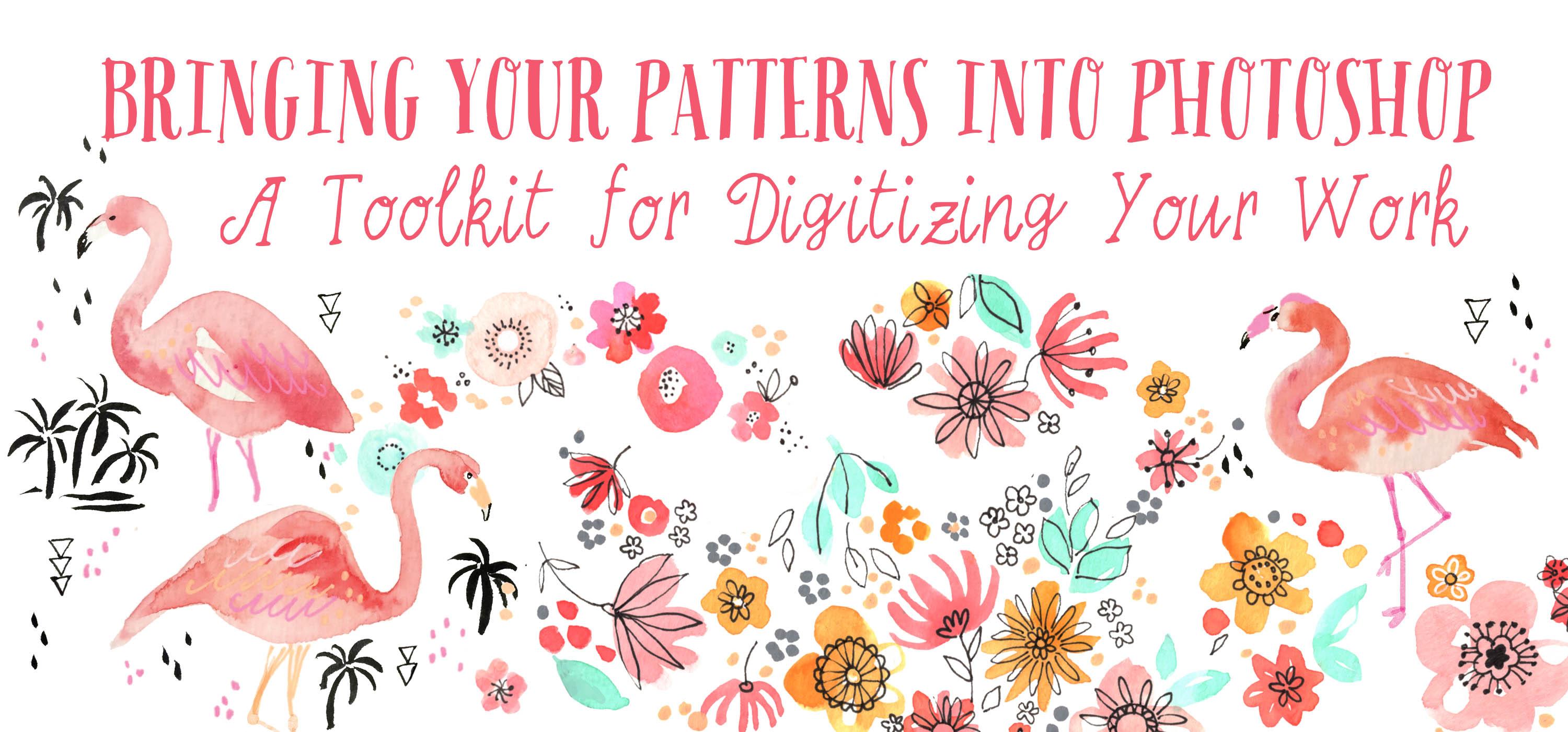
7. Using Photography & Basic Repeat: I wanted to show you this example, which is relatively straightforward making it into a repeat. The only issue that I had was the legs of these flamingos. Many of these flamingos had been cut off and this was made into an actual wrapping paper, as you can see and the client asked me to, please, can you add the legs? I'm going to show you how I did that. The other issue was, when I just looked at a rough repeat when I gauged it, the trees weren't making a very nice formation. I had to move that around as well. When dealing with fluorescent pens, which I do sometimes do, I take a photo of the sketch in good natural light and then I transfer that photograph into my Mac using AirDrop or e-mail it to yourself. This turned up in the download section of my computer and I'm going to call up the image size. Its option command and I and you can see at 72 dpi, it's 34.9 meg up here and it is 56 by 42 inches, which is massive. But I do want to bring that down because it's going to be too large for me to be playing around with. I'm going to change that to 300 dpi and make this 13 inches. You can see it's just that little bit smaller than 34.94 meg and that's absolutely fine. Even if you change it down to 600 dpi, you can change it to seven inches and it's still coming in at 37.9 megabytes, which is absolutely fine for the purposes of what we're trying to do here. Again, we're going to go through the process exactly the same of creating. I'm going to duplicate this. Then on this layer, we're going to play around with the levels. Take this and go to the background. There we go. It makes it really bright and vibrant and we're going to just remove the background using the marquee. As mentioned previously, I did have to add these extra legs onto the flamingos, which I did put in a separate layer and I used a Photoshop brush to try and recreate that effect. Next up were the palm trees, which I did remove from that area because it formed too much of the solid mass when you put them with the palm trees on the left. In this occasion, I had to remove the little one and the ones just here, they came out completely. What I did with was separate them so that they went below that flamingo's legs. This is another example of a half-step repeat. I then placed it on a pale, blue, green, aqua background, and I think it looks really marvelous against that salmon pink color of the flamingos.
8. Basic Repeat Pattern Examples: In this section, I want to show you some other examples of simple repeats where I've literally scanned my sketch book page and haven't had to play around with it too much. This is special cover, just indicate middle class. This is the original artwork for it. Again, this is a really straightforward example where I didn't have to change too much the anything was the shell that was missing in the bottom here, and if you want to take a look, all I did was add a little bit more blue there. I didn't play around too much with the geometrics on the dots, I pretty much use them as is. The background was taken away from these blue seashells as I showed you and placed in a new document and made into a smart object, this is what happened. This was just a simple half-step repeat but it worked out really well. This is another little sketch that I really enjoyed doing so to the vintage five coffee pots with bits of geometric thrown in. When I came to making the repeat, I realized some of these just didn't quite work out. So I did place into new document and play around with some of the positions of the elements like this little coffee pot. In the original sketch, it's more up here. I did move things around a little bit to make the pattern work, and as you carry on with your pattern-making, you'll know when something is working and when it isn't, you become intuitive. Here is another sketch straight out of my sketchbook where I remove the background, and I'll show you the pattern that I created from it. As I started repeating, I realized that there was a bit of negative space here, you can see up there. I decided to add another version of lemons up there. All these patterns ended up in my red bubble shop. I wanted to show you one more example where I played around with some of the elements, and added a few more florals manually because of the negative space. Here on the left is the original scan for this little floral, slightly dixie infill. I removed the background quite easily, and if you remember when I showed you one of the introductory videos there was a gray plonge right here which I removed. This is the tile that I created to make the repeat. As you can see, I had to add extra little elements because the way it was repeating vertically it wasn't a very pretty repeat. The most obvious was, I remove these bits here and in this file you can see all the extra elements that I added, like the flowers here, and also down here, just to fill up the space there add a bit more color contrast. This is the repeat that I created, it was a half drop and some of these aspects do overlap each other which made a really nice effect here. Also it just gelled together really nicely, and it was the exact same method that I've been showing you where you create a small object and you have to play around with various layouts to see if they're going to work, but overall, I was really pleased with this, I think is really pretty. This example is slightly different, here is the original sketch and what it go turned into was bushy tapes. The client was quite specific about what I need to do the set up, and obviously it has to repeat the certain way. The best example I had to take pineapples and completely [inaudible] them so that they would fit within the artwork format that she listed, and the repeat is here. That's that pineapple, and there's that pineapple again just here.
9. Techniques for Solid backgrounds: Part 1 - Poppies: One of the sketches I turned into repeat was this one, believe it or not. As you can see, there is a huge amount of water damage there. I don't know what happened but I think something leaked through and there's discoloration here. There's an entire bit of poppy missing here and the poppies go all the way over the page. But I did turn this into repeat for somebody and it was actually easier than you imagine. Once you are able to follow what I do, I hope that you'll be able to achieve really great repeats in Photoshop too. Here's the poppy scan with the dreadful water damage down the left side here and on the face of it, it does look a little bit overwhelming. But trust me, there is a way of doing it and it is more complicated than what I showed you last time. But if we use these tools that I talked about at the beginning, you will be able to work out when you come to do your own artwork which tools to use on which occasions. I'd like to point out that depending on the artwork, every technique is going to be slightly different. You will be using these tools for sure but because of the nature of the randomness of some of the patterns that I create, it has to be tweaked. It's not like a one size fits all pattern-making factory. First of all, create a copy and work from the copy just in case. What we're having to look at is the extent of this water damage, it's literally half the flower. I have noticed here, this flower is very pretty and what I'm going to do is actually use my lasso tool and select roughly half of this pattern. Fairly roughly because I'm going to show you what else I'm going to do with it afterwards. I've selected that area and now I'm going to copy and paste so that is on its own layer. Then, go to alt, T and drag it over and let's turn it around. That's not bad, that fits quite nicely. I think that's a bit of the funny shape. What I'm going to do is go to Edit, Transform and then I'm going to flip vertical and that will do a flipped mirror image. That looks better for me, that looks a little bit more copy like. We just need to adjust it slightly because it's a little bit too big. What I might do is go to Edit, Transform, Wrap, which will bring up this graded box and you can pull various parts within that box and it will distort it slightly. The majority of your image is going to stay the same and it's really going to help me in trying to match up those petals, that's pretty good. As you can see, if I zoom in, you can still see bits of that happening there. So what I'm going to do is go to this icon here, which is a masking layer. I'm going to click that and I'm going to mask out those areas which are just forming outside of the petals. I'm going to use just a brush and we have to use black, I'll show you. I'm just going to use a box and the brush at maybe about 20 pixels and not too hard, maybe set of 76. What you'll see is when we are on this masking layer it looks like I'm erasing it but it isn't. We're actually drawing this mask in and you can still see the water down just coming through. But we're going to deal with that in a little bit don't worry. That does look much better. I know you can still see the water damage but we're going to deal with that in a minute. This one also needs to be looked at, I'm going to select another petal and a good one I think to use would be this one here. I'm going to select roughly half of this poppy, just quite roughly because again, we're going to be masking it. So command C and then command V and you will create it's own layer and press command T for transform and we're going to just turn it slightly. Rotate it so that it doesn't look too much like the petal that we copied from, that's pretty good. I'm just going to take away so you can see it's on its same layer. Again, we're going to have to mask bits of that off and go to the icon to create your layer mask and we're going to brush it out, just press B for brush. Now we're going to look at the water damage that is underneath those poppies that we just introduced. The best thing to do is to take areas of the original artwork which is not water damaged and patch it together. We're going to have to create area roughly, that shape and this shape from what we've got here. Let's try doing that. Copy and paste that area and I'm going to bring it here. Put that underneath and I might do option and command and duplicate that again and do a bit of rotation. The next thing we have to do is look at this area down here. What I could do looking at these two copies is actually duplicate them and see if they can fit in the area there. There's a bit of a gap there. I've just noticed. I'm going to use the spot healing brush to join those areas together. See that makes it much nicer. There we go. So pop that behind that poppy. Just turn it around a bit. Let's see how much we've got to play with. That's quite a lot. That looks good. Now next step is actually filling up this space here because these petals are going to come down and fill up that space, so I don't want that there. I've already got a little code up another layer and I had started patching things together. I'm going to just use the clone stamp to close up that gap. I might make it a little bit bigger than ten pixels, about 38. Stop there. Make sure it's on the right layer and select a point to clone. Now we can look at these petals. I have noticed here on this side that there is a petal just not doing very much there, which is very handy for me, because I didn't know it at the time, but it's going to come in very handy. Now select the right layer. Don't worry if you're picking other things as well because we're going to apply layer after that. You can go copy and paste, so it's on a new layer and we're going to bring it down and it's going to become part of this petal. Let's turn it a bit. We might have to enlarge it just to fit within the dimensions of that poppy. Probably just because it's easier, I'm going to use the same petal. I might just flip it, edit, and flip horizontal. Just gives a slightly different look to that, and I'm going to make it tiny bit smaller. I added a layer mask and took away some of the background around the petals. At the moment those two petals do look like they've just been cut and paste onto that layer, so we need to look at something to rectify that. There's a device called liquefy. We're going to look at this petal first, go to filter, liquefy. You can see it's in it's own little layer. I'm going to just drag it up slightly to breakup that very straight line. Let's see how that looks. Press ''Okay''. That looks so much better. We'll try the same with this one, so filter and liquefy. I'm just dragging it up slightly as well. Because it's blocking out some of the line work underneath, I'm going to go in on the mask layer and just reapply that. Let's see if we can bring down the opacity so I can see what I'm doing and bring the opacity back up. That looks pretty good, same again with this one. Now it's simply a case of choosing relevant petals like this one on the top left and I dragged it down to try and patch up this flower that's on the bottom right. Again, this is a technique that I've covered just earlier in this video, cut and paste, mask it off, blend in so that it looks a lot more seamless to that sits behind it. I used the petal just immediately to the left of it and I pasted it into position, used a bit of liquefy, masked it. Same again, technique up here, cut and paste a little bit of a petal that looked quite similar use the liquefy tool to blend in a bit better. In order for the repeat to work, I had to erase the petals on the very far right and fill it in by using a patch of the red background with white spots. You can see in a moment that I cut and paste from that upper section towards the left. Also missing was the final petal on the top right-hand corner. What I did was cut and paste a section of the petal just below it. Then I was able to transform it, use a little bit of liquefy and mask off parts of the background. We are now able to compile the technical repeat using this tile and this is what happens. Do bear in mind that you have to have these tiles in the correct order, otherwise, when they overlap, they don't look so good, so do be mindful of that. After I put the repeat together, I realized there was a tiny section which was missing, so I thought the easiest way to patch that together was actually to fill in the entire background of this repeat in color that was very similar to what I was already using. If you zoom out, you really can't see what's going on there. I thought that was a good compromise. I know I've covered a lot in this particular video lesson, but I urge you to play around with all the techniques and tools until you become familiar with it. If you want to re-frame it in your mind, is like a very elaborate cut and paste, patching these together.
10. Techniques for Solid backgrounds: Part 2 - Tiles: Over here on the right in the layers panel, you can see that I have created an adjustment layer. I just boosted the colors using levels, and now I'm using the marquee tool just to cut out the background. I'm dragging the guides over because I want to see if any of these tile or points line up. This would be a good point of reference for the mirroring technique that we are going to use for this particular pattern repeat. There's a few bits that do line up so we can work with that. Definitely. I've increased the Canvas size so that we got a little bit more room to play around with. As always, I do a manual repeat where I'm just dragging the layers over and just seeing how they could line up potentially. This is just a rough guide for the next part of the process. That layer I duplicated it and did [inaudible] and made it into a mirror repeat, I'm just lining it up now to see if there's any potential there and yes, that does look quite good, so we can work with that for sure. Potentially, this could be our tiles. I'm duplicating that entire section there and lining it up with the bottom section. Again, this could be a really good way of making this repeat, so it lines up quite nicely at the bottom with a little bit of fiddling. At this stage it has been converted into a smart object so that I can start playing around with the offset to make a technical repeat. I'm just inputting some offset figures now, and I realized that where it joined up, it was just a little bit too tight. I went in and I looked at that area towards the bottom, and what I did was to use marquee tool just to stretch it and then fill that tiny gap you can see just to give it a bit more space to play around with. I looked again at the tiles that were making the repeat where it mirrors and I decided I didn't actually like this one. It was just a bit too bulky, so I had to just reduce in size by selecting it with the last hue tool. At this stage they're on two separate layer so I just decreased it in size. Afterwards, I grouped those two layers and then duplicated it and flattened it so that I had a copy to work from, and then I started deleting the tiles that didn't need attention. I wanted to concentrate on those tiles in the middle because they needed to look a little bit better and match up a little bit better. I wanted to diffuse that line of symmetry, so I went in with the clone tool and just made it a bit smoother and tidy at the top. Also the outlines of these tiles need just a better definition there a little bit lopsided, so I just smooth those out as well. Next up, this green tile, it wasn't going to repeat, because the middle of that decorative bit wasn't bang in the middle. I had to pull it to one side and then use the spot healing tool just to patch up that area there. To make up that tile, I cut and paste it, cut it in half, put the two halves together. Again, I could see that line of symmetry. I was able to go in with that spot healing tool just to blend that in, so it's not so evident. Next up was just that little flower icon which I just cut and paste onto a new layer and then I went in with the healing brush tool just to blend it in once again. I referred back to the full tile to see what other areas needed work and as you can see, the very top left corner, it was going to be overlapping that green tile which I rather liked. I started making decisions about which tiles I was going to erase and which tiles I, we're going to leave in. I used a masking layer to give the impression of erasing the tiles that I didn't need for this repeat. The corners that I did decide to keep, I copied and pasted it, did transform and made mirror images, which I cut and pasted together so that they formed whole tiles. Towards the end of the process, I found myself refining the shapes of the tiles if they were just a little bit skew with or there wasn't enough spacing in between and these little details, these little attention to detail really does make all the difference. I know it sounds like a lot of hard work, but I just want a balanced pattern, something that is very pleasing to the eye. I reduced the size of this green tile. I just thought it was just a little bit too big, and then I'm going to delete the background so that it sits on that white much better. The last thing left to do was to assess the spacing between the tiles. I had decided to put a white background so that all these amendments, you can see there's gaps between each tile on some occasions that they weren't going to show you through. They just needed a little bit of tweaking to be aesthetically pleasing and so that when they're repeated, they weren't going to be really close up next to each other or even overlapping. Here's the finished pattern of the tile and if you remember, the original sketch in my little sketch work, I honestly didn't know how it was going to repeat. What you see is a lot of initiative. I didn't see this in YouTube, I didn't read about it. I just worked out for myself and I know you can do the same too.
11. Techniques for Solid backgrounds: Part 3 - Abstract: Starting off with the original scan, you can see that on the right-hand side I didn't fully complete it, but I was able to take away the background using the magic wand. I've now placed it in a new document and this is where we're going to create the repeat. I assessed where some of the colors we're merging into one another within a vertical repeat. I decided in this instance I would use a half brick repeat. I know in theory how a half brick repeat works, but this is the first time I've actually put one together. I thought this is the perfect opportunity, because this abstract lends itself to something a little bit different. Next up, I created a layer mask and I started masking out, or erasing bits of the edges because I wanted to patch them together and blend together a lot more. We're going to see a bit more of that in the next few minutes. For this abstract, I'm using quite a large textured brush. Again, this is on the masking layer and you can see how varied and large that area is, that I'm masking out. Now I'm looking on the right-hand side. I want those pink areas to gel a little bit better. What I did was to use my lasso tool, and I copy and pasted that right-hand side onto a new layer. Then I used the liquefy tool, just to pull it along, and to enlarge that area so that I had a bit more to play with. Now I am going in again on my masking layer using a large textured brush just to soften those edges, so that they are going to mesh together. You can see just behind me, where if I update the smart object, it's beginning to happen, but it needs a little bit more work. Please be mindful of the order of your smart object layers, because you do want them to overlap in a certain way so they all create the same look within the repeat. All the time, you need to assess where you're at. Just pause, give yourself a moment, or walk away and come back again to see what's happening within your pattern so that you can come and look at it with fresh eyes. As you can see, there is two harsh a line between the tiles that are repeating vertically, so what I did was to cut and paste a little section of that top half. Then using the liquefy tool, I'm just stretching it ever so slightly, so that you're going to see what I'm going to do with it next. I'm going in again on the masking layer, using a large textured brush. I am just erasing those sections at the top that we just liquefied, so that they have a much softer transition onto the layer above. You can see what's happening there. One thing that I noticed was sections of these little white icons are being covered up, so that's something I need to look at next. As I mentioned, I've not actually done a half brick repeat before, and one thing that I did realize was, that layer orders really do matter because the harsh edges were because I had them in the wrong layer, and the ones at the bottom had to be rearranged. I mentioned earlier that there was a section which was overlapping with the white geometrics, so I had to look at that. I just simply use the lasso tool to just cut out the relevant shapes and delete it, and when I hit the update, it worked out really great. I just wanted to say again that this type of abstract repeat pattern is a first for me. I did think that I could do it, but it's not until you try that you really get to understand some of the ins and outs and pitfalls and considerations of creating a repeat in this way.
12. Solid Background examples: I just wanted to show you some more examples of where I've made a pattern using a sketch where I filled in the entire page. Now, this red autumnal pattern, this is the original scan that I used and I want to show you the tile that I created from it. As you can see in this section here, I have soften, the edges I used a masking layer, and I masked off using a brush, a gentle brush, so that we are going to be blending in with a background. I'm going to show you what I did afterwards. Also I had to move these sections here, just little details like that, just to make the pattern flow a lot better. This is the repeat that I created from the original sketch. If I'd show you what I'd put in the background, it was a solid color, quite dark, so that it would try and blend in. You can't really see the edges because I've soften those edges using the mask. It blends in really nicely with that background color. Let's zoom out, just really quickly. It makes for quite a nice Dixie style pattern. The example I want to show you now are some lime that also appear to my sketch book covering the whole page and as you can see on the left, there was water damage. It was very similar to what happened with the poppies. I did put a vibrance layer on there, just to boost the colors. On the right, we have the tile that I created so that it would repeat technically, as you can see, I had to add sections here and here, and also down here and here. What happened in this case similar to the poppies was I had to delete that lime so that this one could repeat. Again, up here, which is here, this whole section, I had to patch that line and dot back-grounding. It was just a matter of copy and pasting it together. It worked out really nicely. This is the pattern that I created with that tile, is just a basic repeat. It just goes across because there's so much going on and if I just zoom out a little bit, you can see that there's some lovely graduations in color visits over movement happening there. I have to say, I wasn't sure if it was going to work out, but I think I did quite a good job and I'm quite pleased with that.
13. Vertical Repeats - Berries : I've started taking away the background on these berries. One little tip that I don't think I've included is holding down the "Shift" key while you're using the magic form and you are able to select multiple areas. As you can see, there's a little plus sign next to the magic wand and then when you've got the areas that you want, you can delete them. I'm using this method because clicking on the contiguous would also mean selecting the highlights within the barriers, which I don't want to do. Now, I'm just going to manually look at these branches to see how they line up with each other. If I zoom in really close, you'll see that they don't line up terribly well. So that's something that we need to look at next. I'm dragging over guides, so that you can see the top and bottom of each branch and where they could line up. You can see in this section here, it falls just to the left of the guide. I'm going to move up to the top of the branch, so you can see what's happening in that section. Again, it's falling way, way to the left of that guide. So what I did was to use the last tutor and I cut around it and I moved it over, so that it would line up with the guide. I press "T" to transform so that I could push it and pull it, so that it still joined onto that branch where I cut it off. It does take a little bit of maneuvering but it does look pretty good afterwards and it joined up very nicely. I used the spot healing tool just to go over those edges, so that they looked a bit more cohesive and so you can't see the joints. I forgot to mention that I am working on a layer mass so that I'm not destroying the original. That branch was just a little bit too thick, so I just used the less-ing tool to cut it out and refine it a bit more. Another aspect I had to look at was removing some of the barriers that were just floating and were not going to be joined onto any branches, so there it went and also refining some of these branches as well, looking at the bottom and the top of this particular section, it was just a little bit too wide there, so I used the less-ing tool, again on that masking layer to make it just that little bit thinner and more aesthetically pleasing. Next, I looked at this branch just here that the three berries on the left are attached to. There's a white gap there. I use the healing brush tool by clicking on an area that I wanted to blend in with and it did work out really well. Another tip that's really useful for blending, especially where this branch joins the other one, is to use an eraser tool on quite a large setting and own down the hardness of it. When you update, you can see that it blends in quite nicely with the branch underneath. I'm doing this with some of the other branches because it really is quite effective. You can see the pattern forming.This is just a basic repeat and I did try a half step as well. Either way, I was happy with and I think it creates a really effective pattern.
14. Bringing in Ai elements - Halloween: Here's a copy of my little potions watercolor sketch that's been sitting in my sketchbook for quite a few months, and there was a spring flag competition just recently, and I thought that was the perfect opportunity to create this into a pattern. It needed a bit of a boost, so this is what I did with it. Here's the cleaned up version. As you can see down here, I've got various adjustment layers, four levels and color balance, and I decided that the original was a little bit crude that the hand lettering, I obviously did it in just a few minutes and it needed a bit more need to be refined. I actually photoshopped all the lettering out. Well I left some of it and I had to reattach this one. Say moving on to the actual tile, as you can see hold on. I kept most of the same layout at the position of these bottles, I didn't change too much. As you can see from my original, but I did feel that in order to add a bit more interests because I want to add icons as you can see here already, batson, spider webs and skull and cross bones. I needed to create some space, so I actually deleted some of these bottles so that I could have enough space to add other elements which I'm going to show you. One of the things that I did want to add was flat versions of bottles just to give it a contrast between the watercolor versions and the flat versions, and these bottles created an illustrator. I scanned in my line drawings and then vectorize them as an image trace in illustrator. I selected the bottle, did copy, went to Photoshop and then did paste straight into the document as a pixel layer. There we go. Then it is own its own layer and you can move it around. Again, other elements that were vectorized in Illustrator like these panels, decorative panels and also the crow or they, this one was from an original drawing which I tend into a vector, and it just gives a crisper feel, a nice outline. That's why I vectorize and then bring it back in to Photoshop. As I said, I often do this way. Other things that I can bring in is other little decorative elements and also this hand lettering. Again, the hand lettering,I did I scanned and I factorized it and it just gives a crisper feel as before, I image trace this in Illustrator, then cut and paste into Photoshop, and they're on their own layer. You can see here that they're all like the Boo, Magic Potion, Elixer, which I now have spelled wrong, and the other extra elements. These extra elements were drawn straight into Photoshop using the laser tool. I'm just going to show you here. If you go to command Delete, and it will give you the background color or foreground color. If I change the foreground color to say red, and you do draw a circle and option and delete it will fill in the foreground color. That's how I did these little dots and stars. Again, this is something that I do really often, and it gives a much more spontaneous feel that's not the best star, I just add to it again. There we go. Now we're going to go on to the final person. I pity on just sort of I suppose a bone colored background is the only way I can describe it. There was a bit of playing around with it so that of all the elements would fit together very nicely and often weave these things. It's a case of trying something out, saving it, and then seeing how it pans out. I did have a tricky time. I knew I wanted to put cobweb in here, and I have to say it was one of the things that I put in towards the end, and I didn't know where it was going to go, so I had to move it around and think, does it work behind these bottles? Does it work behind these bottles, but in the end I got there. Some of this is trial and error. There is no hard and fast set rules and you just have to experiment and sometimes it happens within minutes. It's great, and sometimes there's a little bit more involved. But I'm really pleased with this pattern, and it's exactly how I wanted it to turn out. Fun and lively, and lots of things happening in there.
15. Final Thoughts : I really hope you've enjoyed this class. I know there's an awful lot to get through, but I do hope some of it made sense and you will be able to tackle some of the basic stuff first and play around with it and try and evolve your own style. What you come up with will be completely different to what I come up with because we all work in different ways. Your way of working will evolve just like mine is evolving, and there are still loads of sketch works which I haven't even attempted to repeat, and I know that I'm going to have to think of some weird and wonderful ways of making them into patterns, but I'm not going to change the way I work. I did this the other day, and I'm wondering, "I wonder how that's going to work as a repeat." I just did it and I thought about the repeat afterwards. I just want to emphasize again that I am self-taught and there's many things that I still have yet to learn, but I am really happy to keep on learning, and keep on pushing the boundaries, and stepping outside of my comfort zone sometimes by learning new techniques and faster ways of working. I hope I've given enough for you to be getting on with and to have fun. Please don't be disheartened by some of the more advanced techniques. Just take it easy. It's taken me three or four years to get to this stage, so go easy on yourself and enjoy the process. I really can't wait to see what you achieve. If you want to tag me on social media, please use the hashtag, "OhnMarSkillshare" and I will try and find you, and I will try and comment, or I would be more than happy to see your work in the Class Projects section, so please post it there. I'm sure there will be a little competition that I will run so that we can encourage you to share your work, which is really important. Goodbye for now. I wish you a very healthy and happy week. Bye bye.
 Ohn Mar Win, Illustrator Artist Educator