Transcripts
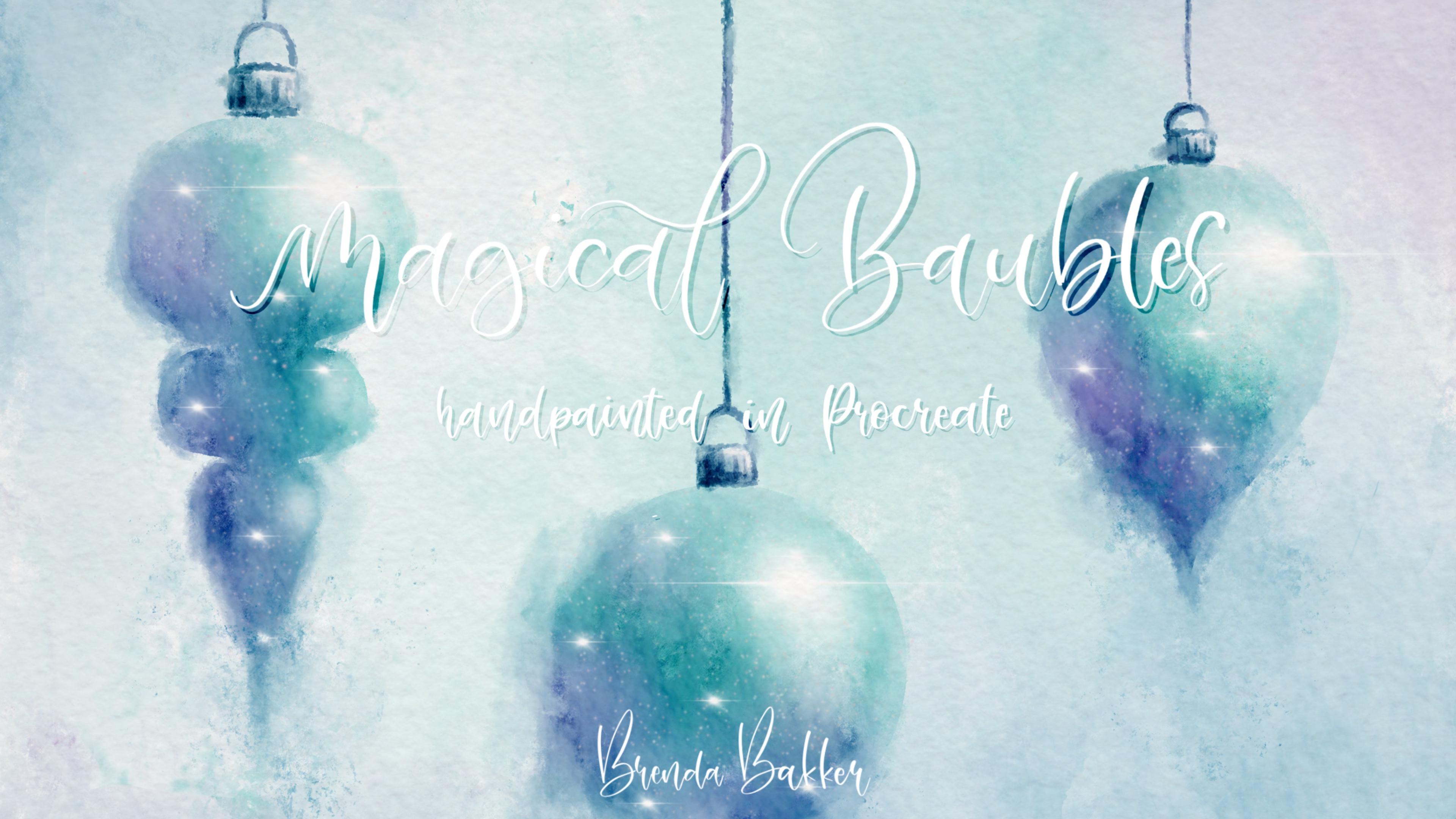
1. Intro: Hi and welcome to my new skill share class. My name is Brenda Bucher and I'm from the Netherlands. In this class, I will be taking you step-by-step on how to create a painting such like this. We are creating it all from scratch. So we begin with the making of the layout and then we're going to color, we're going to fill, we go in to smudge. We're going to blend in beautiful colors, beautiful highlights, shimmer, and make it till it's one complete, a magical fairy tale like painting. So I hope to see you in class. We do it slowly. And most importantly, have fun while painting. See you in class.
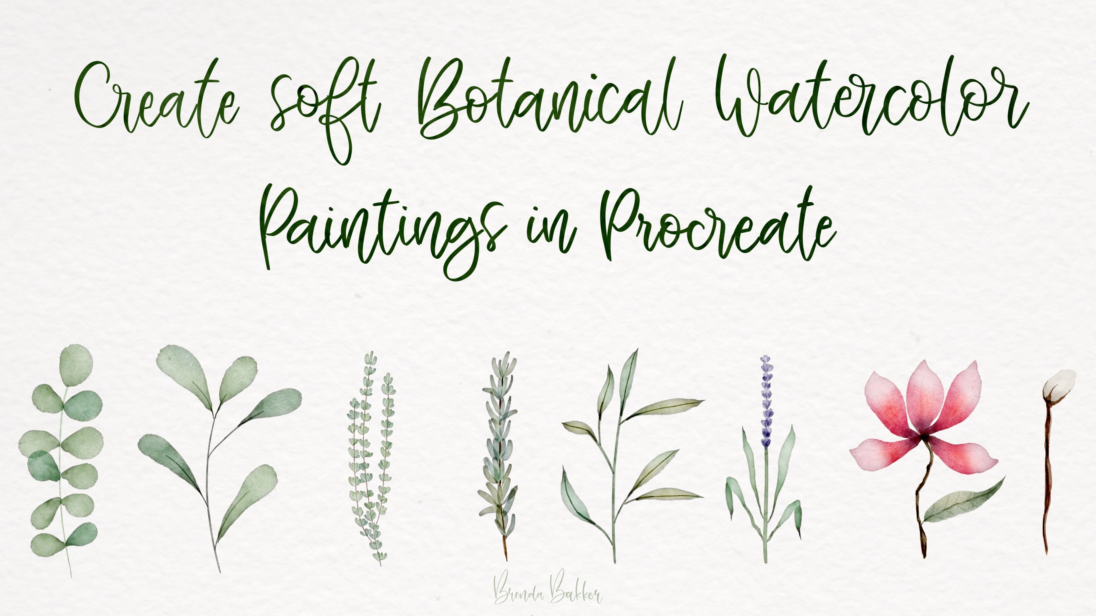
2. Import all materials needed : So now it's important that you can get to import the phones and the canvas and the brushes. And for that you go to the skill share in your browser. So not in the app. You go to the projects and resources section. And you'll have to read all this. Very important. And there you see tapped to see More button below. So Seymour. And then you can scroll down. You then get to procreate canvas, the magical bubble gloss, brush at the swatches and to lettering fonts. And I will see, I will show you how you get them into your procreate. So tap on the procreate canvas. And there you can see opening, procreate. Tabulates export. Open in our click just to procreate. And it will import right away. And then it will be the first one at the left top of your procreate. So then we go back to Safari again, the brushes, let's tap on it also. Let them do the work. Export, find procreates. And it will be imported in your, in your brushes. And you can find it all the way on top here, all the way on top of your brush library. And for the swatches, let it important and export procreate again. So it's almost the same way. And your swatches will be found type or swatches, pellets. And it will be at the bottom. If I'm correctly. Yeah. It's a very small swatch, three colors and just black and white. More you don't need for this class. I will keep it simple. And for the fonts are made to for you. One is you brush letting font and the other is a fun latrine font for dose. You can also, while here, you can see an example of it and click on its export. Procreate importing. And the fonts you will be shown by at that text. And this is new. I click to the little letters here. And then you can see the fonts as in the BB brush lettering. And when you do the other one is the BB found lettering. So have fun with it. And let's get into the glass.
3. Creating the lay out: So the first thing you wanna do is make layout with the brush stamps. And I'm going to start with number three. Well, that's easy, right? I always have to do things and things in different order, but make it large size and just stamp it. And then you can resize it to your liking. I think it can be pretty big. And don't bother when you resize it. When drawing is a little bit sooner than the other because we are only going to use it as an example. Create a new layer, do everything on a new layer so you can make adjustments later on. And another one on another layer and you can make as many as you like and different range if you want. So now that we have this year, we can make adjustments. So when you want something like the middle one, you want to have it more downward. So like here perhaps. And this one is a little bit, and I want to have it a little bit smaller. So just about here. And now I think they're okay. Let me check if they are in the center. So I always do that by clicking updates and that's not needed to be done. So I can see is this one is centre just about yet. I bought I eyeball it and now I'm going to put them. I think this one can be a little bit higher. It will be like this. This one a little bit lower. Well, now it's time for me to make adjustments. So does why do we know what layer am I am going to needs to the middle round ball. Yeah, I think it's like this. And then we go merge those layers together. Now I've done on one layer and I'm going to make these strands little longer. Why? 6b pencil. And just go all the way from the bottom to the top and let it snap. Put your finger on it so it get a straight line to the top. And I'll change the color because I hope my finger there, two lungs. The bottom here to the top, let it snap. Put your finger on it. And now I've got a real straight lines so they don't get cookie hanging. So yeah, I like this one. And now for something we're going to make another selection because we're going to recover it.
4. Let’s do some coloring: So after you did your layout, we're going to color it. And that's where the funds coming in. And we're going to do that with an automatic selection. So choose selection, choose automatic. And then we're going to tap and swipe it little bit to the right so you can get, you see when it changes the whole screen. But when I pull it a little bit to the left, my threshold is on. And so now I can totally fill it in. Now I'm swiping a little bit to the right. Now. Just what the point of it when it's getting the whole part, you get to go back to where it's not. So you get the exact shape of this. We're also going to do this with this one, just approximately where the shape will be here, and also with this one. And now I've got all the three shapes selected. And what we're going to do now is not very hard, but you have to pay attention. So we going to create a new layer on top of this. Now you see the blue is gone, but you have the striped marks. And we're only going to color in debt, but we have to do it on a new layer, so make a new layer. And that's where I mostly get rid of this layer for drawing because I want to see the whole shape and not a drawing. So I'm going to click on this little square here so the drawing won't be feasible, but it still has its selection. So never touch that one in this stage. So now you see we have the shapes of the Christmas ornaments. Just only the shapes are not a drawing. And that's where we're going to color in. And we have to do that on a different layer. So now we're going to take the watercolor scribble brush. And I'm going to use some blue and some green. I will create a color palette and with not so many colors, This one is which one I create from a former drawing of me. And I'm always start with the blue one. And at the very small size, so like say 10%. And just going to make slides, move, just tapping and damping. If you did my watercolor, we'll class you known this already. It's very easy. Just do it to your liking with the colors you like. You don't have to use, especially this color, but it's fun. And for me, I see it much more clear with these colors. So, so just tap and advocates, it's multiplied brush. So when you go over it, it's going to duplicate the color. Multiply the color, and now we're going to take some green as well. And I do approximately the same and mix them a little bit and change some colors. My light will be coming from the upper right corner, so that's where I'm going to keep it light, but we also going to do that in a later stage, but you can make some adjustments to it later, but keep it in mind so you can keep it a little lighter on there. So for me the light is coming from the upper right corner and that's why keep it a little bit lighter, but we're going to make some adjustments to that later on. So just keep that in mind when drawing and coloring. And now I'm going to use the same tool to smudge, just tap and hold, and it was switched to the same tool. I'm going to blend it a little bit, but I also go into tap and depth because I want some little watercolor structure and texture in it. So just keep in mind that it's got to be very yeah, texture arised. So that when I like just little bit moving around the colors, blending but never too much and just depth and depth. And remember, you can get some paint out and smear it out, but you can also get the whites back in. So be careful with that because it can easily make your color muddy, muddy. Yeah. Not as bright and vibrant anymore and unlike brighter, vibrant colors. So keep that in mind. So not use too many whites to get in. On my English is very bad right now, hope you still understand me. Just relax and move those colors around and blend to your liking. Make sure you can fill up the whole color of the whole, the whole shape. And this, you can be very quickly done. You can do it in five minutes, you can do it in three, but you can also spend half an hour on it. It, it doesn't matter, it's just to your liking. And now we're going to make a new layer on top of that. And I just go to get the drawing back. But I lower the opacity of it. So I just only can see the shape. And now I'm going to get a color out of this, which alike take it a bright color because my textured layers on top, they also darken your colors. So take alike light color out of your painting. And I used to take a light blue baby a little lighter. Yeah. I guess that one. And now I'm going back to my watercolor scribbled brush. I had them on, but I'll make it fair every tiny about 2%. And now I can get the selection of and I'm going to trace the little tops and threats. And so let's get to it. Just trace it a bit. And I think just go over it a few times. I wanted a little bit more bluish.
5. Add some colorvariation: In this next phase, we will go on to make some nice color adjustments to it so we can create some more vibrant and different colors. And I do it very easily. I go to my coloured layer here, and it's underneath the white accents. So I'm going to do it with an clipping mask. So I can only color just what is to be seen here on this layer. So it's clipped to this layer. And for now I'm going to go to a little pinkish color. And when I blend this with this overlay brush, it's soft airbrushed, but in overlay mode. Now, we can choose to create some lovely, vibrant and different colors in it. I've put it slightly down in opacity, so I don't want it to be very overwhelming so you can get over it. Go over it again, and then the colors will get more. See, seeable. I think this one is already too light. I think that's just enough. Yes. Creates some little color variations in there. With colors you like, you can you can choose any color you like, right? But I think the purple, bluish in green look well together. So I guess that is fun. You can also do it a little bit on the right here. And you see the wild one change, but it's an overlay so it won't change at all. So this way you can create, so let's say orange, orange cone. Well, I don't think so, but I can show you what it does to the color. So it creates some very different movements in color you see like that's to your liking. You can create your own way.
6. Creating the colorbleed: So now we have all the colors where we want it to be. But it's not magical and it's not fairy tale like. So let's go over to a smudge tool and create some very romantic Christmas ornaments. So go to your smudge tool, set to 1011 percentage and smudge away. You may make sure you can still see the lines, but not too clear. Just let them blend softly into the background. And not too much because we can always go back to it later when we did our background color. So I'd just like to keep this down and drain it a little bit so that it flowed into this. So here you can still see the shape of the, of the ornament. But you can also see it's very painterly like so, and I like it. You can do this also with the other ornaments. And for me, I like to do the left side of the argument a bit more than the right side. I don't know where it is because it's just a feeling IF and painting is all about fields. So if you like to do it another way, please be my guest and make sure you do it to however you like it. Make sure these stay intact. And just keep on Deming. And sometimes it's fun on this part to just smash in some colors. Just like it's fading. Come out of the mist. It slipped into my pencil again instead of smashing. And now I've got it on eraser. Well, nice work, Brenda. Smudging and each matching. When I think too much it goes wrong. And because English is not my native language, I have to think very hard for this. So just do this to your liking. Opec to little smaller because I went to bathe it in. So make sure you can still see all the shapes at all time. But play with those. Yeah, color beads, called them. And just zoom out every once in a while. And I think this is okay for now. So now I think my colors matching is right where I want it to be. So the, where it hangs from a very clean. You can also do this with as much a little just some leakage here and there. Just a little bit bleed, water color bleeds. Resolved, tip. My pencils very sensitive, so I have to work very careful not to let it bleed too much. Just make it believable. And now I think this is totally done. And now I'm ready for the next phase and that will be the brightness and the shimmer and some highlights.
7. Creating more magic with highlights and shimmer: And now I'm ready for the next phase and that will be the brightness and the shimmer and some highlights. So I start with a new layer on top above of all the coloring and also on top of the white acts. And so we make a new layer all the way on top. I go to my white and then I go to the nebula brush, which is a default brush. And I'm going to create some little shimmer highlights. Let me see how big it is. Well 6%, I guess let me try. Just creates. We have some pressure. Some highlights over here is just a little bit more variated down when you would use only as a soft airbrushed. So that's why I chose this brush for it. And create just a shimmer. And it's almost all white again. And make sure it stays soft when blending into the rest of the year. Christmas ornament, just zoom out and see if the overall looks like you wanted to. Yeah. And I think this can also be using a little highlight on this side as well. And this side also. And I think that's still believable. Yep. Ready for the next one. And for this, each of this, i will make a new layer because then I can always change my mind about things and redo or delete them. So taken you layer, go to the next one. That's the glimmer, also in the white color. And just make some nice little dots on it. Just to make it look more painterly. Don't overdo it. Just do liking. And you can also, when you like the Mount you made but you think their way in your site, then you can also play with the opacity. You can make them more opaque or not. So I think about 40, 73%, It's fine. Just so you can notice them, but they're not right in your face. And on top of that, I'm going to news the flare. And then it's on a smaller size like 5%. Let me check. Yeah, just make some depth here and there. Just to create a 1001 night kind of Christmas ornament. And for all of these, the grader highlighted spots, I will make a bigger one. I think that's great. Mic can be bigger. Yeah. So now I get it low into the ornaments itself. And that's what I was looking for. And I think the the ornaments themselves are ready. So time for the background.
8. Creating the background: So now we're going to do the backround. And for the background, we go all the way to the bottom and create a new layer all the way down. And then I'm going to my water color scribbled brush again and put the size way up till about, well almost 50%. And there are chooses the same colors that I used before and just splash and depth them. Not too dark. I'm guessing that will be too dark, but I'm going to smudge it. We can always add color or removed color just to like. And I'm going to put in some purple as well. And let us see what this will bring us by smuggling at the same size to about 50% ish. And let's go and make it some light. Again, I'm lighter colors. It's having a damping. If there's a dog outside, I hope you don't mind. It's not our dog. Our dog is very big and she has a way louder bark, but she doesn't often bark. So this is also something you couldn't have done in almost five minutes, but you can play with it for hours till you like. That's why we'd all do its own separate layers. And you can drag some widen like so from the outside. That's too much. And you can also bring in new colors, if you like. Don't much every texture away because texture is what we need for this piece. You hear my tapping, a dabbing, so you need what you need and what you're looking for is that your background has to be lidar around the ornaments. Can make darker edges if you want, but vec round must be lighter than the ornaments. And then I think there's one ish finished. And what you can do, and now is go back to your layer of your, of your Christmas ornaments and maybe smudge, aim or dragging some more of the coloring. So go to this much to endure. Scribble brush again, and then drag in some color and let it leak into the background. Make sure keeping the sizes very clear of the shapes very clear. Just zoom in and out every once in a while. I think I went too much. Oh, go back there. And if you like, you can also make it go disappear in a little bit. And that's, it's one you go on top of all the layers and much in again, some of these colors, if you like. And then smudge it in again. Bigger size. Just play around with it, but just make sure you do it on different layers. Now you've got a little more texture. Perhaps. Yeah, I like that. I didn't do the homework practice before, but I like it. So let's do that again. Just like the color. That's too much. The colors blushed and leaked bits so much it again, some little splitters here. And I think we just created a very nice and lovely painting for our holiday season. And let me show you what you can do this, what you can do with this in the next chapter.
9. Exploring other colors and finishing the work: So now we've finished our piece and we can do a lot of things with this. But before we do, we going to make a duplicate of it. So go back to your gallery. Duplicated. So you always have your spare one and your original ready, and then you can play with it. These paintings I did here you see here. I did all was that in the same color? But we're going to make some changes because we can make a very nice-looking picture. You can make it for a Christmas card. You can make a menu out of it. That, which I've done here. This is a menu I cheated from, from the internet. Just tried to make look what I, what I would like for my Christmas dinner to be. And then you can play with the size of the ornaments and you can create lovely menus. And when you printed it out on a canvas and hang it on the wall or you can send invitations with it, or just you can make everything in the same style. So that's why we're going to duplicate it. Keep the original. This is the original. This is a duplicate. And what we're now going to do you see that we only have very little layers. There's one we don't need. So I'm going to delete it. And now I'm going to group all of these together and group it. And I also want to keep this intact, but I wanted to duplicate it. Make this group for smaller and invisible again. And this group, I'm going to flatten. So now I've got one picture, what I've made. And underneath it, it's a group with all different layers separately. But that's not seeable. And now we're going to do some fun things because we're going to play with our hue, saturation and brightness. And I'm put non layer mode. And with dead one, I can play with some color adjustments. I can make it to my own interior or maybe the interior of someone. You are going to ship your cards to play a little bit with the saturation. So now you've got a totally different painting of what you made before just with some coloring. So you can play with that one. And now I'm getting into the atmosphere like you see in all those Garden centered, at least when we go by all IRA, Christmas ornaments in garden centers these days. You can create every color to your liking. And as long as you don't go back to your gallery, you can always go back. So what I'm going to do is create and share, took a jpeg of it. So I always have this one in my album. And now I'm going to play some more. But you have to start out with a, with a very saturated and colorful piece. Otherwise you can't change things. Choose layer and then we go all the way up here and you can get a nice pinkish, pinkish one. So it's for every. Interior you can choose for brides. I think that's the way to much brightness. Keep them 50, but you can play with it. You see very small details in color or, or brightness. Saturation can make a totally different picture. So let's go back to where we were. This is the original No, this is one step ahead. Flatten this and make this one unsayable yet. So this is where we were. Let's go the other way. It's more bluish, purplish, keeping away saturation and Brian, and then you get a more silvery kind of painting. So that's what you want, right? Well, for me it is actually. And with that, you can use some text if you want on top. So if you're ready with your, your painting, you liked it like this, then you can add some text. And therefore you can write with your own pencil like here, and take a color out of your picture just by holding it. Well, let me see. So now you can make new layers and right on top of it. And make sure you choose a lighter color. And let me write something less opaque. New layer on top. So you write, don't write on the same layer. And you go on to write some words like Merry Christmas or Let's get rid of this layer with line underneath it. And here you will have a totally handcrafted hand painted Christmas card. Well, I think that's lovely. So I hope you liked these lessons and let me show what you've made out of it. And the projects and about sec section of this class. And let me please let me hear what you were, what you think of this class and I hope you like it and have fun with it. Make it to your own liking. Create your own stamps with ornaments, and go ahead and have fun. I've also did this one with a Christmas trees. So just about the same thing. And with some snowflake brushes, some snow, just some hand painted flourish. So you can do anything with it. This is my own lettered font. I made a font for you, which I will also put down in the project session and about such section of this class. So you can use the fonts also as well as righted in euro on hand lettering here I did some use saturation and brightness magic also, so you can create everything you want. And this one is with a very, very heavy coloring. I did also changed colors, and this is also a font I will put in for US, also handwritten by me. So you can change the style to your own liking and new colors to your own liking. So I hope you liked this class and I hope to see all your funding and great results and I hope you, I hope you like it. Thank you for watching again and see you next time.
 Brenda Bakker, Sharing my skills is sharing my joy