Transcripts
1. Course Introduction!: Hi, my name is Tim Wilson from Red Rocket studio. I would like to take you through creating amazing logos and illustrations from sketches. We'll start with a rough sketch, take it into Illustrator and then use so many tools from pencils depends. Basic shapes, gradients, colors to create some incredible logos and illustrations. Have a look. These are the sort of things that we will be creating in this course. If you don't have much experience in Illustrator on the iPad, why not do our Illustrator on the iPad course first? That way, you'll have all of the skills you need to complete these projects. Because now, although some of these logos look quite complicated, I'm going to take you through everything step-by-step, so you'll be able to recreate them yourself. Start right now. I can't wait to help you to create amazing logos and illustrations from sketches.
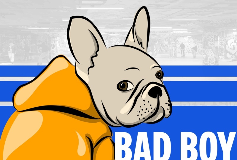
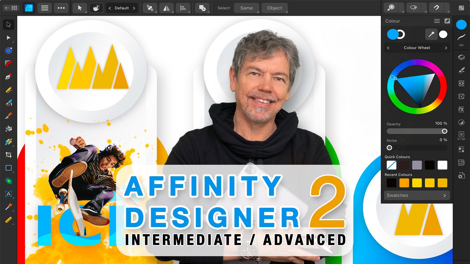
2. Aqua Logo Introduction: Let's get going with the first project. In this project we're going to make this amazing logo. And we're going to just use circles and the pencil tool to cut out bits. Once we've done the basic shape, will then start to add some gradients in. And finally, a bit of text.
3. Setup & Import Pencil Sketch: Let's get started with our first project. What I'm going to do is I'm going to click on create new in the bottom left-hand corner. Now, once I've done that, I would like to then choose from the print section or the screen section. If you choose from screen, you'll find that your settings generally default to pixels. And the color mode is RGB. So if you're doing something where you want a very bright vibrant colors and it's going to go for the web or social media. Wherever on a screen we would choose screen. If I go to print, then generally our settings in here are to do with print setting. So we've got things like points or millimeters that we can work in. And over here, the color mode is CMYK. The big difference between these modes is that RGB has got the brighter colors than CMYK. If you choose one, you can't change over to the other one. But do be careful if you start in RGB mode. When you go to print it out, you'll find that a lot of your bright vivid greens and you'll vivid blues will be dulled down slightly. I'm going to choose screen for now and I'm just going to pick one of these sizes. I've picked that second one in there, which is 1366 by 768. That is really not that important because we can change it later on. I'm going to click on Create file. Now that I've got my document open, I want to bring in the drawing that I want to redraw. Now, if you've done your own drawing and you want to work on that yourself, what you can do is you can click on this little button here. And if you've, for example, scanned it in, you can bring it in as a from a file. If you've taken a photo of it with your smart phone, you can go to photos or you can actually click on camera and then use the camera on your iPad to actually take a photograph of it and come straight into the document. I've got this already, so this is also included in your course. And if you go to your files and find your, it's called the Aqua logo document. Now that I've caught that, I would like to actually do a few things to this. First of all, I would like to lock it in position and also to make sure that it's lighter. So if I go to my layers over here, I'm going to make sure that I've selected the image. Just below that we've got the properties and the properties. I'm going to change the opacity so I can lighten the whole thing right up. Let's go back to the properties here. And I'm going to click on the little padlock next to the word image and that locks it down so I can't move it by mistake when we're actually creating our logo. Haven't bit of a go with that. Get either your own graphic going on something similar to this. Or if you want to use the sketch, bring it in, lockdown, lighten it up, and then come back for the next lesson, we'll start actually redraw the shape.
4. Redraw with Vector Pencil: Now I would like to draw this using some of the simple tools. So I'm going to zoom in first, I'm just using two fingers here. I tend to use my right hand over here while I'm drawing to just use two fingers to zoom in and out over then move the image around. And you can of course use your left hand in there and then use that for your right, whatever works for you. So I've got that quite large on my canvas. I'm going to come along and use one of these simple shapes. I'm going to use the elliptical shape in there. Now, I would like to have just a stroke on the shapes. I'll choose the stroke option down there. And if I click and drag from the top, I can then get a circle going on or lips. If you hold down the touch control over there, you can make sure that you constrain that ellipse to a perfect circle. Now, of course, you can also use two fingers to undo. You can also draw from the middle outwards. So if I start where I think the middle of the circle is and I'm drawing out. I go to the touch control and I go to the outer control there. Now it's actually drawing that shape from the middle outwards. I'll get it roughly right. Of course you can always still using this move tool here. Go along and move those, that circular round. You can still scale it and if you hold down the touch control, you can scale it proportionately. So there's my first shape done. Now what I'm going to do is I'm going to draw in these lines over here. I'm going to do that using the pencil. If you prefer to work with the pen tool, That's absolutely fine. But I'm going to take the pencil over here. And in the pencil, I'm going to go down to the controls because we've got a smoothing control. If you're smoothing control is set to say, for example, 0. When you start to draw a line, you might find it is a little bit wonky puts in a lot of points that way. So let's just undo that. So with the smoothing, I'm going to set my smoothing all way up to ten. And this will, you can see if I do it now will give me a very smooth point or a smooth curve. So with that setup to 10, I'm going to start over here. I'm starting right outside the shape, not on the line, but right outside the shape here. I'm going to go along, go into a shape around, whole way around like that. Once again, I've finished outside the shapes, I'm kinda cutting through it. If not quite correct, we can always use this little tools. The second one down, which allows us to click on the individual points and adjust them separately. So I can go to this point here and maybe drag the handles until I get it looking UPS. Now, if you click and hold on, appointed deletes it. So I'm just going to use two fingers undo. So I'll just keep going around until I've got the sort of shape that I wanted over there. Said I can adjust the handles in there, maybe pull that out a little bit like so. I might move this point in there a bit more of an angle going around there. That's fantastic. So let me select both of those shapes now. And I'm going to click and drag with my Move tool to select them both. Then here's the trick. If you go along to the property of the properties, Let's try that again. If you go along to the combined shapes option. If you're combining your shapes now the first thing is you can't actually see what you're doing with your shapes there. If I chose a different fill color so that you can actually see what's going on. When we get to combine shapes, you can kind of see the shapes, how the happening in here. None of those are actually what I want. What I do want to do though, is I want to use divide all the vitals. Really cool because when I click on Divide all what it's done now. And I will just make this black so it's easier for us to see. When we go to the layers, you'll see that there's a group here. And within that group are those two shapes. You can see the overlapping areas have just disappeared. So in here, if I hide this one, you can see I've got this shape here. If I hide that one, I've got this shape over here and they are separate shapes. The group together at the moment. So if I click on Ungroup, they're just two separate shapes in there. Let's do that again to do the next shape. So I'll just hide one of them. So I'm going to hide the big one. Do the same thing again, I've got this shape now. I used the pencil. I'm going to draw in the curve that I want. Perfect. Use my Move tool. Select them both and same again, go over here to combine shapes, divide the mall. And I will ungroup them down here. So you can see if I hide that one. For hide that one, I've got that. So lastly, this shape here. Let's do the same thing again. I'm going to use my pencil tool, drawing the shapes that I want. Like. So select them both. Same thing again, combine, divide all. Now with this last one here, which these are grouped together with just ungroup them. You see I've actually got a shape that I don't need. This shape here, don't need, only need that one there. So I'm going to take this shape and I'm going to delete it. Let's show all those shapes again. And we'll start up here. I'm going to give them some color. So it's easy for us to see them. So we'll start with that one there. Onto the next one. Sort of some blue on that one. And non tell last one. You'll notice that I'm very quickly going from filter stroke by clicking on that little double arrow between them That's flicks them over. And I'll choose a different color for that. Get yourself up to this stage and have a look at it, what it looks like if you hide that image as well, It's looking quite good at the moment. I like my little logo that's going on there. And then the next stage will be doing is we'll be putting on some gradients onto this. So to give it a bit more depth, try it out.
5. Create Gradients: Let's have a look at getting some colors together. For this particular project, we are going to be using gradients, but I'm going to make up the colors first. So I'm going to go into my fill colors over here and choose the colors that I want. Now with a gradient, I want a light blue or bright blue at the top and I want to get a slightly darker over there. With these shapes here. I would like him feed generally darker but to be darker closer. So it looks like the wave is kind of casting a shadow onto them as well. So what I'm gonna do is I'm going to start off and say, well, this bright blue is going to be my brightest blue for the top. And I've got it over there. But then I want a slightly darker version. So I'm going to just click in here and choose a darker version, like so. And then I'll click on the plus to add it in. So I've got that second color in there. You can see here it is over here. Now, that's fine for that one. What about for these ones over here? Well, let's go and apply the gradient first. Then we can see what works with those colors. So I'm going to click on the wave itself, the, the bit that's coming over the top. Then I'm going to go over here to my fill. I'm going to choose Gradient. And I would like to use a circular gradient like that. Now you can see it's automatically just put on this very nasty gradient will move those across. You can see it a bit easier. Now the first thing is I can move this gradient around and then I can adjust the gradient. So I want the lightest point, the highlight to be hitting this section at the top of it, they're going to move this around so I can actually see it. We're going to pull that down, however they choose at this part. And with that one, I'm going to click on my second or the darker color. So it goes from a bright color up the top. It is subtle through you can see if I do that to a slightly darker version on the sides there. You can then move the middle as well. So if you want more of the light part and less of the dark, you can just adjust that middle section like that. Let's have a go with the other colors as well. So once again, just going to click off of that, I'm going to go and make up some colors in here. So for the next one, I'm probably going to have similar tones to these ones over here for now. So I might start off and say, Well, let's start with that color there. But what about if we made it a little bit darker? And then maybe we could also have a much darker versions. I'll just save that version and I'll go with a darker version for the shadow in there. Remember, we can always adjust these later on. So if they're not exactly how we want them, because this is starting to look very green and less blue. For the last color. I'm going to go back to this one here and I'm going to adjust the shade slightly in this, we get more of a bluish color over them. Save that one. And then a darker version of that for the shadow. Let's try putting those together and see how this works. Nothing is set in stone. We can always adjust it later if we need. So I'll go over to this one. Up to their onto gradients. Choose the radial gradient, could put the middle up there and pulls out something like that. That's going to be the dark has point. So that's where I'm going to choose my darker version of that color. And this one here is going to be much darker version from there. Now, once again, you can adjust this if it's not quite right. Now if you've done it the wrong way round like I have a let's go over then change that. So this one will actually be the darker version, and this one will be the, the lighter version. I think it looks better that way. Let's go back to this last one over here. Once again, I'll click on the color gradient, radial gradient in their place, this underneath. And same again, that's going to be my very darkish blue. And this one here which is kind of coming out from there, it's going to be my lighter blue. That looks too close to that. So I can always go in here and just adjust this color, tweak it around and Tom happy, or just the actual hue, the color on the color spectrum, until it works for me. So I'm going to just take that back a little bit, like so. We have that in there. You can of course, always go totally wild with your colors in here and say, well, you know, why should we bother with having this green one in there when we could go in and go for something completely different. So I'll go to the oranges, maybe choose a dark orange and they're going out to a lighter orange in there. If you feel that that's what you need for your logo. Don't forget, hide your image to see what the final result is actually going to look like. Try it out, do some interesting colors in there, get your gradients going. And then we'll take this little logo bit on one step further.
6. Add a Shadow: Let's add a bit more detail. In the shadows had like just a sort of most solid line in the shadows. What I'm going to do is I'm going to do it by using some of the existing shapes. So I'm going to take these two shapes here. I'm going to make a copy. So click on the Copy button there and copy them. Now I'm going to take those two and I'm going to join them together using the combined shapes. So it combines them into a shape like that. Don't forget to convert that to a path. So this is now a solid shape in here. And then I'll use my pencil tool. So before I do that though, I'm going to go in here and I'm going to choose a none for the fill. Or let's try that again on sulcus. So none for the fill and the stroke, I'm going to make black like we did when we drew the initial shape. And I'll use a pencil. Do the same thing again. Once again, I'm just on the stroke, no fill in there. And I really want the shadow to be kind of this area here. So I'm just going to draw it from there around like so it's not write two fingers to undo it. Let's try that again. I think that's pretty much what I'm what I'm after, but I'm gonna do it one last time. I think that's better. Then I'll select both of these shapes. I'm going to go over to the, once again the combined shapes and use divide all. And that divides them into two separate shapes. Remember there are grouped together. So click on your ungroup button and you'll see now that I've got that one which I don't need. This is the one I do want. I'm just going to fill it with black, so no stroke and black and place it back from where it came. Okay, Looks a bit bad at the moment. But if I go to my Properties now and go down to the opacity and change the opacity. So I get some of those colors coming through underneath. You can see what a lovely little very soft shadow that makes, but it gives it a harder edge in there. And you can always adjust it if you want to try it out a little bit darker. That's fine as well. Let me do another one for you this time. On the top, I want a more of a harsh highlight. This is a very soft current members lack a little hard highlight on there. So I'm gonna do the same thing. But I'm going to start with this one. I'm going to go and make a copy, move it across. I will go in here, solid color, choose none, and give that a stroke. So I've just got this basic shape again. And then I'm going to take the pencil tool and I'm just going to draw from here that will shape that I want. So something like that. Let's take both of those two shapes using over here, the combined options. I'll divide that and it's divided. I will ungroup it and get rid of this bit down here. So this kind of gives me the shape that I want for my highlight. It's bit large. I'm going to take it down a little bit here. It's not going to go right to the edge. That's where I want the highlight to be. So how do I make a highlight? Well, I'm going to fill it with black or fill it and get rid of the stroke, go in there, choose white. And then in the white options, I will take down the opacity. And that's going to give me a very subtle little highlight. On the top. It makes it look a little bit more plasticky or glass-like, and you can just adjust that to exactly where you want it to go. So have a bit of a go with that bit of a shadow under there, a bit of a highlight there. If you want to try the shadows here or shadows on the bottom, feel free to give it a go, even a highlight to the bottom. Whatever works for you.
7. Make a Gradient Highlight: Let's take this highlight on a little bit further. And asha, your lovely trick that I use with highlights. At the moment we've got this highlight which is just white and it's gotten capacity on it. But when I change this highlight, you'll see it kind of goes right the way to the edge DE, looks more obvious on the darker areas. And I'd actually like to just fade out to nothing towards the edges. Well, that's actually really easy to do. We'll just make it a bit more solid for now. Instead of actually using a solid color, I'm going to go with a gradient for this. And I'm going to use a linear gradient. Now with the linear gradient, if you want to add in more points to your gradient, you just click on the line itself. I've got three points in mind. So I've got the start point, the end point, and a middle point. The middle point is white. The outer sides are also white. But if I go to this outer side here, I'm going to change the transparency so it barely visible. I'm not making it as absolute 0, but about two-thirds the way down, maybe 30 percent or so. And what you see from that is that when I go back here, I'll just click off of it. My highlight is more white in the middle and it slowly fades off towards the edges. And let's just double-click by mistake there. If I just adjust the opacity there, you get something a lot more subtle in when it comes to shadows and highlights. People shouldn't look at your shadows or highlights and go What great shadows and highlights. They should just not see them at all. And it should just augment the whole of your graphic. Try that.
8. Add a Large Shadow Under Logo: Let's do a bit of a shadow underneath the object so it looks like it's floating in space. Now the shadow that I'm going to do is not actually going to be a dark black or gray shadow. I want to use some of the color from the object. And once again, it will give the feeling that the object is not quite as solid. Because remember, the whole idea of this. It's aquifers water, it shouldn't be too solid. So I want to get a bit of a feeling that's kind of quite light and almost the licensed gone through it. So my shadow, I'm going to use blue. I will take a little shape like this and just draw shape the bottom. And you can see at the moment I've got a gradient in there. Now, the gradient that I want to use for my shadow, because the light's coming down. Technically, it should be over to the left a little bit more, but I'm gonna keep it underneath the object. I'm going to use a radial gradient over here and I'm going to pull my gradient out. But if you go to this other little handle, you can then pull it in so I can make the gradient sort of the same size as the shape. Now I'm going to choose the color that I want for the middle part over there. So I'm going to pick a, a blue and now make it a little bit darker maybe. And for the outer part, once again, I'm also going to have a very similar blue. But then on the outer part, I'm going to go and I'm going to change the opacity of that color. So what will happen now is my gradient will go from the blue slowly out to transparent. And same again because it's a little bit on the harsh side. I'm just going to go in there and adjust my a pasty slightly. And if you find that it is a little bit maybe too, too blue or too obvious, go and change the colors and try something a bit darker or a bit brighter. Whatever works for you.
9. Add Text & Export: So finally, let's put in some text and save this out. I'm going to go along to my Text tool. And I'm just going to click once and put in the word that I want. So I'd like to just select this bit of texts. I've double-clicked it and I'll put in the word aqua. So a queue, you, I'm happy with that, but I do want to still select this and change the typeface on there. So if I go along to the type options over here, you'll see there are no type options in there that I can use. But if I go to the type itself, we've got the double tee. If I click on that and then got an option to change the size. So where do we change things alike that the font itself? Well, I'll select it again. And if you go down here, remember you've got your properties which change depending on what you're doing. So in the properties option, this is where we find the text options for changing the typeface. And I'm just going to go in there and choose something which looks very well traditional, shall we say, are like that one over there with a big Q coming down underneath it. So I'm going to go with that one. And I think I do need to change the color of the text because it's a bit harsh and black on there. So I'm going to choose a different color in here. Maybe a sort of more of a gray color that would work with the logo that I've got. Right. I like that and I'm just going to pop that underneath. You notice when I'm dragging these things around a little red lines that pop up and that shows me that I'm exactly lined up underneath that logo. There's so many things we could try out now as well. And when you have a go with this yourself, try different things, see what happens if you actually change and maybe move the shadow below it and put that above it there. With that work doesn't really work on mine, but yours might be different. So have a bit of a try with those. I'll just undo that. Once again. In fact, I'm going to go to this, I'm going to make it very, very subtle underneath the shape so you can barely see it like that. Bring up my aqua and that's now ready to save. So when I want to save this, if I want to share it with myself, and I'm going to do it on the desktop version of Illustrator, for example. What I'm going to do now is close it. And all of these items here are available on Illustrator on my desktop using the same Adobe account. Of course, if you want to send it to somebody else, Let's opened up again. If I want to send it to somebody else, I wanted to send them an Illustrator file. Well, if we go up to the top here, this is the Export button. Go to Publish and Export. And in here we can do a quick export as AI. And this will allow me to save it as an Illustrator file. Wherever I want to save it. We can also go down here to Export, As I've got a number of other formats that we can export this in from jpegs through to PNGs, SVGs, PDFs, and finally, Photoshop files, which is PSDs. Try it out, have a bit of a go with that, have fun with it. And remember, try out using that option where you can actually draw a pencil line and then divide the whole object up. It makes life so much easier for creating interesting and exciting gradients. And sorry, interesting, exciting logos, shall I say, with exciting gradients on it. Have fun, create something amazing.
10. Pizza Drawing Introduction: Pizza, one of my favorite food types. Now, we're going to be creating this piece of pizza from the sketch. It's infinite. It's available in your course files if you don't want to draw it yourself. And we're going to be using a lot of the usual tools using fills. We can be using the pencil, you can use the pen if you like. We're going to use the brush to do some of the line work and get that real inked feel to the drawing. And finally, we'll look at doing some shadows and highlights on this as well to give it that really cool illustration, professional luck.
11. New Print Document & Import Files: Let's do a new project. I'm going to click on create new in the bottom left-hand corner. And I'm going to choose the print option up here. And I've only chosen print because I did screen last time. If you want to do screen that's entirely up to you. Remember, print will give you the CMYK options. Screen will give you RGB color mode options, but you can change that to either or. So I'm going to choose A4 and I'm going to go landscape this time. And I'll click on Create File. Now as before, I'm going to go over to the left-hand side and I'm going to choose Import. And I'm going to go to files and find the pizza image. Now, this pizza images have been given to you as part of the course. And of course, if you want to draw your own by all means, do so. I just did this little graphic here by having a look online and seeing what everybody else was doing. Now, let's set this up. So up to the top right-hand corner, I'm going to go along to Properties and I'm going to reduce the opacity as we did before. I'm also going to click on the layers. And this lay here, I'm going to lock, so it's locked down so we can't move it by mistake. Right? We're ready to go and get some drawing done, but we're going to be doing a different tool to the one that I showed you last time. Come back for the next video.
12. Using the Blob Brush Tool: Last time when we did our drawings, we were using the pencil tool which is over here. This time though we're going to go with the brush tool because I want to have a brush shape on my lines to give it more of a well, an inked type of look. So I'm going to be choosing the brush tool there. You can see when you click on it, there was some sort of pre-set brushes in here. But I need to go down to the brushes, the bottom, and to the brush settings. Now in the brush settings, you'll see that we've got the basic brush. And I can change the roundness of that brush. Now, I know it looks a bit strange when you first see that in there. But basically if you take the roundness off when you adjust the angle here, you can see it's more like a calligraphic brush, the way that it's working. I'm going to take that roundness up to the top. We can also adjust the ends, the tapered ends in here. So you can click on the tapers and you can adjust them in here as well. More of a taper going on in there. We can also go down to, let's close that down. One. We can go down to the pressure dynamics and adjust the pressure that we're using for the brush. And lastly, we've got a little option here which says merge brush strokes. Now I'm going to switch mine off. And this is really important. The number of times I've been doing a drawing without checking my layers. With this switched on by mistake. And what it does is it merges all your brush lines into one. Now that can be very useful. But the way that we're going to be building this illustration, that will really, well, it just won't work. Let me show you this. I'm just going to choose a black in here. And very quickly in my solid colors here, I'm going to go to the black shortcut button. There's a white and a black shortcut button in there to choose black, you'll notice I've chosen a fill color rather than the stroke because the brush uses a fill. Let's go down here again and you'll see if I have merged brush strokes switched on, which my layers, when I'm actually drawing lines like this and like that and like this and that one there and this one there and one day, you can see they've just made one object here, one shape. They've all been merged together. Now I'm going to delete that shape. So I'll use this tool here. Click on one. You can see they're all selected and I can delete them together. Now, the one that I want to use, of course, is merge brushes switched off. And this means that every time now that I do a stroke, each one of those will become a separate object in my layers panel. So I'm going to undo that. I'm using two fingers over here to just undo. Once I've got that set up, I can also go over here to the size. You'll find that if you have your sizes too big and you start it in there, you get, whoa, that's a little bit, little bit over the top. Let's undo that. So on my example, I'm probably going down here to about a size four, but you can do whatever works for you. In fact, it's just tweak that and we'll make that five so they're a little bit thicker. Just experiment and see how it works. So I will move this up and I'm going to rotate it around a little bit as well. So I'm using two fingers to rotate. And the reason I've done that is because tonight's angle for me to draw it. So I'm going to start off by drawing the triangle of my pizza. So I'm going to start over there and just draw it down. Doesn't have to be perfect. And you can see as I'm sort of putting different pressures on, I can get much more interesting lines in there. That's my triangle done. It's really as easy as that. Okay, let's go on to the next ones. I'm going to do this bit as well here. So I'm going to start over here and I'm going to draw around the top stuffed crust back down here, back to where it started over there. And notice that's not a very clean setting in there, but it's going to be a sort of an overlap on there. So I'm not too worried about it. Likewise with this one here. And that then gives me two or three actually shall I say separate paths. You'll notice one of those parts called a compound path. A compound path. And it's because it's joined up, is wherever you have a shape that's got more than two strokes to it. And this shape here over here has got two sides to it. You've got the outer stroke on here and you couldn't in a stroke on there. This one here has just got one stroke that goes all the way around the outside. So that's what a compound path is. It's just a shape has more than one stroke attached to it. And it's because I joined that up, that he made it a compound path. You get your basic pizza going and then we'll put in some melted cheese on top of that.
13. Draw in the Cheese Details: Let's draw in some cheesy bits. I'm going to use the same thing in the brush and just go round here to join my cheesy sections. You'll notice that my brush is very slow and that's because if you go down here, you find that you've got a smoothing option. And with the smoothing set to a 100 percent, it's trying to submit that that line is much as possible. If I reduce the smoothing, it will speed up the brush, but the brush went smooth out quite as much as it was before. So I'm just going to do a few of these. You don't have to do exactly like the original drawing. I'll have a nice big cheese coming down there and a few over here. And now for this section here, this is the stuffed crust which I, I absolutely love. It shouldn't actually be melting as it was on the drawing, but it shouldn't be nice and smooth like that either. So what I'm going to do is just go in there and just do a little funny line over there and another one just down here. So it won't be quite so smooth. So it'll look like some of the crust is kind of study coming off of it. And I think that's it for our lines. Well, without doing the bits of tomato end things inside it. I'm going to stop there, get up to that stage, and then we'll move on and we'll put some coloring.
14. Add Some Fill Color with Pencil Tool: Let's start to fill in these shapes. Now we can't just go and fill in the shapes that are here because these shapes themselves are actually fills. That's what the brush does. When you create a shape with the brush, it makes an object which is filled and these are filled with black. If I were to go over here, I'm going to use the pencil tool. If I were using a pencil, I did those lines well, we wouldn't have the nice brush looked lines, but I would be able to fill it. I'm actually going to use the pencil tool. And I'm just going to draw in the shape that I want to fill it with color. I'm starting off with the cheese here. So moving down to my colors, I'm going to go and pick and make a nice sort of yellowish cheese color. I'm happy with that color there. And I'm going to add it in my swatches of there. You just click on the little plus to add it in. I don't want to stroke here, so I'm going to choose none, that little button there for my stroke. And now I'm going to start to draw that in. And when I'm drawing one, I'm doing some drawing down the middle of this brush line over here. If your drawing's not that accurate, first of all, you can zoom into a bit more accurate, but also you'll find that after you've done it, you can always go and use your tool, your Move Tool, sorry, the node tool or the points tool to move those little points around. Now that I've got that, I'm going to change the order this yellow. And if I click and hold on that object, I can then move it down below all the other objects. And you can see how it appears to be filling the background shape. Obviously, we've still got other problems here like these ones over here. But let's do that again. So I'm going to zoom into this one using the same cheese color with my pencil. I'm going to draw in this cheese melted bit over here. And you can see that's above those ones. So I want this to be above the two background ones, but below this, it gets a little bit confusing. But once you start to move these up and down to make sense. So if I pull that up above those two, you can see it looks like that's actually filled with the right color. Let's do some more heavy here. So once again, I'll just go in here all the way round. That's actually in the right position. Same with this one here. And it's going to do that one. That one's coming into the right position. If they're not, just go in there and move them up and down until you get them into the right sort of stacking order. They're looking good. And this one over here, right, you can see our cheeses are all looking pretty good. And we didn't do exactly the same thing now for the crust. So I'll just pick a different color in here. And I think maybe I'll just make it a little bit more orange brown, something like like that. But that's a sort of a crusty color. We can adjust any of these bits. And I'll add it in just in case I lose it. Look, I've made a mistake there. I didn't realize that that was actually selected when I did it. So of course I can just go and choose that color to get it back. That's why I always keep them in the swatches. All right, Let's de-select that. And start again with these top ones. So same again, using the pencil. Getting my appropriate fill color. And I'm just going to start over here and go around my stuffed crust. Okay, so now we've got to adjust this one. So I'm going to click over there and go down a little bit. Sure where these should go. No, that's still not right. Keep going down. There it is. That's below the below the correct one. Same again. I'm going to go and do these ones. Once again, I'll zoom in. I'll start over here and do this little crusty bit, right way round there, up to there and round. And that now also needs to be in the right position. So if I move it above that one, there we go, Look at that. So can Good. Last one here to this one, It's going here. That's in the right position. So do watch your layering positions in here. Let's hide that background, see how it's looking. Looking pretty good. Even if I say so myself. Right, we haven't finished this at always took tomatoes and pepperoni and stuff to put on it. But I'm going to stop there so you can have a bit of a go with this. Keep your layers open so you know where things are and just move them up and down into the right stacking order. And this time we're using the pencil tool with just a fill and no stroke.
15. Group Objects in Layer: Now, before we actually start drawing in the other items on the pizza, Let's go in and clean up the layers. So I've got quite a few different layers here. What I'd like to do is to just group some of the items together to make my life easier. So starting from the bottom over here, I'm going to select these two items. How our select one, hold down the touch Control and then select the second one. So these are the two lines that go down the side, and I'll just group them together. Let me do the same thing for these bits of cheese over here. So I'll do all the runny, the melty bits. Once again, click on group to group them together. The only reason I'm doing this is to really make my life simpler. In here, I'm going to select all these little bits here. I'll leave it like that. Group those together. The ones from the top section can be grouped as well. And let's group that. I think that's pretty much done. Maybe these two could be grouped, so we'll select both of those and group them together as well. So have a look and see how you can clean up your layers to make your life simpler.
16. Draw the Tomato: We're going to be drawing some tomatoes now. So I'm actually going to hide all these items over here by just clicking on the little eye on the right-hand side in the layers. And that's pretty much hidden. All of them, whoops, except that one there. I just want to see this background. Now, if we use separate layers for the various parts, we could actually hide these very, very quickly, but we've got them all within one layer, all the objects within one layer. So it's not such a problem. By the way, these, sometimes I do refer to them as layers. These are actually objects and they are within the layer itself. So if I do say layer by mistake, Sometimes I'm talking about these objects here, sort of see what I'm doing rather than listening to my voice. No, no, don't do that. Listen to my voice too. Anyway. I've got everything is in one layer over here and I'm just hiding the objects except the image in the background. So I want to draw eight smarter. So I'm going to zoom in over here. And I'm going to draw tomato by actually using a shape. I've, we can, I'm going to use this little elliptical shape. And I'll draw in my shape just pretty roughly. So maybe tilt a little bit and then move it over like so. And I'm going to make that shape black. Now what I want to do, because I want to have a black outline. And the black outline is going to be, well, it's going to be thicker enthroned in different pots to kind of match the feel of the strokes that I've got on the rest of the illustration. So to do that, I'm going to select the shape and I'm going to go in and make a copy. So I've now got two copies. The inner shape, I'm going to give it a color. I'm going to make it slightly smaller. So you see when I drag this in, and especially if I twist it a little bit like that, we can get a certain interesting line going on in there, which is not the same all the way round. So that's just a fast way to get that ETL shape going on. Rather than using the brush tool, it would take me a little while to draw something quite as nice as that. Let's do the seeds in the middle of the tomato. So what I'm going to be doing, some need to be doing this kind of section over here. Now do the same thing again. I will draw an elliptical shape over here. Once again, I'm not worried that it's exact. I'm going to manipulate to go in there. And this shape I'm going to cut in half. So I want to bits and I'll do that by using a tool we haven't used in this project yet. I'm going to make a rectangle like so. And I'll give it a different color so it's easy for you to see what it is. I'm going to rotate that rectangle and put that across those shapes. They're a bit, you can see what's coming next. If I select both of them, go over to the right-hand side from the last project we were using the combined shapes quite a lot. I'm going to use Minus Front and then go down here to convert to path. And I've now got that. You can see it's a group as two pieces are actually ungroup is here. So now I can get to the individual bits by themselves. So here's the first one. And I'm going to use the same technique as I did. Then I'm going to make a copy, move the copy underneath one. If I make that black. You can sack and pull this top one over, make it a bit smaller and manipulated rounds. I get an interesting line around the outside. Technically is not aligned, but it looks like a line. Let's do the same with this. So this one here, I'll make a copy. I'll go to the underneath one and make that black. And move this one across. But pull it down a little bit, some scaling it down. I'm not scanning proportionately. I just want this more hand-drawn look. Right? It's select those to just pull them closer together like that. Select all of those and group them together so I can move the whole thing around. And that's going to go on top of my tomato. Now have a bit of a go with that. And then when you come back, we will have a look and see what we can do by putting some little limb seeds inside that.
17. Draw Tomato Detail: So let's get some seeds going on in here. Just before I do the seeds, I'd like to have this inside of the tomato being a slightly darker orange. So in my group over here, if I click on the group, I can then go and pick those areas. And I'm just going to darken that down. I've got a dark orange. They already definitely look work really nicely. And this one the same, I'm going to choose a darker orange for that week. Make up your own color 2D to go inside there. Now you find that I've also got this outside one and that outside when these are the two outside circles. And I want to put them into this group as well. The fastest way is to just drag them. So if you hold and then you can move them and drag and drop them into the group. So over here, drag and drop into that group there. You'll see that that's a whole group. If I hide the whole group, there it is. So we need some, some seeds. And you can do this as you want. You could draw in your seeds. I'm going to just do them very quickly by drawing little shape like that. And doing the same technique that I had for the last bits, I'm going to make a copy of that shape. Let's zoom right into that shape here. I've copied the shape. I'm going to move the copy over. And same again. This one is going to be black. And I'll move this across. Make a bit smaller, like so, select them both and I'm going to group those together. So there is my seed. All I need to do now is moving it into the right position and making copies and moving the copies over. Oops, I made a mistake that clicked on the wrong button. So sometimes you do need to be very careful when you're doing this, that you actually click in the middle when you move in them, not on the edge. Otherwise you tend to actually end up scaling them. However, I am actually going to be rotating them and scaling them independently. So if I do make a mistake like that and I move it across, It's not a biggie. They don't have to be identical. Some of the womb, some of them will be rotated slightly as well. So let's take this last one over here. So we'll get those, pop it in. Make a cup, copy. To the other copy. You have to be very careful because it's very easy when you're doing this to, instead of actually making copies, you end up ungrouping your shapes. I think I did that earlier on as well. I'll just rotate some of these around. As I said, it really doesn't matter too much bucket in this, perfect. All you want to do is to show some seeds. In here. Is I can see that one there doesn't appear to be grouped together. So let's use this one. The thing that's a group. So copy that. Copy that, and we'll move that up to there. There we go. Few little seeds in like that. And my tomato is then done. And of course I can then go and select all of these items here. And we could group those together as well. So we could do a group of those. Just you see, they're so similar, I always go for the wrong one. So let's make sure we select group. There we go, they're grouped together. Then we can select these two and group them. Just be careful that you select the right one. I like what I do. Anyway, I've got all of those in a group. Now finally, I can make a copy of that and I've got a second tomato to go there, which I can just rotate slightly to make it look a little bit different. I have a bit of a go with those seeds, what you're grouping. And particularly watch when you're going in here or you grouping or are you copying? It's such an easy mistake to make and I do it all the time.
18. Add the Pepperoni & Mushroom: Of course now we need to observe pepperoni. So we'll zoom into there. It's going to be exactly the same thing. In fact, this one's going to be even easier, still will have a black outline. We will make a copy of that item. I'm going to move the copy down, fill it with the color that I want for my pepperoni. And that's going to be sort of a probably a blue or pink type of color. I think that's perfect for the pepperoni. Move that in, and I'll move that up a little bit, like so. And then all we need in there are a few little details. So I might go along once again, use the selection tool. I'm not actually going to put in the outlines on this. I could if I wanted to do exactly the same as I did with the seeds. But for now, I'm just going to choose a lighter pink in there and pop them into the, you can do as many details in here as you like. I'm just making a few copies, all of them slightly different sizes. And you notice I'm not holding down the Shift key. It doesn't really matter that they're not perfectly circular. And there is my butt, a pepperoni. Lastly, we need to do a mushroom. Very, very simple. Again, we're just going to use some shapes over here. So I could start off by using a rectangle. Unfortunate that's going to make it a bit too perfect. And really the whole thing about this illustration is the fact that it looks like it's hand-drawn. So rather than using a circular shape and cutting in half to try and make the top of the mushroom. I'm going to use my, well, as we've done before, the brush, I'm going to get black in there. I'm going to take my size down a bit. It's on nine, so I'm gonna take it down to about four. I think you can experiment with this and then I can just try drawing in my mushroom shape. Like so. Let's do another little mushroom here. One of the part of the mushroom, shall I say like that. Right? Have a go and get up to that stage, then we'll cover it up.
19. Color with Pencil Fill: I'm sure you know what we're going to do when we cover the mushroom up. And you're absolutely right, we're going to do it exactly the same as we did the cheese. So I'm going to take the pencil. I'm going to go and find a fill color. See what color would a mushroom be, sort of a brownish. I'm not quite so green. Webs of a gray brown like so. And I'm going to draw in that shape. So over there around. So miss that a little bit. Let's try that again. So around here, up to there. And then I'm going to I'm going to do another one over here. So down, around and up, you can give them different colors if you'd like. You could even put a gradient on a few if you wanted. If I then move those two below my mushroom, I'll then get the same. Look at I've got before one up there that one of the seem to have a third mushroom part of there. I'm going to have a look and see what I can do with that. Because sometimes with these shapes, over here, you find that the software is a little bit buggy. I know I shouldn't say that, but it is. So this shape here, it doesn't seem to want to allow me to select it. This one I can select. No problem, but that one I can't. So what can I do about that shape that appears to be there? Well, if you fold your layers up and then fold them back down again, you see it's got rid of it. That's a little bag that happens within Illustrator. And if you find something you think, why can't I select this? Try closing your legs, opening up again using that little arrow. And if it is a problem, it will just disappear. Have a go with that machine.
20. Adjust Objects in Layers: Let's switch on some of these layers here. So what I'm going to do is to go along and find these ones right, grouped together and turn them all on. Now, things are not going to be quite as perfect as we expected. Now, the way switch that will not switch that alone. Because what I wanted was to have the tomato underneath the CISO, the cheeses on top of it. So I'm going to have to think about how I can rearrange the layers. Now these are in groups. And remember, I want the tomato to go underneath the cheese. So there's a group of cheese here. So if I were to take the tomato, this one here, hold it until it moves over there. Now that's almost under that group, but not quite. So. Why is the cheese not in front of it? Well, let's have a look. If we just hide the cheese over there. And that's because when we did the cheese, we only did the outside areas over here. We didn't do those ones at all. That's the yellow there is just coming from the background over there. If I just turn that background off. You see this No cheese there. So let me leave that off for the moment. I'll go along to this group and I'll draw bit more cheese in there. I'm going to use the pencil tool once again, go over to my Colors, find the yellow. That was why I saved it. So I can always come back to it later on and just draw this part of cheese in over here like that. And if I now switch that background on, that should work absolutely perfectly when you're doing that. But if cheese, you'll find that if you started on the group, that's where it'll be. It'll be if you're up the top, if you've selected the top, then it'll be right at the top, you have to move it around. So do watch your layers and where you're starting from. Have a go with that. And then we're going to come and do some more detail. So we'll look at putting in some shadows and some highlights on the cheese to just lift it up a little bit.
21. Add Main Shadow: I've been looking at my pizza and I think that it needs a few more details on there. So what I'd like to do is to make a few little bits of spring onion to put on the top. Strange, I know, but hey, it's pizza. So I'm going to do that the same way that I've done everything else, but taking a rectangle, drawn in a little rectangle in black, making a copy of it. Taking my copy. Let's try that again. Use my move tool. Take my copy, giving it some color, and I'm going to go with a sort of a greenish color in there, making it a bit smaller. Popping it in with that shape. There. I'm going to select both of them. In fact, that green's a little bit too dark. Let's go. Something a bit lighter. I'll go and select that shape, group it together. So using the group tool. And then I can have a few of these daughter round. So let's take that one. I think we'll pop it over there. I'll make a copy of that. We're going to take the copy. Maybe they're a bit, rotate that around, just that these things are not too obvious. Let's make another copy again and put another copy up here, I think. And we'll just adjust the size of that copies well, so once again, they're not too perfectly, exactly the same. I can keep going with these for ages, just adding little details here and there. And two looks exactly the way that I want to look at. I think I'd better stop. So let's do some shadows. So what are we going to do is I'm going to free hand the shadows. I'm going to use the pencil. And the first shadow I want is underneath the pizza. Now, if we go to Ungroup, sorry, our layers shall I say? I'm going to hide that drawing layer because I don't want to see it now. And what I'm gonna do is I'm going to draw in a shadow, very simply using the pencil tool. And over here I'm drawing the shadow. I'm doing roughly the same sort of shape as the pizza. Just 0, 2 there. Again, I know that looks nothing like a shadow. It looks like mold or green stuff on the pizza. So I'm going to go in here and I'm going to give it a black fill. So why black rather than gray? If I want this to be a shadow? Well, I might be having a color underneath this. And so if I've made it black, and then I changed the opacity of it. I'm going to go over here to my properties and adjust the opacity, then I can get that gray coming through whatever color happens to be at the back. Now of course, it's still over the pizza. So up to the layers. And I'm going to move this right way to the back. Don't forget when you are changing the stacking order. I've been doing them by moving up and down my layers. But remember, you could always use this little option at the bottom here, where you can actually just adjust the stacking order, like sudden move things up and down that way. Personally, I find this a lot easier. And particularly because it, whoops, there we go. It was taken what update? Because it works the same as Illustrator on the desktop. So I'm going to take that right the way down underneath everything else. And there is my simple little shadow. I can move that around her adjusted as I need. Let's have a few other shadows in here as well. So I'm going to do the same thing. Use the pencil. And I want to shadow where the crust costs the light to the cheese. So my light is actually coming in from this direction over here because the shadows on the opposite side. So they would be a bit of a shadow over there. That also be a bit of a shadow underneath the tomatoes and the other vegetables. Let's put it in the first shadow over here. So I'm going to go at the top and then I'll change the stacking order, some working right from the top of my layers panel. Once again, use the pencil tool and I'll just draw in my little shadow. Over here. It's gonna go somewhere over there, right underneath that. Have a look what happens when I adjust the opacity. I can then go into my layers and I can just adjust that object and move it up and down until it's in the right position. Now, you've seen me do that already, so I'm not going to go through all of those. I'm going to say have bit of a go with that. Put in the shadow, the adjusted, so that it actually comes up just on this area here, but it's actually underneath the crust. And then do the same for these as well. So maybe a little shed her lighten that over there. Adjust the opacity down, move it underneath so it's underneath it smarter but in front of the cheese. And a few of them here could just add in a few there. There'll be another one over here as well. And let's have one that goes with cheese and tomato as well. I have to move them and delete both of them. Finally, we could actually have another shadow on this side here with the cheese is actually going round. We could even have a shadow over here on the actual crust as well. And once again, with all those shadows, just adjust the opacity to to get them lighter. I'll stop there so you can try it out. And I'll just fix my layering system on here so that it looks good. And then we'll come back and then we'll have a look at putting some highlights in as well.
22. Fill Shadow Color: Now my base shadows are looking good. But there's still a problem. And I'm going to show you the problem when I start actually do shadows on a color like this. So I want to put a shadow on this side of the crust to show her rounded it is. So I'm going to use the pencil tool. I'm going to draw in the shadow over there. Maybe tweak it a bit so covers those black areas. Now, if we go over to the Properties, we reduce the capacity. What's happening is because the shadow is gray, I'm just saying make this gray semi-transparent. And what that does is it makes the things underneath slightly gray as well. So we're kind of losing the vibrancy of the color which is underneath it. Even if I lighten it up, this still a loss of color in there. Likewise with the shadows from the cheese. The cheese here. If I change that, once again, is always the loss of the yellow. How do we get around that? Well, there's a nice technique here. If you go to blend mode, instead of using normal, change, normal to multiply, look at the color difference over there. If I did a normal seeds gray multiply, we get the color coming through. Actually the same over here. If I change that from normal to multiply is how we get a really nice dark brown rather than that horrible gray. So go through your shadows over here and just change all of these. And to multiply in the blend mode options. Just make sure that you're doing the right one. Otherwise you get some interesting results on your vegetables. So I'll just work my way through these very quickly. Normal to multiply. And this one normal to multiply. And because I'm going to be putting a background in, I'll do the same on that into multiply, but you won't see any difference in the background yet. So have been if I go and change those into multiply. Once you've done those, try putting a few shadows on your items as well. So on here, I might find that I actually need a shadow on the pizza crust. So once again, adjust that and maybe less of a shadow than before, but go from normal to multiply. Maybe I'll do some on that smartest people in the pepperoni and definitely a bit on that area there. And you can also then bring in some shadows onto your cheese as well. Try it out and then when you come back the next video, I'll have put some shadows onto mine. You can see how I've done it as well.
23. Adding Highlights: Now, as you can see, I've put in a lot more shadows and a lot of them are very subtle, like the ones just on the very edge of the cheese to give it the effect that it's kind of a bit rounded in there. Now with your shadows, you can also use a little technique of doubling up shadows. So I've just done one or two to show you. Over here, I've actually done two shapes, so one gets darker. At the bottom there. There's a very subtle one with a little bit of darkness in there. And to do that, all you do is you just make a second shadow. So over here where I've got a shadow on the mushroom, I can then do a second shadow. Let me make this black. Second shadow over there, right way round. And once again, just adjust that and you get that sort of secondary shadow in the change from normal into multiply. And it gives it a bit more depth to your item. It's up to you how many of those on how much you want to actually do. So, if we put some shadows, Let's have some highlights to give it a little bit more life. And if you guessed it, we're going to use white to do the highlights. You're absolutely right. But once again, we're also going to adjust the Blend Modes. So let's start off. Over here. I'm going to go along and get my pencil, change my fill color to white. And I do want to make sure I'm right at the very top there, so I'm not underneath something else. Fill color to white. Let's try that again. And then I'm going to draw in my highlight over here. So I kind of want to have the highlight going around over there fairly large. Like so. It's missed a bit. Something funny is going on there, so I'm going to just undo that. There we go. That's looking better. Let's go over here to the properties, adjust the setting on that. And then you can try different blend modes. Now, if you go to Multiply, you'll see that it will just disappear. But other ones that you can use are things like overlay. Overlay will actually brighten up that overlay color and you get a lot more color coming through. If you have a look between overlay and normal, very subtle. But it might be something that you want, particularly with the cheese down here. So if I were to draw in a highlight on the cheese over there, take the opacity down and change the mode from normal to overlay. It's a bit brighter and a bit yellower in there. I'll keep going with a few more of these. Once again, from normal to overlay. And you can see it's really bright if I don't take down the opacity, pull down the opacity, like so. So i'm, I'm going to work my way through and just put highlights on side. Remember the light is coming from here, it's coming across that way. So the highlights are always going to be on the left-hand side, on the top left hand side of all of the different objects are popping some more. And then we'll add even more highlights after that.
24. If Overlay Doesn't Work: Sometimes what you're going to find is when you go to overlay, like on this tomato, because the color, the overlay doesn't always work. Even if I go in here and I adjust the opacity, I can't really see anything from that. So transom the other ones screened for example, or normal who bring those through. And you've got a few different ones in here. You can try soft, light, hard edge, this color, dodge color, burn. All these things will give you different results. The way that the overlapping shape reacts with the color of the one underneath. So that one, I'm just going to choose screen in there. And I've done one here, which can't see it, but it's there. And if I change from overlay down to screen, there we go. That will come in again. Now, once you've done all of your colors, you can do the same thing again because I still feel that I want more life in this. And I'm going to do that by putting white highlights. So I'll use my pencil. Use white as my fill color odor. Let's undo that. I'd forgotten that I'd had the background selected. It was my my fault. So I make sure I'm on my pencil over here, get white as my fill color. And in my layers, I'm going to make sure that I'm right at the top. And now just put in some white highlights in here, maybe a bit more subtle than the ones that had before. If you do those, you find that you can still go in and just adjust them slightly, but you really want them to be as light as possible. Like that. It just gives a bit more life to your graphic. Same again, I'll just two little white one there. I'm just keeping mind white. A lot smaller. These are highlights on the food itself. You can even go over the black here is if you want to, There's no right or wrong here. Just make it interesting as you go along. So it's sort of highlight on the salami waves from the highlights on the little spring onions on the top here. And I can keep going because if I've got that one is almost white, I can put another pure white one. On the top of that. These ones, maybe a little bit of a highlight there, the highlight over here, and another one in there. I think we're just about done with that. And the next thing to do is to come back and we will do the type over the top.
25. Add Text to Path: I'm going to be pushing some more details into my pizza. And then what I'll do is I will just lock this layer and then add a new layer for text. Now for my details, because I just think it looks a little bit to bear. I'm going to go over to the tool we used before, which was the brush. And I'm going to set up a black as my stroke. And in here I've just got six as my size. And I'll just put in a few details over here. And I'm just free handing this and sort of thinking, will this probably a bit over there and it's a few little It's around it. No, no right or wrong with this. Just a few little details to give it a bit more feel of the cheese on the pizza. That's great. You can even go in here if you want to do a few more details onto the braid itself. And maybe something like that depends on the style that you're going for really. You want to keep it clean. Don't worry about those details. Now, I've done that. And I'm just gonna make sure that all my layers are looking good, which is great. I'm going to close this layer down and I'm going to lock that entire layer so I can't touch that by mistake when I put on my text and then need to add a new lands the button right at the top. Click on that to add in a new layer. If you want with these layers, you can double-click them and give them a name. I'll call that one text in there. And this one here, I can double-click that and call it pizza. So I'm going to make sure I'm on my texts day and I've locked down this layer, I can always hide that entire layer now as well. Let's zoom out a little bit. So what I'm going to do now is to put some text in and I want my text to go round the top. So I'm going to be putting the text on a path. So I'll take a circular shape. So one of these little ellipses, and I'm going to draw an ellipse, but I'm going to hold down the Shift key so I get a perfect circle. And so I'm looking for something, maybe around that sort of size there. I'm going to kind of move this down into here. So there it is, it's the center. My piece would be about there. If I carry on with this. When I put in my text, the line we'll just disappears. I don't have to worry about that line at all. Let's zoom out a little bit over here and I'll just adjust that slightly. I'm going to get my text and I'm going to put my text in along the top. So I'll click and drag a text box in there. I want to change my text. I'm going to double-click on the text and put in the word pizza. I'll do mine all in caps for them. And close down the keyboard. Now to get the pizza text to attach itself to the circle, what we do is we select both the pizza and the circle. Now I can drag across the pizza. Remember the pizza itself, the drawing is locked so it doesn't matter if I drag across it. Then I'll go over here on the keyboard to that little T. And it says, type on a path. When I click that, when it does it touches the text to the path. Now, I would like to move the text around because I wanted to be at the top. So I can grab one of these little beams and just pull it up. I'm going to kind of get my text to go across there. Now mine just happened to be the right size. That was just pure accident. But you can still, if you want, select your text. So you just double-click it a few times. You can change the text in the keyboard or just close down that keyboard. You can go and can, you can adjust the text using one of these little assessing. So this one here will allow me to adjust the size of my text. Let's say I had smaller text there. I could also go along to this one, which adjusts the distances between all the characters. Now, this is very often known as tracking, kerning or letter spacing. So we'll just adjust the distance between those. Tracking is usually when you are working with multiple characters and kerning in between two characters. I'd like to change the typeface on there as well. So I'm just going to open up my keyboard over them. And well, let's try that sentence again. I'm not going to open up my, my keyboard of the, I'm going to go along to my properties up here, and I'm going to change it in there. So click over here and find the pizza. Now this is a little pizza being Italian. Want to choose something which has got a bit of an Italian feel to it. And there we go. You can see it's bit too big now. So I can just go to my size in here and adjusted, or we can adjust the size right over here. So in the Properties panel, I can just click on the size and adjusted with little scrolling wheel over there. I think finally, I'd like to change the color of my text. So I wanted to be sort of a lighter, like a light gray in there. Have a go. Try those bits out if you want to put in any more detail on your pizza, do so, put some text in and then come back and we'll just put a background color in and then we'll export it out for print or for the web.
26. Add Background & Export: Let's make another layer here. And I'm going to click on the little plus, and I'm going to call this layer Double-click it background or BG. And then on that layer I'll just lock the other one down. I'm going to put in my background. So I'm going to make it larger and square. I'm going to choose a color for it, so I'll go into my colors. I'm thinking a color which is sort of opposite the yellows and oranges on the color spectrum. So something in the blue range, or maybe even to over towards the purples. Now, because that's on an entire layer, I can then move that whole layer below those two layers to bring my text or my pizza to the front. Having done that, I've realized that the text looks awful in that gray. So I'm going to go back to my text. I'll just lock this one, unlock that layer, go to my text selected and I'm going to change that text to white. That's looking a whole lot better. It's unlocked this lay here. And just adjust this to the size that I want it to be. Right if you need to move around everything. So I want to put this into the middle of this document. I'll just unlock everything and then I can select objects from all the layers all at the same time and move everything around on all three layers at once. I will just keep locking those because it's so easy to knock something out when you don't intend to. So I seem to have a little dot over there that I've got some ways I'm going to have to just unlock them because I don't know what layer it's on. And select that little dot and deleted and then relock them again. Now this is ready to be sent out for either printing or if you want to pull on the web, we're going to go up to the top, to the little export button. And I'm going to say Publish and Export. And in here, if I want to take it to my desktop, desktop version of Illustrator, I could choose Export As an AI, or I could say Export As. And in here. In the format, I can choose from various formats, so I could export it as a PDF if I was sending it over to a client and they were going to resize it. I could choose it a PSD if I wanted to take it into Photoshop or a JPEG, or of course an SVG. If you're going to the web, whichever way you go, once you've done what you've chosen, that we're going to use all art boards in here and we're going to export out from there. And then in here I can just choose where I want to save it. And we're just going to save mine into my files over here and into my documents. That's it. It's all done. Go and create some amazing, amazing work using this technique. And don't forget to share with us as much as you possibly can. Come back for another logger shortly. Hello.
27. Love Coffee Logo Introduction: This Coffee logo that we're going to create now is actually slightly harder than it looks. But of course, I'll be taking you through everything step-by-step. In order to do this, we'll need to be very, very accurate. And we'll do a lot of lining things up. We'll use some of the alignment tools, as well as cutting objects out from one another.
28. Draw the Saucer: So onto another project. I've already started this one, as in, I've made a new page and I brought in a picture like we normally do. And this is a little illustration of a cup of coffee. It was done in a similar way to the one that I showed you before with the parrot. Just getting a photo app and just doing some basic lines around it. So let's have a look at how we can do this 1. First of all, as per usual, we're going to reduce the opacity and begin to lock that layer. So I'm going to turn the lock that tried to hide it. And I'm gonna double-click that and I'm going to call it BG. Let's click. Okay. So the first thing that I want to do is to start off with the saucer. Now this is going to be an easy one because we've done something very similar to this before. When to start out by using an ellipse. So we'll go and find the elliptical tool. And I'm going to draw in an elliptical shape. Now, I'm going to change this over, so I just have a stroke because it's easier to see what I'm doing that way. And I'll draw my lips in a like so it's not quite the right size that I might be able to just pull this down a little bit. Like so. Now I've made an offer mistake was not an awful mistake. I've made a mistake over here. And I'd love to say that I've done this on purpose to show you how to get around it. But I haven't really was a genuine error. I've put this on the wrong layer, I've put on the background layer because I forgot to lock the background. So I'm going to make a new layer. I'm going to make sure that my new layer is unlocked. I'm going to click on the BG and I'm going to just drag this. So from here, I can just drag that into that led the does sometimes it comes up and says it can't do it. Just make sure it's open. Try it again and drop it in there. There we go. It goes. So sometimes you might do once or twice to get it to actually go right in there. Now this time I will lock the background so I can't do anything to it. And I'm going to name this the saucer. Well source. Now, what do we do about, about this one? Well, what I'm going to do is what we've done before. I'm going to make that larger. I'm going to make a copy of it. And I'm going to take the copy and I'm going to scale the copy down. Now rather than just eyeing it, I'm actually going to go along and do it from the Properties panel. So in here I can adjust the width and the height of the item. So I'm going to click on that and you can see how I can then adjust the width. Now, we can't see what's happening at the moment. So temporarily change the color to something else. And same again over here, I can just drag this little slider and pull it around. I'll do the same with the height and move that in a little bit as well. Now after something like, like that, we can also go to the x and y position. So we can use the x and y position to move things backwards and forwards. Just undo that. So x is going left and right, and y is going up and down. So I can move it into the exact position that I wanted in there. So I'm just going to take it up. I might just go back to my width and height and just change that a little bit, pull it in a bit. Thanks, going to commit a bit like that. Go back to my y and move it around like so. So you can see you don't have to just do things by eye. You can be very accurate using the properties. I'm going to select both of those and go across. And you'll recognize this again, combine shapes and we're going to go to minus the front object. Just click on that. And I'm going to convert to path. And there is my saucer. All done. I need to do each of these on a separate layer to keep it all nice and clean and tidy. So that's done. I'll lock it. I'll do a new layer in there, double-click that, call it cup over there, and then come back in a moment once you've done your, your salsa. But don't forget, use the accurate measures to do that. Once you've done that, we'll come we'll do the CAP together.
29. Draw the Cup: So let's do the cup now and it's going to be done in a very similar way. I'm going to take a shape over there, draw in the shape of the cup. Something like that I think. And I'm on the correct layer. Remember I've locked the other layers down so we're on the coupler now. Just open that up so we can see that the objects, I'm going to make a copy of that cup. I'm going to just change the colors that we can see what we're doing. Go up to the Properties panel. And using my width and height, I'm going to just adjust the size a little bit. So, so in a bit that way, and this one up there because I want the bottom, the base of the cup to be a bit thicker than the top. So I've got those two and that seems to look okay. I don't really need to move it around. I'm happy with where it is because I only want the bottom section of the cap anyway. So I'm going to select both of those. I'm going to use once again, combined shapes and minus the front from the back. And as you can see, my cup is a little bit larger than the one that I've actually drawn in there. So once again, I can go into my properties and I could just change the width of the finished item. So I'll click in the width and just adjust the width down a little bit like that. Now, I think that when I actually did my Combined Shapes, I forgot to convert two parts, so I'll just do that now as well. Okay, The next thing we need to do is to cut this shape off so we can then do another the rim of the cup around as well. And I'm going to do that by going along and using a ellipse. Like so popular over the cup. I want to make sure that these two are absolutely perfectly aligned. So as I move that around, you can see that little red line appears a resultant as I'm moving it, but I'm not sure. Is it lining to that to that to the middle of the page. So instead, I'm going to select both of those items. So and then I'm going to go along and I'm going to use my alignment options to align them. So we'll click on the line and just make sure that both lined up perfectly vertically. You can see if I do that or that they'll line up. So now that I know they're aligned, I can get back to my Combined Shapes minus the front object and convert to a path in there. Now will be able to do the same with the rest of these pieces when we finish the meal, just line them up as well. Have a go with that.
30. Create Cup Rim & Match Size: So let's add the rim of the cup. Now, I want this to fit in perfectly, in then be the same sort of height. So what I'm gonna do is I'm going to draw the shape in that I want. So just roughly like that. And I want to match the width to the very edge of the cup over here. So I'm going to go along and I'm going to check the size of this. Now if I click on this one here, you'll see that the width of this item is 383 pixels wide. This one here. And you can see as I'm changing it, that's 420. But if I made that 1383 pixels as well, then I know that both of those are the exact same size. I'm going to select both of those items and just use my alignment and align them wrong one alignment and align them together upwards that way. So now that, that that is done, I can then start working on this. Now, not only do I want to just align that in there, I'd actually like to have it's just de-select that. I'd actually like to have a little gap on the edge of the cup joins with the rim of the cup, joins the edge of the cup. So I'm just going to move this down a little bit like that. So I'm going to use this to cut the edge of that cutoff. So let's have a look in there. Now. Once again, I'm just going to align those two items together. And then I'm going to make a copy of the top one. So I'm going to copy that. We'll just move that up a bit. So this time I can do that and I can use, you've guessed it. We go over to Combine Shapes minus the front, convert to path. And that gives you a written nice cut, the same sort of size as that. This can be moved into position now. And once again, I can use the options up here to actually make sure that it's all perfectly in the same position. I'm going to select both of those. And I'm good to go in to my Alignment tool and choose to align that in vertical alignment. Now I still need to get rid of the middle. So same again, same process that we did before. We make a copy of the shape. Give the copy of different colors that we can see what we're actually doing with it. And then go to the transform properties and transform the width and height until you get it the way you wanted to go. You could be a lot more accurate and decide that, you know, you always want this to go in 10 pixels of 50 pixels, whatever. I'm just doing that by eye to get a feel that I'm after. So I'm gonna kinda go along something like that. And then with the heights as well, I'm going to adjust the height in there. And I'm thinking to use the y to offset it and pull it up so we get a thicker rim closer to us or we could do it that way. So we have a thicker him at the back. I'd like it to be the center room at the back. So it's sort of mirrors this effect here. Lastly, select both of those over to our Combined Shapes minus the front object and convert to path in there. Right? The next bit is the coffee in the middle, which we'll do shortly.
31. Cut the Coffee Shape: So I'm going to do the coffee now. So I'm going to take a ellipse and draw the ellipse in just roughly where I want my coffee to be some sort of thinking, something, Whoops, something along that line. Let's use this move tool once again. So it's going to be something over there. Now, I'm going to select both the rim of the saucer and the coffee and align them together. Remember, we can always realign other things if we need later on. But I'm going to align those two together like so. And while they're both selected this time, I'm going to go down to my combined shape options, and I'm going to divide that whole thing up. Now remember when you divide it up, it's always also grouped so I can ungroup it. And now what you see is that this part here is independent and I can remove it. And I can just delete that bit. And the coffee itself, I can select that because that's a separate part. So I can just go into my y position in my Properties and I can just move it up a little bit for thought would look better that way. Now, the source itself has a sorry, the, the rim of the cup itself has been actually divided into two sections, is one bit there, and then there's the alphabet which is there. So you might find that you'll actually need to bring those two together. So I'm going to go in here and I'm going to select this 1 first, hold down my touch control and select that one up. So I've double-clicked it. I didn't intend to do that. Try that again. So select one, touch and select the other one. And then I'm going to use my combine options and just combine those together into one shape and convert to path. And that should now be one shape around the outside. So have a go with the coffee this time.
32. Make a Handle & Steam: Now let's have a look to handle. The handle is actually going to be quite easy and I'm going to do it free hand to some degree. I'm going to take the Ellipse and just draw an ellipse, roughly the shape of the handle that I want. And I'm going to be angling that around. So I get something which source of looks? I'd like that. Now, doing exactly what we did before, making a copy, going over here and changing the color of the copy so we can see what we're doing. Pulling that out. I think that's the sort of shapes I'm after selecting both of them and then using the usual Combine Shapes minus the front convert path. And it's pop that in the cup position over there, need to be anchored around a little bit like that, I think with a bit of a gap between those. What about these bits of steam that are coming from the coffee? Well, I'm going to do something different. I'm going to go over to the pencil and I'm going to find the brush. And down here, I'm going to choose a brush options. And when I've got the brush options in here, you can have a play with different settings in here. You could try something with the roundness is set to a 100 percent and you can then just draw the brush stroke in. Like so. Good to undo that. Or you could take the roundness, write down. We'll angle that around a little bit as well. And so when you draw now, you'll find, you'll get that sort of effect of the smoke almost spiraling up. Unlike the round one, it's a lot simpler. So that's the one that I'm going to go with. So I'm gonna take the roundness write-up. There's no angle on it, doesn't need the angle in there. We just have tapered ends right way up. And I think that's about it really, like just start here and draw the shape that I want. If it's not right. And do it, try it again. Right? I like that. That's a nice smooth curve there. Let's have a go with this one as well. There we go. So those are looking lovely. The only thing is that they cross the line here. And the whole style that I've got going on is that each of these items is separate. It's not touching anything else. So what I will do is I will get rid of some of the line on the rim of the cup. So this is why I really should have items on other layers. You see, if I had the, the smoke or the steam on a separate layer, it be easy for me to then just hydrogen go and work on my cap as it stands because it's part of the cup layer. I'm just going to have to hide those two in the end. You can see that's where I'm going to be putting in my, my gap. The gap will be a nice, simple one. I'm just going to use a little shape like so. And draw the shape down to where I want the gap to be. I can angle it around if I thought would help. And I can then use the well, you guessed it, combine shapes to knock one out from the other. If you want to be a little bit more accurate about it, you could even use part of this to do it. So for example, here, I could go in and I could copy this shape. Let's just try that again. Use the Move tool. Select the shape, make a copy. I will hide one of those copies. So now I've just got the one in there and I could move it down the air that I wanted it to be over. And then same again, I could select both of those, go up to my Combine Shapes and minus the front object from the back. Now, something's happened here that might appear on yours as well. Let's just undo that. So few things that I need to look at here is many What is selected? And why is this happening? Well, let's have a little look and see what's going on in here. Firstly, the piece to be a group in here. So let's just show that little group. Now, if you have problems like I'm having here, these things are not selecting. Probably just close down the layer, open up again to get it to sort itself out. So let's see what I've got. I've got this shape here, and I've then got my cup every day. Now look at that, that cup is actually a group. So this probably, well, just one shape inside that group called a compound path. Let's just make sure that we ungroup that if there. So now we've just got the shape here, and we just got this one over there. I'll select both of those again and try it a second time. So same again. Going up here and minusing the front object, you can see it's still disappearing in there. So if you do have problems or like like this now, we could sit and we could go through these shapes and look at the fact that it's compound path. Or you could actually just cheat. If you go up to your shapes in there, just say divide all. And once again, Ungroup what you've got. I've just duplicated. Let's try ungrouping it. Group there. And then I could go through this and I could delete the bits that I don't want. I don't want that. I don't want this. And I don't want that bit in there. Now where is my other shape here? Let's just show that one and show that one. It's actually not quite in the right position. And I'll just move that into the right position of there. The angle is still not right. And we can continue on here. We can be very, very accurate about this. So I could go in and actually the chop off a bit at the right angle for that. Or I could use the direct selection tool and select on the, select those points. Actually pull those points around to see if I just click and drag, I can then drag those points around and dangled them until they are at the right angle. Pull it out a little bit like so. Same with this one or this one here I think would be the better one to move, pull it out like so. And there we go. It's kind of at the right angle. Now for that.
33. Draw Heart with Mirror Repeat: I'd like to align my cup and saucer now. So what I'm going to do is I'm going to unlock my saucer. And I'm going to make sure that this whole cup and the steam coming off with are all grouped together. You can see mine are already in a group. And if I select them both, I can now use my alignment option, heavy here to just align them both. Now the cup and saucer are perfectly aligned. I'll need to move this handle around. It's not quite in the right position, so I will have to fiddle with that a bit until I'm happy with where it should be. So the one thing that we haven't done yet is the hot. So I'm going to draw the heart for the cup. And I'm going to go to the pen tool and draw to the pen. But if you prefer to do this with a pencil, that's absolutely fine. I'm going to start and draw hard. I'm gonna do it in, well, a dark red. So I'll start over here. Click and I'm going to click and drag. Click and drag. And I'm going to click down here and drag a bit. Now, although that doesn't look much like a heart, I'm going to use the direct selection tool and just pull some of these around until I start to get the feeling of the heart that I want to remember. I'm just doing half of the heart in there. Now. I want to take this heart and flip it over like that. So the issue that I've got though, is that these two points are not aligned. So I'm going to use my direct selection tool to select both of those points there. And then I'll go to the alignment option and I'm going to choose to align them vertically in that. So those are both perfectly lined up. Now that I've got that, I can use one of the tools over here to flip it around a bit to make it smaller first before I go any further. So it's going to be about that size. Given smallest still. So I'm going to go down here on the right-hand side to the very bottom, and click on the repeat options. And I'm going to use the mirror repeat. And you can see by clicking, it just mirrors that whole shape over. All I have to do now is to take this and drag the whole thing down to the cup. I might need to scale it. And you'll see if I sketch around like so, move it into the right position. Now, one thing that I found with Illustrator on the iPad is that when you do this, very often It's a little line between those two. Even if you overlap them, the lines still remains there. But if we zoom right in, you see the line just doesn't get bigger. And I've, I've zoomed right in. It's very, very tiny. So when you actually come to print it that line, why shouldn't, I wouldn't say weren't, but it shouldn't print. It's more of a screen glitch that's happening. Anyway. Have a bit of a go with those lines, some things up. Try the heart, draw half of it. Don't forget, you can always use the direct selection tool to adjust it, even once you've done your mirror repeat. So once you've done that mirror, you can always use that tool in there to click on it. And if you want to adjust it, you can see it'll adjust both sides at the same time. Let's undo that. Try it out, see how you get on, and then we'll put in some text. Finally.
34. Align & Expand: Now I'd like to align my heart with the cup, so I'm going to select both of those, the group of the cup and the heart. And I'm going to go over here to align and click on central line in there. You see when I've moved it, once again, that line comes down the middle and this can be so annoying, especially when you're looking at it and you think you will really print, will it work? There is something else so that you can do. If you click on that, go long to your options on the right-hand side and choose the object option. And click Expand that. We'll take this out from being a mirrored object into just basic objects. So if I do that, click off of that, you can see that that line has now disappeared completely. Of course it does mean that I caught then adjust one side and get the other side to automatically adjust as well. Right? It's gets some text in here. So the type tool, I'm going to click and drag over there. And I'm just going to put in a little quick little bit of text in here which says Love coffee. So let's have, I've coffee in there. I'm going to highlight the text and then going to go over to my properties. And down here I'm going to choose a typeface for, for love coffee. And I think I want something which is reasonably delicate like that. Once again, I'll just close that down. I'm going to go to my sizes and increase the size of the love coffee. But I also want to go in and I want to change the distances between the characters to get them more sort of cinematic feel for wondered a better word. So over here, I can go in to my tracking and just adjust the spaces between the coffee. And I think I'll just go out there a little bit like that. Let's change the color and we use the same red in there. Or what you'll find is if you want the opposite color, just look on your color wheel and go to the color which is diagonally opposite. If you want something totally different, really, really don't like that. So I'm going to go back and change this to the similar read that I had before. Lastly, down over here, we can then hide the background because that's done. How logos complete. And we can then go up to export. We can choose to export it quickly as a PNG file. We can click on Publish and Export. You can save it as an AI for somebody else, or you can export it as and choose from your settings in here, JPEGs, PNGs, PDFs, et cetera, depending on what you want or your client wants. Hope you enjoyed that one. Try it out, try it with some other designs as well. And then once you are fairly a fe with those options, let, let's go into the next project together.
35. Parrot Illustration Introduction: So for this project, what we're going to do is we're going to use circles to create this really cool parrot logo. Now we're going to start off with a sketch and, or if you don't draw it yourself, you can find this in your course materials. Let's get going.
36. Find Your Photo & Sketch It: For this project, we're going to do things slightly differently. We're going to take a photo and move the photo into a drawing. And then from the drawing, we're going to go into the vector in Illustrator. And I'm going to show you my whole process with this. Now I am. I've gone to a site called unsplash.com. Unsplash.com, great site. I haven't got an affiliate affiliations to it, but I use it all the time because all the images on here are royalty free. So I don't have to worry about copyright issues. Now, I've done a quick search for bird head, now found a lot of different bird heads in here. And I've been looking for a parrot. I saw an interesting one there, but I rather like this one over here. And what I'm going to do is download the parrot. So I click on the Parrot and then it opens it up. And you can then go in and download the size that you want. We don't need a large size for this. The smaller than medium would be absolutely fine because we're just using it to draw from. Now. I've done this already, so I've already downloaded it. But when you actually download this, you can, if you like, printed out and do what I'm about to do using tracing paper. So you can actually trace the rough shape and get the field. I'm going to be using a piece of software for this. So I've downloaded the images and I'm going to go back to another piece of software. Let's close that down called Procreate that I use. As I said, you don't have to use software for this. You can use, you can do it in real life. You can print the photo out, put some tracing paper on user penciled, go over it and then photograph your drawing or use your sketch to bring it back into the computer for the iPad. Anyway, I'm in Procreate here. If you haven't used Procreate, It's a lovely program, really easy to get on with. And in Procreate, I've just got a new page up. And I'm going to go up to the Import Options is a little button over here which allows me to bring in things so I can say Add. And I'm going to add the file that I've chosen of there, which was the the paradigm. So I think it's in my downloads folder over here. You can do whatever file, whatever image you like. But if you want to follow along, I've used this parrot. Now I'm just going to zoom out. Zoom out there. I'm going to make my parents a lot bigger. In here. I said it doesn't need to be perfect. We're just using this as a starting point. So I'm going to go in and I'm going to like at doing Illustrator, reduce the opacity of that layer so I can barely see it and make a new layer on top of that. So this is where the fun actually starts because at this stage, this is where I start to do the drawing. I'm just using a pencil or a pen or anything like that. And I'm using black, but you can use what ever you wish. What I'm looking for here Is shapes. And I can find the shape over here. This, if I go round here, you'll see this kind of this shape over there. And then the beak. There's another kind of shape and I'm looking for curves. We've got another shape which comes round over there. We've got another shape which kind of goes in there. There's another shape which goes around there as well. That comes over there. There's another sort of circular shape which goes like that. We want to use that. Or we could even say, let's just extend that down to there. And I'm going to pop in the eye. You can see you don't have to be Michelangelo to, to do this type of thing. It's really just simply looking for shapes in there. And in fact, I'm going to now take that shape there. And I will hide the bird. You can see I've sort of got these rough shapes and then I'm gonna take this rounds. What about it that was kind of almost in a circle over there because we're looking to create a logo or badger an icon from this. And if I kinda made this a little bit harder, like so, let's bring that line in there. Like I said, don't worry about accuracy here, just roughly do nothing. I'll take that across to there. So I'm just looking for simple, simple shapes, simple circles in the writer. That is my, is my starting point. As I said, if you want to do it on paper, that's absolutely fine as well. I'm going to save this out. And if you are working in Procreate, you just go to that little spanner of there and choose to share it. And I'd share it as a JPEG. In here. We don't need a high-quality version and I'm just going to save it into my files. And I'll call it Parrot. Now, if you don't want to do this step, as, as I've done here. You find that you can actually go into the course files. And you'll find that I've actually left the picture of the parent for you to work with. Anyway, if you'd like to get up to that stage, they all go and find the picture. We'll then move into Illustrator and start making this into a logo.
37. Draw with Circles: I've brought the illustration in exactly as we've done in the last lessons. And I've placed it onto a layer which I've renamed background. And I'm just locking that entire layer down. And then I'm going to make a new layer over here for my, my graphics. Now what I'm going to do is I'm going to use basic shapes, just circles on this illustration. So I'm going to go over to my circular tool over here, which is the elliptical tool. And I'm going to just have a stroke, no fill. And I might even make the stroke a little bit thicker when I start drawing. And I'm gonna draw in my first circle here. Now, as always, to keep that so-called perfectly round, I will hold down the touch and just making it roughly the same size as the graphic. Now that I've done that, I'll use the move tool and move it across into the right position. Now for the other shapes in here, most of these are very, very similar in size. So I'm going to make a copy of that circle. And I'll move the copy and say, Well, that pretty much works for that little line there. I'm going to make another copy of this line by clicking on that little Copy button. And I'll move this one too. Let's go with that one there for this line that goes across here. Copy again. And we'll try the beak of the beak. Now, I'd like to be slightly thicker at the top. I think it's a bit too much in there. Remember though, you can change the size of these. They don't all have to be exactly the same size. Now what I'm going to do is I'm just going to re-size this one a little bit by holding down the touch over here until I think, okay, that's, I like that sort of size for the beak. So bit smaller than it was before. So tighter beacon there. If you've come across something called the Fibonacci sequence, a lot of logo designers use circles based on the Fibonacci sizes as well. We're not doing that for, for here. If there's something interested in, have a look online and you'll find a lot of stuff about Fibonacci sizes and how you can actually make your circles as Fibonacci sized circles. But for now, we're just gonna keep going with this and do them by eye. I'll make another copy of that. And this copy is going to be for the head. So it's going to be for that line that goes down there. So I'm going to resize it once again, holding down my touch. And I think something along that line, there may be a bit bigger. So my thinking here is that I kind of want this line to come in and go right into that corner over there. So if we zoom in, it's going to be kind of intersecting those lines over there, which gives a nice sharp corner down the bottom, right. I've done all of those lines now. I'll just deselect all and they're ready to be worked on. So have a go get up to this stage and I'll show you how we'll take all those and make it into a final logo.
38. Build Final Shape: Let's start to do something with these lines now. I'm going to select all of my lines. I've made sure my background is locked, so I'm not picking that up by mistake or moving around. And I'm going to go over on the right-hand side to this little button, which is the combined shapes option. Now with Combined Shapes, I'm going to divide all. Doesn't seem to have done much. But what it's done, it's if we have a look here is it's made a group. And inside the group, all of these on our separate shapes rather than just circles. Now I'm going to ungroup themselves, ungroup them over here. And you can see now I've got all those as separate shapes. Let's close up that layer. So what I can do now is delete the bits that I don't want. So starting here, pull this out, delete that, pulled this one out, delete that one. I'm pulling these out. Well, I find that by doing that, I can see that I've actually got the right area rather than just clicking and deleting and hoping for the best. So over here, I'll pull that one out, delete that. Let's get these ones here. Pull those out, and I'll delete that as well. And I think that's it. I've got my basic shapes in there. I know some of these are have got lines through the middle, but we'll fix that shortly. Try it out and get to that point and see how you go.
39. Add Shapes Together: Let's start mixing some of these together. It's going to be a very similar process. I'm going to take these shapes here. Oops, I've just drawn a circle. I didn't want that. Let me make sure I'm on the correct tool. So using the Move tool, I'm going to select these shapes here. So I've selected those four shapes. And then I'm going to go over to the combined shapes. And I'm going to kick on combine all. Now, very often you can actually see a preview of what you're doing in here. And the reason you can't is because I've got black lines on a black background because my Illustrator is set up with a dark background. So a trick here is if you change your stroke to white temporarily, then when you go back into there, you'll actually see previews of exactly what you're going to get. If you want to change the stroke width, it will make it even more obvious when you go back in there. So let's click on that. There we go, we can see exactly what we're going to get. And I'm looking for this one here, combine all. Now, I'm also going to convert that to a path because the moment you can still see the lines through there. So converter path, it becomes one shape. Let's just go back to black on that. And I'll take down the stroke a little bit as well. Right? So the beak, I've got two parts to the beak. I need to do the same thing again. And we'd use combinable and convert the path. I'm not bothering to make that white because I know what it's going to do. On the face. I'm going to take those two parts of the face and once again combine them into one. So combine all converter path. And lastly, I need to give this a little I. So over here I'll just use a circular shape. Hold down my touch control, and draw in the eye shape in there. Once again, get to that stage. And then we'll start to do something exciting with these basic bits that we've got so far.
40. Add Color Fills: I'm finished with these with the background graphic, so I'm just going to hide it in there. I'll keep it just in case I needed again news. I've got this really lovely shapes in here. Now, let's start off by putting some color into those shapes. So what I can do now because they are individual shapes, is just, let's try that again with the correct tool. So the selection tool, select them and I can just go to my fill and fill them with a color. So in here I'm going to be using sort of a dark gray for that part of the beak. This part over here, I'm going to go with maybe a lighter gray in there so that you can see the difference between the two beaks. Hillock. So this section here, Let's give this one a color. And well, we can always change this later on. But I'm just going to pick a lighter orange for, for that area there. So almost a pink color. And then here we're going to have some yellow, yellow for that, and blue over here. Now I need to sort these colors out. I'm just getting basic colors in for the moment. And you can see it's pretty year over the top. Let's take the eye and make the eye just black. Okay, so we've got our filled shapes. Now, what I'm gonna do is I'm going to select all of these items here because I want a gap between the shapes. So I'm going to go along to the stroke and I'm going to add a stroke, which is going to be white because my background is white. And in the stroke options, I'm going to increase the stroke options. You can see how that stroke is then just knocking back those colors a bit and giving me a space between them all. I'll click off of that over there. And I've then got really nice shapes in-between. My colors. Have a bit of a go with that. Experiment with some colors, come back and we'll do some more variations on this.
41. Create Variations: So for the next one, what I'm going to do is make a copy of this whole area, going to select it all. Just move it up a bit, copy it by clicking on the Copy button and move the copy down here. Now with this one, what I'd like to do is just have the lines on a dark background. So I'm going to make a background and I'll do that just on a new layer. So it's easy for me to work on. I'm going to take a rectangle and I'll just draw a rectangular color in there. I don't need a stroke on that color, so I'm going to get rid of the stroke that because I've done that on a, on a new layer, I can move that whole layer underneath that shape and then I could lock it in there. Now let's go up to the shape up here. And I'm going to select with the right tokens again. Let's go and get a little tool there. I'm going to select all the shapes in there, move it all down. Well, we seem to have an extra little shape in there that I didn't mean it didn't delete before. Move it down. I'm going to go to my fill and I'm going to choose the same fill color that I've got for the background. Let's get rid of that little shape over there. And that would give me the reverse of that. You can always adjust the stroke on that as well. So I can affect the stroke width to get anything that I wanted from that shape. I think that sort of seems to work. Okay. Well let's try another one. Select that move over here. And this one, I'm going to get rid of my fill. So no fill over there. And on the stroke I'm going to have that color. And I'm going to maybe just increase the stroke a little bit, like so. So this certainly options you can do in here. One last one. And I'm going to unlock this and just change my background a little bit first. So we'll just take the background. Just a little bit smaller cuspid on the large side. Now I'm going to round the corners off. So it kinda looks like little icon there. But the one at the top. Let's select this one. Move it over, make a copy of it. Move that across to there. And I think with this one or this variation, I'm actually going to take the stroke back to 0 in there. And that gives me a full range of different shapes. As you can see, these ones are actually looking quite, quite good. Not sure about these two down here. They look a little bit, a little bit too lining, but it depends on what you want and what your graphic is. So try it out. Not obviously not just with parents, but with all sorts of shapes. Start with a photograph. Draw in what you feel are the most important shapes. The basic shapes of that did give the feel of that character. And then take them in, just pretty roughly in and create them and make them into a vector.
42. Hair & Beard Logo Introduction: In this simple black and white logo, we're going to use a number of tools. We're going to start off with some circles. We're going to use some squares to cut it out to make things like the beard. We're going to use the pencil tool for their hair. And then we're going to go on and use our mirroring to create the glasses. Once you've created one, I'll show you how you can create some variations. You can get all sorts of interesting designs to show clients and variations on the work. Let's get started.
43. Bring in the Sketch: So let's do a logo from enjoying. What I did was I drew this little rough sketch over here called hair and beard. This is kind of a logo for something like a barber. And what I wanted to do was just a simple picture with glasses and the hair and the beard being the main items from this design. So let's start on that. The next thing that I've done is I've gone to Create New, to create a new document. And I'm creating something once again, it doesn't matter size we using, but I'm going to go with one of my saved options, which is just over here instantly. If you don't know how to save when you go to any of these print or screen. And you make some changes in here, just click, Save the size, and it will save it as one of these little presets in here. So what I'm going to do is I'm going to choose one of those presets there. And I'm going to bring in the picture. So let's click on Create File. I'm going to go along over here to my photos because what I did was I photographed it with my iPad. So I'll go to photos. And there is my picture in there. Now let's just scale it a little bit so you can see the whole thing. So as I said before, I will do a little bit of text here for the barb is, you can see I played with some different ideas in there. I've got roughly the hair shape and the beard shape. Now, this of course, could be one of your own drawings or it could be something that a client gives you and says, All we want, something like this. Now that I've got that in, I'm going to resize it slightly. So I'll zoom out, grab a corner and just size it up a little bit. I will make the final version smaller. But for now it's easier to work on if it's bigger. Up to my layers over there. And we are, well, of course we want to reduce the opacity slightly. But then I'm going to close my layers. I'm going to lock those two layers. Let me do a new layer. Over here. We'll click on the little plus. And this layer, I'm going to double-click and I'm going to call it the illustration there. And this lay here is going to be my background. So unlock that. And this'll be bg or you can call it trace layer or anything you like. Let's call this one trace. Actually, it doesn't really matter as long as you know what that layer is. I'm going to lock it again. So we've got a few things to do on here. The first thing is to actually draw in the basic shapes. And the basic shapes here are the beard shape, the hair shape, and the glasses is a little math in there as well. I'm not actually bothering with the side of the face. That's just not very important. I'm going to stop there. So you can try this out. Get yourself a drawing. If you don't have a drawing, this illustration is available to you in the areas where you get your assets for the course. And then come back and we'll start drawing the basic shapes in there.
44. Draw Beard with Ellipse, Triangles & Pencil: Let's start drawing the beard. Now I'm going to start off with an elliptical shape with this. So I'm making sure that I'm on my layer, the illustration layer that I'm creating in here. And I'm going to go along to my basic shapes. And in the basic shapes I'm going to find the elliptical shape. And I don't want to fill on this, I just want to strokes. I'll remove the fill and have a black stroke. And I'm going to create an elliptical shape there. Now to give them the right position using the Move tool, I will just move that around roughly until the bottom looks sort of like the beard shape that I'm after. Okay. So it still goes across the top of the face and it should come out in here. So let's have a look at what we can do with that. Firstly, I'm just going to lock that shape down really so that I don't move it by mistake. And then I'm going to use some tools to cut away this area in here. And probably the easiest tool to work with to cutaway like that is going to be a triangle. Now, once again, if I go over to my tools here, there's a triangular tool. When you click and drag, you find that you usually get a triangle. And if you change this little slider here, this will allow you to get more sides to your triangle. So you can just change it to any polygon shape you like by dragging up and down. But we want a triangle. We also want to flip it the other way round so it's upside down. You can of course, go to your Properties and you could rotate it a 180 degrees in there. Or if you go down here to the little tab called the aligned tab, there's an option to flip things. So I'm going to flip it and I'm going to move it down to get the sort of shape. I'm off to someone, something which will kind of look like that over there. Now. I don't just want that one there. I want three of them. So I'm going to make a copy. Move this across to roughly there. Make another copy, and move this one across to here. Now one of the things you'll notice that when you're drawing like this is that to get the lines all lined up as you move them along, you get a little pink flash in there so I can see that things are lined up absolutely correctly. But the other way that we can do this is to use the align tools. So let me do that with the aligned tools. First of all, I've got my shape down here. And I'm going to go up to the layers, and I'm just going to unlock it for now. So let's take that shape will go along to the line. And I'm going to click on the line button over there. And you can see what that's done is it's aligned it to the middle of my art board. So that really is where I want to be working. So I will just unlock my tracing and move that also into the right position. So if I can get to my tracing him, just make sure the whole thing is unlocked. And I'll move that over to the right position of there. So now I'm actually building from the center of the document out. Let's go back to these other shapes here. We'll just lock that one. Locks are locked. Tracing again. Let me go back to these ones in here, so I'll select this one. And once again, I'm going to center that in the middle. And I can move that down. And as I'm moving it down, you can see how it's showing me the pink line to show me that it's still in the middle. These ones here, the outer ones. Obviously I can't center them because they'll all go into the same position. But what I can do is I can group them together. So they're a group like that. We'll just click on Group in there. And now once again, if I center the group, Let's try that again. So I'm going to use two fingers to undo it. Make sure that I group it. That's better. Go back to the align options and just choose center and you can see out centered in the middle of the page. So everything is now lined up perfectly. Okay, so how do we cut all of these out? Well, I'm going to select all of them, including my circular shape at the bottom. I'm going to go over here to the combined shape options. Now, if you do want to check these out, what you need to do is to make sure that you use a different color in there because it's very difficult to see otherwise what you're doing if you don't have a light color in the, even that dark pink is not really working very well. Let's go with a bright yellow. And you can see. That's what I'm going to be getting from those. None of them are absolutely ideal. So I will go long and I'll use divide all instead. Now what divide all does is it divides all the shapes. Let's change the color back again to black. It divides all the shapes into individual shapes, which means that these are all separate. Now, if I ungroup them, you'll see how obsess de-selected first, how I can then select the various parts and take them apart. Now they're still in a group. We have to ungroup them. There we go. So the ungrouped like that, this is now a separate part. That's a separate part there. So I can just select all these bits that I don't want and delete them. Let's get rid of that little bit there. Delete that and delete that one there. Okay, so what about the bottom of the beard here? Well, I've got the bottom of the beard. I've got a turning left in here because the flick on his hair goes over to the right side. I get this almost S or reverse S-shape sweep in my document and that's why I use those little shapes. But we're gonna do that freehand. So I'll get the pencil tool. And I'm just going to start over here and just start drawing that sort of shape in there. And backup again today. Now, if you find that you're struggling with your pencil tool, don't forget. You can always go along here into the smoothing and you can change the smoothing. I'll do it again with a slightly different smoothing. Let's take that up right way to the top. And once again, I'll start over here and go round to there. And the great thing about using this tool is that you have very few points to deal with. Okay? How are we going to deal with this one now? Well, first of all, just going to move some of these points around to this little point here. I'm using this direct selection tool. I'm going to select that point there. Get hold of it. We'll just move that down a little bit into the right position. You can tweak it was as you like. Be careful. If you hold, oh, you click and hold. You can delete a point like I've just done there. So let's just undo that. I'm pretty much happy with where it is. We can select both those shapes and then go along once again to the same tool in here and just combine all those shapes and convert them to a path. Do watch when you're putting these together because sometimes you can get little funny things like that. And you have to then go in with this tool and maybe just delete some of those points in there. Right? I'll flip that over so it's filled. That's our first shape done. So don't forget to do this. Use an ellipse first. Use some triangles to as cutaway tools for the beard. Don't forget, you want to align everything up to the middle of the page, so line it all up. And if you've got multiple items that you want to align, so let's say we had those items there. If I select them all and use a line loops in here, they will all align on top of each other. But if I group them together first, make sure they are all grouped together. Then when we start to align things, it's aligning all three of them as a group to the middle of the page. Let's delete that, right. Ever go get up to that stage, come back, and then we'll do the hair, which is actually going to be easier than the beard.
45. Draw Hair with Pencil: So onto the hair. Well, I appear to have a funny little shape lift over here, so I'm going to select it and deleted. And this area down here. I'm going to lock that. So we'll just lock it down and then we go onto my hair now so I'm going to be drawing my hair shape. I'm going to do this freehand using the pencil and just kind of draw around those shapes. Now, I will take my smoothing down. I'm going to go down to about six. So it puts some smoothing on, but it doesn't smooth it out so much that you struggled to draw the shape. I'm going to start over here and just draw down the side and then go round. Now you see, as I'm drawing, it's actually putting a fill-in because I've got a fill in there. And this means it's quite difficult to see what you're actually doing. So let me undo that again. So I'm going to change this around so I've got a stroke and no fill. So let me go down here. So kind of down the side of his head. Around here, I'm going to go round and then do a little flick bit up there, down here, and around to there. And then that nothing is right or wrong in here. And if like this you get something where that should have gone that way. And in there, well, all you have to do is use your direct selection tool. Select those points and move them around into the right position. Or you can just stop and redraw the whole shape again. Once you happy with that shape, just flick over so you get a fill and no stroke. Have a go with that one.
46. Use Mirror to Add Sunglasses: Now we're coming on to a really nice, easy one and that's the glasses. So I'm going to draw the glasses again. So are we use a pencil? And I'm just going to start out here and draw, oops. Now, what happened was when I touch this thought I did two fingers and it's just made my hair was undone, my hair. So for use three fingers to go back again. That's fine. Let's just make sure that it's de-selected. I'll use the pencil tool. I'm going to draw in one side of the glasses. So I want to draw a glass shape which is kind of like that over there. Maybe go back down to there. You can do any shape you like really. But that's my glasses shape that I like. But of course I want one on the other side, which is exactly the same. Now we could go in here and we can make a copy of that shape and then use the Flip option to flip it over on the other side. Or. And this is so much easier because it gives us so much more flexibility. We can go over to the right-hand side and choose to mirror that shape. You click on mirror. And you've see now we've got the two glasses and they're very sort of men and black type of look. Let's zoom in a bit over here. So I've just zoomed in so I can see all these dots down here because sometimes there's little heads up display covers it. With this middle dot. I can move that copy wherever I want. So if I move it right to the middle of my document here, I know that that's lined up perfectly in the center. So that's looking not bad at all. But what about if I wanted to move this glass side out or I can just move it and the other will move appropriately. Let's leave that like that. I might even move it down a little bit. Like so. Of course, if you want to change the shape of that item, it's exactly the same. You can use your direct selection tool. I can go in there and I'm just going to round off that corner a bit and you'll see the other side. We'll do exactly the same. If I pull this out. The other side follows suit. So you can then just manipulate your shape into something which you like. Maybe I'll take these ones here and move them over a little bit. And you can see how the other side is automatically mirroring it. Now, once you've finished with that, you can leave it like this. If you really want to serve work on these independently. So you know, maybe one blastocyst side is slightly bigger than the other glasses side. You can go long and you can expand these. So moving along to the right-hand side, if I go over here to the Object menu, you can see it says expand that, that's grayed out at the moment. So let's just make sure that we select this again. So I'll, whoops, click to select it so it doesn't have that line through the middle. Then I'll go back into here and I can choose Expand. So now those are two independent items and they can be moved around separately. Should you wish. Once again, have a go with the glasses, get up to this stage. The math is going to be really easy and that's the next thing we're going to do. And then we're going to be looking at putting some text into the shape.
47. Add a Mouth with the Pen Tool: Let's get that mouth in. So I'm going to zoom right in a little bit over here. And to do the mouth, you can do it in two ways. You could just take a little line using your pencil and you could draw a little line in there. We could fill that hole, sorry. We could change the fill to a stroke. And I could change the stroke to white. And then I could increase the width of that little line. Well, now that's absolutely fine. No problem with that. As long as you're putting this onto a white background. But let's say you are going to put onto a photograph or something like that. New wanted all the white bits to be transparent. That's going to be a problem. So let's see what we can do other ways. Well, I'm going to zoom in a bit here and I'm actually going to use the pen tool. And with the pen tool I'm just going to draw in the little mouth shape by clicking. And I want mine to be kind of triangular like that. And I'll make that into a shape. Then I can select both the beard and the mouth. Now, look at that. My beard is locked, so I'm going to have to make sure that I unlock it first before I go any further. So I can select both those shapes. I can go into the combined shape options. And in here, I can say minus the front object. And what that's done is to just cut that little shape out where his mouth is going to be. So try that one out. Nice and simple. Make a shape and cut. If you want a solid shape rather than a triangle, just use one of the squares and make it a little rectangular shape.
48. Adding Text: Let's hide the tracing now to I'll just go into my tracing and switch it off. And there is my simple shape. Now, even at this stage, you could look at it and think, well, they seem to be a bit of a funny kink in it. In there. Use your direct selection tool. You can just go in and tweak any of those little bits if you want to get rid of a point, remember, you can just click and hold to remove it. If you want to add more points, you can go in and you can use your pen tool and you can click on the line, and then you can move those points around as well. So I can just pull this in if I want something to know that when tin almost looks like a path that he's got in his hair. Let's move that around. Coming out. Like so you do whatever works for your design. Now, I'm happy with that. Remember, we can still move things around. This is not set in stone. If you think the beard needs to move, you can get your Move Tool and you can move it up or down. Likewise with the hair, we can move that around as we need. Let's bring in some text over here. So I want two bits of text, I want to say established 2001, across the top there for the logo. And then down here I would like to have the hair and beard text. This is going to be really simple on this. So what I'm gonna do is I'm going to go along here and I'm going to use the type tool. I'm going to click over there, put in my text. And its gets a keyboard up. So this will be here and use an ampersand symbol, hair and beard in there. I'm going to select it all and then go over to the right-hand side to my properties. And this is where I can then change the typeface and the size of the type. Now, thinking in terms of the style over here, this particular brand that I'm looking at here is going to be aimed at a very sort of hipster style. Who would probably want something along this line here, this sort of typeface which is not super modern, but it's got a lovely modern flair to it. So we've got the little curly bits in there, and those are known as serifs. So we're going to be using a serif typeface. I'm going to change the size in here, so I'll go down, click on the size, and then use this wheel to kind of spin it up into the right size that I want. Let's move that around. Click in there. And I'm looking for something about that size. We can move that in. Of course, you can always do this individually. So I could select, for example, the ampersand symbol in there and do the same thing. Go in there and just adjust the size of that a little bit more. So I'm looking to kind of get the top of the B and the ampersand along a similar line. Now what about these gaps over here? This needs to be a big gap in there. Well, once again, into my type options on the right-hand side, I'm going to go in and I'm going to change the kerning. So I can just adjust the kerning to move that little bit closer in there. And this one, click in there and change the kerning on that. Okay, I said some more text in here. Very simply again, I'm going to go in, put in my type that I want. So I'll click on the little type button to bring up the keyboard. I'm going to put in established, so EST with a full stop. And same again, I'm going to get it to the right size now what established on one side and 2001 on the other side. So let me use my move tool to move it so I can see what it's doing during my type options. And I'm going to change that and make it a whole lot smaller. So let's move that into the right position over there. Now for the other side, rather than having to redo that whole process again, it's easier if I just make a copy of that. So I duplicated, move that copy across to them. If you select both of them at the same time. So you can select both of those. You can then also go in and use your alignment options and just make sure that they're aligned horizontally. Okay, that one can just be changed now, so I just changed the text on that to 2001. Okay, that's all All done. If you'd like to get your text in over their place, it wherever you want, you can move them close together, further apart. And then we'll do some variations on this logo.
49. Make a Reversal Variation: We need to do now is to select my entire logo with the text. And I'm gonna make it smaller. So I'm going to hold down the touch control and then scale it down. So it scales down proportionately. And let's move that up to there. I want a copy of this. So I'm going to duplicate it, clicking the duplicate button and then move my duplicate down over here. So on this one, let's try a lined version. If I zoom in, I'll click on the beard and our change that over to a stroke. I'll do the same with the hair, has a stroke. And then we could do the glasses as a stroke as well. Let's just make sure that we select black over there and get rid of the fill. Now, this seems to be a weird line around the outside of the glasses. So I'm going to go in, have a look what that is. If I go up to the Layers panel and down here you'll see that my glasses come in as a group. If I click on those, it says that it is a clipping group. So if I open that up, you'll see that if I hide one of those, it gets rid of the line around the outside. Now that probably came about when I expanded it. So I'm going to delete that there and I'll do the other side of the glasses, go to the clipping group and delete that. So I've left my glasses like so you just don't see it on that one there. Let's select the glasses now and get rid of that fill. So we've just got a stroke in there. And of course it looks a little bit thin. So I'm going to go up to my properties, down to my stroke and just increase the stroke width or stroke wait until it suits the rest of my design. That's looking okay, although I do think that the beard now is a little bit too close to the glasses, will just take that down a fraction like that.
50. Two More Variations: Finally, I've been having a little bit of a play around and I've had a go with some different variations on there. If you are creating something that's a logo, do check that when you make it really small, that you can actually still see exactly what it looks like and there. And so it should work whether it's large or small. You could even try doing a reverse of it, putting it onto a black background and making all the bits and pieces white to see how it would look reversed out. Have a go, try out variations, do as many as you feel you, you want to. And then we'll move on to the next project.
51. Simple Beauty Logo Introduction: Now simple logo project is actually easier than it appears. We're going to start off with a illustration of a swan. Or we could actually gain to use a photograph and redraw that. As always, if you prefer to use something else, that's fine. But if you want to use the ones that I've included it in with your course files. Now, once we've done the basic illustration, we'll take it into Illustrator. And very, very simply go around the outside of the shape to put in the wings, the neck, the body, and a few other colors for the beak and the feet. And then I'll show you how to cut out the text as well so we can replicate the orange of the beak on the text. Let's go.
52. Draw Sketch from Photo: For this project, what we're going to do is we're going to use the swan as a graphic, as part of a logo. So we're going to be drawing it roughly now. Once again, you could either print it out and you could draw it on paper. You can draw it freehand if you liked. What I've done is I've brought it into Procreate. And in Procreate, I've gone on and I've made a new layer. I'll just make this one a little bit lighter. And I've done a new layer here, and I drew it using the Procreate Pencil Tool. Just pretty roughly. You don't have to be able to draw to do this. You just got to be able to follow lines. So just a rough outline like that. You don't have to put in too many details because we're not going to be doing that for the final version. Even these wings here are probably too detailed. I just want a rough outline shape. The foot, the beak, and the eye. So once you've done that, save it out. And then we're going to go into Illustrator, do a new document. And I want this one to be landscape. So I'm going to go across to print, and I'm going to choose one of these options here, so A4. And in the I4 option, I'm going to make that landscape. And my color mode is going to be CMYK for this because this is a branding for a product which is going to be printed out. Just click on Create file. Now let me bring in my swan. So once again, as always, I'm going to go across to the tools on the left. I'm going to be choosing this from, in my case, it's in the files that I've saved it. And somewhere in here, I have got, Let's try that again. Somewhere in here. I've got the bird. So I'll just go into my documents and find it. And of course, I did call it S1. And if you're looking for this, it should be in your files that you download, your project files. There it is. Over there. As always. I'm going to go over here. I'm going to reduce the opacity of that layer. So we can just about see it. I'm also then going to go and lock that layer down. And I'm going to create a new layer on the top to work on.
53. Draw with Pencil: So to the drawing stage, I'll zoom in a little bit on here. Remember I've got a new layer for this, and I'm going to use all the pencil as usual. I'm also going to go over to my settings here and just take my smoothing down a bit. I don't want to be too smooth. I want to be able to make my own lines in here, but a bit of smoothing will work. So 56 is good for that. And then I need to find a color for my stroke. And four, now to make my life easier, I'm just going to choose black in there. And we start with these areas. So I'm gonna do this back wing of yeah, although this will be one piece when we finished, I'm gonna do them one at a time. So I'll start over here and just do this wing that will go around it like so. You can see it is pretty rough. If you want to smooth it out and have more points, just go to your settings in here and increase the number in there. I'll do another one at seven so that you can see the difference there. So you can see how much smoother those wings are and there will be less points. If all the way round to there. If you do want to smooth something out, once you've done that, you think I don't have to redraw it again. You can select it. And if we use the direct selection tool, we can select those items. And then you can go along and you can smooth things out from the menu. So if you click down here on this little icon about paths, that's the 1 second from the bottom. And then we can just go down to simplify path, you'll see you get the same option over here. And when you click simplify path, it's simplifies all of those lines in there. Right, Let's move on to the next bit. Would do this next bit a lot quicker without all the talking as much. So I'm just going to go up here. Really nice when you see the problem that I've got to have their wings are a little bit too sharp because there's too much smoothing on here. I'm going to take it back down to five again and go up another wing or round that off. Don't have to be perfect. You just gotta kinda get a feel for them. So there's the next wing done. I'm going to go over here and do the tail section. So I'll start here, go down there, around. And that's going to be the body. I'm going to keep going with the body. Now. I've missed a bit over there. I think it's going to look alright, but if not, I might have to come back and redo that. Let's take this on up here, along, down there, and up again finally. Then we can just join those up as well. I'll do the back foot. So that's going to come down here in the it's going to get round. This is going to be in a dark gray or black. And then onto the head. You've got a few things here. There is the black area of the head which kind of comes around like so. There's the beak which comes out here. And then there's the eye. And I can either try drawing it with a circle like so, or of course I could go and use the circular told to do it. Okay, All of those bits are done. Then it's just a matter of coloring, it's up. So I'm going to go over to my fill and find the color I want to use. Now. Swans are white, but this is going to go into a white background. So what I'm looking to do is some sort of very pale, almost a pinky peach type of color. Here. Let's have a look and see what we can do. We can do so little bit of white in it. Remember, you can change it later on, added to your swatches that you can always get back to it. And I'm gonna do the same thing over here. I'm going to select all of these pieces. And I will choose to fill them with that color. And I'm going to go to my stroke and I'm going to choose none for the stroke. Now, as you can see, that is far too dark for the swan itself. It just looks like it's really horrible and muddy. So in that case, using this color. So I never get rid of the stroke and go into my fill. And using this color, I'm just going to adjust it in here to lighten the whole thing up quite a lot. And I'm just using the sliders now, it's quite difficult to get into the corner of that. And that's pretty much what I was after. The feet per problem. So I'm going to click on the feet and fill them with either black or a darkish gray. I'll do the same with this area on the head. Choose that there. And once again, that would be black or very dark gray. And finally the beak. And that is going to be orange. I'll just use that Oriented we've got here, or I can adjust it. There we go. That's a slightly more pleasing orange. I think the eye, I'm just going to flick over and make that black. So finally, all I need to do now is to go along to the layers and hide the background layer. There we go. There is my swan shape ready to go. As I said, it's very simple. All we're doing is we're guessing the almost a silhouette of this one. To have a go with that and use the pencil tool to get as many details as you like into your design. Come back. And we're gonna put in some text. We're going to make the text look quite interesting.
54. Add Your Text: So we need a bit of text in here. I'm going to first of all go into my layers, double-click my layer and give it a name. And then I'm going to size this down. So I'm going to hold down the touch control and size that down quite a lot and move it out the way. And then we can lock that layer down. Let's put the text in on a new layer. So I'll do a new layer there. Double-click it, call it text. And I'm going to go along to my Type tool, click with my type tool and put in the text that I want. So I'm going to use the word simple beauty. Now that I've got that, I need to change the typeface. I'm going to go over to the right-hand side, to the Properties, go down here. And what I'm looking for is a very delicate, because that's the whole idea behind this particular brand is a delicate typeface. So we're looking for something along this line. I'll just select all the text over there. And I'm looking for that type of thing. Now I'm not a 100 percent happy with that particular typeface. So I'm going to keep going and find a second one. I do have a slightly better one in here which will work a whole lot better. And that's not it there, that look absolutely awful. There it is over there. So this might type in there. I'm going to make the type a lot bigger, so I'll just use my move tool and pull it out. If I'm happy with that. Great. Otherwise, just go back in here and see if you can find any other typefaces as well.
55. Add Orange to the Text: So after much looking around in my typefaces are funny, come up with one that I like where everything is joined up. But what I'd like to do is to actually make the S a bit larger. Now, I can select that S and I can adjust it as editable type. But the other thing that we can do is once you taste is correct. We can also go into the type option here. And we can do something called outlining text. And that converts your editable text into shapes. Now this means that I can then use my type tool and select the individual characters in there and do whatever I want with them. Now of course, there are grouped together. So if I ungroup them, you can see each one of those is an object by itself. And I could scale this up if I liked. I'm going to just hold that down. I'm going to make it quite a lot larger. In there. We kind of get this nice S curve right at the beginning. And you can play with that and make it any size you like really. However, what I'm looking for here is to have the same feeling in the text as I get from the swan. And the first thing you notice about the swan is the orange on the beak. And that's what I'd like to do here. I'd like to just bring it a little bit of orange onto my typeface. So I'm going to copy it. So I'm going to go over there and I'm going to make a copy of my typeface. I've duplicated it. Just this particular S. I'll move it out and we'll zoom right into that. So if you thinking this of vaguely the head of the swan in there, and this little bit here is going to be the beak. I'm going to use my pencil tool and I'm going to draw in a shape, and I'm going to cut this S-shape in to a beak. So I'm going to use my pencil tool. I'm going to just get my stroke up. And we're going to start over here and start drawing. Now. That looks a bit rough, that line in there. So I'm going to go back to my smoothing and have a really smooth line over there. If you find it's difficult to see what you're doing. Try going to the top corner and change your view mode from the preview mode into outlines. And that way when you drawing, you can actually see exactly what you're getting from your drawing. And I'm going to go all the way round. So now once again, you might have to do this a few times. I've gone a bit too far there. I could tweak those lines to try and get it right so I could zoom right in, use my direct selection tool. I keep wanting to call it the selection tool, the direct selection tool. And I can move those points around until I feel that I've got the right sort of shape. So that's what I want. I want this little bit here to be in orange. Let's go back into preview mode again. I'm going to select both of those shapes. Remember, I'm doing this on a copy, not on the original one down there. Select both of those. I'm going to go over to the right-hand side into my combine shapes. And what I'm going to do is just keep this overlapping area. So I will say, I want the intersected area and I'll convert that to a path. Now, let's go back here. I saved the orange and I'm going to go to the stroke and choose none. That was the orange from the beak of the right choice for the swan. And now we're just going to move that into the right position. So I'm going to move it over to there. We get slots in absolutely beautifully. And we have this little delicate bit of orange on the S-shape in there. So as far as the type itself goes, you could then start experimenting with different colors on there. It's going to be too light if we try and use the same colors, the swan. But maybe a bit of gray might help a little bit as well. Now, as you can see, I haven't selected all of the items. I'm just going to go across there again, make sure they're all selected. And I'm going to go with that gray in there if you want to add in any color, that's absolutely fantastic. So I think that's pretty much done. Now, what I'm going to do is to unlock that. Select them both. And I'll just resize them down because I'd like to see it with more page size around it. Move it into the middle. And there we go. We're all done with the next project. Have been if we go with that text and try breaking your text apart and then coloring up bits and pieces. It's a really nice technique.
56. Bad Boy Clothing Illustration Introduction: For this project, what we're going to do is we're going to start off with a photograph. And then we're going to sketch it and then take it into Illustrator. Now, if you don't want to do the sketch in yourself, it is available with your course files. So once we've got it into Illustrator will then use a new tool that we haven't used very much before. And that's going to be the brushes. And we'll start off by doing the base colors. Then we'll use the brush to go through and do all the line work. And finally put in an interesting background in some text. Let's start our bad boy.
57. Choose Photo & Trace: Now this project we're going to do is going to be a lot more illustrative than the others which were more logos. But even so, the process is going to be very similar to the way that we've done it before. I'm going to start off by going to unsplash website. And I'm going to find an image that I want to work from. So I've gone into Unsplash and I'm going to put in dog in here. And I'm going to scroll up and a little bit here. Because there was one that I saw earlier which I really liked the look of. And there we go. Lovely, lovely picture of that animal. And I just like to use the head in there for it. So all you do from Unsplash is you click in there and you go and you download a copy of it. Now, I'm going to click on Medium and just downloaded over there. Remember, Unsplash is all copyright free work. So once you've done that, we can then go and take it into a different software package so that we can actually redraw it. Now technically, you could actually take it into Illustrator and you can work directly from the picture in Illustrator. I like to go via the drawing route because in my head I mentioned to simplify things a lot better if I've got a sketch on it. Of course, if you don't have any other software on your machine, just printed out and do it with a piece of tracing paper. Let's have a look now at the image. So there it is. This is in procreate. But once again, any software that you like to draw poor work exactly the same. And what I've done is of course a layer with the picture on it. I've reduced the opacity, so it's easy for me to draw on. And I've gone to a separate layer and I've drawn very simply just the outlines of the shape that I want to use. So you don't need any skills, as I always say, you just do it very, very roughly. Just go round the edges. Once you've done that. Hide the photo, and then export that out, ready to go into Illustrator.
58. Draw in the Color 'Flats': So I've done the usual, I've got a new document up. My document is 1920 by 1920 pixels in case you're wondering. And it is for screen, so it's RGB. But you can do whatever size and color mode you like. I brought a picture in, I put it onto her layer and I've reduced the opacity. And I'm going to lock this layer down. Now because we are going to be moving our layers around a bit. I'm also going to just double-click on that layer and give it a name. So I'm going to call this trace photo. Let's click. Okay. Now that I've got that lay in, I'm going to start a new layer. So I'll add a new layer here. I'm going to double-click this layer, and I'm going to call this the flat color or color flats. Now I'm going to click Okay. And now I want to start putting in some flat coloring here for the hoodie and for the dog's head. So I'm going to come along and find the color that I want to work with. First. I'm going in to my colors and I'm going to choose for the hoodie, sort of a yellow, orange color. Now, even if you don't, you get your color right, you can change it later on. And we need to be using the pencil tool to fill that. I made sure I'm on the correct layer. I'm going to check my settings in here, take my smoothing down to about seven or so. Once again, when you try it, you find that it's not quite right. You can go again and just adjust it. So I'll start off down here and just roughly draw in the hoodie shape. Now you can see as I'm drawing, I'm losing all the detail from the photo. Now that's fine. I can sort of get around that, but if there was more detail, it would be a problem. So when you start to work with this, what you can either do is you can either do it as a stroke to start off with and then fill the color. Or you can take your tracing layer and move the tracing layer above your fill layers. So the tracing layer will become o, will go right to the very top. And that way you can see both the tracing and the color fill. Now, when you do that, what you're going to find is that if you photo is actually less transparent than mine is. Just pick that first row for a moment. If there or the, whatever it is. If it's less transparent in mind is you won't actually see much detail from your design itself. So what you can do is change the color mode from normal mode into multiply. Multiply will make sure that anything that's white on that layer acts as if it's transparent and you'll see all the colors coming through underneath. So same again, I'm just going to lock that layer. So my tracing layer is actually at the top this time, every time we've done it so far, it's always been at the Boston this time to the top. But the blend mode is changed to multiply. And then I can go back to my color flats layer and add some more details. In here. I'm going to do the dog. So I'm going to find a color for the dog first. And I'm just going to use something Lachish brown over that. Once again, using the pencil tool. I'm just going to roughly run around this area here. And the great thing is that I can actually see what I'm doing now. I don't have to guess where I'm going to. I've done this pretty roughly in the and I could either go back in and tweak it with the Direct Selection Tool or I could just, to be honest, zoom in and do it again. You don't have to be too accurate about what we're doing here because we're going to get the look of a rough drawing with rough lines on it. So if your colors are not absolutely spot on, don't worry about it. Let's go round there. L the gels back into there again. That is maybe a little bit too rough my liking. So I will go back to the direct selection tool, select that point and just move it out a little bit over here, same over there. We can leave that out. And I'll pull this out a bit as well. Not too worried about this. It's also it's roughly. Roughly right. That's looking great. Okay. I'll stop there. And if you'd like to get up to this stage, they're using color flats and the trace layer on the top this time, but change the blend mode of the image. So you have to unlock it, change the blend mode to multiply.
59. Create the Eyes: Let's have a look at the eyes now. I'm going to zoom in. And I'll stay on this kinda flats layer. I want to kind of get this eye shape. And I want the eye to be white over there and there's a little bit of white on that side as well. Not very much. So I'm going to do the same thing again, use my pencil. I'm going to go in here and pick a white. Now I don't want this to be pure white. I'd like a little bit of color in there. The trouble here is that when you actually use this color wheel, It's very difficult to get killers absolute perfect. Sometimes I find when I go to the corner to actually move that around our end up moving the hue rather than saturation and lightness in the middle. So one of the ways that you can do it, and I'll get the color vaguely right that I want is instead of eight hex code in here, change this setup to be HSP. Hsp stands for hue saturation and brightness. And this way I can actually change the saturation. I can change the brightness or the lightness lot more accurately than I could do if I was doing it by dragging that around. Once again, once I've got the color, I'll click on the plus to add it right in here using the pencil very quickly. I'll just go around that area there. Let's find this one here that might be a little bit of white on that side. I think that's going to be about it. Same with the eye. It's going to get a color for the eye. I'm looking for more of a dark brown for the I think something along that line. Now, look at that. I forgot that was.
60. Draw in the Ink Lines with Blob Brush: This next stage is the fun stage where we get the inked line look going on. So we're going to do that on a new layer. Make sure you've locked all the other layers. Add a new layer in here. So click on the Plus for a new layer. Double-click that. We'll call this ink. And make sure you're on that layer. And instead of using the pencil tool this time we're going to use the brush. Now I'm going to go down to my brush settings at the bottom. And I'm going to change the roundness of my brush. So it looks very round for the moments that you can see it easy. I'll just pick a really bright color. Let's go say this vivid green so that you can see what I'm doing. So I've gone from that sort of shape there, the roundness right up to a nice rounded brush. And then the angle doesn't matter because it is rounded. You can experiment with different tapered ends here. You can also experiment with the pressure. So we can change the pressure dynamics. So you can get the less or more pressure to change the brush shape or size. And then finally, over here we've got merge brush strokes. If you keep that switched on. When you start moving your brush around and going over existing brushes, you'll find they're all merged together into one shape. I don't want that. I want to keep them separate because it'll be easier for me to edit later on. Now that I've done that, I'm going to go and get my black that I want to use. And I'm going to change the smoothing over here to get the brush raised me smooth. I've gone to sort of about 80, between 80 and 90, somewhere around there. You experiment and see what works for you. I'm also going to go to the size and adjust the size. I'm going to start off quite small. You find the brush. It's, well, it's very easy to get very thick strokes with it. Let's start out over here. So I'm just going to click and drag to make a line down there. And I want another one that's going to go from here over to there. And another one which is going to go from there down to that. You can see how easy this is because all I'm doing is following the black lines. And you notice I'm not being very accurate. It really looks quite cool actually, where you got a little bit of the color bleeding off the edge of the lines. Let's have another little line over there which is going to go in there. And I'm going to do the Huddie now I'm going to just angle this around to make my life easier. Now, when you do inking, you'll find that it looks really good if you have the lines which are going to be in shadow, thicker and the ones that are going to be an highlight sinner. So the light's coming from the tops of these lines here might end up being thinner. And those ones there which is in shadow are going to be thicker. So I'm going to start over here and do quite a thick line over there. And then we can adjust the size. I could do a much thinner line going in there. You just adjust as you like with these lines. Personally, I think I've made that too thin, so I'm going to undo, so two fingers to undo. And I'm going to take this line width up just a little bit, about 10 or 11, and then go back and do it again. So same here. A little bit bigger, but not, Hopefully not quite as heavy as that one. So it really is just a matter of working around the rest of the drawing. And I'm going to do this now really quickly. So starting up here, it's due this year. I'm going to go into this ear over here. So we've got that bit there going round and this bit going down, back that way. Move on there. Let's do the eye now. And I'm just going to hide the background. You can see how the dog is coming to life. Already. Have a little bit of a go with that one. If you make a mistake, remember, two fingers, just undo and you can just keep undoing with your two fingers. If you want to redo, use three fingers to redo it, see how far I can go back, right way back to the beginning. Or three fingers to work my way forward, tries out and do some line work on that.
61. Create the Imperfect Circle: Let's go and do the little dots on his face. This time I'm actually going to use the pencil tool and I'm going to change the pencil to have a black fill. So similar to the way that I did the nose. I can then just go in and very quickly do little circles in here. The reason I'm using this and rather than the circle tools, I don't want to be, to be perfect circles. I'm just looking for sort of shapes in here. If they are perfect circles, it looks a bit too contrived for want of a better word. So once again, few down here. Right, Let's go and hide this top layer now. So it's looking good so far, but it's still not right. We need to start bringing in some shadows and highlights. And I've made an awful mistake. As you can see, when I hit the top layer, it hid all the little dots. I'll put those onto the wrong layer. So how can we move things like that when we do make a mistake? Well, what I'm going to do is to lock the other layers. So just that the tracing layer is selected. Use my selection tool. And I'm going to click and drag. Now, when I click and drag it moves, this tracing. Just get that back to its right position. So in this layer, I'm going to make sure I lock my tracing. There it is there It's locked. These are all those little dots by the way. Then I can select them all over them. And I can then unlock the ink layer and drag them onto that correct layer. So now they're on the right layer, on the ink layer in there. So if I hide this layer, the little dots are still there. Anyway. Have been if a go with those dots, try not to make the mistake that I've made. But if you do, you know how to fix it. After that, we'll look at doing some shadow and highlights on the dog.
62. Add in Some Shadows: So let's get some shadows going on. Now, in my illustration, the light is coming from the top left hand corner. I have decided it could be coming from the top right-hand corner. It's entirely up to you. But wherever it comes from, the areas at the top are going to have some highlights on and the opposite areas will have some shadows on. You don't have to be too accurate with an illustration like this. So by just talking down a few of these areas here, we can get the feeling of a shadow, and by lightening up those bits, we get the feeling of highlights. Well, I'm going to go in here and I'm going to go and add a new layer. And this layer I'm going to double-click and I'm going to call it shadows. I'm going to make sure that all my other layers are locked. It's too easy to leave them unlocked by mistake. So I'm on the shadow layer. Right now. I'm going to use the pencil tool to draw in my shadows. I'm going to start off with his hoodie. So what I want to do is to go in and find a slightly darker orange and I've got there. So our fund, the orange that I'm using for the hoodie, and that's the one that tied to I'd like to work with, but I want to darken it down a bit. So I'm going to click and darken that down a little bit in here to get a darker version and add that in. So I've got that as a separate swatch. So let me go and find my pencil now. Once again, you just choose the smoothness that works for you. I'm thinking that there's going to be kind of a dark area around here and maybe a dark area over there on the side of the arm. And maybe there's going to be a dark area kind of going with that to join with the top meets the shoulder area in there. And possibly even down here by his head. Right. I'm happy with that. What about on the dog itself? Will exactly the same principle. I'm going to go along and find the color that I was using for the dog, which is this light brown. I'm going to darken it down a bit. I'm going to add that into my swatches. And then I'm going to use my pencil tool once again to go and talk and down a few bits. So of course, this bit here under its Jails, that's going to be quite dark in there. And I suspect actually this whole area have gone. I've made a mistake, so two fingers to undo. Let's try that again. I'll just de-selected. So same again. I'm going to go in here. This little area here. Remember if you make a slight mistake in Gulf the age, it really is not too important. Yeah. Let's do another one over here. So I'm just going to go around that edge there. So same again. Up to there. In fact, I suspect this whole area could be dock and his mouth maybe see a little bit under his nose. Now look at that. We're going to small problem there because I've gone over the nose which is black. I'll have to fix that later on and just adjust the stacking order of those layers. And then maybe a few other bits over here, just possibly under his eye, there's probably going to be a little bit of a shadow under there. And we might have a bit of a shadow going in there, definitely coming up to the ears. There's going to be a shadow inside the ear. And inside that one, definitely. You can keep going as long as you like with those shadows. Now let me have a look at this nose problem. So we'll zoom right in. And if I click on my shadow, my shadow is on this shadow layer, but the black is actually on the color flats layer. So if I unlock the color flats, I'll go in and I believe it's a shape there. So what about if I took this shape and dragged it into my shadows and popped it above o my shadows, then the shadow will go below it. So you can drag items from one layer into the other layer and then change the stacking order that way.
63. Add in the Highlights: Let's get the highlights in the same way that we do the shadows. I'm going to make a new layer. Add a new layer in there, Double-click it, call it highlights. And then I'm just going to draw them in. So what I'm going to do is to start off zooming in here. I'm going to go and find the colors that I want. So if I go to my fill, I've got a light yellow in here. It's not quite white. I don't want a white highlight. I just want to very pale highlight. So I'm going to use my pencil with that is Phil. Make sure Mama Juana its layer. And then just drew in the highlight area. The same over here on the hoodie because the light is coming from the top left-hand corner. So those are the bits that again to get lit. Maybe there's a little bit on the shoulder here. Maybe there's a little bit more I have here. You can just decide a way you think the light might be hitting up. Put a bit more on there because maybe there's a fold in the OD and it's exactly the same on the head. This probably light hitting the top of his head here, but you can see the color is entirely wrong. So I need to go back to my very light or pale color if I don't have one. Well, I go over here into my HSB sliders and pull it up until I get a very, very pale, almost white for the head. Once again, I'll do the same thing over here is probably light hitting the side of his head. In there. They'll be light on these areas on his face. Same probably over there. Maybe a little bit on these gels down here, and definitely on the ears. So there may be gs on the outside of that here and this one over here. But you can do whatever you think works well for your graphic.
64. Finally Add a Background: What it means to do now is to put it interesting background in. So I'm going to go with a color which complements the oranges and the light brown. I'm going to pick a color in here. And so if we've got the oranges, which are on this side of the color wheel. A complimentary color will be these cooler colors here, the oranges are known as the warmer colors, orange and yellows, and these are known as your cooler colors. So I'm going to confine the color over here that I like the look of. And I've gone with this sort of, It's not quite greeny blue, but it is more towards the green side of the blue of this blue rather than the purple side of the blue. I'm going to go and choose a rectangle. And I'm going to do a new layer over here. This is going to be my background. So I will call this one BG. I'm just going to draw in my background over there. Now, the whole background layer needs to be moved underneath my illustration. And then there's no right or wrong here. You can just move it around to get the field that you want. Now instead of just having the one, what I'm going to do is I'm gonna make a copy of it. Take my copy or move the copy up a little bit, just leave a bit of a gap there. Pull that down to get almost this of Stripe behind him. Let's do another one. Over there. We have that up a little bit and we'll make that one a bit smaller as well. Once again, there's nothing here which is right or wrong. You just play with it until you get what you're after. I'm going to pull those out a little bit like that. So the head is more in the middle. And it's now going to allow me to put in my brand in here. So if we were doing something, for example, for clothing, and we've got this off the dog is the motto, Move. Maybe I've clothing line is called Bad Boy. Well, what we do now is just take some text. Click in here, popping the bad boy text. So I'm going to select all that text and do exactly as we've done before. Go along to my properties up here, find a typeface which works for me. So I'm looking for something fairly, fairly bland, but not so blind that it looks really awful. So something along this line there. And then finally going to go once again into my properties and increase the size. You've done this before. You know what I'm doing. Now that I'm there. I'm also going to try seeing what it looks like in capitals. So if you click this button, it'll go to caps. If you click this button, it will go to small caps. And I really like that. Look how good my fill and just make that filled with white. Now, when I go to the fill here, it fills the text. So I'm going to have to move it over so I can see what I'm going to get. Looks kind of quite good. Like the look of that, right? That's pretty much all done then. All you gotta do is save it out as you want it to go.
65. Deer Lodge Logo Introduction: For this logo, we're going to be doing a lot of linework and aligning all of our lines and then using some cutting tools to cut the various shapes out. Finally, we'll do everything was white strokes and we'll place it on top of a photograph and can look really amazing.
66. Set Up the Guides & Grids: This project is going to live very much on accuracy and making sure we get everything perfectly in the right position. So when I create my new document, this time, I'm actually going to go onto screen, but I'm going to put in sizes that work for me. You might find that you are an absolute max width and you can instantly find positions on 1920 pixels. I'm going to keep it to 10, 100 to make it really simple. So in here I'm gonna put in 1000 pixels wide and 1000 pixels high RGB. And I'm going to click on Create file. So now that I'm in here, I want to create some guides. I want to guide through the middle, and I want a circular guide as well to help me with the design. So let's start off with the guides. Go cross. First of all, I'm going to use the pencil. And with a pencil, I'm going to click and drag. Now, if you drag like that, you don't get a straight line. It's undo that. But if you hold down the touch, control the sensor touch, and then draw a line, it will give you an absolutely straight line. Do another one over here. So I'll just go down like that. And you find, as you're drawing, you can draw at 45 degrees. So I've got those two in the right position, sort of not quite, but close enough. I want to make sure there are exactly in the middle. So I'll use the move tool, select that. And I'm going to go over to the alignment options on the right. I'm going to align that to the center. I'll do the same with this one. Once again, over to the align options and align that to the middle that way. So I know that and know that those are perfectly in the center. Still just objects. What about my circular guide? Well, once again, if I go over to the circle, I'm going to draw a circle. Now, remember, I made my page a 1000 pixels by 1000 pixels. So I want my circle to be 500, so it's about half the size of the page. So I'm going to go up to the properties and I'm just going to type in 500 wide by 500 high. And then I'll do the same thing. I'm going to go over here to the Align option, and I'm going to align that, that way and that way. So all of these things are aligned perfectly. Now, I need to make them into guide, so I'm just going to select them all. I'm going to go down on the right-hand side to this little tab here. This is your object tab. And in here, we can just convert to Guides. Now you can see I've select all three of them and convert to guides. This is grayed out. But if you didn't want to time, if I select that and then go in and convert that to a guide, and I'll lock it. And I'll select this one and convert that to a guide. And this one here, we'll convert that one tour guide as well. And those all guides now just check in your layers that you have locked them. I'll make sure that that's locked in that slot because I didn't do those earlier on. So I've now got the guides in there. And I know on your screen, very difficult to see those guides, but they do occur cross there and around. And when you try this yourself, they should look good. Lastly, I'd like to have a grid, so I'm going to go up to the grid options. Now that's the third little tab down on the right. And I'm going to switch on the grid. When you switch on the grid, It's kind of messes with your head ready because things don't line up properly. And that's because of the spacing. So if I go to my spacing in here, remember my document was 1000 pixels. So if I change my spacing to something like 50 pixels in there, I'll get 50 of those big shapes going across and then everything should line up perfectly on there. And then if I go to the subdivisions over here, I'm going to set that to 0 so I don't get any subdivisions in between, right, that he's already to go and I can then start with my design on that. Have a go, then come back and we'll start doing the next stage.
67. Draw the Deer Head: So our next stage is to start designing the logo. And we can have the sort of deer shape in the middle. And then we're going to have text and lines that go around the outside. I will start designing the deer. Now in here, this layer has got my guides on it. So I'm going to double-click on there and I'll call it guides. Click Okay, make sure that all lockdown do a new layer. Double-click that, and this will be the deer. So let's just make sure that can be seen this way. I can very quickly hide my guides if I need to without hiding them individually or messing with what I've got on the layer. So I'll just make sure that it's locked. Let's go to the DEA layer there. So I'm going to draw the deer and I'm going to use a triangle for the head. So we've done this in some of the other projects. We go to the triangle tool, click and drag a little triangle in there roughly to the right size. I wanted a flipped over the other way. So I'm going to go in here into my panels and we're going to find the flip panel now the flip panel is in here with you alignments. So you can just flip things over like so. I'm going to make that may be just us macro, smaller. Now when a line that up to the middle so I could drag it and my smart guides will kind of show me when I'm right in the middle. I want to go, or very quickly, you can go in here and you can just align it using the alignment options. Next thing that I want to do is to have a anchor or the antlers that are going to come around over there in the severity nice curve. So I'm going to draw them also using the tools up here. I'm going to use an ellipse and I'm going to click and drag to draw an elliptical shape. So the anchors against because this shape here with a nice little curve in there, you can do them as curved as you, as you wish. So to get them in the right position, go to the Align and align them to the middle. And then I can just move it down so it's going to kind of go like that. Now, the first thing I want to do is to actually use this shape to cut off the bit that I don't want from my triangle. But because I want to share for the antlers, I will make a copy of that and let's just move that copy up a bit to there. So if we select these two now, I'll go in to the combined shapes. And I'm going to use Minus Front and convert to path. And there's my shape ready to go. And I've got this one over here to go right the way down there. Now if I conquered in the right position, remember you have got your alignment and you can always still align that to the center and that I can move it down. So if you'd like to get to that stage over there and start cutting up the antlers. So get your triangle going in there, cut some bits off, and then have a copy of exactly the same shape ready to mate to make Atlas out of.
68. Cut Out the Antlers: Now I'm going to make my artwork here a little bit darker, so it's easier for you to see on your screen. And I'm going to select both of those. And in my properties over here, I'm going to go long to the stroke and I'm just going to increase the stroke on those two. So it's easy to see exactly what I'm doing while I'm here. I'll also go to the fill because I really don't want to have any sort of fill on there and I'll just choose none for the fill. So transparent middle. So I've got the D is in there. There's a two separate shapes. And I want to now cutoff the antlers over here on the sides. So the great thing is that I've got some guides in here that I can work from. If you want to put in your own specific guides to work from, to maybe put some cut marks in there. Just use your pencil to exactly as we've done before. Hold down the touch and draw in the line that you want in there. And then go and convert that into a guide. So make sure that you selected first with the selection tool. And then we can go and convert that to a guide. So that's just a temporary guide. And of course, I can always move it into exactly the right position. I want for cutting. Don't forget, if you're going to cut. You might want to actually just lock that guide for a while. Of course, if it's on the wrong layer, you can move it to another layer. I'm going to delete that in a moment anyway. It's a temporary guide, but otherwise I'd move it onto the guides layer. So let me zoom right in over here and just find out which one of these I'm actually using. So I'm going to use the bottom one. I'm going to select the antler, a hub there just happens here popping up. I'm going to select, select the antler. And I'm going to use the pen. I'm going to add another point where it crosses over that guide. So I'm just going to add a point in there. Just missed that. So let's try that again. At a point there. And I'm going to go cross to the other side and add a point in exactly the same position over here. So at a point on there. Now that I've got those two points with this one selected, I will use my direct selection tool, make sure that that is selected, and then cut it over here exactly the same. Use the direct selection tool, select that point and cut it. And then the top, I can select that and delete it. And I'm left with the atlas shape. I'm actually going to go right in here and move this until it lines up perfectly with that one. If you want to give things a little bit more accurate, you can go up to the top right-hand corner of your illustrator. Click on that, and then choose Outline mode. And that way you can see in mind off fractions of a millimeter apart, but I can just get them so exact that way there's some they just absolutely on top of each other at the moment. Once again, I'm going to go back to preview mode. If I didn't like that, who I thought, I don't need that guide anymore. Well, not a problem. I can always go in and just remove it. So I'll just make sure it's unlocked over there. And I can delete it from here, or I can slide over to the left and choose Delete in the layers. Get your atlas up and running.
69. Antler Details: I'm going to lock the deer head and the antler. And then I'm going to draw in some more little stylized details on the antler. So I will use the pencil tool this time. And I'm going to draw some straight lines. Now. I'm going to hold down the touch, but I'm going to go to the outer touch. So when I draw my lines, they will be straight, but it won't constrain them to horizontal, vertical or 45 degrees. So I've got one of them in there. I'm going to copy that one. So all of these are going to be exactly the same width. Would have that one there are copied again, go down here, and I'm going to flip that so it goes the other way. So once again, in here, we're gonna go to flip. And that is in your Align options. And we can then flip that upside down. So that just doesn't seem to work for me. I might have to manually move that around to their needs bit more room. Okay. So if I'm happy with the way that the antlers are looking, I want exactly the same thing on the other side. So I'm sure you've guessed what we're gonna do. We're gonna select that. We're going to go over to the mirror option that's in the repeat options and choose mirror. Now that we've got the mirror in there, I want to move the mirror across and you just grab that little dot there. Sometimes it's hidden underneath that heads up display. But I can drag that to the middle. Oops, just selected the wrong one. Let's try that again. Will make sure that I've select all of those. Now if you find that you do, then you think, Oh my goodness, how do I get back to the mirroring options? Just clicking it or double-clicking on there. That'll take you back into mirroring options in there. And then just make sure that when you drag you drag that to the middle of your page. And that then should mirror that absolutely perfectly. And of course, remember, if things are not right, you can move them around on one side and then move exactly the same on the other side. So if I thought maybe that should be out a bit like that, that looks a bit strange, but it will do it the same on the other side. Let's go and get that back to how it should be. Once again, once you happy with that, you can keep that as a mirror repeat in case you need to change it later on. Or you can actually go in and you can expand that into basic shapes. So you could actually change them individually. If you want to expand them into the basic shapes, go down on the right-hand side into your object menu and choose Expand. And that will expand it. You can see into just a group, but those are individual shapes. Now if you go into that group, you've got two sets in there. And there are my individual shapes that I didn't work on. Have a go with that and get those Sir Anthony bits up and running. And then the next part will be the text and the so-called around the outside.
70. Type on a Path: Let's put in the text in here. So the text is going to go on a path. So I'm going to draw another path first using my circular tool. I'm going to click and drag it. Now to get the size. We're going for accuracy here. I'm going to go to the properties. And I want to make this 400. By 400. You can see how nice it sort of fits with my grids that are, that are in there, which is, why choose a size that works really easily with the maths. Then I'm going to go along to align, and I'm going to align this vertically and horizontally. So it's right in the middle. Now that I've got that, I can bring in my text. So up here I'm going to go to my type tool and I'm going to click and drag for some text in there. And that'll work nicely with the text. I'm going to go and pop in my text using the keyboard. And I'm going to call this deer lodge fictional company, who have outdoor camping facilities. Happy with that, can then change the shape. So I'll hide this. I'm going to go over to my properties again and change the shape. I actually meant the size in here. I'm just going to take it out a little bit like that. And then I'm going to go to my typeface and find the type that I want to use. So I'm going with something a little bit more traditional over here, like that. We can change this later on. So you don't have to get it right the first time. Now, I want to apply that to the shape. So I'll select both of those. Go over to the Type Options and click Type on path. And that puts it onto the path for me. Now, I can then take this option here. So this is my left margin and I can just move it into the right position. You could left margin, you could write margin, and you've got a center margin in there. So I can just do something like like that. I can move that around to where I wanted to. I think the l should go right to the top. And you can see the line around the disappears. It's not quite the right size. You can adjust it and I'm going to be adjusting mind shortly.
71. The Bottom Text: Let's get the next bit of text in. So just to make sure that I don't touch that text by mistake, I'm going to lock it. And I'm going to do another layer over here, and this will be the bottom text. Let's click. Okay. Now I want to put the text onto a circle again, so I'm going to draw another circle. This time we're going to do it slightly differently. I'm going to start by drawing from the middle out. So I'll click in there and draw outwards like that. Then I'm going to hold down my touch, which gives me a perfect circle. Move to the outer touch. And that will then go to the Sentinel draw from the center out. So I want my type to be about there. And it's going to sit inside that line. So I've kinda match it up to the lower part of the text. Let's flip that over so you can see roughly where I've put it there. So I'm going to get my text now. So type tool again. Let's click and drag along textbooks in there and go in and change this to outdo wild camping. And should have done this with capitals. Use it's picked up the same sizing as we've got there already. So I'm going to select this and the line around the outside. Now remember, I've locked that text and I've locked my dear. So it should only be those two items which are selected. Go to my type and click on Type on a path and you can see it jumps onto the path. Then I'm going to drag from the little dot just by the texts there. And instead of just dragging around them, but a drag to the inside and that will put it on the inside of the text. And I'm just moving it into the right position. So I've kind of lined both sides up on the right. That text is looking good. I think I've got it exactly where I wanted. Now we'll need to put in some other circles in here, one inside and outside, and cut them through to the deer antler. But before we do that, I'll stop so you can get a chance to try out your text in there. Once you've done that, lock that layer, go and do a new layer, double-click that and get it ready. This is going to be our circles. And we'll just okay, that.
72. Add 2 Circular Shapes: Okay, we're ready now to put in some circles, I've got my layer, they're ready to go and I'm going to draw in a circle over here. So I'm using the circular tool. I'm going from the center outwards, holding down the outer touch. And I can draw that into the right position. So this one is going to go over to there. Now look at that. My circle is not correct at all. Because when I started to drag, I wasn't quite in the middle. But it doesn't matter. We go over here and we can use the alignment to align it perfectly. And it's just flip over to a stroke only so you can see where that goes. And as you can see, mine's not quite in the right size. So I'm going to select that and the outer touch and just scale it down till I get to the correct size. Let's make a copy of that and do the same thing. Go to the outer touch and that can scale a copy down to where I want that to go. So I'm thinking about that. Once again, have a bit of a go with that. And then the next thing we'll do is we'll put in some guides and cut through the circle. So we sort of have a bit of a cut with the antlers go.
73. Make a Cut Guide: Now, in order to cut this in the right position, I'm actually going to make a guide out of the top part of the horns or antlers. So I'm going to go down to my dear layer. I'm going to unlock it and go into the group. And in the group, I should have a path over here, which is this path here. And I'm going to make a copy of that, so I'll duplicate it. And I'm going to take this path and drag it up to my circles. So if I just hide my D layer for the moment, you'll see I've got this layer up here, which is the circles and the path is now in that layer there. Let's just go back to the DLA. If I hide that one, I'm just making sure that I've got the right things in here. Back to my dealer shuttle. It's still in there. So I've just made a copy of this shape here and put the copy into my circles layer. There it is there. I'll just click on Show. I'm going to move it up a little bit. Let's zoom in here a bit. So I'll move it straight up I have today. So this is where I want to be able to cut my circle. I'm using this as a guide. Same again, I'll make another copy of that and I'll move this down to there. So those will be my guide. So I'll make that into a guide. So convert to guide. And this one I'll make into a guide, convert that to guide as well. So that's really all that we've been doing there is just using the shape to make another guide. So I know exactly where to cut. And then we're going to cut this. So I'll start over here, go into my pen, and I'm going to click on that point. Now, I will make sure that I lock my guides just that I don't touch them by mistake. So using the pen, I'm going to click on this point here. Didn't seem to put it in. Let's make sure that we selected first. So use the pen, click on that point, add an extra point in there. I've missed a little bit. Let's undo that. So two fingers to undo. Once again, re selected using the pen. I'll go in and I'll be a bit more accurate this time clicking there. And another one over there. I'll go to the other side and do that side as well. So I've zoomed right in for accuracy, one there and one there. So now that I've done that, we'll zoom out a bit over here. So I can then use the direct selection tool to select that point and cut it this point. The direct selection tool, this point here. And cut it. Same again over here. Use the direct selection tool. Select that point, cut, cut that, and this last one here. And cut that. So hopefully that should have cut out that little section there. And I can delete that. And this side, I can delete that as well. So I've done that and I'm going to do the inside exactly the same, but I'm not going to force you to sit and watch me do that same thing again. Just work your way through those and do some some cuts and then delete them in exactly the same on the inside as well. I'll do you mind while you do yours?
74. Round the Edges: Let's get some of these parts looking better. I'm gonna make sure that I've unlocked my circles layer and that everything else is locked up. And I'm going to select the circles over here. And I'm going along to the properties and down to my stroke. Now with the stroke itself, I'm going to change and I'd like this to be seven points wide. But I also want to go to the end points and round them off rather than having the cutoff points on those edges. If you just have a look at what I'm doing there, it's just rounding them off nicely. So I need to do the same with mine, dear. So I'm going to go back over here, lock that down, and then go to the deer itself. Now, the deer the coast, we had a mirror on it. If you've still got your mirror, you might just be able to change one side and automatically changed the other side. If you've expanded that, you might find you've got different groups in there. So if you're not sure if you select something and you got your properties and it won't change the end points. What you can do is go along to the shapes individually. Click Are you can see that in a group. So if I just double-click, I can select the individual shapes and I can adjust them like so. So I'll just go seven over there and round off the corners. Once again, just double-click. So basically i'm, I'm inside the shape itself. And I can then change that really quickly. And obviously there are slightly shorter ways of doing what I'm doing here, but by ungrouping and then sorting them out that way. But it won't allow you to do the group, especially if you've got different types of objects within it. So we'll just get rid of this one here called that seven. I'll go into this shape. Let's just make sure when the shape round off the corners on that. And that's going to be seven as well. But I won't get you to sit through me doing the shapes up here. But I do want to go along to the triangle here, and I'm going to double-click that to go inside the group. And with this one, because it's got a sharp corner down here. Just have a look at that sharp corner. I'm going to select it. And I'm going to round it off using this option in there, not just rounds off that little corner like so. Have a go with that and I'll fix my other antlers at the same time.
75. Watch for Clipping Mask: Another little thing that you might come across when you're doing this, especially if you've expanded something, is your objects might end up being in a clipping mask without you realizing that they were. So might not actually inside this clipping mask here you can see it's clipping that off those edges and those edges. So to get rid of that, all I do is click on the No Clipping Mask button in here. So I'll just do that again. So if I click on that, I'm in the clipping mask and I get rid of it like so and that'll show the whole shape. So do check it out. You will find when you go into your layers, when you start looking into your layers there you might see a little clipping mask. And that's the problem.
76. Add a Background Photo: Now one of the things that I want to show you is in the layers here. Because sometimes, especially if you have expanded the appearance of something you're going to find. When you go back to it, you get some other odd little shapes. And in mind, there were some clipping masks. So if I click over here on that, you'll see that's actually a clipping mask in there. Now, when you start to change the color of these because we're going to make all these lines go white. Because this clipping mask has got no fill and stroke. You might end up with something where you actually see the color of the clipping mask around it. So do check your layers. And that's a clipping mask there. So I'm going to delete it and I've got a second one on the other side. So I'm going to go and delete that as, whoops, that's not quite the right one. Let's try that again. Another clipping mask there it is. So this one here. I'll get rid of that one as well. So now I can select all of my dear and I can go in to the stroke and I will make it white. White on white background. Yes, we're going to be bringing in a picture. So I'm going to lock my dear down. I'm going to go back to my circles, unlock them. I don't need to see these guides anymore so I can just hide the guides. But then I can select all of those circles and make them white as well. Lock that down. When it comes to the text. Once again, go into your text, choose your text, but do make sure that with text, you're not changing the stroke. You're changing the fill color of the text to make it white. The second bit of text over here, I will unlock that and do the same thing on that with Phil, not stroke for the text to make that white. And I'm going to make one more layer here. And this layer is going to be for my photo. So I'm going to bring in my photo. I'm just checking that all of my layers are locked. I don't do anything untoward. Going to move that photo layer right at the very bottom with high those guides. And I'm going to go and find the photo. So for my photo, I went into Unsplash and I just searched for forest and I found this first picture in an Unsplash. And I've been gland going to bring it in now using the usual method which is over here to import, import files, find my forest. And you can see already it's coming through now I'm gonna make this a lot larger over there. Now the picture is really big. And what I'd like to do is I'd like to crop it down a bit. Let's move that out of the way for a moment. So if I take a shape, I'm still on the photos layer and put a shape where I want that photo to go. I know you can barely see it, but we'll just change the color so it's more obvious. Well that's a bit to bit green is net. That doesn't really matter. This is going to be for my clipping mask. So I'm going to move the photo to where I want the photo to be. It would be something like that. I'm going to select the photo and the shape and then go along over here on the right-hand side to the object drop-down. And I'm going to say Make Clipping Mask, and that'll just clip the photo to the right size. We can still move it around. We can make any changes that we like in here at all. I'm finally going to go along to the precision options and switch off all of my grid in there. Right? I think that's pretty much done from this stage. We could then save it out. If this was going to client. Just go up to the top over here and choose the Export options. And we can then either published to export, we can export it as a PNG, as an AI file or exported as. And we have all sorts of other options down here. And you just choose the one that you want to send out to your client. Have fun with that and try some other simple, simple shapes like that. It's very, very effective. There's one last thing that I will mentioned and it gives a really interesting effect if you take your background picture and you can blur it in something like Photoshop, and you'd have very nice effect from that as well. Have fun with that.
77. eSport Logo Introduction: Onto our e-sport mascot logo. Now you'll see so many of these when you look on the Internet. Some of them have darker backgrounds and have light backgrounds, but they usually made up of animals. And if you haven't come across them before, they are for teams and width, create this one with an eagle. We'll start off with the photograph of the Eagle. If you want to use a different animal for yours, that's absolutely fine. The principles will still be exactly the same. But then we'll use a lot of the tools and build it up and we'll do some interesting things on the text as well so we can get a different feel for our text. Let's get started.
78. Draw Your Sketch from a Photo: In this project, we're going to create a mascot logo for an e-sport team or a hockey team. And I've chosen this eagle. I found this on Unsplash, and I've brought it in the usual way into, in my case, procreate. And I took the opacity back. And I very quickly use the pencil tool and just draw around it. Now, I thought that the beak on the original eagle looked a little bit too small. So I've kind of increased it quite, quite a lot over there to give it a more aggressive feel. But once again, you do what you like. I'll just hide that this will be available on your downloads for your extras that you get as part of the course. So if you want to use this, it's fine. If you want to make your own e-sport mascot. That's great too. Anyway. Once you've got that, we're going to go in and we're going to bring it into Illustrator.
79. New Document & Import Sketch: I'm in Illustrator and I'm going to create a new document. And once again, I'm just going to be using the screen options in here. And I'm just going to pick one of these pre-made screens. I'll click on Create file. And I want to bring in my equal drawing or sketch. So I'm going to go in here, Choose Files, and find my ego. I'm going to make it a little bit larger in here so it's easier to see. And as usual, I'm going to go up to the properties, change the opacity, and goes my layers and lock that layer down. So once again, if you've done all the other projects or a number of the other projects, you'll have work, you'll be able to do this in your sleep to be honest, but I will stop there. So if you haven't, you can try that out and get to that stage.
80. Draw in with Pencil: To add a new layer in here now. And this layer, I'll double-click. It is going to be my ego. So this will be all the vector line, so call it vector. And I'm going to start off at the back most object, which is going to be the head. This is the thing that's going to be at the back. So I'll start off using the pencil in there. If you prefer to use the pen, feel free to do it. In fact, I'll do the beak with the pen just for a change. But the pencil in Illustrator on the iPad is really, really good. I'm going to go over and get a stroke, color and use my pencil. I need to check what my smoothing is. I like to use seven unless I'm specifically after very, very big smooth curves. So that's what I'll start with over here. And I'm just going to draw in these shapes over here. Now, remember, if you want that to be smoother, just adjust your settings In the pencil. I'm just gonna do a few little lines here, so some straight lines around. As you can see, I'm not being too accurate about this. And then from there I'm going to go round the top, over the head and down and back to where I started off. Don't forget, you can always change these around if they're not right. And I'm going to use the direct selection tool to select one to, actually I'll select that one as well, those points in there. And in here I'm going to choose to simplify them. You can see how it's just simplify those points. So I get a much smoother curve going round. But feel free to try it out, move them around, change them as you need, and get the shape that you want from this. So this my first shape done. I'm going to go in now. And the next thing would be the bottom of the beak size pose. That's the mouth really. I'm going to draw that in using once again, the pencil to draw this bit in there. I could probably do with another shape inside that. So I'll just do another shape in there for the mouth itself. And then the beak will be on top of that. So I'm going to go around the beak. I promised I'd use the pen, so I'll use the pen this time. I'm going to start here. Click and drag up to the top there where I want the beak to go. And then I'm going to click and drag to get a nice curve coming down here. Fairly aggressive beak shape. I want to stop this from going around. You see, if I were to just click over here, my beak wouldn't have that sharp area to just go round. So by, Let's get two fingers to undo that by clicking there, that removes the second handle. So when I go in here, I can basically click and drag. And I've gotten rid of that second handle of there. Once again, I'll get the beaker up to there. You can see how sort of curves up, but I'll fix that in a moment and pull that up. So using the direct selection tool, I'm going to launch my beak and I can adjust the handles on here until I get the shape that I'm after. I think I'm gonna go with something like that. So you just do these shapes starting from the bottom and working your way upwards. Let's have an I in there. Once again, back to the pencil. And I'm going to go round like that. And I'm going to have the people inside there, this top, it's not going to be seen. And over here we're going to have the very aggressive looking eyebrow, whether equals f eyebrows, but mine has. And lastly, we want to ellipse over there. So rather than trying to do a perfect ellipse with my pencil, I'm going to go in and just use the elliptical tool to draw a little elliptical shape in there. And then we can move that around. I'm says Try that again. There was a painting get hold of if you don't have a fill on them. Okay. I think that's that's it for now. I've just noticed there's a bit of beak kind of overlapping there. So I'm going to go back to my direct selection tool, click on that, pull that up and maybe reduce the line with that handle. Once those are done, I can then start to color them. So let's just put in some, some wild colors. I'm not really worried about the exact colors yet. We'll look at color schemes later. So I'm going to go in there and just pick some sort of color for that. Let's go into the beak over here. So I've got the backbone to the beak. And once again, we'll get a color for that. We'll do an orange. This part here, Let's do much darker. Orange. And this section here will be an orange, but we'll change it a little bit. Same again. That can be black and we can do the eye as well. That's not looking at all bad now, considering that it's coming from a photograph, that's it without the line work. So I'll go over here and click on the Pencil Tool to remove it. I do have a go with that. Putting some wild colors in there just to get yourself started. As I said, we'll fix those colors shortly. Have go with that.
81. Sample Photo Color: It's going to find some colors to use for this. And I mean, to go along and I'm actually going to go to my files and I'm going to bring in the original photograph of the eagle. Now we'll just move it across over there. Now if I want to take any of the colors that are in here, what I can do is I can go along to my color area and I can click on the smooth that out the way, sorry. And I can click on little sample. Move that across to the image itself and I can sample the color. So I want to sample maybe some of that yellow from the beak. There it is in there. If we now go to the swatches, we can just add in that color to our swatches. Let me just show this as a, as a grid again. So I'm going to do that again and pick another color. So the color that I'd like this time is the color from the eye over there. So we'll go in here. Once again. Click on that, move this until you get the area that you want. So interesting, brown, I'm going to add that in. Let's get some more colors while I'm here. I think it's sort of a light ish almost white, gray type of color. From there. You can move this around. You'll be surprised just how many colors there are in what appears to be white feathers. So I'm just looking for something maybe along that line. Now that's almost white and it's a little bit on the gray side. Let's pick something slightly browner. You can just keep going throughout this. I could find more colors in here. Once you've done, you can delete that to get your swatches. Back. There we go. There's our new colors from that picture.
82. Color the Mascot: Simple, but here I'm just going to cover up the areas with my new colors in here, going through the swatches and just picking the bits that I want. Bit of gray in there up to the beak will have some yellow for the beak. And this one is, well, we'll also choose the yellow for that and I'll have the mouth being read. But I'd read like a dark red. I double-clicked, by the way, that's why we've gone into the isolation mode. It's just say done on them. And I'm going to darken that down a little bit. Like so. Now the AIA had a specific color for the iris of the eye, which was I think it was that one over there. But to be honest, I don't like that. I'll go back to white. Let's select all these items. Over here. Move across to the right-hand side, and I'm going to go along to the properties and adjust the stroke weight on that. So we can get a bit more of an interesting look to the whole thing. So puppy new colors in there. And then we'll take this on to the next level with some text along the bottom.
83. Add Text & More Fonts: When it comes to the layers, I'm going to lock my Eagle. I've got my background which I really don't need anymore. And just to make things simple, I'm actually going to delete it completely. That's locked to the moments. Let's just unlock it and delete that, will add a new layer in here. This is going to be our text layer. Click Okay. And then I'm going to put my text in along the bottom. And well, it's simply going to say eagle, to be honest. You can do any text you like. Once you've popped it in. Remember, go across to your Properties. You can go down to your typeface and you can find the appropriate typeface for what you want. You'll see there's a little button down the bottom that says more fonts. And if you click on that, it'll still show more of them down here. And we can then go into those and then say, well, this one here looks horror hooks, quite, quite interesting. Oh my goodness, there's some really weird ones in there. So you can work your way through other sets. So don't forget that little button right at the bottom over here, more fonts. Otherwise, you're seeing these ones over here.
84. Resize Your Type: Now for my design here I'm thinking in terms of an EA sports mascot logo. So I went into the futuristic version and found this one called sneakers Pro medium. So that was in the futuristic, which was under more funds at the bottom, which increase the size over here. So we'll make it fairly large. And this is going to go down the bottom, underneath the equal. So you do want it to be fairly big. Black. So once again, get your text up to the right size and then we'll take that on and make the text look interesting.
85. Copy Type & Cut in Half: I've made my text blue only because I think the blue works really nicely with the yellow there. And we've got this of calm, calm, complimentary colors, as well as having this a warmer colors there and the cooler colors down the bottom. Now, I'm going to do something interesting with the text. I'm going to make a copy of the text. So I'm going to be working on the copy and I'll move it up to up to here. And I want to cut off the top part of that. Texts are just have the bottom part in here. Now we can do this in a number of different ways. We can use masks to mask things out. But I'm going to be doing is I'm actually going to be using this little option here called outline text. When you outline text, it changes the text from editable text into shapes. So now that they are shapes, I can then treat them like any other shape. And for example, I'm going to go over here. I'm going to use a shape on top of those shapes. I'm going to select all of those shapes together. And going in up to the right-hand side to my combine shapes, I can then use these combined shape options on my text. What I want to do is I want to remove the top section over here and just leave the bottom one in there. Unfortunately, there isn't an option here because where it says Minus Front, Minus Front, minuses all the front objects from the back object. So that's not quite right, but the one that we can use is divide all. Just before we do that, let me show you exclude overlap. It's a really cool effect with takes out the overlapping area into I'll get rid of that. So I don't want to use exclude overlap. I just wanted to show you that I do want to use is divide all. When you choose divide all it divides the whole thing up into separate shapes. So going down here, I can ungroup it. And then I'll be able to use my tool to just select the bits that I want to remove all those ones there and delete them. And I'm just left with that as individual shapes. Now, I will group them together. Just before I do that. I've seen over here, there's a little bit that I've left out by mistakes. How delete that. I'm going to select all of those shapes if they're grouped together. And then I will just pick a different fill color for them for the moment. Now look at that. You can see this two problem areas in the, I want to get rid of those. So I'm going to go along to my Layers, open up the group over there, and you'll see that this is one of them. So I can delete that. And that's the other one so I can delete that. All right, so finally I'm back to my shape that I want in there. If I pop that back onto my text, you'll see that it's now half of the text in there. And I can line it up absolutely perfectly if I need to. If you can't learn it up, go into outline mode up the top. And that way you'll see both of them perfectly happy to have a go give to that stage. And then we'll do something exciting with the color overlaps on.
86. Create Text Effect: Now, when it comes to the text, what I'm going to do is I'm going to click on the Type at the bottom. And I'm going to add a stroke to that type. So I'll go over here and add a stroke. Now I want to use the same color as the text. So if we choose Fill and just add it in, that means I've got that color to work on at anytime. I'll go to the stroke, choose the stroke color. And on the right-hand side, click on the Properties down to the bottom and increase the stroke weight over there. So we get a little bit of a line coming around the outside. I'm happy with that, but you could actually take it further. So you could virtually go into a larger shape like that. Depends on what you want for your final result. I'm now going to go to the top shape, this one over here. And what I'd like to do with this is to actually put a bit of a gradient on there. So I'm going to click on the fill color. I'm going to go over to gradient. And in, in the gradient, I'm going to choose a radial gradient. Now you can see how it's popped the gradients onto all of these little shapes individually. I'm going to go from this color over here on one side of the gradient to a, a darker version. So let's start with this one here. So I'm going to pull that over from there to there. And this side here, sorry, the bottom side, is going to be the same color as the background. And this side here is going to be the same color as the background, but a little bit darker. And what I'm going to do then is to just save that color out as a separate color that take that down there. Now it's not going to allow me to add that to the swatch at the moment. So if that happens, catches me out all the time, I should actually come out of this and do the darker versions. I can pick the color very quickly. But what I want you to see is the effect that we're going to get from that we have this dark area going in. So it's the same color and then it fades from dark through to the normal color. Again, this is going to give us the effect almost of a bit of a reflection on there. You can take these at this and you can do the whole thing, get really cool. Chrome to have effect. If you get your colors right in there, I'm not half to Chrome. I'm just after this interesting effect where you've got a gradient over half of the text. So I'm going to sort mine out. I'm going to go through all the rest of them. I'll do one more to show you how I did it. So same again, I'm going to go back into the fill color over there. So let's just choose that one more time. Go back to Fill. I'm going to choose Gradient. I'll do this one here. So let's move that one to the top, that one to the bottom. Choose one of them. Let's go to the bottom one. And I'll go with the same blues, the top and then the top one, I'm going to pick a different color. You could go for a lighter color, you could change the color entirely like that. But I'm going to pick that color there and just go down to Document off a little bit. Have a go with that and put some of those options all the way along your text. And then we'll do something about the background.
87. Add a Background & White Stroke: I want to change my layers. So I want to get the text behind the equal sign. I'm going to move my entire text layer behind the ECOSOC get equal coming out in front. And the next thing I'd like to do is to put in a background behind everything else. So I'll put that on a separate layer so I can always move it around. Once again, let's give it a name, BG, and I will make my shape. For there. Let's just pick any color for the moment. We'll just do it on a server. Greenish color there. And I'll move that behind my text so that you can see the text coming through. Okay. I know it looks bad at the moment. But I'm going to pick my text now. So I'll go onto my text layer there. What I want to do is I want to select the type itself, the word Eagle, the editable version. And I'm going to put a white stroke around the edge of that. So I can have a large white area going around there. But remember it's already got a blue stroke on it. So what about if I made a copy of it? And then I went to the very underneath version and I changed its stroke to white. That's why. And then I increase the width of that. So we'll just go over here and increase the width in. And you can see how I can then have multiple strokes on my texts. I can just make this, oops, didn't want to do dots. Have a standard line. I can make that as big or as small as I like. And I've got two strokes on my text now. So let's just take that back a bit. Over there. It's a funny little thing over there. Might need to go and get rid of. It's probably coming from the top of the a as it's pointing upwards. But we'll play with that in a moment. The next thing I want to do is to put a white stroke around my eagle as well. So back into here, I'm going to lock my text layer down. I'm going to unlock the ego. And the ego. In order to get a stroke around. All those shapes are neat. Combine them altogether. So I'm going to select all my ego and duplicate the whole lot. And then if you have a look in here, I've got two lots of equals. This lot here, which I will just group together. And then this is my original eagle down here. So I'm going to go to the group, select just the group. Go across to my combine options and just combine them all into one shape. And just convert that to a path. So what that's done is it's made one great big shape out of that group. So if you click inside the group, that's actually only one shape in there, you can ungroup it quite happily. And on this group, I will extend the stroke and make it bigger. So up to the top here. I know this is getting a little bit complicated now. We'll make that a bit larger. And I'm going to move that below all the other ones. And you can see how that gives us a white line around the outside. So same again. If I just go in here to my path, I can click on the Properties. And I can just increase that white as I need. It's probably getting a bit much being on top of the text, we can experiment with some things and maybe move the text above the Eagle. If that will work any better. That way. It does a little bit, although we're losing out on some of the eagles lines as well. I might have to move either one of them around to get a much better feel for it, but to experiment with that. So in order to get a second stroke around an item which has already got a stroke, you make a copy of it. And the underneath one you can increase the stroke width of. As I said, I know this little bit here was a little bit complicated with doubling up the layers and add in a stroke. If you need to just go back and watch this video again, if it'll make more sense to you, try that out and then we'll clean this whole thing up shortly.
88. Addressing Problems: I have just hidden the ethos that you can see. The little problem that I've got here with this little line that comes up. You might have the same thing. You might not have it, but it does appear from time to time. And the reason that's popping up is because of this stroke here. The stroke on the inside of the a is actually quite large. It's going all the way up. What I'll do is I'll just hide the top group. That's the effect. Or hide the next bit of text down, which was the blue text in there. And you can see here because these lines are quite thick and a is going all the way to the top. So what I'm going to do because this is normal editable text. I'm going to change it and go along to the t and choose outline texts. I can deal with these individually. Then you can see that in a sort of shape over there. And because I don't want it to be such a pointing, pointy shape which is forcing the stroke come out the top. I'm going to use my direct selection tool. I'm just going to select just that little point. Now this is where it gets a little bit crazy because I just want this point over here selected. Now I don't want to delete it because that'll mess up my stroke. But if I went along into my properties, I could change this from a corner point into a cutoff point. And you can see how it's actually adjusted that and round and COPD and chopped it over a bit. Let's come out that for the moment. If I then go back and switch on the rest of my layers. You can see how that little pointy bit has now disappeared. Once again, try that out. If you've got any of those little issues there, have a look, break the type of part, and you can actually go in and adjust the individual points as you need.
89. Illustrator Bug: Tissue, a little bug that's appeared, appears sometimes. When I'm working in Illustrator. Looking at my layers here, my textures there, and my graphic is in front of the text. When you look at the layers, the text is in front of the graphic, this is entirely wrong. So the way round that is to actually close down your graphic and open it up again. And then once you've opened it up, when you go in there, you'll see that it's sorted itself out. So don't panic about that. Don't think why is this happening. Just close it down, reopen it, and all will be well in there.
90. Add a Background Gradient: I've put in a bit of a gradient on my background over here by just going to fill and making up a gradient, which is an elliptical gradient. And you can change your gradient shape on the gradient itself. And I've just come from a light-blue through to a darker blue. Looking at my eagle, it does look a little bit strange having the dark line around the outside because the text is actually quite light. And really this, there's nothing wrong with doing it however you want to do it. But for me, I'm going to try and get rid of that stroke around there. So I'm going to do that by going into my eagle. I'm going to select not the white stroke around the outside, but the various paths. So I'm going to go to the body of the day. I'm going to hold down my touch and select that one, that that that I think that I probably that and that one. And then I'll go across to my stroke. And I'm going to choose none over there. And you can see what that does. It just gets rid of the stroke from the, personally I prefer that for this look that I'm going for because all the colors are a lot lighter, but it's entirely up to you. You can then even go and put a black stroke around everything using the same white stroke technique that we used earlier. And you have, have fun, make lots of Anglo mascots and enjoy yourself.
91. Infinity Logo Introduction: Well, this is our last project. Now, although it looks very, very complicated, it's actually fairly easy because we are only going to be using three circles and some gradients. Let's get started.
92. New Document & Grid: Good to be creating a new document for this project. And I'm going to go over to screen in there, so that sets up my RGB. And the size-wise, I'm going to do 2000 square. Now we're going to be reasonably accurate with this. So I've put in 2000 in there and I'm going to divide up my document. So I'm going to go over to the Properties option, Joe, Sorry, just below the properties option to the precision option switch on my grid. And I'm going to change my spacing. So remember I did this a 2000. So I'm gonna change my spacing to something like 200. In there. You can see if I do that, I get 200 subdivisions. Will I'm going to set that to 0. And it just breaks up my document really nicely into a decent size grid meant to bring in the picture. So I'm going over to the import icon on the left, choosing Files, finding the image. It's cold. If you're looking for the one that I've created, it's called infinity. And I'm going to take down the opacity. So all the stuff that we do every single time. And then I'm going to scale this up. So I'm just going to scale it. So what I'm looking to do really is to get it to kind of fit roughly into the grid over there. Let's move it to the so it's kind of fitting into the grid size. I'm happy with that. I'll stop there so you can catch up.
93. Draw 3 Circles: As a waste now, I'm going to go to my Layers, lockdown my existing layer and do a new layer for my artwork. Let's just call this artwork. Okay, okay. Now we're gonna be working with three circles that, that is it for this, there's going to be one circle which is going to be the size of one of those squares. One circle that's going to be the size of nine of those squares. And another circle which is actually going to be the size of four of those squares. So I didn't even need to draw on top of that. I can draw, well, wherever I've got a bit of space. So I'm going to start off by guessing my circular tool. I'm going to flip over, so I've just got black as my stroke. And I'm going to click and draw the shape in. So I'm going to go right up here, zoom right in. And I'm going to start from the corner and drawing a perfect circle, holding down the touch control until I get that absolutely spot on in there. Now, I can also check that my circles the right size because each one of these is 200, search should be 600 by 600. If I go into my properties over there, who? It's pretty close. So let's get that absolutely spot on 600 by 0 and they're gone. And sometimes these things adjusted disappear. Let's go back there again. There we go, 600 by 600, right? So I need another circle which is going to be 400 by 400. So once again, I'm just going to make a copy of that and scale the copy down over there. That's it. And once again, I'll just check this and make sure that this is correct. So 400 by 400, rather than doing it by eye, you can be very, very exact with that. And it's at one more circles. I'll make a copy of that one. And I'm going to scale this one down and this is going to be 200 in size. Hope that was a good guess of this. 200 by 200. Right? So if you'd like to create those circles in there.
94. Move Circles to Position: Let's start moving these around now start with this biggest one over here and kind of put it roughly in the right position. Now, I want to make sure that it lines up perfectly with these grids. So I'm going to check on the positions in here. Now remember that we've got 2468. These are all in pixels in here. So I can actually go into the area here. And if I put that to 700 and click Okay, it's gone halfway through this one and that should be exactly the right position. Going that way. I'm gonna do the next one. So once again, this one here is also going to go up to the edge of that one. Make sure that it's lined up perfectly means that the middle of that should be on the 24 600 mark. So once again, it's almost there. And the last one is going to be here in the middle, which means its center should be the same as the big one. It should be on the 700 mV, which it is. And I'm gonna make sure that they're all lined up perfectly by using my alignment to align the centers. And those are all absolutely spot on lined up. You can kind of see how these are now sort of working for our shape. Once again, get to that stage and then we'll build the shape.
95. Make a Copy of All: I'm going to select all three of those shapes. And just for the moment, I'm going to group them together. And then I'm going to copy them. And I'm going to move them across all the way across here to where they actually line up on this line here. So I've moved them 12 squares over. And once again, if I look at that, These ones here should show me exactly with the middle is of this shape and it's only 1100, mark The, Because it's 2468. 10 halfway through is 1100. Now I want to flip that over so it's going the opposite direction. So I'm going to go along here to my Alignment tool and just use the flip like that. Now you can start to see how all these circles are actually the same as the drawing that I've got. And if I just hide the drawing, I'm going to go into my layers and just hide that. You can see how we've got that shape going from there around the shapes in here as well. Once again, get to that stage.
96. Divide all the Shapes: Let's start to make these into the final shape. I'm going to select all of them and just ungroup them. So if I go along here, you'll see that they are all setup as groups. So this one here, I'll ungroup. And this one I will ungroup. And I'll select everything. And then I'm going to go over to the options to basically combine the shapes together. Now if I combine them or intersect them or excrete overlap, this will make a total mess. If I divide them all though. It will divide them all into the individual shapes. So now, if I ungroup them, because by dividing them all it does group them together. Each one of these is a separate little shapes. So that's a shape there and this is a shape here, and that's a shape over there. Obviously, I don't want to do that. I'm going to undo that. So they're all in the right position. I'm going to put in some colors into these sanguine, say this shape here. And we'll get some proper colors shortly. But I'm just going to make that yellow and then make this one yellow. And this one in the middle is going to be yellow if I can get hold of it. So that's a one shape going round. And then in here, this is going to be a shape, and that's going to be a shape. So I can select those two and make them a different color. And then once again those to make them a different color in there. So it kinda got this shape that goes round there and that come, comes around. It's going to go round underneath.
97. Combine Various Parts: Let's select the yellow ones or I will select the yellow ones here. So it's going to be that one there. I'm just going to hold down my touch control and select that one. And that one. And those three, I'm going to join into one. Once again using the combined shapes you can see it just says combine all. And I can just combine those shapes together and convert to curves. These two here. I could combine those if I wanted to, and those ones that could combine. So I could do two things here. I can either have, this is an interesting shape where I had a separate color there and a separate color on the insights. Or I could combine them into one shape in there. And so then I can show you both versions. I will actually make a copy of all of this. I'm just going to copy it over and move the copy up there so we can have a look at a different version shortly. But for now, let me go back to, back to this one. I'm going to select those two shapes. I'm going to go up to my combine, and I'm going to combine them into one. And over here I'm going to select those two. And I'm going to combine them into one shape as well. And let's go and get rid of all of the strokes on those. So once again, get to that stage. There.
98. Add Gradients: I like to put a gradient on this shape. So I'm going to go in there and I've made a few colors in here. Let me select the shape I want to effect. I'm going to go over here and I'm going to choose the gradient option at the top. And then I'm going to go and make a gradient. So I don't want this to be a radial gradient. And I can pull that out and move this down. And then maybe changed the colors on the gradient. So this inside, I might make that blue. And then on the outside I'm going to go the lighter blue, or vice versa. We can always change that around. So let's go to the lighter blue in the middle. Don't forget, you can move the gradient around by dragging this little middle slider to get more of one color or the other. These outer shapes. Well, I'm just going to go with them as a dark blue. For this example. It doesn't fill one with too much joy because it's fairly plain. But we're going to now move over to this and make this one a little bit more exciting by having left in those other lines.
99. Add More Gradient Detail: Let's recolor this one. I'm going to move this across town to them and go over to this and pull that down a little bit. Now, once again, I'm going to be using a gradient in the middle. So I'll go onto my fill. I'm going to choose gradient, radial gradient. And I'll pick the two colors that I want. So starting from the middle, I think I'll go with the pink. And on the outside, I'm going to go with the purple. I'll just pull that down a little bit. And we can then move the amount of pink or purple across with that slider. Then these two in here, I'm going to select those two and go along to my Fill. Choose gradient. And I'm going to go with a radial gradient. Now you can see ever so slightly offset because this gradient goes from there to there. This one goes from day to day. So they're not exactly the same gradients. So when I choose to change them, I'm going to start heavy here and get to pick the blue that I want. And I'm going to go into the inside. And once again pick the darker blue. This one here. We'll start with the lighter blue, going in to the darker blue. And you can see that there's a difference between those two. Now if you don't see the difference enough, you can always select one of them and change them, but just wait until I remove the stroke from them and we choose none for the stroke. You can just about see a difference in there. Let me do that again. So I'll just click on this one, go back into my gradient and I'm going to adjust it slightly. So over here, I think I will make the one blue the same, but the darker one, I'll go even darker. Still. Pull that down a bit. So you can sort of see more of a difference between that and the inner one. Or we could still keep that lighter. And then we could do the other one, this one here, and once again, make that darker. So we'll have a look. And if we pull that down to make that darker, I think that's looking better for the shape. It gives us that inner shape. In the same on this side. We'll select both of those. I'm going to do the same thing again, gives my gradient, um, apply my gradients and this is going to be a radial gradient this time. And I'm going to start it over here with the darker blue. And I'm going to make it a little bit darker. And this one here is going to be the light blue. Same again over here. This one is going to be the darker one, and that is going to be the lighter blue. But the blue thrive got here is actually darker than that one. So you can just about see the difference between those two. If these colors that I've got in the front too much, well, once again, we could just go in and change them. So let's try and do a bright blue on they're going out into, we'll experiment with a, a darker blue that's working ready, ready quite well. So this is the one that I want to finish with. So have a bit of a go with that. And then we'll count. We put a bit of a drop shadow under it, so it looks like it's floating in space.
100. Create a Shadow: Now I really don't need these guides anymore. They're just getting in the way. So I'm going to go into my precision option and switch the grid off. I've done with that one, I'm actually going to delete it. This is the one that I want to use over here, and I will just group it says I'm moving it around. It it won't be a problem for me. I'll pop it in the middle. I want a little shadow underneath this. It's going to be a very simple shadow. But I'm going to do it by creating an ellipse. And then I'm going to go into my elliptical shape up to the gradient. And the center of my gradient is going to be, well, for the moment it's going to be black. And the outside is also going to be black. But the outside transparency is going to be set to 0. Now, I'm going to zoom out a bit so I can pull this in a little bit like that so you can get the effect in there. Now you might look at that in the TIM that is the most appalling to shadow that I've ever seen in my life. And you'd be right, It's horrible. So let's see what we can do with it. I'm going to once again select the gradient and go to this middle one. Now with a shadow, rather than just using black or even a gray in there, or even reducing the capacity even with the past you would use like that looks quite good. Instead, if I went for a dark blue and for the outside, once again, a dark blue. So it's the same, going to the same, but the outside one has got 0. On the opacity. It'll give us something that is more in keeping with the lightest kind of bouncing off of that and bouncing into the shadow as well. But it's still looks too dark. I could do one of two things. I can either go and try and make a lighter blue. So with the middle selected, I can go to my blues and I could lighten up a little bit like so. And then I have to do the same with the outside. Once again, I'm going to lighten that up a little bit more. That would give us a little bit more of a subtlety. Or we'll just don't do that very simply. I can just take the shape in there and then reduce the opacity, so into my properties and reduce the opacity down to get an interesting look like that. Play with these and see which you can get. Because by adjusting the settings, you can manipulate how much of a shadow, which is the dark bits, which are the lighter bits in there. And I think that's just enough shadow to give the effect that it's floating above the bottom. Half. A bit of a go with that. And then finally, we'll come back and we'll experiment with some backgrounds.
101. Add a Background Gradient: I'd like a dark background behind this or slightly darker, shall I say. So first of all, I'm going to put a new layer in there. I'm going to draw in the shape that I want. So I'm going to go from that side down to that side over there. And then we can play with the gradient on there. So I can go to this side back and adjust the gradient to make it darker or lighter. We can try different options from the fill, whether it's going to be radial or linear. I don't really like that, to be honest, but I could try it the other way round. So this bit here was darker in the middle. With lighter. There's no right or wrong with this, remember? Or we can even mix two of them together. I need to actually go to linear gradient. And what I'm going to do is I'm going to put the dark but at the top and the light bit about halfway down over there. And then the top one, I'm going to reduce the opacity slightly. Now if I take that whole layer and drag it below everything else. Sitting behind that shape, looking pretty good. If you want to add a second gradient on top of that, which you can do, I can maybe make a copy of that one. Go to the copy and sit on the Copy. I'm going to make that a radial gradient. And the outside is going to be, well, let's use black for the moment, but will change the opacity of that and pull it in. So this will just kind of dark and down the edge a little bit if you wanted to. Personally, I prefer it with just the one gradient on this. I am going to get rid of that second gradient, or rather like the look of that. Right? We're all done with that. All you gotta do is to save it out. So experiment with different shapes like that, having a bit of a go. This is only made up of three circles. Amazing. I know three circles and gradients. Have fun with it.
102. Congratulations!: Thank you so much for doing this Illustrator for iPad course. We've come to the end now, but we will have some more courses coming up very soon. If you've enjoyed this, you will enjoy our Illustrator for desktop course. Take care and keep illustrating.
 Tim Wilson, Adobe Certified Instructor and Expert