Transcripts
1. Welcome to the Course!: Hi, I'm Tim Wilson from
Red Rocket Studio. I'm a graphic
designer instructor and a university lecturer. I would love to help you create amazing graphics using
affinity designer on the ipad. If you've ever
looked at designer and thought it looked
too complicated or you've never even looked
at it and you want to make amazing graphics,
you're in the right place. I'll take you
through this step by step and you end up
creating incredible work. This course is designed in such a way that
you'll first cover a series of lectures following
each example step by step. These are some of
the amazing projects that you will get to create. These projects allow you
to put the knowledge you've learned into
real world examples. If you use Illustrator on
the desktop or the ipad, I'll show you where to find
similar features in designer. Not only that, there are some amazing features in
designer that aren't actually available in Illustrator and we'll be looking at
how to use those to start right now. I can't wait to
help you to create amazing graphics in affinity
designer on the ipad.
2. Intro to Color: Color is such a big feature in designer and we're going to be looking at all
stages of color. We'll start off with
the color studio, but also looking at things
like RGB. What is it? Cmyk, once again, why
should you use it? Pantones. What are Pantones? We'll look at all of these
options to do with designer.
3. Color Choice & Shortcuts: Let's have a look at
some of the color bits. I'm going to go along over
here to the little color.in. There what we have first of
all, is the color wheel. Now I know we've looked at
this a little bit so far, but let's take this
a bit further. We've got the color
wheel in there. If you click, you've
got HSL sliders. If I clicked again, you can see we've got gray
sliders, color wheels, HSL which stands for Hue, Saturation and luminance, or lightness, you
can think of that. Rgb sliders and RGB hex
sliders in there as well. You can either do it by clicking or you can actually
just flick through, like I did the first time by
just clicking on the side on the right to flick between
those sliders over there. So I'm going to just go back again to the color wheel
and let's look at that. First of all, with
the color wheel, you've got the hue
around the outside. The hue is the color
on the color spectrum. And then on the inside here, we've got from dark to light, or black to white, up to
fully saturated color. If I want something in the gray, for example, I can do it
anywhere along this line here. If I move over there,
let's just flick over to make sure that we're
on the fill color. And I'll just pick a color
here. You can see it live. If I go over to this
side now I can just go up and down from black
through to white or gray. Then if I start
to move this way, I'm saturating that color
that I've chosen until I get to fully saturated
color, the opposite side. If you go down this
side of the triangle, you're actually lightening it. So I can go from
white through to the fully saturated
color, obviously. Then if I go on this side, I've got black going through to the fully saturated
color in there. Of course, all the
variations in between. But once you understand how
this little triangle works, it makes a lot more sense. Rather than just click
on the color and going, oh, I want something like that. If you understand, I like that pink, but I
want it lighter. If I move down towards
the white over there, I can lighten it up or
darken it down that way. Now, we've got some
other options in here. Let's have a look at the top. First of all, when
it comes to a color, and I'm just going to choose
a blue again in there. There's a lovely little
shortcut over here. If you've clicked a color and
you think, oh my goodness, I should have lightened it up
a bit or darkened it down, you can just go along
to the color dot. If you click and drag
upwards or downwards, you can see how you
can just lighten and darken the color over there. Sometimes it's easier
with your finger, so you just click and hold
and drag down to darken it, to lighten it, I can just
keep going up over there. Now, let's have a look at
another short cut over here. I'm going to go along
to this tal shape. By the way, when
you try this out, get any picture that you like. I've just chosen one that
we've worked on earlier, back to here again,
back to my color. What I want to do is I
want to go over here to the stroke and I'm going to
put a stroke color on there. And as you know, you can
go to the stroke and you can increase the
width over there. But let's say, for example, that I then didn't want
the fill inside my stroke. Well, if I go down here, I can choose none.
We've done that before. But there is another
lovely shortcut and that is you
just drag upwards like that and it gets rid
of that fill or the stroke. Once again, I can go to my
stroke and just wards very, very quickly to remove it. Or you can click on your
color again to bring it back. But those two shortcuts
are really useful. Moving cross over here, we've got the little eyedropper. Let's have picked
up this one here. And I want to make
it the same pink as that now because I
did that a while ago, it doesn't remember those
in my recent colors. What I can do is I can use this little
eyedropper tool here. I'm just going to drag and drop it over the
area that I want. What you're doing is you're looking at the little dot over there where your pencil is. I move it over the
color and let go. Now I wanted to fill this one, so let's try that again. So I'll make sure that
that one is selected first and then have a
look at what happened. I drag it over there, let go. It doesn't change
the color of that. What it does is it puts
that color over here. And then if I want it, I can
click on to fill that color. Let's make this one the
same color as well. So I'll go over there.
Click in there. And just remember that
same color for me. So I can click it or go
to my recent colors, or let's do it again. Just drag over there, let go, and drop it in like, so I want to get rid of
the stroke around this. I'm going to click on
the stroke and just drag upwards quickly to
remove the stroke color. Have a bit of a play with those. There's some really
useful bits in there. The shortcuts for getting rid of your stroke or your fill
are really, really good. Try it out.
4. More Color choice & Shortcuts: Let's do another little
setting in here. This time, rather than
using the color wheel, I'm going to flick over
to the HSL sliders, so hue saturation and aluminus the same thing that
we have in the triangle. I'm just going to pick a
color over there for my fill. And now, sometimes when you start to pick these colors
in here and you go, I want that blue there and you get your saturation
and nothing happens, check that your luminance is light enough so that you can
actually see that color. If in doubt, just
put these two in the middle and you can
then change the color. I've got a fill on that,
and I've got a stroke, and I'm going to
make the stroke with a little bit thicker. And I just want to
remind you of something that I have referred to before. And that is that these
two little things here, you can flick them around
by just clicking on them and dragging
over them to say, I want the fill to be
the stroke or the stroke to be the fill really
nice and easily. I'm going to move This shape
over to here a little bit. You can see it's just
a straight square, and let's have a look at
the luminance on the fill. So I can lighten
that up to white or I can darken
it down to black. But if I go to my opacity, I can also go all the way
to white that way as well. So what's the difference
between these two? Well, if I move
this on top of one of the other shapes
and then do it again, you'll see luminance is solid. It doesn't affect the
transparency of the object, whereas pacity is all
about transparency. So this is one of these things. You can't see it
unless you've got an object on top
of another object, and then it makes perfect sense. I'll just pop that one
back in there again. Let's go to this
next one up here, and Last little slider
here for now. Noise. Noise allows you to put
texture into a shape. You can see I can just
drag it over there, get some interesting
texture on that. I'll just go up to 100% at
fady grainy on that shape. There's just a nice
way of getting a little bit of texture
into a vector shape. Once again, try those out.
5. Make a Color Palette: Now I've changed my
picture in here. So I've got something different. You can use any image
that you like for this. But what I'm going to
do is I'm going to go over to my colors over here. What I want to do is
I want to go down to the bottom to look
at these swatches. First of all, in
the quick colors, you've got a quick
way of getting to a colors If I've
selected the stroke, and I can just go to non, or black, or white, or gray. I've always got recent colors
that I've used in here. Lastly, I'm going to
go down to swatches. And this opens up
the swatches area. By the way, you can get back to your normal color picker by clicking on the swatches
word at the top there. What swatches do we
have full of color? Well, if I click on
the word Colors, it gives me a drop down. You can also use
the backwards and forwards arrows to go back
up and down on these. You've got colors over
there, you've got gradients. We'll be getting to gradients
later on. There's grays. And then down here we've got a whole lot of what are
called spot colors. Now spot colors are colors
which are used for printing. They are extra ink
when you print. Normally the printer
works with sine magenta, yellow and black and Y K inc. But then if you want
a special color, you can then get them to print a particular special
or spot color. The company that makes these colors is a
company called Pantone. There are other brands as well, but Pantone is one of the
bigger brands out there. A lot of people will just
call them Pantone colors. Anyway, Pantones or spot
colors, if I just click on one, you can see it just looks
like a normal color swatch. Anyway, I'm going to go
back over there again. Go back to my colors. And
you can see I can scroll up and down through the
various colors in there. But what about if I wanted to
make my own swatches panel? Well, what I want to do is
I want to save this blue. Now you can see it's selected the whole
of the monkey face. I'm going to just double click. So I can just select inside that group because that
was grouped together. Double click to
select the blue area. I'm going to go up there. I'm going to click on the little burger menu right at the top. Now when you add a palette, there are two types of palettes. There's the application palette
or the document palette. The document palette is only for this
particular document. If I make a palette,
add some colors in, I won't be able to get to that when I go to
another document. An application palette is
for the application itself. It'll be available to
other documents as well. Now I'm going to make
a document palette. I'm going to click over there. And then it says, what do you
want to call your palette? So I'm going to call it monkeys. You can call it
anything you like. It really doesn't matter as
long as you know what it is. And you can say, I've got
my monkeys up the top. Now let's click on
the Fill color. What I'd like to
do now is to get this color into my Swatch. And I do that by going to
the top and I can just say add the current fill to palette
right at the top there. And there it is, we go and
get another color here. I'll double click on
that monkey there. Once again, click in there, and I'm going to go and add that current fill
to the palette. It really is as easy as that. Now with this monkey here, I'm going to double click it. Because what I'd
like to do is I want to get the red in there. That's the stroke. When
I click over here, it says add current fill. Now that's a yellow
fill with a red stroke. If I click Add filter palette, it actually adds in the
one that's selected. It doesn't actually
say add stroke to it, It assumes that both
of them are the pills. If I go back to this
one here, once again, we click in there, add
current fill to the palette. Now I have come across
a small issue in here before where
I've been trying to add colors and well, it doesn't like it and it
doesn't add the correct color. It adds a bit of a mix
of colors in there. If you come across that, just
close down the software, open up again and open
up your picture and you can go back and it should
work correctly for you. Anyway, once you've got
your palette up there, you might be thinking,
oh my goodness, now I've made a bit
of a mess of it. I didn't really
want that palette. You can go to the top and of course you can always rename, or more importantly, delete
the palette From there. I'll just delete
my monkey palette. Try that out, It
really is very useful.
6. Make a Global Color: Now if you would like
to remove a color, all you have to do
is to click on it. And we can then choose to
delete that color or rename. Or we can edit that
color as well. If I go in here, I can click Edit because they're a
little bit too bright. I'm going to go with maybe
a slightly darker green. Or let's go totally different. I'm going to make it orange.
Just close that down. That's done now, so that
new color is changed. But what you'll notice is
that the color that it was used on my document
hasn't changed. If I were to click
on this shape here, choose that color and
maybe de selected. And then I went in here, clicked on the edited the color, and we'll make this
one purple there. This color still
remains the same. That's because these are
standard colors. What amount? If I wanted some colors where if I changed
it in the Swatches, it would change it
in my document. Well, that's because we'd
need to use a global color. I'll make a global
color by going in here and I'm going to
add a global color. I haven't got anything selected. I'm going to go in
and make my color up. I would like my
global color to be a, let's go with an
orangey color there. And I'm going to make
it a little bit darker. I'll add that in
as a global color. Now you can see a
global color because it's got that little extra
arrow at the bottom. Maybe I went to this
document here and I changed that color on this one, I changed the stroke on there. I'll make that stroke a bit thicker so it's
easier for you to see like I might have
used this color, this global color
throughout my document. But then I decide,
you know what, all of these browns, I really
need a different color. Now I don't need to select them. All I need to do is to
go to my global color. You click on it, click Edit, and change the color in here. And you can see it's
live. So it'll show me exactly what's happening with my new color that I'm picking. I'm going to go across
to the greens and find something a little bit
different in the greens. Again, to add abnormal color, if you edit the color in the
swatches, it doesn't change. If you go to a global color
and you add a global color, if you change it
in the swatches, it will update everything
in your document. If you click on
the color itself, then if we just go back
here and edit that color, you can see I can change
that color without actually changing any of
the other colors as well. That's now no longer
from that global color. These ones here are the global color,
very useful feature.
7. What is RGB?: Let's have a look
at color modes. There are two main color
modes, RGB and CMYK. Now this is RGB over here, and it stands for red, green, and blue RGB. This is the way that
almost all devices work, whether you're on an ipad, or a digital camera, or a scanner, or a
television or smartwatch. When you look at
the color on there, the colors are made up
of red, green, and blue. All the millions of
colors that you see are just combinations of
red, green, and blue. If you take red, green, and blue on a device and
have that light coming in at 100% it gives
you pure white. Even that white over there, well, it's 100% of
red, green, and blue. If I close down designer and looked at a page which
had a white background, it's showing you white because
it's 100% of red, green, and blue light that you're
seeing. What about black? Black is just a lack of light. If you don't see
any light in there, it's going to look black. These three colors are
also known as channels. Sometimes you'll
hear people saying about a document which has got three channels or four channels,
that's what they mean. It's just these
three colors that make up all the colors
on your document. Now when you're creating
a new document, if you're creating something
that's going to be seen on screen I on the web, social media, you're designing
an app for a device. You will work with red, green, and blue if I go over here and I do a new document in there, when I'm picking colors in here, whether it's photo colors or
whether it's the web colors, I'll be making sure that
I'm using the color format, which is RGB in there. If I flick through, you'll
find that there are other color modes in there, but the main ones that we're
going to be working with are RGB over there, RGB eight and, and YK, which will come to shortly. If you're creating
anything for screen use, go with RGB every time.
8. What is CMYK?: This is CMYK Y. K
stands for cyan, which is the bluish color. Magenta, which is
the pink and yellow. M Y Cymagena, yellow. And K R. Now K is for black. Why have we got K
there rather than B? Well, first of all, it used
to be called the key color. You've got red, green, and red, green and blue Cmogena, yellow, and the key
color which is black. Also, you might find that the B could be confused
with blue as well. This is all about printing. We start off with a white
background, which is for paper. You don't put any ink on that, it's going to be white anyway. Then you use Simogenter, yellow and black
ink on the paper. If you mix together
sagent and yellow, you do actually get
a black in there. It's not a very good black, but it is a black nonetheless. Why do we have this
extra ink in here? Well, most printing,
when it comes to words, are done with black. You don't want to
have to print and use Cymagentrain yellow ink every time you want to
print a document with lots of writing on it, we can just use the
black ink from there. Also, the black that
we get here is not a good solid or a rich black. We'll talk more about
those later on. If you're doing
anything that's going to be printed up commercially, then we're going
to use Cymogenta. Yellow and black printers
will expect you to send the document in CMYK mode. Now if you're printing something on a
photographic printer, a lot of photographic
printers will to print using RGB color if you're printing
on an office printer. The office printers
usually use Cymogenta, yellow and black ink
in them as well. When you do go to a document over here and we
create a new document, you'll see if I go over
here to the press ready, it defaults to CMYK in there. Whereas if I do a new one over here and I went
to standard print, it says RGB because you
can actually use RGB and print onto an office printer
or a photographic printer. Just be careful of those
differences in there. If in doubt, if you're
going to print it out CMYK, especially if it's going
for commercial printing.
9. RGB vs CMYK: What are the big
differences between RGB and C and Y K
apart from this? One is for ink or print and
this one is for screen. Well, there is a difference in the colors you see with R GB. This is all about light. That is all about ink. If you're using light, you can actually
create some really bright and vivid colors. This is a very bright
green that I've got here. The blue is also
quite vivid as well, and the green is quite bright. But over here, using CMYK, there is no way that you can use cymogenrain yellow ink and
create a green like that. It just doesn't work. There are certain colors that
are much brighter in RGB. Greens are one of them. Blues are another as well. Reds less so. Although you probably
wouldn't know that RGB colors tend to
be brighter than CMYK, Now, does that mean that every time you
create a document, it's going to look awful? No, not at all.
You see everybody who's printing things is in exactly the same
boat as you are. Everybody has the problem with CMYK colors not being as bright, so you just don't notice it. Because if you're
in a magazine shop and you look at the magazines, you don't go while that
cover looks so dull. Well, maybe you do, and it's just the cover. But you don't look at the colors and say they're all so dull. It's only when you
take something which is printed and put it next to a device like an
ipad or a computer screen, that you'd action with
the same picture that you'd actually notice
the difference. Can you get super bright
colors for CMYK? Yes, you can. You use something
called a spot color, I mentioned these earlier on. And you can get some
very vivid colors, bright oranges, bright greens, to use in printing, but you have to use those
as a separate ink in there. It's not made up of CMYK.
10. Spot Colors: What about spot colors? Well, spot colors can be used in a number
of different ways. First of all, you can
use a spot color, as I mentioned before, to choose a very vivid color if you
want a really bright color. For example, you might be
doing a magazine and you want this vivid orange or vivid
green logo on the cover. You could do that
by printing and Y K plus an extra bright color. But the other use
for spot colors is if you're doing
limited color printing. For example, you're
creating a business card and there's some black
text on there and you want to use the company's main
brand color on there as well. You would use a spot color for the brand color and then
black ink over there. You're only printing
with two colors. The other reason for spot
colors is if you want the color to be absolutely
perfect when you print it, you see if you print with CMYK. If you print on paper, or cardboard, or fabric,
or anything like that, you might find that your
color you've chosen looks different on
those different media. It's not that the
printers are bad, it's just that that's
the way it is. Cmyk doesn't always look the
same on different media. Also, if you print from one printer and you go
to a different printer, I'm talking printing
companies at the moment and they
print the same thing. You might find that the color actually looks different again, Whereas if you print something, let's say you're
doing a brochure, but you want to make sure that your logo is in the
correct brand color. You would print the brochure using and Y K. But
for your logo, you would then add a spot color which is correct
for your branding. You'd actually be printing
with five colors. You can have more spot
colors than just one. You could have 6789,
as many as you want. But remember the price
just rockets up. As I've said before,
spot colors are an extra ink that
you use in affinity. We tend to use the Pantone brand as I've
said many times before, there are other brands
available as well.
11. Find a Pantone: How do you choose
a pantone swatch? If you go to the
swatches in here, and you pick your pentons
from the swatches, when you look at
the pantones and somebody gives you
a pantone number, they give you this odd number. And you think, well,
which one is which? What you can do is
you can click on the little square next
to it says pantone. That will give you all of the
different numbers in there, so you can very quickly find the number
that you're after. By the way, you're very often you get a number
and then you get a U or a C. U is for
uncoated or matt. C is for coated or glossy. Don't forget when you go
in here, click on that. You can see that
this is a pantom because it's got a
little.in the middle, but you can always
click over there. If you need to search by
numbers, have a look at that.
12. Gradient Basics: Opened up my cool vinyl project that we were working on before. I've just made a little
shape in the corner here. What I want to do is I want
to go and add a gradient to the shape over in the tools
on the left hand side. I'm going to click this little
gradient icon down there. You see if you're not sure. Once again, I'm
going to click on that with my shape selected.
Let's do that again. I can then click and drag to make a quick
gradient in there. Now this gradient can be moved around wherever I wanted to go. The great thing is I can
click on these little stops. I can change the color. I'm going to say this
color on this side. I'm going to have that as a. Let's go with the pinkish color. I'll click on this side here. That's going to be to make
that a bit of a blue like. So I can move that
around anywhere I like. I can also just click and
drag again over there. Now right in the middle, there's a little middle point, so I can have more color on that side or more
color on that side. Now, right at the top, we've got some other
settings in here. If I click on them, you can see we've got a linear gradient, which is the one that
goes from side to side. We click that again. We also have a conical gradient. Let's make it a
bit smaller then. I'm just going to
change the color on that looks a bit
more interesting. Let's go with that. In
there we have a bitmap. Now bitmap is not a gradient. It allows you to put a
photo in as a pattern. The last one over
here I missed out on was the radial gradient, so I can make that as big
or as small as I like. And once again just
change the colors on here to anything that I need.
13. Gradient Types in More Detail: Let's have a look
at these gradients in a little bit more detail, once again onto
the gradient tool. Over here we have
got the solid color, which is the solid color there. The linear gradient which goes from one side to the other, which as you've seen and
probably played with, you can just drag
around like that. You've got the middle
point over here, which is going from one
color to the other. But what about if you want
to add in extra colors? Well, all you have to do is
you just click on the line, it'll add another little node. And you can then
change the color on that node. Go and do this. Add another color in there that works the same
with all the rest of them. I'm going to go along here to the elliptical
elliptical gradient. Let's just pull that around. Now you can see with the
elliptical gradient, I have got two limbs over here. These two limbs both
move at the same time. But if I go up to here to the lock and I actually
unlock the aspect ratio, then I can pull one out
without affecting the other. So we can get gradients which
look a little bit more like that you can pull on
whichever side you prefer. Once again, let's click in here again, the radial gradient. I'm going to go to
the conical gradient. Now the way the
conical gradient works is it goes from one color
around to the other color. If I click on this color here, I can then change that color. If I click on the other side, I can change that color. I'm going to put them
to the same color so it looks smooth all the way around. But as before, you can
click anywhere and add in new colors to your gradient. You can always move
the gradient around by grabbing the middle of
that gradient over here. It doesn't matter how big
or small you make it, It's all the same thing. Let's just go back to the
standard linear gradient. I've got a gradient
which goes from one color to another color. Then this is on the pill. If I click on the
stroke over here, I can have a gradient
on my stroke as well. I'm just going to
have a gradient which goes from one
color to another. Click on this side,
I'm going to make that red click on this side, I'm going to change
that to yellow. You can choose
either the fill or the stroke to apply your
gradient, have to go with that.
14. Gradient on the Vinyl: Let's have a look at putting a gradient on some
of this vinyl. What I'm going to
do is I'm going to select one of these pieces. First of all, I'm
going to do this shine hold down my finger and that will allow me to add the other bits
to the selection. I'm going to my gradient tool. The gradient that I'm going to choose is just going to
be a linear gradient. I can move that gradient across from one
side to the other. I think I want the outside of this gradient to be quite light. I've chosen not quite a white. Let's go with slightly
off white in there. Then over here we're going
to use the same white. I'll just use it from
my recent colors. Then if I click in the
middle over there, I can go in and I
can put in maybe a darker color or
blacks a bit too dark, but maybe something like that. I could even go lighter if
I thought it would work. You could of course, have done a radial gradient from
the middle outwards. Now the text, we can do the
same thing with the text. I'm just going to go
along to my text here. Choose the gradient and
just click over there. I've got a gradient
which is going to go from black through two. Get hold of it. A gray. Same again, I could do it across both or I could do
them individually. Then you can do the
same thing with these and just have a
bit of a go with these. And these ones might be
quite fun actually to do, let me just get the
right tool over there. The move tool might be
quite fun to do using the gradient that goes
around in a circle. Just make sure I've
got all of these now. Just to check that
they're all select. If I change the color, you
can see how they all change. Let's go across to the
gradient tool over here. Rather than just a standard
gradient like that, I'm going to choose this
conical gradient over there. Let's move that to the
middle over there. Then I can get the
colors to go round. So I could start it over here with maybe a black and
finish on a black. But then over here where
we've got the red, I could change that to
a dark gray over here. I could put another
color in there. Maybe that's going
to be a slightly lighter gray on that side. Same with this one over. Then we can get these shines to go along on the record itself. I'm just lightening those
areas up like that once again. Rather than using
this technique, we can use that
technique to get more of an interesting
shine on our vinyl. Do have a bit of a play with that or seem
to have lost those. Might need to just
undo those again. There we go. Do have
a little bit of a play with those and try
different gradients on this. By means going in to the middle, one put a radial gradient or a linear gradient in the middle. Anything you like,
just experiment. Now when you go up here and you think we have my gradients gone, it's because you're
not on the gradient to make sure you're on
the gradient to first. Then you can go in
there and choose from those different gradients
in there. Try it out.
15. Gradient with Transparency: Let's try another gradient. I've opened this image that
we've been working on before. The word adventure
down the side. Well, the T and U
are on a light area. Those are very easy to read. But this is not quite so much. Yes, you can still read it, but it doesn't look that great. I'm going to take a
shape and I'm just going to draw a shape over here, make it reasonably
large like that. I'm going to fill that shape with a dark color, like black. Or if I wanted to, I
can sample the color. Let's try that again. I
could sample the color from the background and use that
color in there as well. Now what I want to do is I want to actually
change this into a gradient. I'm going to go along
to my gradient tool. Click and drag over there. This side here, I want
that to be a dark black. And this side I want
to be transparent. So I'm just going
to make it black. First of all. I'm then going to go into my capacity
and change the capacity. We get something
which just fades out from dark through to black. Of course, you can still adjust that depending on what you need. Now, of course, this
is in the wrong place. So I'm going to go
along to my layers. And I'm just going
to drag that layer down underneath the
text over there. That gives us something
which is far more readable, but you can still
see a little bit of the detail coming through. Have a little bit
of a go with that. Do watch out for gradients
when you have a gradient with transparency and your gradient
has two different colors. For example, with this one here, I might have the color on
that side which is black. But this side maybe the
color is bright red. Or let's go with green so you can see it a
little bit better. Even though this
side here is set to zero and that's set to 100% you'll still see a bit of the color bleeding
through in there. Watch out for that.
Try and make sure that both sides are the same
color or very dark. If that's what you're
after. Have a go with that.
16. Transparency Tool: Now there is a second tool in with the gradient tool called the transparency tool that does exactly the same
thing that we've just done with the gradient. You see, if I were to select the shark over here,
I could then go in. Actually, I better make sure
that I select all the shark. I could go into not
the gradient tool but the transparency tool. And just click and drag, and it does the same thing, it adds transparency
into that shape. In fact, if I go back
here to the color, if I've selected
that little node and go back to my
color in there, once again, you can see I can adjust the color for that node. I can adjust the opacity for that as well. This
is quite interesting. I can even add noise to a
single node so I can get some texture which blends into the smoothness of the
rest of that shape. Do be careful if you've
got things like this which are shapes which
are on top of each other, you're going to see the
differences between them.
17. Create a Menu Project Intro: For this project, we're going to take a lot of the stuff that we've used already
during the course. We're going to make
this interesting. Well, it's basically
aimed at a hotel where you have holidays
with different budgets. These show the
different options, but the important thing
here is we're going to be using a lot of gradients
that we looked at with color. We'll create the colors,
we'll make some gradients. And then we'll use gradients to get not just the
different colors, but even make things
like little buttons. I'll stop talking. Let's get.
18. Create a Rounded Corner Shape: Now for this project, we're going to create
a new document and we're going to be
doing something for print. I'm going to go along
to my press ready, I'm going to choose a four. And I want this
to be landscapes. I'll click on Landscape
at the top of there. Here's the sizes, absolutely
fine, in millimeters. And I'm going to make sure
that my color is set to and Y, K, the color profile if you
leave it on the default. But I would suggest if this
is going for printing, talk to your printer
and ask them which color profile they
would like you to use. It's not the end of the world
if you get that one wrong. Now I'm going to click okay. With this project, what
we're going to do is we're going to start
off with a rectangle, which we will then repeat once we've finished doing all
the detailing in it. I'm going to go to
my rectangle tool, check them on a rectangle, click and drag to make
a rectangular shape. And I want to round off
the corners of this. If we go to the very top, I'm going to choose rounded
and then I can choose how much I want to round
those corners off. I'm really just looking for something like this
to start off with. If you want to make sure this is in the
middle, by the way, just drag it until you see the little green and red lines which flash up if
you don't see them, go to your settings up the
top and make sure that you've enabled the snapping options and that you have
got preview mode. And we're actually previewing all the guides and the grids and everything else that you actually need to see in there. So I'll just pop
that in the middle. It doesn't have to be in the
middle for this project, by the way. Not yet anyway.
19. Adjust the Basic Shape to Customise It: If you want to move this to
the middle of the document, just make sure that when you
go to your snapping options, you've got the appropriate
snapping switched on when you click over here. If you move it
around and you don't always see the little
lines that are appearing, I'm just going to move
that to the middle, that way in the
middle, that way. Just make sure that that
is actually switched on. If you switch it off, you won't
see those movement marks, but doesn't have to
be in the middle. For this project,
we're just getting it there for ease Now, I would like to have
less rounded corners at the bottom and much more
rounded ones at the top. There's a number of ways
that I can do this, but I'm going to do it by actually having two
separate shapes. I'm going to make a
copy of this shape. I'm going to put
down two fingers and drag a copy up because I've
got my snap switched on. You can see it just snaps to that middle section
really nicely. And then of course, this
top shape over here, I want to round that
off now where my little rounding things for want of a better word gone than
the little red dot. Well, if I go back to this
till here, now you'll see it. And I can just round that
one off a little bit like. So I think I'll go back
to this bottom one here. And I want that to
be less rounded. So it's going to be slightly
rounded at the bottom. And I'm going to move
it up a bit like that. That'll work nicely.
Then here I want a little arrow
going downwards or a pointy bit going
downwards at the bottom. I'm going to use a triangle. Draw in my triangle over there, but I'm going to rotate it round using my move til I will rotate that around one finger to make sure I rotate it
exactly 180 degrees. Move it in there.
And then once again, I can line it up to the
middle of those objects or to the center of the object,
the center of the page. Just make sure your
snapping is on and that way you can get
into the right position. Now I'm going to select
all three of those shapes. I'm going to go up to the
geometry and I'm going to add them together into one
single shape like that. Have a bit of a go
and make some copies. Try to be accurate with
this and switch on your snapping if you need to get things exactly in
the right position.
20. Creating a Color Palette & Gradients: Let's have a look at
making some colors here. We want a gradient which is
going to go across this. I'm going to go up to the top. I really need to
find some colors. First, I'm going to make
a swatch up to the top. In here I'm going
to go to swatches, go up to the top, and I'm
going to make a new swatch. I'm going to add only for this document, a
document palette. Let's give this a name. I'm going to call this whale because we're going
to have a little log of a whale on the top. Now, I need to make some
colors to go in here. I'm going to go back
to my colors and just pick the color
that I want to use. Now what I like to do is I
actually like to just have a few little squares
with some colors that I can see that these things
would be working quite well. I'm thinking of maybe some
purple color in there. And then I'll make
a copy of that. Let's have another
copy of that there. I'd also like a blue
in there as well. Let's have one more
color over there. Two fingers, drag that one down, then I can see what
other colors would work. Well, with that, I've got
those two colors there. Let's see if there's
something on the opposite side of the color
spectrum, like an orange. That would go well with that, I've got those two up there, and then I go directly opposite, And that's yellow or orange. Those three colors work
together rather nicely. But let me make a gradient
to go over there. Actually, I realized I
better save these colors. First, I'll go back
to my Swatches. I'm going to click on the
Swatch and find my Swatch, there it is, it's called Whale. Let's start with
that color first. And I can then add that
color in by going to the top and add the
current fill to palette. Now if you want to make
that a global color, by all means you can add
it as a global color. If you change your mind later, you can always adjust it. But I'm just going to
use the standard one because I've clicked on
that little button there, you can see the
difference that shows me my settings for that
particular color. Once again, I'm going to go
along here, save my color. It's a third one
over there as well. Let's save that
color into the two. Don't actually need these, I'm just going to move them
to the side over there. Let me go back to my shape. Now, I did say
gradients a few times. I'm actually going to go
along to the gradient. The type of gradient that I want over here is going
to be a linear gradient. It's going to go
across like that. I'm going to choose to have
one color on one side, so the blue will
be on one side and the other side is going
to be the purple. Now if you want to add in any more colors
between those two, feel free to do that. If you want to remove a color, you can click on the Color and this little bin at the top, you can just get rid of
that color from in there. If you'd like to
get to that stage there, make a new Swatch. Add your custom colors in there if you want to
have them on the side. It just helps with the whole
design process where you can see the colors
that you're going to be using in the document. By all means, do so, but make a gradient
across your shape.
21. Using Subtle Effects: Let's add in a second
shape on top of this. It's going to be a rectangle. I'll choose my rectangle
tool over there. I'm going to draw my rectangle and just get it to
go into the middle. I'll start drawing
it over there. I'm going to hold
down two fingers. It draws from the middle out, but it's not constraining
the proportions, it's just going to be
some shape like that. Then I'm going to move that
up a little bit over there. We'll have to bring this whole
thing down a little bit. Now, I want to round the
corners off on this, I have to go back to
my original shape. Any of those shapes,
to be honest, it doesn't have to be the
original shape up the top here. I can then choose to
round the corners off and grab a corner
and pull that out. Just a little bit like that. Now I'd like the shape to actually be white because it's going to have text on top of it. But I want to be
able to be seen. First of all, if I
go and choose white, I'm never going to see
that on the background. But I'm going to
actually bring in a little bit of a drop
shadow over there. Let me go along to my X, That's the X over there. I'm going down to
my outer shadow. I'll just switch it on. Then we need to
change these settings a little bit over here. First of all, I've got this one setting which allows me to move that shape around. Remember, you can do that
manually if you wish. I'm going to go to
the second shape which changes the blur on there. So I can blur it now. My white is actually showing up against that dark background. But finally I'm going to go to the opacity and pull
that down so it's not too very obviously
drop shadow on there. It's just got to
be very subtle so you can barely see
it at the top even. That might be a
little bit too much. Just play with these until you get something
that you think, wow, that works
really well for me. All right, that's
it, that's enough. So I can just about see
that at the top. Have a go.
22. Creating the Button Look with Gradients: My shape in the
middle is quite big. I'm going to select it, use three fingers and just scale it down a
little bit like that. Maybe move it down on my page. I've got room for the button
that's going to go on the top to make the button, I'm going to go
over to my shapes. I'm going to use an ellipse, and I'm going to draw a
perfect ellipse in there. I've got this perfect
circle now mine's got quite a large stroke
around the outside. This doesn't actually matter because I'm actually going to be using a stroke which
is about that size there. But for the moment I'm
interested in the fill color. I want to do a little
gradient in the fill. You'll see how it works shortly, but my gradient is
going to go from a light gray to a white. Let me make sure
that's selected. I'm going to go along
to my gradient tool. I'm going to click and drag across there to make
a little gradient. This side here, by the way, just make sure that you're
on the linear gradient, if that's the one that you want. This side here is going
to be a slight gray. Now, to get to my grays, I could just pick
a gray like that. Or if I went back
to my swatches, I'm going to go actually
rather than the color wheel, I'm going to go
over to my sliders. I'm going to just go in and
find my Y K sliders in there. Those are all set to 0% and this is the one that
I can adjust over here to get a nice little light
gray color in the subtle. We're going for absolute
subtlety on there. I might even take the
middle and move it up just a little bit like that. Now I want to save
that gradient. I'm going to go over to my swatches again with
the gradient selected. So make sure that you
select the shape. Don't stay on the gradient tool. Otherwise you'll end
up maybe just adding one of the colors
from your gradient. You want both of them. Go back to your move tool, select the shape, and then you can go in here and you can say, add the current fill
color to the palette, because that's on the
fill color there. It'll add that subtle
gradient in there. Now I can go to my stroke over here and I can apply the
gradient to the stroke. Now I'm going to go over
to my gradient tool, just make sure I'm on
the stroke over there. So I'm adjusting the stroke and then I can change
that stroke around. So I'm going to
have a light area there and a darker area there. You can see how we're going
opposites on these gradients. I'll just move that
across to the for now, place that right
in the middle like so once again you can't see
it because of the white. So I'm going to
go to my effects. I'm going to go to my outer
shadow and switch it on. Let's move it out like that. Move it across just a
little bit and give it some more blur on there. Just so we can see the whole
shape in this is lovely because it's slowly building
up the layered effect. We're not talking about
layers at the moment, but the layering
effect on there. You can do some lovely
infographic style work with these gradients where
you've got opposite gradients, which then appear to give almost a three dimensional
feel to your artwork. Now let's see if we can apply that same setting to
this shape over here. I'm going to go up to the color. Let's go to the
fill, first of all, into the swatches and I'll apply that gradient fill to the fill. Then I'm going to go over
to the outer stroke. I'm going to apply to the
outer stroke as well, But let's make that
outer stroke a little bit bigger over them. Once again, go back in there, make sure it's applied. Then using my gradient tool, I'm going to just change that outer stroke around and the inner stroke
around as well. I'm going to make
the inner stroke go from there down to them. The inner fills, should I say? Then I'll go to the stroke
and I want the stroke to go this way around
over to there. That gives us quite a nice
little effect on there. If you thought, well, maybe that outer stroke doesn't
look quite right. You can go to the strokes and you could then
choose to have it on the inside or on the
outside of that shape. You can see how the
outside keeps the, the stroke and the line
running around quite nicely inside the middle bit goes a little bit
too squared off. I'm going to leave
it on the line, but it's up to you
what you'd like to create, have to go with that.
23. Create a Custom Shadow to Get a Floating Look: Now I want this whole thing to look like it's
actually standing up. I'm going to just move it
up a little bit over there. I want a shadow
underneath it down there. I'm not going to
use the shadow tool because that doesn't work really well for these type
of shadows I'm about to do. I'm going to go along and
I'm going to get an ellipse, and I'm going to draw an
ellipse in from under there. So I'm going to use two
fingers to draw my lips. Look at that. It's
just remembered these last settings that I had. Which means that
with those shapes, if you've done one setting, you can then just
carry on and draw multiples of the same thing. Obviously, I don't want that. I want to go to
this shape here and I'm going to fill the
shape with black. Let me try that again. I don't want a stroke, so I'm going to pull
the stroke upwards. Go to my fill and
fill it with black. Then I'm going to use the
transparency tool and I'm going to click and drag on
there to get a gradient. Now I don't want this
linear gradient. I'm going to go up to
the top and I'm going to choose my elliptical gradient. The elliptical gradient has
got these two settings. This setting can come down here. I'll move that into the middle. Pull that down.
Let's zoom in a bit. So I've got a bit more
control over that. Pull that down to there. Let's go to this one here. I think that'll be
about right now, that is actually black
going into transparent. If I move that over there
you can see what I've got. But of course that's a
little bit too harsh. I'm going to go along to my
layer and my object itself. I'm going to click on the
three little dots and I'm going to change the
opacity of that whole object. I've just got a very
subtle shape like that. Of course, you could
change the color of this whole gradient as well, rather than having
an actual shadow. If you want it to be
almost like a light that comes through a semi
transparent object and casts a colored shadow. If I want to change the
color of this area, all I've got to do
is to select it with the black arrow tool and then I can change
the fill color. And I can get whatever color
I want underneath that. We don't really want to
yellow, blue, maybe purple. I actually prefer the black to have a dark
color under there. Once again, this
is a little bit, well, it's not quite right, so I'm going to go back over to my transparency tool
and just pull this down a little bit like so Have
a bit of a play with that. These are really nice ways of getting shadows and objects.
24. Make a Logo: Now let's make a little logo
to go in the top there. This particular
infographic that we're creating here is for a restaurant which is
all about seafood. I'm going to make a
little whale in them. I'm going to do that
using an ellipse. I'm going to go to my lips tool. I'm going to draw an
elliptical shape like that. Then I'm going to take a copy of that shape using the move tool. I'm going to use two fingers to copy that shape over there. Make it a lot bigger like that. Select them both, and
then using my geometry, or my billions, I'm going to
subtract one from the other. This is the body of my whale. Now I want to put in
a tail over there. I'm going to use
circles for that. Let me go along
here to my ellipse. I'm going to draw in
the first circle. I'm going to make
a copy of that. Two fingers, select both
of those over here. I'm going to use the Intersect area to get
just the tail itself. There's my first tail. You can rotate around if it's not quite
in the right place. It's entirely up to you
how you want this to look. You can make it bigger if
you thought all whales should have a really
big tail like that. I'm going to make a
copy with two fingers. Let's try that again. This one I want to be around
the other way. I'm going to do that and
just pop that tail in. Now I think the whale should
have a big fin on the side. I'm going to take
another one of these, once again with two
fingers to make a copy. That will go on the side. We need eye on the
whale down there. That's going to
be a, an ellipse. Pop that over there. Now, of course, the problem
is the colors here. I'm going to go along and I'm going to pick a different
color for this. As you can see, I wanted that other color
for something else. And I think it'll work
quite well up here. I'd like to be able to see the whole of that
shape in there. I might actually go along to the stroke and just put
a white stroke in there, but make the stroke
a whole lot smaller so you can just about
see it over there. Go to the eye. I think
the eye should be white and I'm going to
fill that with white. Select all those items and
I'm going to get them all into one shape but one group. So I'll go up to the
three little dots and I'm going to say group to
group it all together. This can now be scaled down. That's about the right
size to go in there. Let's have a closer
look once again, just that it looks a
little bit better. I'm going to go and put a
very subtle drop shadow under that to lift it
from the background. This is where you can experiment
with different things. You could try doing
glows shadows. You put an inner shadow there. If I did that, I
could actually get a shadow to go inside
the shape like that. So it looks like it was
actually punched in. If the whole thing was white, I'm going to just use the
outer shadow over there, pull it out just a fraction and soften it and take
down the opacity. Once again, I'm just
looking to very subtly lift it from
the background. Anyway, do have a go
with that and create yourself some little
logo to go in the top.
25. Create a Copy & Add Text: As you can see, I've put in a little bit of white
text down the bottom, and I just moved this shape down a bit so it would
actually fit in there. I want to have
three of these for the client so they
can then put in their own details for
breakfast, lunch, and dinners. I don't need these
colors anymore. I've used them in my document. I'm going to remove them. So I'll just select
them and delete them. I'm going to select
all of these items here and group them together
to make my life easier. I'm just going to go in
here, group them together. This one is going to start
off over there on this side, then I'm going to make a copy. So I'm going to duplicate it. Move my copy along a bit, over to them, to the middle. Then once again duplicate it again. That's
power duplication. So I've now got three of them, all in the exactly the
same space, shall I say? I've got the same
space between them. Now, all I've got to do
is to select the text. Change the text,
and we can save it out to change the text. If I click on that,
this is grouped. I don't really want to
have to ungroup it. If I click a few times, I can select that
bit of text and then just change it in there. Let's have this as lunch. I will just move that across a little bit into the
middle over there. All right, one last
one for dinner. And using the move to pull that across to
the right place.
26. Layers Cilpping and Group Shortcuts: I've got a little
scene over here. When it comes to your turn, you can make one as well. I'll just show you what it is. I have got a blue square
in the background. I've got these little clouds. Now to make the clouds, I made a circle. Copied it a few times, and then link them all together, or unite them all together using the Ad option over there to
make a cloud really quickly. The sun is a circle in
there, This foreground. I used the pen tool
and just clicked and dragged to make
some foreground. Now, you don't have to
do anything like this. You can do anything you want. As long as you've got
a few objects in here, we're going to look
at the layers. Now these objects here we've got are one above
the other as you know. And you can move them around. At the moment, my sun
is above the cloud, so I'm just going
to drag it down. What I want you to
see this time though, is as I'm dragging it, you get the little blue line appearing. If I drag it down underneath, it will go underneath the cloud. But what would happen if I dragged it and
dropped it in there? You see how it goes
blue when I drop it in. What it does is it puts it into that object and clips
it to the object. Now if we click on the little drop down
button over there, you can see that
the sun is actually clipped inside the cloud. Let me take this up again. So I'll just drag
it out of there. I'll do the same
thing. I'm going to clip it into the background. So I'll go over there and clip. And you can see it's
now in the background. Can I move these
around separately? Yes. If I select that I can. I can move the cloud, the sun, anywhere I like
inside that object, it's just clipped in
that object over there. This is quite important
to know about because if you move
something around, you might by mistake
actually just drop it into an object rather than above
or below that object. I'm just going to pull
this up a bit like that. Now, of course, I need the
sun below everything else. Let's move that one down. And this cloud should
be in front of the sun. Move that up as well. Now, when it comes
to grouping objects, we've looked at grouping before. But I want to show you a
few other little things that you can do with grouping. First of all, to group, I'm going to select my clouds
and group them together. I can use my one
finger method to just select multiple
clouds together. Or the other way
that we can do it is we can select
one and then just drag over to the right to select or de, select
multiple items. Then to group them. I
can do that in two ways. I can go to the top and I
can choose group from there. Or I'm going to use two
fingers to just undo that. Let's go back here again. And I will select them in there. We can go along to the
options over here. First of all, if I go to this middle option,
this is a menu. And there's a lot of
different things that we can do in here, and one of those is Group. Let's undo that again. I'm
going to click in there. Moving to the left of that,
we've got more options. We'll talk about some
of these later on. These are about
moving things around. We've also got the little
three buttons over there. We have more options
once again in here. Do check out your
options in there. When you go in, I'll just
go back again to my layers. So the one that we
want is this one here with the grouping in there. But you can do it from
the main menu as well. But while you're there, do
check out these ones in here. Now there is another method
of grouping things together, and that's using your fingers to pinch them together like that. I don't have much joy with that. I managed to do that
one quite easily. But very often I'll be pinching and pinching
and pinching, and it just doesn't work. So what I tend to do is
actually do it from the menu, but as you've seen, you
can do it by pinching. Let me just ungroup these. I'll go over there and click on Ungroup to get rid of them. Now the other thing we
can do is let's have a look at these
options over here. Oops, pressed on the
bin by mistake there. These three little
buttons down the top. I want to show you
the solo option. We've been in here before. We've used the lock over there. I'm going to go to the
solo option in there. Let me just choose something
that I want to see all by itself and I just
want to see the Sun. I'll click on the
Sun, go up there. When I choose solo, it just shows that
object all on its own. If I go back to my layers, you can see that they
are still there. I can just solo things to see and work on them
just by themselves. Of course, we've got
visible in there, so we can show and hide
objects at the same time. We do have a little bit
of a play with this. I know we've done a
lot of it before, but there's a few extra options. Do try that grouping with pinching together, it
might work for you. Maybe I've got the
wrong sized fingers. I don't know, have
to go with that.
27. Layer Group : Now let's go and
group these together. I'm going to select
one, select those, I'm going up to my dropdown
menu. And choosing group. If you want to work
within a group, you can go to the group. You can click on the dropdown, and you can get to the items
independently like that. You could also click on the
little dots to hide objects. Groups behave in a very
similar way to normal objects. If I were to hide
the whole group, I can do that at the top. I can also click on the
group to work on the group. Now I'm going to just pin that so it doesn't
keep disappearing. I would like to
actually select one of these clouds to work
on it individually. I could do it by
selecting in there, or I can just double click that isolates that
object within the group. And I can then work
on that object, move it around, do
whatever I want. When I click out of it again, it just goes back to normal. So I can just click on
my group once more. Do be aware of that You've
got little objects here. You can treat them the same as your other objects, but
they are in a group. Double click to
isolate them as well. I do want to do something
else though with this group. And I want to put something
else into that group. And I want to put the
sun into that group. And you can see when I drag, I can just drag and
drop it underneath that cloud to put that
into the group as well. I can do the same with the
background, drag it up, drop it over there, and all of those are
now in one group. You can drag things
into a group, you can drag things
out of a group. Let's drag this one
out over there. And we'll just drop
it down there. I'll drag my son out
and drop it underneath. You have to be very careful when you're dragging these
things and just know exactly where you're
actually dropping them. Try that out.
28. Layers Details : Now let's look at layers. And I know that you're thinking, hang on, isn't that what
we've been doing so far? Well, we've been in
the layers panel, but we haven't actually
worked on layers. These are objects, you'll notice I've been talking
about them as objects. These are not layers. I'm going to make a layer by clicking on the little
plus over there. I'm going to choose
a vector layer because these are
vector objects. When we start working
with the pixel area, later in the course, you'll find that you can
have a pixel layer. I'm going to go to
a vector layer. This is my layer over here. Now I want to put these objects into the layer because
they're not in the layer yet. I like to think of a layer more like a folder that you
can put things into. I'm going to take the group. I'm just going to click on
the group and I'm going to drag it into that layer. You can now see I
can fold the layer up and that group is
actually in the layer. Let's take this one as well. Or you can do it by selecting
multiple items and you can drag them together
into that layer. I've got all of those
objects in the layer, and I've then got a group
over there as well. Now I want to rename the layer, and I'm going to
call this background because I'm going to
put another little bit of art or another
graphic onto here. The first thing to do, to
name it is to go along to the options up here and
it's called layer one. I'm going to click on layer
one and I'm going to call this background or BG faster than me typing
out background. Let's go back to the layers. I've now got all of
those in the BG layer. What is the difference
between having a group like that that I can click on or a layer that I can click on? Well, it's very subtle, but it's to do with
how you select things. You see if I go to this group and I click on the
group, it's selected. If I click on the layer,
everything is selected in here. If nothing is selected and I click over there on my group, I've gone into the group. You can see over there if you have a layer and the layer is selected and you click on an
item, you jump into that. Whereas if you have
a group and you click on the group,
well nothing happens. Look at that again.
If I've selected this layer and I click on
an object in the layer, it selects what
is in that layer. If I have a group and
I click on an object, it doesn't select
what is in the group. You have to double click to
select something in a group. Very, very subtle
difference in there. But it does make a difference when you're
actually selecting items. And as I said, I
like to think of these layers as folders
for my objects. And you can have
groups in there, you can have multiple groups
in your layers as well.
29. New Layer : I want to lock this layer down. I'm going to go up
to the top and I'm going to choose lock in there. Then I want to make a new layer because I
can't work on this. I'm going to do the
little plus over there. I'm going to add a vector layer, then I'm going to name that one. Let's go in here and
just double click. And this will be my little vehicle tractor I
think I'm going to do. Let's click. Okay. I'm going to start drawing my little tractor in here
because that layer is active. I can then just happily draw away without worrying
about the background. I'm just going to use a
little ellipse over there and draw a back wheel for
the tractor over here. Now I've drawn that
as an ellipse. I actually want to donut shape. I want the middle
cut out so I can go right to the top over there and adjust the back wheel like so I'm going to
make that one black. I'll just change the
color of that to black. Now I want to make a copy. It's the usual two
fingers over there. I'm going to change the copy, so I'm going to use three
fingers to just scale it down, move it down to where
I wanted to go. And then I'm going to
use a rectangle to a little rectangle for
the top of the tractor and a chimney stack up there. I'm going to select both of those and I can do
that very easily because my background is
locked in that layer. Let's make those red. Once again, I could take
those two and I could either unite them together or
I could group them. It really doesn't
matter either way. I'm actually going to go in
and just group them together. Angle that around a little bit. Well, maybe my tractor should
be something like that. I don't know very
much about tractors. If you do, you're
probably laughing at me. Let's see, we'll make
it something like that. Now, I'm going to move
this below the wheels. I'm in the tractor, I've got a group
there and I moved the whole group
below those wheels. Have a bit of a go with that and start working
with layers now. By adding layers
in and then using your layers to be able to lock things down as you're
not working on them, It makes life a lot easier by just having this set of folders. I like it, as I said, I like to think of them
as folders to work on. Try it out.
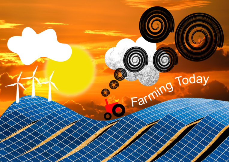
30. New Layer & Move Between Layers: I'm going to add
some text in here. And I'm going to do
that on a new layer. I'm going to lock
down this layer. We'll just choose to lock that. Then I'm going to add a layer. It's going to be a
vector layer in there. I think. I'm going to the rename it, let's call this one,
Farming, Farming type. Now what I want to
do is I want to get some text onto that layer. But I'm going to
go along the path. I'm going to use a pencil. I'm going to draw in
my path over here, nice and smoothly
up to the side. I'm going to change the stroke. I'll increase the stroke
so that you can see exactly what it is
that I'm doing. Now I'm going to go
and get my text tool. I'm using the artistic text. I'm going to click on the
path and put in my text, This is going to be
farming today now. I'm happy with the text, but I think the whole thing
should be a lot bigger. I will go back in,
Select the text. Let's make it a
little bit bigger. So I've clicked a number
of times to select it. And then we can either go to the top there or
we can go along to our type options down
here within the text. I can change the usual options. I'm actually going
to just change it in here and make
it a bit bigger. I'll get that like so he
I'm happy with the text, but I'm not happy with my
tractor because I'm thinking, do you know what I've
forgotten to put in the cab? There should be a little cab for the person to sit in over there. So I'm going to go and
draw that in now as well. I'll go along and I'm going to use square tool,
my rectangle tool. And just draw in the little cab over there I can rotate
round at the right position. Let's get rid of
the stroke on that. And I'm going to go
to the layer options. Go to the layers. I've
realized now that this is on the wrong layer
because I need to put it behind the wheel. I'll open that up and I can then drag this into that layer. Just drag and drop into the layer it puts in that
layer and then I can move it around in that layer and
I'm going to drop it in with my group for the
rest of the tractor. Unfortunately, you
can see I've still got a stroke around it. I thought I'd
gotten rid of that. Let's go along here to
the stroke and choose none that once again, if you do start to
unlock things like that, just make sure that you
relock them again when you've finished and you can
move things between layers. And that's what I was
showing you ready with this whole procedure
is that you can just drag things above or
below your layers anyway. Do have a little bit of a go with that and see
how you get on.
31. Clip a Photo to a Vector Object: Now my text doesn't look right. You can see the R and the M are very close
together and the day today is very far apart as
it goes round this curve. Let me go and see what
I can do about that. I'm going to select the text. I'll click a few times
on here to select it. And remember, you can always
click and drag as well. To select your type, I'm going to go to the word
farming. Just select farming. I know it's quite difficult
to see because it is actually on a blue background and
the selection area is blue. But it is selected. First of all, I want
to make that white. I'm going to go up here to my color and just
choose white for that. Slightly easier to
read now as well, but I'm going to go
to my type options. I want to adjust the distances between various characters. I'm going over here to
the character options, clicking the little arrow. And I'm going to
go to positioning. Where this is positioned
on the baseline. I can change my
tracking then to adjust the distances between
all of those characters. Now most of them
are fine except for the R and the M. So I'm
going to click between those two and do the
same thing going along to my character options
into the positioning. And I'm now going to use
the kerning to just adjust the distances between those
until it looks right. Let me select my word today. Just today, there
go in there again. With today, I'm going to
change the tracking and actually pull it closer
together as well. Let me go back to my color, and I think that could be
white at the same time. Anyway, now that I've got
all my text selected, I'm going to move a few little
bits and pieces around. So I want to unlock
things and you're going to find your locking and
unlocking things all the time. I'm going to go to my
background and whoops, now I seem to have
clicked on something, which means that I'm, I'm not seeing my
background in there. It's such an easy
mistake to make. I've done it numerous
times before. When I go to the top, instead
of going to the options, I hit the bin and it
deletes everything. Don't forget two fingers
to undo to bring it back. Be careful, I've made that
mistake so many times. I do wish the bin was slightly
further away or something, But once you've done
it two or three times, you get used to just using
two fingers to undo. Anyway, I'm going to unlock my background and I'm just
going to go to the clouds. Move the clouds up
a little bit and I think my son can go up as well. Now, I'd like to replace
my green grass over here. Where are we, the green
grass over there? I'd like to replace
it with a photo. I'm going to just go
down to our pictures. This is our stock library. I'm going to click on the stock library and
I'm going to search for a field there. There's quite a few
different fields in here. I'm just looking for something which is a little
bit farming like, but maybe from a distance rather than too close up in the. Remember, if you're not happy with what
you find in there, go and have a look at
the other library, the Pexels library, and
see what's in there. That's quite an interesting one, although it might
be a little bit too dark. I'm going to try that. I'm just going to drag it
into my document over there. It is a little bit
on the large side. Let's just pull that down. Putting a finger down so I
can scale it proportionately. It's not quite the
field that I wanted. I'm going to just go
back in there again. I'm actually going to go to Pia Bay and use this
one at the top. Let's drag that one in there. This one is huge. That's absolutely perfect. Being big like that because I just find the area
that I want to use. I want some of this
greenness in there. We'll just make it a little
bit smaller like that. When we look at our layers now, you'll see that it's
right up there. It's actually in the
farming type layer. And I'm going to drag
it down over here. It's underneath those layers, but I want to actually
get it to clip itself into my green shape. If I drag it not
underneath but into that, it will clip that picture
to that vector shape like. So let's do the
same thing again. I'm going to replace
my background over here with a picture. I'm going to go along and
find another picture again. This time I'm going
to do sunrise. We'll find a nice sunrise. That nice blue sunrise
I think will work well. Once again, I don't
want to spend too long looking for a good picture. I'd rather you just had
some time to try it out. I'm going to use this
one over here and I'm going to just zoom out a
little bit so I can click on the picture and scale it
in to the correct size. I'm just really looking for
something along that line. Let's have a look and see where this is. It's right at the top. So I'm going to drag that
down underneath that. And I don't have to
clip it to anything because it's underneath
those layers. I'll just move it around
into the right position, like have a bit of a go
and try out those and get an image to clip
inside another image.
32. Adjustments: Now let's have a look at a different type of
layer or object, shall I say it, because
it's not a layer itself. It's an object that
goes in a layer that is these options over here. Now there's so many
different adjustments, but I just want to find a
simple one to show you. I'm going to choose
black and white. Now I'm going to go back to my layers and I'm going to move this black and white object above all of the
layers in there. You can see black and
white now affects every single layer
underneath itself. I can then go along to these settings here
and I could say, well, I want to make the
greens lighter or darker so you can see
I can adjust the greens. I can go to the blues
maybe for the sky and lighten or darken those
in the black and white. All of these
adjustments have got different settings
that you can use. But the adjustment itself affects every single
layer underneath it. If I only wanted
the background to be black and white,
not the tractor, if I drag this underneath all of those layers but
above the background, it will affect just the
background in there. If you drag it into a layer, for example, with a tractor, if I dragged it into
the tractor's layer, it will only affect
the tractor layer. If you have something
in a layer, it only affects that layer. If you have something
above a layer, it affects everything below it. The same works with all of
these adjustments in here. Have a little bit
of a go try out the black and white one because it's the most obvious one. If you find that when you apply the black and white
adjustment layer or adjustment and
you can't see it, just check where it is
because in my case, when it first came in, it came in with the
farming type over there. The black and white was
actually only affecting the farming today text
which was white anyway. Have a bit of a play with that. See how you get on
with the adjustment. Object.
33. Multiple Adjustments on Individual Objects: Now let's have a look at
another adjustment down. I've gone back to the project
that we were working on. What I'm going to do
is I'm going to go over here and I'm going to
add an adjustment in there. And the adjustment
that I want to use to go down to my adjustment
is something called HSL. If you remember from our colors, we had the hue, the saturation, and the
lightness With HSL. I'm going to click on the
color option at the bottom. What this allows me to do is to actually spin
the colors around. And you can see as
I'm doing this, how it's adjusting
all the colors. I'm thinking, you know
what, I quite like this orange to pink color. But when I go back to my layers, I only want to affect
one of those layers. So I'm going to open
up this layer and drag that in there just
above the color. It doesn't affect the gold wall, it's only affecting
the background. I'm going to do that again. I'm going to put in
another one of these. Same again, over to here, HSL. Click on the color.
I'm going to move this along until I find
the color that I want. I like that color there. Then back to my layers. I'm going to move that into this layer object, shall I say? Because it's not a
layer, it's a group. I'm going to move
that in and move it just above the
color in there. I've got three different
color variations. Of course, these
can always be shown and hidden if you
don't like them. And you can even double click to go back and adjust the color on there until you find something that
you really do like. I think I'm going to go
with that one anyway. Try it out on another
piece of artwork.
34. Introduction to Artboards: This is the last section. We're going to be doing
it slightly differently. We're going to have our project being part of the
learning process. What we're going to do is
we're going to be looking at a number of areas. We're going to
look at artboards, and we're going to create up our project with a
number of artboards. So we'll make one artboard
and then we'll copy the artboard and do variations. The idea behind
this is that we're doing a layout for a
phone application. We have different screens
using the same phone basics. Not only that, we'll also
do something where we can take an existing
graphic that we've made and repurpose it or re, use it a number of times
within that graphic. If we change one,
it'll change them all and we'll do
that with our logo. Then we're going to go
into the bitmap area. In the bitmap area, we will take our graphic and I'll show you
how to cut it out, both the skater and the boxer. We're going to take from a
photograph and do a cutout. And we'll look at all of the
options in and around that. This is a big one.
Let's get going.
35. Make a New Document Project: Now for this project, we're going to go and
do a new document. We're going to go in and
we're going to use a device. Now, I'm going to use
an iphone over here. I'm going to make
sure that my settings in there are set to pixels, because that makes more
sense for a device. If you want to do it
for a different type of phone, that's
absolutely fine. Just Google the
pixel size in there. I'm making sure that on the right hand side
this is set to RGB. I'm also going to go down to the bottom here and make sure Create artboard is switched on. That's in there, because we're going to be working
with artboards this time. I also want this to be vertical. In here, I'm going to design vertically rather
than horizontally. Let me click Okay. Now here
is my page with my artboard. Then you can see the artboard. It says Artboard, one at the top has got some little
dots around the outside. You can actually just
resize it very quickly. Let's have a look in the layers. Now, this comes up
as an artboard. If I decided to put a
shape in that artboard, I'm just going to do an
elliptical shape over there. Let's give it a different color, it's a bit more obvious. We go. The difference
between an artboard and an object is that if I'm on the artboard and
I use my move tool, I can click and move
the artboard around. If I'm on an object, I can move the object around if neither of them are selected. If I click on the
object, I can move it, but if I click on the
artboard, I can't. The artboard is only accessible when you actually click
on the artboard there, and you can then
start to move it. Anything on the artboard will
be moved around as well. Just be aware that you've
got artboards in here, it's like a layer, and you've got your
objects which will appear in that artboard. I'm going to actually get
rid of this one here. I don't need it, we
just need the artboard. Set yourself up an artboard, Maybe put a shape in there, and just get used to how
that actually works. It is ever so
slightly different, you can't just
select an artboard. You have to click
on it in there. If you want to make any
changes, try it out.
36. Make Some Assets: Let's start creating
some content Now, this project that we're
doing is all about creating a layout for an app. We can show the developers
how it's going to look. Obviously we need
some buttons in here, we need some sliders and all other things that you'd
normally find in an app. I'm going to start
with some buttons. I want a button with a tick
on it, a button with a cross, and maybe a button with a bin
so they can delete things. I'm going to do that
by first of all, starting out by using
my lips and drawing in, let's make sure I'm
on the ellipse over there and drawing in
my circular shape. I'm happy with that. I'm going to zoom in a
little bit like that. Now. I don't want a stroke
around the outside, so I'm just going to pull upwards to get rid
of the stroke. And I'll put a color
on this button. This is Yes button if you like. It's going to be the green one. I think that's going to do
something like that's nice, bright green for that. Then I want to
tick inside there. Now I'm actually going to use
the pen tool with the pen. I'm just going to draw a little tick shape
like this up there, down there, and across to there. You can do this
however you like. Let's move that into
the right position. And I'd like that to be white. Once again, I'm going to
go and fill that with white Now to give it a little
bit more depth in there. I'm also going to
go into my effects and put on a very
subtle drop shadow. It's very tiny, like maybe
a bit softer than that. And reduce the capacity
on that just so it looks like it's actually slightly above that background. I'll go back to my move tool and let me just move that
into the right position. There's my first button now. Let me do one with a
cross through the middle. Of course I can just re, use the shape here. Two fingers down and I can just click and drag to
make a copy of that. Then I need a cross
through the middle. Now once again, I'm going to just do something
really simple. I'm going to take a rectangle, I'm going to draw my rectangle. Let's give it a color so we can just see what it
actually looks like. It doesn't really matter what
the color is at the moment. I want to round the corners
of ever so slightly. Back to this tool here. I'm going to make
sure that I go to the top and I'm going
to choose round. I can round the corners off
just a little bit in there. I want another copy of that to be at 90 degrees to that one. I'm going to use duplicate. Then rotate my
duplicate two fingers, one finger over
there to 90 degrees. Those two are going
to be one shape. I will unite them by
using Ad in the top. And I'm going to rotate this around 45 degrees with
one finger over there. That will be the cross or the X. It'll go in the
middle of this one. Now that's going to be white. Let's make that
white over there. And a little bit of a shadow underneath that as
well. Same again. We're going to go
down to the shadows. If I can find my
effects over there, put an outer shadow, pull it out a little bit, and do something similar to
what we had in the last one. Of course, the background
will need to be red, so I'm going to choose
red over there. I think that could be moved
over just a little bit like so now I've got these two shapes and I want
to save them so I can re, use them time and time
again in my documents. First of all, I'm going
to select this one and I'm going to go along
to my Assets panel. If I click over here, you'll see this is my
Assets, by the way. It's that third one up over
there. It's called Assets. I've got a default panel there, or I've got one here
called simply flat icons. And there's lots of icons
in here that you can use, but I'm going to go to
my default panel there, down here where it says assets. I'm going to choose add
asset from selection. Now, this won't be
quite right yet. If I add that in,
you see it adds in both those assets separately. I'm going to just undo that over there and
get rid of this. I'm going to click
on that and delete. Click on that and delete to
get them in as one shape. I'm sure you've guessed
it. You go up to the top. Group them together. Let's group that one together as well. Now I can drop those into
my Default Select that. Go once again to my asset panel. Let's just put the
little pin up there. And I'm going to add
that from the selection. I'm going to select this one. I'm going to add
that one in as well. You can just add things into your asset panel by grouping them together and
then choosing to add them. Now I'm going to come
out of this document for a moment and go into a
different document over there. And go down to my asset panel, and you can see they
still exist there. So the great thing about these assets is you can
create them once and re, use them as many
times as you like. Before we do the next button, which is going to
be a little bin, have a bit of a go with those
to make two little buttons, and then go and add them
into your assets panel. You want to do Totally
different looking buttons, Absolutely fine,
whatever works for you.
37. Make More Assets: I want to draw a little
bin now or bin icon. So I'm going to do it about
the same size as these ones. I'm going to start
off with a rectangle, so I'll just draw
a little rectangle vaguely the same size as that. I want to round off the corners. So I'm going to go
up to my nun choose rounded and just round them off ever so slightly like that. Now I want three stripes
on this little bin. I'm going to use this shape
over here to start off with. And just use my
two fingers down. I'm going to make
this a bit smaller. We'll pop one over there now. I'm going to give it a
different colors that I can see what's
actually happening. I'm going to select that. I'm going to go up and I'm
going to duplicate it. Then I'm going to
move my copy across. I'm just putting
a finger down to move it parallel to that one. Once again, go and
duplicate again. Now if those aren't in the
right place, just select them. You can then deselect the outer one and just
move them around. Remember, you can always
switch on your snapping so that things will snap to each other or to
the other objects. I think I'm going to actually, with those three shapes, rather than choose white, I'm going to make them
completely transparent by going over to the top here
and saying subtract it. Subtracts the top three
from the bottom ones. If I put that over,
you'll see what I mean. Like, so then I need the
lid of the bin in here. For that, I think I will
do a little semicircle. I'm going to take a
little shape over here and ellipse draw
elliptical shape. I'm going to now
use a rectangle. Put a rectangle over it like so. Select them both. And then use my subtract to subtract
one from the other. That will be my bin shape called the top of
the bin in there. I'll put a little handle
over the top as well. It's going to be very
simple because this is just a little icon that will
go over the top of that. Select both of those and go into add to add them together, my little bin, I will just
color up a different color. Let's make that a
gray color like so now it's pretty much the
same size as these ones. I think just a fraction bigger. I want to put that
into my asset. So I'm going to go along, make sure it's grouped together. First, I'm going to
go along to my menu. Group it together,
and then I can choose to add the asset from the
selection, And there it is.
38. Add Slider Graphics: Let's try making a
few more assets. I'm going to make one of those slider buttons
that you see around. I'm going to start
off with a rectangle. Just to draw in my
rectangle like so. I'm going to give it some color. I'm going to make this green, but I want the rectangle
to have rounded ends. I've gone to the rounded
option and pull that in. Then I just want to
circle over here. So this is one of
these buttons that you click on or
goes left or right. Once again, I'm going to
go up to the ellipse. Draw in my little elliptical
shape over there. That is going to go on the side. I'm going to make it
a little bit smaller, so I'm going to
use three fingers. I can scale inwards
from the outside. I'm going to make it white. Now it shows up a
little bit better. I'm also going to go
along to my effects. Put on an outer
shadow over there, move it across slightly, and blur it just a
little bit to lift it. That one can of course,
go back in there again. I think actually this is
a little bit too long. I'm going to just shorten up
just a fraction like that. Let's move that into the middle. Let's make one last
asset over here. That's going to be
a slider button. Very simply, I'm going to start off with a
little bar like that. I'm going to make this gray. Let's just choose
a gray from there. I'm going to have another one
which is go on top of that. Another little slider. That
one I think we'll have that. Let's use the same gray but just make it a
little bit thicker. I'll move that into the
right position there. Finally, I just want a
little circle over there. The circle, once again, will have a bit of
a shadow under it, same as before,
using my ellipse. I draw on my little ellipse in there that's going to be white and it's going to have a little drop shadow
underneath it. So let's go along
to the effects and outer shadow. Let's
try that again. Out of shadow, we'll
switch that on there. It can see my shadow but I
can't see my effect in there. A bit more blur on that. I think that we'll use the move tool and just
pop that up there. Same again, that
one can be taken. Putting in, I've
just noticed that these are not quite
the same length. I'm going to go and move that over a little bit like that. Yeah, I think that looks
a little bit better. Let's select both of those. Go along to my asset library
and add that one in as well. Of course, now that I've
added these ones in, I have got all the assets that I need to start working
on my document. I think that's it. I add in just add asset from selection. Why is that going horrible? Well, it looks really
weird, doesn't it? But it's my fault what
I should have done. You're probably looking
at me thinking, group it, I forgot. Let's group that together
now with the assets. What about if I want to
make changes to those? I've decided that I want
to actually use one of these circles as the
background for the little bin. Well, let me bring this sense, I'll insert that one and I'm going to insert
the bin as well. It's fairly easy. All I've got to do
is go to the bin. I'm going to ungroup it there. I'm going to go to this one
and ungroup that as well. I can then get rid of
the little x over there. Go along to this, let's move
it top as well, onto there. I'll scale it down. I'm using
three fingers over here to scale proportionately to the
middle. Make that white. Probably could do
with actually having a little bit of a
drop shadow on this. I'll deselect the outer one and very quickly put in my
drop shadow over here. Let's go along outer shadow there and just a little bit of a shadow behind that go small, very small, delicate
little shadow on there. I think that's pretty much it. All I've got to do now is
to pop it back into here, which means hoops going back
to my move tool select, going up to group it together
as we've done before, I'm going to go along
here and just add the asset from the selection
straight in there. I'll do the same thing
again with another one, because I think this one here, this has got a button on it. But maybe I want one
without a button, and maybe the button separately. By popping that in there, I can really easily ungroup it. Move the button. Maybe I didn't ungroup it.
Let's try that again. Ungroup it. Move the button out. This can go in separately
as a little object. Let's add that in this one here, which I will group together, because there are
two shapes in there. Let's group that together. And that can go in as a single
shape in there as well. Right? We've got
all of those bits and pieces ready to go. What I'm going to do now is to bring in three buttons
along the bottom. And I'm going to have
a little slider at the bottom and at the top, and a little green button
at the top as well. Let me go and start with these. This one I'm going
to scale down. I'm going to pop that right
at the top, Over there, I'm going to have a button with a slider that's going
to go right at the top. I want another one
down the bottom here, but with a slider in
a different position. I'm going to go to insert that move that I'm
holding down my fingers. I move absolutely vertically. This little button will
insert that and I'll place that elsewhere on that. In fact, what I
should have done, should have done
that in two parts. I could have changed
the length of that. I can still do that. I'll just select
that ungroup that. Then I can choose this
one and just pull it out to the correct length. Right? The rest of
them are very easy. Insert, insert that. And insert a bin in there. So I'm going to have a bin down the bottom that's in the
middle, that one over there. I do want to make sure that these little shapes over here are the same
distance apart. I can do it by I could
go up here and I could switch on
my grid and do it a grid or I can actually
use some of the settings on the top over here
which allow us to align and space things
evenly as well. First of all, I'm going to align these via their
middle so they're all correct that way I'm going to space them
horizontally as well. So they're all
space out together. Let's move that one
back down to there. Now, content is going
to go in the middle. Have a little bit
of a go with that. Try redoing some of
your assets and then go in and build this with two little sliders
and some buttons. If you want to make any
other exciting buttons, please feel free to do that.
39. Make a Logo: Let's make a logo for
the brand that we're creating this app for Now, normally the Hether brand
would already have the logo. But hey, it's all good practice. Now, this is all going to be
about an orange drink brand. I'm going to create a little
using the word orange. I want a nice, I hesitate to
use the word swish because that gives you the idea that it's going to
be a n symbols, like a little swirl underneath. I'm going to first of all get my pencil and just make my
little shape that I want, like that over there. Let's give it some width
so that you can see it. But I want to change
the width on that. I'm going to go down
to my pressure now. First of all, let's
get rid of the cap. So they're going
to be square caps. I'm going to go to the
pressure and I'm going to put a point in the middle and
then drag these ones down. What that'll do is it'll give
me thin to thick to thin. But I want the thicker
part over here. I'm going to move
this thicker part up to that side there. Now we can still go
along to our width and make it thicker still. I think something like that
would work really well. Remember, if you're
doing something like this and then
you want to maybe use the geometry tools
to add things together. You might also need to
actually go in and just expand the stroke into objects like that. I don't
need to do that. So I'm going to leave
mine as a stroke. Now, I want to
bring in some text. I'm going to go along to
my artistic text tool. With my artistic text tool, I'm going to just click and
drag the size that I want. I want something like that, and I'm going to have
the word orange. I need to find a
typeface for this. The typeface I want is something which is going to be
reasonably friendly. I like that American typewriter, I'm going to be using that. I think we'll just
have bold for that. That looks pretty good. I like that. But
the O from orange, I want to select that. I'm going to select it. Just drag across to
select the O. I'm going to increase the
size of that as well. I'm going to try 144. That's good. I really like that
with that big O. But I want to bring
the downward, so I'm going to once
again select the O. I'm going to
move it downwards. For that, I'm going to go to
the type options over here. Go into my character
options over there. I can then use positioning
the baseline shift. The baseline shift then allows me to shift things up and down, and I want the down over there. Now, even once you've done this, you could still say, actually
I don't like that bold. Let's go and try regular
and see if that looks any better because
the O is so heavy. I think I'm going
to go with that. I could even maybe just doing the range from range as bold. Let's have a little
bit of a look. Yeah, that's it. I'm going to go
with that one now. I'm going to bring this
little shape in here. I'm going to rotate it
round because I want that little thing to be
almost underlining it, if you like, with
this shape now, there's a little bit
too much on there, not enough on that side. I could actually just go in because remember this
is all about nodes. I could pull this node down a little bit over
there, move that up, and this is why I
wanted to leave it as a stroke rather than making
into a filled object. Let's go to that one there. If I choose to delete, I can delete that one node, which will just leave
that little shape. I think that's what I was
really after over there. We've got the thicker line here, which is offsetting the
weight of the O in there. In fact, even the
thick line itself, if I just go back to it, we can go back again over
here and maybe make it a little bit thinner so it's
not quite so heavy in there. I'm looking for balance. We've got a big thing there and we've got a
heavy weight there, and those two tend to
balance each other out. Now it really is just a matter of going in and
choosing the color. And obviously it's orange, so it has to be
orange. Let's go. I prefer, when I'm just
picking colors like this, to actually go to the
color wheel and go up. I like that orange and then
put it around in there. That's gone into
my recent colors. I can click on this.
Go to my stroke. Let's go to the stroke up there. And choose the same
orange for that. Let's select both of those
and group them together. Those two are grouped in there. I'm going to group
everything else. And those over there, I'd need to select that. That one, I just
held my finger down so I could select
multiple items. I'm going to also go in there and choose to group
those together as well. We've got one group here and another group over there
have a bit of a go, you don't have to
use the word orange. You can use anything you like, but create a little
logo or in your
40. 122 Artboard Symbols: Now let's have a look
at the symbols panel. That's this little
one over here. If I can hold, you'll
see symbols over there. Symbols are very
similar to your assets, but there is a
difference between them. What I'm going to do is I'm
going to take my orange and I'm going to insert
it in my symbols. We do that the same
way that we do assets. Click on the little menu and add the symbols from selection, Making sure that you've
grouped it first so that it comes
in as one symbol. Now if I were to
take this symbol and insert it again, a little copy. You can see as I
start to scale it, the width of the line
underneath remains constant. It doesn't scale
with the object. To get around that, what I'm
going to do is I'm going to select the original over there and I'm going to go
to the stroke down here. I'm going to say
scale with object. If I switch that on now,
let's go and have a look. Again, I haven't actually put
it back into the symbols. I just left it where it was. I'm going to click on
there, I'm going to insert. If I grab a corner this time, you can see how it
actually scales as well. Even though I did it to this one over here, it still scales. Now I want to pop one
right at the top of a little logo at the top there. Maybe I want another one
down somewhere else as well. I can use two fingers and
make a copy of that one. Don't place that
at the bottom for the What's different
about symbols. Well, if I go to this one here and I'm going to just double click a few times so
I can get into the group. I'm going to go and
make a change to it. I'm actually going to change it and I'm going to
change the color. You can see as I'm changing
the color of this one, it's updating all the other
instances that I've used, that whether I've made
copies of it or whether I've got it in from the
symbols panel. We've got a let me just get
back to my original orange. We've got a parent over
here whenever it's used. These are the children.
If I go to one of the children and I'm
going to double click, and I'm just going to
move that away from it. You can see how it will
affect the other ones. At the same time, you can change any of the
child objects and it goes to the and
the parent then changes all of the
other siblings as well. Really useful if
you need to update something very
quickly, try it out.
41. Pixel Layers: Now let's add a bit of
texture to the type. I'm going to do that
by using pixels, and we're going to go into
the pixel persona for this, I'm going to go to my layers. First of all, what
I want to do is I want to add in a new layer. I'm going to click on the Plus, and it's going to
be a pixel layer that I'm going to
be painting on. You can see it says
pixels in there. The little icon is
slightly different, is very, very tiny. But you have different
little icons here to show the differences between
vector and pixel layers. I'm going to go along up to the top left hand corner and I'm going to choose
pixel in there. This changes my
tool bar over here. I'm going to use the paint brush and I'm going to go along to the brushes panel on the right hand side and go and
pick an interesting brush. Now I'll just flick
through and you can see these are all the
different types of brushes that we have. I'm going to go along and find some texture brushes
over there. There we go. And I'm going to be using
this brush pattern, one, you can use any brush
you like, just that. That's the one that I think will be really
good for textures. Let's zoom into the O over here. And I want to give this
the orange peel texture. I'm going to make sure that
I'm actually on orange. I'll use my recent colors in
there when I start to paint. You can see it's painting
with a texture on there. I can just keep
building that up. Now, some of you are probably
looking this and thinking, yeah, you really should paint a little bit
more carefully. Tim, look, you've
gone over the edge. Well, yes, I have, but we've
also got an eraser in here, so I can just use an eraser
and go and erase out the bits around the edge
that I didn't want. Now, we've got some options
for the brushes in here. First of all, you can just
change the size very quickly. I can see the brush size in here and we'll talk about
some of the others later on. But for now I think I'll just darken that
down a little bit and use my Or to get rid of
that section over there. If I go back to my vector
area which is designer, that will still
be there and it's on a new layer called
a pixel layer. The big difference
between these two is that vectors are lines with points and they are
fully scalable. Was pixels are made up
of little pixel dots, for want of a better
word. We can see this. If we zoom in, you can see the individual
pixels over here, but the vector shape
is always going to be absolutely super
smooth in there. Do try that out.
Have a bit of a go, don't forget to make a pixel
layer go into the pixel area and have a play with
a paint brush and some different
brushes over here. You could spend hours just looking at these brushes
and going through and experimenting and trying out and seeing what you're
getting with them. Or make sure you're
on the paint brush, not the arrays tool over there, but some of them are quite cool. The results that you get, in fact, that one, there would probably
be quite a nice one for the orange if
that was the case. I could actually just
erase this out like that. Go back and paint in like so.
42. Painting Pixels in Symbols: Now the texture that
I've put in here, I really like those dots. By the way, the texture
that I've put in here is only on this orange over there. It hasn't updated
these other two. That's because when I
put in that pixel layer, the pixel layer was
just in the artboard. It wasn't actually in
one of the symbols. I can move it around. I'm going to click over
there. This is the symbol. I'm going to find
the pixel layer, Whether it's at the
top or the bottom. I'm going to drag it
and I'm going to put it inside that symbol. Now it's in the symbol, you can see it's updated on
these ones over here as well. Let's do a little bit
more detail on this. I'm going to go along and I'm going to go
to the symbol here, that symbol there
which is selected. I'm going to go into
it and I'm going to add a new pixel layer. Let's try that again
inside that symbol. Now I'm going to go over
to the pixel persona. Make sure I'm in there onto my brushes and I want to paint in that
little green thing, I don't know what it's called. There's a green thing which goes at the top of the orange. I'm sure it's got a proper name. Anyway, I'm going to go
along get, get a brush. I'm just going to go over to my standard basic brushes And just choose a very
simple brush in here. Let me find a green
because it's going to be green. Now I've got my green. I'm going to go along
and I'm going to paint on that area. Just build that paint up
a little bit over there. Put in the things that go around the outside, little star bits. This doesn't have to
be perfect, it's just getting the rough idea. What should have happened
now is it should have updated on all of the
instances at the same time, because we've added
it inside one of those instances of the
symbol. Try that out.
43. 125 Artboard Non Project Painting Texture Example: Let's just go back so I can
show you another example. I'm going back to
this little drawing over here and I'm going to go to my layers and down
to the bottom over here. And I'm just going to get rid of the picture of the grass
in the background there, which I think was one over here. I'm just going to delete that. Now. I want to put some
texture on the grass, so I'm going to click
on that little shape. I'm going to go over
to my pixel persona. Over to my brushes and I'm going to go over
to my texture brushes. You can use any
brushes you like. I just happen to
have a thing for the texture brushes,
I really like them. Once again, I will choose
an interesting texture. Now I'm going to go and find the color that I want
and I'm going to go with maybe slightly darker
green over there. Let's make sure I on the fill, I'm going to choose a slightly
darker green in there. Now this happens
sometimes in designer, things don't do what
they're supposed to. You can see I'm trying
to drag that back, but it just won't
allow me to do it. What I normally do is just close down everything
and restart it again. I will very often actually
go in and get rid of it and then once more that usually
clears that problem. I'll go back again here. You can see it just didn't even remember that I had removed the, those little grass, the grass picture.
I'll go back in there. I'm going to remove
that grass picture. Let's just say delete
in there. Over here. I'm going to go and
add a pixel layer. I'm going to go
to my brush tool, but I'm going to go to my
brushes in pixel mode. Over to my textures, find a texture
that I want to use over there and go and choose
a color for that texture. I think something like
that might be quite good. Just slightly darker. I'm just going to paint,
so I'm going to go with a fairly large brush and just paint along the top here to get an interesting
texture going on. Let's go and add
another one in there. So I'm going to go with some
yellow and put a bit of yellow on there as well. Now I want that texture to
only be on the hill in here. We did this before
with the pictures. What I can do is I
can drag that pixel layer onto the vector
layer right onto it there, and it will clip it to just
that particular shape. Let me do it to the clouds. I'm going to go to my clouds. I'll choose the
cloud that I want. I think I want to use that
cloud the same again, I'm going to add a pixel layer. I'm going to go along
to my paint brush. I'm still in pixel
mode in there, find the texture
that I want to use. Let's go with this
grunge pattern. I'm going to go with
black over there, nice largish brush and just paint under the cloud like that. Because I only wanted to
affect the cloud as before. I'm going to go in and
just drag that on top of the cloud like so it'll
only affect that cloud. This technique is used
a lot in illustrations. I use it myself quite often. I will just show you one of my own illustrations
where I've used it. I do a lot of figures, amongst other things, but if
we have a look at this one, for example, you can see
there's textures in here on the clothing to just give a little bit of
depth to the item. Once again, here
we've got a texture in there where the hands
are in front of the other, a little bit of texture
on her top as well. It really helps to give objects some depth and you can then just clip it to the object that you want to
paint straight on. Try that out on any
graphic you like, and just clip a bit of a bitmap drawing or bitmap
painting to a vector layer.
44. Artboards: Now let's make another artboard. We're going to make
a copy of this one. To copy it, I'm going to
go up to my artboard here. I'm going to make sure
that nothing is locked. That's pretty important. Really. Just close that down. Nothing is locked on there. Select my artboard and I can use two fingers and
click and drag to make a copy of that
first artboard, like so. Then on this artboard here, I can then just get rid of
any bits that I don't want. I'm going to select
that orange and remove it that's on that one
instance that I got rid of. These two are still over there. If I change an instance here, I'll update these
at the same time. We can then put in some
different details over here. Let me show you
this once again on a live working copy of
my own personal work. I work with quite a
lot of artboards. And this is a car series that I was doing with all these little different types of cars, each one on a separate artboard. But as you can see very often I will use
artboards and make copies to experiment with
different layouts of that. The client wouldn't
see all of those, they would only see
the final results as I actually did them. But it allows me to do a lot of experimentation as well as create very quick backgrounds which are all exactly the same. Anyway, do try that out
on your own one up there, and make a copy of that. Delete the big logo
from the middle, and then we're going to
draw an orange juice can in there.
45. Metal Gradient Can: Now let's start out Can. On this side, I'm going
to use a rectangle. And I'm going to just draw
in my rectangle in there. But look at this line
that I've got over here. It looks really strange. That's because when we were
creating the orange swish, I used a shape like that. Now all I've got to do
is to go in here and remove these nodes and
just say reset pressure, which will reset it back to the default single width
line all the way around. However, I don't want to stroke, so I'm actually going to click on that little button there to say no stroke and fill. I want to have a fill
to start off with. Now my can itself needs to be ever so slightly
rounded the top corner. So I'm just going to
go back to that tool, go to non choose rounded. And I just want a tiny bit
of roundness on there, not much at all. The next thing I want to
do is to put a gradient on here to give this
can a metallic feel. I'm going to go to my gradient til of course I'm going
to drag across there. Now when you're dragging,
if you put a finger down, your dragging will jump in 45 degree increments so I can make sure that it's
perfectly horizontal. Then let me go and change the
colors on here for the can, I'll just pin this down. I'm going to start
off with that one. There being a lightish gray, I am actually going to go
over to the HSL sliders. I can then use the luminants to lighten and darken things, we'll have that
as a medium dark. Then over here, I'm going
to put in a new point. I want that to be pretty light,
almost like a high light. Then another one over
here. This is going to be slightly darker over there. Maybe we'll have another
little highlight over there. Let's see over here. If we try that, being slightly darker, there's no
right or wrong. I'm just putting
light and dark and light and dark until
I get something which vaguely resembles the
metal of a can. Try out.
46. Metal Gradient Can Details: Now what I want to
do is I want to adjust the shape of my can, because cans are not usually
straight up and down. A few of them are, but
most of them come out a bit here and they taper back
down again at the bottom. To do that, I want
to first of all, set up a grid in the background so I can
measure things easily. I'm going to go along to my snap options and I'm
going to switch on the grid. By the way, you've got a little, what's that windscreen
wiper over there? And you can turn things
on and off with that. If you can't see what
your grid coming up, just click on the
windscreen wiper itself. I'm going to move this
so that it goes right back to some of
those squares there. I'm going to pull this
out in a little bit to there at the bottom. I'm going to move it along
to those squares there. As I said, I'm only doing this, so it's very easy for me
to just measure things. Now I want to put in some
more nodes in there. Before I do that, I'm going
to make a copy of this. I'm just going to drag a copy across over to there that
we can use later on. You'll see Y shortly. Now I want to add a node in
there and a node in there and move that edge outwards. But I can't add a node
because if I click on here, the node tool doesn't
add nodes until you make something into a
normal editable shape. At the moment, this shape here, you can see that
little red dot is still an editable rectangle. Let's click that button there, and that converts it
into a normal shape. Now I can go over here and I'm going to count down
a few of them. I'm going to go
down to say there and click Do the
same on that side. Now you can see why
I've actually put in this one over there
and one over there. Then I can select those points. I can move them out and do that, I can move them out
of little dots, for want of a better word. I'll select those
again, these two here. I'm moving them out to
whatever those things are on my graph so that
both sides are matching. Now, right at the top of a can, you normally have a little
piece of metal around the top. That's why I wanted
to have this. I'm going to pull it
down a little bit like so make a copy of it so that I can work with
that copy for the middle. I'm going to move
this over to here. Before I actually
put that on the top, I'm actually going to
adjust the color slightly. It's a bit lighter and brighter. To give that brighter
metal look to it, I'll go back to my gradient. I'm going to just change
the color on some of these, make sure that that is pinned. And I'll make that bit lighter. This much lighter still. I'm going to work my
way through all of these in here, that's okay. And this one is
okay as well, like, so now I'm going to
pop that in there. That's going to just go
in there and a little bit smaller because remember
I rounded those edges. I do want it slightly
smaller than the top. I'm happy with
that. I'm going to make a copy of this
to go to the bottom. Actually, it's a
little bit too tall. Let's go down to one there. I'm going to use two fingers
and copy that to the bottom. Just make sure that
this is correct in the right area, it looks good. Finally, we're going
to take this shape here and use it in the
middle over there. I'm just going to pull it out, pull to the same sides. This is going to be the
sticker around the middle, but instead of it being
so dark as those are, because remember it's
got a gradient on it. I'm going to go to the gradient, I'm going to really
lighten this one up. So this one is almost
going to look like it's paper around here. That's going to be
much lighter there. This one is going to be a
lot lighter, just dark. And she has the very
edge down of those. Once again, there's a lot of noise from birds
in the background, which I'm hoping you're
not hearing too much of because I work
right next to a river. We hear a lot of wildlife here. I do apologize if you're
hearing the geese again. I think that that's
working okay. And I can now go and turn off my grid like so I'm going to select all of those
and I'm going to group them together like that. That can then go in the middle, have to go with making that can.
47. Add a Logo and Shadow: Let's get our logo on the tin, so that's really easy. We're just going to go
along to the symbols. Click on the symbol,
insert a symbol. And I can then scale that
down to the right size. I think maybe a little bit
bigger, something like that. Now, this is not just
sitting over there, I want it to look like it's
almost floating in the air. I'm going to put a very small little shadow
underneath it. I'm going to go to
this logo, by the way, and just move it elsewhere. We'll put it up there for now. But I want a shadow down here, so I'm going to use elipse, Put in my lips under the can. I'm going along to my gradient. I'm going to have a
gradient on here which is just going to go
from dark to light. A lot of these little points
in here that I don't want, I can get rid of by clicking
on the bin at the top. The type of gradient
that I want in here is going to
be not a linear, it's actually going
to be this Ellptical. Because I can move that around and adjust
these independently. Remember you can lock
and unlock them. For adjusting them that way, I'm going to start over here and this one is going to be
black in the middle. And then the outer one is
going to be black as well. Okay, I don't black
as well because I used the gradient tool rather than the
transparency tool. It really doesn't matter
which one you choose. But if I go to that
second one there, I can go along to my color. I'm just going to adjust the
opacity on the outer one. I make that just a little
bit bigger over there. Then I'm going to
take the whole of that shape and adjust the
capacity on the whole thing. Now, let me just make
sure I've got the shape selected over there and
we'll adjust the capacity. Now by adjusting
the pasty in here, you can see what it's
doing is it's saying all make everything
the same color. How can I adjust the capacity? Well, if I go to my
layers and I go up to the layer options and
adjust the object capacity, there's a subtle difference
between those two. Now, I can adjust
the object capacity and to work
absolutely perfectly, do be careful of that when
you adjust the object. But you've actually got
some gradient on there. You might find that you
end up moving everything. Do it for the object
in the layers. Have a bit of a go
and put a bit of a shadow underneath your shape. You can move that as high
or as low as you want. I want mine floating just in
the air like so dried out.
48. Add Texture Spray: Let's add another
pixel brush into this. I've gone to my pixel persona
and I'm on the paint brush, and I'm going to add
a new pixel layer. I'm going to make my
brush pretty large. I'm going along to my brushes. And the brush I'm
going to choose, I've been having a look around, is probably one of these
watercolor brushes or the ink splatter
brushes in there. Because what I really
want to do is I want let's make that pretty big, which is almost that
sprayed effect. That's pretty much what
I was after over there, which is the water color drops. Having put that in
as a pixel layer, I can now just go underneath all those layers and drop
it underneath my can. I've got that, the fresh sprayed orange
juice type of look. Now that it's there,
I can still add a few more bits if I want some more orange
juice coming out. Of course, you can
use your rays to erase things at the same time. Have a little go if
you'd like to do that. And don't forget, you can
move these things around, but be careful because it's
cut off on the side here. I can move that down.
Just a little bit like that. How do you go?
49. Add Liquid With Blends: Let's add a bit more
to this graphic. I want to show you
a new tool now. This new tool is actually a
new one in V two of designer. What I'm going to do
is I'm going to take a copy of the shape of the tin. If I click on it over there at the moment you can see it's got a few bits attached to it. I'll go to my layers over
there into the group. I'm really just looking
for this bit over here. What I'm going to do is
now that I've selected two fingers down and move a
copy of that out over there. But I don't want to
be in that group. I'm actually going
to pull it out of the group over there and just put it right
at the very top. You can see if I've done
the wrong one, haven't I? Let's just undo that. It must be one over there. Okay. Well, that
seems to be correct. Now. I think I must have
moved the wrong one anyway. What I want to do is
I want to actually just change some of this
so I can get a wave form. It looks like liquid. I don't want liquid in there, but I want to look
like this actually printed liquid on the outside. I'm going to do that by using
the knife tool over here. I'm going to click,
I'm going to just drag a little wave
curve in there. If you don't like it, just
undo it and try it again. Once again I'll just click and drag my little wave in there. And what that does is it
splits this into two parts. I'm going to do it one more time over here onto the knife. When I'm clicking and dragging, you can see it's
following me along. But if you want, you can actually change
the stabilization. There's a rope
stabilizer there and a window stabilizer,
or no stabilizer. Now, we've looked
at that earlier on with some of the other tools. I'm on the rope stabilizer, I will stabilize it
a little bit more. And I'm going to do it
again starting here. And I'm just going to have a
bit of a splush thing going on over there to do
the same with the top. I'll go the opposite
way from the top, so it'll be bigger over
there and down to the. Now you'll notice that when
I did this immediately the fill changed as well
to just a flat color. I could then go in and put in
another gradient on there. I'm not going to, I'm just
going to remove the middle. We've got these two here which I will group together to
make my life easier. Remember we can click on
the top there and I can go down and group
those together there. I'm just going to change
the color in here. I'm going to go to the
fill on those two and give them a color over there. So what do we want? We want
this to be orange, don't we? So let's have some
orange over there. I'm now going to move
those two across, back on top of the can there. And I think that's
Looks just about right. Brilliant. Okay.
Now it still looks very flat with this selected, what we're going to do
is we're going to go to the layers and we're going
to go to the Layer Options, and we're going to change how this layer affects what is
underneath with the color. You can see if I click in there, we've got a number of
different blend modes. I can just go through the
blends and see how it affected. Look at that. The
yellows have really, really come out over there.
That's with color burn. We've got linear burn darker. There's no right or
wrong with this. You just go through
until you find something that works for your
particular graphic. That pin light is quite
interesting as well, although the color is
quite good because it keeps the color and you can
see the gradient underneath. I think I'm going to
go back over here to the color burn there. Because the great thing about this is now that I've done that, if I'm go and change
the color on that, it will still have
the same looks. I can just go through
my colors until I find the color that I'm after. Obviously want something
just a bit more orange. There we go. That's a
lovely looking color there. I don't have to
recreate the gradient. All I've got to do is
put something on top of it and change the blend mode. But do have a little
bit of a go with that using that knife tool. So let me just run through
the knife with you once more. You make your shape, you go to the knife and you click and you drag across your
object and it will just cut it into various pieces. Now there are some more options, and I'll show you those later
on with another example, but for now I can cut that up. Each one of those is a separate piece in there.
Have a go with that.
50. Use the Shape Builder: Let's make a copy
of this one now. I'm going to go in here, make sure I'm on the art board. So it selects use two fingers and pull
that across to there. There's a lot of
things in here that I don't actually need
at the moment. I'm just going to go in with my move tool and
delete some of them. For example, this one here. I'm going to get rid of those. I don't need the
logo at the moment, I don't really need that one
because we're going to do a variation on a different,
let's get rid of that one. On a different type
of drink here, we've got the orange drink, but then the client has just
come back and said, oh, could we also have something
to do with ice Because, well, we want our
drinks to be cold. What we're going to do
is we're going to create a little logo here with ice. And I'm going to use some of the existing tools and
some new ones as well. For that, I'm going to go along and I'm going to create a
bit of text saying Ice, using my artistic tool. We'll just do that. Obviously we want a font which
is more in line with ice, but for the moment,
let's just put in ice. I did all in caps, but at the moment
I've just got it in that font there.
Let's select that. And I'm going to go
and find something which looks a little
bit more jagged, I suppose is the word for it. Nothing too complicated
over there. I've got something
in mind over here, just that I think Gill Sands would work in a
bold version of that as well. We'll end up with something
which looks like that, nice and chunky, obviously. I'm going to change
the color to blue. I've got a blue in my
recent colors over here. There's my first little bit. Now we're going to use the same principle
that we used with orange of having
something underneath it. What I'm going to do is I'm
going to take a shape and I'll go over here and
pick a little shape. I'm going to use the triangle and just draw a
little triangle like, so I want a few of
those triangles. I'm going to use my
two fingers to drag a copy of that across like so. And a third copy over there, I'm looking for the
sharp a bit in there. I'm then going to go along
and use my rectangle tool. And draw a rectangle
over that as well. Because I just want this
icy look up the top here. Now what we've done so far is we would have
selected those, you used our geometry
to add them together, and then selected it again, and subtracted these
ones over here. Now that's okay, you
can absolutely do that. Or there's another tool
in here that we can use. And this tool allows you
to do it all in one. See if I go over here to
this little tool over there, it's called the Shape Builder. If any of you used Illustrator, you'll know exactly where
I'm going with this. At the top, we've got a plus
and a minus over there. If I use the plus and I'll just click on
the plus over there, I can drag along
these ones here. And as I'm touching
them, you can see it's uniting them together into one. If I click on the minus, I can just drag across the
ones that I don't want. There's another one, I can
just get rid of it like that. It's very, very quick to
just add or subtract. Let me do that on another
shape for you and show you a little bit
more of the options. We'll get a shape like
that, we get a shape like that one there.
Select both of those. Go to this little tool if
you are not on any of those. When you click and drag, it selects the items
and then says, do you want to add
or subtract So I can then click on Subtract
to get it to do it. You don't have to do it
while you're dragging. You can just select the
ones you want and then choose how you
want to effect it. Now the next example
I'm going to do is something we did earlier, and I'm going to be very, very fast with this example of doing like a little
car type of shape. We did a speedy truck, I'll just do a quick car here. So I'm going to take
a shape like that. I'm going to take
another shape over here, put a rectangle across that. I'm going to go up here. And what we have a round rectangle at the
top for the top of the car. Then I can select all of
those. Use this little tool. What I'm going to
do is say, well, these on here I
want to subtract. Let's just make sure that
I select those again. These ones here, I
want to subtract those ones I want to add together then exactly the
same with the wheels. I could just go in there. I'm just going to put in, we're making a silhouette
here of this car. One wheel in there.
Make a copy of that. Select all of those, and very
quickly do the same thing. I know I'm going to be
adding them together, so I may as well just do that. Have a bit of a go
with this and get your text in make a little
simple shape like that. Something. Icy, try out that tool and then we'll
make this really cool.
51. Vector Flood Tool: Now we're going to do a few different variations
on this logo. I'm going to make a
copy of the word ice. And just leave it out there so I can come
back to it later on. Now for the first one, what
I want to do is I want to take this little
triangular shape. And once again I'll copy that
in case I need it again. I'm going to make it
a lighter blue in, then I'm going to put that
on top of the word like. Then what I want to do
is when I selected, I want the word ice
to actually be seen, but where it overlaps
on the ice caps, I want to be a different color. I'm going to go and choose the new color that
I want in here. I'm just going to pick
a very different blue. Now, unfortunately,
because that was all selected, it did them all. I really am looking for
a new blue in here. Let's try luminants on that. I always like to
draw a large square there so I can actually
check the color, make sure that I'm
happy with it. It also ensures
that it goes into the recent colors
down the bottom. Now to do these
overlapping areas, we use a new tool here. And if I press on there, you'll see it's called
the Vector Flood Fill. This is really useful because it enables me to
actually go in to a piece of artwork like
that and just say I've chosen this color here and that's the bit that
I want to color with it. Look how easy this is. You can just very quickly
color up overlapping areas. I'll do that on two shapes here so that you can see exactly
how it's working. I'm just going to go in
and choose an ellipse. Let's have an ellipse like that, another ellipse like that. What I want to do is I want to change the color
of the middle. Actually, let's do a third
ellipse in there as well. While we're at it, I can go in here and let's
select all of those. Go to my Vector
flood tool and say, well, that one there
is going to be green. I can just keep changing
the colors like that. It's so very simple
to do and it's a lovely new tool that
they've introduced anyway. Do try that out and use
that Vector Flood tool. You can do something along that line with your
logo, see how you go. And then we'll go do another one and use some more of
these tools again.
52. More Knife Tool: Now I brought in my other copy. I will just make a copy in
case Rene need to use it. Again, I always tend
to work on copies. And when I'm finally
happy then I can delete the copies over here. I'm going to go along
to the word ice. What I'd like to do is I'd like to have it into two tones. Doing something similar
to what we did over here. I can go along and use
my knife tool on text. I can then break it up
like so, very simple. Go along to these bottom
bits and select them. Now trying to select them
is a bit of a problem. I'm going to go over
here and have a look. We've got a group in there. I can then go down
to the various parts of the group and
select them this way. I want to select
the bottom bits, which I think is that one there. I want the bottom of the E, which is that one who we'll
come to that later on. We'll have that one
there. And what else? The bottom of the I I don't
know which part it is. I've got lost here a little bit. I think it's that
one over there. And then I'll just go and
change the color on that will lightened up and get
this lovely look like. So that's the first part. Let's have a look at this
bottom section over here. Because what I want to do
is I want to break this up into a few little shards of ice. I'm going to just
give it a color to start off with over there. I'm going to use the knife
tool again for this. Now when you're using the
knife tool, as you drag, you can see it drags a curve
like we did over there. But if you want to
get a straight line, what you do is start dragging and go to your little dot on the side and move
out because you want to go to this one over
here, which is the control. Now you'll see even
if I'm doing this, I'm getting a straight line. I can get a straight line
over there and let go. Let's do that again.
Click, start to drag. Go over to the control, and I'm going to get a
straight line over there. As I'm moving this around, you can see I can adjust where
that straight line goes. One more click over to
there, up to the end. And a straight line
across like that. I'm going to do the
same over here. So I'm just going to have
some slightly darker versions of my ice in there. And then if I wanted to, I could always just move these around. If I thought, you know what, it'd be great to have a distance between them. Just
pull them out. So anyway, do you have a bit of a play with that
using the knife tool? Using this little tool for basically breaking
the object up and allowing you to change the
individual areas. Try it out.
53. Move Between Artboards: What I've done here is just made my little icicles smaller
and put it on top. And this is the one
I'm going to go for. I'm going to remove these now. I'm quite happy with what I've got. Let's get rid of those. But what I'd like
to do is I'd like to have the same splat, for want of a better word, in there, but I
want it to be blue. Now, I could actually go in and repaint it again or I could
just take this one here. We didn't mean to move it to
do two fingers, move a copy. Now when you move it,
move until you get to that artboard and
then it suddenly jumps onto that
artboard as well. If you haven't moved
it all the way across, just be careful because it might not actually
come in there. Then what I want to do is
I want to color this up. I'm going to go along
and I'm going to use a rectangle to color it. I'll put the rectangle
over the top of that. I'm going to go to my
layers over there, you can see I've got
this layer is above. Those are the splats down there. I'm just going to drag
it on top of the splat. You can see that this will
now clip to that shape there. That shape is clipping this one. Now we don't see much
of the detail in here, as much as we did before. If you wish, you could
actually go into that and you could
change the blend modes. Now at the moment,
you could see that my blend mode is set
to normal in there. You can change
blends by going to the top and choosing
them from there. Or you can change the
blend modes in here. You can see I can just
go through all of these different variations until I find the one that I like. I'm seeing all the
details that I want. Now I'm actually going to go down to something called color. Then I can adjust
the color on that. I'll go to my color settings
and tweak the color until I get the color
that I want to use. Let's just have
something like that, lighter or darker in there. Of course, we need the text
to be in front of that. I can just drag my text
and drop it above that. I can't really see
that very well. I might have to put a bit of a shadow in front
of it or lighten up this or change the
color of that as well. I'll leave it as orange for now. But you can experiment with
that. Have a bit of a go. The most important thing here to learn is that if you take something from one
artboard onto another, you have to drag the whole thing right across before it
will actually move. The copy will move
onto that artboard. The second thing is that
you can change the color of items by just putting
a shape on top of it. And don't forget, you
can always go into your settings here and
change the blend modes, either there or up in the top. Hey, that looks really good. I like that color setting
that we've got over there. Do try it out. Habit
of a play with those and see what you
can get from them.
54. 136 Artboard Selections and Masks: I've made a copy of my artboard the usual way by clicking on the artboard two fingers and using the move tool
to make a copy. What I want now is I want a skateboarder jumping
over my ice logo. I'm going to do
that by going and finding an image in
the stock library. Over to my stock
library over here. I happen to be in Pexels and I'm just going to
type in skateboarder. The image that I'm looking for is something where
somebody is actually jumping. There's quite a few
jumping ones in here. I like this one where he's
actually jumping over something but coming towards us rather than going sideways. You can see that's rather nice and even though the
board is missing a bit, it'll look like he's
actually jumping through maybe one of the
letters in the logo. I do need to scale this down a bit because it's a
bit on the large side. One finger over there,
scale that down, get it to the size
that I want it to be. I think something like that. Let's go a bit further
like that over there. Now I need to go to cut it
out into my pixel persona. I'll go to pixel persona. I'm going to select my border. Now I'm going to use a
little tool over here. It's fourth one from the bottom. It's called the smart
selection brush, if I use this tool. Firstly, I've got a brush size, we can adjust the brush size. But the way it works is you just paint the areas that
you want to select. It sees those very smartly. It finds similar ones and tries to find
the edge over there. I can just pate down these bits here, paint onto the board, onto the wheels over
there, up to his hands. Now, even if I don't
get this perfect, I can still go in
with that tool, maybe use a slightly
bigger brush to paint all these little bits in
here that I'm missing out. If I paint too much like I've painted this bit in over here, I can go to the subtract
option. There's an add option. I go to the subtract option, and then with a smaller brush, I can just subtract that
little bit in there. Let's zoom in a
bit. Subtract that. Once again, I'll
go and I can add in all these bits
that I'm in here now. I don't want to spend too long getting everything
absolutely perfect, because you'll start
to get bored soon. I will go around these
bits really fast. Getting the edges of
his arm onto his hand, not too worried about his hair, and you'll see why in a moment. Once again, other hand, I think I've got
virtually everything that I need to start off with over there that I'm I think there's a
bit of skateboard down here that I wanted as well. Right. I've got a
nice selection there. But now I want to go in and I want to refine that selection. There's a little
button along the top here with a paint brush
and a dot around it. If you click on that, it takes you into the
refinement area. Now in the refine area, we use brushes to just paint the bits that we
want in and out. You can choose how you
want to actually see this. And you can choose either
to have it as an overlay. You can go into black to see
the background as black, white background, or a
transparent background. I rather like the transparent background because
then I can see exactly which bits to concentrate on that
are problem areas. You can also see this
purely as black and white. With that, I can see, oh, I'm actually missing
quite a lot of that arm, but the idea is with
these little tools, you just paint on those areas
and it rejigs them for you. This is particularly useful
for hair when I want to go into the hair and
repaint those areas. Now, I'm going to leave those
there because to be honest, when that's on a white, transparent background, it
actually looks quite cool, with those bits being
semi transparent. It adds to the whole effect. But what I want to do
when I'm finished now, before I press the little tick, is I want to change this. Instead of making a selection, I'm going to make a mask. That's the second
one down there. Just make sure I'm on the mask and I'm going to click on this. And now I've got my
cut out in here. Let's have a look at the layers. And you'll see that
the whole picture has cut out on the artboard. It hasn't cut out the bit
that's off the artboard. Whole picture on the
artboard is cut out because of this little mask over here. Now with the mask, you can then choose to work on the mask or on the
picture itself as well. We'll come to that later on. But I'm happy with that.
I'm just going to move now. Look what's happened
when I started to move. It actually moved the
mask, not the picture. This is one of these things
you have to be careful of if you click on the picture. When you move it, it will
move the picture around. If you click on the mask, it just moves the mask in there. Do be careful of that. I think that's actually
working quite well with him jumping through the logo. But try that out
with some images. Have a little bit of a go. As I said, you don't have to
get the selection perfect. We can come back
and we can tweak it with the mask shortly
and paint in and out things just in a moment,
but have a go with that.
55. 137 Artboard Paint on a Mask: Now let's have a look at this mask and how
this mask is working. Because you can
paint directly onto the mask to hide or show
things from your layer. If I click on the mask rather
than on the picture itself, I'm going to go onto the picture and I'm
using my paint brush. I'm actually going to get a
much smaller brush over here. Just to start off
with color wise, I'm going to paint with black. If I paint with black, you can see what it's
doing is on the mask, it's hiding those pixels. It almost looks like I'm
actually erasing them. But the thing is that
if I paint with white, it'll actually bring them back. Any of these can
come back I like, so just undo that. If you're on a mask and
you use a paintbrush, black hides and white shows, I'm going to make sure
that I'm on the mask. I want to add some
more of these bits in using my paint brush. I'm just going to
go over to white. I'm just going to paint back
the little bits that I want. I'm trying not to go too far or I'll start to pick up
the blue of the sky. Those bits I want to get rid of. So I'm going to go to black. And let's just paint those bits out really quickly like that. That looks pretty good. Now over here, actually what I'm going to do is because that
looks a bit strange, I'm just going to round
that off and paint it out.
56. 138 Artboard Flood tool and Rasterise: Once again, I've
made another copy of the artboard and I'm
going to get rid of my skater over there. And I'm going to
take the ice and the logo and just move them down a little
bit for the moment. Now I'm going to
bring in somebody else in here, another sport. I'm going along to pay. I'm going to choose
female boxer. I'm just looking for somebody
with their gloves up there. If I can't see it in here, I will try pexels. This is the image that I wanted. So I've got the boxer
on a plain background. Now I'm going to scale her down one finger to constrain and bring it into my
document over there. Now what I want to do
is I want to cut out, I want to show you
a different way of cutting out without
actually using a mask. So this will be a
much more destructive method to do that. We're going to go along
once again into pixel mode. I'm going to use a
little tool over here called the selection. What this tool does
is it just floods an area where the
pixels are similar. If I were to click on
the background here, what it should do, let me just make sure that
this is selected, is it should select that area. There we go. Now I want
to delete that area. I'm going to use cut. If I go to cut that, you can see it just cuts
the whole thing out. Now I'm going to show
you why that happens. It's because this image
here is an image object. There's a tiny little
image over there, which means it's
an image object. It won't allow us
to actually cut directly from it. I
could make a mask. I don't want to do
a mask this time. What I need to do
is if I want to actually cut from the image, I need to go up to the top. And I need to use rustterize will convert
it from an image. You can see the little
icon is changed ever so slightly in there
to a pixel layer. And it's the same
with any other layer, which is just pixels. Now if I go up to
the top and cut, it will cut away the
background for me. Unfortunately though,
I've lost some of arms. Let's use two fingers
to undo that. I want to actually, because this is
the selected area I want to deselect that. I'm going to go over here
to these selection tools. I can well this
squares and circles, but I'm going to use the
freehand selection tool. Then if I were to click and
drag around that over there, you can see it does a totally
new selection for me. Let's use two
fingers to undo it. But if I change up
here from new to now, remember I want to
subtract that bit. Takes a bit of
getting used to as to which one you're
actually doing. Now if I surround it, you
can see it subtracting it. So I can surround that. Just run my little line along over there. If I want to clean
up the selection, I can do exactly
what I did before by clicking on this area. Using the brush with
maybe a small brush, brush around her hair to
make sure it's nicely cleaned up around there. And once I'm finished, I go back as a selection. I can then missing a
little bit over there. Let me just clean that area up. I'm happy with that.
I'm going to go along and I'm going to cut that out. Now, I want to deselect this. I've shown you
this little button here allows you to deselect, but what we haven't
looked at yet is if you press and hold for
a second and then release, it gives you a short cut
menu to various things. For example, we've
looked at Solo, we've just looked at Rusterize, where we rusterize an object. There's one in here
called de select, which is what I'm about to use. We've got a new pixel
layer this cut and copy the things that I got
from the top over there. There's grouping in there too, so I'm just going to say
deselect to get rid of that. The last thing I'd like to do is I actually
want to just have the top of her in here
I want to cut out. I'm going to go back
to designer mode. I want to use this
little tool over here. It's called the vector crop. This will then allow
me to crop that image down to the size that
I want it to be. I don't need to do
these outer ones, but I will for neatness over there and I can just move that down to
wherever I wanted to go. I'm then going to go to my logo. Let's try that again. You'll notice that now that I'm actually in designer mode, these options have changed to
keep an eye on them and try them every so often by clicking and holding to see what you get. I'll select those two and
move them up to the top. I think we'll put them
slightly behind her. Once again, have to
go with that and be aware that if you're trying
to do something to an image, you might have to rustterize it. And you rustterize it
either by clicking holding, or you can go to the
image and go to the top, to this little drop down menu. And choose Rustterize
from in there. While you're at it. Do
have a little bit of play with this
flood tool as well. It just selects colors
which are similar. I can select something
like that and it'll select similar colors and you've
got a percentage in here, so the high the percent, the
more of those colors that it will actually end up
selecting. Try out.
57. 139 Artboard The Mesh Warp: As before, I've made another
copy of my artboard. What I want to do is
I want to basically take my boxer and really
make her a lot bigger. I'm on her layer over there, Get my correct tool and I'll just scale
out with one finger, something like that over there. Now I'm going to take the logo, the ice logo and I'm
just going to move it above her layer and move it down a little bit
because what I'd like to do is I'd
actually like to have the word ice on her
boxing glove to do that. There's a new feature
that came in in version two which is really lovely. It's called the mesh warp tool. I've gone to the little
plus up there and I'm going to add a mesh warp. Now what I can do, it just
looks exactly the same, but I can actually go along to the edges and I can
just pull it around. I'm putting one over
there, one over there. And then these are
bezier handles. I can actually pull that around. Like I'm going to do the
same on this side here. I'm just going to
bring that one down. A little bit like that move
that went too far with that two fingers to undo
it once again there. Let's pull these ones up. So it appears to be going
around the glove that now. What about these ones here?
I want to push them in. Well, I could do that
either by going over here to the handles and
pulling them up like that, or you can actually click
on the line itself. You can put in more of these little points that
you can then pull around. So I can actually move
those to around like that. If I wanted more of the C and the E at the front of
the glove and all of these handles so I can have full control over what
I'm doing in there. Now this one I'll actually
pull up just a little bit, so let's get this
last one coming in that's moved around
to the right position. Now that I've done that, I want this to actually blend
in a little bit better. There is my group over there. I want to blend it
in a little bit better where it
says Pass Through. I'm going to click on
that and I'm going to change that to something else. I'm probably going to
use something like overlay because that shows
the image underneath. I can still go
back to my warp if I need to and
continue on with it. You'll see over here, it's
called a mesh warp in there. If I click on the
word mesh warp, it then allows me to
continue editing. So if it didn't
look quite right, I can go back and edit
a little bit more. What about my logo? Well, I'm going to go and find the logo which is over here. Let's just drag that
one up as well. I want to put the logo
into that mesh warp area. I'll use my move tool. Move the logo down. I wanted to be quite small
in the middle there. If I then drag that into the mesh Warp group over
there, let's try that again. I'll drag this into
the mesh warp group. Let's just pop it over there. You can see how it's
now affected by the same mesh warp that's
affecting all of the text. I'll just move that up just
a little bit over there. Lovely way of just getting one thing to fit in
with something else. Do try it out.
58. 140 Artboard Saving Navigate View Mode & History: Let's close this down. I
want to make sure that I save it and I'm going to
be saving the design, the designer image into a folder which I've
called designer. I'm going to go up to the
top little three dots. I'm going to say Save as
I will give it a name. Let's call this orange. It's F Design. I'm going to click on Save. And then I'm putting
mine onto my cloud, into my affinity
designer folder. And I can just save it in there. It appears I've got something
else called Orange. I didn't think I had.
But there we go. That's now saved and you
can see it's called orange. Whereas these ones here
are all untitled and they've all got an M next to it. Which means that
they're not actually saved anywhere else. Apart from in
designer on my ipad, it's always a good idea to
try and save your work, especially important
work, into the cloud somewhere so that
you're not just relying on it being within
the designer app itself. Let's have a look at our
work in different ways. I'm going to go down to the bottom over here where we've got the
little question mark. And there's an option in here, which is your navigator. Now, you've probably looked
at this and thought, oh okay, that's just
for navigating. We can just move around with
our fingers over there. You're absolutely right. You can do that over here. You can just fit
to various sizes, whatever, whatever you're
looking to actually work on. But I want to show you this
little section down here. Now we've got the main view
mode, which at the moment, if I click, gives me some options So I
can see it as vector. That way it will show me any of these items that I'm
working on as vectors. I could see them as pixels. So it actually shows me
what will happen when this is saved out as a pixel file, like a PNG, which we will
be doing in a little while. We've got retina pixels
a lot smaller in there. We've also got outline mode. If you're working on something, you just want to
see the outlines and I can see exactly
where things are. It doesn't show me the bit maps, but I can just see the
outlines in there. If I were to get one of these
tools and click on there, you can see I can go in and
I can adjust them just in outline mode like then. Lastly, in here we've
got the x ray mode, which shows you outlines as well as the bit maps in there. At the same time, you can see these little dots around
the outside of her showing where the
mask actually is. Below that, we've got the ability to see them
both at the same time. We've got a split view mode. I'm just going to go
back to my vector mode. If I go to my split view mode, then I can see with a split view an x ray or I
think I'm going to go with outline over there and
I can have a look at the document in both
of those modes. You can also see things
with or without effects. Now you can only see that button because
of the effect on it. If I switch the effect off, you see how almost
disappears in there. Likewise over here,
the shadows we can show and hide the
shadows over there. It's well worth
having a look around here just to see what it does. Sometimes, especially if you've got something complex like this, it's fairly easy to
actually go in and say, well what if I just go in
here into outline mode. It'll be much easier for me to just select those
little bits and pieces. Do check that out. It's right down the
bottom, over here. While you're there,
I'm just going to take this back to vector mode. Also, have a look at something below it called the history. Now what this does is it records everything that
you do in your document. If I were to go along here, I'm just scrolling
all the way up my history and I clicked there. That was where I
was at this stage. If I keep going up my history, I can go back to before
I'd even done those ones. I'm just going to go
down before I lose it back to where I was finally. Now that history can
actually be saved, when you actually go
and you do a save as, I'll close this down and I go over here and
I choose save as. One of the options is that
it allows you to save the history with the
document as well. If you open it again
at some point you'll be able to get you
go back in time. Of course it does increase
the file size as well, but do check out
those two options in the history and
also the Navigator.
59. 141 Artboard Appearance Panel: Now let's have a
look at the last of these little menus
down the bottom, if I click on this one. This is the transform options. We've looked at some
of these before. Along the top, there's some
buttons along the top. This just takes it a
little bit further. If I, for example, selected
my first orange logo, I can then go in and flip it, very similar to those
options along the top. If I've got a shape over there, I could choose to move the shape above or below the
other options. Once again, the same as
those buttons along the top. We've got the
position and the size of items over here as well. Now let's look at the last one that we
haven't touched on yet, and that's this little
one with the eye on it. To show you this, I'm
actually going to go into this shape and I'm going
to click on that eye. And this is called
the appearance. It shows me the stroke and the fill which are on
the selected items. Now you might be yawning at
this stage and saying yes, It's another way of
seeing what you've done. But there's something
extra here. You see, I can go and
add another stroke now. I've actually got two strokes on one if I'm on this stroke here. And I then went in and maybe
changed the color and said, okay, let's have a blue
stroke over there. I'm going to go to the
fill. I've now got two strokes on the one shape. In fact, I can go down to
the pressure here and I can adjust it like that. I've now got two strokes on
that one shape over there. Let me go back again to this. Once again, I can add a
third stroke on there. So I'm going to do the
same thing on that stroke. I'm going to go along, I'm
going to give it a color. Let's go with yellow
this time there. I think we'll make
that thinner in there. I thought I had gone with
yellow. I went with red. I'll check that in a moment and we'll do the same thing here. I'll just change that, the
color to a bright yellow. I've got three
strokes on one shape. If I were to adjust the shape, it's just as if it's
one shape over there. Of course, because I've
done it on this item here, it will reflect itself throughout all the
rest of those shapes. Very useful. Now, of course, I've shown you that
with the stroke. But you can do the same
thing with the fill. You could have one fill and then another fill on
top of that as well, which was semi transparent or had a C through gradient on it. The appearance is really good. It just allows you to add extra fills and extra
strokes to an object. Try it out. If you go back
to your original logo, if you've got that line there, have a bit of a go and put
some extra strokes on that.
60. 142 Artboard Transparent Canvas: Let's go and save this out, and I'm going to
go and export it. I've gone to the
menu at the top, and I'm choosing Export. If I choose Jpeg, this will export it as a Jpeg. And I can choose
which ones I want, the whole document or any
of the artboards in there. The thing about Jpegs is
that the background will always be white or solid. But I'm going to go
to PNG over here. Now PNG allows you to have
a transparent background. However, when you first do
this in affinity designer, well I'm going to click
the preview button here. This is how it will
actually look. It won't have a
transparent background. There's no little button here to say make the background
transparent. I'm going to cancel that. The way that you do it is
you go along to your canvas. You choose transparent canvas. Now the canvas is transparent, so I can go and export it. And I'll just go in
there to export. I'm going to choose one of
these art boards over here. I will just click on Preview. So that you can see
that's how it'll export. The black is actually
transparent right now. All I've got to then
do is to click okay. Once I've done my
settings in here, most of these can be
left on the default. Click Ok and save it out
wherever I want it to go. I'm going to call
this orange three, or just three in there. If you want a
transparent background, just make sure that you go to your canvas settings and
choose transparent canvas. If you save us a J pig, you will always get a
white background in there.
61. 143 Artboard Export Persona: Now there's another way of exporting that is to do
with the export persona. I've gone to the export persona here on the right hand side, something has popped
up, which says slices. We'll come to slices shortly. But at the moment I've
got artboards down here. Now I can choose to export a single art board by just clicking on the export
button over there. But if I do that, what
am I exporting them as, and where am I
exporting them to? Well, if I go along to the
little three dots over there, I can then choose what
I want to export. These, as you can see,
there are generally tons and tons of different
export options. Like when we go to the
menu and say export. I'll just choose
P and G in there. Once again, go back
over here and I can then just click on any of
them to export them out. It says, where do
you want it to go? Well, I'm going to put mine onto my affinity designer
folder. There we go. The current item
is being exported. I could of course click Export all to export them
all at the same time. This is fine if you've
got multiple artboards like this and you can get
those as individual items. But what about if we had
a document like this one? I want to export these
as individual items? Well, once again,
I'm going to go back to export over there, I'm going to use slices. There's a little
tool up the top. This is called your sliced
tool that allows me to click and drag over the
area that I want to export. I want to export that bit there. I want to export this bit here. I'm going to export, let's
say this bit over there. I can see my three
slices in there, and it's exactly the same. Go and choose the type of
document you want to export it as if you click on the little
three dots over there, you can say choose
the export folder. And I can just select
my folder over there. It'll go into that
folder in there. Now it's very quick for
me to just click on those top and export
them like so. Of course we can just
click on Export. All that should have done it. If I go back into here
again and open up the folder somewhere in here I show a whole lot of those who we've got the
background in there here, slice number one, slice number two, and slice number three. If I were to just open that, you can see it. Do
check that out. Sometimes it's just easy to go to the menu and
choose export. But sometimes you'll
actually want to go along and just
export of an image. Or various boards as well. That's what this whole
export persona is all about.
62. Help - Where to Find IT: Now finally, if you are working in designer
and you do have a problem, now obviously you can post your problem so that I
can have a look at it, but you can also
go along to help. Over here we've got
a learning portal, a Quickstart guide,
and what's new. But I'm actually interested because I find this most useful is the help option over here, we've got all a
list of everything that you could possibly think of that you might
need help with. If I went to, for
example, to art boards, I can click in
Artboards and then just see something about
exporting artboards. And tells me all about the
export options for artboards. Assets. Click on Assets. Go in there and I can see all my information
about assets. I know it looks very
daunting when you look at a piece of software and
you're just looking at this, think in terms of using
it for specifics. If you're not sure
of what something does or you want a
bit of help with it, particularly the tools, go
along to the tools in here. You can choose the
type of tools, say for example, the
shape tools in there. And I can say, well, I want
to find out more about that triangle tool and it will tell you the
information in there. Don't ignore the help,
it's really useful.
63. Outro Affinity Designer iPad Udemy and pt 2 ss: Well done for
finishing this course. I hope you feel like
an affinity designer on the ipad Guru, don't forget to have a look at our other courses
or we do Adobe and affinity courses and hopefully we'll see you on one of those.
 Tim Wilson, Adobe Certified Instructor and Expert