Transcripts
1. Intro: Today is going to
be super creative. I know you're already making beautiful things,
but let's be real. Artists don't always have
it easy on social media. Sometimes it feels
like the pieces that get all the
attention aren't even that special while the algorithm just
skips over ours. That's why today,
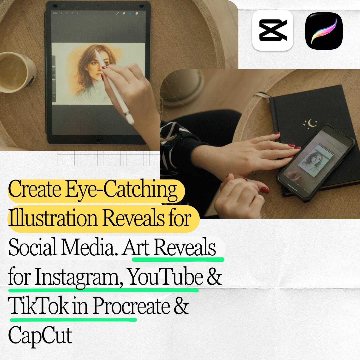
I want to show you a really fun way to make your art stand out
on social media. Listen, we are going
to turn your art into short videos and
transition that you can use on stories that your community will actually
love engaging with. I will walk you
through how to create amazing and creative reveal
animations for your arch. I will show you two
methods in cup cut and in Procreate so you can
choose the method you prefer. It looks super cool, and honestly it's easier and quicker to make
than you may think. And don't worry. I will explain
everything step by step. So let's go.
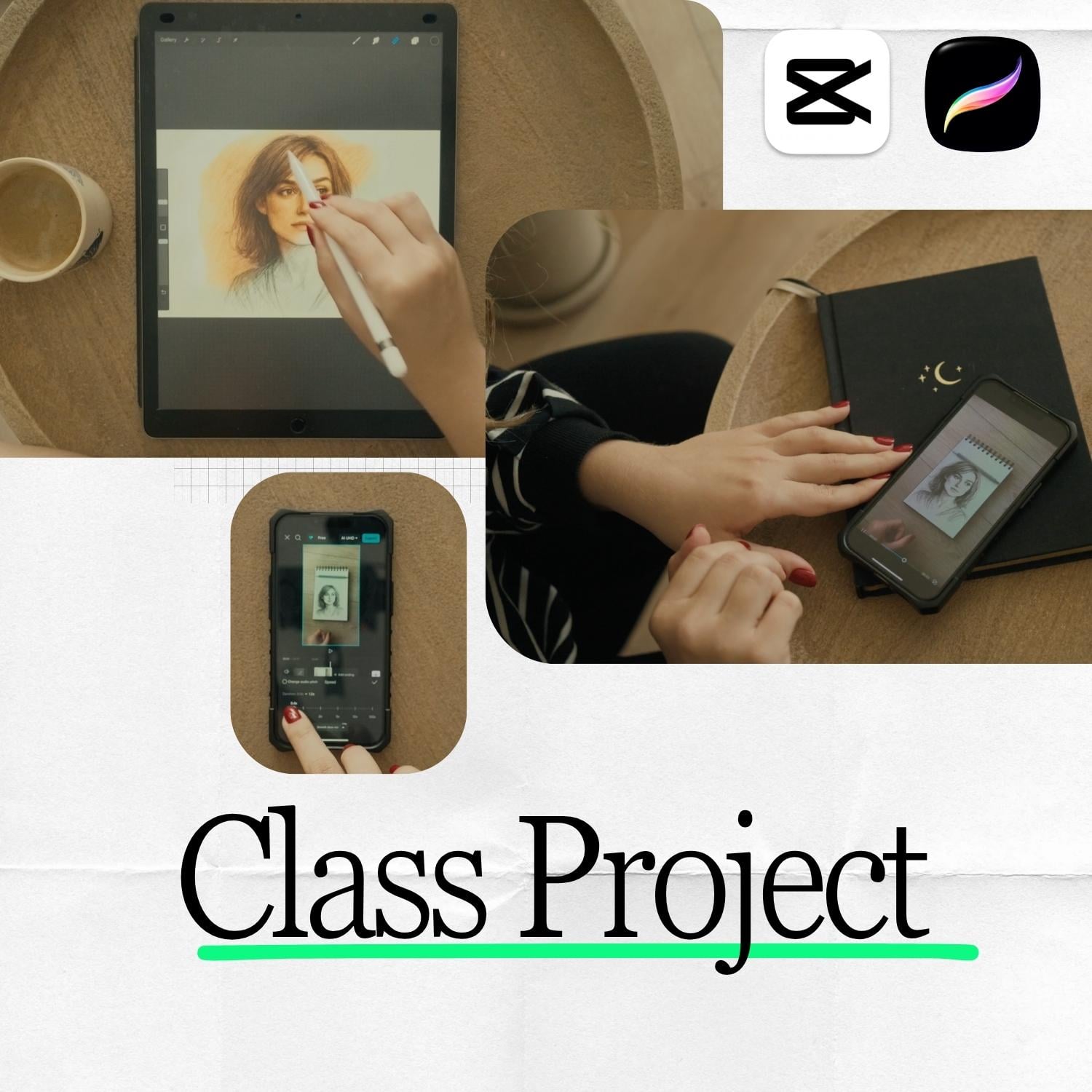
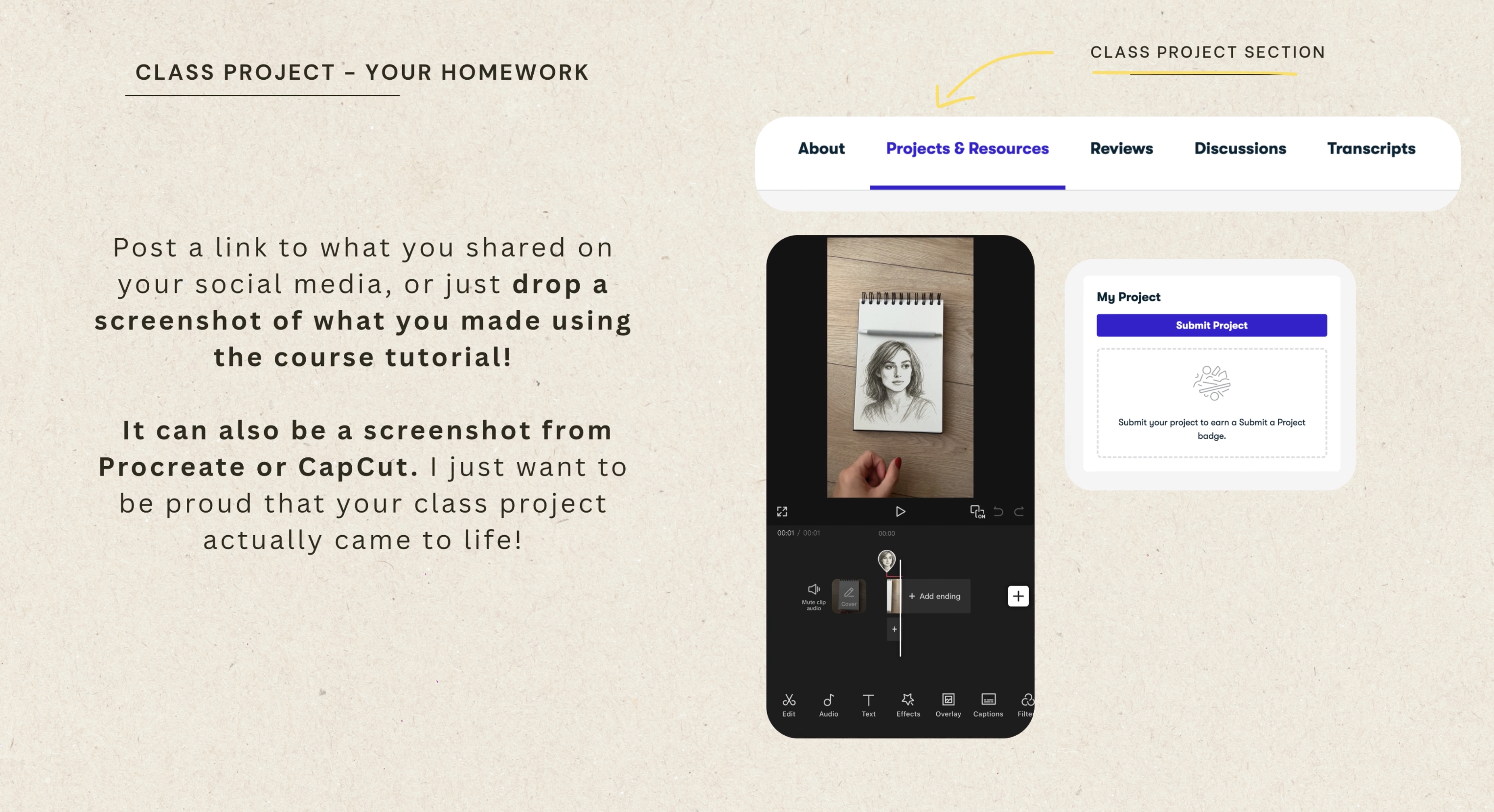
2. Class Project: The best homework for this
course for you is very simple. Create your very own
reveal transition. Show me what you've made using the tutorials because I
love to see a version. You can share it right here
in the class project section. Drop a link to a published
reveal animation, for example, on social
media, where you posted. Or post a screenshot
of your work. And remember, don't let perfectionism or overthinking
stop you from sharing. The whole point is to celebrate what you created and get
comfortable experimenting. And if you have any questions or you are unsure
about something, write it under
your class project and I will be super
happy to help.
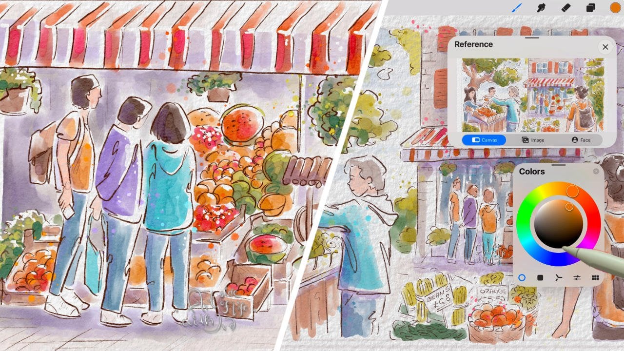
3. The Magic Wand Art Reveal in Procreate: This veal transition is super eye catching and
really easy to create. It's honestly one
of my favorites. I will show you a few cool
ways to create it and remember the final result totally depends on the eraser
brush you use. I will show you that too
because the effect can look completely different
depending on the brush. To create this kind of revealed
transition in Procreate, you will need two things first. Your sketch, the
original outline of your illustration dally in one line color like I have here, and the second thing, your final illustration, the finished version with
all the colors and details. If you worked in
Procreate using layers, export both the sketch and the final version as PNG files. That way, it will
be easier to create the transition in a new project using only these two layers, the sketch and the
final version. Now that you've saved both your sketch file
and your final version, it's time to create a
new project where we will add those two
files to work on. From your main gallery, tag photo and at the
sketch file first. On the project is created, tap the actions icon and choose at and then
insert a photo. And you guessed it. Now you're adding
the final version of your illustration as
the second layer. Here is another important step. The lines in both versions
need to line up perfectly. If anything's been moved or changed like the size of
the eyes or small details, the transition won't look
as smooth and polished. Lower the opacity of the top layer a bit and check
if the key lines match up. Do the eyes line up? Does the jaw line look right? Think back, did you move or adjust anything after
finishing the sketch? If so, it will
definitely show up here. I will show you an example using one of my
other illustrations. In this case, I made quite a few changes after
finishing this sketch. Oh. Let's see. See that? Unfortunately, the two
versions don't line up at all. The lines are in completely
different places. That's why this transition
won't work well here. Of course, sometimes
you can try to fix it a bit by adjusting
the layers, for example, moving the
final version around so the key lines line
up a bit better. But even then you won't get that perfectly smooth effect since not all of the
lines will match. In this illustration,
the final version just drifts too far from the
sketch unfortunately. Do you see that? Look, even
though I adjusted it a bit, the eyes are still
slightly different in size and in slightly
different spots. Look, that's why the transition looks okay at first glance, but if someone
looks a bit closer, they will notice the two
images don't really line up. One doesn't directly
transform into the other. That's exactly why I mentioned earlier how important
it is to keep the lines consistent and why it's best
to use this method with illustrations where
the lines stay in place after
this sketch stage. That's why we'll be working
with this illustration instead because it's perfect for this transition
because here, the lines are all
good and I will use this one to show you exactly
how to do everything. Now the super important step, we need to move the layer. The sketch layer is at the top. This is extra important because
in the next step we'll be erasing parts of
the sketch layer to reveal the final
version underneath. You need to remember that sketch layer needs
to be at the top. Now it's time to start
erasing the sketch or actually revealing
the final version. To do that, tap the
eraser icon and pick the brush you want
to use for erasing. I will show you in a moment how different brushes can totally change the
look of the effect. Also, make sure the
eraser opacity is set to maximum 100% and adjust the brush size depending on
the look you are going for. Okay, let's get back to
choosing the right brush. What's a good one
for erasing? Hm? Personally, I like to
stick with the classics. Traditional marker
style brushes give this super clean and
super striking effect. You can find them
and procreate under the built in markers category, and they are really amazing. But honestly, as
you probably know, everyone's got their own taste, my advice is to experiment with a few different brushes to see which effect fits
your artwork best. And what's next. Of course, if you want to share
this on social media, you will need to record it. The easiest way is to
just use the phone. Overhead shots usually
make the biggest impact. I used a camera and a big tripod to film my
shots for the course, but that's only so
I could show you all the details of what
I'm doing in Procreate. For capturing your
transition to post online, your phone and a small
lightweight tripod are totally enough. Personally, I think that whenever we watch a tutorial
for the first time, we always always miss a few things or
overlook some details. So Round two, just
to really in, okay? This time, I will show you a different illustration and use a different brush to keep
things even more interesting. And well, to show up
a little All right. All right. Let's start from the top. Do you remember every step? Or maybe you've already thinking you might
miss something? We begin by choosing the files. Remember you will
need a new project and two files, your sketch, perfectly a pretty
simple one with single colored lines and your
finished artwork in color. What do we pay
special attention to? The lines in both versions need to match up so the
effect looks smooth. Finish your finished piece magically appears with
just a wave of a wind, a well apple pencil
just like this. Pure magic. That's the
way it should look like. And I will probably never
shut up about this. That's why the enlightenment
is so important. The lines just have to match up. Never skip checking
that part because the whole effect might
not work otherwise. The next step, yep, move the sketch
layer to the top. It needs to be the highest
layer because we will be erasing it to reveal the
finished art underneath. Of course, not every brush
will give you a nice effect. You've got to experiment with different ones to
find your favorite. If your brush size is too small, the reveal will be too slow
and not as smooth and fluid. In my opinion, as
you already know, classic brushes work
best and make sure to go for a fairly large size for that clean
flowing transition. If your brush is too small, it will look like
something like this. Interesting for sure, but it loses that magic wand
effect we are going for. I will say that again, it's definitely
worth experimenting because you might discover that a totally unexpected brush
gives you an amazing result, but be prepared along the way. There probably will
be plenty of oh, no, not this time moments
and don't worry, I go through that
every time too. Sometimes it's not until
the tenth or even 20th try that you finally find a brush that really nails the effect you are going for. And a friendly reminder, don't forget to show me your
atoms and your results. Seriously, there is nothing I love more than
seeing your work. And if you have any questions, don't hesitate to ask. I love chatting with
you all and sharing tips and thoughts. So go ahead.
4. The Pencil Roll Art Reveal in CapCut: Are you ready? Now I will
show you how to create the Rebelo art effect in
Cop card. It looks complex. I know it may also
look super impressive, but is it really considering I'm about to explain everything
in just a few minutes, I think we can safely say, definitely not
complicated at all. Of course, the first thing, you need to open Cop cut. You don't need the paid
version for this effect, at least not at the time
I'm making this video. To create this effect, we will need two things. A photo of your sketch
and a video filmed on your phone of a pencil or marker moving across your
notebook page just like this. It's very funny because filming such a simple video sounds way easier than it actually is. It's really easier
said than done. The best tool to use is a plain pencil or pen without
any bombs or decorations, since those can mess
with the motion. I struggle with
it too sometimes, you can see here, the pen at first didn't want
to move at all, and then suddenly
went way too fast, and the next one didn't really have the energy
to roll smoothly either. But it's not just about picking a simple undecorated
pen or pencil. The size of your node book
actually matters too. I know. It sounds very funny, but take a look and let
me show you really quick. This one has pages that
are way too big and wide and the pen doesn't
cover the whole width. That would limit your
editing options later and your illustration
would have to be as narrow as the pen itself. This notebook doesn't really work well and won't give
us the effect we are aiming for unfortunately. Okay. Let's look at this one. Unfortunately, it's too small. As you can see, the surface area for movement is pretty limited, and for most illustration, it just won't be enough to
show off your work properly. Oh, of course, there is, for example, this one. Is the perfect size to
fit your illustration. It's not exactly a fault to put it in international terms, but more like a large
school notebook format, which gives you plenty
of room to work with. The pencil or pen
movement is much longer. The space for your art is
just right and it's going to be much easier and more
fun to work with in Cpcart. When you are
recording the video, make sure your pen
or pencil travels across the entire
length of the page. It doesn't have to go both ways. That's easy to fix
later by simply reversing the clip in
cop cut during editing. Record at least a few takes and make sure at least
one of them looks good and that your
pen or pension really travels across the entire
length of the page. Also, watch out that your hand doesn't block the
movement or accidentally slip into the frame because that will make editing a
lot harder later on. It's totally fine if
your hand appears at the start to set
the pen in motion, but after that, keep it away from the page
and one more tip, record the movement in 60 FPS, so you can slow it down in cop
cut later because that way your final effect will look much smoother and more polished. Input only your
bestik into cop cut. Watch the whole clip
carefully to find the exact moment when
the pen starts moving, and the moment when it
reaches the end of the page, that's going to be the start
and end of your video. You don't need anything
before or after that, and use the trim tool
to cut your video and remove those
unnecessary parts. Just keep the clean
section where the pen smoothly travels
across the page. That's the movement we
need. Nothing else. Now we are going to work
with the overlay since the main timeline in Copcat
is just our notebook video. What we need to do now is add your art on top of
it as an overlay. That's what will appear
on the notebook. Go to the tools and find
the overlay option, then tap at overlay. Now we need to import the
photo or scan of your art. It works best if it's a sketch on paper or a file
from Procreate, since that makes removing
the background a lot easier. Next, scroll to the
bottom and find the background removal option
and then tap chromo key. Use the color picket to
select the background color. Once you do that, Capcot will automatically remove
everything in that color, and that means you
will get rid of the paper or any
other background. Now, that your art
has no background, adjusts its size and position, so it looks like it's
really sitting on the page as natural and
realistic as possible. Now we are moving on to masking
with your overlay layer, your illustration in
simply wid selected, scroll to the end of the cup
cut tools and find mask. We are going to apply
horizontal mask. When you select it, you
will notice it appears in the wrong direction by
default. But no worries. You just need to rotate
it 180 degrees with your fingers so that
your illustration will appear in the right
direction during the reveal. Go ahead and flip the masking
line around 180 degrees. That's how we will get the
reveal to move correctly. Now we need to find
the moment when the pen starts rolling
onto the paper. Once you've got it, move the masking line
all the way down, so it lines up with
the pens position at the bottom of
the notebook page, and now comes the most
important part using keyframes. We need to add the
first keyframe right at the start of
the pens movement. Then slowly move forward through the timeline and
watch where the pen is. As it moves, adjust the
mask position so that both the pen and your
illustration move together. Side by side, just
perfectly in sync. Here is a helpful tip. As you keep moving
through the clip, new keyframes will be audied automatically when
you adjust the mask. If you see a keyframe
icon with a minus sign, that means a keyframe has already been audied
at that point. Every now and then,
check to make sure the movement looks right
and every flows smoothly. The more key frames you add, the more precise
the motion will be, but it also gets easier
to make a mistake. I wouldn't go overboard
with them just add enough to keep the movement
natural and consistent. In Wala, we've got it. At this stage, I like to save the effect and then import
it into a new project. And from there, I duplicate the clip and
reverse the second one because that way the
pencil open moves in both direction and
the whole rebil looks even more
dynamic and polished.
5. Final Words & My Question to You: That Okay, I really hope that by now, you feel super confident
about creating these school reveal animations and
most importantly, that you are proud of
what you've created. If you have any
questions at all, don't hesitate to ask seriously. And in the meantime, let me
know in the review section if you enjoy this effect and what you'd love to learn next. I absolutely love sharing my
creative methods with you, so make sure to keep an
eye out for updates, and I've also created other short practical courses that are waiting for
you to be discoveD. And please share your thoughts. I honestly enjoy chatting
with you also much. You feedback and your reviews
means the well to me, so I hope to see you there.
 Kasia Pilch, Online Strategist & Marketing Specialist