Transcripts
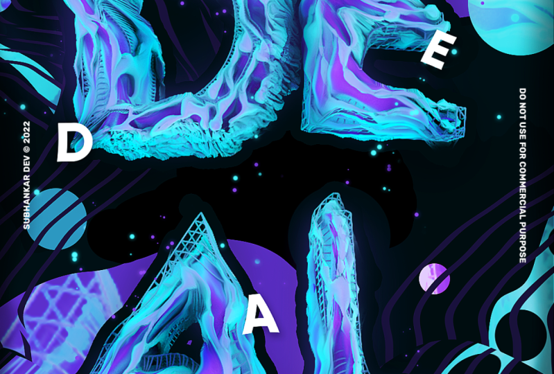
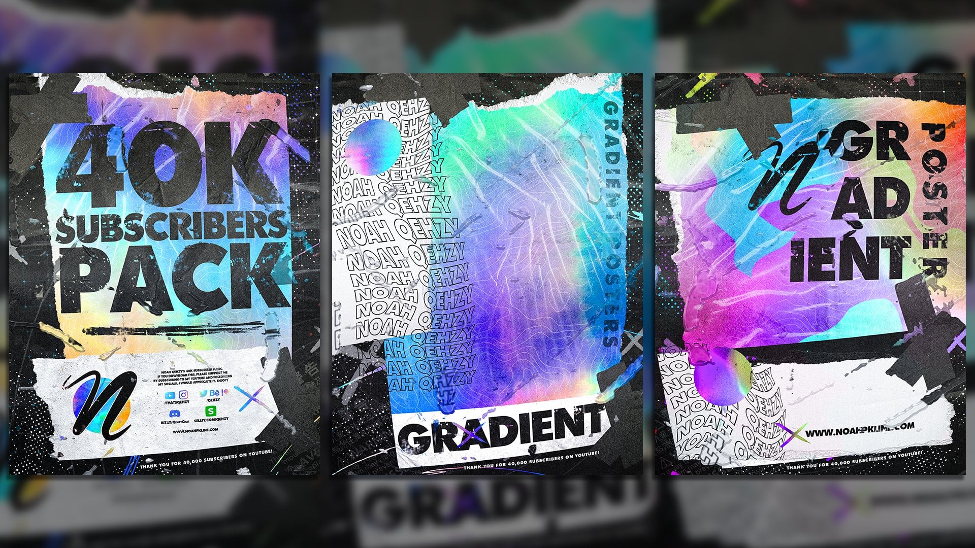
1. Introduction: What's up, guys know here or quasi? And today I'm gonna be showing you how to create this abstract, simple 40 and Photoshopped poster. We're gonna be using a plug in in cinema four D, and I'm gonna show you how to create some abstract, wicked looking text and then how to take that into photo shop, make it even more interesting, and then combine it all and create a nice looking poster, um, which you can turn into a banner or any sorts of things using the same technique. Um, and hopefully you guys will learn something as we go through this process. Um, and let's just go ahead and get started.
2. Setup - What you Need: before we get going, we have to install a few things and get a few other things ready. So the first thing you need is a light room forcing a 40. I'll put a link up on screen right now that you guys conveys it real quick and download one , which would be one of mine. But you can download these on the Internet or make your own, or if you already have one, great. And just go ahead and open it and get ready for some text. Um, also, you want to go ahead and download this plug in the Alvey Ole plug in. So you have to visit this website and click the download button. If you're struggling to find it, just follow what I do on screen. And hopefully nothing changes in the time that passes between you watching this and me creating it. Once you download it, you want to unzip it and you will get it in a folder like this. This is Vonk. LV old years probably won't have a two. Or maybe it does. I don't know. I've installed this before. Um, but once you do that, you want to drag this two year plug ins folder, which is in your max and folder. Um, if you're not sure how to get there, I always open cinema four D Go to content browser presets and right click one of these and showing finder and that will bring this up. And if you go back a couple, you'll see a folder called Plug Ins and mine's already installed there so you can just drag it over into your plug ins. Once that's done, you're gonna want toe quit your civil 40 and restart it, and then your plug ins will be right here, or that Alfio plug in will be right there and then once you that you are ready to go.
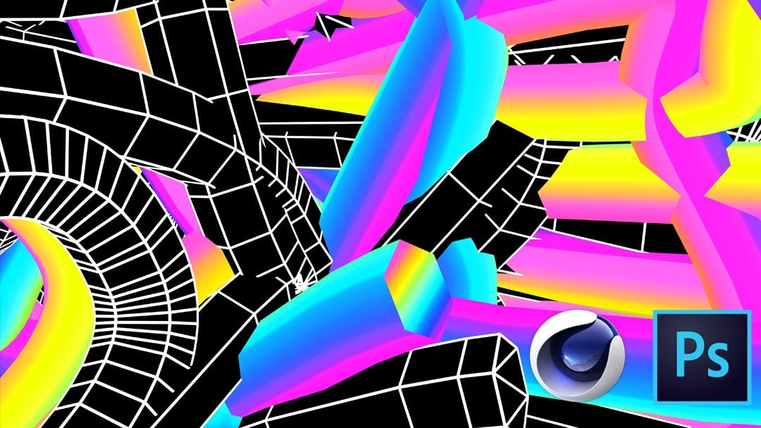
3. Cinema 4D Setup: all right. Now that we have everything installed, we can go ahead and start creating the poster. So the first things first is to get into that simple 40 light room and go to mo graph mo tex. And then, um, I like to set mind to allying middle. And you can take whatever you want. And I'm just gonna take days, which I use before. And since this is gonna be a portrait, um, set up, I'm gonna try Teoh, make use of my space and put a return in there. Sorry. Text is nice and vertical like this. And then the vertical spacing I'm gonna decrease to about negative 50. Maybe we'll probably to play around with this. Um, maybe even a little more will try 60. That's a little better. Um, and that way, our text is nice and close, and we could make use of that. Now, let's go ahead and select a farm. Now, this will take a couple seconds for mine to load, So Okay. I'm gonna be using a fun called Blanca. You can use any font you like. Um, doesn't really matter. Here we go. Um, let's go to the depth. Here. Let's make that about 75 right below it subdivision. We're gonna make that six and you can see what that does to the text here. It adds thes lines. If you don't see these lines, go to display and make sure your shading lines are on. Um, if they're off, it'll just look like that. But when you turn him on, you'll be able to see those lines. Um, in between, go to intermediate points and then go to subdivided. And that's everything for the object. Have no go to the caps tab. We're gonna leave it at cap and cap, go down to type, and we're gonna do quadrangles and check regular grid and you'll see a grid show up there. And we're just gonna bump that down to about seven. I'm gonna go ahead and zoom in here a little bit. It kind of set up the text a little nice. Her group. All right. Now, while we have the mo text selected, we want to go to McGrath defector random goto parameter, and you can leave the position checked and do a small number like five like so. But you also want to check rotation and add a couple negative. Here I went about negative, Tanisha of negative 11 There I can go a few negative on this one will go eight and then the last one will go positive for And I just gives us some tilted text and makes it look pretty nice. We can drag that random to the bottom because we really won't be using it anymore. And it should apply that effect to the text even when we duplicate it. Now let's go get our plug in Salvio and drag that into our text and you'll see it will create this kind of cell effect if you will, to look something like that, Um, which is kind of coral in tone and this is Ah, we're at the point now where you guys can start experimenting with things you may want to follow through with the video and then go back An experiment that might be easier. Um, but this plug in could do a lot, so I recommend just playing around with it and having fun eso on that plug in. We're going to go to the pie gone. Reduction said that to 35%. We're gonna go down too. With said that to seven extrusion. We're gonna set that to seven. Ah, uniformity. We can leave at 10 extrusion subdivision. I'm going to do to cat more Clark's of division. I'm also gonna do to and finally we're gonna come down and check Phil. Now, at this point, um, I'm gonna let you know that if you want to move your text or play around with the random effect, Er, um, I'd recommend, um, uncheck ing the plug in or anything else we add to the text because of you try to do those things with all these on. It's gonna take a while to do all the math and stuff like that. But you can see this is what our text is sort of looking like right now, which is pretty cool. I really like that. Um, one thing that I forgot is if we go back to mow text and in the cap section, which has create single object, be sure to check that. And that will make, um, everything a solid rather than having those big holes through each letter, as you could see Now everything's together in, and that looks a little nicer, right? Now, let's go ahead and add a few more things. First thing we're gonna add is a polygon reduction depending on your signal. 40. It might be here in the effect er's like down on the right here. Mine doesn't have it. And I can't really find where they put it at now. So I'm just gonna go to the search in search Polygon polygon reduction. Now let me click it and then let's go ahead and add that now. This will really require a lot of math to be done, and it's a subtle effect, So if you don't want to use it, that's fine. I'm gonna go ahead and use it, and it shouldn't be too big of a problem. But we're gonna send said we're gonna set that to 59. Then let's go to the defectors and do a display, sir, at that below the polygon reduction, go to shading, click the arrow and do noise. Now let's go to display in New. We don't really need those lines anymore. Now this might be a little too strong, so we can go to the object. It may be bumped the height down to seven ish seven or eight should work. Now if you want to give it a quick render just to give you an idea of what's what it's looking like, it's looking pretty good. I'm going to go ahead in, click here and add a subdivision surface just to smooth out everything a little bit more. Because in the end, product in photo shop, we're gonna be doing that anyway, So it's nice to do it now, even though the plug in does it for us. Um, I like to do it a second time. So there we go. There's the text. Now we have two more steps to kind of finish this off. So what I'm going to suggest is unchecked. These three things. Our plug in the polygon reduction in the display, sir. Go the text commune C Command V, um, select all those things in there and delete um, so we just have our text, and then you can recheck all of those and bring him back again once you re cecum may take a second to do all the math and everything. Um, there we go. Now, let's go to, um, Adam array and get one of those and add the mo text to that. Now, in the moa text, we're gonna set the depth to 50. Um, you can go change just about everything with this, so I'm gonna go in uncheck regular grid and you could even set this back to and guns. But I'm gonna leave the quadrangles there. Let's go to Adam Array and said this 2.5, I'm gonna hop out of my camera and dragged this a little bit back. So there's space in the front in the back of the text. So now we have a nice, like, little grid there, and if we go back in the taxi, I'm gonna set the subdivision 23 and I think I'm gonna be happy with that. Now, let's go to the subdivision surface, duplicate that whole, um, section here, and we can go ahead and do the uncheck thing again and then recheck both of these and again , we'll give it a second. Now go to our plug in and scroll down and uncheck Phil so that will get rid of the fill part of this and kind of make it They're given more holes and then if we go to our Mo text . Um, you also don't have to do the subdivision surface on this one. So I'm gonna drag it out and delete that, Um, if we go to the moe text, I'm gonna increase the depth to 85. I'm gonna hop out of the camera and bring that text a little bit forward again. It would probably be easier if you hide all the plug ins and display, sirs and things. Why you do this? So the math doesn't take his long and you can see what you're setting up. Um, but I nailed it. So there is our text. That's everything I did. Of course, you can go through the plug in and change with the settings or change the settings of everything. Really? It's up to you guys, but now we have to go ahead and add some materials.
4. Cinema 4D Materials + Render: All right, now we're gonna add of materials to this. So you're gonna want to create a new material by going to create new material. I have my materials already saved here. So it's this 11 and this 13 And this three material is like a bluer one, and then the one materials, like, a little darker purple. So if I double click on this, you'll see sort of how to create this. You don't need to reflect its on, um, so that's optional. But if you create a new material, go to color, you're gonna want to do a ugly yellow and then on Luminant, you're gonna want to do a Grady in Fresno here. So if I open this up, I'll show you how it kind of looks. So if we go to color, um, do like an ugly yellow here. So 63 60 to 58 works. I guess I could have looked at the color there, but, um, let's go to Lou minutes, hit the job down and do layer click that go to shader color, pick a color you want. I'm gonna go ahead with a blue um to 5 67 in play, not 100 will go 90 at the up arrow Shader Fresno said that to overlay and boom, there is the blue material. So three right there. I open up one you can see this is like the same thing, but the color is more purple instead of yellow. So three or 5 60 to 55. So if we duplicate that material we just created go to color. And what was it was a 25 three or five three or five 62 55. Oh, so this is basically it. There we go. There are our materials then and you can see they are basically exactly the same as the ones I had created. And again, you don't need the, um, reflect its unnecessarily. The first material with the yellow. We're gonna go ahead in drag that to the top mo text and the atom array and then the other material more purple one we're gonna add to the subdivision. Once this loads, I'm gonna show you guys what it looks like in a quick render. And that's what our text looks like. Now I kind of want to tilt us a little more so I'm gonna go back to my random effect er and again uncheck all the plug ins and things and we're gonna increase some of this. So let's But that went up a couple, but that one damp down, one down, I think that should be good enough. Rechecked this and there we go. Okay, now we're ready to render. So if you go to your render settings here, um, I'm in a standard render. My output is just 10. 80 p 1920 by 10. 80. And I'll go through all these settings here for you guys if you just want to copy. So I'm gonna save it to my desktop. I'm gonna have to actually name it Something else. So it doesn't overheat the original. Make sure Alfa channels checked. That's the big one. Make sure it's PNG. Um, don't do. I'm not gonna do multi pass anti alias ing geometry. Cubic. Here. My options. If you want to pause and look at him, just make sure that the same team render I have a media inclusion. Checked an object glow. Um, those two things maybe you don't necessarily need, but if you just want to have the same thing I do, that's fine. And then once you have all that, go ahead and click render And once this is done, we can go ahead into Photoshopped.
5. Photoshop Text : All right, Now we're in photo shop, and we can go ahead and set up our document. So let's go to file new and I'm gonna do it. Document size of 1500 pixel height in a 10 80 with and 72 resolution. My background color is black, but that doesn't really matter. And we're gonna go heading Click Create. Now, we're gonna go ahead and drag art text into our document. I'm gonna zoom out here and just increase the size to fit how I want. You could make it small. You guys could make it big and fill the whole page if you want, I'm gonna leave some space about there and hit Enter. So the first thing we're gonna work on is the text itself. So I'm gonna right click Rast, Arise that layer and I'm gonna duplicate it with command J. And I'm gonna go filter distort wave and we're just gonna add a little bit of distortion too. This text and erase some of it. So let's play around with some of the sittings here. All right? So I'm gonna go, um, about 2 70 max to 75 max on wavelength and amplitude of around 30 min. 10 men, Five, as you can see. And you can copy my sittings here. If they're not the same, go ahead and click. OK, then. And you can see we get this slight distortion. And actually, I'm gonna go ahead and do that one more time. I'm gonna add a little more wavelengths. Let's go or let's go a little lower. Rather, maybe 1 50 Yeah, that's a little better. Um, so you can see we have this distortion. I'm gonna go down and click the layer mask, go to my brush tool, reflect a soft brush. So the hardness is zero, and then I'm gonna make sure black is selected. And on this layer mask, we're gonna go ahead and just erase some of this. So I'm gonna go through like the main part of the text may be leaving some wavelengths, like right there. Um but really, I'm just trying to leave some of this distortion on there. If you create something that looks a little off, like right here, you can go ahead and erase that, but try to keep a little bit of the wave effect in the front. Facing part of the text. It just gives it some character. You can play around until you find something you like. But also make sure the text is able to be read that you don't want distorted so much. That three user can't even read it. Um, so that works. This a looks really sweet with it, so I'm gonna just breeze a little bit of it. Maybe Reese that bit, um but yeah, I think the Texas still readable, and you can see the difference here. I'm actually gonna get rid of this, like, overlapping area here, and I'm pretty happy with that. Maybe this bit down here on the S is a little too much, but I will just roll with it for now. Now go ahead and select both those layers. Command Jada duplicate, um, and command E to merge them. So now we have one layer with both of these layers combined. Go to filter style eyes, oil paint and set your settings. You want to do a stylization of 4.3? You can go higher if you like to, um and then in 10 10 10. And make sure shine is zero. Go ahead and click. OK, and again go to your layer mask like that. Get the brush tool and we're gonna race some bits here so you can just kind of click around . I don't really have a set method for picking what I erase in what I don't erase. I just try to mix it up and give some of this smooth oil paint effective some parts of the text. I just think it looks pretty Meet with thesis before D plug in that we used and combining that with the wavelength or with the the wave effect we just did. It kind of just blends that effect together with everything and looks pretty nice. You can see that's the difference. It kind of blurs some bits and I'm gonna race a little more. And then, if you would like, you can set that opacity a little lower. So I go down to about 80%. Just so it's not too overwhelming, cause it is a pretty strong effect, and you can see what that does for our text. Um, now we can go ahead and select thes three layers and command G to group them and create a new layer hold all and click at the bottom of that layer to create clipping mask. Go to your colors and I'm gonna click the black and white, but in here to give us black and white as a background, Make sure white is the background in the press command Delete that will fill our layer with white. And we're gonna set that to overlay and bumped capacity down to around 50 or around 30%. You might have to go lower or higher, depending I'm gonna go a little lower. I'm actually gonna go down to about 15. I think anything alone, anything higher than that is a little too much. So I'm gonna go 15 creating another new layer all click to make another clipping mask. This time, we're just gonna get the brush tool and have black selected. And we're gonna just fill in some of the shadowy areas that have been kind of cancelled out by that white overlay. So we're gonna just add some black in here. You can also do this the same way and just erase some of the white um, layer. But I like to add the black to maybe increased some of the shadows as well all right. Once you're happy with your shadows, go ahead and set that to overlay or you consider to multiply. It's up to you. I'm gonna go ahead with overlay and decrease the capacity. And let's go about 45. I think that works. Now we're gonna go and create another new layer, get the brush tool again, increase the size. So it is about the width of our letter. So I'm gonna actually use this a down here for a guide. So that's about the same thickness. And let's select a color and we're going to select one of these purples in the text. So let's try maybe right there. And that's about perfect. You want it like, right in the middle So you can see I'm not too far to the white, Not too far to the purple. I'm right in the middle here, which is what you're gonna be looking for. I'm gonna click, OK? And I'm just gonna follow the letters, mainly the front part. If you can see a lot of the sides, you don't have to follow. It just keeps on the front part or where mainly the purple is or the color you're using. So follow the letters like that and said that layer to screen and you can go ahead and bumped down the opacity. Um, you just you don't want to strong, but you still want the effective be there. Gives it like, a glowing effect. I think 34% works in my case. Here again, you can play around with your settings and find something you like. Now we're gonna go ahead and add some particles on top of this. So if you want to name that layer globe and named the folder texts or whatever you'd like and go ahead and create another new layer and name this one particles, we're just gonna create some particles around the text. And there's a couple ways you could do this. If you have a brush save that has particles, you can go and use that. I have a few that I use for particles, or you can go ahead and use either a soft or a hard brush kind of up to you. I'm gonna go with a hard brush and I'm gonna make the pixel size about eight. And then I'm gonna keep that purple color selected or select another purple color that's up to you. And I'm gonna go do this brush settings button up here, and we're gonna go ahead and play around with some of these settings. So the spacing here, first of all, we're just gonna increase all the way we're gonna go to shape dynamics size, jitter We're gonna turn all the way up and then scattering. We're gonna go ahead and turn that all the way up and you can increase the count as well, if you'd like. I'm gonna just set that at two. So it's not too crazy, and that should be good. Now, on this particles layer, we're just gonna go ahead and click around and you can see we get different sized particles and I like to stay sort of around the text. I don't like to go too far. You can also do this throughout the whole poster canvas. It's completely up to you guys. Um, feel free to do whatever you like, but I'm just gonna go ahead and click mainly around the text. All right, so there are mark my particles. Now you can create a new layer and do the same thing with a bluish color. But I like to do the old duplicate command J command T flip horizontal and flip vertical and then holding all I'm just gonna increase the size a little bit like so and hit. Enter. Now this kind of spreads out are particles even further. And if we double click on that layer, go to color overlay and select a color, we can select a blue. So I want, like, a brighter blue. Maybe a little brighter than that. Let's try this one. That's what I'm looking for. Click OK. And OK, and then right click and arrest arise that layer. So now we have some particles. Um, if you think that they are too strong, too many of them you can go ahead. It's like both those layers command eat, emerged them and go head into our layer mask thing that I did earlier. But be sure to go to your prices settings and revert them back to how they were before and go ahead and increase the size here. I'm gonna go with a soft brush and just kind of click around these densely populated areas . All right, so I kind of decreased some of those particles and I'm gonna duplicate that particle layer . Go to filter, Blur, Gaussian Blur and 3.7. So yet that should work. Maybe a little further, as do about four pixels of blur. Click, OK, and set that to screen. And I kind of give those particles a bit of a glow and you can go to the original particles layer and decrease the opacity if they're too strong. But I'm gonna leave him at 100 now. I did this thing where I added some of Photoshopped text to the three D text to make sure um, you could read it, so if I flipped back here, you can see I did a d a. Y s throughout. And I mean, that's just something that I think looks pretty neat on posters. So I'm gonna go ahead and do that. I'm gonna make sure white is dif foreground color. Click here, and I'm gonna just type in a D command T and increase the size. Um, you might have to hold shift depending on your version of photo shop, obviously, And I'm just gonna set this to a about the size I want. I think that works. So let me tell you what size that is. It's about 1 17 a little higher than it. And I'm using the font baron new if you're interested. And I'm gonna duplicate this, said it over somewhere on the A duplicated same thing with the why and duplicate it for the S. And of course, go in and change all those letters A. Maybe arranging more appropriately, put that one up there. Let's put the wide down there and let's see what works with neatness. We'll go about their And once you have that figured out, go ahead, select all those layers community to emerge them. And I just like to call this days. Just rewrite the text and let's go filter. You can distort them with a twirl, um, or a wave or really any of the other ways. But I I like wave and you'll notice is a common theme throughout this video. Um, or this Siri's is me using the wave distortion because I really like it and we're just gonna increase the wavelength size to somewhere in the five hundreds. Click OK, and there we go. There's some distorted texts and I'm just gonna drag it up just a bit and I'm going to double click on that layer and go to drop Shadow and I think thes air my settings from before. Maybe I'm gonna change the angle to about 1 15 And so my distance here is eight. My spread is 17 and my size is 18. Uh, opacity is 25 the blend modes multiply. And that just kind of makes the letter stand out a little bit more and I'm gonna click. OK, now, the last two things before we can move on to the background, I'm gonna select our text. Down here are group and I'm gonna double click it and select a stroke. Now, make sure the stroke is said to outside and select a color. Um, we're gonna be using our background color, which we don't have up right now, but it will be 01111 five and then click. OK, click OK or actually, no click OK once and then change the size to 21 and then click OK, and you'll notice we have this stroke going around our text and it looks pretty ugly right now, but it will work out towards the end once it blends in with our background, and it makes the text a lot more legible and easier to read. If you don't like it how it looks right now because we will be going to the background soon , and it kind of is a distraction. You can uncheck the eyeball so it's not visible for the time being. And also we're gonna go click the background, creating a new layer, uh, have a white selected for now, get your brush tool. Make sure is a soft brush with 0% hardness, and we're gonna just decrease the size of that a little bit. So it's a little thicker than our text, and we're gonna do the same thing we did before and just follow our text. This time. This will be a shadow rather than a glow. Um, so just follow your text like this, and it doesn't have to be the best. It just has to be a general kind of layout here and decrease the opacity to about 20 and then hit command I, which will inverse it and make it black. So it looks something like this. Obviously you can't really see with the background, but if I make it white, you see, it's just like a subtle shadow. And that will also help distinguish the text from the background which we will use later on . Now the final thing is select everything we just did and command Geeta group it and we call this text now we can move on to the background.
6. Photoshop Background: Okay, so now we're onto the background. First thing we're gonna do is select the background layer here, go down to the effects and add a solid color. Now we're gonna use that solid color. I just mentioned that we used as a stroke. So 011115 and click. OK, and we're gonna create a new layer above that, and we're gonna create, like, an overly effect I like to use for posters and various things. So we're gonna grab the pen tool, and you're just gonna create a shape that go that starts by clicking outside of the canvas , then click inside, then click outside and then we're gonna click outside again, but kind of make it go through this corner and then click inside again. Click outside, click inside, click outside, and then we can go around and connect it. You could also go inside one more time if you'd like. Um and then we're gonna right click Phil path and fill it with white Click. OK, ray, click and delete path so you can see we have this, like white shape in the background of our canvas. So let's go to filter and distort, and we're gonna use the wave effect again. And this time, let's decrease the wavelength size to about 2 50 And we can actually jump up the amplitude if we'd want. So I'm gonna try out 75 click, OK? And you can see we get this sort of look, we're going to set this layer than to overlay and bump the opacity down somewhere in the twenties. I like 22. So that's just a subtle background effect to give us a little bit of like distinction amongst the background. We're also going to go into the text folder and get that glow. We did command J and duplicated Drag it down outside of the folder and you can close the folder command T to transform, hold all and increase the size and fill the entire canvas with it like so and hit enter once you have it at a spot you like and we're just gonna keep it at on, blend motive screen and just decrease the opacity a little bit. I'm gonna go to 10% and you can see that just adds a little bit more to our background. No, we're gonna go ahead and create some interesting shapes in the background. So it's creating new layer and get the pin tool again, and we're gonna create a shape that starts from the bottom left and goes through to the top , right. You can do a bunch of different things with this. You can go straight across and just make it a straight line. Or you can kind of create your own custom shape, which is what I'm gonna do and sort of follow the text a little bit because this inside part will be erased anyway. So let's just go ahead and mess around here a little bit. Okay, so there we go. There's my first shape and I'm gonna right click Phil path. Fill it with a color and I'm gonna use a different purple. I'm gonna use a little bit of a darker purple. So let's go in here and click. And that's perfect. So you can see our last purples maybe appear this one's a little darker down here. I'm gonna click, OK? And OK, right Click delete path. We're gonna create a new path, and we're gonna do the same thing in the bottom. Right? And the top left but we're gonna make the shapes blue, so kind of just create any sort of shape you like. I'm gonna try to avoid the text this time, So there's our first shape. Now let's go to the other side and do the same thing. There we go. I think I'm okay with these two shapes. Of course, you might not be satisfied right away, but for tutorial purposes, I'm gonna be happy. And we're going to just move on here. So once you get the shapes you like, we're gonna right Click who that's actually command. Click off the path. Make sure neither of them were selected, then right? Click Phil path, select color and go with a blue. So I like that blue. Um, again, click until you find, like, a medium blue here. This one's leaning a little more on the blue side than the greyish white side, which is fine. And we're gonna click. OK, ok, right. Click into the path. So now you can see we have a few different colored shapes through the canvas. We can go ahead and merge those now together. And one thing the reason I keep him separate is if I want to, like, increase the size of the blue. I can command t and I go ahead and resize them and keep them together. You can also do each one of the blues on their own layer and transformer however you want. But in the end, we end up merging them together anyway and calling them shapes. Now, what we're gonna do on this layer is create a layer mask and make sure black is the selective color. We're gonna get the brush tool again, and this time we're gonna get a hard brush. So a hardness of 100% and we're just gonna cut out some circles. So I try to follow some curves here so you can see there's a nice curve right here on this blue. So I'm gonna try to put a circle like right there, that sort of follows it and then maybe do a similar thing over here and maybe a small one right there. And we're gonna do that to all the texts or all the shapes. All right, there we go. So put some holes throughout the shapes, and we're actually gonna go ahead and grab the shape tool and get the Ellipse tool, and we're gonna create some circles about 45 circles in some other areas of the canvas. So I'm gonna start over here and create, like, a fairly decent sized one about there. Let's go to the top here, create a smaller one. Hoops. Let's actually get off that. Oh, actually, what we can do is instead of creating a new one, we could just duplicate this, drag it to the top command t hold all and shift and decrease the size. That's a lot easier. Um, and we can set this wherever we want. I'm gonna just put it right here. I'm gonna get a little smaller. That's duplicate that one. Move this one down to the bottom left, increase the size of a bit and then duplicate that one and bring it down to the bottom. We're gonna put this. We'll go right here. All right, that works. I'm gonna make two of these purple now and two of them blue. And they could be all sorts of different blues and purples. It doesn't really have to be the same one that we use before, so just double click on the Ellipse, so I want this one to be purple, Some just going to select a purple in there. Cool This one I'm gonna do blue. It's like the blue maybe a little brighter That works This one purple? Yep. And this one blew. I'm actually gonna leave that one a little grayer and darker since it's at the bottom and click. OK, so we could rearrange these. However we want I'm actually gonna bring this second blew one up to the corner. Feel like that's a space that needs filling. And arrange this however you want until you're happy. And then we're gonna select all the circles and command you to group them and call that circles. Uh, we're gonna go ahead to the text folder, command J to duplicate that and then come in and eat emergent. Now we're gonna set this as like, a color dodge on the circle and shapes. So I'm gonna drag it down above the shapes layer, hold all and click to make it a clipping mask. I'm gonna zoom out here a little bit, command t hold out and just boost up the size like so and try to arrange it so it feels as much of the purple and blue shaped as it can like that. Zoom back in and you'll notice it's really blurry, which is fine because we're just gonna go ahead and set it as a color die. We're colored colored dodge. There we go and decrease the opacity. I'm gonna go about 60. That works. Also, I'm gonna go into my shapes layer mask and get rid of the middle area here. So let's grab the brush tool. It could be hard or soft brush. I'm just gonna get get rid of it right here. Here in their cool. Now go to the text that we have as a clipping mask. Duplicate that dragon above the circles group and make it a clipping mask as well. And I'm gonna companion t right, click, flick, horizontal, maybe take it down a little bit to fill everything, and I'm actually gonna get slightly smaller. There we go. And that's a pretty nice I'm actually gonna bump up the opacity tiny bit to 75 to make the circles a little brighter than the other shapes. And I think that's pretty good. This one's a little bright, Um, so we could go in there in tweak that. Meet bumped capacity down to 69. I'm gonna adjust the size of this room fast. Make sure your later said to color Dodge. What do you have? The sizing, right? Positioning right And the opacity you like. I'm actually about this one up to 70 and increased this one to near 80. Now that I got my blending mode correct. And we're gonna go ahead and create a line pattern. So to do that, we're gonna go creating new layer, and we're just going to click black and white and make sure this is black. Get the shape tool and get rectangle greater rectangle from the top to the bottom. Relatively thin. We'll go about 30 pixels what with and go ahead of blindness towards the left side and then duplicated and drag that one to the right. Select both those rectangles. Duplicate him three or four times. Select all of those layers, go to layer, distribute horizontal center, and we can actually duplicate maybe two more. And we do that and let's see what that looks like. I like that a little better. And let's go ahead and command, Eat emergent once you are happy and I'm gonna press command t and bring this into just thin everything out. Maybe about things says about 412 pixels wide. A little less than half the with the document. Duplicate that and change the color to white or something else. Really press command t and just rotate it slightly like that. So if I zoom in here, you'll see there's little effect here in the middle. If we go to the edges, Deep black bit is a little thicker. So if we hit, enter and we zoom out, press command and click the white rectangles. We just tilted. Hide them by clicking the eyeball. Go to the black rectangles and press the layer mask. You can see it does something like this where the middle is thicker and the edges are wider . And we just want on that layer mask press can, and I to inverse it. So now the edges are thicker in the middle is a little thinner. Now, you see this little square here from merging. If we double click that, we can actually select the color, so select a darker purple. I'm just gonna click somewhere in the text and then go ahead and drag that purple down a little bit, make it a little dollar. Um, I think that's pretty good. So this one is one A 1933 X code click. OK, and we're just gonna go ahead and align this in a few different places, so I'm gonna press community, rotate it and drag it to the top. Here, you drag it down a little bit, get some thicker lines, appear and duplicate again. Bring it to the bottom. We'll change the rotation here, so it's not exactly the same. And have it go through a few. These shapes we have in the background so goes through this circle the circle part of this shape, part of the shape and a little bit of that shape. And actually, I'm gonna rotate it even further and maybe bring it up like that so it gets a little more of this in a little more of this shape. Um, once you are happy with that alignment, we're gonna go ahead and group both those rectangles. Command G command, Jada Duplicate, um, and command eat emergen. So now we have to one in the group and one merged the merged one we're gonna use and the one in the group we're just gonna hide for now. And you can call that like, rectangles or whatever. Just have it as a backup in case you mess up where one ADM or something like that. Now, on this one, I'm just gonna call it our I'm gonna go to filter, displace or distort and do the wave. This one, we're gonna increase the wavelength pretty dramatically to somewhere the 500 maybe like 5 50 and increase the amplitude just a bit too. Maybe like 1 40 So 1 44 and 5 52 and click OK, and there we get, like a wavy line. It's looks pretty neat, and the lines sort of blend in with the background. You could also make them the background color if you want them to blend in. But I kind of like their texture over the background as well. Once you're happy with everything in our background, we can go ahead and delete the the white rectangles and then select everything, including this color fill and group them, call it BG or something, and we're gonna go ahead and duplicate that whole group and commanded emergent, and we're gonna go to filter, distort and guess what wave again. And we're just gonna add a little bit of a wave effect. This one's going even have a longer wavelength to about 600 and maybe increase the amplitude to almost 200. So 1 94 and 6 14 are the numbers I'm using. Click OK at a layer mask and then on that layer mask Press command, I So that will make everything black. So you don't even see this layer. We're gonna get the brush tool. We're gonna get a hard brush. So 100% hardness and we're gonna get white as our foreground color. I'm gonna decrease my brush size to about 1 75 and was gonna go across here a few times, so boom, boom, boom. Um, like that And maybe just one more down here, and that just distorts the background a little more and gives it a pretty unique feel and that is it for the background. And now we can move on to kind of fixing the color and making everything look right
7. Final Touches: all right. Now we want to fix the color and everything, but the first thing we're gonna do is add a slight vignette, so creating new layer, flip your color so black is the background color and press command delete to fill. Now we're gonna add a layer mask, get the brush tool and use a soft brush and make sure that black is selected and you are the layer mask, and we're just gonna leave the edges of little black. So fill in all of the middle and progressively make the brush smaller until you get to a point where you think it looks pretty good and it's not taking away from too much of the color. Let's play. So I I'm okay with that and you can see if you look at my little layer mask. It's basically just the very edges that are white, which is what I was going for. Maybe make this one a little smaller, and then once you get it to a place you like, you can set that layer to overlay. Decrease the opacity to about 70. So there's are slight vignette. Now we're gonna go ahead and add some air adjustments so I'm first thing I'm gonna add is a vibrance, and I'm gonna bumped of vibrance up to almost 40. We'll go about 37 you can also play with the saturation. If you think it's too saturated, you can bump it down. Or if you want more saturation, you could bump it up a few. I would not recommend going above, like, 10 maybe four come for me here. And then we're gonna go ahead and add levels as well. And you couldn't just use levels here, so I'm gonna bring this in slightly to brighten it up. And this one slightly too dark in the background just ever so slightly. You can play wrong that more. But I like to go ahead and then add a brightness and contrast and just bump up the contrast ever so slightly to about 10. And that is basically the color question part of this. Now we're gonna go ahead and merge everything together, so I like to just like everything in group. Call it a poster Sanjay, to duplicate command e to merge it, and the last step is to go filter, sharpen more. And if you see some weird spots throughout the background. You can add a layer mask and just kind of get rid of anything that's too sharpened, um, or decrease the opacity to about 75 and that just kind of cleans everything up. That's it for the poster guys. Hopefully you learn something through the series of videos, and hopefully I can catch you in the next one.
 Noah 'Qehzy' Kline, Graphic and Web Design