Transcripts
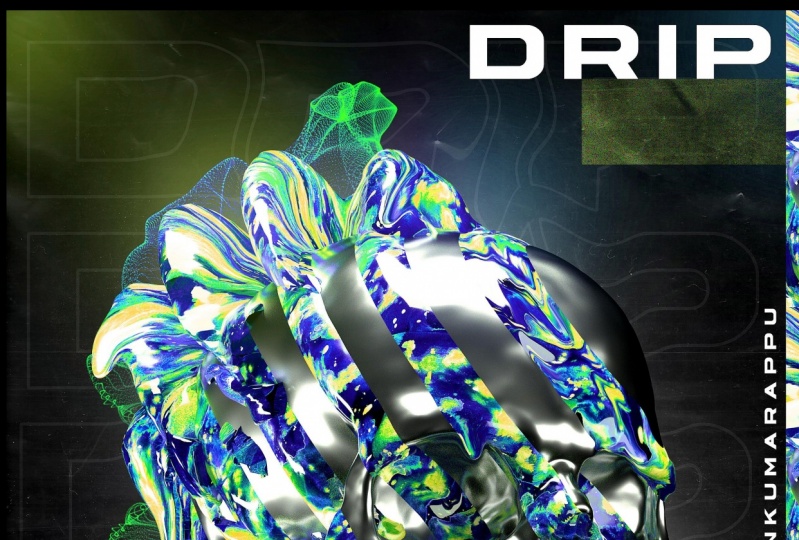
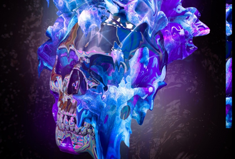
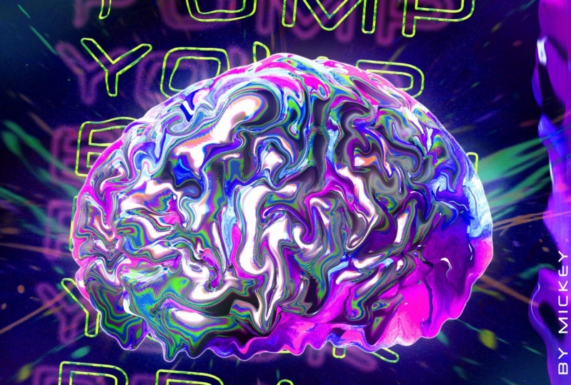
1. Introduction: What's up, guys know, or quasi here. And in today's class, I'm gonna be showing you how to create these abstract skull posters in some of 40 and Photoshop. We're going to start off in semaphore D with a skull model and add a few displaces and materials to it to get a pretty standard looking skull render. We're gonna take that to Photoshop and use the liquefy tool to kinda make it more interesting with some trip effect, we're going to clean it up at a few more stock images and effects at our text and add a small color correction and get our finished poster. All the techniques in this video are pretty simple. So if you're a beginner, This class is definitely for you. You'll be able to follow along, no problem. But I hope you guys enjoy it and let's just go ahead and get started.
2. Setup & What You Need: All right, so the things you need for this class, first of all, you need a semaphore D Lightroom of some sort. There's plenty of free Lightroom's out there that you can google and find one. You could just set up your own lights real quick as well. I'm using my own light studio, which I sell in my store if you guys really want to go all out for it. So check that out on myself. Also, I'm going to be using a skull as my model. And I downloaded from CG trader just typed in sql and set the price to free. And this is the one I used. There's also a snake one that I used before, which is pretty cool as well. So you can use those or you can use any other object you like. And then you just drag it into symbol 40. And I will show you that when we get there. So for the materials, I'm actually going to include a download to both of these materials to make it as easy as possible for you guys to follow along. So check the class check the class info down below 400 attachment with the materials. To walk you through the materials real quick though, this is just a black material that is just a spectral reflection, which if you've watched my two most recent classes, I've used this material. The reflection or the spectral reflection isn't as important, but the normal reflection is. So, yeah, it just happens to be the material that I had here and it looked good. So that's why I went with it. The more important material is this one. And basically, this is a material from IV7 pack if you already have it. Great. But it's a colorful material with a clip and distort on it to kinda make it pop a little more. And it has the luminance to make it glow. Which is really important because this will make it look really good in Photoshop and like really brighten it up and make it look neat. So it's got the luminance of the texture and then a pointless reflection kinda, but it's there. So those are the materials. Be sure to check the download for them, and then we can go ahead and get started. So let's get going with the render. I will hide this in. Let's do it.
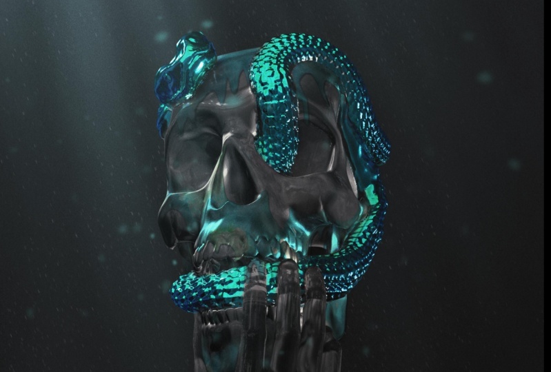
3. C4D Model Creation & Render: So you want to open up whatever Lightroom you're using. Azure materials in here from the download and go ahead and add the skull model you downloaded. Or skull models if you have multiple. I'm going to do the basic skull without the snakes because this mixed ones, the snake one takes a little longer to load because it has more polygons. I'm gonna delete the material on this. I'm going to select it. Command C to copy, go to window. Let's go back to the Lightroom. And let's just paste it in here. And you can see it's way too small. So let's go to the scale and just really scale it up. Come on. Okay, that might be a little too much, but let's just bring it down. Yeah. Slightly smaller. There we go. And I'm going to leave it front-facing for now. But we're going to, we're going to be rotating this here soon. So this is the first setup one and this is the only one that's going to have the chrome on it. So add the Chrome material to that. And you can see we've basically created a crystal skull from Indiana Jones now. But we wanna make it a little more interesting. So let's duplicate it. Command C, Command V, and add the colored material to the second one. And then on that second one we wanna go to our display CRS and get a, get a display SIR. Add that to the colored one, and let's hop into the display, sir. A big important thing here is to come to hate any we want to do one or minus one. So for now I'm going to do one. And that's go to shading and get a noise. And you can see his displaces it and it looks really funky. We need to open that little thumbnail. Go to our noise and let's make it 700. And that's a little better. Maybe even go down to 500, depending on the noise you use. You might want to mix it up. So for example, if I open this in instead of noise, I do VL noise. Okay, that's about the same, but if we do Voronoi one, you can see we might have to bump up the global scale to a 1000 instead. And that looks better. But let's, for the sake of consistency, stay with normal noise in 500 scale. And we can mess with the seed here. And actually down when I like a lot, 671. So I'm trying to find a good bounce of the color and the normal crystal skull look. And I think that's a pretty good balance. And then since it's a skull, I didn't want both sockets to be just boring blanks. This one's kind of not, it has little material. So what I'm gonna do is come in here and get a sphere. And I put it in this eye before, but we'll put it in this i, for this. So let's set that up in front and I make it a lot smaller. Actually, we get a little bigger to fill the socket. There we go. Add the purple material to that. Boom, perfect. And I'm gonna bring that sphere down just so it's out of the way here. And we can duplicate the displaced skull, uh, one more time. Command C, Command V. And I'm going to come out of the camera view that I have set up here for the Render and has come to a kind of a side view. Select this skull and bring it back. And what we wanna do is get the scale, scale it down a little bit, and then bring it up a little bit. And then on the display, sir, let's go to object height and put that way up to like a 100. And then let's go back to our view here and see what we got. So I think that's looking pretty cool. Let's select all of this stuff. And I'm going to press Alt G to put it in a null so we can just easily rotate everything. Like so. We're getting there, I'm going to something like that. Rotate it a little more. Let's come into this or this second display, sir. Let's go in and actually increase the global scale to maybe 750. And OK, we're going to have to move it back a little further and then maybe move it slightly to the right. Okay, I'm actually unlike in this. So we have all this on the back end cut on this side. And then the fret is pretty clear. It has these purple spots coming in, but that's what we want. And I think this is looking pretty good. If I go to my Render Settings, By the way, I've object glow, illumination and ambient occlusion on. And I'm going to be rendering this as a PNG Alpha channel checks, so it's a transparent background. And make sure you have a pretty decent size. This might be a little too big, but like ten ADP ish size is the way to go. And if I give this a test render, it should look pretty, pretty neat. Is that going to look as good as it will go to Photoshop and kinda increase the contrast or whatever, but it should look pretty neat. Here's what the renders looking like. It's looking pretty wicked. And you can see the spectral on our reflected material doesn't really come through. I mean, it's slightly comes through there, but it's also reflecting the purple in like in the nose here. But yeah, this looks pretty wicked. Pretty happy with this. I might change the rotation is slightly. Before we go to Photoshop, kinda want it slightly more. Dead on. And maybe we go with more of an angle. And maybe we Caucus head. Now, we'll do something like that. Let's go ahead and save it to our desktop or wherever you'd like to save it. And now we'll head over to the Photoshop. You can see that similar 40 stuff was not too difficult. Pretty basic stuff their skull for. Let's go ahead and run this app.
4. Photoshop Setup & Background: Alright, so now we're in Photoshop and this is sort of what we're going to try to recreate here. There's going to be two things for you guys to download. By the way. It's going to be the background texture in this form stock that I have from a pact or actually a couple of these for you guys. So you guys can use whichever one you like. But anyway, once you kind of Photoshop, Let's go to File New and create a letter size. You can create any dimension you want. For your poster. I'm going to unlock the background by double-clicking and pressing command i to make it black. We're gonna go over here and make my colors black and white. And let's go ahead and find our render download, our render skull for, for me, add that in here. I'm going to hold all increases size a little bit in, center it up a little bit like so. I'm going to add these two downloads over into the file awhile so I can close this. And I'm going to put them at the bottom here. I'm not going to touch him yet because we have a few things to set up. So I'm going to right-click Rasterize the skull. And I'm going to click the background layer and get the guides. If you don't have the guides press command R and the rulers will pop up. And I get one from the left side and it should click in the middle. And then I'm gonna press command skull, and yet it is centered. I'm gonna create a new layer above our render, and I'm gonna click on it to make it a clipping mask. I'm gonna get a brush or I'm gonna get the brush tool and then get a soft brush. And with black selected in probably like a 1000 size brush. Go along the bottom here just to darken up, bit, set it to overlay, and then maybe about 75. And we can also do the same thing again, but with white at the top. So maybe like right there. So to overlay and maybe a little lower, like 50% this time. Yeah, cool. Now we'll set up the background first and since we brought in this material are our texture, we're gonna go ahead and add that. And it looks something like this. Basically, when it's on normal, a 100%, it's pretty extreme. It's like a plastic, like a dirty plastic texture. But we're gonna set it to Screen. And then like 40ish percent, I think it was actually at like 37. And that's going to be our background. And then above that, you wanna create a new layer and get the brush tool. Again, he went white and a soft brush increase the size of bits. So we're at about 1800. Click behind, maybe click behind it again, and we have that white behind. And we can set that to overlay or we could leave it at normal or even screen. Maybe we leave it at normal for now. And if it's a little too bright, we can change it and actually going to move it up slightly. And let's change the opacity to 75. Cool. And now our posters setup, and let's go ahead and get into the interesting effects and stuff.
5. Liquify Drip & Design: So go to the very top layer and create a new layer. And now we want to get to colors from the render. So I'm going to click here. And I'm definitely gonna get this cyan slash teal. And then I'm gonna get a purple polish or pink. And I think purples the better bet, since there's more of it. And we'll click that and bone Cool. Let's get the soft brush. And since we have Teal selected first, we'll go over a couple teal spots. So this is a big teal spot over here, up here. And then we'll do one in top and bottom corner. Switcher color then. And let's do the same with purple to purple here in purple there, bottom, top. Cool. And we'll set that to screen and then decrease the opacity to maybe 30. Let's zoom out and see how it's looking. Yeah, I'm gonna go with 35. I'm happy with that. We can always erase the spots along the outside if they are looking a little too out of place, which right now they are. But I'm thinking once we get a little further, it might look a little better. Let's go ahead and add the form stock, which is this guy. And if your layers aren't on normal, be sure to set it to Screen or lightened. I think screen looks a little better. And this one was originally yellow, and I change it to a pink to change a color, just press command hue on that layer. And you can mess around with the color. And actually I'll go a little younger than go minus five to make that a little more purple. And I'm going to set that with like wherever my big blob of color is, which is on the left side of my skull. So let's set it up here. And then I'm going to add a layer masks who click down here any Layer Mask, get the brush tool again. Flip to black in. This is going to be a little smaller and we're just going to erase some bits. So I don't want it here on the skull. I don't want it here. Maybe a recent there. So it's like in and out. There's some parts here behind and in front. But it's not too overwhelming. And when you're zoomed out and pretty far, it's a very subtle effect, but I think just adds a little more to that big bubble that's going on. Now before we get to the chip effect, we want to do one thing to the skull. So select the skull, get the rectangle tool, and find the part with the most color, which for me is right here. And select a long bit. Actually, I'm gonna come here and select a long bit of this. Like so. And press Command C, go to top press Command V. And you'll have this square of color. And we're gonna use this as like a low cheeky border. So let's put it up at the top here. Duplicate it, bring it down. And we're going to need one more. Maybe rotate this one. See if we can blend it in a little bit. Yeah, cool. Maybe if this one is Chris community and flip it horizontally. Yeah, that looks pretty cool. That's our border. There's a little too much of the cyan going on there. So I'm gonna take this and overlap that. And then maybe we take this bottom one and move it up. And okay, I like that a lot better. And let's select all of these press Command E to merge them into one layer. And we can bring them down below, down, at least down below the color screens. And then duplicate that with command J, Press community, rotate it so it's horizontal now. And put this at the bottom or the top. Whichever one you prefer. I'm gonna go to the bottom here. And let's actually rotated this way. Okay, I like that. And if you don't like that hard edge, you could come and let's get the Pen tool, click, hold, shift, click, and then erase this part. So we'll add a clipping mask, right-click fill and fill it with black. And then I'll just delete it so we get like a sharp edge and I think that looks a little better. And then we can slide this over. So those are just a couple of borders. You could add more, you could do the whole thing link that. I just like the couple borders like cell. But once you get that, we can come to our skull and do the tripping effect. So select your skull is go to Filter and liquefy. Let's get the basic liquefied tool. I don't know what it's called, but it's the top one. And I just like to liquefy everywhere that there is the color. So don't go too crazy, but kinda just mess around with some of these. And I like to follow parts of the skull. So like right here, I like to come and then go along the nose. Maybe follow a tooth here. Let's follow this line. Follow the jaw line here. But, but, but, but okay, let's start with the chipping. So, and here too, a little trip and then do a trip down. Alright, so I've been adding some drips. Let's increase the size and maybe you covered this big spot and at a big trip. Not really adrift with just give it some big movement. Like it's kinda melting. And then we can add another one here. Close. I'm happy with those drips. Let's go ahead and add or go to the twirl tool now and kinda mess with some of these areas just to make them a little more interesting. I'm going to come back and make this one a little more cool. Alright, so I'm happy with all those effects that got going on there. You could also get crazy and, and make it real big and maybe do you like the whole side of the face drip? Something like that. That's actually pretty wicked. I'm going to stick with that. Let's see how that looks. Click OK when you're happy. And boom, we got, we got our drip edge going on. Looks pretty wild. I really like how it's looking though. And if you do this and you are not happy with the placement or whatever, like I'm not happy with the rotation right now. Come in, select everything, just keep it like a slight rotate. Their cool. Maybe, maybe rotate the form stock here as well. Cool. Now I'm gonna go right below the borders here and create another new layer. And we're just gonna get a plaque and soft brush and maybe make this a little bigger and just darken up the top and bottom. Okay, and set it to overlay. And 50%. I added some cool noise textures then above this. So if you create a new layer, get the rectangle tool and just fill it with like black or white. I'll do a little square like that. Press command, Delete, fulfill it, and then go to the filter. Noise, add noise. And yeah, this is like all the way up to 350 Guassian. And click OK. And then you have this noise texture. And you can set it to like dark in lighten overlay, which is what are soft light, which is what I'm gonna do. And this adds a slight bit of texture. So I'm going to put it here in this gap. Duplicate it, put it up at the top here as well. And then you could duplicate it again for it to stand out a little more. That's up to you. I'm fine with more subtle effect. But now we can move on to adding text.
6. Adding Text & Text Elements: Alright, so let's add some texts, get the text tool I selected the top layer. So this texts will be above everything. Click and type in your text wherever you want it to be. I just typed in Drip here. And let's make it 200. I, that's 220 in size, is a little big, but whatever the font I used was astra, which looks like this. And you can double-click on that and come to your character settings in increase the spacing to like 200. If you don't have your character, window, go to Window character and it'll pop up. So you can use this as normal text, which is what I did. Like I put it off to the side here, maybe to the right or the left. But also I did a thing where if I duplicate this, hide one of them. I filled the whole document with the repeated text as a stroke. So let's fill up the text so it's almost the same width as our document, but not really. And then set the fill to 0, double-click, go to stroke, make the color white. Set it to center. And then yeah, about ten pixel in size is pretty good. Click OK. duplicate, bring it down. Select both. Duplicate, bring him down. Duplicate, bring him down. So let's fill it like that. Select all of these and go to layer, distribute vertical centers to evenly space it. Press Command E that merges it into one layer. And then there's two things you could do with this. So if I duplicate it, so I have 21 is to bring it down below and have it as a background, like 20%. And then at a liquefy effect to it, or you can have it smaller inhabit like next to the render somewhere. So maybe over here into where all the color is. But you want to add this, I cool liquefy effects. So if I go to Filter liquefy and just get the normal Move tool, you can barely see the text here. You guys probably won't be able to see it, but I see it and you just want to do some slight drag. And then get some slight location. Ok, click OK, and then that's what it looks like. Okay, I might have pulled that one down a little too far, but if we do it to the background here, which by the way, I want this to be like 5%. Actually, I think that looks better. But let's go to Filter liquefy. And maybe you can see that better. I don't know. We'll start with the twirl and twirls some of it. Actually, if you just use twirl, it doesn't look too bad. But let's get the Move tool and maybe this chunk down, and then this chunk up. Cool. Click OK. And then if I increase the opacity for you guys, something like that, set it back to 5% and I'm going to press Command T and just like rotate it, increased the size of it a bit. And that could be your background. You could do that or you could do this one. All right. Or you could do both? I think I did both at 1. We'll keep both up that went up. And then it lets go ahead and bring this text back and we'll put it to the top left. And then actually no, I don't know. We'll go top left and then duplicate it. If you want text at the bottom, you can do that as well. So the other text cited was abstract and we'll make that smaller. We actually, I want it to the left as well. I wanted with this bar. And then duplicate that takes one more time. And this is going to be the vertical texts along this bar, which we're going to just do design. And then this will be very small and very spaced out. So if you open up your characters panel again and then specie, that's like 350. There you go. So I'm not happy with how these text elements are aligned right now. So, and I don't like how the trip texts looks up here. So maybe I'll just not even use that and move my skull and stuff up. So if I grab all of these and just move it up, I think that would be the play. And I'd be happy with that. Although the top is looking like it's missing something, so I don't know. This would take some playing around with it would be if I make this smaller and more. Yeah, I know that that's actually ok. But anyway, mess around with the elements. You can add more to it at this point. But this was the general setup for my poster. And once you're happy with it, go ahead and put everything into a group. And then duplicate with command J and Command E to merge. And you can do something like filter, sharpen, sharpen more on that. To skip things, to stand out a little more, that texture gets a little too strong, but it's alright. Now we can move on to the final touches.
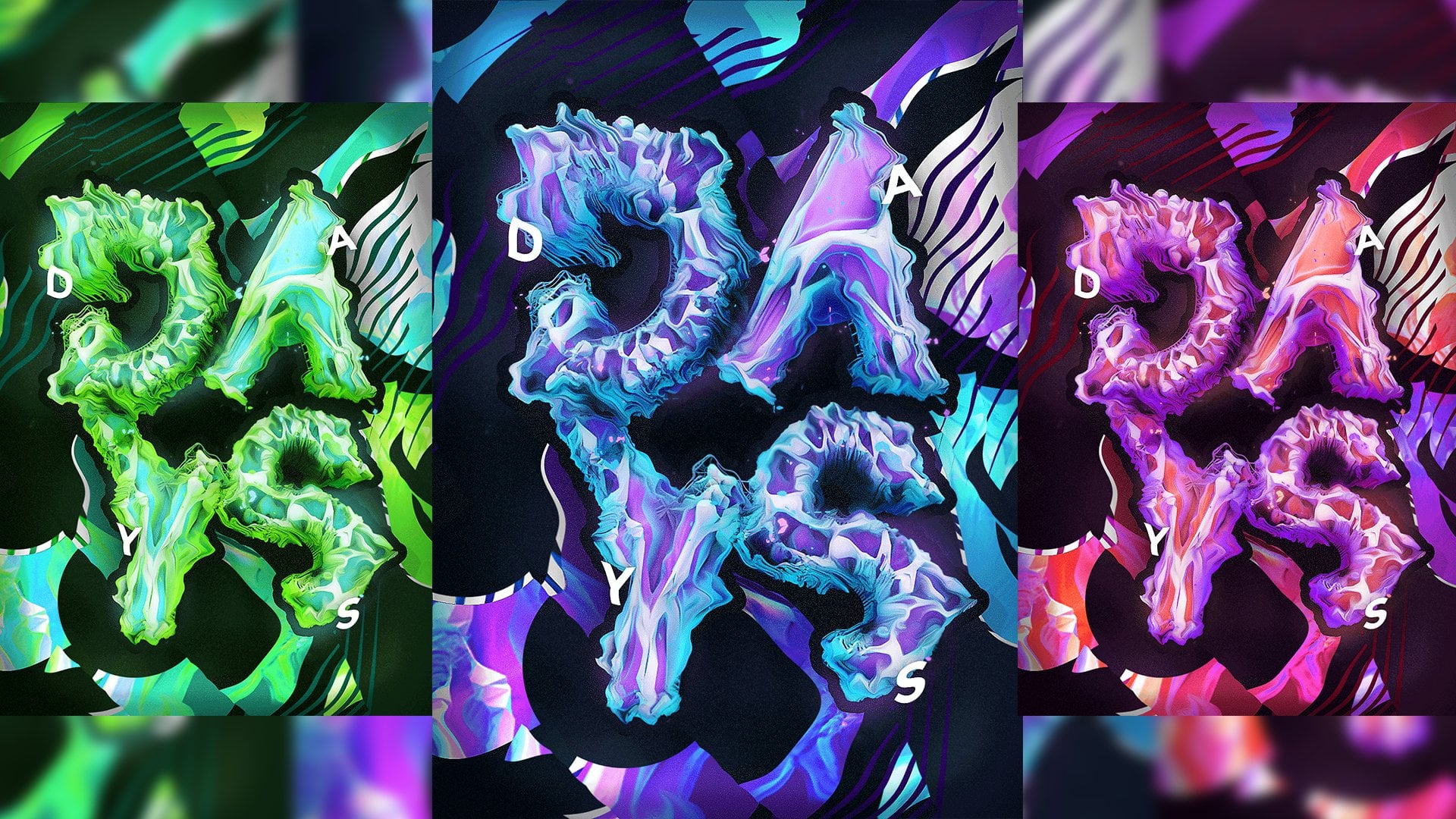
7. Final Touches: So the final touches for this, we want to add a levels, and that's about it for the color correction. Basically just bring this guy in slightly and then bring the right guy in slightly and the color will really pop. And then if we go ahead to human saturation, the color scheme I have here with the purple, blue, pink is really easy to change. So if I go slightly up, you can see I bring out a little more pink and that looks good. I can keep going. That even looks good. That looks good in my mind. The Green, I mean, everything looks good when you're when you have these colors. Maybe not so much here. When you get the green, you can see I can modify the hue to any one of these. And he could bump up the saturation, go crazy. Maybe even that looks pretty cool and actually kind of kind of looks wicked. But, um, yeah, you can mess around with this as much as you want. If you want to change individual colors, you can go from master to whatever. So if I go to magenta, I could just really changed the magenta isn't here. Maybe I do that to bring in some of the crazy color. That's not a bad book. But once you're happy, you're done, you can save it. I hope you guys enjoyed this class. These posters are a lot of fun to make. I love doing the tippiness and like adding the colors and like the border, it's stuff. I'm not too satisfied with the tech setup. That's why I kinda was open-ended About the text. I think it might even look best without any text. But I know people like adding text to their posters and and I just wanted that option to be available. I do like the text effect here though. But anyways, I hope you guys enjoyed if you did leave a review, follow me on Twitter at quasi my Instagram's That's quasi subscribe to my YouTube channel full of free tutorials, which is that's quasi, were almost 40.5 thousand subscribers. So any help, that would be great. If you guys want to check out my store or my website. Feel free. My website's know a peak climb.com. My story is self phi.com slash quasi. Thank you guys for watching and hopefully I see you in the next one piece.
 Noah 'Qehzy' Kline, Graphic and Web Design