Transcripts
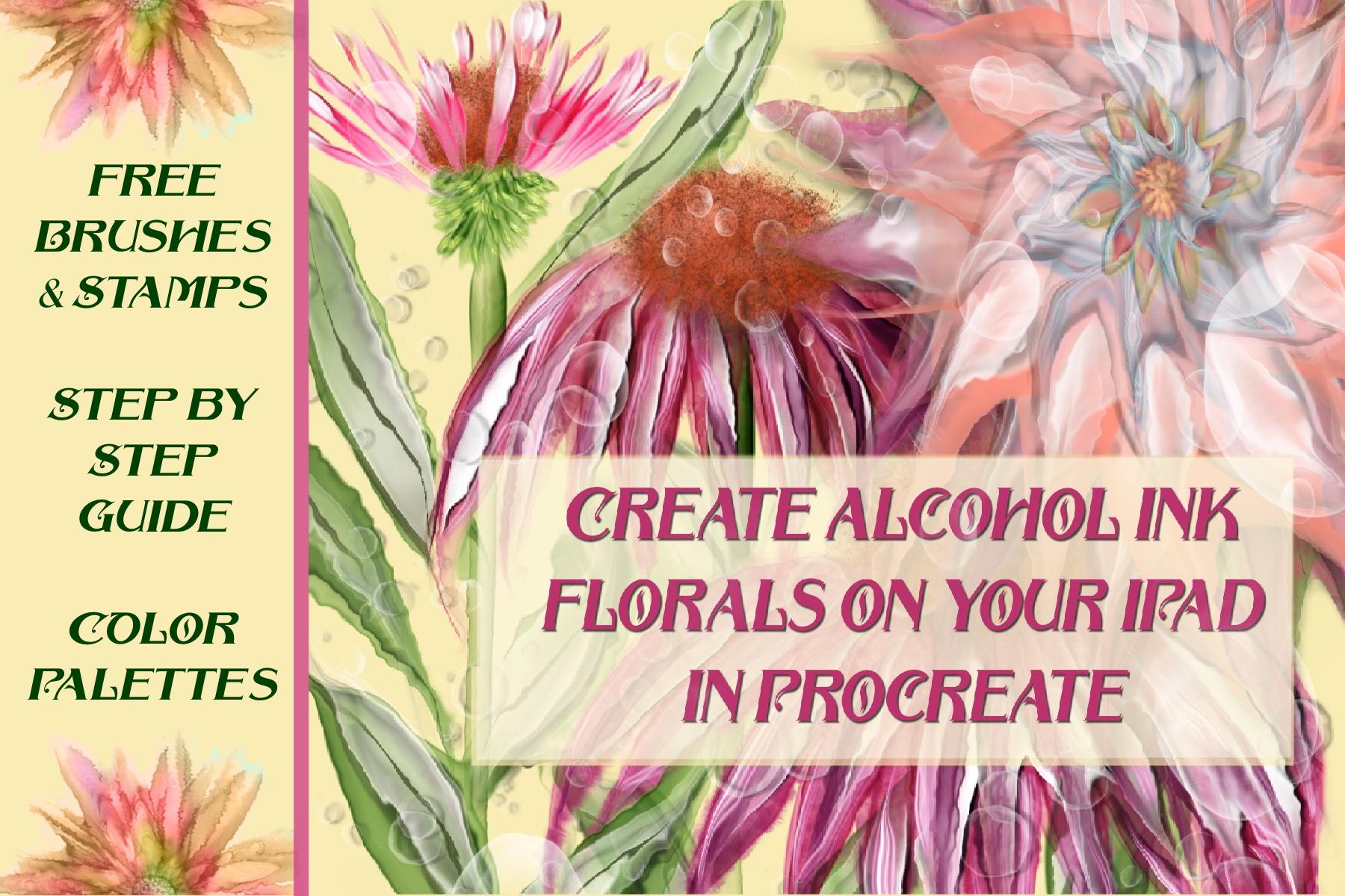
1. Instructor Intro: that Hello and welcome to this exciting class where we will create Alcohol Inc florals on your iPad using the procreate app. I'm Starlene, your instructor. I'm an illustrator, a surface pattern designer and an animal lover, as you will see from some of the photographs here. But today I come to you as an illustrator and we are together going to explore procreate and some unique brushes that I've developed which simulate the Alcohol Inc Appearance way will be creating beautiful florals. And I believe you'll be so excited with the techniques and skills that you will acquire in this class that you may never create florals the same again. I live in a beautiful part of the South in North Florida, on a small farm where I am surrounded by nature and wildlife. Each and every day I find thes surroundings so inspiring and so calming that I wanted to share them with you here at the beginning of our lesson. I hope you'll enjoy spending this few moments with me at home way . When you finish this short scenic intro, be sure you go to the class discussion area and locate the class resource is download those either into your cloud or to your iPad directly because we will be needing them to finish the class. You will be receiving brushes, pallets and photographs. So make sure that you download all those and you're ready to go. I'll see you in a few moments. I hope you enjoy this scenic tour of the place I call home.
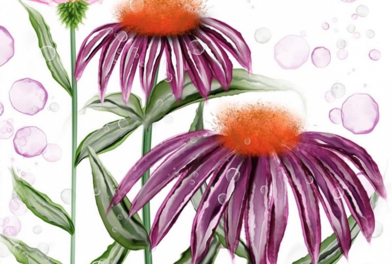
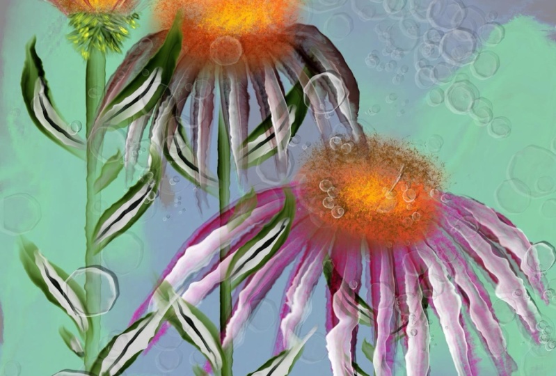
2. Lesson 1 Intro: Let's jump in and get started with this. It's quite a process. So let's go to our plus sign here and let's create ourselves and you canvas. Most Alcohol Inc florals require quite a few layers because of the complexity off the blend modes and the colors and the different processes and brushes that you'll need to create the right look. So I'm going to suggest that you start at a size of about 656 I usually work in squares. You can work in a rectangle if you wish so a six by six would be the equivalent of a five by seven. If you wish to work in a rectangular size or seven by five in case you don't know how to create a new custom canvas, go here two plus create custom size designate inches. Make sure it said it 300 dp I Let's go ahead and set it at five inches here by five inches . I'm gonna go ahead and save this one so I can use it again without having to go through this process. Here we have our blank. Candace could make a little smaller now if you go to canvas information you will see that there's a maximum of 85 layers, and that is quite a lot of layers but depends on how many flowers you put in each creation . Now a five by five at 300 DP I can easily be printed onto textiles or home decor products through any of the print on demand sites. You can easily print five by five at 300 d. P. I as I 10 by 10 at 1 50 d. P. I and up size it that amount and still have good quality reproduction in printing. It's just something to keep in mind at the beginning. If you know what you're in, product might be. Okay, so let's get started on this. The first flowers I'm going to teach you how to draw are going to be purple cone flowers, which are a very easy flower, in my opinion, to render realistically digitally toe look like alcohol inks. And as I go, I'm going to rename my layers and number them so that you can see how this process unfolds along with your resource is in the class you will also find under the pallets you will find two pallets that I've given you. One is alcohol inks one and alcohol inks, too. Now those air pallets that I created from the most popular colors of actual alcohol inks that are on the market right now, if you want to create and a limited palate and most closely duplicate the colors that are already out there and alcohol ANC's use those pallets. I, however, am not bound by that. So I create with any color that looks good and, uh, make it up on on the fly many times as I g o I'm also sending you in your class resource is this handy dandy menu, uh, brushes that I have created specifically for this class. It's a dozen brushes. After you have completed this class, I look forward to seeing in the project section some flowers of your own creation that you have made. Let me show you briefly a photograph off the flowers that we will be creating in this class . These are purple cone flowers, and I got this photo online free at unspool ash dot com. Unspool. Ash is a really great website that you should make a note often, but mark it on your computer It's beautiful free images and photos that are royalty free and they're stock photos with no license required to utilise them for your own work and for our purposes. Today we're just basically going toe. Look at the style of these flowers, the length of their pedals, the shape of their pedals they're positioning and use it as a reference photo to glance at . So let's go back to procreate now that you have this image in your head. And once again that website is called a new splash, and it's also listed on the page of print outs in your resource materials and we will get started.
3. Creating Petals: Let's go to our brush menu. Let's choose this brush here. My Alcohol Inc number two I have put on here some of the purposes you can use thes brushes for. This is very good for round pedals. This is good for long pedals and leaves, and this is good for really wide pedals. But you can very your stroke marks so very much with the liquefy tool that we're not really going to be married to any particular brush for any particular purpose. And you feel free to experiment once you have your photograph in there and you have lowered its opacity so that it's not so glaring. Create a new layer above that. Leave the mode at normal for now, and select your Alcohol Inc number to brush. I'm going to be using a medium green, and on this layer I'm going to keep my brush about half halfway and the opacity of full opacity. I'm going to start here and with a very light stroke that says, Even as I can get it, I'm going to go all the way down to about there. Hold your apple pencil on the screen and it will create a straight line. My second Stam will began up in this region behind the pedal and the third will be here. Okay, now, if you turn off the photograph, you can see we have three stems. Now, the beauty off working in the alcohol ain't method that I've designed is that once you have made your initial strokes, it is very easy with the liquefy tool to change those to really replicate the look off alcohol inks. I like the looks of these very much and I don't mind that this one starts small and grows larger and go small again. I think that that looks very natural. However, there are two main tools here in the liquefy menu that we will be using to create all of these flowers. Number one is push. The other one is the edge. If you want to explore all these different liquefy tools more thoroughly, my other class called create alcohol. Create Digital Alcohol Inc on your iPad in procreate is very thorough and goes through all the different tools for the purposes of this class. And florals were only going to be using the push tool and the edge tool. Let's go ahead and set up our push tool here at the beginning so that we don't need to set to change the settings later. You want your distortion app it 100% your pressure at 100% in your momentum at 100%. This will allow you a very fluid look to the effect off the push tool. When you have it set there, you want the size to be relatively small and to be suited for whatever the area is that you are using it. For example, this stem is very narrow. We want a tool. We want to brush that. It's slightly smaller than that. Let me show you what would happen if my brush is larger than the area. So I'm using the push tool on this stem. Can you see what it did to that? That is a nice effect that you might want to use our background, but it doesn't work on this stem. So what's undo that by tapping two fingers on the screen? Let's move our brush back down to a much smaller size. I'm just going to go right down the middle off this just enough to give it a liquid look gonna do the same thing. Toe all three. Okay, That gave me a little bit more organic. Look, toe all three of those stems. Now, if you don't like how wide something is or how on edge looks, that's where the edge tool comes in handy. Keep your pressure and momentum at 100% and vary your size again. Your size wants to be slightly larger than the area you're working on. What the edge tool does is it pulls and just together, If they were within the circumference of that circle and it cleans up and clarifies edges and thins them out, it can also make them look very wispy on pedals, as you will see. So here, what I'm gonna do is just maybe see, I don't like that is I'm just going to go out here, maybe clean up that and a little bit. I don't really need the edge tool very much on the stamps. Then let's go back to our layers. And even though this is like called layer one, I'm going to name it base because it's going to be our floral reference on this one is going to be actually layer one I'm just gonna name it One stems. The next item that we're going to be creating, creating new layer. Let's go ahead and name at layer to this is going to be flower. One base, a flower. One base is going to be this flower here. We're going to start from the right and work our way over to the smaller flower. OK? And I do want the petals of this flower to be on top of that Stam. So it's correct that this layer is on top of the stand layer. Otherwise I would either need to mask it or erase it or move the stem layer to the top. It's on this layer here. We're going to use floral brush number one. Okay, If you pull up your pilots, you will see that in the alcohol inks palette. Number two, there is a very nice color here that she could start out with for your purple cone flower paddles. What you want to dio with this brush is keep your pencil vertical to your surface. The slanting will not give you what you need with this brush, so keep it vertical to your surface. Let's start here in the middle press lightly press lightly, travel down and let up a little bit on your pressure. Don't worry that your pedal is not the exact shape or dimension or length off the one in the reference photo. This is just for you to use as a guide, and in fact you can turn it off if you wish. When I'm creating, I don't leave it on. I just use it there as a guide to check with every once in a while. But some people are more comfortable having it for the first time, using this technique, tohave it there so that it's more visible. So let's make our second paddle here. I'll show you in a moment when we get into the liquefy tool again. Why? You don't need to be as concerned with your pedals looking perfect at this stage. I'm gonna turn the photo off because it is distracting me. Okay, here we have our base pedals in the purple color. I'm going to duplicate that layer, not because I want it darker. In fact, I'm going to take the bottom layer and move it almost to 10 to 15% opacity. I want it there as a shadow image behind the layer on top, and I'm going to change this name here. It's going to be called layer three pedals liquefy, and that's exactly what I'm gonna do to that layer going to go into my liquefy tool on the very top layer, always using my push tool first. Going to look at the size here and the size of my brush needs to be slightly smaller than my pedals. That's starting here very gently. I'm going to move down the pedal. I don't like that size. I will move it up or down. Each stroke of this will carry some color and create some different contrast and waves and the color. And since Alcohol Inc is known for that look, you can utilize that to your advantage here. But just use a very light stroke. Do not be heavy handed. Don't worry that the pedals aren't the right shape on the ends. The edge tool will fix that forest in just a moment. So just continue using your liquefy tool on these first pedals to add the effect of water, and we will be back in just a moment with the next step in creating this purple come flower illustration.
4. Adding Texture & Depth: don't be upset if you're illustration is right at the edge like this because it is home market. Seems off many people who create Alcohol Inc florals that they often do go off the edge of their canvas because the very nature of Alcohol Inc is somewhat unpredictable. When you began puddling and blowing the ink with a compressor or an air can, it goes very often off the side off your canvas so you can replicate that look here in your art. If you don't like that, you can go into your canvas settings and extend the edges of your canvas so that you're not running into that problem. Okay, we have now liquefied our pedals and given them a nice little wet look. We're going to go into the edge tool, what's again, moved the size of your brush slightly larger than the area that you will be working on. What I'm going to be doing with the edge tool is I'm going to be clarifying the ends of these pedals and making them look more like pedals, and I'm gonna be pulling them in here a little bit so that they look as though they're actually coming out of the the seeds and the center. So let me do the centrist first. If I use my edge tool, Can you see how that's bringing all those in like this? You don't want to go all the way down. You just want to use it here at the beginning to pull those edges together and make them resemble more the flower. Okay, like that. Then we want to use the edge to also on the ends of these pedals. Go over it very lightly like this, and it creates a very wispy look on the ends of the pedals. Just keep going over and over until you get the look that you like as faras, the wispy nous goes. If you get it to theater, you could go back in with the push tool and make it even with Speier and pull the color down more. Once you've done this a few times, you'll get a really good feeling for how much is too much. Okay, Now you will see that there's this large gap right here. And since I may or may not paint grass into the background like the original photo head in it, sometimes adhering strictly to a photo can cause you to have a large area of negative space where you don't really want it. So since I don't want it, I'm gonna go back in and use my same brush, same color, same settings. And I'm gonna paint myself one more pedal in here and go back into liquefy liquified a little bit to make it look like it belongs. And I know that I will like it much better Having another pedal in there can there we have our first layer of pedals on the purple coma flower. Remember, we have the the bass pedals left in here. Usually at this point, I'm just going to delete them and rely solely on these pedals. If I want these pedals to be darker, I will duplicate them and then lighten the top layer down to where I want it. Once you have duplicated your pedals. If you want to vary the look of them and give them give more depth to your pedals. You can go to the top layer and put it on multiplying mode. Then you're going to go to the curves and I'm going to pull up on the lights and down on the dark's to make that layer just that top layer that that's multiply have more contrast. You can see if I turn it off, and on that it increased the color to a little different shade, which is very close to the actual color of the flower. And it increased the contrast and the depth, and you can dial it down if you don't like that or throw it away totally. For now, I'm going to keep it. But I am going to rename that layer. Four pedals increased contrast. I'm going to click on the stems layer. I'm going to add a layer above that. This layer is what I call the hot wax layer. I'm going to paint onto this layer underneath with a very textured brush. At this point, we have layers two and three, which are both of the pedals set to multiply mode, and we have placed a layer beneath it called Hot Wax. I have reduce the opacity on layers two and three significantly so that they're still visible as an outline for what I want to paint on this next layer. But I don't want them to get in my way. So with this hot wax layer, we're going to choose the hot backs brush, and we're going to choose a dark pink that will show through these pedals underneath. We can change the color. If it doesn't show up enough, I'm going to select this color to begin with between a pink and a purple. You want your brush to be approximately the with of your pedal, and you can, of course, experiment with that and see what works best for you. You want to paint a shape that is very similar to the pedal. You can also experiment with makin your brush size a little larger, and it will make the dappled effect more pronounced because the texture will be a larger texture. Don't worry. If you get slightly outside the pedal, you can use liquefying. Clean that up. This is a very pressure sensitive brush, so I like to use a very, very light touch when I'm painting with it. And really the only purpose in doing this entire layer is because I like a lot of texture and I like a lot of detail and a lot of depth in my Alcohol Inc illustrations and this accomplishes that this is the layer we just painted. Let's turn it off and on to see its effect. Now, at the moment it is showing through these two other layers which are settled multiply mode . But we're going to raise their opacity back to a more normal amount of opacity. We don't want to raise the opacity so much that the work we just did is invisible. Now, at this point, it is becoming difficult to see what we just did. So let's go to our hot wax layer and let's duplicate it to see if we like that look, just as we did up here when we went to the top layer and we adjusted the curves, I'm going to go to this top layer. Let's go ahead and rename at five hot wax curbs because we're going to take just the top layer and go here. If you pull this line up into an s curve by pulling this part there and pulling this part down, what you're doing, in essence, is you're increasing the contrast all that one layer quite a bit. Then turn it on and off again to see the effect of what you've created. You can also go into that layer until it to sharpen it. As you move here, your pencil or your stylist across the screen, you will see at the top here. The blue slider is going to increase or decrease the sharpness of that layer, and we'll leave it about their. I will tell you, once you've increased the sharpness of a layer or the Gazi and blur off a layer, you cannot go back and undo that. You would have to redo that layer because it marries that to the layer. And, um, it's not changeable, really. At that point, let's go into our liquefy for just a moment and see what happens if we use our edge tool on some of these areas, where it looks like the hot wax has melted out beyond the pedal just to clean it up a little bit. The good thing about alcohol and because it's such a fluid and sometimes very abstract art form that you don't have to clean up every edge that you think is a little out of place, it just adds to the authenticity and the organic look of your piece.
5. Highlight and Shadow: Let's create a new layer on top of the pedal layers that we already have in order to add some highlights and shadows to these pedals and make them look more realistic. This will be layers. Six. We will rename it six highlights to apply highlights. We were used this brush, the alcohol ain't number two, and we're going to change our color to pure white. We can then reduce the opacity of pure white if it's too much and what we're going to dio is create a smaller pedal on top of the pink one and bear down at the very widest part of the pedal, which is where the sun would be striking it and creating the most highlight. So you start out light here, they're down, create a larger area, and, as I've said many times that I will say probably many more times. Don't be concerned if the shape isn't exactly what you want, because it's very easy to modify that with liquefy tool. This is the first step of the highlight. Let's go ahead and go into liquefying usar push tool make size slightly smaller than the size of the pedal that you'll be working on, move down the length of the pedal, adding an some fluidity. I could sit and do this all day. Isn't it fun and relaxing? And it's just really awesome to watch. How about colors all mixed together anywhere. I want it to be more transparent. I just moved the water down. Now we're going to use our edge tool. We will go in to this end and we will go to the upper end. We will do that on each pedal, pulling the edges together to mimic the outline of the pedal. But not exactly. I am pulling the edges together at the ends of the paddles and at the base of the pedals because I wanted to be naturally darker in both those areas because in nature that is where those flowers would be darker. We can also augment that by either erasing part of the white out or by adding and dark. But our first step is using the liquefy tool. Okay, there, that's nice. And we have the highlights painted in looking like that. You can see already that it's really beginning to look like pedals. You can, of course, lower the opacity to wear it where you like it now. Another thing you can do on this layer, it's Take your erase brush. You can erase with any of the brushes that air supplied, or you can use your own favorite brush. I'm going to erase using this brush the soft, smudgy bleed brush, and it does exactly what it sounds like it would do. You can build it the effect of it when you're painting with it or when you're erasing with it. I'm going to choose a very small brush size. I'm gonna move the opacity down a little, going to go with the upper end of my pedals. I'm just going to erase some of that white out of there until it's a very gradual look, therefore leaving the base of my pedals darker in relation to the rest of the pedal. For I've just painted on the highlight. We will also go to the ends of the pedal and maybe move removed. A little of this don't remove so much that you get rid of this beautiful white layering detail because that's very pretty. I like it a lot. Here's what we have at the moment with our purple cone flower creation. It's looking very nice. So what's Zuman? What we will do next is Goto our highlight layer and duplicated not because we want there to be more white and the highlights, but because we're going to do something special with this layer this later, we're going to go ahead and rename it. It's gonna be course layers seven, and I'm going to name it Shadow Erase, and you will see why I am named at that. In just a moment. Now, on the shadowy race layer we will put on Alfa Lock. We'll make sure that black is chosen as our color in our color picker here and we will say , Fill the layer. What this did waas. It took our highlight layer and fill that highlight layer with solid black. If I turn on only that layer, you will see this is an exact duplicate of the highlight layer, replicated in shades of black shades of gray to almost pure black. Let's turn off Alfa Lock and let's press on that layer and turn all of our other layers on as well. We are going to be using the erase tool, and we're going to use the soft smudgy bleed brush on this layer. What we're going to be doing is erasing at full opacity. We're on the black layer. We're going to be a racing all of the black except for the very edges of the black. I will demonstrate what we're doing, and you will see why we're doing that in a moment. So go down the very center of each pedal and erase the black. Don't erase too much because you could go back in a moment and a race more. This is one of those steps that we will create over and over again, both in this illustration and in other flowers to give us a lot of depth and make it look much more realistic to be an Alcohol Inc creation. You'll see in just a moment that I left a little bit of the black here where that white edges because I want there to be some black left there for the effect that I'm creating. We want to erase enough black that the highlight is preserved, but not so much that we erase it from the edges where we're going to be wanting to see shadow because that's going to be producing a lot of the depth in our illustration, most of going to leave it here in the center of that pedal, because I like the depth that it created there as well. You'll see as you began toe work with this process that no matter how many times you paint a flower, you won't do it the same exact way any two times. And you'll always end up with an illustration that looks somewhat different than the last one you created, which I think is a very nice part off digital alcohol art. So I've erased a lot of the black at this point. If we go and we turn on just that layer, you'll see quite a lot of the black was erased with with a lot of a lot of it left Justus details around the outside of areas If you want to go back in at this point, if you see too much black in this layer, go back and erase it. If you have it going down the center of your pedal, though, you might want to leave it for definition and depth. Specifically, you want to leave it along one edge and in the center. Let's go turn all of our layers back on. Now go to your shadow. Erase layer with it. Highlighted. Hit your arrow selection now that has selected that entire layer. What we're going to do at this point is we're going to nudge the layer, which is the shadow two or three pixels in a direction. You can choose any direction you want to go in, but remember the direction you went and how many times you nudged this layer because you want all of your shadows to match for the rest of the creation. You don't want to have some shadows cast on that side and some on that side. That's not very realistic. So I'm going to make mine go to the right and up slightly so I wouldn't choose a position about here. I want to nudge. That was one nudge. Each tap is a nudge to, and now we have Three Alcohol Inc does tend tohave very dark contrast ing shadow lines that build up like this at the edge of a color so you can leave it full opacity so that it's very dark and a very delineated shadow line. Or you can reduce the opacity. Some. As I go down, you can see the effect that it reducing the opacity has. You can decide where you like it best. If you like it at full capacity, you still have one other thing you can dio. You can go into Ghazi and blur, and by moving year apple pin across the surface. It will give you a percentage blur for only the shadow. So watch the shadow and what? How it blurs it out until it's almost not there. And then we go all the way back. It's a very hard, very distinct line. I don't think that I like it with a slight blur to it like that. So I'm going to leave mine about there and go back to the layer, Turn it off and on and you can see the effect of it now, as long as you don't combine these layers down, you can always go back in and a race more off the the shadow. If you don't like how much it is blocking up your highlights. Fact. You could do that now. Or you can wait until the and to see the full effect, because there will be other things that we're going to add on top of this highlight to create this flower
6. Completing the Flower: so you'll see. If you look over here at our layers that they really do hop all around. We have our stamps than we have pedals. Then we have more pedals. Then we jump down here to our hot wax layer, and we have our hot wax layer with some curves added way appear to our highlights. Then we duplicated our highlights for a shadow. Now we're going to add an one additional layer of dark accent to the top off the quite before we move on to complete the center of this flower. So let's add a layer in. Let's go ahead and name. It will be layer eight, and I'm going to call it dark details. I'm going to be painting dark details down each of these leaves to finish thes leaves off. Here we have the top most layer number eight, which will be the dark details that we add to the top of the highlight. Down the center of these pedals, we will be using this brush the Alcohol Inc pedal and leaf brush. I have gone to the color that I used for the pedals, so you should go to that color as well and then I have chosen a darker shade off that same color just by sliding down. So I started here and I slid down my color picker to select a darker color. Now I'm going to rotate my canvas a little bit, so it's easier for me to draw. I'm going to make a very light, hopefully smooth line down the center of each of my pedals, - just as we have done with every other pedal layer. We will go into liquefy, choose the push brush. First, move down the center of that color. We just light down, adding some liquid and some movement to that color. - One more layer on top of this, go ahead and name it layer nine, and it's gonna be called the glow layer. We're going to go to the color family that we're currently working in, going to move up slightly to make it a lighter color. Going to use this brush colored glow was leaving on half opacity and select a smaller size brush. What we're going to do with the colored glow is instead of going down the center because we don't want to do that to cover up the shadow. We just created. We're going to go just to the left or to the right of this wide area to create more highlight there. Just like this. Let's look at what we've created here. We've added in some glowing highlights it's going to liquefy, so leave it on edge. Let's clean up the edges. At this point, you can leave the glow exactly as it is, or you can go to Gazi and blur and slightly blur it. If you prefer that look, I'm gonna leave mine as it is. And while you're looking at it for a moment, you might want to add a little more highlight in some area. If you squint your eyes, you can kind of see that sometimes your flower will suggest it to you. And remember, if you put highlight exactly beside a dark area that accentuates the dark area, so once you've added and some additional glowing highlights go very quickly back into your liquefying to the edge, clean those edges up a swell and we can leave that where it is now, and we have nine layers that it required to create the basic flower. We're going to work on the center portion now of the flower, which is a seed pod. We're gonna take a M, a dark brown, almost orange color for the center. Because if you go out a new look, that is the color that it really is gonna choose this I'm going to use. Why Softly smudgy bleed brush. I'm going to make sure I have a new layer. It's gonna be layer 10. It's going to be the seed pod color, and I call it that because in a moment we will have some detail added to the top of that in a texture. So this will just be the seed pod color portion. I'm on the smudgy bleed brush. I want to choose a color a size that's going to allow me to paint in this area here had a a little bit less than full opacity. If you look back at your photograph, you will see how the seed pots pod sits in here and the relative shape of it. Here it is, and you'll see that the seed pod goes out and then back up, and the center is actually in here, and all those other little details lead back to this center. So if you want to leave it on to give yourself an idea off the shape. You could do that. I'm going to cover the edges of my pedals down here. Let's go in and turn that photograph off and let's look at this in relationship to the flower, OK, you would notice that the top edge off that seed pod and even the bottom was a little jagged, so I'm going to put in and a race right now. I'm going to use this brush right here. This is fiber at a medium size full opacity, and I'm going to a race into this top edge. If you overdo it, just undo and go back until you like it. I'm going to race a little bit on the bottom edge as well. If you look at the seed pod again in the actual photograph, I don't think you can see it here because this is obscuring it. But okay, if you look at it, you'll see it's darker and then much lighter in here, so I don't want to g o any darker than the original color that I used. I'll make another layer on top of that. Call it 11 it's gonna be seed pod highlight going to go and choose the color that I originally used. Whatever color you use is fine. Then go lighter and brighter with that color. Until I think that it matches what I'm seeing here. We'll use that smudgy bleed brush again. I'm going to add in some of the highlight that I'm seeing. Turn off that photograph. Let's turn back on the seed pod and now we can see the highlight that I added. Once you've turned on the seat pod and you have the highlight in there, you can see that the highlight isn't really as pronounced as you might have thought. Itwas when you were originally painting it so you could go back in paying it more could choose uneven, lighter color. If you think that represents the look of it, better then to this layer do the same thing you did before. Take your race brush with the fiber chosen and a race the very edge of the high life down so that it matches the rest. Now I'm going to create a grouping from this layer and that layer by sliding to the right until they're both blue and hitting group that place them in a group. I'm going to select that group and the reason I put them in a group and did this because I want to slide it down to about here on the head of the flour to make it what weren't realistic. Now, within this group, I'm going to add a new layer at the top. I'm also going to choose a very dark shade of the same about down into here. I'm going to use my fiber brush as the actual brush and not the erasing. Then I'm just going to ad all around the edge and in the center some of this texture detail to show. But the seed pod kind of looks like sitting there in the top of my flower, and that's all together in one group. But we do need to go in here and then this layer, and let's leave it all together in a group like that because you'll see in a few minutes that it's very handy to have all those elements together in one group. Now, if we back out, I can. We can see that we've created this one flower and a stand going down seedpods the texture and we move on to our second and third flower. Stay tuned for Part two, where we will create the remaining flowers. It will go much more quickly and more easily then this first part.
7. Reviewing the Process: Of course, these pedals here are very transparent and are showing the stem through their. I'm goingto leave it for now like that. But at the end, we will go back and a race, the stem or the pedals. Depending on how we want the layers here to appear, I'm going to draw a second and 1/3 flower, repeating the exact steps that I just did. And if you want to know exactly what I'm doing, you just follow the order here that I created to begin with. And I will be doing everything exactly over again. If you want to turn on your photograph to see where the pedals should be falling or where they should be beginning and ending. You could do that. It will help you, and you'll see that what we've created so far is definitely not exact to the photograph is just similar to the photograph and the layout, so if we leave that on for the moment, we will go up here and add a new layer. We will reference the layer number down here and named this one to be instead of to a pedals and liquefying, because that's what we're going to do to them. So we will pick our color that we want to use. We might want to choose just a slightly different version off that color to set them apart . A little war, how we use this brush for my main pedals.
8. Flower Buds & Details: okay. On our second flower, we have completed all the layers, just as they were done on the flower beneath it. I want to do one more thing to this flower before we began on the third and final flower in this creation, if you see here on this flower, you'll notice that there's a shadow under the seed pod area, and I want to just go under this one and shadow it as well. I'm going to go immediately below the seeds. Ad a layer there, choose my softly smudgy bleed brush in a dark color black. Or you could do a dark brown for alarm, opacity to about half and use a brush about that size. I'm just going to create a little bit of, ah, semi circular shadow there, the kind of shadow you would see in nature. If it's a little dark, I'll either back off on that layer a little. I'm going to go ahead and move this shadow into this group of here so that I don't have to create a whole new layer name for it. So continuing on, let's look and see how we're doing with our layers, I'm sure we're doing fine, but it's always good to look at your canvas information as you create. We've used 25 layers, so we still have 60 left to work with, and I believe we can definitely finish this in that amount of time. Now, when you get to the end of this creation in a moment, you may want to leave this flower where it is and the layers so that the pedals actually are resting almost on top of this seep pod. Or you can group this entire flower together as one group or flattened the layers. If you're at the stage of flattening your your creation and move it beneath this flower so that the pedals actually fall behind it, it's up to you and what you want to do when you get to that place. Let's look in our reference photo for a moment and you'll see that this next flower is very different. It has very short spikey pedals that have not unfurled yet. It has more pedals here around the base, going downward instead of upward. That will form an open and then just barely behind it all. You can see the little bit of the head of the seed pod in there. So if you want to leave that up for reference just to get the basic shape and length of the pedals, correct, you can do that. You notice that these or not light pink hardly at all. And they're almost white or very bright near the tips. So I'm gonna create them and I lighter pink than the two flowers here. And then I'll go back in with my highlights and highlight just the edge the upward tips of those pedals to give it the same look that we have here. And I do think that it's absolutely all right in the beginning, when you're learning how to draw, learning how to place things and trying to make things look as natural as they are in nature. I think it's perfectly fine to use a reference photo. Um, I do encourage you to not copy it exactly to, you know, do your own thing, create your own compositions. But in the beginning, it's a very good tool toe have to use, and I enjoy having it myself. So I'm gonna pick a very light pink here, and I'm going to use this first pedal and leaves brush. I'm going to make sure that the size is relatively small. I'm gonna leave opacity at full capacity. I want to turn it upside down. Let me tell you why. A lot of these brushes, I think, work much better when you're creek creating and making a downward stroke. Also, it's much easier for most people to maintain control of their pressure and their stroke when creating a downward stroke. What's the times That upward stroke, uh, tends to sway or band one way or the other? And for me anyway, it's easier to control my strokes if their downward strokes. So I'm going to turn my like illustration upside down to create thes pedals. So let's start a new layer on top off our second flower, and it will be to see pedals liquefy, and we're going to create our layers in this almost exactly as we did the other layers. Except we won't have the exact same top of layers because we have to create this detail ing in here that isn't present and the other two flowers. But let's start here and let's rename it, and this will be layer to see pedals and we will liquefy them. I'm going to make a M a very controlled stroke. Down with this brush, let's start out a little light to give it a smaller type of beginning. Breast down little more at the very widest portion when you make your first strokes with this color. If you think, Oh, that's not the color I wanted or that's not exactly what I had in mind. Don't worry about it. Go ahead and create your strokes and we will go into hue, saturation and brightness in the control panel over here. And, um, adjust that pink toe where you do like it, and I'm going to turn the photo off, said that I'm not getting a false sense of how light those tips really are. Now. You could leave this color exactly as it is there, or you could go here and use one of my favorite tricks that I've showed you before. I just play with the slider here to see if I get it closer to a color that I wanted. I think that that is in the same family that I had hoped toe have at the beginning, but it's still a little too rich, So I'm going to raise the brightness first. I'm a de saturated slightly. It may not be true to the actual colors in nature, but with the other colors in my composition. I think that that color works really well. I will go in and liquefy thes slightly Now. You'll notice, though, that on this flower, Thea pedals don't need to be nearly as liquid looking as in the larger flowers with the pedals that drooped down. Yet I am going toe liquefy each of these just slightly to give it the same look that the rest of the composition has. You know, did that brush that I told you to use for these pedals gives you a very nice natural valley right in the center of your pedal, which is a very nice look and a very nice touch for the alcohol ANC flowers. And if you get one of these petals completely a way you don't want it, Don't worry. You can either backtrack by hitting, undo or just use your edge in a moment to clean it up. I don't like my edge brush to be larger than just one pedal, because you don't have as much control over what it's doing, and I like to make the ends here wispy and and rather point at the end. So that's our liquefying pedals. Now we can in, um, copy those pedals and create a curves level on top of them. So let's do that. Let's duplicate. Let's go ahead and name this one three c and it will be pedals, curves, because that's what we're going to do on that. Let that layer you know we're going to do is go over, gonna raise the light levels in that, lower the darker levels, and you'll see that at full opacity. That's what we have on the smaller flower. I'm not going to do a hot wax layer because the pedals air so small, and I want them to look smooth and not to have the variation and color that the larger ones do. So we're going to skip the hot wax and the hot wax curves, and we're going to go next toe highlights. Even though I'm skipping those layers and going straight to highlights, I'm not going to remember my layers in the top. I'm going to leave the the numbering exactly as I have it below so that it's easier for me when I look at it to really see what I did. So this will be six. See, Highlights wouldn't choose white again. And I'm going to use the same brush that I used before hand because I just and much better at the downward stroke than the upward. I'm going to turn my illustration upside down again and I'm going to move it, move my opacity to about half and test this. Move it this way. I'm going to just do white tips on each of these and see how I like it all we're gonna really need to dio is the edging on these.
9. Adding A Background: What we will do next is we will duplicate our highlights. Layer the highlight on top, the one on the bottom. We're going to rename it as the shadow layer will be seven. See Shadow the Shadow erase in case we erase part of the detail. We can fill that layer with black, as we did here. But yet again, I want this flower toe look a little different because it's it's just a bud. It's just a baby. So let's make it look a little different in coloration and in shadow even than the two older, larger flowers. So what I'm gonna do is I'm going to, So I'm going to sample the darkest color we have in here. I was trying making our shadow out of that color, so we will say we've already got apple lock on will say Feel layer. And then, instead of erasing any of it to begin with, let's selected and move it a. Nudge it over a little bit Now we'll go back in in the erasing mode with arm smudgy brush at a very small size, because this flowers pretty small and with the brush tip at 100%. But pretty small. We will go in and anywhere that we don't like the shadow in here. If you could just erase it out and it'll create a life spot again. Sometimes the shadow is really good for adding in some extra detail. If you could see, just quickly erase some of that. The show bright colors back through before we go any further, withdrawing the bottom part off this. Let's move our seed pod from this flower. The seed pod is four layers, the colors and the texture, plus the shadow layer. I'm going to collapse the group. I'm gonna duplicate the group because that's what we want appear. But in the new group, we don't need that shadow layer. So just go there and delete it and then collapse your group again. So let's go select the new group. So it's still here and we need to move it. We're gonna move it into position so that we can may get the size that we want it. Okay, let's make it much smaller because this is just a baby flower and I think want to maybe even rotated slightly. I don't really like the way it's sitting there and want to rotate it just a little. Then once you have it there, you can a race. If you wish a little bit of the detail off this. Okay? I like where that is. Now I'm going to draw the bottom part of this, which is very different looking. We're going to select a medium green. I'm going to use the same brush, this one that we used for the light pedals. Because this bottom part is very similar and structure to the pedals just much shorter. Let's go up here and add a new layer, and this is gonna be layer eight. But down here, eight was darting details and nine was glow appear. Eight is not going to be dark details. It's just gonna be details. So let's rename this new layer. I'm gonna start here at the center and come down like this and create myself a longer, almost pinwheel looking. We use very short brushstrokes to create shorter and shorter details in here with very short looking pedals in green. Then I will go into liquefy and tissues my edge to draw some of those back, an to be pointed the way I want them. If My pressure isn't always exactly right to make the brush behave the way I see it in my head, gonna add a few more So I'll go back into this and hit it once more. One more time with my edge tool. It's kind of amazing, isn't it? What it does, I just love it. Really. Let's turn it back up the way. But it goes and see if we like that or if we want to erase any of it. In a perfect world, I would erase some of those a little bit and add in some other detail. But what I see that I want to change more than anything is appear on these pedals over here . I'm gonna go hit them again with my liquefying. I'm gonna do the pool on them because they really shouldn't be just hanging out out there in space. They should be connected a little bit to this. There are connected them. So we have now the details here. Down here we have dark details, but this is just details. And now we're gonna add a glow to the top of this for the highlights. So let's add a layer rename it nine c glow. Use the globe brush in the same color with very, very short strokes. Go into edge again on the glow layer and only on Onley on this end here, the smaller end make them a little pointed, just like the their counterpart beneath them that they belong to. Okay, At this point, a lot of people who use alcohol inks will create an Alcohol Inc background. They will either painted an or do some extra splotches and watermarks. So I'm going to show you what it would look like if we did that. I'm gonna go to the very bottom. We'll go ahead and erase this space picture, gonna go to the very bottom and add a new layer, and that's gonna actually be a background layer on that background layer. I'm going to import some Alcohol Inc backgrounds that I painted from my other class. You might really enjoy taking the other class and seeing all the different tools and all the different paintbrushes that air in that class is. Well, I think I'm just going to import this one because I like the colors in it and I put it there at the back and I'm going to stretch it. Okay, there. We've stretched it all the way to the edge, to the edges off our piece of work. So this is how you're Alcohol Inc Florals would look with Alcohol Inc background behind them. Once you have it in place, you can lower its opacity to see how you like it being a much more muted look. And you can also go into hue, saturation and brightness and completely changed the color off the background. Just keep in mind that because the background is all one layer when you do a color change, it's gonna be a global change. It's going to change all the hues in the background, depending on how you have them placed. So before we go into hue and saturation and brightness, let's make our creation a little smaller. Move it to the top of our screen and so that it's not block here. So let's just start with our top slider, and as you slide it in one direction, it will take all those different values in the background and more or less equalized them toe one color, just probably not what you're going to want. Just keep in mind that that's the That's the beauty of having a lot of different layers is that you have the capability of controlling all those colors on their own. So here is about where we were in the middle. But you can also increase the saturation if you wish on the background for the lightness of it or the darkness. Of course, I'm just trying to show you what is possible, not necessarily what is the best option. Then we have another step we can pursue. At this point. We can paint some leaves in here toe, add some filler into some of these areas where there are not any elements if you wish to do that. So let's quickly go over the process of creating leaves. Now, we're not going to go to the very top of our later stack to create all the leaves because we want them to be layered and interspersed the same way the flowers are. We can start at the top of our stack and draw some leaves for this flower. This will be a whole new number for this layer. It will be 10 for Leaf base, and we can use that same numbering throughout the rest of the flower illustration because I'm starting with this flower and because this everything associated with this flower has a C after it. I'm going to start the leaves at 10. See each time I add leaves to these other two flowers, I will name that layer appropriately a or B so that I know who those leaves belonged. Teoh, you may not understand the naming convention here at the beginning, but I think that once you start working with it and you name your layers in that same way, you'll see the sense of it and the rationale of it, especially if you go back to a piece that has a lot of layers and you could see exactly what the layers are and which element they belong to. Depending on the letter that's associated with them. Come. Flower leaves are very elongated, with a little bit of a jagged edge to them. I'm going to use this light shade of green that I used for that because I can make all the leaves that color on the base and then darken the other layers on them to create depth and dimension. I'm going to use the pedal leaves brush to place your leaves, consider your composition and also where a leaf might occur in nature. I have this rather empty spot here and, of course, all this area here where I'm gonna place a leave. And so let's do our first leaf start here and go up. You can go across these other pedals Utkan, which we later weaken a race and make it look like it's behind those pedals.
10. Adding Leaves: then we have another step we can pursue. At this point. We can paint some leaves in here toe. Add some filler into some of these areas where there are not any elements if you wish to do that. So let's quickly go over the process of creating leaves. And we're not going to go to the very top of our later stack to create all the leaves because we want them to be layered and interspersed the same way the flowers are. We can start at the top of our stack and draw some leaves for this flower. This will be a whole new number for this layer. It will be 10 for leaf base and we can use that same numbering throughout the rest of the flower illustration because I'm starting with this flower and because this everything associated with this flower has a C after it. I'm going to start the leaves at 10. See, each time I add leaves to these other two flowers, I will name that layer appropriately a or B so that I know who those leaves belonged. Teoh, you may not understand the naming convention, but I think that once you start working with it and you name your layers. In that same way, you'll see the sense of it and the rationale of it, especially if you go back to a piece that has a lot of layers and you could see exactly what the layers are and which element they belong to. Depending on the letter that's associated with them. Come. Flower leaves are very elongated, with a little bit of a jagged edge to them. I'm going to use this light green to draw in some leaves. On this first stop here, I'm going to use this first to create small stocks where the flower where the cone flower leaves will be attached to who went to liquefy before we go any further, hit your edge tool and make it pointed a little here and point a little at the the origin and and the terminating end. We're going to use this larger brush to create the leaves because the leaves air fairly long and tapered. Make some of the leaves go up, make some of them swirl out. Don't worry if it's overlapping these other flowers. After you get them toe looking the way that you want them to look. You can go in and a race or mask out areas so that you have a real layering effect with us . So let's use our push and go into each of these hand. Give it that Alcohol Inc appearance. To use these on the outside edge of your leaves, you will give the cone flower leaves. They're, um, very little jagged edges appearance that they naturally have. - Okay , we have our leaves for that one in place, and you can see that I probably want this leaf to go behind the pedals of that. The easiest way that I think to do that is to lower the opacity so you can actually see the pedals behind it, see about where they are and then thank your erase with soft, smudgy bleed brush. Just a race, a rice belief so that the pedals are allowed to come to the front. Okay, now we have the leaf going up behind those pedals and letting those pedals to the front. We can also go ahead and a race a little bit of the leaf here so that it looks like it's going behind the flower at this point as well. Now what we can bring the opacity back up to full capacity so that we can see what we have on top of this leaf base. We want tohave, some highlights and possibly even some dark details, just as we did here. We're not going to add pedals. A We're not gonna add a curves layer on top of that, but we are going to do highlights and then shadow. So our next would be the highlights on the leaves. We will name this 1 11 See highlights. Move it, toe. Why? I like to do my highlights and white and then dial them back back. If I think that it's too much, I'm going to go to this smaller brush here, though, to do the highlights on these leaves. Let's zoom man here so we can see a little bit better what we're doing. I'm going to use the same brush here for the highlights because I want it to mimic the size and the shape and the flow off the leaves that we've already painted. And what, of course, we're gonna be altering this highlight quite a lot. So do this. - Okay . When you have that done, you can go back into the highlights with your race very quickly and briefly a race. Were you erased before toe? Let those pedals of the other flowers come through if you need to. And let's also lower the opacity of our highlights so that they're not quite as overwhelming. And we're going to duplicate the highlight layer. It's gonna be underneath, and it's gonna be called 12. See shadows a race. We will do justice. We did on the pedals. Turn on Alfa Lock, Select black. Tell it to fill that layer with black. Turn off Alfa Lock. Take our race brush. So now hit the selection for that. Remember, on the rest of our shadows we have nudged it over about three pixels and slightly up. We're going to nudge that shadow. If you turn it off and on. You can see what it added can see if there's still areas that might need to be erased. Or you can see if you like it, you can dial back the opacity or leave it like it ISS. And now, for just one last tiny touch, we'll go to the top of the highlights. Add one more layer with lucky number 13. It's gonna be darting detail on top on the very top of the leaves. Just gonna be a very small amount of that. We want to choose a very dark green going to use the first brush at a very small size. We'll go ahead, do it at full capacity. Let's blow this up so we could see what we're doing. I'm going to add a small little dark stripe up the center off the leaf again. Then a quick push an edge will give me what I'm wanting here.
11. Completing the Foliage: came out very quickly. I'm going to complete drawing leaves on the rest of this illustration It
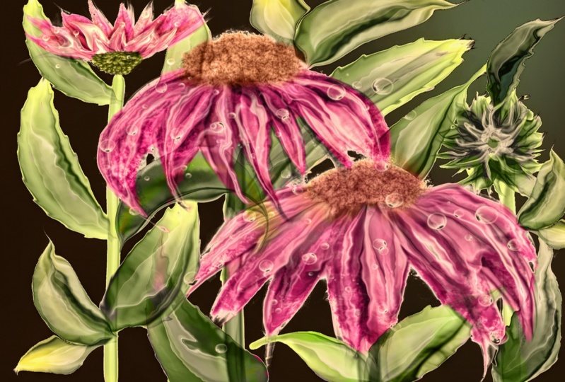
12. Customize Your Background: Y la I finished all the leaves, and it's time for us to put the finishing touches on this and move on the several things you can do. At this point, I'll show you some of the things that I like to do well, for one thing, this background that we initially put in there is a little much with all believes. And the leaves are a little too dark from my preference, so we can change some of those things around and see if you like it better. One of the things you can do is go down to your background and lower its opacity even more if you want to, to make it a little more subtle and not so many different things going on. Or you can turn it off completely and create a new background. Sometimes it's hard to know what color will look good with your composition once you've gotten it to this point. So let's create ourselves a new layer on top of the existing background, and let's just pick a color off the color will to fill it with. I'm gonna go with light yellow, so let's go to that layer and say Phil Layer. And there we have and light well, we have a medium yellow. I'm going to make sure that I turn this other Alcohol Inc background off, so it's not going to interfere if I lower the opacity of this one. So let's pretend that we think that yellow is hideous, because I do think that yellow is hideous. The best way to know what color might actually look good with all these colors to go back to our good friend hue, saturation and brightness. Go to your top and move the slider, move it slowly to the left and look at the colors that it is creating in the background. When you find a color that you sort of like with the background, you can stop and then do something with the brightness or saturation. I'm going in the other direction to see if there's something I like better. Isn't it odd how the colors of the flowers really looks so different just by changing the color of the background? You know, I really think I like this blue, but I want it lighter. So I'm gonna now move my lightness and you know what? I kind of like that blue. I think I could do something with that blue. Now, let's see if I wanted to be more saturated, sort of a robin's egg, turquoise blue or less saturated more towards a grey blue. I like it a little more saturated about there. Now, the next thing you might want to do is create a layer on top of that. Get your smudgy bleed brush. And I do recall that yellow was really pretty with these flowers. Now, with this brush, I am going to go to this new layer. I'm gonna make the brush size fairly large. I'm going to put some color behind these flowers to see if I like yellow behind them to kind of framed them, set them off, make it look very sunny and right against the blue. That ground. Seriously, there's a 1,000,000 different things you could do with this background right now to improve it. I'm just going to show you very quickly a couple of things you can play with, experiment with, to see which direction you want to go in. And now it created this swath of color right through the middle. Now, on that layer, which is all by itself, the yellows old by itself. See, I'm gonna go to Gazi, um, bore, and I'm going to slide my adjustments and see what's happening here to the edge of the yellow. It's blurring, blurring, blurring into a very indistinct line into the blue, which I kind of like that. I see more about there. Okay, I'm gonna leave it there now. I mentioned to you that I don't like how dark the leaves are. It's not that they're too dark in color. It's that they're too prominent with the flowers. So I'm going to start at the bottom. Well, first, let's correct this one problem that's been bugging me along. See these stamps here? Watch will turn them off and on I see them. Now that's jam. Going through that flower has bugged me from the very beginning, so I'm gonna finally get around to racing it. We're just going to raise in here. So it's not showing through those flower petals because flower petals are not sheer. They're not made of Tapia where chiffon and I want to. There I race that stamen. Now it's not bothering me anymore. I think the stem over here is fine. That looks good. Okay, continuing on here's our leaves that are the leaves for flower A. We have the base, the shadow, the highlights and the dark detail. So let's do this. Swipe to the right until they all turned blue. All just the leaf layers. See that now that's group those four layers into one group. If we collapse the group and we turned it off and on, you'll see which leaves. Those are. But let's flatten it now. I almost never flatten anything in my original artwork for the purposes of this class, because I didn't duplicate my entire artwork. I am going to flatten the leaves together once the leaves air flattened, you can then reduce the opacity of those leaves. Make them less prominent in relationship to the flowers, which is what I'm trying to achieve here. And I put that opacity on 64%. We will pretty much duplicate that same opacity with the other leaves. So let's just go up until we found our other leaves. Here they are those four layers, dark details highlights. Shadow Leaf Base Group. We're going to collapsed the group and flatten it, and now we can also reduce the opacity on that second group of leaves Down to about between looks like around 60% is kind of where I prefer them. Go to the very top for your last group of leaves are a swipe to the right group there it iss flatten it and reduce the opacity. Now the very last thing we're going to do And just let me say this right now so that you are aware I fully expect your flower masterpieces to so far excel this that this will look like a kindergartners finger painting two things I really love kindergarteners and finger painting. However, I have faith in you that your work will put this one completely to shame. One of the last things weaken dio iss and a layer on top change our color toe white goto our paintbrushes in thes paintbrushes. We have not just brushes but stamps. Some of the stamps are water droplets. I like thes. I'm gonna start at full capacity. You'll see if you change this up and down, it will go to different sizes. Now I'm just going to pain stamp some water spots on my artwork. Sometimes it's hard to see really what you're doing. So here's what we're going to do so that we can tell what we were doing. Just now we're going to duplicate the layer so that it's twice as white and we're going to merge those two layers down. Then we could take our A racing brush. And where we've got too many water spots, we can erase some of them. Okay, so I don't really like that one for that one. Maybe not all of that one. It's hard to go wrong with the water spots. They really add a really nice element to it, but you can't overdo it. You don't want it to look like it's absolutely underwater, and there should be fish swimming by. Okay, so after we've duplicated them and made them white, we're going to duplicate them again On the bottom layer. Hite, Alfa Lock. Choose black for your color. Phil that layer with black turn apple, look off, hit, select. Move the shadow layer over, see how nice it looks and then reduce the opacity of that shadow layer. So it's not quite as sharp and cause iam blur the shadow layer so that it's nicer. Then go to your white layer and reduce that opacity so that the white isn't quite so brilliantly. Why? And there we have it. Good job, everybody. Thanks for hanging in here. I know it was fairly complex, but you did a great job. And I'm looking so forward to seeing your projects that you post. Now, take a breather, Go get a cup of tea or coffee or a glass of water, and I'll be right back to show you some beautiful mock ups that I created using the illustration we created in this class.
13. Mockups and Bonus Material: after you've completed your illustration. Now what? My favorite thing to do with my illustrations is to send them to a print on demand company and have them put on items that I keep around me every day. It makes me feel really accomplished when I use an item that has my design on it, and they make awesome gifts as well. So I have compiled for you my favorite print on demand suppliers that I use personally, they're all tested. They have great customer service, and their delivery time is really fast. Just polish your video and do a screenshot of this page to keep handy for reference. So now let's take the design we've just created. And look at it on several different products from these companies. I hope you enjoy this little slide show theme . Next to slides are flowers from my own garden that I'm giving you as bonus material. Feel free to screenshot them from this slide show and test out your new skills. I'd love to see these posted in the projects area. Thank you so much for being a part of this learning experience. If you have any questions, please let me know
 Starlene Designs, Illustrator :: Teacher :: Animal Lover