Transcripts
1. Let's Go: Hi, I'm Karina, illustrator and graphic designer based in monocyte is I sell my illustrations on a print-on-demand platforms and I worked for brands to, in this class, I wanted to share with you my whole process from a photo to a beautiful illustration. For a long time, I've been trying to find my own voice. In illustration. I wanted to draw the beautiful essence that lives inside every woman. And I wanted to add a quote of self-love and self-care. And suddenly everything found plays in my illustrations. To get free, find out how to use the land values to emphasize BS and separate rock will create a beautiful my team father, to play for you, Carlos, without loosing compositions. We'll make textures and we work with fonts and quotes. And in the end of the class, you'll have by reading for media or 43. This kind of illustration is perfect to use in your social media or to give someone a very special gift. I will show you how to work, clean, fast, and organize. This class is perfect for any skill level of coin. B Fresco app is real easy to use and very intuitive. This workflow I'm sharing with you today is perfect for any digital illustration you'd be making in the future. Once you make it yours, you will have so much time. And I hope you'll enjoy drawing and smudge a site. Do. So. Let's go on to the next lesson.
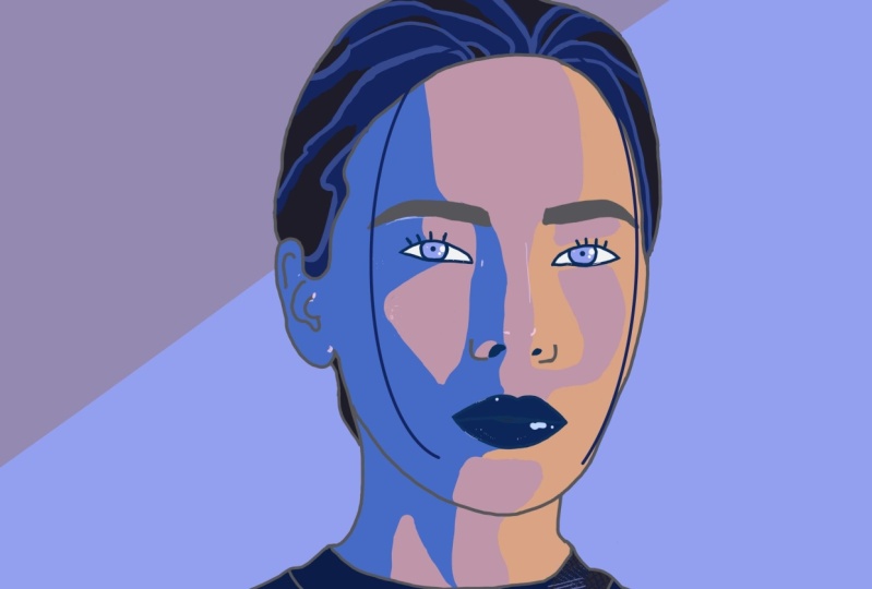
2. Illustrate from a Photo Project : Today you will create your own illustration from a photo. And in the end, you will have a file, credit preprint, or media. Love to use my personal illustrations as an avatar or stickers or a tissue. This technique, very easy to follow and beginners will be thrilled. I suggest to choose some image that stems out. An eye-catching can be a phase, a hairstyle that dress, shoe maybe oppose, that calls your attention. You don't have to worry about the quality based won't be an issue at all. For this project, I've chosen the yellow triads. I loved the way she is sink, making a wave and a lovely composition, but are really catch my eye is what it should look in not I thought many answers. And with this, I will write a quote at the end To finish thetas creation. So download the image from the bracket section and then open up, open a new file, set it as an a for in a frame mode, then import the photo and open a new layer over it. And now we're ready. So let's go to the next lesson.
3. Lining, Easy and Fun: Lenin is my favorite part. In this class. We'll do the lining over the photo. I use a regular brush in size a. Try to make it quickly. Only the basic lines with not so much detail. I tried to identify the structure, the movement, the eyes, the mouth, the waves in the pose, told worry if lines are wavy or unfinished, will polish them in the next step. This sketch is finished. Close the photo layer. Now it's time to it with the eraser tool and the brush has done to do the cleaning up. I prefer a plain brush to make contrast later when I give textures to a part of the prostration. Sometimes I love to change the hair style, the out feet. Maybe I add rings, bones, et cetera. In this case, I love how it looks. And pay attention to close the figure is gives a professional and clean loop. Also be careful with converging lines. Sometimes makes the solutions change them. Feel free to change the lines and help fund until you like. Okay. Imagine where you want the light to becoming from. In this case, light comes from the upper side. So lines in the line used to be thin and those lines in the shadow are bold. Now it's time to emphasize the point of a traction, why you chose the photo. The I loop, the mouse hip bones, also with bold lines. Try to make it a smooth transition between the theme on the boat. I'm happy how the lines look. So now I love transparency in the liar and Eigen change God on earth. As many times as I like.
4. Color, Feel Free and Crazy: Let's find out how to create a matching palette. Like TPP is to use a short amount of colors, about 12, It's okay. Another tip. Imagine a red, and now you need a lighter red. Try using an orange instead of adding white to that red. This way the eyes have more information to read. And Martin, I think colors likes to be with neighborhoods. Blues, the greens, reds, and orange genes beings, the buyer led a group of colors linked together in a diet like friends. They need to get along in a combination of character and composition. I use a dark gray fur lines. I don't use black. Makes too much contrast, but feel free to use it if you like it. I love a deep indigo blue and a very light blue, like the daylight color scheme, I use three colors, depending on the palette I use can be warmer or cooler. I use a very light pinky orange, a menu beach. And the direct sound. For the hair, I use three colors to her lips. I use to color this red and a pink, red for the eyes and the grass. I use a very lovely blue-green and they indigo, blue, blues and grays farther back. You can then load all these colors from the project section. Feel free to create your own palette.
5. Painting Workflow: Keep the line layer with the transparency block. Outline the lips with red and the eyes with the indigo blue looks more natural. Go to a new layer under the line layer and start to paint with skin tones. Don't worry to class. You can erase or paint over labor. Remember, dopamine comes from the upper side. So dark colors go into shadow. See how to protect a shadow over the face, and how light shines, nip cheek and the nose. With three colors, I can create a notion, light, shadows and volume. Go on with arms and legs and see how to make colors. Okay? Painting medicare is the same principle. Orange and the lower part, yellow when it's illuminated by mouth. And lighter yellow on top. I mean, shine fives, leaps with orange, red, and white, and with a very light blue. Thank the dress with a blame integral. In the next step wouldn't give texture and color to the fabric. This is only one way to use the ballot. Feel free to change colors as you like. Here. It can be blue, red, yellow, or green or whatever. Hearing much nation the sides colored this pillar plan. So see you in the next lesson.
6. Background: Add a new layer under the color layer to paint the background. Now, with three colors, I play with big shapes that follows the way the popes. In the next step, I will give texture to the address. So to make contrast, the background isn't. Circles, stripes, dot, loops. Very nice. Also. You can try them. The point is to get the difference between figure and the background. And to make the colors work altogether, or use some of the background tones to paint little dots in the iris. Now, add a new layer over the color layer and under the line layer, Let's make up the ice. But the beautiful blue green in the same layer with the same color and the same brush insights to make a dot pattern all over the dress and the hair band. And with the eraser tool, Erase dx. Working in different layers is very helpful to change colors as you like. Keeping organized will make your workflow. Now, we already put texture. So let's go on to the next lesson.
7. Layers and Texture: Let's emphasize one of the elements to be character to the illustration. I choose the dress can be the hair or the background eta to anything you want to. Create a new layer. Under the line layer had over the dots. Pick a new brush. I use the blob brush from the gallery, play with a sizes and try all the halftone brushes out of them. Gibbs beautiful texts. They indigo blue and start to add texture as the shadows morning the dark side. I mean DHS on a p-type 2, it's here and there. Remember to paint the hair band. And then he raised the accident. Beak, the light blue from the eyes and with the same brush and size. And keep the light that just once you're ready. The layer opacity, you can diminish the textured effect with a round brush in various laws, tiny dots of light in the eyes, the lips, eyebrows, takes a nose, changed the light pink, and add little dots and cheeks, nose, the chest, on the arm, and everywhere the sunlight, that chip. Set that file with a quick Save. You'll find it in the gallery photo or a save it as a PDF, PSD or AI to give working in another program. And now let's go on to the next lesson.
8. Fonts, What to Say and How: What we should look at? The answer will be my quote. Maybe she's looking at her next mistake. Oh no, that's so wrong. I can do better. Let's be positive. Two other quote, I use Adobe Spark Post app. You can use any text editor you have or just other layer in Fresco. And write a quote with your handwritten style. Try different fonts and play three, because the color palette, I'd even a new color to summaries you may take, keeping into the Bible is the best advice I can give. Retro fonts, try classics, try weird. For me. The only trend to follow is that trend in your heart, you unique. Choose what to rely on your style will be awesome.
9. Happy End: Congratulations, you have finished your first illustration from a photo. In this class, we covered everything from lines, color, textures, layers, to final touches and inspirational quotes. If there's one thing I want you to keep from this class is to enjoy the process. Keep organized step by step, and follow your heart. Be brave. Use this workflow to express your own voice. Now that you have uploaded project, the project gallery, and less than. So, we cannot take a look at it. I hope you enjoyed this class as much society, liter review and follow my profile. Let me know how you enjoyed the class. You can also check my Instagram to find Mike samples of these workflow. And sine sounds Gracian. Keep drawing, keep creating and be yourself. Thank you so much again for watching this class and see you soon.
 Cari Branz, I love to illustrate