Transcripts
1. What Will You Learn In This Class?: Hello, everyone. I'm in its founder of reverse gains here in reverse cuts. We edit videos and photos and teach other people to say have been broken and photo shopped for a while and you should see a couple of my latest works right. Once I realized that there is no foot flower classes feel share, I immediately had to make it. So Here's exactly what we're going to learn. First will set up the best project option for the final outcome and make a few adjustments for the beginning. Then we will great some stunning design details that will enhance the flyer and make it look professional after death. We're going to showcase the foot and prices for dance. We're going to do some final touches like anchor text, the barcode and our logo. This is something that you're interested in joining us now. Let's great your flowers the right way. That's great. We can do it
2. Best Project Option Startup and Our First Adjustments: Hello, everyone. And welcome to our brand new class. I'm really excited to have you here. This is actually the first and the only food flyer class on how to make it into photo shop because nobody made this. I came up with this idea, So I was like, Why not? Let's let's teach people how to do this because this is a really easy job that you can land anywhere. I'm pretty sure like that Doesn't matter where you live. You can land a job for this on your closest closest restaurant or a fast food chain or something. It's really easy. So I'm pretty sure that I explained a lot of things in the in the promotional video. So right now let's jump straight into this. So right now in photo shop and what I'm gonna do is explain to you which type of a project or which type of a file one eat. So right here I created a new one on When I want you to do is go to print right here and view all presets right here. You should see a couple of difference of these. So the standard should be a 548 to 210 millimeters. But of course, it's all but personal preference. You can use something else if you would like to, but this should be the standard for these. On what I wanted to mention is about the resolution. You should keep it at 300 if you want Teoh like print them, you know it went to print them and the restaurant handle their mouth or something. But if they're trying to send them through an email as an attachment, you should go easily with 72. But that's a completely different story. That's not something that should be hard. And also, if you click on this should see millimeters right here, continue to 14 to 21 centimeters. Bigger difference. But let's just create a project. And right here we have our project in which forget to work. And so what I'm going to do right now is the next thing I'm going to start off by creating another layer on. I'm going to click this option right here, which is the pen to, and I will be explaining briefly every single one of my moves, who would understand everything. What I'm doing and we should get this easily in those times. So what I'm gonna do is click right here and then click right here. But I'm gonna hold and drag this out as much as I want to to make this curve right here. Once you make this curve, but I would advise you to do is take this thing right here. Is them out This zoom option on what I'm gonna do is go back to the pen to and this time I'm gonna hold all option Ault. And it's used to move these right here. So basically what these represent are like, where the direction off the next the next Ah kee is gonna be. So if it was there, it would go there and twist stupidly. So basically what I did right here is I made sure it could go straight right here, Right here, right here on Boom. So right here we created this shape. It's Trista raters. You can see I made it harder on this side on purpose. So what I'm gonna do right now is click shape right here. And as you see, we made this. What I'm gonna do is double click this right here, not decide. It should open these blending options. But click this right here. And it should open these color picker. What I'm gonna do is actually choose one of these colors. Andi, it doesn't matter, Actually, just choose whichever one you want. So let me just check my reminder. The reason I made a reminder it's on my second monitor is because I don't want to miss anything. I want to explain to you every single step that I made while creating this on. Sometimes when I go from the top of my head, I can forget some things. Maybe, like, forget some shadow, which is important on. That's why I wrote everything down on my second monitors so you could follow up step by step. Everything that I did for my first picture that I showed you. So right now wait should add the picture. So think the picture that you want to be on your headline on I'm gonna take mine's gonna place it like this. What I would advise you to do is just drop it down like this and press ok And what I want you to right now is right. Click on it right here and create a clipping mask. There's gonna insert it inside our selection right here that we make earlier. So make sure you click on our picture. Go to edit free transform on. What I'm gonna do right now is just kill it up, Teoh, where I think it fits. Good. So don't be afraid to hold shift and maybe stretch it out like this or something. I think this should be good. Let's see. All right. I really like this way. But for some reason, the highlights are blown out. So what I'm going to do is click right here and get to brightness and contrast and drop down the brightness just a little bit, isn't it? Is You can see it's getting right now. Ah, a natural color. So must was killed it. And our next lesson we're gonna create the downfall right here. The second mass right here. But they were based for this episode. I don't want toe curry with you, but don't worry. You can watch this whole thing from like one take, but always back you in our next lesson.
3. Let's Create Some Amazing Design Details!: All right. Welcome back. Everyone On. Right now, we're going to create the bottom. The fact that we made with Cem layers and some shapes. So right now we're going to do is create another layer right here, and we're pretty much gonna repeat. The same process is with you up here. Just, basically click right here. Click right here, and we're gonna create something some dessert shaped like something like this. Right on. Just let's make sure that we Oh, if you want to move, if you want to move the key frames, just hold controlling. If you want to move these pointers, just hold Ault. It's really simple, so I'm just make sure we get them in the right position. I'm gonna be moving this one up a bit. I'm not gonna, like, synchronize these, but I want to move him up. So right now I'm going to do is close this out just like this, and we're gonna repeat the same process click shape right here, and double click on this right here, as within our last one. So the color that I'm gonna be selecting for the down there is gonna be, like, sort of Ah, like Harder. Harder Gray will say like that. So that's completely black, because it looks weird. But something like this, you know, something like this should be fine. So what I'm gonna do right now is hope Ault and copy this layer above it. Just called Alton. Drag nous layer up. Or you can just hold this layer and drop it down in this new layer option right here. So make sure it's like the 2nd 1 and what I'm gonna do is double click on it and select some type of You are correct. That would see as I did earlier. So, Michu, you drop it down. Sorry. Right now what I'm gonna do is at it. Free transform, actually, Yeah, because free transform on what I'm gonna do is get it above this one just like this, and you can even make sure it touches a bit off the top. You know, something like this, it covers have been at the top right here when he makes a curve. So what I'm going to do right now as press okay on. And I'm actually going to duplicate this one more time, and we need to be careful where we dropped the second. I mean to turn copy, because that's gonna be our white one, which is going to separate these two. So let me just double click on it, create a white on going to edit Christians form. And as you can see, it's creating this white separate separate mint. But we're going to do is rotated like this, so we would actually cover it up right here on the top. So, as you can see right now, let me just make sure I get this right. Press rates. All right. So you can see what we created right here is just this separate mint from the right thing right here. But of course, you can get the desired it's desired with and the shape of this. But this is how I personally like it. Just a little detail that's gonna separate the top and not can not make this white so boring. So what I want to do right now is get to the red shape right here on. What I'm gonna do is right. Click on it, go to blending options and check this Grady int Overly. It cannot seems boring like this. What? I'm gonna do is to the radiant right here. And actually, these are existing colors that I used in my last one. So these are the ones that I'm gonna be using its the right on the left sides, and it's gonna be purple on the right. So if you want to copy these, here you go. You can even pen tool them if you screenshot my video right now. So basically, these are options that I use if I press, OK? Oh, let me just check something. All right? So Yep, we did everything right. What I'm gonna do right now is sleeve the grading overlay checked on. The next thing that I'm going to do is click this inner shadow. Think Ondas. You can see it's gonna create a really, really cool shot shadow. This field right here is gonna be filled with shadow, and it's gonna look way, way more professional and good looking. This is something that I would advise you to do to not live it without the shadow. So make sure you use in her shadow on our job shadow. And as you can see right here, you can copy my options, but basically, I can't tell you what will be the best fit from these options for your picture. Because it's something that's all about personal preference. How you like it? What does your pictures tile tells and stuff like that? So, basically, these are the options that I use right here, Andi. Pretty sure that I'm going to stick with them, but basically extreme. Just tweak around and see with fist for you. Use the global lightning for this one. And as you can see, I bumped up the size a bit because it falls up from the top, which makes really cool. Make sure you set up the distance, right? So you don't cover the whole thing right here. You need some color. Right? Years. We would actually see the shadow. So basically, those are the only times that I could give you about this. Since you know, as I said, this is all about personal preferences. So let me just click OK on and let me just click control the rate enter. Right. So, as you can see, this is what we created for now, we managed to recreate this important part of the picture and I will see in our next lesson we will be covering up some more stuff
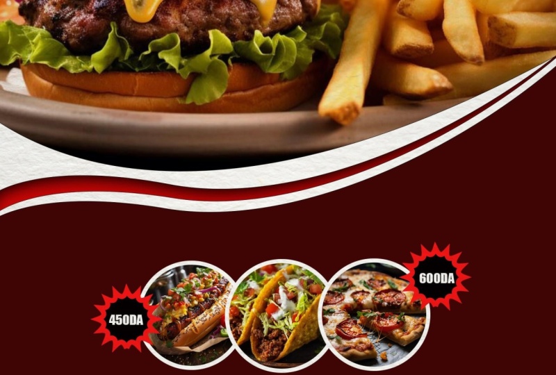
4. Showcase The Food Promotion: All right, so in this lesson, we're gonna be covering up a important, important part of this class. So let's start right away. The thing that we wanted to do is create those circles right here as if you remember from our preview picture and at food to them and add some prices to them. I'm not gonna be bothering about setting up the right price. The right text. As you remember. There's a text right here. I'm just gonna be giving you examples. So if I puts a state that cost $1 it's not rial worth the trio. I know we would like to you to stay for $1 but it's a cruel world war world out here. So what I'm gonna do right now is click on the last layer right here that I have Make sure it's on the last one. Andi, click new late, right yourself created. What I'm gonna do right now is go right here to this option. It should be rectangular for years. You see, I guess you can find it. It should be rectangular for you and right click it and find a lips to There's something that I've always wanted to mention my tutorials. Guys don't seem a lot of people do it. A lot of people who make tutorials over two courses about photo shop, for example they would be using this as their last and they would say, like, just click on this But students will get confused because they don't see this option. And there option time right here on does because it's probably has a range of its select still take their lives right here. In case you have something other on. What I'm gonna do right now is zoom end. So actually, let me just get this right here. Is there have been more But the reason why I'm not using a lot of shortcuts on Sorry about that. But the reason why I'm not going to be using a lot of circus is because I literally got a new keyboard just today, and it's the 60% 1 is the new one. So I seriously can't catch up with all the shortcuts, but I will be working on that. Sorry, guys, and let's get back to the work. So I'm gonna take that lips to make sure you create a good circle and There we go. So there's a circle that we needed. What I'm gonna do right now is like enter and right. Like, uh, I think that I wanted to mention is let me just check if it's about this. Yep. Uh, you shouldn't be having like the white line out is because I had stroke on. I just got it to zero, but actually want the line out. So what I'm gonna do is go to the lips right here, lending options. And this is a better way to created. What I'm gonna do right now is, uh I'm gonna go to blending options, as I said, and create a stroke. As you can see, this is this truck that I'm gonna be using. You can create with size missing with size. You can create how 10 or like, big you want it to be. But 13 is fine for me. What I'm gonna do right now is at some type of food, but actually Sorry. Before we do that, what I'm gonna do is hold old and duplicate this twice because I have three foods too showed to the world on basically because you have three of these. So what I'm gonna do is line them up. So what I did in my what I did in my picture and the previous is I lined them up exactly, like exactly like this as I did right now. But what I see other people like to do as stack him up. So they're stacking up like this. They would increase every other, so that would make it look cooler. But it's also personal preference. It's nothing special. It's just a small detail, but I like this way sharp and clean. But of course you can do that. If you want to, you can stack him up and increase the size of every other above it. So right that what I'm going to do is go to the Ellipse one on. I'm gonna add a picture. I selected random pictures. You can see it has a hot Doc Baker, chicken wings, a swan, a freakin swan. But I don't know why, but I just selected some random pictures. I'm gonna place it on top like this, just with it as our 1st 1 place right there on right. Click it, create clipping mask and it's gonna insert right there at it. free transform. And right now, I'm gonna be giving my best to set it up just like this. So, of course, if you're doing this as a job, it should be having a restaurant giving you the pictures. But I'm using some random ones just for the sake of the class. So I'm gonna be keep keep repeating this process. Let me get some chicken wings. Afraid. Oh, so I'm just getting, uh, make sure you click on these layers before he actually said the picture. Because if you had it on the hot dog bacon it for forget to click. This one is gonna mess up everything you want. The wife, your beginner, that stuff like that. So make sure selected, as you can see at some chicken wings and get it right there. Created clipping mask for it. And at it, frictions form. The reason why I'm not using a shortcut for free transforms. As I said, Uh, it's kind of hard when you're on a new keyboards, you know? So don't be afraid to cold shift and stretch it out. These there's just some small pictures, so it won't make much of a difference. They won't see it, actually. So let me just add our last one where it's the swan on Dhere Swan. It looks perfect. Gonna go? I forgot to at the clipping mask, right. Clicking and created clipping mask at it free transform. And I think I'm just gonna leave it as it is. Maybe just get it a bit on the sides in. All right, So here's what we managed to create. Right now, these are their food products that we're trying to show off. That's gonna be really important for this. Barth. So this is how you do it? You just create clipping mask, as we did in our intro on and learned. That's how you create these foot pictures. So see, in the next one where we will be learning how to create something really cool is the prices
5. Add Prices Or A Discount: on right now. As I said, we're going to be creating food prices. And how are we going to do that? We're gonna do that by going right here to the shapes their lips too. But this time, right, click it and use the custom shaped tool. Once you go to custom shape to what I want you to do is go right here on. You should be seeing a lot of these right here. In case you have don't have a lot of them, but you need to do is click right here and select which one you want to use. I found this one, which is the best for prices by going to all. And you will see this right here. You just need to find this. But I already found it. So is that easy? In case you can find it is because you're not to your right in the options. You're not on all your on something else, so make sure fix that. I guess you can find them. So what I'm gonna do right now is drag this out. Let's see, this is gonna be for the prices. And right here we added a new shape, and we're gonna mess around with its Phyllis stroke. What I'm gonna do right now is change the Phil actually gonna keep the filter black. Sorry. I'm gonna keep the filter black on the stroke when it comes to the stroke, What I'm gonna do is change the stroke to Ah, hard red Right here, Andi to about 6 10 Let's your 10 looks as you can see it. It looks good. It looks good. It could be a little bit bigger, but I'm not gonna increase it. I'm actually gonna drop down a bit off the stroke on. That's how I'm gonna get the perfect size for this. But I'm going to do right now is hold Ault and drag this up. Teoh, Duplicate it. I'm gonna be taking this move to on Get this one up here. Make sure you set him up like separately. Don't match them like like this. Just like move them around, see where they fit the best and just scratched the surface. These products right here because it looks cooler. So what's been duplicated days? What? Okay I'm gonna have to do is I think the text tool and make a text right years Gonna create a layer right here right away. What I'm gonna do is like, let's say right. 1 29 1 $29 have been selected. Changes. Color to white show is the most noticeable. Don't change some stupid colors so people won't see it or get dragged away for the attention. Make it white. So people see it clearly black on white is the best option. I'm not gonna keep this font. There's actually a funding everybody has and their computers. And it's called an impact if I remember. Well, let me check. Oh, yes, there's that impact. So as you can see, it's the one they really literally use in their hope. Staffs and flyers, sir, if I click Okay, I'm gonna hope Ault again Drag it up, cop it, give it to move to get it. And right here. Get this one in Actually should resize it first, but oh, well, we're gonna do that right down for both of them. And as you can see, just as you resize them, it's gonna look better and better. So basically, this is how you resize dentist. I answered them on a hike radio. Let's say the shocking shape of the prices fell off on a little bit for this episode. In the next episode, we're gonna be adding some final touches, as is the text. Right Here is the name of the restaurant. The slogan the barcode that they could be using if you're flat, has one the logo right here off the restaurant. And we're gonna be adding some final touches to it. So for now, this is what we managed to create if you want to seat, and I will see you in our next lesson.
6. Add Text, Logo, Barcode And Polish It Up With Some Final Touches: All right, Welcome back. Everyone on this is gonna be our last lesson. Actually, this is where we finish off. And as you can see, it literally wasn't hard. It was actually pretty easy as long as you learn. As long as you keep learning. So if enjoyed by now, measure to leave a review of what you think about this glass on if enjoyed it, slap on the best one. If you didn't. Hey, I will take the critic critics. But what I wanted to say is make sure to follow if you want to be updated, because I will be posting a lot of classes at Let's jump it. Our last lesson. All right, So what I want to do now is highlight the text option. Click on it. What I'm gonna do is actually forgot to zoom in. As I said, Sorry for zooming in like this. I can use the shortcuts because I'm not used it in your keyboard. I'm gonna click on my text and highlight big amount of it. Uh, rest rest. Wrong name. All right. I'm still using the impact. The impact was it called font. I'm gonna press. Okay. What? I'm gonna do right now, as I could have resized it and they, uh, the text thing. But it's some some reason easier for me to resize it like this. What I'm gonna do right now is click OK, you can add You could just, like, get to blending options and add a drop shadow to it if you want to. But I don't like it's on fliers, but I'm gonna do is highlight it again. And right here you could add. You know what you could advocate at a slogan off the restaurant also or something like that . Or maybe explain what the Flyers about, for example, collect five fires, get a nice cream for free or something like Daddy All depends on what you're working with on the flyer. But for the sake of the like, the class I'm just gonna give you an example. So I'm gonna add a slogan. Let's say, like we care about our customers. I love this new keyboard. This my first mechanical keyboard and love listening to it. I get type for a day. So what I'm gonna do right now is therefore font called Ariel. It's probably heard of it. It's a normal one like the reason why I'm using this one is because I don't want everything to be monotone and the same one because this one, it clearly shows that what it is, it clearly shows that it's the slogan. Just go edit frictions for And one of what I want to do right now is lined this up so they fit perfectly underneath each other. But I'm going to do is hold control and highlight both of these. Click on to move to and place them where I want them to be. Ricky also do is right. Click them on and group them or you can link layers. So where you could do right now is go to edit and free transform on as increases that will increase together. If you want to make this bigger, I'm gonna drop it down like this a bit on. Let me find the right point for this stalemate right here was, I think, Okay, As you can see, it's looking pretty good. So what I'm gonna do right now, as at the bar code, you can find it on Google. The reason why I added the barcode is because a lot of these Ah, lot of these flyers have a can which you can work which you can use with your phone to get something for free under ab the next time you purchase something in the restaurant something that is the reason why I'm adding the barcode. So I'm just gonna slap it and just like this, add it to side. It's mostly on the bottom, always And maybe just right here this big click, OK? And what I'm gonna do also is insert check, but it's you can see it's it's not the transparent. Once I'm gonna go to select on color range on. We're gonna be messing with these going to select the green color, see what's front fits for me the best. Okay, but I'm also gonna do is once it selected at it. Cut. Where's it cooked? Take out right here paste. Andi, think to move to Andi at it. Just like this. Maybe resize it. These air. These are, as I said, just some final touches that you don't need to follow if you don't want to. But I just find them good. Make sure lying everything up so it looks perfect as a like it. So let me just zoom out. And what we're going to do right now is the next thing. So I'm gonna go right here and change again. Philip still right here is you remember? We want to add the logo. But we wanted round because everything is round and we want logos around. So I'm going to create something like this right here. We can move it later and resize it and stuff. It was something like this, and what I'm gonna do is double click on this. It's like this color right here. But I'm gonna make it a bit more great than this right here because we don't want everything to be the same color. What I'm going to do right now as duplicated slayer, hope all and duplicated, click on the other one to be selected on. I'm going to go right here and change this throat to this. And let's say one stroke could be like five. Let's see how that looks. So what I'm gonna do is click on it on to go here free transform. And I want to resize this and make it like this. You say about this new? It looks good. It's not exactly in the middle, but let's not Let's not bother with that. And what I'm gonna do is, of course, you will have the logo off the company of the restaurant. If they don't have one, make sure you offered them for you to create them the logo. So that will be actually dough. People even get more money. Another job for you. So what I'm gonna do, right years I've found some random logo from Google, which is probably free to use. You can see something like this, but I'm going to do also is good to select the color range. Going to select the black on. Okay, it's gonna be selected at it. Uh, cut. Taken right here at it. Paced. Where is it based? And at it, free transform. Bring it right here and make sure you fit in just like this. You'd have to make it a bit smaller because the circle that we made is not actually a pretty good of a circle that you could do Also is choose zoom option and, um, and better on this, they would have more space to fill it. And, like, this is you can see they should make it better. What I'm gonna do is change this layer, blending options right here at the logo. Do we add it? I'm gonna go to color overlay and add it to white. Okay. Okay. Apply it and then just go right here. Fit. The scream smiled, and we officially created our flyer for our restaurant. I hope you enjoyed guys. I really, really had fun creating this. And as you can see, it's it's pretty pretty easy. Anybody can land a job for this. I mean, come on. You literally learned this and walk like a really, really short amount of time. If it did enjoy, make sure to follow me on skilled share or even check on Ah yuk uber I blow upload free tutorials. If you want to keep learning with real skill share, you will have to follow to be notified when I posed also with you should do is write this course it's your personal opinion. But thank you for learning with me. I really appreciate it. I had a lot of had a lot of fun. I don't know about you. So that's how you create this flyer restaurant money winning flyer. Andi, thank for me here. And it's from a risk of signing out
 Reverse Cuts, Master Media School