Transcripts
1. Introduction to the class: Hello there and
welcome to my class. Create your own digital
planner in Canva. This class is all about teaching you the
basics of designing an interactive digital
planner that can be used with annotation apps on your tablet by GoodNotes or samsung Notes. We're going to be
using a very popular and easy to use design
software called Canva. And you may already be
familiar with this software. Let me first introduce myself. My name is Michelle
Marks and I'm a graphic designer and
digital product creator. I love to share my techniques
with you so that you can design for yourself and
build your creative skills. In this class, I'm going
to teach you how to design a beautiful digital planner with your own custom
cover page designs and your own planner layouts. I'm going to show you
how to make your planet interactive with clickable
links and buttons in your planner so that you
can easily navigate through the planner without having to scroll through to
find the right pages. This class is set out in a step-by-step
practical format so that you can create
with me as we go. By the end of this class, you will have your own
gorgeous planet that you can use on your own tablet to organize your tasks
and projects. While this class is
designed to help you create a plan of your
own personal use. You can also use
the techniques to design digital planners
to sell commercially, if that's what you'd like to do. However, I want you
to keep in mind that Canva commercial
licensing rules restrict, which can be elements you
can use in things you sell. I'm not going to cover Canvas
terms much in this video, but I will share
some reminders along the way when you need
to check the terms. So excited to get
stuck on this project. So let's get started
on the first lesson
2. Design your planner cover: In this first lesson, I'm going to quickly
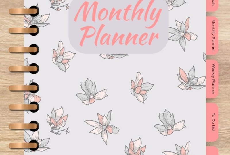
show you through this planner and we're going to design the front page or the front cover
of our planner. So this planner is
the one that I have created to demonstrate along the way what we are
creating so that you can visualize what the end result
is going to look like. So then layouts and I've
got here is the cover. I've got a Monthly Goals layout, Monthly Planner, Weekly
Planner To Do list, or you can use that
as a daily planner. And it also got
my notes as well. Now, than layouts that you use personally will be
different to what I use. Everybody has their own
preference when it comes to what layouts
they like to use. But if I can, if I
can, in this class, show you how the basics
of creating each layout. You then have
creative license to go and create what ever layouts. You dream of knowing that you have the basic
techniques down. So the first thing
that I'm going to do is I'm gonna go back
to my home screen. And this is where you can
start creating with me. The very first thing
we're going to do is we're going to
Create a design. And Canva already has a preset
size that works really, really well in planner layout. So you may not
have it already on your suggested list because this typically goes by what
you've previously used. But what you can do
is if you go into the search bar and type planner, you will see here that
you'll have a couple of journals and that sort of
thing that are preset sizes. So these planner here now just
take notice of this size. This planner is 21 by 29.7. Now that is A4 size. But typically on most tablets like iPads or Samsung tablets. And 8.5 by 11 inch, which I believe is US letter. That size tends to fit nice
and neatly on the tablet. So this is your, entirely your choice,
what size you make it. But for starting out,
if you're not sure, I'd recommend sticking with
the 8.5 by 11 each planner. So it click that. The other thing that you
can do is you can create a custom size where
here you can input the, the width and height dimension. So if we go 2 ", the width can be 8.5
and we can go by 11 ". Create the same size for us. Now, just bearing in mind this original
planner that I made. I made this in a
portrait orientation designed to use the when using the tablet in
portrait orientation. Another thing that you
can do is you can create a horizontal or
landscape orientation. If you would like to use your tablet in that format or if you would
like double pages. But for this
tutorial, this class, I'm just going to create a single pages in
portrait orientation. Okay, So it's
entirely your choice. So let's create our me design. This is what we're going
to be starting with. Don't be scared by
the blank screen. I'm going to help you. I'm gonna guide you through
the hallway, right? So we've got our page. The first thing that I like
to do is set a background. Now, the original planner
that I've created, I have designed it as
though I'm looking at an actual planner sitting on the desk so you
can see the elements. I've got the tabs and
I've got the binder here. Now that is again, your choice whether you like to have that
binder look or not. So what we're going to do first, if you're re-creating
the planner that I have, I'm gonna go into photos
and then I'm going to search for desk texture. There's a few different, a few different search
terms you can put in there. You can just play maybe even
a Canvas texture could be nice way you've got
like a Canvas texture. You can have marble texture. Just choose like we can even have black marble texture here. Like how pretty is that? Anyway, we can have
white marble texture. It really, it comes down to
your own personal preference. But I'm going to duplicate the same one that
I've created here. So I'm going to go desk texture. Because what we want it to
look like is this though, we are looking at
a bird's eye view down onto a table
that's got a planner. And we can choose a dark wood. You can choose a lightweight are really quite like light woods. Now if you're using the
free version of Canva, I've got the paid
version of Canva, so I can use a lot
of the pro elements. However, if you are using
the free version of Canva, then just come up
to the Settings button here and just
toggle on the free. And that will show you
all of the elements that you are free to use without
needing to pay for them. Okay, so I'm just going to
choose one that I like here. Oh, use that one. Okay. So once you've finished And you've got
your desk texture. The next thing that we
want to do is we want to add a, a frame. Now this, there's
two ways we can go about creating our cover. The best way, I'll
show you both ways. The first way is if
you add a rectangle, shortcut or you can go into
elements and add the shape. What we're going to do is
we're going to essentially create the cover,
the cover frame. What we want to do is
create a rectangle. And just for now, let's make it white so
that it looks like a page. This is going to form
the base of our cover, and it's also going to form
the pages as well here. If you would like to do a layout without the binder elements. So this binder element here, what I would recommend
doing is you can re-size it using as
much room as possible. But regardless of
whether you're doing a plane page or a
bound document, make sure that you've
got room either along the side here or along the top. For when we place our tabs. The tabs alongside
or along the top, again, it's your choice. I'm going to put them
along the right-hand side. So I'm just going to
leave a bit of space on the side for my tabs. I'm also going to leave space on the left-hand side for my binder rings because I
really liked the look of that. But basically what we've got
here is we've got a page. Now, if you would like to have the curved edges on your page, then select your rectangle. And then as you can see here, if you select border style, you've got a toggle here
that's got corner rounding. And you can see as I'm
moving this slider, you can see that the
edges of the binder, the edges of my page
are becoming round. Cheese. Personal preference to how round you would
like that to be. And then, and then it's set. Okay. So what we're going to do, this is a blank page. And you can add elements
to your design. So let's say if I wanted to
recreate this floral pattern, what I can do is I can
type in leaf outlines. Now, when you are using
graphics that are in Canva, there's a couple of
things that I want you to want to note. First of all, if you're using
the free version of Canva, don't forget to toggle the free. Again. The other thing
to note is if you are creating these planner
to sell commercially, you probably cannot
use the pro elements. You may only be able to
use the free elements. So just check with
Canva commercial terms. So if in doubt, just use the free
elements or if you have some elements that you
have purchased for commercial use from Creative
Market or creative fabric, then you're free to
use those as well. But what I'm going to do is we can create our planet template. I think mine was white. Anyway. You can create
whatever color you like. I'll go back to these
elements and I'll just add a few patterns. So basically, what
we're doing is you can create your planner, cover from elements like this. And you can just
position them on your planner In a way that looks aesthetically
pleasing to you. Just bearing in mind to
keep it looking realistic, makes sure that you don't have the planet elements
coming off to the side. If you were to position them and you'd like to do them that way. That is one technique, however, I'm going to show you another technique if you
would like to use patterns. What I'm going to do is I'm
going to go back to elements and I'm going to scroll
down two frames. So not the grids. We want the frames. Unless you want, if
you would like frame that has sharp square edges rather than the rounded edges, then you can certainly go
for the frame and just size it to the right
size that you like. But there is a frame
in here that has nice rounded soft
edges, this one here. So that is the round
corner rectangle frame. I'll tell you in a
minute while we're using the rectangle frame. This one here, if
you're using this size, works quite well
because it's got the soft rounded edges and it's quite a good size so
that you've got room for your tabs on the
right-hand side, and then you've got room for the binder on the
left-hand side. What this is going to
allow me to do is I can I have a design. Like if I don't want to
create the design myself, then I can actually
place an image. So if I go down to
photos and let's look at alcohol ink is got some
alcohol and alcohol ink. Some of these designs
are quite beautiful. So like if you see this graphic here,
this photograph here, I can just select it
and click and drag, and there's a beautiful
cover for my planner. You may like to choose other photos that you would
like to use as your planner. We could, even if you
would like to have maybe a rainforest photograph, you can use that as well as
the color of your planner. But for now what
I'd like to do is I would like to use one
of my pattern designs. So I've got patterns here so
I can just click and drag. So that's the cover for
my Monthly Planner. Right now we want to add a
couple of the other elements. Namely, I want to
add a drop shadow. So as you can see in this one, it's got a drop
shadow behind it. And that basically
makes it look 3D. It helps to make the planner look a little
bit more realistic. So what I'm gonna do is
I'm gonna go back to elements and I'm going to go and find a drop shadow in graphics. And it's just a
matter of finding one that is the roughly
the right size. You may have a little bit
more trouble if you're using the free version because a lot of these
or pro elements that if I go to free lists, it helps me narrow my search. So if you can't find the
right side in a square, what you can do is you can
take some of these elements, use this one for example, and just resize it. So I'll just re-size that there. And I will position
it towards the back. Just like that, just to add a nice soft shadow
to my planner. Okay, Now, the problem with this one is it's
got quite sharp edges, but look, if you're not fussy than then that's perfectly fine. If you are using the
pro version of Canva, they have more shadow
effects that you can use and may even have there. I can use a square one. I'll just go with this
rectangle one here. I'll just rotate it. Now, when dealing with
frames like this, you might find that
when you hover over, it wants to put the
shadow into the frame. Just hold down the Control
button if you're on a PC, or the Command button if you're
on a Mac and it stops it from snapping into the
actual frame, right? So we're just going
to re-size the S. We just want to pull it
a nice to resize that. Sit there and then I'll see if I can adjust that. Let's send it backwards and
see what it looks like. It should be the
background image. Okay? Alright, there we go. So we've got a, we've got a nice
shadow there behind our behind our planner. Now I'm not happy with that. So I'm just going to, I'm
sorry, I'm a little bit fussy. I like my designs to
look good. Here we go. That's probably a bit better. We can also, if you've chosen a shadow that's a
little bit too harsh, we can just drop off
the transparency. You can say that it still adds the shadow
without pulling focus. Right now the next element, if you want to add
the binder rings, just typing binder rings
or something similar. And you'll be able
to see lots of different options for
how to add binder rings. Again, if you're
using a free version, just toggle on the
free version so that you can find some other binder rings so you're limited
with choice there, but they still look good. It's still occur
and you can change the colors of those as well. If you have the pro version, then you can find
different binder rings. So you've got gold loans,
silver loans, bras. If you've got purple here, so just choose your
own preference if you like the
coil binder rings. I think that's what I used in this one here, and
I quite like that Let's have a look at these ones. Those binder rings,
they probably suit. They suit and open leaf. A little bit better.
I'm just going to go down to these coil binder rings because I actually
really like those. So we do coil binder rings. Now I'm just going
to rotate this way. Because we want the hole punches see the black circles that we want those hole punches to
sit in side the binder. Now just re-size so that it
is more of a realistic size. And now I'm going to
duplicate and just line them up so that they are
the right length. Because we are going for
what's a little bit more. We wanted to make it as
realistic as possible, even though we know
that it's not real. Just position them there. So now you can see that
those few steps help to make this look more like a binder that's
sitting on a table. So it's nice and
realistic for us. Okay, so what I'm gonna
do is I'm going to select all of these
binder rings. I'm just going to
group them together. This kind of helps
to lock them there. And I'm going to also
take the shadow. And I'm going to, what I'll do is I'll
group it together with my page, at least. So it just kinda reduces the number of elements that
can be accidentally moved. In a later step, I'm going to show you how to lock them so that
they don't move. Alright, but the last
step that we wanna do, and you don't have to do
this for this lesson, but I'm just going to add
the Monthly Planner header. So that's the last thing
I'm going to show you how to do for this lesson. So let's just add some text. I'm just going to
do Monthly Planner. You can do like you can also do Michelle's planner
or obviously use your name. But whatever you would like
on the top, maybe it's a, you might like to have like
an inspirational cover, like the little book of big
plans or something like that. I'm just going to stick with
Monthly Planner for now. The other thing that I will
do is I'll choose a color that I can sample
from my cover image. And that way it looks
a little bit nicer. So I know I've got some
dark blue in there so I can have Monthly Planner, I can have my texts
and that color. I can choose the
teal, the light teal, go with something that you
feel looks aesthetically pleasing depending
on the pattern or the cover image
that you've got. I'm also going to choose
some script fonts. So I'm going to
search script. Now. Again, just bearing
in mind if you are creating for commercial use, don't use pro fonts. Make sure you're
using free fonts. And I'm going to choose
a nice thick one. I'm going to try it now. I went on when I'm
searching for fonts, I tend to get really stuck and I just want to find
the perfect font. So I'm going to try and
avoid doing that today. Going to reduce the spacing
between my lines. Okay. Now if you were to
leave it like this, it's a little bit difficult
to read the cover. So what I'm going
to do to fix that is I'm going to add a
rectangle with a shortcut, are going to change it to white. Then I'm going to position
it behind my text. And that way it helps
to make the cover, the text on the cover
nice and easy to read. There we go. You can also
round the corners as well. Not quite aligned to
the way. I'm not. Move it. There we go. Okay. How do you like the look
of your planner so far? If you've been following
along with me, you should now have a beautiful front
cover of your planner. We haven't got the
tabs yet, that's okay. We're going to sort that out
in future lessons, but yeah, I would love to hear some feedback on how you
went with your first, your first lesson,
the cover image. In the next lesson, we are going to start forming the rest of the pages for
the rest of your planner. So I'll see you over
there in the next lesson.
3. Add your planner pages : Alright, in the first
lesson or the last lesson, we created our cover image, the cover of our planner. The next thing we want to start focusing on now is we want to start adding our tabs and
are additional pages. The first thing that
we need to do is we first want to start off
by adding our pages. The reason being when
we go to link our tabs, we need to have the pages in the document established so
that we can link to them. So the first thing that we are going to do is we're
going to come back to our planner and
we're going to use the work that we've done
in creating the Planner. Create our next pages. We don't have to, we
don't have to re-create the same thing each time where
we can duplicate and copy, we will do so because
it is a time-saver, creating planners can be very, very time-consuming if we don't
use the proper shortcuts. The first thing that we're
gonna do is we're just going to duplicate this page. So now we have to cover images. But what we're gonna do is
we're going to delete a lot of these elements that we
don't need in our planner. We left with a frame here, so we're going to
select the frame. We're going to come
across to color. We're just going to make it
white for the time being. So what I've got now is I've got both my camera and
I've got a blank page, lovely blank slate for us
to start designing with. Now we want to establish how many pages we
actually want to use, the layouts that
I'm going to use. I'm going to have Monthly Goals, Monthly Planner, Weekly
Planner To Do List and Notes. So we want to create
five blank pages. So all I'm going to do
here now that I've got my blank page is I'm going
to duplicate it four times. What I've got here, just
duplicate it one more time. So what I've got here, I've got my cover and
then by blank pages. The other thing, and this is a tip that will be
helpful for later, is we want to rename our pages. The reason being is when
we go to link our tabs, it's easier if our pages and names so that
we can find them. This is especially
helpful if you have got planner with lots of pages
like you might have. You might have weekly
plan as you may even have one page for each month, in which case you're
going to have over ten different pages. So it's much easier if you
can rename your pages. That's what I'm going to do now. So I've got my color
and then I'm going to do Monthly Goals. Then I'm going to
do Monthly Planner. Page four is going
to be my planner. Page five will be my to-do list, and page six is going to be my notes and scribbles, right? So now what we've
done is we've got our cover, we've got our pages. And in the next lesson
I'm going to show you, show you how to add
the tabs and then link them to each individual page
4. Create clickable tabs: In the previous lesson, we created our blank pages for our Planner and
we gave them names, which is very important
for the next monkey. In this lesson, I'm now
going to show you how we can add the tabs to this side of our planet and make
them clickable. Saying that whenever we
tap each of the tab, it takes us to the
corresponding page. So let's start with
the front cover. Now we're just going to create
the tabs for one cover. We're going to link them
and then we're going to duplicate the tabs for
the rest of the pages. So there's a couple
of designs or styles of tabs that
you can create. The first thing I'm gonna do
is I am going to make sure that my shadow is locked because every time
I create these, the sneaky thing keeps moving. Alright, so let's
create some tabs. Now there's a few
different styles. If you come across
to the elements. The elements menu on
the left-hand side, come two lines and shapes. And here you will find a
few shapes that you will find suitable for
your, your tabs. Now, there's a
couple that I quite like the what's this one called? The trapezoid? I was gonna say it,
no, no, that's wrong. Anyway, the trapezoid makes
quite nice looking tabs. If we just rotate
them 90 degrees. Then if you position them on
the side of your planner, the other one that makes
nice tabs is the, the arch. Trust myself. So if we resize that a little
bit longer and then again, rotate 90 degrees, they make quite so both of those make really nice tab options. And really it's
personal preference. The one that I typically
like to use these, I just go for a normal
rectangle but I round off the corners because I
was like soft corners. Now I'm going to rotate this and you may
think I'm a little bit loopy for rotating a square. But the reason being is
if I don't rotate it, I like to type directly
into the shape itself. But if I don't rotate it, it's gonna be on the side. Rotate it 90 degrees, and then I'm going
to position it on the side now it's
gonna be too big. So I'm just going to re-size my texts and I'm also
going to make it bold. All my text bold. I'll just change the color
of the shape itself, the mint color, and I'll change the color of my text to blue. Okay. Now the reason if
you're just using a square with if you're just
using, sorry, the rectangle. Let me zoom in so you
can see if you're just using the rectangle
without the rounded edges, then you can bring yours right to the edge
of the planner. But we'll just position it backwards so that it's
behind the cover. Because what we don't want is we don't want the little edges of our planner coming to
in front of the color. Otherwise it's just
one of those things. It just makes it look a
little bit less realistic. But what I like to
do is because I like having my rounded corners. If I, if I zoom in here, it's going to have
rounded corners at the bottom where the
tab meets the cover. So I'm just going to
extend it slightly. But what I also want to
do is adjust my texts so that it is lifted up a little bit so that
it's evenly spaced. I'm on my tab. What I'll do then is
I'll just select my tab. I'll come over to
Spacing and then I'll make sure that it
is vertically aligned. The vertical alignment
is towards the top, and that would make
sense if it was rotated. Position it to the top.
And then I'll just increase my padding a little bit just to bring it down a
little bit like that. Okay, so now we have
one tab. Great start. So when you're happy with
your formatting of your tab, then you can just
simply duplicate it. Now, I need five tabs because
I'm doing Monthly Goals, Monthly Planner, Weekly
Planner To Do List and Notes. So I'm just going to duplicate
that another three times. Let's see. Now, I've got my five tabs here. And as always, let's
make sure that they're all lined and
vertically aligned. Perfect. I'm going to position
them behind the cover. But in front of my shadow. If I place them behind the
shadow, I can't quickly, I can't quickly select them
or move them or rewrite, which is what I'm doing now. So I'm going to change
the name of my tabs. It's Monthly Goals,
Monthly Planner. Weekly Planner. Me want to do not feed him Do List and then make some scribbles like this. Okay? All right, so then we have it, we've got our tabs. Now, the next thing that
we need to do is we need to link them to the
corresponding page. This is where it becomes
helpful that you have you have typed in the name of
the actual page itself. Let me show you
how to link these. So select the term that
you would like to link. I recommend that you link the
tab itself, not the text. This just provides a large,
larger clickable area, especially if you've
only got tabs that say something like your
months in three letters. So Jn for January, it just creates a
larger clickable area. But what we're gonna do
is we're going to select our tab. Just above. We have a menu that pops up. We want to click the
ellipsis that says more. Me want to link. Now, when you ordinarily link, you will put a URL
in here like it, HTTPS colon slash slash, slash slash www dot something, one of those addresses and that links to a different page. But what we want to do this
time is we want to link to a page within the document
that we've got, right. So our Monthly Goals, we're going to link that
to the Monthly Goals page. So we just verify that it's the page we want
and then we'll click Done. Now what happens
here is it pops an underlying automatically
to indicate that there is a link. If you want to leave the link there, that's
perfectly fine. If you don't want
the link there, just click the underlying and that will remove
that Formatting. We're going to repeat that
for the other links as well. Select your tab, More. Link. Link to the corresponding page, which is Monthly Planner. Then I'm going to
remove the underlying. I'll do the same for
the Weekly Planner. Link to Weekly Planner,
remove the underline. To Do List. Link to my to-do list,
maybe underline. Then link the notes together. Done, remove the
underlying, sorry. You were we'll test out these links a little
bit lighter if you want to download this as a PDF now to test your links, you can do or we can
just check each link and just make sure that
each one is linked. You'll see that indicated there. So you can see that it's
linked to the correct pages. I don't think Planner
Monthly Goals. Okay, so all of those
links are in place. So now we are happy. What we want to do
now is we want to copy each of these tabs. We can do that in
one fell swoop. So if you just click and drag, you can see that all of
my tabs now highlighted. What we want to do
is we want to copy. You can either go
through the main, the More menu and click copy, or you can use your shortcut, which is Control C on a
PC or Command C on a Mac. So I'll just click Copy may want to come down to each page. We want to paste
all of our links. And the reason that will do that now is because it's going to bring across everything that's going to bring cross the design, the formatting, the
spacing, and the links. You'll see that if
I click on that, the link is still in
place, which is wonderful. The last thing we wanna
do is we just want to position it so
that it is behind, behind the page but in
front of the shadow. So let's repeat
that for each page, I'm going to use my
shortcut Control V, which is the shortcut for paste and just
move it backwards. We use these little shortcuts. Then it makes the
process a lot faster. Okay, so let's go back and have a look at what
we've got so far. We're gonna beautiful
cover page. We've got our blank pages
with clickable tabs. So every time we click the tab, it takes us to the
corresponding page. There is one more
nice little feature. This is entirely optional, but one more nice
feature that I love adding because it just
adds that little bit. For each page, I change the color of
the corresponding tab. I'm going to take the tab
and I'm just going to make them lighter color. So the Monthly Goals tab on the Monthly Goals page is light in the rest are the darker teal. So the Monthly Planner, I'm just going to change
it there as well. And what that looks like is
it gives you that indicator, that visual indicator of the
page that you're on now, some of these page
colors are going to change in some of
the future videos. But they're just adds a
little bit to your planner, especially if you're creating these planners for
somebody else. Yeah, there we go. So now we have got a cover page, are clickable tabs
and all of our pages ready to create Las
5. Layout 1 - Monthly Goals: Now we get to start on designing the layouts for the inner
pages of our planner. So the first one
that I'm going to do is the Monthly Goals layout. This is the one that we're
going to replicate today. So let's go to a Monthly
Goals layout page. Now the first thing I
wanna do is I want to lock some of the elements
because what I'll be doing is I'm going to be designing with a lot of bits
and pieces on the page. But what I really don't
want to happen is for the elements that are in
place for them to move. So I'm gonna highlight, click and drag to
highlight all of the current elements
that have gone. I'm going to go to
the More tab and then I'm just going
to lock them. So now I can't, I can click on things but I can't accidentally
move or edit them. Alright, so while on Edit, and this is probably good
thing for you to do as well. Let's do it for the
rest of the pages. Let's just lock them so that
they don't accidentally. While we're editing. Because some designs can have quite a few
moving parts to them. We don't want to we don't
want to mix them up. So now let's go
back to my example. So now I had a teal page, lacteal page for that one and
I really quite like that. So even though we're just
unlock lock them all, I'm going to have
to lock it again. So I'm just going to
select the page and just change the color and then I'll lock it again so everything else
should be looked lovely. The other thing that I wanna
do is I want to create a nice little header that all use across the design
along the top. So first thing I'm going to do is I'm going
to add some text. So what I'll do is all
just write Monthly Goals. Okay. I'll just
change the texts. That's just check
that's playlist script. So I'm just going to change that again to playlist script. Re-size it. I'm going
to change the color. That's probably like the look of that where it's just
like a soft header, it's not pulling focus. And you might like that
look over it as well. Just want you to bear in mind if you are creating these for other people that might
not be contrasting enough. You might need to make the
text a little bit darker, just in case people are
purchasing these who don't have quite as good eyesight as they don't have
like 2020 vision. They might struggle being
able to see if it's low contrast seat or
if you're creating something for someone
who is colorblind. We want to make sure that
this is inclusive design. If you are designing
just for yourself, you can obviously go with
your own preferences, your own personal
preferences there. So I'll just leave it at that. The other thing I wanna
do is I'm just going to bring the floral elements
that are used up here. And I just want to bring them across to the top
of the page there. So I'm just going to
go across to elements. And I'm going to type
in leaf outline. That's the search that I like to use when I'm finding
these styles, these types of graphics. So I'll just choose one. That one looks like a nice, I think that's someone I used in the previous one. No, it's not. What I'll do is I'll just resize that a little bit because that sits nicely
along the top there. One thing that I do
want to do and I'll zoom in to show you
is I want to make sure that the element itself is behind
the binder element. So I'm just going to position
that backwards just so that it looks a little
bit more realistic. We don't want to have elements flying about the place, okay, so I'm happy with that there. I'm going to group these
two elements together. And then I'm going to just copy them across the other pages because I'm going
to use them as head is consistently across
the rest of my design. But now that I've got them set, I'm also going to I'm going
to lock both of them as well. It's I don't want them to move. Okay. I'm going the wrong page. Ungrouped. I'll select both the
days and lock them. Okay. Alright, so let's
go and have a look now. They this page, I've got five textboxes with
five questions, so we're going to
replicate that as well. So what I'll do is I'll
create some more text. The first question I asked was, teach you achieve your
goals last few months. Because I like to do
a bit of reflection. I do love my monthly
goal setting So we're just going to do
I want that text in blue. We will want to need TO I
think I wanted to teal. I'm going to you. Okay. Did you achieve your Monthly
Goals last month? So that's the first question
that I want to ask. And I'll just resize that
text and left align it. Okay, now I'm going to
put a rectangle and I'm just going to use the
shortcut rectangle. Now, at time of recording. For some reason, the rectangle shape has
disappeared from the gallery. So if you used to use
the rectangle shape, There's a couple of
ways around that. You can either use the
curved square and then come up to the border style and just remove the corner rounding. Or you can use the
shortcut for rectangle, which pops the square
shape with no rounding. By the time you're watching
that the shape may come back. I'm not sure that at
time we're recording. If you don't have it,
then there you go. There's your way around that
now I'm just going to change the color because I'd like my boxes that are
used to annotate in, in my, on my tablet. I'd like them to be white. I'm just going to make sure
that they're in the middle. Okay. So I've got
one text-box there. So what I'm gonna do
is I'm just going to copy those and I'm going
to duplicate them. For my next question, did you achieve a
goal last month? What would you do? Frequently? What would you do differently? I'll just expand the
box because that will a prompting question that will have a little
bit more detail. So just adjust the
size of the boxes depending on how
much information you think you're right in there. Then I'm going to
duplicate that one again. And this is going to be
Monthly goal number one. And I'm to recycle
a little bit and then let's duplicate
that another two times. Now we've got three
Monthly Goals. The page. So every
month I can come to this and I can do a
little bit of reflection. Did you achieve your
goals last month? What would you do differently? Very powerful lessons
learnt that way. Then I can establish my goals, my next three goals
for this month. One other thing that you
can do as well is you can, in the other Planner in liked to have like a bit of depth
with more floral elements. So you can do that as well. What we'll do is we'll go
back to our leaf that line. Of course, you can do
whatever style you like. And I'm just going to choose one that I think
would look nice. Again. Just a little reminder. If you are creating
a planner to sell, you will not be able to
use the pro elements, so you'll just need to
filter for the free, for the free graphics. So just ensure that
you are doing. You'll just, just
double-checking as he goes like that one. So I'm just going to
change that to white. I'm just going to soften
it a little bit because I just want a bit of texture. I don't want to pull focus. And I'm not sure that
one's doing job. I wonder if maybe a pattern of a leaf pattern
would be better. We have any on here. That one. Like that one too. Oh my goodness. So much choice. Isn't Canva or maybe amazing. I can't change the
color of that one, so I'm just going
to choose something different. Let's go with that. Just adds a little bit of depth. Let's just drop
the transparency. To reckon I can get away with. Maybe let's just
delete it for now. Thanks. One thing that you
can do, let's just go back to our normal
floral element. That little bit of tips. Again, this is
completely optional. You don't need to do this. It's just something
I like to do. Okay. And I'll just make sure
it's positioned underneath my text boxes.
Alright, there we go. Our Monthly Goals
layout is complete. In the next video, I'm going to show you how to do the Monthly Planner layout
6. Layout 2 - Monthly Planner: In this lesson, we are going to start designing our
Monthly Planner layout. So come back to my example. And the part, the
elements that we've gotten our Monthly
Planner is we've got space to write a month. Now this is an undated planner. So we can write month. Then we've got plenty of space
for the days of our month. We've also got a
to-do list section and a nice and scribble section. So let's start
recreating this planner. I'm just going to unlock
the page again because I would like to create
another TO page. And then I'll just lock
the page again so that I don't accidentally
move elements from it. The first thing I'm
going to do is just add my section for where
I can enter my month. So I'm just going to
use the shortcut, change the color to white, and then I will re-size it and position at
just above my head. Now what I also wanna do is just unlock my Monthly Planner. This right, the one, that one. Okay, there we go. So now I can write which
month this corresponds to. While I'm planning. The next thing I'm
gonna do is I'm just going to add my calendar. So for that, we are going
to use the table elements. We will find under the elements menu on
the left-hand side, come back to tables. Then I'm just going
to pick a plane one because I'm going to
format that as we go. Now, as you may have seen
in his previous planner, I typically plan
my weeks each day, but then I plan my
weekend as a whole. So what you can do is you
can either have the six, the six columns,
so Monday through Friday plus one column
for the weekend, or you can have seven columns and due Monday through Sunday. And the other thing is, you may way you are based
where are you are living? It may be customary to start
your weekday on a Sunday. Here in Australia, we typically start out weekdays on a Monday, so that's why I've done
my weeks like that. So you just adjust
your calendar. You adjust your
calendar accordingly. So what I'm doing now is
I'm just adding rows. I want six rows. One's going to be my header row. That's going to say Monday
through Friday in the weekend. Then I want five rows for the four-and-a-half to
five weeks in each month. So I've got my six rows now. I want to add some columns. So I'm going to
add a column and I need six columns altogether. You might need seven. I've got six now, and now I'm just going
to re-size my calendar. Alright, so when we
re-size or reposition, you will notice
that the columns, all the rows that you re-size, they will not become
evenly spread. That's no problem,
we can fix that. So what we're gonna
do is I'm just going to select the top lift. Hold down the Shift button while I click the bottom right, and that selects
the whole table. Then I can come to the menu. And I'm going to
select the option for size columns equally. And that will just resize my table so that all of
my columns are equal. Last thing I'm going to
do is I'm just going to re-size the top column, the top row, because I would like that to
be a nice theme one. Now, it's limiting the
amount I can re-size it. It's giving me a minimum width
and I want to change that. So I'm going to select the top left cell and the top hold Shift and
the top right sell. Then I just want to sorry, it's going to be
in this spacing. I'm just going to reduce
the cell spacing. Then I can actually then re-size to have a very thin
top header row. So there's my table. I'm quite happy with that. Last thing I'm gonna do
is I'm going to select the whole table again and I'm
going to change the color. I would like the color on
the inside to be white. And then I'm going to
adjust the border. I actually don't
want a border color, but I'm just going to
change it to the editor. It doesn't matter
what color it is. Because when we
go to board away, we can just remove the
border altogether. But now you can see that our table has just turned
into one big rectangle. So now we want to
adjust the table spacing just like that. And then that creates
them lines in the middle. So you might like thin lines, you might like thicker lines. This is just, this is
personal preference again. But now we've got our
calendar and I'm going to start writing the
days of the week. Monday, Tuesday, Wednesday Friday weekend. Okay. I'll just format my text. I want my text to be teal. I'm going to reduce
the size of it so that it's new, we have it. So you can change a
few different things. Like if you would like your
headers to not be white, then you can change that here. I can make it the teal color. So I've just got the
headers instead. You've got a lot of
freedom with the design of your of your planner. Okay, so I've got
my calendar solid. Now I would like to
have my Notes section, so I'm going to use shortcut. Change the color to
white and bring it back down here so that I've
got a to-do list. Got it to daily section here. And I would like to just line up my annotation space
with the cell spacing. So I've got one there. I'm just going to
duplicate that one and bring it over to this side. Okay, now pop a little
header in here. So this will be To Do List. Change that. Well, and I just want to drop it down in signs. I've got my to-do list. Duplicate that, I'll be here. That's going to be
Monday night scribbles. So we've got most
of our layout here. One thing that I do
want to add though, is I want to add some circles
for my checkboxes here. One thing, one way you
can do that easily can you can find the circles under graphics where you might want some
fancy circles like that to be your
checkboxes or you might want to use this one would be quite a nice one for a checkbox. I'll just resize that and position that here
is my chatbox. So that's one option for you. The other way that you can
create a checkbox is you might like to have a square checkbox this time instead
of a circle world. In which case we'll select which is our
shortcut for a square. And then if you make the
interior with no color, select your border,
increase your border, wait. And then you can change
your border color as well. So you might like square
checkboxes there. Then if you like
thinner checkboxes, you can also change the
corner or the border. Wait. If you want them
to be a bit thinner. What I like to do is I'll
create a circle and I'll just do the exact same thing and make it clear on the inside. I'll give it a border
weight of one. And then I'll change the
color of my border to teal. And then we'll just
make it a little bit smaller. Here we go. So I've got one checkbox done. Now. We can just simply duplicate
position the first one. And then I can just
hit duplicate. And it will position each
consecutive checkbox. Not enough room for that
one, the same distance. So what I'm gonna do is I'm
just going to spread them out evenly like that. So what I'm doing
now is I'm holding the Shift button down each time I click one of the objects, that allows me to select multiple objects
at any given time. Then I'll come over to position arrange and I want to just make sure that they or
center aligned, which it's grayed out, which means it is center aligned and then
I'll just space them evenly so that all of my checkboxes are the
same width apart. So now I've got my just
going to reduce the size of this text so that it matches
the text inside my box. The box is I've got here. So size eight and I'll just
make them teal as well. Okay, so now we have got
our Monthly Planner layout. And I'm very happy with that. So hopefully if you've
been following along, your planner layout is
looking lovely as well. One thing I've just
picked up here is that my floral element, I'm just going to unlock
it because it's just snuck in front of
my binder elements. So I'm just going to send
that backwards there. Okay, and then I'll
just lock them again. Alright, so that is our Monthly
Planner layout completed. In the next video, I'm
going to show you how to do the Weekly Planner layout
7. Layout 3 - Weekly Planner: Okay, So we've done our color, a Monthly Goals and
our Monthly Planner. Now we're going to move on to create the Weekly
Planner spread. So our Weekly Planner, let's just look back at sample
design for inspiration. Now, there's a couple
of ways that we can do the layout for
the Weekly Planner. This is the way I like to
design my Weekly layout, and I'm going to
show you a couple of different variations of that. So let's come back to
our Weekly Planner. I'm just going to change Weekly. Oops, make planner. To sound great. So
that I can leave that you make a new group. Then again, move it
backwards behind binder. And then I'm going to look at imposition so that
it won't move on. Now, one example of the layout that we can do for Weekly Planner and a nice
Some people prefer this, is they like to do, let's just add some text. We might do Monday. And just again, if your
week starts on a Sunday, obviously that's the
way you'll start. Have Monday. And then we might like
to have a space for annotation that spreads
across the whole planner. I'll make this a lot, a lot teal color. So we've got Monday and
then we can duplicate those for Tuesday, Wednesday,
Thursday, Friday. Okay. So won't have to make
our boxes a bit thinner. Okay, So let's see. Now let's duplicate that. 1234567. Looks like it'll fit. Let's just let's green. Yeah, For some reason I'm
just doing this manually because my keyboard
has stopped working. So I can't actually
use the Shift button. It's come back now in perfect. On Monday, Tuesday, select a minor to make things. Tuesday, Wednesday, Thursday, Friday,
Saturday, and Sunday. Thursday, Friday. And I'm tabbing in-between. If you're wondering how
I'm doing that so quickly. Sunday. Okay, So if you like to
plan your week like this, this is one example of a
layout that you can use. The other thing that you
can do as well is if you'd like a really nice
simple layout, then we can just do a
line in-between each one. Really nice thin line. Maybe even a dotted
line if you like. That just separates
each day of the week. Just adding lines just to
separate each of our days. So if you like the
minimalist soil, then that's another option
for a layout for you. What I'm going to
do is I'm going to re-create the
same layout that I used for the previous design, which looks like this. Okay, so Monday, Tuesday, Wednesday, Thursday,
Friday, weekend. And I'm just going to
bring them up a little bit because I'll make
room for nights. Create my rectangle. Cable's not behaving itself. So I'll just use Michelle, I don't want use the shortcuts. What I will do is
I'll just reduce my corner rounding to around 13. 15 is good. You can just re-size my boxes so that
they're all consistent. I'll duplicate. Copy, paste, paste each one. If you're wondering
why I'm doing this manually without
using my shortcuts. Some reason when it rains interferes with my keyboard because I have a
wireless keyboard. I'm switching. Okay. So that was a nice
simple layout. So I've got Monday, Tuesday,
Wednesday, Thursday, Friday, and then the
weekend, and then Notes. Again, Monthly. Now, digital planners
are very personal thing, so you might like to have a
slightly different design. Just remember, this
is your planner. You are free to design
it to your preference. That one is completed. And in the next video, we will complete the
to-do list layout
8. Layout 4 - To Do List: In the previous video, we created our Weekly
Planner layout. And in this video we're going
to make our to-do list. This can be kind of like
your daily planner as well. So again, this is your planner. So you create an how you
would like to do it. Let's come across to the Weekly the digital planner
that we are working on. I'm just going to come
down to the to-do list. So the first thing I'm gonna
do is just change my header. Then it says To Do list, keeps sneaking to make it
move it below the binder. So To Do list. Now, the to-do
list is quite a simple one. We've just got lists
with checkboxes here. For this one, we can just create basically a simple list with
a page full of checkboxes. If you want to,
you can do lines. You can do lots of
different items. But what I'd like to
do is I'd like to separate mine into sections. So I've just used the
shortcut and I'm just creating my rounded boxes. This is going to be
my top priority, my top priority box. So we're just going to have
three items in that box. Then I'll just create a header. Top priorities. I'm just lifting line that
all the way down the bottom. I don't know if he
saw that will change the text color of
the texts to teal. And I'll just drop it
back to size nine slides. I have been using this for consistency top
priority tasks. Then I'm going to want
one for my normal tasks. So let's just check
my other tasks and then Notes and scribbles. But of course, tasks and I'll
make a little bit longer. Matches, shift them
up a little bit. And then I will do another section for
notes and scribbles. Scribbles. I'll just extend that
box a little bit. Okay, so we've got
the base layout for this and to-do list. I just want to add
my checkboxes. Now we don't have to create our checkboxes again
because we've got some that we had here. So let's just go ahead and
select a couple of them. Then I'm just going to use
Control C to copy them. And I'll come back down here, Control V just to move them. So I've got some
checkboxes already. I'll duplicate those ones. Duplicate those ones. Just make my minor adjustments so that everything
fits properly. Now I only want three checkboxes in my
top priorities and tasks, a top priority tasks section. So I'll just resize that one. Like that. Maybe this one. Then that will allow
me to then make my notes and scribbles
section a little bit bigger. And then I'm happy with that. Yeah. So that is my to-do list page. Now, of course you can. You don't have to have
your colored boxes here. If you like. Just a nice minimalist
style design, then that's the way
you can do it as well. It looks, still looks
lovely. It's gorgeous. But as well, you might like to just have
a page full of task, so you might not need
nights and scribbles. You may want more for
top priority tasks. So you create these planner
the way you like it. But I'm happy with that layout. Now we can move on
to our notes layout
9. Layout 5 - Notes: This video, we are
ready to design the last page layout of
our Digital Planner, which is the Notes layout. So I've got a couple of this, a few ways that you can do this. This is going to be a really, really quick simple layout. In my sample digital planner, I've just got a series of
lines and I can write in. So I'm going to do a couple of examples of different layouts. Start with my knights
and scribbles. Some scribbles. All right, so let's
just locked those two. They're not going to
move the wrong button. Just control Z to go backwards. Now when I wanted to do is lock them, knocked, delete them. So nice and scribbles. You can just leave these
plagues blank if you like. Because you may like to just do random knights and scribbles like almost like a
bullet journal style. You might like to use digital stickies and
that sort of thing. Or you might like to also do, let's just bring up
a rectangle where we are born, a rounding. Let's just change the size. You might like a
dedicated box like that. Well, you might like
to do some lines. So let's, I'll show you
how to create some lines. If we use the L, which is the shortcut
for a standard line, you can just extend the length of your line
and if you want it to make sure that it is
is completely vertical, hold down the Shift button, and that will ensure
that it stays. Doesn't matter where
you move your mouse, it's going to stay straight. She's very handy. Don't go ahead and create
all of them lines just yet. Let's format the
first line first. I'd like it to be
in my teal color, and I'd also like
it to be thin line. So line weight of one. You can do dotted
lines if you like. It's entirely up to you. Now I'm happy with
the first line. What I'm going to
do is I'm going to duplicate it and then I'm
going to position it. Session the first duplicate
in the right spot. And then every time
I hit Duplicate, every consecutive line
will be perfectly spaced. As long as you get
the first one right. And it will be perfectly spaced. Okay? Yeah. If you don't quite get that right and they're not
perfectly spaced, It's not the end of the world. What we can do is we
can click and drag. And this is why
it's helpful that all of the other
elements and lot, because if they weren't, I'll be selecting a whole
bunch of other elements. So I'm just selecting my lines. So once you've
selected all of them, if you go to Position range, but you can do is make sure that all of them are center or left aligned and then space
them vertically evenly. And that will ensure
that your lines are perfectly spaced and
in line with each other. Okay, So that is a nice, simple layout just for your
notes and scribbles again, you can have it
blank if you like. You can even do dot
grids if you like. It's entirely up to you.
10. Downloading your planner: All right, I'm so excited We've got to the end of our planner. So what we have now is we've got our cover
page and then we've got our five inner layouts that we can use to help
organize our life. Now, what I'd like to do
now is test the tests the planner to make sure
that all of the links I'm working in this video,
we're going to do that. I'm also going to show you how to download
your planner from Canvas so that you can
move it to your tablet. Okay, so what we're going to do is let's download our planner. So once you are happy
with your layout, you, everything is
finalized and you are, you are perfectly happy with it. What we want to do then is
we want to download it. So come up to the top right-hand
button that says share. Tweak that. And you may want to
download the file type, made sure that is either
PDF Standard or PDF print. It doesn't matter
which one it is. The difference between
them is simply the amount of compression that the file goes through and therefore
has an influence on the size. So PDF print has the least
amount of compression, but it's also a
larger file size. What you are going to need because you will be
using this on a screen. Pdf Standard is going to be more than adequate for
what you want to do. So just click PDF Standard. Now I want you to make
sure that flattened PDF is not ticked. If it is ticked, it is going to remove
all of your links. So just make sure that
flattened PDF is not ticked and makes sure that
you haven't gotten it. We haven't probably
haven't written any notes throughout
designing this, but you just want to
make sure that is not included as well. By default, all of the
pages will be selected, but just double-check
to make sure. Then you can go
ahead and download. And then it's going
to download for you. And you'll just figure out where you want to save it
somewhere you can remember, obviously, I'm just going to pop that on my
desktop for now. Then we're going
to open up just to make sure that our
links are working. Okay, so I've just opened this up in my
browser's PDF viewer. What you can say is I can see my design has saved beautifully. And as you can see, when I hover my
mouse over the link, you can see that it turns, it turns into the hand, goes from the
cursor to the hand, that indicates that there
is a clickable link there. So let's go ahead and
test all of the links. This one will take us to
our monthly goals page, this one to our monthly planner, weekly planner to-do list, and then the note section. So all of the links
are working perfectly. So I've done my test and I am
very happy with my planner. In the next video, I'm going to show you how to upload your planet
ink onto your tablet. Onto your, your tablet. I will be using a Samsung, but you might be using
an iPad or something. And I'll show you how we can
use our planet on our tablet
11. Using your planner: Alright, so we've
created our planner and we've downloaded
it as a PDF. Now I want to show
you how you can import it and use
it on your tablet. The tablet that I'm using
today is a Samsung tablet. You might be using an iPad
or something different. But basically you
want to open up your, open up your annotation at
which could be good notes. I'm using Samsung planner. So what we want to do is
inside your annotation app, there will be a button somewhere that allows you to
upload or import. Mine is right here. So if you're using the Samsung and you can't really
see it very well. It is a little icon of a PDF
where I'm going to click that and it's going to prompt
me to upload my design. I've just saved it from my, I've just saved it from Canva. So what I'm gonna do
is I'm going to select the one I wanted to upload
and I'm going to click Done. What you can see here now
in my in my annotation app, you can see the planet that
we have just designed. And I'll place it down because
we can scroll through it. However, one thing
that I wanted to show you is that are links. When we click our tabs, they take us through
to the right page. That is one thing that you
can do when you are testing. Then you are testing your
annotation is whether you can scroll through them
and whether you can click through each of the
individual links as well. Now the other thing is you
can annotate on those. So I'm just going to exit out of the view mode and I'm just
going to start annotating. So what I'd like to do
is shift my textbox. It's not going to behave itself. These are shift my textbox
over here to Monday. Now if you're using an iPad, you won't need to actually do that because
you can type directly in, but because I don't
have palm recognition, I like to type down here. So what am I gonna do on Monday? I'm going to plan my week on Monday so that
you can see that there. And then I'm going to what
else do I wanna do on Monday? Maybe let's have a day off show. We Day off. Then as you can say, when we go back into
read my Samsung planner, I can zoom in and
focus on my Monday. Or I can go to my to-do list, I can start planning
out my task there. I toss on Monday. I can do my business
books Today, my business books there. And I can also annotate with, with my pen where once
I've done this task, if I'm done, I can
tick the box. All done
12. Your Class Project: There you have it. You have designed your
very own digital planner for use in organising
your tasks, your projects, your
weeks, months, years. And now you know the
technique that you need to use in order to create
your own digital planner. So the next thing
I would love to see the digital
planners that you have created for your class project. I would love to see
a screenshot of either your planner cover or some of the layouts
on the inside. I would really so
much joy to see the creations that you've made based on the
class that I've held. You ever to upload a project
where you can share some of the screenshots or some of the images that you have
created of your planner. I would love to see them. Thank you so much for watching
this Skillshare class. I know you've got a lot of courses that you
can choose from. So it really means a lot to
me that you have chosen mine, and I hope you got a lot
out of this project. I've got a lot of other classes that you can watch
on Skillshare. So feel free to follow me and browse some of the other
classes that I've got. But until then, I will
see you next time.
 Michelle Marks, Surface Pattern Designer