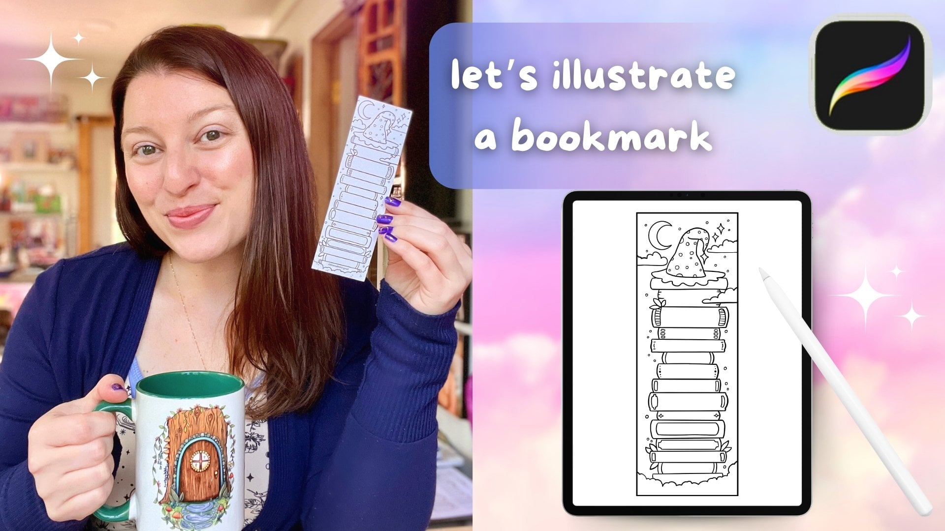
Transcripts
1. Create A Coloring Page in Procreate: Hey, there creative friend. If you have ever wanted to draw your own stylized
coloring pages, then this class is for you. AI might be able to make
coloring pages super fast, but you can make them better
and in your own style. I've been selling my own
printed coloring books in downloadable coloring pages
for many, many years now, and I've learned so much
about what it takes to create a really great coloring experience
for my customers. You can learn that today too, and you'll learn it
even faster than I did. We're going to put our
own unique twist on our coloring pages today
by learning how to use the symmetry tool in
Procreate to create really impressive looking
butterflies and moths. Real quick if we haven't
met yet, I'm Melanie. Hey, I'm a full time
artist and teacher, and I want to be your
creative cheerleader today. I love making colorful
whimsical art usually for cozy products
and coloring books, and I'm all about keeping
things approachable and joyful. If you'd like more happy art and inspiration in your life, you can also go find
me over on YouTube. Lastly, don't forget to hit
that green Follow button here on Skillshare so you never
miss a new class from me. But for now, grab your iPad and Apple Pencil, and
let's start drawing.
2. Supplies and Downloads: For today's class, you're
going to need your iPad, the latest version of Procreate
and your Apple Pencil. You're also going to have
some downloads that will include some reference
photos for tracing and a couple of helpful reference
guides that you can refer back to later when you go to make more coloring pages. I recommend
downloading these from an Internet browser on your
iPad and then saving them to a place kind of like Dropbox or an iCloud so that you can access them directly
from your iPad. You'll want to save the
reference photos at JPEGs or a photo file on your iPad so we can pull them in
to Procreate later. And that's all you should
need for today's class. So let's jump into talking about brushes and line style next.
3. Brushes + Line Style: Let's talk about
brushes and line style. When it comes to
choosing your brush and line style for
a coloring page, you have several options. And this will end up being a personal choice
that can depend on your art style and your intended audience for
the final coloring page. I highly suggest you try at least three
different brush and line style options and
then print them out so you can see what will create the
best coloring experience for either yourself or the customer you intend to sell
your pages to. For instance,
thinner line art is best for adults who like to
color with colored pencil. So you will use a thinner
line over here on the side with whatever pen you choose to make
your artwork with. Because those border
lines can be a little bit thinner because colored pencils can get into tighter spots, and adults have more control
over their hand movements. Larger bolder line
art is best for either children or adults who
like to color with markers. So you need to make your shapes larger and your lines
need to be much thicker. This gives a larger space for markers bleeding over lines. Whereas if a marker tried to color in something like this, likely the marker is going
to bleed outside the edge, which can frustrate the
person coloring your artwork. Your line weight is going
to be really important, and your art style may dictate which direction the
thickness of your lines go. I started with thinner line art, and as I found my own style, my lines are now
a bit bolder with some variation in the
weight to fit my subjects. Now, if you like
textured line art, then you need to do some
more testing and make sure your texture looks natural
and not like pixelation. If your lines end up
looking pixelated, you will not have happy
customers later if your intention is to sell
your coloring pages. Your line art needs to be crisp, and that starts with
choosing the right brush. So some things to
consider when choosing what brush you want to make
your final line art with. You need to consider your
line weight and thickness. You need to consider,
do you want any variation in your line? Do you want texture? Are you going to be making any additional mark
making on your pages, and will you be adding
any gradients or shading? So let's look at
some of the brushes that I like to generally go to. I have these in order of my
favorite to least favorite, and this is going to be kind
of the opposite of what you might hear from other
coloring page creators. The model line is the standard what everybody
typically goes to first. And that's because
there's no variation in the starting and
stopping point. The pressure will not change
how thick your line is. It's going to make a consistent
line all the way across. You can, of course,
change your brush size so you can make thinner
or thicker lines, but it's going to be a very
consistent brush that you can create very good shapes and
line art with, no pixelation. The next brush that I like
is the dry ink brush, and I like this one for a
little bit of texture in there. You can see the edges
are very textured. There's some kind of
speckling going on here. So if you like a textured brush, the dry ink brush is a great one for doing
textured line art. Now, my absolute favorite go to. This is the only brush
I use at this point to make my coloring
pages is the studio pen. And the reason I
love this brush is because it does actually
have some variation. When putting more
pressure or lifting up pressure on
your Apple pencil, you can make thinner
lines to start, and then they can get
thicker or heavier in certain spots if your
subject requires that. So I really love the studio pen. It feels more handmade to me. It feels more natural to use. And I just change the brush
settings to make it even smoother for using if I have
a shakier hand some days. And so I use a
modified studio pen. But you need to get
in here and play with the brush options and
see what you like best. I always sketch with a six
B pencil on one layer, then make a new layer,
and then go down to my favorite studio pen to
make my final line art. If you like really,
really textured line art, here are a few other
brushes that I found that the texture reads really naturally and not like
little pixelated boxes. So the tinder box, the Ica, the mercury, and the inky ink, Jasinki gainki I'm not
sure how we say that, but these four have a cleaner
texture feel to them, and I think you could
get away with making a coloring page with these. So the best way to test out
what kind of brush you like is you need to open up a
clean page and Procreate. You want it to be
set at 300 DPI, because we never want to go
below that when creating a coloring page because
that's when things will start to get
blurry and pixelated. So keep your page at 300 DPI. You could use whatever size you think is going to be best
for your coloring page. Never go smaller than what
you plan to print at. So typically, for me,
it's going to be an 8.5 by 11 inch sheet of paper. You may be doing like an A
four or something like that. That's totally fine to
use a different size. Just don't go smaller
than you plan to print and keep it at 300 DPI. Next, you're going
to want to open up your brushes and
start playing around. So you may see a
different brush view with this newest
updated Procreate. You may see a Procreate library
in the classic library. This is a library
here that I made for myself, so just
ignore that one. Depending on what
you want to play in, you can choose either one. The brushes I'm
recommending most typically are coming out of
the classic library, though. So I'm going to click
on Classic Library. I have a lot of added
brushes in here. Yours may not have all of those. And I'm going to go to Inking. So go to your classic
library and go to inking. The other place you can find
some good brushes would be under calligraphy and drawing. Inking is though where
you're going to find those really nice
crisp black lines. And down here, you're going
to find the studio pen. That's my favorite.
Here's dry ink. That's my second favorite. And then, lastly, the model
line is under calligraphy. So there's a model
line brush right here. So I'm going to come
back up to inking. I'm going to choose
the studio pen just to show you what
I like about this pen. So as I add more or less
pressure to this brush, my line is thick in some
spots and thin in others, depending on how
hard I'm pressing. And I really like
that. I like being able to add weight to a subject, like in an area where
it may be heavier towards the bottom of
something, lighter at the top. It feels more natural
and like drawing to me. This is a super smooth brush, so you're not going to get
any textures on the outside. It's going to feel
nice and clean. It's going to print
really clean. And this is what all
of my coloring books are done with is the studio pen. However, I could definitely
see a dry ink brush being a really nice option and
giving an even more handmade feel to things because
of that rough edge. If you find that customers are complaining about things
looking pixelated, though, that's where you'd want to pop
back over to a studio pen, or I can show you
the model line. So, again, the model line is the same from start to finish. No matter how hard I press, the line thickness
stays the same. So this is really
good for, like, creating shapes that start and finish at the
exact same size. Whereas if I'm using
the studio pen, I will admit, let's see.
Let's come back here. Doing things like a
really clean circle can be a little bit
tough sometimes, because you might
get a little bit of a difference in the
start and stop point, so it's not going
to be a perfect thickness at the start and stop. However, generally,
I'm okay with just little small imperfections in my coloring pages
like that because, again, it's handmade,
it's done by me. And sometimes what I'll do
if it's really bad is I come in here and I just kind
of clean it up a little bit. And I would take my time and
make that look really nice. That does not look
really nice right now, but it gives you an
idea of how I work around that and still
use the studio pen. But the model line might
be the right fit for you. The only way to know is to get in here and make a few pages, maybe use some of your
old artwork and trace over the top to make a
coloring page version of it, and see what pen
feels natural to you. Alright. Next up, this is
the most important part. Once you've chosen your brush, we need to learn
how to modify it. So find the brush that you
decide you want to work with. And we need to
duplicate that brush. Do not work on the original. So to duplicate, we're going
to swipe this direction, swipe towards the left,
and hit Duplicate. You'll notice the duplicate
has a two after it, and that's how we know that's
the one we want to work on. So go ahead and tap on it
to open up Brush Studio. We're gonna be working under the stabilization section
over here on the left. You're gonna see a lot
of things going on here. If you're new to Brush Studio, don't worry about all of these. Just go to stabilization. So we have three areas
here to help us, and we can think of them as levels of help to
simplify things. So we have streamline, stabilization, and
motion filtering. All of these are going to
help to smooth your lines. Let's think about streamline as the lightest amount of help. Stabilization is being
a little stronger. And then, lastly,
motion filtering really helps clean
up hand jitters. So if your lines feel shaky, turn these things up just a bit. But if things start to feel slow or stiff, then bring
them back down. To test this out,
clear this over here with three fingers
scribbling back and forth. Now, make a line for yourself
with the current settings. And just kind of see feel how that feels to
create that line. I'm going to erase it. I'm going to bump some of these
up just a little bit. I'm going to start
with just these two and make another line that
definitely feels smoother. I can't make as many tiny
little wobbles it fixes them. The other thing that's
really handy is you can make a line and then change these and watch
how it changes your line. Can see just how much
it smooth things out. If you go too high up on these, you're not going to be able to make the shapes that
you need to make. The line is just going to be
super stiff and corrected. So you're going to need to
play with this and find the settings that feel
the most natural to you. Typically, I don't really use a whole lot of motion filtering. I do more streamline and a little bit of stabilization,
something like that. Now, what I recommend
is creating three levels of this
pen for yourself. Duplicate the brush so that
you have three of them, and then save different
versions that you can use depending on
what you need for that part of your artwork or for that kind of shaky
coffee hand day. So I might save a
version just like this. Hit the little check here to say that you are done
editing this brush, then you could
duplicate this again, and now we're going to
go into number three, and maybe we bump
these up even more. And we'll call this level three. You can make another
one as four, right? So then knowing when you go up, you're going to have
more assistance in creating your line art. That's how I would
do this because you don't always need
as much smoothing. You might want to have a
little bit more natural hand feel to something to be able to make more squiggly
lines, tiny imperfect shapes. So for days like that
or objects like that, you can come down to that
first studio pen and then work your way up when
you need more assistance. Alright, so I highly, highly recommend that you get
in here, create a new page, play with lots of
different pens, and find the one that feels like the most
natural fit for you. Once you've picked out
the pen that you think is your go to new coloring
page line art pen, let's go ahead and start talking about the symmetry tool next.
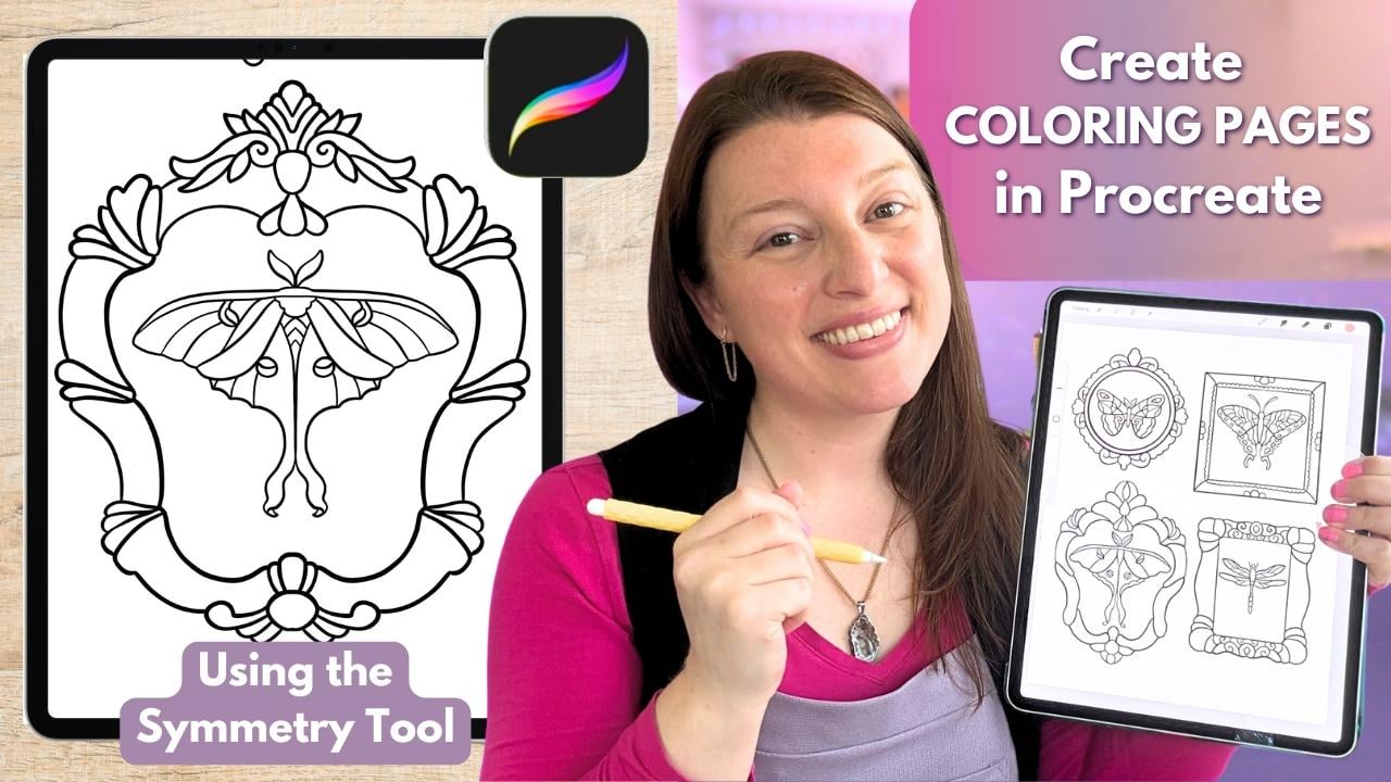
4. Symmetry Tool: Before we start sketching
out our coloring page, I wanted to take a few
minutes to show you one of my favorite Procreate
features that we will be using today
the symmetry tool. This tool allows Procreate to mirror your brush
strokes automatically, which is especially helpful for things like frames, houses, doorways, butterflies,
moths, birds, wreaths, and other
mirrored shapes. Alright, let's figure
out how to turn this on. So go up to your wrench icon. Go to Canvas if it's not already
on, make sure it's blue. Come down to Drawing
Guide and tap that on. You're going to see possibly a grid show up. That's
not what we want. So we want to hit
Edit Drawing Guide. And we want to come down here to the bottom where
there's this new menu, and we want to hit symmetry. For this project, we're going to be using the vertical symmetry, which is going to mirror
the left and right sides of your canvas depending on wherever you have
moved this guideline. So you're going to
notice a couple of colored nodes that have appeared on your
symmetry guide here. You're going to see a
blue one and a green one. These help you customize
how the symmetry works. The blue node lets you shift this line from left to right and take it
off of the center. So we can grab this and move the line anywhere we
need to on the canvas. You can zoom in and
out by pinching like this and moving
this line around. The green node lets
you change the angle. So say you needed something
mirrored like this, or maybe you need to mirror
something horizontally. So you can move the angle
with the green node. To reset it, we're
going to tap it, and then a little button
will pop up that says reset. Now it's going back to vertical, which is how we're
going to keep it today. What we will be moving around
today is the placement. So we will be using
the blue node to move this to different
parts of our page today. For today, we're going
to keep it upright, and we're just going to move it around for each
separate element, but it's nice to know
that those controls are there if you need them later
for future coloring pages. So once you're happy with
where the placement is, that's when you would
hit this little markup here to hit Done. You could also change the color of the line
if you need to, but I'm going to keep
mine a dark color. So I'm going to tap
right here to say done. So now anything I make over here is going to be
mirrored over here. Now, one thing that can
often trip people up, they're going to go in and
draw, and for whatever reason, it's not mirroring
to the other side, and they don't know
how to fix this. That's simple. We
need to come up to our layers and check. So I've just added
a few layers here. And you'll notice that
only one says assisted. So only this layer one is
going to mirror what I draw. If I need layer two to
mirror what I'm drawing, then I need to come up here, tap it and hit Drawing Assist. Now it says assisted. Both of these layers will now allow me to use
the symmetry tool. Layer three is not going to allow me to use
the symmetry tool. This is going to be
very important today, paying attention to if your
layer says assisted or not. Okay, so I'm going to come
back down here to layer one. It is assisted, so I know I'm going to get
some symmetry with this. I'm just going to choose one of my studio pens so that this shows up nice and dark for you. I'm going to zoom
in a little bit here so I can see a
little bit better, and I'm just going to
practice making some shapes. I'm going to turn
up my brush size, and I'm going to watch and feel how this mirrors what I'm
doing at the exact same time. This can take a little
bit of getting used to. So you'll see I
drew on this side, and it automatically mirrored everything I did
over on the left. So the thing I love
about this tool is that it takes away some of the pressure of trying to make both sides match
perfectly by hand. You only have to focus
on drawing the one side, and Procreate will mirror
it for you in real time. So the way we're going
to be using this today is we're going to
be moving this around for each new butterfly or moth or element
frame that we make. So for now, I'm going
to show you I'm going to make one little
thing right here. It's a very interesting
little butterfly. Now, I'm going to add
these little antenna here. This is not how our butterflies
will actually look, but this is just
giving us an idea. Okay, so now that I
have this one done, let's say I want to
make one over here. Well, if I want to make
just one over here, when I start to draw, if I leave the drawing guide
where it is right now, it's going to make two exactly of the same butterfly,
one here, one here. I don't want that
for today's project. So what I need to
do is I need to move this symmetry line now. I need to move the guide. We're gonna come back
up to the wrench, make sure we're on
canvas, drawing guide, edit drawing guide. And now we're going to
move this line let's say I want my next
butterfly to be over here. So now my guide is right here. So now whatever I draw on this side will
mirror over here. Tap that to say I'm done. Now I can put another
one over here. So we will be using this
feature a lot today. We will be moving the
guide around a lot. So I want you to get
really comfortable with doing that in this
practice right now. Now, again, even though we're using the symmetry tool today, we still want our coloring page to feel cozy and hand drawn and not stiff and overly perfect like an AI
page might feel. So later on, we can always add details on separate layers that aren't symmetrical if we want to give the piece a bit more
personality or charm. So again, we'd come up here to this layer three
that's not assisted, and then we can see how
let's say we wanted to add a little star on just this
side of the butterfly, it did not mirror over here because I am not on
an assisted layer. So, for instance, other
use case scenarios here. If you were drawing a house that needed a
chimney on one side, you could draw the
entire house with the symmetry on and
then either turn it off or add a new unassisted
layer on top to add your chimney to just one side, you
probably don't need two. Okay, so keep practicing that. Keep moving that guide around to get the feel of this tool. And once you feel see, I wasn't on an assisted
layer. Come back down here. Once you feel like
you've practiced enough, we are going to get into
our actual coloring page. Okay, so let's go ahead
and start sketching out our cozy critter
coloring page collage next.
5. Sketching Your Page Part 1: Alright, we are ready to
work on our initial sketch. So once you're done, your
initial sketch should look something kind of like
this with pencil. So I moved my symmetry tool
around to each element, including the frames to
make a mirrored shape, except for this one here did not require this butterfly did not
require the symmetry tool. So I'm going to back out, and we are going to start
by making a new canvas. So hit the plus. Hit
this little image here to make a new canvas. And mine's going
to be in inches, and I'm going to make an 8.5
By 11 Oops. Come on now. By 11 at 300 DPI. Now, you could make your page whatever size is best
for you that you plan to print the page
out at that size. Do not go smaller than
you plan to print. That is going to lead
to pixelation and blurry lines and unhappy
coloring friends. So you could again
make a square page. You can make A four, you
could make letter size. Whatever you want
to make is fine, keep the DPI at 300. Then go ahead and hit this
to open up that page. So, again, we want
crisp, clean line art, and that's going to start
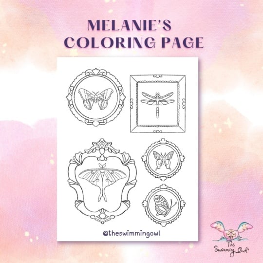
with the right canvas size. Okay, so for this project, I want to create more of a collage style
composition using vintage inspired frames and butterfly and moth
references to create a lot of symmetrical
elements on my page. So the first thing I need to do is pull in my reference photos. Alright, so you need to add
in your reference photos, so you're going to come to
the wrench and go to add, and you're going to
either insert a photo or a file depending on
where you've saved that. The first thing I
want to pull in, though, are my frame shapes. Okay, so I'm starting
with these frames. I'm going to enlarge
this just a little bit. And there's multiple
ways you can move this around and
trace what you want. What I would recommend
doing is lowering the opacity on this and then using the ribbon tool to cut out the ones that you
think you definitely want. So I'm going to trace
around this one here. The fingers swipe
down, cut and paste. Now it's on its own layer
and I can move that around. So what I might do
is go ahead and turn this layer off layer one with all the frames and take
this one and move it around, maybe make it a little larger. And thinking about
the butterflies or moths that you might
want to put in here, this would be good for
some kind of bug that has larger wings up here
with a longer bottom. So like a una moth or a dragonfly could fit
really nicely in here, or even just a butterfly facing one direction
would fit well. Now, we can also distort
this shape a little bit. What we don't want
to do, though, is change it so that the
left and right sides would be different from one another.
We want it symmetrical. So I'm only going to distort it. And to do that, I'm just
going to pull this direction. I don't want to go up
or down like this. I want it to remain straight
across as best as I can. And then it'll give me
a little bit more room on the inside of that, make it a little
bit wider. Oops. I want to go back to uniform. So maybe I'll put
that one there. Let's come back to
our frame shapes. Come back down to this
layer, ribbon tool. And let's see. How about a square? Okay, so I kind of
like those there, and I wonder if I put maybe a rectangle here
and a circle here. So I'm gonna try that. I'm gonna go ahead and cut out. I kind of like this one. And I'll put that one kind
of right about there, come back down to
the base shapes. I can't see very well, 'cause
this one's in the way, so I'm just gonna turn it off
temporarily so I can trace this or cut this
out, I should say. Okay, now that's
on its own layer. I'm going to go ahead and
turn this off completely, turn this one back on. And now I can tell I
need to move some things around and maybe
resize a few things. I could distort this and
make it a little longer. Oops. I don't want to
distort the corners. I just want to make it
either wider or taller. And now the circle
feels a little small. I'm gonna go to uniform so
I don't skew the shape. And just play around with
the placement of these. Now I'm going to
select all of them at once and kind of
center everything. I know I'm in the center when I see those crossbars show up. And then I'll just
enlarge all of them. Just kind of give this a look. Are we happy with this? Do we
want to move things around? I might move this
up a little bit. I'm okay with it not being
perfectly in line down here. And I'm going to bump this up to the top because this one was hiding it a little
bit just to look. Okay. So, feel free to play with your
placement of frames. You could also duplicate some
to make like two circles or two squares to get a more
natural composition, as well. You can do this as many times
as you need to, as well. So I'm going to go ahead and
lower the opacity on these. We don't need them for
absolute perfectly copying. So we just want the
general shapes. You could also add
any of these kind of flourish pieces around
if you wanted to. Again, this is your
coloring page. Make it your way. I think
I'm done with it for now, so I'm gonna go
ahead and delete it. So now I'm just left with the four frames that I
plan to work with. Okay, so I've lowered the
opacity on all of them. Now just to kind of clean
things up a little bit, I'm happy with the
placement for now. I'm just going to go
ahead and pinch these together to keep things a
little bit cleaner for myself. So here's where we're going to start using our symmetry
tool and making a sketch. So making new layer, come over to the wrench, come to canvas, drawing guide, edit drawing guide,
and symmetry. These are the things
we practice earlier. We're just repeating
those steps. Now what we need to
do is we need to move this guide to the first frame
that we want to work on. So I'll go ahead and move it to this circular frame over here. Circles can be a little tricky, so I'm going to teach you a few little things here on
how I would approach this. But what I'm going to do
is I'm going to try to line this line up in this kind of ornamental
element here at the top and get it as
centered as I possibly can. Then I'm just going to hit
this and say I'm done. Zoom in here a little bit. I'm on a new layer, but
for the first circle, I don't really want symmetry on necessarily because it can be pretty tricky. So
I have my pencil. Sometimes making a circle in the symmetry mode is tough because it makes an
arc instead of a circle, and so it's hard to edit it. So what I do for a
circle is I actually go ahead and make it on a
new unassisted layer. Assisted is not on this one. And I'm going to start by making the inner and outer
circle of my frame. I'm going to draw pretty
close to perfect circle, then tap ellipse, hit circle so that it corrects
it, it makes it perfect. Don't tap on the blue nodes now. Change the size by pulling or tapping
somewhere anywhere other than those blue nodes to make it a little bit smaller or
larger to fit your frame. I'm going to put that one here. Then I'm going to
duplicate this, hit the arrow, and
make this larger now. So now I have an inside and
an outside of my frame, and I'm going to center it
based on that first circle. So now I have that circle part of the frame without symmetry. I'm going to pinch
those together. And I'm going to pinch it
down to the assisted layer. Now we will be using
the symmetry tool. But those circles can be
really tricky inside symmetry, so I make them
outside of it first. Now, any ornamental stuff that I add to the
frame is going to mirror on the left side if I draw on the
right and vice versa. I'm right handed, so I
tend to work on the right. So I'm not going to copy these perfectly because that
would be insane for someone to try to color all of these tiny details
and not fun, okay? Your coloring friend is not
going to enjoy all of that. They want larger spaces
to fill color into. So I'm just going to mimic
these shapes without copying. So maybe something like that. I like this curly flourish here, so I'll do something like this and then maybe kind
of go like that. I'm going to do something
similar on the bottom. That looks pretty good. And then I'm just going to
kind of make this up. So I'm rotating my canvas to make this more
natural for me, but my symmetry line
stays where it was. So now I'm going to
make something a little bit similar to the top. And if I back out, I see
it made it over here. Perfect. Then I'm going to make these little
flourishes here. Again, I am okay with them not being a
perfect match here. This is handmade. This
is not AI making this. And I'm just going to
make kind of a scallop for that part and a
scallop for this part. Okay, I'm really
happy with that. If you need to play
around with that one a little bit more, go ahead. But I like the
simplicity of this. Somebody can fill these in with all kinds of different ideas. Okay, at this point, I need to move my symmetry line
to my next frame, and I'm going to also
put this on a new layer. So I'm going to move to
this square frame here, but I'm going to come
over to my layers and hit the plus to
make a new layer. I'm going to turn
on drawing assist. Okay? That's very,
very important. And now we're going to edit the drawing guide to drag
that line over here. So wrench, edit drawing guide. Grab the blue node
and move it to the center ish of
your next frame. Not sure, but this is
looking a little angled. I'm going to reset
it. Okay, it's not. It's just the way
that I'm standing. I'm going to put this
somewhere centered, hit this and now
start this frame. So I'm gonna give
myself an inner square. Holding down will straighten
out this line for me. Not lifting up my pencil. Again, I'll show you that again. I'm going to drag the
line, see how it's wobbly, but if I just hold down, it
straightens it out for me. I never lifted my pencil and I'm going to
drag it to where I need it to meet this
corner. That's perfect. Now if we wanted to without
having to redraw this shape, we can duplicate
it, make it larger. Make sure it's centered. The blue line will pop up when I am in the center of
the other square. That's going to be very
important for the symmetry tool. It needs to be centered
on the other shape. Now we can pinch those together
and add our flourishes, our ornamental
pieces on here now. I'm going to give
these frame curves. Now it almost gives it a three D feel and you can
add whatever you want. You can follow these
shapes or add your own. I might add some scallops again. Sometimes adding these shapes can get a little bit tricky with the symmetry if they're not started at just
the right distance. Sometimes it makes the
most sense to start at the symmetrical at the
symmetry tool line. Again, this is just
our sketch layer. Feel free to get really playful and make things really fun. That only mirror left to
right, not top to bottom. I'm going to have to come
down here if I want it to be the same over here. But this one will mirror across. Okay. That's good for me. Feel free to keep adding
to that one if you need to if you are making
a very similar one. At this point, I
need a new layer and I need to edit my drawing
guide again down here. Wrench Edit guide,
symmetry is on. We're moving it down here. I'm going to try to get
this somewhat centered on this frame. That
looks pretty good. Now I made a new layer, but I didn't turn on assisted, tap it, drawing assist. Now I'll have mirroring. And you're just
gonna keep repeating this process for however
many frames you have, So I'm going to go
ahead and speed this up a little bit while I
finish these last two frames.
6. Sketching Your Page Part 2: Alright, so my frames
are all finished, so I'm going to go
ahead and turn off this layer with the
frame references, so I can see everything a
little bit better here. At this point, it would
be a good idea to do any movement of your frames that you think you
might need to do. I think I might move this
circle frame just a bit. And I want to see what it would look like if I do
drag this back down. I think that looks
a little weird. I might just leave it there for now or maybe just move
it down a little bit. Okay, so now we need to
do the same idea with our reference sheet that has the butterflies and
the moths on it. Okay, so go ahead and find wherever that
reference image is on your iPad and go
ahead and pull it in. Resize it a little
bit if you need to. And now you're gonna kind
of want to move this around and just
decide what moths or butterflies you'd like
to put into your frames. I think I'm gonna drag this
up like this to the top. And I'm going to lower the
opacity just a little bit. So I think what
I'm going to use. Now that I just kind of moved
that around and looked, I'm going to go ahead and cut out the four that I want to use. So I'm going to use
my ribbon tool, trace around them, and cut and paste them
onto their own layers. I'm gonna come back
down here and do this process all over again. Okay, I got the
four that I want. I'm going to go ahead
and delete this page, and I'm going to
move these around to the frames that
I want them inside. So the dragon fly I think is going to go
in this box down here, which might be a
little bit weird. I could always put
two of them in here or I could mirror
it upside down. We'll play with that
in a little bit. For now I want it over there. My una moth, I do want
inside this frame here. So the top wings will
fill up that space. And I might distort
it a little bit, make it a little bit
longer like that. I'm going to move this one over here and I'm going
to straighten it out. Oops. Uniform. Oop. Uniform. And now let's make it. I kind of do the same thing. Okay. So now we're going to go ahead and do the
same idea as the frames. We're going to move our
symmetry tool around and trace each butterfly or moth onto
their own assisted layer. So I'm going to turn the
opacity down on all of these. Tap on it, hit the end, and lower that opacity. Come up to the top of your
layers, hit the plus, turn on drawing assist, and let's move our symmetry tool to the first one that
we want to work on. I'm going to go ahead and
work on this one up top. I'm going to try to center
this as best as I can. Make sure I'm on my layer good. And now I'm just going
to trace this moth. It does not need to be perfect. And I'm going to do this
side because this side has, like, a little bit of, like,
a fold in one of the wings. So I'm going to trace this side. I'm gonna make it like that. And so you'll see this doesn't match perfectly,
and that's okay. I just wanted this
shape from this side, and Procreate did the hard part of making it the same on
the other side for me. Then I'm going to
give it kind of these interesting shaped
antenna at the top. And then I'll do, like this. Again, I am not doing a
perfect replica. That's okay. Maybe a wiggly line down here. Going to do some kind
of swirls like that. Something like that. And
then I'm going to go ahead and turn off that layer
that I just traced, and I'm pretty happy with that. I may need to move
this around inside my frame a little bit
more, and that's okay. So now I'm going to repeat
this process on all of the other butterflies or moths. New layer, keeping them on separate layers makes this
much easier for yourself. Drawing assist, move my tool. Zooming in so I can see if
it's actually centered ish. And I'm kind of using the
center of this butterfly here instead of looking
at the wings because the wings aren't going
to be exactly perfect. That's okay. So for this one, it might be easier to draw
on this side based on where that wing is in
comparison to the line. You can kind of
make that decision. So that looks pretty good. And I'm just gonna
make up an antenna up here since there's
not one up there. And then just roughly following
some of these shapes. Not trying to be perfect here. I just want something
interesting for people to color, not something perfect that they're going to be able to say, That's exactly this kind
of butterfly that I know. That's okay. If
you were trying to do something that was
scientifically correct, then you would actually follow
along a little bit more, but I just want a
representational butterfly. Some of these are going
to be a little bit too small for people
to color inside. So I'm going to fix that now. I think that looks pretty
good. I'm happy with that. Now I can tell this is way
off center out of my frame. So I'm just gonna
move that around. And I'm going to
turn this off first, though, so to clean
that up visually. So I turned off the
reference layer by just tapping the checkmark. Now I'm gonna come back up
here and move this butterfly, maybe even make it a little bigger to fill up
this frame better. That looks much better.
Okay, I have two left. I'm going to speed
this up a little bit. Just keep following that same formula that
we've been doing. Alright, so I am all finished with my little
critters in here. I'm okay with there being some empty space around
that because, like I said, colorists do like
areas where they can really add their own expression and creativity into things. So I'm going to leave that
empty around the outside, give it some breathing space. And now I'm really
happy with this sketch. This is the point, though, where if you want
to warp anything, move anything, resize
anything, do it now. We do not want to be
editing our shapes or skewing anything after
we make our final line art. Things will absolutely
get blurry. As soon as you try rotating or enlarging anything
in Procreate, it just can't handle it yet. Hopefully one day they fix that. But for now, you need to make those kinds of changes
to the sketch. So play until you're happy with your composition and where everything is placed in the
sizes until you're happy. Once you are, let's
move on to making that really satisfying crispy
line art in the next video.
7. Final Line Art: All right. If you
are sure you are 110% happy with your sketch, it's time to make
our final line art. So let's start by making
a brand new layer at the top of all of our layers that will be for
our final line art. So I'm going to make a brand
new layer right up here. But I also want to clean all of this up because this
is bothering me. So I'm going to go ahead and
delete my reference photos. And then I'm going to pinch
all of these layers together. So I'm going to grab the top and bottom and pinch them together. Now I'm going to
lock this layer so I can't accidentally draw
on the sketch layer. Actually, wait, unlock it first, turn down the opacity
and then lock it. Now I'll make sure all
of my clean lines are on their own layer and not
accidentally on the sketch. Yes, I have done that before. Now we need to turn
on drawing assist, and we need to go find
our favorite inking pen. For me, that will
be the studio pen. You just need to pick
where you want to start, and you need to move your
symmetry line around again to redo all
of these shapes. And the reason we didn't just do this in the first place with the symmetry tool in our pen is because we knew we were going
to need to move things. We might need to work
things or resize things. And so you're just going to have to remake the lines anyway. So I like making them with
a pencil so I can tell what is my first layer and what
is my new clean final layer. So I'm going to come
over to the wrench, and I'm going to move my
drawing guide around, and I'm going to start by
making all of my frames, and then I'll go around and make all of my butterflies and moths. So you really just want to take your time with this and make your lines nice and clean
and crisp and professional, so that way you can sell
this if you want to. And you can switch between your different levels of
streamline brushes as needed. The last tip I'm
going to give you is to make sure you close
all of your shapes. You want to make sure you're
not leaving a gap like this because if you plan to sell this as a digital coloring page, people are going to
want to be able to drop fill color into shapes. And if it's like this,
the color will spill out, and they're not going
to be able to do that. Whereas if it's a closed shape, now they can actually drop fill color into this
finished shape. At this stage, I
really love putting on my own music or a
movie and just zoning out and letting
this become really meditative because you're
just tracing at this point. Okay, so since I'm
going to start on this circular frame,
one more reminder. I like to make my circles
off of an assisted layer, so I'm going to
make a new layer, and I'm going to make
my first circle, which my line right
now is way too thick. I'm gonna lower the
size of my brush. You may need to play
with this a few times, print it out and see what
a good brush size is. And then remember that you can always save that brush size. So this is too thick. I'm going
to come down to 15 or so, and I'm going to tap 15. I'm going to tap
and hit the plus, and now I have a
little reminder that that's where my
brush size is best. Go to make my circle, hold down, hit ellipse and do perfect circle and then move
that to where I need it. It's a little bit small. I'm gonna make it
a little bigger. And I might just clean
this up a little bit. Again, that's where the model
line might come in handy. Instead, I'm just going to
thicken it a little bit. And then I'll duplicate this, make it larger and see
if it's getting blurry. Yep, so that's getting blurry. So instead, I'm just
going to make it by hand. These are the decisions
you have to make, and this is what makes
the difference between an okay coloring page and a really professional
feeling one. Going that one extra
step is going to make this feel better
when printed out. So while that worked
for making this sketch, for making my final
clean line art, I'm just going to
go the extra mile and make it a little bit better. There we go. Now I
can go ahead and pinch those down to
my assisted layer and finish up this frame. Alright, my first frame is done. So now what do we need to do? We need to move our line unless this butterfly
lines up perfectly, which it looks like
it actually does. If you want to, you can
make this on a new layer. If you feel like you might
need to move it later. But I'm happy with
where this is placed. I don't feel like I'm
gonna need to move it. So I'm going to go
ahead and put this on the same exact layer
and just go ahead and get it done while my line is exactly where I needed to be. The symmetry tool is
exactly in the right spot. Now, generally, if you can move your hand just a
little bit faster, you are going to get cleaner, smoother lines instead of
going a little bit more slow. But just take it
at your own pace, remembering we can always two fingertap to undo a
line and start over. We can always change
our brush to go up to a smoother, more assisted line. And you can always add in other details that weren't there before if you're
starting to kind of get in the zone and
making fun things. Okay, at that point,
that one is done, and I need to move my line, and I'm going to just
keep repeating this until I finish the entire page. If you have questions about
any part of this process, you can always leave them in
the comment section below, but I'm going to go
ahead and speed this up and finish up my
page at this point, making sure I'm
closing my lines, that my lines are nice and
smooth and that I'm not resizing anything after I have finished the
clean line art. So as I finish up this final line out
for my coloring page, I just want to give you a
few tips on how you can improve as a coloring page
and coloring book artist. And the first one
is pretty easy. You need to color your
own coloring pages. I want you, if you can, to print out some of your
pages and color them yourself. You can test out
both colored pencils and markers on your
coloring pages, it will help you understand the frustrations colorists will feel when working on
your coloring pages and also help you know
who your audience is. Should you be appealing to people that are only going
to use colored pencils? Or do you think that your
work might work best for people who like bolder
lines or even children? So coloring your own
pages is going to really, really help you leap forward in your
improvement by so much. The other way to
do it is to also color some on your iPad using your transparent P
and G version of your coloring page and
try digital coloring. And see, is that an
enjoyable process? Do you have too
many broken shapes that make that feel frustrating, or is it going to be
absolutely perfect for people who like to
color on their iPad? And by doing this, you are
going to give yourself a massive advantage
over people making AI coloring pages because
the people doing it that way and not creating their own artwork
with their own hands, they don't care about
the frustrations that colorists feel. They only care about
making coloring pages fast to try to sell
as fast as possible. As you are going to
understand how it feels and you're going to make
pages that are way better, and people are going to
enjoy them way more. So it's a much more satisfying
and rewarding process, and your customers are going
to notice the difference. The last tip I
have for you is to remember that this
is a collaboration. You are starting the
artwork and someone else is going to finish it with their color and imagination. And so see how that can affect how you make your coloring
pages moving forward, thinking of it as
a collaboration. Where can you leave more
empty space so that your colorist can really
insert their own imagination, and where should you
insert more detail to tell them how you want
the artwork to read? So, moving forward, think
of your coloring pages as a team effort between you and the person that's going
to finish the artwork. All right. And that
is it for my page. It is done. So I'm going to go ahead and turn off
my sketch layer. I'm gonna clear out
the drawing guide. And now I can get a really nice, clean view of my
finished coloring page. You did it. You made a really nice professional
coloring page. So in the next video,
let's talk really quick about exporting it so that
way it's ready to sell.
8. How To Export Your Page: Okay, so if you plan to
print or sell your pages, you need to save at least two
versions, possibly a third. You need to save a
high quality PDF, a transparent background PNG. And lastly, you could
also save a JPEG. The PDF is best for printing, and the PNG should have that transparent
background so people can color digitally with
it on their iPad. So to export those options, you're just going to come up
to the wrench, hit Share, and then you're
going to choose PDF, and you want to choose
the best quality and save it to wherever
you save your files. I always use Dropbox. And then to save the
transparent background PNG, we need to come to our layers, turn off our background color. So then you should see the
background of Procreate back here that looks like the little grid
lines back there. We're going to do the same
thing, wrench, share PNG. And you'll save that
to whatever location you save your files, too. So that's the PDF and PNG. You can also do the
same thing for a JPEG. You won't really
use that too often. The PDF and PNG are
pretty standard. Okay? So that's it
for saving that. You now have the salable files that you are going to need
if you do want to sell this.
9. Bonus: Digital Coloring: Okay, so really quickly, if you want to be able to color your own coloring
page on your iPad, so digital coloring, this is a very fast and
furious tutorial. If you want the
full length thing, though, you can go check
out my other class. It's all about
digital coloring on the iPad for more
in depth lessons. But for now, make sure your
background is back on. So check that back on. And if you want to, you
might even want to back out and make a duplicate
copy of this canvas, but I'm just going to
show you right here. So my sketch layers turned off. Now, on this layer, I want to tap this image and
go to reference. This is now going to allow
me to drop colors into the shapes that are used as a reference in our
final line art layer. So I'm going to
hit the plus now, and I'm going to bring this
above any coloring layers. So I'm going to drag this
beneath. There we go. I'm going to make a couple here. And now what I can
do is I can drag and drop colors into any
of these shapes. So I'm just going
to pick a color, and I'll drag it into
the background of that butterfly.
Pretty cool, right? So that's a very quick depth not in depth lesson
on digital coloring. Then you can change your color. You can make as many layers
as you want to, by the way. The more layers you make, the
more flexibility you have later for coloring on
these individual spots. So once I have all of these
little backgrounds filled in, what I could do then
is I could color with other brushes on top
of these colors. You can do that through
either Alpha lock or clipping masks, and you could add more
textures to different areas. Again, use as many
layers as you want to, so you can really
customize things. And if you'd like to
learn more about that, go check out my other class.
10. Next Steps: So now that we have
finished our coloring page, I wanted to not only end with
a thank you for joining me for this really fun class and tell you how
proud I am of you, but I also want to invite you to share your coloring
page down below in the projects tab so that I can see your beautiful
coloring page. And I also wanted to end with just a few words
of encouragement and inspiration for just how
far this could take you. If you really get into making
your own coloring pages, there is just the sky is the limit for what
you can do from here. Journey as a coloring
book creator started with just one page and then another and then another and another. So I started by making
a couple and selling them as downloads in my
Etsy shop at the time. And I offered a PNG, a PDF, and a JPEG with
each digital download. And then after I made
several and I started getting good feedback and knowing people were enjoying it, I then created an entire book. And my first book was
all about mermaids. So I had a very clear theme, and I made over 30 pages
to put into one book, and I taught myself
the entire process of creating that book and uploading it to KGP to
sell and from there, things just got
bigger and better. As of the recording
of this class, I just released my
seventh coloring book, and I have hundreds of downloadable coloring pages
at this point in my shops, and I've built an
entire community around these coloring pages
that I've been making. So I just want to encourage you to start practicing
and keep going. And I didn't use AI to make any of these books
or coloring pages. It's all done by hand, and I'm really proud of it, and people really love them. And you can do this, too. Alright, again, thank you so much for being here
and taking this class. I can't wait to see the
coloring page that you created. If you would, please leave
a review down below, letting me know what your favorite part about
this class was. And don't forget
there are plenty of other classes that I have
available on my channel. If you haven't seen those
yet, go check them out. And if you have, then I look forward to seeing you
in a future class. Alright, my friend. Happy
drawing and happy coloring.
 Melanie Bess, Painting By The Light Of The Moon