Transcripts
1. Introduction: If you're looking for a fun
project to do on Canva, that will help you improve
your design skills, but also leave you with
a cool finished product, then you're in the
right course because we are making a recipe
poster today. This is a poster that basically
uses different pictures from the Canva Elements library to represent the ingredients. And then in a sort of
minimalist style way, we're going to put the actual measurements
and the recipe below. That turns it into a fun poster that you can print off yourself and frame or have printed somewhere else if you want
to make it even bigger. I really enjoyed building the
prototypes for this class. My favorite one uses my mom's chocolate chip cookies recipe, which I am putting in
the class discussion in case you would like to
use that as your project, or if you just want to make
them, they're really, really. Class is going to
challenge you in terms of finding the different
elements for your poster, the different clip art pieces. So if you feel like
that's something you want to improve on, then
this is a great class. It's a little bit
like a treasure hunt, and I think it's a lot of fun. All you're going to need
is a free Canva account, but if you do have a pro
account that will give you access to a lot more
clip art elements, so you can make a lot
more variety of posters. But you can definitely make a nice one with a
free account, too. So, if that sounds
good to you, let's head into the first
lesson together.
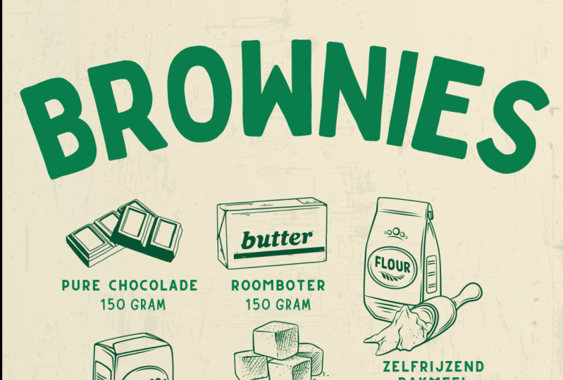
2. Design Tips: Let's get started by looking at two examples of this project
that I have already created. The first one is this
chocolate chip cookies poster. This is actually the recipe that my mom made
for me growing up, so it's very precious to me. And I have used a black and
white clip art style here. In my second example, I have used watercolor
style illustrations, and this is a buttermilk
pancake recipe. Both of these designs, the
style is basically the same. I have the name of the recipe at the top and a little
bit of text underneath. There is a rectangular
frame around the design. In this one, it goes
behind the text, and in this one, it goes above. Both designs have the
clip art elements from the Canva library of
the different ingredients that are in the recipe and a little bit of text
underneath that says the name of the ingredient
and the measurement. I'll zoom in so you
can see better here. The bottom of each design, I've included the
actual steps for the recipe just as a
solid block of text. This way, you can actually follow and cook the
recipe from this poster, but it still looks a little
more aesthetically pleasing, as it's likely to spend most of its lifespan being a piece of art rather than
being functional. I've designed these mini
posters or art prints on a Canva document that
is 8.5 " by 11 ", which is the size of
a standard piece of printer paper because my plan
is to print this at home. But if you wanted to
have this outsourced, you could certainly choose a
larger poster size document just to get the resolution and the scale correct for the
size you're printing at. But if you're like me,
just printing it at home, I would recommend
going with a piece of paper sized design. In terms of font choices, for the black and
white one, I went with a Sara font with a bit
of a vintage feel. The specific font is
called Gilda display, and for the watercolor design, I chose a little bit
more of a modern font. This one is called economica. It's sort of narrow
asansaraFont, and I think it looks cute
with the watercolor designs. The most challenging
part of this project is going to be locating the
different pieces of clip art. So be ready to be spending the most amount of
time on that element. This is because no
one clip art pack or artist is probably going to have every single
ingredient you need. So I think it's a little bit easier to approach this based on a style of art versus
just one specific look. For example, if we
get really close, we can see that this
maple syrup has a lot of watercolor
paper texture on it, whereas these sugar cubes
are totally smooth, but still have a bit
of a watercolor look. It's not such a big deal that it throws off the overall
look of the print, especially when it's scaled to the size of the actual
document that will print. But in general, I
think we're looking for things that
relatively match. This is a little bit easier, I find in the black
and white designs because the color harmony makes them look a little
bit more uniform, even if they are done
by different artists. And one last note on all
these graphic elements before we start
designing our version, a lot of the food graphics
that we'll find in the Canva Elements library
tend to be for P accounts. If you have a Pro account,
you're just going to have a ton more options for what
you pick to design with. But if you don't,
there's certainly lots of options you
can choose from. And if you want to
filter those out, you just go up here
to the filter tool, click on free, and it will remove anything with
the paid tag on it. You can still find elements in these different styles
in the free section. For example, there's a watercolor
sort of looking flower. It just may take
a little bit more searching or maybe some
creative thinking. So, for example, this
flour sack here, maybe we could look
for the word wheat. We have some different
elements that are sort of that line art style, or you could choose an item
that is more symbolic, so like the wheat
leaves themselves. For brown sugar, I just used a bag that was
labeled under sugar, but could be white sugar. I needed both, so I chose the sugar cubes for
the white sugar. For an ingredient
like vanilla extract, we just use vanilla pods, but I made sure to
write extract in the text to indicate
what kind of food it is or rather the format in
which we want the vanilla. And then for little ingredients
like baking soda, salt, and baking powder, they're sort of just generic
pictures of piles of powder. I've just chosen a different one for each and labeled
them accordingly. Think if it's
difficult to locate a powder graphic in the style
that you decide to go with, it would be perfectly
okay to just choose one and then just
write baking soda, baking powder, salt, et cetera, all under the same graphic. Those are just my design
tips before we get started. Now, you are going to need
a recipe to do this design. I'm going to put my mom's
chocolate chip cookies recipe in the class discussion of
this class you're taking. You can go down there to
borrow the text if you'd like. I also recommend making them. They're really
good. For example, I'm going to do a
savory recipe since I already did chocolate
chips and pancakes. I think we're going to go with a cauliflower risotto
for our design today. These are all
recipes that I have in my personal recipe binders, so that's where I'm
pulling them from.
3. Designing: Cauliflower Risotto Poster: So the first thing I'm
going to do is search for the elements of my recipe, which are all the ingredients. I'm going to do this one in a
black and white style again because it's a little bit easier to find
certain ingredients. I had to look through some of the watercolor ones available, and I'm going to try
and use the free filter just to show you
that it's possible. And I have a feeling that
the black and white ones are just going to be
a little bit easier. So let's move ahead with that. The first ingredient
is cauliflower. So just looking at
the ones that pop up, we have a black and
white one right here. There's obviously so many
different art styles. There's this more minimalist
line art version. There's this one sort of a
watercolor version as well. Next, I'm going to need garlic. Sort of feel like I am
shopping for ingredients right now. We can
use that graphic. I'm sort of looking for
similar levels of detail. This cauliflower is super detailed with lots
of cross hatching. So the garlic is
a little simple, but because it's scaled down, it ends up looking a little
bit more harmonious. With olive oil, I
could definitely use the olive branch just to be
a little bit more artistic. There is a bottle right
here that I think I'll use. The recipe calls for salt. I'm going to go with the
salt and pepper grinder just because they're
pretty close to the art style
I'm looking for. The recipe doesn't
necessarily say pepper on it, but I would definitely
add it if I was cooking, so I
think that's fine. The next ingredient
is vegetable broth, and I had a hard time finding something that was an
exact representation. I looked for cartons. I looked for measuring cups, and there wasn't a
great illustration that matched my style. But I did find this picture, which I think is
supposed to be like water, but it doesn't
really matter. I'm just going to change the
colors on it to black and white and just add it
to the collection. It just represents a liquid, which is really the
only important part. I'm going to add this
onion down here. It's a little sketchy, but
I think it looks cute. This recipe calls
for white wine, so I'm going to use this wine bottle and glass with grapes. It's a little more than I
needed, but I think it is cute. For Parmesan cheese, I found this wheel graphic with
a slice of cheese on it. It may not exactly be Parmesan, but it looks close enough. Again, I will change
this color to be black. Parsley is next, and there is an illustration of
some parsley here. And the last ingredient is rice. Now, I did have a
glance at this earlier. There wasn't a great black
and white rice option, but there are these little
kernels right here, which look kind of
crazy but close. We'll make it
smaller. But this one isn't one that I can easily
edit to make black and white. So I'm going to go
into the edit tool and just edit this photo
itself using adjust. We're going to turn the
saturation down to zero or -100. I'm just going to
make the whole thing just slightly darker. It's not a perfect match,
but you know what? I think it does
the job just fine. So now that we have all of
our food elements here, the next job is to
arrange them into sort of a rough box so that I can put the text in around them and then add the other
text above and below. I'm just going to
play around with the orientation and the scale. I'm kind of roughly
trying to keep things the scale
that they would be in comparison to each other. It's not always
entirely possible. You don't want things
to be so small that you can't tell
what they are, but you also don't want them to be disproportionately big. There we go. I think this is
roughly grid like enough. I'm going to center this, and then we'll start
adding some text. I'm going to hit T on the
keyboard for a text box, and I'm going to go with
this Gilda display font again just because
I know I liked it for the black
and white style. And we're going to
write the name of the recipe at the top. So this is roasted,
cauliflower risotto. And I will make
this a little bit bigger. Pop it in the center. I'm going to duplicate this
and put it right below, and we're just going to
write something else. So in some cases, if you have a recipe with, like, serves four people and makes this many servings or
takes this long to cook, you could put that
kind of text there. Now, the recipe that I have, I have no idea how many it serves. It's just in my cookbook. I typed it out myself, so
I'm just going to write a delicious main or side dish. Not an inspirational sentence, of course, but we're just
going to go with it. Gonna make this a lot smaller. And then I'm going to
use the spacing tool. Just space out those
letters a fair bit. Sort of like a subtitle
for our recipe. Next, I will hit Tea again. Next, I'm just going to write out the steps for the recipe, so I'll skip ahead so you
don't have to watch me type. I will do a slightly
abbreviated version. I'm not going to write
out every step in full. I'm just going to do it
the essential information that you would need
to cook this recipe. Alright, I typed out the recipe. It was quite a long one, but
I'm going to highlight it. We're going to make
this font quite small. I think I like it sort of
down to, like, a size nine. I'm going to try
and fit it within the guidelines of the page. Here we go. I'll move
that a little bit up, remove the cheese to accommodate it, and then select
the whole thing. Put that sort of
centered on the page. Alright, now we are going to label all of our ingredients. I'm going to tap T
for Textbox again, and I'm just going
to go and write the name of the ingredient,
for example, garlic. Hit Enter and write the
amount, three cloves. I will make this a
bit smaller as well. I think a size ten, perhaps. I'm just going to position
it underneath the object. Now, you could put
this in line with the item so we could rotate it so it takes on
the angle here. You can format this in a
lot of different ways. Totally up to you, but I
think the version I'm doing is sort of just like a classic
inventory style poster. So we'll keep it
like this. I'm just going to go around and edit this text to fit the item
cauliflower, one head. Alright, now I have
labeled everything. And once the labels are added, you may decide to adjust
things a little bit just to improve the visual
flow of the piece. So I'm just going to
readjust a tiny bit. But I think this is
looking pretty good. So the last thing I
added to my designs above was a rectangle to
kind of close it off. And I just think that
this adds a sort of visual impact to the piece, but if you are framing this
in something with a mat, you may want to leave
that off just because it may look a little bit uneven depending on the
size of the mat. So you can leave it as is. I'm going to tap R on my
keyboard for a rectangle. We're going to make the
fill color no color. Border style, we're
just going to do one for a really
thin little line, and mine's black,
so that's okay. Going to go and put this
halfway through the text. I'll select this
whole thing, move it up a little
just to center it. Now, obviously, I don't want
this line going through, so I'm going to hit R again for another rectangle. No
border on this one. We will just make it white, and I will tuck it right in behind. If you were for some reason,
making this transparent, this little box trick
would not work. But because we are just
using a white background, it just blocks over
the line. We go. So this is our little food
poster with a recipe. I think it looks pretty good. It's certainly
cute. And there are little things that perhaps
we can adjust here, maybe the garlic cloves
can come up a bit. But overall, I'm pretty
happy with how this looks. I think it's really charming. It could also make a great gift. So, for example, if
I wanted to give my mom this one with her
chocolate chip cookies recipe, I think that would be
really nice, aside from the fact that she definitely
has it memorized already. That's it for our
project. I hope that you have a recipe
in mind or feel free to use mine to create your own poster
style recipe print. As a class project, I bet you can bet what
you're going to make. If you have a Canva
free account, then perhaps a black
and white style print or watercolor would be easiest. If you have a pro account, then the world is
really your oyster. There are a lot of
graphics you can use. But please feel free to
take inspiration from mine. You are done designing,
I would love it if you would export it as a PNG or JPEG and upload it to our class project section
so that I can take a look, see what you came up
with, and you can get inspiration from your
classmates there as well. If you have any questions, I would be happy to chat with you in the
class discussion. So feel free to leave
a comment there. That is also where I'll be
putting my mom's recipes. So definitely check that out. If you enjoy learning
today with me, then I have lots of other fun projects you're
probably going to like. I also have lots of classes
on different subjects, ranging from entrepreneurship to graphic design to
digital products. So definitely something
else to check. And finally, I would love it if you left to me a
review for this class. Not only do I read
every single one of them and really
appreciate your feedback, but the reviews also help other students know
that my classes are cool and fun and maybe
they'd like to take them too. So that's everything for our
class. I hope you had fun. I hope you learned something and feel inspired to make
something really charming for yourself as a gift to sell
whatever you choose. Thanks for watching
and happy creating.
 Rebecca Wilson, Artist