Transcripts
1. Intro: This class, I'm going to teach you how to find a
hidden character inside the first letter of
your name and illustrated. Even if you've done
something similar before, you will still learn a
lot from this class, and don't worry if you
make mistakes because it's the part of the process and
you can always try again. Of course, I'm going to give you all the
templates you need, bring the examples, and be there on each step
of the process. By the end, you will have a finished illustration
that you can frame or gift, and I promise you, you will never look at your name
the same way again. Macho Margih. I'm a multi
disciplinary artist and a cartographer
of visual worlds. One thing that stays constant in my life since childhood
is imagining, inventing and
transforming characters. I make illustrations,
murals, animations, mixed media art, and I work on commissions worldwide on
a freelance capacity. Join me in this class, and let's go to the
character hunt together.
2. Tools and Materials: Welcome to the class. I'm
happy to see you here. Now, let's go through all
the details, materials, template that we're going to use to create our character
illustration. In this class,
we're going to use the first letter of your name, which will be transformed
into a new creature. So for the materials, we will need a normal paper
this is A four size paper, but you can use any paper
that you can find at home. We will need the
transparent paper that we will use to trace
the character on top. You can find the template
attached to the project, and when you download it,
you can print it out. Inside, I included each letter separately in a larger scale. The larger letters will help you to go through the
details more easily, and it will make your
process much smoother. For the extra materials, we are going to use a pencil. Eraser. Also, the ink pen or something to trace on top of the pencil work will be useful, and it will make the entire
illustration sharper. For coloring, I'm going to use the acrylic markers.
I really love those. They have a smaller
tip which helps me to go through the smallest
details possible. But if you don't have
acrylic markers, you can use any coloring
that you have at home. The template offers you
an English alphabet, but if you prefer
your native script or to write freehand, do that. The template will help
you to get started, but if you are already an
advanced illustrator or writer, you can use the technique that is the most
suitable for you. This class is a
beginner friendly. Anyone can take it. Don't worry if you
make any mistakes, you can always try again. But the Advanced
illustrators could also use this class if they are searching
for the inspiration. In the next video, we'll
talk about how to get inspired and read
shapes in letters. I will start with my letter, you can start with yours. Now, let's get ready. Get your workstation
ready, and let's start.
3. How to Read Shapes: Okay, now that we
have our space ready, let's start with our characters. At first, let's download the template that is attached
to the project page, and let's open it or you
can also print it out. You will get this file. This alphabet is
already stylized. As you see, it has shades. It is three D, but
you can also use two D alphabet if it's
more convenient for. Make sure that the lines
are not too thin because it will be harder for you to transform the letter
into a character. As my name is Macho, and the first letter
of my name is M, I will start with M character. I already have it ready here. Before we start
tracing our letter, let me explain something
about the shapes. So each letter has its curve
its rhythm, its space. It also has angles and the
positive and negative space. What is a positive
and negative space? The positive space is the letter strokes and what is happening
inside the letter. A negative space is the
space around the letter, which is as useful as the positive space.
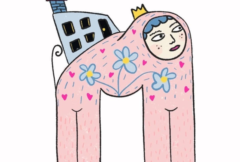
You can use both. When I look at my character, many ideas come to my mind. It reminds me of the
legs of somebody. It also reminds me of house. I can also use this
negative space, this shape, and make
ice here, for instance. So when you look at your
character, at first, just look at it and think of the shape and what this
shape reminds you of. You can look for limbs, eyes, head, posture,
the monster inside. You can also think of your
name as a character itself, what does your name
remind you of? For example, the name Caroline could be
connected to Carol's. What does the sound of
your name remind you of? It could be the root
of your inspiration. If nothing comes to your
mind right now, don't worry. Maybe the next step
will be something that hints to your
final character. I think right now we
have everything that we need to go to the next step, which is the tracing
the character. See you in the next video.
4. Tracing Steps: I have my workspace
ready to start. I have my letter underneath. I have something harder. Make sure that you have
your letter printed out. But if you're writing freehand, make sure that it's big
enough to transform. Then we're going to use
this tracing paper, the transparent paper and
place on top of your printout. And then we're going to trace
on top of it with a pencil. At first, we are not going to
add any character details. We're just going to
follow the lines of the letter the outer lines here, I'm going to draw really
slowly so you can follow. Here. If your lines
are not straight, don't worry about it
because we're going to fix everything and it doesn't matter how straight
your line is now. The first time I
used this exercise, it wasn't exercise
during that time. I was working on a
letter of a campaign, and I really enjoyed
the process and I discovered this new
technique for myself. We're almost done. And then here we go. Let's remove the printout
letter because otherwise, it won't be possible
to see our outline. And then I'm going to
take an empty paper, just normal A four size paper. And put it underneath. So the lines are clear. This is what we have. So right
now, everything is vague. Even I don't know what
character is coming to my mind. There are many versions, and let's decide together
which one is better. One version is to add ice here. And this awkward smile
of the character. But this is too
simplistic for me. I want something that is more complex yet easy to understand. Okay, I will use an eraser
to remove those eyes. So this version is eliminated. The second version is to combine a character
with an object, let's say, a house. I somehow want to
use a human like character maybe to
add a head here. Right now, this one
reminds me of a body. So imagine the character
is wearing a suit. And when you are
drawing with a pencil, you can be as free as you want. You can make as many
lines as you want, and don't worry about
any mistakes you make. So this reminds me
of a character. Maybe those are
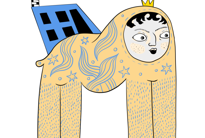
going to be limbs. Those will be hands. Yeah, like this. And this can be a house the sphinx is
carrying on its back. As you see, the further I go, more the letter doesn't
look like M letter. The main purpose of
this lesson is not to have distinguishable
character of your first letter, but to find a hidden character
living inside the letter. Let's have a chimney here so everyone can see
that it's a house. The windows of the
house could be crooked because the
house itself is crooked, something that you can
find in Amsterdam. Maybe we can have a door here. And this looks like a el. Okay. And now let's
create a face. It could be as cartoony as we want or as human
like as we want. I think it should be
something like a statue face, but also not too serious. I'm adding ice. This eye is bigger,
but it's okay. When it comes to
eyebrows or eyes, there are many different
ways to draw them. You can use different
expressions to exaggerate the feeling. You can make them neutral. You can make them surprise. You can make them angry, excited or any face
that you want. I want it to be more
neutral because my character is health statue. So the eyebrows are
going to be neutral, like a straight eyebrows. If you want to draw surprise, you can make the eyebrow
shapes like this. The set could be like this. Angry could be like this, happy face can be smiling, excited could be with
a mouth and so on. It's a small detour. Let's continue with my
eyebrows and the mouth. A female like mouth. And perhaps we can add some hair similar
to the feet curves. My character will
be the combination of curvy shapes here
will be curves, the face will be curvy, the tips of the legs
will be curved, but the rest will be angular, like the house shape,
will be angular. So we will know
that curvy shapes will be the part of the
character that is alive and the angular side of the character will be object
like parts of the character. Those are not
straight as you see. You can always fix them like
this or maybe like this, so it will be tilted. Don't add too many details
right now and don't spend too much time on this character because
on the next step, we're going to trace the
main parts of the character, and later on the stage, we will add the details, colors, shades and
everything that you need. Okay? For now, this
stage is done. We successfully
traced our character, and we are ready to
go to the next stage, which is tracing by ink
pen or something darker. Let's go to the next video and continue working
on our character.
5. Inking Process: Right now, you might already have an idea what you're doing. If not, don't worry. We still have time to decide. I have the strace character. I can always make changes. If you don't know where
you're going right now, you can think about it. You can take 5 minutes to
decide where you want to go. You can try different
shapes, different faces. Let's move to the next step, which is tracing on top
of this current stage. I'm going to take another
transparent paper, and I'm going to place on
top of this current page. Make sure that the
papers are aligned, otherwise, you might
need to redo this step. Even though I said in
the previous video that my character is tattoo like
and I want a neutral face, now I think I'm going
to use surprise face. Perhaps my character sees
something that surprises it, and I think it will add more characteristics
to this letter. Now I'm going to use
this tracing ink. And I will do this step very slowly
so you can also follow. So let's go through
this outlining process. I'm slowly, slowly
outlining the face. And at first, I'm going to draw the surprise face because this is the part that
I'm not sure of. And if I complete the rest of the lines and the face
is not good enough, then I will need
to redo the step. Surprised face. So nose first. Bigger eyes way bigger. I need to move this eye closer
so it's more proportional. Then And it has to have
a surprised mouth. I can fill in the mouth with a black color so everybody
sees that it's an open mouth. The eyebrows go higher
when you're surprised. Maybe they should come
closer to the nose. Mm hmm. If you don't like how it looks, you always can redo the step and make sure that you're
satisfied with the result. I didn't like the hair, so I'm going to redo it
something more theatrical. Add more curls here. Let's continue with
the entire body to see how this character
looks overall. In this class, I want to go
through all the details, how to create the body shape, how to do shading theory of the character design because I covered it in my
previous videos. I want this class to be
shorter and easier to follow. So you also feel freer to create whatever your mind asks you to and not to have
too many limitations. I can split one
side of M into two. Like this. And this
is another leg. I think it's a better
idea than the belly. Always pay attention
to your papers, make sure that they
don't move too much, so you don't need
to redo the steps. I like that this leg has four toes and this
one has three. Maybe we're going to
repeat the same here. And one, two, three. While creating your character, you can always imagine what
this character is about. Is it living alone or is
it living with a colony? What does your character eat? What does your character do? What is its entertainment? What does it live for? What is the purpose of
your character? And so on. Maybe my character
lives in the winter, the place where the snow
fills the environment. The house has a chimney, which can hint that
the people who live inside always
need a fireplace. The windows will be tilted, so they align with the
shape of the house. If I did the straight lines, they would conflict with
the house structure. I made a mistake, but it's
okay because we're going to redo this step
with more details. Or perhaps the door
can be even taller. Here. It could be a gate. And later I can add some clouds
coming from the chimney. Do do do. Do do do. Here. Well, right. I feel like this character
also needs a tail, something like this, and
maybe a crown would be nicer. Similar to what I have here. This is what I have for now. This character still
needs some colors. It needs some details, and maybe some
people looking out from the window or
the dogs or cats. We'll see on the next step. I believe you already have a character base of your
first letter of your name. You don't have to have everything
figured out right now. As you see, I'm still
making mistakes, and I might make more mistakes
in the future. It's right. We have other tracing papers that we're going to
use in the next video, and the most interesting
part is coming up. So stay input in the next video, we're going to trace
our character again. We're going to add
colors and patterns and perhaps come up with the story behind our
character as well. You can have a five
minute break and then come back and let's
go to the next video.
6. Bringing the Character to Life: Now the most interesting
part is starting. The coloring is your choice. If you're happy with your black and white
version, you can stop there. But if you want to add
more characteristics, then you can add colors. If you're a starter, I
would recommend to use maximum of three colors because
it's easier to navigate. But if you are more
advanced illustrator, you can add more colors, of course, shading and everything to make your
illustration feel complete. I'm going to take one
more tracing paper. Place on top of my current one, I will remove extra papers that are underneath
because they might slip and make the process
more complex than necessary. One thing that is very
obvious right now, perhaps you can see
it here is that the upper part is more complex, and the part on the
bottom is very empty. That's why I'm going to
move my paper a bit on the upper side to make my character feel like
it's in the center. Take a look at your character. If you want to make any changes, write it in your mental notes. In my case, I think that the curve here doesn't
feel very natural. That's why I'm going
to change it a bit. The tail doesn't feel like
it belongs to the body. So I want use the line here, and the rest will come as we go. Let's start tracing again. You can use the black tracer before we start using colors. I'm tracing really
slowly and fixing the parts as I go here. While drawing, make sure that your ink is properly dried
before you move your hand, otherwise it will smudge
and ruin your illustration. As you see, instead
of a sharp angle, I curved the back a bit. As you notice, I have
not started with a face because I was already pretty happy about my final results, but if I still didn't like
what I created before, I will start with a face
and move on with the body. This eye is a bit
bigger than necessary, so I'll make it smaller. The nose, I can even make
a different kind of nose. I think the mouth can be
more simplistic that I had. It doesn't need to
have fuller lips. And I will make it
smile that will hint that the surprise that it did sinc is a good
surprise, not bad. Then eyebrows I will add freckles later
because if I add them now, when I color it, it might smudge and also it won't
be visible anyways. And I will add it
after coloring. The hair is pretty messy. So I'll correct it here. Now let's move to the building. I think I smashed a bit. And then the clouds or the
smog coming from the chimney. Now that you have the
main tracing done, you can take the paper
underneath, put it next to you, and use just empty
paper underneath to make sure that your character
is visible, fully visible. Now it's time to
add some colors. As I said before, I would recommend to add maximum three
different colors to make sure that visual
language is more cohesive. But if you are more experienced, you can use as many
colors as you. It comes to the colors, if you don't have any idea
what you are going to do, you can think about the references that we
have in animations, comic books, movies, and think about the colors
of specific characters. But you can also think
about your name to get inspired about the colors. You can think about your
preferences and colors. You might have a period
when you like blue color more or yellow or
pink or purple. It really depends on my case, I'm going to come
up with the color based of the illustration
that I have right now. As I mentioned, my character reminds me of sphinx from Egypt. So perhaps I'm going to use pastel colors and something
that reminds me of sand. But I want the body
to be lighter. The face can have more
details and the house on the back might be more colorful. Let's pick the color. I have so many markers. So many materials that
sometimes I get lost. But I like this color for my spinks maybe a
different shade, a bit pink for the face, this for the cloud, this for
the body, this for the face. Okay, the black
color for the hair. I don't want to use
gold color or should I. Perhaps I should
because Egypt is connected to lots
of golden colors, and it might be a good idea. I have these colors
together right now. I'm still not sure about gold. Maybe I'll replace it
with bright yellow color. If you're working with
different coloring materials, such as acrylic paint or
something that is super wet, consider the process because sometimes it will crumble the paper and it will
be inconvenient. But if you are
working digitally, you can always use a different
layer for the coloring. And if you're working
with pencils, it will be very smooth. Make sure that you're
painting inside the outlines. Ah, so satisfying. I love this process. For me, personally, coming up
with a character and later adding details are my favorite
parts of the process. Again, don't be afraid
to make mistakes. As you see, I went
over the outline, but I can always fix it. Also, you don't need to fill
out the color entirely. Sometimes it looks
even better if you leave white parts as well. It shows that it's a hand drawn and gives crafty feelings. I don't actually want to
color the entire face. I like the white color
on this character, but I will add a slightly pinkish hue to add some checks and
slighten some details. I'll also use it
underneath the eyes. So it has more life. It's not a traditional shading. It's just my way
of adding colors. And when you are making your own character
based of your name, there are actually no rules. You can create
whatever you want, however you want, and
nobody has a say in it. It's your character, your
imagination, your process. The most important part is
that you like the result. Actually, I was thinking
about the windows, and I think that I
want to fill them with a black color because I want
to keep them as a mystery. The viewer shouldn't know if it's a house where people are living or the temple similar
to what we see in Egypt. So I want it to be a mystery and I'm going to
fill them with a black color. Later, if I feel like
it's not a good decision, I'm going to redraw them. And I will add some characters. I just want to see how it
looks with just dark shades. Do you remember previously, I told you that with wet colors, your paper will crumble a bit. So this is what I meant. You can press them in
between of the books. Alright, now we have the colored version
of our character, but we're not done yet. Only one step is left. The next video, I'm going to use thicker outlines and also a
textures to make sure that it looks cohesive
and something that I like for my first
initial of my name. Okay, let's move to the next video and
finalize our illustration.
7. Adding Colors and Details: Finally, we are on the last
step of our illustration. Let's add more texture to our character to make sure
that it looks nice and we can also add thicker outlines because right now what we see is that the outlines
are too thin and sometimes you cannot
distinguish the character. I'm going to use black marker with thinner tips
for the outlines. I'm going to use my tracer
ink for the details. Let's outline our character and fix the mistakes that we
made in the previous video. Do you remember what I
said about the freckles? I'm going to eat them now. Just some dots are enough. You don't need to go overboard. Okay. I think it's enough. And now we need some
ornaments for our body. It also reminds me of a dog. Should I add some fur instead? Hmm. I'm using short strokes
to illustrate the fur. I don't want them to
be too messy because my character looks pretty rigid. And I want the
patterns to follow the characteristics of my
character. I'm not even sure. I think you can still
see the letter. But if you don't
know the exercise, you might not know why this
character has its body. One thing that I truly love
about this exercise is that you're coming up with the shapes that you
wouldn't come up otherwise. The letters whisper what kind of characters you
are going to create. And every time you
do this exercise, you will come up with
different characters. None of them will look alike. And even if students' names will start with the same letter, everybody will come up with
completely different results. The rest of the exercise
is just your imagination. You are doing whatever
you feel like doing. You can take as much time as you want to complete
your illustrations. We're done with the fur. And now let's think
what else we can do. Perhaps I'm going to add some floral elements
to the body. It's more fictional. It's
more fairy tale like. Maybe this one has some shapes like this
hinting that it's a costume. It's not the part of the body. We need one here for
the composition, perhaps another one
coming from here. I'm just going with the flow. You don't have to have a
specific idea while starting. You might come up
with that as you go. We'll add some stars. We'll add some circles. I just to fill up the composition so it
doesn't feel empty. When you are done
with the texture, you might go through the entire illustration and
correct the mistakes again. And the final step
for me is to use the black marker and
to add thicker lines. We are more or less done
with our character. Of course, there are always going to be the
parts to improve. But if you are a beginner, especially if you
are a beginner, it's always better to stop
when you don't know what to add rather than overwork your illustration
and then regret it. So we're going to stop here. And in the next video, I'm going to summarize the entire class and we will see the results
very clearly.
8. The Final Reveal: Lesson closes the loop. We started with a letter, and we ended up
with a character. Let's go through all the steps, where we started, and
where we are right now. I started with letter M because my name starts
with an M. Then we imagined a character that could be living
inside the illustration. We traced the letter
M with a pencil, and we got this uneven
shape and the main idea. In my case, there was a pink sl character from Egypt with a building
on the back. Then we used a pen or black ink to trace on top of
this illustration. I changed the face,
I changed the hair. I edited a tale and the
idea of the building. On the final stage, we used a new paper to add
colors, textures, and ideas. This experience is always
surprising, even for me. Sometimes it's even a healing
and learning experience. When you look at your character, what's the relationship between that character and yourself. What I can learn from
this character is that perhaps I need
more flexibility. Also, I could see the
inclination towards mysticism, which are these windows and hidden truth behind
the character. Those letters could hint a
lot of information about you. You want to add speech bubbles, some environmental details,
feel free to do so. We didn't have too
much time to explain all the details because this
class is beginner friendly. But if you want to explore
more about those topics, you can check my other classes. But for now, congratulations. You created perhaps
your first character based on the first
letter of your name. That's a great achievement, and I'm sure that you're
surprised with the final result. If you have any questions,
you can always ask me in the discussion page
underneath the video. Now it's time to wrap up our
class and say our goodbyes.
9. Wrap Up: Throughout this class, we went through such a long journey. We started with a letter and ended up with an
illustrated character. Now you can frame
your character. You can gift your character. Throughout this
process, you learned many interesting and
important skills. This exercise is really great
for illustration warmup. You also learned visual
problem solving. You got a personal connection to the letter and have a better
understanding of your name. If you want to try it
in your native script, that would be
really interesting. For example, I'm Georgian and we write in
Georgian alphabet, and I could try to illustrate
my letter in Georgia or if you are an English speaker and you want to continue, you can try to illustrate
or find characters in your entire name and see
relations in between of them. You can also try illustrating your friends initials
and gift it to them. Thank you so much for
taking this class. I'm really looking
forward to seeing your project in the
project gallery. If you cannot find it, you can see it underneath the video. There are a few tabs, and there is a project gallery where you can submit your work. Even if it's a working progress, even if it doesn't look great, please still applaud it because it will be encouraging
for other students, and you will get feedback
not only from me, but from them as well. And one more thing. If
you enjoyed my class, I would really appreciate it if you could
leave me a review. With that action, other students so find this class easily, and they will be able to
create their initials as well. It will help me see that people are enjoying
my classes, too. Thank you for taking a risk and going for a character
hunt with me. I think it's time for me to go, but I'm sure I'll talk to
you soon. Bye for now.
 Masho Marg, Multidisciplinary Artist & Designer