Transcripts
1. Intro: Cozy Fall Scene in Watercolors: Hello, and welcome.
My name is Emily, and I'm an artist and instructor based in Madison, Wisconsin. In today's class, I'll
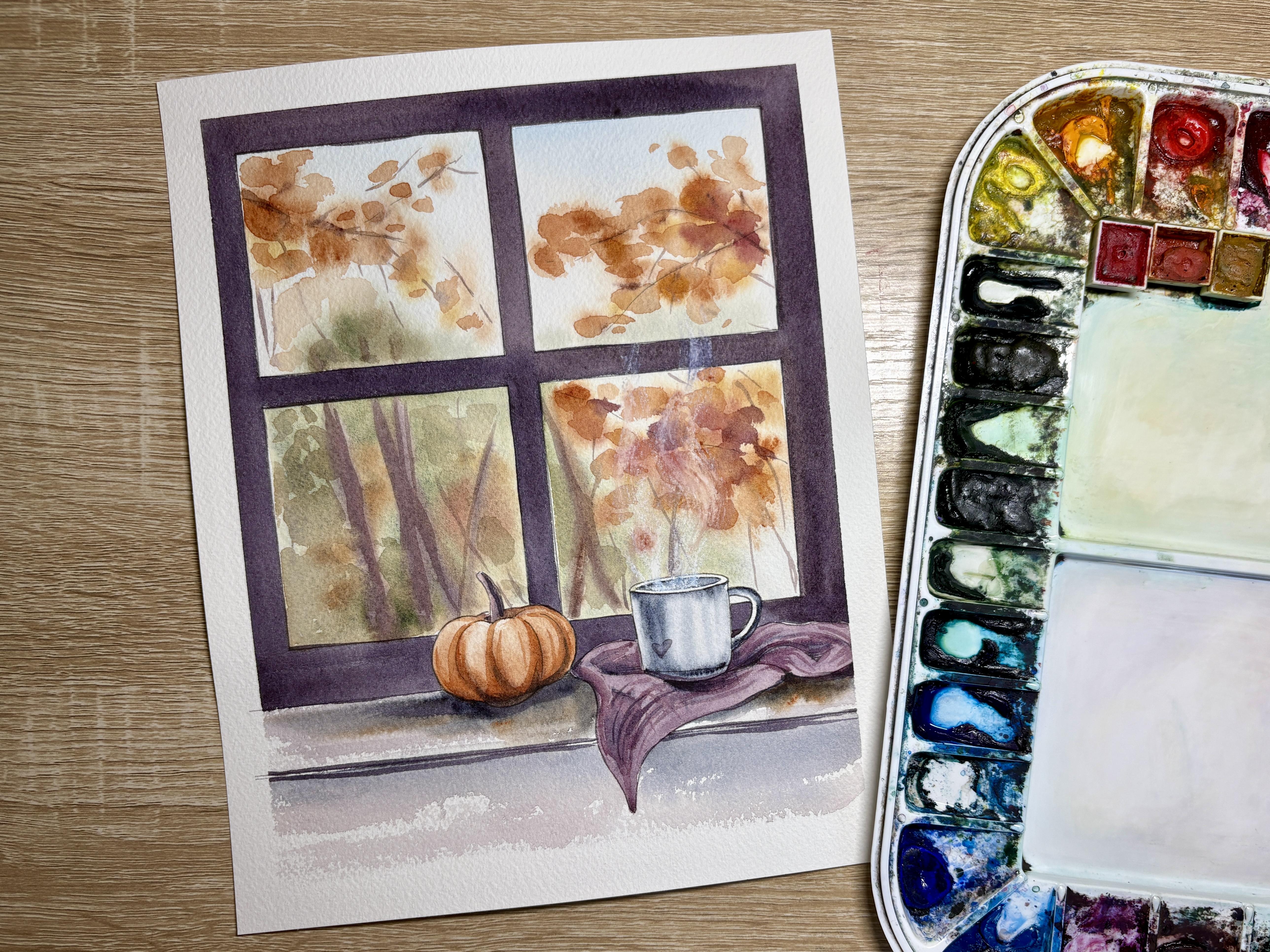
teach you how to paint this cozy fall scene
using watercolors. In this tutorial, I'll
teach you how to create a soft background using
wet on wet techniques, and then add dimension to your
painting using wet on dry. You can use the template
included in this tutorial to print or trace the design directly onto
your watercolor paper. So get your paints,
brushes and paper ready, and let's get ready to paint this cozy fall scene
in watercolors.
2. Supplies: Alright, so let's talk supplies
for our cozy fall scene. The first thing that
you're going to need is some watercolor paper. So I actually printed out the
template that's included in this ertorial onto a piece of eight by ten
watercolor paper. I like to use arches,
watercolor paper. It's cold pressed
and 140 pounds. I like to buy the A three size, and then I'll actually
just cut it in half and cut it into eight
by ten size pieces. Um, if you are using your
own paper and tracing, I would suggest maybe
an eight by ten size. You can always go smaller
if you would like. However, it might be a little
bit tricky to get some of the details and if your pumpkin and your
cup are too small. For brushes, you are going to need a variety of
round size brushes. I am using both a
size four round and eight round from the
company silver Limited. These are black velvet brushes. And then I also chose one
slightly smaller detail brush, not too small, though,
still a size two. This is a Rafael brush. Any small detail
brush will also work. You will need some tape to tape down your paper to some
sort of flat surface. I am using a corrugated
plastic board that I bought from Michael's and
cut into smaller pieces. You can tape directly
onto your table or you can tape onto a different
waterproof flat surface. The tape that I'm using, I'm using a tape
called Kiwi Hub. So all of these names and brands will be included
on your supplies guide. Kiwi Hub is a tape that
you can find on Amazon. Otherwise, you can always use
a different type of tape. So you can use a
green frog tape. You can use a blue
painter's tape, whatever sort of tape that you have at
home that's suitable for paper and will help leave
some really clean lines. I find that this kiwi hub tape
really protects my paper, but also make sure that I have really nice crisp
lines afterwards. You'll need a paper
towel, a cup of water, maybe two cups of
water if you don't want to run back and forth
to clean out your water. And then at the
end of the class, I'm going to demonstrate
how to make some steam coming out of your coffee mug using a white charcoal pencil. Now, this is optional. If you don't have a
white charcoal pencil, you can try using a
white colored pencil or some white guash. But I will be using a
white charcoal pencil, and you will need a variety of watercolors for this class. So let's talk about the brand of watercolor paints that I'm
using and the specific colors. For watercolor paints,
in my palette, I use Daniel Smith watercolors. If you use a different brand of paint, that's totally fine. I did swatch out what my colors look like on paper so
that you can choose a color that you have at home that's fairly similar to
the color that I'm using. I'm using a Thalo blue a
quinacridone burnt orange. So unlike a normal orange, it's a little brighter in color. This one is more of
a tone down orange. It has a little bit
more brown hue to it. It's not as bright. And thraconde
red, piamanite genuine. This is a granulating color. So you'll notice that
it's a warmer brown. It has more reds in it
than a cooler brown. Undersea green, which is
another granulating color. This undersed green actually
has some teals in it. It has greens, of course, and it also has some
brown hues as well. So if you do not
have undersed green, you can mix a green maybe
by adding a little bit of brown into a brighter
green that you have at home. New gamboge, indigo,
and carbazleviolet. So before we start painting, I'm going to move some
of my things aside. We need to prep our paper, meaning that we need
to tape it down. Now, if you are
also painting and printed out or traced
out your template, you notice that there's going
to be a thicker edge along all four edges than what your window pane
is on the inside. That's on purpose
because I do want to leave a ring around
our painting. So this is the final piece
once I took the tape off. So I do want to try to tape about a fingernails width here, all around my paper. And I want to try to tape
so that the window pane around the edge of
the window pane here is about the same width. So if you notice this
T in the center, it's about the same with all the way on
these three edges. There are no guidelines
here for you. So you're just going
to eyeball it. So rip off a piece
that's the same length. I like to start on
one side first. So I'm going to
kind of eyeball it. The right distance, I'll lay that side down first and keeping the other side up
so that I can kind of move it if I need to. And now, the nice thing
about this kiwi hub tape is it is a little bit
more transparent. You can see through it a
little bit better than your painter's tape or
your green frog tape. And so that kind of
helps I find it helps me to line up my tape a
little bit better. So it'll be more
or less lined up. With the edge of
your blanket here, you notice that that
edge kind of cut off, so I'll try to line that up. Got a little dog
here under my tape. That's okay. And then one
more along the bottom.
3. Wet-on-wet Windows: Alright, so we're going to
start by painting some wet on wet in the four window
panes that you see. So I'm starting by using
a size eight round brush. Really, you can use any
larger capacity brush that you have that still
has a nice fine point to get into those corners. I'm using clean water to paint and wet the upper
two window panes. I'm making sure to be cautious here that I don't
go over these lines. And I do really
want to make sure that I'm wetting
the entire area. So I do like to go back to the beginning
where I first started and re wet that area just to make sure it's
really nice and wet. And I'll do the same
thing on the second pane. Now, I'm doing the
upper two panes first, and then I will paint
the lower two panes. If you feel like your paper dries a little bit faster
than arches cold pressed, you can do one window
pane at a time. I am using a really
high quality paper, and so I'm not concerned about
my paper drying too fast. Alright. And then,
like I said, I'll go back to that first pane, go over it once again to
make sure that I have an even wetness in
both window panes. All right now I'm grabbing
a little bit of pal blue. It really can be blue. I'm just using a
really light amount to just add a little bit of color to the upper portion
of that window pane. If you don't want it to be
a nice bright blue sky, you can always use
a different color for this little accent color at the top of the window pane. If you want it to be a
little bit more moody, you can use a darker blue. You could also use a magenta or more of a fall color as well. Alright, so I'm going to switch brushes to a slightly
smaller handled brush, so this is a round size four. I did get it wet just to get
some of my orange pigment. It's a burnt orange,
quinacridone burnt orange. But I do need to make
sure that I have mostly pigment and not that
much water on my brush. You have too much liquid on
your brush at this stage, when you're dotting in
some of these fall leaves, you're going to notice
that your orange is going to spread too much. So although my brush is wet, it is not soaking wet. I do have a paper
towel in my left hand, and so you might notice me
dabbing my paper towel, my brush to my paper towel to get rid of some of
that liquid on my brush. I'll do the same thing on
that first window pane. So I'm using more of
the edge of my brush, not necessarily the tip of my brush because I
want a larger blob. And I do want to have some of that blue background
space come through. So I don't need these little
blobs to connect at all. Now, if I'm wanting to switch to a different color,
say, a yellow, I'll clean my brush off, grab some of that pigment. And then I just want to make sure that my brush isn't soaking wet when I add that color
to my wet window pane. I'm using a little
bit of a brown. So this is a piaminite genuine. It's a reddish brown. I'm
not wetting my brush. I'm using the amount of water that was left
over from the yellow. I'm grabbing a
little bit of that brown directly from my pan. And then I am adding a few brush strokes
to mimic branches. I am leaving some
space in between these little brushes
these little branches, just so that some of the leaves can kind of shine through. Nine. Now, I'm not adding extra water
here because I want to make sure that that line
stays where I put it. If I were to add water
to my brown there, it's going to act
just like my leaves, and it'll expand a little bit
more than I'm wanting to. Now, here I'm just touching
up some of those browns. So I'm taking a damp brush, and I was drying it off
just a little bit before I softened up some
of those branches. Now, here I'm taking a little
bit of some undersea green, so that's a brownish green. I did add water to it, but once again, my brush
isn't soaking wet. And I'm adding a little bit of a tree line to the base
of these window panes. Now, you can kind of control using a dry brush
where this green goes. But once again, just make sure your brush isn't sopping wet. Alright, now we'll do
the same thing for the bottom two window panes. We'll wet it first using
our larger capacity brush. This time, I just need to make sure that I'm painting around the pumpkin and around the glass and the bottom
two window panes. Once again, you'll notice
that I'm going to re wet both window panes so
that they're equally wet before I add any of my pigment. Alright, now for the pigment
on the lower two panes, I'm going to use primarily
greens and some oranges. So this is going to be
more of my tree line. So I'm adding the green first, and I'm making sure to
leave a little bit of space where I want my
oranges dotted in. I'm still using the same orange as I did in the trees above. So this is the quinacridone,
uh burnt orange. As you're adding your
greens and oranges here, just make sure that you extend the color all the
way to the edge, making sure that you've got a nice hard edge on that window pane
instead of a soft edge. At this stage, what I'm looking for is I just want
some blurred colors. I want some darker tones, I want some lighter areas. And then I want to make sure
not to over mix my colors. So I still want some of those
oranges to shine through, and some of the dark greens. I don't want to
blend them together. And at this stage, you can add any extra fall colors
that you like. So I'm dotting in just a little
hint of red here as well. Now, I don't want to
spend too long on this left panel because I
did wet my right panel. So I want to go in
with my green first. I'm starting on this
left hand side where you see the template of that
branch in the upper right. That's where I want to stop my green
slightly before that. I do want the oranges of that branch to be able
to shine through. So I don't want to bring
my green up too far. I'm going to do the same
technique that I did in the upper branches down below where I'm using the
edge of my brush, not the tip of my brush
to make some kind of more blurred leaf
shapes on this branch. And, of course, the
closer that I get to the edge of the branch
on that right side, kind of the larger these
clumps of leaves are. I can always add in some extra accent
colors like my reds. I'm going to keep
the darker colors, like those darker reds
and darker oranges. I'm going to keep those
closest to the branch. That's where the darkest
colors naturally would be. And if I have any
lighter yellows, I might keep those towards the ends and the edges
of these branches. So now you see me coming back
to that left window pane. I've grabbed some of my brown. That's my Piamintite brown. Once again, I did
not wash my brush, so I'm using whatever
liquid is on my brush because I do want these branches to stay
in their linear shape. I'm pulling up a
little bit of pigment here because using a dry brush, just because it kind of got a
little bit too dark for me. And now I'm grabbing
a little bit of purple along with my brown. I know I want to use some
purple in the base of this painting where the
cloth is and the mug. And so I want to add a little bit of purple
in the background just so that I can kind of have some common colors
throughout this painting. You'll notice that
I'm going back over these tree trunks with I'm lifting some of
the pigment there, so I'm drying my brush off
and lifting some of it off. And then I might go
back after I lift some and replace it
with some more pigment. While things are wet, I do try to my best to kind of rework that area until I get it to a point
where I'm happy. And so I might
rework the area two, three times before it
gets to be too dry. And then I just have
to let it sit and dry.
4. Wet-ton-wet: Objects on Windowsill: Alright, so here I'm testing
out in this upper pane if my papers dry enough to do a second layer on these leaves. As I started doing
the second layer, I noticed that the paper
isn't quite dry enough. It looks dry, but it is still spreading a little too
much for my second layer. So I just lifted that color up, and I'm going to
move on to some of the foreground pumpkins and
some of the foreground area. I kept this in the video just because I wanted
to share with you that sometimes we do have to test out the
dryness of our paper. And if we notice the
color spreading too much, we just need to stop and pick a different
area to work on. So instead, I've
decided I'm going to paint the first
layer of my cloth here, my little towel underneath
my mug of coffee. I mixed up a muted purple, so I have a purple that
I added some brown too, and that kind of gives it this more musty purple color that's more indicative of fall. I'm just doing a
single layer of color, so I don't want a gradient. I'm just painting even
color on this whole cloth. So while this cloth
is still wet, I'm gonna drop in
some darker pigment in some of these creases. So I'll take that
purple pigment that I mixed and I'll add it to some of these crevices around the cup where it would
be more shadowed. And without wetting my brush, I'm going to grab some
indigo from my palette. So that's my darkest blue. You can use indigo. You
can use Prussian blue. You can use a
different darker blue or even a gray, if you'd like. And so here I'm going to add just a little
bit of that color to some of the darker shadowed
areas of my cloth. I'm doing all of this while
the cloth is still wet. Once this cloth starts to dry, then I've lost the chance to drop in some
softer shadows and then I need to let it
dry fully before I add a second layer wet on dry. All right, I'll do the same
thing with my pumpkin. So I've mixed some water along with my quinocradone
burnt orange. And now I'll paint that
first layer on my pumpkin. This time, just like the cloth, I'm painting wet on dry. So my paper is dry, but I do want to drop in
some darker pigments. So I'll try to paint this
first layer fairly quickly, but also making sure that I am bringing my paint all
the way to the edges. I noticed they got a little too dark towards the
top of my pumpkin, so I just grabbed my paper towel to lift up a little
bit of color there. And then I grabbed some of that burnt orange
directly from the pan. I did not add any
water on my brush. I just used the amount
of water that was there already because I don't want that orange to
spread too much, so I want to make sure I
don't have that much liquid. And I'm kind of tracing along
those ridges of my pumpkin. If I need a little bit
darker of a shadow, I can always take some of
that purple that I mixed for the cloth and add some purple along the
base of my pumpkin. After adding the shadows, now I can wash my brush, dry it with my paper towel. And now I'm using my dry
brush to lift some of the highlights in the centers of those little
sections of my pumpkin, just to make sure that I've got a little brighter of
a highlight there. Alright, we'll move
on to our coffee mug. I'll start by mixing a
very watered down indigo. That's going to serve
as my base color. So I'm adding quite a bit of water and then just a
little touch of indigo. You can choose to
paint your mug, whatever color you would like. Remember that the base
layer of that first wet on dry should be a
lighter transparency. I am going to paint
the whole mug, but I'm going to try to leave the little lip of the
mug and the upper lip. I'm going to try to leave
that without any color. I want that to be as bright as it can be to serve
as the highlight. Well, the mug is still wet. I'll grab some indigo
directly from my pan, so I'm not adding any water. I want a very opaque indigo, and I'll add that to the
upper rim of my mug, as well as the lower
base of my mug, the left side of
it, and the handle. So I'm trying to add some shadow using that opaque indigo. Once I've placed the
indigo where I want it, I can use a dry brush to help blend those edges and kind of soften up any edges
that got too dark. I can also grab some pigment and add some vertical strokes. Those vertical lines
are going to help resemble some reflections
of that curved mug. And you'll notice that I'm
still keeping a little bit of a highlight along that
leftmost side of the mug, so that's going to help give it more of a cylindrical shape. And then with my smallest brush, I'll go into that really
tiny oval in the center of my mug and add some darker indigo to
the center of that mug. I'm trying to keep that outside
ring free from any color. That's going to act as the highlight on
the top of my mug. Alright, so now
I'm going to check on the dampness of
my window panes. I know that they're
not soaking wet. There's no glare
or gloss anymore, but I still feel them
to be slightly damp, and I want them to
be a little drier before I paint my second layer. So I'll continue painting that first layer
of wet on dry and those nice soft edges of wet on wet with
the pumpkin stem. So I started with a brown
on the pumpkin stem, and then I added
in a little indigo towards the base just to
give it a little depth.
5. Wet-on-dry: Creating hard edges: So now that we're done with our first layer of wet on wet, where we add all of our soft edges and highlights and shadows
using soft edges, now we're going to add our
second layer, wet on dry. And this is where we're
going to leave some of those edges to be hard edges. Hard edges just
basically means that we have a very clear definition
between the paint, and it's going to
be a solid line. We're not going to
blend any of the edges. So I'm going to start
with my pumpkin. I mixed up a medium transparency
of that orange color, and I'm just going to add
a layer of color on top of those trace lines
along the pumpkin. And I might add a few extra
little texture lines as well, but I'm not going to soften
up any of those edges. Now I'll move on to the little napkin underneath
the coffee cup, and I'll do the same thing,
adding a wet on dry. So my paper is dry,
my brush is wet. Now for this wet on dry, I'm actually using
the same color that I used for the first layer, but it's going to
automatically sit and show a little bit darker because it's added on top of
that first layer. So if you're noticing that your second layer is looking
a little bit too intense, your color might be just
a little bit too dark of a color or too opaque of a
color to be a second layer. Our second layer wet on dry, we still want to have
some transparency to that layer because we don't want the contrast of the two layers
to be that intense. So like I said, I'm still using the same color that I
mixed up for the napkin. And I'm just adding
some harder edges. I'm kind of going and adding
a little bit of texture, but I'm also following the lines of that
napkin underneath. Now that I'm done with a second layer on my pumpkin
and my little cloth, I'm going to work on the
second layer of my leaves. So I'm using the
same orange that I mixed for the second
layer of the pumpkins. So it's still a
medium transparency. It's not overly opaque. I still want to be able to see the colors that I
laid down underneath. And so that's why I still need a medium to medium
light transparency. And I'm adding some
leaf like shapes, but more just blobs. I'm keeping these
misshaped blobs to be a little smaller towards
the edges of the branches. And then when it gets closer to the stems and the branches, then I'm going to make
those little blobs a little bit larger in size. Once again, this is
still wet on dry. So my paper is completely
dry and my brush is wet. Another important
thing to note is that when I start painting
these little blobs for leaves, I'm keeping them pretty
separate from each other. And now, when I look at this
branch, I just painted. I'm noticing that it looks a
little off. It looks weird. And I think partially because none of those
blobs are really touching. So I took my paint brush and I connected some of those blobs, connected them the ones that are closest to the stems
and to the branches. Now, while these
blobs are still wet, I can go in and I can drop in any additional
colors that I want. So right now I'm adding
some of that purple that I used for the
cloth in the foreground. And I'm also I can add in
any red or any yellows or any or a different shade of orange just to give these branches a
little bit more color. And I'll add a second layer of wet on dry to the
lower left pane. So I'm using my undersea green, which is a brownish green to add some tree like shapes to the foreground or to
the background here. And I'm still using
the edge of my brush. It's still very fairly
transparent green. Here, the more transparent you have your green
and your colors, the further back in the
distance they're going to look. So our goal here is to
not have very dark, intense colors because
we want those shapes to fade into the background and not be what our eye sees first. We'll move on to our tree trunks and giving them a little
bit more definition. So I have a watered down medium to medium
light transparency brown, the same brown I used for the tree trunks in
the wet on wet layer. And I'm just adding some
vertical lines here, trying not to have that brown be too dark of a brown
because once again, I want those tree branches
to fade into the distance. I don't want them to be
what your eye sees first. I Oh.
6. Dry brush technique for the shelves: So we're going to mix
our color for our shelf. I'm actually just mixing
a few of the colors I already have on my palette
to create a warm gray. So this is the brown
from the tree trunks, along with that purple
from the cloth. And I'm using a dry
brush technique here. So I have a size
eight round brush, so it's a little larger. I'm using the long
end of the brush, the edge of my brush, and I'm trying to keep some of the texture of the
paper and have some of that texture of
the paper shine through. So although my
brush is still wet, it's called dry brush because we want to be able to see
some of that texture. I'm going back with
a little bit of indigo towards the top edge of that shelf there because I want that edge to be
a little bit darker. We'll do the same thing
on the upper shelf. So once again, I'm
using the edge of my brush and keeping my brush a little bit drier and
a little bit lighter of pressure so that you can see some of that texture
in the paper below. Once again, I'll go back in. This is some indigo
directly from my pan. So it's not watered down at all. It's a very opaque indigo, and I want my shadows
under that pumpkin and under the cloth to be the darkest so far in my
painting because that's where the darkest shadows
are naturally going to be. You can see I added a little bit of orange into the shadow. Adding orange to that
indigo color is going to kind of connect all of the colors that I've been
using up until this point. And, of course, I always
go back in and I'll lift any colors that got a little too intense or if
they mixed poorly. So right now I'm
just lifting some of those colors away. Mm.
7. Painting the window frame and final details: So I'll start mixing my color, my darker color that
I'm going to use for the window pane around the
edges of the window pane. I'll start with some indigo, and I'll add a
little bit of brown. I tried adding a little magenta. And then I'm also going to add a little bit of purple,
a little bit more brown. Really, I'm wanting
to add to create this sort of dark wood color, but I want my dark wood color to be a little bit more purply. Than that. So mix a shade of color that
you're happy with. I still have water in
this with this color. So it's not as opaque
as I can get it. And that's important
because I still want the main focus to be on the
coffee mug and the pumpkin. And if my window pane is
too dark and too opaque, if there's no transparency
to it at all, then your eye might focus
on that window pane. So, I'm still keeping quite a
bit of water in this color. I'm using a size
eight brush here, and I'm using part of the
reason also why I'm using quite a lot of water
here is to make sure that my edges are
really nice and clean. If you don't have enough water mixed in with your pigment, your edges aren't going to
be very nice and clean. I am painting the window pane all the way up to the
tape on the edge. This is partially why we taped our paper down and
made sure that we were taping at the same distance
so that this window pane around all of the edges is going to
be the same width. Oh A oh We'll use the same color to add just a few lines to
that edge of the shelf, just to help that edge stick
out a little bit more. And then we'll finish
the details of the window pane using a
slightly smaller brush. Alright, so I'll use the same color that I use
for the window panes, and I'm going to add
that color to a few of the darkest shadows
in my painting. So I'll add a little
bit of that color under the napkin and
then under the pumpkin. I might also add a
few brushstrokes and some darkest shadows to
the stem of the pumpkin, maybe a few in the
napkin itself. And then whatever sort of extra little details that you might want to add
to your painting, this is a great time to do that. So I decided that
I was going to add a little heart to the coffee
mug using the same color. You're more than welcome to add whatever design you would
like to your coffee mug, whether that's poka dots or initials or any other
little cute memento.
8. Additional Tutorials: If you enjoyed this video, I also have a variety of online
tutorials on my website, emilymarwatercolors.com, as well as Skillshare
for Skillshare members. And I do sell completed
physical watercolor kits where it comes with everything
you need to paint at home. Visit emilymarwatercolors.com.
 Emily Marie Watercolors, Watercolor Artist and Dog Lover