Transcripts
1. Welcome: What inspires you. For
me, it's mostly nature. I love the colors, the animals, the
plants and the trees. I love the seasons and
the changes in weather. And also what that does to us. Because in the winter we
like to be more endorsing. And in the summer we
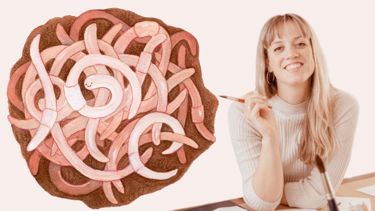
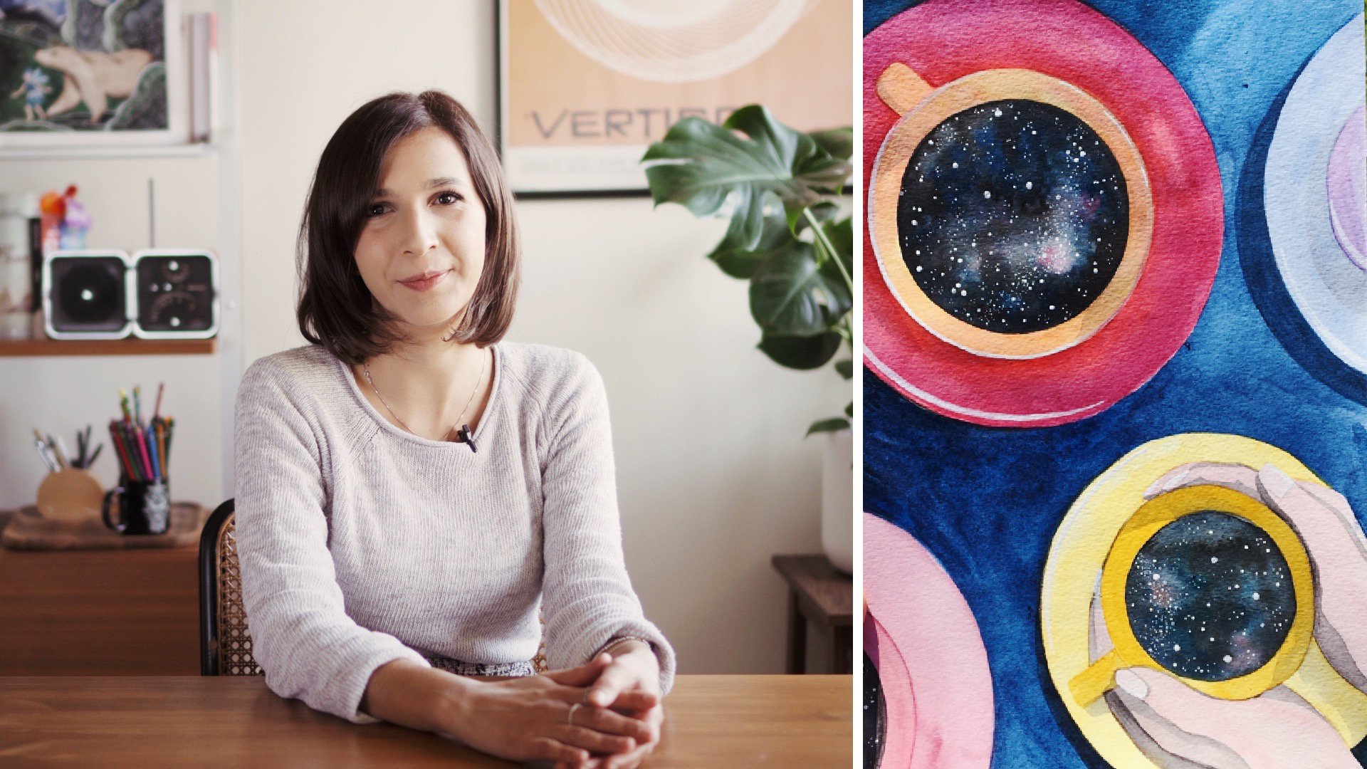
like to go outside. My name is Elise and I'm an illustrator from
the Netherlands. I love to make illustrations
that tell a story, but I also like to make, as I call them
little collections. These are objects I think
surrounding a specific topic like the month of the year or maybe the things you
need well camping. I think those objects
grouped together, but I also like to digitize them so I can make my own
library to use later on for making a postcard or another design or
creating a pattern. For this class, I
want you to get cozy and thank some ornaments
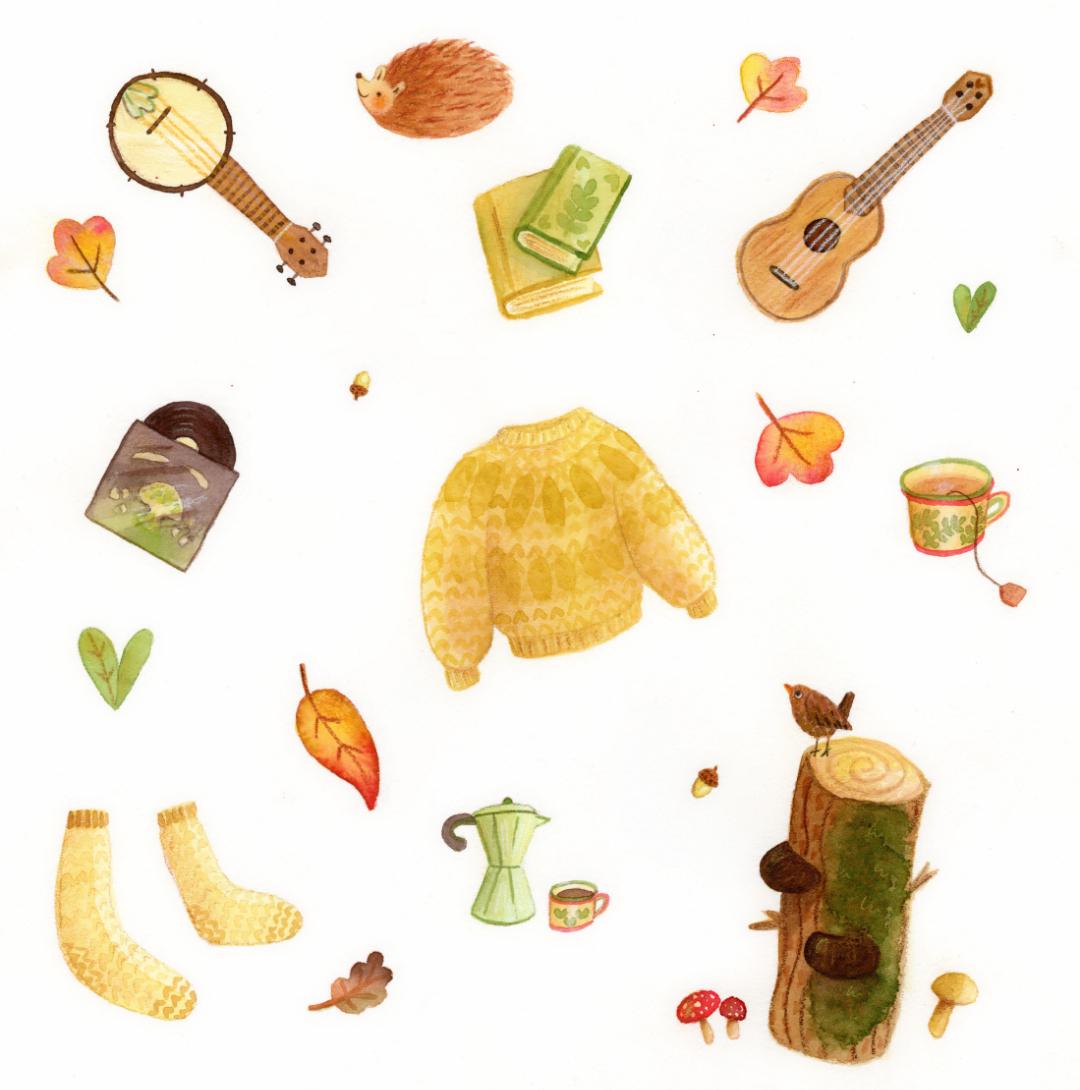
that five of them. We will create a cohesive set of illustrations using
your own prompts. This class is all about enjoying the process
of painting while exploring your
style and creating your own library to
put to use later on. This class is friendly
to beginners. You will be able to
follow along and create your own sets
of illustrations. So let's dive in.
2. Supplies, Inspiration and Class Project: Let's talk about
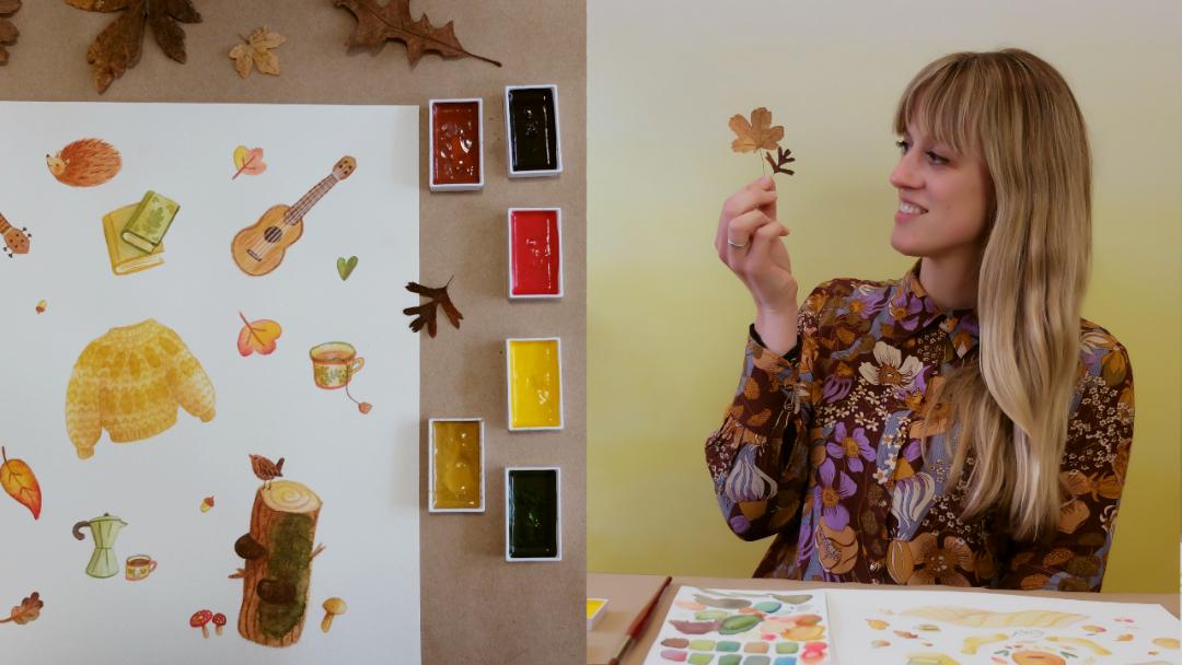
supplies for this class. I will use this
watercolor paints. I really loved this watercolor paint because of the pants. They are quite big. I can pop them out really easily for our limited color palette. You can use any watercolors
you've got lying around. I use this box all the time. It's from Winsor and Newton. I think this is a
student quality and it works fine
for me all the time. I use this watercolor paper. It's 100% cotton and it really absorbed
your layers very well. I really loved this paper. You don't need expensive
paper like this. You can also use
students quality paper. You will need a
regular sketchbook. For painting. I use a big brush and the
small brush, this is a ten. And this is, uh, to use whatever
brushes you really like. Of course, we will
need some water and some paper
towels, an eraser. For this class.
You will also need some colored pencils for our last layer on top of
the watercolor layers. Now let's talk
about inspiration. You can get your inspiration
from my Pinterest board, but you can also
create your own. Find the link to my
Pinterest boards in the projects
and resources tab. Here I'm searching for
some redness rash. Just click on the red button to add the image to your board. I also saved this beautiful
collection of leaves. I find that the different shapes are a good source
for inspiration. And how lovely are the socks? I'm definitely going to add socks to my cozy illustrations. This fall bucket list looks like the project
we are going to make. So I'm saving this one too. There is a lot of inspiration
to find Pinterest. But you can also get or
your own stuff from home, like a cup of tea
or maybe you've got some nice cozy sweater
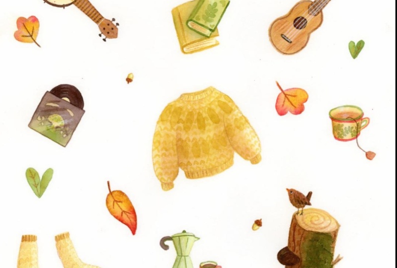
and socks like either. Let's get them. About the class project. Create a cohesive
autumn artwork, a collection of your
favorite autumn things. Complete your class
project by posting your artwork in the
projects gallery. Choose to post a photo of
your finished artwork or create a new artwork from
your digitized library. You made both are only two
photo. It's your choice. Have fun with it.
3. Sketching Thumbnails: We've got all our cozy stuff. Let's get started with
sketching some thumbnails. Try to find some
balance in your design. Drawing lines and circles
can help you align the objects and create
a balanced artwork. As you can see, I
created lots of thumbnail sketches to
loosen up and to explore. Now I am ready to make my
final thumbnail sketch. While sketching. I tried to be loose. You don't have to draw photorealistic. Make errors and play around with different
shapes and options. When you don't like
something in your sketch. Just adjusted better now, done in your final art. I wasn't happy about how
the book was looking. So instead, I'm
making two books. This little hedgehog
is here to stay. I like that one to camera turns into a one year later. I like how it's turned out. So now I'm ready to
make a bigger pencil drawing so I can trace it
onto watercolor paper.
4. Transfer to Watercolor Paper: So are you ready to make your
set of cozy illustrations? Let's get started. Now we've got all these
nice thumbnail sketches. Let's transfer one of these
sketches onto a bigger paper. I am using a regular
pencil on printer paper. I taped two pieces together to get a
bigger piece of paper. I still made a few adjustments compares to the final
thumbnail sketch I made. After drawing with
a normal pencil, I am tracing the edges with
a dark colored pencil. This will help me
when I'm going to trace it on the light box. Get your watercolor paper and
place it over your design. Use a window or a light
box to trace the images. For tracing, I am using a brown pencil to
trace my images. I think this color will match the warm water color paints I will use on top of the tracing. I am happy with the results. Let's move on to
the next lesson.
5. Quick Color Theory: Are you new to watercolors
and color theory? Then just stay here because I'll learn you everything you
need to know for this class. These are the colors I'm going
to use for our projects. But for this lesson we only use the yellow, blue, and red. The color on the right. We
are not using right now. With the primary colors, yellow, blue, and red. You can make almost every color. By mixing the primary colors, we get the secondary colors, which are green,
orange, and purple. When combining all
the primary colors, we got beautiful black, grays and browns depending on the quantity of each color
you add to your mix. I am adding more blue and red to this mixture to get the color to appear more black than brown. This is a beautiful
shades of gray. I am drawing triangles to empathize the primary
and secondary colors. You can see which colors are opposite each other
in our color wheel. These are called
complimentary colors. These colors are often used in logos because next
to each other, they make each other
stand out more. Rinks, more green.
Next two reds. And reds looks more
red to green, e.g. mixing the complimentary
colors will make beautiful shades for shadows
without having to use black. Depending on how much of a
color you add to the mix, the color will appear more gray, red, gray blue, or gray brown. You can divide your
color wheel to see which colors are seen
as warm or cold colors. For this class, we will
use mostly warm colors. So I've owned, used much blue.
6. Limited Color Palette: So now you've learned
everything about color theory. We're going to make our
own color palettes. And let's start with
choosing our theme colors. For our color palettes are
chosen warm colors, a yellow, a yellow, ochre, red, and some brownish red, which is called burnt sienna. But you are free to make your own pellets and to
choose your own colors. Also, I chose to cold
colors, blue and green. I will use them to provide some contrast and to
make dark shades. Limiting yourself and your
art supplies and colors can enhance your creativity because you are not overwhelmed
by choices. Too much choice can make it difficult to even
start a project. That's why I suggest you
make a color swatch sheet. First two, not only is it
necessary to understand your chosen colors and to know how many variations you can
make with those colors alone. It's also great when you are dealing with the fear
of a white page. And last but not least, by swatching your colors, you are in the process
of painting already. So it's great to warm up before working on
your final artwork. Let's loosen up, enjoy the
process of painting and relax. My swatches are in the shapes of leaves because I'm
enjoying that. But you can do circles or
squares, whatever you prefer. Firstly, I'm painting
all the chosen colors. At the top and at the
left side of the page. I'm working wet on wet. So I'm blending the
colors on the page. When making an error
like a smudge, you can take a clean
brush with water. With this brush, pick up the moisture with the
paint and if necessary, debit with a paper towel. Working wet on wet, the colors will
mix on the paper. I'm working wet on dry. You can add details. You have more control for drying your swatches. You can use a hairdryer
to speed things up. My swatches or dry. I can add details
if I want to hear. I am painting on
top of my leaves. And here I'm painting
the negative space on top of my leaves. You see the difference.
7. Let's Paint: It's time to things. We're going to work
with layers of paint. So make sure you use water for
your watercolor paintings. We start by painting
light washes of color. So we use a lot of
water as first. Some of the edges are too harsh. I erase the edges by lightly using a soft kneadable eraser. Be careful not to
damage the paper. While the paint is wet. We can blend other colors
inside the shapes. Although I wanted to first give every shape is soft
wash of watercolor. I already started adding some layers on top
of dry washes. In the next video, we
will add more layers of paint to the Dries washes. Let's move on to
the next lesson.
8. Adding Layers: In this lesson, we are
going to add more layering and also we are going to add some shades and some details. We are applying more washes. They can be a darker shades. Here I am adding shadows. Make sure your layers
are dry when you want to add a layer for
shadows or details. Or new layer should not activate the paint underneath your layer. So be careful with
your brushstrokes. One shape is drying, I paint, the other shapes. I am building on
top of each layer. In the next video, we will add some texture and lost
details and colored pencil. Let's move on to the next
lesson and finish this piece.
9. Adding Texture: Once our watercolor
layers are totally dry, we can use our color
pencil to create some textures and to
create some more details.
10. Digitize Your Art: So we made, are very cohesive set of
watercolor illustrations, often themes in a
beautiful color palettes. You can be very
proud of yourself. Get your computer
out or your iPad, and let's get started. We are using Affinity photo, but you can also
use Procreate or Photoshop or another
program like that. After scanning my
image as 300s DPI, I make a copy of the background. When I make an error,
I can always go back. I go to Filter colors,
erase white paper. You can see squares
through the images. They are now transparent
and the background is gone. Make sure to wet edges option for the brush is turned off. I don't paint all the
way to the edges. This way. I will keep
this watercolor five. Also, I will create a
layer in a bright color to check if I don't forget
to call or something. Let's paint all the objects
white on a separate layer. This way, it will not
be transparent anymore. When I'm finished, I
placed a white layer behind the transparent
watercolor layer. Select the two layers and make the other
layers hide from view. I go to layers, merge visible to make one
layer for my ornaments. Now my images are no
longer transparent. After this step, it's time to get every shape
on its own layer. Select, using the selection
tool and use control C and control V to copy and
paste on its own layers. Let's select copy
and paste them all. Make sure you export as PNG
and choose selection only. Now it's time to make a
folder for our outputs. I will call the folder
goatee fold PNGs. I am proud of you. What will you make with this
set of illustrations?
11. You Made It!: Congratulations on making
your illustration Library. Thank you for watching and
I hope you enjoyed it. Please show your work
in the class projects. It can be your hand
painted illustration or your set of digitized
illustration. Your choice. And please don't forget
to leave me a review. This will help me a lot. I hope to see you in my next class.
 Alies Broekhuizen, Illustrator, art teacher, dog owner