Transcripts
1. Welcome!: Hello everyone. Welcome to another Skillshare class. My name is Giovanna. I'm a visual artist and illustrator. Today I'm going to show you how to draw a very fantastic and magical creature with a surrealistic inspiration. One of my biggest struggles when I started to draw, was coming up with ideas on what to draw. Today I find a lot of inspiration in my dreams and all of that imaginary and surreal worlds we can create in our minds. We all have the ability to dream and create something that's unique to us. In this class, I'm going to help you find a path to discover and explore those imaginary worlds that live in your head and that are dying to come out in your artworks. Literally, anything can be inspiration for this kind of surrealistic drawings. But since Halloween is just around the corner, we're going to get spooky and create a scary creature from imagination. Here's what you can expect from this class. First, we're going to go back in time a little bit and understand how this realism movement can be inspiration for our project today. Then we're going to do an automatic writing exercise to connect with your imagination and spark creativity. From there, we will design a surreal, fantastic creature that is completely unique and original. I'm going to show you several different inking techniques and how you can combine them in your illustration and you'll learn how to create the textures, depth, and contrast you want in your drawing with fine line ink pens. At last, just to add a little challenge, we're going to explore color layering using mixed media, which means literally any materials you have at home to add color to your drawing. You're going to learn how to use colors to add a lot of complexity and information to your illustration and then be able to actually tell a story through your drawing. This class will not only help you improve your drawing skills, but it'll also bring some very important reflections about your work as an artist and what message you're trying to send with your art. Illustrations are really powerful tools to tell stories. Today, you're going to learn how to do that by using textures, lighting, and color. Now grab your art materials, some nice drawing paper, and of course the most important thing, which is your favorite drink. Let's get started. Before you go, don't forget to follow me here on Skillshare, so you can be the first one to know whenever I post a new class and I don't want you to miss out. Just click this button right here. See you soon.
2. Materials: Hello, everyone. The main materials you're going to use for this class are: ink pens, a sketching pencil and eraser, and some good drawing paper. For the coloring part, we are going to use mixed media for this class, which means any materials you have available to you. I'm going to show you a little bit of the materials I'm going to use, but don't worry, if you don't have any of them, use whatever is available to you. These are my ink pens. I'm going to use a range from 003-01, which is a very fine tip. That's because I really enjoy creating tiny details and that delicate effect on my drawing. The thinner the line of your ink pen, the more delicate and detailed your result will be in the end, but it's usually a little bit more time consuming. If you're just starting out with ink pens, I totally suggest you start with a thicker tip, like a 03 or maybe a 05, and you will be able to have great results like that. Also, of course, I'm going to be using a sketching pencil and a plastic eraser. As I always tell you guys to sketch, you have to choose a hard pencil. You're going to know that by seeing the number in the back of the pencil. Mine is a 4H and the hard pencils go from the HB until like an 8H or 9H. The higher the number next to the H, the harder it will be. This is good because the pencil won't smudge too much on the paper and it's going to be really easy to erase, so you can sketch as much as you want and your paper is going to be clean in the end. Now, a few of the materials I'm going to use to colorize my drawing; the first one is calligraphy ink. I'm going to use black and white calligraphy ink. These you're going to use with a tiny round brush like watercolor brushes. Let's say you need to add some details in the edge or add some light, the white calligraphy ink is what I usually use to do that. I'm also going to use this cool water-based markers. They are very simple. You can get them in any art store. I'm going to use a few colors and I'm going to show you later the colors I'm going to use. This is a white gel pen, which is also very helpful when you want to fix little things here and there and to add little details in the end. I'm also going to be using wax-based colored pencils. I have this really cool earth tone and skin tone color palette. I love it. Of course, I'm also going to be using watercolors. We're going to use super basic techniques on watercolors. If you've never used water colors before, this class will totally be fine for you. Now, if you're using watercolors, of course, you need a little container with water to water down your ink and to clean your brushes, a little paper towel or a little piece of cloth, and of course, some soft round brushes like this. I like to have a few different sizes so I can create different effects in my drawing. Lastly, but very important is our paper. To choose the right paper for you, you want to look at the thickness of the paper. Watercolor paper usually is 300 grams and it's a very absorbent paper. This is great if you're using watercolors, but not so great if you're only using ink pens, they're going to absorb a lot of ink from your ink pens and your pens just won't last so much. I suggest you only use watercolor papers if you actually need to absorb so much water, like if you're actually using watercolors. If you're not going to use watercolors, if you're only using markers and colored pencils and your ink pens and your calligraphy ink, go for bristol paper or mixed media paper, those are going to be so much better for you. This is what I'm using today. Don't be overwhelmed by the amount of things I have here for me. Literally, any materials you have available to you will be great. I will show you how to layer your colors so you can get amazing results no matter what medium you're using. Now when you're ready, meet me on the next lesson so we can get started.
3. Surrealism Inspiration & Project: What is surrealism? Surrealism was a movement that started in Paris in 1924 and it totally explored completely new ways of making art. It tried to access something that was beyond reality or surreal, that's where the name comes from. We all know how things are supposed to work or look like in real life, but in our minds, absolutely anything is possible. We all had crazy dreams where nothing made sense, for example, maybe in our dreams we could fly or a transformative something else or maybe you saw creatures or situations that would never really happen in reality. The fact that we are able to create all of the scenarios in our minds consciously or not, was the biggest inspiration for artists at that time. Basically, they believe that our dreams were a direct expression of our true thoughts and feelings like our true nature, which is a little scary. Famous artists like Salvador Dali, Rene Magritte or Frida Kahlo would create these very irrational and crazy scenes with the mix of objects and creatures that had a symbolic meanings but had nothing to do with each other in reality. It's clearly things that we would only be able to see in our imagination or in our dreams, but never in real life. In this class, we're now going to try to understand any symbols or meanings behind our drawings. We're just going to explore creative potential and hopefully spark new ideas and new ways of illustrating those ideas. We're going to get inspired by this super fascinating movement and our own imaginary worlds. Since all my classes have a bit of a self-awareness approach, today we're going to get inspired by our fears, of course, because it's Halloween and it's October, why not work on something scary. I thought we could work on our fears and again, we're not going to go deep into our fears or anything like that, we're just going to use it as inspiration. I like creating these little challenges for us because the more we practice translating feelings and thoughts into visual elements, the better we will become a telling stories through our illustrations and creating meaningful art. This is a valuable skill if you want to become an editorial illustrator or for example if you went to illustrate books. In those careers, you're not simply making art, but actually trying to send a message or actually illustrating a story. I also chose the element of fear for the inspiration of this class because we really tend to fear the unknown or what's different, what's outside the norm, and this is a natural protection from our system. Like our brain will always prefer the safe and familiar paths that you've already crossed before. Every time you do something new or you do something in a new way, your brain is going to be more alert to danger. But the safe path and routine and doing always the same things the same ways is the complete opposite direction of creativity. To spark our creativity and to move our creative choices and to really spark new ideas and new solutions for anything, for our arts, for life, we need to challenge ourselves to get out of the box. We need to challenge ourselves to create new paths and to do things, maybe the same things that we do every day, but do it in a different way. If you challenge yourself to do things in a different way, you're going to keep your brain in the state that is the best environment for creativity. That being said, fear has everything to do with this. A lot, if not all of our fears are based in imaginary scenarios we create in our heads, they're very often not related to reality at all. By exploring the surreal universe you have in your mind, you might come across symbols and scenarios that are directly related to your fears. Sometimes we are afraid or scared to do things in a different way or to maybe change our lives or to may be experience something that we've always experienced in a completely different way. I thought today we could grab all those fears and transform that into a super cool, fantastic magical creature. As I said, we're going to use a surrealistic influence with a modern approach. If you're thinking like "Oh, I don't want to look at my fears right now." Don't worry, this is a safe space and we're just going to touch on them and get inspired and then transform that into a super cool, fun creature and hopefully make you realize that your fears have no power over you and that you are in control. I hope you're excited to join me in this project. Now join me on the next video so we can finally start our writing exercise. See you there.
4. Automatic Writing Exercise: When I became an artist, one of my biggest struggles was to find what to draw. At some point, I will introduce two automatic writing to come up with ideas and that's when I found a big passion for exploring the imaginary worlds I was able to create in my mind. This process became my biggest inspiration to create art and my art started feeling authentic and more original to me. This class is really designed to help you access your imaginary worlds so you can translate that into your art. This is a very simple exercise. All you need to do is grab a piece of paper and pen and we'll start by writing a list of our fears and leaving some space in between each fear. Of course, you can do this with any other themes you would like but I am giving us a little challenge and this is why we're choosing fears. It could be small things like a fear of spiders or a fear of heights, or even emotional fears like the fear of loneliness or the fear of losing someone, the fear of rejection, the fear of failing, those are very common fear is that lots of us struggle with. Don't overthink this too much. It's just a fun self-awareness exercise to inspire our illustration for today. Once you have a good list of fears, I want you to write down next to each fear, every word that comes to your mind when you think about that fear. What you're trying to do here is find visual elements that could be part of your artwork. The idea here is to express your thoughts with no control of the mind. No judgment and no filter, anything is valid. No one will see this and you can totally burn this piece of paper later. This is just between you and yourself and here's the most important rule. It doesn't have to make any sense. Be as random as you can. Let's start by working on our first fear. Visualizer your first fear and now start writing down next to it anything and everything that comes to mind. Could be an object, a situation, a specific person, an animal, a plant, or a color or shape, something abstract, really, anything that comes to mind as valid. Let your mind flow freely and write it out without trying to control the outcome. Do this with all the fears in your list until you have 5-10 elements per fear. Once you have finished this part of the exercise, look at everything you put down on paper and circle the items that you're interested in drawing. Don't forget you're trying to create a surreal creature. Try to start picturing how some of these elements could maybe transform into a creature. Also, I wanted to find a balance between things you enjoy drawing and new things that are a challenge to you. Circle the items that seem interesting to you, even if you don't know how or why you want to circle them, just select some items that you feel could be interesting elements in your artwork. For example, in my case, I have a snake and I love the curvy shapes that a snake has, so I'm going to circle that. Moon is also a cool element so I'm going to circle that too. I'm just going to circle some other elements that I like for some reason and then later we will try to come up with a composition that includes some of these items. Now do you have some items to work with? I want you to grab another piece of paper on your sketchbook so we can start sketching ideas for your final project. See you on the next lesson.
5. Composition & First Drafts: In this lesson, we're finally going to create a creature with some of the elements we found on our last exercise. With a sketching pencil, I want you to draft a few ideas you have for your composition. It could be a completely random creature from scratch that resembles nothing you've seen before, or you could use inspiration from creatures you've seen before, like animals or creatures you've seen in movies, for example. If you choose a creature that already exists as a base, try to make it surreal by adding something you would only be able to see in a dream or making that animal unique in some way. Maybe you want to combine two animals, like a bird head with a horse body. I don't know. Later, I'm going to help you to get even more creative on how to make your creature look fantastic and surreal. But for now, just focus on the concept for your drawing. Guys composition is key. This type works like a storyboarding for a film. We are going to roughly sketch ideas to view the scene that represents all of those interferes you were able to welcome into this class. From this, there are really no rules and you can feel free to create whatever comes to mind. Don't judge your ideas, and don't feel stuck on just creating a creature. You could draw things surrounding your creature as well. Not all of it needs to be part of the creature itself. The scenario in which the creature is in matters as well. This type is actually supposed to be very fast. You want to do a very quick drawing with zero worry to how good it looks. You're just coming up with the form of your drawing, the position of things, where they should be on paper and how they relate to each other. As you can see, I'm doing more than one draft until I'm happy with my idea. I started sketching some things that came to mind, but I felt like it was still not quite there. Yeah, if you don't like your first draft, don't worry, just start over until you're happy with your idea. Remember that surrealism was all about the subconscious mind. I find that the more I draw, the more relaxed I feel, and this helps me to have more ideas and access more information inside my mind. This might be happening to you too. If you start having new ideas at this point, feel free to draw them. Don't be stuck to the writing exercise. Anything that comes to mind at this point is welcome. In my case, I'm trying to incorporate the snake with the whole on the ground that I have for my writing exercise. I'm having this idea of the head of the snake to have big eyes or more than two eyes, so it looks more scary. I also want to add a little person alone to get a better notion of size from our creature, because I want it to look huge. If I added a little lonely human, that will make it seem big enough, I think. By turning our inner blocks, fears, and even bad thoughts and memories into art, we are subconsciously acknowledging that those are just thoughts and blocks and they are not part of us. They're just temporary visitors and eventually they can go away. When we have a problem in our lives, it usually seems so much bigger, the more we run away from it. When we finally decide to address it and look at it, the problem becomes so much smaller. What we're doing here in this class is just a fun and creative way to work on those subconscious blocks. I hope you feel empowered and relaxed the more you work on this project today. I'm not super happy with my sketches yet. If you're not either, that's totally fine. Hopefully the drawing will come together once we have our references ready. Once you have your first ideas ready, join me on the next lesson so we can gather some references and start drawing our final piece. See you there.
6. Gathering References: Now that you have a rough idea of what you're drawing will look like. We are going to look for references that will help us create the right shapes, textures, and lighting for our creature. In my case, the body of my creature is inspired by a snake. I'm going to look for snakes and try to find some images with the position and shapes that I want. Remember that you're the one that decides how your drawing is going to look like and not your reference. This is a great way if you're starting to draw from imagination, because sometimes we need references for little things here and there, but you don't need to copy a whole reference photo. Try to find references that can support you in what you have in your mind and you might not find exactly the positions you want. Try to find things that are similar to your ideas in a way. I for example don't know how to draw snake skin and I want to incorporate the snake skin on my drawing so I'm trying to find snakes that have that similar position on my idea and that also have the texture that I want for my creature. I also like this vibe of dragons or lizards. I think they have a very interesting texture. I'm going to try to incorporate that somewhere in my drawing. This is really how you start drawing from imagination. You can mix up different references to be able to create your own unique artwork. Eventually once you become super confident and super familiar with the subjects you like to draw, maybe eventually you won't need references, but if you're drawing something that's maybe your first time or second time, or maybe you've done this a million times and you still want you to look for in a reference. There is no problem at all. Once you have a good amount of references, keep them accessible to you so you can come back to them whenever you are ready to draw and need some support. On the next lesson, we're going to use those references to start drawing our final project. See you there.
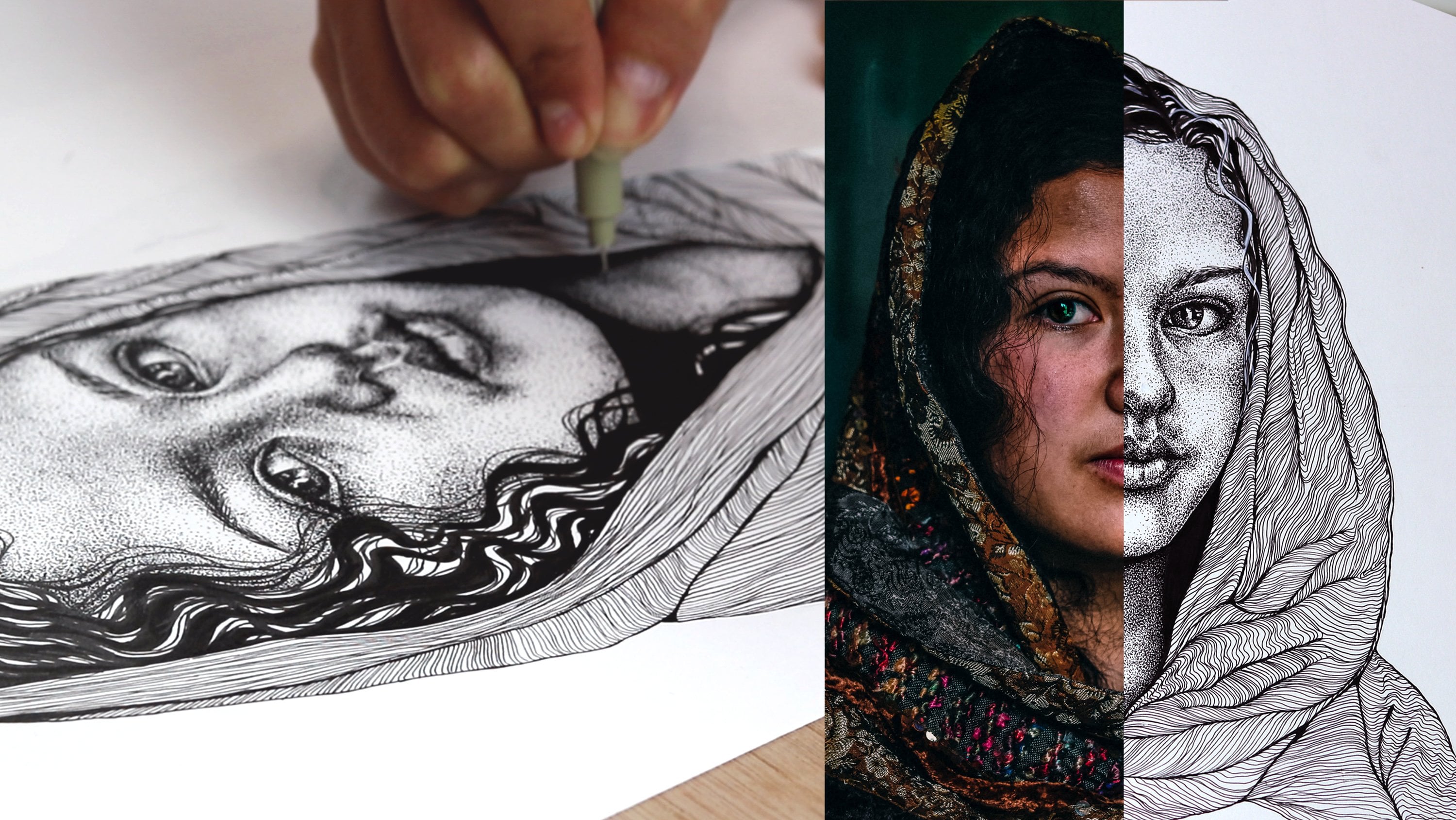
7. Sketching From Imagination: In this lesson, we're going to make some decisions about our final project. I want you to grab your drawing paper and sketch your surreal creature taking your time this time. To start, I always mark some grid lines first and those will depend on your ideas. For example, my drawing is pretty centered on paper. I want to draw a center line and a line that marks where the ground is so I can make sure that my drawing is balanced in the end. You can do this by eye or use a ruler if you want to be more precise. As I said in previous lessons, if you use a hard pencil like this and minus a four edge by the way, you will be able to sketch as much as you want without making your paper too dirty. Start adding the main elements on paper and start by where you're more certain about. If you feel confident about a specific part of your drawing, start drawing that part. I'm still not so sure how to do the head of my creature so I'm going to leave that for lists. Don't forget to use your references as a base if you need and feel free to look for more references as you realize that you need it. I always have my computer or my phone next to me as I draw because whenever I need, I can go back to my references. Once you have a good pencil sketch, you can start outlining your drawing with an ink pen and I will be using a 01 pen for this step because I want a very thin line at this point and then later we will add textures and contrast with the ink before adding color. Just outline your drawing with the confident hand and start by where it's clear to you. Again, start by where you're confident about because the more you draw, your confidence will grow and then you will be able to tackle the little parts that you're not so sure about yet. Also remember to outline without adding any details yet, you just want to have the main shapes down on paper. Once you're done with your outline, you're ready to erase any pencil marks that you still have on paper. Now join me on the next lesson so we can add textures to your drawing with ink.
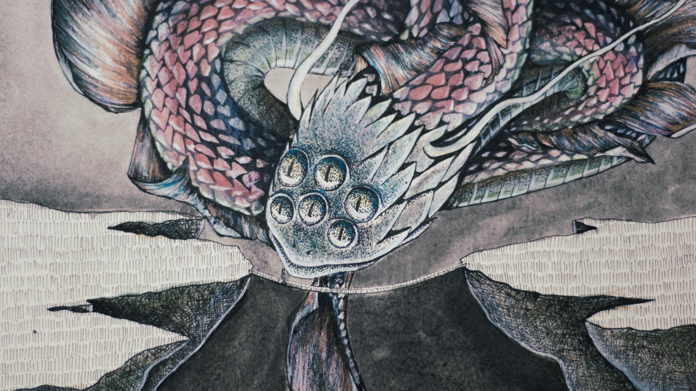
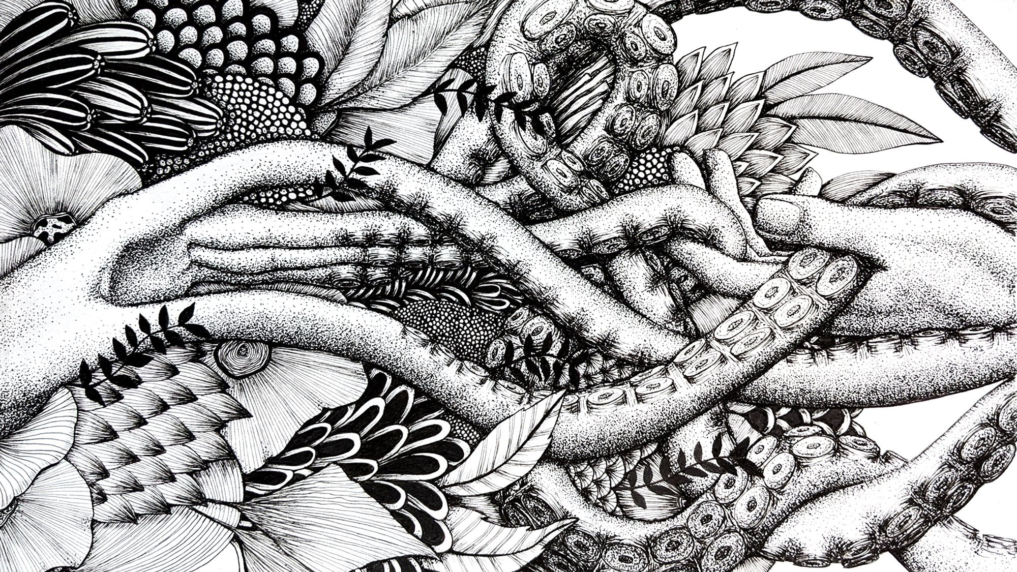
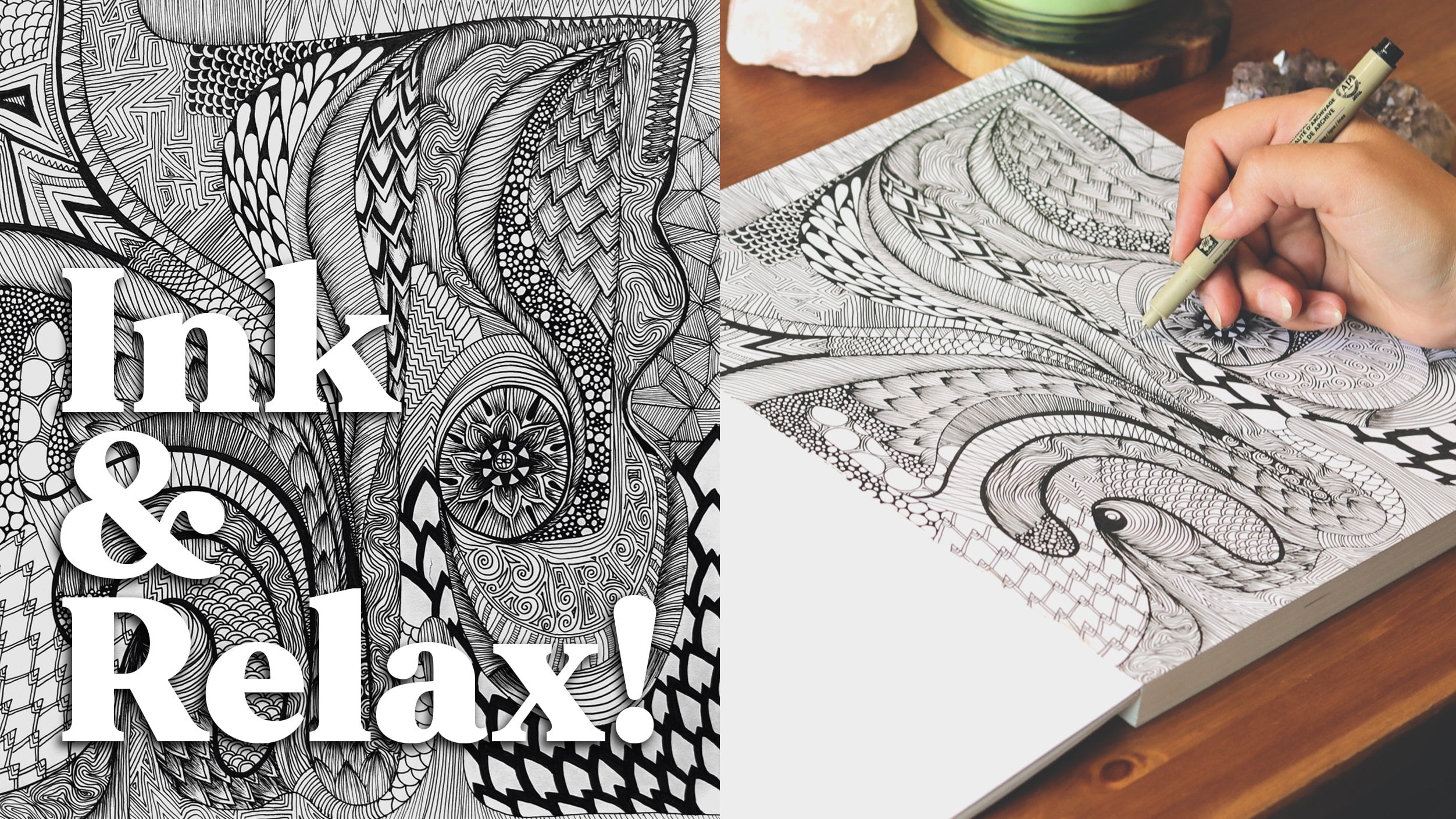
8. Patterns & Textures: This is one of my favorite steps in any illustration, the textures. With lines and dots, we are able to create a certain feel to a drawing. This will totally help you create the mood of your artwork. Now is the time to look at your elements and think, what texture does this have? Is it sticky? Is a shiny? Is it pointy and scratchy? Or maybe it's soft and smooth? Is it wet or dry? Is it hairy? What textures does your creature Have? Again, if you need, go find references for those textures, if you want to represent them in your drawing. Since I want this creature to feel like a reptile of sorts, I want that lizard, snakish texture. With my pencil, I'm going to mark some of the textures I'm picturing for this creature. Remember that the texture is like the fabric that covers an element. With the ink, you're focusing on linework. The direction and the length of your lines will show the movement of your creature and the style of that texture. This is the time to ask you those questions. Why do I want it to look like? What do I want it to feel? If I touch this animal how am I supposed to feel? The textures carry this information. For me, since I don't have much experience on drawing snakes or dragons, or anything like that. I need a reference to guide me on where and what direction those lines should be. You can use your pencil again to mark some of those lines to help you when you start adding the details of the patterns in case you're not too confidential to just start using the ink pens. This is a creative part of the process. There's no manual on how to do each texture. You basically have to discover yourself how a texture can be portrayed with lines and dots and using the materials that we're using today. Sometimes just by looking at a reference photo, it's hard to imagine how that would actually look like in a drawing. Another way you can do this is by looking up other artists' drawings and observing how they do it. With more experience, you will be able to figure out how to draw a certain texture from imagination. But there's really nothing wrong to get inspired and learn from other artists just by observing their art and see how they portrayed some sort of texture that you think it's interesting. If this is not easy for you yet, that's totally fine. It's actually hard for me too, and it takes a lot of practice. Again, when you're ready, you can start using the ink pens to create those patterns in more detail. I'm going to start adding some lines to create this flowy texture on these fins I drew on my creature and I want it to resemble the fins of a betta fish. I looked up betta fishes online to use their fins as a reference and I basically have to draw the lines in the direction I want to show the movement of the fines. It looks flowy and wavy like that. I'm drawing this scales pattern to resemble the snake's skin. I'm doing pointy like this because that reminds me more of a dragon creature and I don't know, pointy things are more scary maybe so I'm trying to make something scary, guys. I have a little insecure to draw this, but I decided to do this anyway to show you that it's okay not to be sure it's okay if we don't know how it's going to look or if it's going to look good at all. This means you're challenging yourself and this is what is like to live a creative adventure. This is good to boost your creativity and to access new layers of your creative potential. The more you get out of the box and draw new things in new ways, the more confident you will become as an artist and more you will be able to create original and authentic illustrations. Once you have your textures outline, join me on the next lesson where we create depth by directing the light to your creature in the right way.
9. Light & Depth: In this lesson, we're going to make our creature totally pop from the paper by adding shadows. To add depth, contrast and shadows, we need to understand where the light is coming from. The light has a super powerful way of sending a message to the viewer. Each illustration has its own story, and even if you don't mean for it to have one, a person who looks at your artwork will feel something or think of something, and this is a story in itself. Even if there is no element creating light on the scene that you are creating, it could be coming from a hidden element. In my case, I want the lights to come from underneath the creature as if it's coming from the moon. It also could have a hidden meaning that the light is coming from the darkness of this hole on the ground, which could mean that the light comes from the unknown. I think I can create a lot of meaning in my illustration by making the light come from underneath my little snake dragon. Maybe in your drawing, you have an element that could be creating light. Since this is a real illustration things don't really have to make any sense. Maybe there's an important element in your illustration that could be the source of light, for example. In this case, then you can pretend that the light is coming from this element, and that could have some meaning, or maybe you want this elements to be bright with lots of lights towards it. Just remember that the light directs the eye of the viewer. Wherever the light is, is where we are basically going to see first. This is a way you can start playing with the storytelling of your illustration. It's really your choice and it doesn't really have to have a meaning. But it can be fun to like start having these reflections. Who knows, maybe this will evolve into an actual series of illustrations or it grows into a bigger project. Whatever you decide, once you pick the direction in which the light will hit your creature, start marking with a pencil some of those shadows just to get the feel of it. You're basically going to ask yourself, so if the light is coming from here and hitting my creature or hitting this element in this angle, where would the shadows be? Then once you're ready, start adding the ink to the shadow parts. This will get better the more you use your observation. If you're insecure to create light and shadow from your imagination, feel free to use your references and copy the direction of the light from a reference photo. I did a lot of that in the beginning of my drawing career. This is super helpful for you to really understand light. In my case, since the light is coming from below and directed upwards, the shadows are going to be on the top part of the body of the creature. Start adding ink where the shadows should be in your illustration and start where you're most confident about. I usually like to start the shadows on the darkest part of my drawing because if I make a mistake, it's okay because it's supposed to be dark anyway, so I can even add more ink to fix it. I usually start adding shadows from the darkest parts of my drawing to the lightest. Now I'm going to show you a few different techniques that are so versatile and so helpful to create different textures in your drawing. Of course, you don't have to use all of them, but I want to show you the different ways you can use your ink pens on an illustration to show the different effects that you can create. The first technique I'm going to use is adding solid black to the scales of the snake as I'm doing right now. Basically in between each scale, I'm adding ink and always coming back to that question, if the light is coming from this angle and hitting this little scale right here, what would the shadows look like? Sometimes you have to lift your head and go back to the question because it's easy to get distracted and start adding shadows where they're not supposed to be. Adding solid black to your illustration will help you create a very dark shadow in your drawing. Choose wisely where you want to add that. One tip I have for you, after looking at your projects and all the amazing artworks you guys are creating with my classes, is to really take your time in this step. I know this type of drawing is really time consuming and I want you to look at it almost like a meditation. Maybe you need to put some music in the background, maybe you need a podcast, maybe you need something to distract you. I personally always have something in the background to distract me while I'm drawing, so you don't get bored or tired because if you rush it or if you're just not feeling the vibe of doing this type of delicate work that takes so much and it's so repetitive, it's really easy for it to look maybe a little messy or not as precise as it could be. Honestly, anyone can do this work. It really comes down to patience and the attention to detail. The second technique I'm going to use is hatching. There are several ways of using this technique, and I'm going to show you a few of them. These are little details on the back of my snake that I wanted to create a texture almost like the fins on a fish. Very flowy and wavy. To do that, I'm going to hatch in wavy forms following the movement of each fin. If you use this technique, you'll be able to create beautiful shadows like this by always moving from shadow to light. You start with your pen on the shadow part and with a fast movement like this in the shape that you want, you move in the direction of the light. The more comfortable you are with this technique, the more you can play with it. If you want to add even more darkness, add another layer of lines where you want the shadows to be. You can also use old pens if you want to create a more smooth and delicate results or new pens if you want lines to be more clear and visible. The more you practice, the more you will discover your own preference on how to use this technique and what styles you actually like to create in line art. Honestly, talking from my experience, once you start really putting a lot of time and energy in these drawings, you will see such a difference in the results, like you're going to be so motivated when you see what you are capable of creating by just allowing yourself to relax and take your time. Even though, I know that we're living in this time where our attention spans are really almost nonexistent. This is a very manual type of work, and it's beautiful that you're here watching this class and allowing yourself to connect with that part of you that is not in a rush. That part of you that really wants to do a job well done manually, old school way of doing things. This is really, really beautiful and admirable. I'm really happy you're here and I really want you to be impressed with yourself, impressed with what you're capable of creating. This is my tip for you. Relax, take a deep breath. If you start getting annoyed, tired, bored, just close your sketchbook for today, maybe it's time to go for a walk. Maybe it's time to get a snack, drink some water, come back to it later when you feel ready. Dot work is also a great way to add shadows. I use this technique a lot. If you want to create a kind of like a crispy or rougher texture, you can use a thicker tip like a 03. If you want a smoother result, you can use a very thin line, like a 005. I'm going to use this to the bottom side of my snake and I want it somewhere in the middle. In terms of smoothness, I'm going to use the 01 pen. This is quite time-consuming compared to the other textures I'm going to show you. Choose which parts of your drawing you actually want to spend most time in. What you're basically going to do is place a bunch of dots moving from shadow to light. Where you want the shadows to be, you're going to put a lot more dots and fade away with less and less dots towards the light. Again, this takes a while but it creates this really smooth, delicate shadow that I personally really love. With this technique, I'm going to give you this same suggestion I gave before. If you do it too fast, your dots are going to start looking like strokes. They're going to start looking like a little tiny line. Take your time, take a deep breath and do it slow, if you have to do it slow. With practice, you're going to be able to get faster and faster with very precise ink work. You're going to get beautiful shadows from the dot work. This is another form of hatching called crosshatching. In this case, you want to create several short lines in several directions to create this rough texture that I think it's perfect to represent the soil or rock that is forming in this part of my drawing. It's totally different from the other hatching where you're hatching on only one angle. You're following like a curve, you're following the light. In this case, you basically going on top of each line. Turn your paper around to get the best angles for your hand to create the lines. After some time you will get a result like this. You can also play with the shadows by adding more lines where it's darker and less lines where it's lighter. As usual, old pens will have a smoother and lighter results and new pens will drop a lot of ink, making everything a little dark. Also, thin lines will, of course, make your texture lighter than thicker lines. Depending on how dark you want your drawing to be, you can choose which pens you're going to use. I totally suggest you practice on a little side paper if you're not so confident yet. This is unacceptable. It's officially a hostile work environment. Another technique you can use is hatching in angled lines. This is a little more abstract, but still really interesting to me. You're basically going to draw short parallel lines in rows [inaudible] It's delicate and create some texture and add some contrast in relation to the background, and I just love it. It's a good pattern to add to places where you're not so sure how to fill in your drawing or what textures do they have, this one is a great choice. It's easy, it's quick, and it looks really good. This is my illustration with textures and shadows. I hope you like it. Now, join me on the next lesson so we can explore colors and ways to make your creature look even more interesting. See you there.
10. Exploring Colors & Your Materials: Now let's bring our illustration to the next level by adding colors to it. We're going to use mixed media in order to create a very unique and beautiful result. Whatever materials you have at home are welcome. Markers, colored pencils, crayons, pastels, watercolors, anything is welcome. Feel free to use whatever you feel like could be a creative exploration for you in terms of colors. To warm up our creative juices, grab a piece of paper to just test out some of your materials. I want to create a small sample of each color that you might want to use just to see how they feel when you put them down on paper. You'll notice that you will feel more drawn to some colors more than others, some textures more than others. Maybe you have blue and two different materials for example, but one of them is more fun to use than the other. Like for example, I have this shade of blue that it's almost the same shade of blue in colored pencil and markers, but it's so much more fun to use the markers. So I'll probably be using that instead of the colored pencils and maybe they actually complement each other. By doing this experiment, you will start understanding your materials better and getting more familiar with them. You can also try adding one color on top of the other, just see how they transform and mingle together. So for example, I'm using a wax-based colored pencils, and watercolors. Those two materials usually don't go together too well because the wax will create a layer on the paper that prevents the paper from absorbing the water from the water colors properly. So I already know to avoid painting with colored pencils before using the watercolors because then I will cancel out the connection between the watercolors and my watercolor paper, which is very important. But the opposite way works amazing. If I paint it with watercolors and then when it's dry, I use the colored pencils on top of it to add some shade or to add some details. It works perfectly, and there's only one way to find these things out. It's by trying. So that's why I'm giving you this opportunity right now to just really experiment with what you have, put them on top of each other, mix them together just to see how they will combine. Keep experimenting with your colors until you feel ready to choose a few of them to work with. Once you have a few favorites, try to picture how they would look good together to create a color scheme for your illustration. I personally really like the pinks and I like the blue and the gold color with it. I'm just making out a small sample here in the bottom to see how they would look together and you don't have to feel limited by it. This is more of a starting point for coloring your artwork and we're not going deep into color theory or anything like that. I'm really just going with our intuition here and what feels good to you. Once you decide some of your favorite colors for today's project, join me on the next lesson where I'm going to teach you how to layer the colors to reach the effect you want in your illustration. See you there.
11. Color Layering: Are you ready to add some color to your artwork? Well, I know this stuff can be a little overwhelming, but we can do it. The first thing for you to think about is that some materials cover the black ink and some don't. Colored pencils, for example, and markers, they will leave the black from your ink pens, super black. But watercolors can cover up your ink a little bit, the more water you add, the less it will cover the ink, and the more pigment you have from your watercolors, the more it will cover your black ink. Since we don't want to cover the ink and just want to add some color, we have to be mindful about the materials we use and how we use them. The second thing to have in mind is that we are going to create complex colors by layering them. This means that you can use a lot of different colors and a lot of different materials to create new shades for your creature. To start, let's pick one element of your drawing and add color to the shadow part of it. I'm going to use the back of the snake and add some blue to the dark side of it. I'm adding some water to it first so the blue is less saturated and just to add a little shade of blue. Now when you're done adding your first color, choose another element and pick either the dark or the light side to add another color. I'm adding a light pink to the fins of the snake. Now to add a new layer, this golden-orange to the light parts of the fins. Notice I'm following the movement of the lines we did with our ink pens. In the color layering process, I'm not adding one color on top of the other. I'm choosing parts of my drawing based on the shadows that I did before to add the colors on top of each tonal plane. There's going to be one color for the shadow, one color for the light, for each element, and maybe one color for a mid-tone, and when you see in nature, when you observe life and the light around you, things change colors. You can have a white object under the sun and maybe there's going to be a tint of pink and maybe a tint of green, and this is going to be based on the shadows and how the light is hitting each object. This is kind of what we're trying to create with the color layering process. Now I'm going to add another layer and I'm going to add some light blue to the fins and body of the snake. As you can see, the more layers we create, the more three-dimensional our creature becomes. Now, I tried to add some green, which was a total mistake. I knew from the beginning I didn't want to add green and I have no idea why I did it, but sometimes you do this stuff, and I really hate how it looks. This is an important part of creating an illustration by hand guys. There will be little mistakes here and there and there's going to be times where you just wish you did different, but it's part of the process. Let's try to fix this. With color, you usually are able to fix or at least improve a lot a color mistake by using the opposite color in the color wheel or a color that's right next to it. If you go to the Resources, I attached a color wheel for you guys that you can use as a reference and you'll be able to cancel or at least hide a little a color that you don't like by using the opposite color. In my case, since I went to high degree, I chose to add more pinks and reds right next to it and on top of the green, I added a little more blue. That's right next to the green in the color wheel and now you can barely see it. Now as you can see, I'm still a little bit attached to do this idea of green. Oh my God, I'm being so brave right now and yeah, I just added more green, but a different tone of green that I actually think contrasts nicely with the red. I don't hate this one so much and I'm just going to leave it. I regret nothing. The end. Let me give you another great tip for you. Let's say you need to add some white to your drawing. Maybe you need to fix something, or maybe you need to add some lights or add a little white detail on top of dark colors and of course, if you use a white watercolor or a white marker, you're not going to be able to have that results and a white colored pencil might work, but it might be a little smudged. If you want a very precise and tiny detail in white, you might want to use either a white gel pen or a small round brush with acrylic paint or gouache or the calligraphy ink, which is what I'm going to use. Those materials can cover your ink and color as well. If you need to add some white to maybe make something pop from the dark background, you can do that by using those materials. With the calligraphy ink or with the white gel pen, whatever you choose, you can add some light touches that are going to help your creature pop from the paper. This will make it a lot more 3D and will create another layer of depth that's super interesting to me. In my case, for example, I'm adding light underneath each scale. Since my light source is the moon and it's coming from the bottom, I'm adding lights to every little scale and the bottom side of it and as you can see, the scales are kind of starting to pop from the background. Then later with the ink pen, I can even add the dark side of each scale to make it pop even more, to add that contrast and that darkness on the other side of each scale. Now for the background, I want to create a nighttime feel and I want to make the dark side on the bottom contrasting with the moon and fading away to the top. I think this will create a good contrast with the whole piece. Notice that while it's wet, you can still play with where the color will rest on paper, and to make this the fade away effect, I'm going to add a lot more black to the bottom and then water it down towards the top part of my paper. This is how you create a fade-away effect. Now, this is my final art for you guys. I hope you liked it and I hope this class challenged you as it did for me and that you're able to create some beautiful and unique fantastic creatures inspired by surrealism. Now join me on the next lesson so I can show you my final thoughts and thank you guys for being here.
12. Final Thoughts: Hey everyone. Thank you so much for taking part in this class. I hope you had fun and that you've relaxed and that you discovered new things about your imaginary worlds. We should just take a moment and appreciate how lucky we are. I feel like the more we practice these kinds of exercises that touch on that subconscious or dream level, we really get to know a little more about ourselves. I really believe that the more we know ourselves, the more we can create original art. I hope this was a great step on your artistic journey. If you feel like it, leave me a review down there so I can know what you thought about this class. If you have any ideas for future classes that you would like for me to cover, I would love to hear your ideas. Also, if you want to post your project on social media, you can tag me and I will make sure to share your artwork in my platform as well. Of course, if you want to, you don't have to, but you can follow me here on Skillshare. You can hear about my new classes whenever they come up and you can hear about giveaways and I'd rather be sending you emails and stuff. But sometimes, I will send you an email here and there so you can know about the new cool stuff that is going on. Okay. But only because you begged. Things that I think you would be interested of. I'm not going to be throwing stuff in your face. Yeah, I think that's it, guys. We're done for today. As procrastinating, so I urge you from this class. I don't know why. I think it's because of fears. So funny. Oh, the most important thing, post your project If you want. Again, you don't have to, but I love to see the projects. People love to see the projects. You will connect with people and create a community. Did we just become best friends? Yeah. It's really awesome. I comment on all the projects, I am super. As soon as someone posts a project, I'm so excited. Should I not show my boyfriend? I don't think there's a problem. I show my boyfriend because I'm so excited to show him. Oh, my God. Look at this amazing artwork that someone created with my class. Every project makes my day. Post your project, make my day. I may stop talking now. Bye. I hate the most awkward smiles in the end. Oh, well.
 Gio Vescovi, Visual Artist