Transcripts
1. Intro: Hello, my name is Jesse and I am an artist and art educator. I am so excited to share with you my first Skillshare class. So a little bit about me. I am an article graduate. I have a bachelor's in fine arts, but I also have my master's in education. So I have been working as a high school art teacher for the last 23 years. I think that makes me uniquely qualified to give you some really tried and true strategies. I have worked with hundreds of students. Help them to understand whether they were complete beginners or more advanced students who were going for scholarships to really help them to understand our InDesign in memorable ways that are accessible and are really fun. So today's course is all about color and composition. These are some of the building blocks of making good art. I will review color theory and perhaps it could be kinda beginner for some people, but I'd like to think that I can offer you some fresh ways to think about it. Or at the very least, a really good review will then be talking about composition, which is so important, how we lay things out on the page. And that helps us to communicate feelings, but it also helps us to make just a well-designed image. And so I have plenty of strategies for that. By the end of the course, you will have made multiple examples that you'll be ready to frame and hang on your wall. And we'll end with a final illustration where you're going to combine everything you've learned about color, composition and how to put an interesting piece together. So please join me. I can't wait to get started. Let's do it.
2. Supplies: All right, Let's start off by talking about the supplies that are really kinda required for this course. You're going to want some paint brushes. Now, it's a 100 percent up to you what you like. I've just got an assortment of sizes. I've got an assortment of bristle types. I've got some that are very soft and have very little snap. I've got others that are a little stiffer and have a quick snap back. And so totally up to you what you like. You're going to want some watercolor paints. I like the Winsor and Newton Cotman set. However, you can use any watercolors. They don't have to be anything fancy. You don't need this many colors whenever you've got on hand is going to work just fine. You're going to need some kind of watercolor paper or mixed media paper. So I'm just going to use a sketchbook that has mixed media paper in it. And then you'll want a glue stick and scissors for later on in the course. Now those are the things you really need to have. Other than that, Here's some fun stuff with just a few little extras. Some fun things to have in addition, are a pocket color wheel. So we'll be talking about this. A random assortment of dry supplies. So things like colored pencils, maybe oil pastels, Sharpies, and that could be Sharpies in various colors. Maybe I'm a pencil. And then a few other really fun things for using your watercolor. If you have never used salt in your watercolor, a very coarse salt is going to do some really cool effects. So we'll talk about that. If you don't have this little table salt would actually work and would be just fine. Also a spray bottle. I just have plain water in this bottle and that's going to give us some fun effects as well. Finally, another optional thing is rubbing alcohol. This is also another technique that we can use in watercolor. That's just a whole lot of fun. So get yourself a nice workspace. Oh, I should mention too. Cup of water for cleaning your brushes. That's a paper towel. Alright, once you've got all that stuff gathered together, you're going to be ready to start. Let's get going.
3. Color Theory: Value Scales and Neutral Charts: So let's start off with an introduction to some basic concepts about color. So color has three properties. They are hue, value and saturation. And one of the ways that I like to teach this is through a pocket color wheel. So if you don't have one of these, they're really handy, especially when you're just learning and you don't, it's not necessary. You can certainly use just a regular old color wheel that you find online. But here's why these are nice. So first of all, let's just talk about that first property, hue, the hue or the proper names on the color wheel. So red, orange is a hue, so is yellow orange, so is yellow. This is not to be confused with sort of like designer names. Like let's just say the color coral. We all kinda know that's like a red orange maybe mixed with a little white. We recognize the name of that color, but technically the hue would be red, orange. This is helpful because when you're learning to mix color, you want to know the base hues that would be needed to make that color. So this pocket color wheel shows you the hues on the color wheel. A very helpful thing to know is color opposites. So these are known as complements. So yellow, for example, is opposite of violet, red is opposite of green, et cetera. We've got our three primary colors. So those are hues that would be red, yellow, and blue. But of course there are other hues. From these three. We can make all of the other colors that are on the color wheel or the hues are no value. This relates to a colours, lightness or darkness. And one of the things I love on the pocket color wheel is this little value scale. So if you can see values are shades of gray that go from 10, which is white, all the way to one which is black. Now, why this is helpful to know when you're learning color. Let's take yellow for an example. I'm going to spin this until I find the shade of gray that I think is closest in value to yellow. Now, I'm kinda thinking that's maybe around a nine. So yellow just naturally is a very light value. Let's compare that to its compliment, which is violet. You're going to see that that's much closer to maybe like a two. And so what I learned from this, yellow is naturally a lighter value than violet. And how that's helpful if I'm going to mix these two together. I always put yellow down first and then I'd add a small bit of violet at a time. This I just know is going to dominate that lighter valued color. So that's one way to think about how color and value work together. Now if you want to practice value with your watercolor set, it's really all about the amount of pigment you've got to water ratio. So if I just want to make a little value scale, I'm going to put a lot of pigment. And then I'm going to add some water to that to make my next value. I might even be a little light, and there we go. So my goal here is to have this. I'm just going to keep adding water. And that as I go down, you can see those values changing. So it goes from dark to medium to light. And in watercolor, that's really easy if I just adding different proportions of water to my pigment. Alright, now the last property of color is saturation, and that's a really important concept to note. So saturation is something on the color wheel that's going to be handy. We can get more advanced at some point, but shades, tones, and tints are ways to change the saturation. This is intensive intensity of color. And what we're ultimately looking for here is how exciting is this color or how natural. So this leads me to our next term which is neutral or neutralizing. When you neutralize a color, you make it more natural. You also bring its saturation level down or that excitement level down. So what I'd like you to do next is to make yourself a little neutralization chart. You're going to start by taking the primary colors. So I'm gonna do a little swatch, a red, little swatch, a yellow, and a little swatch of blue. Now your pigments, depending on your watercolor set, might look a little bit different than mine, which is totally fine. You're then going to take your secondary colors and I want you to go straight across from the color opposites. So orange is going to go straight across from blue. Violet is going to go straight across from yellow. And green is going to go straight across from red. Now, these are colors we've kinda call this like straight out of the tube or straight out of the cake, I guess in this case, we want to make a scale where the slowly fade, say from red to green. So what I'm going to start with is some red on my palette, and I'm going to add just a dash agreeing to that. So it's still primarily red, let's say it's about 80 percent red. I'm going to paint that down. You can see what's just been created as a red that is not quite as exciting and intense. All right, Now I'm going to add a little more green with these particular pigments. What I'm getting when it's 5050 is a gray, which is a really beautiful Greg. All right. I'm going to add a little more green. And then on the last step I'll add even more. And then this is going to be very close to my true green. So you can see in that little value scale, I've just created this beautiful little set of neutrals. Now what I always tell my students is that if they want to take their work to the next level, they want to really go beyond being a beginner. What's helpful is to learn your neutrals. I definitely think there's something to be said for, you know, someone who's got more experience there is maybe a little more advanced, recognizes that in you, that you are also more trained, are more advanced when you learn how to neutralize your color. Having that skill, It's not that we can never use colors like straight out of the tube. It's just that having that skill gives you more opportunity. You can make more decisions intentionally about what you're trying to accomplish with your color work. And that's really what the goal is. We just want you to be able to do vision that's in your mind and actually pull that off when it gets to the page. Okay, so as I go over then, okay, so what you can see in this little neutral chart now is I have made a whole selection of some really beautiful natural colors that I can certainly use in combination with these intense colors, are these straight out of the tube colors or not? And again, the whole point of this is that you can make the choice. So go ahead and make yourself practice maybe a little bit of the value scales. Practice this little neutral chart. And then let's come back and move on to the next lesson.
4. Color Theory: Color Harmonies : This lesson is all about color schemes or color harmonies. So I'm going to pose a question to you. In this collage. Do you know what the color scheme is? Well, I'm hoping that after a short little lesson, you're going to know right away color harmonies or color schemes. There are really an interchangeable concept, harmony. Think of it in music. When you've got all the musicians of different instruments playing together, it creates a harmonious sound. Color should act the same way. Scheme is a plan. We want to have a plan for our color. And so unless you're going to intuitively choose a color palette, which you certainly can do. This is so helpful to know tried and true color harmonies that are going to work. So the first couple of really simple primary we were to talk to about this are red, yellow, and blue. Secondary. You mix two primaries together and you get orange, green, and violet. Tertiaries. Those are those hues that are a mix of a secondary and a primary. Whoops, like yellow, green. So they will look good together. Now monochromatic mono means one chroma is color. You see here all different types of reds, different values, different intensities. Red looks good with itself, right? Analogous. One of the things I love on this pocket color wheel is look at, teaches you color schemes, and it'll explain these to you. And then in a moment I'm going to show you how this little spinner actually teaches them to you. So analogous it tells us right here they are adjacent to each other. Think of an analogy there like or as each other. Red, orange, red and red violet there right next to each other, their family, they're going to look good together. So any three colors next to each other, like blue, blue, violet and violet, look great. Okay, complimentary. You already know this. But again, our pocket color wheel teaches it to us. So it shows us red-violet. Straight across is yellow, green. If I spin that to read, straight across is green. So compliments or groups of compliments can look great together. Now a split complement is a lot of fun and the color wheel shows it to you. Alright, start with any color of your choice. So I'm going to start with green. Now normally it's compliments going to be read, but I'm splitting. So I'm going to use red orange and red violet, their family to read, so they're going to look good with green. That's a split complement. Then you've got triads and tetrads. These are forming like a geometric pattern on the color wheel. So triads form even triangles. Green, orange, violet for my triad. And if I spin it, yellow, blue, and red do the same thing. Tetrads form a square or rectangle. And so there's going to be four colors in a color scheme there. Now, let's go back to my initial question to you. What is the color scheme? All right, well, let's break it apart. I see some reds, I see some greens. I see some yellows, and I see some violence. So red and green are opposites, right? Those are compliments. Well, so our yellow and violet, this looks to me like a complimentary color scheme. It's using two sets of complimentary colors. And it's still really harmonious. And I want to point out all the variety in here. Do you see how there's like neutralized greens and saturated greens? There's some that are a little yellow, there's some that are a little bit blue. There's some violet that leans towards red violet and some that leans towards blue violet. So you can have a lot of variety within your basic color scheme, and it looks great. The last thing I want to show you, I mentioned early on, on the color wheel, this thing that says tints, tones and shades. So when I'm talking about variety here, tints are when we add white to any color. Tones are when we add gray and shade is when we add black. Now, I prefer not to use black very much. I like having a very colorful palette, so I would prefer to just mix compliments or to find a way to make black with colors. But you can certainly do it. And just to show you again that there's a lot of ways to make variety in your color. All right, so hopefully that helps you just kinda set up in your mind what a color harmony is. Your assignment for the end of this lesson is I want you to choose one big decision, pick one color scheme, and then come back for the next video.
5. Watercolor Fun: Use Color Theory to Create Collage Papers: All right, have you chosen your color scheme or about to do next is so much fun. I love doing this. We are going to be making some collage papers. And you're going to do this in the color scheme you just chose. We're just going to be scribbling and having fun and experimenting with all that stuff. I showed you at the beginning of the class, the salt and alcohol and all that stuff. Got these beautiful patterns. So you get that with all of these different effects that I'm about to show you. So we're going to make papers and we're just going to scribble, we're just going to enjoy color. We're going to just play. And then we're going to let these dry and you're going to get results like this where I love watercolor because it is so unexpected and unpredictable and just absolutely beautiful and the results you get. So what I like to do then with these papers is a cut them up and that becomes the basis for my collage. So you saw this in the last video. But just to show you like another example, a few other images that I make with that same process. So you can kinda see just taking those papers that are already randomly colorful. And by cutting them up into different simplified motifs, I get these really, I think, beautiful collage designs. So here's how we would get started with that. I want you to think about that color scheme that you just designed, that you just sort of settled on. And go ahead and prepare your paper first. I want you to use any dry media that you have first. I don't want you to think too hard about this. All right. So I am just letting it flow whatever kind of pops in my head. I'm scribbling down with a Sharpie. I think I'm going to grab a colored Sharpie. So I decided I'm going to do a primary color scheme. And so when I scribble, I might kinda loosely stay within that. But you know what, you're not a 1000 percent married to any of these colors. So for example, my color scheme is going to be primary, but who says I can't throw some hot pink in there? It's similar to red. Okay, so just have a little bit of fun with that. Now if you've got any other stuff, this is when like the other dry things should come out. So like oil pastels, what's great about oil and water, they don't mix. And that's actually going to be of benefit to us here. So I'm just scribble a little bit of that down. A white oil pastel is so handy because it's not going to be adding color, but it is going to be resisting the paint that we put down. So you'll see what that looks like in a moment. And then if you have any colored pencils, like I said, do all your dry stuff first. And you can just play with this. But it does not have to really be much rhyme or reason. Just sort of enjoy the process. I, that's why I think this is so fun. Such a stress reliever. Okay. I'm going to say that's good for my dry stuff. So you see, I did that really quick. Now you might be thinking, okay, that's a big old mess. Yeah, it is. That's why I love it. Okay, I want you to think about the first color in your palette. This one's going to be my blue page, so this is all about blue. And see that nice wax resist going on there. Now I want variety, so I'm going to try different blues in my palette. I want to think about value. So see how I'm mixing up some areas where I've got like heavier saturation of color or it might even be like darker values. I should mix a little bit too light. I really just don't want to use everything straight out of the cakes. This is a Payne's gray. I'm going to mix that in. That's very pretty. I want to have some areas that are light values, so I'm just going to use plain water and just drag some of that around because you want to have a lot of variety on this page. That's what's going to produce a really nice result for you. Even though this is a blue page, like I'm going to grab some of my old paint here. Again, I want variety, so I want maybe a little bit of purpley stuff kinda come in in some neutralized, speaking a neutral, Let's get some orange in there that is the opposite of blue, right? And so then I'll just kinda layer that. So I've got that nice kinda olivine thing going on. A couple of bonus color. Let me grab a little more blue. I like that. I really nice intense stuff going on. I paint all the way to the edges of the paper. That's why I keep this kind of brown. I don't know, sort of like a water resistant little tablecloth down. So I can just be messy and I don't care if it gets on my table. Let's see, I haven't used much of this Boolean. So the Walton, I'm painting, I'm thinking blue, blue, blue. That's like the main color for this page. But I'm also constantly thinking a variety. I just don't want to slap one type of blue on here. So I'm thinking value, I'm thinking saturation. Okay, Now we can do some other fun stuff. If you have a spray bottle with just plain old water, give it a spritz here in there. What you'll see is that the paint you will get like little marks that appear in it. But it's really more when this dries that you're going to see very beautiful, what we call blooms. So blooms are this kind of thing where the pigment just kinda gets dragged along with the water as it dries. And some other ways to get some beautiful effects are with that alcohol and salt. So both of these are going to dry up the water that's already on the page. I don't have a real fancy way of applying the alcohol, to be honest, I just drop it, so give it a drop and you're going to see that alcohol just start to soak up the water that's there. And things just start moving around. And it's just kinda fascinating. And again, unpredictable and not a 100 percent sure how that's going to dry. I can spritz a little water in there and again, we'll see what happens. It's going to make that alcohol move around. Now let's try some of the salt. So I'm just going to pour a bunch of greens of that real coarse salt into my hand. If all you have is table salt, totally fine. And I'm going to drop that on here. Just again, very randomly. I'll leave something piles of salt. Okay. What does the salt look like when it dries? It's this. So the salt crystals will almost look like sparkly in a strange way like the literary. When it's totally dry, you're just going to wipe them right off. And they will also, because the salt is like absorbing that water. Again, it's like pulling pigment around and kept pushing it in strange patterns. And so it dries with these beautiful little sunburst glittery type of shapes. And if you kinda look at my design here, you can see I really intentionally chose some of those beautiful sunburst and little salt patterns when I cut those papers for this design. So I want you to make one page for each of the colors in your color scheme. So I'm going to make a blue page, I'm going to make a yellow page, and I'm going to make a read page because I chose primary. Alright, so go ahead and do that, make your three pages, and then here I'll put them aside to dry. Have fun with this. It is so much fun. Okay, Enjoy.
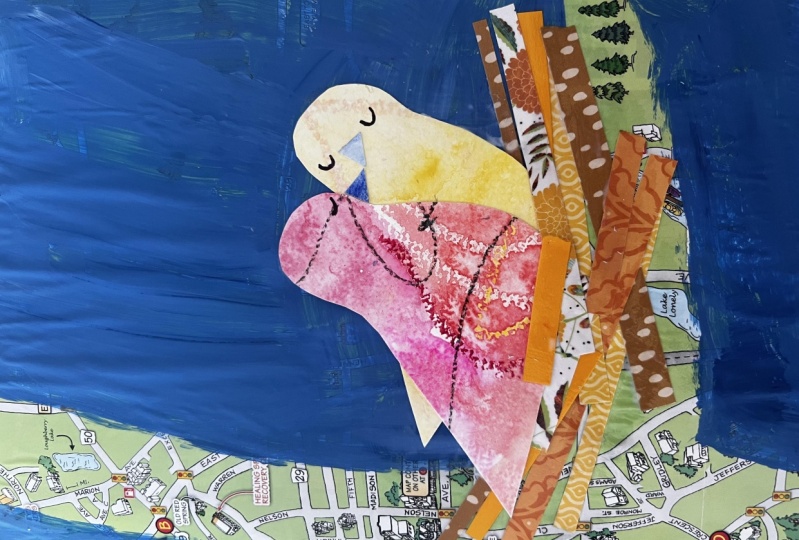
6. Paper Cuts: Make a Paper Illustration : All right, It is time for your first project. Now to show me that you understand how to use color in some of the ways that I've just taught you. I would like you to complete this project. You have just made your papers. So at this point you've chosen a color scheme. You have made one sheet of paper for each color in your color scheme. So these are my three for my primary colors. If you did the salt, by the way, all you have to do is just kind of rub that off and then the salts will just flake off and you can just dispose of that. So you've got your three papers, they should be a 100 percent dry by the way, so you don't want those papers wet at all. If they are, you may want to just take a hairdryer and dry them up real quickly. Your assignment is to choose a motif. Know motif is a very simple image that you're going to be able to cut with basic scissors. So like my succulents here, or these little birds that I just did as an illustration. I want you to choose a simple motif. And you're going to, we're not worrying about composition yet, we're just worrying about using color and making it unified. And so I want you to make three versions of your motif. And to the composition is going to be incredibly simple. It's just lining them up, so very orderly as you see here. Now what's a motif? Okay, So these, let me give you some other examples. Coffee cups that could be really cute. Dogs or cats. You could do something like stars and moons. Other very simple things to cut out. You could do little faces. So you get the idea, I'm flowers would be a really easy one. You don't have to be really solid drawing in order to do this because the idea is, it's so simplified that you can just cut it out with a pair of scissors. So you can choose any motif you want. If you don't know what else to do, I will say these little succulents, we're really fun to make and we're not too hard. If you look at it, It's really just three different shaped flowerpot. So I'm sure you can imagine just cutting those out of your paper. And then for the actual plans, I just looked online to get ideas for the shapes of different succulent plants. And then as you can see, I've just cut out leaves in different sections of my paper to assemble. But you can pick any motif you want. I would suggest when you start researching motifs that you use Unsplash.com. So why Unsplash is so grade is these are photographs that are freely usable images, which means that the people putting them up here are willing to share, then we really don't have to worry about any kind of copyright issue or anything like that. All right, for my motif, for my next design, I'm going to do cupcakes. I think that would be really cute. And so I just typed that into Unsplash. And, you know, it's not a copyright issue in the sense of I'm not taking this photo. I mean, the thing I make is not going to be photographic by any stretch. But we just always want to think about borrowing ideas as opposed to stealing ideas and giving credit where credit's due. So this is what I'm looking for. I love this photograph right here because if you really just think about how simple that is, I could easily cut out the little cupcake wrapper, a little sort of shape for the cake and the frosting shapes. So I could make that in about three pieces of paper. So I really like that as a nice photo reference, but it's worth just looking because I always want variety, right? I kinda like this one. How like there's swirls on the top and maybe a little nuts and texture. And I keep that in the back of my mind. Of course, the cherry on top is really classic and really cute. So I'm just looking for inspiration and ideas. And again, I'm going for variety. I don't want three cupcakes that look exactly the same when I'm done. So I think I've got a few ideas to go on here. Now, as I said, if drawing is maybe not your strong suit, I just want you to think about how you can simplify the shapes that you see. All right? So think of simple, all right, that little cupcake shape basically goes like this. And again, we are not worried about photographic realism here. Okay, so that's essentially all I'm worried about. Then I've got the actual little cake piece for that. I think I would cut a piece of paper that was just sort of like a little, little mound. So if you want to practice this on a scrap page like I'm doing, there is no shame in that. And the little frosting lump, which is so darn cute. I can picture. Again, keeping it simple. Here's a good thing, guys. If you're not so confident drawing, who's going to know if you drew a frosting lump incorrectly, right? We just need the shape of it. I don't care about any details. I don't care about shading. I don't care about any of that. I'm just trying to think. What shape do I need to cut out so that it looks like a little lump of frosting. All right, so that's my basic plan. So I can put the iPad away. My next step would be thinking about, okay, here's my three main colors I want to work with. So. Whereas each piece going to go, I think I'm going to start with my blue and I'm going to cut a cupcake liner out of the blue. So what I like to do if I feel, if I want to draw this first and sometimes they don't, sometimes I just the shape is easy enough where I can just wing it. But if you'd like to draw it first, what I love to do is to flip my paper over. I kinda look for an area that I want roughly to be on my cupcake liner. But I'm not going to be too fussy. I sort of liked how this corner was, so I'll sort of follow what I have drawn out and keep the relative size of it. And it's on the back. So who cares if it's sketchy? Now, just remember because it is on the back, anything you draw that has a direction would get reversed. So when I did my little birdies, if I drew the birdies body on the back of the paper like this, then when I cut it out, it was going to be facing the other way. But in a cupcake liner doesn't really matter. So I'm going to then cut this out and what's really fun? It's a little bit of a surprise element here because I don't know a 100 percent know what pattern is going to end up on the other side. I'll just cut that link. And then the big reveal after I've cut it out, Let's see what I got. Okay, I think that's adorable. I love the little tiny bits of yellow that ended up in there. So that's going to be my first cupcake liner. Now, if I wanted to add some details, I certainly could do that. Like in fact, I think a little edge right here could be really cute if I just give it that little bit of shape. And again, I don't have to be worrying about drawing. So if drawing is holding you back from making illustrations, don't let it. This is an easy, easy way that you can still make a super cute illustration and your learning of a color while you do it. So it's the best of both worlds. Okay, so there's my little cupcake liner. I think that's adorable. Now I have a decision to make. Do I want the cake and the frosting to be red and yellow? I actually don't think so. I I'm a little afraid that that's going to get chaotic if I have three cupcakes and they're all three colors, I think it's going to get a little wild. So I'm actually going to look at my paper or my blue paper for an area that might just kinda still be blue, but it's something different than this. So it could be a lighter value area like here. It could be where I've got the pink scribbles. So that would be something quite different. I'm going to try that right here. I think that might be kind of fun and I'm just cutting out that little oval shape. Now you can draw on the back first or I'm just going to wing it and I'm going to cut more than I need because it's certainly too big, but I just want to see if I like it. I actually do. I think that could be a really cool. So now I'm going to just have it a little more intentional. So I'm holding up the little liner piece. Flips it cut a little funny lump there. Okay, so I think I've got my liner and my cake, and now I need frosting for this one. Now, I think I am going to switch colors. I think I'm going to do some yellow frosting for this guy. So I'll kinda think of an area that I like for the frosting colors. Like this area here. So I'll flip my paper over. And this is the shape of the frosting that I wanted to get. So I'm going to just wing that. Right because again, nobody's going to know if that frosting is not exactly the way it wasn't a photo because that's not the point anyway. I want to just cut a hunk of paper out, right? And then I can cut this shape more specifically. Now, if you are kind of precise, you certainly could use an exacto knife. Although I like to work quick. I just find it more fun if it's very spontaneous. So I like the scissors because it doesn't slow me down, but you do what works for you. All right. This is what I got now for my little frosting blob. So let's see that. Okay, now I don't like how it's kinda covering up my little cake. So I think what I'm actually going to do is just take some off the bottom here a little bit. I think I'll just kind of shape it like so. And I can kind of imagine these pieces being together. Okay, not too bad. However, what I don't like is how the little cake is kind of disappearing in there. It's just like you can't really even see it too much. So here's where we can do a little trick. I'm actually going to bring my paints back out. Because really what we need here is some contrast. That's the reason we can't see that little cake very well. So I've got this blue. And then the little cake piece is a very similar blue. It's, it's kind of a light values, so there's not much contrast there. It does have the pink, you know, sort of drawing on it, but I think what I actually want to do is I'm going to grab a little bit of a purple, like a blue violet kinda paint. And a little more blue in here. So I'm going to repaint this little piece. And I don't want to go overboard because I still want it to look kinda random. But I'd like a little more contrast there. So I'm adding this blue violet. And I don't want this to be even so I'm purposely leaving at a little chunky and some bits. And then I'm just going to check again at C. Now I like that contrasts way better where there's just has a more purpley cast. It still feels blue, but it definitely has that little more like touch of purple to it. So I'm going to because it usually dries just a little bit lighter. I'm going to enhance that even just a little bit more. I don't want that fun Brian, to disappear. And the great thing is because watercolor is transparent, it won't. Now, while that's drying, I can take a look at my little frosting that I cut out. Here's where I might also want to just do a little bit of enhancement on that. And again, I don't really want to draw, so I'm not trying to fake it, but I'm going to grab some yellow. I might grab some of this ocher color here too. So it's just like a golden like just a touch darker than what's really here. And I'm just going to drop some of that on their sort of where I imagine there would be shadows from little frosting. But again, I don't want that to look obvious, like I kinda don't want it to appear like I did anything, so I dropped the color on and now my brush just has clean water. And by dropping some clean water in there, I'm making it blurry. And so that suggests, look, it kind of has some shading to it, but it still has that random look that I want. Okay, so now these pieces need to dry before I can assemble. But you can sort of see the vision of that. Also cute. All right, now, when I cut my next one, I want to think about the color working with this. So the thing is I'm still going to stay in my primaries. But I'll kinda ask myself like, okay, well do I want the next cupcake liner to be yellow? Drives me read, et cetera. I think I'm going to go with red. And I can kind of envision this one using this sort of pink area as the frosting. And so I think I'm going to cut a dark red cupcake liner. And then maybe I'll do a yellow cake and then a pink frosting. So the thing is when I'm making these, I ultimately want three, but sometimes you have to make more than three because once you put them together, I don't know. They just don't jive somehow. Like if we go back to this finished illustration, what I really like here, and this is where I did some of that budget. So some of these little petals were not initially purplish. But I wanted to draw some of the purple from here into this little plant. And so that's a way that you unify the page as I want to pull some colors from here and here and here. So it just has spread throughout. I actually made more than three at these little succulent plants. It's just that these are the three I really felt like went well together. They had a variety of shapes and sizes. They had a variety of colors. And I just really enjoyed that about them. So I'm gonna make one more little cupcake. And in the meantime, you can start thinking about your motif and even going a little bit of research. In this instance. This hi.
7. Composition: This lesson is all about composition. And if you're not familiar with this term, composition is something that I can tell you the basics of and really understanding it. A true comprehension is going to be practice. So let's get into those sort of conceptual basics and then we're going to talk about how to apply this new information. So ultimately, composition is the layout and arrangement of elements on the page. Where do you put stuff? And that can affect the meaning of the piece, that can affect the visual excitement or calmness of the piece. And so that's what we're really going to be getting into. The first concept I want to talk about is known as the rule of thirds. And this ultimately says that if I split a page in thirds, going both horizontally and vertically, I get this little grid rule of thirds says I can put my focal point, or really interesting stuff on any of those points in the crossbars or any of the boxes outside the center. I really just don't want to use center. They call it dead center for a reason. So anywhere but here. So rule of thirds says, move things over. Really simple idea of a composition would be, I'm taking a photograph. I put my person here as opposed to smack in the middle. Now of course, rule of thirds can get more complex than that, but that's the simple basics that I want you to know. This also leads to a thing known as balance. Visual balance. Simply put, how we arrange things can help to start to send a message or a communication. Symmetry is when I split the page evenly. Now in my example of my little person, my person is right in the middle. This breaks the rule of thirds, but rules can be broken. Symmetrical designs tend to feel very Harmodius. They tend to feel calm. Asymmetry is great to use when you want something to be orderly. Think of the Taj Mahal, right? It's like the most symmetrical building you can imagine. And so there's a real beauty in symmetry. But symmetry does break that rule of thirds. You just need to know what these things are. So again, you can make choices. Now, asymmetry is used quite a lot in design. And here we'd be talking about splitting the page, but not in even amounts. So it kind of follows that rule of thirds a little bit more, splitting it 1 third to two-thirds. And I can go horizontally or vertically by doing that. And if I have my little person here, maybe my person is way off to the side. But by doing this, what I'm creating is this off-balance feeling. And that can create excitement in a design. It can also create a sense of tension or fear or anything like that. So asymmetry is going to be more exciting, whereas symmetry is going to be more balanced, more calm. Another thing though, that I think is really important to understand is how our eye moves around the page. So the direction of your eye movement. Think about a horizontal line. So it's called such because if you think of the horizon, you think of a landscape, we look out into the distance. This typically is a very peaceful kind of thing where we see that horizontal line. But another way I want you to think about it is with your own experience. So sleeping is a time when you are horizontal. It is calm, it is peaceful. Horizontal lines make us feel at ease. Now a vertical line. Think of this as standing up. Okay, so now you've woken up, you are standing. You're more active than the horizontal line, but you're standing there, so you're doing something. But this is not like a big party time. Okay, but then we get to diagonal. This is party time. All right, think of dancing. So diagonal lines, this is one we're going to get excitement in our design work. So when I start to create diagonals or I start to create a lot of jaggedy edges. This gives me high excitement. So horizontals that are also sort of smooth or even curvy. Those are all things that really emphasize peaceful. Vertical lines. Can still, they can really be either jagged or the smooth and curvy. But verticals are going to now start to add a bit of excitement. If I want high, high-energy, I'm going to do diagonal lines and I'm going to do DJ good minds. So you'll see what I mean here in a moment. First, I just want to take a quick peek at master artist. And this is Henri Matisse. So if you are not familiar with Matisse, as he got older in life, he was a painter, but as he got older, there's a little more difficult for him to continue painting. And he actually started cutting papers and collaging as a way to kinda deal with the older age. He is just a master of color. He has a Master of Design. And so these are some great examples to take a peek at. Alright, what I want you to notice here, and I make sure I'm on the right layer. I'm going to draw in pink so you can see what I'm talking about. Do you feel how this design is very orderly? It is very calm. It's beautiful, it's visually exciting and interesting. But the layout and arrangement, the composition is very orderly. Do you see how, because he hasn't organized things, ultimately that creates a grid. So there's a heavy emphasis on both horizontal and vertical lines. This creates an order. Do you see how the entire design is completely symmetrical? So I split it in half. It's a mirror image really. All of this is working together. Even the line work here is nice and curvy. It's exciting and flowy, but it's not that like frantic energy. So he's created here in his composition, in his choice of line work, this really calm, orderly kind of image. Let's look at another Matisse. So he's done a similar thing here, but as you can see, the grid is no longer quite, quite so orderly. So I've got an emphasis on verticals and horizontals, but see how my horizontals are now broken. This creates just a little bit more like visual excitement because I'm no longer getting that perfect grid straight across that very calm horizon line. And so by breaking those up, there's a little more emphasis on the vertical. And that is why this design, I would argue, feels a little bit more exciting then this design. And it just again depends on what you're going for. One is not more valuable than the other. All right, let's look at this piece. So this is probably his most famous paper cut. And what we're looking at here is a real emphasis on starting to use vertical or I'm sorry, diagonals. And these kinda jag it exciting lines. So, All right, I did it again. Kind of switch layers. Okay, So we see emphasis on diagonal in that color blocking. But in the shape of the figure. Even you want to visually connect here and here. And then you do to kind of visually connect here and here. So you get this nice cannot cross shape that your eye follows. These sort of, these starburst type things are very jagged and rough, very pointy. And that kind of creates an arrow for your eye to follow. Look at this guy right here in the corner. I mean, that's like basically direct a util look straight across the page. But also do you see how he's balanced these? So it's kinda natural that I want to connect these needs, these, and these, these knees. Everything about this is all movement. And so this design now I'm going to argue, is far more exciting visually, it creates an emotion of excitement more than this design. Okay, let's look at this one. Also very well-known piece by him. Now this one that features a lot more curving lines. However, look at again this diagonal approach. So visually, there's a heavy diagonal here. Heavy diagonal here. So do you see how he's creating this exciting sense of movement? Even though this is a very minimal image, completely minimal color. The shapes are very, very heavily abstracted. But he's still creates this visual excitement. This is really why Matisse is a master of this. All right, let's put it into practice a little bit. So for this next exercise, what I would love for you to do is to cut yourself a five inch square of paper. And I would just cut from one of the papers that we've already made. No longer have a five inch piece because you've just been chopping so much. That's okay. You just grab another paper, make a fresh one, or just grab a sheet of white or you can also I do also like working on just colored card stock. So you know, if you've got something like this lane around, you could cut that to cut it into a five inch square. I just like that size for making these kind of small samples. What I want you to do is practice. And now I've got a bunch of pieces of paper here. And I'll just kinda show you, I save a lot of my scraps. So as I'm working, I've got all these funny shapes. Sometimes I cut them into something recognizable, but a lot of times they're just little abstractions. And so what I want you to do is to grab a handful of those abstractions are just little shapes, lines, stripes, whatever. The goal for this is to practice making one design that uses horizontals and creates a column effect. Another design that uses verticals and creates a slightly more exciting effect. And then finally a design that uses diagonals that he's the most energetic and kind of emotionally exciting. So how to practice this? I'm going to just start laying some papers down. Now, another thing that I want to emphasize, a good design, you want to think of variety. So I'm using these kinda stripes, but I don't want them to all be the same thickness. I don't want them to all be the same value. I am kinda thinking rule of thirds here, see home putting it much heavier at the bottom. If everything is spaced out super evenly, this is going to be really boring. You see that not an exciting design. So you want to vary the distance between things. You want to weight, the top or the bottom. And then you can play around with different arrangements of things. It'd be great if you had a color palette in mind. But if you don't, you know, just kinda go with whatever scraps you got. Another thing just to throw this at you. I was at the craft store the other day and found this on clearance. And I hope this was really cool. So it's all these like pre-cut, just strips of colored flat paper. Why? I like this is sometimes these patterns that we've made or they're just so loud visually and they start to blend in. You know, if I start to put this on top of this, It's like they're both so visually noisy that it's almost hard to see. So I like to mix actually flat colored paper with my handmade, kinda chaotic watercolor papers. So your goal for the first design is create something calm. And you're going to emphasize horizontal lines. So I'm gonna put something together. And now you could do this or not, but I made a frame. So basically just took a sheet of sketchbook paper and I kind of five inch hole out of the center. So I can just kinda get an image and ask myself like, Okay, Does that feel like good design? Does that feel like it's calm the way I wanted it to? Now, if you love this, go ahead and glue it down. You could keep it. It could be a final thing. But otherwise maybe just shoot a picture of it. So you remember like, okay, here's what I did to create calm. Alright, your next task is to start emphasizing verticals. Now, I can just turn this and we'll just see if I even like it in this direction. I might. But the goal with this one is emphasized vertical. We'll also see what that looks like. I actually do kind of like it. I really like how this orange stripe is kinda hitting against this dark green. But you can play with this to like perhaps I want to add a little more like the yellow. So you can kind of just play with that. So second design is going to emphasize verticals. And you want to create a feeling or a mood of this design being just a little bit more exciting, a little bit more active. Okay, now the last one is the diagonal. And this one, I definitely want you to start thinking, how do I create excitement? So we want to start kinda come in across the page and I think a great way to do this is cut some papers that are much more jagged and I can certainly still use like my little straight lines. And just to illustrate to you that I can use these exact same pieces. And just how I compose the page can create a new and exciting composition. And we're going to kind of weave this. You know, that's kinda cool. And what I'm doing right now is composition. That's essentially a radial composition. So see how it's all starting from this corner and it's all kind of growing out. Think about overlap, like I just never want it to be predictable. So you see how that design just feels like a lot more energetic. So that's your goal. So what I'd like you to do now is to go ahead and in a moment when this video stops, I want you to try this exercise. So you're going to cut out a five inch square. You are going to either use scraps that you already have or you can cut just some lines are some random shapes. It's fine by me if you want to do recognizable things like if you wanted to cut out leaves and maybe you want to do like little flowers. I mean, you do your thing because you can absolutely still accomplish this with imagery. In fact, I made some examples of that. So if I want to really illustrate something and not just go abstract. Okay, So landscape is a great way to practice these. So here I'm thinking of a sunset, and so I've got my different papers. I'm still emphasizing horizontal lines even though I've got a little bit of that circle in there. So see how this design is very calm. Hey, my design emphasizing verticals. So now notice I do have a big horizontal back here, but I thought I needed that for some contrast. Otherwise, I just felt like my flowers were just machine into their background. And so I'm emphasizing verticals again, a lot of different colors and values of these different vertical lines. And then just the little circles for the flower petals. Finally, my design that's supposed to be diagonal and energetic. So this is a mountain landscape, and so you can kind of see him using tons of diagonal lines. J gets sharp. And so if we line these three up, I'm thinking of landscape and that's a great way to do this. So I've got calm with horizontals. I've got slightly more awake and alert with verticals. And then I've got high energy with my horizontals. So I'd love for you to try this. And again, if you don't glue stuff down, at least to shoot a picture so you can kind of critique yourself. And this would also be a really great thing if you'd want to post it in the class so that the rest of us can take a peek. Alright, have fun with that. And then I'll meet you back here for the final step.
8. Final Project Step 1: This next lesson is all about brainstorming for your final project. You're here, It's so exciting. All right, for your final assignment, I would like you to illustrate a season. So that'll be summer, winter, spring or fall. I decided I'm going to pick summer. I'm making this video in the summer. It's just fresh on my mind and so summer is going to be my season. My advice is to brainstorm on a page like this. So just find a scrap of paper and just kinda brainstorm, write some ideas down, just free-flow, let things come to you. So the first two things that I think are really important are just thinking about your color palette and activities that you relate to that season of summer. So I've already gotten a list going. You can certainly make a longer list than this, but you don't want your list too short either. If you only brainstorm three things, you're limiting yourself on potentially a good idea. So try to think of like, I don't know, ten to 12 things that you do in the summertime or that you associate with summer? As I was making that list, the lake is really important to me. So my parents live on a lake in Northern Wisconsin. It is just absolutely beautiful. And one of my favorite things to do there is go fishing with my dad. So I'm going to make those kind of two things, the center point of my image. And when I think about those activities, this is a color palette that makes sense for me. So again, I went back to my pocket color wheel. I want blue to be one of the main colors in this image. And so I just started to think about, well, what's a good relation to blue? I don't want primaries because I think that's just not the right vibe for this. So I decided to go with a split complement of red orange and yellow orange with my blue. Now it's not to say that I'm a 1000 percent married to these colors on a can't go outside of that. This is just my starting point. So, but I think that's going to be a nice grouping of colors for me to work with. Now the next thing I want you to do after you've figured out your season, your color palette, and maybe some of the activities that you do during that season. Now I want you to start brainstorming symbols so you can sketch these out. You can just write them out. For example, with the lake. I mean, I'm thinking, okay, that's real symbolic, but right? Water or waves of some sort is a possibility. The lake is surrounded by these beautiful trees. So I'm thinking of just these nice like pines and evergreens and that kind of thing. And, you know, it's possibly making some little tree symbols. With fishing, of course, I can have actually fish. And no judgments on your sketching, right? Just get it on papers so you kind of think through it. Okay, so I've got my fish, I can certainly do a fishing pole. And so for right now, don't stress out about what exactly you're drawing or like, you know, what style ads in or anything like that. Just so you kind of remember, the symbols that you might be able to work with here? Put a little hook on my fishing pole. Okay. Other things related to the lake and fishing while the bot I could have forgotten that. Okay. So I'll kinda get our little rowboat in there. Give me orders in order for the other side. So I think you're kinda getting the drift here. This would be how you want to move forward with your brainstorming. What symbols relate to this activity that you do in the summertime. And I think that's going to really help you get this going. So this is going to be kind of a short video because I want to give you time to plot this out. Choose your season, Think of activities, think of colors that would go with it. Start to research some symbols. And then another thing that you could also get into would be to start looking for reference photos. So again, I love Unsplash for finding royalty free imagery. Images that people put on here. Oops, expecting that they will be sharing, oh boy, my iPad's going crazy. There we go. So like here, this might be a good example of a picture of a lake fish that I might want to work with. So having those reference photos ready is going to get us prepped for this last and final step in making our final image. All right, hopefully you have some good ideas for illustrating a season. And last time we talked, I had told you that I'm gonna do summer. I was thinking of a color palette of blue, yellow, orange, and red orange. And my activities were fishing on the lake. And so I thought of some symbols. I've added a few more since we last talked. And I went ahead and made some new papers for my illustration. Now, these were the three original colors I had decided on. But when I really thought about it, I was like, you know, I need some green. I want to do trees, I wanna do. I think some of the fish should be green, so I added that one color in so you can go ahead and certainly do that. Your next step would be to start making some of these little images. So as an example, here is a little fish I made. I simply cut it out of my green paper. And then I wanted to give this a little more character and contrast so you can absolutely customize this after you cut it out. I looked at my reference photo, I drew the shape of the fish eye. Then after I cut it out, you can see added a little bit of paints like I added some little bit of orange and a little bit of blue. Just to give this some space. I also outlined it with Sharpie. I just feel like that gives it that little punch, a contrast that's going to make it stand out against another background. So this certainly helps no matter what background I choose to put it on. That black outline is going to pop. What you're gonna do then is go ahead and start making some of these symbols. Now, the only other thing to think about is scale. So do I want, let's say the fish, to become a bit of a focal point. In that case, it should probably be one of the bigger shapes that's just naturally going to draw our attention. The other thing to consider is that illustration we're going to use kind of as a loose term. This does not have to be like a realistic sense of coal landscape kind of thing. I can have my fish flying on top of barbers and fishing poles line across the page like this can all just overlap and be mishmash. I, however I want to do it. So I'm not going to sketch or plant a composition too much right now. What I am simply going to do is start making these little symbols out of the different colors of paper. I actually, I'm not even going to plan that much. I'm just going to wing it as I go. I'm going to decide, okay, the boat should be red, orange, the sun's going to be yellow, et cetera. I'm just going to make all of these little papers. Here's a little tree I just started. I'm just going to work on these and then when I have a handful of them complete, we're going to start to talk about composing the page and putting this together. So your next step, go ahead and make a handful of these things. And I would just make it so that each one you think looks like a complete little image. And then we will worry later about overlap collaging what goes where. And that'll be the absolute last and final step. So go ahead and make several. My advice would be to make an odd number, so make 357, et cetera. That just seems to give you the nicest, slightly off balance. And so then we'll come back and go ahead and talk about final composition gluing and altogether, and wrapping up our class.
9. Final project step 2: So I think I'm ready to at least try some composition. I've made several pieces. I've kind of got three of everything except for a couple of things. So I've got a son, I've got some trees, I've got some water, some fish, some clouds, the boat sufficient poll. And I feel like it's time to just start putting this together and then I can decide if I need more pieces or they need to change. So I'm going to move these all aside. And I have decided I want to work on a flat colored paper. And I want like this very pale blue, so I just buy colored card stock. I get variety packs. I think this is going to work nicely because if I were to make one of my watercolor backgrounds and then put the objects on. I just think it's going to be to visually chaotic. So my advice would be to choose something flat, so we'll just white or a flat color to get you going. The first things I just want to think about, if you kinda go back to our idea of rule of thirds and trying to figure out like, how are we going to compose this in a unique and interesting way? I thought that I might want to put down a flat darker blue for where I'm kind of visualizing the water at the bottom third of the page. So I got this darker flat blue. And again, I'm kind of thinking about thirds roughly, so I'm thinking like about that much. I'm going to cover on the bottom. And I'm just laying this down right now. I'm not gluing anything because it's important to me that I try things and then I can always modify from there. So we're just going to leave that in place and I'm going to just try some things as far as placement of my objects. I don't have to use everything I made, but we're going to just see how this might look. Let's get our little fishing boat in here. It didn't glue the oars down yet because I figured I might want to change their directions once I get started. We'll see, so I'm starting to compose and now I don't want symmetry here. I want this to be a more active design. So I'm intentionally going to go with a little heavier to one side, more of like an asymmetry type of thing. Although you certainly can go with symmetrical and you can center objects and then sort of mirror image things on the site of them. You can play with that. Let's see. Oh, I think you need to start to put some of this water in. And so this is really a process of just playing. And maybe this looks good. Maybe it doesn't. Maybe I decide I almost feel like I want like a strip of green right here, maybe. Let me see if I've got some extra got this piece of green still. I think I'm going to just cut a strip here. See how that would look. Fat one under the fear. So almost suggesting that's kinda of like land. And then the C, or the lake is going to meet it there. I think I kinda like that. So again, I'm not gluing anything down yet. This is really just playing. And then I may leave like some of that dark blue kind of peeking through there. We'll try it. All right. My fish, who I really do kinda wanted to be a focal point. So as I'm doing this, I'm starting to realize like a kinda, a lot of stuff that I kinda want to be more watery. I'm actually going to good thing I didn't glue this. I'm going to move this up to two-thirds water and 1 third sky. So I'm scooting that, wake up. And think that's going to give me a lot more space for the parts that I want to emphasize. We're gonna give this a try. And there's no reason things can't run off the page. It's up to you if like later you want to trim that or if you want to just let things run off the page, either way is totally fine. All right, let's try this again now. I have my fish. I don't want things to get too cluttered because then your eye just has nowhere to rest. And that is important to you. Don't want it to be so visually chaotic that it's not enjoyable to look at. Let's get my dad's fishing boat as names, the normal gene. So that's why you see she has a name. Okay. So you know, I almost wish I would've made this fish facing the other direction, or at least the boat being opposite of the fish. But hey, if you live in learn, so we're going to roll with this anyway. So we're going to try. Maybe that's kinda fun, like almost like a little narrative developing here where, you know, the boats sailing along and this huge fishes under and it's like you don't even know that big fishes under there. Let's try and have the fishing pole. So one thing I have been thinking is that I could for the fishing line, I didn't want to try to cut that out a paper so that could just be drawn on here. So if I do want the fishing pole to kinda be coming out of the boat, maybe I'll have a line that kinda goes to the bobber and then it goes down to the big fish under here. All right, let's just pretend I was going to glue everything down as it is right here. What if you kinda pay attention? Composition, right, is one of our goals for this lesson. I've created really a zigzag. So do you see how the fish kinda goes? Jungian, your eye just kinda zigzags through the page. So that's a pretty nice composition, That's a pretty nice arrangement of space in that sense. There's some nice calm area here. I think like the focal points are really centered down at the bottom there. So the boat and the fish. Now just to play with options, I could try like a smaller fish and then the boat really becomes the focal point. I could also maybe it's going to work to let them run off the page. And so I would probably cut this later, like cut that right there. But let's just say possibly the boat is going to be cut off. I could put the fishing pole. And it there. I do have this fish who's facing this direction. Now I don't love how that fish is blending in so much to the blue. So I don't know if I really want to use that one. Again. I really wish I would've made my fish going the other direction. What I might actually do, I might do that. Here's what I would advise and this is what I'm gonna do myself. I'm going to take a photograph of this as it's laid out before anything is glued down. And I just want to kinda so I can see better if I really like it or not. And then I can make a decision on do I want to make another fish and flip it over? So I'm going to figure that out. Next time you see me, I'm going to have things glued in position, so I'm going to find an arrangement. I really like. I'm going to glue things down. I'm going to trim my edges off so that it's a complete and finished illustration. So you go ahead and start figuring those things out for yourself. And then we'll come back together and see what I come up with. And then I'd love to see what you come up with. So please, please shoot a photo and post it to our class so that we can all share. All right, let's come back in a few minutes and you'll see what I dreamed up here. So tragic.
10. Thank You: Thank you so much for taking this class. I hope that you love everything you made and I hope you really have a stronger knowledge of color and composition. After studying with me, I wanted to just make a suggestion to you before we kind of wrap things up that these illustrations that you've created don't have to stop here. You certainly could frame this and this can be a final piece, but you could also photograph this and turn it into a repeat pattern. When this piece super cute wrapping paper or a gift bag, or a single cupcake with Happy Birthday around it for greeting card. So there's so many different things you can do. These little illustrations that you've made. Part of the class is understanding that these skills can translate to many media. So whether you're a digital artist or photographer or a painter, please understand that color theory and these ideas about composition translate to all those media. And so understanding these core concepts is really the backbone of you producing better work anytime, anywhere. Again, thank you so much for participating. Please shoot a photo of what you produced. I think we can really learn from each other that way. And then if you share it in the class, we can comment back to each other. And I'd love to hear and see what you've been making. Again. Thank you and see you next time.
 Jessica Belich, Artist, Art Educator