Transcripts
1. Welcome: Hello and welcome to Colour Mixology. I'm Sue Gibbins, a surface pattern designer from the UK, also known as Rocket & Indigo. In my previous classes I cover many design essentials including making motifs, creating patterns and illustrations, and visualizing designs on mock-ups. This new class will focus on colour style, developing beautiful palettes, and applying colour effectively in Adobe Illustrator. So what's inside? The early lessons of the class cover important foundational knowledge about colour modes, swatch types, and Pantone books. That's followed by lots of techniques and tools for working with colour in Illustrator. Including eyedropper tool for capturing colours, saving colours in swatch libraries, tints and shades, harmonies and accents, mixing neutrals with object blending, alternate colourways with colour group editing, applying and reducing colours with recolour artwork tools, colour balance, transparency and blending modes, gradients and more. You'll learn to use a full suite of powerful tools in the software. Throughout the class, I'll provide tips, both technical and artistic, on using colour successfully. And there will be three fun projects to practice with along the way. The class is geared towards designers with some knowledge of Illustrator already, who'd like to learn additional colour techniques. Beginners to the software should also be able to follow along and gain skills using the tools. I'm excited to share my colour tips and software techniques with you. So let's get started.
2. Setup for Class & Projects: Hello again. In this class, I'll be demonstrating using Adobe Illustrator, and that's the recommended software for you to have to follow along. In case you don't yet have the software installed, you can get a free trial from the Adobe website and I'll list the link in resources for you. To help you see what I'm doing in the software, I'll generally use the menus and select the tools with the mouse at least the first time I used them. But a faster way is to use shortcut keys for tools and actions you use a lot in the software. I've set up my screen recording so that a caption at the bottom of the screen will call out keys I press while in illustrator. So you'll be able to see when I use shortcuts. Shortcut lists for both Mac and Windows can be found on the Adobe website. The shortcuts are basically the same in the two operating systems, except that the command key on Mac will be the control key on Windows. Likewise, the option key on Mac will be the alt key on Windows. In the resources section of the project tab I will list these links so that you can download the one relevant to your operating system. Also in resources you will find a glossary of colour terms and a full written transcript of the class to refer to if you wish. For this class, I will suggest several projects. I encourage you to try one or more of them and posts in the project area. That's a great place for you to share about your colour experiments, get feedback, and learn from each other.
3. Colour Modes: Welcome back. In the next couple of lessons, I'll talk about some definitions and a few technical details to give a good foundation for the rest of the class. Please bear with me during the slightly dry but nevertheless essential section. Let's begin by looking at setting up colours in a new Illustrator document with file new or shortcut command N. Since vector graphics are fully scalable the document dimensions are not particularly important. I often work on a 300 millimeter square file. You can choose any dimension you'd prefer. If we look in the advanced options, there are two choices for document colour mode. It can be RGB or CMYK. RGB document mode is based on the model of red, green, and blue light used in screens. The CMYK document mode is based on the model of cyan, magenta, yellow and black inks and printers. Note that the possible range of colours is not the same for each model, but there is a lot of overlap. I'm going to create the file with CMYK mode. as I would for artwork for printing. The raster effects setting here is important if you will use pixel-based effects such as drop shadows, glow, and feathering. In any case, I tend to leave the raster effects on high just in case. Ok, let's create the document. After creation the document colour mode can still be changed via the File menu if needed. CMYK usually converts well to RGB. Loss of vibrancy can be noticeable when going from RGB to CMYK. Even though CMYK mode is the standard when the document is to be printed, some printing companies may ask for RGB files. Personally, I still design in CMYK and save another version for them to the specified format. So CMYK is my default for creating artwork unless it is exclusively for screens. As printing evolves, things might change. So I tried to keep up to speed with new technology developments. For accuracy and consistency, some projects may require colour management. This is where the capabilities of the devices involved are taken into account and managed. The term colour space is used in colour management and refers to the range or gamut of possible colours, for example that this device is capable of. Colours that are not possible within a particular colour space are described as out of gamut. Color management activities could include device calibration, generating a profile that gives details of the colour space, adjusting between colour spaces, and proofing.
4. Swatch Types and PANTONE®: Hello again. In this lesson, we'll look at colour swatches. Swatches panel is shown here in my workspace. But if you don't see on your screen then open it from the window tab here. This swatches panel menu allows changing the view of swatches, so size and how they're listed. For this class, I'm going to make it bigger so you can see more easily, but I still need to fit plenty in the panel. So let's go for medium thumbnail for now. To clean up the swatches panel I'll delete any unwanted swatches. I like to start with a clean slate. So I'll select the first, hold shift and select the last, and now click the Delete icon. There's an icon here for creating a new colour swatch. When creating swatches, there is a choice of colour type: process or spot. Colour type comes into play when printing the artwork. Process colours are mixed during printing from the four colours, cyan, magenta, yellow, and black. Spot colours are not mixed during in printing. Rather they are premixed to a formula, so are considered to be single colours. A common use of spot colour is to apply a metallic, which cannot be achieved by process printing. Because a separate plate is needed for each spot colour, this method is generally used when the palette is limited to just a few colours. A number of companies offer systems to standardize spot color pigments and formulas so that they can be reproduced consistently. In surface design and graphic design, the Pantone Matching System is probably the most well-known. Some designers don't use it, and I'm not suggesting you have to go out and buy colour matching products. But I think it's worth knowing how they work with Illustrator. The link to this webpage is listed in resources; it's where Pantone explains their colour systems are organized into two main purposes. Firstly, the graphic system for print and packaging. Secondly, fashion home interiors system for fashion and products. Each has a different range of colours, with the latter having more neutrals to cater for the needs of fashion and product designers. Pantone also offers specialized sets for metallics and also for pastels plus neons. To aid designers and printers with matching Pantone offer both digital swatch libraries for use in software such as Adobe Illustrator and physical references on various base materials, such as uncoated paper, coated paper, cotton, nylon, and plastic. Although Pantone system is primarily for formulated spot colours, they do also provide guides for process printing as well. Color Bridge is for CMYK process designed to match as closely as possible to the spot formulas. To see the differences, the physical guides for Color Bridge have side-by-side comparisons of the process versus spot, plus colour data. There is also a regular CMYK guide from Pantone as well, that illustrates process mixes with percentage data. A fairly new development in process printing uses extra links to extend the gamut or range of colors that can be reproduced. The extended gamut guide from Pantone is based on adding orange, green, and violet inks, making it a seven colour process. Some colour books come with Adobe Illustrator, but not all. To access installed swatch libraries, use the panel menu and Open Swatch Library. Or alternatively click the books icon here. Navigate to Color Books: there are Pantone and others too. If I open this one, Pantone solid coated, we can see the range of colours in this particular colour book. Spot colours are indicated by a white triangle in the corner with a little black spot. Swatches from the book can be copied to the swatches panel for use. Do this by double-clicking or selecting and dragging. Note that these Swatch Libraries and not necessarily bang up to date. The companies may update their sets but Adobe may not always reflect that in software. There are a couple of ways to get the latest Pantone books in Illustrator. Firstly, with the Color Manager software from Pantone. This is available for purchase as a standalone product, or included as part of the package when purchasing physical guides. For example, I've purchased this Pantone fashion home interiors two-volume fan deck. To get the Color Manager software register the project online. Once the first details about the product or entered the webpage tells you where to locate the product serial number. The next steps are just address details and a few marketing questions. I'm already registered, so I won't do it again. After registration there's a link to download the software, installer for your operating system. Install and enter the serial number one more time for activation. Once installed, open Color Manager, the icon button right is where you can change between the different fan decks. Click the swatches to get info about the colour. The feature we are most interested in is exporting to Adobe Illustrator. Go to File Export and choose the software. Then choose Lab option. Back in Illustrator the export will have appeared in the swatch libraries menu ready for use. The second way to get the latest Pantone books is via Pantone connect for Adobe Creative Cloud, available on the Adobe exchange site. Connect is available on a subscription basis at a few dollars per month, but six months usage is included with my fan decks. Click the button and it should say extension acquired. You do need to have Creative Cloud desktop app installed for it to work. Illustrator then needs to be shut down and restarted before the extension becomes active. Once Illustrator has restarted, go to Window extensions, Pantone. The menu lists the wide array of features offered. And all the books are listed. However, I found that the account registration went round and a bit of a loop and I've only been able to use the panel as a trial so far. At the time in writing, Pantone also have a very useful section on their website, Color Finder. If you ever need to look up or convert colours to Pantone but don't have access to Color Manager or Connect check it out. I'll add this link to the list in resources for you. With all that said, my recommendation is to use a Pantone or other swatch library with spot colours if it is specified by your project or if it is a standard within your industry. Otherwise, you can choose a CMYK setup with process colours for maximum flexibility. If you ever need to combine process and spot colours in the same document, for example if the design will be printed with CMYK inks, but then a spot colour like a metallic applied over the top, I recommend that you keep the artwork for spot colours entirely separate by using a dedicated layer for that colour. Double-check with the client or print supplier how the document should be set up. I hope I have given you a useful overview of spot colours and the Pantone Matching System. Now for the rest of this class, we will use process colours for our swatches. This will provide opportunity for colour mixing and adjustments. When creating a new colour swatch that is process type, you can also choose whether to make it global with this checkbox. Note the spot colours will always be created as global, but you have a choice with process. The objects coloured with global swatches remain linked to the swatch so that if it is updated all of the objects using that swatch have the colour updated too. I find this helpful when designing. So I do make my process colours global. When you make a swatch global, It will be indicated by a white triangle in the bottom right corner. Below the global checkbox is a color model dropdown menu. What can be confusing is the colour model for swatches themselves have additional options on top of the modes available for the document. As well as RGB and CMYK, there are grayscale, HSB, lab, and websafe. Each one uses sliders or you can type in values directly. I like to think of these options as being for the purpose of mixing. So for example, if choosing grayscale than the swatch can only be mixed with black, even though my document is full CMYK color. You can still use RGB sliders in a CMYK document if you wish. If you choose a colour that is out of gamut in CMYK mode, for example something quite fluorescent, then you'll see this warning triangle. Click it to go to the nearest match that is in gamut. If you create the swatch, then go back to edit it, you'll see it has been converted to CMYK percentage values because the document mode remains the same even if you selected a different mode to mix the swatch. Another model on the menu is HSB, which is actually quite interesting since it allows colours to be mixed and altered according to hue, saturation and brightness. This is based on the way the human eye perceives colour, and I find it really intuitive to use. Lab is a model designed around the way human vision works and it can encode the full spectrum of colours that the human eye sees, so it has a large gamut. It's used behind the scenes in colour management to transform between colour spaces. Lab can also be used to create spot colour swatches if a specific project calls for it. Web safe RGB is a more limited version of RGB suited to the capabilities of old web browsers that could only handle 256 colours. Clicking this cube icon converts to the nearest web safe colour. Modern browsers and not so limited, but the web safe RGB model is still popular with Web designers. There's no need to worry about these specialists models unless you're working in industries that use them. So I'll make my swatch with CMYK mixing. I'll give it a name. If you wish you can choose to add your new swatch to your cloud library for sharing across devices. This is totally optional. The Libraries panel pops up when you add a new asset to the library. You can also use the Window menu to open it. From here, you can make changes to the assets in the library.
5. Colour Style: Welcome back. Now that we've covered the technical foundation will consider some artistic aspects. It's worth being tuned into your own colour preferences because it helps when choosing colour schemes and can make the artwork more recognizably yours. You might ask yourself what kind of colours and combinations you like most. Warm or cool colours? Saturates or muted? Soft or contrasting combinations? Colourful or monochromatic? Light or dark overall? Contemporary or vintage? If you wish, note down the answers to the questions to refer to later. I would write warm, brights and neutrals mixed, contrasting, colourful, light, and contemporary. This doesn't mean that all my artwork has to rigidly meet these requirements; it is just an overall tendency. You can get really specific about preferences too. For example, I know I often sweeten my work with peachy pink and I tend to use lots of off-white. Paint chips from the decorating department are great for exploring colour. And as a bonus, the names of the colours are often really fun. I have a box of them I've added to over the years. I sorted through and picked out the ones that I especially liked. And now I have two heaps on my desk. Even at the glance you can see the difference. I've chosen the fresh and vivid colours that come across as contemporary, whereas the rejected pile has more muted colours with a vintage feel that aren't my usual choices at all. This exercise alone tells me a lot about my colour preferences. There's a tool online at khroma.co, spelled with a K, that is a bit similar to choosing favorite paint chips. You get to pick 50 colour chips from a huge list. Afterwards, your favorites can be presented in various ways. Paying attention to your preferences allows you to put together unique and interesting combinations much more easily. And you'll begin to develop a signature colour style. Many designers and teachers suggests the use of a go-to set of favorite colours that can form the basis of a signature colour style. The idea is that only a small subset of the whole go-to set will be used for each piece of artwork, but by using the same set as a starting point, that body of work produced over time will become more cohesive as a whole. When I first tried to create a go-to set of colours, I selected 20 and found that too limiting. Later I selected a larger number, around 40, and this works better for me, although I think the number that works well will vary from person to person. However, I do still like to keep a larger pot of interesting colours to dip into when I'm looking for something different for a specific project. So if I see one I like, I just take a snap and drop it into a folder for later. In the next lesson, we'll look at the eyedropper tool so you are able to capture colours from various sources into Illustrator. You'll also have the option to do a project to put together a set of favorite colours.
6. Eyedropper & Project 1: Hello again. As designers, we often notice colors around us and sometimes we'd like to use them in our work. For example, I have this tea mug in a lovely blue. I've taken a quick photo of it so I can add it into Illustrator using File Place and drag out on to the artboard. Now I'll use the eyedropper tool, which is found here in the Tools Panel, or can also be activated with shortcut key I. It can be used to pick up precise colours, and works with both vector and raster images like this placed photo. When I click with the eyedropper, the colour appears here in the Tools Panel as the colour fill. Double-click to access the colour picker, containing information and ways to modify the colour. Ensure that the fill colour is on top of the stroke color by clicking it. The colour appears as the current selection in the swatches panel too. After picking up a colour, go to the swatches panel and make the captured colour into a new swatch by clicking the add swatch icon. You can optionally name the swatch or leave the colour mix information as the name. I find it helpful to keep the mix information, which appears when hovering over the swatch. I'm going to set my swatches up as process and global. Do bear in mind that sometimes the shadows within photos can make colours duller, so take well-lit photos and select from and non shadow area. Colours can also be adjusted manually using the sliders so that you achieve the colour you had in mind. Okay. In the last lesson, we considered the benefits of a go-to set at favorite colours. So the first project is to create one. Start with images you like especially because of their colour. Although this class is about using colour in Adobe Illustrator, it can be refreshing to get away from the screen. Many people find that working with colour comes more naturally when it is in the real world. You might take photos of flowers, food, objects around home. Go through your travel photos and pick out ones where the colours call out to you. Perhaps you will include some artwork you have made or a sketchbook page where you especially love the colour choices. Maybe choose a few favorite paint chips if you have some. Scan any papers in or take a photo of them in good light. You don't need high resolution for colour capturing, and in fact it is better if the images aren't too large otherwise Illustrator might start slowing down. Place the images somewhere next to the artboard. Zoom in and start to use the eyedropper on your favorite colours in the images and save them as swatches as you go. In case you try to use the eyedropper tool to select a colour in a shape filled by a pattern swatch, note that the pattern not the colour within will be picked up. There are several techniques to capture colours from within pattern swatches. I find the easiest is to pull out the swatch artwork onto the document and use the eyedropper on the actual artwork itself. Sometimes I need a few attempts with the eyedropper before I find the colour I want in the image. I'm not worrying about if I already picked a similar colour because I can delete some later on. The main thing is to pick plenty of favorite colours from the images. You'll want a wide value range (lights to darks) to create adequate contrast. And you'll need neutrals in your palette too. So even if you prefer pastels overall still trying to get a few darker tones in your selection. And if you prefer saturated colour, still aim to balance that with a few neutrals, even if it's just black and white. We'll talk more about contrast and neutrals later. Now I have picked from all my images. I'll arrange them roughly by hue so that I can see if there are any that are too similar. I think I'll make my swatch thumbnails a bit larger now so I can see the colours better as I work. I'll delete swatches that I don't wish to keep. In some cases I'll double-click to edit the swatch and make small adjustments with the sliders to help achieve a nicely varied set. So I think this will still need a little more adjustment, but that's the general idea. The exact number of colours you choose for your go-to set is up to you. But as a guide select approximately 40 colours that cover all the bases in terms of the range you'll want in your work. Once you have your colours in the swatches panel, you can make shapes on the artboard with them. The geometric shape tools are handy for this. To copy hold the option key on Mac or alt key on Windows while dragging the shape. Circles or squares in rows is the classic layout. But there are many other ways. I came up with three fun layouts that I'll share with you in the next lesson and can be downloaded. The main thing is to begin to play with the colour set and make any adjustments. until you are happy. If your swatches are global, any changes to them will reflect on the artboard as you go. It's worth mentioning that there's more to the eyedropper tool and just grabbing colours as we've been doing here. It can also be used to copy attributes like fill and stroke colour, transparency and blending settings, and even text font and size from one object to another. We'll finish this project in the next lesson, where we'll be creating a custom swatch library to bring into other documents so you can add your colours to more artwork.
7. Saving Swatch Libraries: Welcome back. Once you have a set of colours, you'll want a way to call those up into the document you are working on. An easy way to do this is to save the contents of the swatches panel. First, you might want to organize the panel. Consider deleting any unwanted swatches, reordering swatches, and organizing them into groups. I recommend you do use groups because it makes using swatch libraries more efficient and is important for certain recolouring tools. Once the panel is how you like it, save a swatch library via the swatch panel menu. There are two options. ASE stands for Adobe Swatch Exchange file, and it's the best option if you want to share swatches with other Adobe programs like Photoshop and InDesign. However, you can only share solidly filled colour swatches, not patterns or gradients. AI is Illustrator format. If you have patterns and gradients that you'd like to share across Illustrator documents, that would be your best choice for saving you swatch library. I'll choose ASE for this set and save to the default location. Once the swatch library is saved, you can open it from other documents. Let's go to another document where I have those layouts I promised you. There are flower spots, connected triangles, and a circular pie. These are available as part of the project file you'll find for download in the resources section sidebar. The swatch library we just created can be accessed from the swatches panel menu or by using the book icon here. Your own saved libraries will be under user-defined. When you select a library, it opens in a separate panel. You can have several libraries here at once and browse through. If you want this particular set to always be available in the panel whenever Illustrator launches afresh, use the menu and check persistent. If you've organized swatches into groups, you can click on the group icon to transfer the whole thing efficiently to the swatches panel. You can also drag and drop individuals swatches or double-click to transfer across. To finish off your project, bring your colours into a different documents such as these layouts or your own layout document if you prefer. Choose whether you'd like to organize your colors, for example by hue and brightness, or present them randomly. Then fill the shapes. I like to fill them, then remove the black strokes. And this is how my project turned out in the end. I'd love to see your colour set, so please do post in the project gallery. In the next lesson, we'll begin to look at developing great colour combinations for individual pieces and collections.
8. Colour Palette Guidelines: Hello again. Now that we have explored capturing colours and using swatch libraries, it's time to build palettes for artwork. First, let me say that putting together palettes and applying them is highly subjective. The sorts of palettes I like may not be to your taste, and that's fine. In this class, I'm certainly not aiming to tell you which colours to choose and how to use them in your art. But I can share with you some tips and the guidelines I follow. An effective palette will have contrast, which can be contrast in value, hue and/or saturation. Value refers to light and dark. Value contrast is probably the most important contrast to include. In some pieces where I want to keep a softness, such as in a sweet animal pattern, I might only use a tiny bit of the dark colour to pick out details like faces, but it makes all the difference. Hue refers to the position on the colour wheel. Not all palettes will have contrasting hues, but a mix of warm and cool hues provides interest. Complimentary or opposite hues are often used in small amounts as accents. Note that limiting the number of hues can be a way to achieve a more sophisticated look. Saturation refers to vivid versus muted. It's helpful to include neutrals for balance and to contrast with the more intense colourful elements. Sometimes to choose a direction to go in with a palette at the start of a project it's helpful to have some inspiration. Often I get inspired from colours in nature if I'm drawing such subjects. There are also quite a few sources online for colour ideas. Adobe Color website at adobe.color.com has many tools, including a colour theme creator. You can choose to save themes as public or private. There's also colour themes from other designers, colour trends, and a library of the themes you created. I absolutely love that there is a Pantone matching feature in the library as well, and the swatches can be downloaded as ASE. In Illustrator use the other library option in the swatches library menu to open the ASE file from your downloads folder. If creating colour themes on Adobe Color website, sign in with your Adobe ID and the themes you create are available automatically in Illustrator. The colour themes panel links with the website. As well as Adobe resources, there are also other online generator apps like coolors.com, and blogs such as color-collective.com and design-seeds.com to name just a few. There are colour resources on the Pantone website too, such as fashion colour trend reports, colour of the year palette suggestions and more. I'll add all these links in the resources section for you. I tend to get ideas from these sources, but then develop them and make the palette my own. When I'm designing my palette usually evolves as I create the artwork and isn't completely finalized until the end. For me it's easier to make adjustments when colour as applied to the piece. Many designers work like this but some finalize the palette before the artwork is made. And sometimes clients make specifications about the palette from the outset. Whatever the approach, remember to include adequate value contrast (lights and darks), pick hues carefully and consider limiting the number, and build in some neutrals. The exact mix will depend on your style and what you are designing for. But usually when a palette isn't working for me it is a problem in one of these three areas. So if you're having difficulty, I recommend that you check these points. Over the next few lessons, we'll look at specific tools for building great colour schemes with harmonious combinations and interesting contrast. We'll also cover re-colouring in detail too.
9. Tints and Shades: Welcome back. Adequate value contras, in other words darks and lights, is crucial for definition. Using darker versions (shades) and lighter versions (tints) of colours is one way to achieve value contrast. Here I have a new file with my favorites swatch library opened and added to the swatches panel. I'm going to be using just these three panels at the top and I'd like more room, so I'll rearrange my workspace. I'm going to pick one colour to begin. You can begin with a favorite colour from the set made earlier or mix a colour up that you like. A tint or lightened version of a colour is sometimes described as pastel. In painting, tints are created by adding white paint or for watercolors by watering down the pigment so that more of the white paper shows through. There are a few methods to create a tint of an existing colour in Illustrator. The colour panel provides an easy option. First, select a swatch. It needs to be a global process colour or a spot colour, so it has to have a little white triangle in the corner. Non-global swatches won't work with this particular tint method because the tints remain linked to the original colour using the global feature. When you have a global type of swatch selected, go to the colour panel. You may need to select Show Options from the menu to get the tint or T slider to show. Move the slider percentage. 100% is the original and reducing the percentage lightens the colour to a tint. After making the tint, go back to the swatches panel and drag the new colour down or click Add icon to capture it to a swatch. The name of the swatch will have the tint percentage at the end. You can have multiple tints of the same swatch. Modifications to the original colour swatch will also affect all of its tint swatches. Having global tints can sometimes be handy, but it can also complicate recolouring. Usually I prefer to use a different method of creating tints via the Color Guide panel. As well as being another route to produce tints, the Color Guide panel can generate shades and much more! There are two main features of the Color Guide panel to notice. The first feature is the type of variation. By default, tint / shade variations are shown of the original colours. This can be altered from the panel menu to warm / cool, or vivid / muted options. Menu also offers some color guide options, such as how many variations are shown for each colour. Note that if the original colour is a global swatch than the tints will be linked to it, just like those created in the Color panel with the T slider. You'll see a white triangle in the corner of the tints in that case. However, if the swatch isn't global, is still possible to create tints in the Color Guide panel and they will be unlinked, making some recolouring activities simpler. I'll make a non global copy of this swatch. If I go back to the cooler guide, nothing has changed because the mix percentages are the same. Illustrator hasn't refresh the panel. The best way to get it to refresh is to select a swatch with different colour mix and then select the non-global version of the swatch you want. Now the panel has refreshed and we are seeing non linked tints. Note that unlike tints, shades and all the other variations available in the Color Guide are never kept linked to the original colour swatch because the mix proportions change rather than the colour being merely diluted. To get the best of both worlds, create the tints unlinked, and then convert to global afterwards. Multiple swatches can be changed into global at once. The second feature in the Color Guide panel is harmony rules list, which can be useful in choosing hues. And we'll look at that in the next lesson.
10. Harmonies and Accents: Hello again. In the last lesson we explored the Color panel and the variations in the Color Guide panel. Let's now look at the harmony rules list found here in the Color Guide panel. Harmony rules generate colour schemes from a keystone or base colour according to certain rules. For example, the analogous rules present colours clustered in the same section of the colour wheel to the base color, such as reds and oranges. On the other hand, the complimentary rules pair up the base colour with the colour opposite on the colour wheel. This is really useful for selecting an accent colour. In a similar way to value contrast, contrasting hues like complementaries can add energy, interests, and make the piece pop. Often I like to begin with some warm, analogous colours and then add a cool accent from the other side of the wheel. There are many harmony rules and options to explore. The base will usually be the currently selected swatch. To swap to a different base colour, make a selection from the set, then click the highlighted box on the left to choose it as the new base colour. If you wish, the base and harmony can be limited to a specific swatch library. For example, you can just choose harmonies based on your go-to set of colours. To do so, click on this icon and choose a set. To stop limiting the harmony to a set, choose the none option. I usually start with a fairly saturated based colour rather than a pastel to create the harmony because I know I can make tints later. Whole harmony groups can be saved from the Color Guide panel to the swatches panel using this icon. In the swatches panel, you'll see the group added at the end. To capture an individual colour, selecting it in the variations list, and then use the icon to copy it across to the swatches panel. If you want global swatches, you can select them as a batch and then alter in the Swatch Options via the swatches panel menu. Think of harmony rules as a useful starting point. Pick some favorite combinations, organize the swatches and then develop the palette further with tints and shades for full value range. If you like, draw shapes on the artboard and fill with colour for a better view. Hold option while dragging to make a copy, and then command D to repeat. As well as using the complimentary harmony rule, another way to get a colour with an opposite hue is to invert. Select a shape on the artboard that is filled with a colour. I'll make a copy so we can compare. Go to Edit, Edit Colors and Invert Colors. Multiple colours can be inverted at once by selecting multiple objects. What I also like about invert is that it calculates the opposite colour hue such that tints become shades and vice versa. For example, a pale aqua becomes a dark brown. This can create some interesting pairings. These teal and mint swatches and non global. Global colours can't be inverted directly: If you try, a warning message pops up. If like me you prefer to use global swatches, make a temporary non global copy of the swatch to fill the shape and then invert. A different message appears, and this time the colour does invert. Save the new colour to the swatches panel and delete the non global copy of the starting colour. Organize the swatches. Experiment with inverting and see where it takes you. There are also more options in the Edit Colors menu that I'll cover later on. In the next lesson, we'll look at including neutrals in the palette and ways to mix harmonious neutrals.
11. Mixing Neutrals: Welcome back. This lesson is all about neutrals. Neutrals and near-neutrals include white, black, various grays, beige, browns, cream, pale pastels, and dark colours such as navy blue. These colours may not necessarily be your favorites, but they can allow the other colours you choose to shine. Often, I'll use one of my neutrals for the background, but not always. I like to include in my palette at least a light and dark and sometimes mid neutrals as well. I prefer inky dark colours rather than pure black. And cream off-white rather than pure white because they have a richer feel. Usually I mix those myself with the sliders. When creating dark neutrals, mixing colour with black will make it richer. However, I aim not to exceed 250% total of all the percentages added together when mixing CMYK as this will use too much ink without any extra benefits. For browns, beiges and grays that sit well with the other colours in the palette, I'm going to show you a trick with the Blend Object tool. This tool is not the same as color blending modes found in the transparency panel, which we'll cover later. So don't confuse blending modes with object blends. With this tool, a sliding scale of shape and colour is created between two or more selected objects. For example, a square, diamond, and square in three different colours can be blended by both shape and colour using Object > Blend > Make or shortcut option + command + B. Object blends are live, meaning that if the original objects are changed then the blend changes dynamically. Use the white arrow or shortcut key A to direct select one of the objects. I can move them around, scale them, and change the colours. It can be loads of fun to play with blending shapes. But in this class we'll use the tool just for colour. So I'm going to stick to squares for this example. There are some options for blending objects. To set them go to object blend, blend options. Under the spacing menu, there are three choices. Smooth color, specified steps, and specified distance. There are also two options for orientation. Because we are interested only in colour here. the first two spacing options are of most interest to us, so we can ignore distance and orientation for this class. The first option creates many shapes and colours in-between and generate something close to a smooth colour gradient. You can see it with Preview checked. However, I find that the second option - specifying steps - is the one I tend to use for colour mixing. To get a colour exactly between, so an equal mx, just have one step. To get a few colour options between choose more steps. For example, using nine steps between gives 11 colours on a scale, and you can think of these as percentages. The middle one is the 50-50 mix. Them from left to right is a 0-100 mix, 10-90 mix, 20-80 mix, etc. Experiment with how many steps you prefer for mixing. Use this technique to create neutrals that will be harmonious with the palette. Mixing two complimentary colours together will create a brown. In the last lesson, I included a complimentary harmony in my selection. So I have the base colours I need to mix brown. Using colours already in my palette for the base colours will help make my brown harmonious. That's the big benefit of this method. If you want to make the blend permanent, use object expand and be sure to expand the fill. The individual steps will be grouped once expanded. Use Object Ungroup to release them and then deselect. Add one or more of these to the swatches panel. You can take a new colour created and blend it again. Blending with white is an alternative way to make a tint, so we can make beige. With this method, you have the option to tint with a pastel rather than pure white as well. You can use the eyedropper to capture colours from live groups. There are also some preset neutrals in a library in Illustrator that you can use. Open Swatch Library (with the icon or the panel menu) and choose Neutral. So start by having neutrals in the palette and be sure to use enough of them in the artwork. To my eye, artwork with plenty of neutrals feels more elegant and sophisticated and the most saturated colors seem to shine better amongst them. I'm finding I use more neutrals in my artwork now than I did a few years ago and I liked the results better.
12. Colourways: Hello again. Once you have experimented with colours as the basis of a palette, select the ones you want to take forward. For a collection I'll usually have around 8 to 12 swatches forming the whole palette. For individual designs, it might be less. I'll make some new boxes on the artboard. First I'll add my neutrals. You might find that you have too many hues. Sometimes I use the blend object tool to go in between, like with the green and teal. I'll choose my oranges and peaches from the ones mixed earlier. The Color Guide and Object Blend tools are meant to give you a direction and provides some useful combinations, but you don't have to follow the results rigidly, and you can tweak colours that don't quite sit right. I think I'd prefer to make this less purple and more pink. Once you've played with some palette ideas and got the general gist, you can perhaps swap out colours for similar ones in you go-to favorites set to bring a colour consistency to your whole portfolio of work. I know I want to include my sweet candy pink here. So I'll just go ahead and use the one from my favorites. And this one also, but a bit lighter. I think the grey is too pale, so I'll select one that will be right from my favorites as well. Organize the chosen swatches into a colour group and clean up any unwanted swatches. I like to put the palette into some sort of order to see how it's looking. That might need a few tweaks later, but it's starting to shape up. I'll remove my favorite set from here for now so I have a bit more room. Now try making different versions of the group for colourways. Click on the group and this recolour wheel to edit the colours. Note that when artwork isn't selected, only this Edit tab is active. In the center is a representation of active colour group. On the smooth and segmented wheels, the colours appear as dots, or you can view them in columns. I usually work with the smooth wheel. On the wheels you can also toggle to show either saturation info or brightness info. There are various ways to edit the active colour group. Colours can be added or removed with the plus and minus icons. This link icon allows the colours to be edited alone or in unison. When the link is turned off, each colour can be altered completely independent of the others. Alterations can be made on the wheels or using the sliders below. The first colour in the group has a larger dot and acts as the base or keystone. When the link is turned on, if you select the base colour and make alterations on the wheel or with the sliders, the hue, saturation and brightness of the others in the group are affected accordingly. Saturation and brightness can be tweaked individually for non-base colours as well. To reset the changes, click on the palette in the colour group list. This little menu icon allows you to choose the slider mixing options. I find HSB the most intuitive because it's easy to see how the colour points on the wheel correspond to the different types of changes. After creating a new group that you like, give it a name here and then click on the new colour group icon. There's also a global adjust option in the sliders mixing menu where everything is always linked. I find the colour temperature slider really interesting. Going to either extreme of the slider makes the palette monochrome. Sliding part of the way we'll bring the hues closer together, which can be worth exploring. You can make multiple new colour groups if you wish. To save them and exit click OK. If you already have artwork created before making the new colourway, you can view the changes on the artwork. Just bear in mind that if your piece doesn't have all the colours in from the full palette you won't see the full spectrum of changes by looking at the artwork. I copied a design I made previously to the clipboard. And now I'll paste it into this document. I'll have a couple of copies actually, and put one off to the side. First select artwork, then choose a group and go to the recolour wheel. I'll move the panel to the side so we can see it and the artboard at the same time. To match the order of the swatches to the artwork, I'll press the eyedropper icon here. In addition to the Edit tab there's now also an active Assign tab, which we'll use in the next lesson. For now, let's focus on the Edit tab. When Recolor Art is checked, any changes to the colour group are shown on the art. This can be very helpful when developing colourway palettes. Toggle the checkbox off and on to view the before and after. Add colour groups for any new palettes that work well. If you have Recolor Art checked and click OK, changes will be made on the actual artwork. For this reason, I like to work on a copy of the artwork so I can also keep the original alongside. So I'm much happier with the palettes I created while seeing it on the artwork, so those and my original are the ones I'll keep. The next lesson will cover re-colouring artwork in more detail using the Assign tab of the Recolor tool. And I'll introduce the next fun project for you.
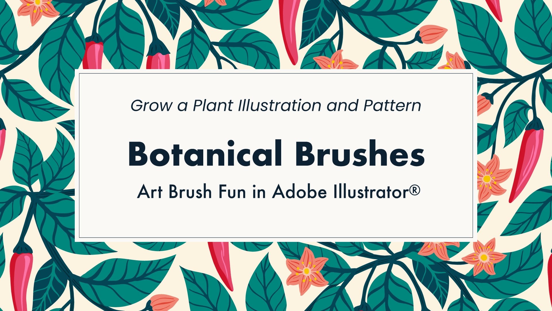
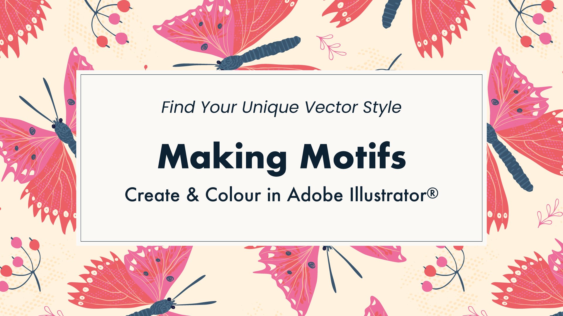
13. Recolouring & Project 2: Welcome back. Okay, so it's time for colouring artwork and for the second project. As with palate development, applying colour is subjective and I encourage you to follow your own instincts. Here is how I tend to approach colouring my work: Usually I have a fairly neutral background in most cases, and I tend to make it either light or dark for contrast with the other design elements. I tend to use analogous colours for the main elements then drop-in small amounts of a complimentary accent colour. I sometimes used tints and shades of the colors to show detail and form. For this section of class you'll need some artwork. It's fine to use any of your existing Illustrator artwork or create something new. If you want to make a new piece, I'm going to suggest the theme of mocktails and cocktails. The class does have Mixology in the title after all! Ideally take the theme and make a graphic, illustration or pattern in your own style. My usual style is to combine vectors shapes with hand-drawn elements like in this mocktail. Showing my full drawing and motif-making process is beyond the scope this class, but my previous class "Making Motifs" covered many techniques. For this class, I have provided some simple beverage glasses made with geometric shapes meant as a starting point. You can find these in the project file for download via the resources section sidebar. I'll copy so I can bring them into my other file. I have this artwork saved elsewhere, so I'll remove it and then paste the glasses artwork. To make liquid layers for the drinks, use the line tool to draw across the glass shape, holding down shift if you want to keep the line perfectly horizontal. You can draw multiple lines if you like to make a visually interesting drink. Select the lines and the glass. Then open up Pathfinder panel and use the Divide icon bottom-left to split the shapes. They'll be grouped, so first ungroup the sections and then apply colour from your palette. Here's the one I made earlier with a few extra fruits, and it's ready to show you recolouring. A simple way to change all the instances of a colour in your artwork is to use Select Same. Choose Fill Color from the menu options to pick up the current fill selection or the most recent fill colour in the Tools Panel. Then just click on a different swatch to change. If you can't see the artwork because of the selection edges, use command H to hide or show edges. Selecting same colours is quick for single colour changes. The Select command has other options for selecting aame stroke colours, opacities, and more. If you're working with tints, use select same appearance. However, when changing more than one colour or experimenting with re-colouring, the Recolor Artwork tool is often the best option. First select the artwork to be recoloured. The selection can be the whole or just the part that you want to change. It can be regular artwork or a shape filled with a repeating pattern swatch. You may prefer to work on a copy of it and keep the original alongside. Now select the colour group to use. You can recolour the artwork using a different order of colours in the existing group, or apply a whole new group of colours to the artwork. Click the recolour wheel icon and the Recolor panel opens. Ensure that Recolor Artwork is checked so that you can see the changes. The order of the swatches in the group will determine the initial colour order applied to the artwork. So the first swatch in the group will be at the top of this recolour list by default. Via this little menu to the right of the new column it's also possible to order the recolour list by lightness or hue in ascending or descending order. If you want to start with the current colours of the artwork in their original order, click the eyedropper icon to capture the artwork colours and order. The recolour list can also be re-ordered manually by dragging the colours in the new column up or down to swap them. Toggle the Recolor Artwork checkbox to see the before and after. You can switch to a different group while in the recolour tool by clicking on the colours or name. However, any order swaps already done will be lost if you decide to return to the first palette. I'll try this new palette and manually change the order. Once happy with the changes, apply them by clicking OK. If you change the order of the swatches, you'll be asked if you want to save that change to the colour group. Saying yes will swap the order in the group within the swatches panel. But it's also OK to say no if you want your group colours orders to be unchanged in the swatches panel: Artwork, colour changes are still applied. Alternatively, cancel and make a copy of the group with the new order. I'll save my artwork re-colouring and any group changes now. I actually don't need the copy of this group with the oranges in a different order o I'll remove that. When the number of colours in the artwork is less than swatches in the group, not all of the colours will appear in the recolour column. I'm going to use a single glass on the background square so there are less colours. Let me rearrange my artboard and group the glasses I'll be using. I'm just trying to get setup so it will be easy for you to see everything, and I'll make a few copies. So each of these is like an individual piece of artwork with less colours than in the whole design. I'll go to recolour this first one. The greens are missing from the list. To assign a colour not in the recolour column, double-click on a colour in the new column that you want to change. The colour dialog comes up. You can use the colour picker tools to mix a colour if you want an entirely new one, or click on the Color Swatches button to go to the colour list. This is a full list of swatches across all groups. Pick one and choose OK to bring that Swatch into the re-colour list. Another use of the Recolor tool is to cycle through the various colour possibilities within a palette. This is the randomly change icon here. The order is random and it's important to know that there is no back option to go to the previous combination. So if you see a combination you like be sure to save it before moving on. That's why I usually make a few copies of the artwork first. I can assign the combinations I like onto the copies as I go. Repeat with another copy of the artwork to try more combinations. If you see a combination that's almost right, there's nothing to stop you from making a swap to it as well to get it just right. There is also an option to change the saturation and brightness randomly while keeping the same order. Changes are reflected in the active colours area. If you liked the active combination, click the folder icon to save them to a new colour group. I tend not to use this randomized feature as I like to control saturation and brightness myself. I'm going to delete that group and the artwork because it doesn't fit with my project. It is also possible to recolour just some of the swatches. To turn off the new assignment for a particular row click on the arrow and it becomes a dash indicating that the row won't be recoloured. I use this often when I'm happy with some colours already in the artwork, but would like to experiment with others. If I'm still designing my artwork and want to explore colour distribution within the different motifs, I might make a checkerboard of squares and place a few different motifs. Sometimes when re-colouring a dashes is already there and no new colour is assigned. This is probably because it's black, white, or some shade of gray that has been set to be preserved in the settings. If you want to recolour it, access the settings here and uncheck in the preserve list to allow changes. Now I can change the inky dark gray. I'll continue the rest of my checkerboard but speed it up a bit for you. I'm combining the various techniques of random order browsing, swapping swatches, selecting specific swatches and choosing which colours to assign a which to keep. Of course, I can also recolour the whole checkerboard in another colourway. I even have fine control over individual colours if I want. For example, I feel the red in this palette is too strong compared to the other colours. So I can soften it by slightly reducing the saturation. That looks better. Now this time I actually want to copy the colour group because it has that new red in it. I'll go back and make a new group before I finish up. Project two is to explore the Recolor Artwork tool. You can either make a combinations checkerboard with motifs, or you can simply take a design and create a second colourway of it. Or try both. Remember that following my suggested theme is totally optional. Use existing artwork that has a different theme if you wish.
14. Contrast Check and Tweaks: Hello again. Earlier I applied my colour palettes to this artwork. After getting to a stage where I'm fairly happy with the overall palette application, usually I put the work down and come back to it later for final colour and contrast tweaks. If I'm not able to take a break from it, one option is to look at the design from a distance, so step back a few meters from the screen. Another useful trick, particularly for checking value contrast, is to view a grayscale version of the design. To do this in Illustrator first make a copy of the artwork. With the copy selected, go to Edit, Edit Colors, Convert to Greyscale. This fully desaturates the artwork. It will now be easier to see if any areas need more value contrast for definition, or if more contrast is needed overall. An easy way to make tweaks is with the sliders on global swatches, if you had them set up that way. Remember that artwork coloured with global swatches stays linked to the swatch, so making changes alters the colour across all of the artwork. Any linked tints that were created as global will also alter. If you need to create global swatches, select the artwork and click new colour group icon in the swatches panel. For the options use selected artwork with convert process to global checked. If using tints in the artwork, you'll also need the second option checked to capture them to the swatches panel. To adjust a swatch, double-click on it and use the preview checkbox to see how the tweaks are affecting the overall artwork. There's more to do here, but I think you get the idea. Taking the time to do fine adjustments to colour can make a big difference overall.
15. Reducing Colours: Welcome back. Earlier we looked at the Recolor Artwork tool for making colour palettes and changing colours in artwork. There are also some features for reducing the colours in artwork too, which might be to cater for a particular print process or first aesthetic reasons. Here I have one of my designs where I feel the number of colours needs revisiting. The first thing I like to do is double-check exactly what colours I have in the artwork. So select all the artwork and make a group directly from the art. The groups created cannot contain gradients or patterns, but they can contain colours from within them. So you can select a shape filled with pattern and extract the individual colours from it in this way. And a shape filled with a pattern is what I have here, as indicated by the current fill selection. Happily, the recolour tools work on pattern fills as well as regular artwork. The first way to reduce colours is to merge swatches together. This is quick and easy when an extra colour has been introduced by mistake. Here I have these two gold swatches in my group, and I know I should only have one of them for this design. If swatches are setup as global it's easy to merge them. Click the swatch that you want to keep first, hold shift and click the unwanted swatch. Now go to the swatches panel menu and choose merge swatches. If the option is grayed out, it's probably because you've selected non global swatches. Because the merge feature works on global swatches Illustrator makes the changes across the artwork including any pattern swatches that contain the colour. If you watch closely, you might see the subtle change in the gold that surrounds the violets. Do you see change around here? And now there's just one gold swatch. Though it is quick and simple, there isn't any preview, so only use this if you are sure exactly which swatch needs to be merged, otherwise go for the Recolor tool. Reducing colours may be done for artistic reasons. For example, palettes with limited hues tend to come across as more sophisticated in my opinion. So I might reduce the hues in the artwork. This early version of my Violet Ogee pattern has blues, greens, antique gold yellow, and pink. I like the overall effect of the violets and the pink gold surround, but I'm not sure the green adds thing. I'll use the re-colour artwork tool to reduce colours. I'll first make a copy so we can compare them later. Select the artwork and it's colour group, and then click the recolour wheel icon. Drag the unwanted colour so that it goes into the same row is another colour that you'd like to use instead. There are several options for colorize method where multiple colour swatches are to be recoloured with the same swatch. Click on the mini menu to the right of the new colour and choose a method. In this case, I want an exact match and that will give me one less swatch in the group. Options are only applied after clicking away from the menu. So I'll reduce the other green as well. It all looks good with the preview, so I'll click OK. I can capture the new pattern version to the swatches panel as well. Comparing these versions side-by-side, I feel that reducing the colours to a more limited palette makes and design a little more sophisticated. The option of a limited palette is worth keeping in mind. For some projects, the numbers of swatches used may be limited by the print process or by cost. In this Flamingo Lake design, I originally made the flamingos in three different pinks, for a bit of extra visual variety. Plus I added darker pink feather details too. While that's fine for digital process printing, the variety of pinks in the palette might be a bit extravagant if the printing involves an extra cost for each different colour. There are some features in the Recolor tool that help with reducing colours particularly when working with colour books or other swatch libraries. So here there are a number of options in the presets menu. I'll use a colour library preset and choose the Pantone fashion and home book. It will now try to match my original colours as closely as possible to the Pantone colours. Toggling Recolor Art off and on shows there is a subtle difference in the original colours versus the library, but it's fairly close. At the moment the colours are on auto, but there are options to choose less. I currently have 9 colours, as it says here at the top. To reduce colours, I can either choose a number from the colours menu or type in my own number. I'll go for 7. And then I need to press Tab to get that to apply. Three pinks are now combined. I'll choose exact for the colorize method. I can see the result on the artwork and I'm happy with the pinks, but the coral orange on the legs isn't right. To fix that double-click and choose manually from the library. Now I'm thinking about the pale peach colour on the face. Depending on how the printing is being done, using tints might be a good option, but it's always worth checking that first. If tints are appropriate for the project, I might change this pale peach swatch to a tint of this specific orange. So I'd need to have this row use scale tints with preserved spot colours checked. But I don't want to apply to all because the pinks row should use exact colorization method. I'll need to reset the pinks to exact. Toggle the Recolor box off and on to compare the changes. Great. I'm happy with those flamingos. I'll say, okay. I won't to save changes to the existing group, but I'll collect the new colours into a group in the swatches panel and I'll choose to include tint swatches. So I've reduced this from 9 process swatches down to 6 spot colours plus a tint. Remember that little black dot in the corner indicates a spot colour. And if I hover over the pale peach, you'll see it's still a spot colour but has a percentage included in the name to indicate the tint. So there are a few ways to reduce colours in artwork.
16. Colour Balance: Hello again. I wanted to take a few moments to look at the Adjust Color Balance feature under the Edit Color menu. Colour balance alters the overall mixture of colours. It is typically used for subtle correction in photography. But it can also be used to alter colour and intensity for effect in artwork too. At first glance, it may seem that a special colour balance feature is obsolete in Illustrator given the many features and fine adjustments available in the Recolor Artwork tool. However, there are some instances where colour balance is the tool of choice. A key feature of colour balance, and also of invert found under the same menu, is that they can be applied to non-vector (also known as raster) graphics. This could include photos, scanned paintings and collages, or art from pixel-based apps such as Procreate and Photoshop, if exported in a format such as PNG or JPEG. To enable raster file adjustment, either open up the graphic file directly, or if it's placed into a document it will need to be embedded via the links panel menu where it says embed images. With the image selected, go to Edit, Edit Colors, Adjust Color Balance. Ensure preview is checked. Now adjust the individual colour sliders gradually until you reach the desired adjustment and click Okay. So what are the uses? Firstly, raster images can actually be included with designs, for example as digital collage, and their colours adjusted as part of the artwork. However, beware that the scalability benefits of vector artwork are lost if rasters are added to the file, and files can slow down dramatically as well. A second use for raster images in Illustrator is as the basis for image tracing. Adjust Color Balance can be used on an image prior to tracing. When photo presets are used during image tracing, resulting vectors may have many hundreds of colours. In this case, the large number of colours might be difficult to manage in the Recolor Artwork panel. So a third use of colour balance is as an alternative for colour editing highly complex vector traces. And forth, some designers may be most familiar with colour balance and prefer at even on simple vector artwork. If vector artwork includes global swatches, colour balance options are initially limited to tints only. For the full options, simply change to CMYK here and check Convert to activate the four sliders. Or if working in an RGB document, select RGB and check Convert to activate three sliders. Make adjustments as before. At this point with the adjusted artwork still selected, you may want to capture the new swatches into a group. To do so, just click New Group icon in the swatches panel and use the selected artwork option. You can choose whether to convert into global here, which I generally do because I like working with global. Adjust Color Balance is one more useful item to add to the re-colouring toolbox.
17. Transparency & Project 3: Welcome back. It's time to look at transparency. For some designers transparency is key to their work and for others it doesn't feature as much or at all. I personally enjoy some of the effects that can be achieved with transparency, but I'm wary of the added issues it can sometimes cause with printing. I have a new file here and I've added in my go-to set of colours from the swatches library. Let's open the transparency panel. On the right is opacity and a percentage. Opacity is just how see-through the object is, with 0% being totally transparent and 100% being totally solid or opaque. A base object can be placed below and another object on top. When the top object is made less than 100% opaque, base objects and any background will show through. To change stacking of objects, use Object Arrange options. On the left is the blending mode menu. We can get to range of interesting results by altering the mode of the top object. The exact result depends on the colour fill of each object, the mode, and the opacity. There can be many stacked objects with various colours, opacities and blending modes, so the possibilities are endless. Rather than trying to learn how Illustrator works it out, I tend to just experiment with the modes by going down the list. Having said that, the list is ordered with similar modes together to make the results easier to predict with a little experience. So Darken, Multiply and Color Burn tend to all darken the colours in slightly different ways. Whereas Lighten, Screen and Color Dodge generally produce lighter colours overall. So let's experiment with a transparency project. My suggested theme for this project is gemstones. I have provided the shapes in the project file downloadable from the resources sidebar. The template for the gem is in two main pieces: The underside of the gemstone and the top facets of the gemstone. Additionally, there is an extra circle the same size to go right on top for more transparency blending fun. Start by adding colour fills from your go-to set of colours of from a palette you made. Aim to fill in the template so that it simulates the lighting on and through a gemstone. On the top piece, the side from where the light is coming will have highlighted facets and the opposite side will be in shadow. On the underside. the refraction of light makes more of a radiating effect with random dark and light adjacent. You can use different tints and shades of a single colour. Alternatively vary the hues a bit, I suggest to stick mostly to analogous colours with similar hues, for example greens and yellows. I couldn't help but add a dash of pink to mine as well. Once the fills are added, group the whole top piece and the whole bottom piece. Use the align tool to get the top and bottom pieces to overlap exactly. So select both pieces and then click one more time, which should make the selection edges bolder. The align panel has buttons to make the shapes centrally aligned, both horizontally and vertically. Now apply a blending mode. Experiment with the order of the two pieces by selecting the top one and then using object arrange send to back. With some blending modes, the stacking order will matter a lot and others not at all. Explore the modes and stacking. Now make the third shape come to the front in the stack and align it to the gemstone. With the extra top shape selected, explore the blending modes and also changing the fill colour. The Hue and Color blending modes are great if you want a single coloured gem. Make copies, and experiment with blending and opacity. Transparency can sometimes behave in unexpected ways when printing. I've also noticed unexpected colour changes when switching between CMYK and RGB. Furthermore, if you ever wanted to capture colour from the artwork, you'll find that the eyedropper doesn't capture the overall mix of colour, it only captures the top colour and the transparency details. Flattening a copy of the design can be used in these circumstances. I don't recommend to flatten the original of your artwork. Always work on a copy so that if you want to go back to do edits you still have the original. Select the items and go to Object Flattened Transparency. There are a wide range of settings and the ones you choose will depend on the artwork and what you're trying to do with it. For this sort of artwork I'd normally choose the high-resolution preset. Notice how the artwork is divided up where there was overlap. And also when you use the eyedropper on the flattened colour area, you'll capture the colour you want. When I first explored this gems project I came up with many versions and ended up creating this fun gemstone ring pattern from them. If you like, incorporate the gemstones you make into a design. But the main thing with this project is just to enjoy experimenting with transparency and learn along the way. Remember to share your transparency experiments in the project gallery.
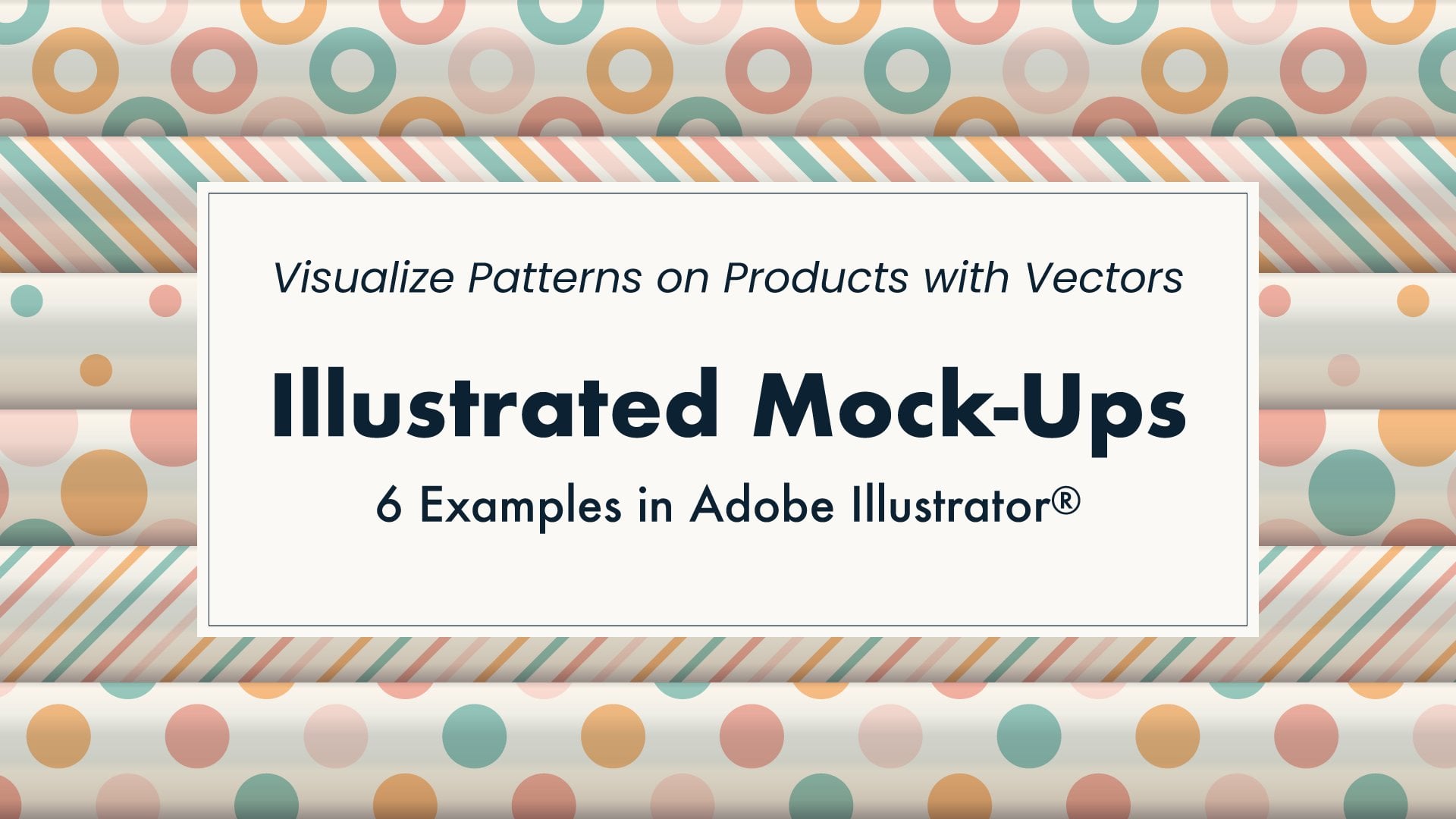
18. Gradients: Hello again. I felt this class would not be complete without at least touching upon the topic of gradients, which are gradual blends of two or more colours. In my own work, gradients don't feature much but I do occasionally use them. My main use of gradient is to simulate more realistic lighting. For example, the metallic in this Christmas gift wrap visualization, or the shading of the paper in this illustrated mockup of a gift wrap wall display. Let's see what gradient libraries are already existing within Illustrator. Open Swatch Library from the icon or panel menu. Note that there is a library called metal here, but that is just regular swatches. Instead, go into the gradients sub-menu. There are quite a few gradient libraries to explore here. This metals library is the gradient-based one. So let's take a look. I'll first open up the Gradient panel. I'll select this solid star so I can fill it with a gradient. Some of the gradients come in a linear and radial format for different purposes. Type of gradient is shown here in the panel. The gradient also shows the colour stages (or stops) used. To apply the gradient at an angle the degrees can be set here. It's also possible to manually apply the gradient with the gradient tool here. With the gradient fill and this tool selected you see that the distance and position of the colour stops are shown on the artwork. If that isn't showing, go to View, Show Gradient Annotator. Drag to apply the gradient in a different position. Gradients can also be customized. I can drag the color stops to change the distribution. To edit the colours, double-click and use mixing, swatches or eyedropper to pick the colour. You can also drag current colours to the gradient from here as well. Using the eyedropper tool it's possible to capture realistic gradients from photos too, as I showed in my previous "Illustrated Mock-Ups" class. Stops can be removed and added as well to achieve the desired effect. Drag the new gradient across to the swatches panel to save it. If applying a gradient to an object made of multiple sections like this first star motif, the gradient fills each area independently. This might be what you want, but if you wish to fill the sections of the motif as if this is a single surface then make the sections into a compound path. I will select all the elements then use Object, Compound Path, Make or shortcut Command 8. This will cause them to behave as one object. Now when I apply the metallic gradient to the compound path it flows across the entire surface. If you have any trouble making a compound path, it might be because of the way the object is grouped, so go back to the ungrouped state and then create the compound path. I'll turn that angle round to 45 degrees to give it a more realistic shine. The highlights of the gradient seems a bit too light so I can go back in and edit it. There, two gold stars for you. So that's just a quick introduction to gradients in Illustrator. There is more to learn about them and many ways to use them, so do explore further if this technique fits with your design style.
19. Your Project: Okay folks, it's time to share your color experiments. I want you to try the techniques in this class through one or more of the projects. Click the create project button so you have somewhere to post images and text describing how you've been exploring colour. Here are some suggestions for what you might share. Your set of favorite colours captured with the eyedropper tool. Your artwork with different colour palettes applied using the recolour artwork tool. Your choice of colours and transparency blending modes applied to stacked up. Or all of the above. Posting your project is a good opportunity to connect with other members. I do enjoy looking at each project and commenting, so I encourage you to share what you have made. And if you want any feedback from me specifically about your project, you can ask questions here to. If you are new to posting projects on Skillshare, here's a quick guide to image sizes. Cover images get cropped and will become landscape format. Choose a size that is approximately 3:2 ratio. For example, 1500 pixels wide by 1000 pixels tall. Images within the project can be any dimensions with file size below 2Mb. However, it's recommended to save a bit small for online viewing. You can use file export, export for screens feature in Adobe Illustrator if you wish. As you work on your project, remember I've added some useful resources for you here. The project file has shapes and layouts to get started. It's available for Illustrator CC plus there's an earlier legacy version as well. If you have any issues with opening the file in Illustrator please first check the version. But if you still can't open the file do let me know and I'll try to help. In the resources sidebar you'll also find a list of useful web links, glossary of colour terms, and a written transcript of class. So enjoy the projects and have fun with colour.
20. Thank you: Thank you very much for joining me in this class. I do hope you've enjoyed it and picked up some new colour tips, techniques and ideas. If you have any questions, feel free to email me directly via hello@rocketandindigo.com. Or you can post in the discussions tab and I'll get back to you there. If posting your class project on social media, do you remember to tag me @rocketandindigo so I can see your fabulous colour experiments. Feel free to use the hashtag #rocketskillshare. I already have some exciting new classes planned for the future. To be notified when they launch, please be sure to follow me here on Skillshare. And if you found the class helpful, please do leave a review. So that's it! Many thanks and see you next time.
 Sue Gibbins, Designer at Rocket & Indigo