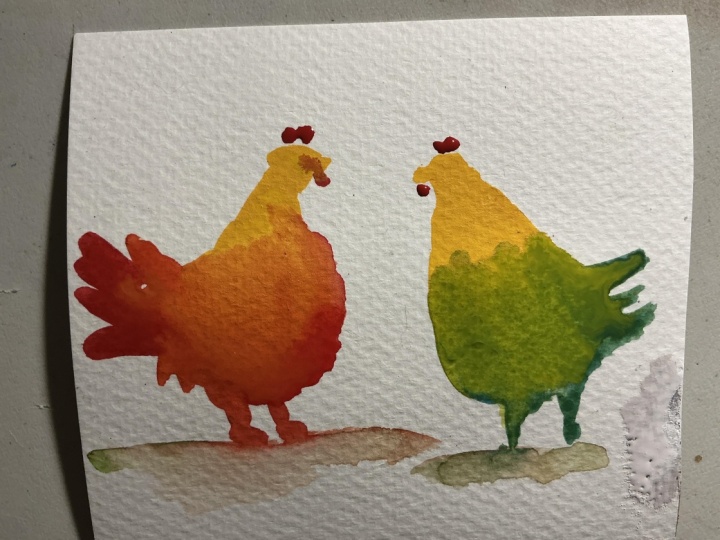
Colour Chickens - Best Exercise to swatch watercolours
 Patrick Visser, Designer and Artist
Watch this class and thousands more
Watch this class and thousands more
Lessons in This Class
-
-
1.
Intro
0:38
-
2.
The Colour Chickens Exercise
2:48
-
3.
Project
1:03
-
-
- --
- Beginner level
- Intermediate level
- Advanced level
- All levels
Community Generated
The level is determined by a majority opinion of students who have reviewed this class. The teacher's recommendation is shown until at least 5 student responses are collected.
64
Students
5
Projects
About This Class
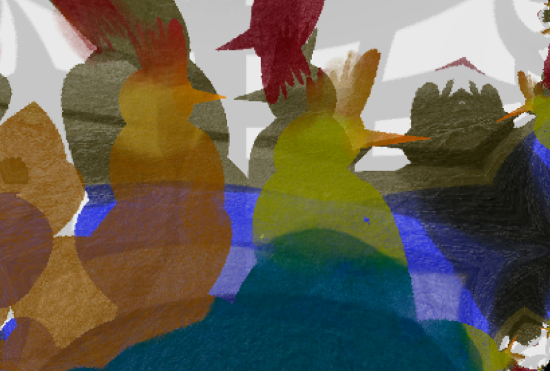
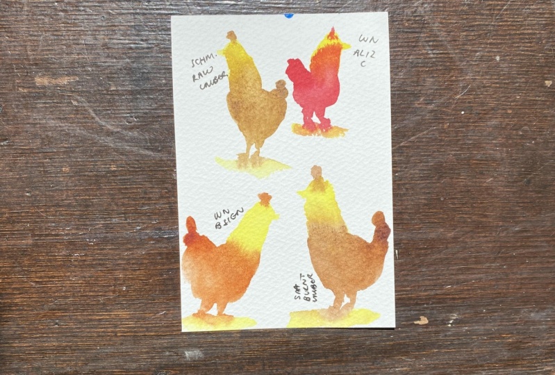
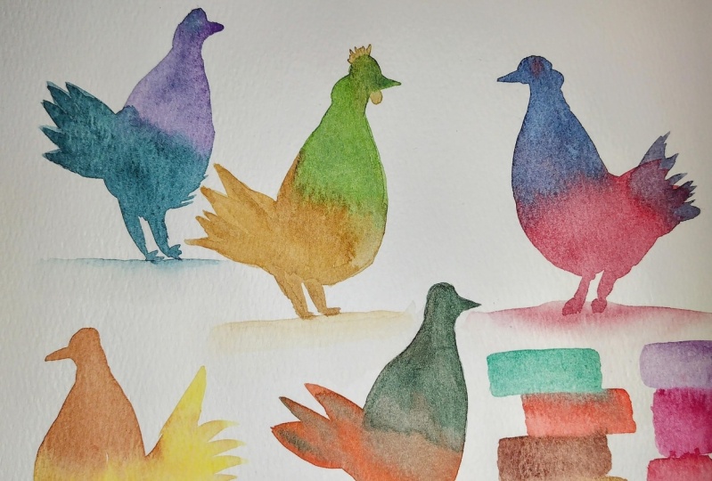
In this mini class I show you my favourite way to swatch colours and have fun at the same time. It's also a great exercise to practise colour mixing and brush control.
Meet Your Teacher

I'm Patrick, a Designer and Watercolour Artist living in Sydney.
My passion is drawing and expressing ideas with pen and pigment on paper. Whether that's in my job as a UX Design Manager, or when I live my "other" life as a Watercolour Artist.
I'm an autodidact and learned to draw and paint not until I was well progressed into my adult life. I truly believe ANYONE can learn to paint and draw at ANY TIME in their life.
All it takes is determination and consistent practice.
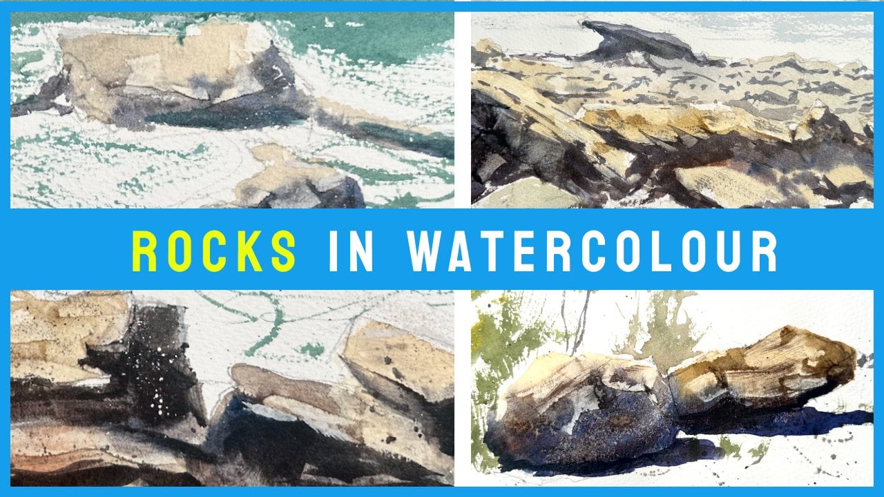
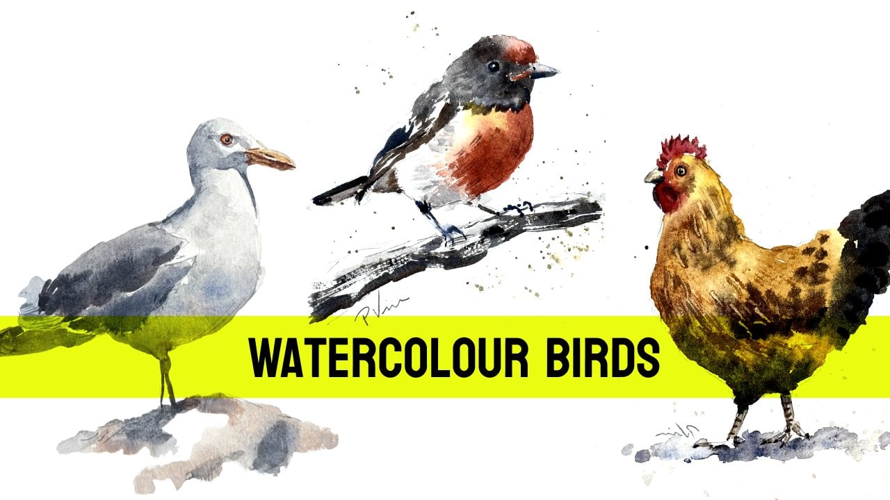
And consider my Watercolour Quick Guide Bundle, which includes 4 quick guides for painting Chickens, Clouds, People and Rocks
See full profileHands-on Class Project
As your project swatch your colours with Colour Chickens using your favourite colours or even your entire palette!
Please share your colour chart, AND your most surprising or favourite colour combination.
Class Ratings
Why Join Skillshare?
Take award-winning Skillshare Original Classes
Each class has short lessons, hands-on projects
Your membership supports Skillshare teachers
Learn From Anywhere
Take classes on the go with the Skillshare app. Stream or download to watch on the plane, the subway, or wherever you learn best.