Transcripts
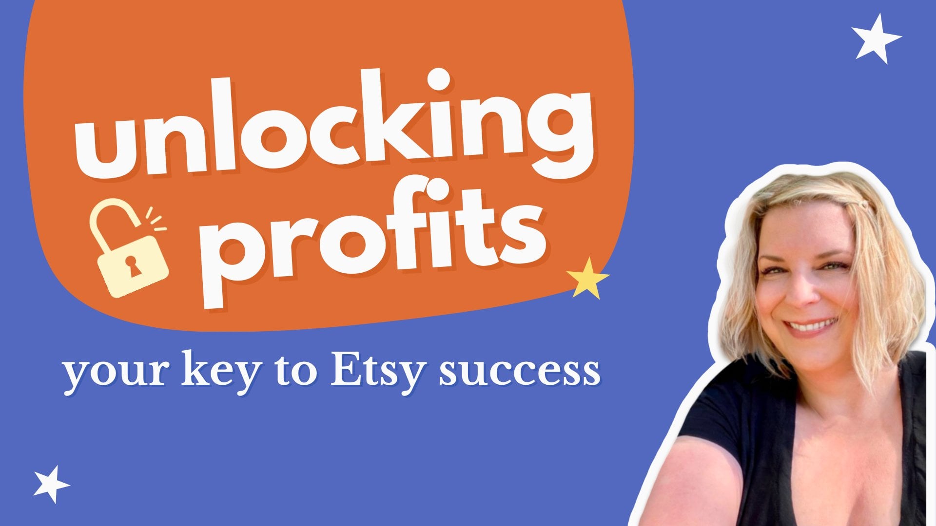
1. Hello & Welcome to Class!: Let's start with a quick story. It's 2014, and my Gems PiKely Etsy shop
is just 1-year-old. Back then, I hired a
branding professional to create a logo and a
brand color palette for me. This is what I ended up with. But there's a big issue
with this palette. It doesn't offer
enough contrast. Here's how I would redo
this brand palette today. Hi there. I'm Kelly Bren Burg. Fast forward to today, my Gems by Kelly shop is over 10-years-old and I have
over 14,000 sales. I have achieved things that 2013 Kelly wouldn't
have dreamed of. I'm here to help you
reach your dreams, too. This class is for
creatives that want to master brand color
palettes in Canva. One often overlooked part of
branding is color contrast. When your colors contrast, well, they make logos, texts, and graphics stand out. In this quick class, we
are going to dive into the world of color palettes
using free resources. So whether you're a total
beginner or just want to explore more about
colors in Canva, this class is for you. All you need for this
class is the Canva app. There's a free
version of the app, and that will work just
fine for this class. Here's an overview
of what's to come. We'll start with a
quick intro to Canva, and then we'll explore eight
free brand color palettes. You'll learn how to import
these colors into Canva, check for color contrast, and finally, take your
chosen palette for a spin while editing
Canva templates. This class is hands on and
it's super actionable. With each lesson, you'll receive a worksheet
to complete in Canva, picking up tips and
tricks along the way. And if you're craving
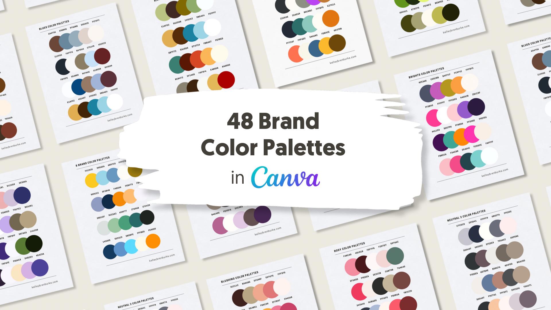
even more color in your life, I've got you. You'll find 48 additional
brand color palettes available for purchase. They're linked in
the class resources. And the next lesson, we'll
dive into all the resources available to you in this
class. I will see you there.
2. Class Project & Resources: You'll receive an
editable Canva template for each lesson in this class. Let's take a moment and
explore them together. First, click on the
Project and Resources tab. You'll find a resource there
that provides links to all the Canva templates we'll
be using in this class. Simply click on a link, and it will open
a page like this. Now, click here on the page. It will instantly open
up your own copy of the template in
Canva. Super easy. We'll kick things
off with a worksheet that covers the basics of Canva. Then you'll use a
worksheet designed to help you test the contrast of
your chosen color palette. This works, whether you're using your own color palette or a palette provided in
the class resources. After that, we'll
dive into editing four different Canva
templates together. This is the perfect way to test drive your
chosen color palette. Plus, with each lesson,
you'll be picking up tips and tricks to use
Canva more effectively. For your class
project, I'd love for you to share one or more of your Canva templates featuring
your chosen color palette. I can't wait to see
what you create. Are you ready to get started? Access your Canva worksheet by clicking in the link in
the class resources. I'll see you in the
next lesson where we'll work on our first
Canva worksheet together.
3. Intro to Canva: Quick Start Worksheet: Let's do a quick overview
of Canva in this lesson. Canva is pretty
intuitive and you can accomplish a lot by
understanding the basics. We'll be using editable Canva templates throughout the class, and I'm going to walk
you through every step. If you don't feel 100% confident after this
quick worksheet, no worries, you're going to get more exposure to Canva
throughout the class. Here is the template
and you can access this template through
the class resources, and there will be a link for
this template right there. When you pop the link into your browser, it
will look like this. And then you can hit Ue
template for new design, and it will come into Canva. You do need a free Canva
membership to get this far. Here it is in Canva, and we're also in
Safari browser. One thing we're going
to be doing through this class is using
the color dropper, which is not accessible
in the Safari browser. The color dropper
is accessible in the Chrome browser
or in the Canva app. I'm going to access this
through the Canva app. I have the same
worksheet right here. You can make the worksheet
bigger or smaller like this. You can also change
it right here, so I'm going to bring
it back to here. We are going to go through
all of these steps together. We're going to do
the first step here. Add a graphic element here, then change its
size and rotate it. For this step, we're going to be looking at this left menu, and we're going to be
tapping on elements, which was already there. If we search, say star, we'll see that
there are graphics, photos, and videos, and
shapes that respond to star. But for us right now, we just want to
choose a graphic. You'll see that
there are a lot of different graphic stars
that we could choose from. I'm just going to go with
this top one right here. I'm going to tap it and it'll
go right into the design. Next steps are to change the shapes size and
then to rotate it. I'm grabbing this corner
right here and I can make it bigger or smaller
from any of the corners. If I adjust it this way, it's going to crop it so
it will be a partial star, but I'm going to bring
it back that way. Using one of these
corner circles, we are just going
to bring it here. Then we're going to use these two arrows
here to rotate it, we can rotate it
any way we want. That was the first step. The next step is
to edit this text, change the font,
size, and color. To do that, we're going
to tap on it right here, and now we're looking at
this menu on the top. The current font
is Cooper Hewett, and we can change it
to anything we want. A bunch of popular
fonts pop up here. Let's just do league Spartan. It's asking me if
I want to change all the Cooper Hewett
to leak Spartan. If I did, it would look like
that, but I don't want that. I'm going to hit this
backwards arrow, and it's just changing
the font right here. We changed the font, and this is still selected, and now we want to
change the size. We're going to this top menu up here and we can change
it by tapping here. We can also change
it by tapping in the middle and choosing
any size that we want. I'm just going to go
back to a smaller size. Let's just do 21. We change the font in the size and now let's change the color. You changed the
color by tapping on this A with the
color underneath it, and then you can change it to any color that's right here. On top here, you'll see
the document colors. Those are all the colors that are present on this document. Right here, you'll see what
Canva calls a brand kit. I have Canva pro, so I can have a brand kit with as many
colors as I'd like. If you are using the
free version of Canva, you can have a color palette
with three colors saved, and we'll go over that later. But right now, we can choose to change the color to
anything we want. We can tap there and change it, we can tap there and change it. We can tap there and change it. Now we're done with that step, so I'm going to tap anywhere
else and deselect that. The next step is to
upload your own image, then change it size
and add it here. We're looking back at
this left menu again, I'm going to tap on uploads. These are some things that
I've already uploaded, but I'm going to show
you how I do that. I'm going to tap
on upload files. I'm going to go to choose files, and I'm just going
to put something in here that I have saved before. I'm tapping on it and
I'm hitting open, and there it pops right into
there with my other uploads. If I tap it here, I will
add it to this document. It's ladies with funny
hair, as you can see. Right now there's some
text on top of them. I'm going to show you how to fix that by going into layers. I'm going to tap position, and then this pops up here. What we want is layers. And we just want to
tap over here on these dots and drag it
all the way to the top. The text is still there, it's just underneath it. Just like the star,
we can change the size by grabbing any of
the corners and doing that. We could also crop it
just like the star, and that's fine, and then we're just going
to make it tiny, tiny, so it fits over there. That is that step. Next, we're going to go
back to the layers by tapping position. This
is what we want to do. Tap on position in
the upper right menu, done tap some text in the right hand layers
and change its font. Here's some text right here. It happens to be that text, and I can change the font
again by going up there and changing it from Cooper
Hewett to shrick hand. Again, it's going to ask me
if I want to change at all. It would look like
that if I did, but I'm going to undo that by tapping this little undo arrow. I'm going to deselect that. The next step is to change each color below and
any color will do. I'm going to tap on
this circle right here and I'm going
to tap right here. Here again are the same colors. It's my brand kit, the existing document colors, and then some default
colors that Canva offers. I'm going to change
this to this color. I'm going to tap on this circle and change it to
a different blue. I'm going to tap on that teal
and change it to this teal. I'm going to tap on this yellow and change it to a
different yellow, and I'm going to
tap on that orange and change it to a
different orange. The next step is to
save this document to your files or
your camera role. You do that by tapping share and download and then
download again. We can save this image to our files or to our camera role. I'm just going to save
it to the camera role, so I'm going to save image and that has
been completed there. If you have any questions, there's a little question
mark on the lower right of the Canvas screen.
It's right here. It's AI powered and
it's really helpful. You could type on there,
but I have voice activated, I will do that instead. I'll tap there, tap
on the microphone. I'm just going to
ask it how to change a color. How do you
change a color? And here are the steps for
changing a color, right here. If you wanted to know
how to change a font, you could ask that. How do I change a font? And the steps pop
up right there. That's really helpful.
You can also ask me questions in the discussion
part of this class. I'm going to tap on
this x to close that. For the next steps, finish this Canva worksheet
on your own. I will see you in the next
lesson where we'll explore the eight color palettes
that are part of your class resources.
I'll see you there.
4. Explore 8 Free Color Palettes: Welcome back. In
the last lesson, we completed a practice
Canva worksheet. If you don't feel like you are absolutely proficient
in Canva yet, no worries we'll be working with Canva for the
rest of the class, so you'll feel more comfortable with it by
the end of the class. In this lesson, we're going to explore your free
brand color palettes, which are another Canva template
just like the other one, and this is linked in the
class resources for you. Again, you would use
template for a new design. And it pops up here in Canva. I'm going to go back
to the Canva app because I want to
access my color picker. Here are eight free color
palettes that you can use. They each have five
different colors and you can choose any of them
to use through the class. If you'd like 48 more brand
color palettes, I've got you. They're available for purchase, they're linked in
the class resources. Let's go back to the
brand color palettes. For your next steps, choose one of these
color palettes. Again, it doesn't
have to be perfect. We're just taking one of these palettes for
a spin right now. In the next lesson, we'll import your chosen color palette into
Canva. I'll see you there.
5. Add Your Brand Colors to Canva: Welcome back. In
the last lesson, we explored your
free color palettes. In this lesson, we're going
to import them into Canva. We're using another
Canva template that you'll find in
the class resources. It looks like this. It's labeled KBB Palette brand Contrast. Here's the template.
Let's go back into Canva, and let's go back to our eight free brand color
palettes right here. For this class, I am going
to select this top row, and I am going to take
a screenshot of it, and I'm going to do that on
my device by pressing here. If you don't know how to take a screenshot on your device, just Google how to take a screenshot on
iPhone or whatever. That got saved right
here to my camera row, and I'm going to edit
it by cropping it in. I'm going to tap crop here, and I'm going to
crop it in so all I can see are these colors. The white will be in
the background as well. And I'm going to tap done. Then I'm going to
bring this into Canva. I'll show you how I do that. I'm going to go into Canva. I'm going to go back to our
color testing worksheet. Now let's upload our screenshot by tapping first uploads
and then upload files. I'm going to go to
my photo library, and here it is, and
I'm going to hit add. Here's the color palette. I'm going to tap it here. Stretch it out a little bit, so it's even with this. Then I'm going to
tap to unselect it. If I tap on this dark color, you can see this
color menu here. Again, there's my brand kit, but here's something new and
that's our photo colors. We're going to use
these photo colors to change the color palette
above to these colors. Canva will pull out up to
five colors from any photo. It can be a photo
of a landscape, it can be this photo, it can be anything.
It's really handy. So let's start
changing our colors. I have that one selected, but I want it to be
this cream color. It's actually not
on here because it pulled the gray
background instead. I'm going to show you how to do that using the color picker. I'm going to tap on
this color wheel up here and I'm going to
tap on color picker, and I'm going to go down
and set it on here. I'm going to hit done, and there we have
changed that color. You want to know
what the hex code is of the color,
it's right there. A Hex code is a number
that's used universally, it's six letters and numbers and it identifies
a specific color. This ex code is FB
f9eo. Let's keep going. I'm going to change this
color to the green. That one showed up
here. There we go. You can see here that some
of the document colors are disappearing and they
have that little red line because they're not on the
document anymore because we're changing the color palette.
But let's keep going. We're going to tap
on that color, and we're going to
change it to this. We're going to tap on that
color and change it to that, and this color and
change it to that. We changed all of our
colors successfully, so now we can delete
this photo that we imported by clicking on
the little trash can. It's still here and we
could bring it right back if we wanted
by tapping on it. We're going to be
using this worksheet in the next lesson as well. But we're just going to keep going changing all
of the colors. I'm going to change
the dark font colors on here to this
color right here. I'm going to tap on there, I'm going to tap on the A with the color line and I'm going
to change it to this color. It's going to ask me if
I want to change all of those colors to
that color and I do. I just did that.
We're going to keep doing that with all of
these contrast words. We're going to tap on contrast. We're going to tap on the color. And we're going to change
that word to this. In this case, we don't want to change all of them
just this one, so we're going to
tap out of there. I know we can't see it
there, but that's okay. It's part of our next worksheet. Just keep on going even if you can't really see it on the page. I'm going to tap right
here on the pink contrast, change it to the green, and
I'm going to keep going. Now, I think I have changed all of the colors successfully. If you want to double check
that you got the right color, you can tap on this font and drag it down here and
if it disappears, it's the right color and so on. I'm just going to to bring
that back to where it was. If I have that circle selected, I on the colors again, you'll see here that there are only five document colors and that's exactly what we want. If you have a free
Canva membership, you can create a
brand kit like this, but you can only
use three colors. I'm going to show you
how we would do that. I'm going to start by
going to this pale yellow. It's selected right here. I circled and it
has those lines, and I'm going to
copy the Hex code, the number that identifies it. I'm going to copy it
by selecting this. If you don't know how to
copy paste on your computer, you can Google or you could also ask Canva. Let's ask Canva. How do I copy paste images? It tells you exactly how
to do it here as well as the shortcuts for
both Windows and Mac. I'm going to close that out. I'm going to make
sure we still have this yellow color selected
for the Hex code. It ends in a nine EO.
I'll remember that part. I'm going to hit copy. Then I'm going to go back
to Canva, the main screen. I'm going to tap on
those three dots and then on the icon. Then I'm going to tap
on brand kit here. You can add a new brand
kit by tapping right here. I'm going to call
this Canva class. And I'm going to hit Create. You'll see here that
there's a space for logos, colors, and fonts. In this class, we're
solely focusing on colors, so we will just work with that. I'm going to tap Add new. Canva will give me a
color straight out. Since I don't want that,
I'm going to hit delete and then I'm going to hit this
past symbol right here. Now we have that
first color saved. We're going to go back
and do it all over again. We're going to go back
to the Canva home page. We are going to go back here. If you'll notice, I just want to show you this
I'm going to tap on these three lines
again and tap on Canva. Right here, it looks
like it's still pink. This first image
hasn't updated yet, but the correct
colors are in here. The image saved on
the Canva home page should update to these
colors sooner or later. We're going to save
the second color. This dark green, and we're going to find
the Hex code here, and this Hex code ends with a three B. I'm going to copy it, tap these three lines again. I am going to go to
the Canva home page, tap these three lines again, go to brand, go to my KBB Canva class
brand, and tap here. Again, it just populates
with a suggested color. I'm going to paste
the color I want. Let's do that one more time. Tap the Canva logo. Tap right here. Tap
this dark color. Tap right here. Find
the selected color, copy, tap the three
lines, Tap Canva. Tap the three lines
again, Tap brand. We're back in the Canva class, and we're going to change
this color that Canva suggested to the other color. Now we have three colors
saved from our color palette. Since three colors is the max, you can save with the
free version of Canva. That's all I'm going to save. We'll all be working with the same thing in this
class going forward. If you happen to have Canva P, you're welcome to save all five colors using the same methods. For the next steps, save your chosen color palette
to Canva on this worksheet. You can save three colors or
five if you have Canva pro. Again, if you don't
have Canva Pro, we'll still be able to access the other colors because they'll stay here on
the document colors. In the next lesson,
we'll check that your brand colors
offer enough contrast, which is a super important
step for a brand that has colors that pop
and that are legible. We're going to use a
free accessibility check that comes with Canva.
I'll see you then.
6. Check for Color Contrast & Accessibility: Welcome back. In
the last lesson, we uploaded our chosen
brand palettes to Canva. In this lesson, we
are going to use a Canva accessibility
feature to tell us quickly and easily whether
our colors contrast enough, specifically, whether you can read on top of the other colors. Let me just show
you what I mean. We're going to start with this
cream contrast right here, and we're going to hit plus, and we're going to
duplicate it and put it on top of all
the other colors. And then Canva will tell us whether it contrasts
enough to be legible. These are the steps
we're taking down here, if you forget, it's file, accessibility, check
design accessibility, and then color
contrast right here. There's two other options for typography and alternative text. But in this class, we
are all about color, so we're just going to
look at color contrast. So Canva will point out right away what colors don't contrast, and they will suggest
another color in your brand kit
that would work. This one we're not worried
about because this color is on this white gray background that is not part of my color palette. So we're not going to
worry about that for now. We're going to click
on the second one, and it's saying that this
cream color doesn't work on top of this color right here,
so I'm going to delete it. And we're going to
keep going like that. We are going to take this, and we are going
to duplicate it. I just duplicated it
all at once there. And, you can get a sense that this does not
offer enough contrast, but Canva will
tell us. For sure. So right here, if you
kept this menu up, it tells you about
that first issue. We'll just disregard that. This green does
not work on top of that color, so we'll delete it. The olive doesn't work
on top of that color, and the live doesn't work on
top of the blackish color. So let's just keep going. Let's look at this
issue right here. It highlights this box. This is not legible. Canvas still pointing out
this issue right here, which we can get rid of
by moving this across. This is highlighted right here. That doesn't work, and this is highlighted,
that doesn't work. We have one more color to
test within this palette. I'm going to take this and
duplicate it. All right. Let's see what our issues
are. That one doesn't work. This one doesn't work, and
that one doesn't work. Now, all issues have been resolved so we can
click that shut. If this was your color
palette and you're creating a graphic or a
website or anything, you would know that
these colors are safe to use on top
of other colors. And that offers a lot
of different options. So that is a contrasting
color palette. You want to have as many
options as possible. I was looking for color
contrast when I created them, but I didn't check all
of them like this. So if this was your
color palette, you could print this out and
have it for a reference, or if you continue
to design in Canva, you can just go through these steps anytime
you want to check if your colors are contrasting
and if your text is legible. In the next lesson,
we are going to start editing some design
templates in Canva, so you can explore your chosen color palette and learn some more tips
and tricks about Canva. I will see you in
the next lesson.
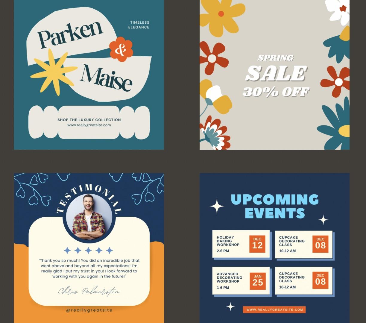
7. Project 1: Shop the Collection: Welcome back. For the
rest of this class, we'll be exploring your
chosen palette and Canva by editing four
different Canvas templates. I will walk you
through every step. Please share one or more of these edited templates
as a class project. I'd love to see the
color palette you chose. But first, let's look at two
different examples of Canva templates that I've
already edited with some of the
class color palettes. They show you how much color
can impact your design. I'm going to access them
from Canvas homepage. So this is a square
Instagram template, and here is one of the class color palettes and
another one and another one. This one was the
original design that I saw in Canva within
the design templates. You could find different
ones by searching, for example, or
sale or whatever, and there's tons of them. The ones that are pro only have that in the
right hand corner. And the ones that are
free to use or not. If you want to use
a pro template, if I remember correctly, it'll cost a few
dollars, I think, but the ones I chose for
class are all free templates. Let's look at one more
template. Here it is. And this is a template
we will actually be editing during class
for one of our projects. But I just wanted
to show you how you can play around within your chosen color palette and make the template
look different. I think this one is my
favorite right here, but I encourage you
to do that as well. Play within the template within your colors
and switch things up, and we'll also be doing
that within the projects. On to our first project, it is again a Canva template, like all of the projects are, so I am going to open
that within Canva. And I'm going to
edit my template, and here it is. The first thing we want
to do is change all of the colors to our color palette. So let's go and
look at the colors. I have my brand kit chosen. What I want to use is one
of the class brand kits, and I am using this one
that's in my uploads. Using the same techniques
we used before. The first thing
I'm going to do is look in the layers and move
this up, so it's on top. There we go. If I click here, I have the background color, we can change that first. It looks like it pulled in
all the colors pretty nicely. I'm not sure. It looks like that white color
is the background. But let's just start by
changing the background color. Let's do it this dark
blue. I like that. Let's do this pink
as this light cream, and I actually have
it saved up here. And it's asking if
we want to change all the pink to
that color. We do. Let's move on to
this little star. Let's try orange for that. I like it. So go
back to this font, which is pink, and maybe we
want that to be bright blue. It's asking if we want to change all the light pink to
bright blue, we do. Don't get too hung up
on things right now. We'll work with the
colors we have right now. We're just eliminating
the original colors and bringing in our own colors. So let's go to this flower and change the flower colors
to this bright blue, which is the same as the text. M. Let's change it
to the dark blue. And it's asking if we
want to change all of that color to the
darker blue, and we do. So we want to make sure
we have all of our colors represented here within
the palette up here. Oh, we have this extra
color right here, which was part of the
original palette. Let's do the orange for that. And it's asking if we
want to change all of that red orange to our
orange orange, and we do. So now if we look at the colors, we have up here in
our document colors, all of the right colors
that we want to be using. So now we can get rid of that. So this is what we
have right here, and let's start
editing the colors. I'm going to change that
blue to this off white, and I'm going to change
this to that, that's Poppy. I like it. Let's change
this to that color. So right now, do we have all of our brand colors
represented on here? We do. So I like that. Let's try it a different way. I'm going to duplicate
this by tapping on the three dots and
hit duplicate page. And then I'm going to
tap on the first page, and we will start re
editing the colors again. What I want to show
you first though is what all of these
different layers look like. These are all the different
elements that you can choose. They would be things from
graphics within Canva. If you wanted to use a flower, you would find all of these
different flowers you can use for your templates. But that's just where
the things came from. If you wanted to use
different shapes, you would type in
abstract shape, and there's all these different abstract shapes that
you can plug in, you can change the
color, and so on. We don't want that, so
I'm going to trash it. So, let's try a redo
with these colors. Let's try the orange
in the background. No, that's going
to make the font. Let's try it. I want to. We're going to change this
font to our dark blue. This isn't going to
work. I don't think. Oh, you know what
we can do, we can look at our accessibility. So File accessibility check
design accessibility, and it says there are nine issues with color
contrast on page one. So we don't want to
do that. Let's try different color for
our background. Let's try that. That is nice, and let's not worry about
accessibility for a little bit. Let's change this color
to our dark blue, and we want to change all of
our orange to our dark blue. Let's change this flower to orange. I'm
already liking it. I'm noticing that this little
flower has a blue center. I'll move this ampersand
so we can see it, and then I'll put
the ampersand back. And let me click on the flower, and here's the color for
the center of the flower. We will just change
that to orange, and then we won't be able
to see the center anymore. We don't have all of
our colors represented, I don't think, or maybe we do. Let's just take a look. We do. I love this. I'm going
to end here with this one because I think that looks really nice, and it pops. So that was Project one. In the next lesson, we
are going to keep editing Canva templates and
learning new techniques. I will see you in
the next lesson.
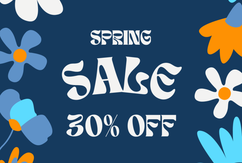
8. Project 2: Spring Sale: Welcome back to Project two. And just a quick note, if you did that first project and you didn't love
your color palette, you're always welcome to choose another color palette for the rest of class or
for whatever you want. This is, again, a
great way to test a color palette and see
if it will work for you in your social media
designs and give the vibe that you are
looking for in your brand. Here is Project two, and we can see the
different elements here. I'm going to use the same
color palette that I used for the last project. I'm going to look at my uploads and I'm going to bring it here, and I'm going to
bring this palette to the very front layer, and there we go. The first thing once again is
we're just going to change the colors and eliminate the
colors that are not ours. So let's change that text
to be this dark blue. And it's asking if we want
to change all of them, in this case, we do. Next, let's get this light
blue on the template. Let's just change this
flower right here. Here is our light blue. Do we want to change
all the purple to the light blue? We do. We're going to
change the yellow of that flower to this white. Or cream color.
Let's keep going. So we have this reddish color. Let's change that to orange. And let's ask if we want to change all those
colors to orange. Yes, we do. Let's change the center
to this bright blue, and we want to change all of
their reds to that color. All right. We need to
keep eliminating colors. We want to change that yellow. Let's change that to
this darker blue. We still have a lot
of document colors that we need to change. One thing I'm noticing
is they might be using more colors than we're
using here, but that's okay. We will make it work. Let's. This looks
like it's purple. Let's change that to our navy. Let's change this flower to
our different shades of blue. So here is that orange. We're going to
change it to that. And to that. Into that. It's asking if we
want to change all of that yellow, we do indeed. I think there's a
purple stem there. Here is their purple color. Let's be funky and
do an orange stem. It's asking, do
we want to change all the purple to
orange? Yes, we do. There's still a lot of document
colors hanging on here, and I'm not really
seeing where they are. Let me tap out of
there and then back in and see what we have here. This flower right here,
we want to change. Let's do this orange. And let's give it
a white center. But we still have say a green. There we go. We want to
get rid of this green. Let's swap it out
for our dark blue, and we want to change all the
dark green to that color. This is like hide and seek here. Let's go back into the colors
and see what we have here. What we're looking for
is a yellow, ah ha. We don't have yellow
in our template, so we'll change this to a dark blue, and we'll
get rid of that. And we have two oranges
and a light blue. That is not ours. Let's
go back into the colors. Did we change the background? We did not change
the background. There we go. It's usually a good idea to change the background
right away. Obviously, I didn't
do it, and it's fine. Okay, so we have an
orange that is not. Is this orange. That
orange is not ours. So we're changing all of that orange just
slightly to our orange. This is trickier than I thought
with the similar colors. I think all of our colors
are represented here. Let's just take a look.
We have, you know what? We're down to five
colors. We did it. Those are our photo colors, our brand colors, and then we
have five colors up there. We are ready to get rid of that and see what we have here. I think that looks pretty good. Like I said, I think they were using more colors than we are. I'm going to start by changing, I don't want these two
flowers next to each other. I'm going to change that bright blue to. Let's just try orange. There we go. We are going to look at fonts in Canva now and the different
effects that they have. This font has an effect, you know because effects
is highlighted up here, and the effect it has is Hallow. If we tap none, that eliminates
that Hallow effect. Let me just show you
some other effects that you can do with text. Shadow is one I use a lot. Here, you can change the
color of the shadow. I wouldn't want it to
be this bright color. Generally, you would
want the shadow to be darker than the
original color. Let's go back to effects. We could make it neon looking. That doesn't look
great with that color, but you get the idea. We could give it a glitch.
That's pretty subtle, but we could increase it
by increasing the offset. We can do all sorts of things. We could curve the letters, and when we curve them, we can curve them to
different degrees here. But for now, we're just going
to go back to how it was, Hallow and no curve. All right, so we have
our design here. I think I want to change this
center to a bright color. I don't love this font. Let's just change it
for the heck of it. It's asking if we want
to change all of that to shirk hand the font, and we do. So here we go. I
just might want to bring these a little
bit closer together. You know, I could play
with this all day. And sometimes I do. You know what I don't like
this outline effect here. Let's do none. Let's just take this design
and duplicate it. We'll click on those three dots, hit duplicate page, and let's play around the colors
a little bit more. Let's change the background, which we can find in
the positions right here to that dark color. Let's change all of it for now. And now our font disappears, but we can find it here. Let's just change all of our
fonts to the lightest color. You can also find
the fonts just by tapping on the page
where they are. Think I kind of like
that better already. Now, let's change some of the flowers to this cream color. Let's go here and
change the center. Let's go here and change the
center to a bright color. Let's go here and change
the blue to this cream. No, not that I don't
want to do that. So this is the color, this light blue. All right. No, what I want to do
is I want to change the orange to the cream. Okay, so now the flower looks
like it's all one color. Let's go back and
change the center. Oh, that Thank you. Try to find where everything is. There we go. And this
color could be that color. That's now the same as the stem. I like it. I want to keep adding more
cream here. Let's do this one. Let's do this one, and let's change this
orange to that color. I'm liking this better.
Let's take a look. I think it was changing two. Now we have two or I changed
some color throughout all. Anyway, let's just keep
going with this one. I think I did change
all to a color. I'm going to do this
orange to that? No, I'm not because I don't want those two blues
next to each other. So I am going to keep
this that orange. I'll do the center,
a dark color. And so on. I think that
looks pretty good. I would probably want to
change this flower down here, but now I'm getting fussy. You can spend all
day doing this, and believe me, sometimes I do. Okay, so here we have all of our brand
colors represented. I think we see
that we still have that other orange from
the other palette. It's fine. That looks pretty good, and we are going to
move on to project. I'll see in the next lesson.
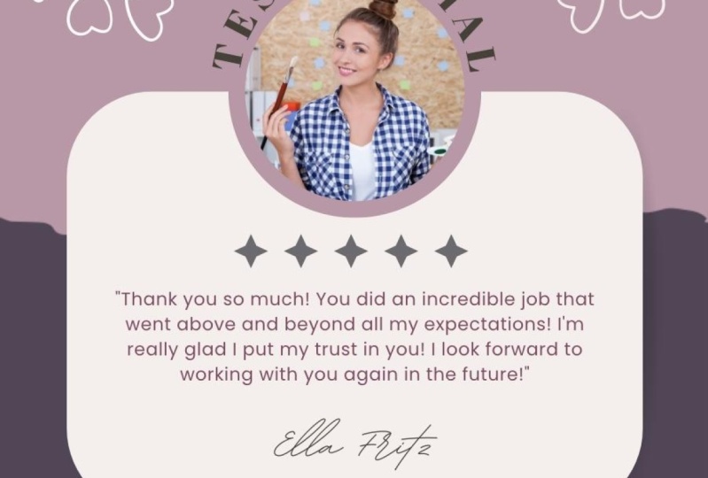
9. Project 3: Testimonial: I Welcome back. Let's get started
with Project three. Project three is a testimonial. This would be great
to share an Instagram or your website. Let's get started again
by changing the colors. So I'm going to use
this color palette. Again, I'm going to get rid
of the colors real quick, and I just want to show
you these shadows. There's one right here, and there's a shadow
right here as well. And if you note at the top, we can't change the
color of those shadows. They're just a dark gray. So I wanted to show you
what that looks like. I've probably said this before, but you can learn an
awful lot by just looking inside a Canva template and seeing how things
are put together. All right, Let's change colors. Let's bring our
color palette back. We'll go to uploads, and here we go. I am going to bring it to the front position,
the top layer. Let's start by
changing the colors. We have that color. We want to change it to orange, and I have that already saved
there, so let's change it. That's pretty bright
there. Doesn't matter. We're just changing
the colors right now. Let's change the background
color to this dark blue. Don't know if I love it. That's okay. We're
going to keep going. We want to get these other
colors in our color palette. So for now, I'm just
going to change this to the bright blue. And it's asking if we
want to change all of that white to the
bright blue, we do. And here again, because we
have two photos on there, it's pulling the
colors from her, as well, but we're looking
at these colors right here. So we want to get
rid of that color, so let's change it to this, and it's asking if we want to change them all. Yes, we do. And let's change that
color to our navy blue. Obviously, we don't want the
texts on that light blue. I'll just change that. I
think that's more text there. Let's change it
to the dark blue. And it's asking if we wanted
to change all of them. We do not for now.
Here's the stars. We want to change
the star colors. So let's tap there. We don't have that blue in
there. So let's change it. Let's change it to that color, and we will hit
this color wheel, the color picker, and
bring in this color. So we've selected it, we hit done, and we want to
change all of that to this. When we close that
and reopen it, we can see if this
has been updated. Okay, this is a frame. And let me show you what I mean. A frame has a special
meaning on Canvas. This frame has a border, and that has this
color around it, so we can change it
to our color palette. So that looks nice. We'll go back to frames
after we change the colors. There must be a black somewhere, too. Here we go. Let's change her
signature to that color. Okay, let's talk about frames. A frame will take any picture
and pop it right in there. So let's go to elements, and let's change her
out with someone else. Let's pretend our
testimonial person is a man, and let's put him over there, and he hops right in there, but he's not centered. I'll show you how to fix it. We're going to undo him, and
we are going to tap on him, and we're going to grab the
sides and just bring it in. And let's re pop him,
and there he goes. He actually works well
with our color palette. Let me show you
another frame just so you can see they're an
important part of Canva. They're within elements.
If you click frame, these are obviously like the
kind of frames you think of, but these are Canva frames that we're using
for our purposes. And they're all sorts of
different colors and shapes. You can get a lot
of fun effects. So you could put a picture
within a computer. Let me bring that to
the top. We don't want to use it for this, but
I'm just showing you. Any frame can do a
video or a picture. So let's pretend we want
a video of flowers. We could get
graphics of flowers, we could get photos, or
we could get videos. Let's just do this. We want to just move it, and it goes right into that frame. That's just an intro to frames. Let's get rid of
this whole frame. So we're going to click
on the little trash can. We could delete the video, or we could delete the whole
frame. I just did both. Okay. Here are colors. I don't think he looks
like an Adeline. Let's call him Chris. Okay, I think that looks
pretty good, actually. Oh, this color, I
don't think is right. Let's change that color. Now that I changed
it to that color, let's check our accessibility. So there is one issue
with color contrast, and yeah, just like I
expected, it's that one. So suggesting we
do that dark blue. So we have resolved our issues. Let's close this out. Let's move on to Project four. I will see you in
the next lesson where you'll learn
some new Canva, tips and tricks in Project four. I'll see you there.
10. Project 4: Upcoming Events: Welcome back. In
the last lesson, we completed our
testimonial in Canva. In this lesson,
we're going to be doing this upcoming
events template. Let's bring it into Canva. Okay. So here it is in Canva. Let's start by
changing the colors. And I got to warn
you with this one. There is, like, a
phantom gray black color that cannot be gotten rid of, or if it can, I could not figure out how. Believe me, I have tried. So when we're eliminating
the existing colors, just know that there's one color that I could not
find a way to eliminate. Let's start with the background. I'm going to go to
position and layers. I'm going to toggle down
here to the background. Here's the cream color, which I am going to
change to our Navy, and I'm going to change all
of the cream to the Navy. So let's keep going. I'm going to change this
to my orange color. I'm tapping on that A
and we have the orange. Okay, so we have
this retro staar. We're going to change
the color to the cream, which we need to grab
with the color picker, and I'm going to tap done. And the color hasn't
totally changed because this is like
a textured star. If we wanted it to be all one
color like they had before, we would change the
color a couple of times. Since we don't want to keep on doing that throughout the class, it'll just be a pain. I'll show you how we can get
a different star instead. Let's go to the elements
and let's search star. Here are some star options
under graphics that are stars and not all of them will be able to
change the colors. We can in this one because we have the color slider coming up. But I want a more
retro looking star. Maybe this one we'll do, yes, we can change the
color for that one. I am going to tap this.
And get rid of that one. Again, this is just so we
have the ease of changing the color of the star just once in case we're doing
a lot of color changes. I think I like this one
a little bit better. And we can change the color, so we're going to
change that to cream. What I'm going to
do is I'm going to delete the other stars. And copy this guy. I'm going to hit plus twice and we'll just move
them roughly into place. Canva will help us move
things into place. They'll snap into places where it makes sense. That's
really helpful. I'm going to make it smaller
by grabbing the corners. Canva likes it there. We have this other little
star behind there. I'm going to trash that.
Okay, that looks pretty good. Let's go back to
changing our colors. I actually want this
to be a light blue. Let's do that instead. I'm
going to tap on this A, and here's my light blue, and I'm going to change that. Let's change these little
squares to orange. Now it's tricky because
if you tap on here, you could pick up the December, you could pick up the eighth, you could pick up the square. What we could do
instead is go into the layers and find those that way and just
change it to our orange. It's asking if we want to
change all the pinked orange, we do in this case. All right, we need to
add the medium blue. Let's go back and find this, and we are going to change
that to this color. And I don't think
I want to do them all at once because it's going
to affect something else. It did anyway. I
changed these stars. That's okay. We'll
switch them back. We need the color picker again. Okay. I don't want
to change them. Also, I'll just close that out. What color do we
need to get on here? We have all of them,
I think, represented. Let's get rid of
this and keep going. Let's change the front
square to the cream color. We don't want to change
all in this case, I'll just keep going like this. This box actually has a border, and you can see it
by clicking on here. The color is there and
it has a weight of four. Let's change all of that
gray color to our navy blue. We do want to change it all. Let's see if we did that. Going to click on that one. Yes. The Navy blue is highlighted
there, we are good. We need to change the text here, and we're going to
change that to the Navy. We want to change all
that great to the Navy, so that is done. I don't think this second font works well with this design. I'm just going to change
the font to all Amo. If I click on here
and click here, I'm going to change all of
that coder font to mol. It is looking good. We want to change
these stars back to the cream. You know what? I think that looks pretty good. If you look up here in
the document colors, this is the color
that I can't figure out how to get rid
of in any way. Let me just see if
we can find it here. Now, everything is navy. There is a mystery color in here that we cannot get rid
of, but that's all right. I think we are good to go. I think that looks good. We could change this
font to a cream. I'm not sure if that
would look better or not or even be legible. Let's see what Canvas says. File, accessibility, check
design, accessibility. Color contrast.
That does not work. So we will undo it undo, undo, undo, and now we have no
color contrast issues. So that is my version
of Project four. I would love to see yours
in the class project area. And you are almost
finished with this class. We have one really
quick lesson with your next steps before we wrap
up. I will see you there.
11. Congrats! Thank You! And Next Steps: Hey. Congrats for
completing this class. You've taken a step towards mastering brand color
palettes in Canva. And I hope you're
feeling confident and inspired to apply these
skills to your own projects. You've done some hands
on work that's going to make a difference in
your future designs, whether that's for
your business, your art, or just for fun. Keep experimenting with colors
and trying new templates. The more you play with color, the better you'll
get at creating a cohesive and eye
catching color palette. And remember, if you're looking for even more inspiration, check out the 48
additional color palettes available in the
class resources. They're there to
help you dive even deeper into color exploration. I would love to see
what you created. So don't forget to upload
your class project of your Canva template using
your chosen color palette. I can't wait to see
your designs in action. Finally, if you
enjoyed this class, I would be so grateful
if you'd leave a review. Your feedback helps other
creatives find this class. And thank you so
much for joining me. Keep exploring your creativity, and I will see you
in the next one.
 Kelley Bren Burke, Artist & Educator